23 Best Elegant Calligraphy Fonts for Wedding Invitations in 2026
This collection spans open upright scripts, high-contrast copperplate lettering, and dramatically slanted styles shaped by loops, swashes, and pointed terminals. These Elegant Calligraphy Fonts suit invitations, wedding stationery, logos, packaging, headlines, quotes, and identity work, with readability and scale determining where each design performs best.
Looking for more calligraphy fonts? Browse our complete Calligraphy Fonts collection to compare modern, elegant, bold, wedding, and logo-friendly calligraphy styles.
Elegant Calligraphy Fonts: Readable Display Scripts
These Elegant Calligraphy Fonts favor clearer structures: upright or gently organized forms, stronger display presence, and more open spacing. They remain more approachable than the heavily flourished groups for headings, cards, quotes, and practical project work.
Valentine Chocolate Font
Best For: invitations, wedding designs, quotes
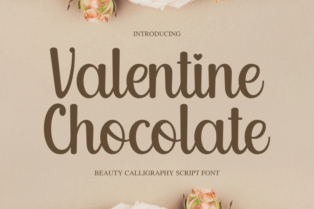
Valentine Chocolate Font uses rounded upright letters, a steady monoline stroke, and disconnected construction, with a heart-shaped i dot adding personality. Its open forms stay clear at medium display sizes, making it one of the more practical Elegant Calligraphy Fonts for invitations, wedding designs, quotes, and Cricut projects.
Cable Beach Font
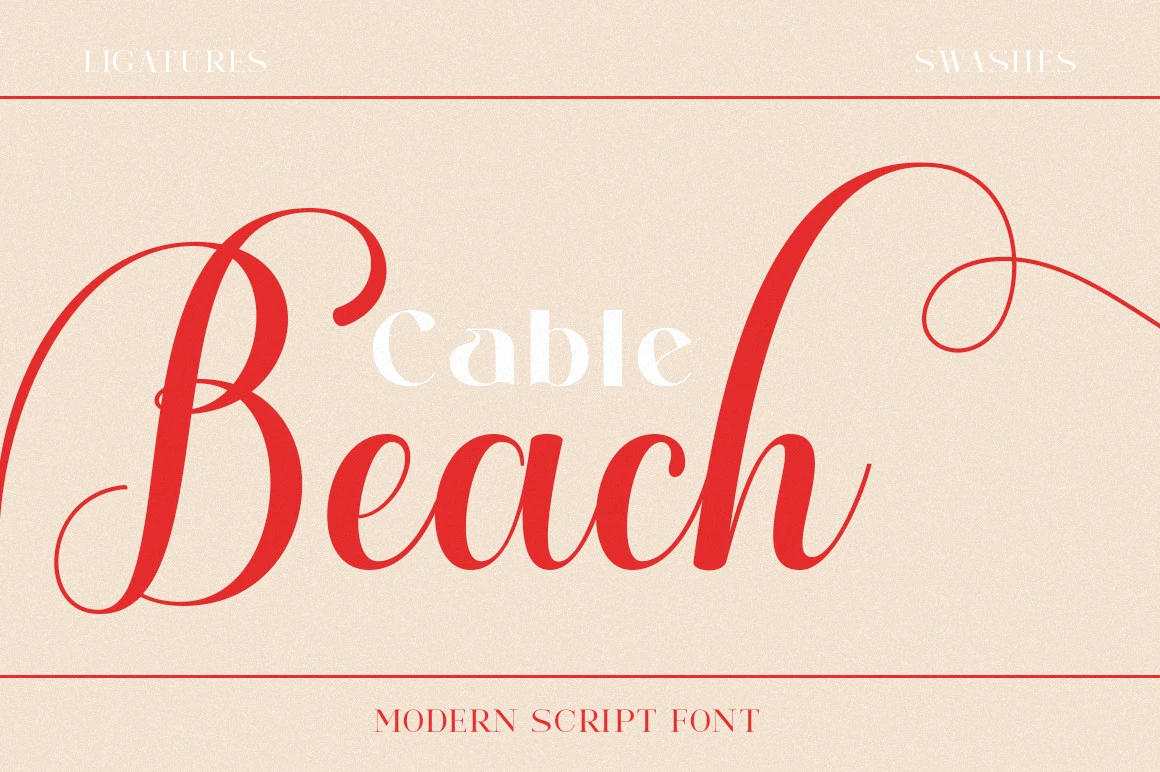
Best For: invitations, wedding designs, logos, headlines
Cable Beach Font combines bold upright lettering with high contrast and unusually fluid rhythmic curves. Its heavier weight helps wedding designs and invitations stand out, while exaggerated swashes create memorable logos and headlines. The connected forms remain a display solution rather than a choice for long passages or small labels.
Allexandia Font
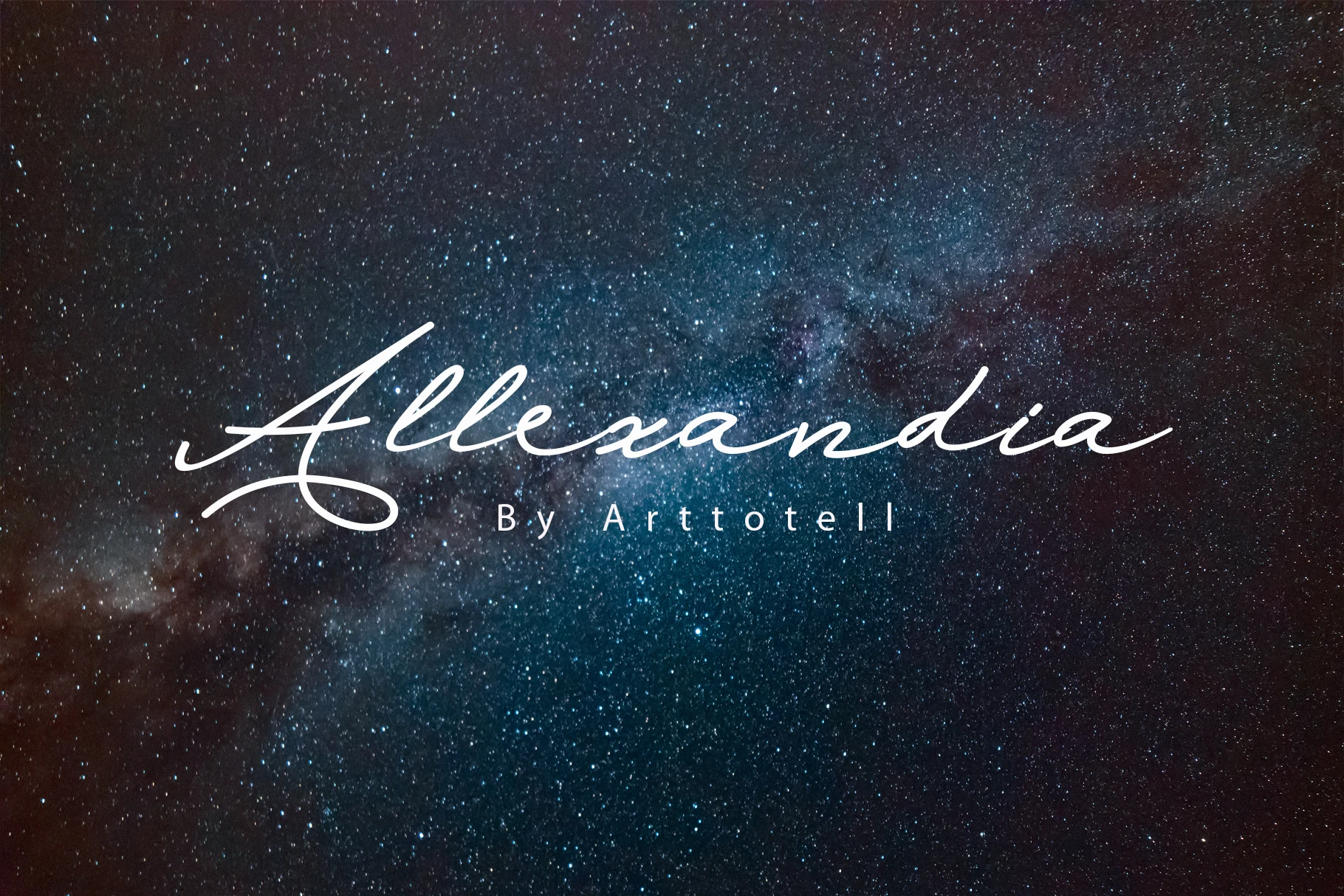
Best For: logos, branding, invitations, wedding designs
Allexandia Font centers its signature treatment on a prominent initial capital A and organic terminals. Four unique styles provide useful variation for logos, branding, invitations, and wedding designs, though fine hairlines can disappear in small marks. Choose it when a short name or phrase needs a personal, recognizable focal point.
Elegant Calligraphy Font
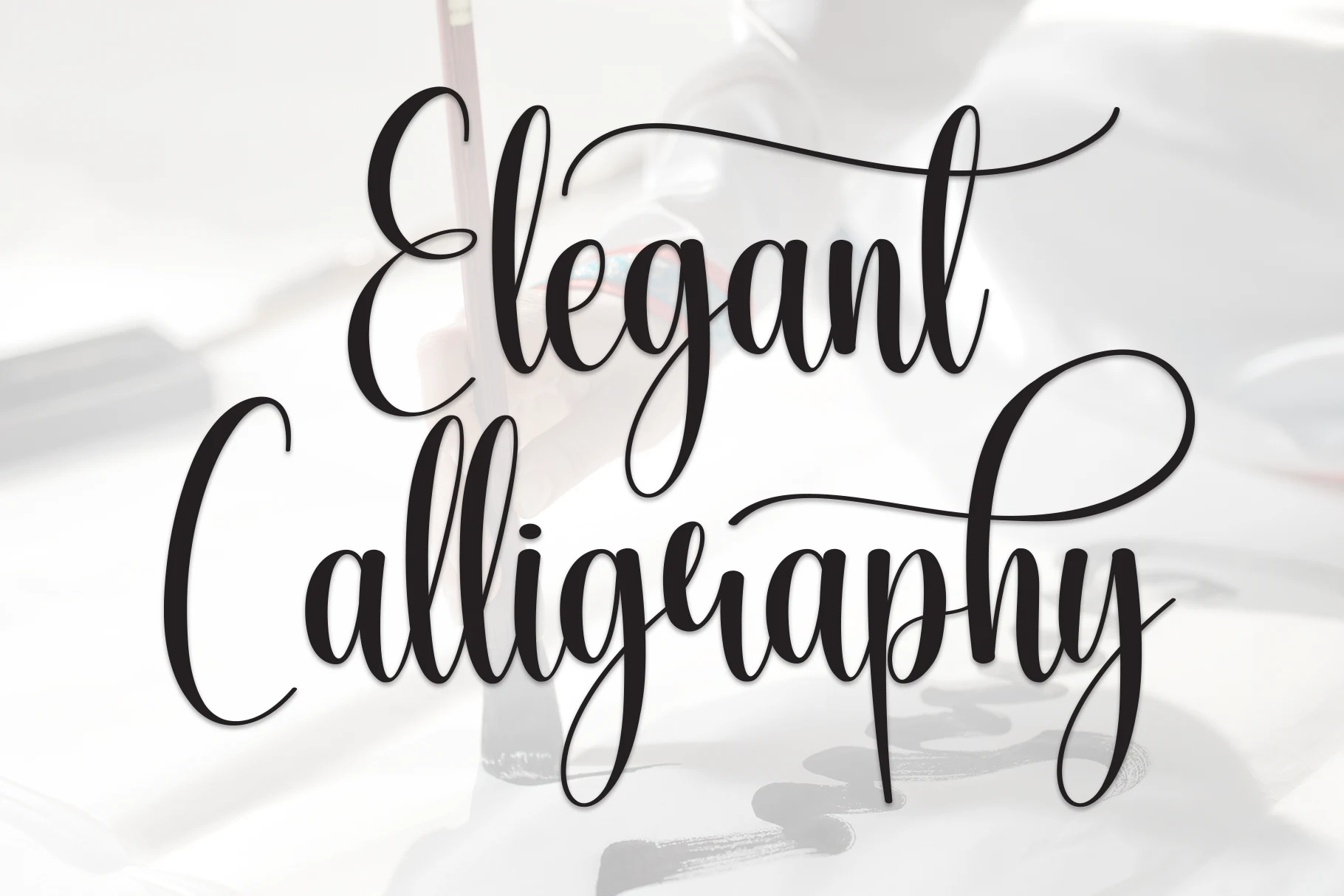
Best For: headlines, short phrases, display text, elegant designs
Elegant Calligraphy Font uses continuous pen-like strokes, varied line weight, and extended swashes for a dynamic brush-lettered finish. It is notably legible for headings and short phrases, though thin connecting strokes become fragile when reduced. Use it for headlines, display text, or concise wording rather than dense copy.
Warton Font
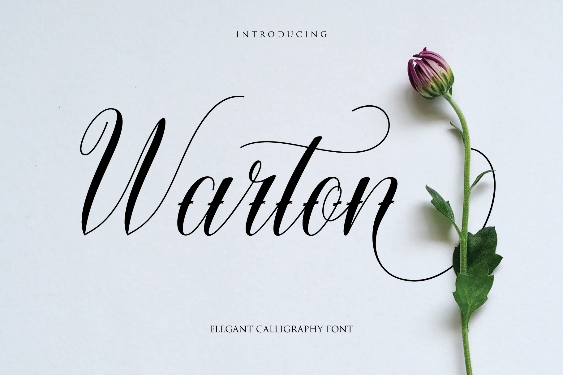
Best For: invitations, logos, business cards, quotes
Warton Font combines upright connected lowercase forms with variable letter heights and elongated terminal swashes. That irregular cadence adds personality to invitations, logos, business cards, and quotes, though it makes long-form setting inconsistent. It is a strong option for cards and short identity lines that benefit from a distinctive handwritten touch.
Formal Copperplate Flourishes
Copperplate influence defines this group through high contrast, connected lowercase forms, and prominent capital or terminal swashes. Compared with the other categories, these designs emphasize ceremonial structure and engraved-style flourishes over casual readability.
Village Rabigen Font
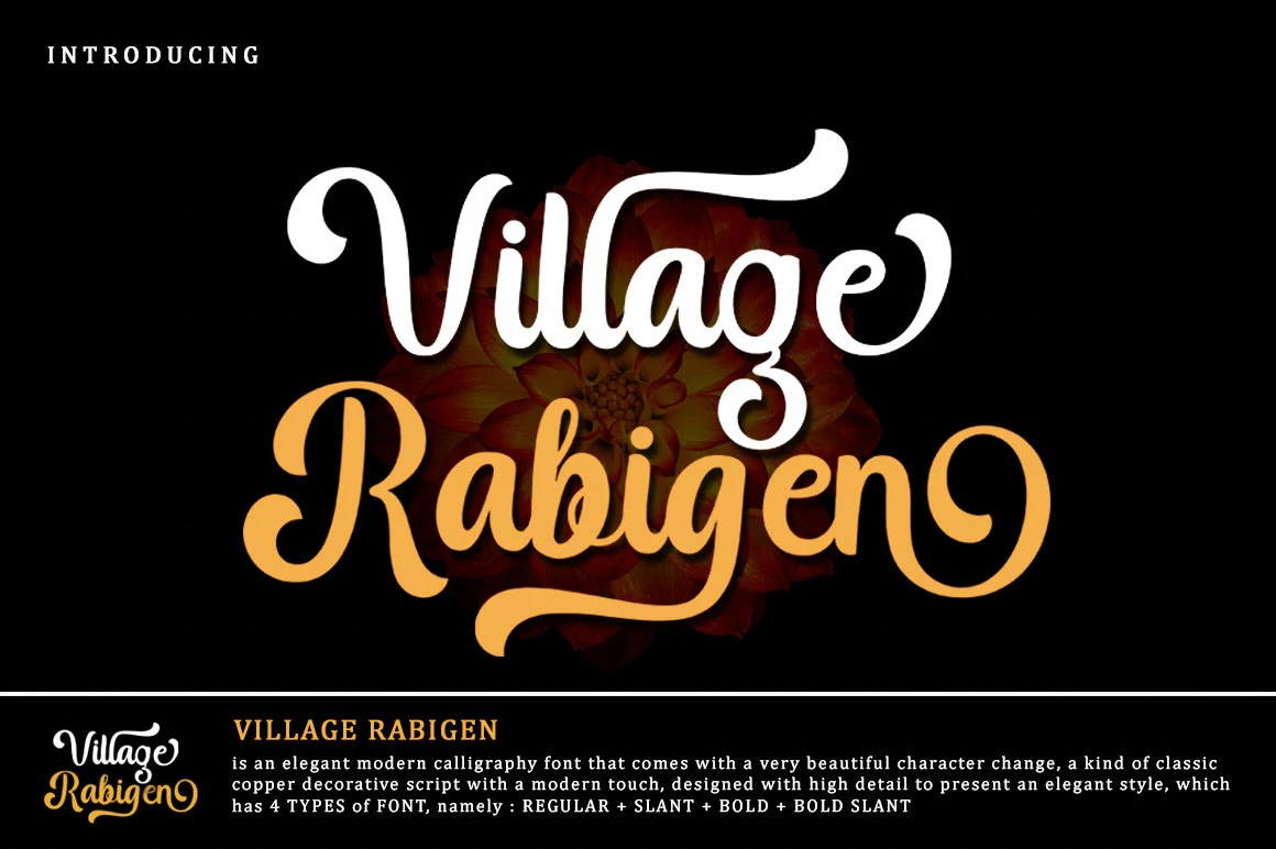
Best For: invitations, wedding designs, logos, display text
High thick-to-thin contrast gives Village Rabigen Font its copperplate foundation, while pronounced opening and closing flourishes frame each word. Character changes add useful variation, including upright and slanted treatments, but the dense swashes need generous sizing for invitations, wedding designs, logos, or other display text.
Absolute Bernaby Font
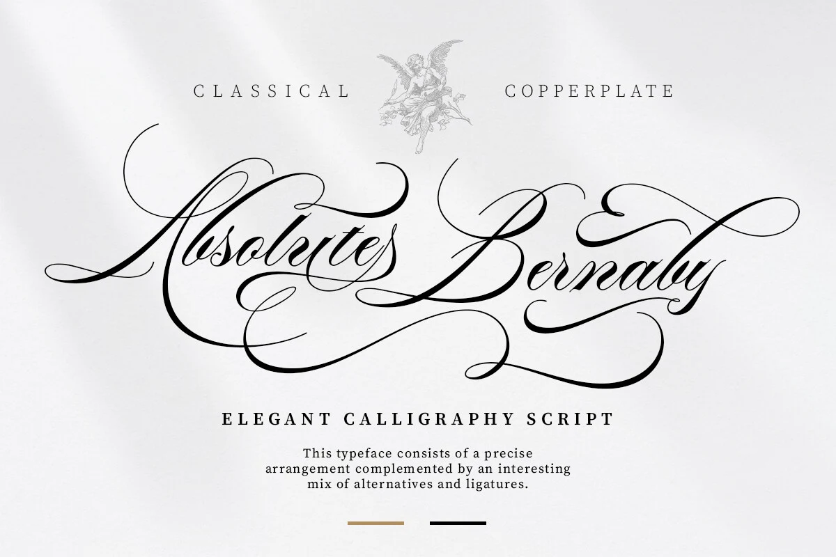
Best For: wedding designs, invitations, logos, display text
Wedding designs and invitations benefit from Absolute Bernaby Font’s copperplate character and exaggerated terminal loops. Thick-thin contrast and dense connected forms create a ceremonial impression, but the layered connections slow recognition. Use it at generous display scale, where its elaborate swashes can function as part of the composition rather than obstructing the wording.
Darlington Font
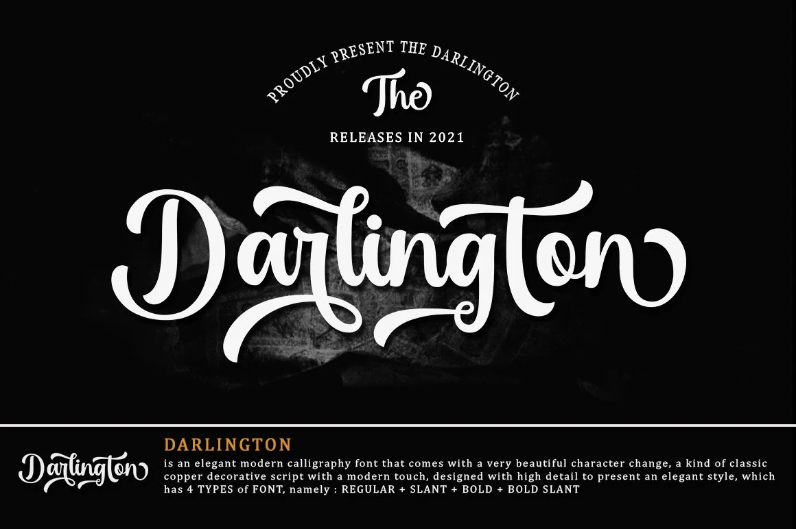
Best For: logos, invitations, wedding designs, luxury designs
Darlington Font softens its copperplate-influenced construction with rounded terminals, while varied stroke thickness and connected forms keep it firmly display-oriented. A character-change feature adds flexibility for logos, invitations, wedding designs, and luxury designs, but paragraphs will lose clarity as the flourishes and contrast accumulate.
Ramolina Script Font
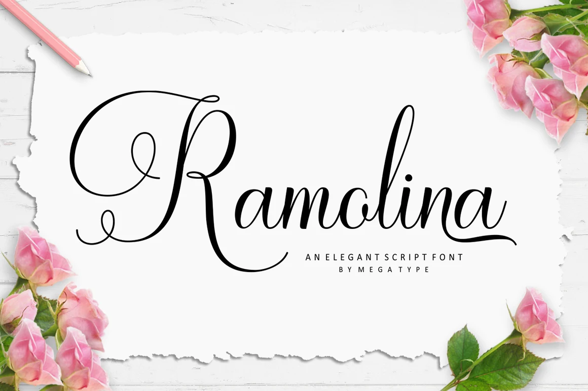
Best For: logos, invitations, product labels, fashion branding
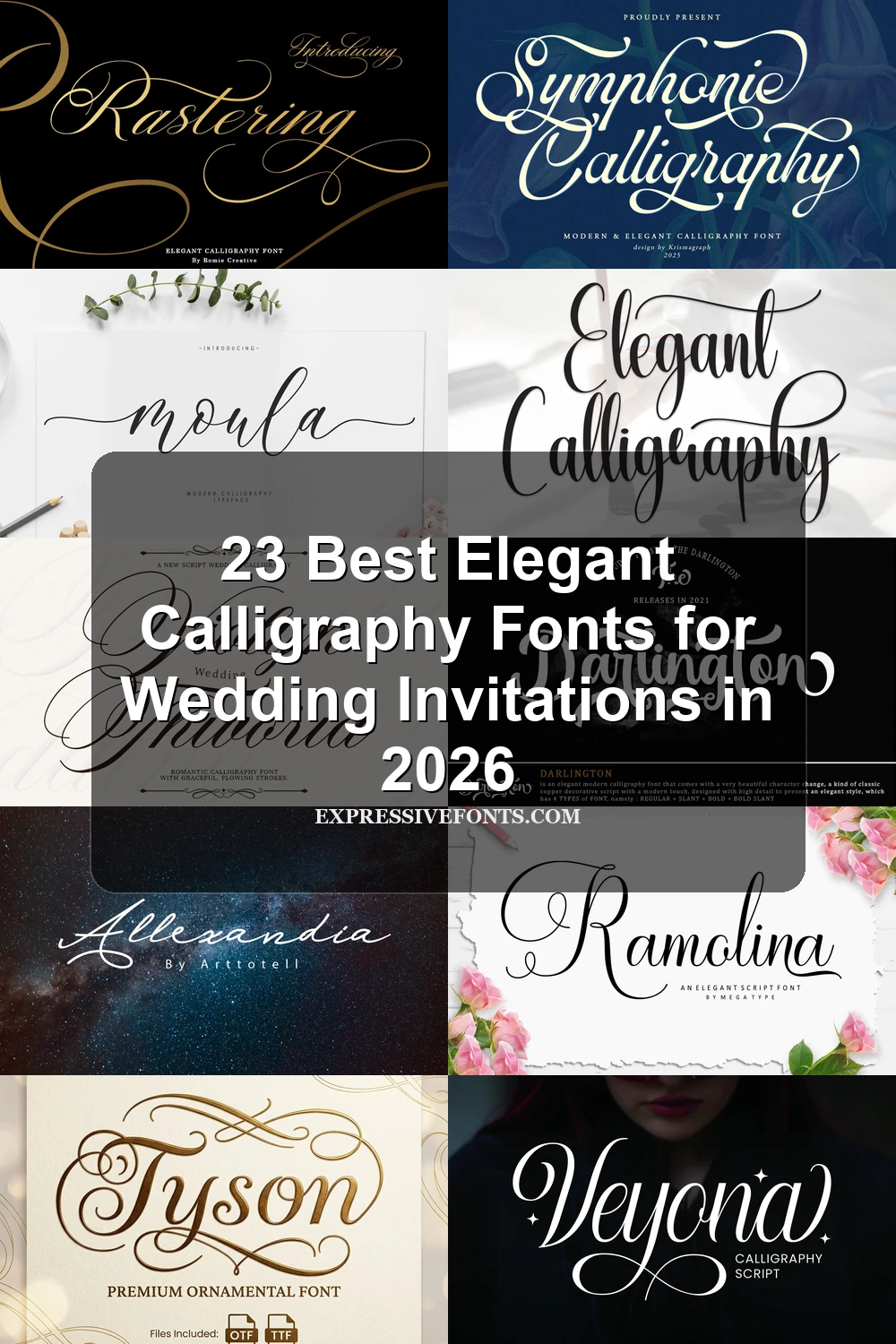
Ramolina Script Font is especially recognizable through the oversized swash on its initial capital R, set within a copperplate and handlettering hybrid. Alternate characters broaden its use for logos, product labels, and fashion branding. Because the lowercase is densely connected, enlarge it enough for the letter joins to remain easy to follow.
Symphonie Calligraphy Font
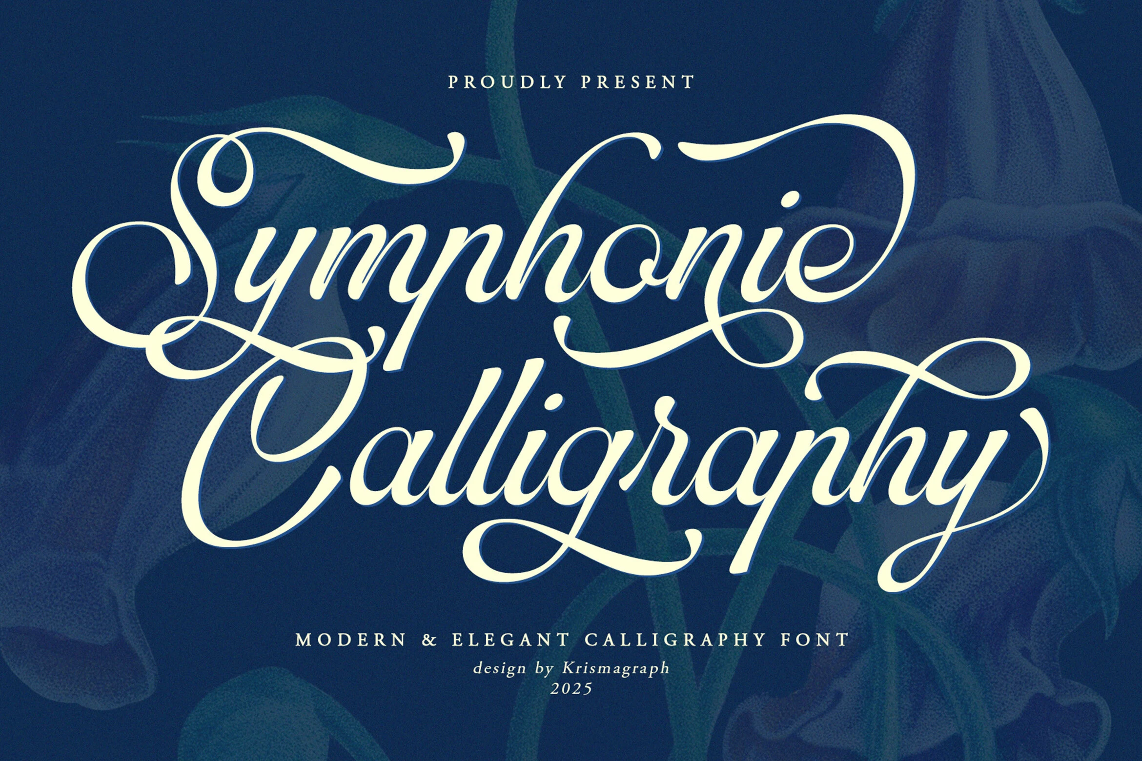
Best For: invitations, wedding designs, logos, headlines
Symphonie Calligraphy Font stands upright while many neighboring scripts lean right, giving its connected forms a more centered ceremonial rhythm. Flowing tails work well in invitations, wedding designs, logos, and headlines, but high contrast and flourishes become less dependable at small sizes. Use short wording and generous leading for clearer results.
Nightshade Font
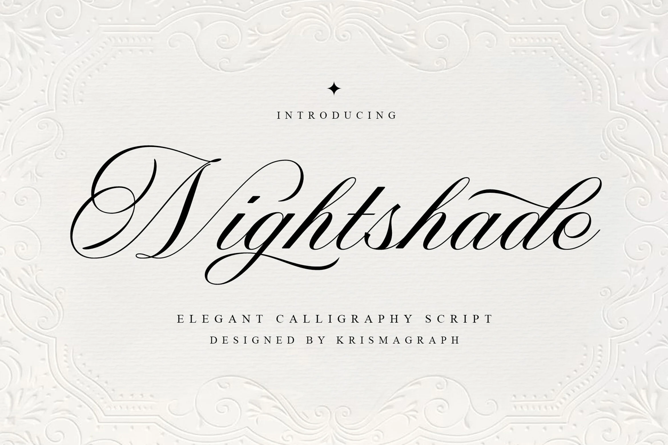
Best For: invitations, wedding designs, display text, quotes
Nightshade Font brings rounded terminals to a connected structure with capital and terminal swashes. Its clean, legible quality helps short quotes and invitations, while high contrast still favors large display text over tiny captions. The balance makes it a useful choice when you want decorative detail without the most difficult letter shapes.
Scarlet Flettcher Font
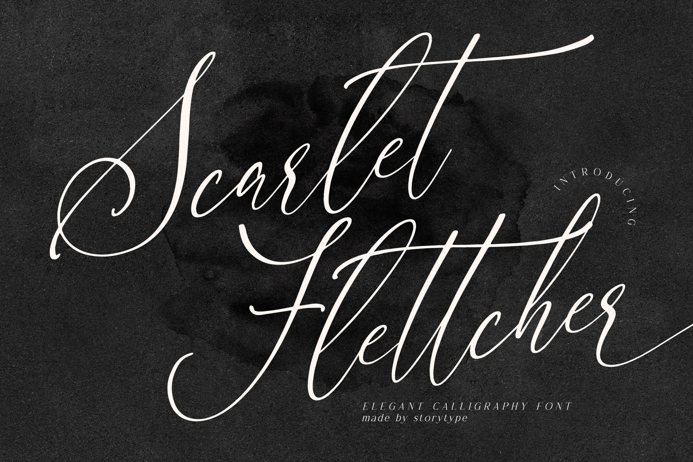
Best For: wedding designs, invitations, luxury designs, headlines
Scarlet Flettcher Font shapes connected copperplate-style letters with sweeping ascenders, descenders, and a pronounced rightward slant. The directional movement works well for wedding designs, invitations, luxury designs, and headlines, while fine weights favor large display sizes. Use a short phrase and generous spacing to preserve the letter structure.
Slanted Luxury And Romantic Scripts
These slanted scripts build their identity through directional movement, connected letters, irregular rhythm, and expansive flourishes. They deliver the strongest romantic or premium impact, but generally need more space and size than the upright options.
Bontana Font
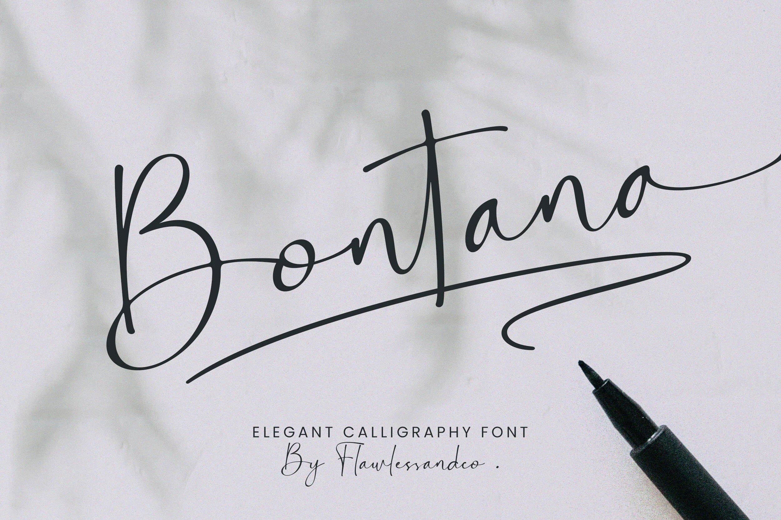
Best For: logos, wedding designs, luxury designs, invitations
For luxury designs and wedding titles, Bontana Font offers sweeping connected forms, rounded terminals, and assertive thick-thin contrast. Its cursive silhouette carries noticeable baseline movement, which gives large lettering energy but can reduce clarity when reduced. Treat it as a headline or logo face rather than a compact reading font.
Tyson Font
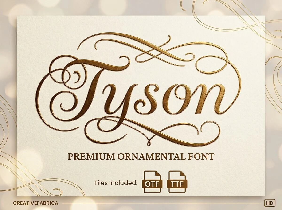
Best For: wedding designs, luxury designs, packaging, branding
Tyson Font creates a strong rightward pull through connected cursive letters, high contrast, and extensive swashes. The hand-penned rhythm gives branding and packaging a distinctive presence, yet its ornament competes with quick reading. Reserve it for large titles, wedding designs, luxury designs, or short branding accents instead of body copy.
Soulmate Romantic Font
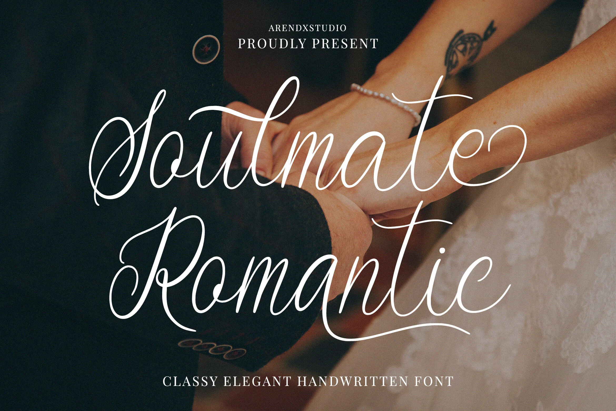
Best For: logos, branding, wedding designs, invitations
Soulmate Romantic Font combines a pronounced rightward sweep with connected lettering, high contrast, and emphatic flourishes. It adapts readily to logos, branding, wedding designs, and invitations, although headings remain more dependable than extended text. Its regular width helps keep short wordmarks from becoming unnecessarily wide.
Marbelyn Walenstan Font
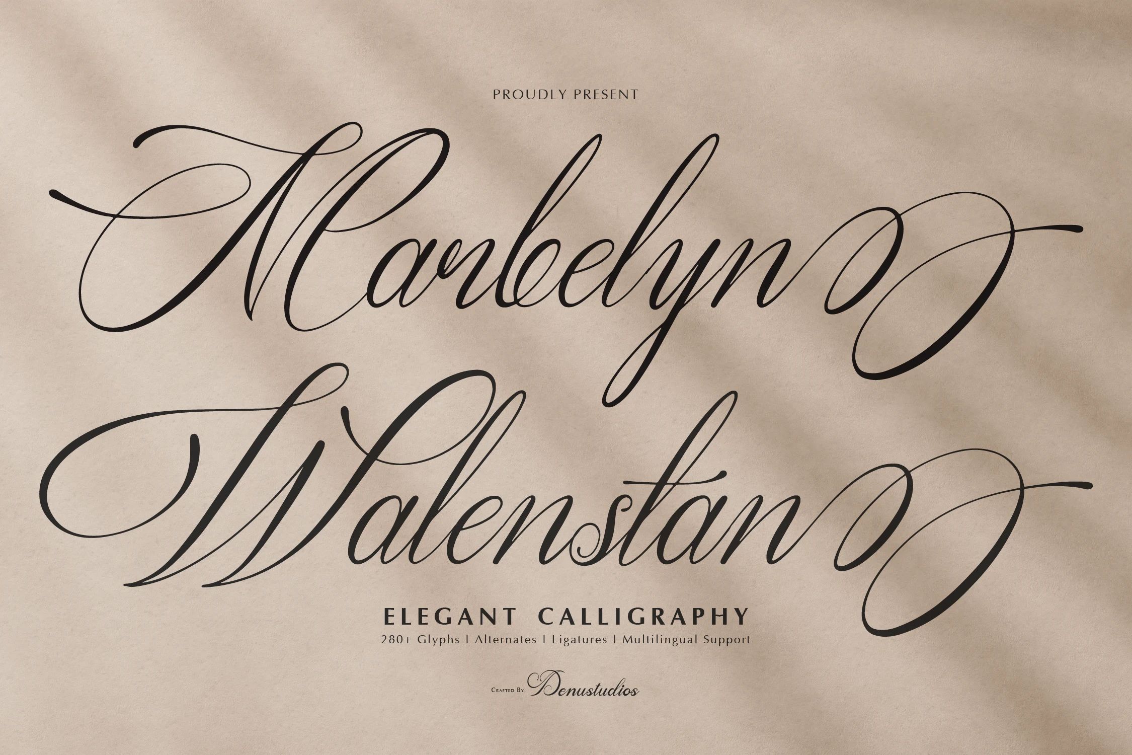
Best For: branding, wedding designs, invitations, logos
Marbelyn Walenstan Font pairs a consistently slanted connected structure with high contrast, thin strokes, and elaborate terminals. More than 280 glyphs, alternates, and ligatures give identity systems room for variation, but the fine construction needs large sizing. It is particularly useful for branding, wedding designs, invitations, and logos.
Gabyan Font
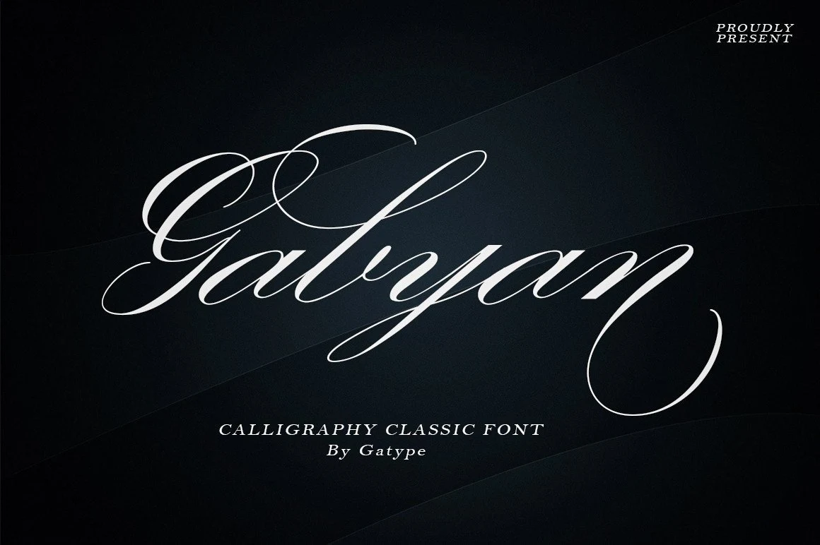
Best For: logos, packaging, wedding designs, branding
Gabyan Font establishes a consistent rightward rhythm with connected letters, high contrast, and pronounced swashes. Its directional structure gives logos, packaging, wedding designs, and branding a clear visual signature, while the detailed flourishes make large headings safer than compact applications. Allow surrounding space so the letter movement remains visible.
Rastering Font
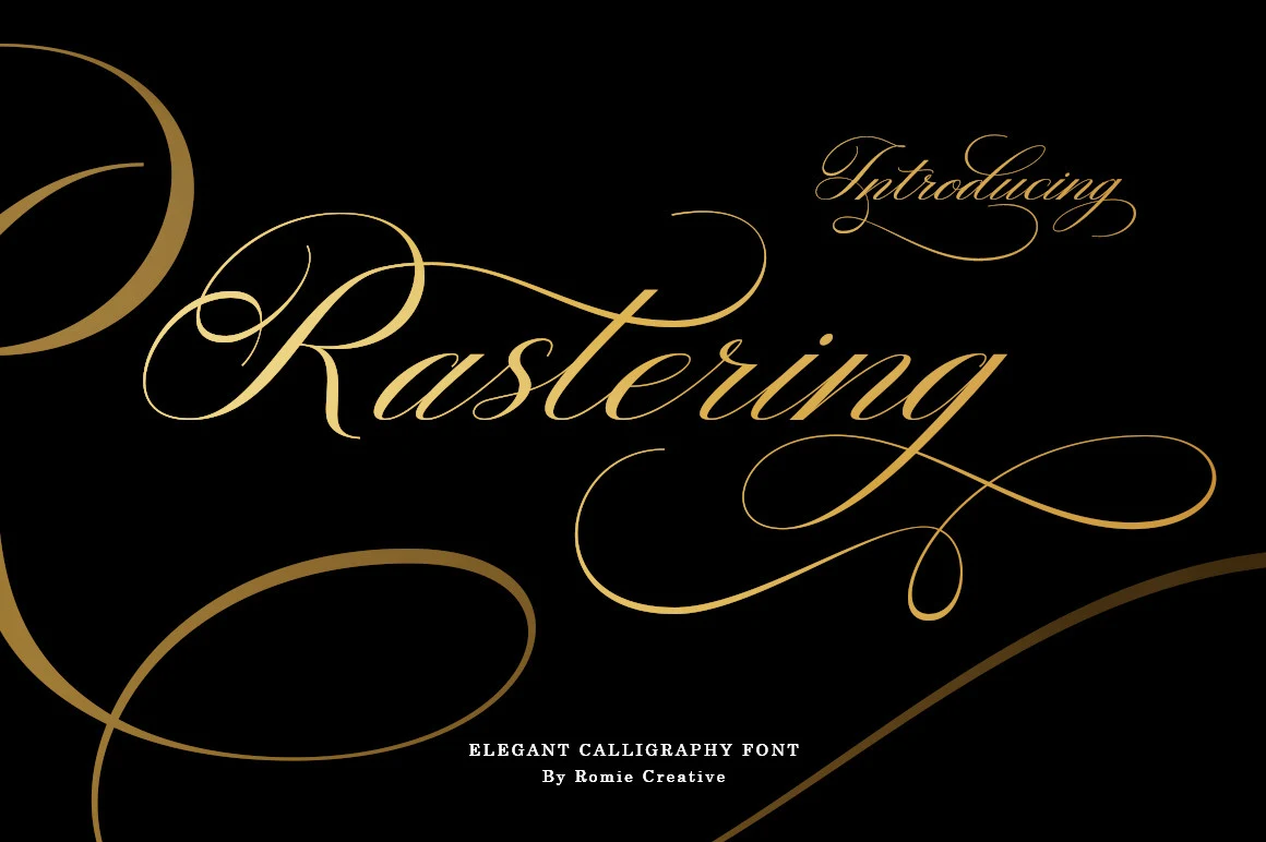
Best For: invitations, wedding designs, headlines, high-end designs
Rastering Font uses mixed widths, a pronounced rightward slant, and lowercase swashes to create an expansive headline silhouette. Alternate fonts, ending characters, numbers, and full punctuation support complete title systems for invitations, wedding designs, and headlines. Its dense construction is less suitable for paragraphs or tightly packed layouts.
Violyn Wedding Thivoria Font
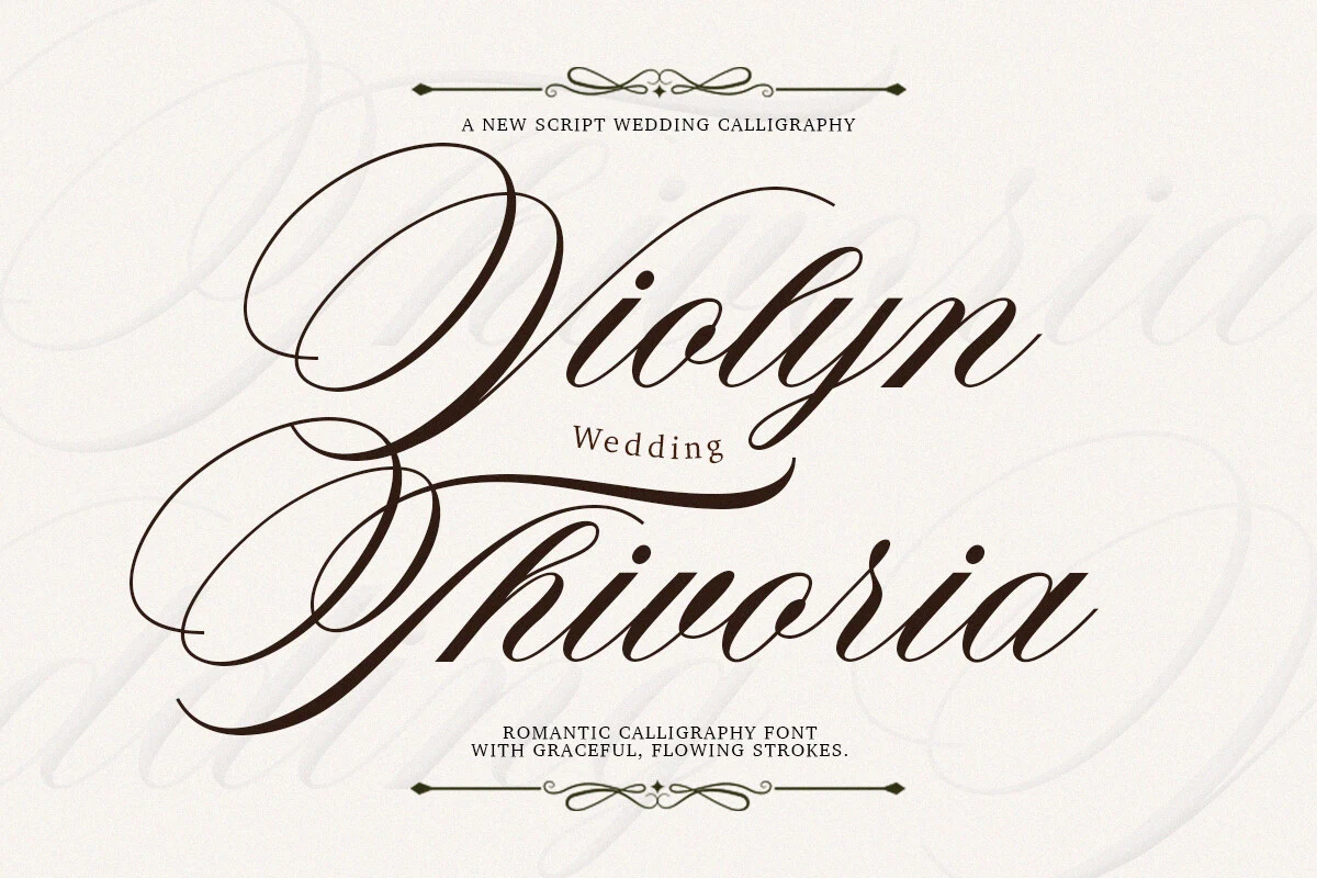
Best For: wedding designs, invitations, logos, display text
Wedding designs and invitations gain immediate theatrical impact from Violyn Wedding Thivoria Font’s extended loops, connected lettering, and long swash flourishes. High contrast heightens the display effect, but the loops require generous scale to stay decipherable. It works best for a title, logo, or short line with ample surrounding space.
Veyona Font
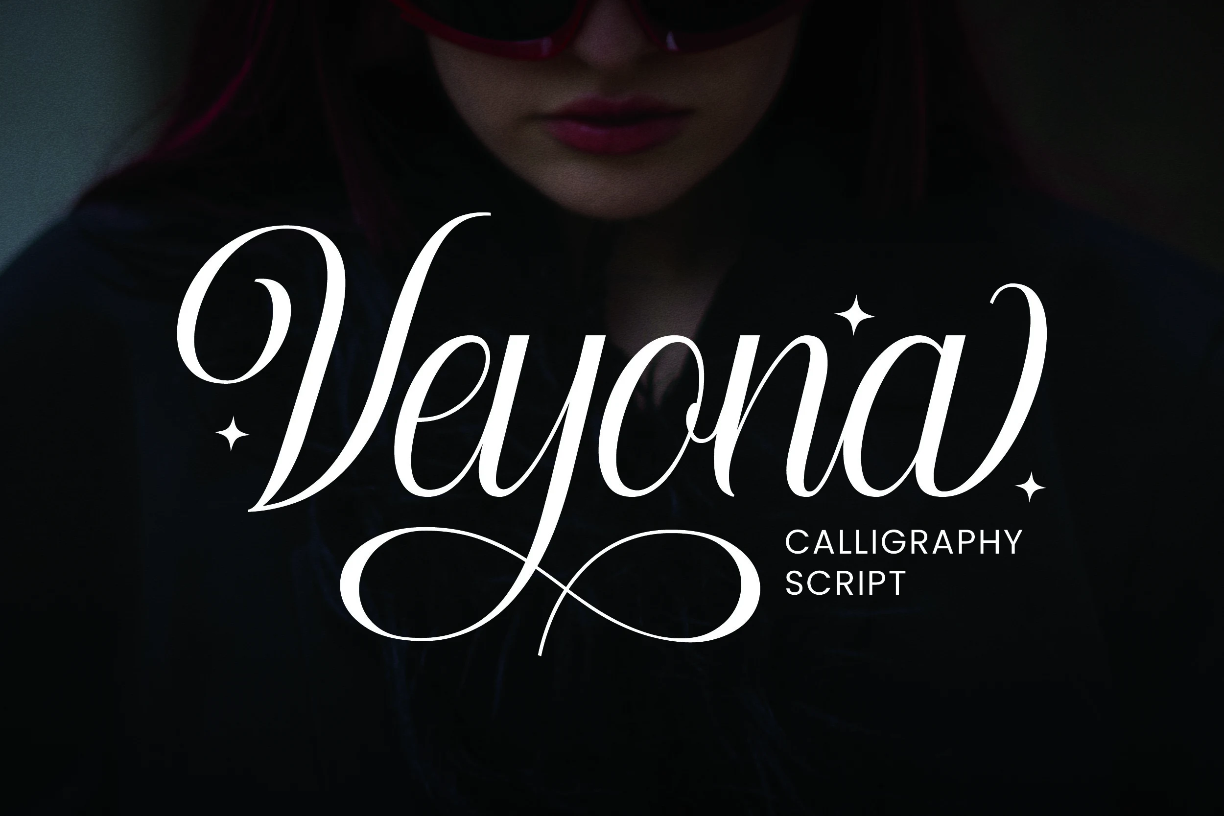
Best For: branding, logos, luxury designs, high-end designs
For branding and logos that need a premium edge, Veyona Font contrasts sharp pointed terminals with connected, high-contrast lettering. Extended first- and last-letter swashes reinforce luxury designs and high-end designs, but intricate forms need large placement. Keep the wording short so the pointed details remain distinct instead of merging.
Lamborgini Font
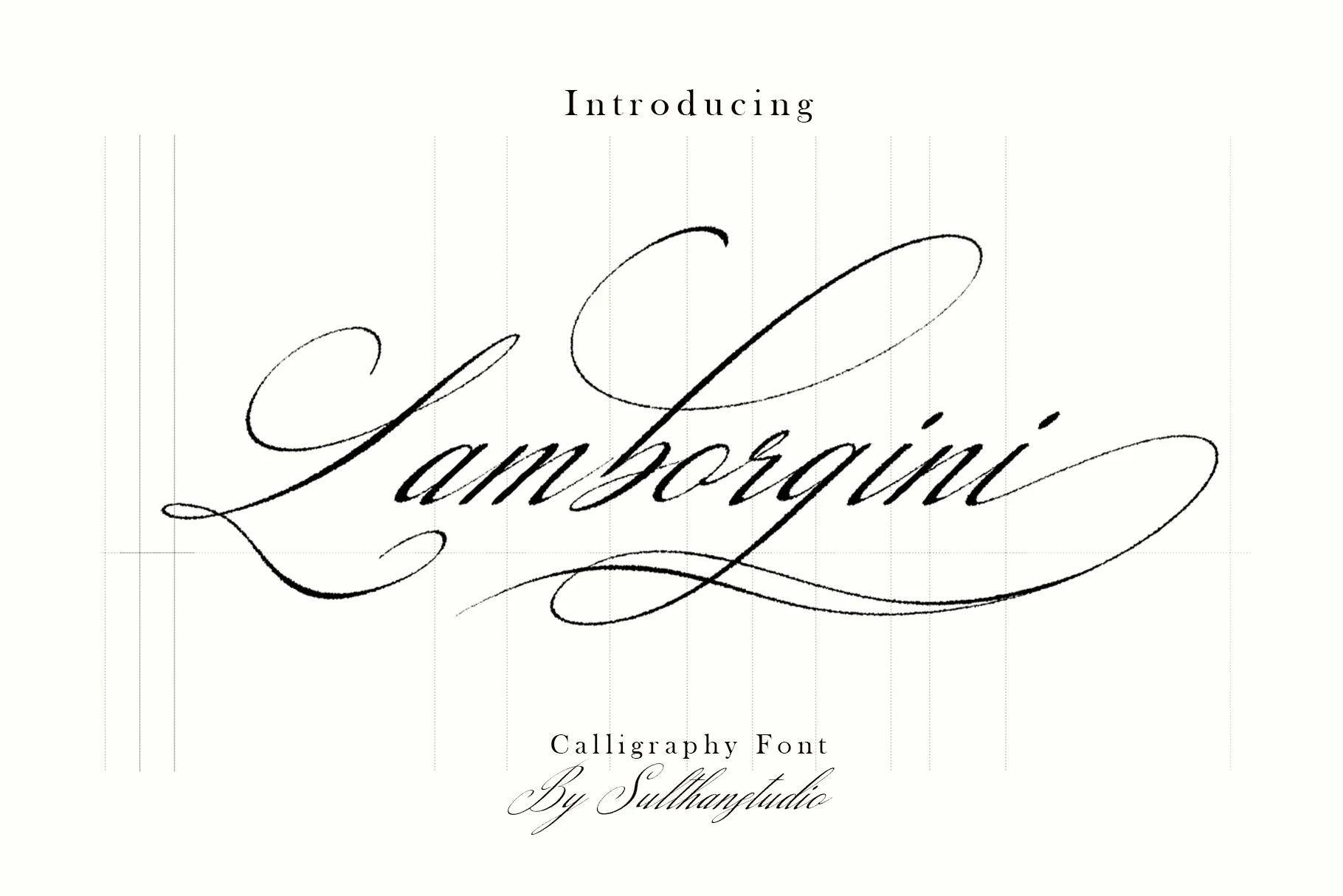
Best For: invitations, wedding designs, headlines, logos
Lamborgini Font uses razor-thin hairlines, oversized loops, and a sweeping rightward slant to create a finely etched display effect. Its delicate construction suits invitations, wedding designs, headlines, and logos, but reduction quickly weakens the hairlines. Give it high contrast against the background and avoid crowded supporting text.
Senatheca Font
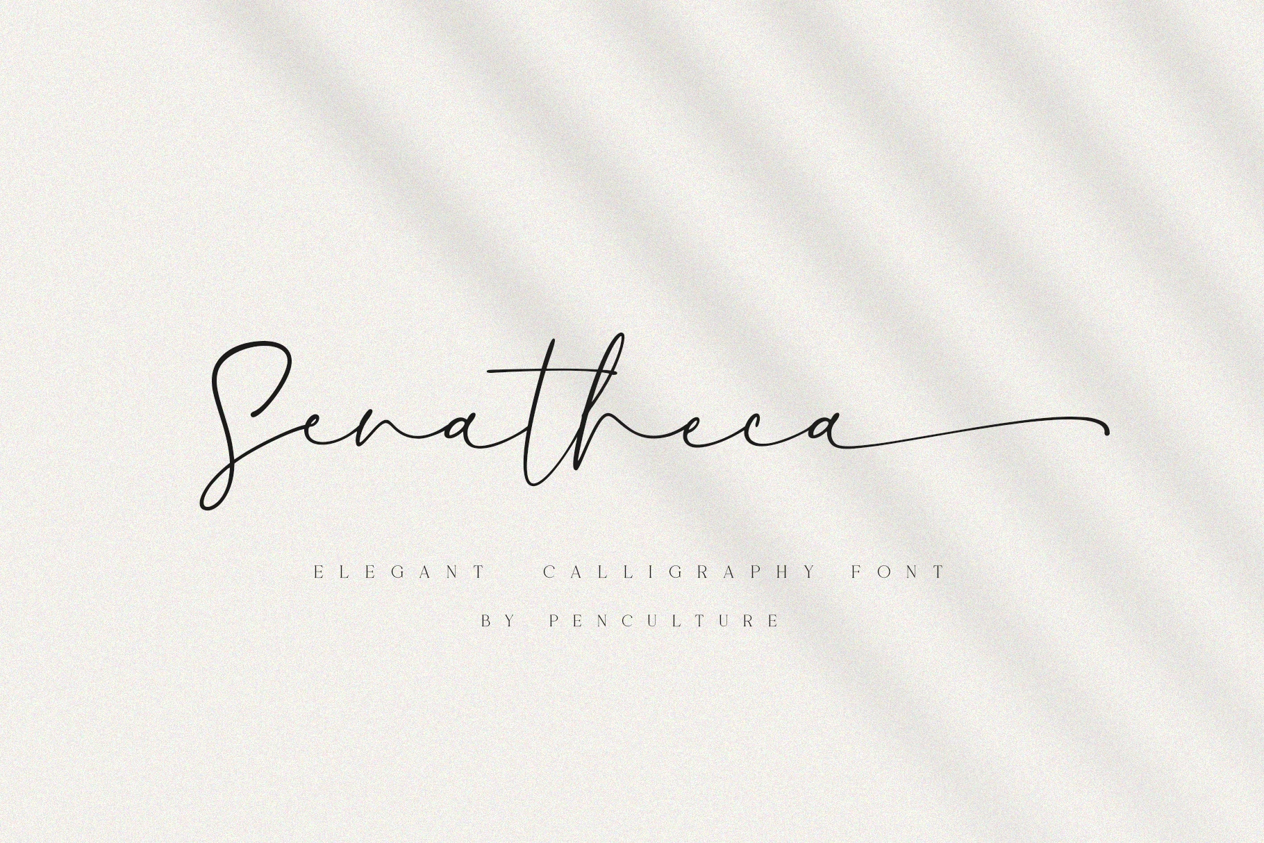
Best For: branding, posters, wedding designs
Senatheca Font gets its signature finish from irregular baseline movement and a long final-letter swash on its right-slanted connected script. It suits branding, posters, and wedding designs, especially when the lettering can occupy space freely. Thin strokes make small branding applications risky, so test the final size before committing.
Moula Font
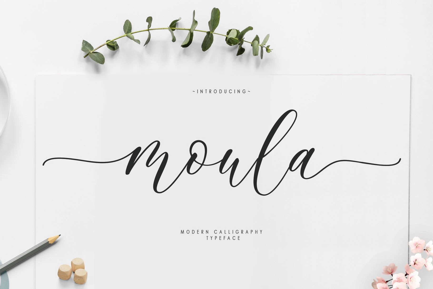
Best For: logos, branding, display text, headlines
Moula Font is identified by looping ascenders and descenders within a connected, high-contrast structure. Extended swashes give logos, branding, display text, and headlines strong movement, but tiny applications can lose separation between letters. Its visual impact improves when the word is isolated and set at a generous size.
How to Choose the Right Font
Choose among these Elegant Calligraphy Fonts by starting with construction: open upright lettering is generally easier to read, while connected joins, high contrast, thin hairlines, and long flourishes demand display scale. Favor restrained swashes for practical invitations or cards, and reserve irregular baselines and dramatic terminals for short logos, titles, packaging, and identity work.