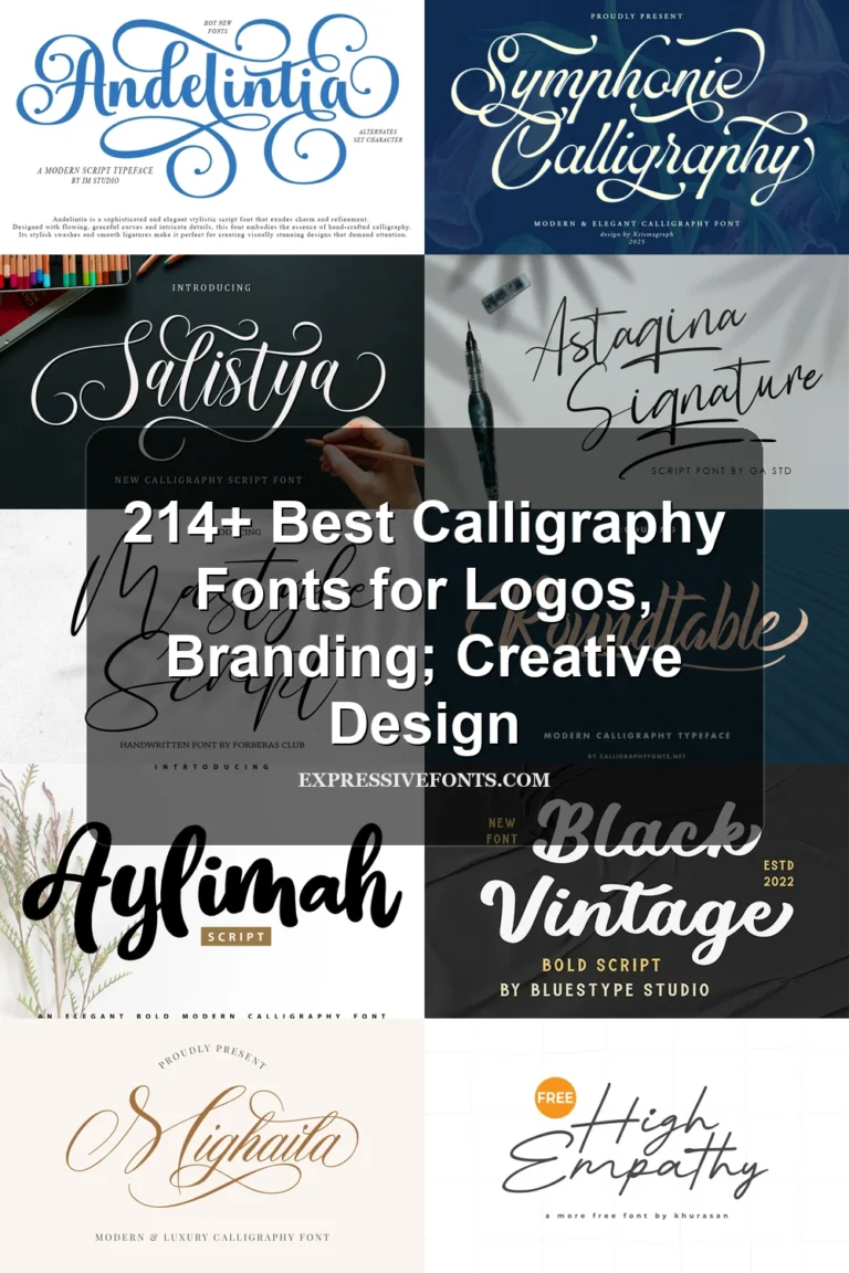
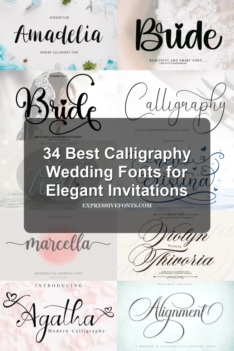
24 Best Luxury Calligraphy Fonts for Weddings in 2026
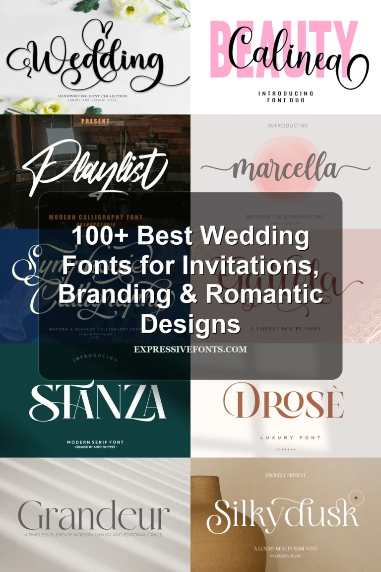
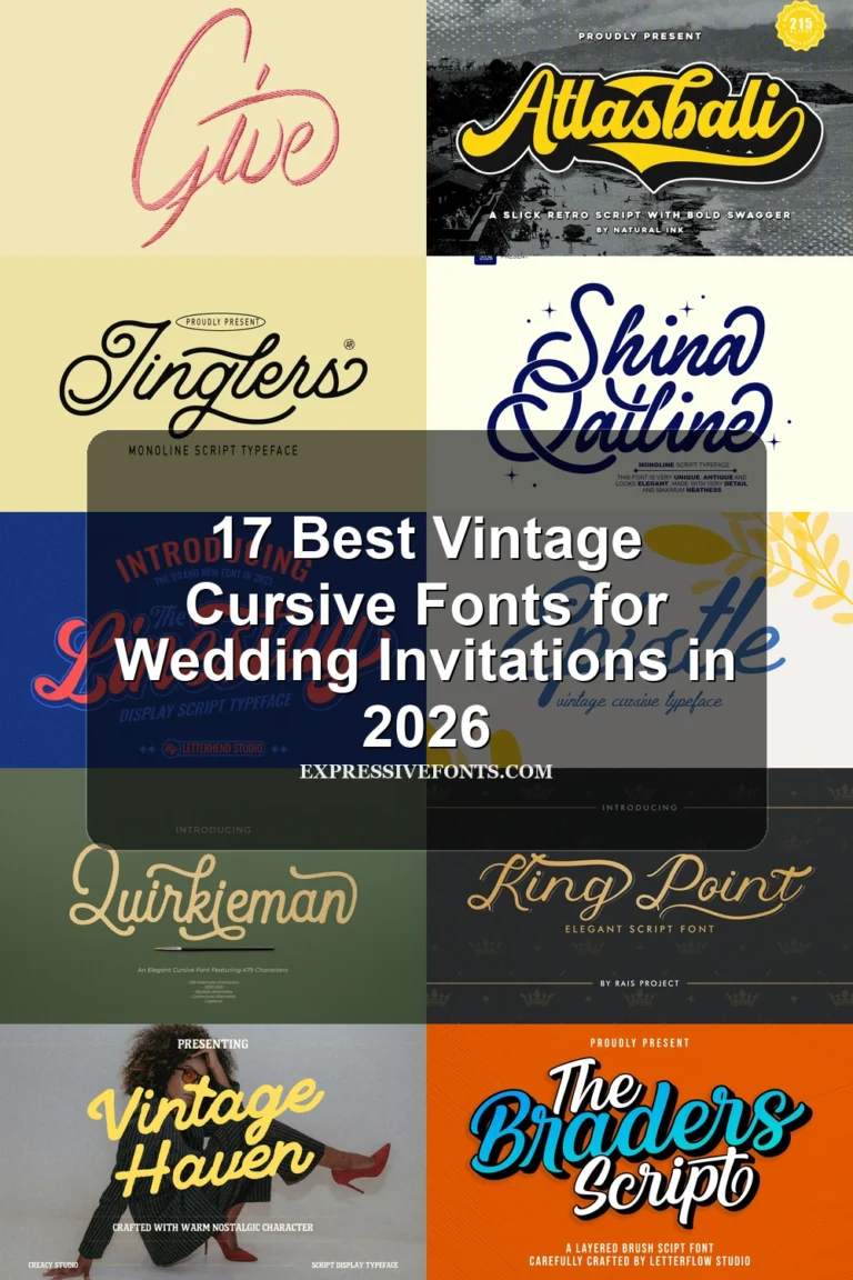
This collection of Luxury Calligraphy Fonts spans pointed-pen copperplate, romantic swash lettering, expressive brush scripts, and signature-led marks. Their practical differences appear in stroke contrast, connections, baseline movement, and flourish density, making them especially useful for logos, invitations, packaging, covers, and short display text.
Looking for more calligraphy fonts? Browse our complete Calligraphy Fonts collection to compare modern, elegant, bold, wedding, and logo-friendly calligraphy styles.
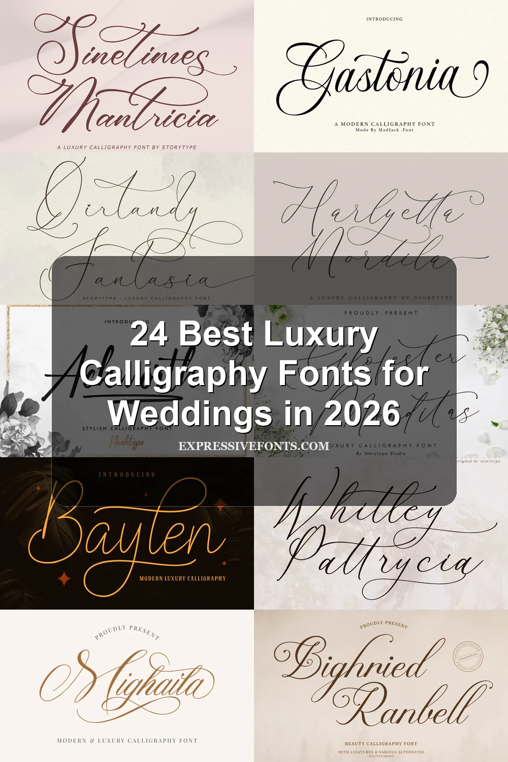
Luxury Calligraphy Fonts: Formal Copperplate
Luxury Calligraphy Fonts in this group emphasize copperplate contrast, connected construction, and controlled formal slant, with more structured movement than the freer handwritten and signature-led categories.
Kaleagnetta Font
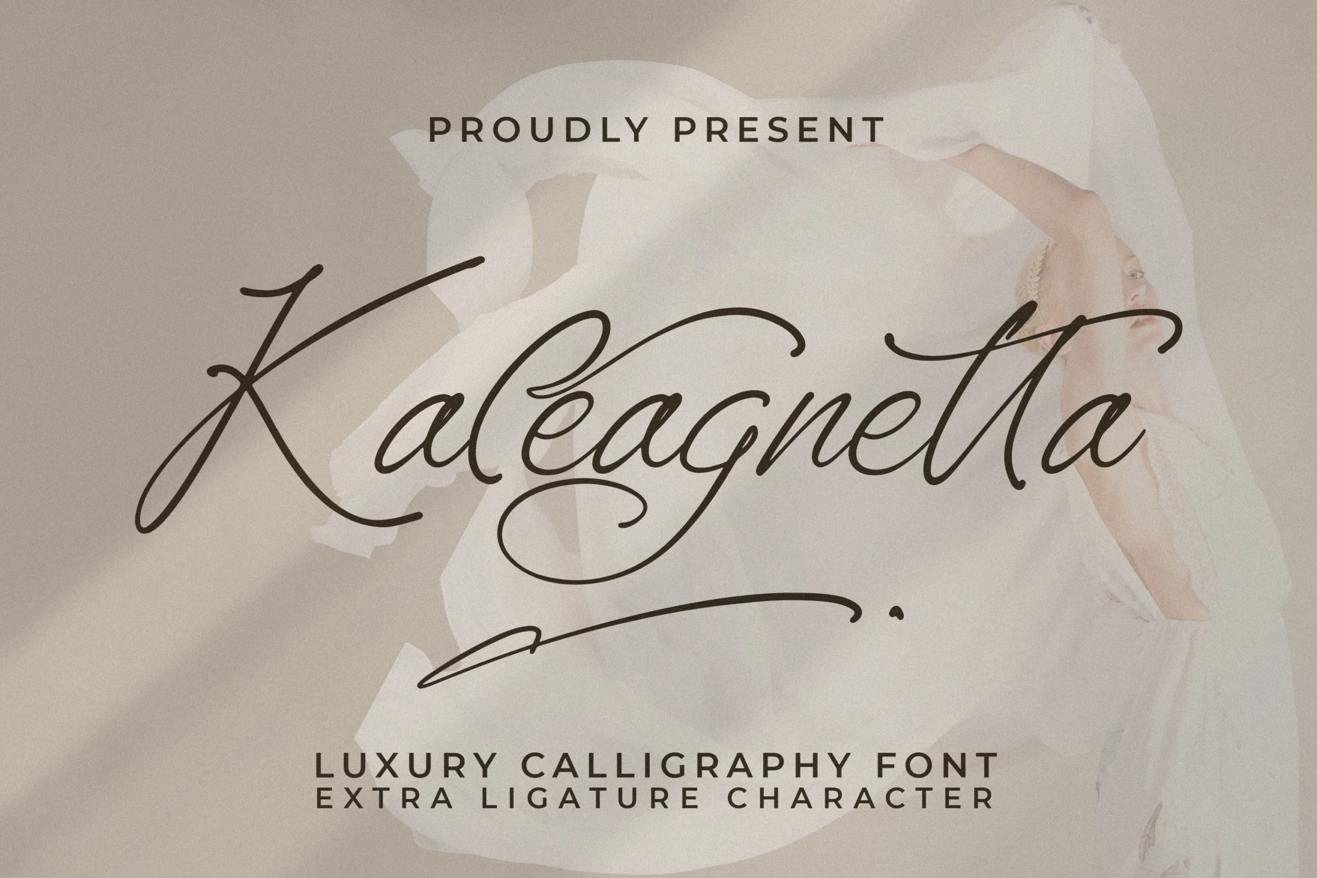
Best For: logos, branding, packaging
Kaleagnetta Font pairs high-contrast copperplate strokes with connected forms, pronounced swashes, and a variable slant. It adds character to logos, branding, and packaging, but thin details and flourishes need generous display sizing.
Bighried Ranbell Font
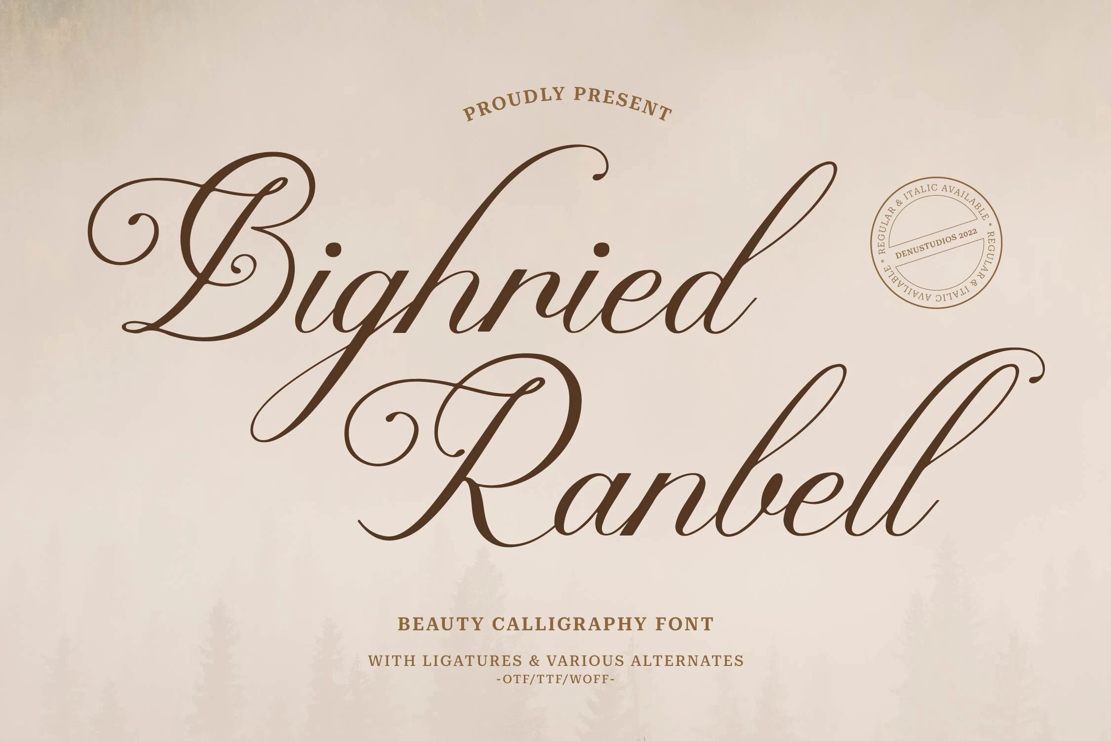
Best For: logos, packaging, invitations
Bighried Ranbell Font stands out through oval terminals and oversized uppercase swashes layered onto connected, high-contrast forms. Those shapes give packaging and invitation headlines a strong finish, while decorative connections make small text less dependable.
Modern Calligraphy Font
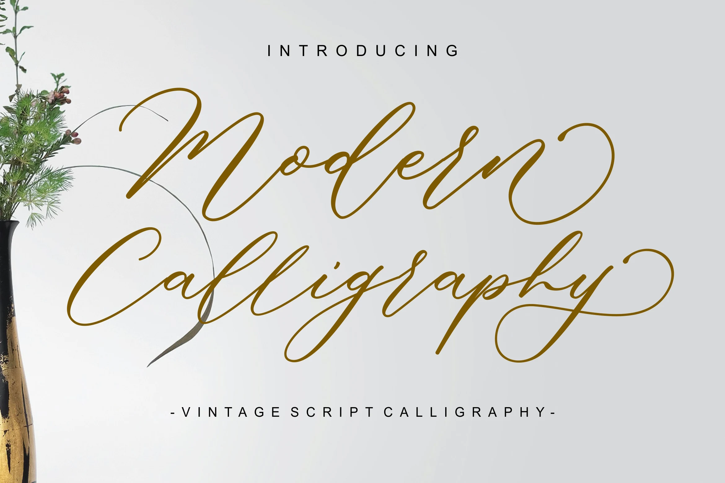
Best For: invitations, wedding designs, display text
Modern Calligraphy Font draws on vintage script handwriting, combining connected, right-slanting letters with elaborate terminal swashes. It suits wedding stationery and display titles when swirling details can remain visible, but it is poorly suited to paragraphs or small body text.
Mutiara Font
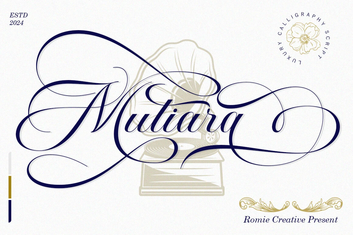
Best For: branding, invitations, wedding designs, quotes
Mutiara Font brings copperplate-inspired connected forms together with style sets and swashes. Its irregular baseline adds handmade variation to branding and quotes, while overlapping flourishes make body text difficult to follow.
Sinetimes Mantricia Font
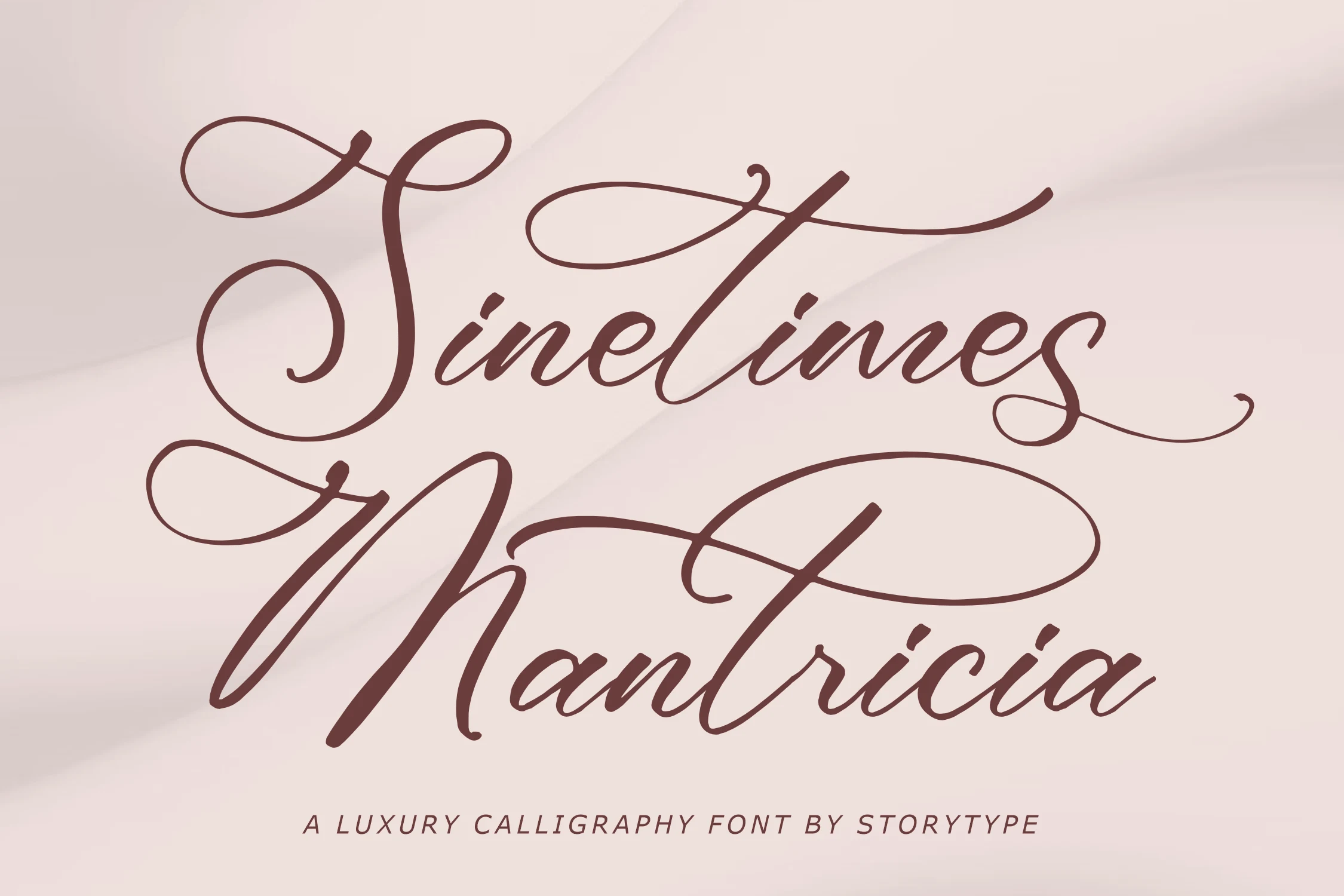
Best For: invitations, wedding designs, logos, display text
Sinetimes Mantricia Font uses pointed-pen-style stroke variation to establish a strongly copperplate-like construction. Its formal swashes fit wedding titles, invitations, and logos, but high contrast and ornament require substantial display size for reliable clarity.
Waittelian Grolinda Font
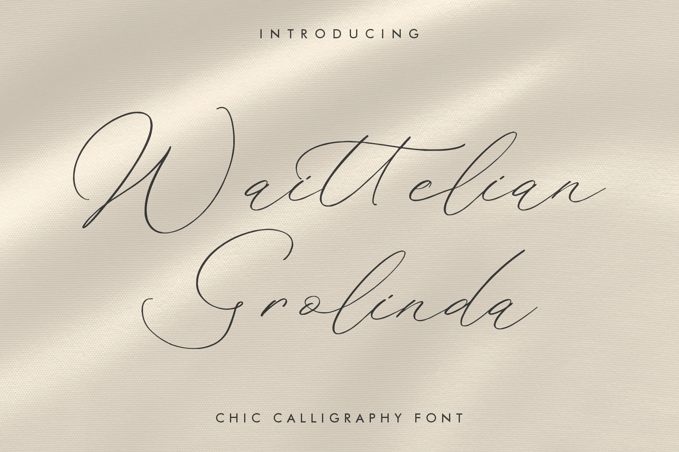
Best For: logos, magazine covers, headlines, luxury designs
Waittelian Grolinda Font uses decorative initial and terminal swashes to create title-like compositions. Its documented fit for magazine covers, fashion brands, logos, and quotes gives it a broader editorial role than scripts intended mainly for invitations.
Romantic Swash Scripts
These romantic swash scripts build their identity through sweeping tails, ornamental terminals, and decorative accents, creating more ceremonial compositions than the restrained copperplate group.
Whitley Pattrycia Font
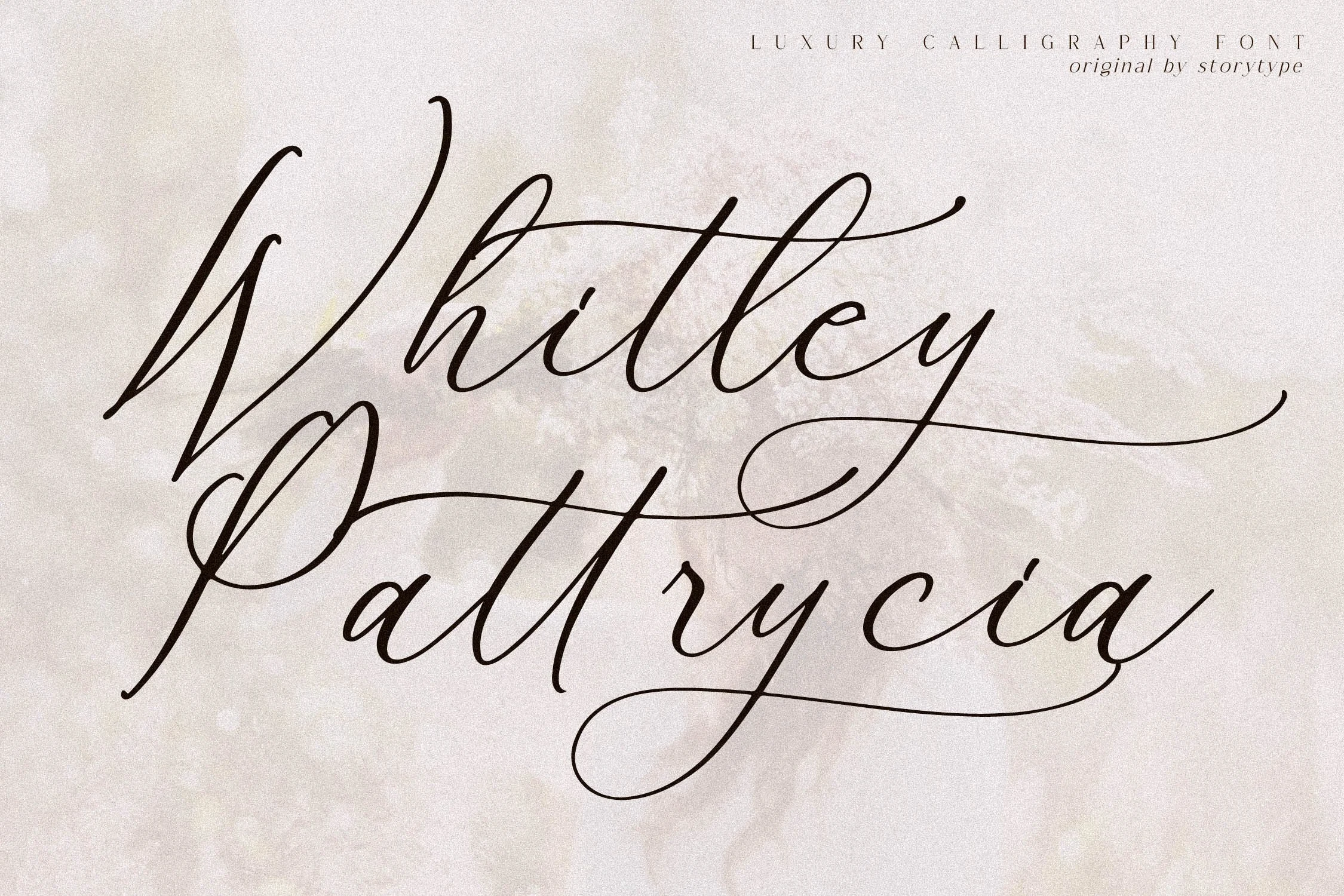
Best For: logos, branding, invitations, wedding designs
For wedding marks and invitations, Whitley Pattrycia Font offers a distinct rightward slant, connected cursive, and elongated sweeping swashes. Its contrast between thick downstrokes and fine hairlines creates a formal silhouette, but the ornament is best reserved for prominent display text rather than compact wording.
Engagement Time Font
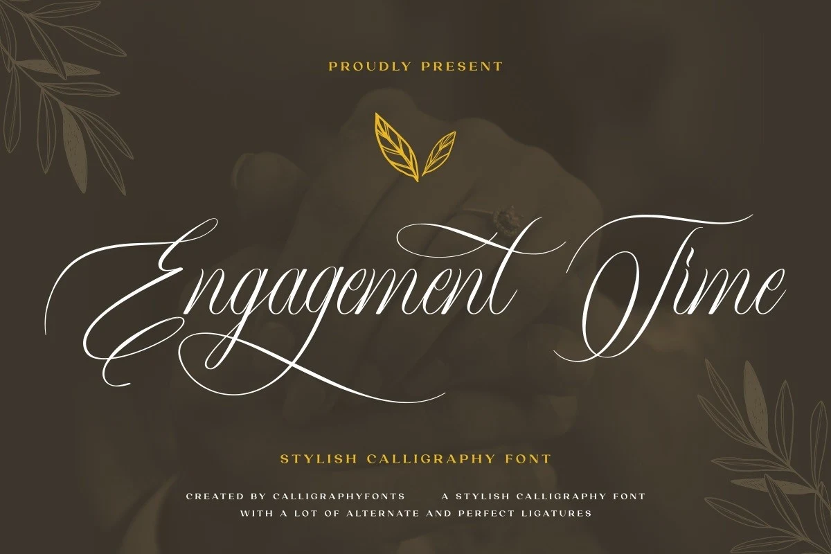
Best For: invitations, wedding designs, logos, headlines
Engagement Time Font is a strongly slanted formal script with connected strokes, sweeping swashes, ligatures, and PUA-accessible glyphs. It gives wedding headings, invitations, and logos extra headline variation, with ornament that reads most clearly at large sizes.
Blacktime Font
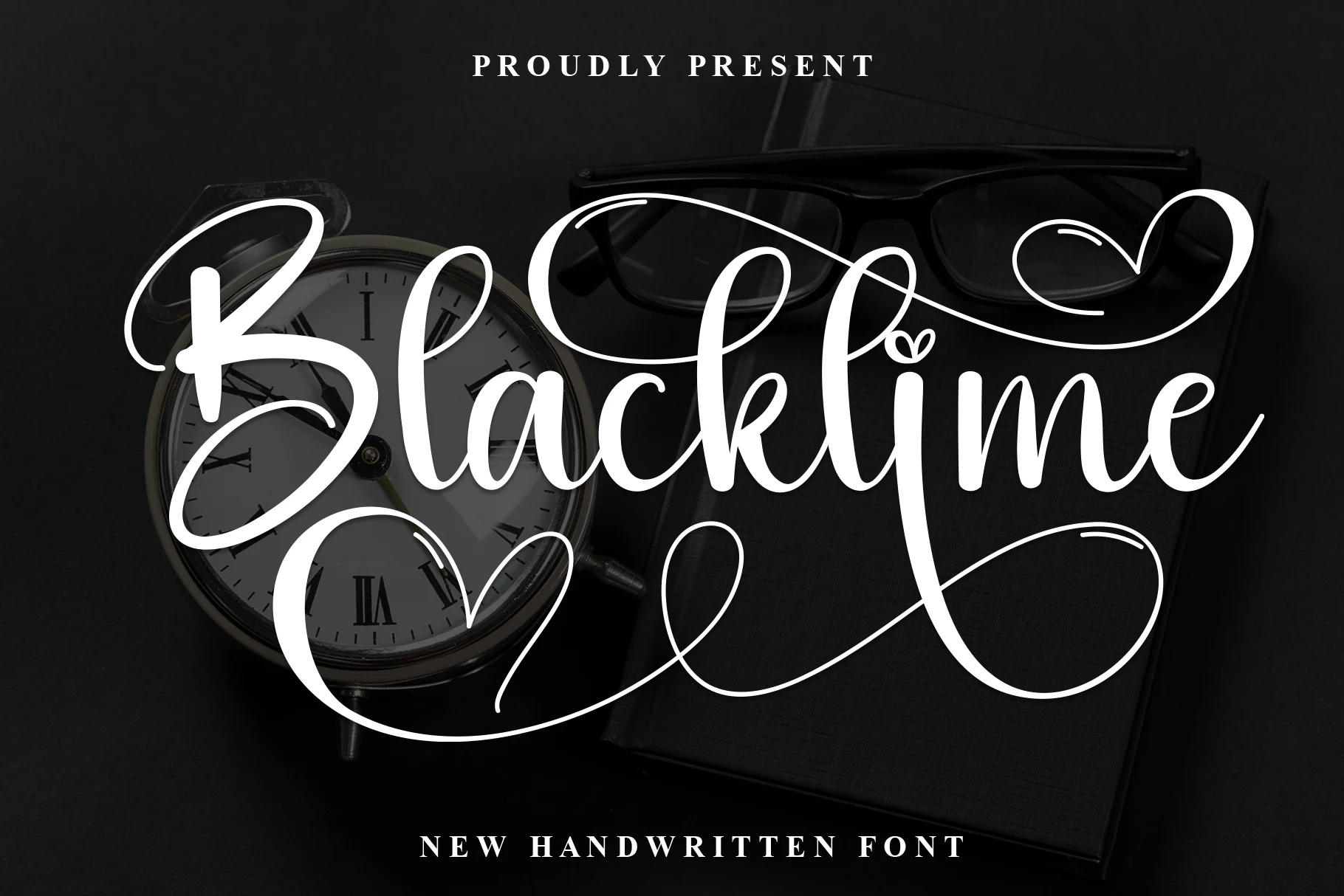
Best For: wedding designs, invitations, logos, headlines
Blacktime Font builds its high-contrast connected lettering around heart-shaped stem accents, loops, and extensive flourishes. Those details make wedding headings and logos decorative focal points, but they compete with the clarity needed for extended reading.
Aldyn Heart Font
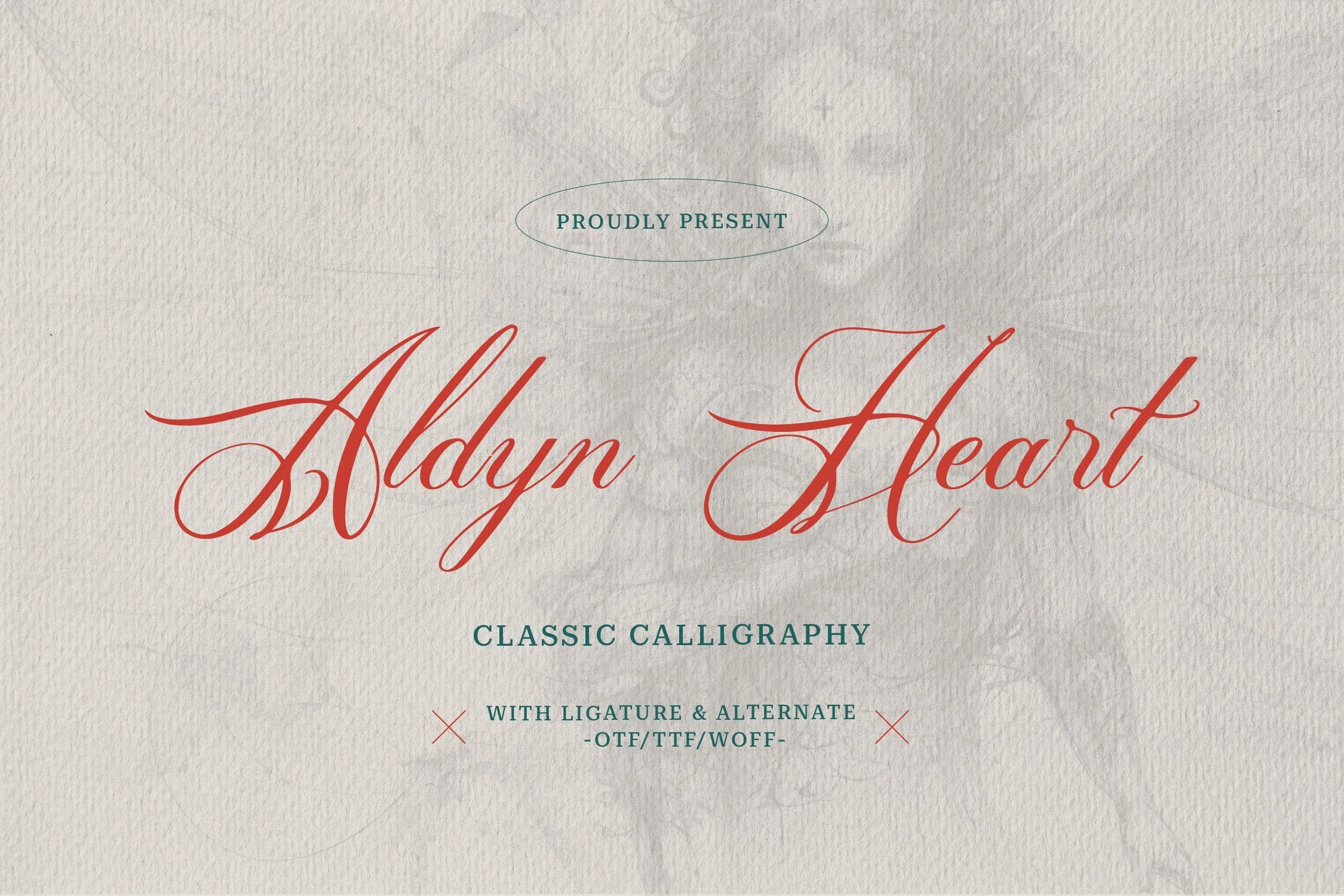
Best For: logos, branding, packaging, invitations
Aldyn Heart Font extends its connected, high-contrast construction with long decorative tails. The endings create a strong finish for logos, packaging, and invitation work, though their density reduces clarity in small applications.
Qirtandy Fantasia Font
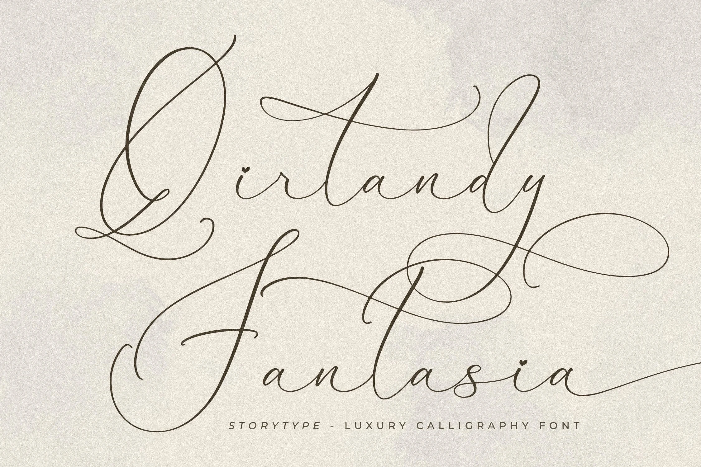
Best For: headlines, display text, invitations, wedding designs
Qirtandy Fantasia Font is defined by delicate thin strokes, fully connected lowercase letters, sweeping swashes, and heart-shaped i dots. Those small accents reward stationery, titles, and wedding layouts where they remain visible, but reduced-size copy loses clarity quickly.
Fesbrise Font

Best For: invitations, branding, wedding designs, display text
Fesbrise Font emphasizes continuous movement through extended entry and exit swashes across its slanted connected forms. That directional flow works well for invitations, branding, and display lines, while high contrast limits it to larger applications.
Expressive Handwritten Scripts
Expressive handwritten scripts use bouncy or irregular baselines, brush-like gestures, and personal spacing, giving them more organic movement than formal calligraphic constructions.
Ackworth Font
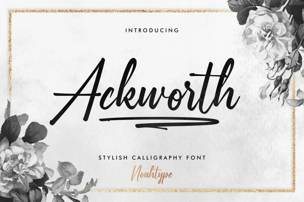
Best For: branding, invitations, fashion branding
Ackworth Font uses a right-leaning, partially connected structure that feels more openly drawn than a fully joined copperplate. Its underline flourish, alternates, and swashes support fashion branding and invitations, although thin joins become harder to read when reduced.
South Dakota Font
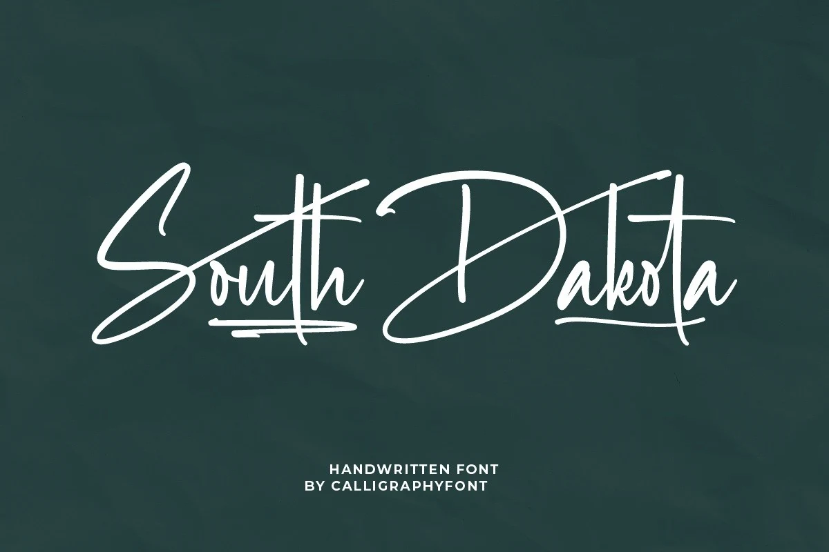
Best For: logos, headlines, display text
South Dakota Font uses a bouncy baseline to make its connected calligraphy feel more personal and animated than stable copperplate. The shifting character placement benefits logos and short headlines, but uneven positioning is unsuitable for sustained text.
Gastonia Script Font
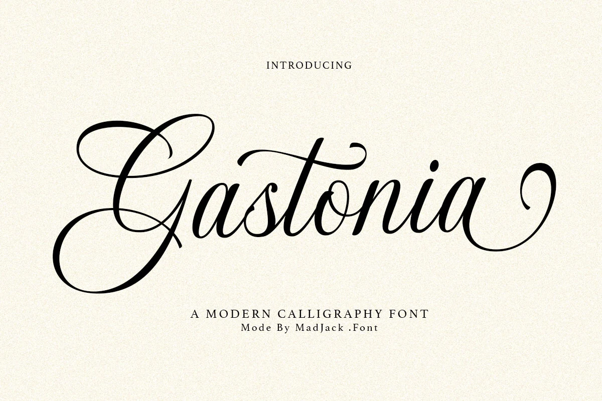
Best For: invitations, branding, packaging, editorial designs
Gastonia Script Font uses variable baseline movement to loosen its connected, high-contrast rhythm. Its moderate legibility works for upscale packaging, branding, invitations, and short editorial titles, but thin strokes and flourishes rule out long copy.
Darkloose Font
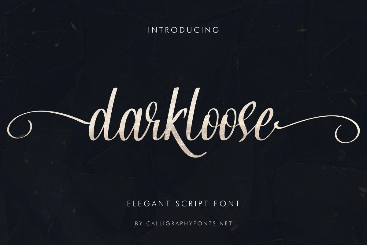
Best For: logos, branding, invitations, wedding designs
Darkloose Font takes a brush-pen approach to connected script, giving its high-contrast letters a more gestural surface than pointed-pen styles. Fluid joins and extended swashes bring energy to logos and invitations, but keep it out of body copy.
Harlyetta Mordila Font
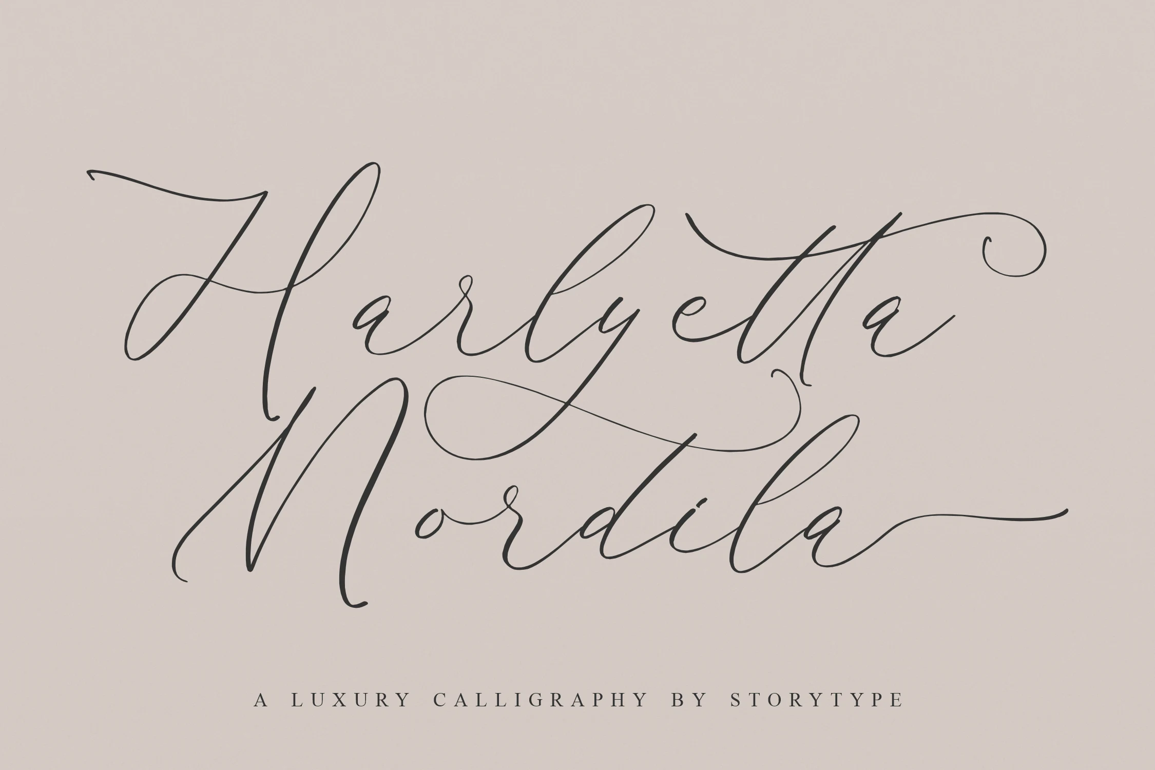
Best For: invitations, wedding designs, logos, display text
Harlyetta Mordila Font combines controlled right-slanting letters with an irregular baseline, adding organic motion to its connected forms. It supports decorative headings, invitations, and wedding designs, while ornamental loops slow reading in longer text.
James Arthur Font
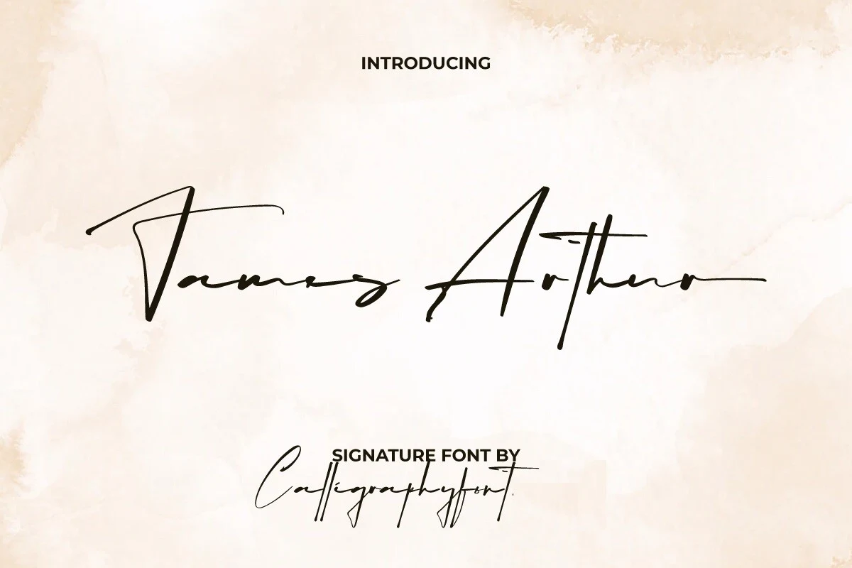
Best For: logos, branding, invitations, display text
For logos and formal invitations, James Arthur Font pairs long horizontal swashes with an organic baseline and connected signature lettering. Its expansive gesture creates presence, but complex letter connections need large sizing to remain legible.
Signature-Led Brand Scripts
Signature-led brand scripts prioritize recognizable loops, extended terminals, open counters, and logo-ready silhouettes, balancing handwritten character with stronger identity and editorial applications.
Glofester Menditas Font
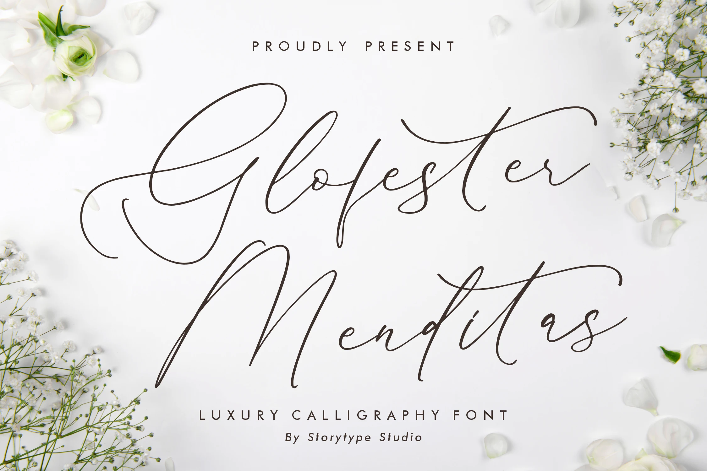
Best For: invitations, logos, business cards, quotes
Glofester Menditas Font introduces a variable vertical slant to its connected, high-contrast lettering, giving each line a changeable gesture. Dramatic swashes suit invitations, logos, business cards, and quotes, provided the layout offers generous display scale.
Hamedory Dumbless Font
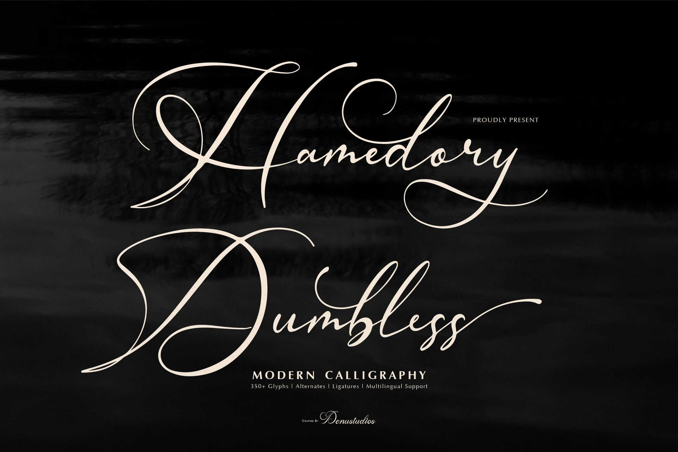
Best For: logos, packaging, wedding designs, editorial designs
Hamedory Dumbless Font’s strongest production advantage is its set of more than 350 glyphs, including alternates, ligatures, and multilingual support. That range helps branding and editorial work, while extended initial capitals keep the design oriented toward display layouts.
Mighaila Font
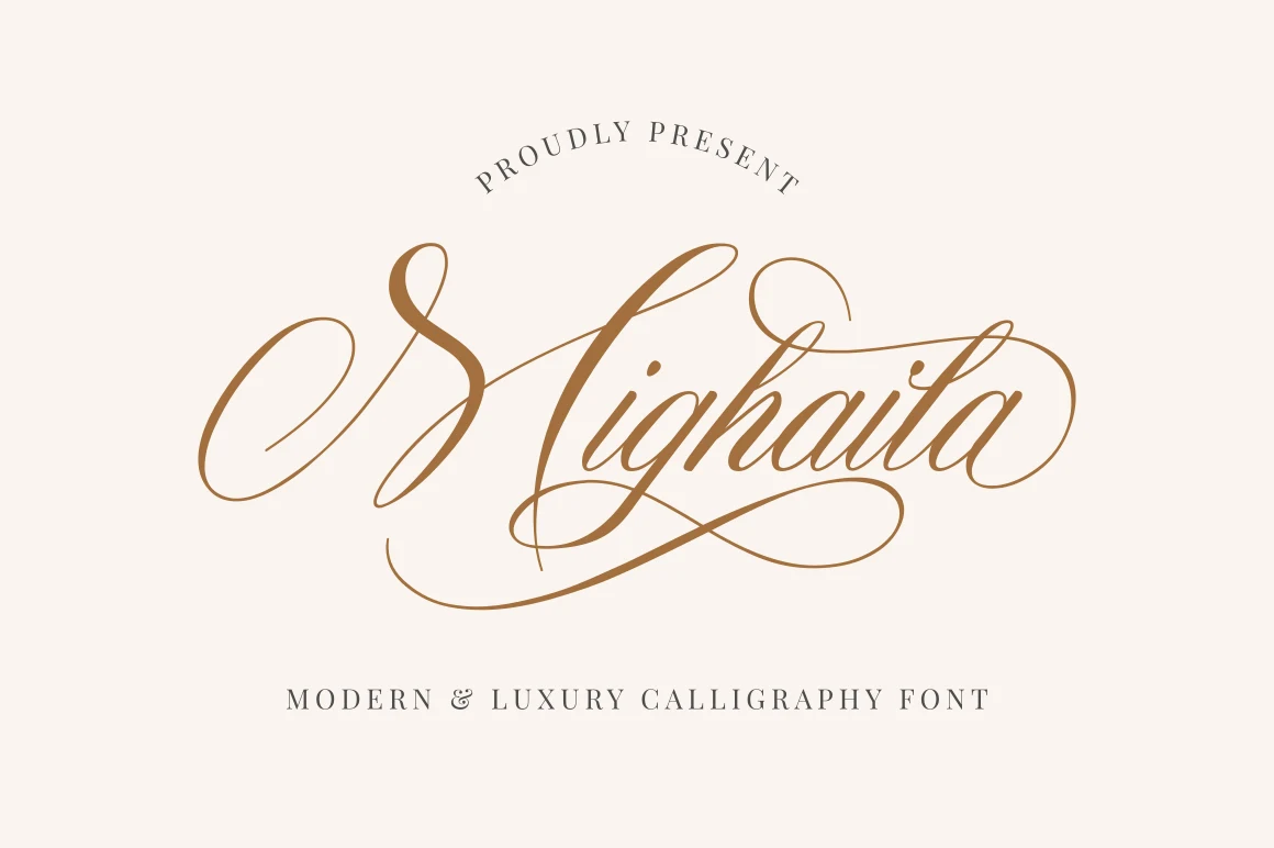
Best For: logos, branding, wedding designs, headlines
For logos and wedding headlines, Mighaila Font uses fluid manual-style ligatures so connected letters feel individually drawn rather than mechanically joined. Its extensive swashes add personality, although dense flourishes become difficult to parse when the lettering is reduced.
Baylen Font
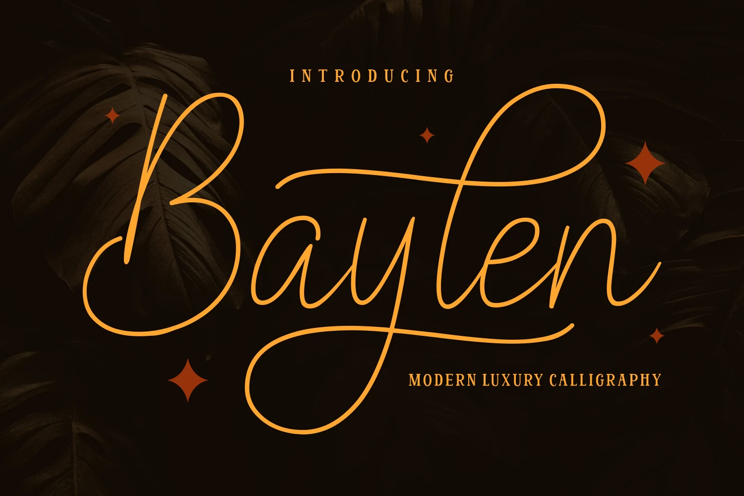
Best For: logos, wedding designs, beauty branding, social media graphics
For beauty branding and wedding suites, Baylen Font offers a wide connected design with open counters, natural ligatures, tall ascenders, and extended strokes. Its horizontal presence helps headlines and captions, though long flourishes can overwhelm narrow formats.
Qloveland Marrtin Font
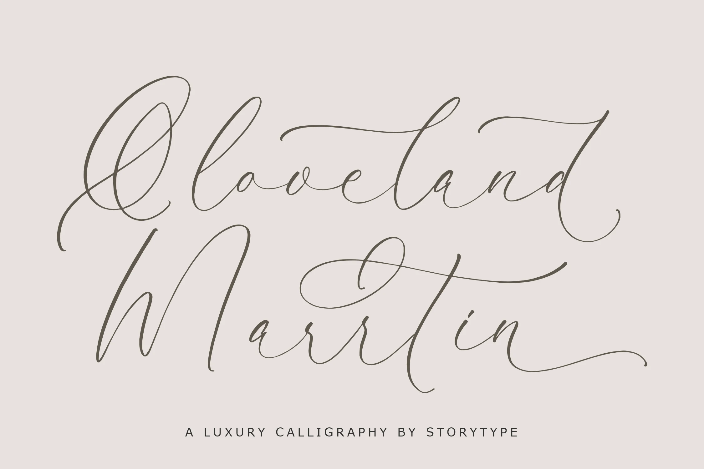
Best For: logos, branding, quotes
Qloveland Marrtin Font centers on pronounced loops, extended terminals, and a rightward handwritten slant. Its signature-script construction makes a clear logo or quote wordmark, but thin details and ornamental swashes are unsuitable for small identity applications.
Charttisle Wadfield Font
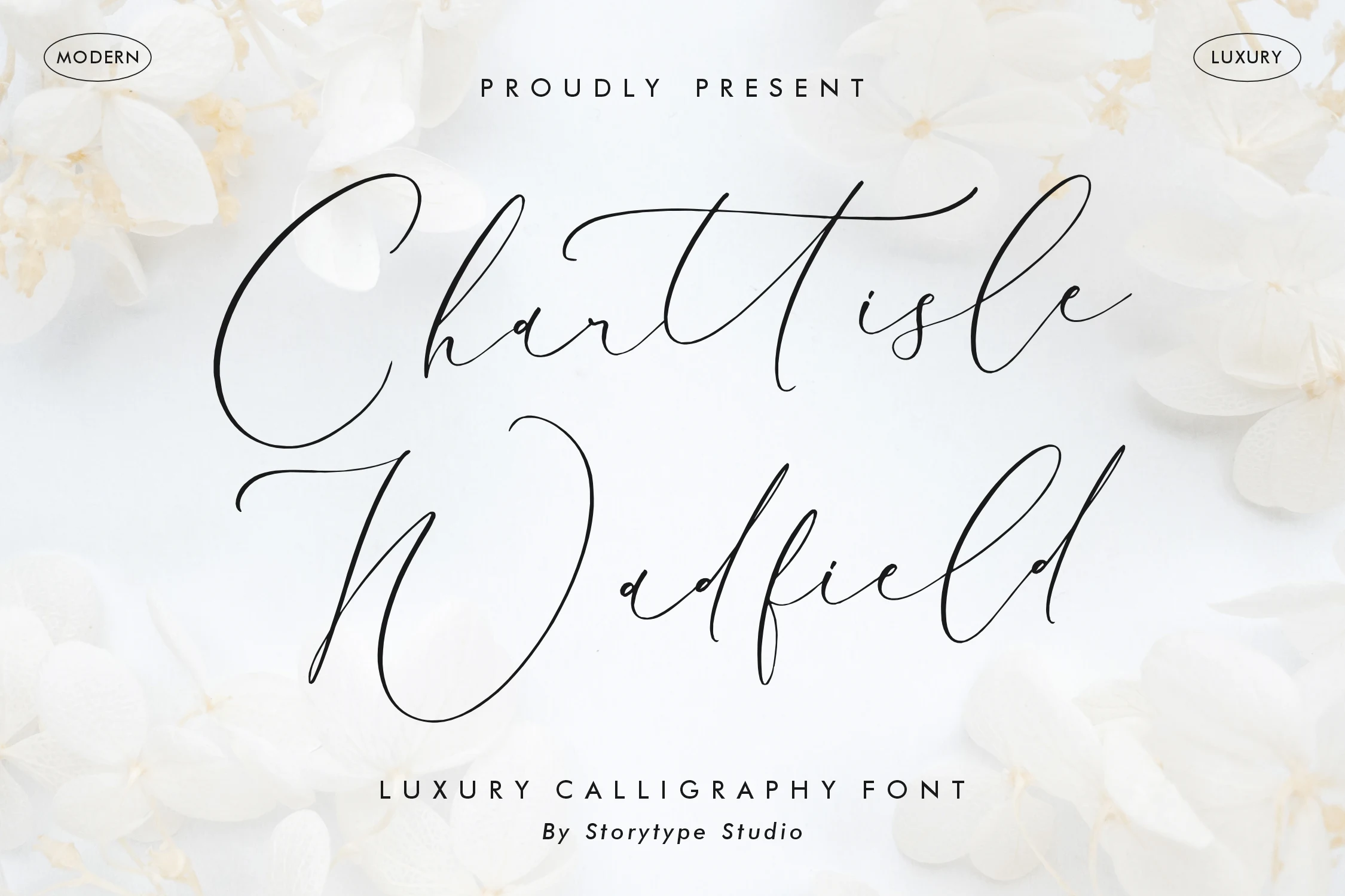
Best For: logos, book covers, magazine covers, quotes
Charttisle Wadfield Font creates a recognizable silhouette through exaggerated ascenders, descenders, loops, and flourishes. The vertical drama works on logos, book covers, and magazine covers, while intricate line work limits compact use.
How to Choose the Right Font
Choose Luxury Calligraphy Fonts by matching construction to scale: copperplate contrast suits formal titles, irregular baselines add motion, and signature scripts strengthen wordmarks. Check thin joins, open counters, swash density, and available width before production; the most decorative options need display size, while moderate-contrast designs remain easier to read in short packaging or editorial lines.