17 Best Vintage Cursive Fonts for Wedding Invitations in 2026
This collection moves from high-contrast, flourished lettering to restrained monoline joins, textured brush edges, and heavy retro display forms. These Vintage Cursive Fonts are best suited to invitations, logos, packaging, posters, apparel, and other short, prominent wording where movement and character matter.
Looking for more cursive fonts? Browse our complete Cursive Fonts collection to compare modern, bold, wedding, logo-friendly, and Cricut-ready cursive styles.
Vintage Cursive Fonts
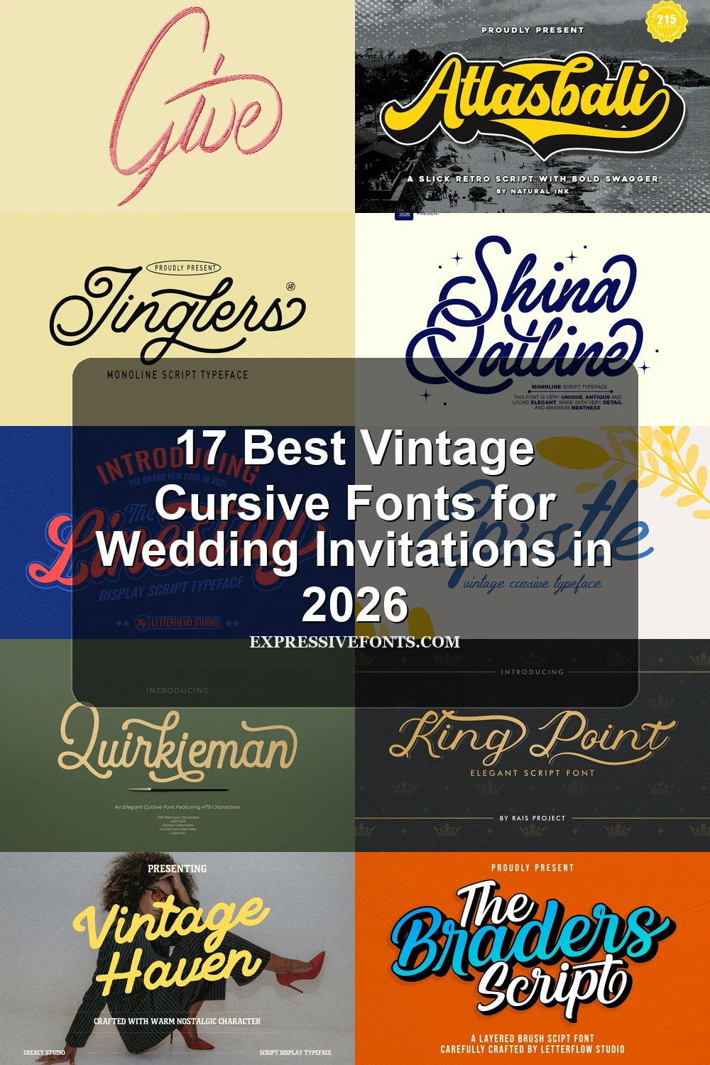
Vintage Cursive Fonts in this group emphasize connected calligraphic movement, strong slant, and decorative swashes, with more contrast and ceremony than the simpler monoline styles elsewhere.
Zürbrich Font
Best For: wedding designs, invitations, logos
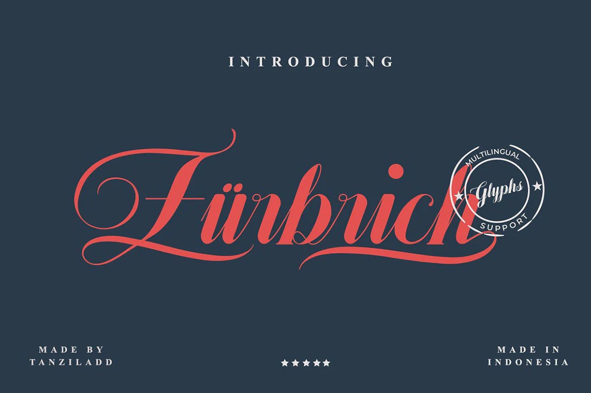
Zürbrich Font layers intricate entry and exit swashes over high thick-to-thin contrast. Its connected, right-leaning rhythm makes these Vintage Cursive Fonts especially effective for large wedding headings, invitations, and logos, rather than extended copy.
Epistle Font
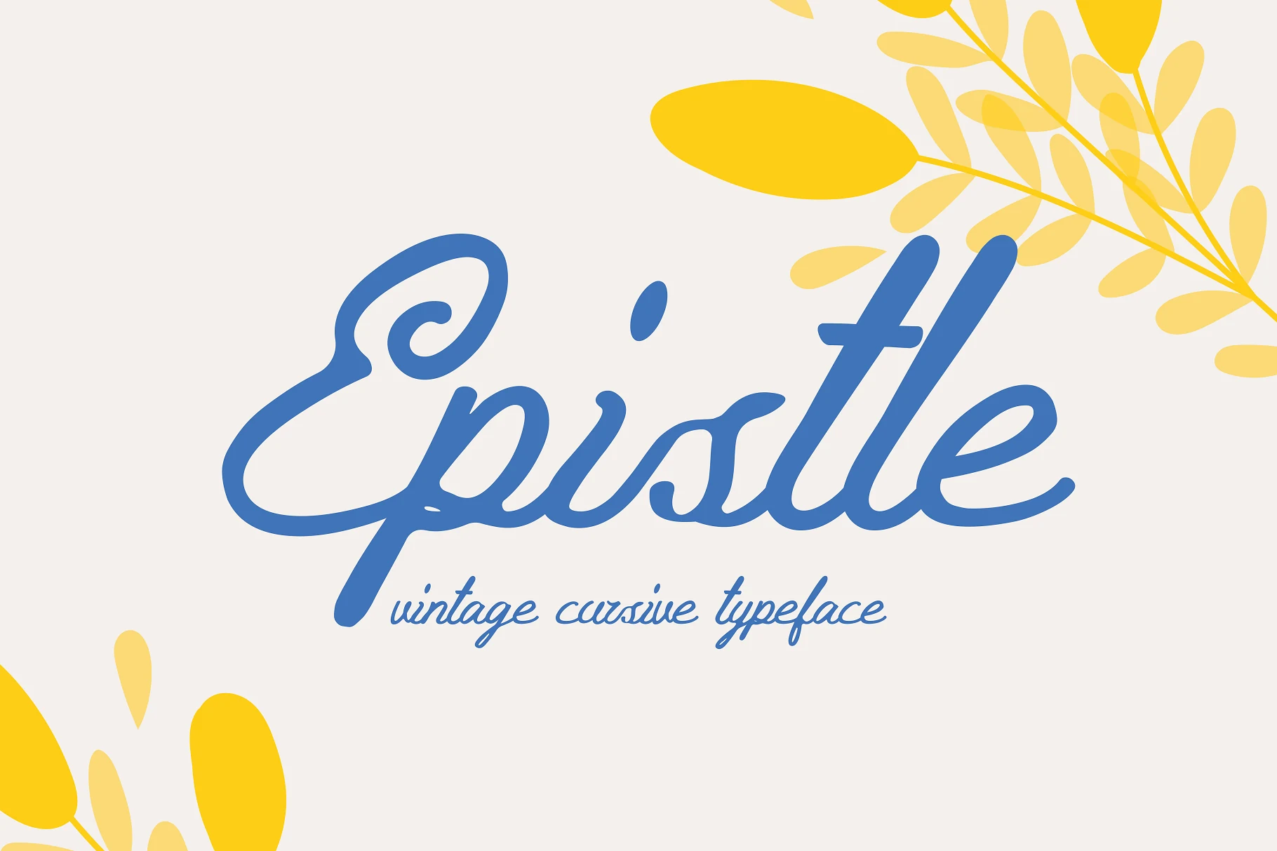
Best For: logos, branding, invitations, vintage designs
Epistle Font combines bold connected lowercase forms with calligraphic modulation and deliberately imperfect lines. The stronger weight keeps short display phrases clear, while its rhythmic curves add character to logos, branding, invitations, and vintage designs without suiting dense text.
Royallique Font
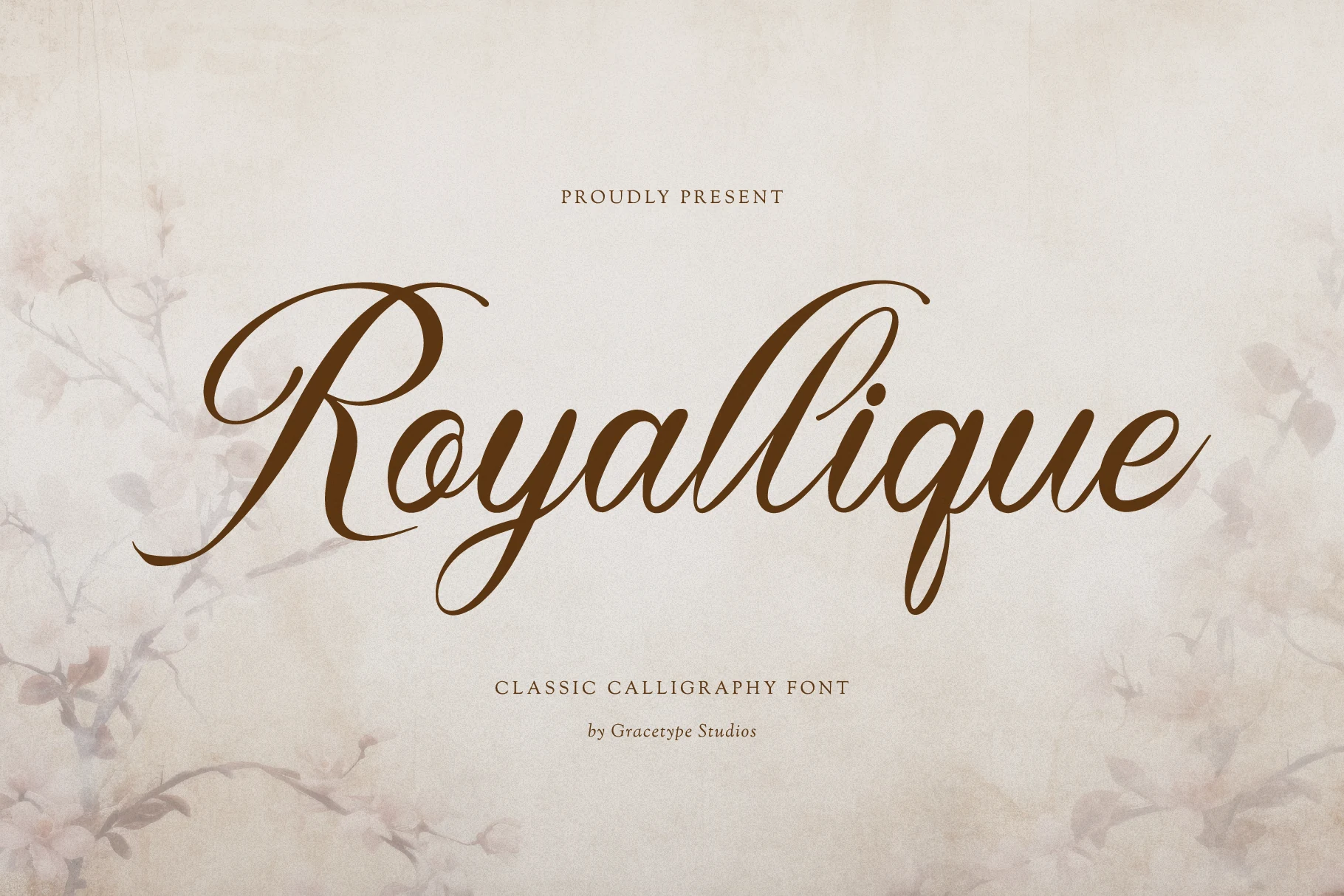
Best For: wedding designs, fashion branding, social media graphics
For wedding designs or fashion branding, Royallique Font brings wide capital loops, sweeping ascenders, and a pronounced rightward slant to its connected structure. High contrast and terminal flourishes reward generous sizing, where the ceremonial shape remains readable and visually commanding.
King Point Font
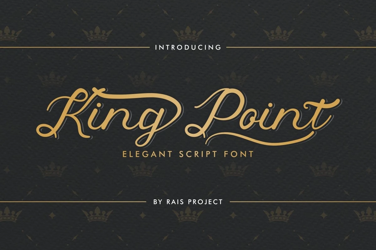
Best For: invitations, logos, wedding designs, branding
For invitations and logos, King Point Font offers tightly joined letters with a disciplined calligraphic rhythm. High contrast, a rightward slant, and extended initial and terminal swashes create a distinctive display profile, though the flourishes slow quick reading.
Give Vintage Lettering
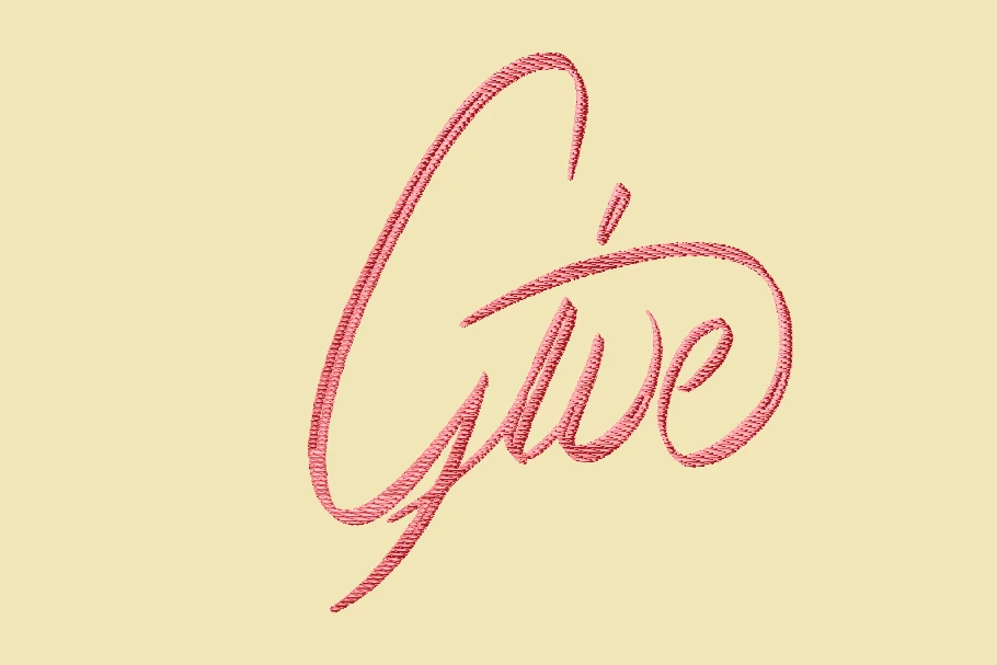
Best For: wedding designs, personal branding, T-shirts, decorative designs
For wedding designs, apparel, or personal branding, Give Vintage Lettering pairs connected cursive with an elongated initial G and sweeping details. High contrast and embroidery-oriented texture give marks a material feel, but the ornament needs generous display scale.
Monoline Cursive Flow
These monoline designs maintain a consistent stroke while using loops, ligatures, underlines, and rounded terminals to create continuous decorative movement with cleaner visual weight.
Winterine Font
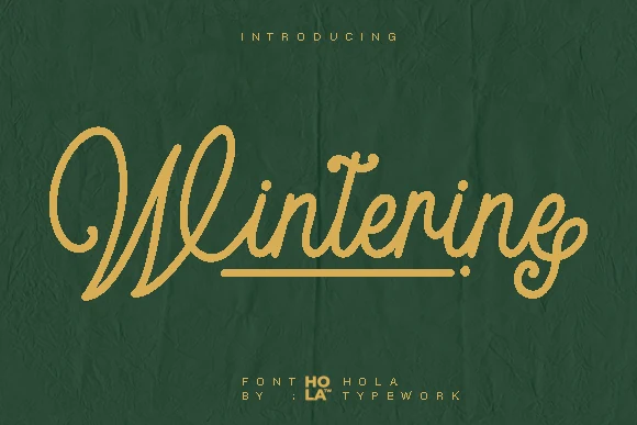
Best For: logos, branding, invitations, short phrases
Winterine Font turns a monoline connected skeleton and integrated underline into one continuous decorative gesture. The low-contrast strokes keep the silhouette clean, but interconnections make it better for short branded phrases, invitations, and logos than sustained reading.
Jinglers Font
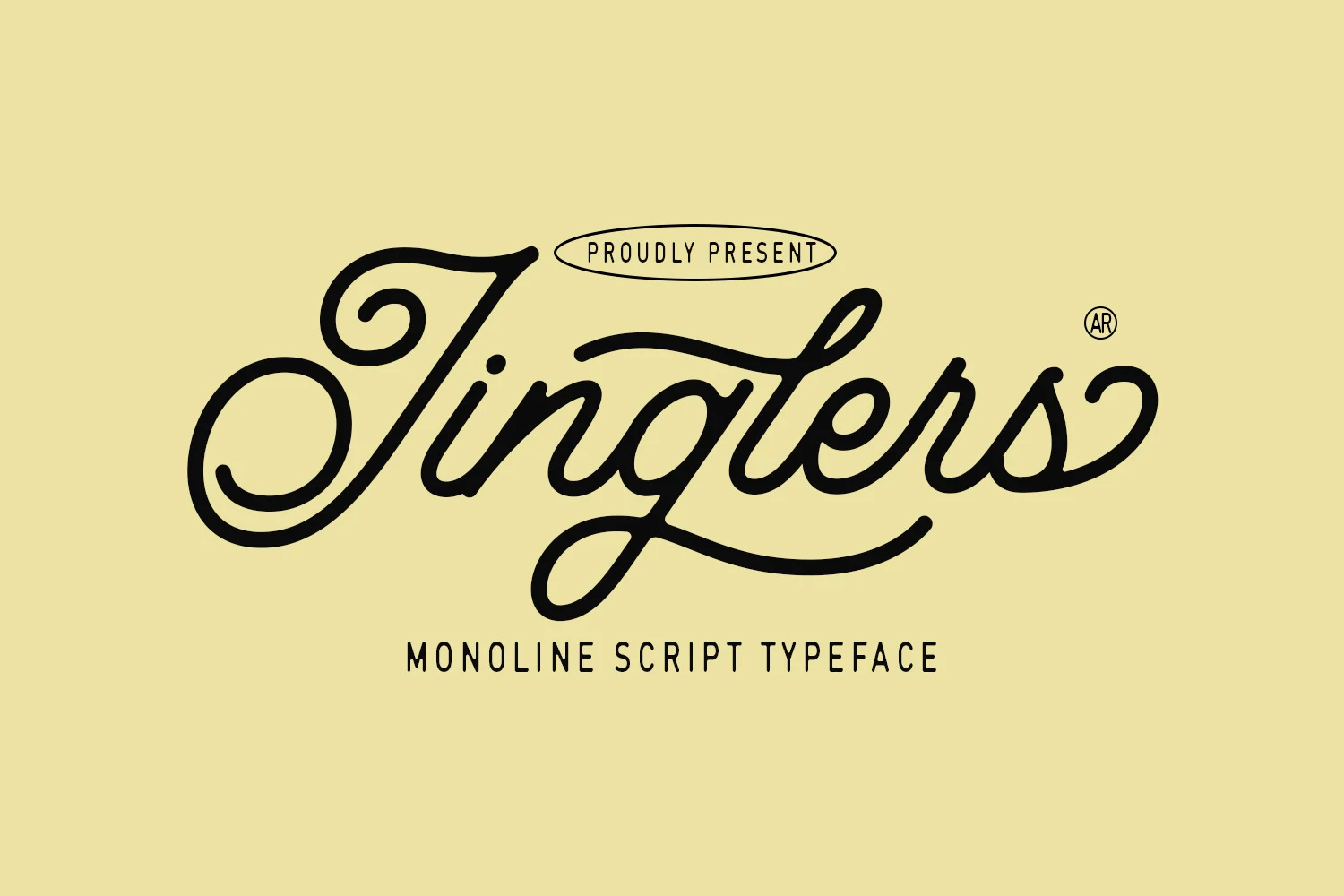
Best For: logos, branding, posters, display text
Jinglers Font uses an unbroken monoline construction, carrying movement from its entry loop through the terminal swash. The smooth connected line suits decorative headers, logos, branding, and posters, while dense flourishes make body copy impractical.
Bayhours Font
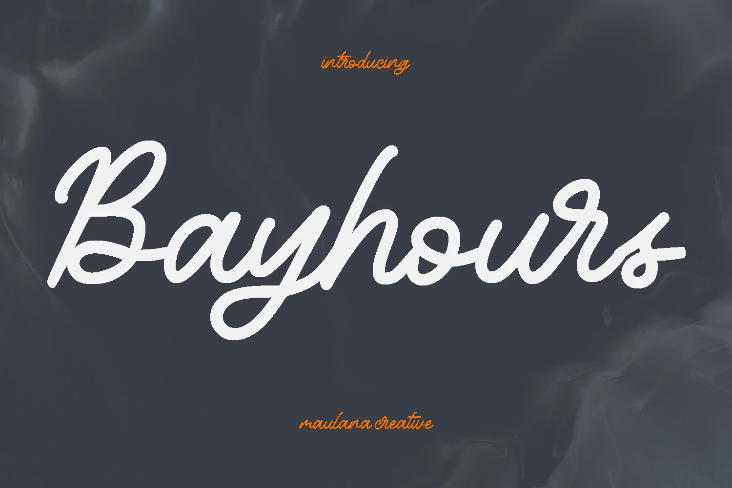
Best For: logos, branding, invitations
Bayhours Font adds rounded terminals, ligatures, and alternates to a medium monoline cursive structure. Its moderate slant supports logos, branding, and invitations across varied lettering needs, though tightly packed loops can lose clarity at very small sizes.
Shina Qatline Font
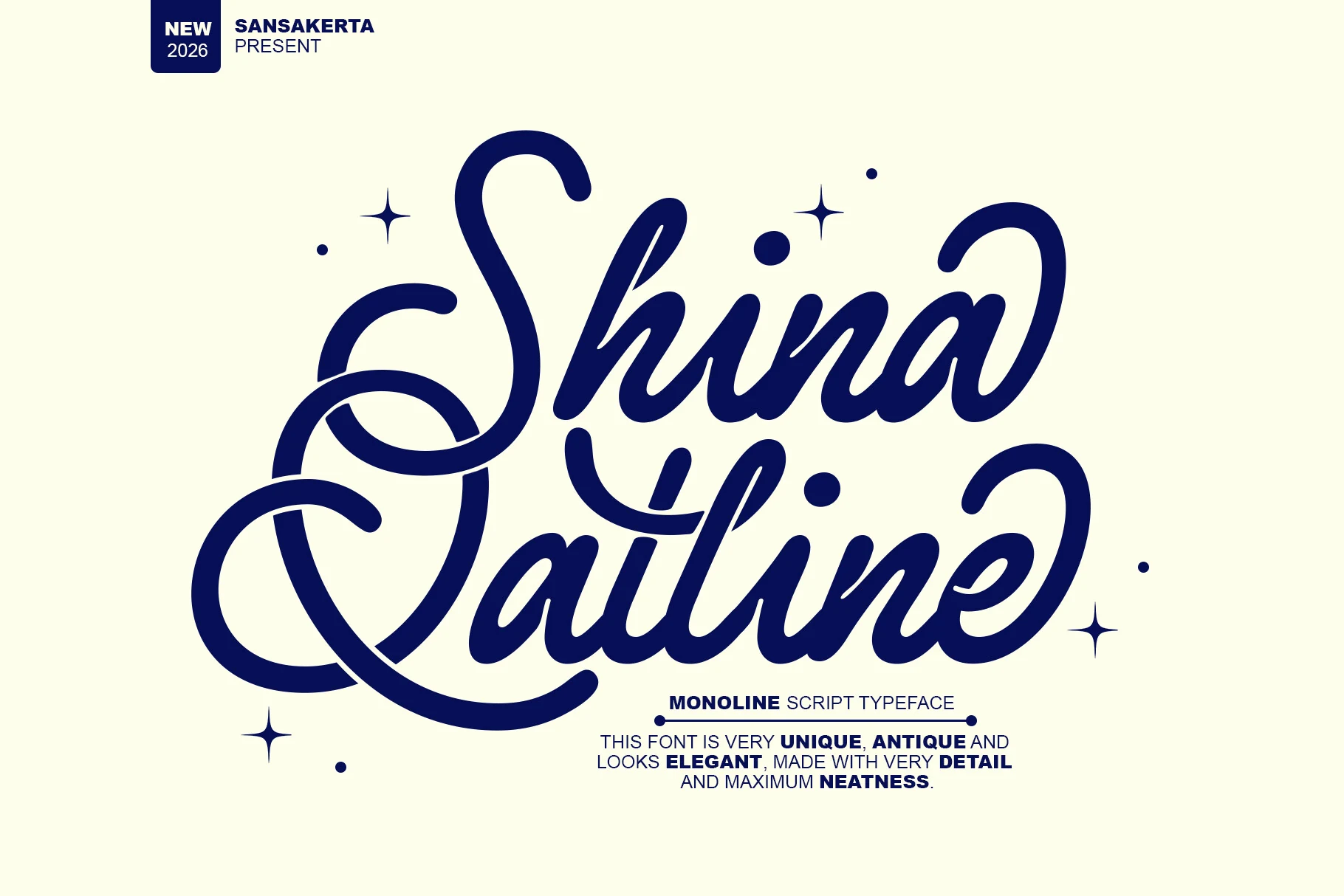
Best For: logos, branding, packaging, display text
For logos, packaging, and display text, Shina Qatline Font uses uniform strokes and overlapping loops to form a decorative emblem. Its clean monoline foundation supports clear branding, but intersecting swashes require generous scale to avoid visual congestion.
Brush-Textured Cursive
Brush-textured cursives combine joined or brush-built lettering with irregular edges and substantial strokes, giving them a tactile poster presence distinct from smoother calligraphic scripts.
Vintage Haven Font
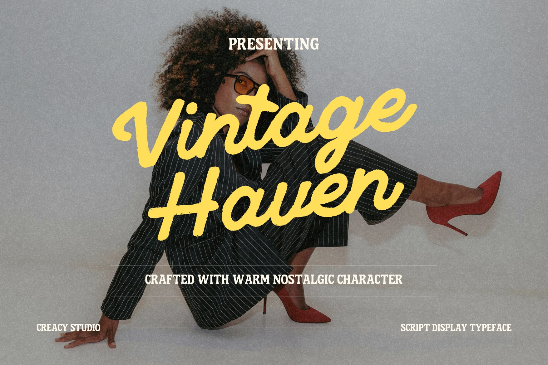
Best For: posters, display text, short phrases, nostalgic designs
Vintage Haven Font uses connected cursive joins with irregular dry-brush edges and rounded terminals. That weathered surface gives posters and short phrases strong display presence, although the texture can soften letter definition when reduced.
Winland Font
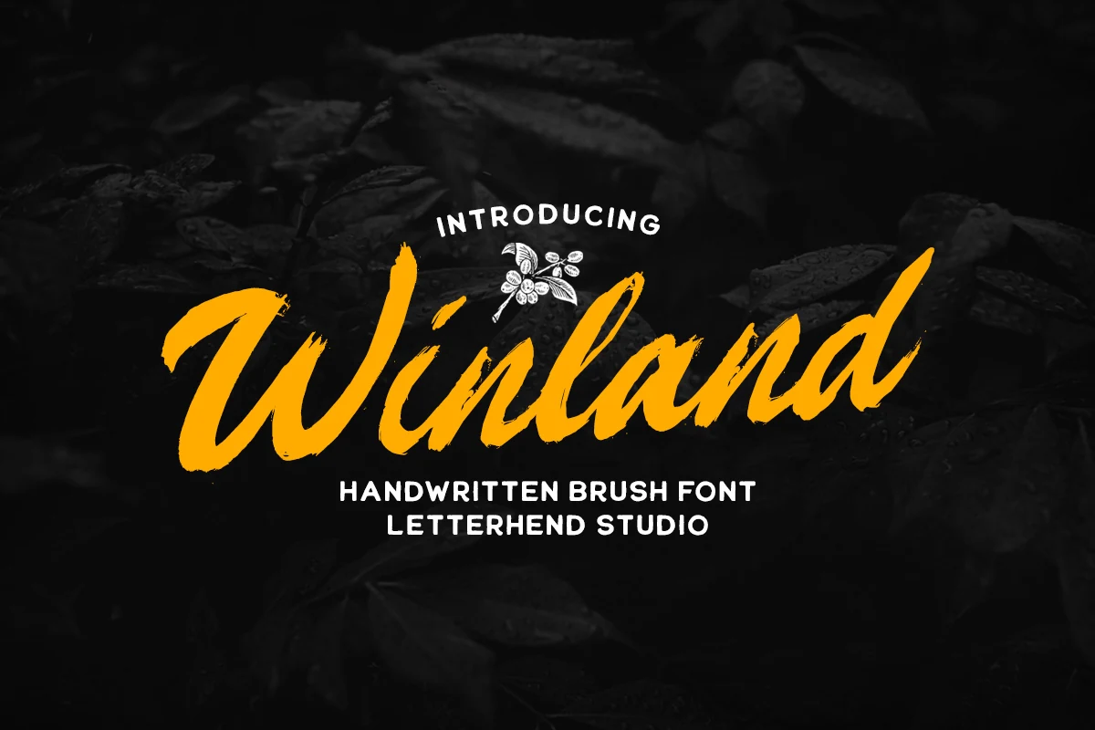
Best For: headlines, display text, short phrases, artistic designs
Winland Font builds its characters separately with thick, high-contrast brush strokes and a pronounced forward slant. Large headlines stay readable, but dry-brush edges can muddy compact titles, making it a stronger choice for display text and artistic designs.
The Braders Script Font
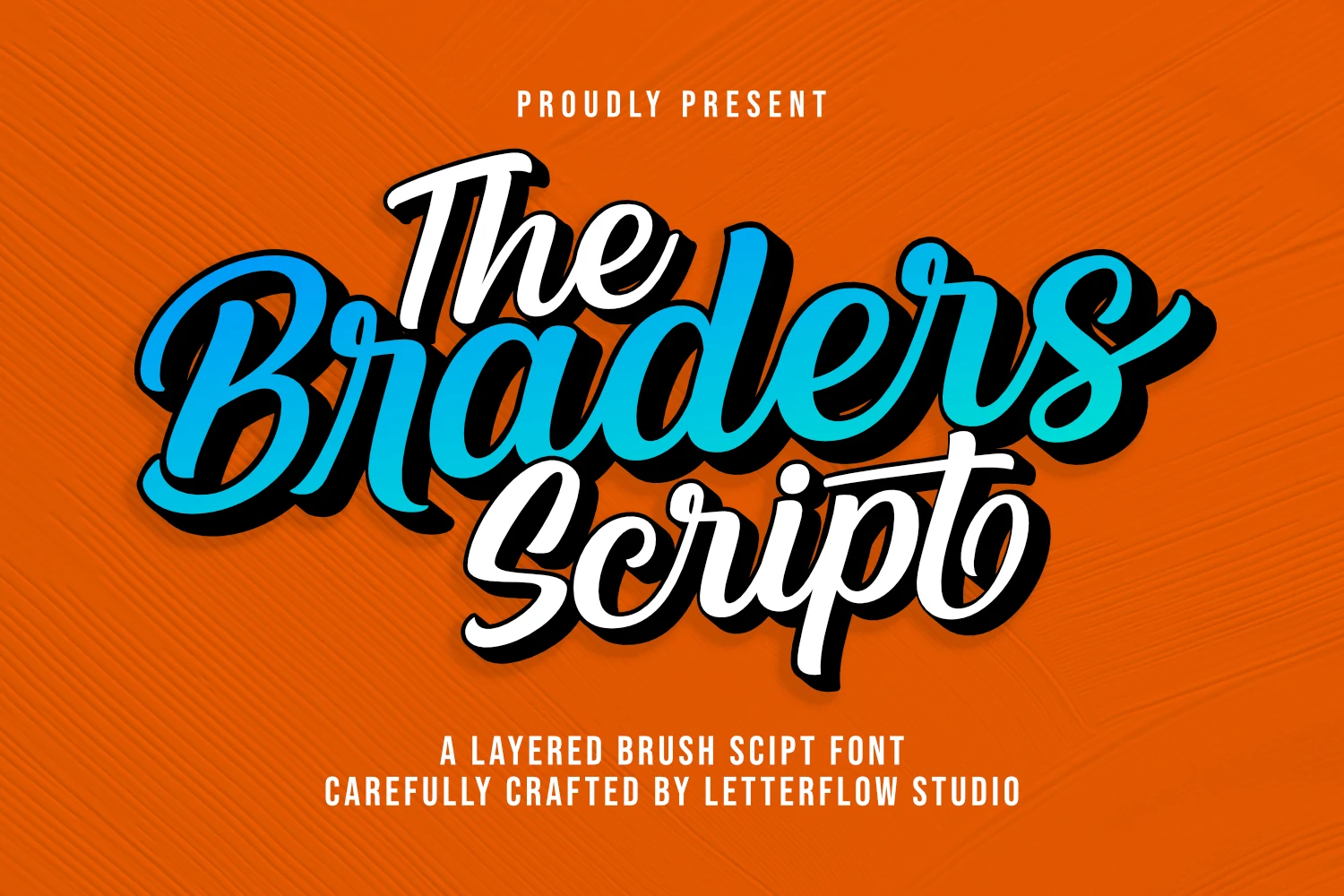
Best For: logos, branding, headlines, display text
The Braders Script Font brings Vintage Cursive Fonts into a heavier brush register, combining interconnected forms, bold strokes, and prominent flourishes. It reads strongly in logos and headlines, while its layered display treatment is too involved for body text.
Tahta Font
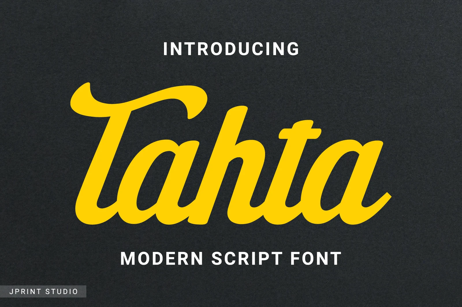
Best For: logos, branding, posters, T-shirts
Tahta Font uses heavy uniform strokes, soft-edged terminals, and connected brush lettering with a steady forward slant. The weight holds up on posters, shirts, and logos, although closely packed letters lose definition at very small sizes.
Bold Retro Display Cursive
The bold display group uses heavy connected forms, pronounced slant, dramatic swashes, and built-in ornament for emphatic headlines, merch, stickers, and logotypes.
Atlasbali Font
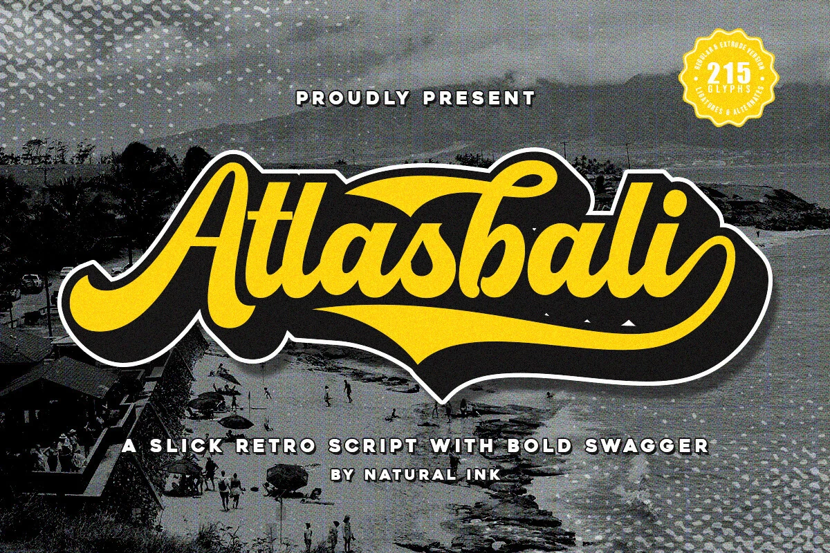
Best For: logos, invitations, quotes, stickers
Atlasbali Font gives Vintage Cursive Fonts a heavy sign-painter finish through connected strokes and a sweeping final swash. Thick forms support quotes and stickers at display size, while alternate glyphs and the extrude style allow layered shadow treatments.
The Linestay Font
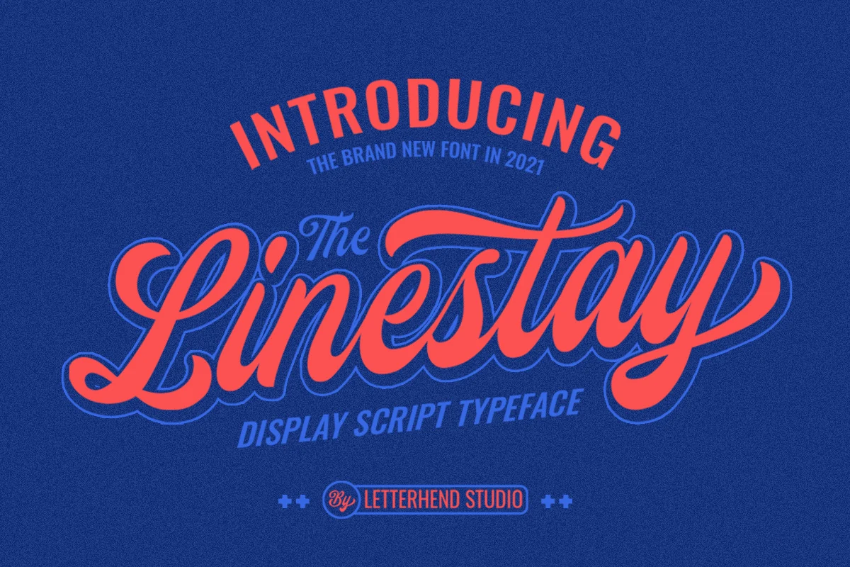
Best For: logos, headlines, display text, posters
The Linestay Font combines bold connected lettering with high contrast, a strong rightward slant, and oversized initial and terminal swashes. Its curves carry headlines, logotypes, and posters convincingly, but complex joins become less dependable when lettering is small.
Vintage Font
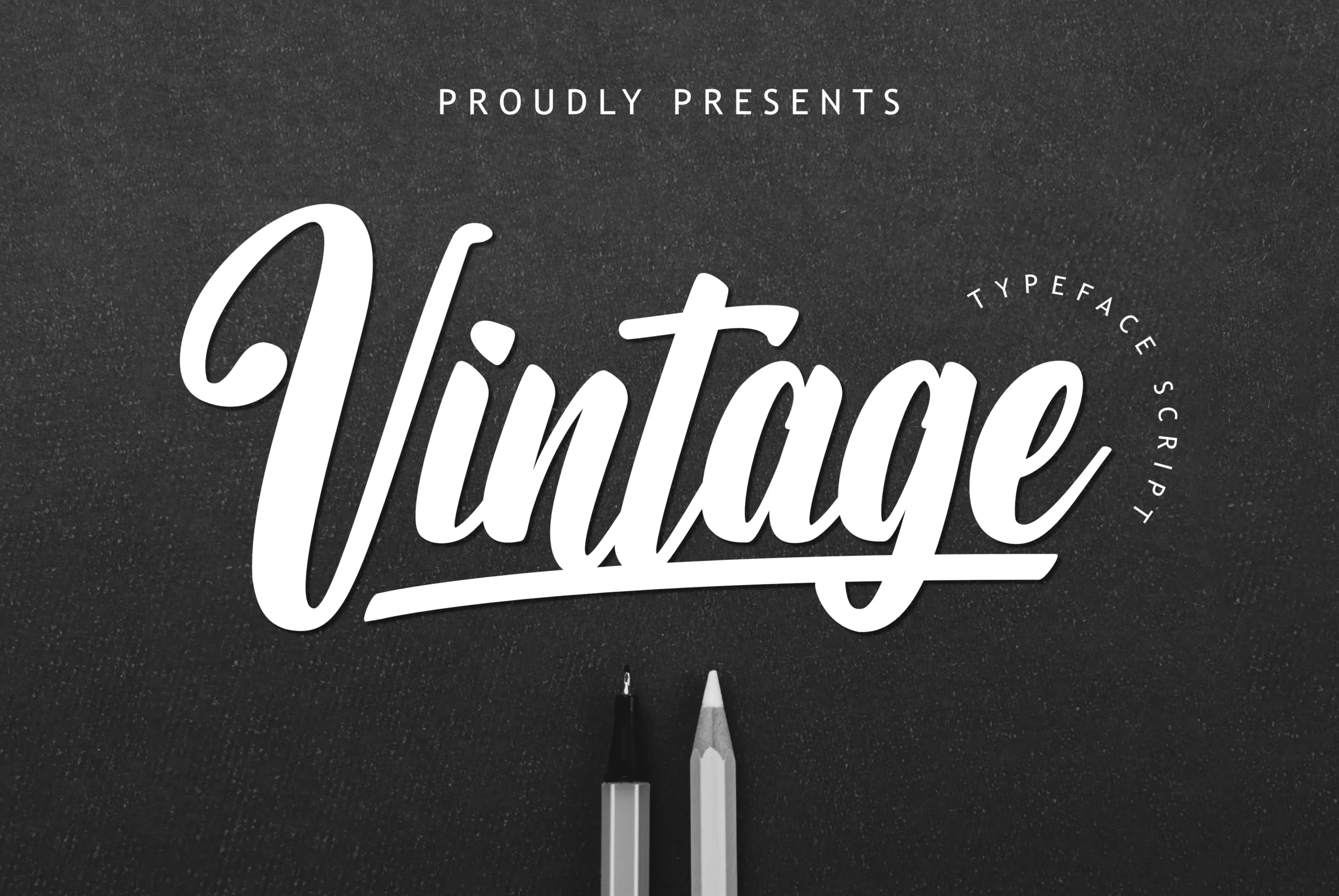
Best For: logos, headlines, merch design, display text
Vintage Font extends underlines from the word base, making each title carry its own built-in ornament. High-contrast connected letters and calligraphic terminals suit logos, headlines, merch design, and display text better than compact copy.
Quirkieman Font
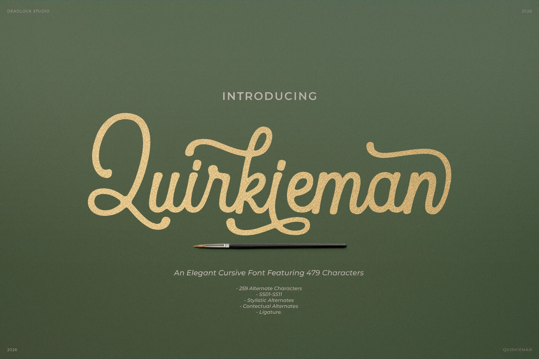
Best For: logos, branding, packaging, display text
Quirkieman Font gives Vintage Cursive Fonts a consistent slant, rounded terminals, and pronounced swashes that balance irregularity with decorative polish. It adapts well to packaging and branding, while flourished joins keep wording short and display-focused.
How to Choose the Right Font
Choose among these Vintage Cursive Fonts by matching construction to scale: high-contrast scripts need larger settings and generous spacing, while monoline options provide cleaner movement. Use textured or heavy brush styles for posters and merch, and reserve dense swashes, overlapping loops, and long underlines for short logos, titles, and invitations.