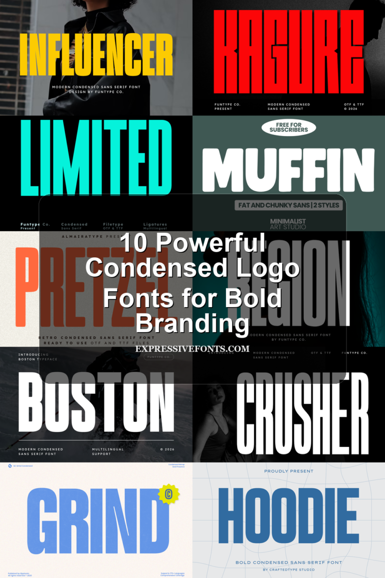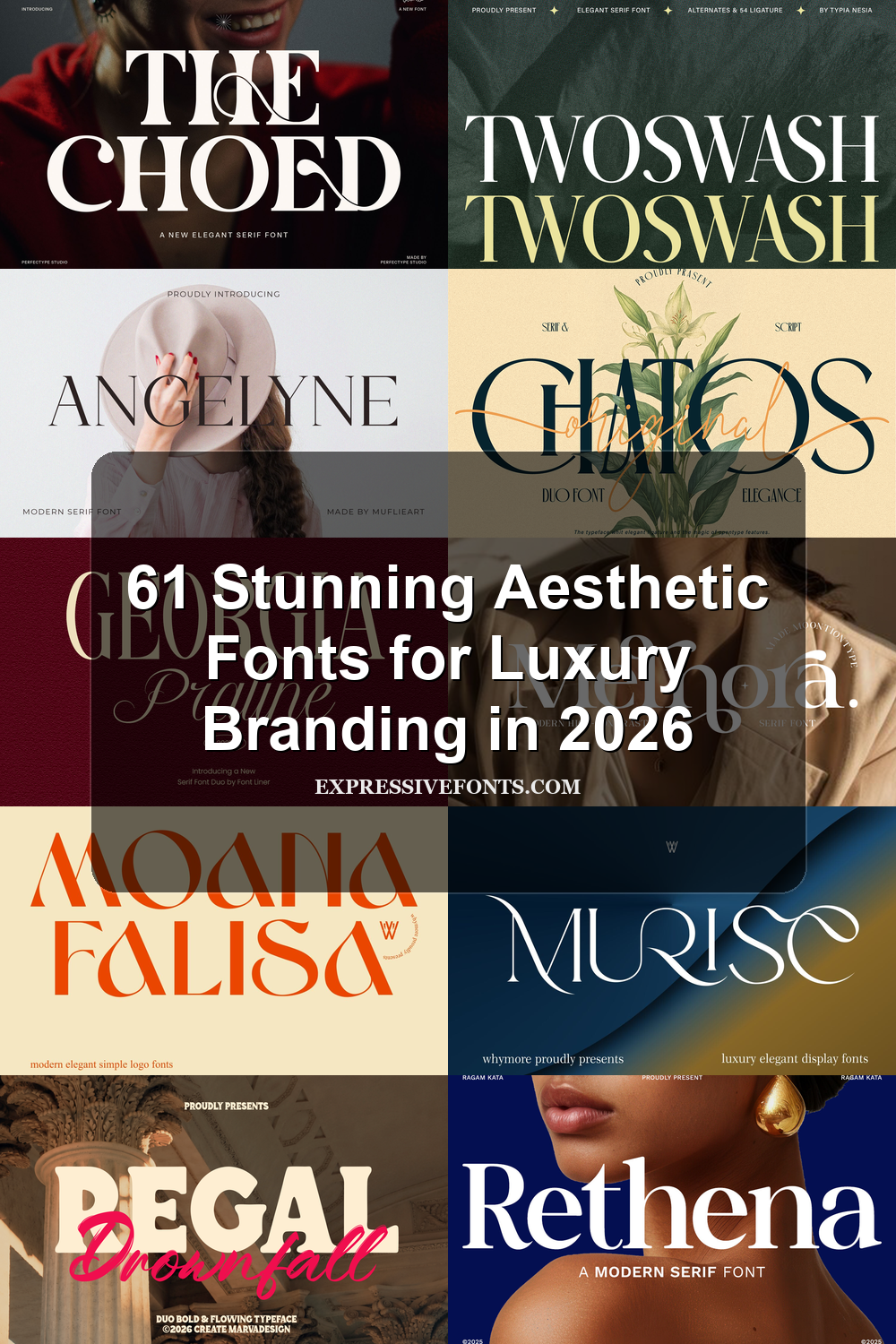
61 Stunning Aesthetic Fonts for Luxury Branding in 2026
Typography has become one of the most important elements in modern visual identity, and Aesthetic Fonts continue to dominate branding, editorial layouts, social media graphics, and luxury-inspired design. The right font can instantly change the mood of a project, making it feel more elegant, artistic, minimal, or premium without relying on heavy visuals.
In this collection, you’ll discover some of the best Aesthetic Fonts for logos, beauty branding, fashion campaigns, editorial headlines, invitations, packaging, and creative projects. From refined high-contrast serif fonts to decorative display typefaces with dramatic swashes and modern curves, each font offers a unique personality that helps designs stand out while maintaining a polished and stylish appearance.
Whether you are building a luxury brand, designing social media content, or creating modern editorial compositions, these Aesthetic Fonts provide the versatility and visual impact needed to elevate your typography and create a memorable aesthetic.
Flamingo Font
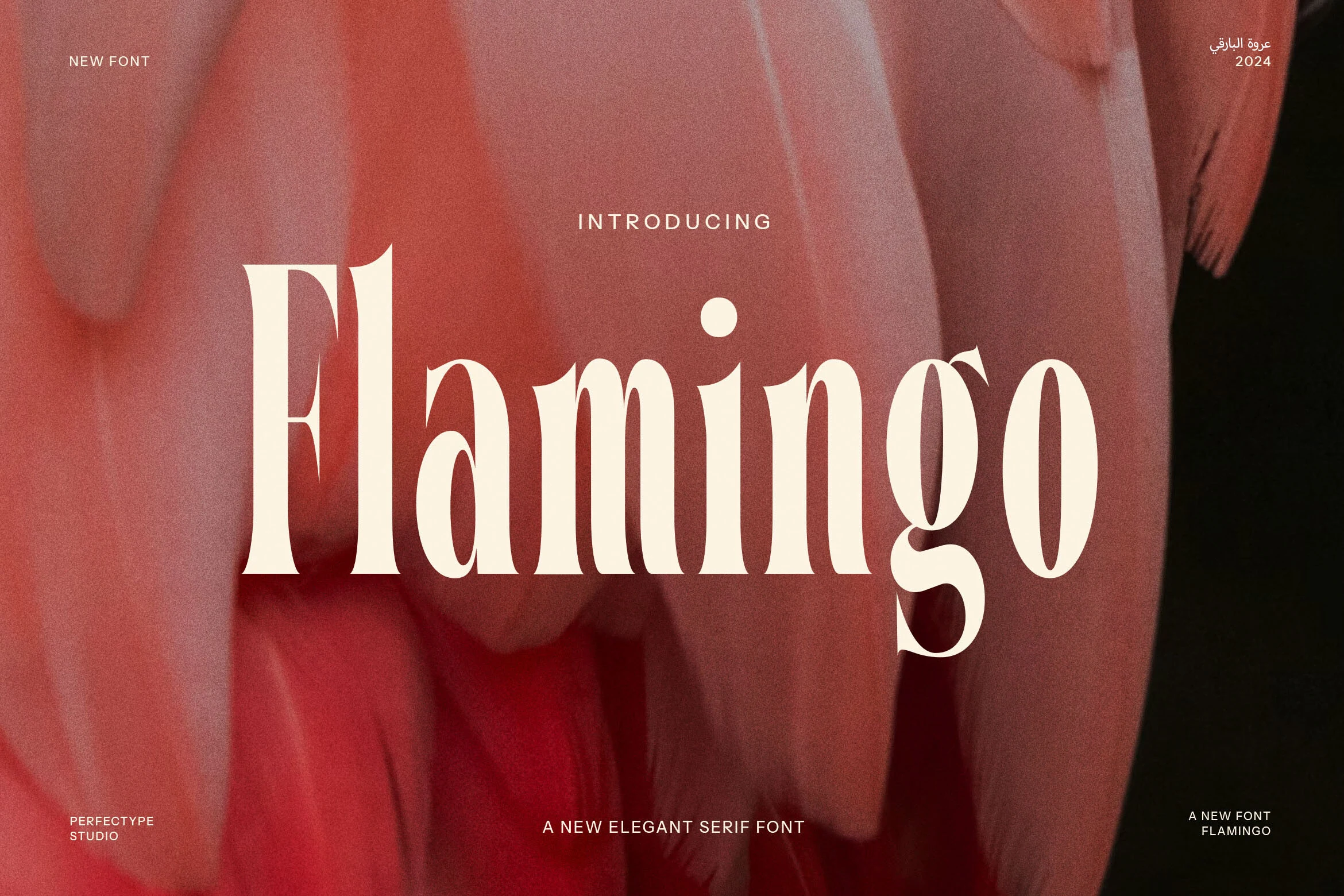
Best For: logos, branding, elegant designs, editorial designs
Flamingo Font has a tall modern serif build with heavy vertical stems, fine inner cuts, and curved bracketed serifs that give each word a polished vintage edge. The lowercase g and soft oval counters add personality without disturbing the rhythm, making it a strong fit for Aesthetic Fonts used in refined identity work.
Use it where the type carries the hierarchy: logo marks, editorial titles, beauty branding, or hero headers. Its contrast benefits from generous tracking in small uppercase text and tighter spacing in large wordmarks, so the thin details stay visible while the main shapes remain crisp.
Game & Reality Font
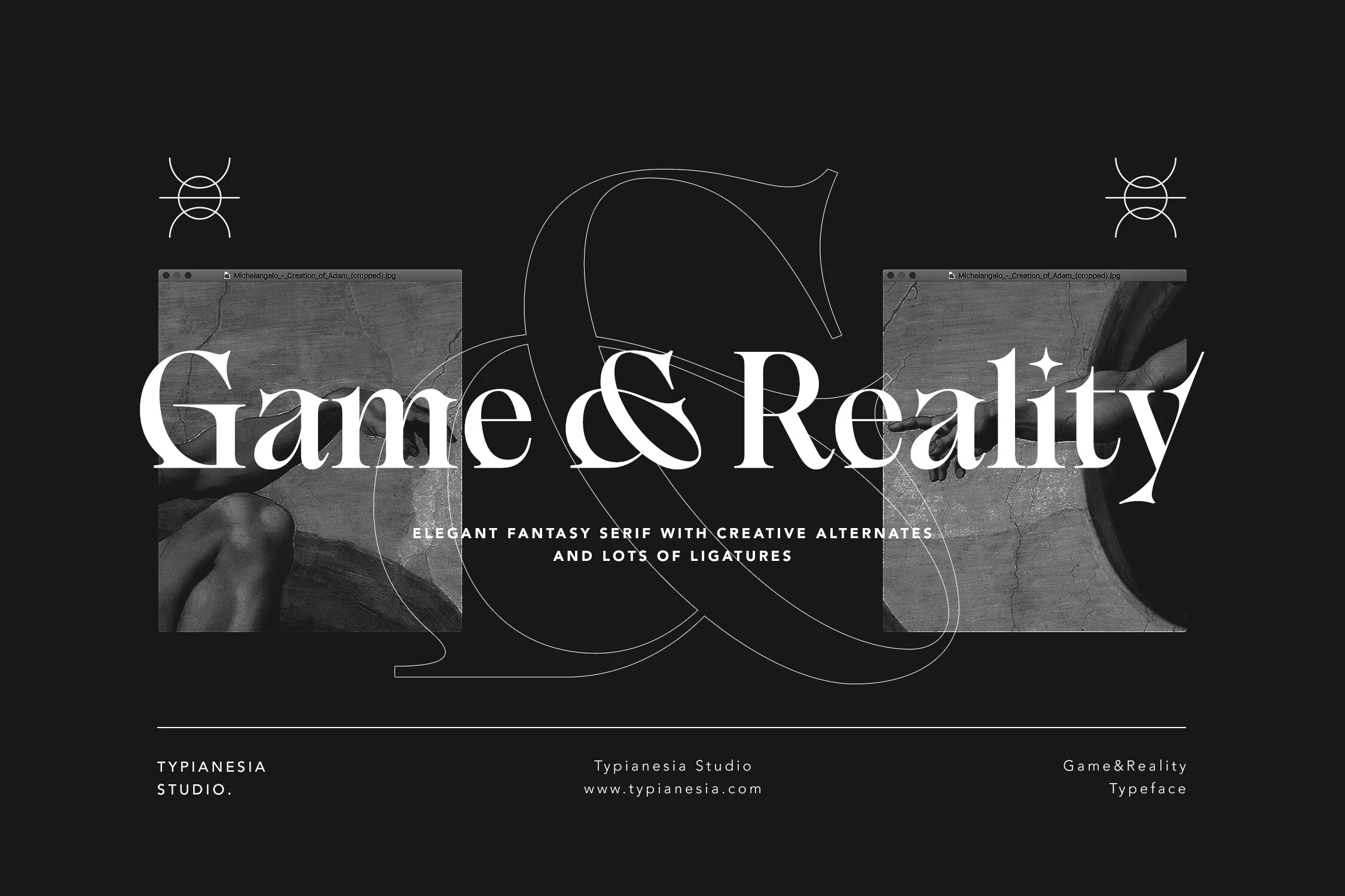
Best For: branding, editorial designs, book covers, posters
Game & Reality Font has a theatrical serif look with tall contrast, crisp wedge serifs, and sweeping fantasy curves that make the wordmark feel dramatic rather than delicate. The ampersand and terminal details bring real character, which gives Aesthetic Fonts a more cinematic, gallery-like direction.
This is a display face that works best when you let the shapes stay large and spacious. Use it for short titles, covers, or identity work where the sharp strokes can lead the hierarchy, and pair it with restrained supporting text so the ornate rhythm stays elegant instead of overcrowded.
Gomied Aesthetic Font
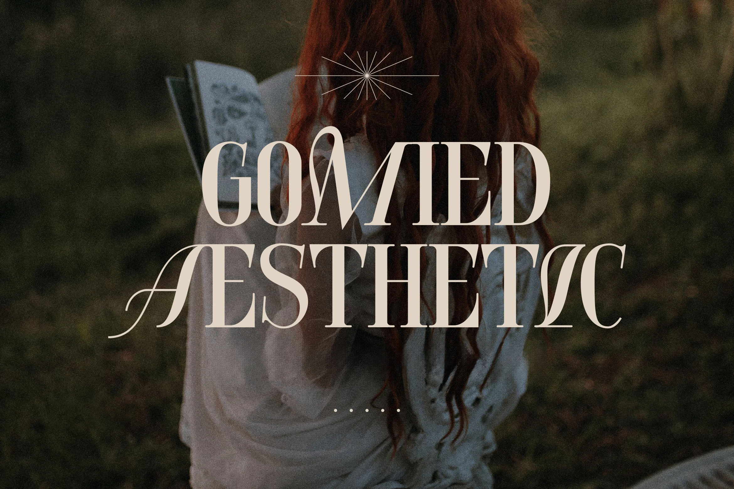
Best For: beauty branding, fashion branding, invitations, editorial designs
Gomied Aesthetic Font leans into a high-contrast serif style with elongated strokes, narrow proportions, and sweeping entry flourishes that give the capitals a poised, romantic feel. The sharp hairlines and soft curves create a polished silhouette, so it stands out easily within Aesthetic Fonts that aim for a more feminine, editorial mood.
It works best in display settings where those long terminals and airy counters have space to show. Use it for beauty branding, invitations, or fashion-led headlines, and keep supporting text simpler and more compact so the decorative swashes stay refined instead of visually crowded.
Chatos Original Font
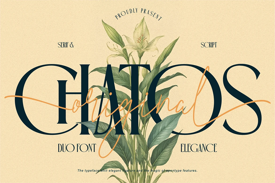
Best For: invitations, wedding designs, beauty branding, packaging
Chatos Original Font pairs a tall, high-contrast serif with a loose handwritten script, creating a duo font that feels romantic without losing structure. The serif brings long verticals and elegant curves, while the script cuts across with a lighter, expressive rhythm, giving Aesthetic Fonts a more layered and artistic direction.
This combination works especially well when you use the serif for the main title and let the script add contrast as a secondary accent. That split helps invitations, boutique packaging, and branding feel styled rather than busy, especially when you keep the surrounding layout clean and the text short.
Moguela Font
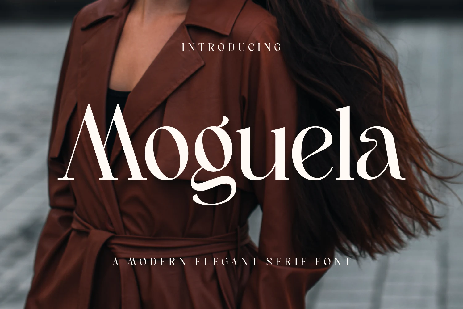
Best For: fashion branding, beauty branding, editorial designs, premium designs
Moguela Font has the kind of high-contrast serif structure that feels instantly editorial: slim hairlines, strong vertical stems, and long tapered terminals that give the wordmark a sleek, fashion-led silhouette. In Aesthetic Fonts, it stands out for its poised proportions and the subtle tension between delicate curves and crisp edges, which keeps it elegant rather than soft.
Use it where typography needs to carry status on its own—mastheads, boutique packaging, luxury labels, or refined brand marks. Its ligatures help headlines feel more composed, and the contrast looks best when you keep the layout spacious and let larger sizes show the thin details clearly.
Distressed Sherlock Font
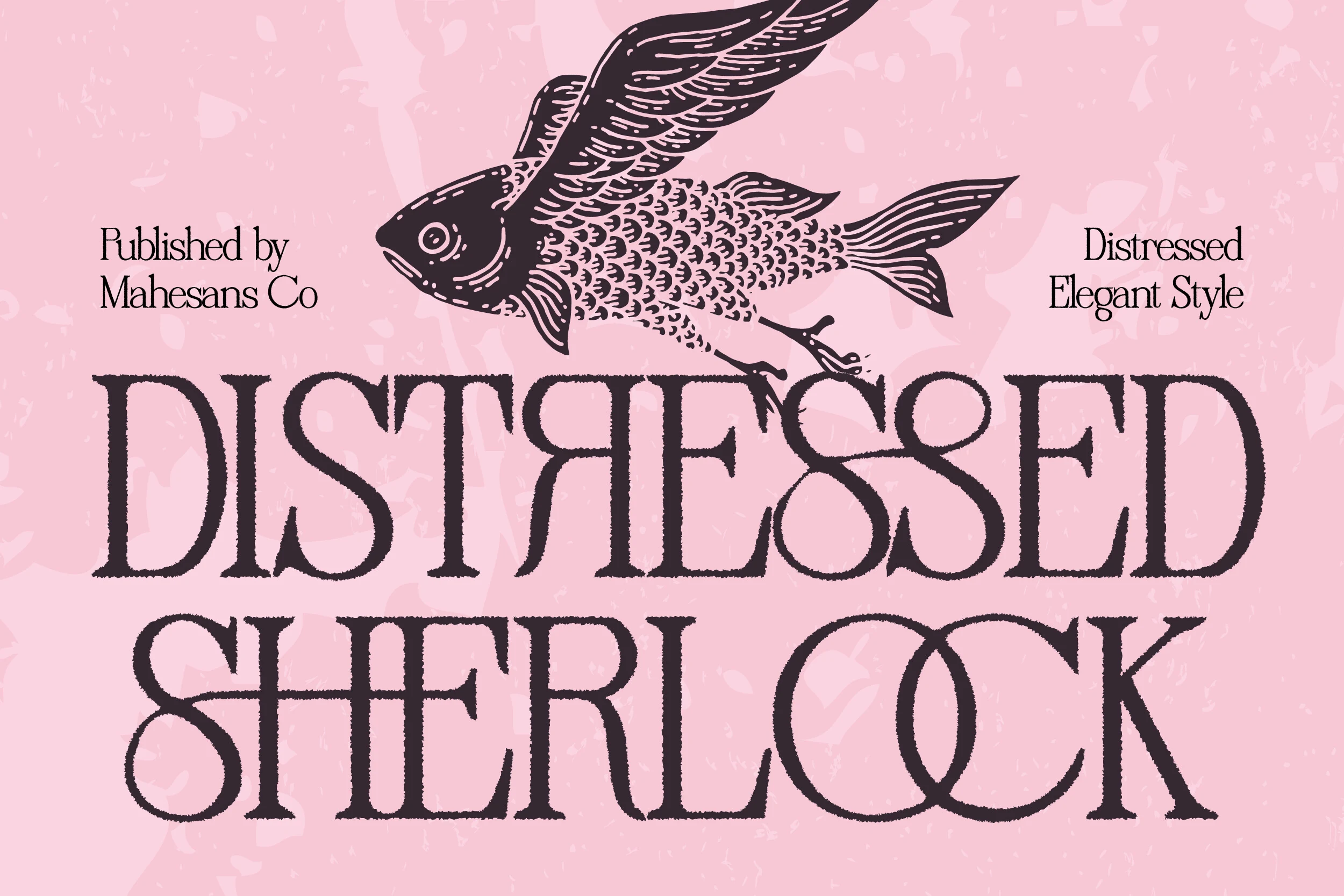
Best For: branding, packaging, posters, vintage designs
Distressed Sherlock Font pairs a classic serif structure with a softly worn texture, so the letterforms feel elegant without looking too polished. The tall proportions, rounded bowls, and fine contrast keep the words readable, while the distressed edges give Aesthetic Fonts a more tactile, vintage tone.
It works especially well when you want decorative character without losing clarity in the main title. Use it for packaging, posters, or brand marks where the texture can add atmosphere, and keep the surrounding layout fairly clean so the rough finish reads as intentional detail rather than visual noise.
Evorine Serif Font
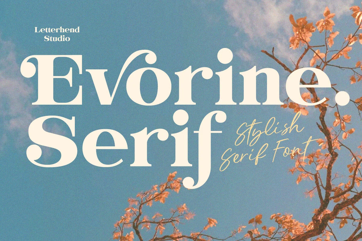
Best For: fashion branding, beauty branding, editorial designs, social media graphics
Evorine Serif Font has a bold high-contrast serif look with soft curves, rounded ball terminals, and generous proportions that make each word feel warm and self-assured. The shapes carry a subtle vintage charm rather than a strict formal tone, which gives Aesthetic Fonts a sweeter editorial direction without losing clarity.
It performs best as a statement face for short headings, branding, or social graphics where the thick-to-thin contrast can stay visible. Try pairing it with lighter supporting text and a clean layout, so the wide curves and playful details hold the hierarchy instead of competing with too many decorative elements.
Dringk Font
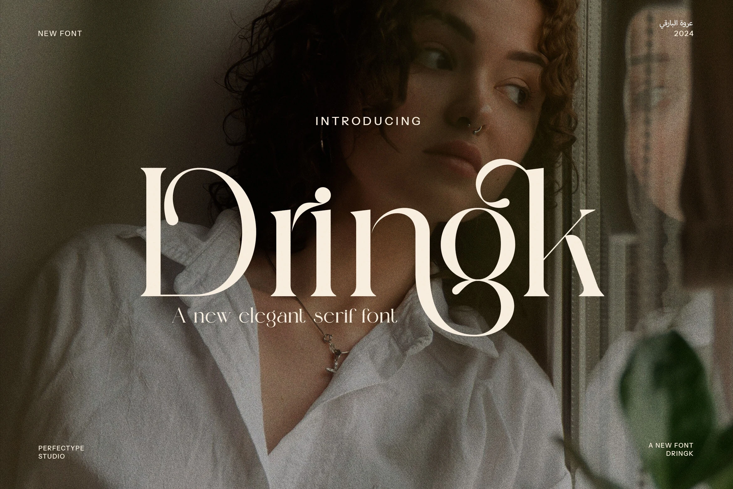
Best For: fashion branding, beauty branding, editorial designs, premium designs
Dringk Font has a refined high-contrast serif build with slim hairlines, broad curves, and tapered terminals that give it a poised editorial presence. Its ligatures and alternate forms add a sculpted rhythm to the word shapes, which gives Aesthetic Fonts a more polished, fashion-forward character.
This is a display serif that rewards larger settings, where the joins and contrast stay crisp. Use it for brand names, packaging, or headline work, and keep the supporting type quieter with balanced spacing so the custom letterforms lead the hierarchy without making the layout feel crowded.
Moana Falisa Font
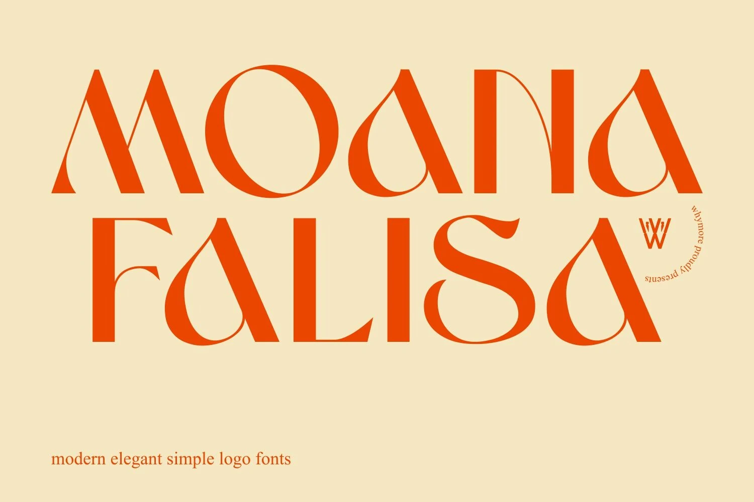
Best For: logos, branding, minimal designs, elegant designs
Moana Falisa Font has a clean display serif structure with smooth contrast, broad curves, and distinctive counters that make familiar letterforms feel more sculpted. The pointed A shapes and rounded bowls give it a refined graphic rhythm, making it a strong pick within Aesthetic Fonts when you want something simple but not plain.
It works especially well for logos and polished brand headers, where the unusual shapes can stay crisp and intentional. Keep the wording short and give the letters generous spacing, so the elegant details read clearly instead of blending together in a tighter layout.
Torkias Jole Font
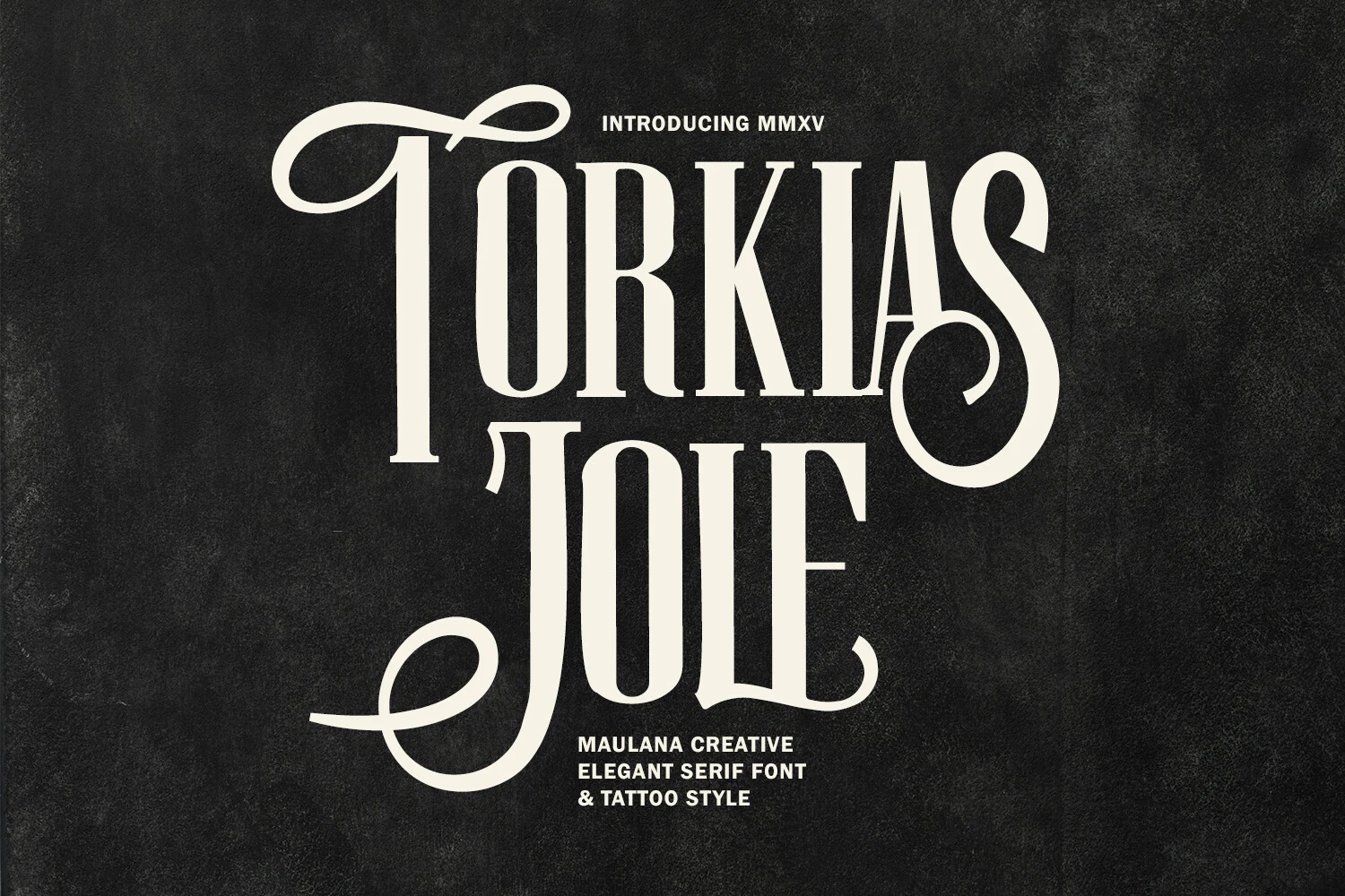
Best For: logos, posters, display text, decorative designs
Torkias Jole Font has a tall condensed serif structure with sharp contrast, elongated stems, and oversized swash flourishes that give it a theatrical custom-lettered feel. The capitals look sculpted rather than neutral, so within Aesthetic Fonts it reads more like statement typography than a standard editorial serif.
This one is best reserved for short words, covers, and identity work where the sweeping terminals can stay fully visible. Give it generous space and pair it with quieter supporting text, otherwise the narrow proportions and ornamental curves can start to compete instead of carrying the hierarchy cleanly.
Higlean Font

Best For: beauty branding, fashion branding, editorial designs, premium designs
Higlean Font has a sleek modern serif shape with high contrast, rounded bowls, and softened terminals that keep the wordmark polished rather than severe. The ligatures create smooth joins through letters like g, l, and e, giving Aesthetic Fonts a more custom editorial rhythm.
Use it for brand names, magazine-style headers, packaging, or website hero text where the type can sit large and uncluttered. Its thin strokes need enough contrast and spacing to stay sharp, so restrained supporting typography will let the graceful curves carry the hierarchy cleanly.
Kangelan Font
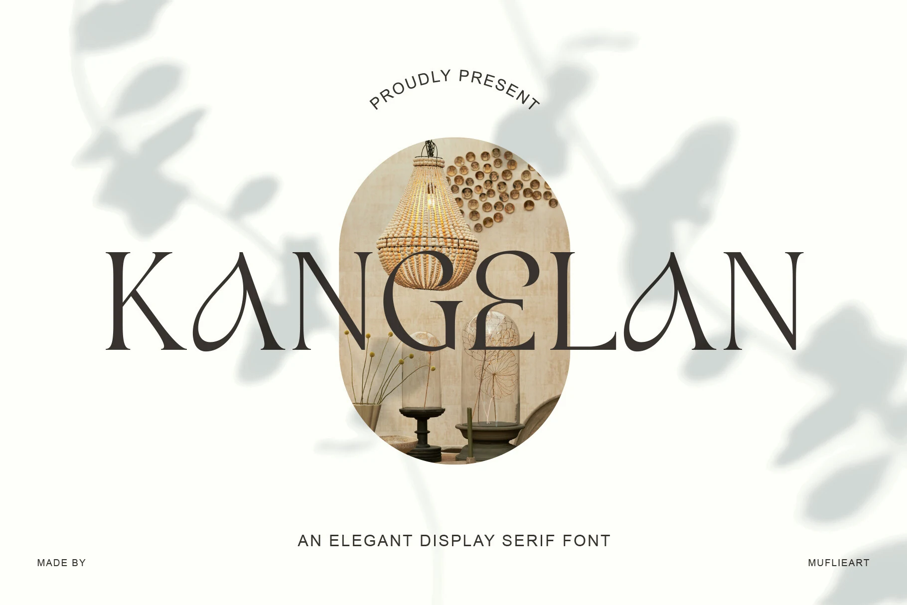
Best For: logos, branding, signage, editorial designs
Kangelan Font is an elegant display serif with narrow verticals, needle-like serifs, and airy openings that keep the wordmark light despite its tall proportions. The stylized A shapes and soft internal curves give Aesthetic Fonts a calm, architectural character rather than a decorative or overly romantic one.
It suits minimalist branding, interior signage, and editorial titles where the typography needs restraint with a visible signature. Use generous letter spacing and a clean supporting typeface, because the thin details and open counters depend on clear contrast and uncluttered composition.
Melnora Font
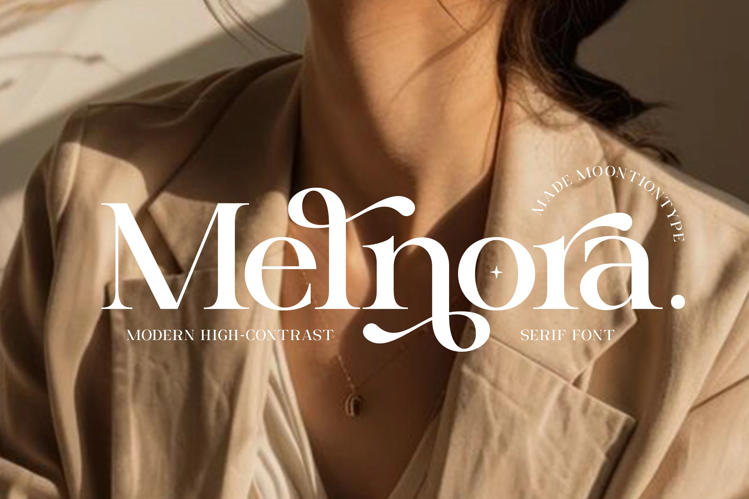
Best For: fashion branding, beauty branding, wedding designs, premium designs
Melnora Font has a modern high-contrast serif build with slim hairlines, soft rounded bowls, and flowing terminals that give each word a polished editorial rhythm. The graceful curves feel refined without becoming overly ornate, making it a strong choice for Aesthetic Fonts aimed at fashion, beauty, and premium lifestyle work.
Use it where the typography can act as the main visual cue: logos, magazine-style titles, packaging, or wedding stationery. Larger sizing helps the thin strokes stay clean, while balanced spacing keeps the swash details elegant instead of letting them crowd the surrounding text.
Bright Pasqia Font
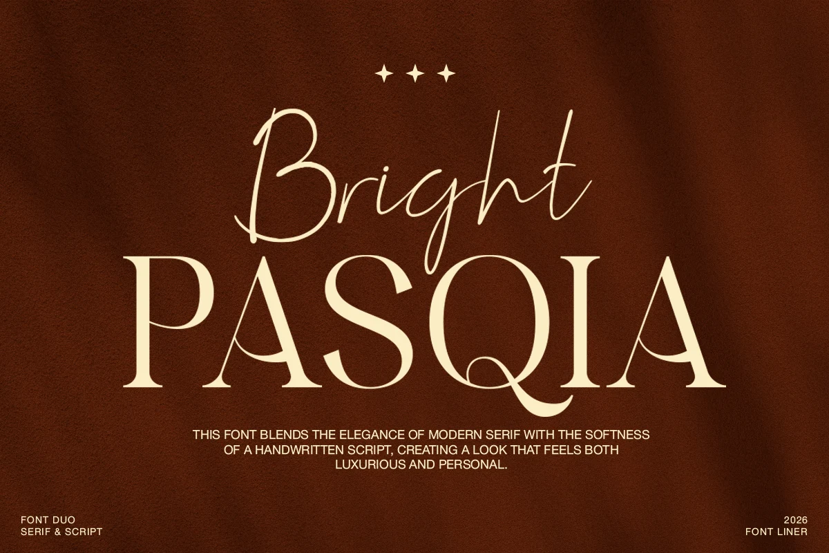
Best For: branding, wedding designs, editorial designs, premium designs
Bright Pasqia Font combines a high-contrast serif with a slim handwritten script, giving the design both structure and a personal accent. The serif capitals have clean vertical stems, sharp curves, and decorative inner swashes, while the script adds a lighter rhythm above the main wordmark, making it a polished fit for Aesthetic Fonts with a luxury editorial tone.
Use the serif for the primary title and the script as a short accent rather than running both styles at equal weight. That hierarchy keeps branding, wedding stationery, and premium packaging readable while still letting the softer handwritten layer add warmth and contrast.
Angelyne Font
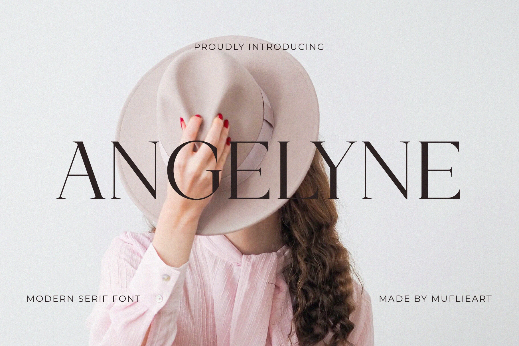
Best For: fashion branding, editorial designs, website headers, luxury designs
Angelyne Font has a wide modern serif silhouette with fine hairlines, sharp bracketed serifs, and a composed uppercase rhythm. The spacing feels airy rather than fragile, while the custom ligature connections add a subtle bespoke detail that gives Aesthetic Fonts a more polished editorial direction.
Use it for luxury headers, fashion branding, magazine titles, or clean web hero sections where the letters can stretch across the layout. Its thin strokes need strong contrast and measured tracking, so keep supporting typography restrained and avoid crowding the wordmark with heavy decorative elements.
Munnes Font
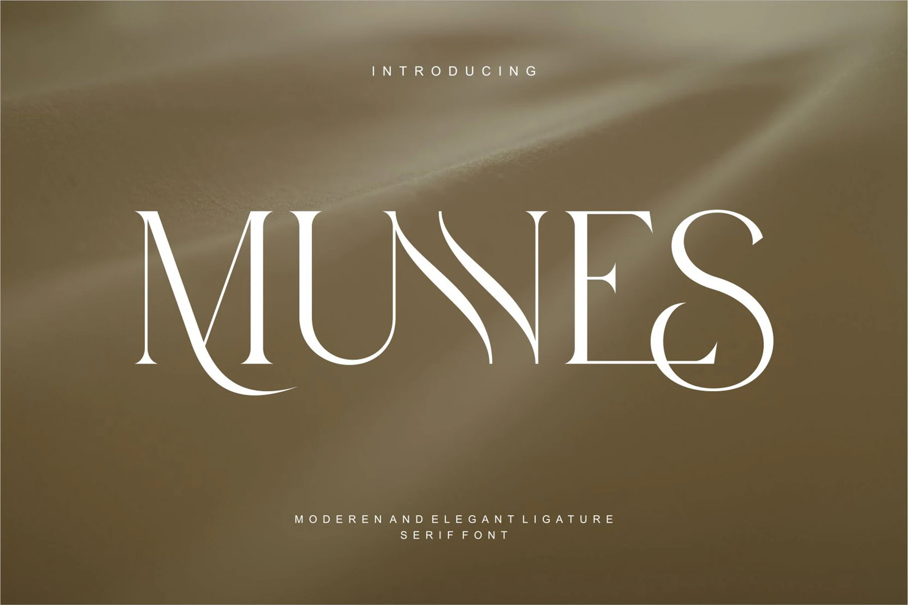
Best For: logos, luxury designs, editorial designs, fashion branding
Munnes Font uses a refined high-contrast serif structure with slim vertical rhythm, sharp bracketed details, and long sweeping curves that give the capitals a controlled luxury feel. Its wide spacing and sculpted ligature-like joins make it a strong fit for Aesthetic Fonts collections built around polished, editorial typography.
The letterforms work best when the title has room to stretch across the layout, because the dramatic curves in the M, N, and S need clean negative space to stay crisp. Use it for short names, magazine-style headers, or premium branding where contrast and proportion matter more than dense reading.
Ghond Font
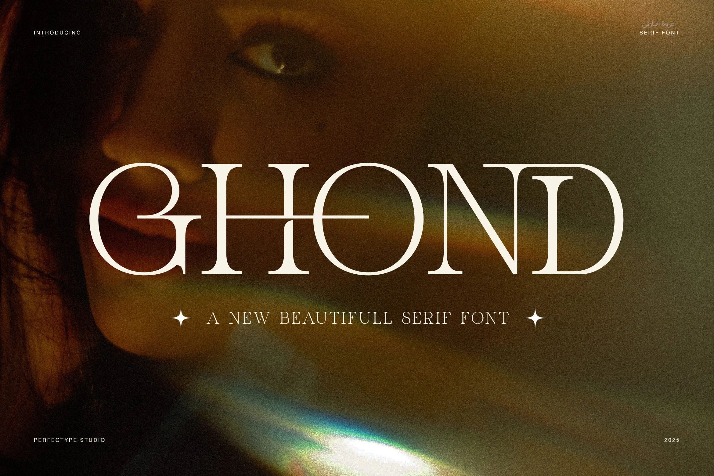
Best For: logos, luxury designs, editorial designs, fashion branding
Ghond Font has a polished serif form with clean vertical stems, rounded counters, and thin horizontal links that make the wordmark feel precise rather than ornate. In an Aesthetic Fonts roundup, it stands out through controlled contrast and smooth ligatures that add movement without breaking the luxury tone.
The wide, geometric rhythm suits short names, mastheads, and fashion-led branding where the typography needs to carry the hierarchy on its own. Keep the spacing open enough for the connected strokes to read clearly, especially around the G, H, and O forms.
Georgia Praline Font
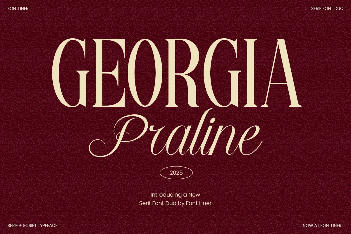
Best For: logos, wedding designs, invitations, editorial designs
Georgia Praline Font pairs a tall, high-contrast serif with a softer italic script, giving the duo a formal title-and-signature rhythm. The serif has narrow proportions, sharp bracketed serifs, and clean vertical stress, while the script adds long entry strokes and sweeping terminals that bring warmth to Aesthetic Fonts layouts.
Use the serif for the main hierarchy and let the script act as a secondary accent rather than competing at the same scale. The contrast works especially well when the uppercase word is tracked slightly open, while the script stays tighter so its connected strokes remain fluid and readable.
Lathenia Font
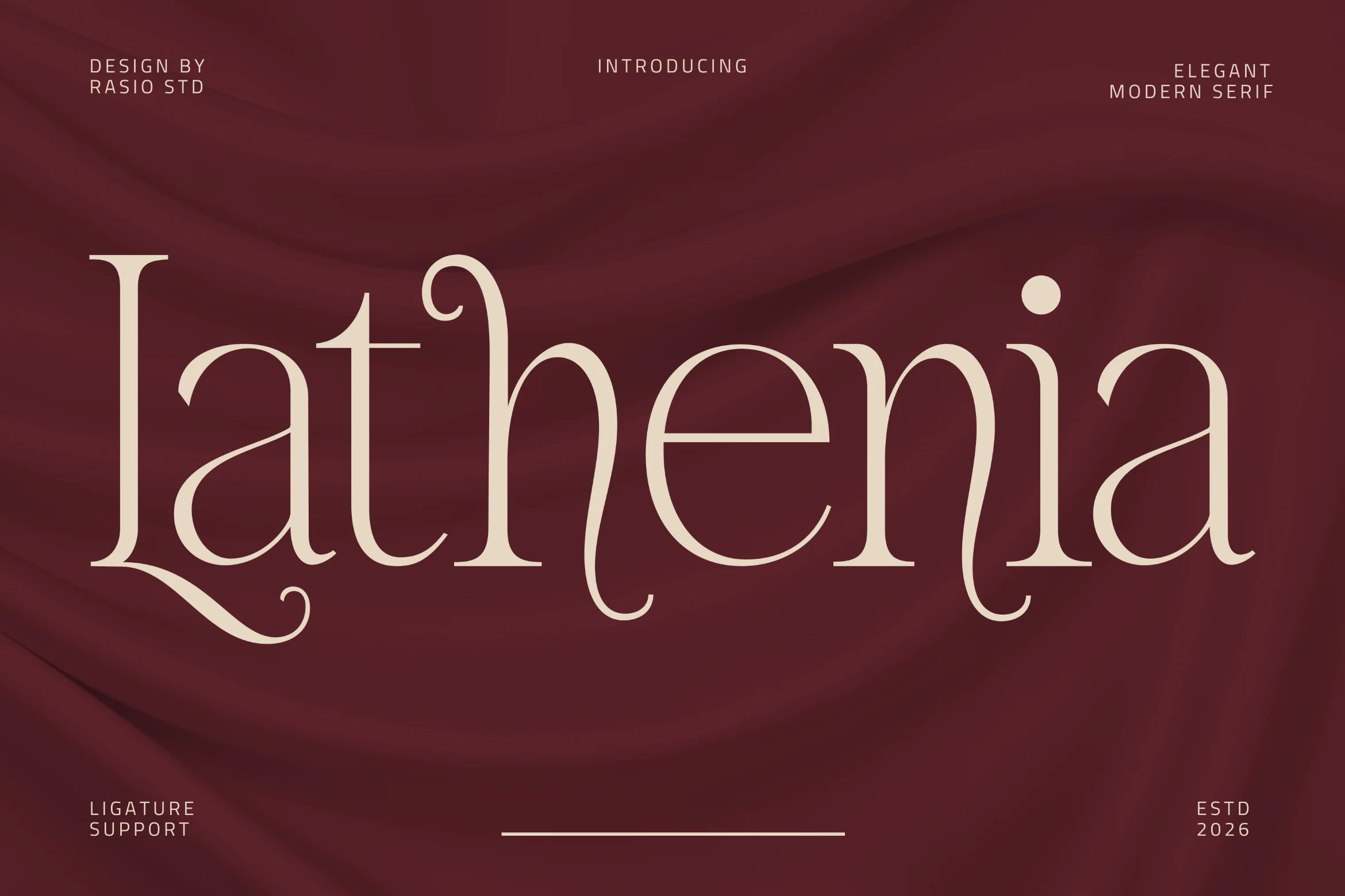
Best For: logos, wedding designs, luxury designs, book covers
Lathenia Font has a modern display serif shape with high contrast strokes, wide curves, and extended descenders that give the wordmark a romantic editorial pull. Its refined ligature support helps connected letter pairs feel intentional, making it a strong choice for Aesthetic Fonts lists focused on fashion-led and premium typography.
The font needs careful hierarchy: use it for short titles where the long tails and curled terminals can sit without crowding nearby text. Slightly open tracking works well on the broader forms, while tighter supporting copy keeps the composition from losing its polished, high-end balance.
Kisvo Font
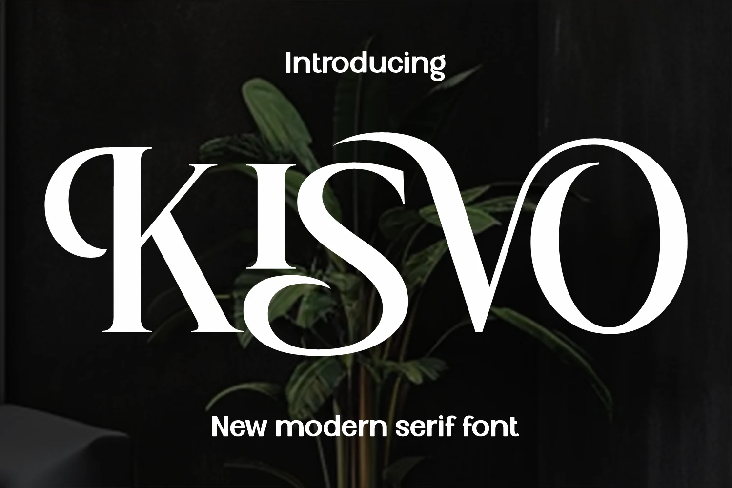
Best For: logos, wedding designs, fashion branding, luxury designs
Kisvo Font brings a boutique serif look with heavy vertical contrast, narrow hairlines, and large circular curves that push the letters toward a sculptural display style. Its dramatic K, looping S, and open O give Aesthetic Fonts layouts a refined but slightly unconventional rhythm.
The font is strongest in short wordmarks where each curve can occupy space without colliding with nearby letters. Pair it with restrained supporting text and keep the title scale generous, because the thin strokes and sweeping forms need contrast to stay crisp.
Rosse Rossa Font
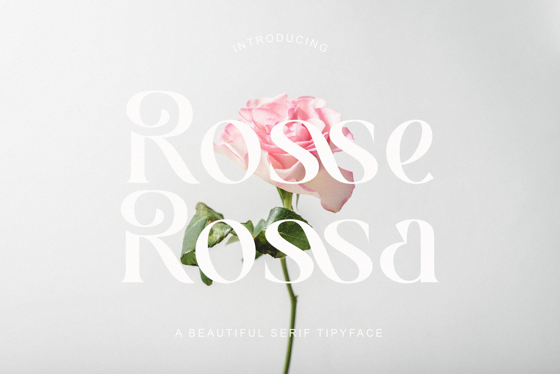
Best For: wedding designs, beauty branding, romantic designs, social media graphics
Rosse Rossa Font has a soft display serif character shaped by high contrast strokes, rounded bowls, and airy looped terminals that feel more lyrical than formal. Its generous negative space and teardrop-like openings give Aesthetic Fonts layouts a romantic, floral-leaning rhythm without becoming overly decorative.
The letterforms need light backgrounds and clean spacing so the pale hairlines and overlapping curves remain legible. Use it for short names, wedding headings, beauty marks, or ethereal social headers where the typography can sit large and carry the visual tone with minimal supporting text.
Saficel Font
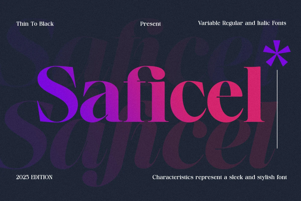
Best For: logos, editorial designs, fashion branding, professional designs
Saficel Font uses a high-contrast serif structure with rounded bowls, tight counters, and a sharp slanted S that gives the headline a sleek editorial push. Its mix of heavy curves and fine terminals makes it useful in Aesthetic Fonts layouts where the type needs to feel stylish but still professionally controlled.
The Thin-to-Black range and variable Regular and Italic forms support a full title system: heavier weights can hold the main wordmark, while lighter or italic styles can handle subheads without changing the visual language. Keep spacing measured, since the dense curves read best with clear contrast around each letter.
Afterglow Font
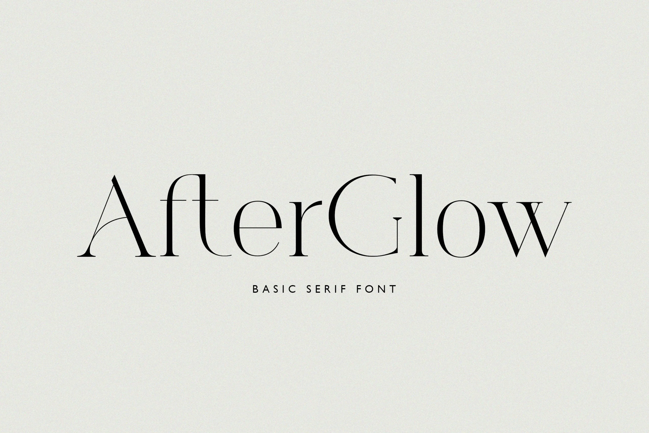
Best For: logos, invitations, fashion branding, elegant designs
Afterglow Font has a clean fashion-serif profile with thin hairlines, tall vertical forms, and lightly bracketed details that keep the wordmark restrained rather than ornamental. Its open spacing and delicate contrast make it a useful pick for Aesthetic Fonts collections built around quiet, editorial refinement.
The font works best when the composition gives the letterforms enough blank space, especially around the long crossbars and narrow curves. Use it for logos, invitations, or branding marks where a slim title can carry the hierarchy without needing heavy decoration.
Camenia Font
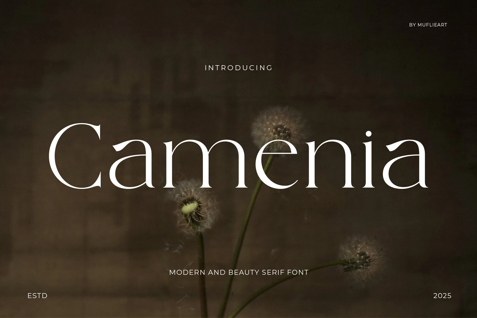
Best For: beauty branding, luxury designs, editorial designs, social media graphics
Camenia Font has a calm modern serif profile with slender stems, high contrast, and softly curved apertures that keep the wordmark refined without feeling rigid. Its open spacing and long horizontal movement make it a strong fit for Aesthetic Fonts collections built around beauty, wellness, and editorial restraint.
The broad C and rounded lowercase forms need generous side margins so the thin strokes do not get swallowed by busy layouts. Use it for short brand names, lifestyle headers, or premium packaging where airy spacing and quiet contrast can carry the design hierarchy.
Beagio Font
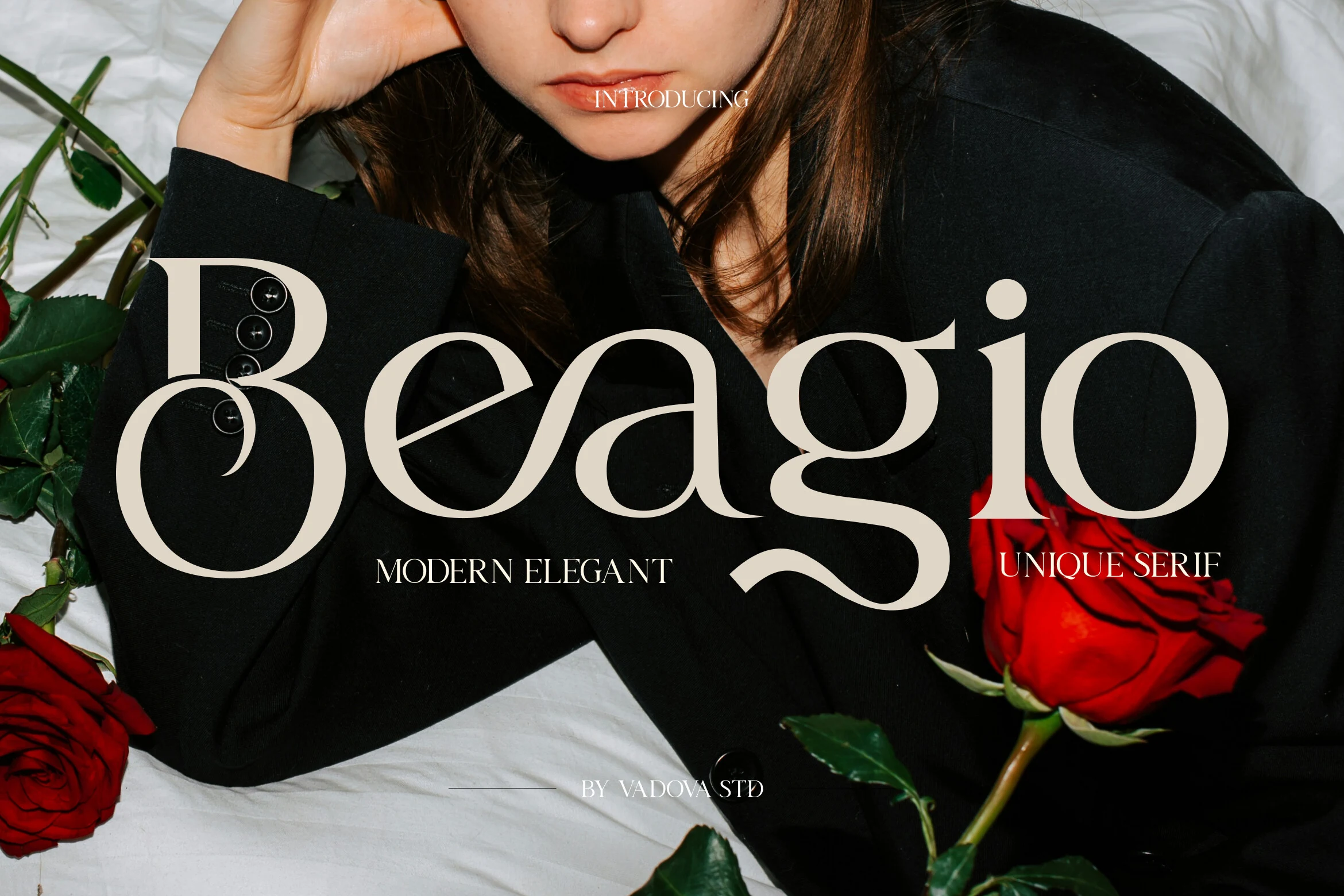
Best For: logos, romantic designs, editorial designs, beauty branding
Beagio Font has a modern serif silhouette with heavy-to-light contrast, rounded bowls, and soft sweeping joins that give the wordmark a romantic editorial tone. The oversized B, curved e, and deep g tail add enough personality for Aesthetic Fonts layouts without making the letters feel overly ornate.
Use it where the title can sit large and carry the mood by itself: perfume labels, fashion spreads, invitation headers, or premium packaging. Keep supporting type smaller and cleaner, because Beagio’s broad curves and dramatic descenders need clear space to stay elegant and readable.
Murise Font
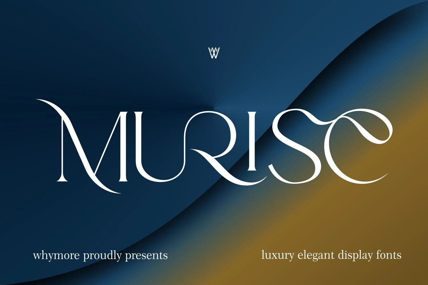
Best For: logos, luxury designs, fashion branding, high-end designs
Murise Font uses a luxury display serif structure with extreme contrast, tall hairlines, and broad sweeping curves that give the wordmark a dramatic high-end profile. Its sculpted M, curved U, and looping final forms bring a controlled sense of motion to Aesthetic Fonts layouts without losing the clean editorial base.
The font needs generous width and strong background contrast, because the thinnest strokes can disappear if the layout gets too busy. Use it for short brand names, premium logos, and fashion-style headers where the oversized curves can define the hierarchy on their own.
Moon Creme Font
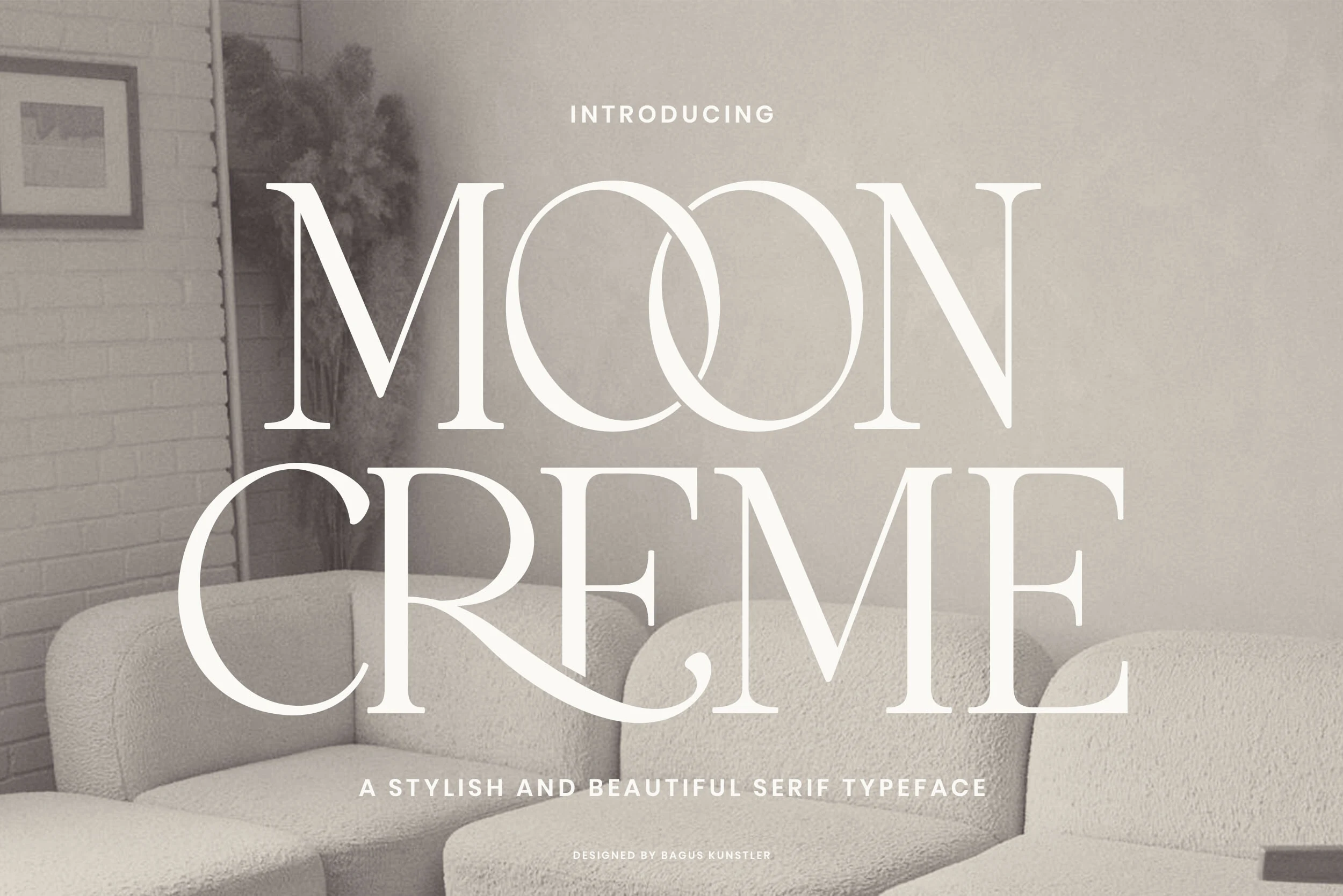
Best For: logos, editorial designs, luxury designs, classic designs
Moon Creme Font has a poised serif construction with tall vertical stems, high contrast, and wide rounded O forms that overlap to create a soft lunar rhythm. The squared serifs and open spacing give Aesthetic Fonts layouts a vintage-modern tone without making the title feel ornate.
Its best use is in short stacked headlines, logos, and editorial covers where the big circular forms can act as a visual anchor. Keep supporting text narrow and understated; the font relies on clear margins and contrast so the thin curves stay sharp against pale backgrounds.
Mickle Font
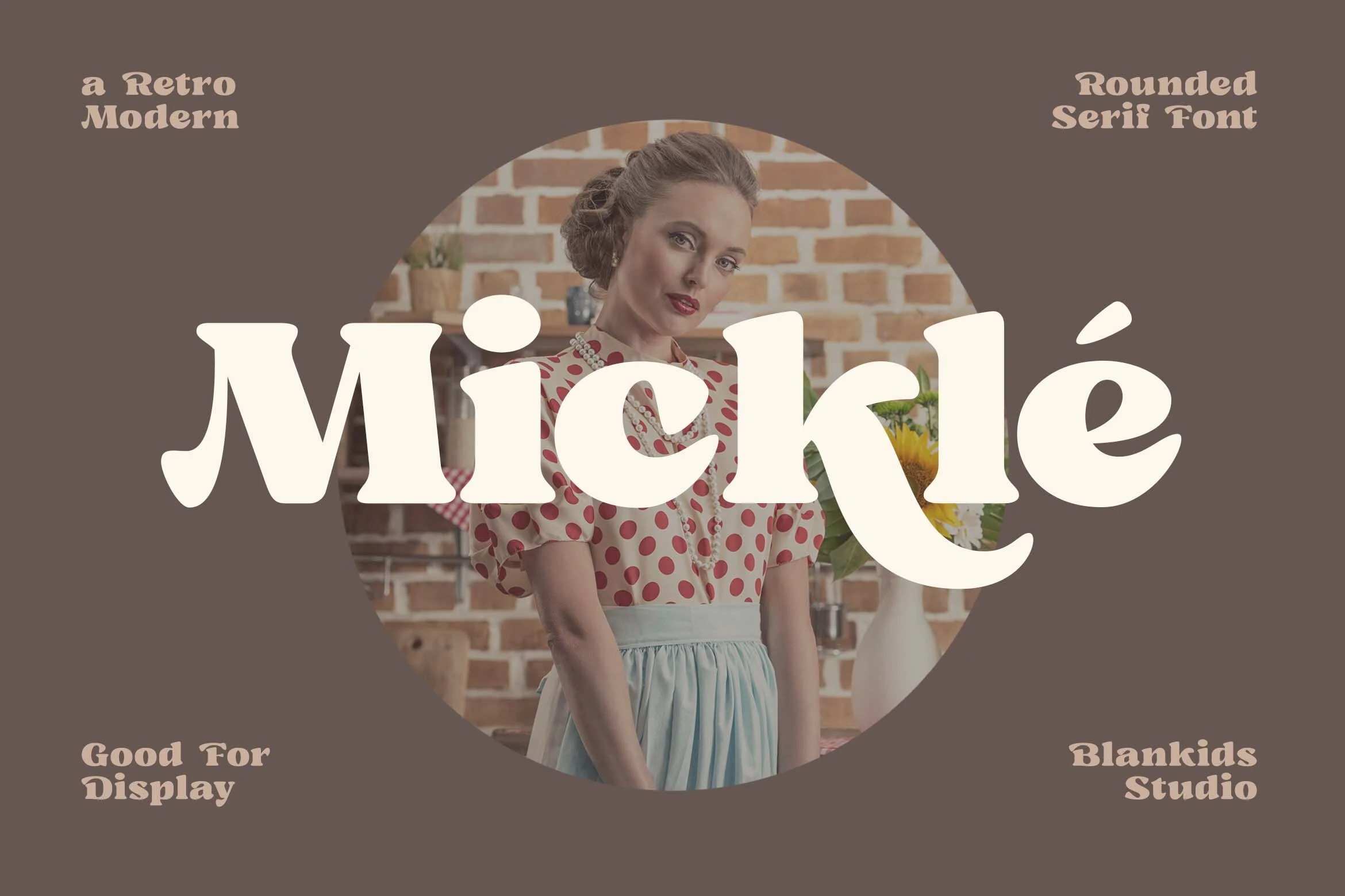
Best For: logos, packaging, retro designs, display text
Mickle Font has a chunky retro-modern serif style with soft slab-like weight, rounded terminals, and inflated curves that make the letters feel friendly but still structured. Its bold shape gives Aesthetic Fonts layouts a warmer vintage tone than the thin luxury serifs in this category.
The font works best as a display face for short names, labels, and packaging where the thick strokes can become the main visual asset. Keep tracking fairly tight and use simple supporting type, because the rounded serifs and heavy counters already create a strong rhythm.
Papillon Serif – Elegant Modern Luxury Font
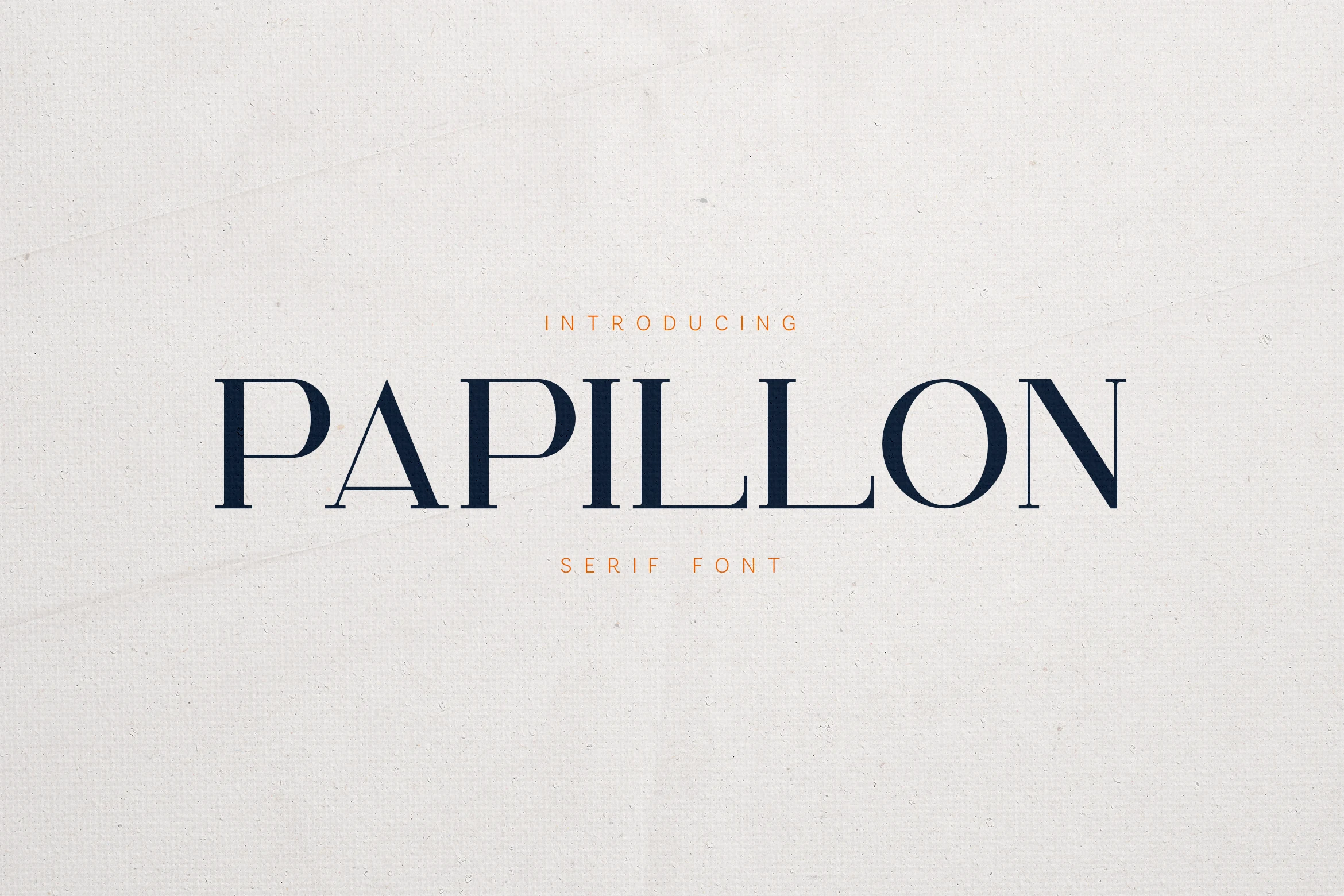
Best For: logos, luxury designs, editorial designs, high-end designs
Papillon Serif – Elegant Modern Luxury Font uses a restrained uppercase serif structure with sharp verticals, fine bracketed details, and open spacing that gives the title a calm editorial presence. Its subtle organic cuts keep the design from looking too rigid, making it a clean fit for Aesthetic Fonts built around polished luxury typography.
The letterforms work best in wide wordmarks and centered layouts where the thin strokes and large counters can stay clear. Track it slightly open for premium branding or magazine-style headers, then use compact supporting text to preserve the contrast between the main title and the smaller information.
Emerale Font
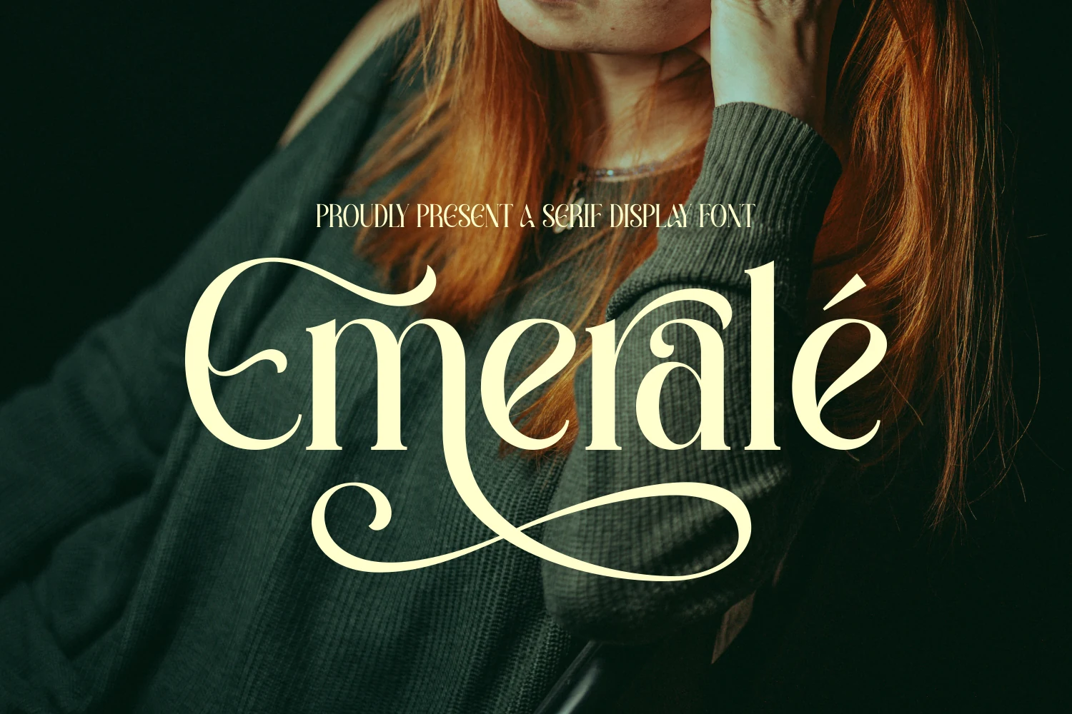
Best For: logos, luxury designs, high-end designs, display text
Emerale Font has a decorative serif display style with sharp contrast, rounded bowls, and long ornamental swashes that give the wordmark a theatrical luxury feel. The oversized E, curled r, and sweeping baseline flourish make it one of the more expressive choices for Aesthetic Fonts layouts.
Keep it for short titles and logo-style compositions where the flourishes can stretch without colliding with other elements. It works best with strong contrast and generous vertical spacing, since the thin strokes and extended curves need clean negative space to stay readable.
Seraphim Font
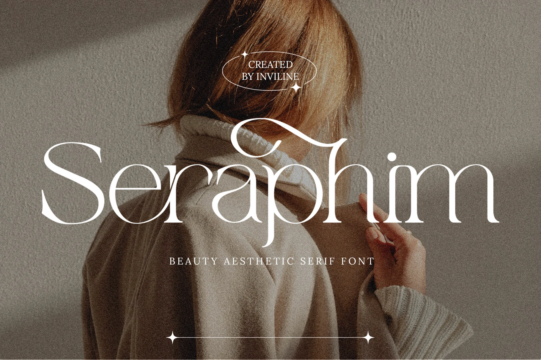
Best For: beauty branding, fashion branding, editorial designs, wedding designs
Seraphim Font has a high-contrast serif structure with thin hairlines, wide curves, and long, sculptural terminals that give the words a soft but controlled presence. The oversized capitals and flowing details make it feel polished without turning overly decorative.
For Aesthetic Fonts projects, it works best where the typography can act as the main visual layer: beauty packaging, fashion headlines, wedding stationery, or editorial covers. Keep the text short, use generous spacing, and pair it with restrained supporting type so the delicate curves stay readable.
Rethena Font
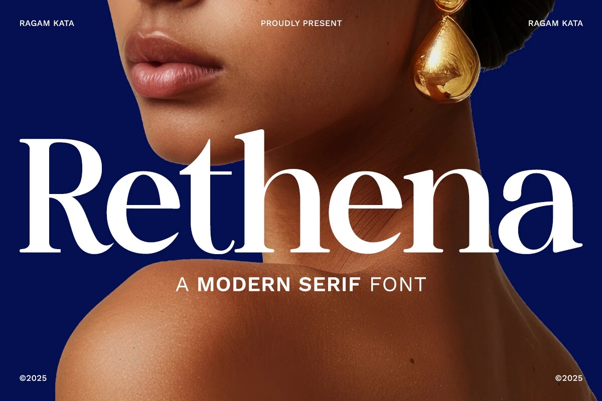
Best For: beauty branding, fashion branding, editorial designs, luxury designs
Rethena Font leans into a dramatic modern serif style, with tall proportions, crisp thick-to-thin contrast, and smooth sculpted curves that give each word a polished runway feel. The broad counters and delicate hairlines keep it refined, while the weight in the main strokes gives it real display presence.
Within Aesthetic Fonts, this one works especially well when the type is allowed to lead the layout. Use it for premium branding, cover-style headlines, or beauty packaging, and keep the surrounding text restrained. A clean sans pairing and generous spacing will help its contrast stay sharp instead of crowded.
The Altar Sight Font
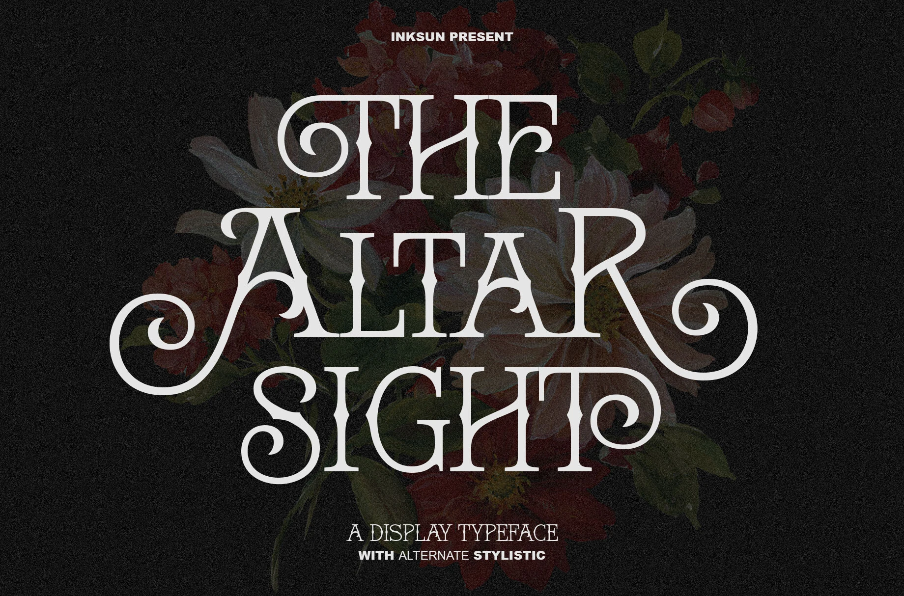
Best For: luxury designs, editorial designs, decorative designs, vintage designs
The Altar Sight Font is built around a high-contrast serif skeleton, but its character comes from the exaggerated curls, sharp bracketed serifs, and theatrical swashes that wrap around key letters. The result feels Victorian, gothic, and ornamental without losing the structure of a formal display face.
Use it in Aesthetic Fonts layouts where the title is meant to dominate: editorial covers, boutique branding, atmospheric posters, or refined vintage packaging. The alternate stylistics work best on short phrases, so keep supporting copy quiet and let the swashes define the hierarchy.
Slowdate Font
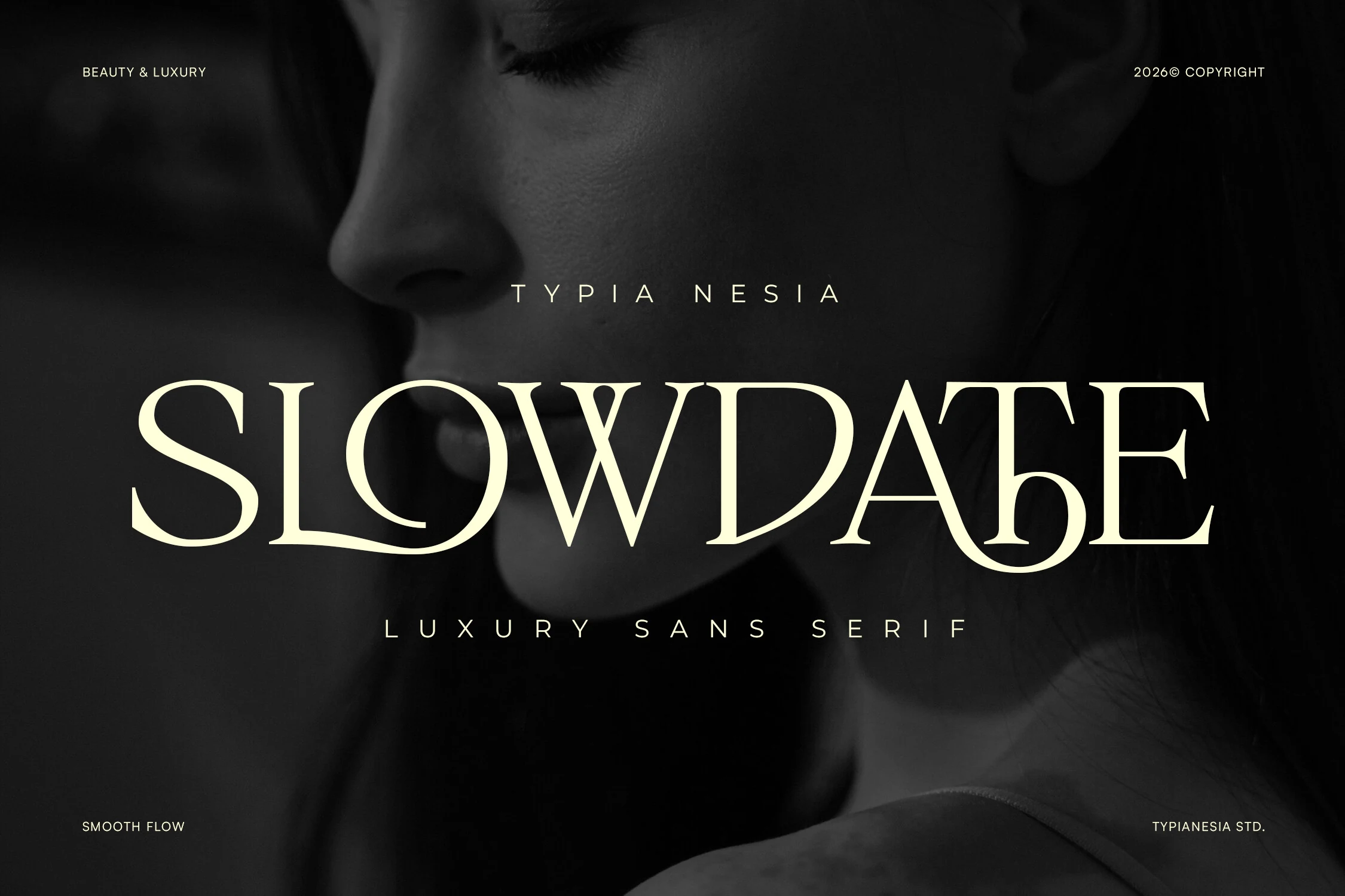
Best For: beauty branding, luxury designs, fashion branding, editorial designs
Slowdate Font has a wide luxury display shape, with stretched proportions, crisp contrast, and subtle flared endings that keep the letters sleek rather than ornate. The smooth ligature flow in the wordmark gives the type a slow, polished rhythm, especially across long horizontal headlines.
Use it for Aesthetic Fonts projects that need a restrained premium tone: beauty packaging, fashion campaigns, magazine titles, or high-end logo concepts. It works best with generous tracking and dark-to-light contrast, while smaller supporting text should stay simple to avoid competing with its refined letter shapes.
Molcer Font
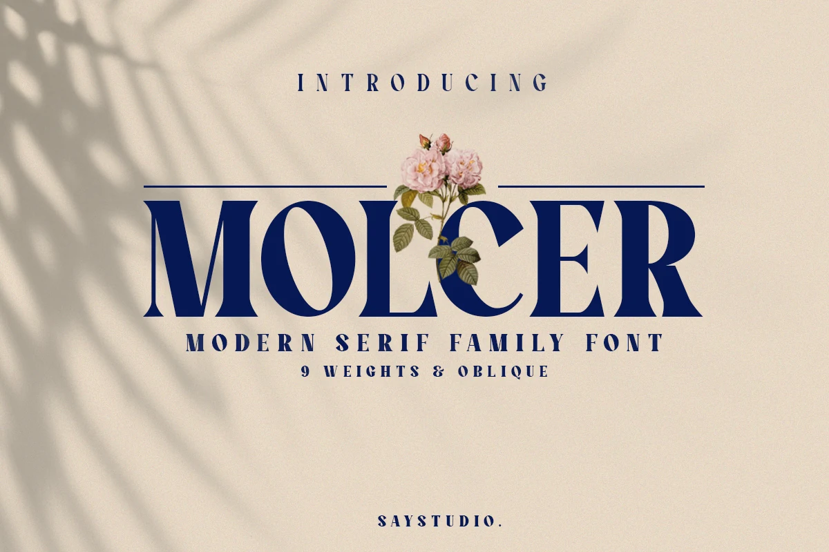
Best For: branding, editorial designs, packaging, logos
Molcer Font uses a strong modern serif build with high contrast, wide uppercase forms, soft terminals, and sharp triangular cuts that make its headlines feel formal but not stiff. The heavy display weight in the preview gives it a confident editorial tone with a subtle vintage-chic edge.
For Aesthetic Fonts projects, Molcer is useful when a layout needs hierarchy rather than decoration alone. Its nine-font family with upright and italic styles supports logo systems, packaging, and magazine layouts, while the bold cuts need clean spacing so the letter shapes stay crisp at display size.
Englan Font
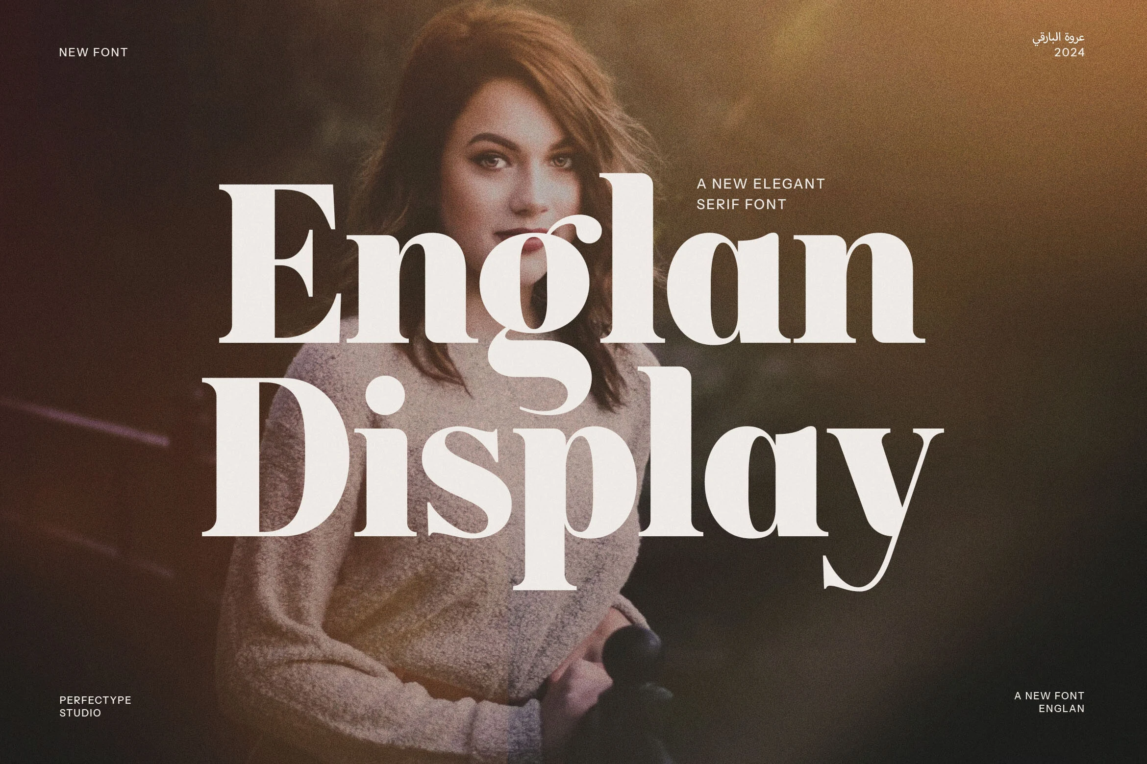
Best For: logos, branding, editorial designs, premium designs
Englan Font has a bold modern serif structure with heavy vertical stems, smooth rounded bowls, and crisp stylish serifs that give the letters a vintage display edge. The large curves and compact rhythm make it feel confident and polished, especially in title-sized settings.
For Aesthetic Fonts projects, Englan works best when the headline carries the identity: logo marks, brand campaigns, editorial covers, or web hero text. Keep spacing controlled rather than loose, and use a quieter secondary typeface so its thick strokes and refined curves remain the visual anchor.
Calteo Font
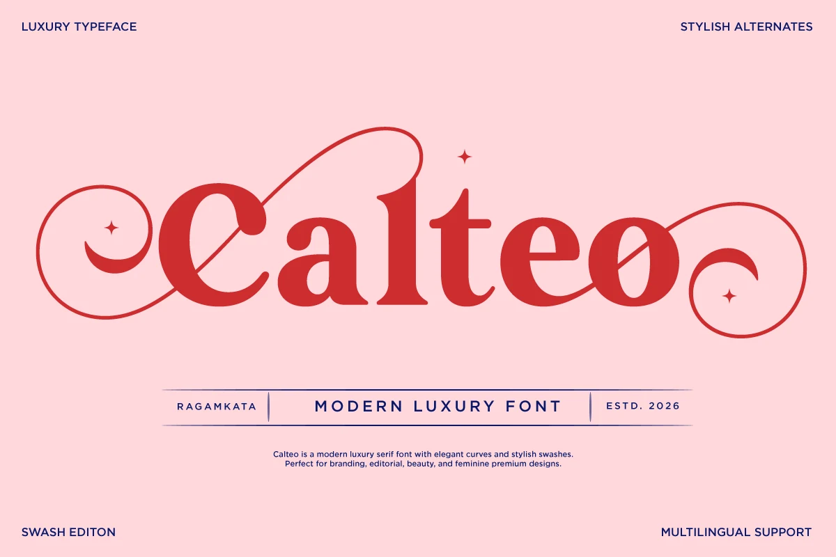
Best For: beauty branding, feminine designs, luxury designs, editorial designs
Calteo Font has a soft luxury serif shape with rounded bowls, thick vertical weight, and decorative swashes that stretch far beyond the core letters. The loops on the opening and closing characters give it a romantic editorial rhythm, while the solid red letterforms keep the design bold rather than delicate.
Use it in Aesthetic Fonts layouts where the wordmark needs to feel feminine, premium, and ornamental: beauty labels, boutique branding, fashion graphics, or invitation titles. Keep the phrase short and leave horizontal space for the swashes, because tight margins will cut off the part that gives Calteo its identity.
Twoswash Font
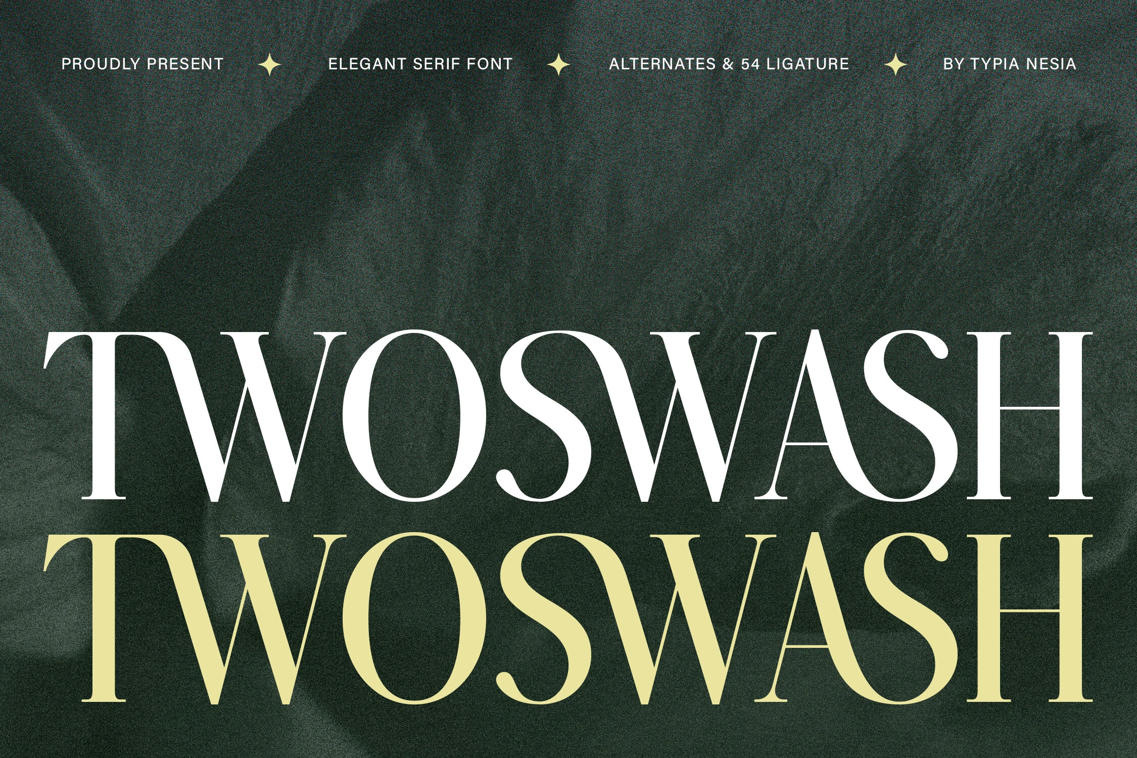
Best For: beauty branding, luxury designs, premium designs, editorial designs
Twoswash Font has a refined high-contrast serif build with tall uppercase forms, slim hairlines, and dramatic inner curves that pull the eye through each word. The sharp vertical stress gives it a royal display tone, while the softer swash shapes keep the overall rhythm smooth rather than severe.
For Aesthetic Fonts projects, it suits beauty labels, premium logos, fashion headers, and editorial title treatments where one word needs to carry the composition. Its ligature serif styling works best at large sizes with controlled spacing, so avoid dense copy and let the contrast define the hierarchy.
Acreme Bloom Font
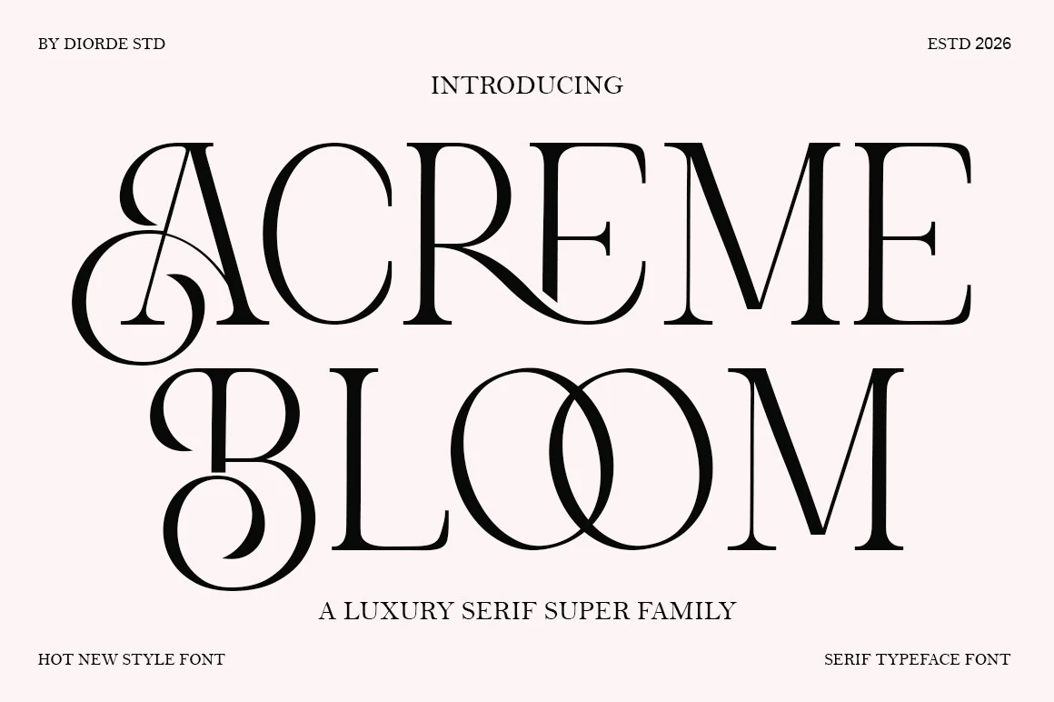
Best For: logos, branding, luxury designs, editorial designs
Acreme Bloom Font has a tall, refined serif structure with narrow hairlines, firm vertical stems, and ornate capitals that curve into decorative loops. The contrast between its clean straight strokes and flourished letterforms gives it a formal luxury tone with a slightly romantic edge.
For Aesthetic Fonts projects, it is strongest in wordmarks, editorial titles, premium packaging, and boutique branding where one or two words can carry the layout. Give the swash capitals extra side space and avoid tight line stacking, because the overlapping curves need room to stay clear.
Eryndor Font
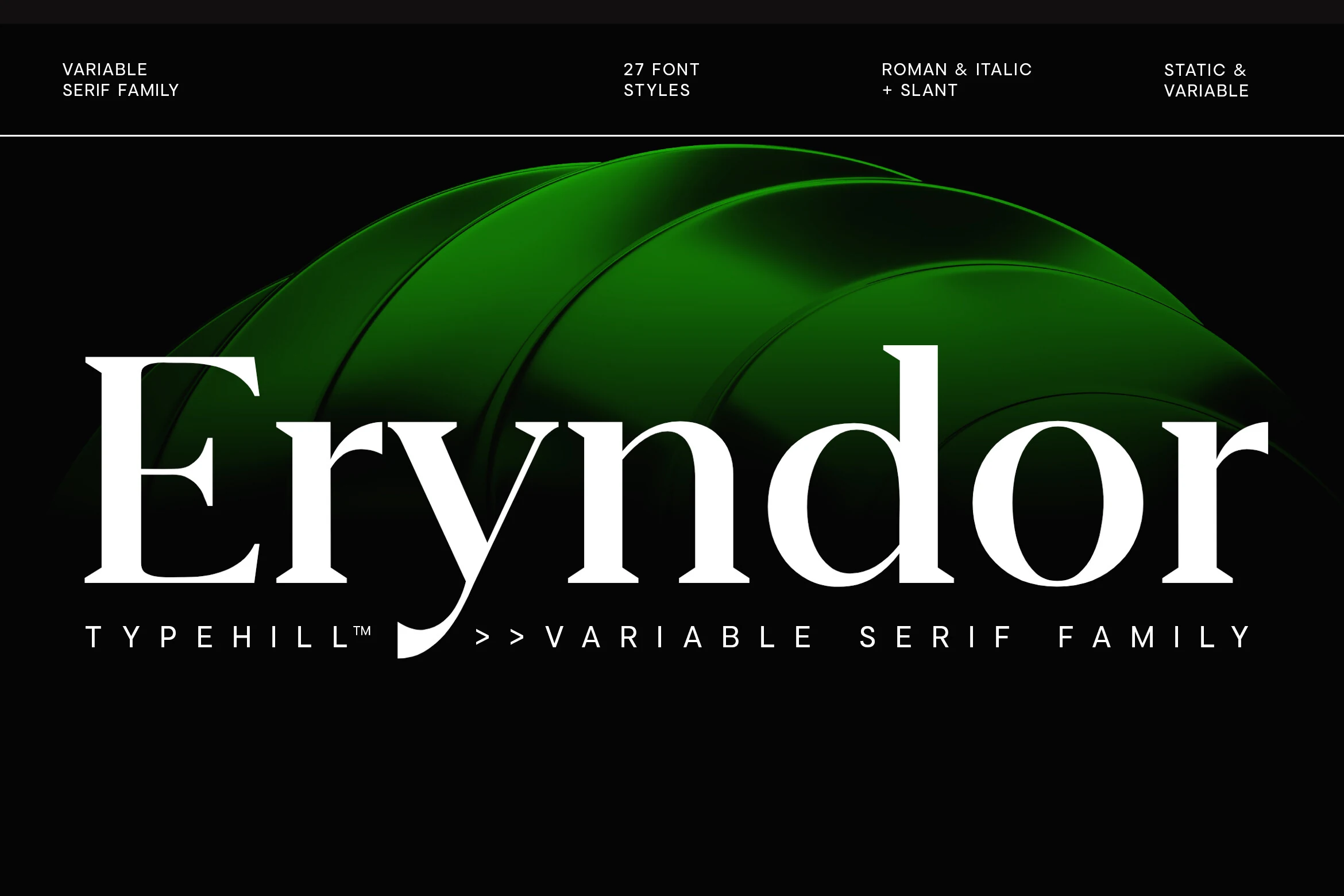
Best For: luxury designs, editorial designs, fashion branding, packaging
Eryndor Font has a modern serif profile with strong vertical stems, sharp contrast, and clean wedge-like serifs that give the letters a controlled premium tone. The smooth bowls and distinctive descending “y” add personality without making the design feel decorative or fragile.
For Aesthetic Fonts projects, Eryndor fits luxury branding, fashion campaigns, editorial layouts, and premium packaging where the typography needs authority more than ornament. Its variable serif structure makes it useful for building hierarchy, but the spacing should stay measured so the bold curves keep their polished rhythm.
Marone Font
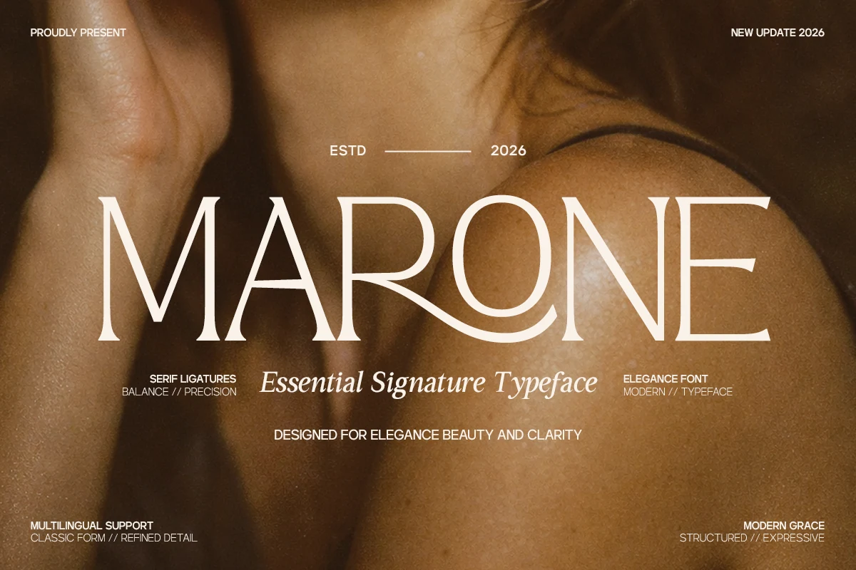
Best For: beauty branding, luxury designs, premium designs, editorial designs
Marone Font has a refined serif shape with tall narrow capitals, balanced proportions, and clean contrast between thin hairlines and stronger vertical strokes. The curved leg on the “R” and the smooth round forms give the wordmark a graceful rhythm without adding heavy decoration.
For Aesthetic Fonts projects, it fits beauty branding, premium packaging, editorial headers, and polished logo concepts that need clarity with a soft luxury tone. Use it at display size with calm spacing and strong contrast, since its thin details depend on clean composition to stay precise.
Glypster Font
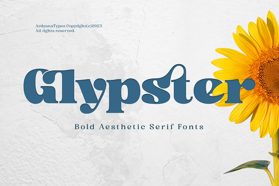
Best For: logos, posters, business cards, retro designs
Glypster Font has a bold retro serif build with chunky stems, rounded counters, and decorative cutouts that make the letters feel playful but still structured. The soft slab-like weight gives it strong poster presence, while the curled detail in the “s” adds a more ornamental rhythm.
Use it in Aesthetic Fonts layouts where the type needs to be readable, memorable, and slightly vintage: logos, posters, business cards, or cheerful brand graphics. Its multilingual support helps keep the same look across regional designs, but tight spacing should be avoided so the thick shapes do not merge.
Retro Vintage Font
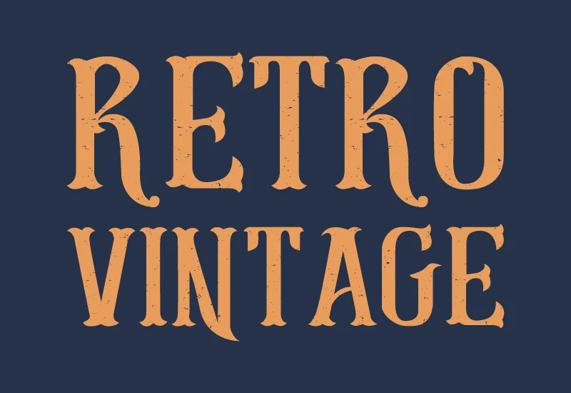
Best For: logos, branding, retro designs, vintage designs
Retro Vintage Font has a bold Western serif shape with chunky vertical stems, split decorative serifs, and a rough distressed texture that gives the letters an aged printed feel. The tall uppercase forms are clear and forceful, while the worn surface keeps the style from looking too polished.
Use it in Aesthetic Fonts layouts that need a rugged nostalgic voice: vintage logos, badge-style branding, poster titles, or themed web headers. It works best in short words with strong contrast, and the texture needs enough size to read as intentional rather than accidental noise.
Rutina Grace Font
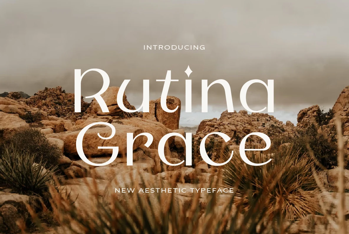
Best For: logos, website headers, social media graphics, modern designs
Rutina Grace Font has a calm modern display shape with thin rounded strokes, open counters, and soft curves that create an airy rhythm across the words. The letterforms feel light and spacious, with just enough character in the “R” and “G” to keep the name from looking plain.
Use it in Aesthetic Fonts projects where the layout needs quiet polish rather than heavy ornament: logos, website hero text, banners, or digital artwork. It benefits from wide spacing and strong contrast against the background, because the fine strokes can lose clarity if placed over busy textures.
Sandria Font
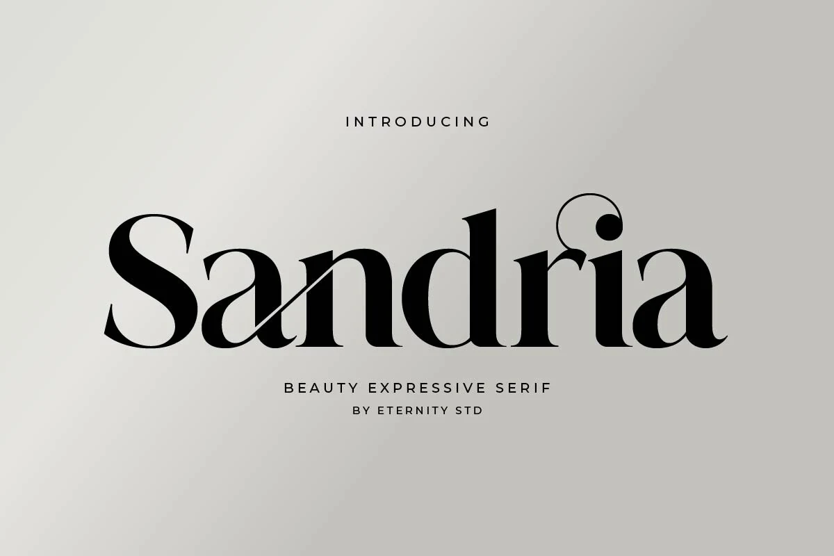
Best For: logos, posters, website headers, beauty branding
Sandria Font has a bold expressive serif shape with high contrast, deep curves, and sharp terminals that give each word a polished beauty-editorial tone. The curled alternate on the final stroke adds movement, while the clean vertical stems keep the design from becoming overly ornamental.
Its Aesthetic Fonts strength is in short, controlled display settings: refined logos, poster titles, and website hero text. The ligatures help letters connect more fluidly in wordmarks, but the spacing still needs room around the curves so the dramatic details read as intentional rather than crowded.
Erendela Font
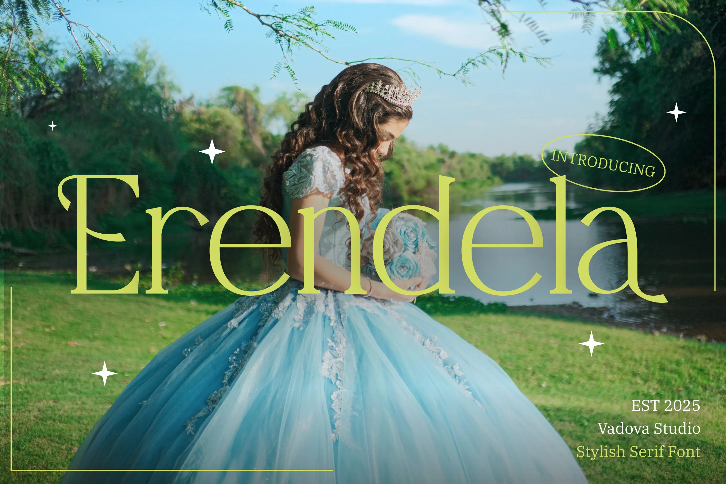
Best For: logos, wedding designs, luxury designs, editorial designs
Erendela is a high-contrast serif with long slender stems, sweeping curves, and sharp refined terminals. The wide lowercase shapes give the wordmark a calm bridal rhythm, while the dramatic capital forms and soft round bowls keep it closer to fairytale editorial than a strict classic serif.
Use it where Aesthetic Fonts need a polished headline voice: boutique logos, wedding titles, packaging names, or magazine-style headers. Its thin hairlines need enough scale and strong background contrast, and slightly loose tracking helps the elegant proportions stay readable without flattening the romantic tone.
Ausle Font
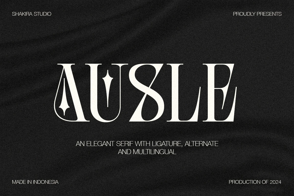
Best For: logos, luxury designs, editorial designs, beauty branding
Ausle is a sculptural luxury serif built on heavy verticals, razor-thin hairlines, and sharp wedge serifs. The preview shows exaggerated alternates in the A, U, and S, with star-like cuts and a looping S that gives the wordmark a dark editorial tone rather than a soft romantic one.
Use it where Aesthetic Fonts need a high-fashion signature: logo marks, cosmetic labels, album-style titles, or premium packaging. Its ligatures and alternates help create a custom-looking title, but the decorative shapes work best in short words with generous spacing and strong contrast.
Lenkiro Font
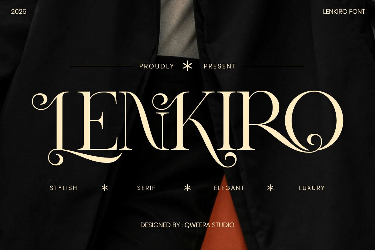
Best For: logos, wedding designs, packaging, luxury designs
Lenkiro is an ornate luxury serif with tall condensed letterforms, high-contrast strokes, and curled swashes that turn the ends of L, E, K, and O into decorative hooks. The rhythm feels formal and fashion-led, with smooth curves softening the sharp serif structure.
Use it when Aesthetic Fonts need a dramatic title rather than neutral text: logos, wedding invitation names, magazine covers, or premium packaging. The ligatures help the letters connect more fluidly, but the swashes need short wording, wide spacing, and strong contrast so the ornament stays intentional.
The Choed Font
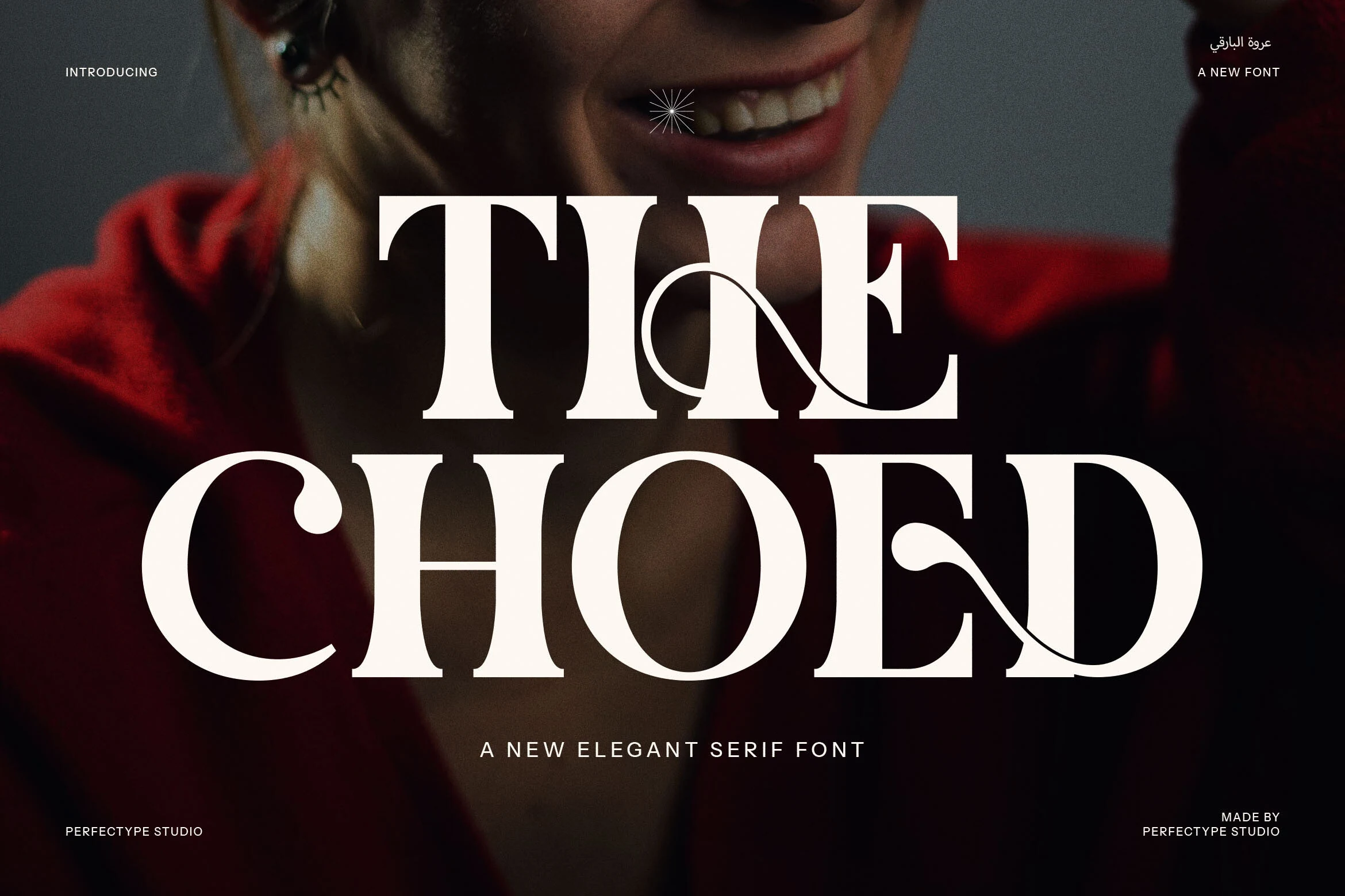
Best For: luxury designs, editorial designs, fashion branding, magazine covers
The Choed Font uses heavy, high-contrast serif capitals with sharp bracketed feet, deep curves, and decorative ligature strokes that cut through the wordmark like fine ribbon lines. Its scale feels cinematic rather than quiet, which makes it a strong pick for Aesthetic Fonts with a darker luxury or editorial mood.
The connected letterforms give titles a custom-logo feel, but they also need controlled spacing so the swashes do not crowd nearby characters. Keep it for short names, mastheads, covers, or campaign headlines where the wide proportions and dramatic ligatures can set the hierarchy on their own.
Begia Font
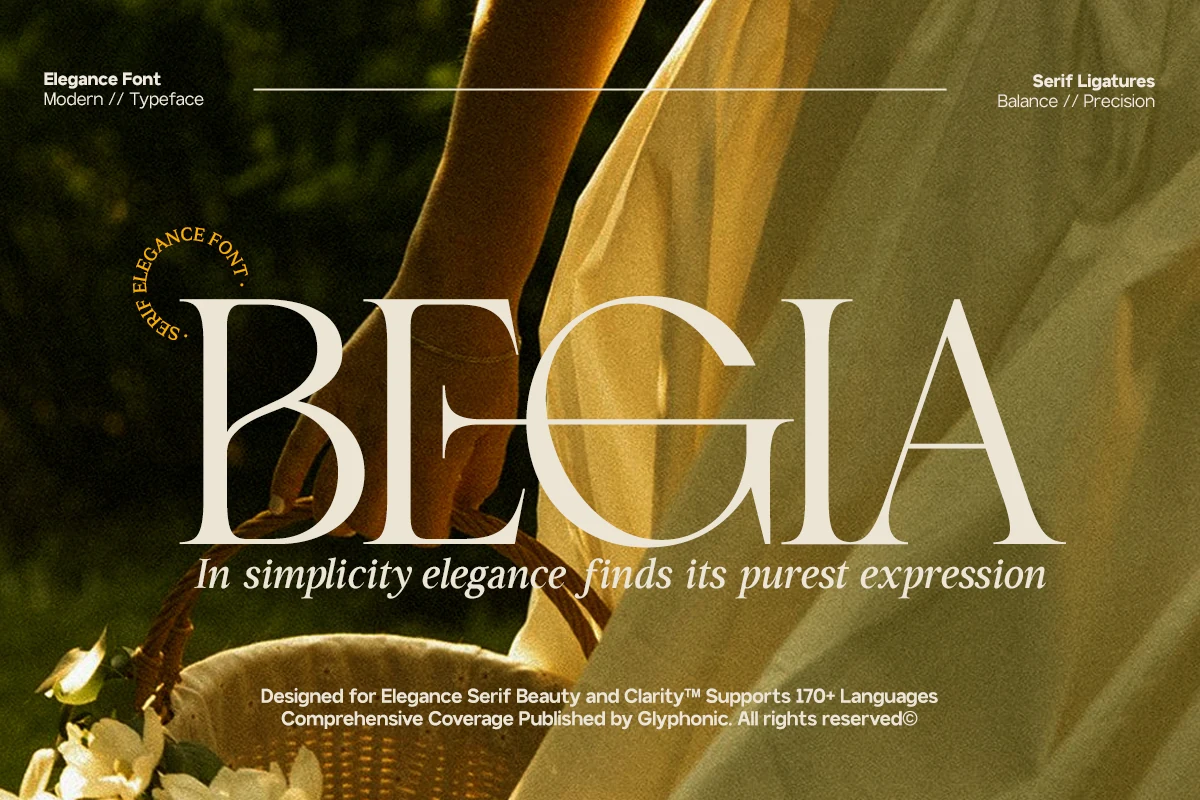
Best For: luxury designs, fashion branding, beauty branding, editorial designs
Begia Font has a polished high-contrast serif shape: broad vertical stems, fine hairlines, curved entry strokes, and a long crossbar that gives the uppercase setting a controlled editorial rhythm. It fits Aesthetic Fonts with a quiet luxury tone rather than a decorative or playful one.
The wide proportions and delicate joins work best when the wordmark has enough horizontal space, especially in fashion, beauty, and premium identity layouts. Use it for short headlines or logo-style typography where contrast, spacing, and clean negative space can carry the hierarchy.
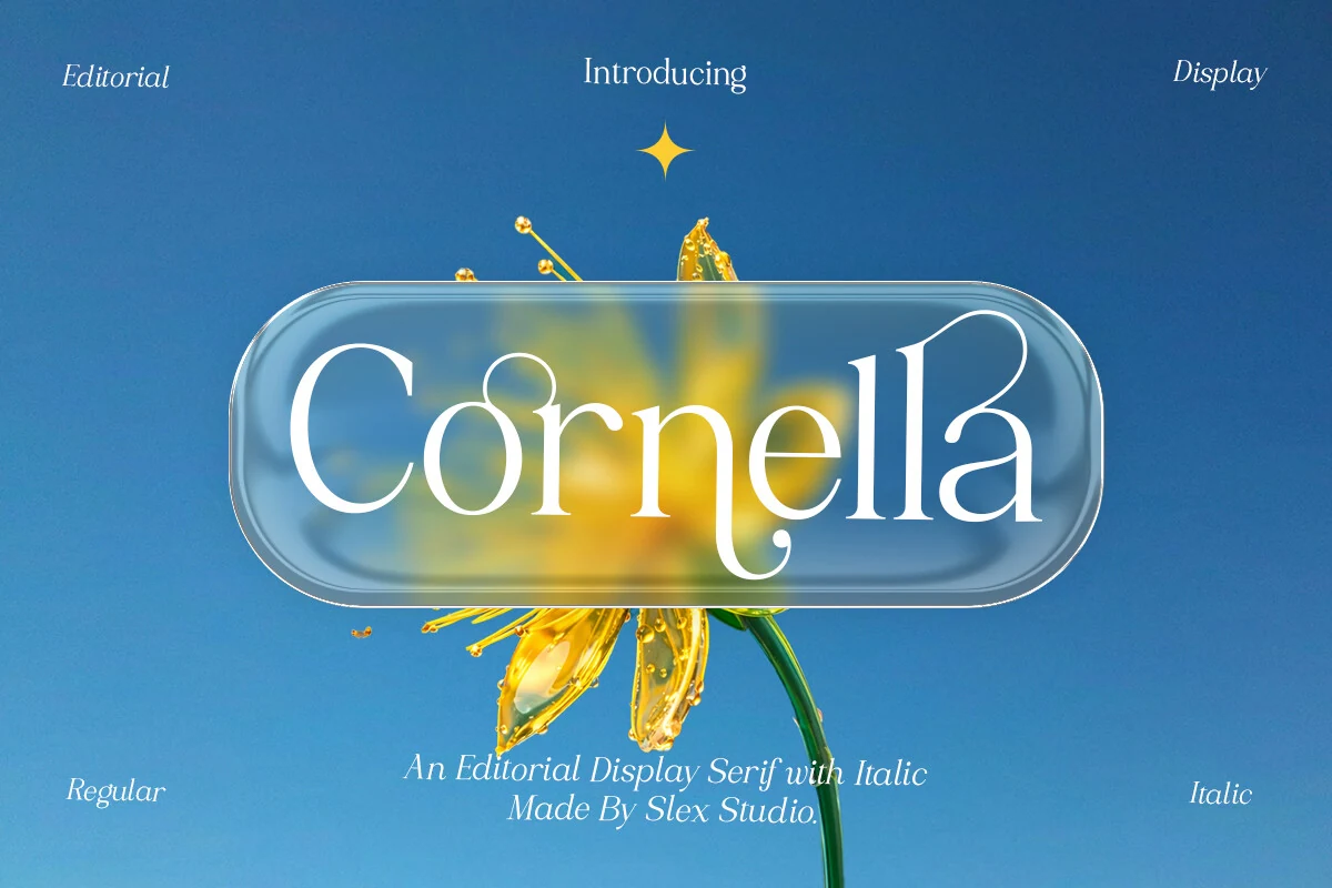
Best For: editorial designs, magazine covers, luxury designs, display text
Cornella brings a polished editorial tone through tall serif shapes, refined stroke contrast, and graceful curves that stay crisp without becoming ornamental. It fits naturally into an Aesthetic Fonts roundup because the letterforms feel composed and fashion-facing, with expressive italic styling adding movement when a layout needs a softer secondary voice.
Use it where the title hierarchy matters: magazine mastheads, beauty branding, premium logos, or display headers with enough space for its thin details to read cleanly. The narrow hairlines and curled terminals benefit from measured tracking and strong background contrast, especially in short names or headline-length typography.
Bezoria – Elegant Serif Font
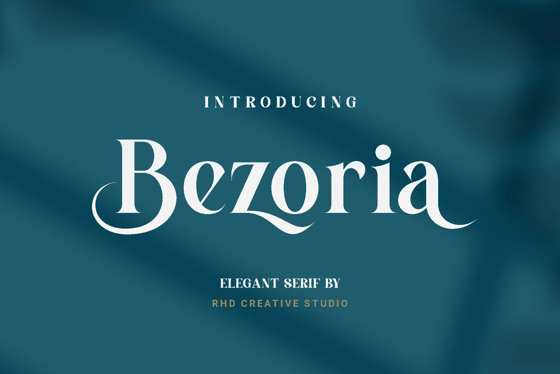
Best For: logos, wedding designs, editorial designs, luxury designs
Bezoria has the polished tension of a luxury display serif: tall vertical stems, sharp bracketed serifs, and sweeping entry and exit strokes that make the word shape feel custom. The contrast is strong without becoming brittle, while the extended curves on letters like B, z, and a give it a more dramatic place among Aesthetic Fonts.
Use it where the typography needs to carry the composition rather than sit quietly in the background. Bezoria works best with generous tracking around small supporting text and tighter spacing in the main wordmark, so its swashes feel intentional instead of loose or overextended.
Vagist Font
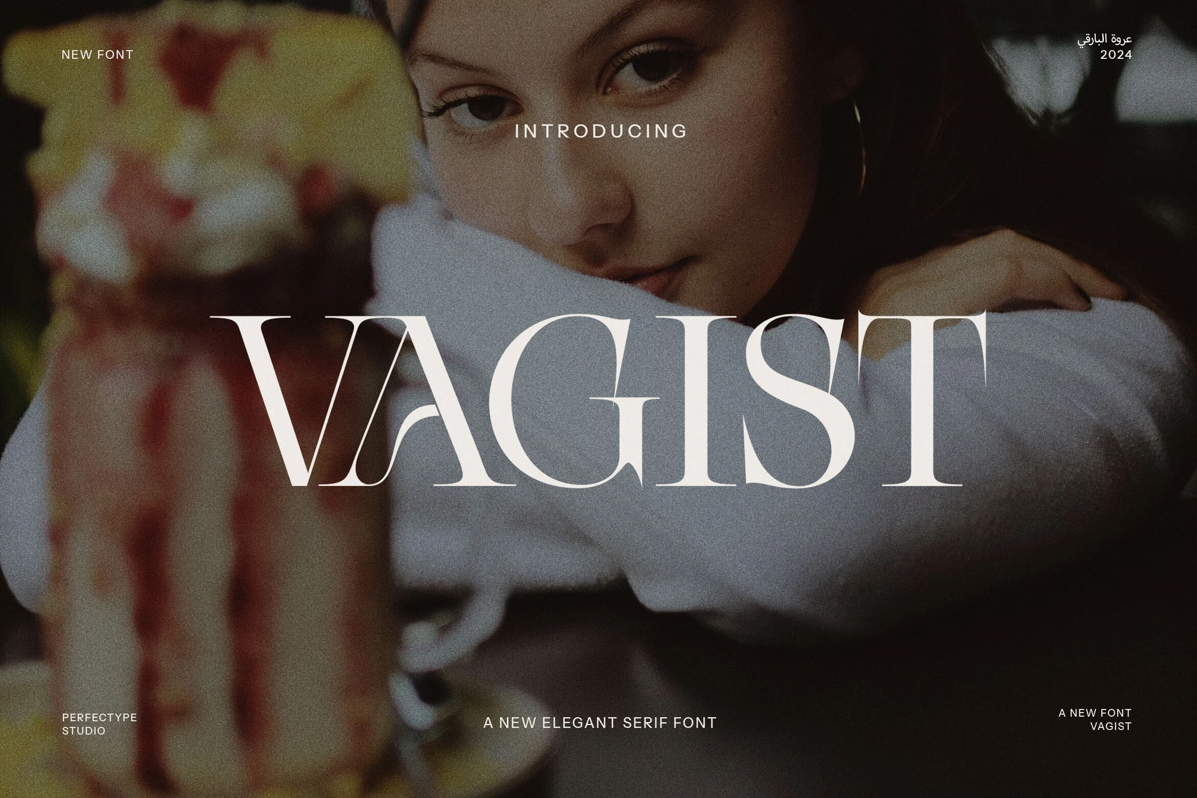
Best For: logos, fashion branding, editorial designs, luxury designs
Vagist uses a wide, cinematic serif structure with sharp hairline details, tall capitals, and smooth curves that feel more editorial than traditional. The dramatic contrast gives each letter a clean silhouette, while the narrow internal spaces add a controlled vintage edge to Aesthetic Fonts.
It is strongest in short titles, logo marks, and fashion-led headers where scale can show the thin strokes clearly. Keep the surrounding typography quiet and adjust letter spacing carefully: too loose weakens the word shape, while moderate tracking keeps the refined serifs crisp.
Intenso Font
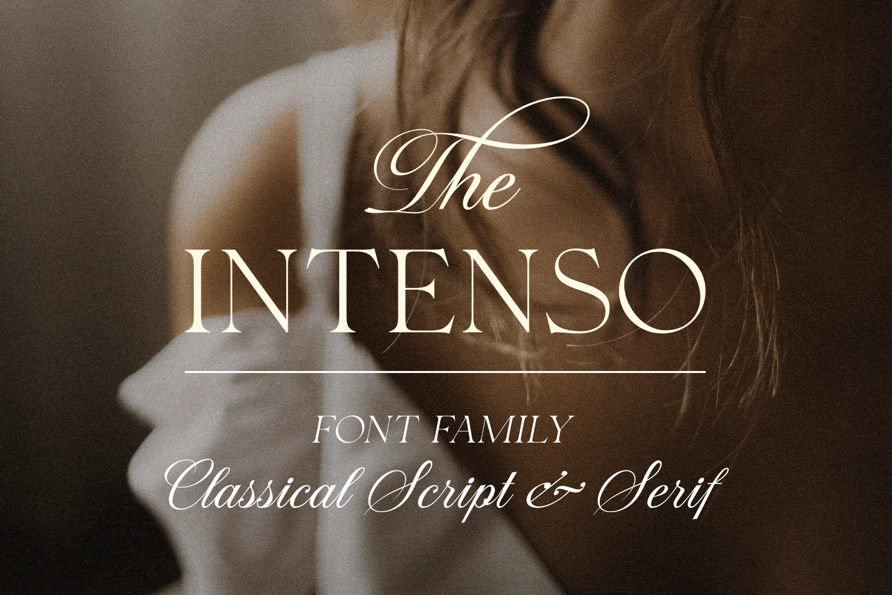
Best For: logos, wedding designs, luxury designs, editorial designs
Intenso Font pairs a dramatic high-contrast serif with classical script and italic styling, giving the family a formal, editorial rhythm. The serif capitals feel tall and composed, while the script adds long hairline loops and sweeping entry strokes that work best when used as an accent rather than dense copy.
For Aesthetic Fonts with a polished mood, Intenso is strongest in layered title systems: let the serif carry the main word, then use the script for a smaller phrase or signature detail. Keep spacing generous around the ornate strokes so the flourishes read cleanly instead of colliding with nearby text.
Melona Woman Font
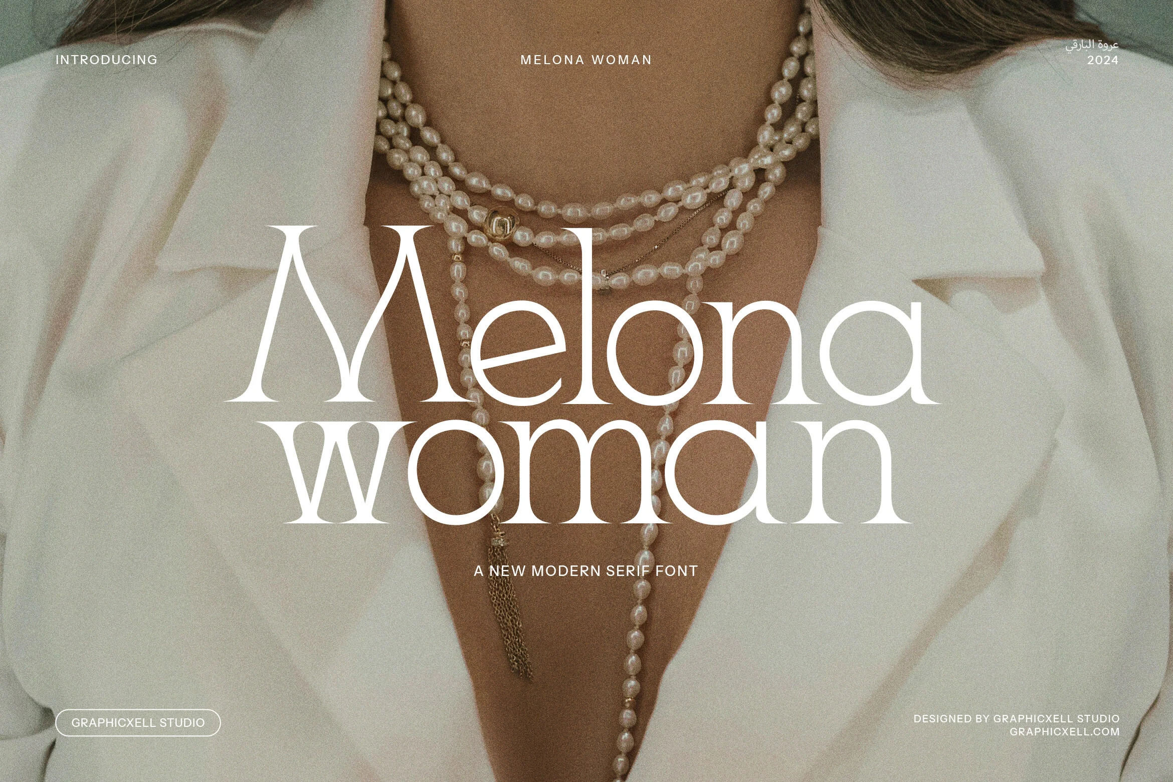
Best For: logos, fashion branding, beauty branding, editorial designs
Melona Woman Font has a polished modern serif voice, with a dramatic flared M, narrow hairlines, and soft rounded bowls that keep the wordmark smooth rather than severe. The contrast feels vintage-luxury, but the open lowercase rhythm gives it enough clarity for contemporary brand layouts.
Use it where Aesthetic Fonts need a refined fashion tone without turning ornate: logos, magazine titles, beauty headers, or packaging names. Its thin strokes need contrast against calm backgrounds, while tighter line spacing can make stacked titles feel intentional and editorial.
Quishe Font
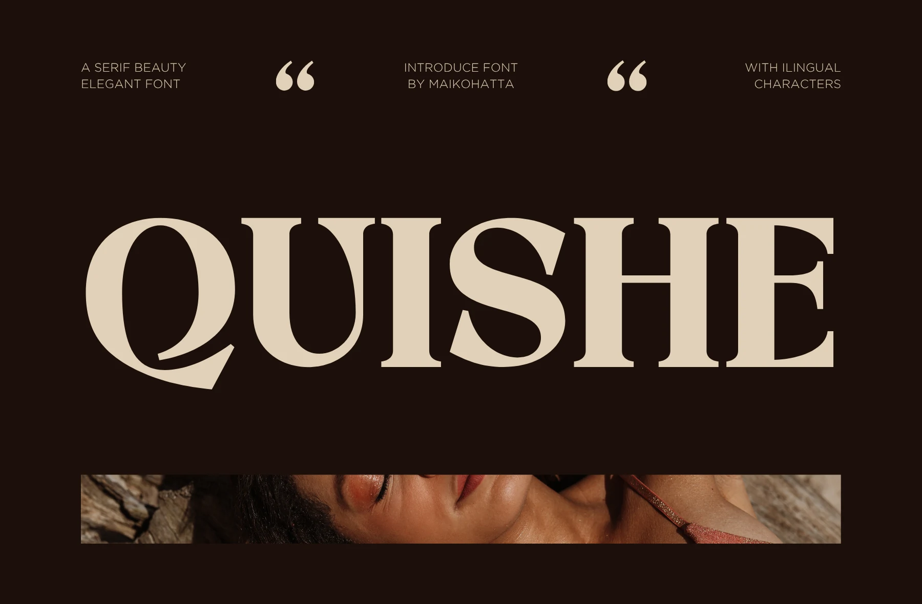
Best For: logos, fashion branding, luxury designs, editorial designs
Quishe Font is a bold modern serif with heavy vertical weight, sharp bracketed serifs, and high-contrast curves that give each capital a controlled luxury feel. The sweeping Q tail and angled movement through the S make it more expressive than a standard editorial serif.
For Aesthetic Fonts with a premium magazine tone, Quishe works best in short words, logos, and large title settings where its thick stems can dominate the composition. Keep generous letter spacing and strong background contrast so the curved details stay crisp instead of closing up.
Monigk Ones Font
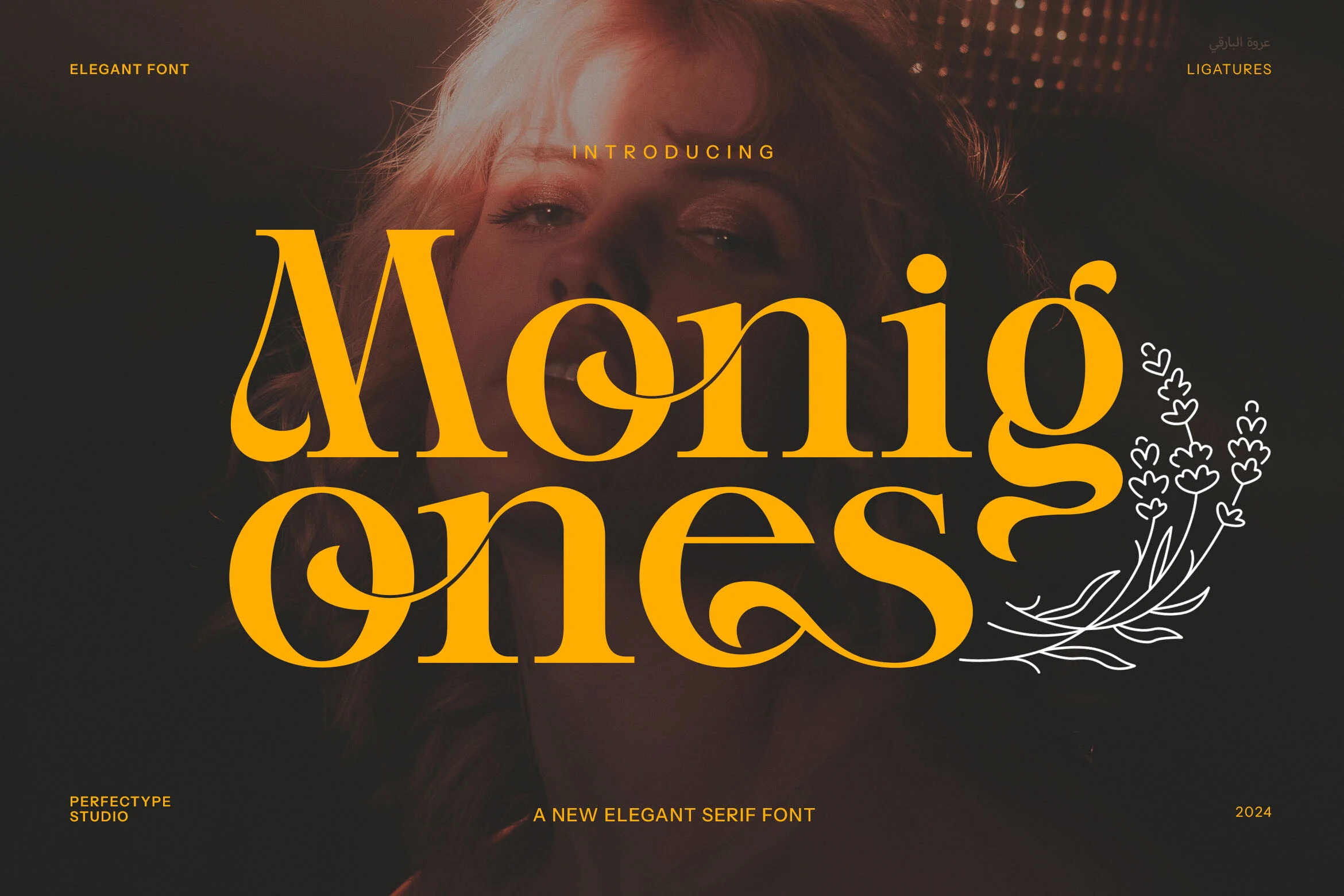
Best For: logos, luxury designs, vintage designs, editorial designs
Monigk Ones Font leans into vintage glamour with thick serif forms, soft bulb-like curves, and sweeping terminals that pull the eye across each word. The rounded counters and high-contrast strokes keep it polished, while the dramatic lowercase shapes add a more nostalgic editorial rhythm.
In Aesthetic Fonts roundups, this is the kind of typeface to reserve for logos, title lines, and premium headers rather than long copy. Let the larger curves carry the hierarchy, and avoid cramped spacing so the curled endings and heavy serifs do not compete with each other.
Regal Drownfall Font
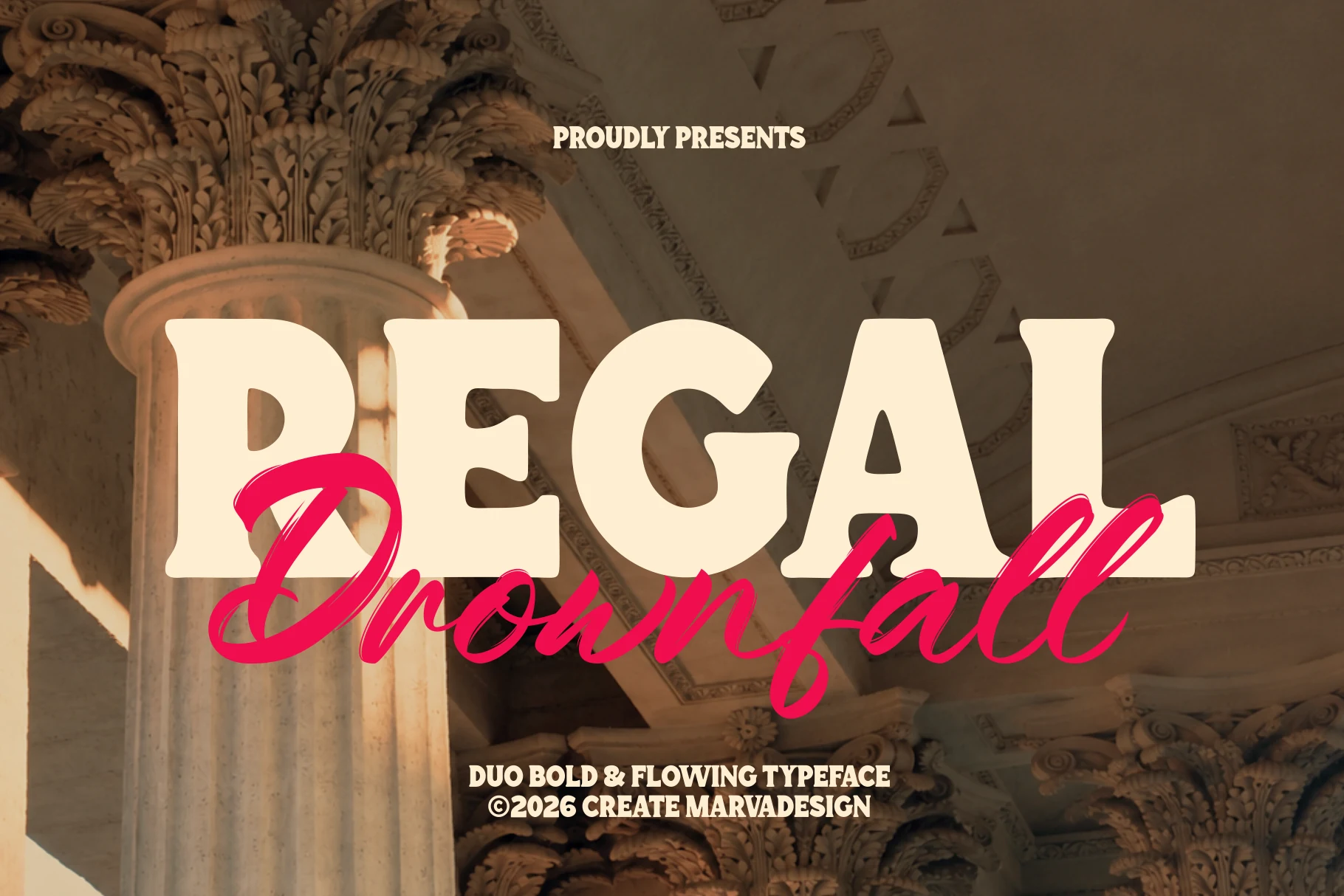
Best For: logos, posters, packaging, branding
Regal Drownfall Font pairs a chunky retro serif with a fast handwritten script, giving the preview a clear headline-and-signature hierarchy. The serif side has broad cream strokes, softened corners, and compact counters, while the script cuts across it with long loops and a sharper, more expressive rhythm.
For Aesthetic Fonts with a cinematic branding angle, this duo works best when the serif carries the main message and the script acts as a secondary accent. Keep strong color contrast between the two styles and avoid tight vertical stacking, because the script’s descenders need space to stay readable.
Daphinci Font
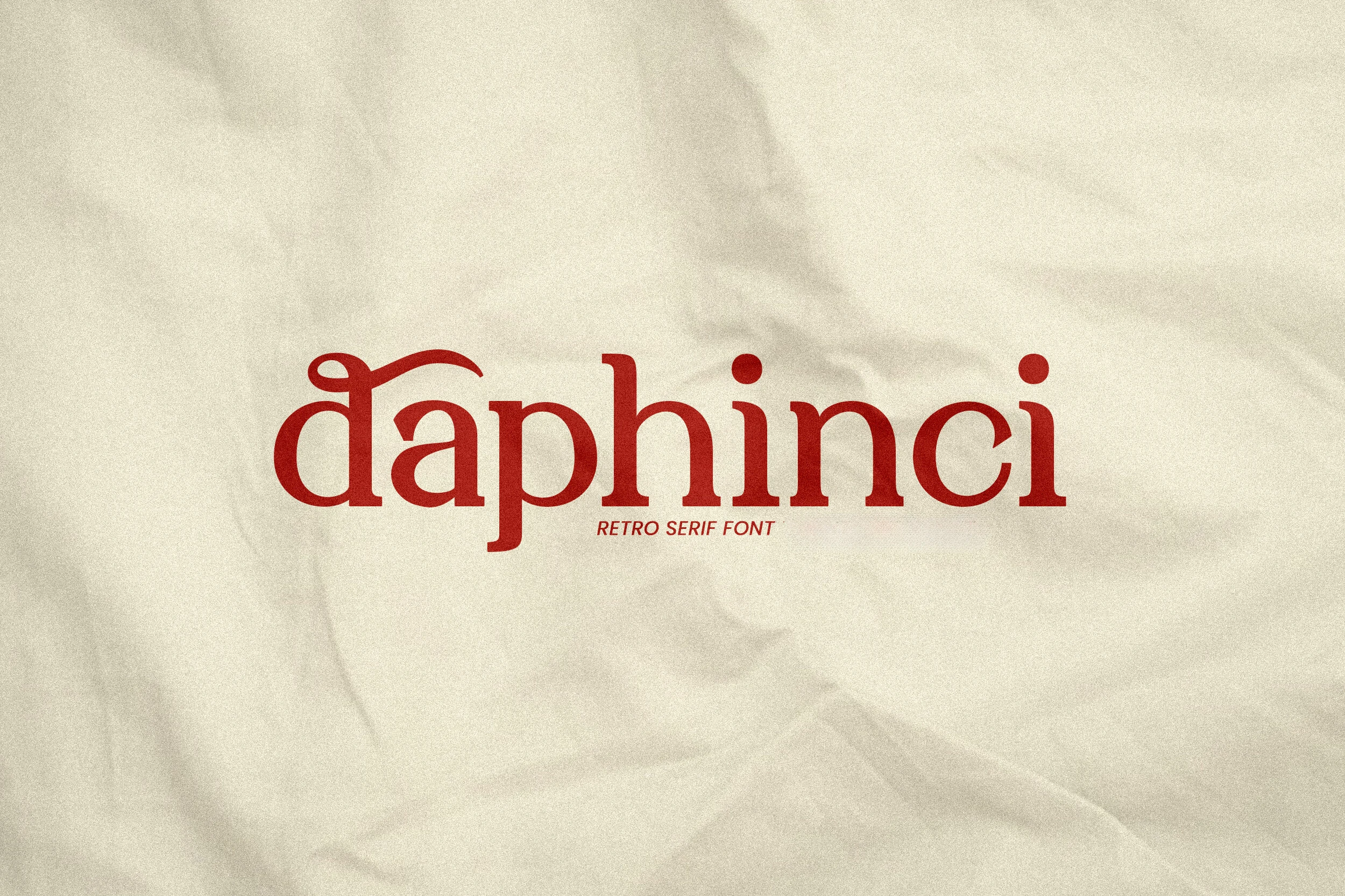
Best For: logos, posters, vintage designs, branding
Daphinci Font has a compact retro serif build, with rounded bowls, sturdy stems, and a distinctive looping detail on the opening letter. Its red preview shows the typeface’s nostalgic side clearly: decorative enough to feel styled, but still controlled in wordmark settings.
Use it when Aesthetic Fonts need a classic editorial mood with more personality than a plain serif. The curves work well in short titles, logos, and poster headers; keep spacing moderate so the vintage details stay connected without making the lowercase rhythm feel crowded.
Renger Font
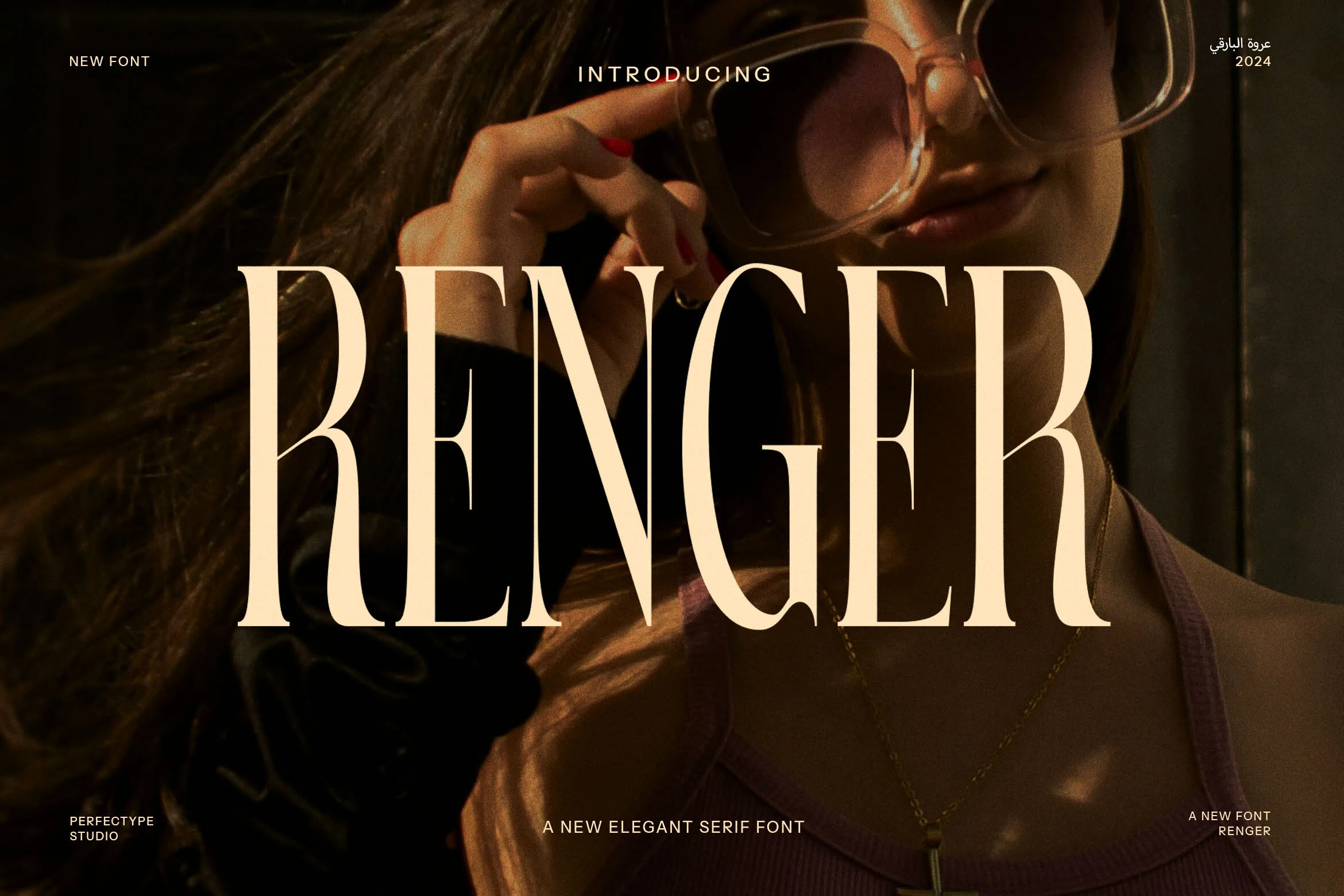
Best For: logos, fashion branding, luxury designs, editorial designs
Renger Font uses a tall, high-contrast serif structure with narrow proportions, sharp vertical emphasis, and elegant curved cuts through the letterforms. The large capitals feel cinematic and fashion-led, with enough spacing inside the shapes to keep the wordmark clean at display scale.
Use it when Aesthetic Fonts need a refined luxury mood without extra ornament. Renger works best in oversized logos, editorial headers, and premium brand titles; keep the background contrast strong and avoid squeezing the tracking, because its thin strokes and long stems rely on clear breathing room.
Lunessia Font
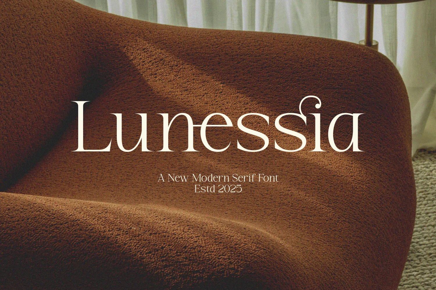
Best For: logos, branding, editorial designs, luxury designs
Lunessia Font is a calm modern serif with slim hairlines, soft contrast, and rounded lowercase shapes that give the wordmark a relaxed editorial finish. The tall initial L adds structure, while the small curled detail near the ending keeps the design from feeling too plain.
Use it when Aesthetic Fonts need a quiet luxury tone for logos, interiors branding, lifestyle headers, or refined packaging. Its thin strokes benefit from warm contrast and uncluttered layouts; keep spacing open enough for the delicate curves to read cleanly at display size.
Sugar Valley Font
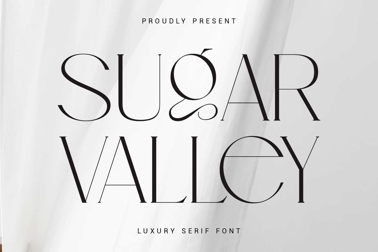
Best For: logos, fashion branding, luxury designs, editorial designs
Sugar Valley Font has a refined luxury serif structure, with very thin hairlines, tall proportions, and sharp contrast between its broad curves and narrow stems. The distinctive ligature details add a custom editorial feel, especially in large wordmarks where the curved G and extended crossbars can be seen clearly.
Use it when Aesthetic Fonts need a high-fashion tone with minimal decoration. It suits logos, magazine-style titles, beauty branding, and premium packaging; give the letters generous spacing and strong contrast so the fine strokes stay crisp instead of disappearing into the layout.
Aesthetic Fonts continue to shape modern branding and editorial design by combining elegance, personality, and strong visual hierarchy. Each typeface in this collection offers a distinct style, ranging from clean minimalist serifs to dramatic decorative display fonts, making them suitable for a wide variety of creative projects.
Choosing the right font is not only about appearance — it is also about readability, spacing, composition, and how the typography supports the overall identity of a design. When paired thoughtfully with clean layouts and balanced supporting text, these Aesthetic Fonts can transform logos, packaging, posters, fashion branding, and social media graphics into more refined and professional visual experiences.
Whether you prefer modern editorial typography, romantic serif styles, or bold artistic lettering, the fonts featured in this collection provide strong inspiration for creating stylish and memorable designs that feel both contemporary and timeless.