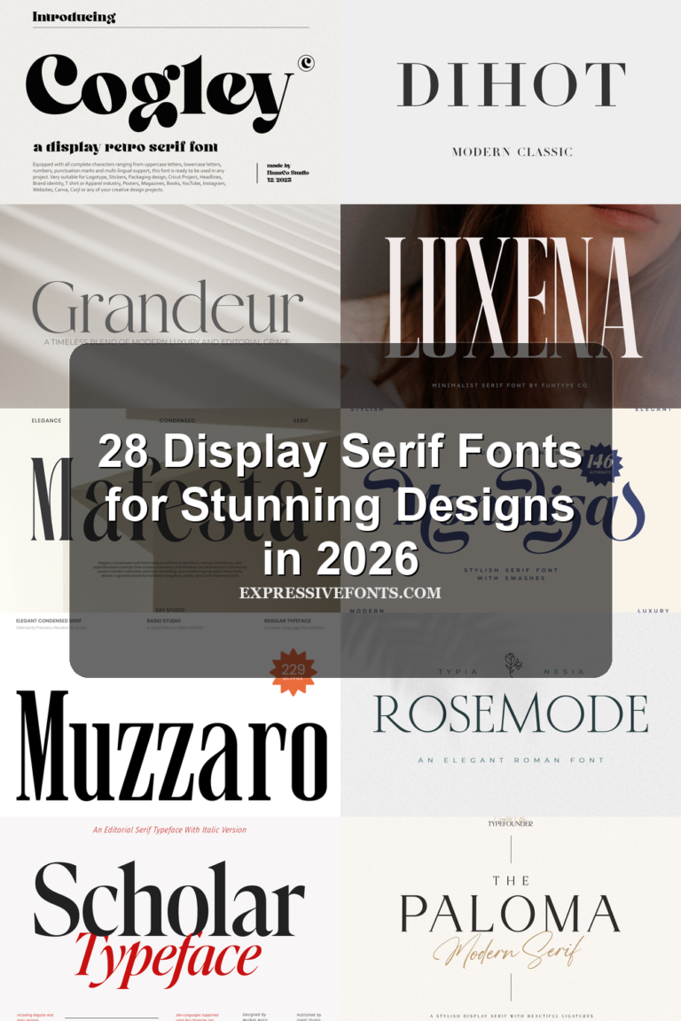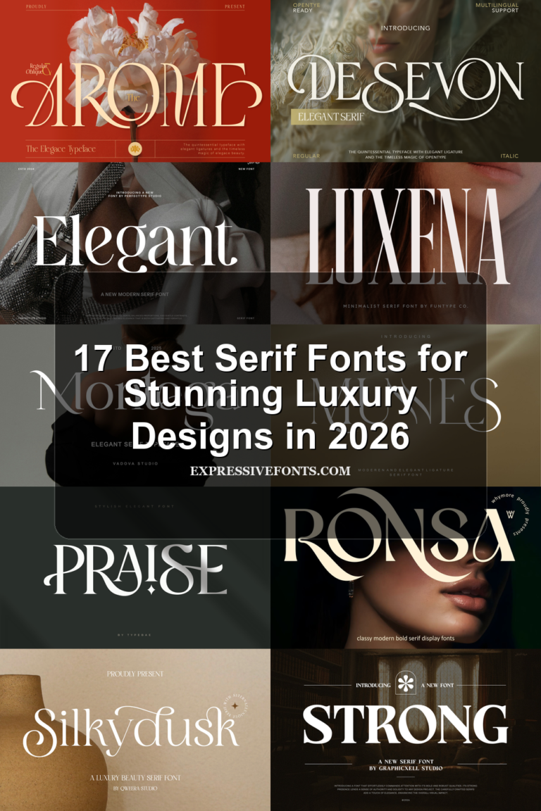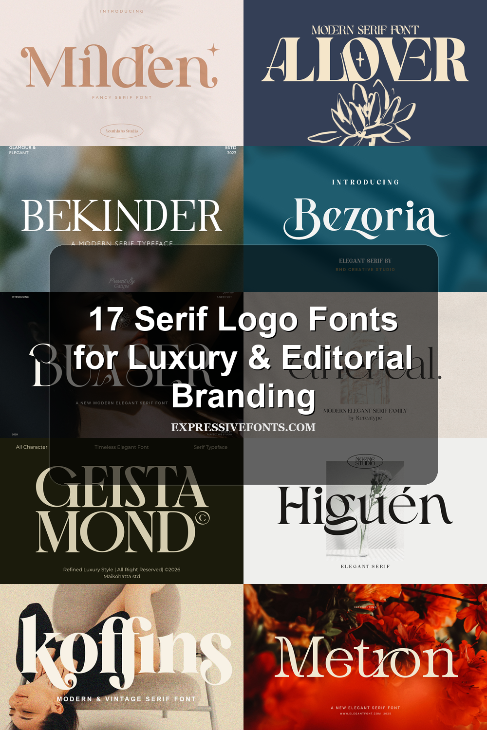
17 Serif Logo Fonts for Luxury & Editorial Branding
Serif Logo Fonts are built for designers who need logo typography with authority, contrast, and a refined visual tone. This collection focuses on serif styles for fashion branding, luxury packaging, editorial marks, wedding identities, beauty logos, posters, and polished display layouts.
Modern Editorial Serif Logo Fonts
These polished, high-contrast serif fonts suit fashion mastheads, refined logo marks, packaging, and editorial layouts that need clean structure with premium restraint.
Geista Mond Font
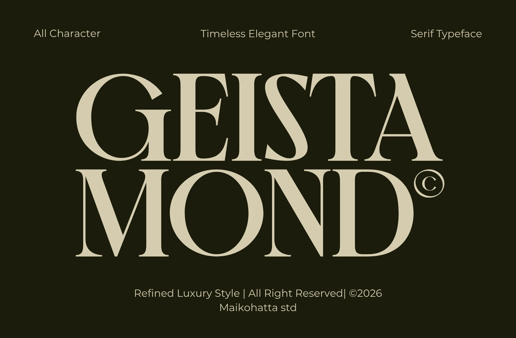
Best For: logos, fashion branding, editorial designs, luxury designs
Geista Mond has the slow, controlled rhythm of a fashion masthead: tall caps, sharp hairline transitions, heavy vertical stems, and wide curves that make the word shape feel polished rather than ornate. Its contrast gives Serif Logo Fonts a premium editorial tone without relying on decorative swashes.
Use it where the title is the hierarchy. The thin strokes need firm contrast and careful tracking; a little extra spacing keeps the G, S, and A from crowding while preserving the compact luxury feel for logos, labels, and cover-style layouts.
Retcaro Font
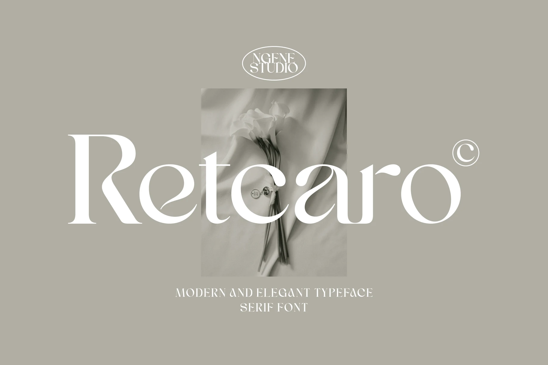
Best For: logos, branding, editorial designs, luxury designs
Retcaro carries a smooth modern serif style with strong contrast, rounded bowls, and thin tapered details that keep the large wordmark feeling refined. The broad R and curved terminals give Serif Logo Fonts a softer luxury tone without making the letters overly decorative.
Keep it in short display settings where the thin strokes and open curves can stay visible. Slightly loose tracking helps the elegant forms breathe, while multilingual support makes it more practical for brand systems, magazine layouts, and identity work that needs broader language coverage.
Theqor Font
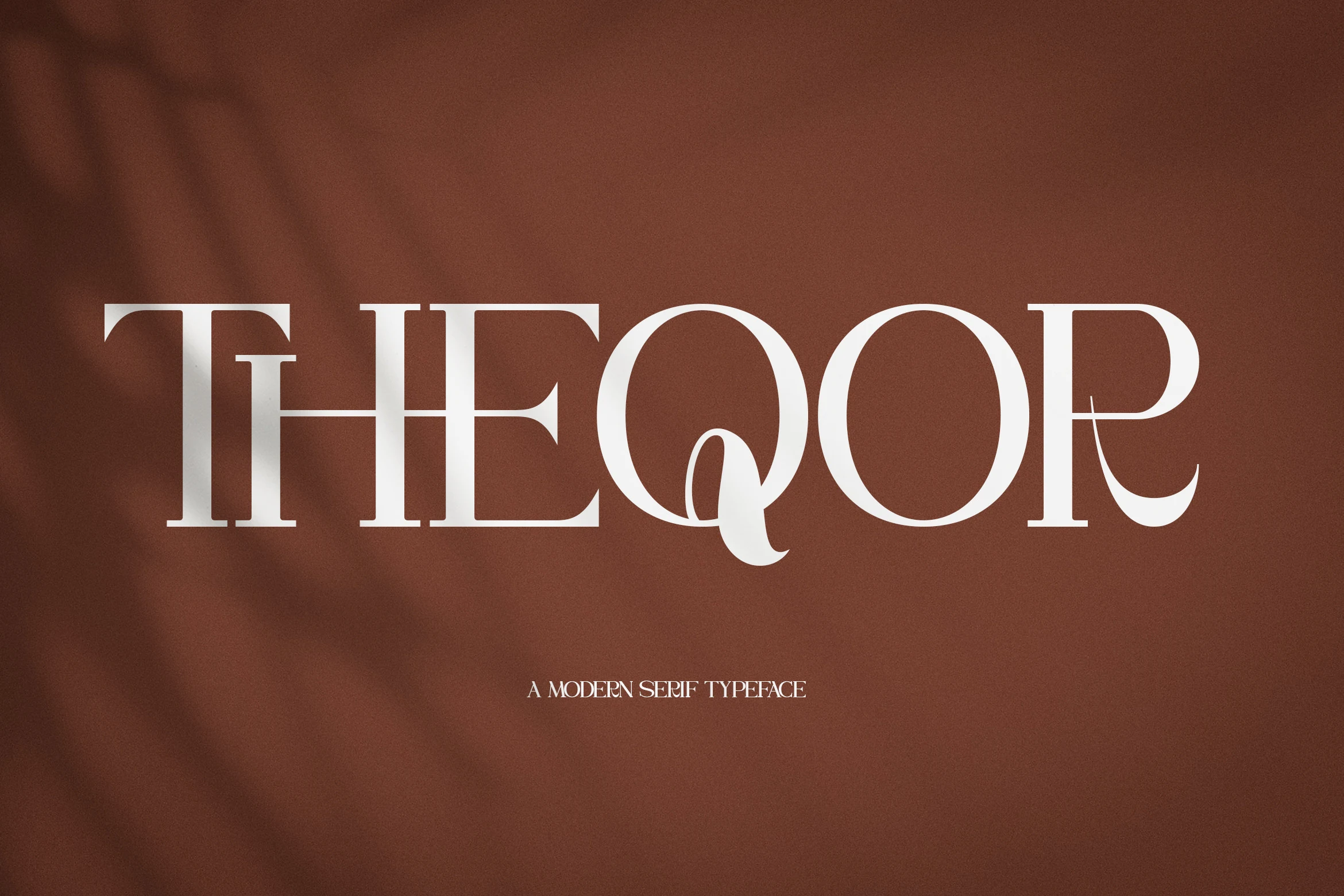
Best For: logos, fashion branding, editorial designs, magazine covers
Theqor uses a clean modern serif skeleton with wide capitals, firm vertical stems, and fine hairline serifs that keep the wordmark sharp. The oversized O shapes and looping Q add just enough character for Serif Logo Fonts without pushing the design into ornamental territory.
It suits short, confident display settings where spacing can stay measured and the thin strokes remain clear. Keep supporting copy small and quiet, then let the main title carry the hierarchy across fashion branding, packaging, magazine covers, and polished logo signs.
Ethereal Font
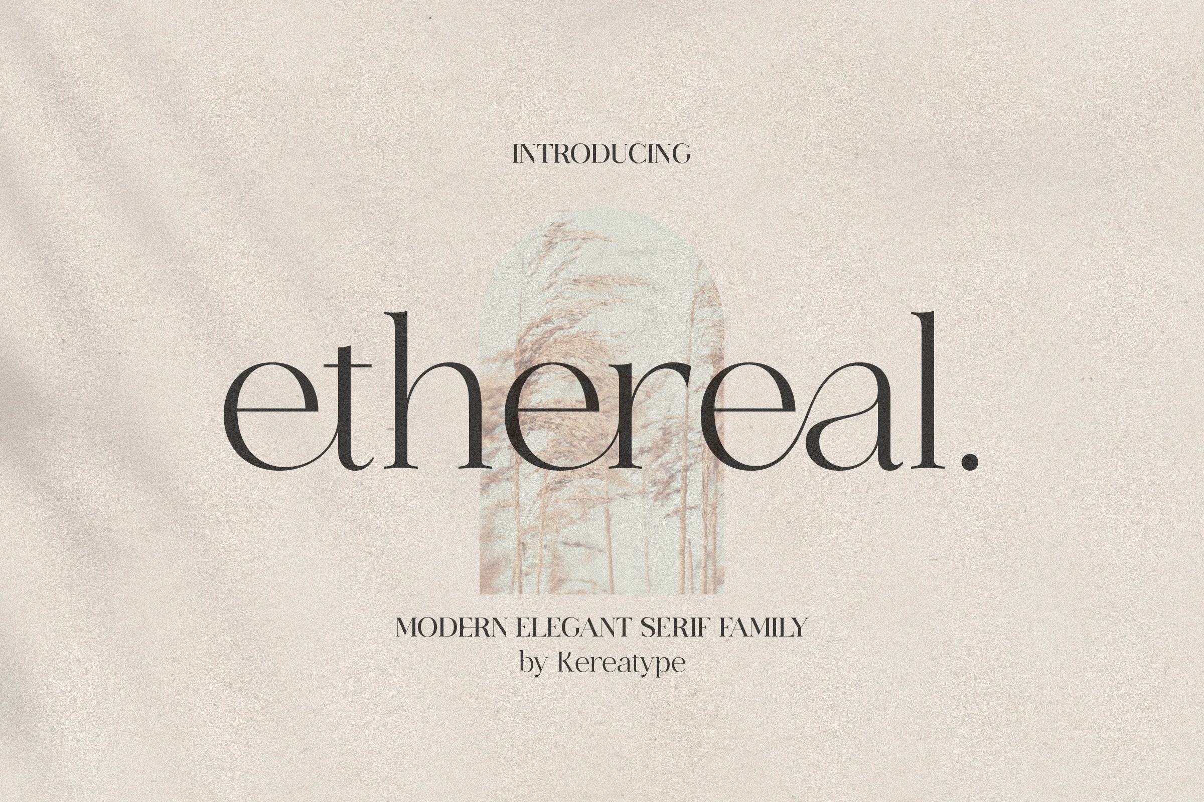
Best For: logos, editorial designs, fashion branding, beauty branding
Ethereal has a quiet editorial elegance, with slim stems, delicate serifs, and broad rounded bowls that keep the lowercase forms light and polished. The soft contrast and clean spacing give Serif Logo Fonts a more graceful, fashion-aware tone without feeling cold or overly formal.
This is a typeface that benefits from breathing room. Short names, wider margins, and clear contrast help the fine details stay crisp, while the different weights make it easier to build hierarchy between a main wordmark and lighter supporting text in branding, packaging, or cover layouts.
Bekinder Font
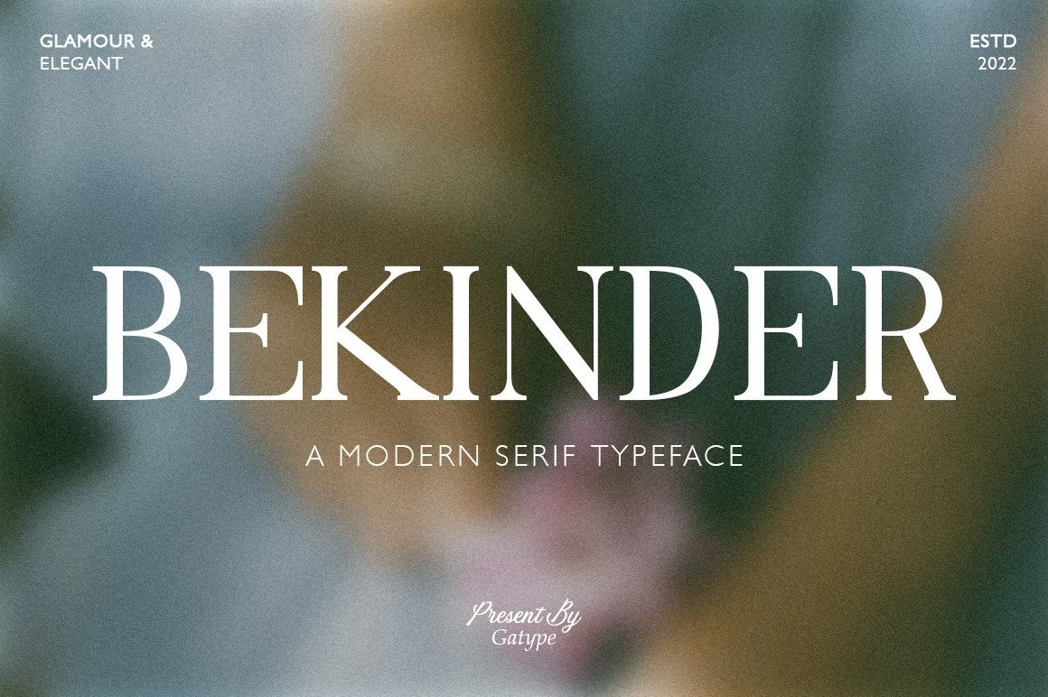
Best For: logos, fashion branding, editorial designs, luxury designs
Bekinder is a poised modern serif with tall capitals, narrow hairline serifs, and soft bracketed curves that give the wordmark a calm fashion-magazine rhythm. In Serif Logo Fonts, its strength is the balance between broad readable letterforms and refined contrast that still feels polished at large sizes.
Treat it as a headline face, not body copy. Controlled tracking works better than tight spacing, because the thin joins around the K, N, and R need clean negative space; pair it with a plain sans or small spaced caps for packaging, editorial headers, and feminine brand marks.
Metron Font
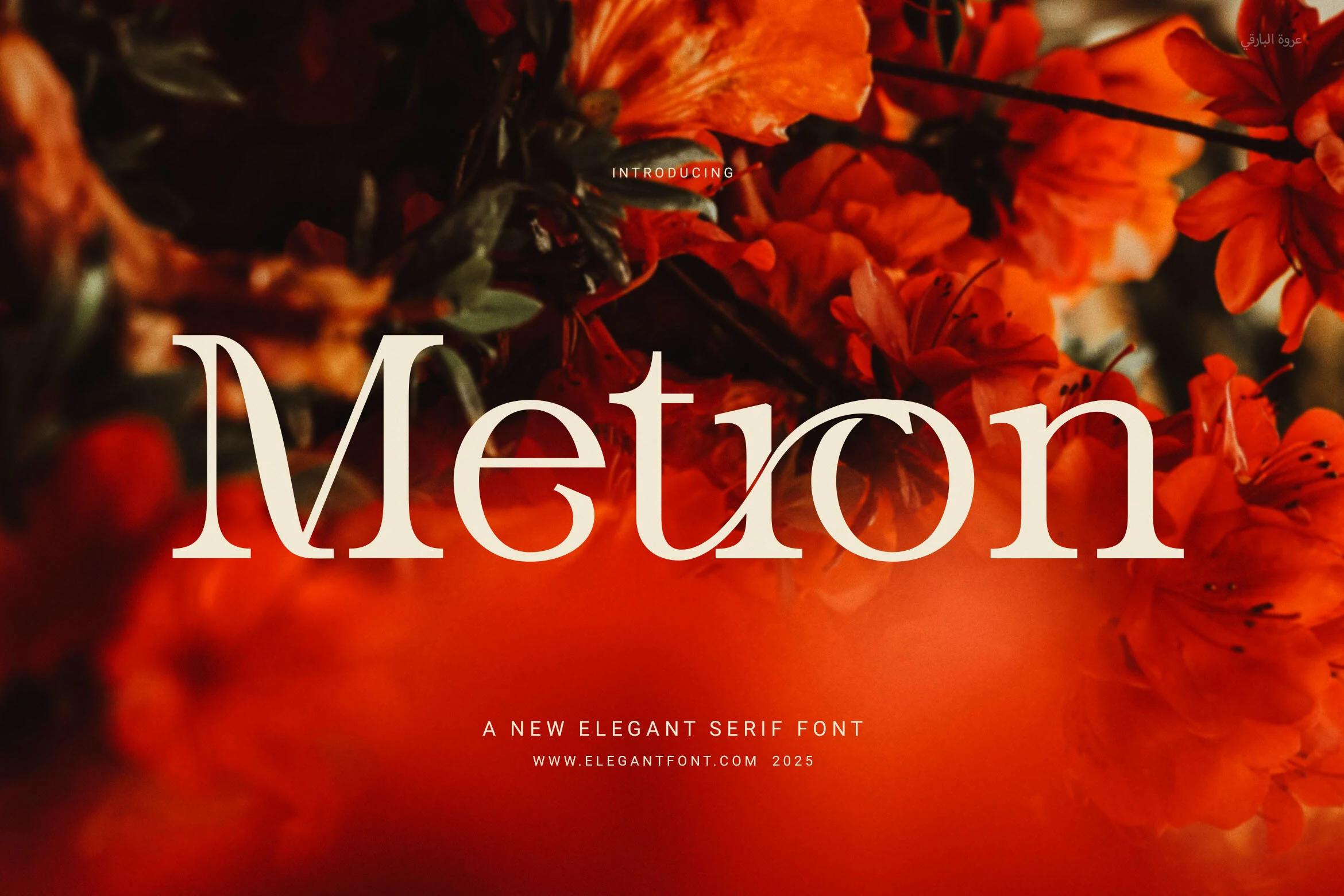
Best For: logos, branding, luxury designs, editorial designs
Metron Font uses a refined modern serif structure with smooth curves, slim hairlines, and broad sculpted shapes that keep the wordmark calm rather than ornamental. The generous counters and measured proportions give it the kind of clarity that works well for Serif Logo Fonts, especially when the layout needs polish without heavy decoration.
Its contrast is strongest in large title settings, where the thin joins and elegant terminals stay visible. Keep spacing controlled rather than loose, pair it with quiet supporting type, and use enough tonal contrast so the delicate strokes do not disappear against photography or textured backgrounds.
Luxury & Fashion Serif Logo Fonts
This group focuses on elegant serifs with graceful curves, swashes, and luxury rhythm for beauty brands, boutique identities, wedding design, and premium packaging.
Bezoria – Elegant Serif Font
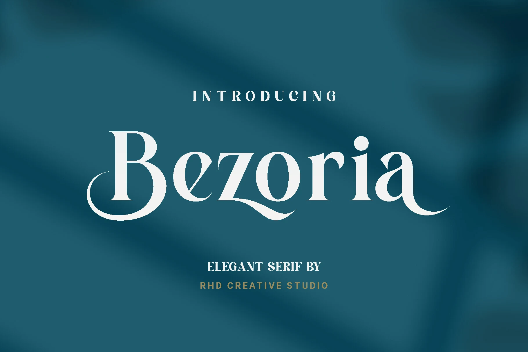
Best For: logos, branding, wedding designs, editorial designs
Bezoria has a graceful editorial presence, built on crisp contrast, rounded bowls, and long sweeping terminals that give the B, z, and final a a soft sense of motion. That mix of structure and flourish makes it a strong fit for Serif Logo Fonts that need to feel polished rather than stiff.
It works best when the main word gets room to shine. Use generous space around the logo or headline, then keep supporting text smaller and simpler so the swashes stay clean and readable in branding, wedding stationery, and cover-style layouts.
Milden Font
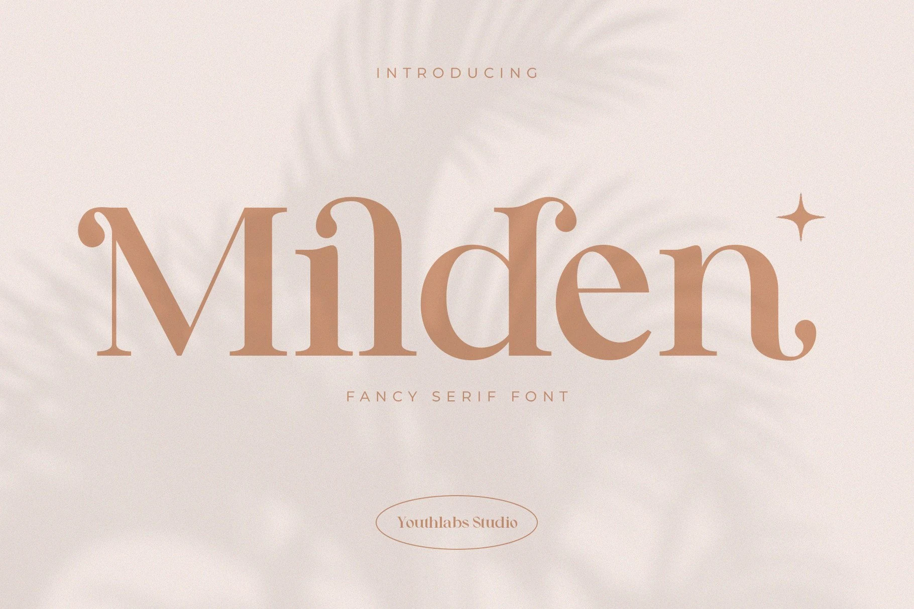
Best For: logos, fashion branding, editorial designs, magazine covers
Milden has a soft high-fashion feel, with gently flared serifs, rounded bowls, and curled terminals that give the letters a polished, slightly romantic rhythm. It brings Serif Logo Fonts a dressier personality than a strict editorial serif, which helps brand names feel warm, refined, and immediately styled.
The alternate characters are useful when you want a cleaner or more decorative word shape without changing the overall tone. Keep it for short names and prominent titles, and pair it with a quiet sans or generous spacing so the delicate contrast and ornamental ends stay crisp in logos, magazine layouts, and branding.
Rogelia Font
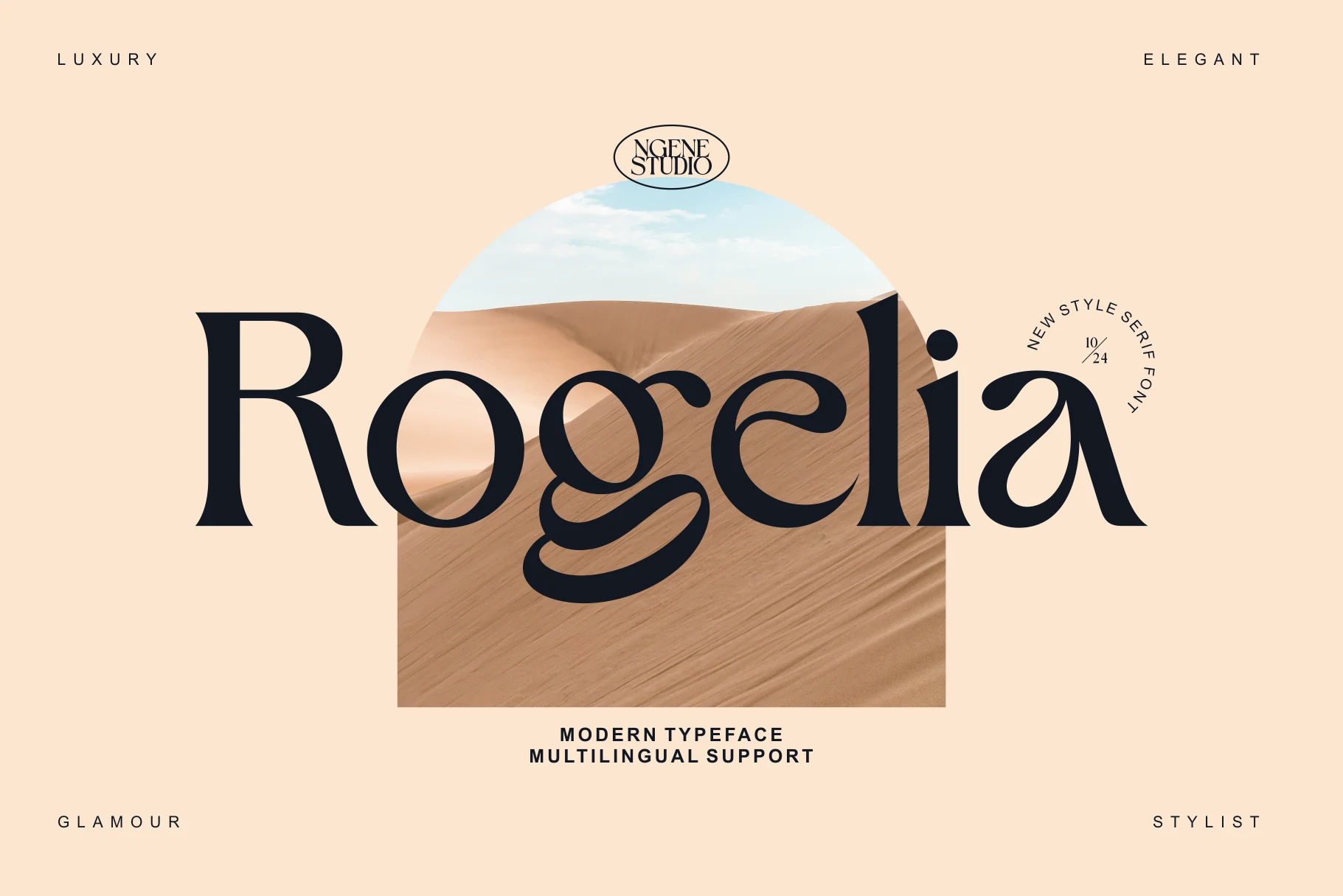
Best For: logos, luxury designs, fashion branding, editorial designs
Rogelia has a glamorous vintage-serif shape, with a tall R, rounded bowls, and a dramatic looping g that gives the wordmark a strong editorial pull. Its refined contrast and soft curves make Serif Logo Fonts feel luxurious without losing the clean structure needed for polished brand marks.
The alternate characters help shape a more custom-looking logo or badge, especially when a name needs one distinctive letter to carry the identity. Use measured spacing and firm contrast so the thin joins, curved terminals, and multilingual character set remain clear across magazines, packaging, and web-based branding.
Buaser Font
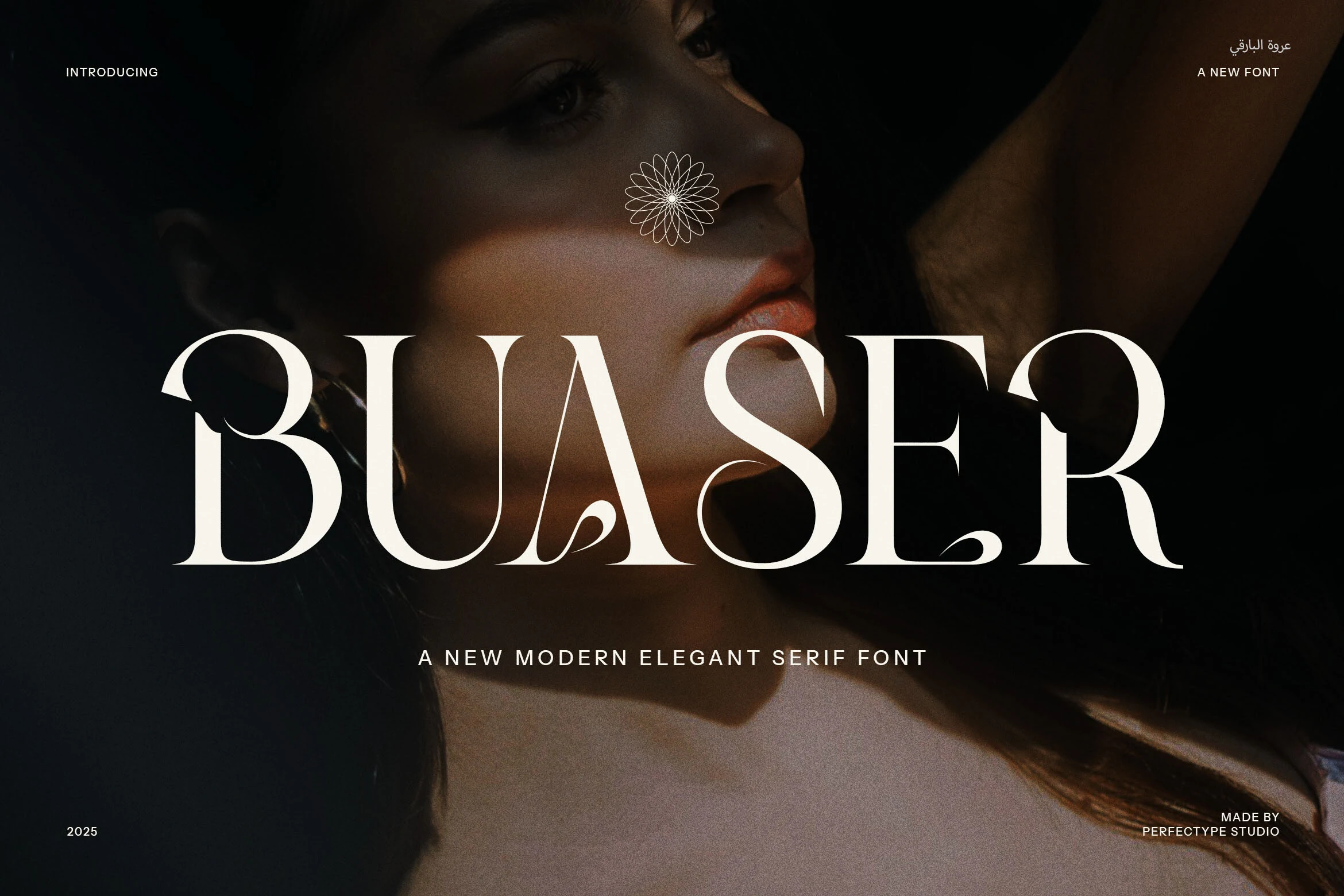
Best For: logos, luxury designs, fashion branding, editorial designs
Buaser has a dramatic luxury-serif voice, with broad capitals, sharp vertical contrast, and sweeping inner curves that make the B, A, and S feel sculpted rather than plain. For Serif Logo Fonts, it gives a brand name strong fashion-editorial presence without losing the clean authority of a classic serif base.
The ligatures and alternate forms are useful when a logo needs one custom-looking connection or a more distinctive final shape. Keep the wordmark large, use firm contrast, and avoid tight spacing so the thin strokes and curved swashes stay readable across branding, packaging, and high-end title layouts.
Praise Font
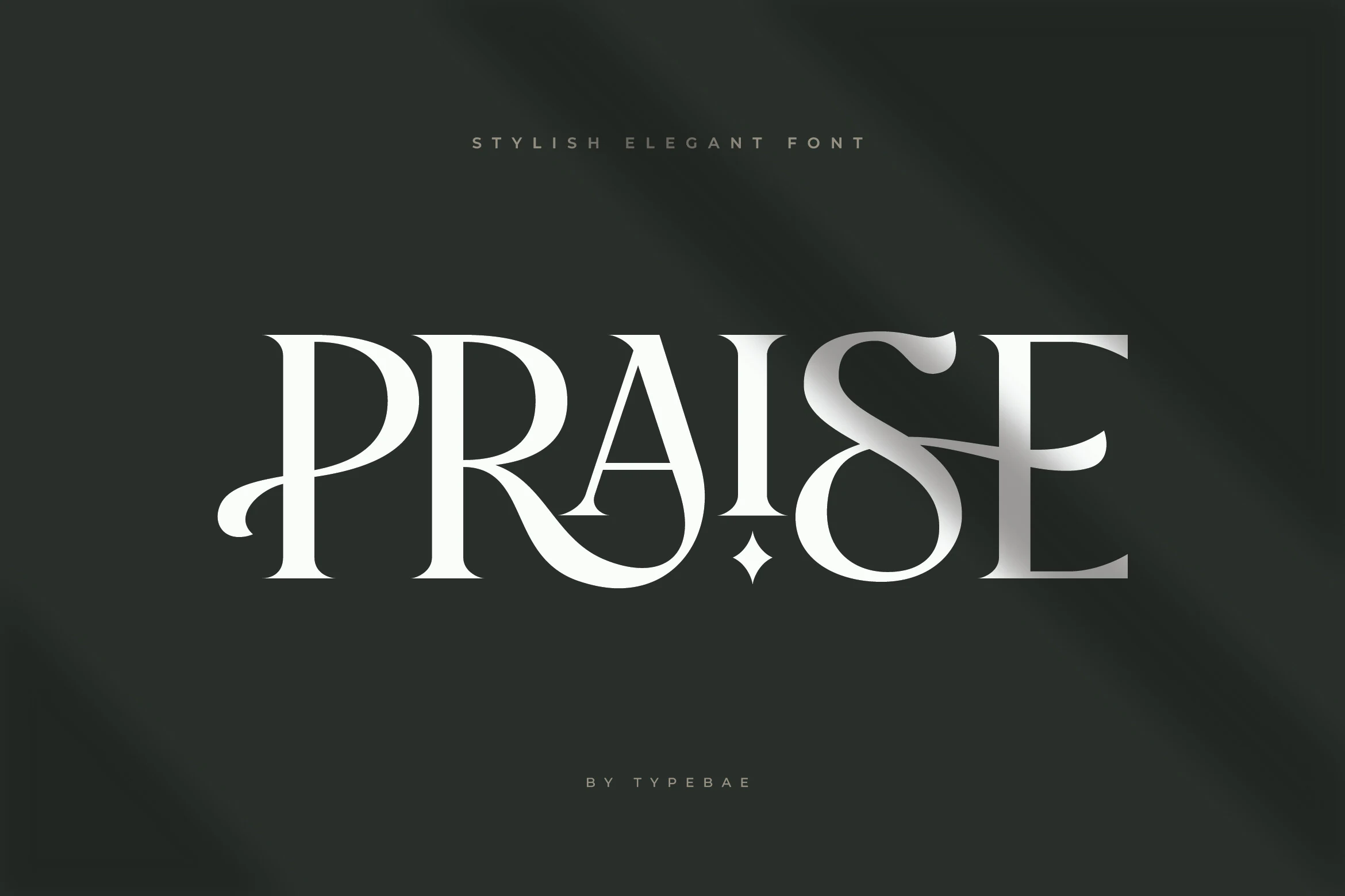
Best For: logos, branding, luxury designs, high-end designs
Praise has a polished display look with crisp contrast, broad capitals, and graceful curves that sweep through the P, R, and S. That refined silhouette gives Serif Logo Fonts a more expressive tone, so a short brand name feels styled before you add anything else.
It works best when the wordmark stays large and uncluttered. Keep tracking balanced and pair it with restrained supporting text, because the thin joins and decorative curves carry the personality on their own in branding, packaging, and premium logo systems.
Ronsa Font
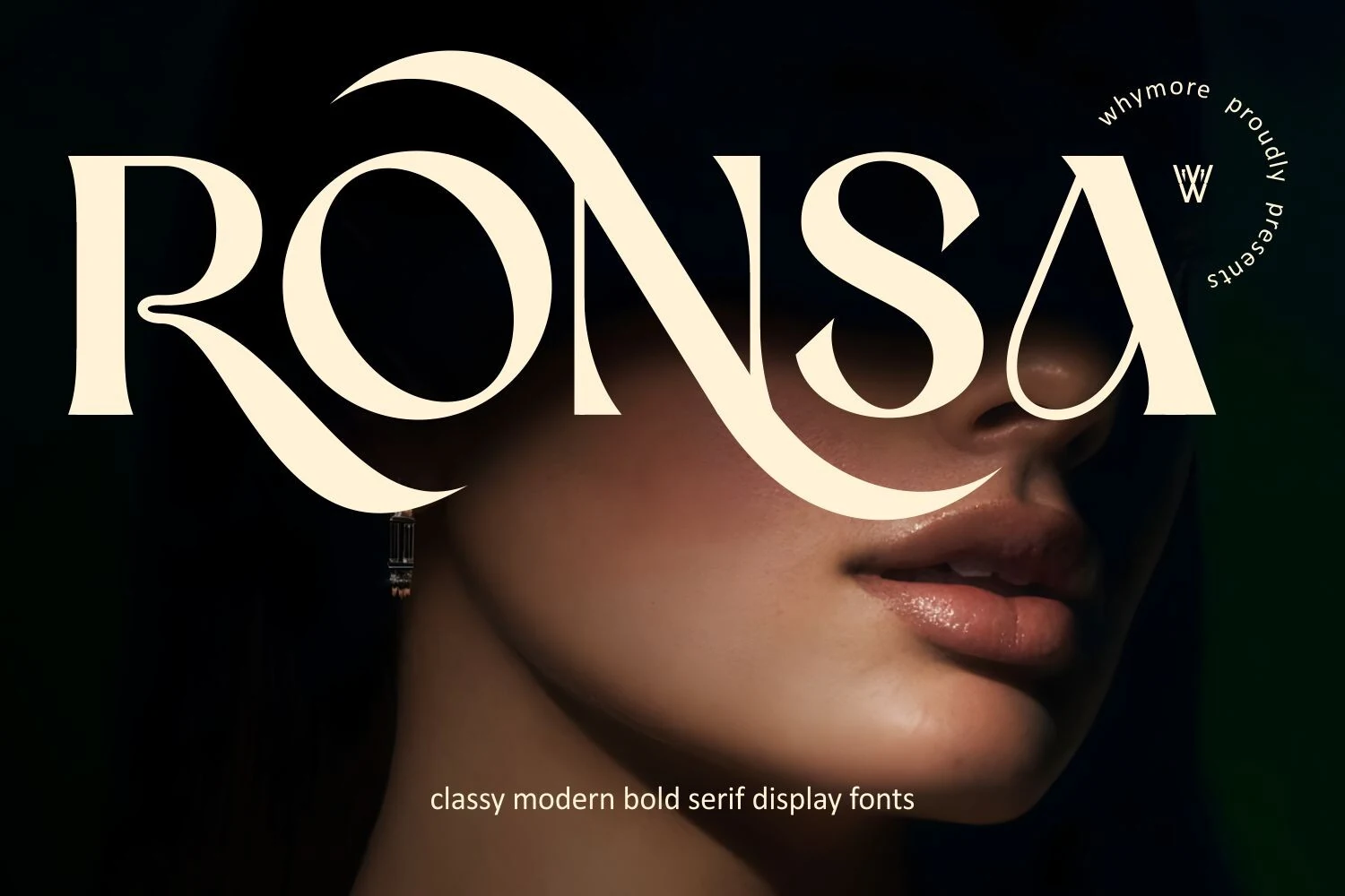
Best For: logos, branding, fashion branding, luxury designs
Ronsa Font has a bold editorial presence, built on high-contrast strokes, broad curves, and sharp tapered terminals that make each letter feel sculpted rather than heavy. The dramatic sweep in characters like R and N gives it a strong identity for Serif Logo Fonts, especially when the brand needs polish with a little attitude.
This is a display serif that performs best with short names and clear hierarchy, where its elegant curves have room to lead the composition. Keep tracking slightly open and let supporting text stay quiet, so the thick-to-thin transitions and luxurious rhythm remain crisp instead of crowded.
Vintage & Decorative Serif Logo Fonts
These expressive serif fonts use curled terminals, bold contrast, retro weight, and ornamental cuts for posters, badges, nostalgic logos, and statement display work.
Koffins Font
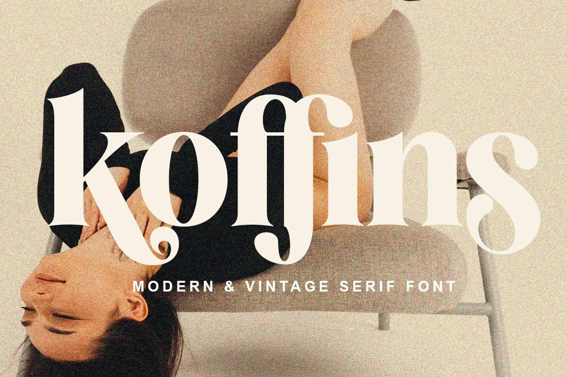
Best For: logos, fashion branding, magazine covers, posters
Koffins leans into vintage drama with thick serif structure, sharp contrast, and distinctive curled terminals that give the wordmark a confident, slightly theatrical finish. That combination makes Serif Logo Fonts feel bolder and more memorable, especially when you want a fashion-led identity with real display presence.
It performs best in short headlines where the decorative k, f, and s can stay crisp. Pair it with a restrained sans serif for subtext and keep spacing controlled rather than tight, so the heavy strokes and rounded counters hold their shape across posters, covers, and branding pieces.
Higuen Font
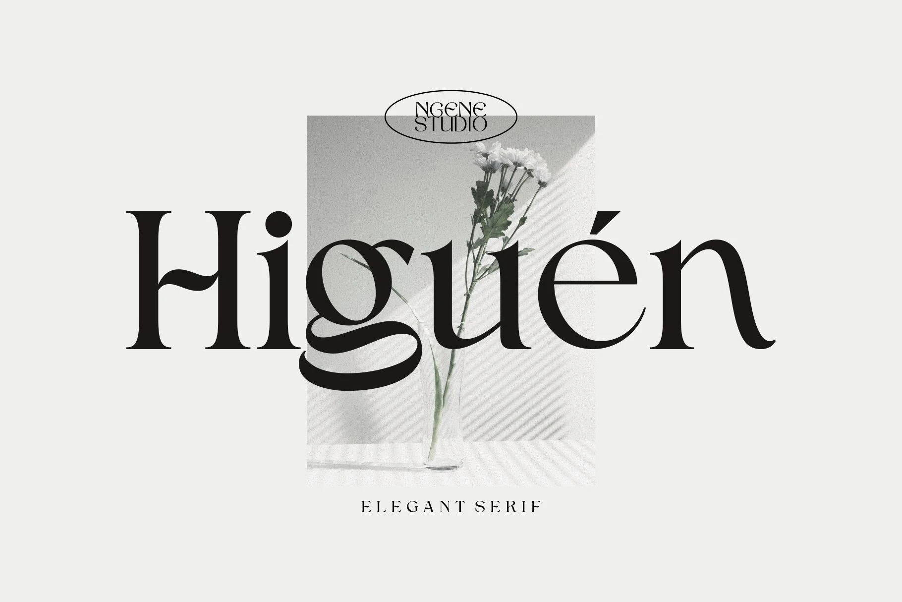
Best For: logos, branding, magazine covers, vintage designs
Higuen has a striking vintage voice, with thick verticals, fine connecting strokes, and a sweeping lowercase g that gives the whole wordmark a stylish pull. That contrast makes Serif Logo Fonts feel expressive and upscale, especially when you want a logo with more personality than a standard modern serif.
The built-in alternate characters are useful when you need a more tailored headline or badge lockup. Keep it for short words and prominent placements, where the sharp contrast and curved terminals can stay crisp across branding, magazine covers, and editorial-style titles.
Sego Font
Best For: logos, magazine covers, posters, display text
Sego stands out through wide sculpted capitals, sharp contrast, and wave-like terminals that give the letterforms a smooth cinematic sweep. For Serif Logo Fonts, that distinctive silhouette does a lot of the visual work on its own, making even a single word feel styled and memorable.
This is a display face first, so keep it for short names, mastheads, or headlines where the unusual shapes stay easy to read. Give it enough surrounding space and avoid crowding the letters, especially around the curved tops and inner cuts, so the character stays crisp in posters, covers, and editorial layouts.
Pink Sunset Font
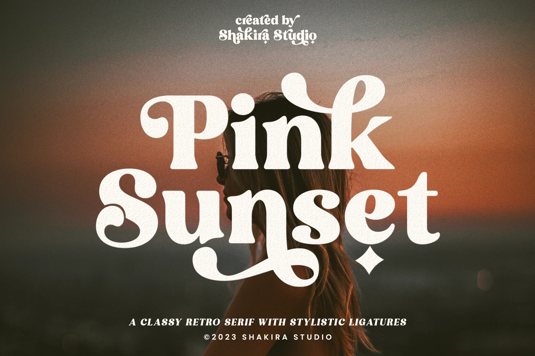
Best For: logos, branding, retro designs, posters
Pink Sunset has a chunky retro serif build with soft slab weight, rounded curls, and big looping descenders that make the letters feel cheerful and bold. It brings Serif Logo Fonts closer to a 60s or 70s display mood, with enough clarity to hold a stacked title or short brand name.
Use it where the lettering can be the main graphic element. Moderate spacing keeps the dense shapes readable, while strong contrast helps the white, textured forms stay crisp on posters, apparel graphics, packaging, and nostalgic logo layouts.
Allover Modern Font
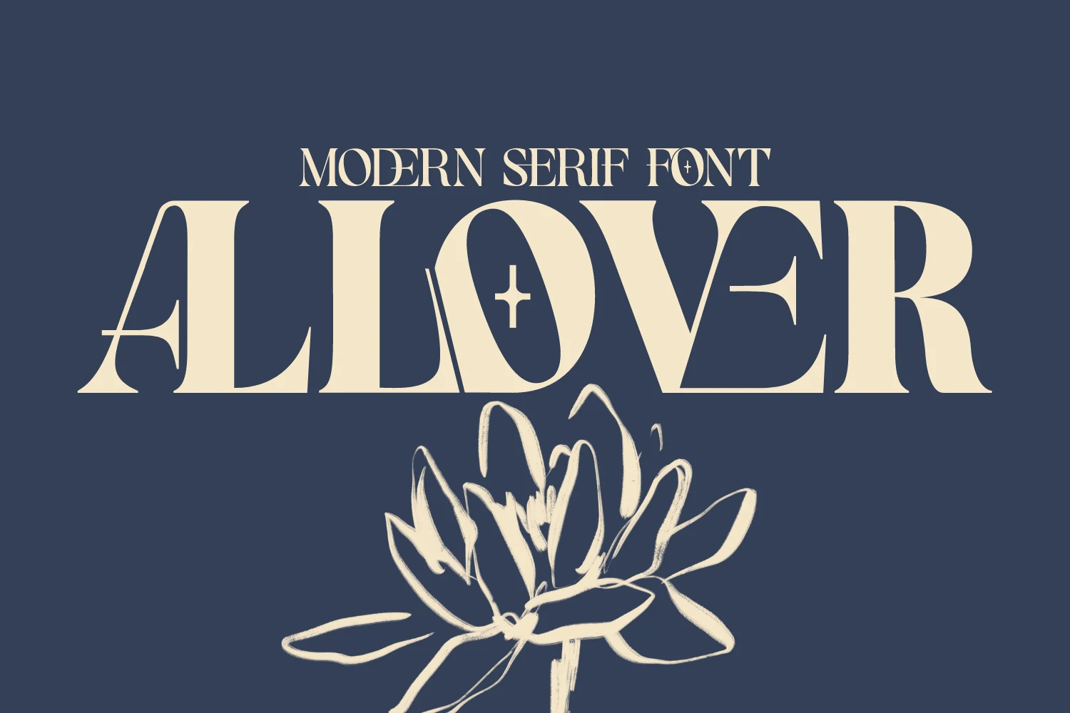
Best For: logos, branding, packaging, magazine covers
Allover Modern pairs broad high-contrast serifs with sharp inset cuts and diagonal details that break up the heavy strokes. Those carved shapes give Serif Logo Fonts a more graphic, fashion-led feel, so even a short wordmark looks styled rather than plain.
It stays useful beyond oversized titles because the main letterforms are still clean and stable. Let the decorative characters do the visual work, then keep secondary text quieter; a little breathing room around letters like A, O, and V helps the cut-in details stay crisp on packaging, mastheads, and brand marks.
Conclusion
Choose a modern editorial serif when clarity and restraint matter, a luxury fashion serif when the logo needs elegance and polish, or a vintage decorative serif when the typography should carry more personality and display impact.