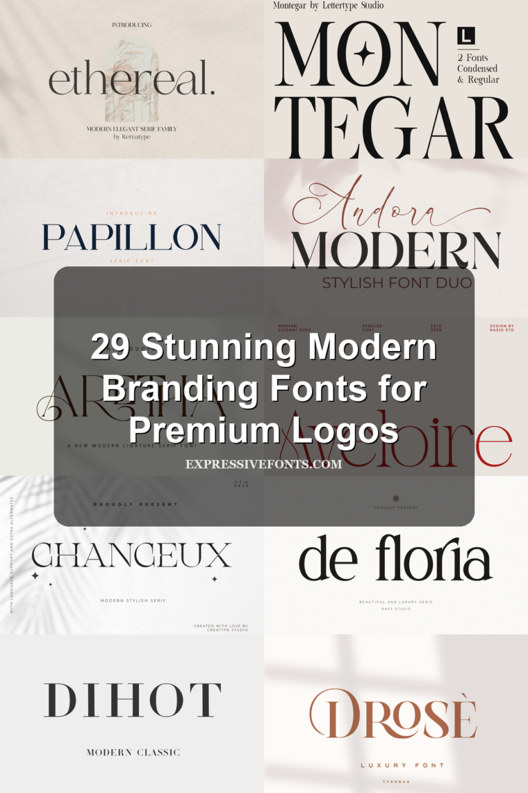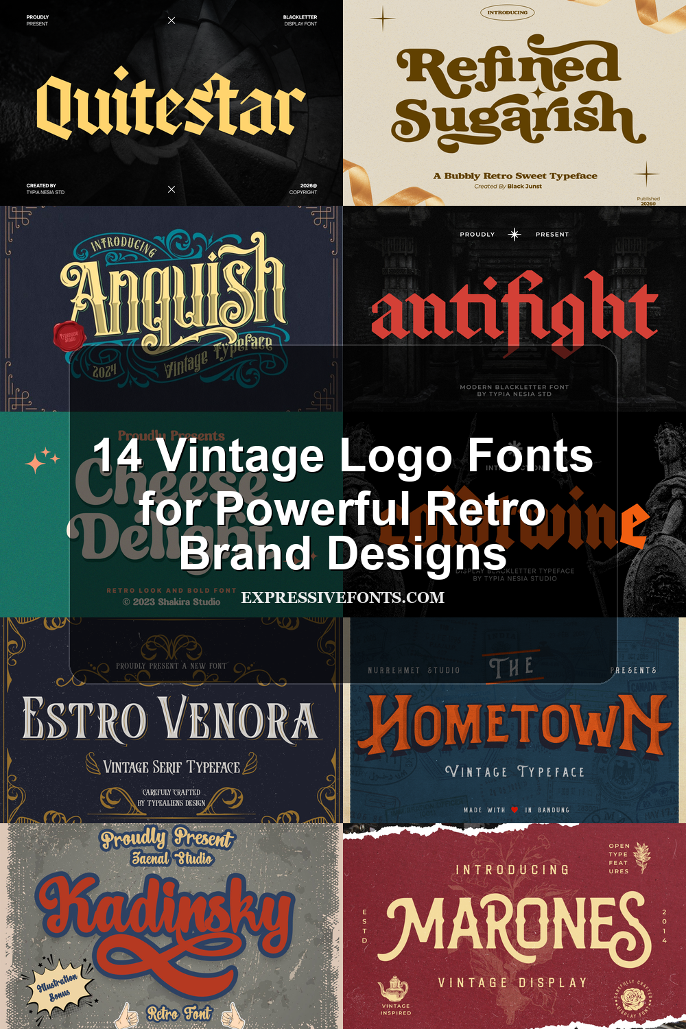
14 Vintage Logo Fonts for Powerful Retro Brand Designs
Vintage Logo Fonts work best when a brand mark needs age, texture, and a clear visual voice. This collection is built for designers creating labels, badges, posters, packaging, stickers, apparel graphics, and nostalgic wordmarks that need more character than a plain modern typeface.
Ornate & Decorative Vintage Logo Fonts
These vintage logo fonts use engraved serifs, dramatic flourishes, and old-label detail for premium packaging, badges, book covers, and formal display marks.
Estro Venora Font
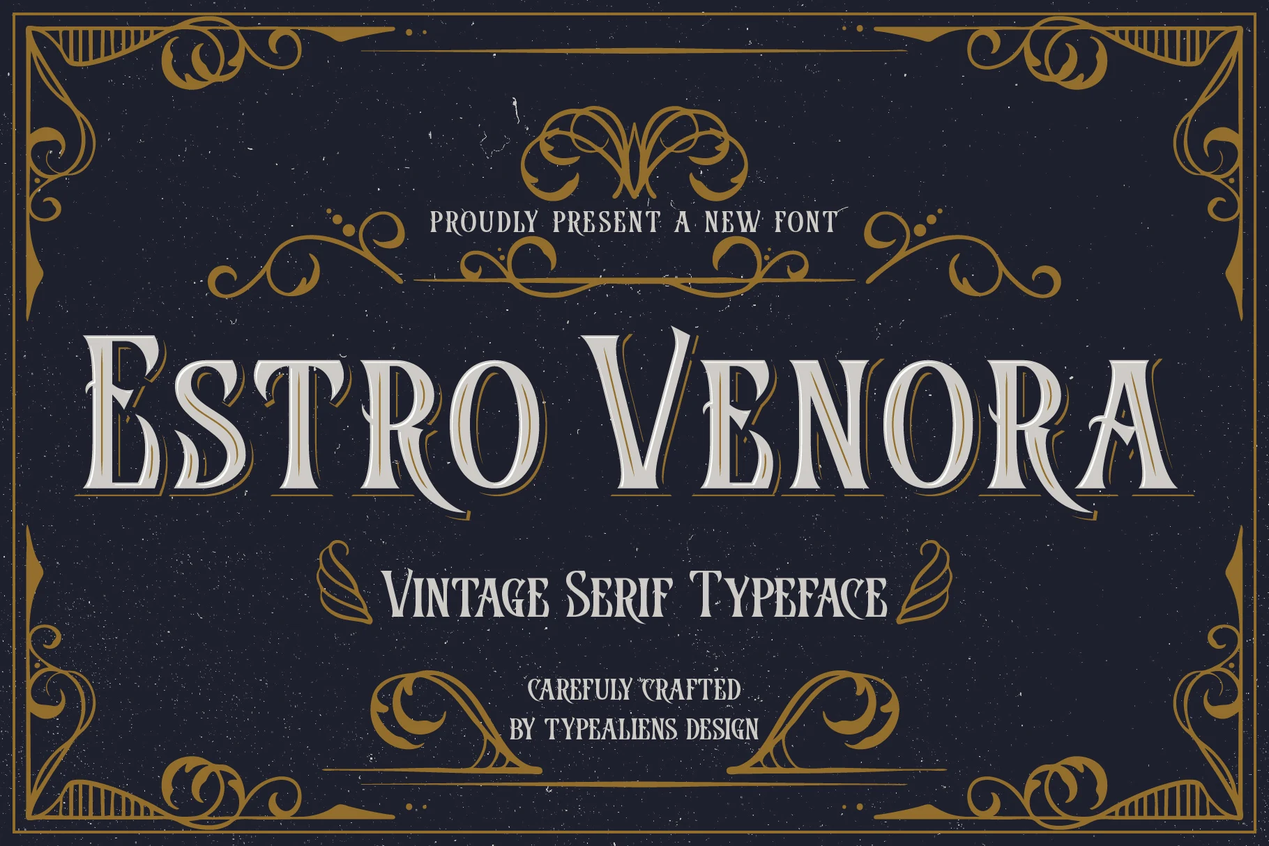
Best For: logos, product labels, vintage designs, decorative designs
Estro Venora Font has a theatrical Victorian serif look: tall capitals, flared wedge serifs, strong vertical stress, and fine cut-in details that make each letter feel architectural rather than soft. The narrow counters and ornamental curves give it a period sign-painter mood, so it reads best as a display face instead of running text.
Use it where Vintage Logo Fonts need an antique, decorative voice—labels, badges, posters, or header marks with a clear title hierarchy. Keep wording compact, add a little tracking around dense capitals, and place it against a plain high-contrast field so the internal shadows and sharp serifs stay legible.
Anguish Font
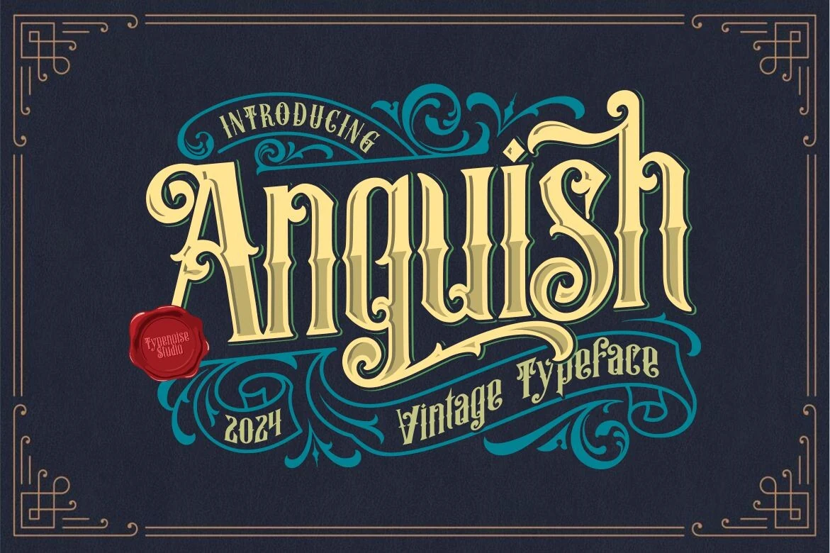
Best For: logos, posters, book covers, vintage designs
Anguish Font mixes blackletter character with a showy vintage display structure. The letters are tall and narrow, with split strokes, pointed terminals, and dramatic curls that push the wordshape upward and outward at the same time. Ornamental swashes wrap around the composition, giving it the feel of an old sign or label centerpiece.
It fits Vintage Logo Fonts especially well when you want a formal, decorative mark with real period flavor. Use it for short names or titles, keep supporting text much simpler, and leave enough surrounding space so the flourishes and inner cuts do not compete with the rest of the layout.
Marones Font
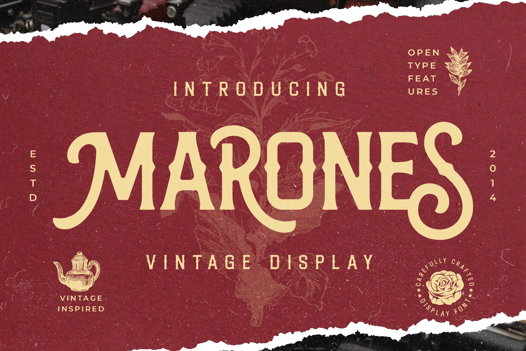
Best For: logos, packaging, posters, vintage designs
Marones Font has a bold old-garage attitude, built from tall display capitals with inky edges, sharp spurs, and a few dramatic curves that keep it from feeling stiff. The long leg on the R and the looping finish on the S give the wordshape a custom-sign quality, while the slightly worn texture helps it feel printed and seasoned rather than polished.
That makes it a strong pick for Vintage Logo Fonts where the lettering needs to do most of the work. It holds up especially well on labels, bottle graphics, and poster titles; just keep the wording short and leave room around the outer strokes so the spurred details and sweeping terminals stay clear instead of crowding the layout.
Groovy & Script Vintage Logo Fonts
This group covers rounded retro lettering, bubbly serifs, and bold sign-painting scripts for stickers, posters, playful packaging, and nostalgic brand names.
Retro Goldy Font
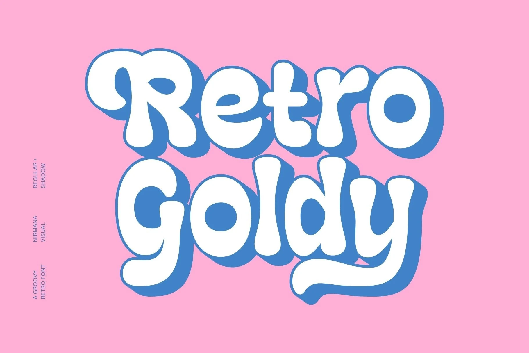
Best For: logos, stickers, retro designs, playful designs
Retro Goldy Font leans fully into groovy display styling with oversized rounded forms, soft terminals, and thick bubble-like weight. The letter shapes are compact and cheerful, while the built-in shadow treatment in the preview shows how well it carries depth and instant personality without needing extra decoration.
It works especially well when Vintage Logo Fonts need a friendlier, more nostalgic tone rather than a strict antique look. Keep it on short names or bold headlines, give the letters enough breathing room around the edges, and pair it with a plain secondary typeface so its chunky rhythm stays clean and readable.
Refined Sugarish Font
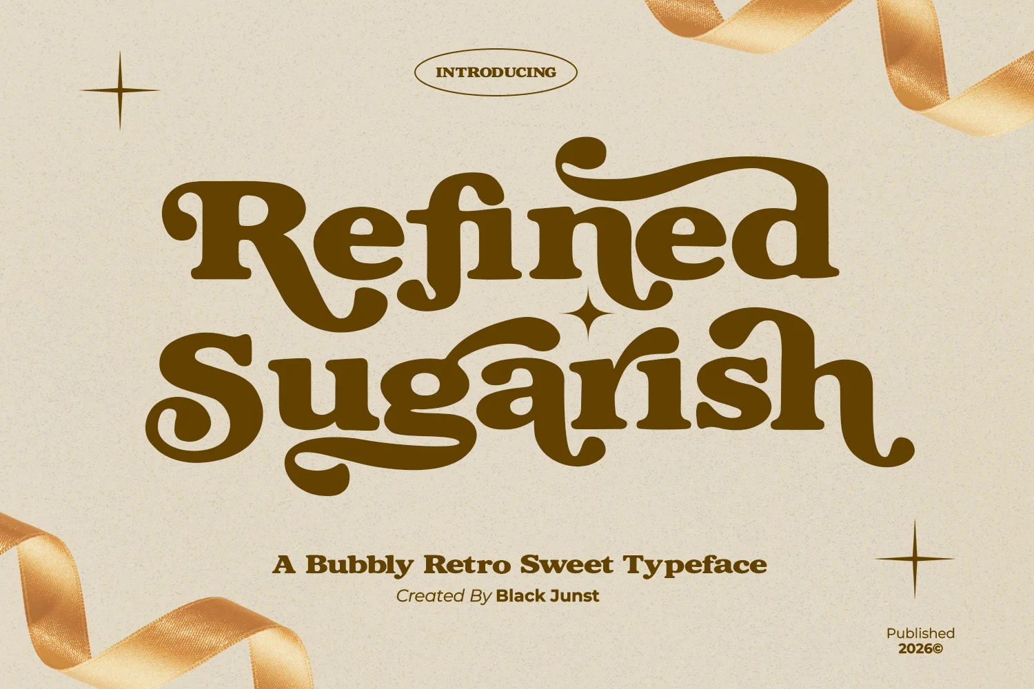
Best For: logos, packaging, posters, retro designs
Refined Sugarish Font has the thick, bubbly rhythm of 70s display type, with rounded serif edges, deep curves, and exaggerated swashes that give the capitals and descenders a syrupy pull. It feels cheerful and theatrical, but the heavy shapes stay stable enough to carry a headline cleanly.
For Vintage Logo Fonts, it works best when you want a softer retro tone rather than a rugged antique look. Keep wording short, leave room around the longer terminals, and pair it with a simple secondary face so the bold curves can lead the hierarchy on packaging, posters, or brand marks.
Vintage Classic Font
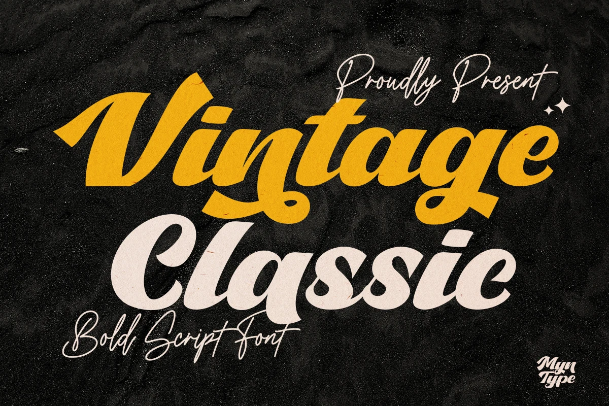
Best For: logos, branding, quotes, vintage designs
Vintage Classic Font uses a heavy slanted script style with broad connected strokes, rounded bowls, and confident swash movement. The letters feel more like a bold sign-painting headline than a delicate handwritten face, with enough weight to hold strong contrast on dark or textured backgrounds.
Use it when Vintage Logo Fonts need a fast, retro, highly readable script voice for brand names, quotes, or display headers. Keep the composition wide enough for the entry and exit strokes, avoid tight line spacing, and let a simpler supporting font handle small details so the script stays dominant.
Kadinsky Font
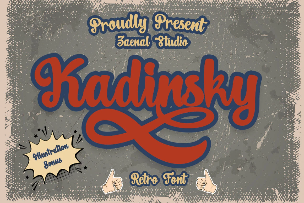
Best For: logos, branding, stickers, retro designs
Kadinsky Font has a bold retro script build with thick connected strokes, rounded terminals, and a large looping underline that gives the wordmark a comic-shop, sticker-style energy. The letter rhythm is casual and dense, with enough weight to hold strong outlines or shadow effects without looking fragile.
Use it when Vintage Logo Fonts need a loud, playful identity rather than a refined antique tone. Keep names short, allow extra space below the baseline for the swash, and use strong color contrast so the inner counters and connected joins stay readable at display sizes.
Cheese Delight Font
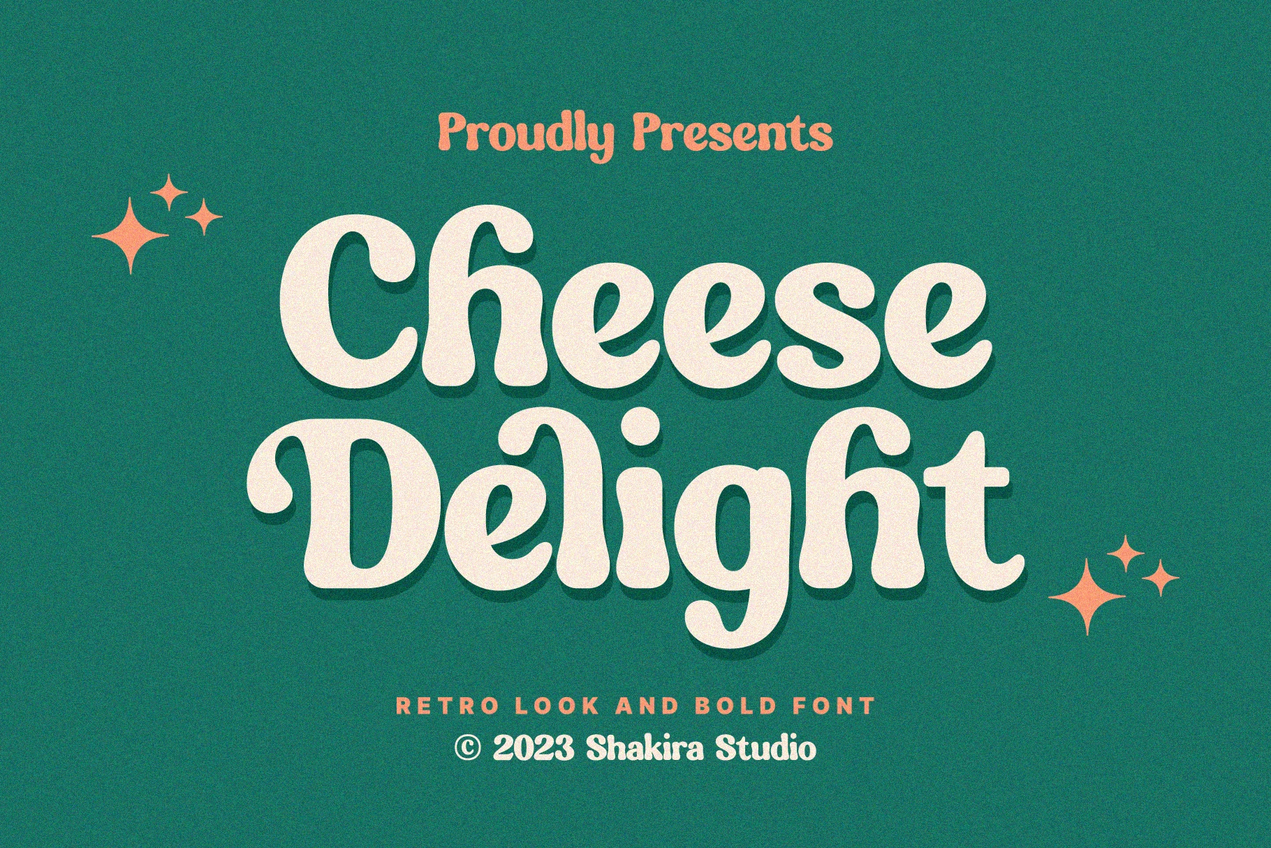
Best For: logos, packaging, posters, retro designs
Cheese Delight Font has a chunky retro serif build with rounded bowls, thick stems, and soft bulb-like terminals that keep the letterforms friendly instead of formal. The low contrast and broad proportions give it an easy vintage rhythm, while the preview’s shadowed styling shows how well it holds shape in bold display settings.
It fits Vintage Logo Fonts especially well when a brand needs a warm, cheerful headline rather than a sharp old-style look. Keep phrases short, use generous contrast behind the letters, and let the main word carry the personality while a simpler secondary face handles small details or supporting copy.
Gothic & Blackletter Vintage Logo Fonts
These fonts use angular blackletter forms, sharp joins, and dense vertical rhythm for darker logos, music graphics, posters, and high-impact display work.
Coldtwine Font
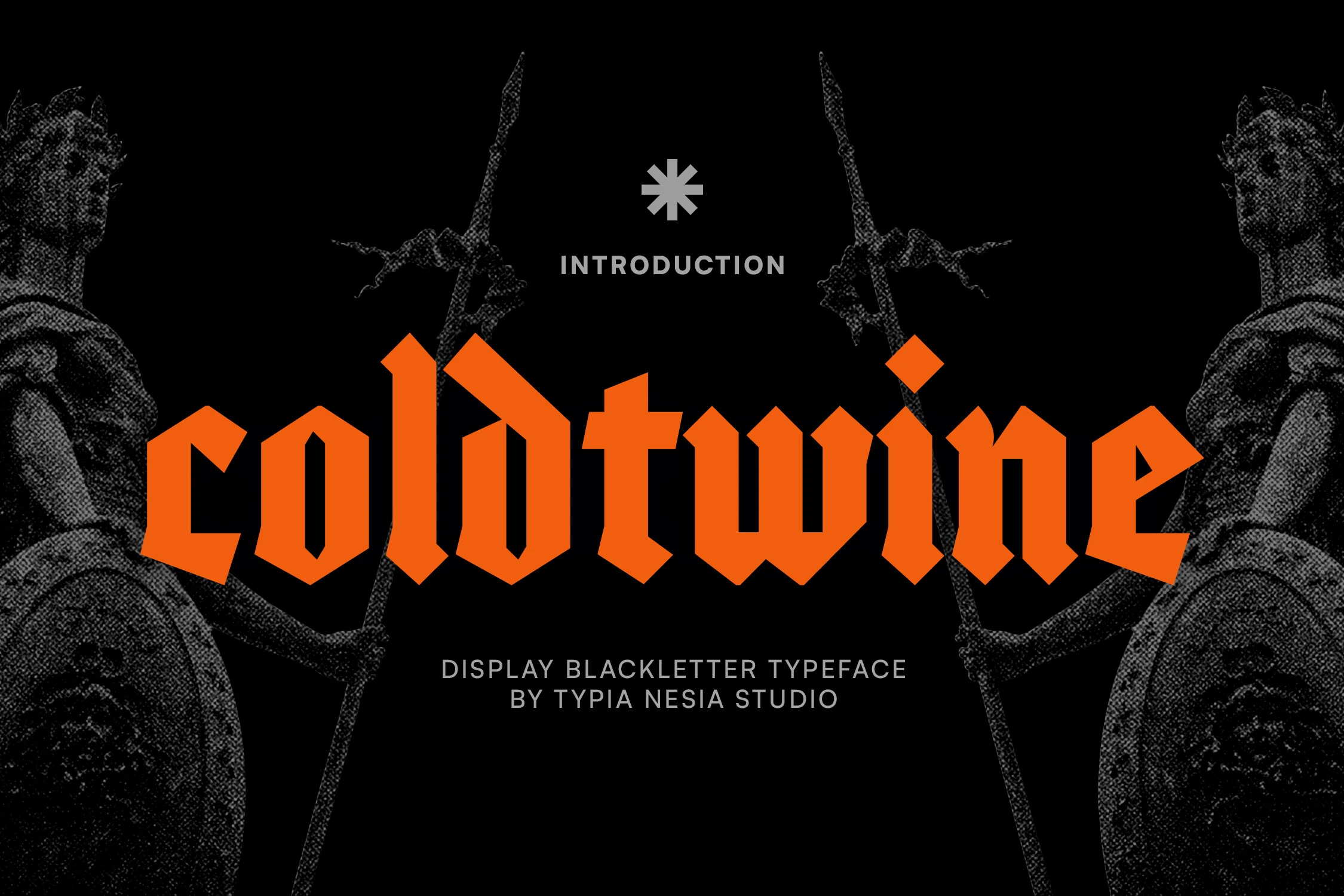
Best For: logos, posters, display text, vintage designs
Coldtwine Font is a bold blackletter display face with sharp verticals, angular joins, and dense geometric counters that give it a hard Gothic edge. The heavy stroke weight and clipped terminals make the wordshape feel compact and forceful, so it lands with more impact than a softer old-style blackletter.
It suits Vintage Logo Fonts that need a darker, high-contrast presence for titles, emblems, or statement branding. Keep the wording short, give the letters room at larger sizes, and avoid cramped tracking so the inner shapes stay clear instead of closing up in smaller display settings.
Quitestar Font
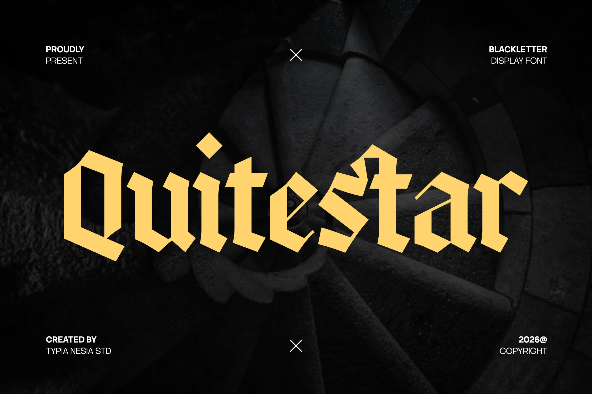
Best For: logos, posters, display text, vintage designs
Quitestar Font has a modern blackletter structure with tall angular stems, faceted joins, and sharp broken cuts that give it a hard Gothic edge. The forms are bold and simplified rather than heavily ornamental, so it keeps the drama of blackletter while staying cleaner and more direct in a headline.
It works well for Vintage Logo Fonts when you want something dark, assertive, and display-driven. Keep the wording short, use it at a confident size, and pair it with a plain secondary sans so the pointed counters and uneven rhythm stay crisp instead of getting crowded in smaller text.
Antifight Font
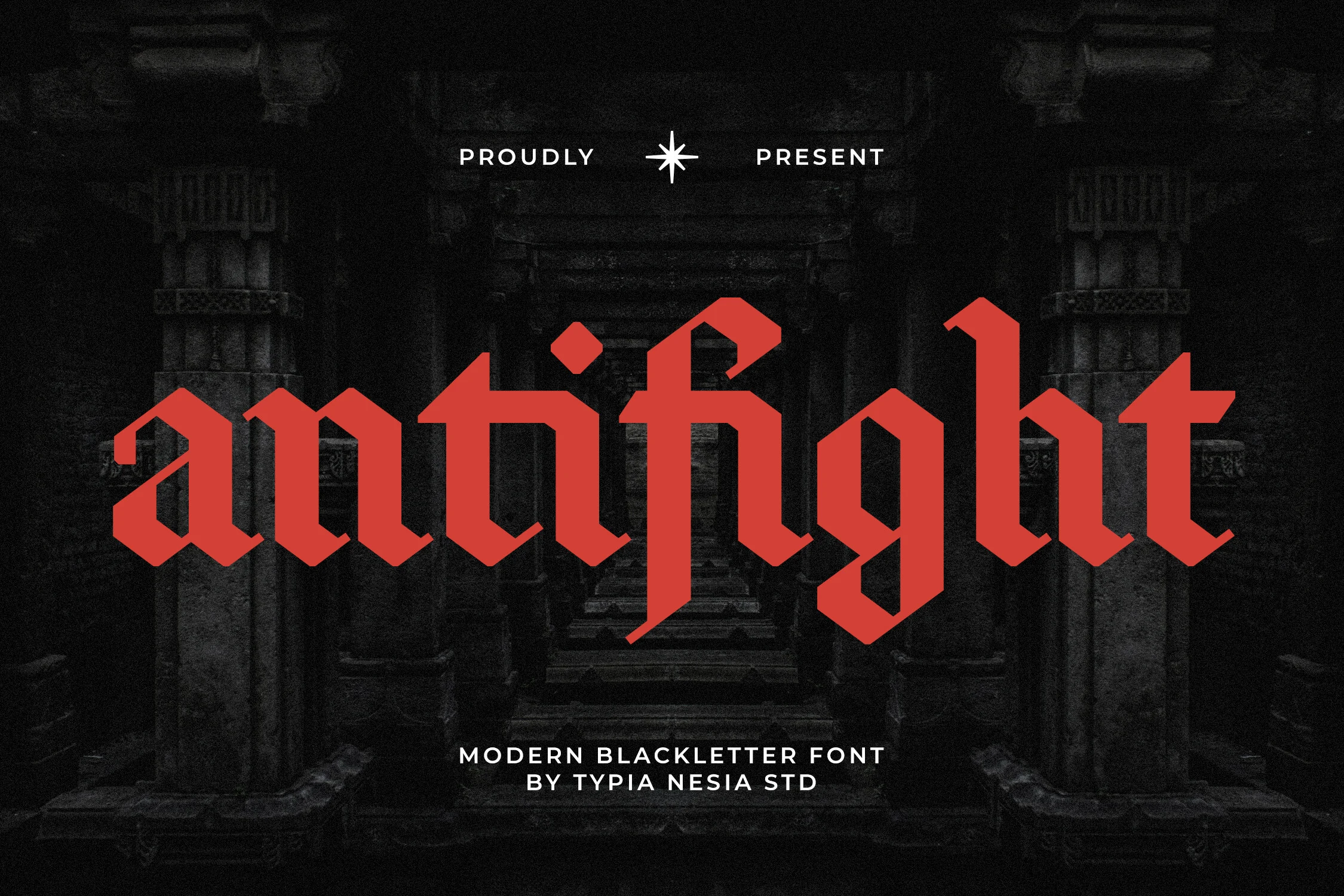
Best For: logos, branding, posters, vintage designs
Antifight Font is a blackletter display face with a stripped-back Gothic build: sharp broken joins, tall verticals, and compact counters that keep the wordshape dense and forceful. The strokes feel clean rather than ornamental, which gives it a modern edge while still holding that classic blackletter tension.
That balance makes it useful for Vintage Logo Fonts when you want something darker and more assertive than a standard serif. Keep it on short names or headlines, give the letters enough size for the inner cuts to stay open, and pair it with a plain secondary face so the angular rhythm stays in control.
Rugged & Badge Vintage Logo Fonts
These vintage logo fonts favor sturdy shapes, worn texture, and badge-friendly proportions for labels, apparel graphics, outdoor branding, and shop-style marks.
Trilate Font
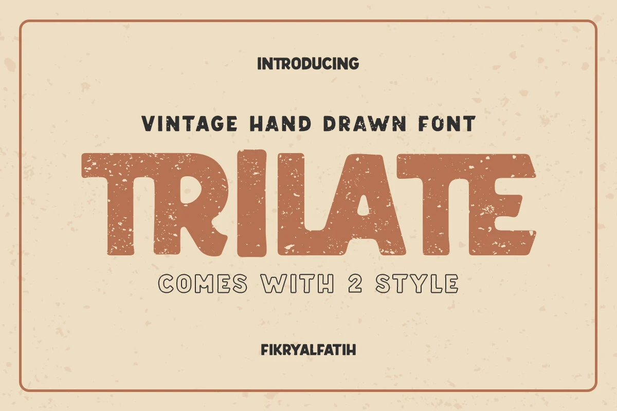
Best For: logos, branding, posters, vintage designs
Trilate Font has a broad hand-drawn display build with chunky uppercase forms, softened corners, and a worn print texture that gives it an easy vintage shop-sign feel. The distressed surface keeps the letters from looking too polished, while the wide proportions make short words feel solid and confident.
For Vintage Logo Fonts, it suits badges, labels, and poster headlines where a rugged, friendly presence matters more than refinement. The two styles help with hierarchy—use the heavier form for the main word and the rounder companion for supporting lines—and keep copy brief so the textured details stay crisp.
Hometown Font
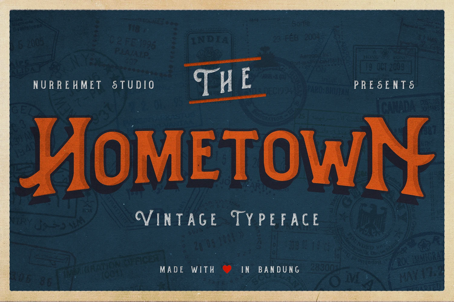
Best For: logos, posters, product labels, vintage designs
Hometown Font has a postcard-era display feel, with broad vintage serif forms, softened corners, and a sturdy silhouette that holds up well with shadow or layered styling. The uppercase letters look wide and grounded, while the smooth curves keep the texture friendly rather than stiff.
It suits Vintage Logo Fonts especially well for labels, signs, and short headers that need instant nostalgia without losing clarity. Try mixing uppercase and lowercase to loosen the rhythm of a wordmark, then keep the supporting text simple so the chunky shapes and old-postcard character stay front and center.
Wildborn Font
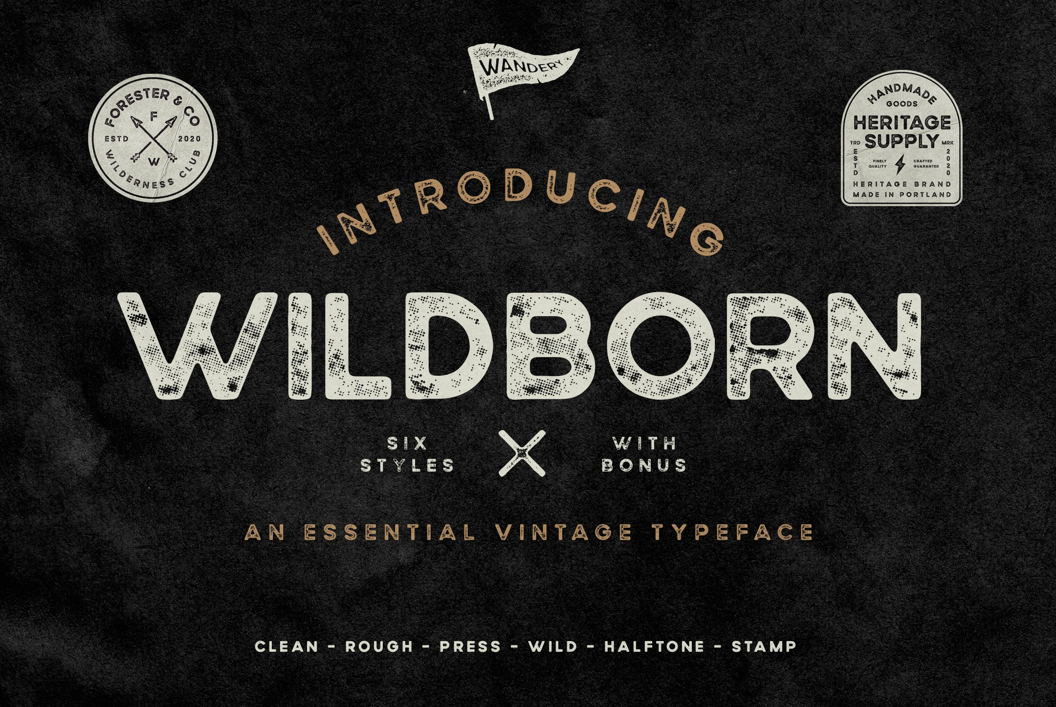
Best For: logos, badges, product labels, vintage designs
Wildborn Font is a sturdy vintage sans serif with wide uppercase forms, rounded corners, and a speckled halftone texture that feels printed rather than digitally clean. Its open counters and even weight keep the wordmark readable, while the rough surface adds the worn character of outdoor labels, club badges, and heritage packaging.
For Vintage Logo Fonts, it is useful when a design needs rugged nostalgia without moving into ornate serif or blackletter territory. The six styles help you shift between cleaner and rougher marks, and the included vintage logo templates give a practical starting point for badge layouts, label systems, and apparel graphics.
Conclusion
Choose ornate serif styles for premium labels and period detail, groovy or script fonts for playful retro marks, Gothic blackletter for darker impact, and rugged badge fonts for textured heritage branding.