16 Best Bold Cursive Fonts for Logos in 2026
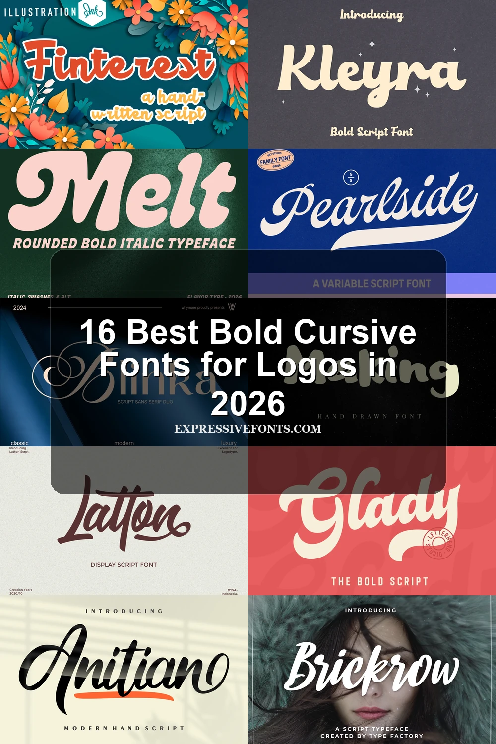
This collection moves from high-contrast, right-slanting brush scripts with sweeping flourishes to rounded connected lettering and more deliberately separated display forms. These Bold Cursive Fonts are aimed at logos, headlines, packaging, apparel, invitations, signage, and other short, prominent applications where movement and personality matter.
Looking for more cursive fonts? Browse our complete Cursive Fonts collection to compare modern, bold, wedding, logo-friendly, and Cricut-ready cursive styles.
Bold Cursive Fonts: Connected Brush Scripts
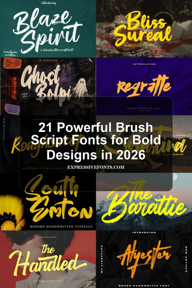
Bold Cursive Fonts: Connected Brush Scripts share continuous joins, rightward movement, and visible brush variation. They are more energetic and flourish-heavy than the rounded group, with the strongest impact at display scale.
Clarkson Font
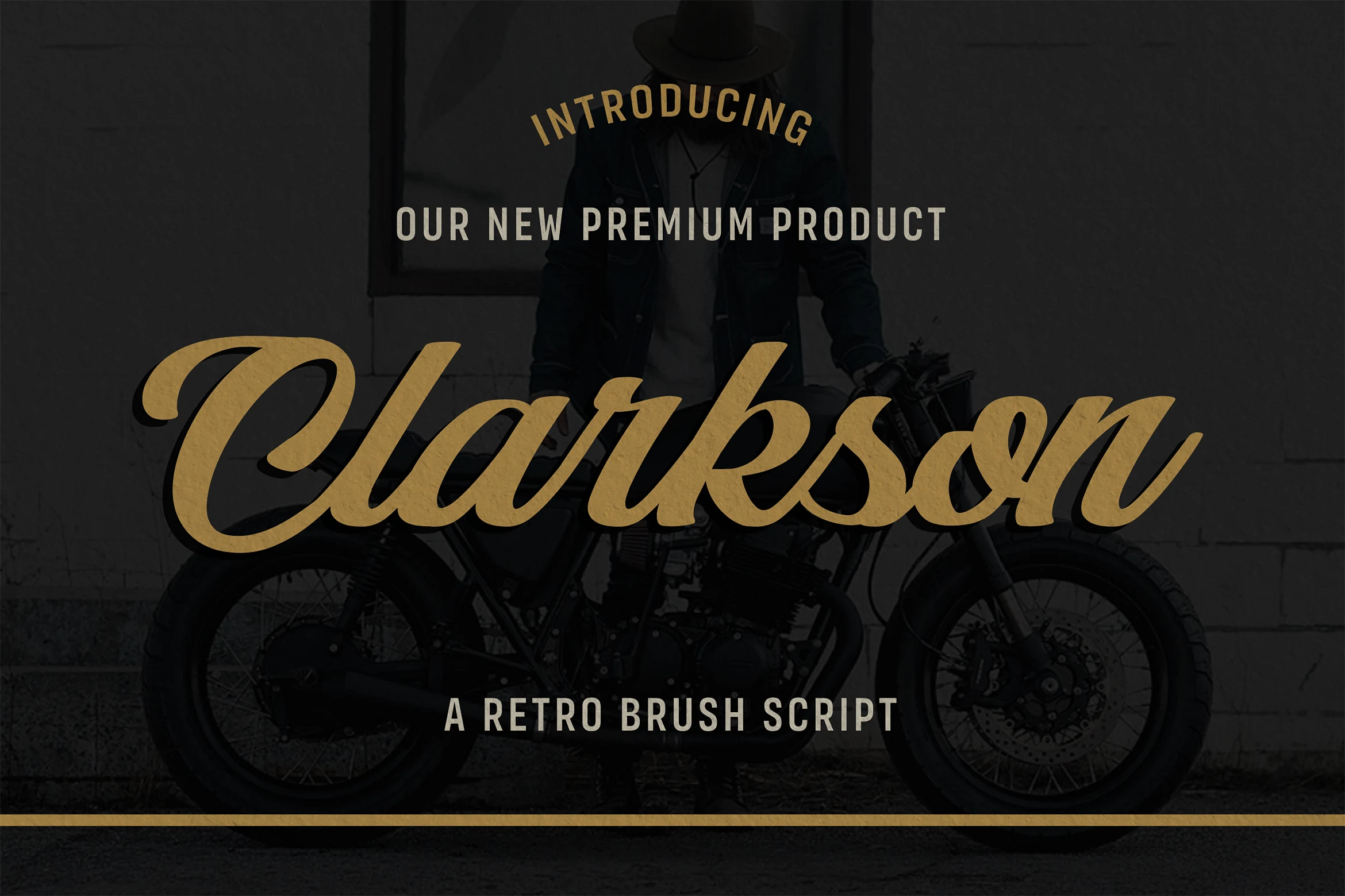
Best For: fashion branding, editorial designs, display text, headlines
Clarkson Font combines high-contrast brush strokes with a pronounced rightward slant and sweeping entry and exit strokes. Its dense swashes suit large fashion branding, editorial headlines, and athletic display work, while smaller settings may lose clarity.
Jaqueline Font
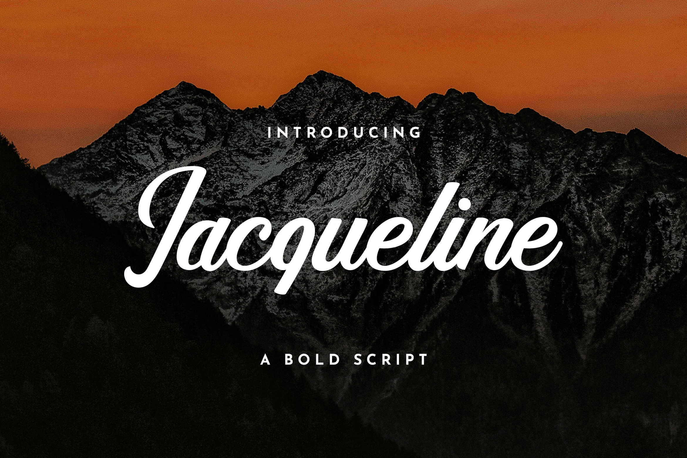
Best For: logos, wedding designs, T-shirts, signage
Jaqueline Font applies a monolinear paint-brush treatment to connected, right-slanting forms. Without heavy stroke contrast, its stable bold structure stays suitable for display branding, signage, wedding work, and apparel lettering.
Tahta Font
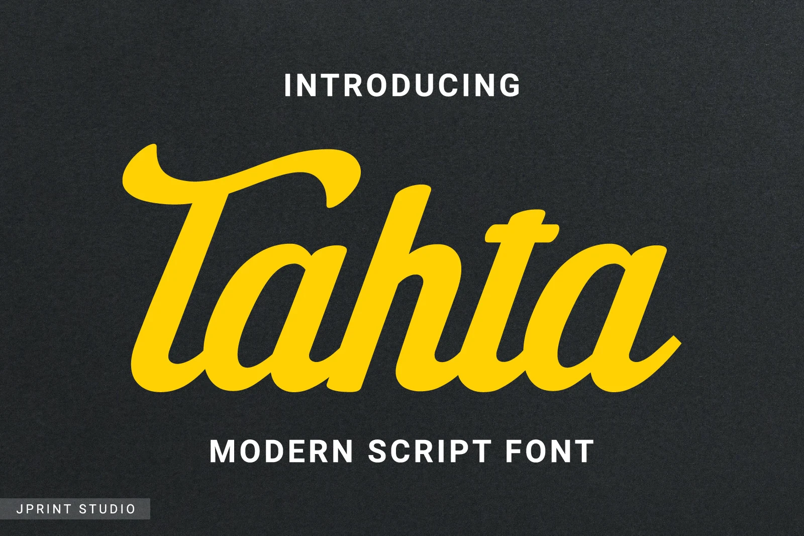
Best For: display text, posters, vintage designs, expressive designs
Low-contrast connected strokes give Tahta Font an approachable brush impression, while the sweeping capital T supplies a clear focal flourish. Check spacing in short phrases, where that terminal swash can occupy more room than expected.
Brickrow Font
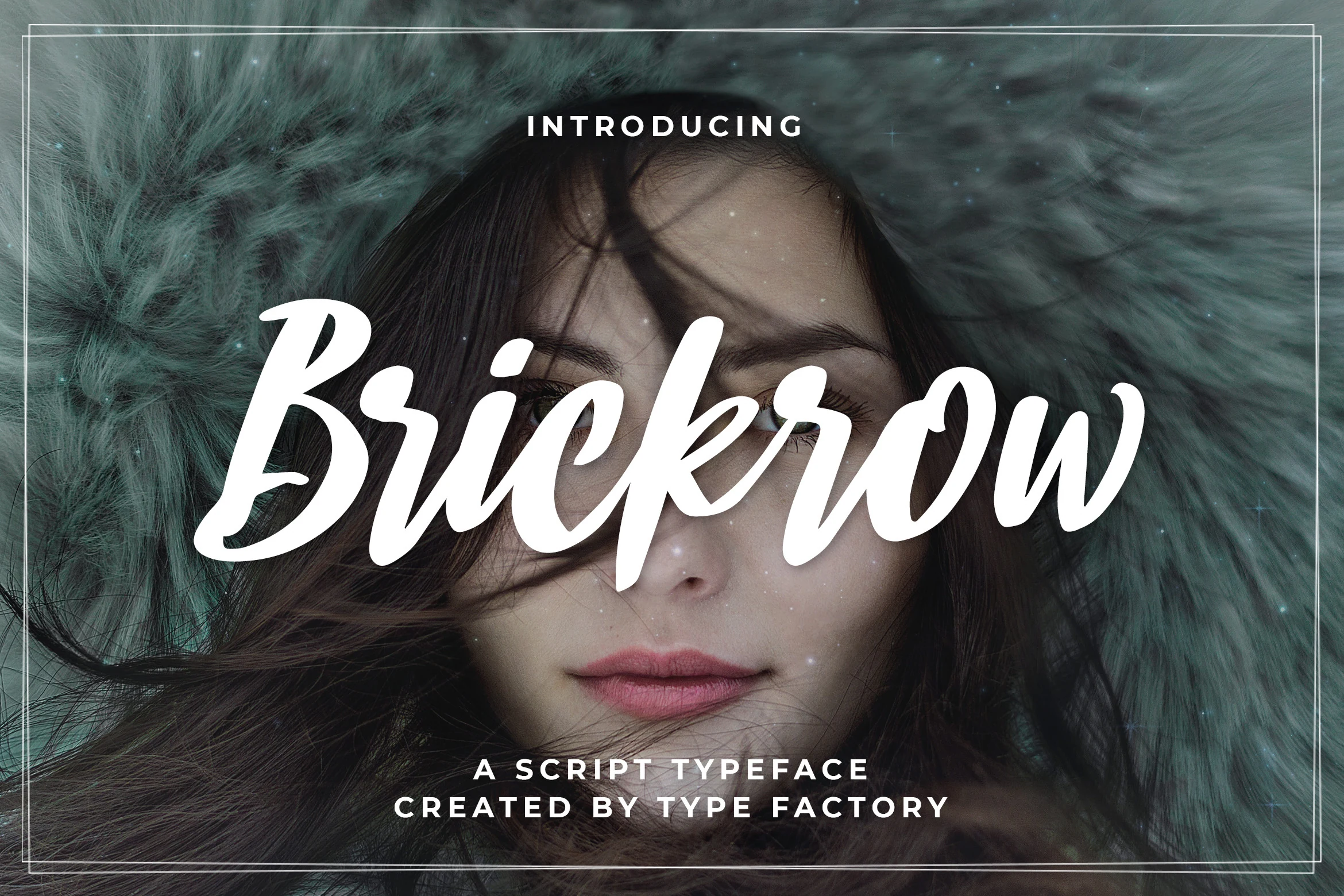
Best For: logos, headlines, posters, badges
For posters, badges, and logos, Brickrow Font brings asymmetrical character construction to high-contrast connected brush strokes. The uneven forms create an energetic edge at large sizes, but their decorative joins make the font unsuitable for extended reading.
Vafgary Font
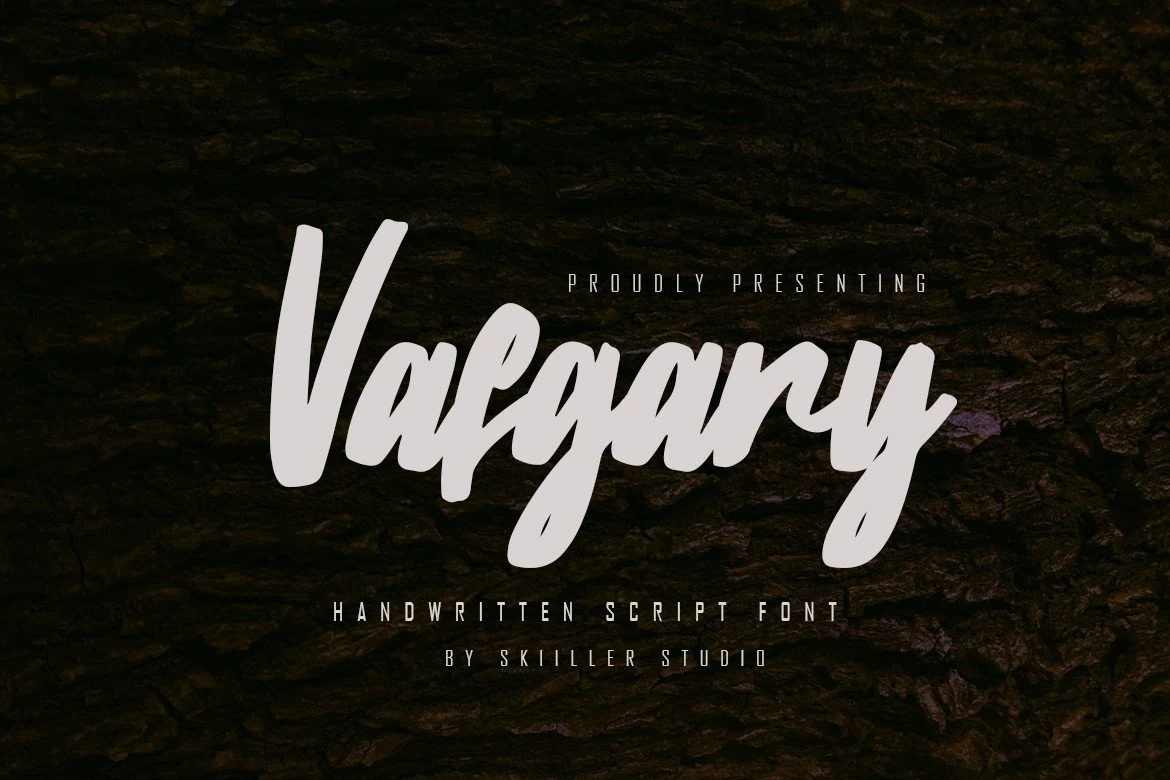
Best For: logos, branding, short phrases, personal branding
Vafgary Font pairs high thick-to-thin contrast with a forward-slanting marker-pen impression. It gives short personal-branding phrases a distinctive signature, though its thinner connections can weaken at small sizes or in longer wording.
Sandbox Font
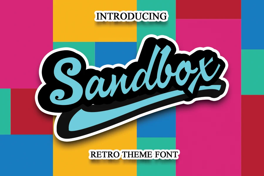
Best For: headlines, logos, signage, retro designs
Sandbox Font is built around connected brush lettering and a large sweeping underline flourish. That underline makes it particularly effective for logos, signage, and headline emphasis, although it can become the dominant element in a compact composition.
Latton Font
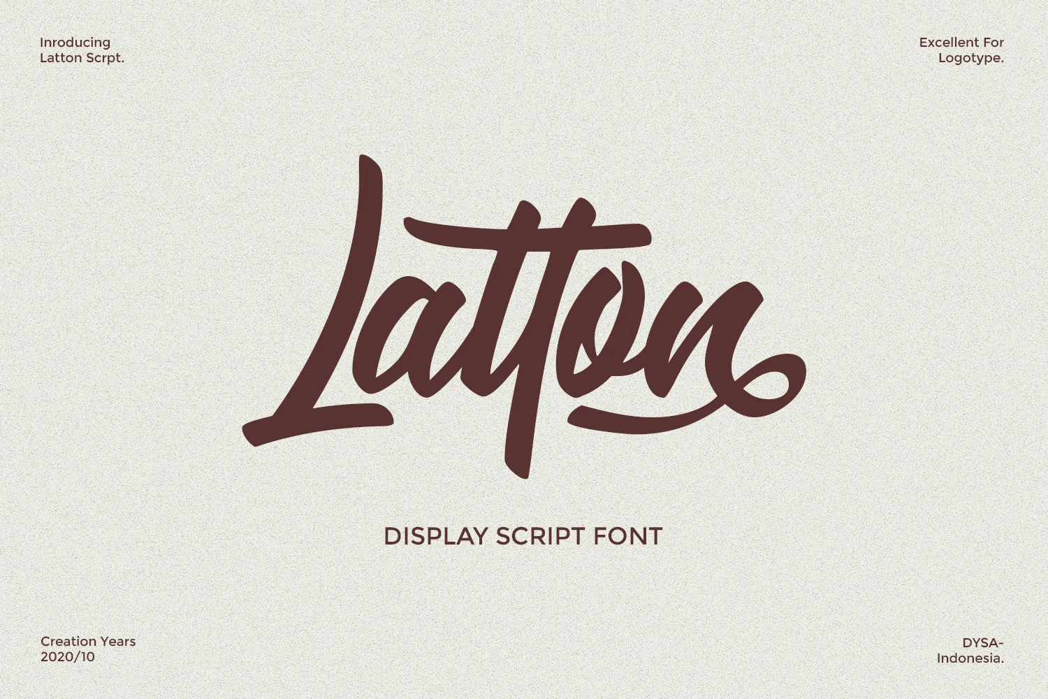
Best For: logos, branding, packaging, headlines
For logos and packaging, Latton Font combines varying brush thickness with prominent flourishes and swashes. Its connected display construction supplies strong personality, but the ornament and heavy strokes limit it to short wording at generous sizes.
Anitian Font
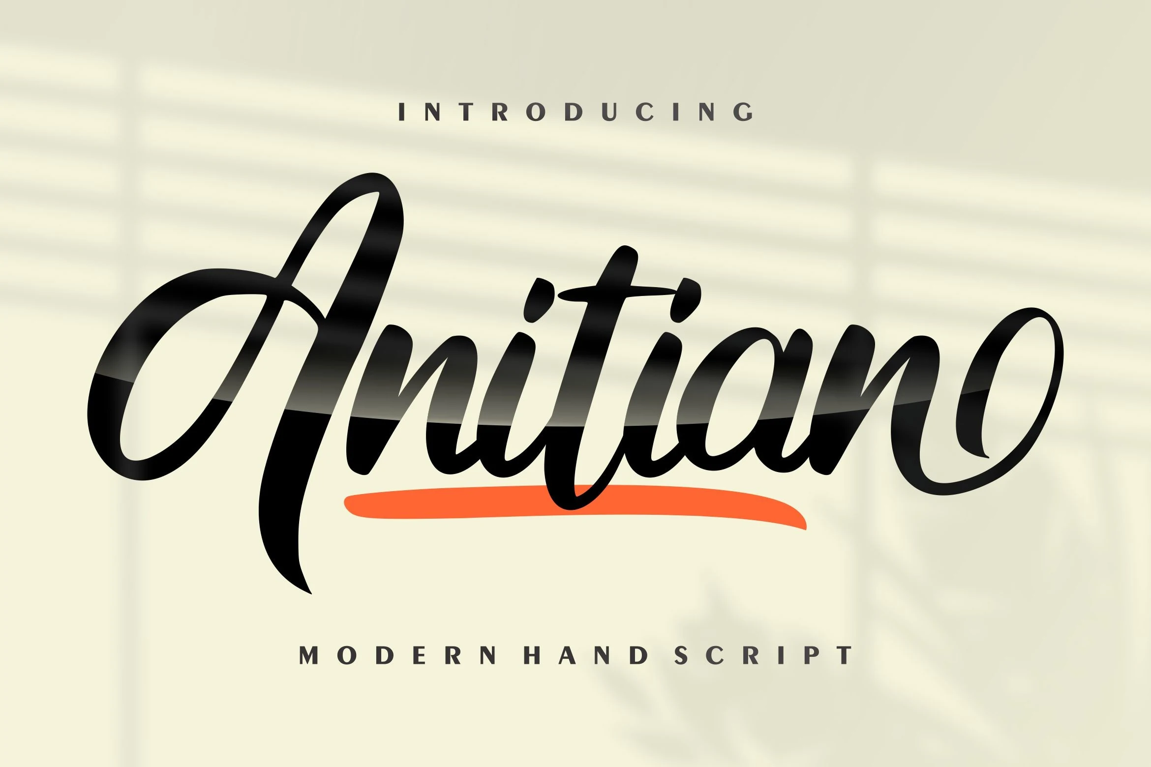
Best For: logos, headlines, display text, nostalgic designs
Anitian Font uses high contrast, a pronounced rightward slant, and elongated terminal swashes to create nostalgic movement. Its thin connections and extended flourishes are most effective in large headlines and logotypes, where small-scale clarity is less critical.
Rounded Connected Scripts
These rounded connected scripts soften cursive movement through broad terminals, heavier strokes, and restrained or upright slants. Compared with the brush scripts, they prioritize approachable clarity while remaining suited to prominent display wording.
The Linestay Font
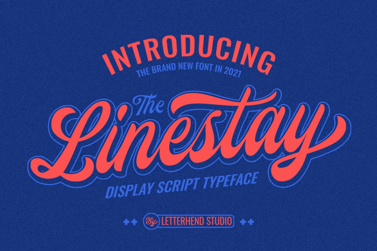
Best For: logos, branding, headlines, display text
For logos and headlines, The Linestay Font brings high-contrast connected cursive with a pronounced rightward slant. The extended swashes on the initial L and final y provide strong visual punctuation, but their detail calls for generous display sizing.
Pearlside Font
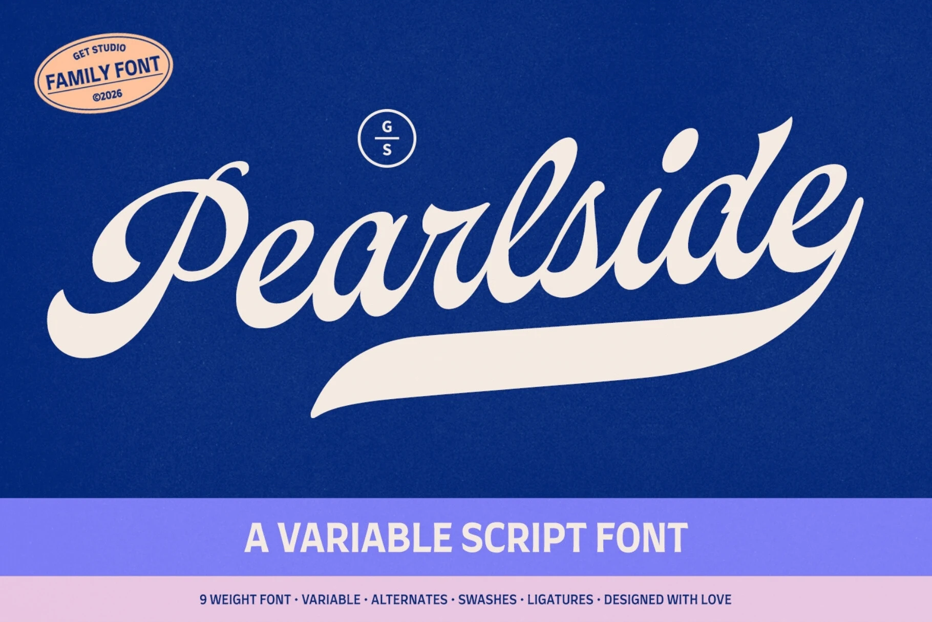
Best For: logos, branding, social media graphics, T-shirts
Pearlside Font offers nine weights and swash alternates, giving its connected athletic lettering broad control across large logos and apparel graphics. Its irregular baseline and decorative joins add character, but small text can become difficult to parse.
Glady Font
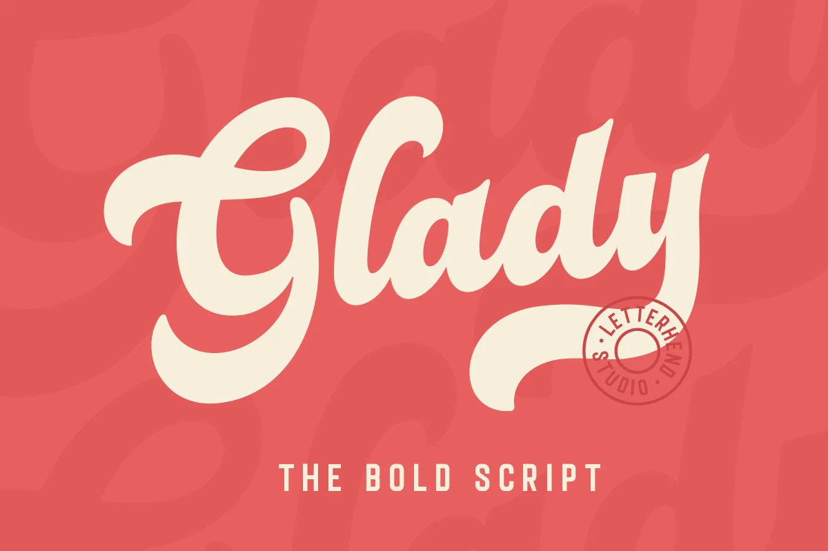
Best For: logos, headlines, display text, branding
Heavy connected strokes, rounded terminals, and pronounced thick-to-thin modulation define Glady Font. The combination gives headlines and logotypes a friendly vintage presence, though dense joins and weight can blur when used at small sizes.
Kleyra Font
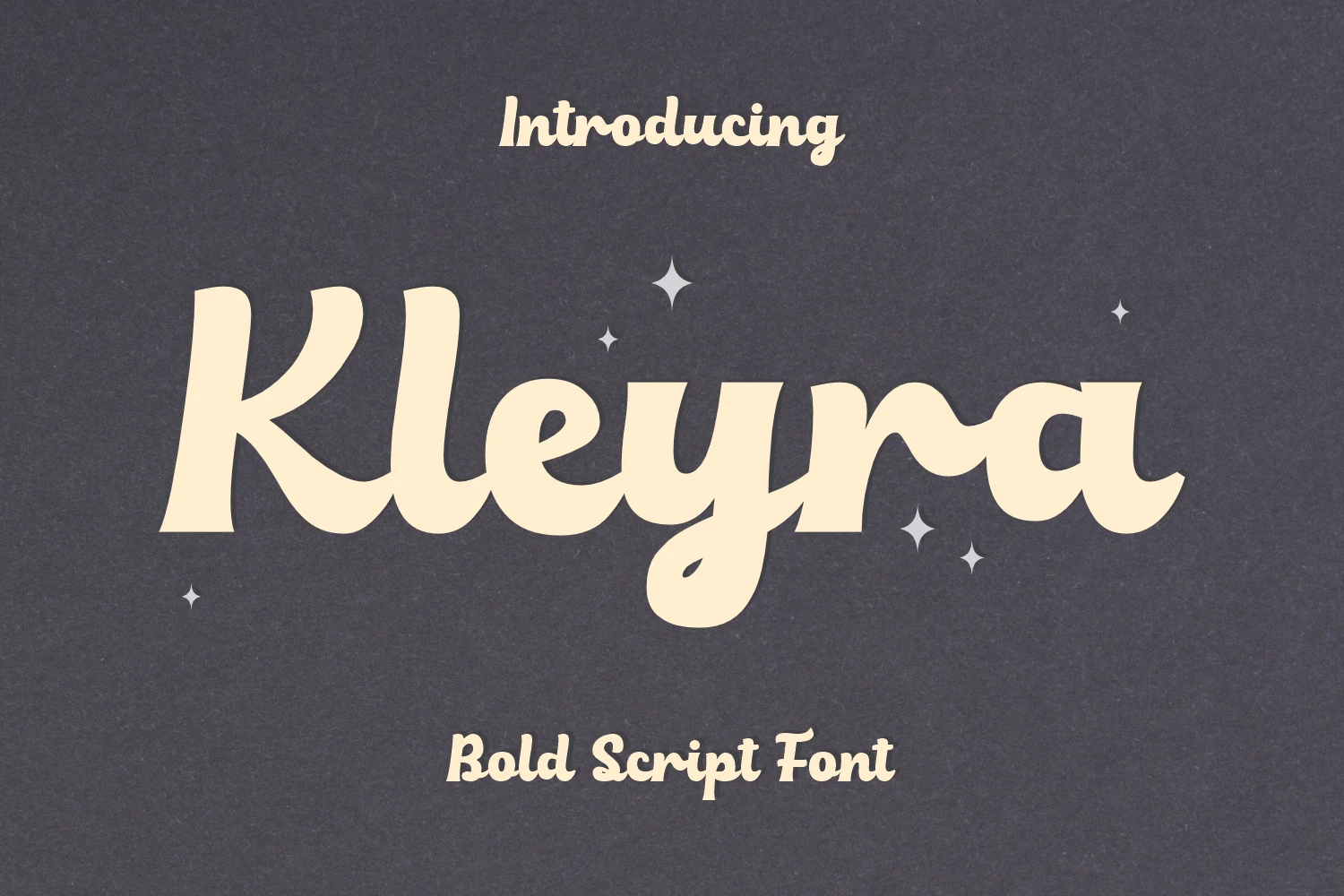
Best For: invitations, packaging, posters, display text
Bold Cursive Fonts do not always need a pronounced slant: Kleyra Font uses minimal lean, uniform bold strokes, and rounded connected forms for greater upright clarity. It holds up well on packaging, invitations, posters, and other medium-to-large layouts.
Mixed And Disconnected Display Forms
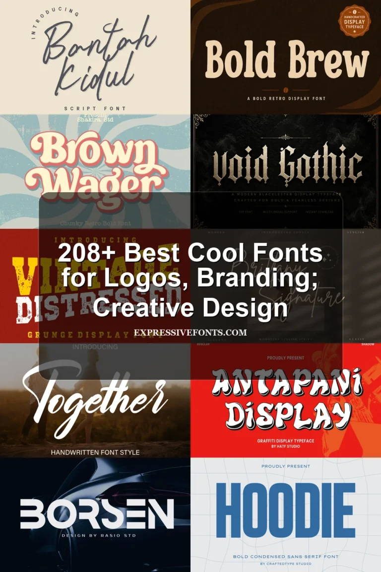
This group mixes separated letters, irregular baselines, rounded forms, and occasional script-like details. Its print-like construction offers less continuous movement than joined scripts, but often improves warmth and recognition in short labels and titles.
Melt Font
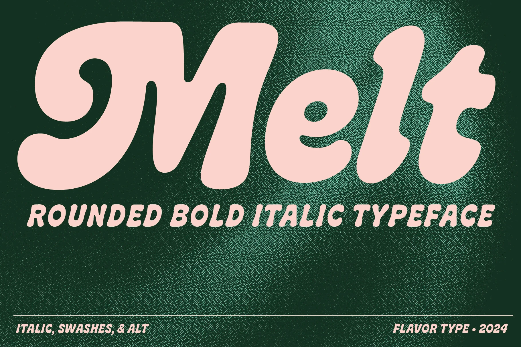
Best For: headlines, display text, logos, posters
Ultra-bold rounded forms and bulbous terminals give Melt Font a distinctive disconnected construction with a retro display character. Its soft corners and italic movement stay clearest in large headlines, logos, and posters rather than extended reading.
Blinka Font
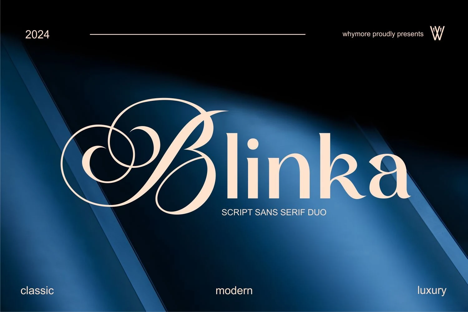
Best For: luxury designs, branding, logos, display text
Blinka Font creates contrast through an ornate script capital B followed by cleaner sans-serif lowercase structures. That mixed construction supports branding and logo work, although the initial swash can lose definition when the lettering is reduced.
Finterest Font
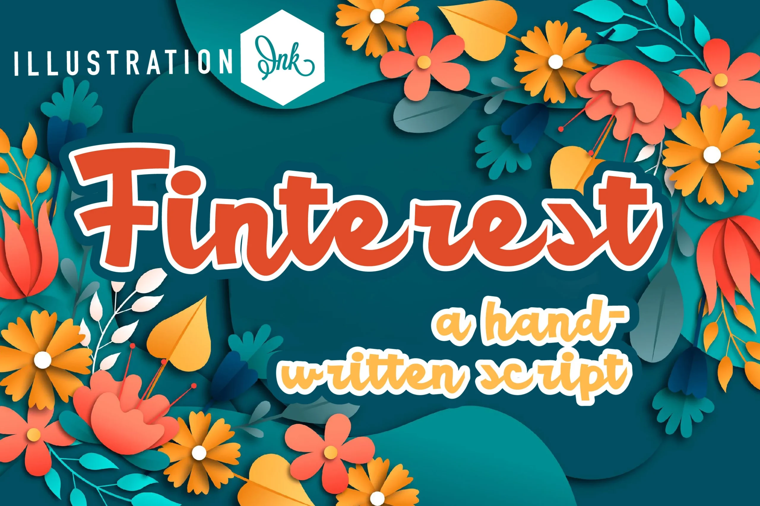
Best For: logos, branding, invitations, product labels
For labels and invitations, Finterest Font uses disconnected rounded letters and a bouncy irregular baseline to create an approachable rhythm. Its print-like construction favors warmth and short titles over the continuous joining found in brush scripts.
Making Font
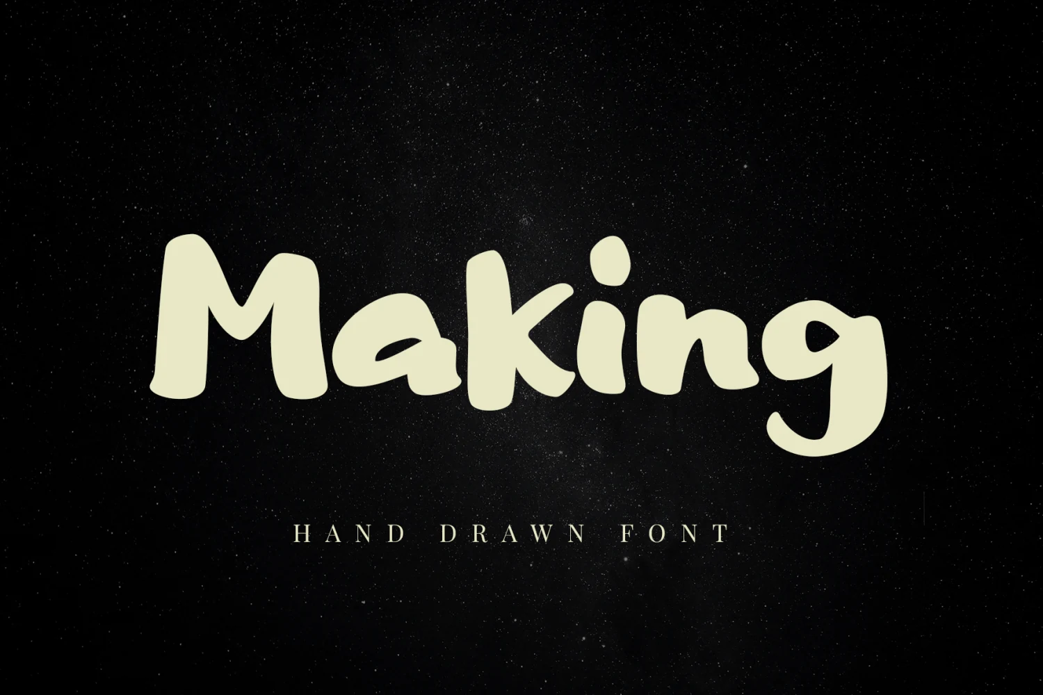
Best For: logos, product labels, display text, short phrases
Making Font relies on monolinear strokes, rounded terminals, and irregular proportions for a relaxed hand-lettered consistency. It remains readable on short labels, tags, and watermarks, but provides less continuous movement than joined lettering.
How to Choose the Right Font
Choose connected brush scripts when continuous movement, slant, and flourishes should lead the design; compare contrast and swash density before committing to a small size. Rounded connected options offer steadier readability, while separated forms suit labels and compact titles. For Bold Cursive Fonts, test the exact phrase at final scale, especially around joins and ornate capitals.