11 Best Cursive Fonts for Logos in 2026
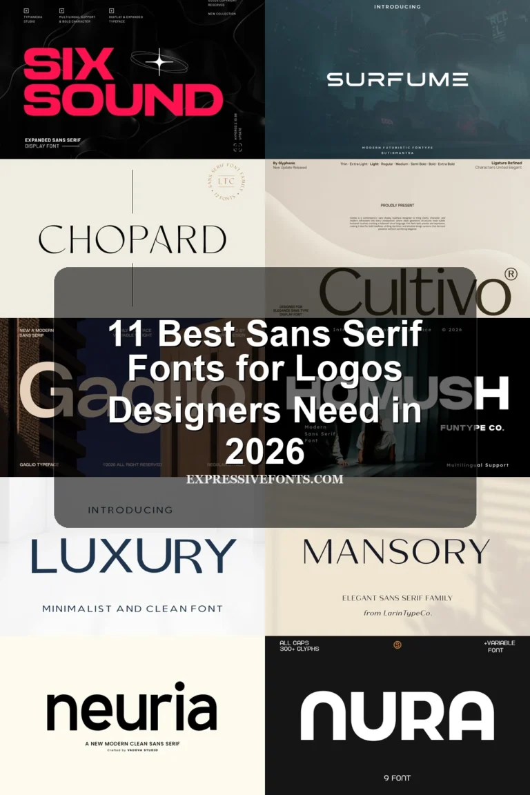
This collection ranges from connected calligraphic scripts and signature lettering to brush-based handwriting and high-contrast display forms. These Cursive Fonts for Logos serve different identity roles, from playful creative marks and personal brands to refined packaging, concise wordmarks, and bold headline-style logo treatments.
Looking for more cursive fonts? Browse our complete Cursive Fonts collection to compare modern, bold, wedding, logo-friendly, and Cricut-ready cursive styles.
Cursive Fonts for Logos: Connected Flow
These Cursive Fonts for Logos share connected movement, flowing strokes, and display-oriented curves. They differ mainly in weight, historical character, and readability, from playful joins to light signature lines.
Basskia Font
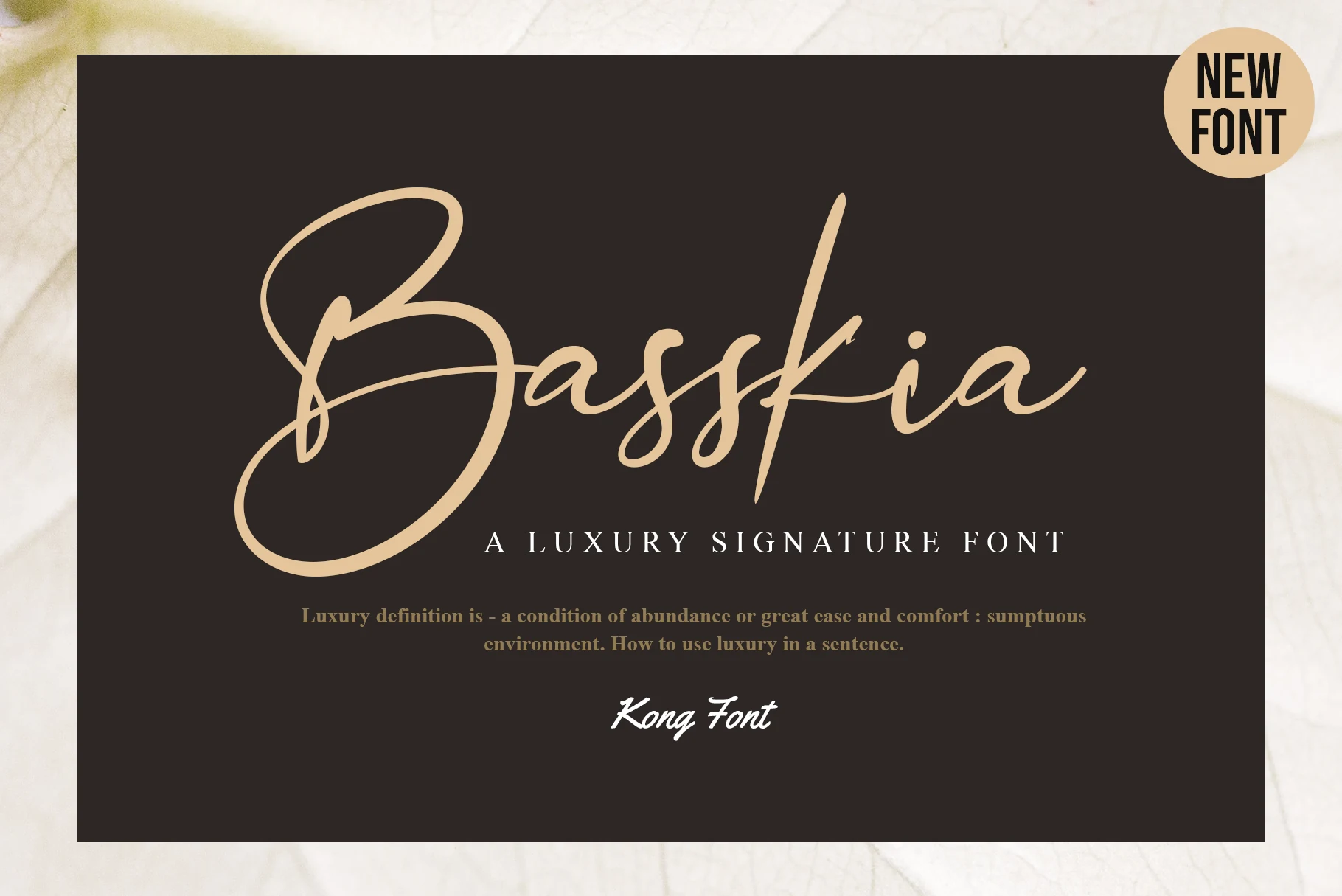
Best For: logos, branding, creative projects, short phrases
Basskia Font is a strong choice when Cursive Fonts for Logos need visible movement without losing a rounded, playful personality. Its connected or softly joined letterforms give short names and creative marks a clear directional flow, while the modern construction keeps the result lively. That playful character may be less appropriate for restrained or highly formal brand voices. It is also compatible with Photoshop and Silhouette Design Studio.
Zephan Font
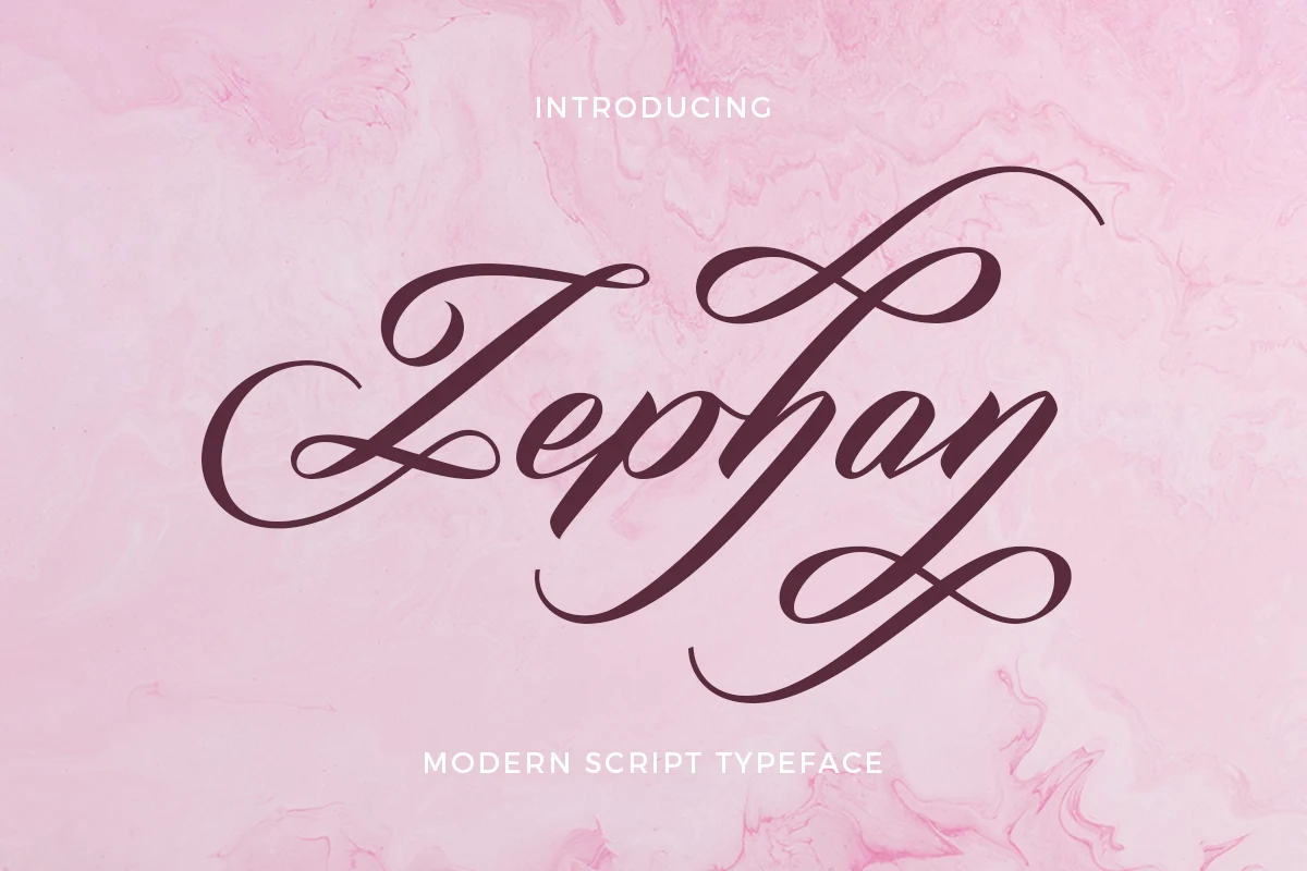
Best For: logos, branding, wedding designs, invitations
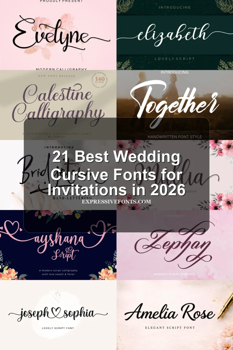
Zephan Font creates a polished rhythm by balancing substantial strokes with refined slender details. Its calligraphy-inspired, connected construction helps a name move smoothly across a logo, while moderate contrast prevents the lettering from feeling uniformly heavy. Keep wording concise: dense taglines can obscure the weight variation that makes this script distinctive.
Gastonia Script Font
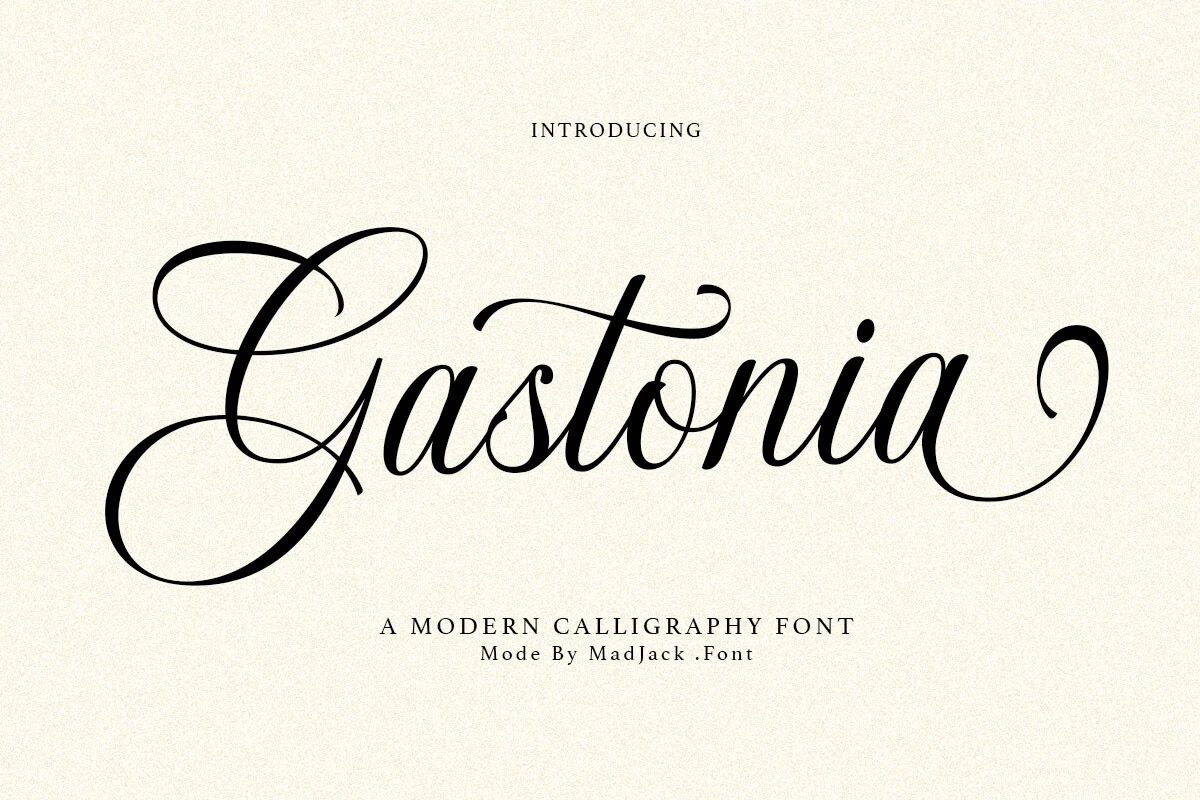
Best For: branding, packaging, wedding designs, editorial designs
Gastonia Script Font is a light modern calligraphy script built from continuous flowing strokes, graceful curves, and slender letterforms. It works particularly well for refined brand names and packaging marks where a soft line can remain visible. Its limited visual mass makes it less suitable for logos that need to dominate at small sizes or from a distance.
Alanta Font
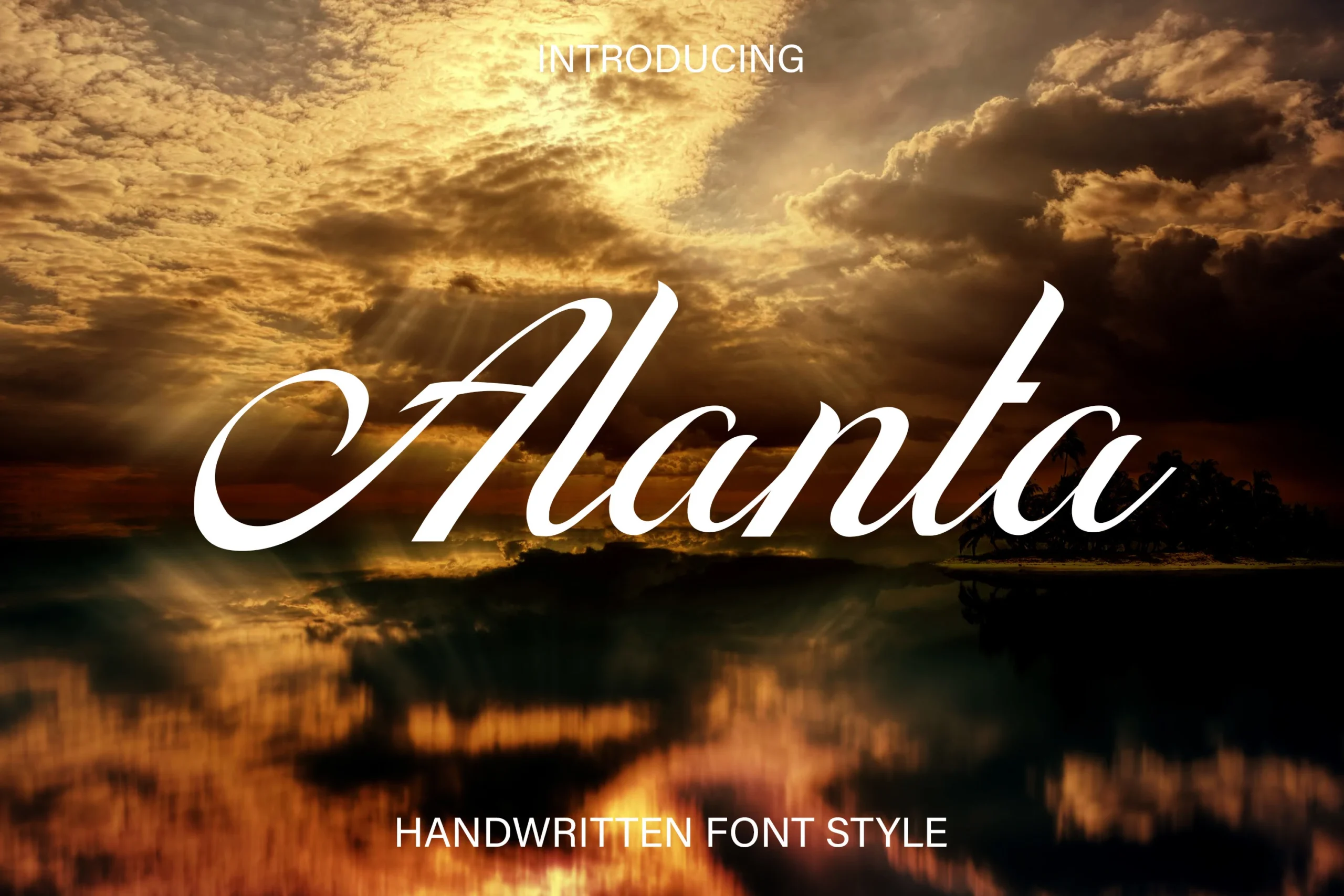
Best For: logos, branding, headlines, short phrases
Alanta Font combines connected cursive movement with an explicitly easy-to-read treatment, making it one of the more practical options for logo names and short headlines. Its flowing forms still provide display character, but the light construction needs sufficient scale and contrast. Use a larger application size when the mark must remain clear in reduced formats.
Calestine Calligraphy Font
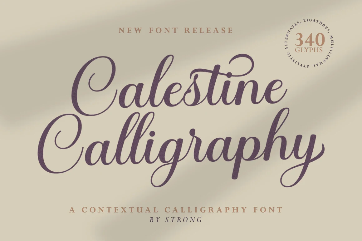
Best For: logos, headlines, short phrases, invitations
Calestine Calligraphy Font brings flowing calligraphic motion, slender strokes, and distinctive display letterforms to concise names. The connected treatment can make a logo or invitation title feel graceful and directional, while its light construction favors brief wording with generous space. Longer taglines or small lockups may hide the fine details that define its character.
Mueband Font
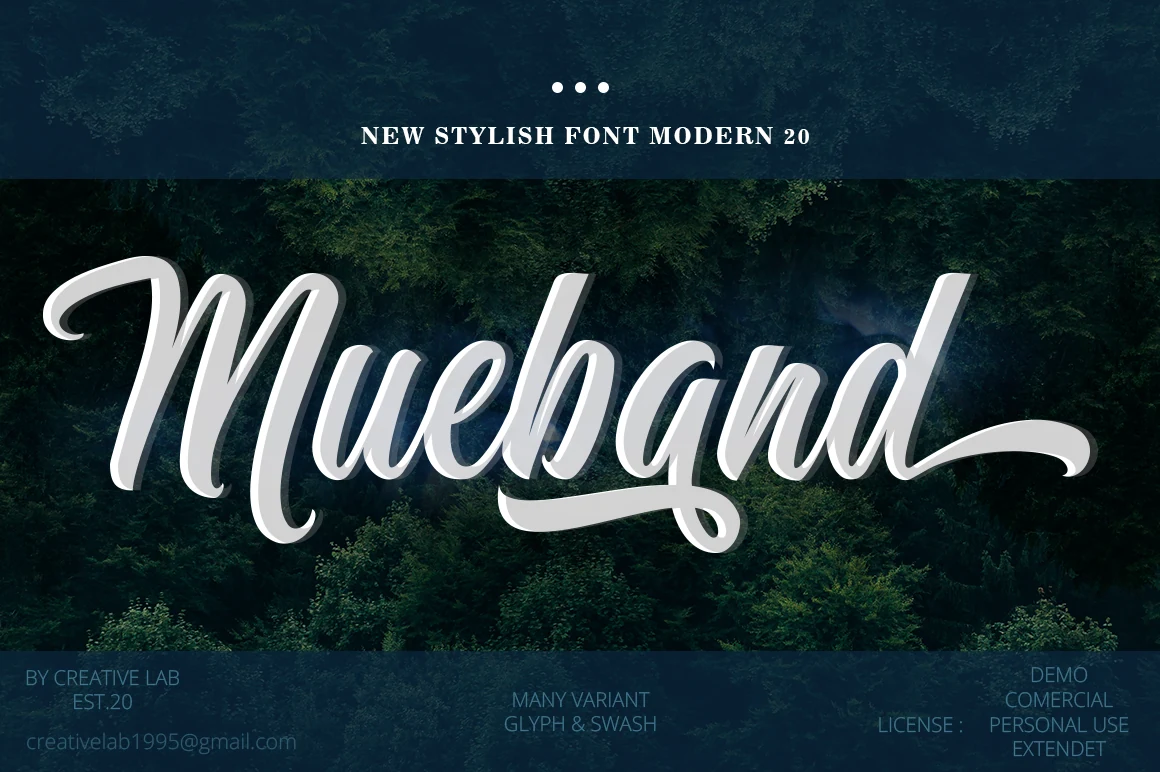
Best For: logos, branding, display text, short phrases
Mueband Font stands apart through its classic, period-inspired calligraphic character within a connected script structure. That recognizable display flavor can give a brand name a strong signature, especially when the identity welcomes historical references. It is less suitable for brands seeking a plainly contemporary tone, so compare its visual period feel against the rest of the identity system.
Brittany Signature Script Font
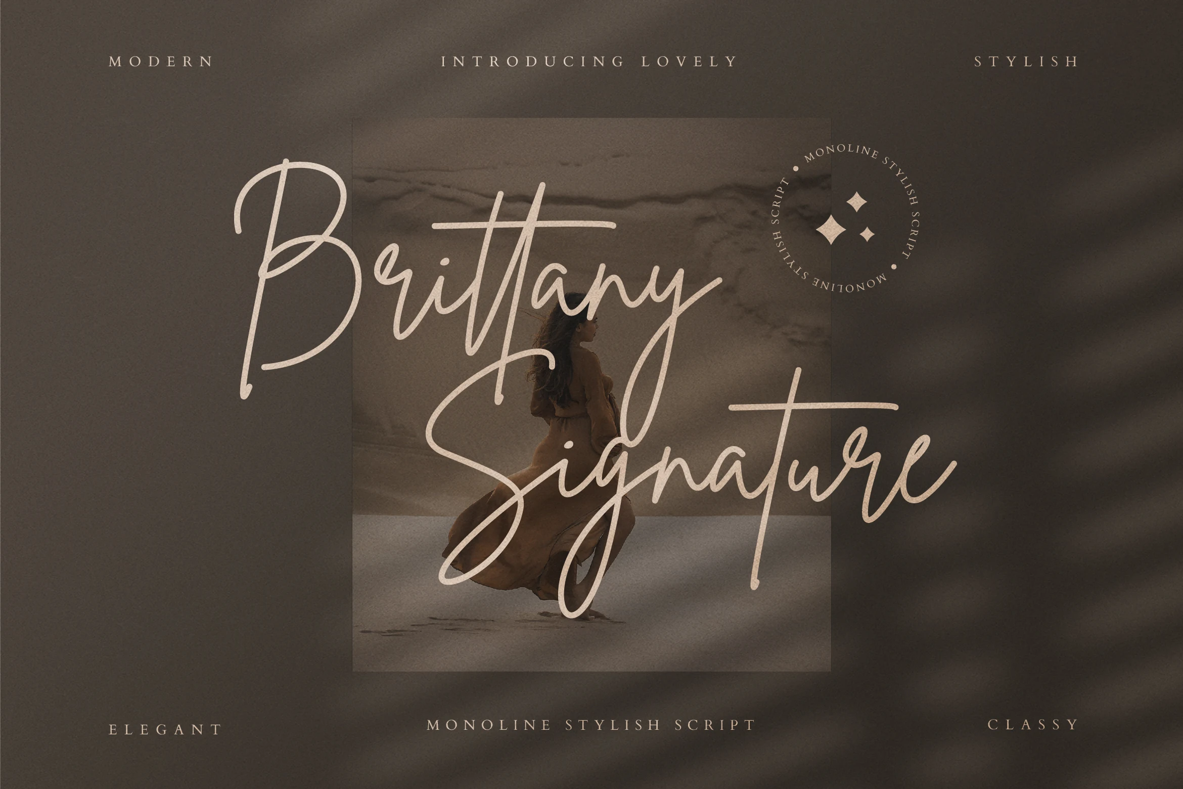
Best For: logos, branding, personal branding, short phrases
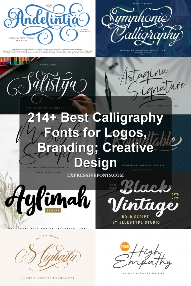
Brittany Signature Script Font centers on distinctive curves and an inky flow that resembles a personal signature. Its light connected strokes suit concise logo names and personal branding, where the individual gesture is part of the message. Avoid information-heavy lockups: extra wording can reduce the clarity of the fine curves and signature-like movement.
Monoline Font
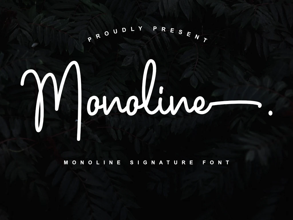
Best For: logos, branding, short phrases, invitations
Monoline Font uses a flowing signature-script approach to keep short phrases visually continuous. The connected movement can support a clean personal-branding impression, particularly in names and compact marks. Despite its style label, the evidence does not establish a fully uniform stroke system, so inspect joins and contrast at the final production size rather than assuming every line has equal weight.
Handwritten and Contrast Display Lettering
This group uses handwritten rhythm or strong display contrast without relying on confirmed cursive joins. Its heavier or more expressive construction gives short marks greater visual impact than the flowing scripts.
Dakiens Font
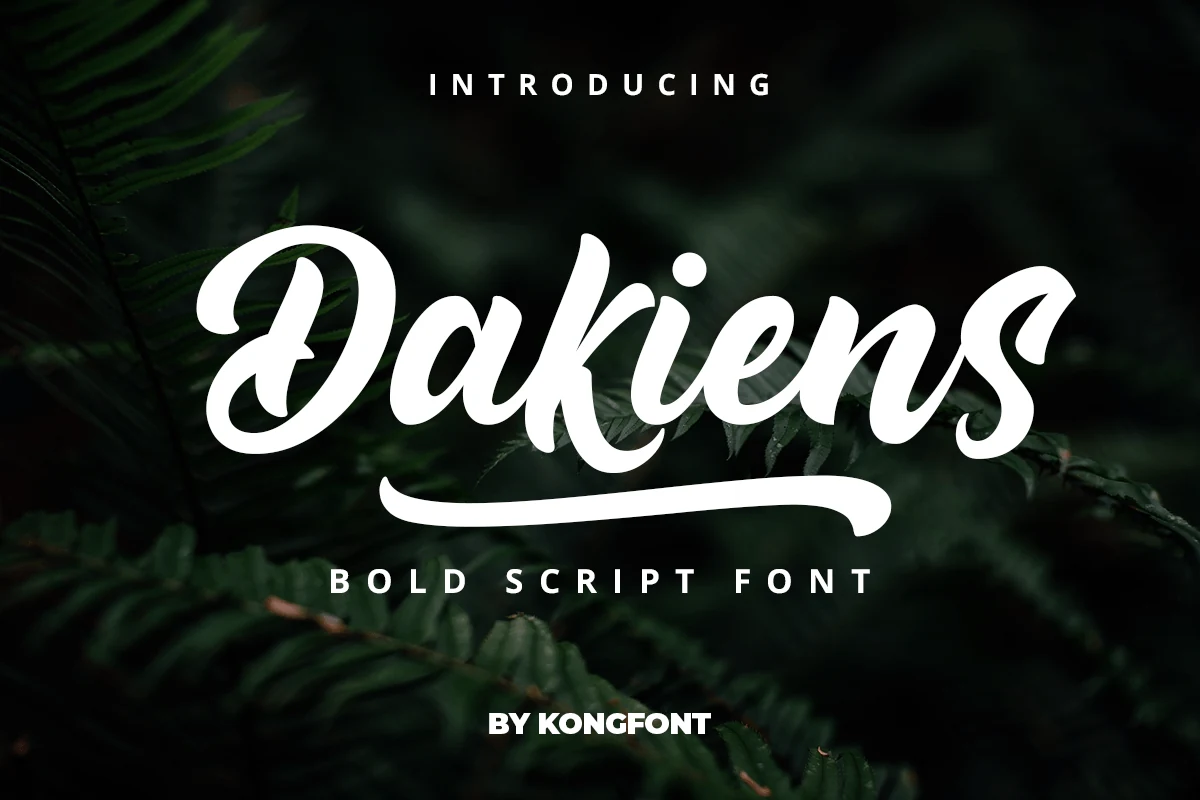
Best For: logos, headlines, display text, branding
Dakiens Font brings a substantial bold display weight that gives names and short logo phrases a stronger footprint than the lighter scripts here. Its main strokes and details create clear contrast, making it best evaluated at headline scale rather than in dense wording. The evidence confirms handwritten display lettering for logotype projects, but not connected construction.
Hiatus Font
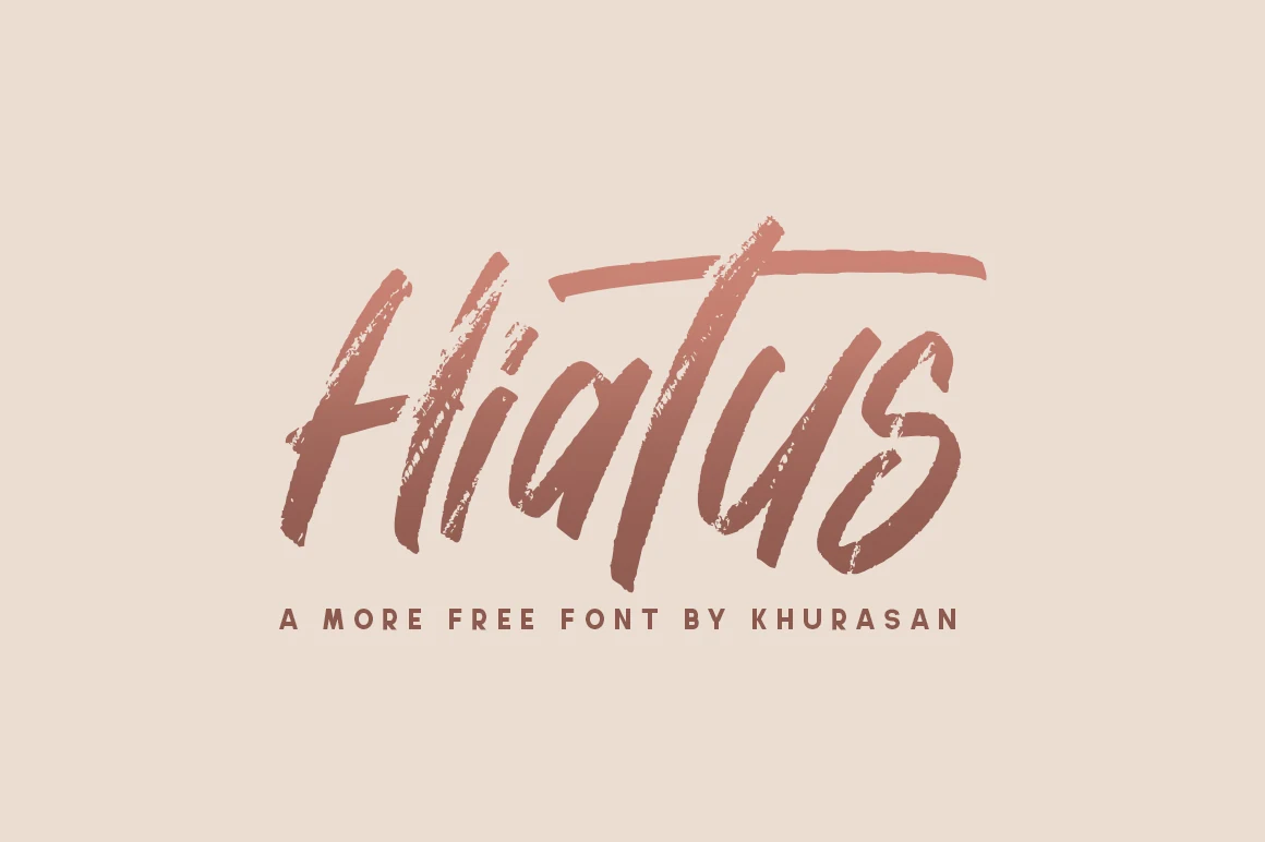
Best For: logos, branding, headlines, short phrases
Hiatus Font uses a modern brush-like stroke rhythm and a mixed-weight construction to create a clean, casual display presence. It suits short brand marks and compact names where the contemporary movement can remain visible. Because its joins are not confirmed and longer wording may become less even, test it at the intended logo size before committing.
Together Font
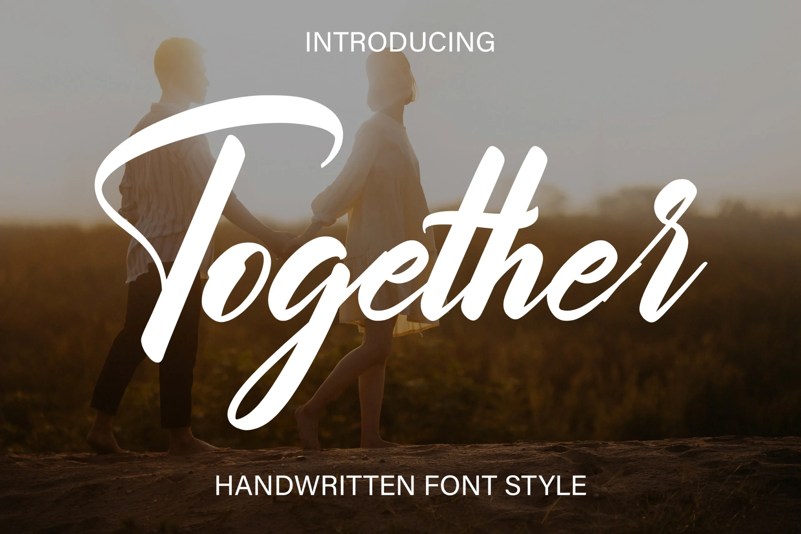
Best For: logos, branding, invitations, headlines
Together Font shifts away from cursive joins into expressive, high-contrast display lettering. Its contrast between main strokes and details can make a short logo or headline emphatic and immediately visible. Treat it as display lettering rather than a connected script; it is most effective when the identity needs graphic punch instead of handwritten flow.
How to Choose the Right Font
Choose by construction first: connected scripts create flow, while brush and display forms offer stronger standalone impact. Check weight and contrast against the application size, and reserve light, highly flourished styles for short names. For Cursive Fonts for Logos, compare joins, readability, and the brand’s desired voice before selecting the most distinctive option.