18 Best Retro Aesthetic Fonts in 2026
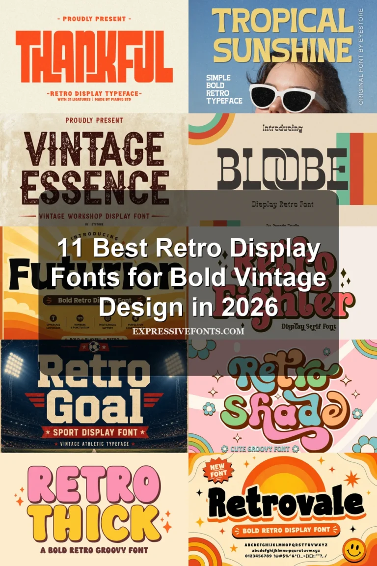
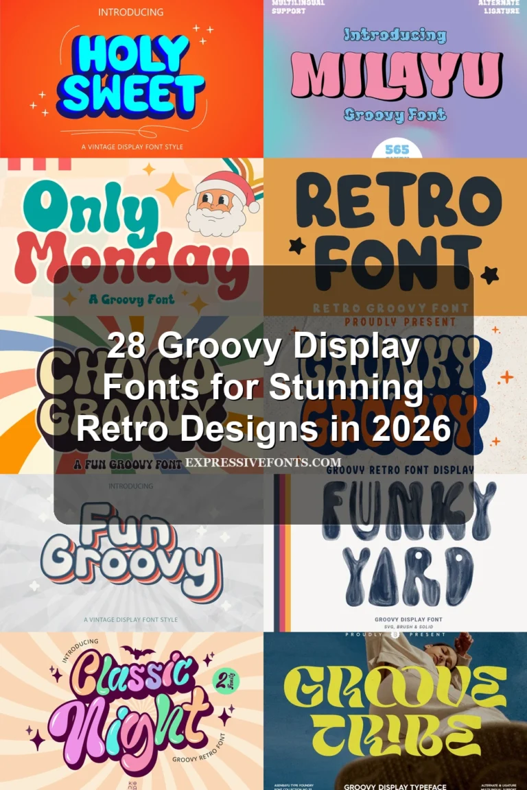
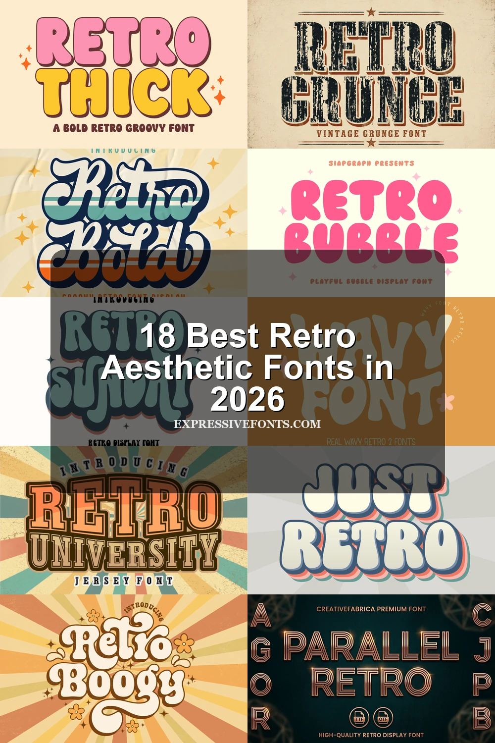
This collection spans fluid psychedelic distortion, rounded bubble lettering, connected scripts, collegiate slabs, distressed textures, and geometric line work. These Retro Aesthetic Fonts are best suited to logos, posters, apparel, packaging, invitations, and other short display applications where construction and mood matter more than paragraph-length readability.
Looking for more aesthetic fonts? Browse our complete Aesthetic Fonts collection to compare modern, elegant, bold, vintage, and retro aesthetic styles.
Retro Aesthetic Fonts: Flowing Scripts
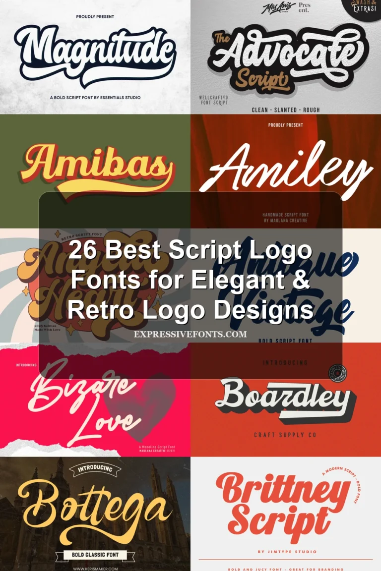
Retro Aesthetic Fonts in this script group rely on connected cursive joins, thick strokes, and expressive terminals. They feel more fluid and logo-oriented than the collection’s disconnected display faces.
Retro Vintage Font
Best For: logos, branding, invitations, wedding designs
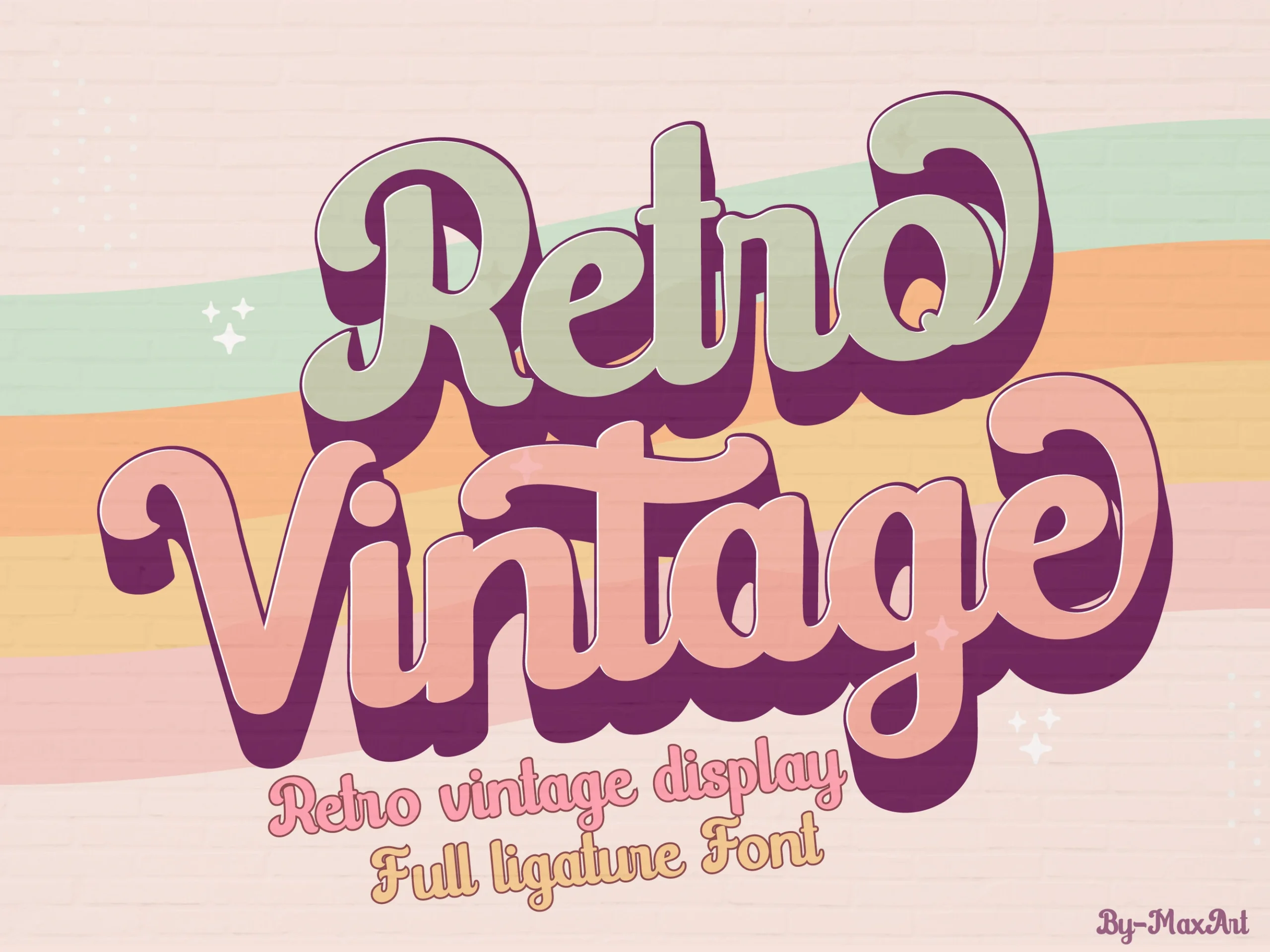
Retro Vintage Font is especially effective when a logo or invitation needs connected cursive movement. Bold strokes, rounded terminals, and sweeping cursive joins create a strongly connected silhouette that reads well at display size, although those complex connections lose clarity when reduced.
Retro Bold Font
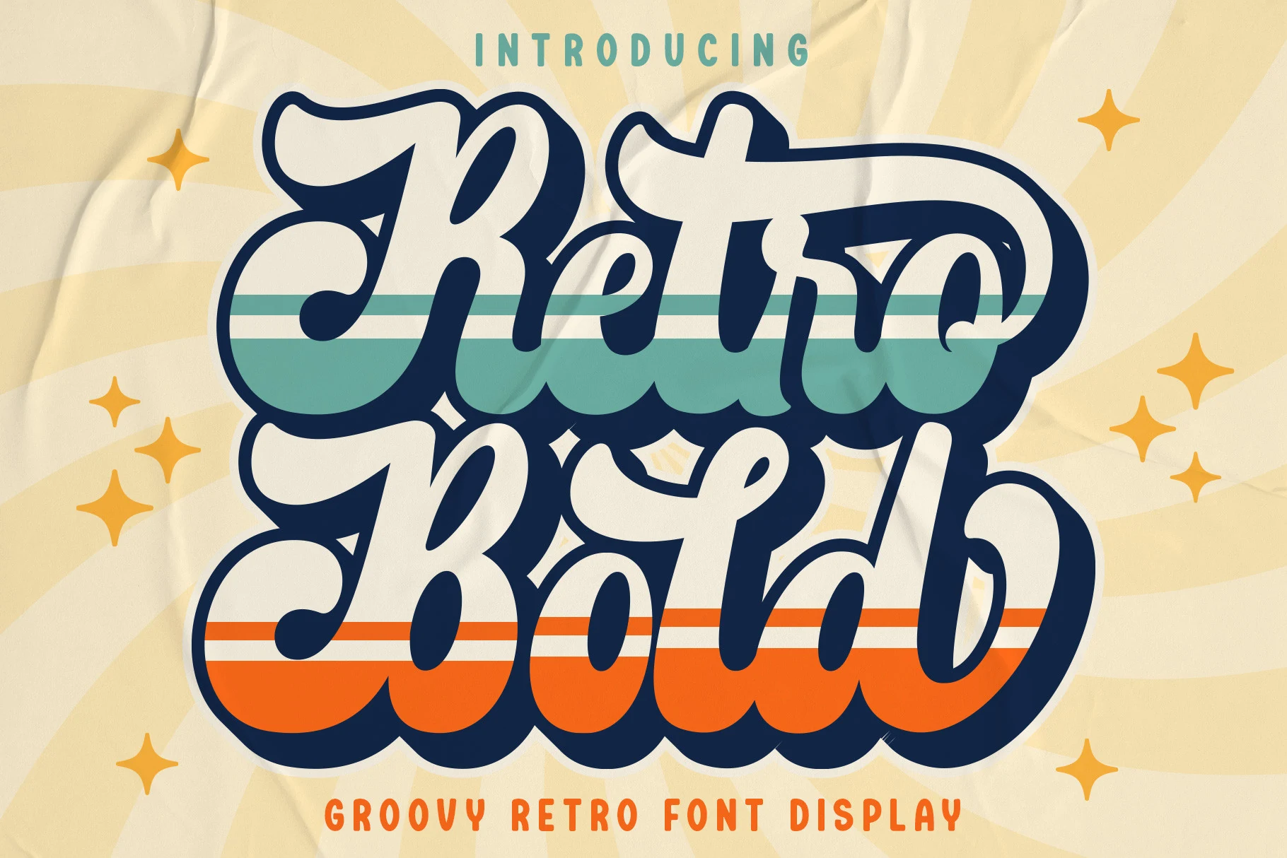
Best For: logos, branding, invitations, wedding designs
Retro Bold Font relies on consistently thick, connected strokes to create a straightforward script silhouette. Its monolinear mass is clear enough for large logos, invitations, and branding, but the joined forms need display scale to retain separation and definition.
Retro Script Font
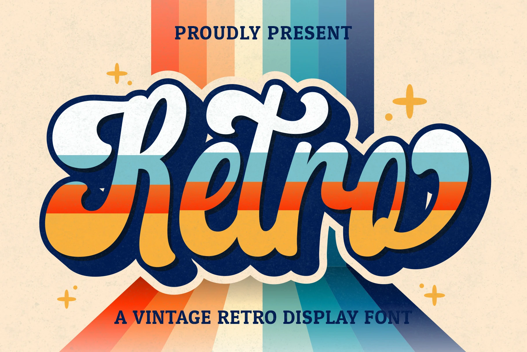
Best For: logos, branding, invitations, wedding designs
Retro Script Font is a connected, high-contrast face with a slight rightward slant and large rounded terminals. The directional angle gives logos and invitations movement, while thick joins and terminals can crowd together when the wording is reduced.
Retro Barbie Font
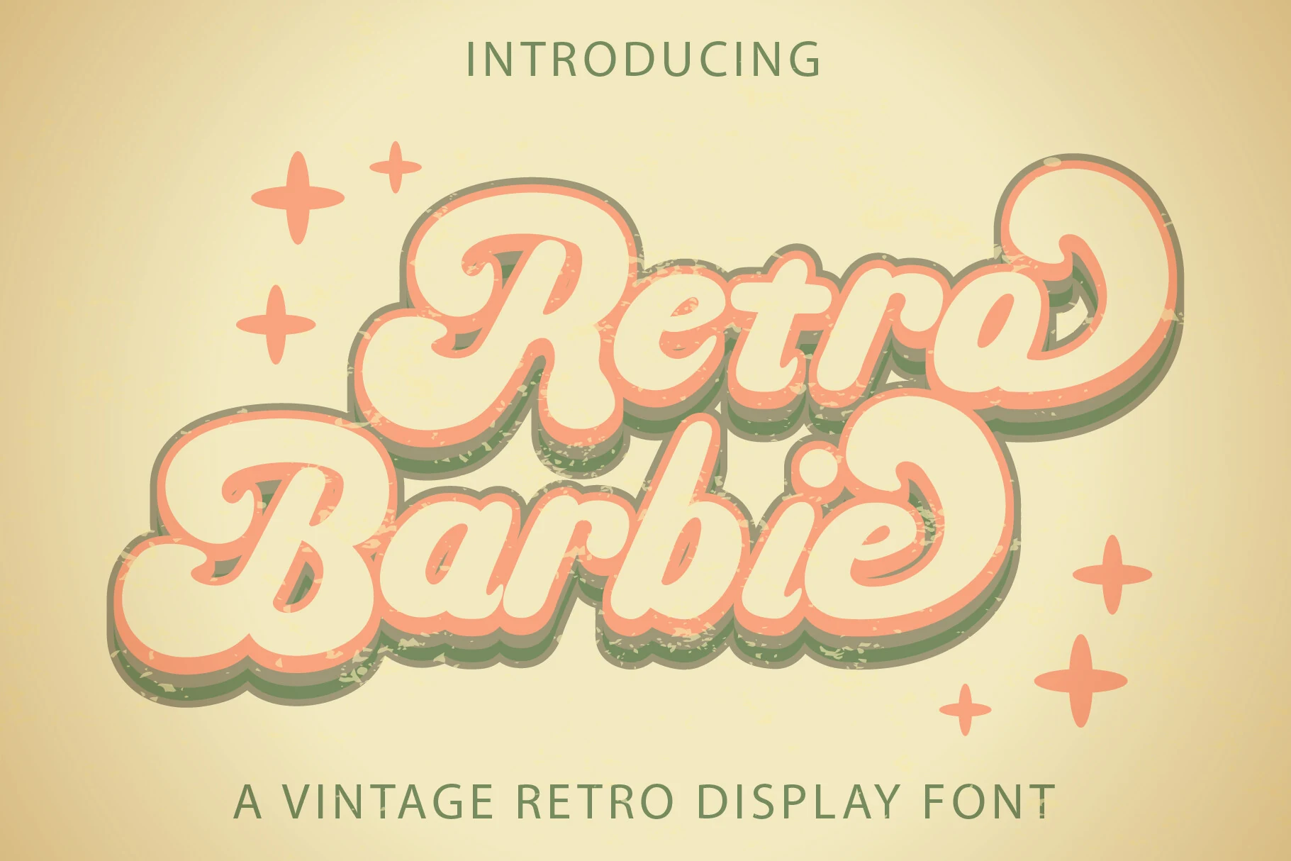
Retro Barbie Font combines connected cursive letters with layered drop shadows, creating a stacked logo effect with immediate branding presence. Its heavy interconnected forms suit large logos, invitations, and social graphics, but generous sizing is needed to preserve clarity.
Wavy And Organic Displays
These faces use waves, irregular contours, and organic curves to create movement across each word. Their fluid silhouettes are more distorted and asymmetrical than the rounded bubble category.
Wavy Retro Font
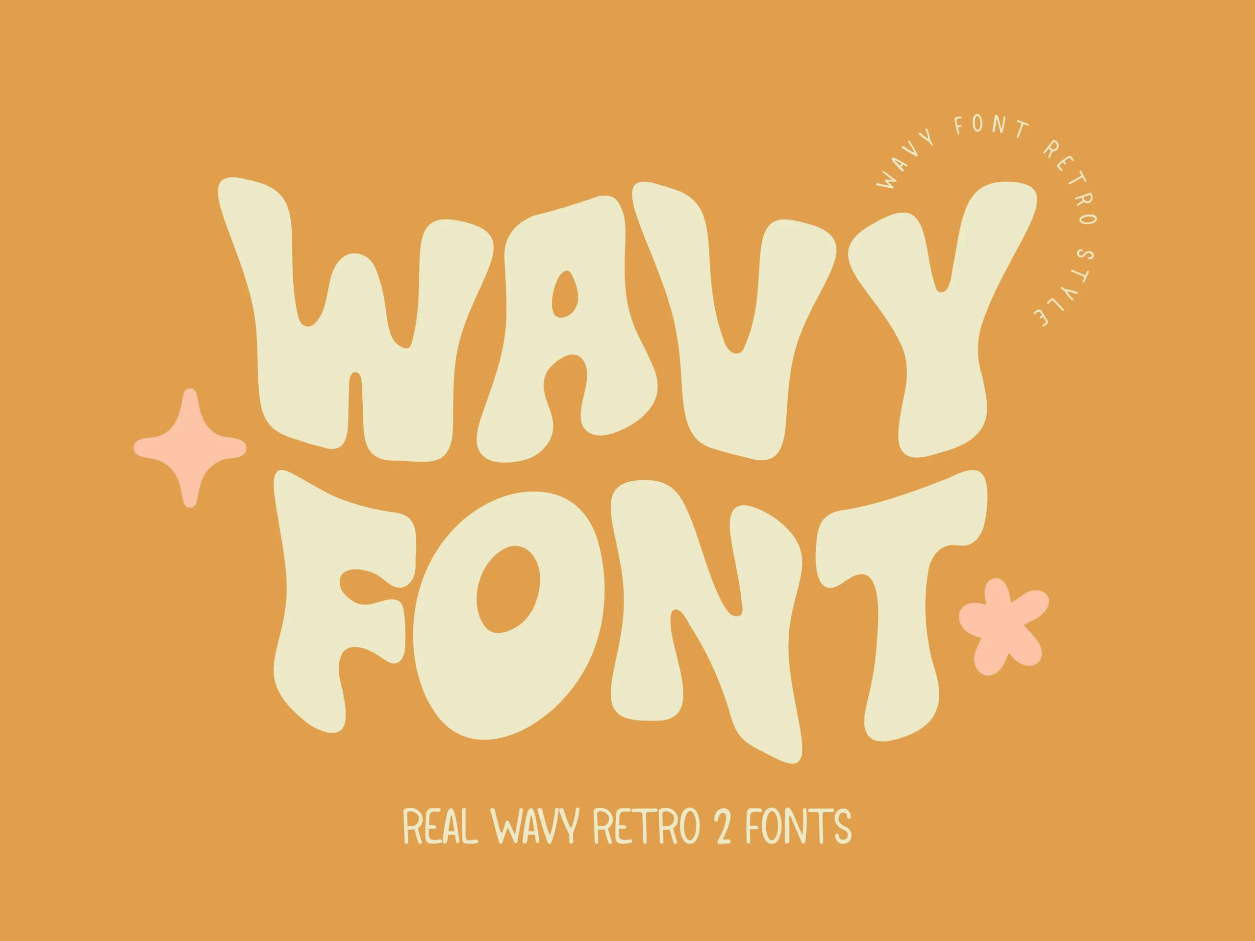
Best For: branding, display text, headlines
Wavy Retro Font pushes Retro Aesthetic Fonts toward extreme psychedelic distortion, turning heavy strokes into fluid, irregular shapes with rounded terminals. Its low legibility makes it a specialist choice for short, oversized headlines, logos, and expressive branding rather than supporting text.
Retro Sunday Font
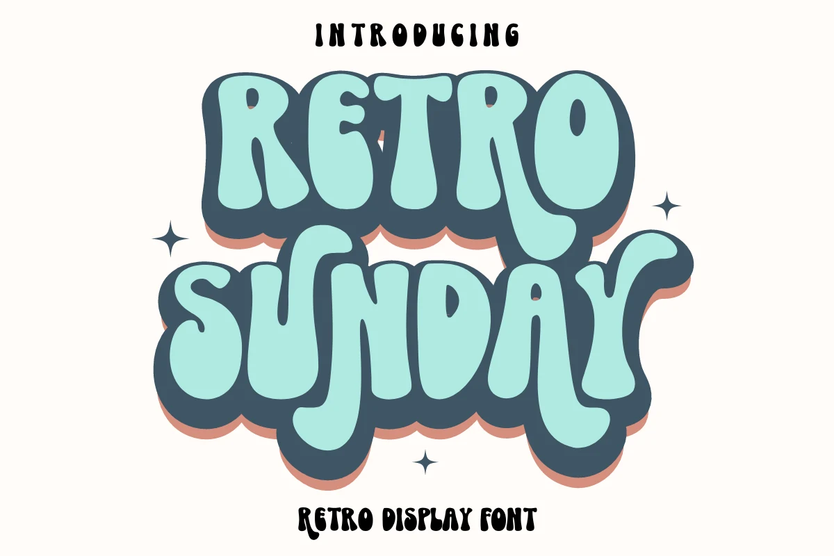
Best For: branding, T-shirts, posters, merch design
Retro Sunday Font uses thick, wavy strokes and exaggerated rounded proportions for an energetic 1970s display character. The disconnected construction suits posters, T-shirts, tote bags, and other merchandise, but its distortion and weight make it unsuitable for extended or small text.
Retro Holly Font
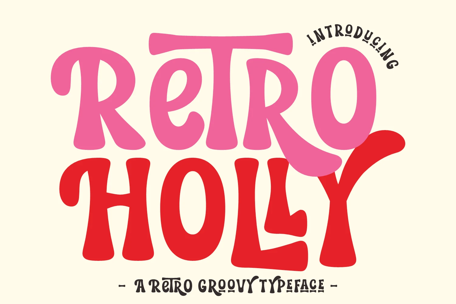
Best For: branding, headlines, posters, display text
Retro Holly Font brings Retro Aesthetic Fonts toward softer organic curves, with bold rounded forms and low contrast throughout. It can support large branding, Cricut work, and poster lettering, though its more complex curves become less distinct when scaled down.
Reatro Retro Font
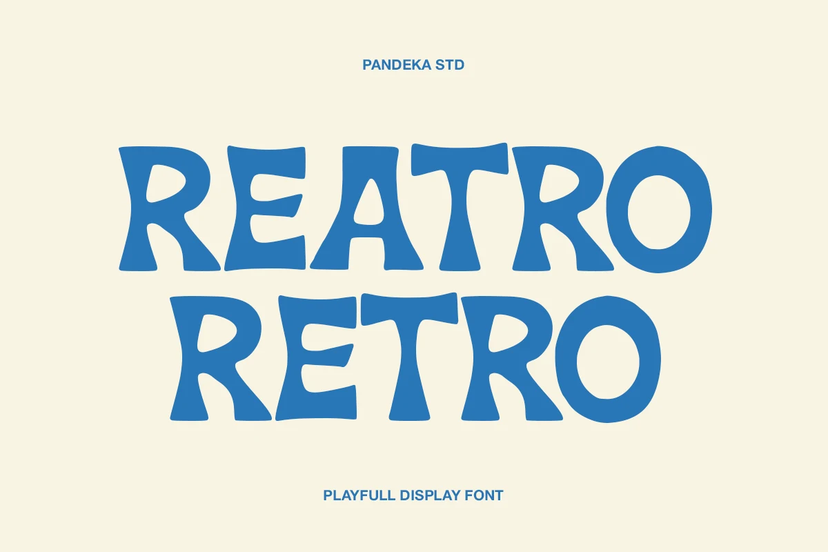
Best For: logos, posters, headlines, vintage designs
Reatro Retro Font combines wavy western contours with wide proportions and asymmetrical terminals, giving headlines a distinct retro Americana character. The irregular construction works for logos and rodeo-style posters, but its unstable shapes are too demanding for body text.
Retro Voyage Font
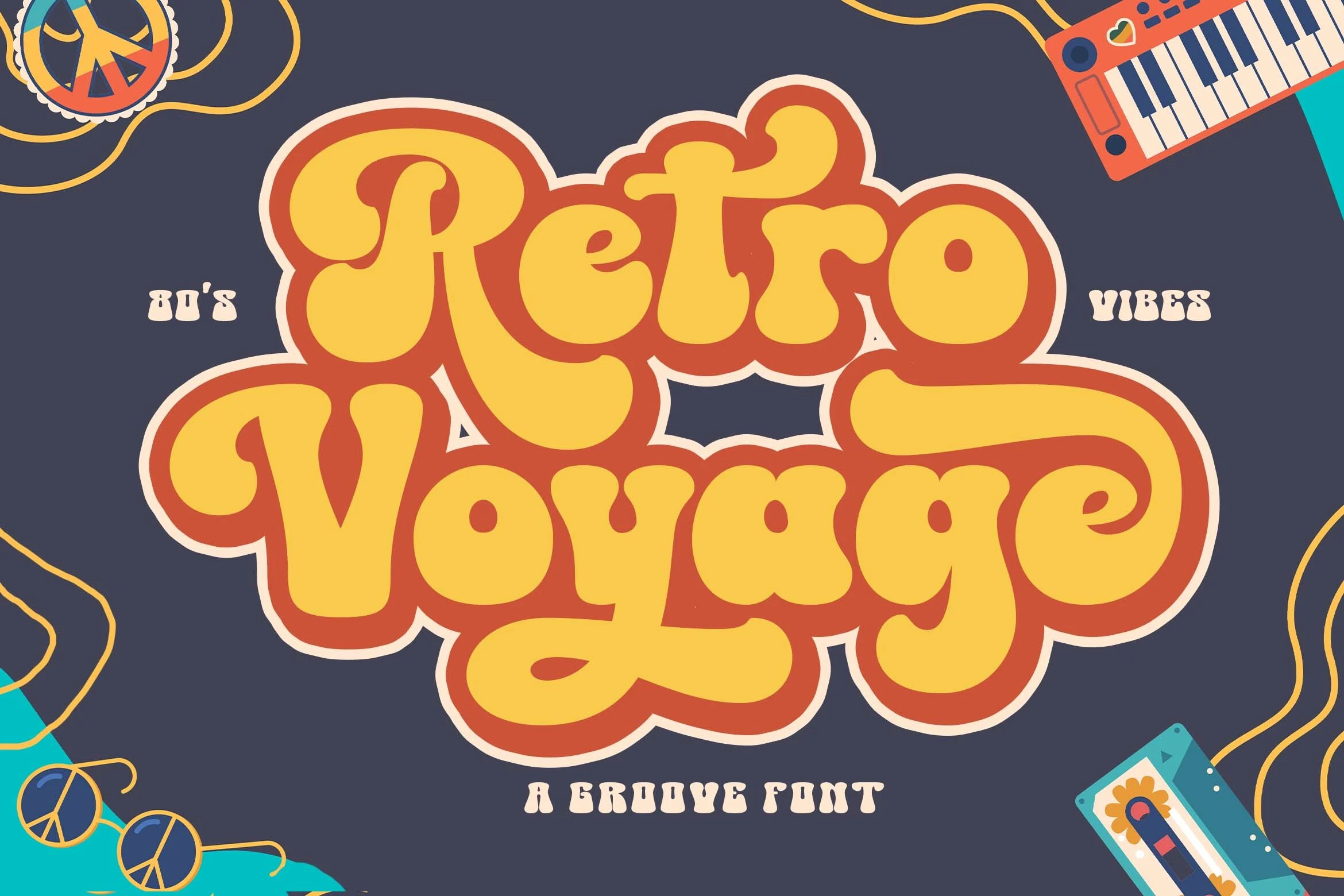
Best For: posters, headlines, branding, display text
Retro Voyage Font pushes Retro Aesthetic Fonts into a psychedelic poster treatment through heavy rounded letters, tight spacing, and overlapping strokes. Its wide curvilinear forms make a strong branding or headline statement, though overlap reduces parsing at smaller sizes.
Rounded Bubble Displays
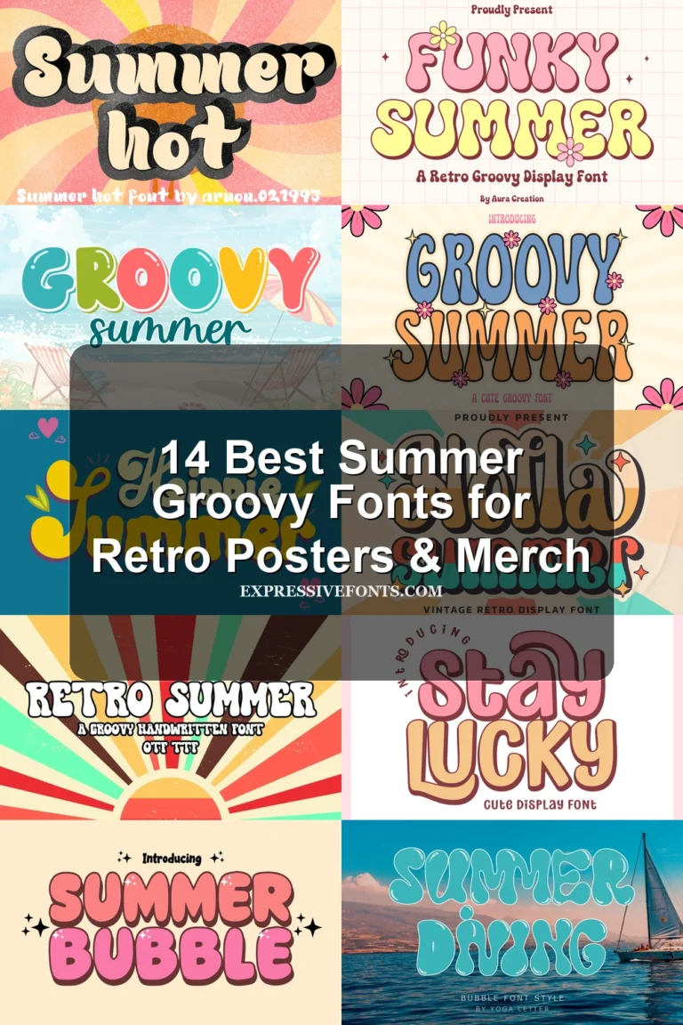
Rounded bubble displays emphasize heavy monolinear shapes, broad proportions, and compact counters. Compared with the wavy group, they offer more structural stability while still prioritizing oversized visual impact.
Stay Retro Font
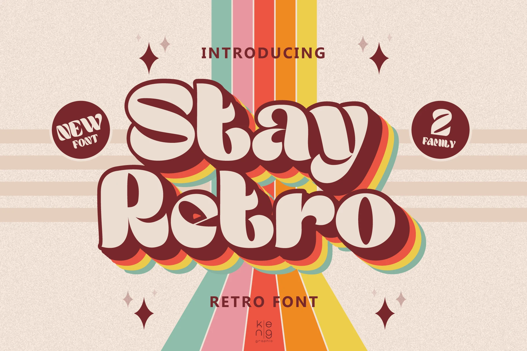
Best For: posters, headlines, T-shirts, display text
Stay Retro Font builds compact rounded letters from thick forms with minimal interior space, then reinforces them with offset layers for a built-in 3D treatment. The shapes remain readable when large, but their dense interiors can clog noticeably at reduced sizes.
Just Retro Font
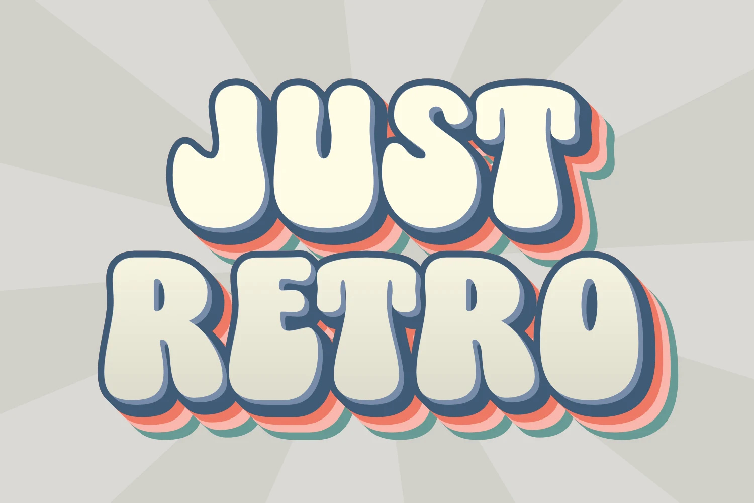
Best For: posters, signage, display text, headlines
Just Retro Font takes a simpler route to Retro Aesthetic Fonts with monolinear bubble letters, heavy rounded strokes, and no traditional serif structure. Its stable shapes stay clear in large headlines and signs, but the display weight is not intended for paragraphs.
Retro Boogy Font
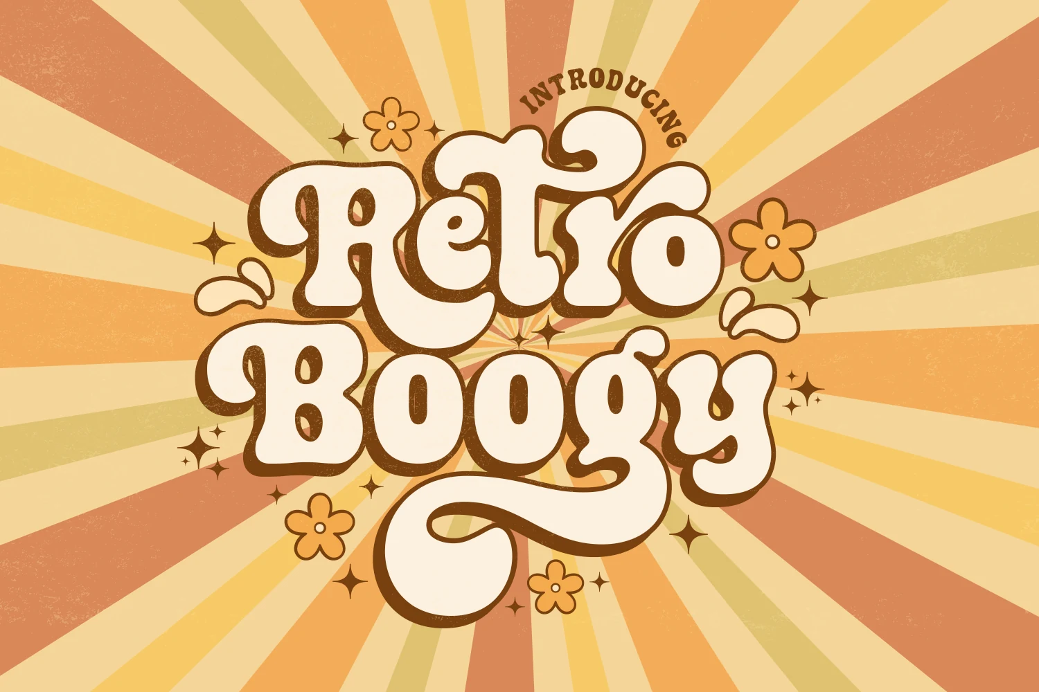
Best For: display text, headlines, posters, retro designs
Retro Boogy Font creates its psychedelic effect through wide bubble characters that interlock and overlap rather than sitting apart. That dense placement produces strong large-scale poster lettering, while the connected arrangement makes smaller words harder to parse.
Retro Bubble Font
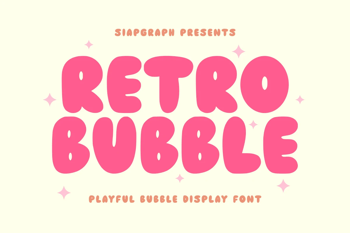
Best For: logos, packaging, stickers, headlines
Retro Bubble Font uses wide rounded forms with internal negative-space cutouts that help define each large letter. Those openings support logos, headlines, stickers, and packaging, but they may close up in tiny labels or other reduced applications.
Retro Thick Font
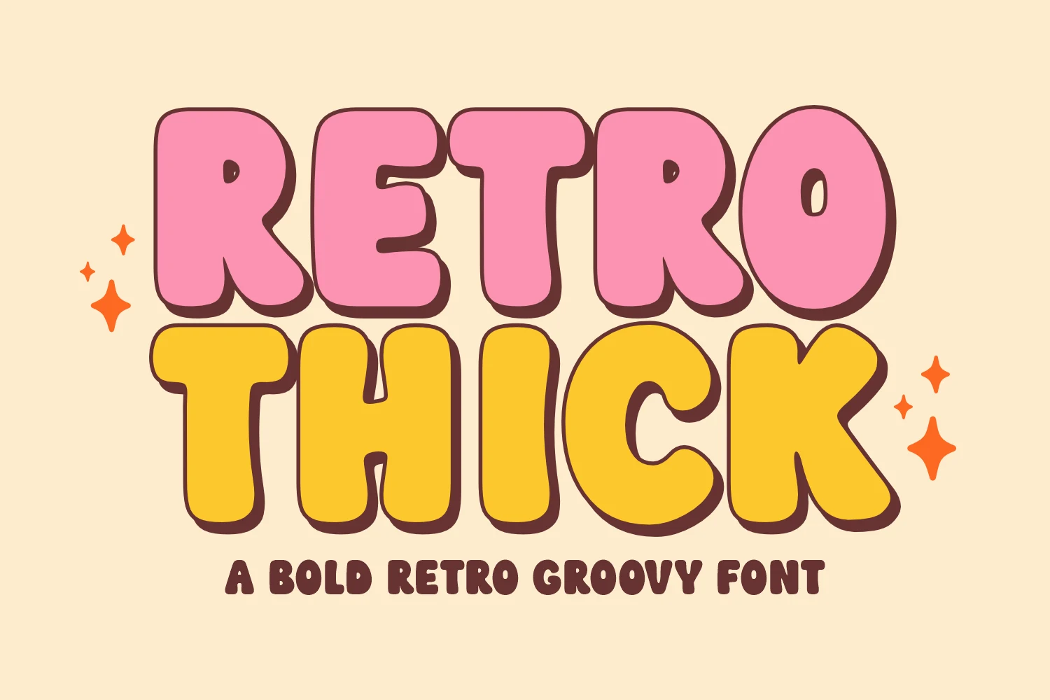
Best For: logos, posters, headlines, T-shirts
Retro Thick Font offers a direct rounded display treatment built from simplified monolinear bubbles without visible serifs. The clear large lettering works for logotypes, clothing, posters, and headlines, but its bold proportions provide little utility below display scale.
Block, Slab, And Line Displays
Block, slab, and line displays build their character through serifs, shadows, distressing, or parallel contours. They provide firmer graphic structure than the softer scripts and bubbles.
Retro University Font
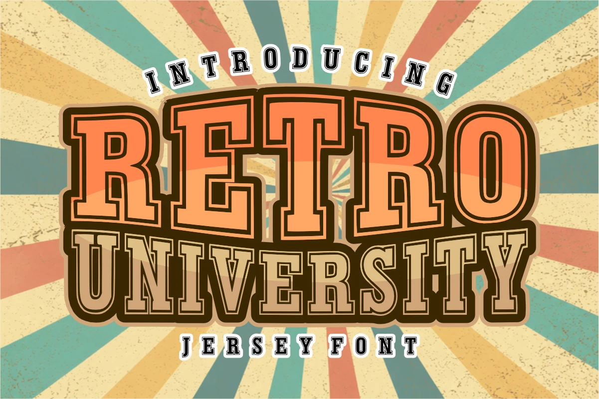
Best For: logos, posters, display text, T-shirts
Retro University Font gives Retro Aesthetic Fonts a wide collegiate block silhouette through strong slab serifs and heavy upright strokes. Layered outlines and a 3D shadow effect add poster and apparel impact, while the dense construction keeps it out of body-copy territory.
Retro Grunge Font
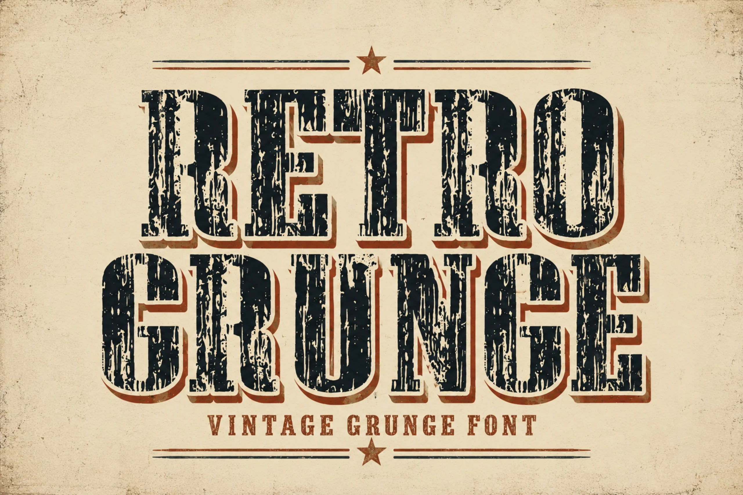
Best For: posters, signage, display text, vintage designs
Retro Grunge Font adds distressed, weathered texture to heavy rectangular slab-serif forms. That surface treatment supplies an old-sign impression for large posters and signage, but the broken texture materially reduces legibility once the lettering is made small.
Parallel Retro Font
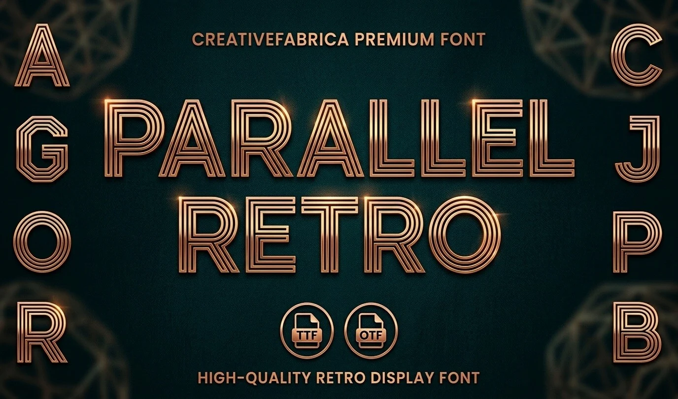
Best For: posters, headlines, display text, retro designs
Parallel Retro Font replaces solid strokes with internal parallel contours, producing a geometric, line-based poster texture. The regular upright construction feels more structured than the bubble faces, although the fine internal lines can fragment and weaken readability at small sizes.
Retro Groovy Font
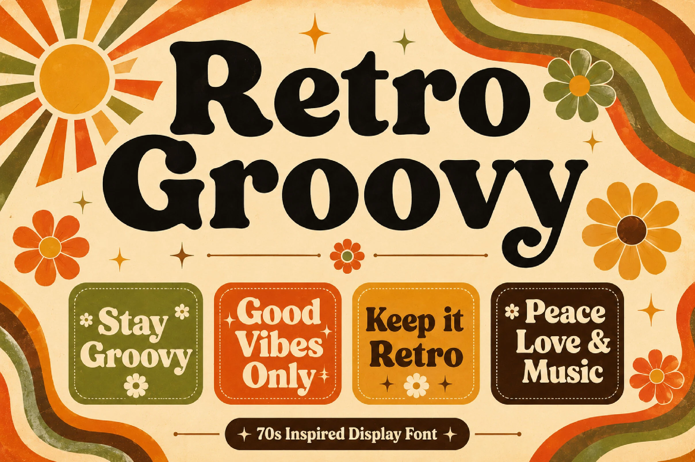
Best For: logos, branding, packaging, posters
Retro Groovy Font uses wide, heavy letters with rounded slab serifs and a distinctive curved-tailed y. The softened block structure stays readable for logos, packaging, and apparel marks, but its proportions are most effective with short display wording rather than long text.
How to Choose the Right Font
Choose among Retro Aesthetic Fonts by matching construction to scale: connected scripts suit logos and invitations, while bubbles and wavy faces need larger lettering and shorter words. For firmer impact, choose slabs, shadows, or distressing; for lighter poster texture, use parallel lines. Always test joins, counters, overlaps, and flourishes at the final size.