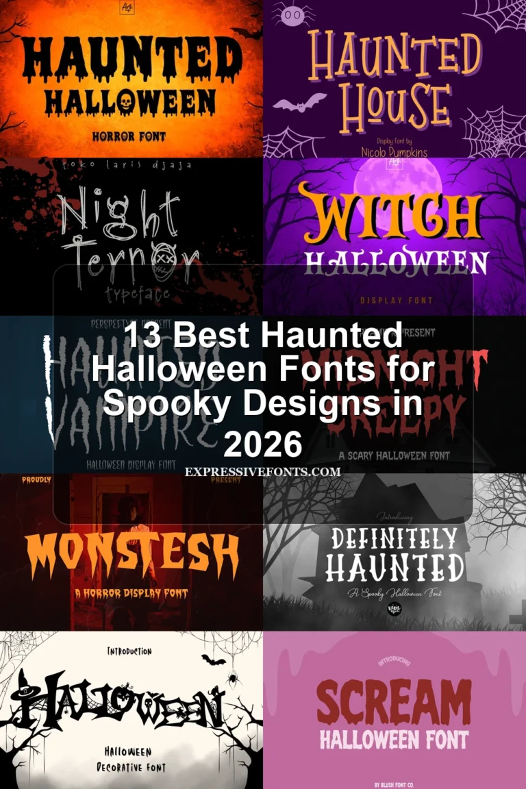
30 Best Scary Halloween Fonts for Halloween Projects in 2026
This collection ranges from liquid-dripping capitals and sharp Gothic serifs to skeletal, spider-patterned, and rough hand-drawn displays. These Scary Halloween Fonts are primarily built for posters, merchandise, invitations, logos, social graphics, and other short, high-impact messaging rather than continuous reading.
Looking for more halloween fonts? Browse our complete Halloween Fonts collection to compare vintage, cute, scary, spooky, and creepy halloween styles.
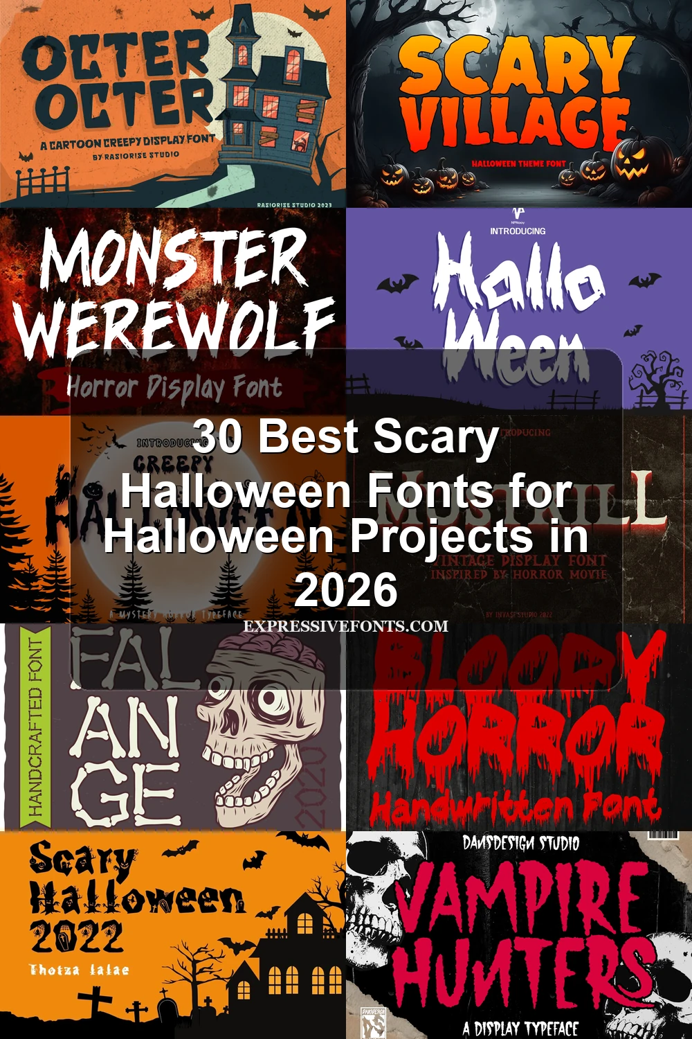
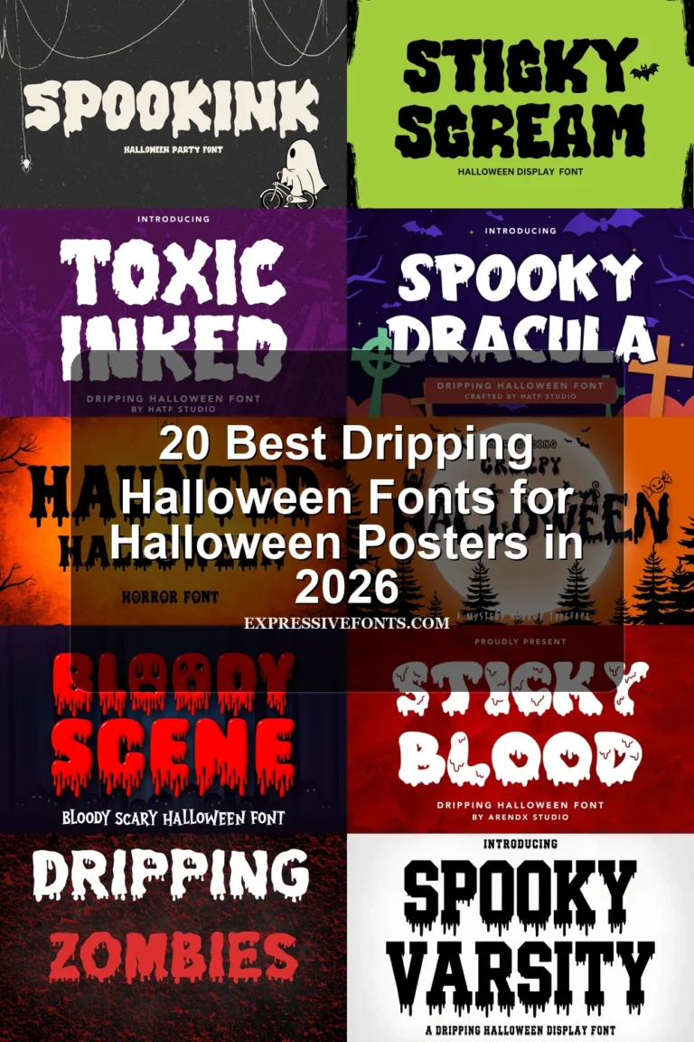
Scary Halloween Fonts: Dripping and Melting Letterforms
Scary Halloween Fonts: Dripping and Melting Letterforms center on heavy disconnected shapes, irregular baselines, and liquid-like terminals, making them more graphic and theatrical than the sharper distressed groups.
Creepy Halloween Font

Best For: posters, display text
Creepy Halloween Font combines heavy disconnected capitals with ragged dripping edges and illustrative elements embedded inside the letterforms. It gives Scary Halloween Fonts a built-in graphic role, so it suits oversized posters and headlines better than small wording.
Scary Halloween 2022 Font
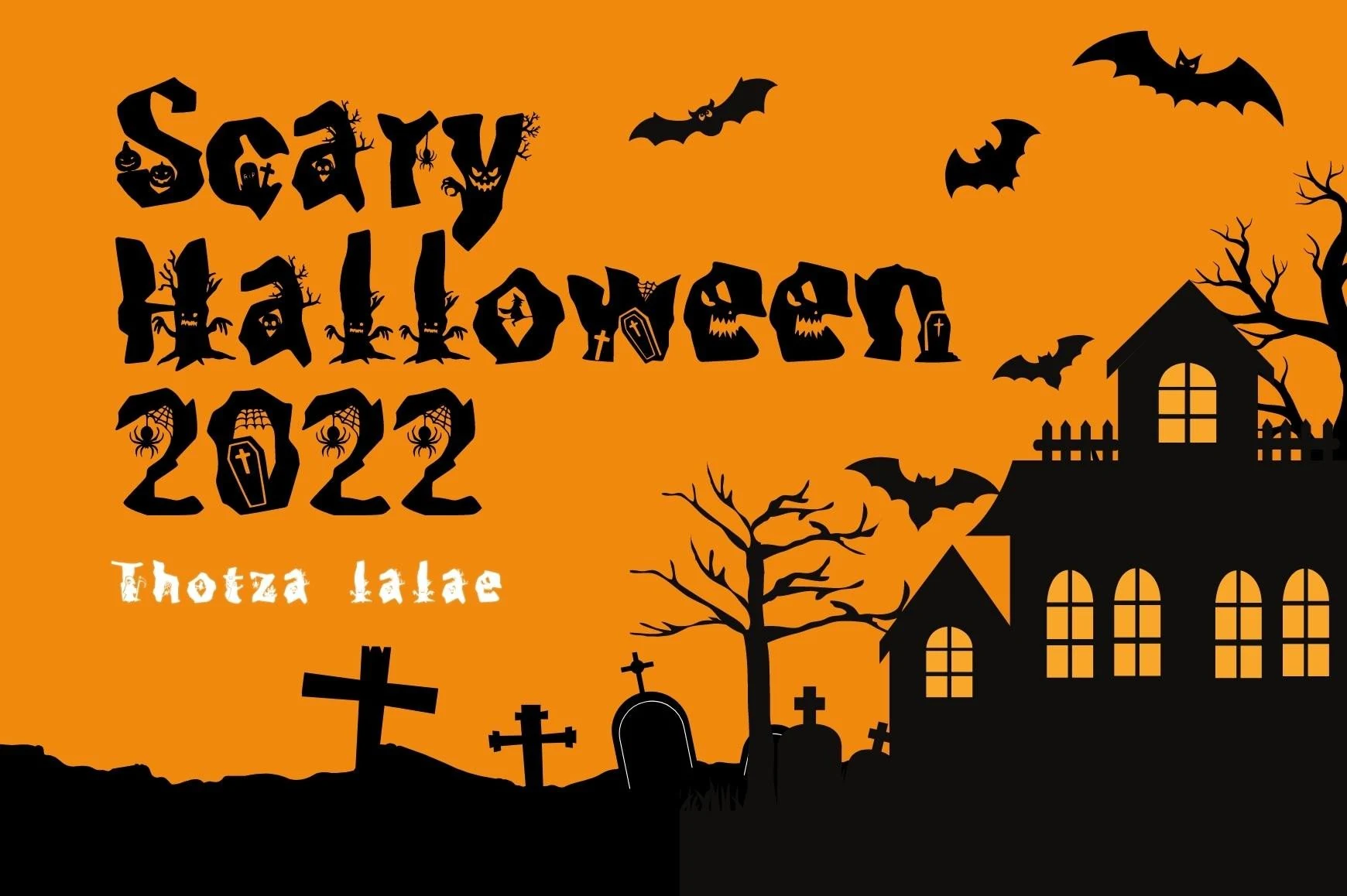
Best For: posters, packaging, T-shirts
Scary Halloween 2022 Font places Halloween silhouettes inside irregular characters, with uneven sizing and baseline alignment making each character feel partly illustrative. That visual density is effective on packaging, billboards, and apparel, but not dense copy.
Haunted Halloween Font
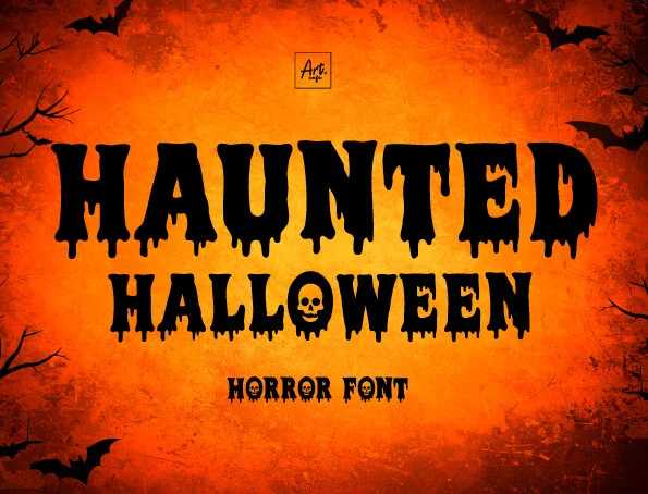
Best For: posters, display text, headlines
Haunted Halloween Font gives Scary Halloween Fonts a clear signature by replacing the O with a skull. Its blocky heavy letters and melting lower edges make short headlines memorable, though paragraphs quickly lose clarity.
Scary Halloween Font
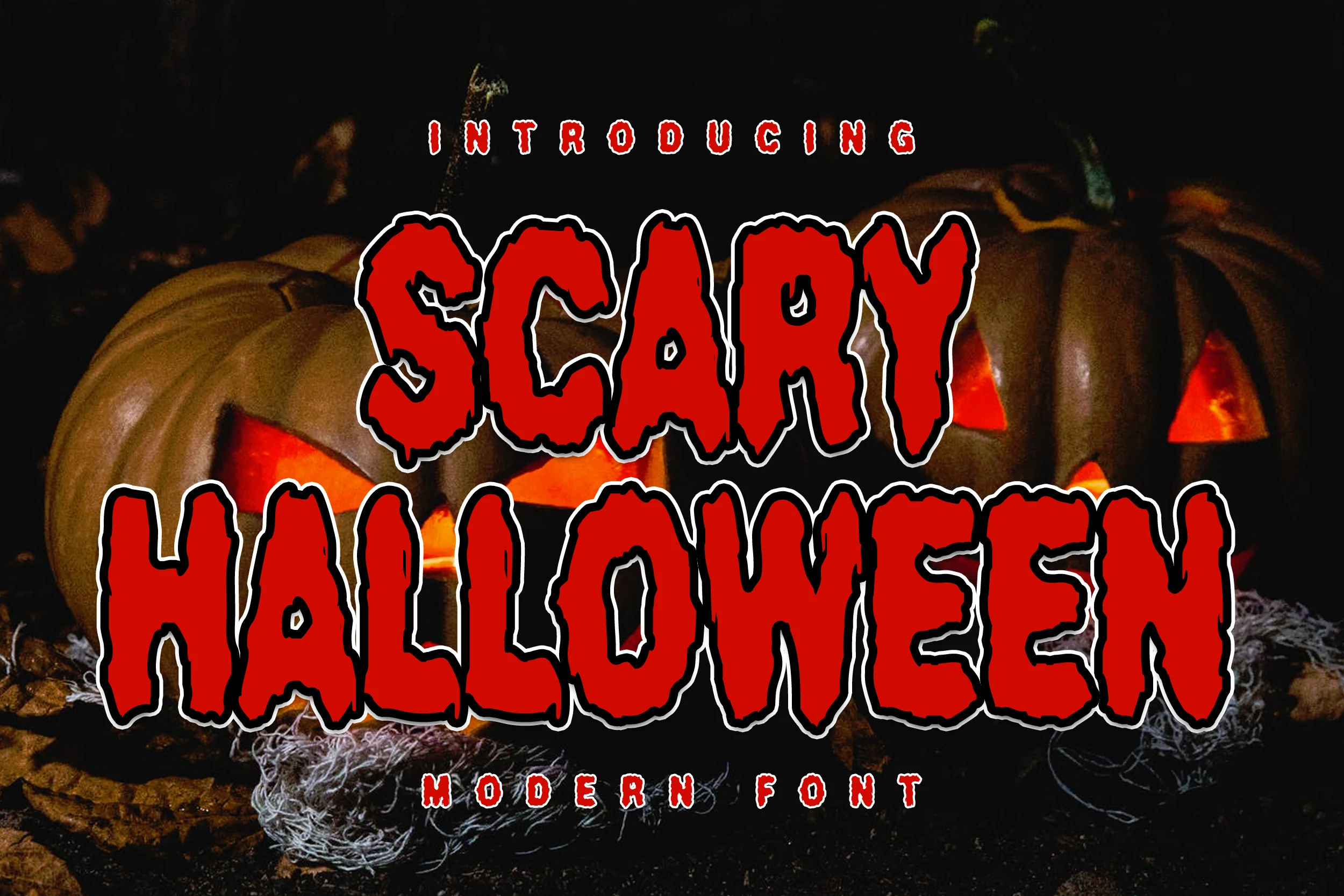
Best For: posters, display text, headlines
Scary Halloween Font uses bold disconnected capitals with irregular dripping terminals and a simple heavy structure. It creates strong recognition in large titles and stickers, but the decorative edges make extended reading an unsuitable role.
Dripping Season Font
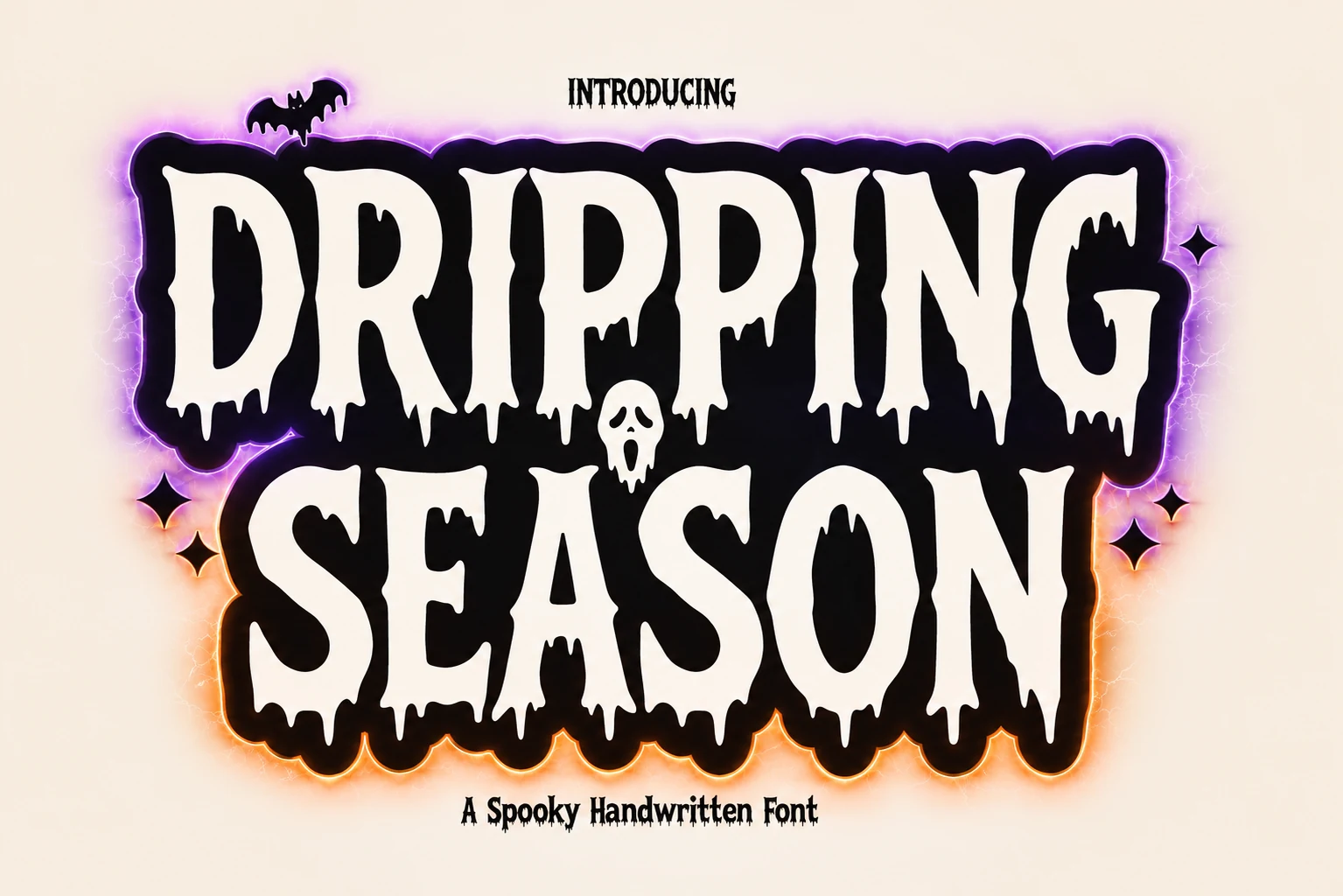
Best For: posters, headlines, stickers
Dripping Season Font gives Scary Halloween Fonts a bold melting treatment, with uppercase letters extending into liquid-like terminals. Its heavy mass holds up on posters and stickers, while the organic edges rule it out for body copy.
Bloody Horror Font
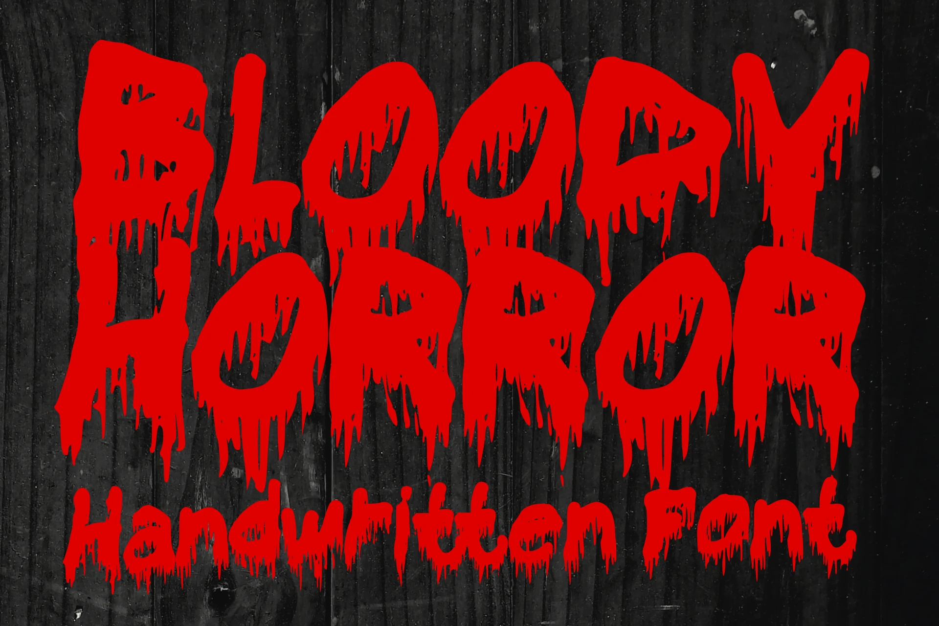
Best For: T-shirts, book covers, posters
Bloody Horror Font combines ink-made disconnected forms, heavy strokes, and uneven dripping terminals. It is a strong choice when Scary Halloween Fonts need short, bold wording for clothing, book covers, posters, or party materials.
Scary Horror Font
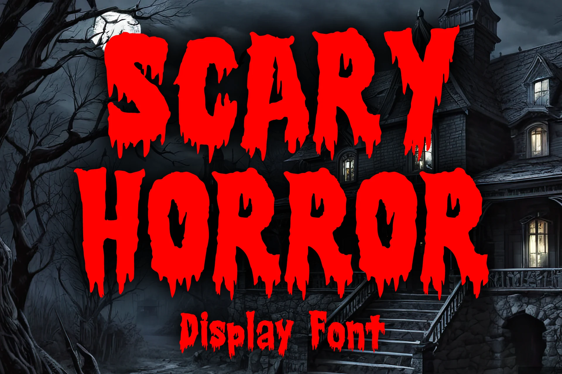
Best For: T-shirts, stickers, posters
Scary Horror Font gives Scary Halloween Fonts extreme ink-drip terminals on condensed heavy forms with a stable baseline. Its vintage horror-comic and metal associations suit merchandise, but the drips compromise character clarity in smaller titles.
Melted Brain Font
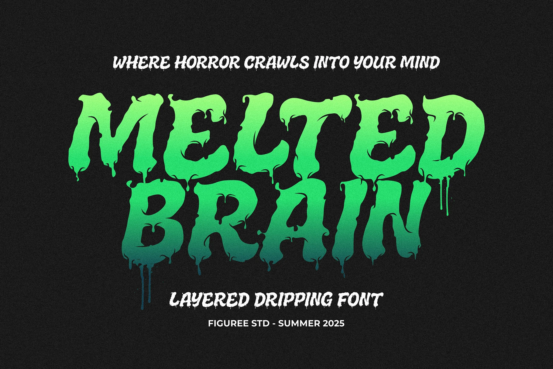
Best For: posters, invitations, headlines
Melted Brain Font gives Scary Halloween Fonts a flexible layered system: Base, Outline, and Shadow versions can be stacked for poster compositions. Its melting terminals remain powerful at display size but are unsuitable for body text.
Vampire Gothic Font
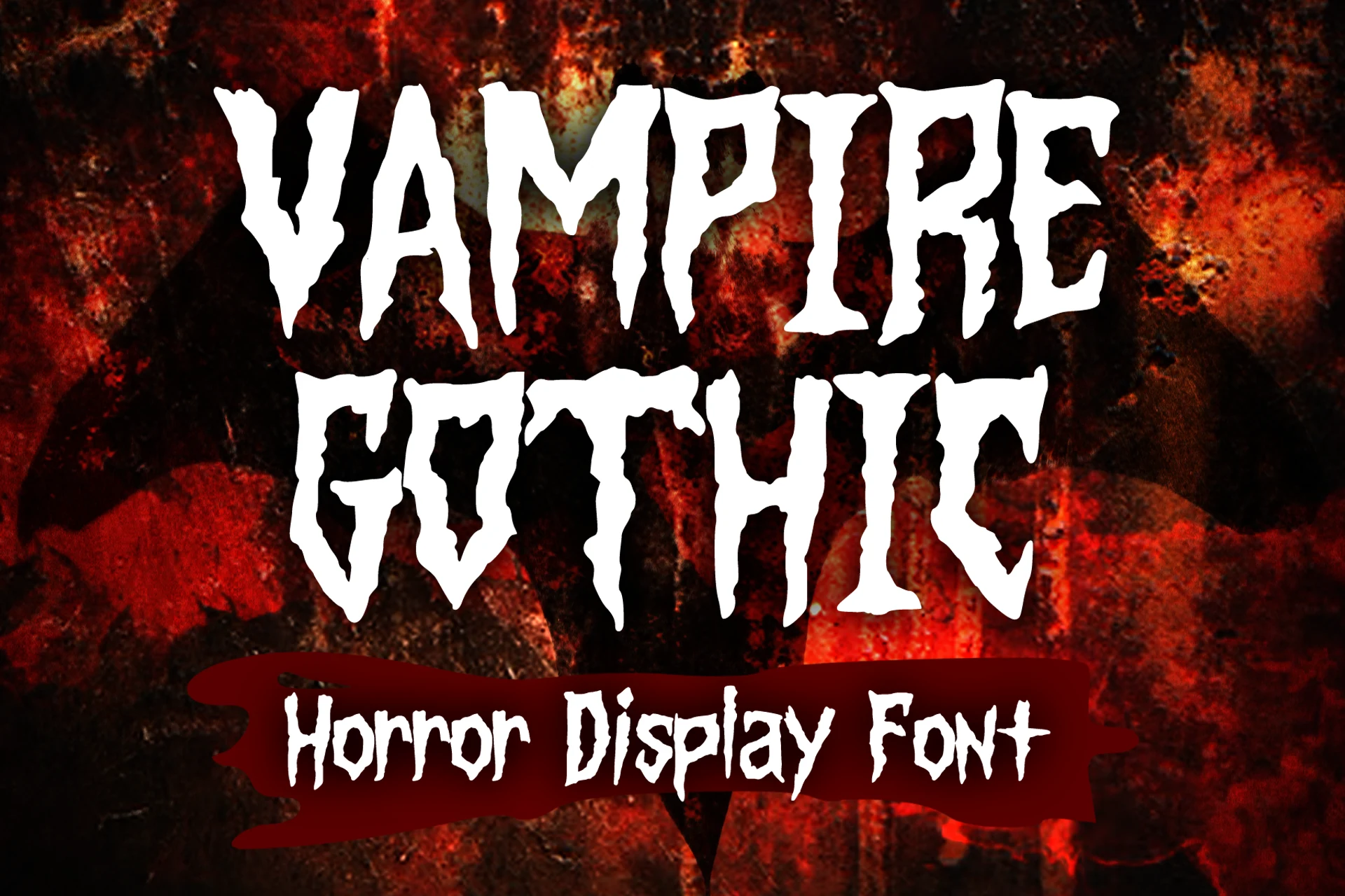
Best For: T-shirts, book covers, posters
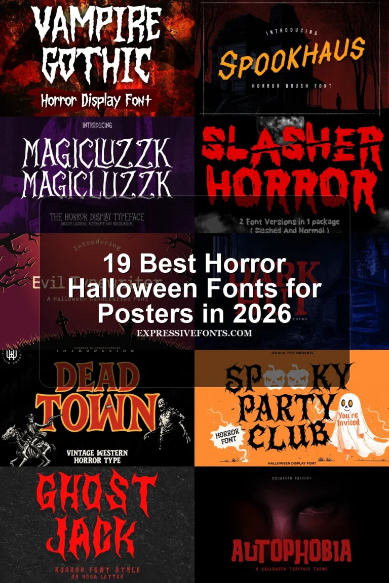
Vampire Gothic Font combines sharp pointed terminals, distressed vertical strokes, and dripping edges for a theatrical silhouette. High contrast adds drama to covers and posters, but the competing details reduce legibility in compact settings.
Jagged, Gothic, and Distressed Horror
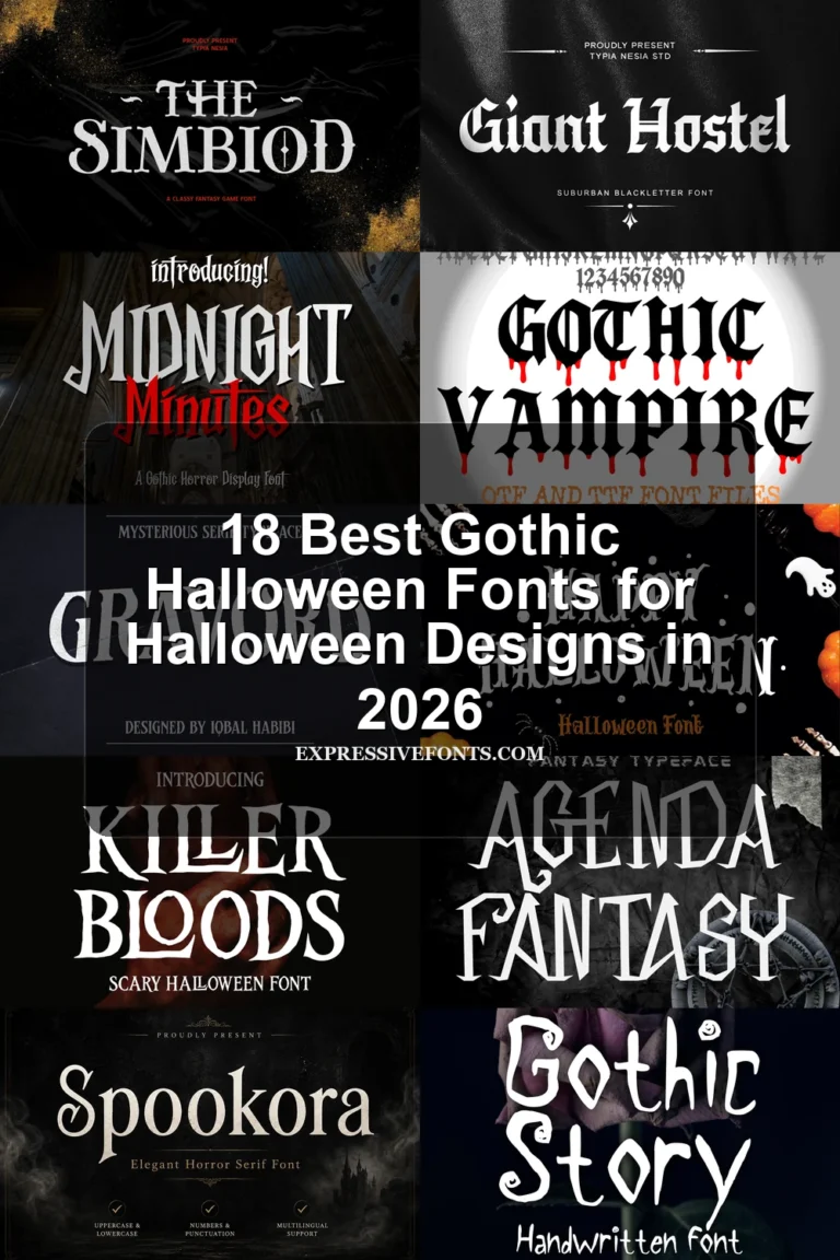
These jagged, Gothic, and distressed designs rely on pointed serifs, slashes, erosion, scratches, or high contrast. Their structured silhouettes differ from dripping styles through sharper edges and stronger poster-serif construction.
Killer Bloods Font by Dreamink 7ntypes Font
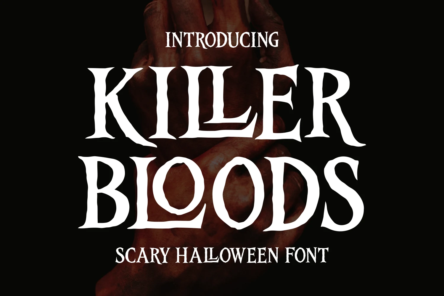
Best For: posters, headlines, display text
Killer Bloods Font by Dreamink 7ntypes Font uses tall, slightly condensed proportions, blade-like serifs, and sharp thick-thin contrast. The aggressive profile fits narrow poster headlines, although its fine points and uneven edges need generous display sizing.
Scary Village Font
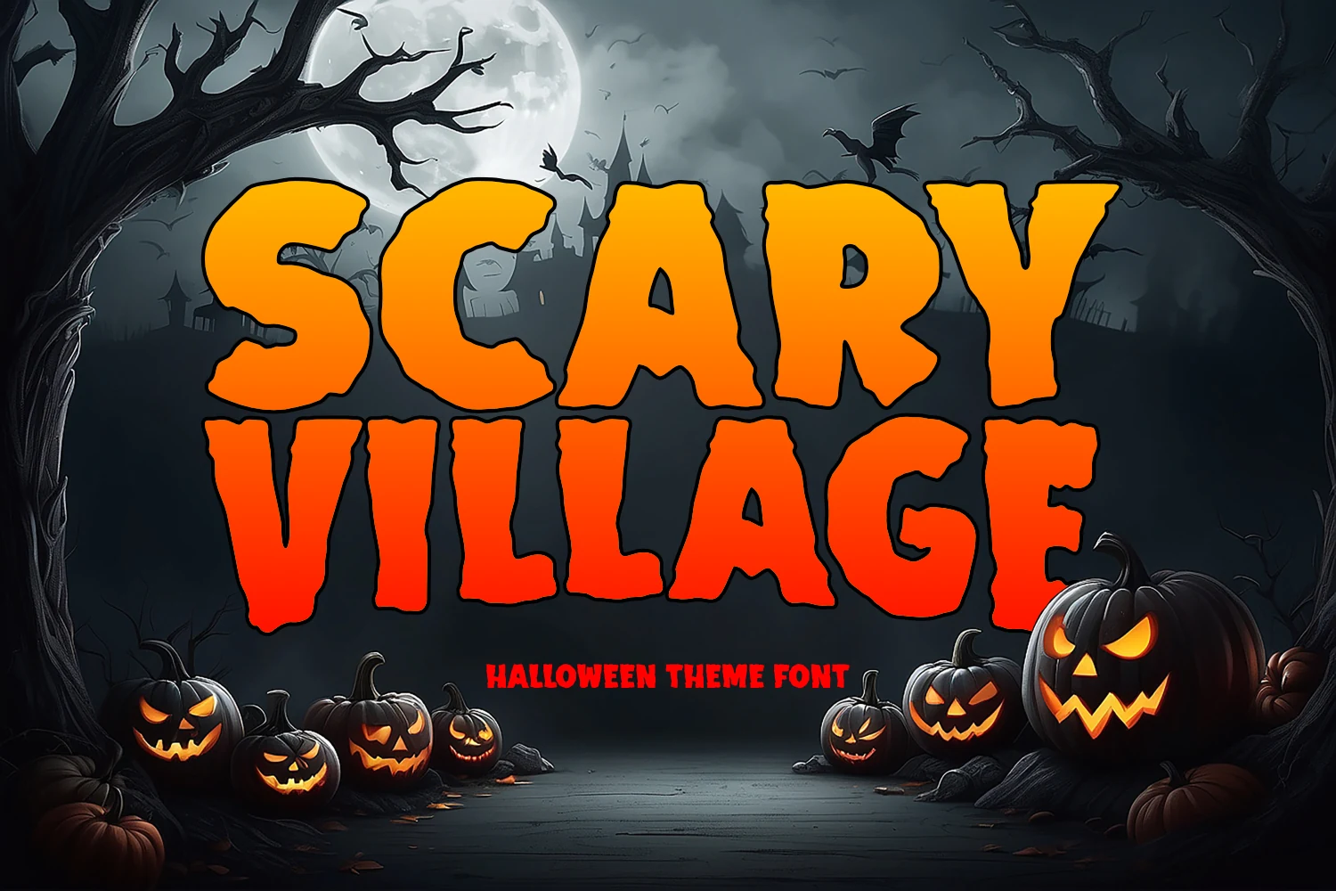
Best For: posters, headlines, signage
For blunt poster impact, Scary Village Font uses thick heavy strokes, jagged edges, uneven proportions, and a weathered surface. Its low contrast keeps large signage readable, but the distressed texture loses definition when reduced.
Helloghost Font
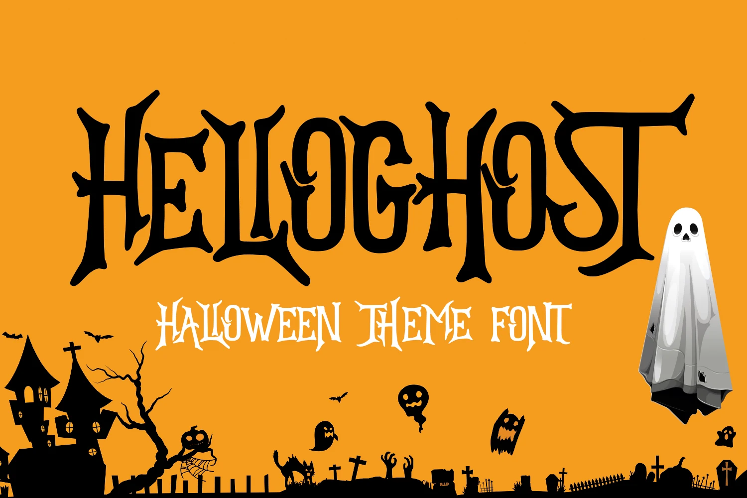
Best For: posters, display text, headlines
Helloghost Font gives Scary Halloween Fonts a spindly Gothic direction through thorn-like terminals, extended pointed serifs, and pronounced stroke contrast. Its delicate details are most recognizable in large headlines, posters, and apparel lettering.
Hallooweek Font
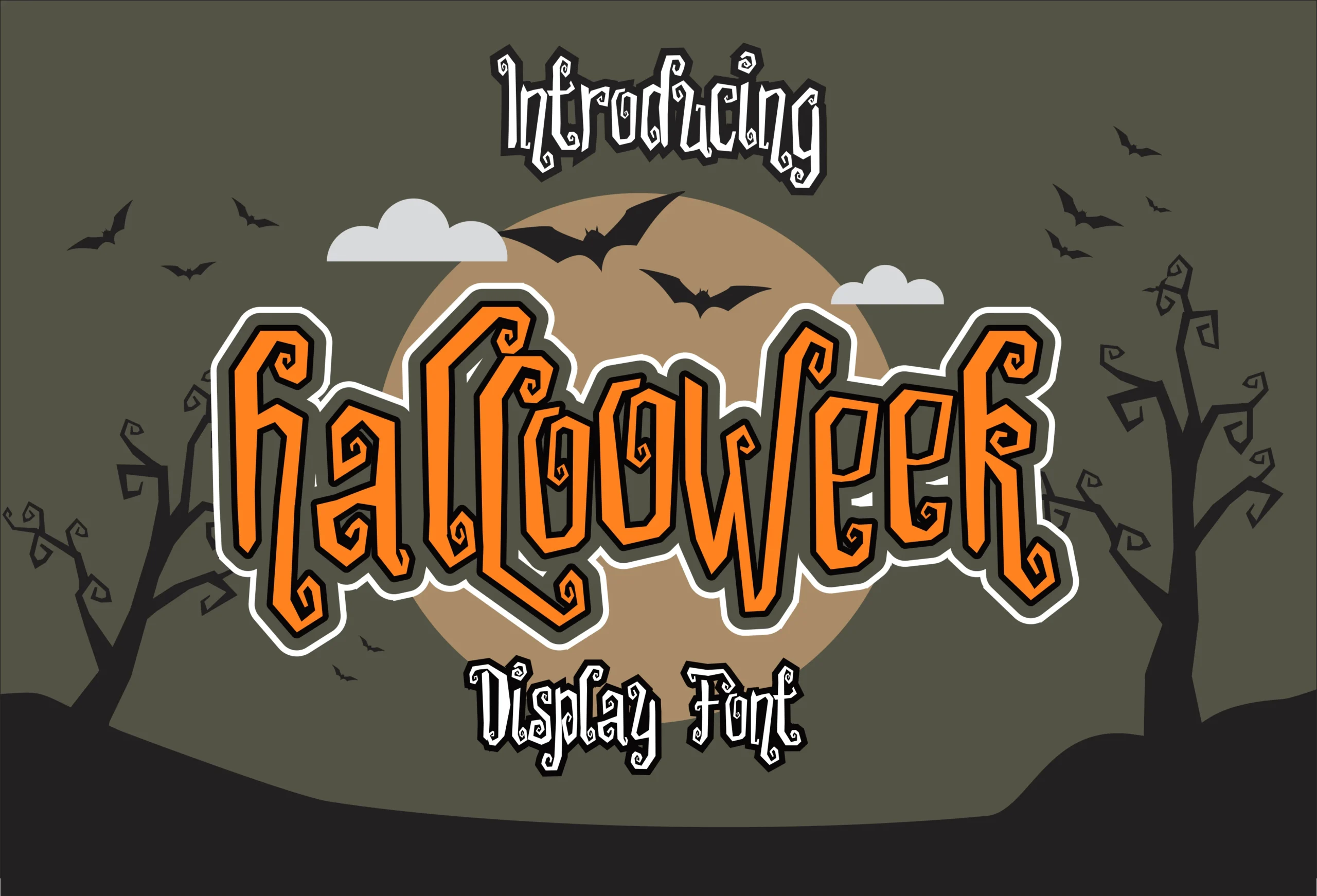
Best For: headlines, posters, stickers
Hallooweek Font creates an unstable silhouette through jagged outlines, angular terminals, inconsistent heights, and varied stroke weights. Short labels and stickers let those irregularities read as intentional, whereas longer strings accumulate distracting visual noise.
Vampire Hunters Font
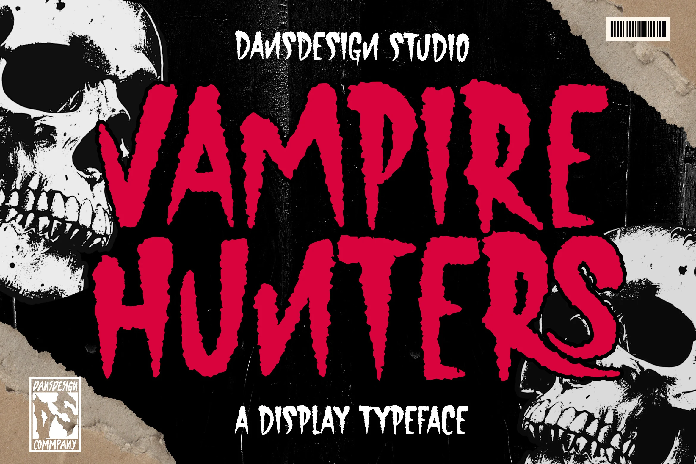
Best For: posters, headlines, display text
Vampire Hunters Font uses condensed heavy lettering, a stable baseline, and eroded serrated edges. Its compact width handles haunted-house titles efficiently, while the scratched texture remains convincing only when posters and display text are reproduced large.
Slasher Horror Font
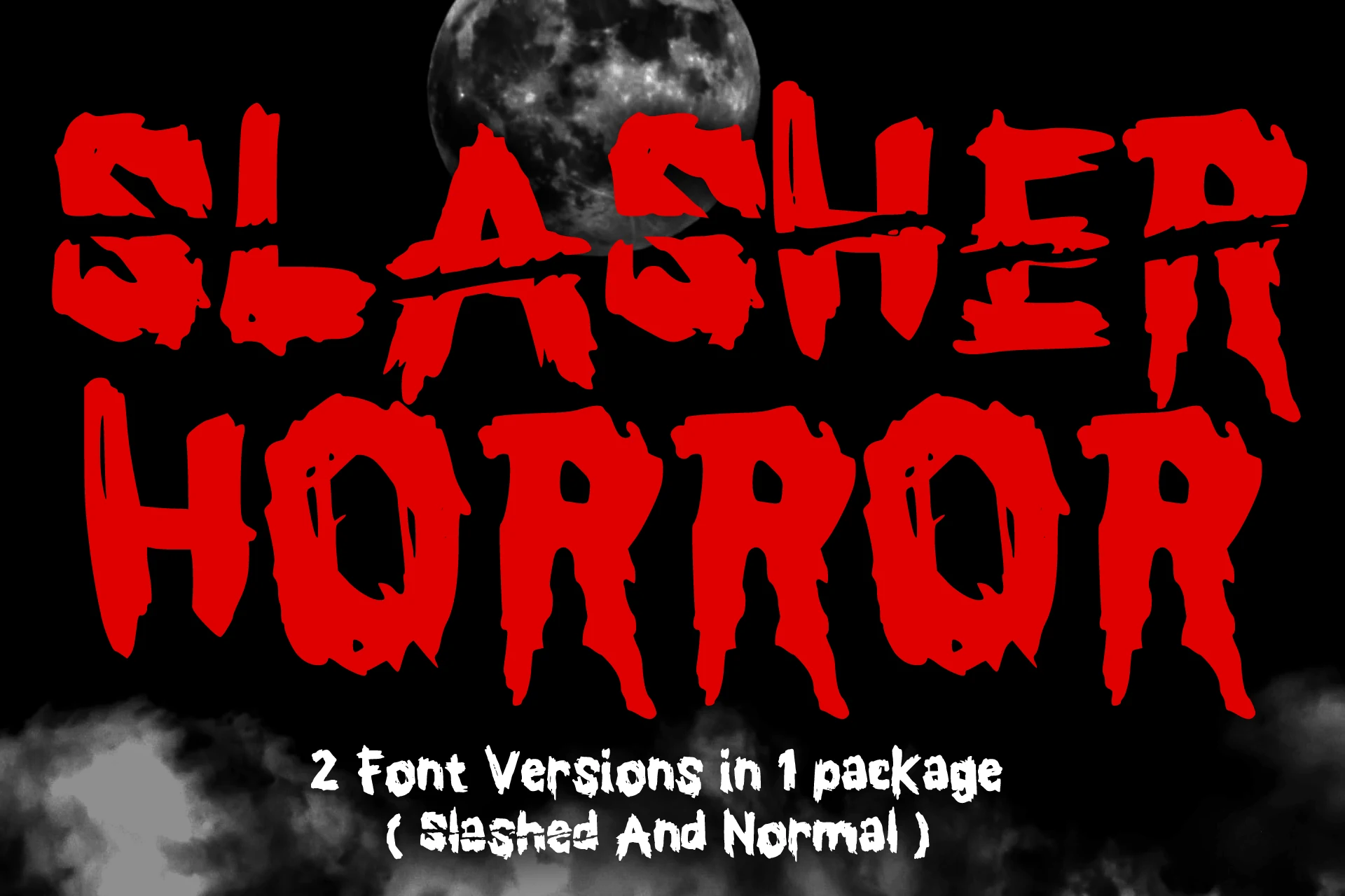
Best For: posters, T-shirts, book covers
Slasher Horror Font stands apart through horizontal slice effects layered onto dense condensed blocks. The package includes solid and slashed versions, offering flexibility for covers and apparel while keeping both treatments firmly at display scale.
Scary Ghost Font
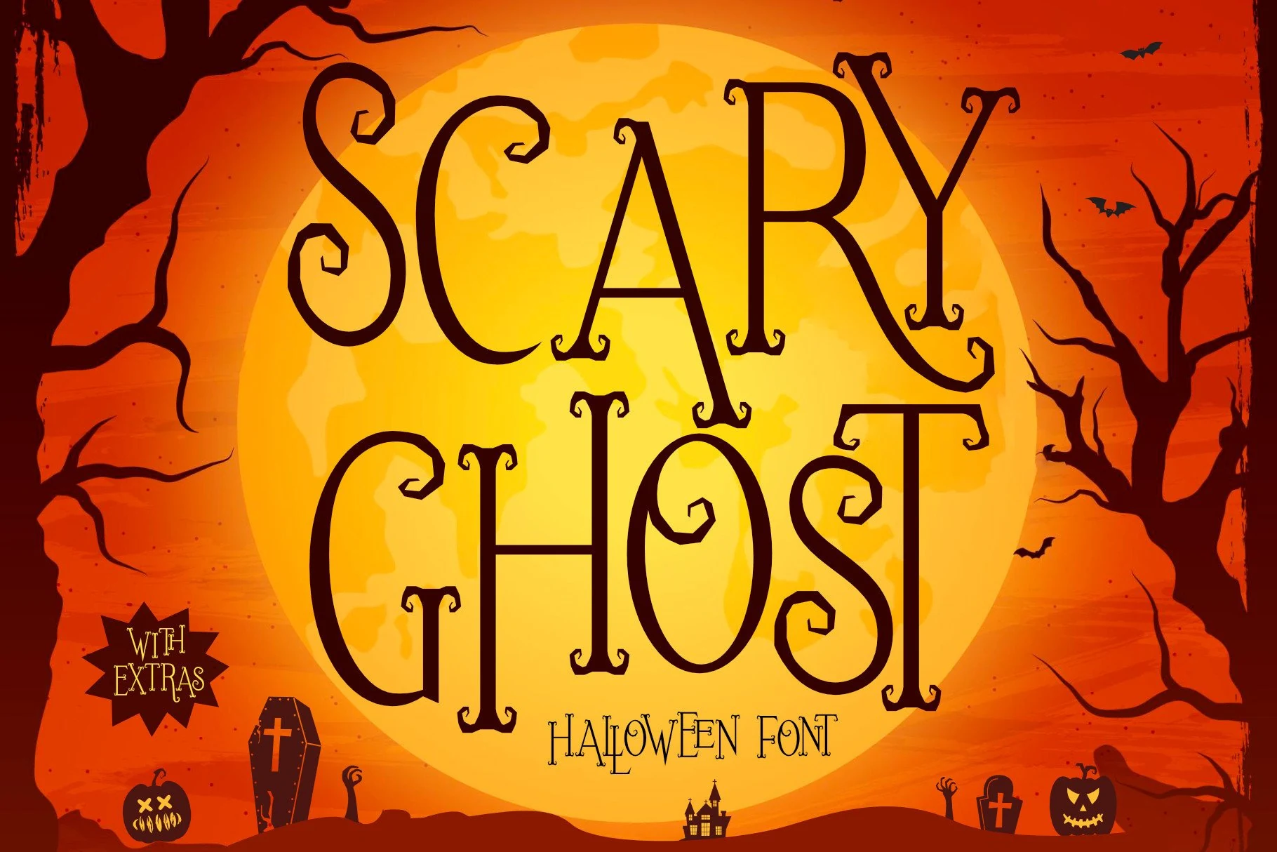
Best For: posters, display text, headlines
Scary Ghost Font pushes high contrast into spiked, jagged serif-like terminals and irregular organic proportions. Accessible glyphs and ligatures add expressive options, but the complex silhouette needs large sizing to remain clear.
Scary Halloween Font
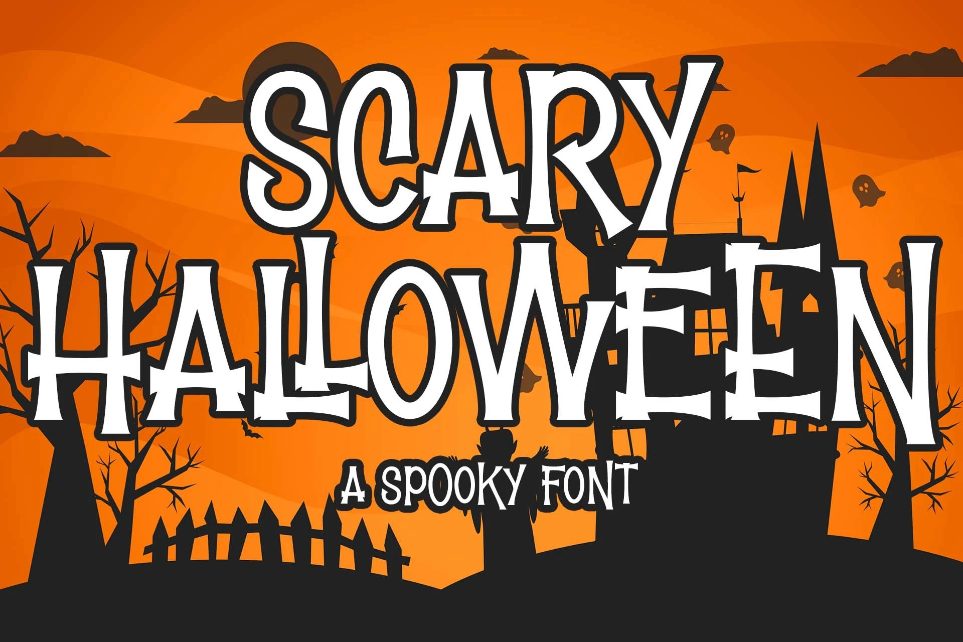
Best For: headlines, posters, display text
Scary Halloween Font combines condensed high-contrast serifs with an uneven baseline and irregular heights. The narrow proportions help poster titles fit limited width, but the unsettled construction is less dependable for small text.
Scary Halloween Font
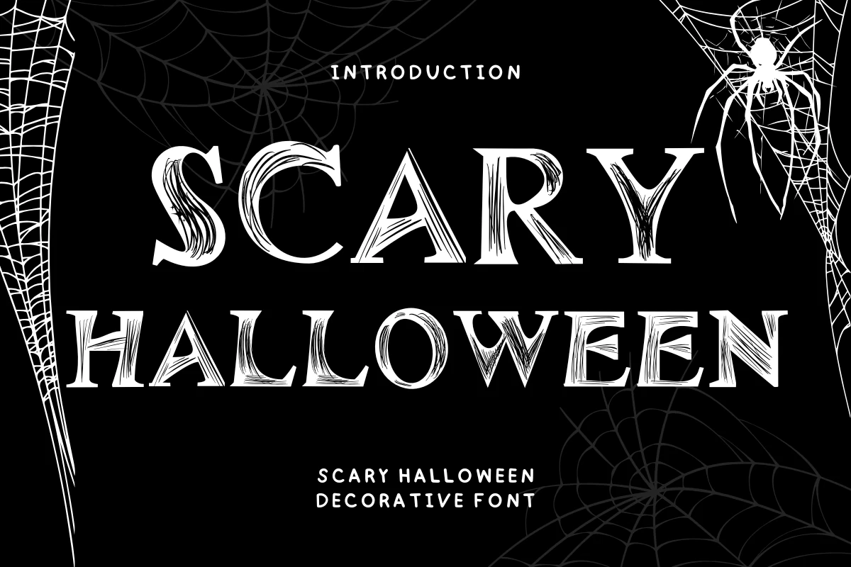
Best For: social media graphics, T-shirts, posters
Scary Halloween Font layers pointed elongated serifs with scratchy internal texture over a stable baseline. The construction supports large social graphics and T-shirts, though fine texture can disappear when the artwork is reduced.
Halloween Font
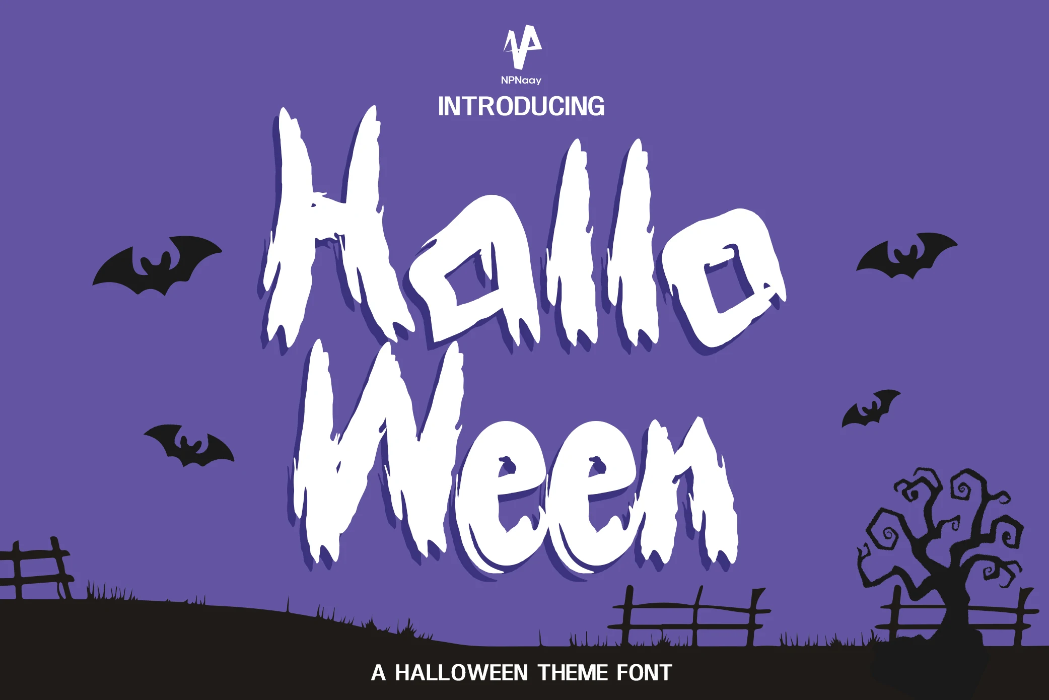
Best For: headlines, posters, logos
Halloween Font treats irregularity as the main graphic, combining heavy high-contrast letters with jagged organic terminals and a distressed surface. It is strongest as a logo or headline, where texture can command the composition.
Monster Werewolf Font
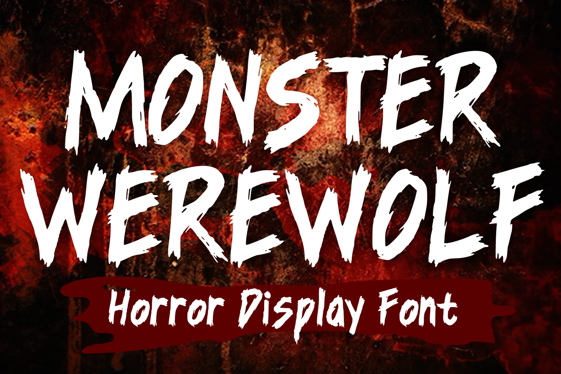
Best For: T-shirts, posters, book covers
Monster Werewolf Font uses brush-stroke texture, high contrast, jagged edges, and uppercase-heavy forms for a vintage horror-comic attack. Large reproduction keeps the distressed surface visible across merchandise, book covers, posters, and stickers.
Mustkill Font
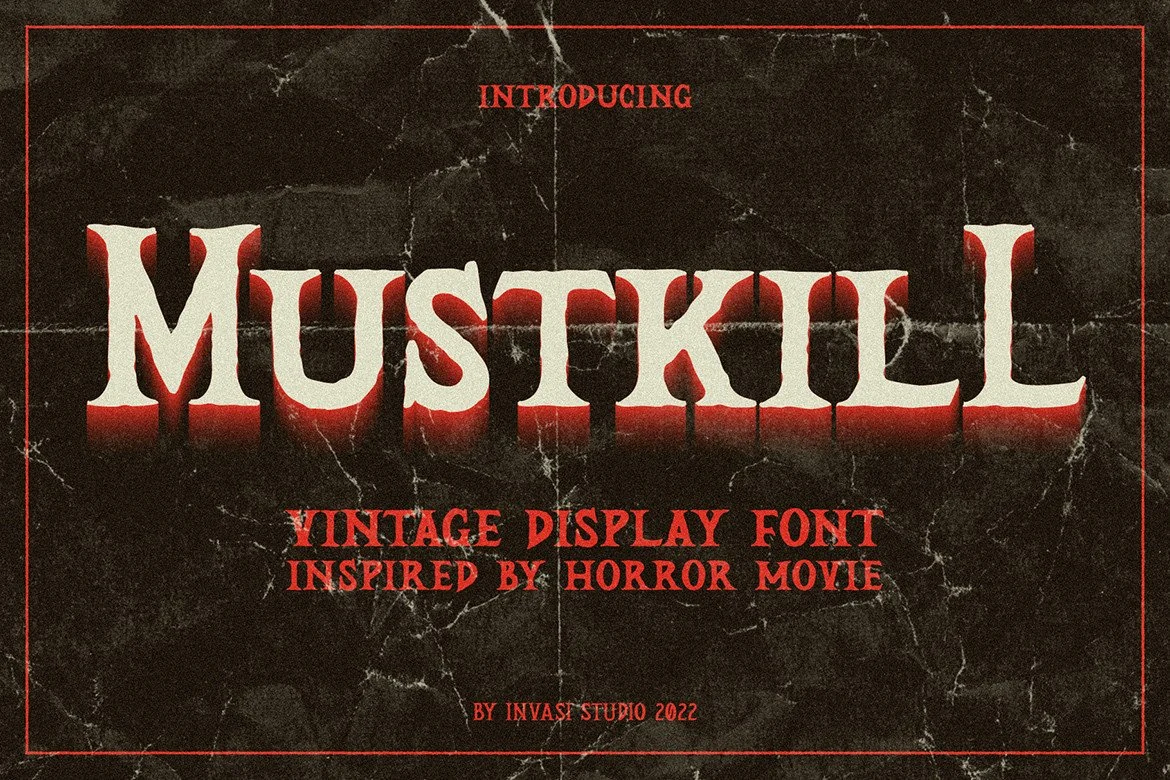
Best For: posters, display text, headlines
Mustkill Font gives Scary Halloween Fonts a condensed vintage-serif foundation, balancing high contrast with weathered detailing. Its title-friendly width suits retro posters and headings, while distressed edges need generous scale to stay legible.
Themed, Hand-Drawn, and Patterned Display
Themed, hand-drawn, and patterned displays build personality through spiders, bones, masks, brush texture, bubbles, or playful baselines. They offer more illustrative variety than the collection’s primarily damaged letterforms.
Now Spiders Font
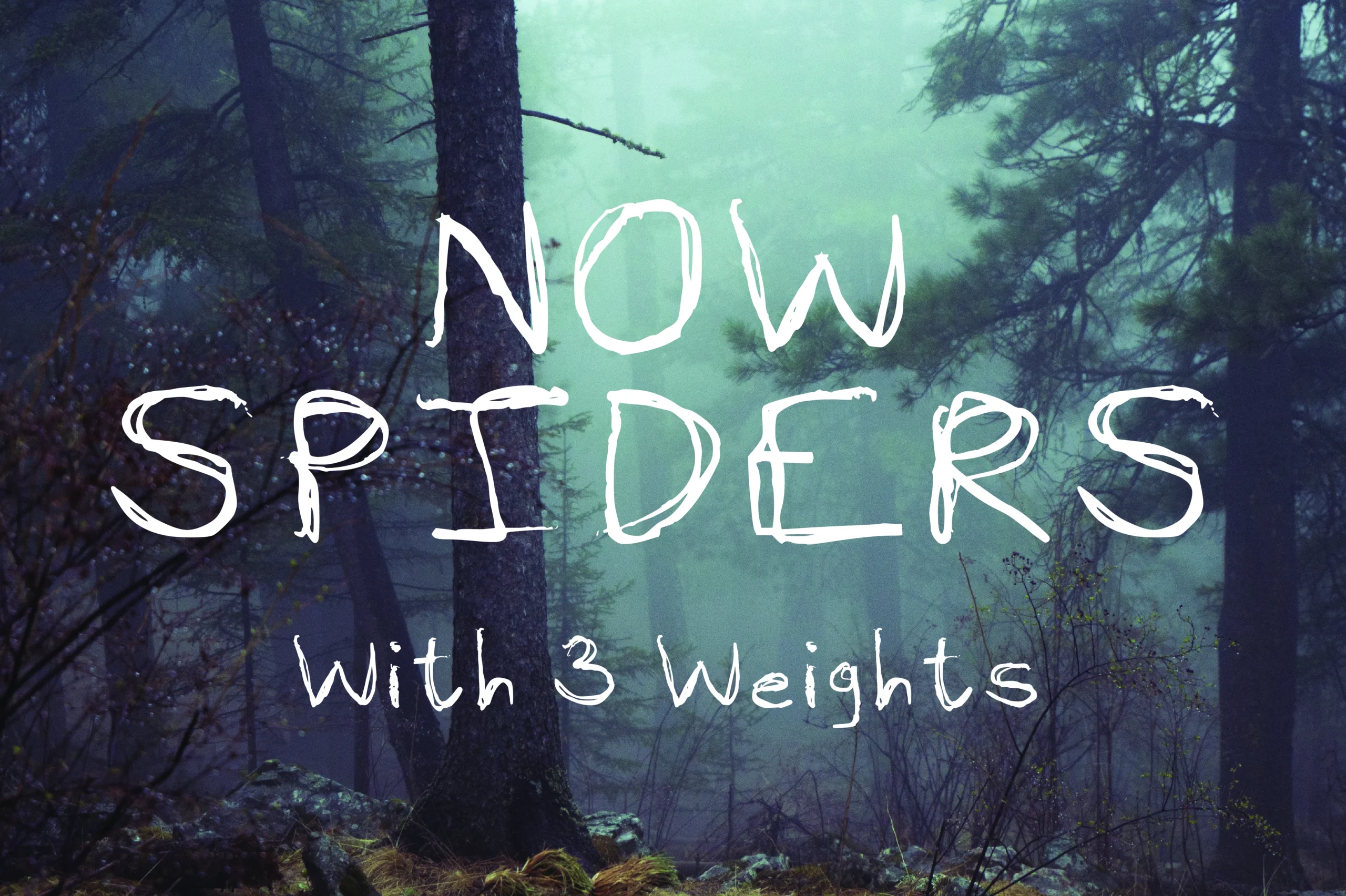
Best For: stickers, T-shirts, posters
Now Spiders Font turns all-caps, monoline lettering into a sketchbook-like spider theme through uneven proportions and rough strokes. The disconnected construction works especially well on stickers and T-shirts, while small supporting text becomes slower to decode.
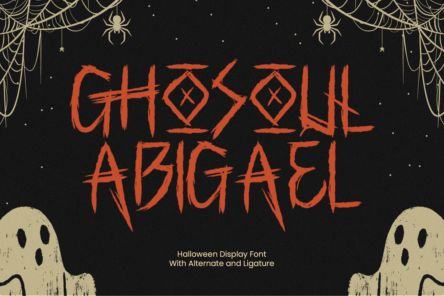
Ghosoul Abigael Font
Best For: posters, packaging, invitations
Ghosoul Abigael Font combines brush-built strokes, pointed terminals, distressed edges, alternate characters, and spooky ligatures. The variation creates a gritty horror-mark effect for posters, packaging, and invitations, but rough texture limits small-size readability.
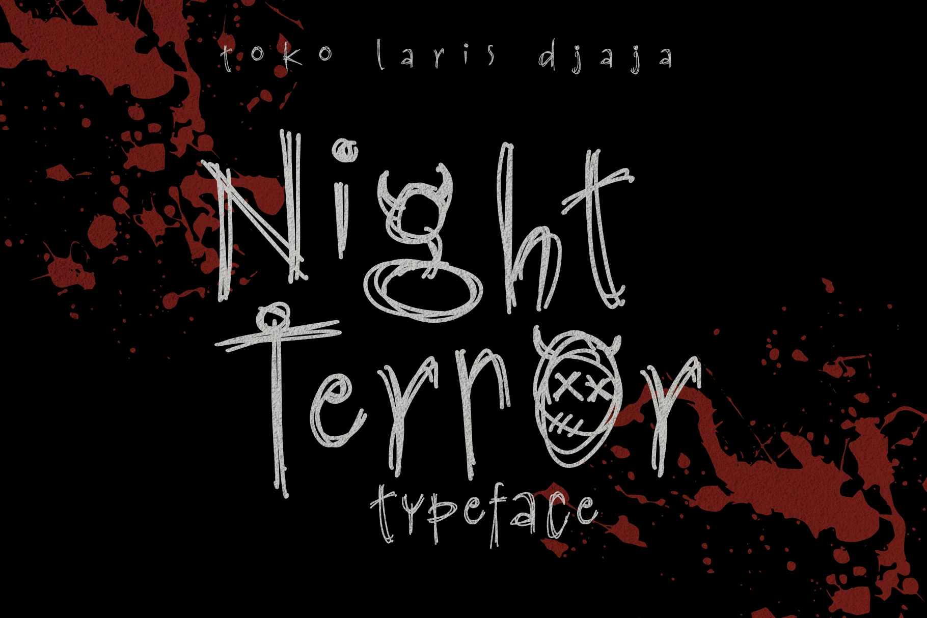
Night Terror Font
Best For: posters, headlines, T-shirts
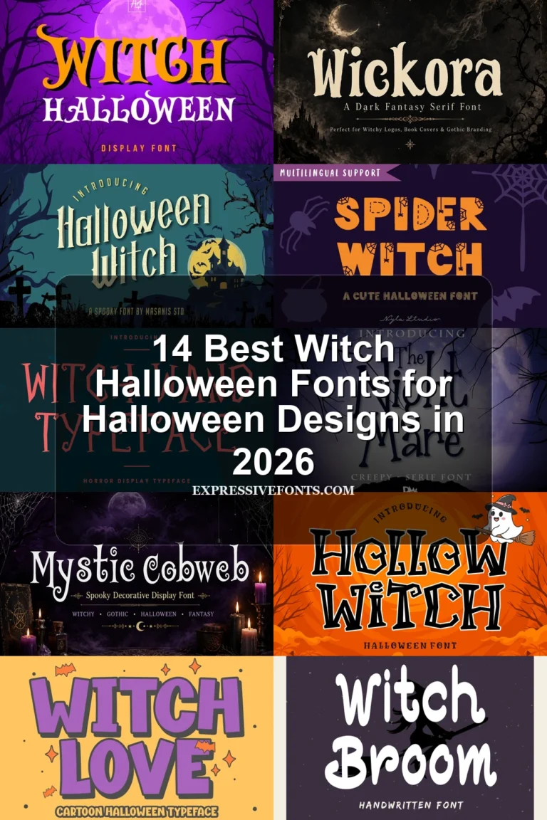
Night Terror Font builds its disturbed handmade tone from sketchy disconnected letters, inconsistent stroke widths, and integrated horns and stitched-eye masks. Those motifs add character to posters and shirts, but they slow recognition in longer wording.
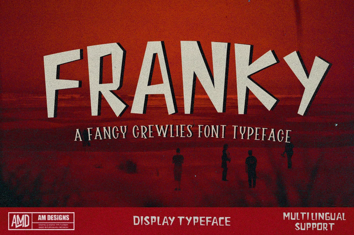
Franky Font
Best For: posters, headlines, stickers
Franky Font uses rough-hewn proportions, angled terminals, mixed slants, and uneven heights for an unrefined monster-display tone. Its heavy forms remain usable in large headings and stickers, though small settings become less predictable.
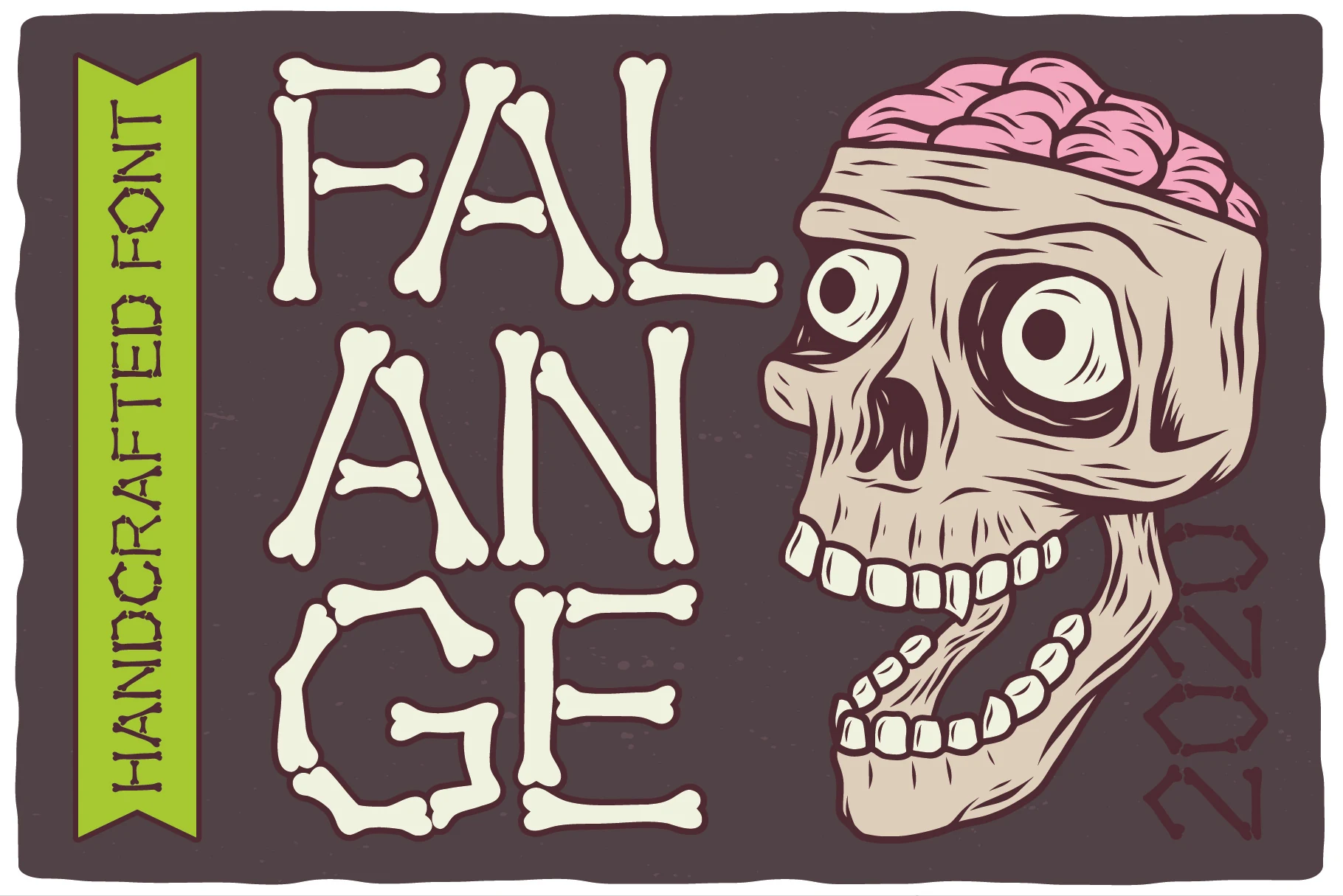
Falange Font
Best For: posters, display text, headlines
Falange Font constructs its letters from individual bone shapes rather than simply weathering their outlines. The skeletal idea reads immediately in party headlines, although the disconnected forms become difficult to decode at small sizes.
Scary Halloween Font
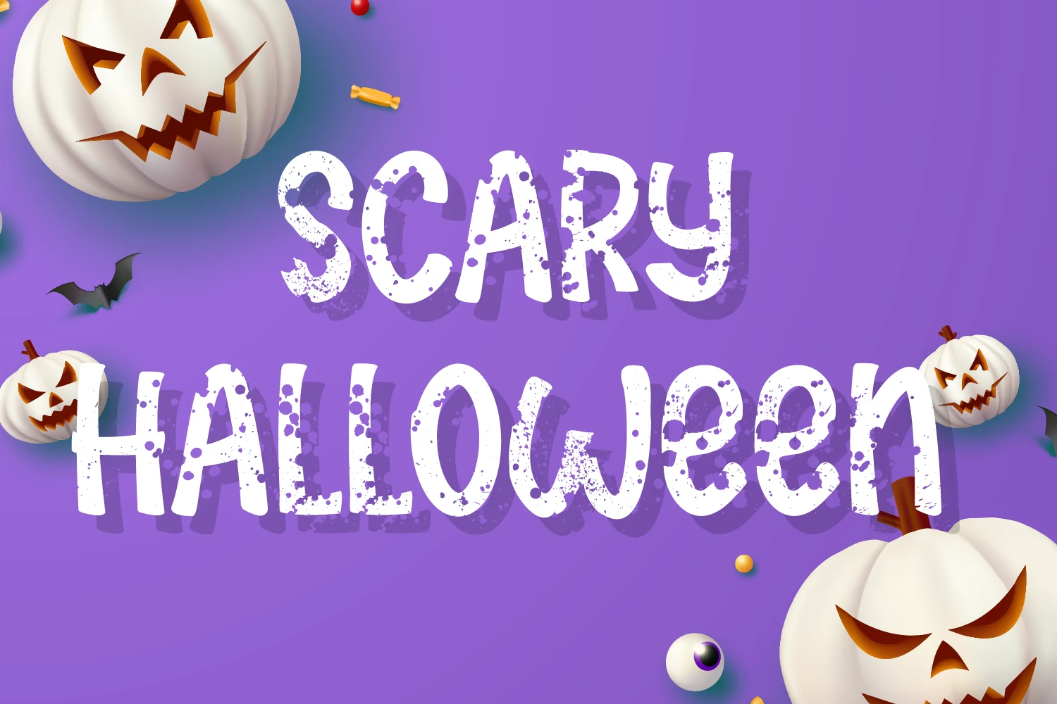
Best For: posters, display text, headlines
Scary Halloween Font is one of the more readable choices here: uppercase-only heavy lettering sits on a stable baseline, with grunge texture supplying the atmosphere. It works well for prominent labels, posters, and stickers at display sizes.
Octer Font
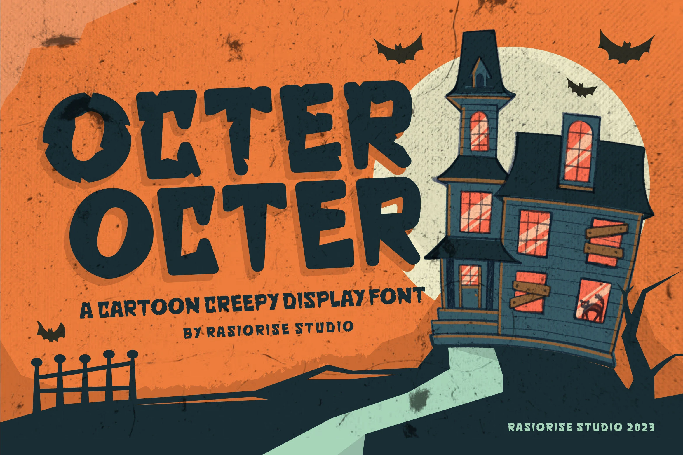
Best For: social media graphics, posters, stickers
Octer Font softens its notched block construction with rounded terminals, creating a cartoon-oriented horror display style. Thick strokes preserve large-size readability for social posts and stickers, while irregular edges become less distinct when reduced.
Retro Spider Web Font
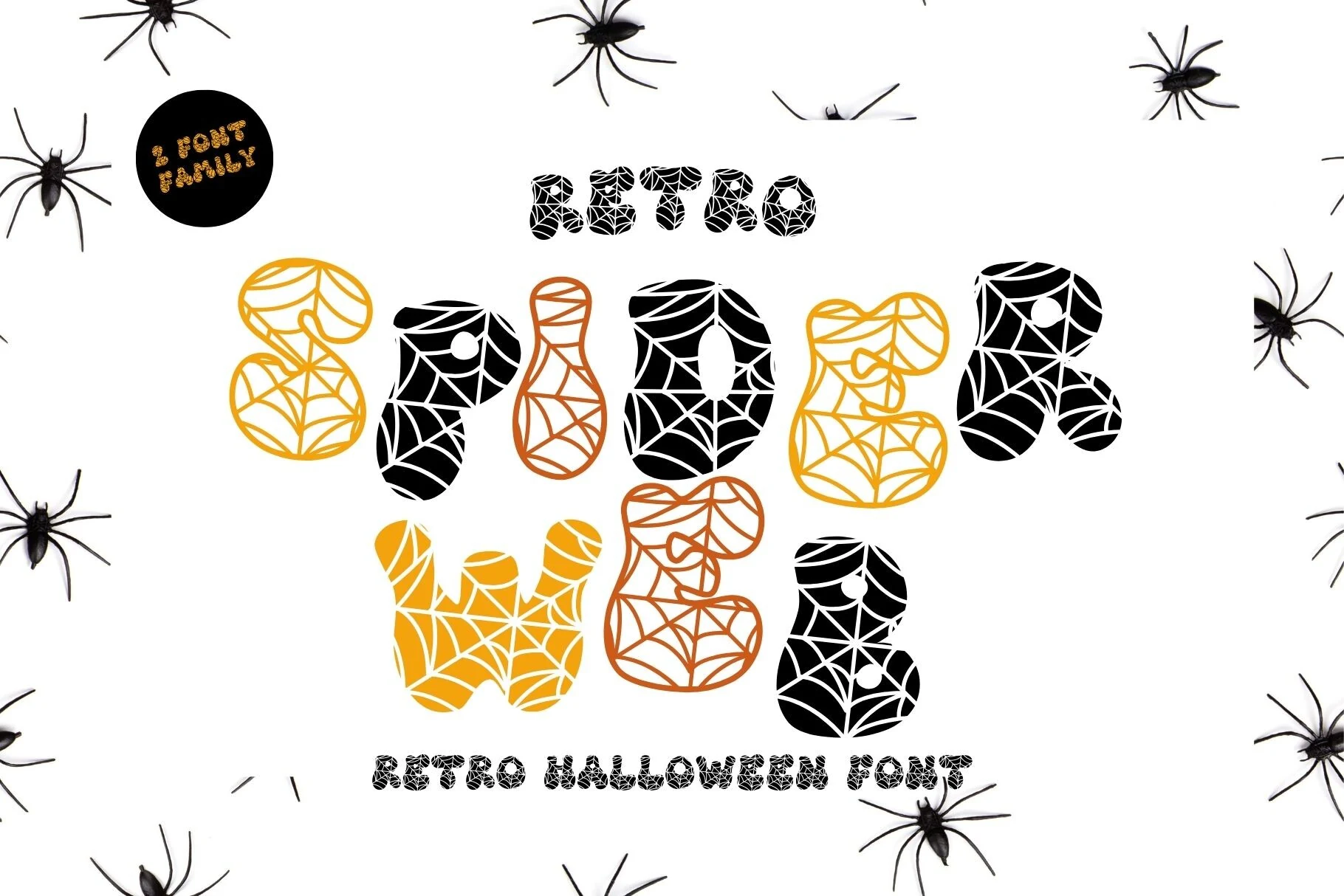
Best For: logos, branding, invitations
Retro Spider Web Font replaces jagged damage with rounded bubble letters carrying a repeating spider-web pattern. That patterned surface makes a distinctive logo or invitation, although the texture can blur and reduce clarity at small sizes.
Scary Halloween Font
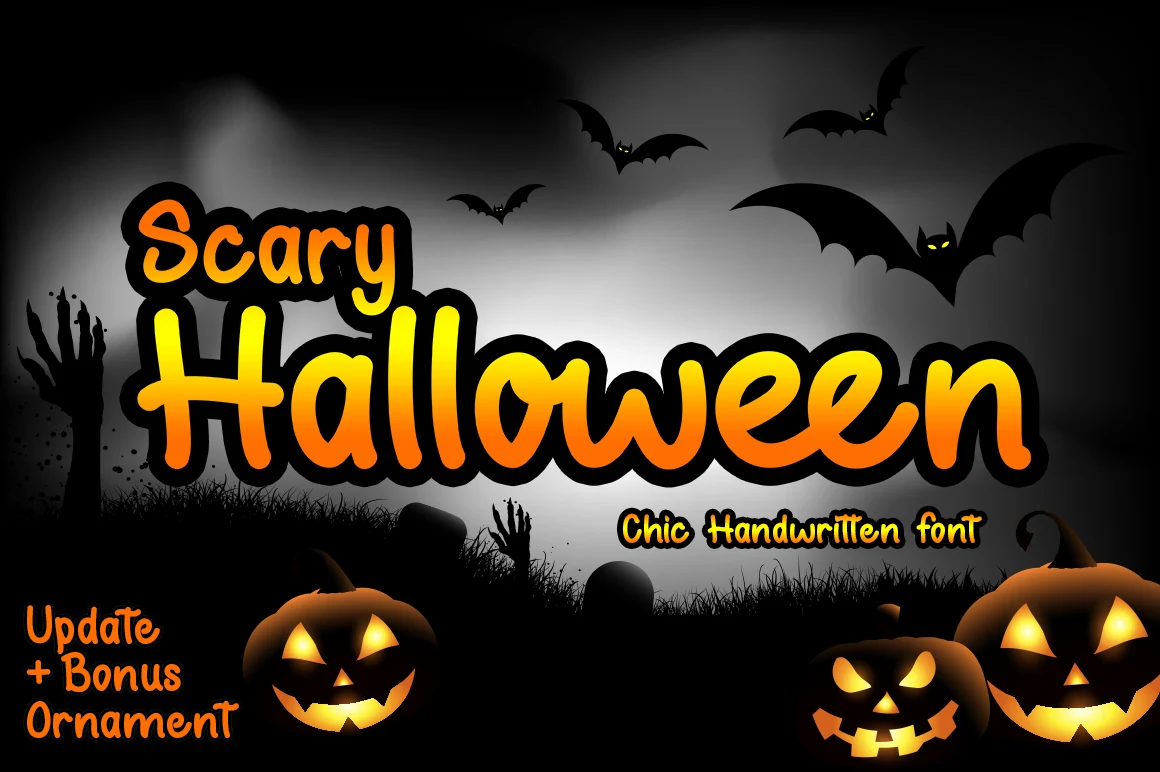
Best For: social media graphics, website headers, posters
Scary Halloween Font is the most approachable option here, using rounded monoline letters, disconnected forms, and a bouncy baseline. Consistent thick strokes keep headers and social graphics readable while maintaining an informal spooky mood.
How to Choose the Right Font
Choose Scary Halloween Fonts by matching construction to scale and message length. Drips, embedded icons, bones, and web patterns need oversized treatment; condensed serifs help narrow titles; stable baselines improve control; and heavier, less textured options offer better readability. Reserve the most irregular designs for short headlines, logos, stickers, and merchandise.