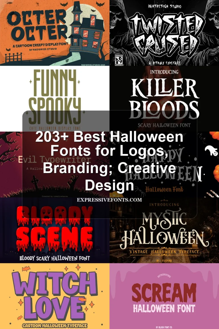
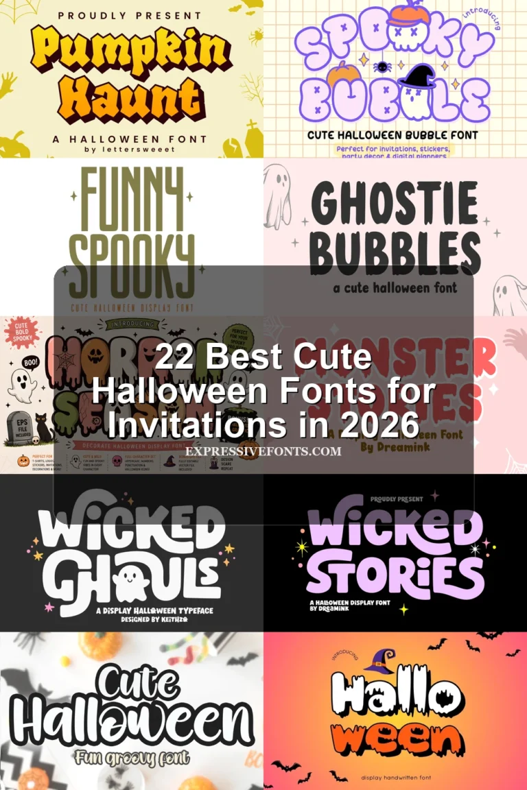
13 Best Haunted Halloween Fonts for Spooky Designs in 2026
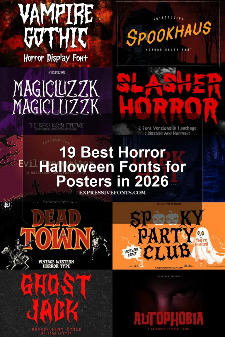
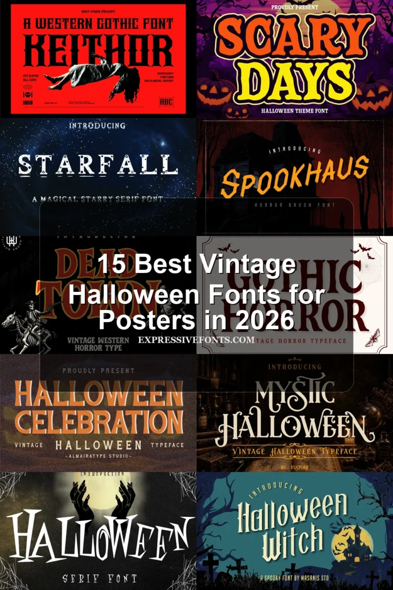
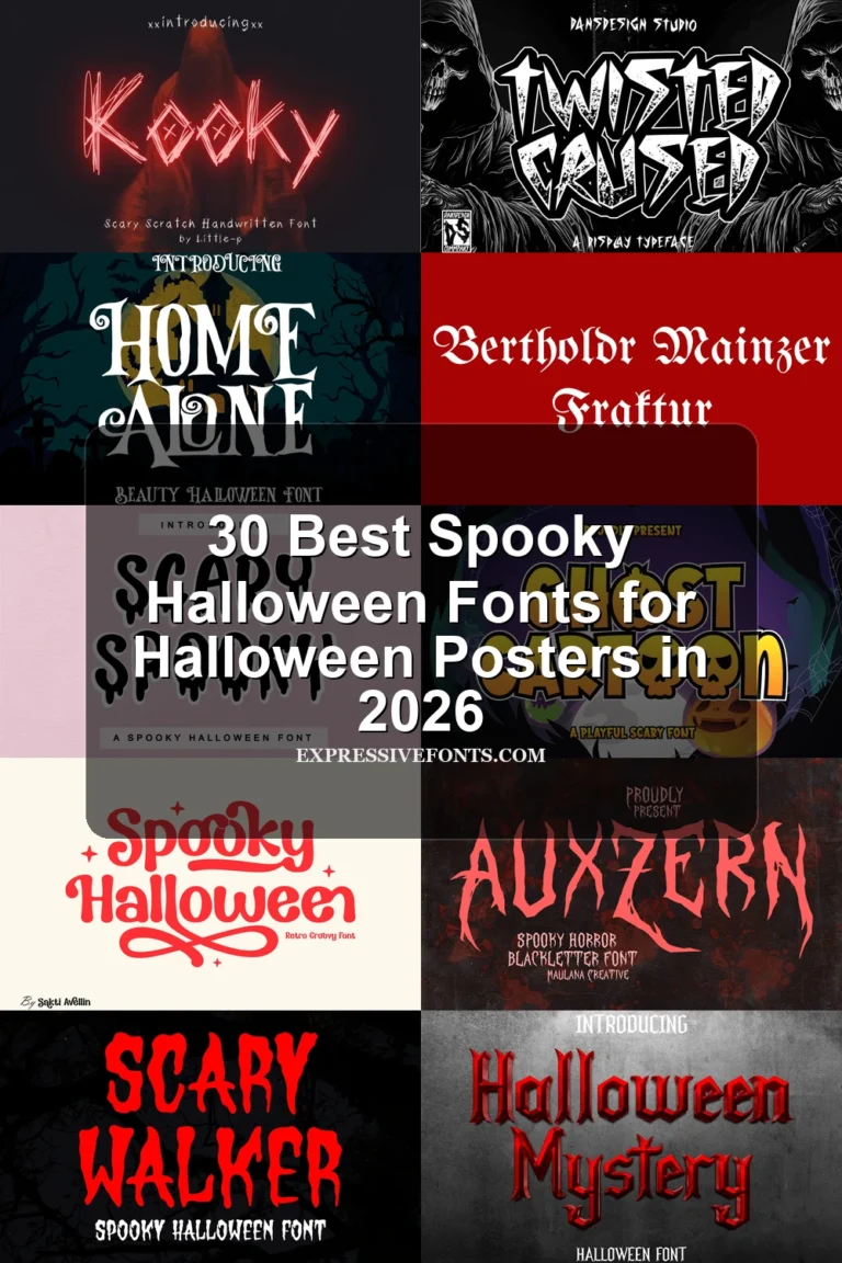
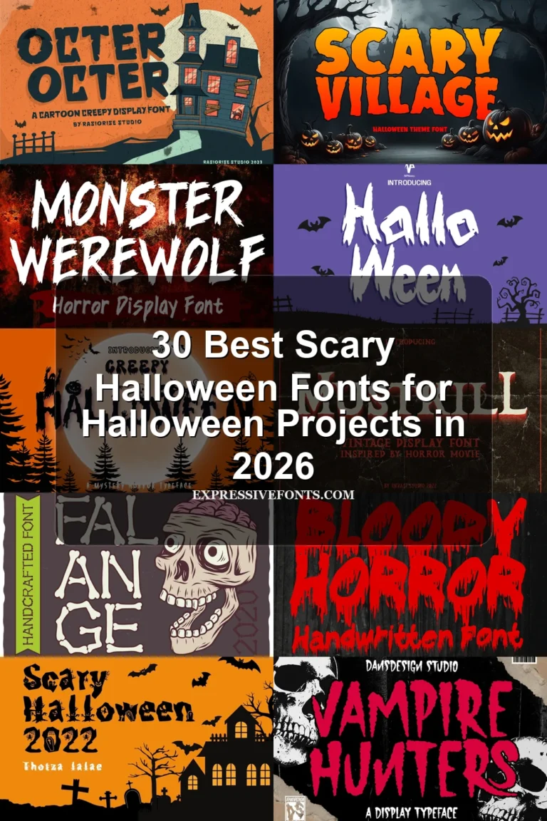
This collection ranges from scratched, jagged lettering to dripping blocks, bone-like terminals, and illustrated characters. These Haunted Halloween Fonts are built for practical display work—posters, shirts, invitations, logos, packaging, and social graphics—where atmosphere matters more than extended reading.
Looking for more halloween fonts? Browse our complete Halloween Fonts collection to compare vintage, cute, scary, spooky, and creepy halloween styles.
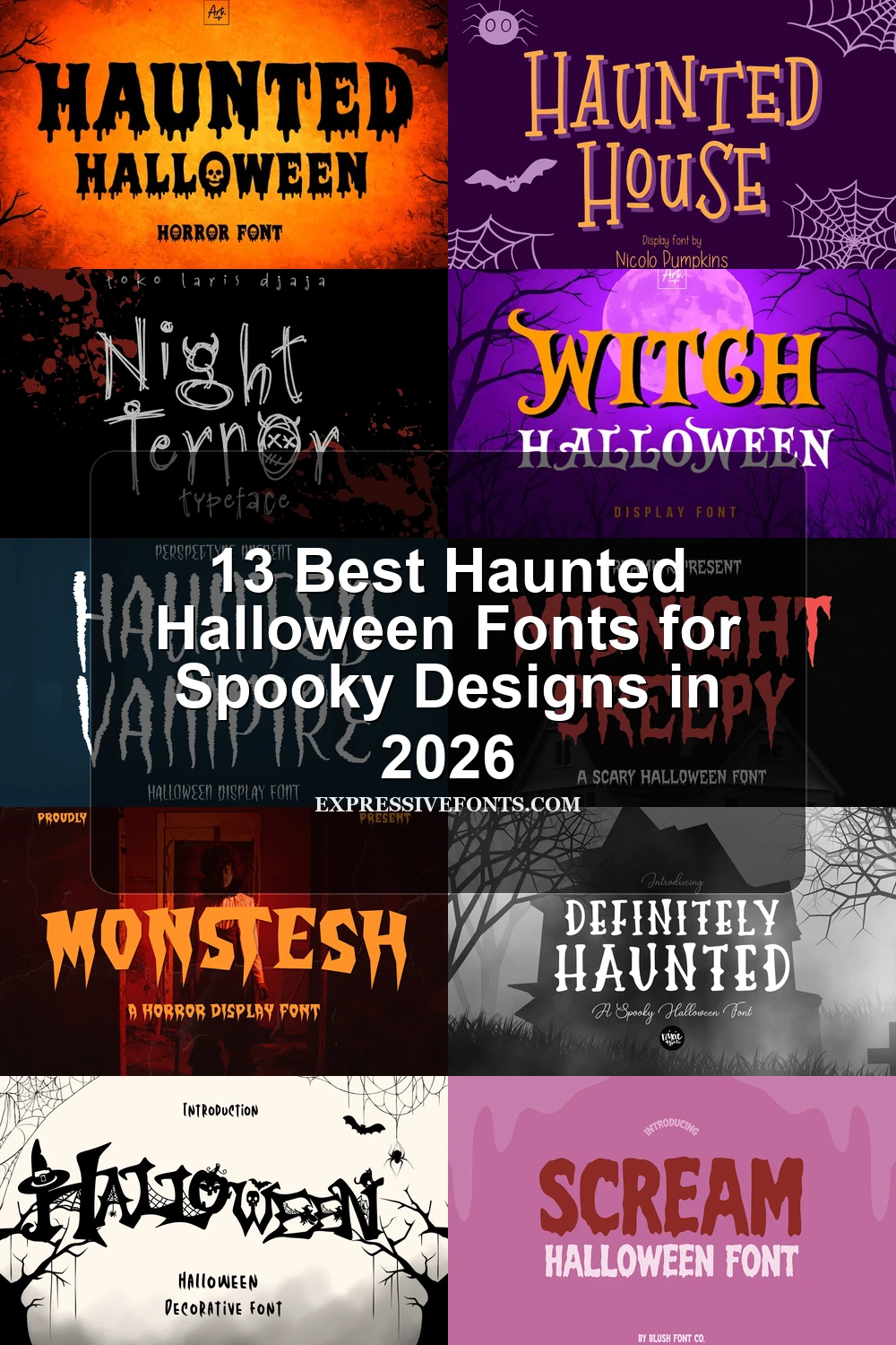
Haunted Halloween Fonts: Jagged Texture
These Haunted Halloween Fonts rely on broken strokes, distressed edges, irregular baselines, and claw-like terminals, creating harsher texture than the more fluid or illustrated groups.
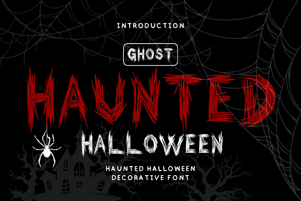
Haunted Halloween Font
Best For: posters, social media graphics, T-shirts
Haunted Halloween Font uses scratchy broken lines, sharp terminals, and uneven heights and widths for an eerie, aggressive texture. Its disconnected construction works best large, since the distressed detail quickly reduces readability in smaller messages.
Haunted Vampire Font
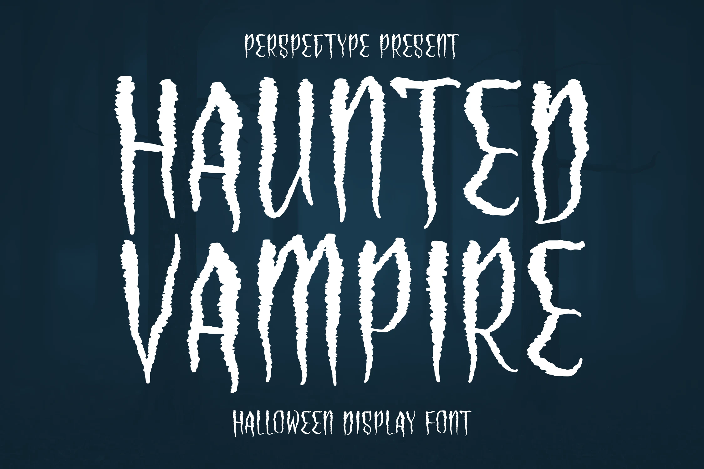
Best For: logos, branding, posters
Haunted Vampire Font creates a compressed vampire-poster effect through narrow vertical proportions and shredded, distressed edges. Its condensed width can help names fit logos or packaging, but the jagged texture is too disruptive for body copy.
Night Terror Font
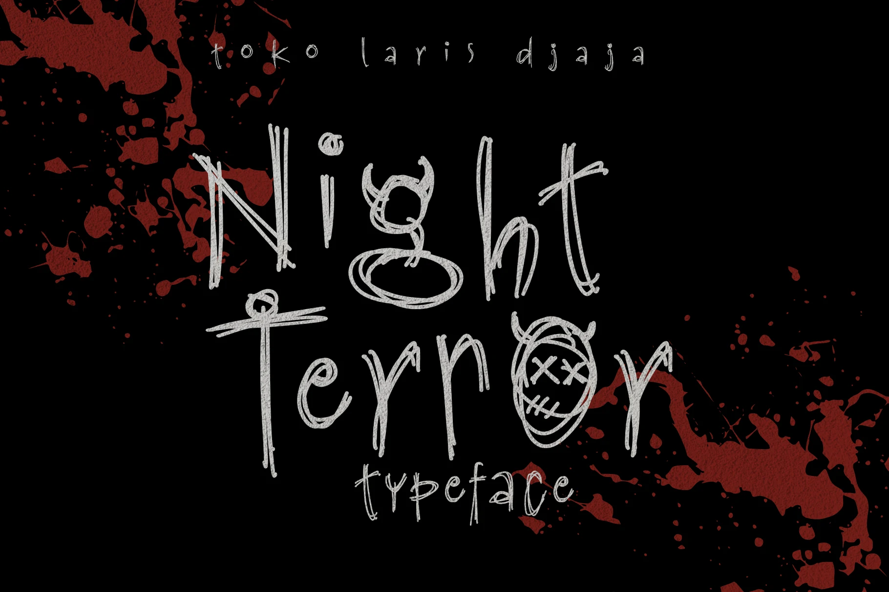
Best For: headlines, posters, T-shirts
Night Terror Font feels illustrated rather than conventionally handwritten, with disconnected scribbles, a rough baseline, and distinctive circular O forms. The aggressive texture has the strongest impact in large headlines and thematic shirt graphics.
Monstesh Font
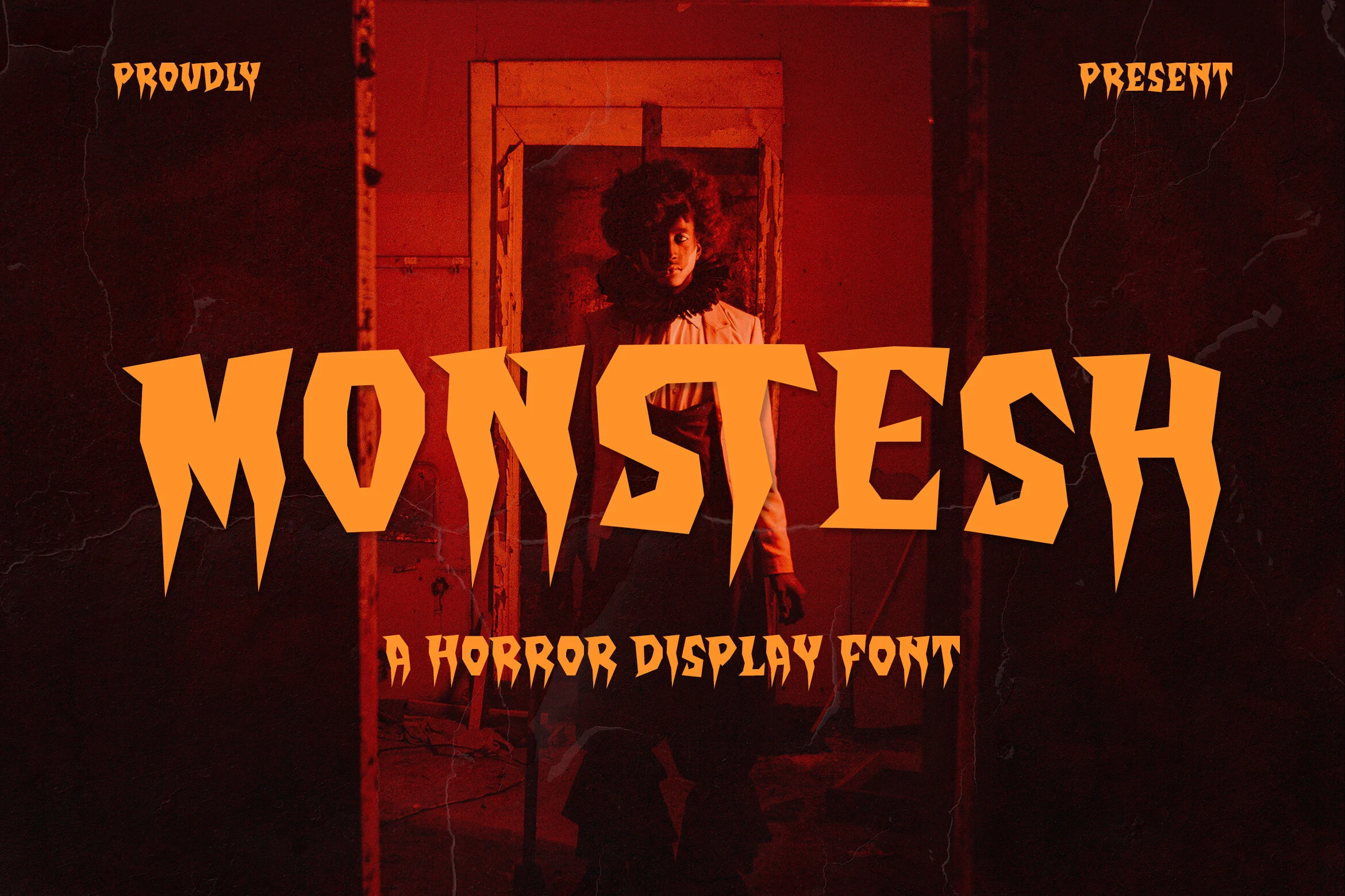
Best For: posters, headlines, T-shirts
Pointed, claw-like terminals turn Monstesh Font's heavy strokes into an aggressively angular silhouette. The concentrated menace reads clearly on posters and shirts, but its jagged vertical ends interrupt the rhythm needed for fast-reading copy.
Dripping And Melting Displays
Heavy letterforms in this group descend into liquid, runoff, or melting terminals. Their menace is more literal than the jagged category and more effect-driven than the structural designs.
Midnight Creepy Font
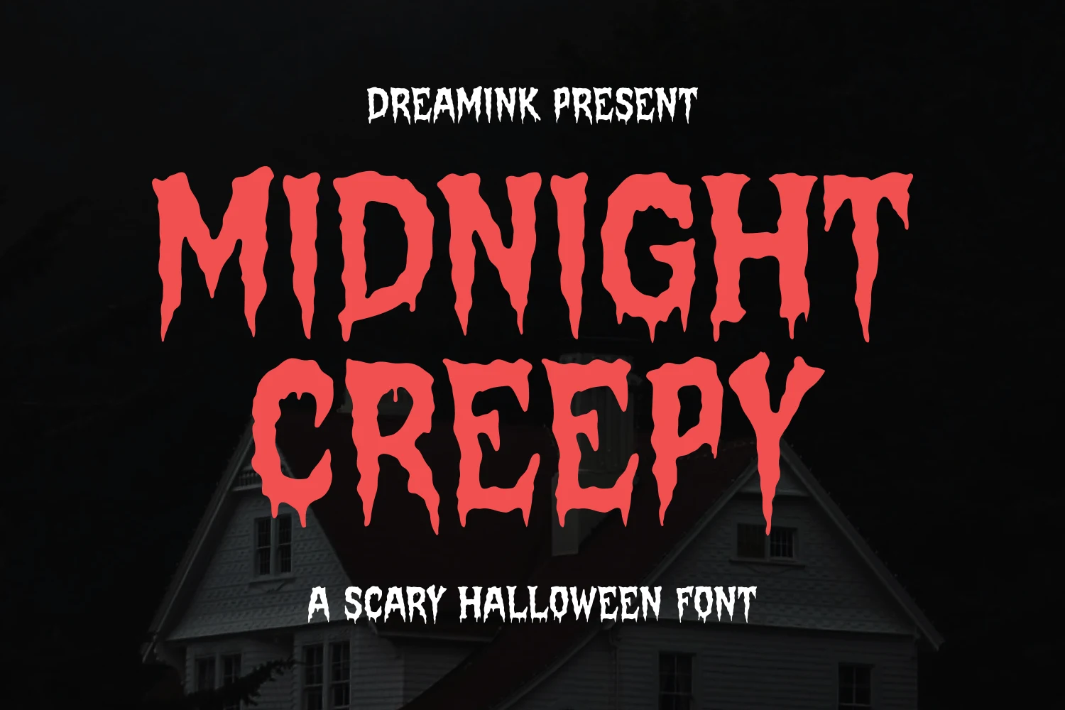
Best For: posters, headlines, T-shirts
Midnight Creepy Font turns heavy block letters into a liquid threat with dripping terminals, jagged edges, and a blood-like flow. This Haunted Halloween Font delivers immediate menace in titles and posters, but its melting detail obscures smaller text.
Ghouls Howdy Font
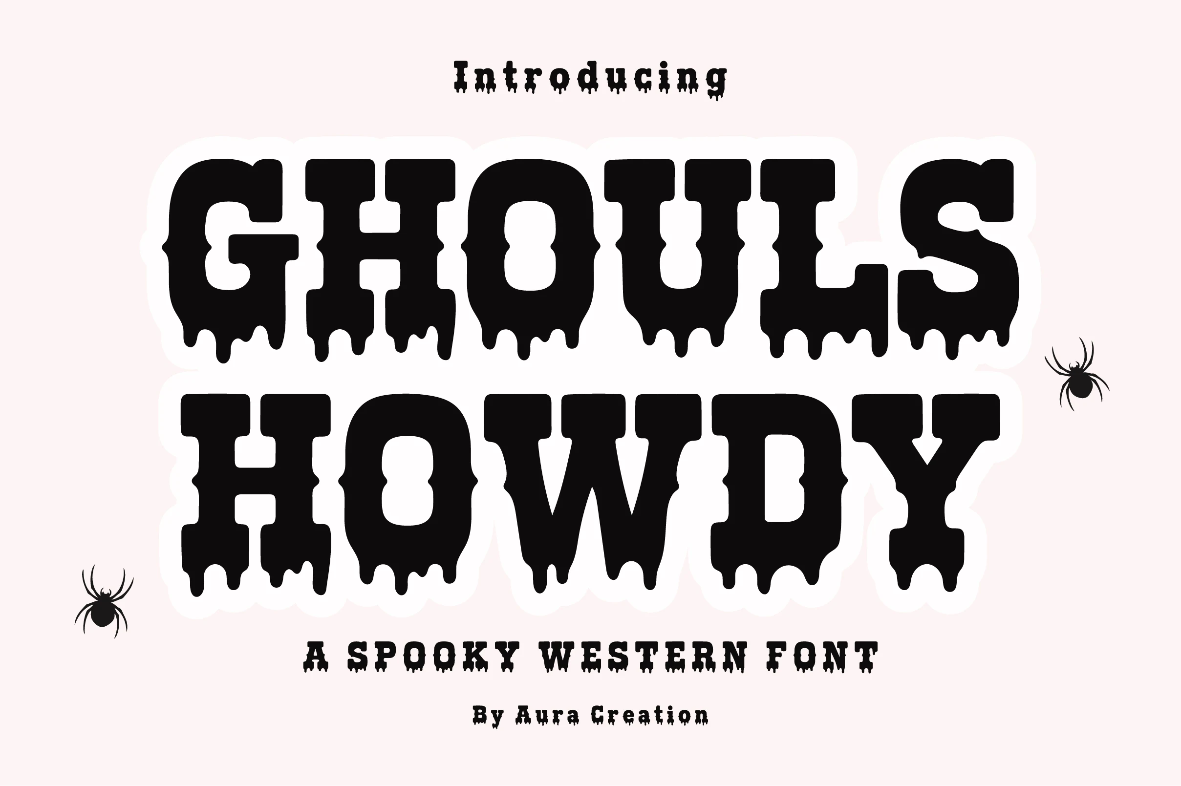
Best For: T-shirts, posters, invitations, stickers
Ghouls Howdy Font brings a wide slab-serif, western-inspired structure to the dripping category, giving it broader, sturdier forms than narrow horror lettering. Its playful melt-effect bottoms suit shirts, stickers, invitations, and branding, provided the design stays large enough for the details to remain clear.
Scream Halloween Font
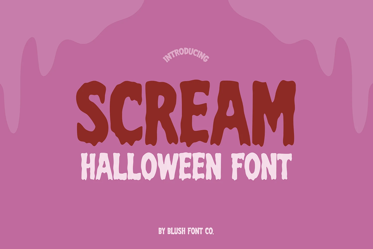
Best For: posters, display text, stickers
Scream Halloween Font is built for short uppercase titles, combining thick strokes, caps-only proportions, and uneven dripping runoff for a forceful sign-like presence. Its irregular terminals make stickers and large posters effective, while smaller labels can lose clarity.
Haunted Halloween Font
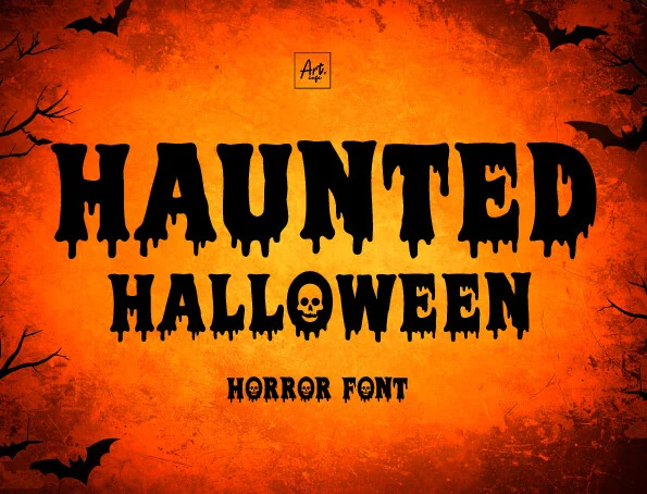
Best For: posters, headlines, social media graphics
Haunted Halloween Font combines blocky melting forms with a skull embedded in the O, giving short titles an unmistakable iconographic hook. The bold construction stays effective in posters and social headlines, although the dripping extensions become harder to read when reduced.
Illustrated And Structural Spookiness
This group builds spookiness through structure and imagery: slabs, serifs, bone-like shapes, and embedded Halloween icons. It offers clearer visual themes than purely distressed lettering.
Haunted House Font
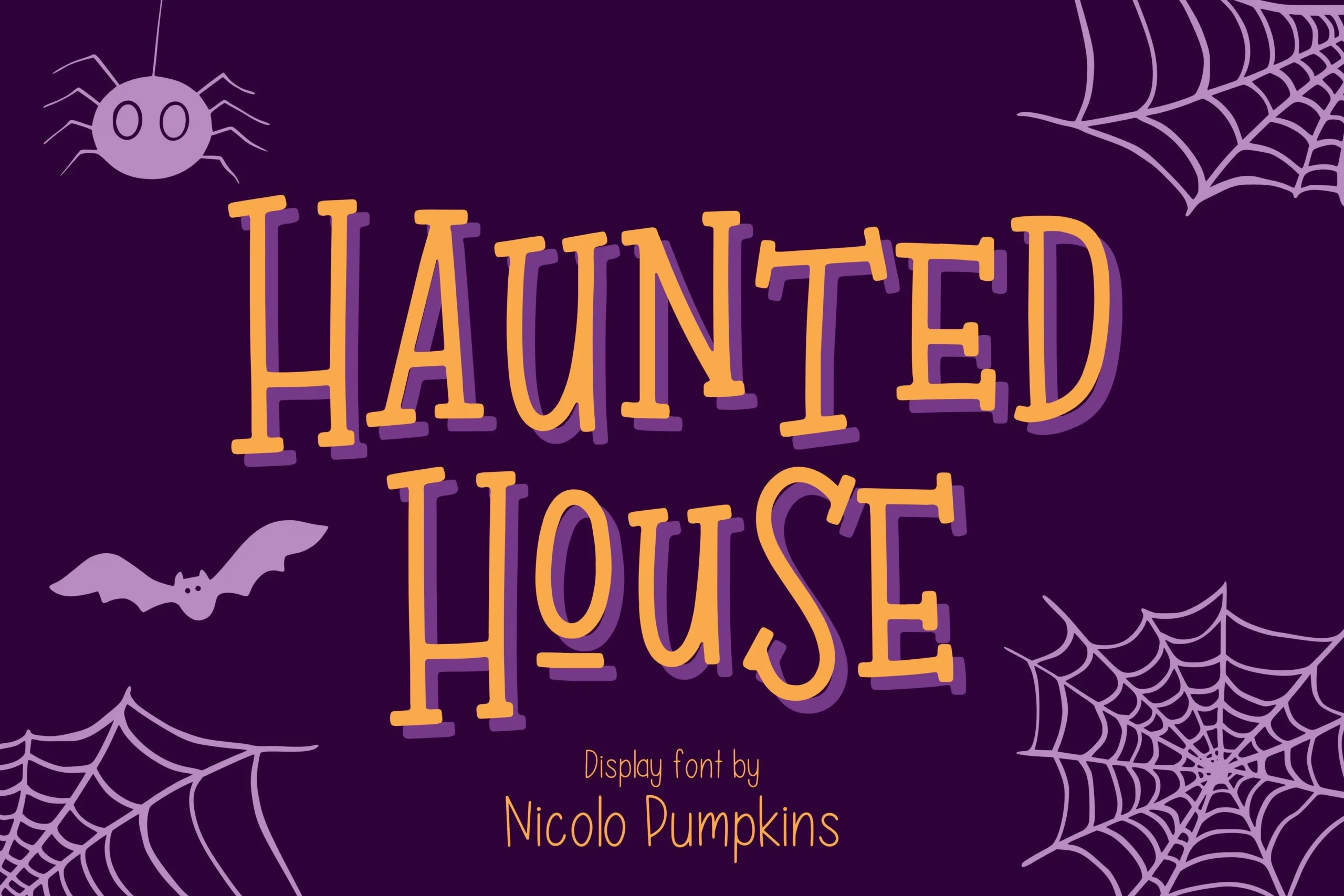
Best For: logos, quotes, headlines
Tall, condensed slab shapes give Haunted House Font a stronger headline silhouette than ordinary handwritten lettering. Its bold, hand-drawn forms suit Halloween quotes and logos, although uneven alignment and baseline shifts make small text slower to read.
Halloween Font
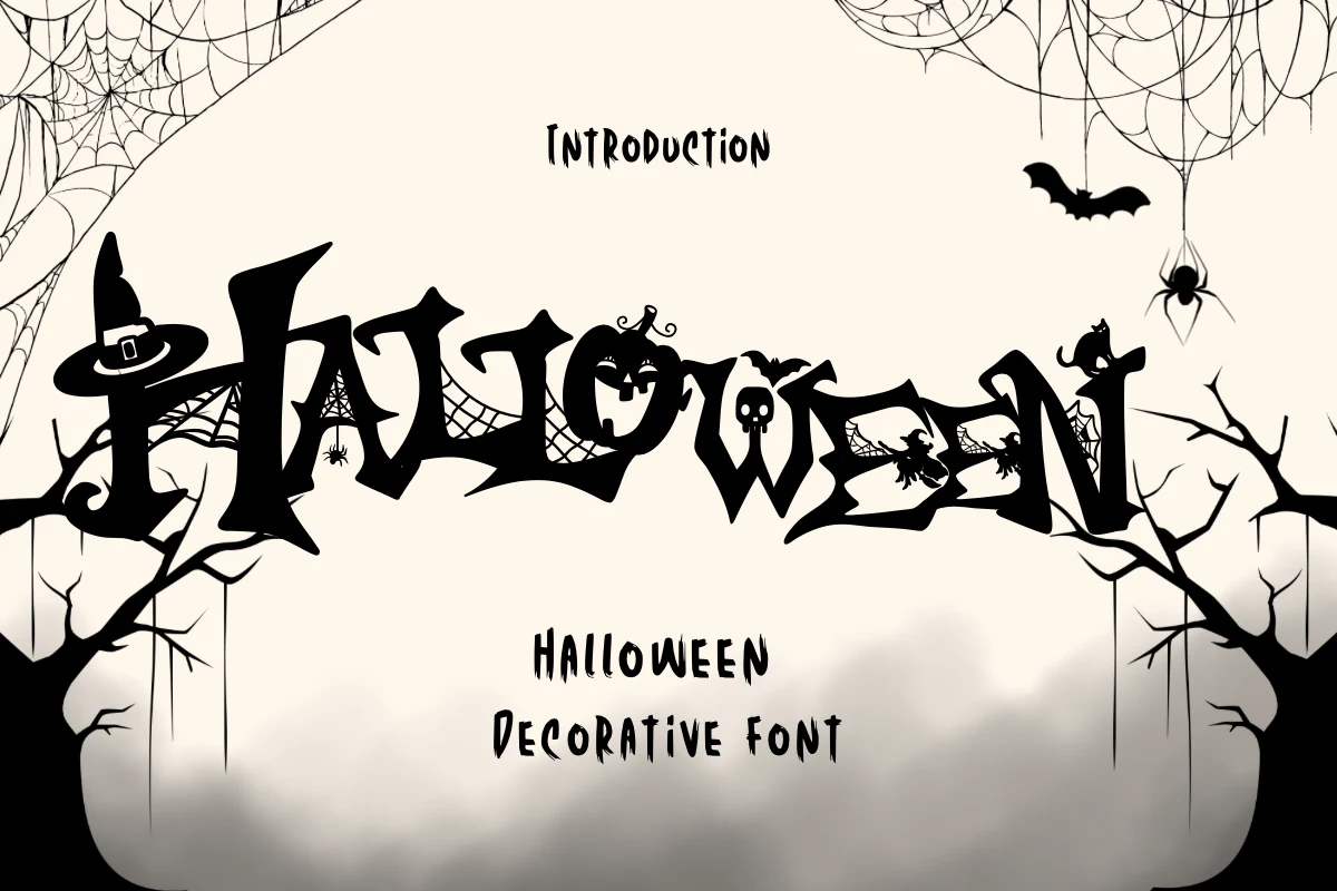
Best For: headlines, posters, invitations, decorative designs
For instant Halloween theming, Halloween Font builds witch hats, spider webs, bats, and skulls directly into its bold letterforms. The irregular baseline and sharp terminals make it especially effective on spooky invitations and haunted party posters, while the integrated illustrations need generous display scale.
Haunted Halloween Font
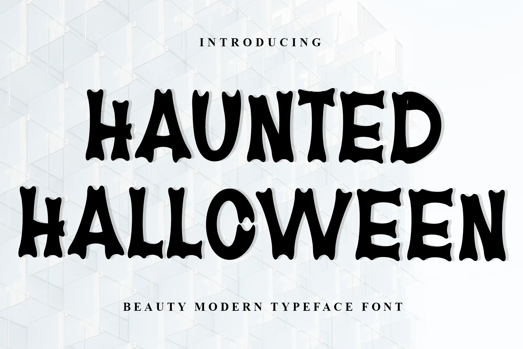
Best For: display text, headlines
Haunted Halloween Font uses flared, bone-like terminals and wide rounded proportions to create a whimsical skeletal outline. The organic construction feels more playful than jagged horror lettering, making it useful for cards and gift tags, though its high contrast keeps it firmly in title territory.
Witch Halloween Font
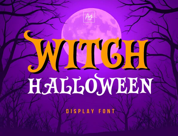
Best For: posters, display text, headlines
Witch Halloween Font offers a structured alternative to melting effects, pairing sharp triangular serifs with bold strokes and pronounced contrast. Its irregular edges keep the mood festive and thematic, while detailed terminals call for poster-sized headlines rather than tiny text.
Definitely Haunted Font
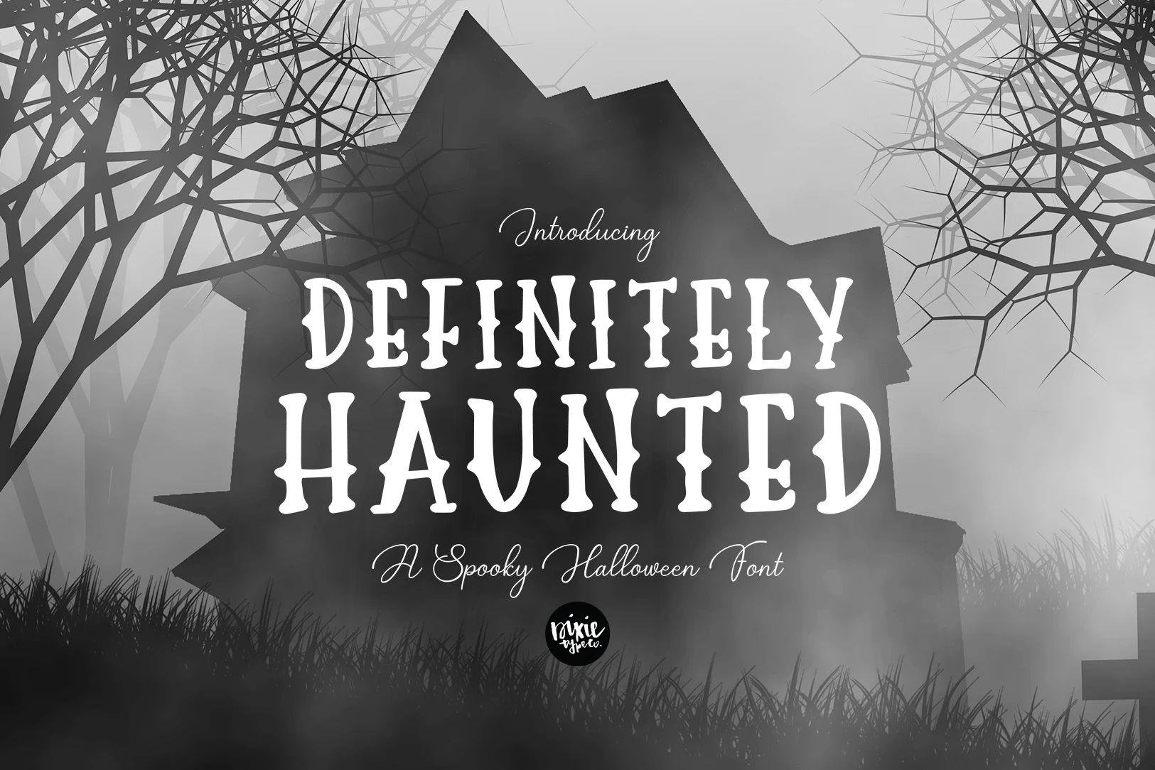
Best For: posters, display text, decorative designs
Definitely Haunted Font brings unusual control to horror display type through condensed slab-serifs, a stable baseline, flared rounded terminals, and strong contrast. The narrow format helps poster headlines fit, but its decorative density still rules out dense body text.
How to Choose the Right Font
Choose by construction as much as mood: distressed and clawed styles provide raw texture, while dripping faces deliver a more literal menace. For stronger readability, favor slab or serif structures, stable baselines, and restrained detail; reserve the most illustrated Haunted Halloween Fonts for large titles, where their joins, contrast, and flourishes can be seen clearly.