19 Best Horror Halloween Fonts for Posters in 2026
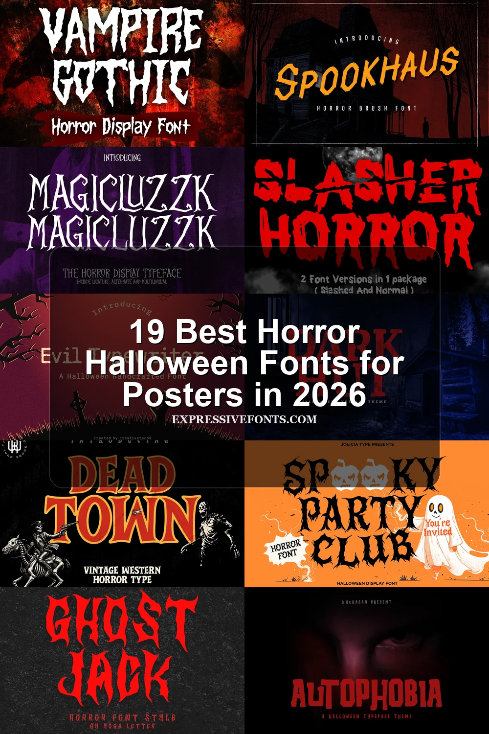
This collection spans liquid drips, melting terminals, distressed slabs, jagged brushes, organic growth, and pictorial skull details. These Horror Halloween Fonts are built for high-impact display work, including posters, T-shirts, stickers, book covers, logos, labels, and other designs where visible construction matters more than extended reading.
Looking for more halloween fonts? Browse our complete Halloween Fonts collection to compare vintage, cute, scary, spooky, and creepy halloween styles.
Horror Halloween Fonts: Drips, Melts, and Flowing Forms
These Horror Halloween Fonts use drips, sagging terminals, and liquid extensions as their main silhouette. They feel more fluid and melting than the sturdier serif or jagged brush groups.
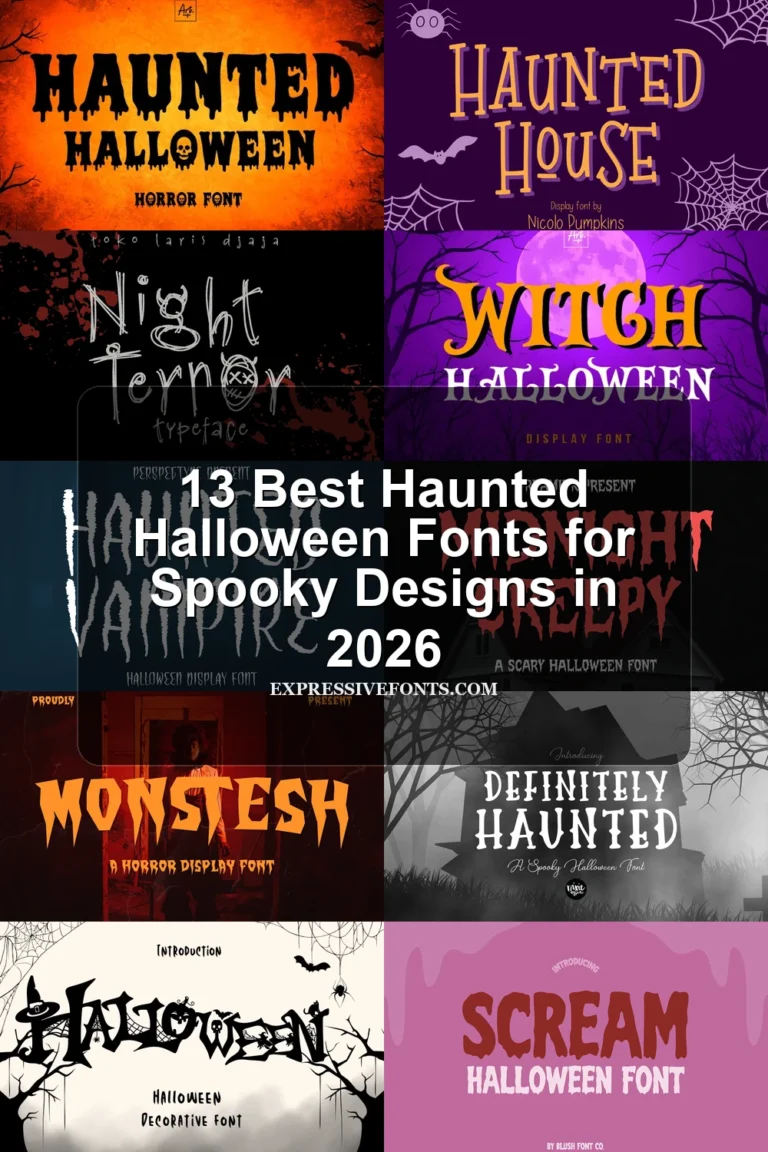
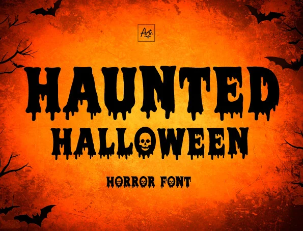
Haunted Halloween Font
Best For: posters, T-shirts, stickers
Haunted Halloween Font is defined by liquid extensions hanging from its lower terminals, creating an instantly recognizable dripping silhouette. Thick main strokes keep headlines readable at display sizes, while the projections need breathing room because they can collide in tight line spacing. It is a direct, highly thematic choice for merchandise and posters.
Horror Halloween Font
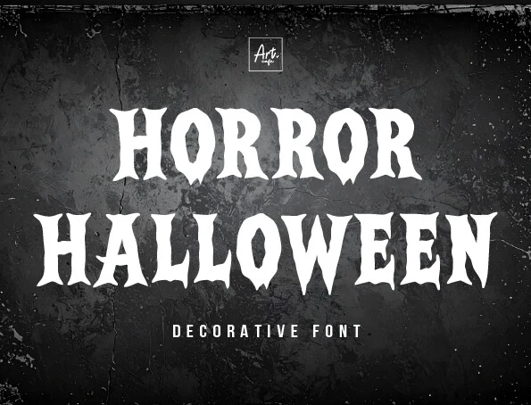
Best For: headlines, posters, T-shirts
Horror Halloween Font makes melting terminals and uneven serif-like strokes do the visual work, so each word appears to sag and liquefy. Heavy forms create strong impact on T-shirts and posters, but irregular shapes slow reading. Use it for short, prominent wording rather than long messages or dense layouts.
Nightmare Font

Best For: posters, display text, T-shirts
Nightmare Font connects cursive letterforms with extended liquid tails, making continuous movement central to its horror effect. It suits a dramatic poster wordmark or short headline, but irregular joins and drips make longer phrases harder to read. The connected construction sets it apart from the mostly disconnected faces in this collection.
Death Secrets Font
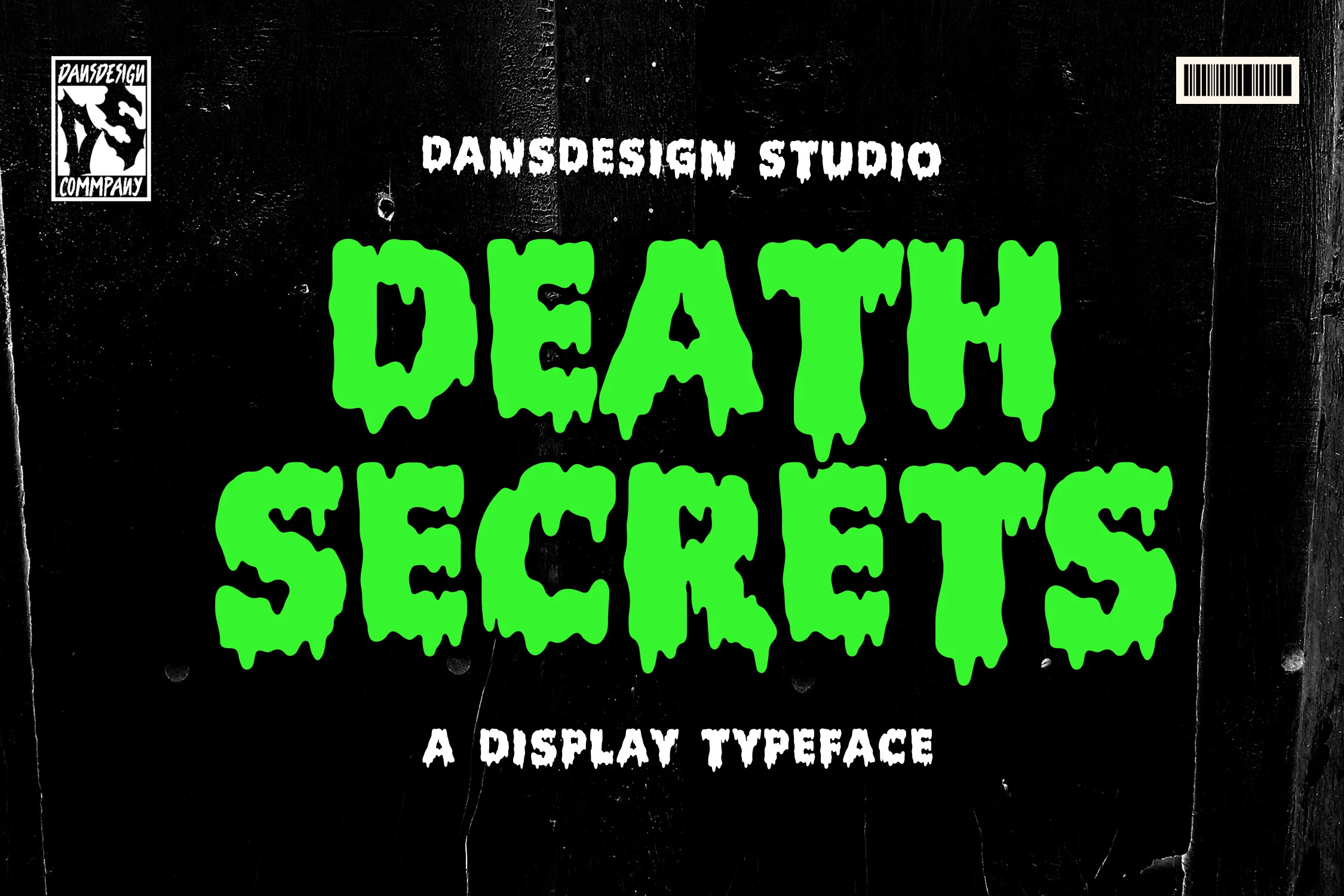
Best For: display text, headlines, posters
Death Secrets Font uses monolinear block shapes to make its melting and dripping treatment more uniform than sharply contrasting designs. The consistent stroke structure keeps large headlines comparatively legible, while decorative drips complicate small stickers and labels. Choose it when you want liquid distortion without losing a basic block silhouette.
Dripping Halloween Font
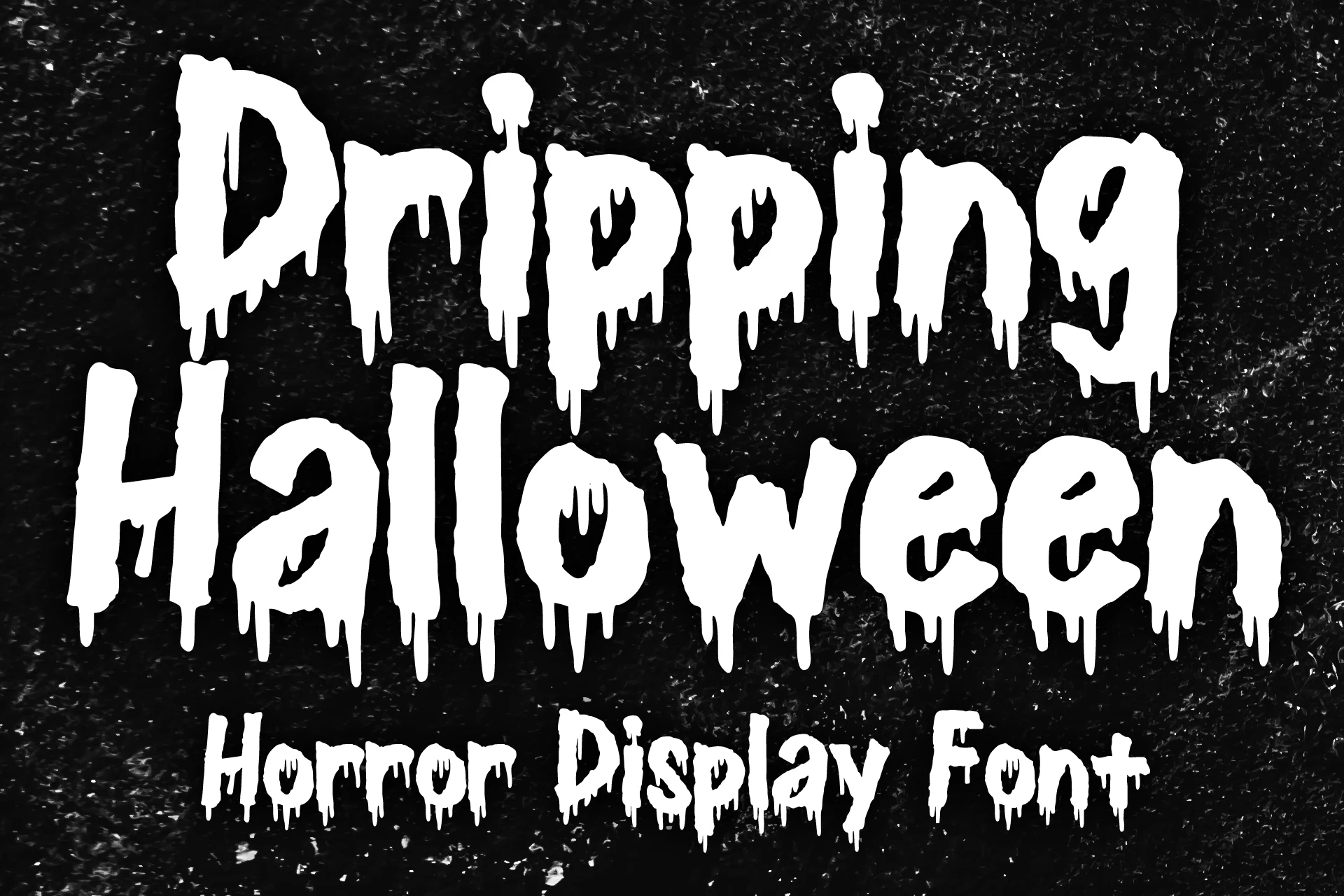
Best For: posters, T-shirts, headlines
Dripping Halloween Font reshapes blocky sans-serif forms with vertical drips along the bottom edges, giving its silhouette a cleaner base than more ornate Horror Halloween Fonts. Heavy strokes support poster and T-shirt headlines, while the drip terminals still lose clarity when reduced. It offers a straightforward route to a liquid horror mood.
Distressed Serif and Slab Lettering
This group combines slab or serif frameworks with erosion, weathering, and carved irregularity. Its solid, often wide or condensed structure feels more architectural than the looser organic and brush-led designs.
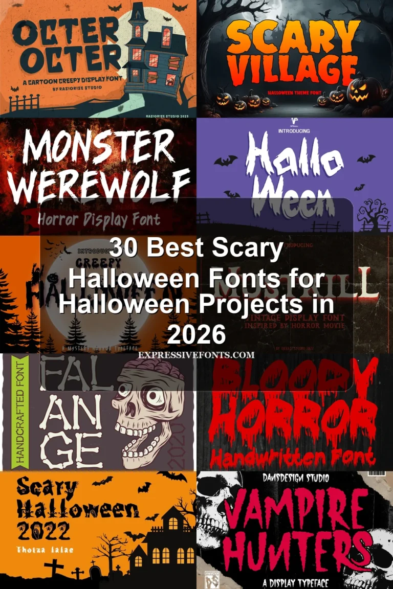
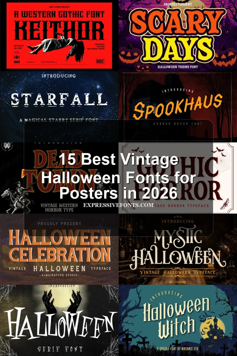
Dead Town Font
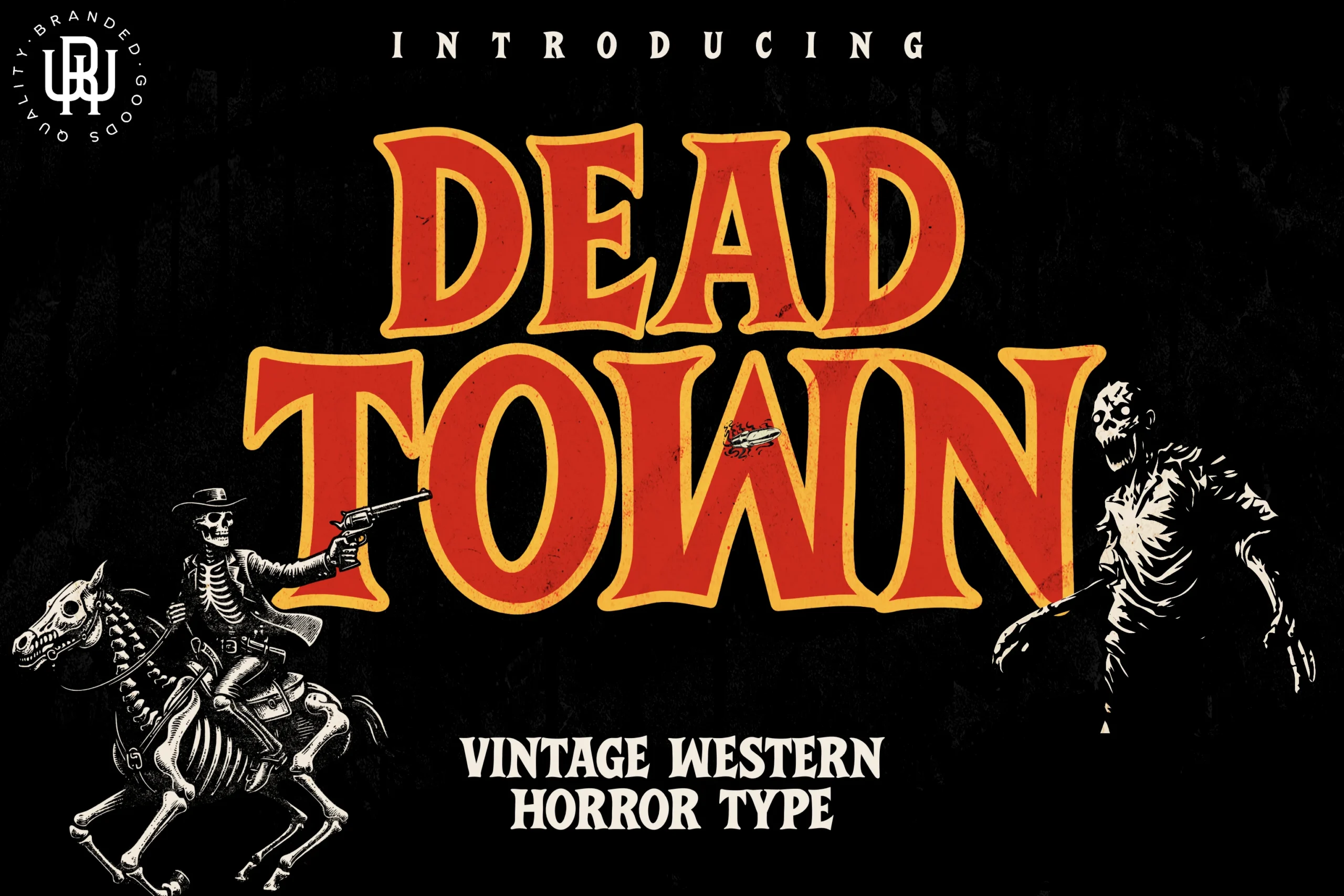
Best For: headlines, posters
Dead Town Font pairs wide proportions with prominent triangular serifs for a distinctive Wild West–Halloween crossover. Its bold upright silhouette stays clear in large headlines and posters, but weathered edges and ornamental details become less dependable when reduced. Use it where a sturdy display presence matters more than compact text.
Infection Font
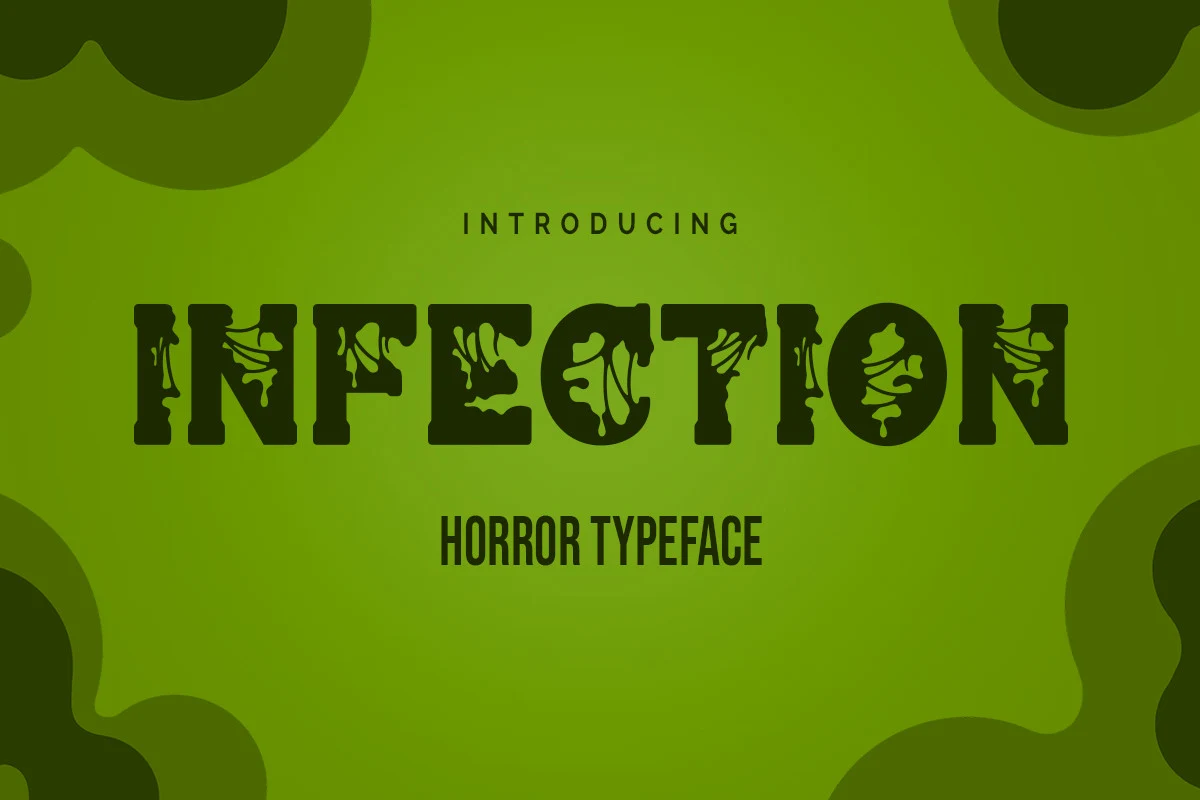
Best For: product labels, posters, headlines
Infection Font interrupts a heavy slab-serif build with organic internal cutouts and eroded, dripping edges. The decay remains visually convincing in large titles, posters, and product labels, while damaged counters can interfere with recognition at smaller sizes. It delivers a dense, menacing block rather than a light decorative treatment.
Evil Typewriter Font
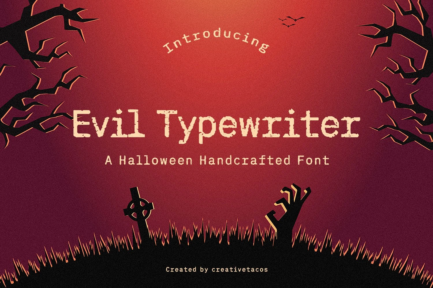
Best For: posters, display text, headlines
For poster blocks and title treatments, Evil Typewriter Font combines chunky slab serifs with monospaced-style spacing and an upright posture. The even rhythm gives words a worn typewriter impression without relying on an italic slant. Its distressed edges add character at display scale, but limit usefulness for small supporting text.
Autophobia Font
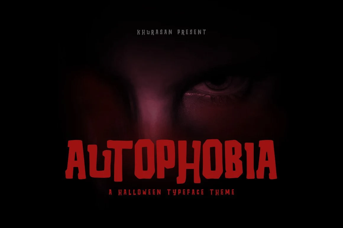
Best For: posters, headlines, stickers
Autophobia Font builds its irregular, hand-carved surface onto a blocky slab structure. The bold silhouette remains effective in headline layouts and stickers, while uneven stroke thickness makes it less suitable for body text. Compared with brush-based Horror Halloween Fonts, its framework feels more solid and controlled beneath the rough texture.
Dark Hut Font
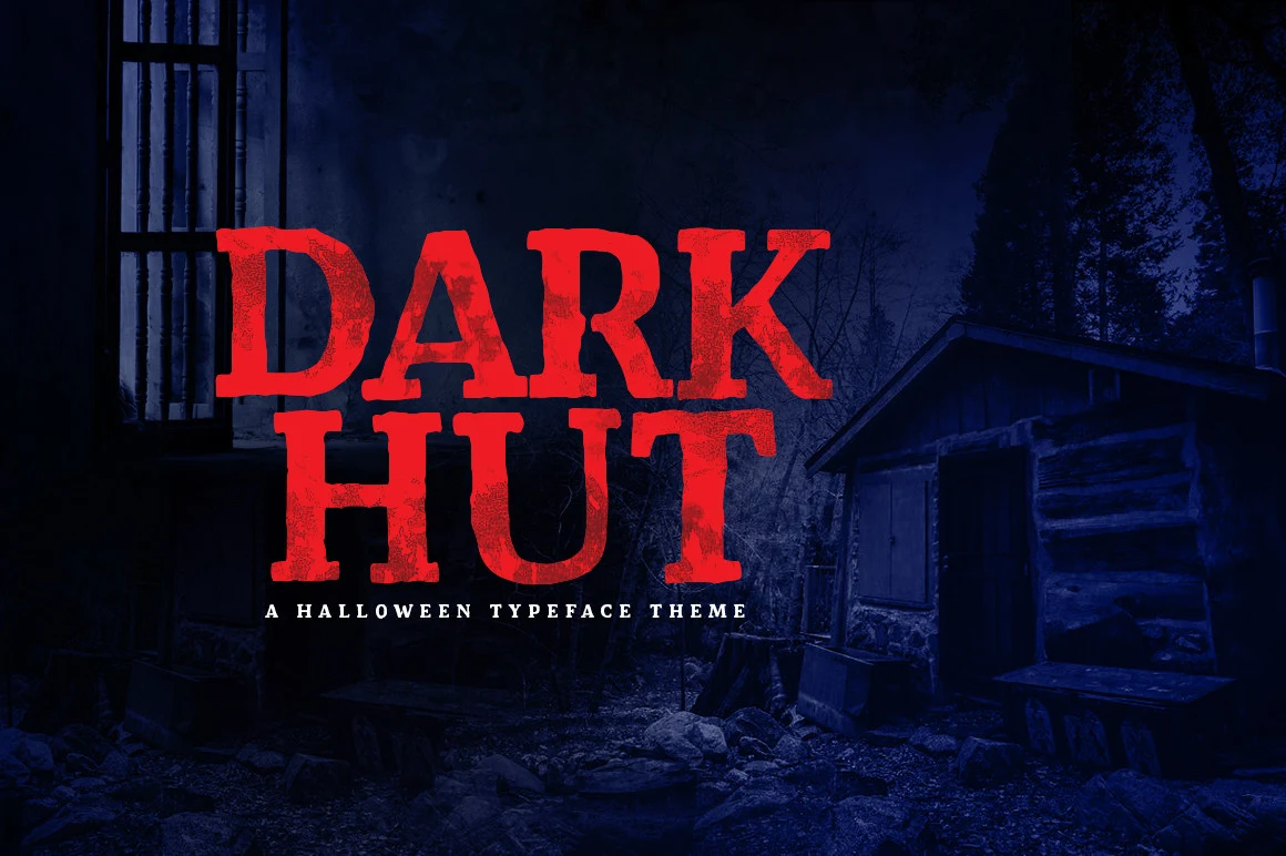
Best For: posters, headlines, T-shirts
Dark Hut Font places heavy distressed texture inside a weathered slab-serif framework. That sturdy foundation gives it more visual weight and stability than brush-led Horror Halloween Fonts, making it dependable for posters and shirt graphics. Its eroded surface still needs generous display scale to keep the letter shapes distinct.
Vampire Gothic Font
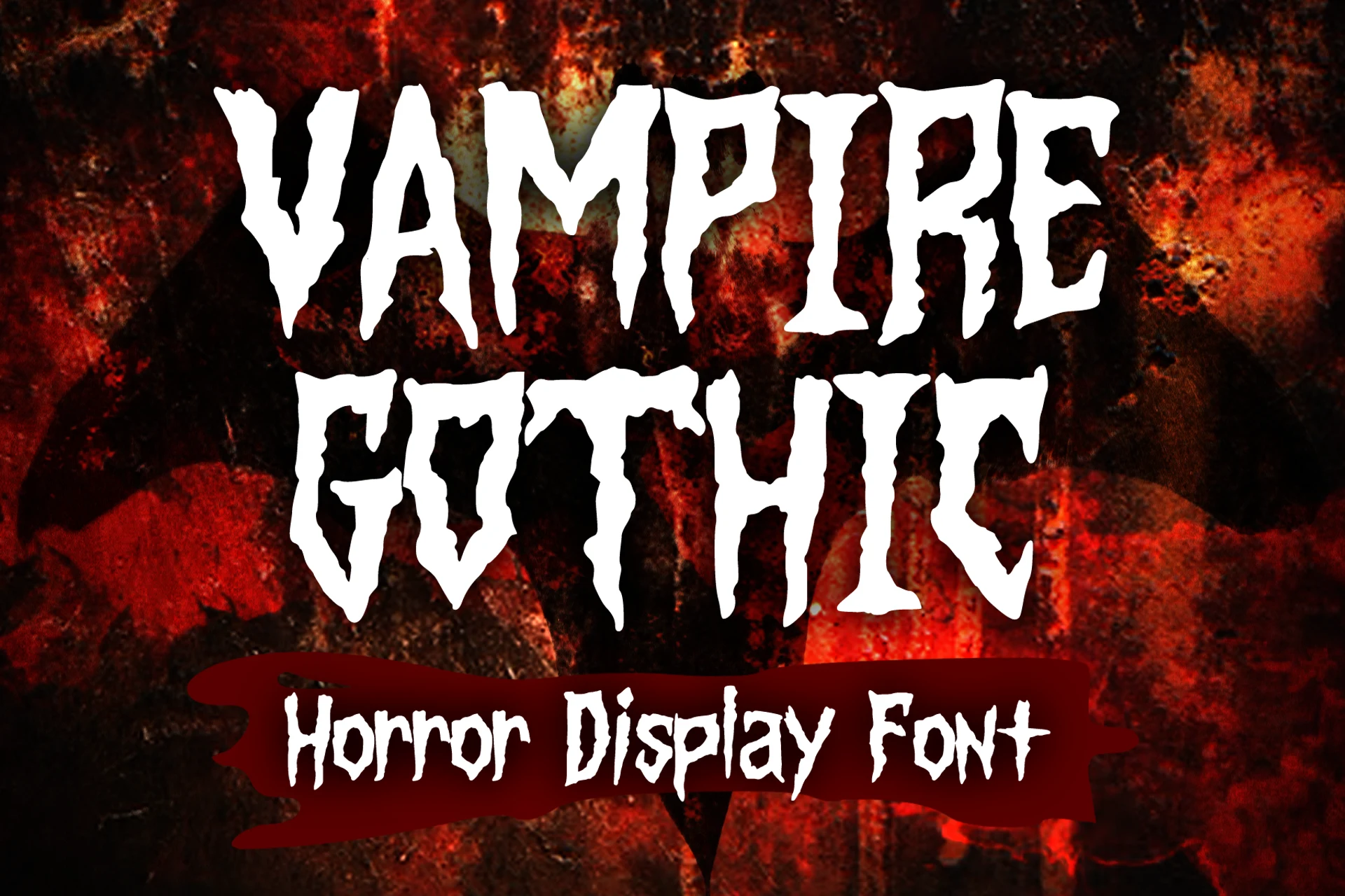
Best For: T-shirts, book covers
Vampire Gothic Font uses condensed vertical proportions, claw-like serifs, and a textured interior to pack a menacing silhouette into limited horizontal space. It is useful for banners, book covers, shirts, and posters where width is constrained. Despite its narrow footprint, jagged texture means it still belongs at large display sizes.
Jagged, Brush, and Organic Horror Forms
Jagged edges, unstable baselines, brush marks, roots, claws, and pictorial details define this varied group. These faces prioritize expressive surface movement over the controlled structure of serif lettering.
Night Terror Font
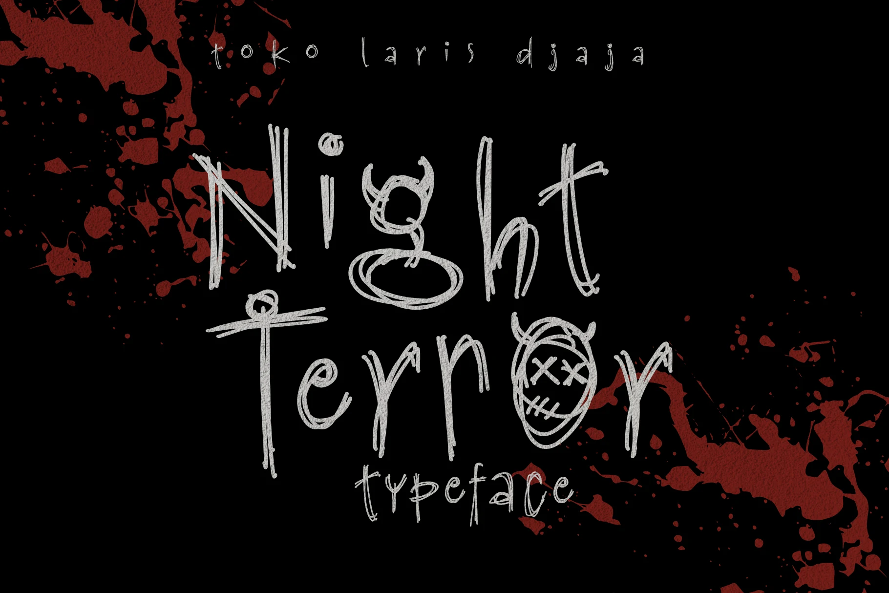
Best For: posters, headlines, stickers
Night Terror Font looks visibly sketched through overlapping multi-stroke outlines, shifting character heights, and an unstable baseline. That raw construction suits graphic headlines and stickers, where irregularity is part of the impact. Compression quickly reduces character recognition, so generous sizing and open spacing are important.
Spookhaus Font
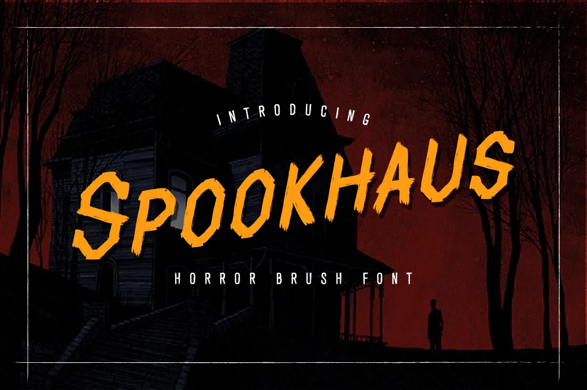
Best For: posters, T-shirts, headlines
Spookhaus Font is an all-caps brush design built from sharp angular strokes and jagged, hand-painted wear. Its broad forms hold together well on posters and T-shirts, giving Horror Halloween Fonts a forceful vintage-poster energy. Fine brush detail fades when scaled down, so keep it firmly in display territory.
Ghost Jack Font
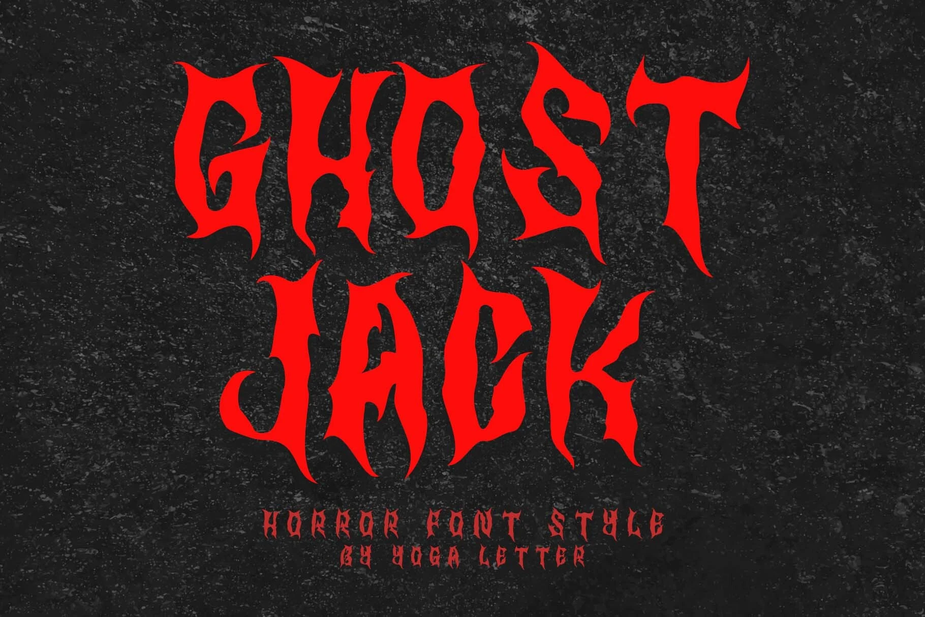
Best For: logos, posters, stickers
Ghost Jack Font turns its letter edges into sharp visual points through blade-like serifs, uneven fluid strokes, and high contrast. It is more versatile than many Horror Halloween Fonts because the package includes uppercase and lowercase letters, ligatures, numerals, punctuation, and multilingual support. The jagged terminals still call for large display sizing.
Ghoslty Whispe Font
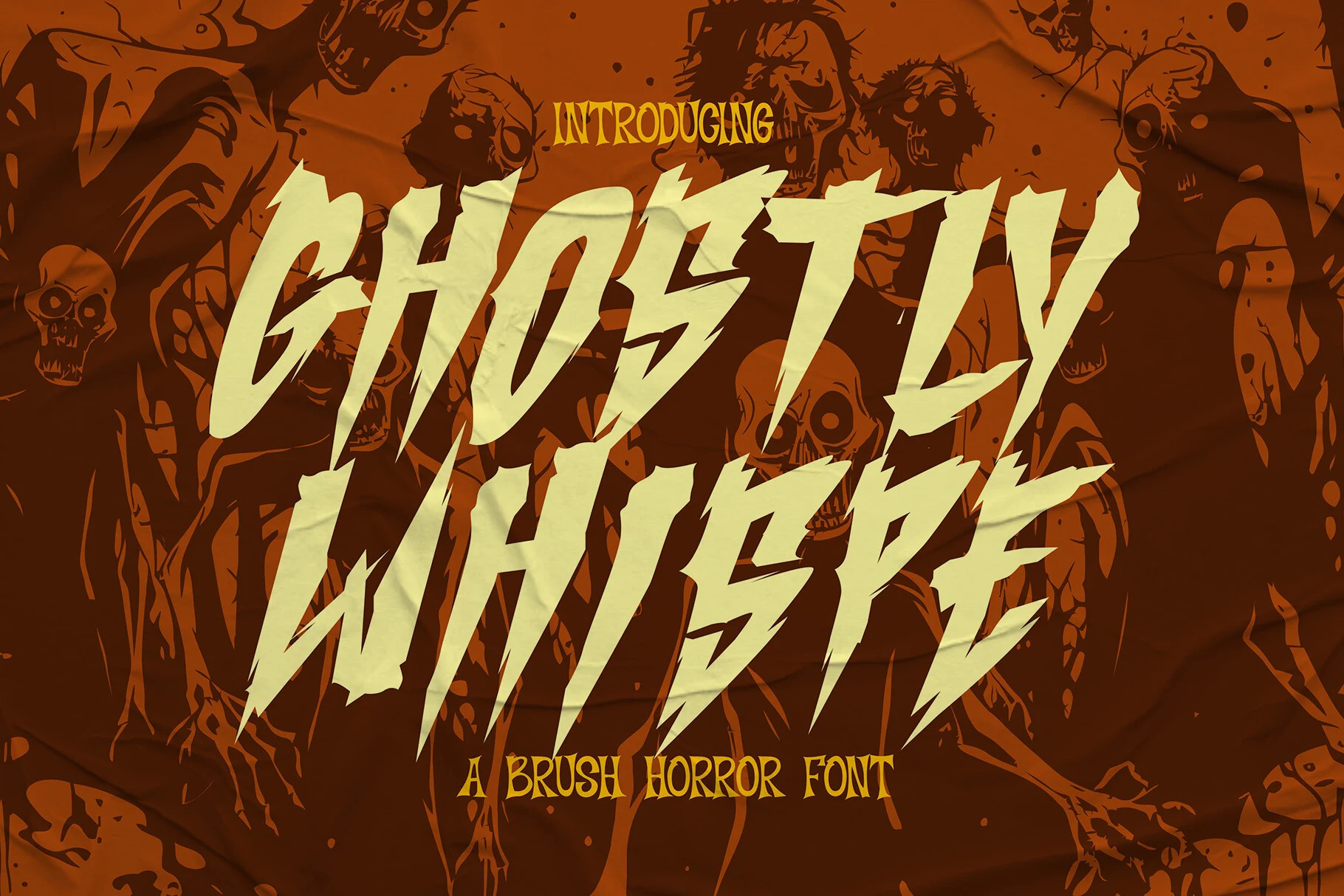
Best For: posters, social media graphics, headlines
Ghoslty Whispe Font pushes hand-etched brush marks into a forceful right-leaning slant, giving headlines an unstable, aggressive direction. High contrast and jagged terminals create urgency for social graphics and posters, but the intricate edges need large sizing to remain clear. Its movement is stronger than a static distressed treatment.
Slasher Horror Font
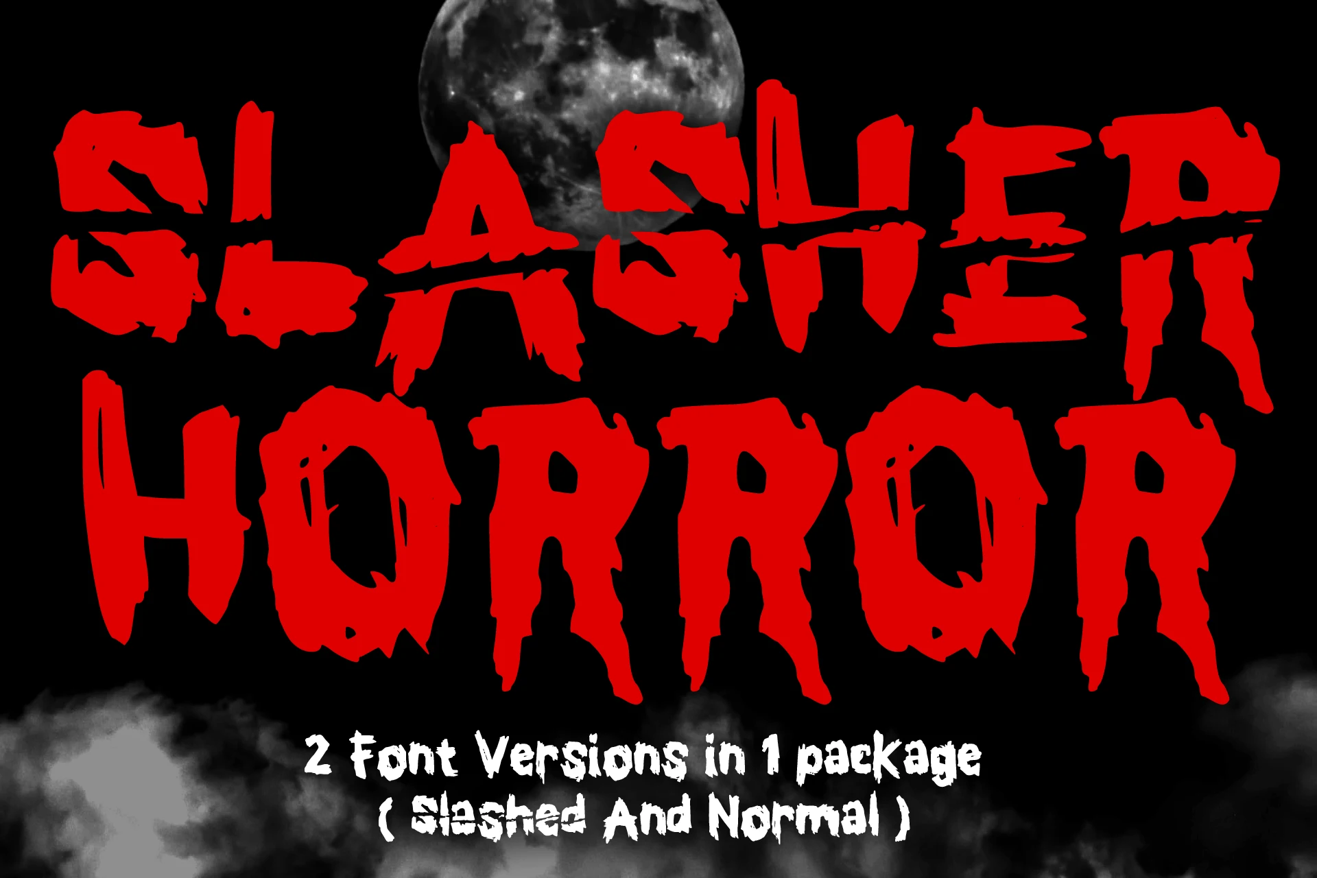
Best For: T-shirts, book covers, stickers
Slasher Horror Font makes surface damage the central device, cutting slashes into heavy block letterforms and uneven contours. Its two included versions can be combined for layered T-shirts, covers, or stickers. Because the distressing breaks up the edges, it works best as a large graphic rather than compact copy.
Spooky Party Club Font
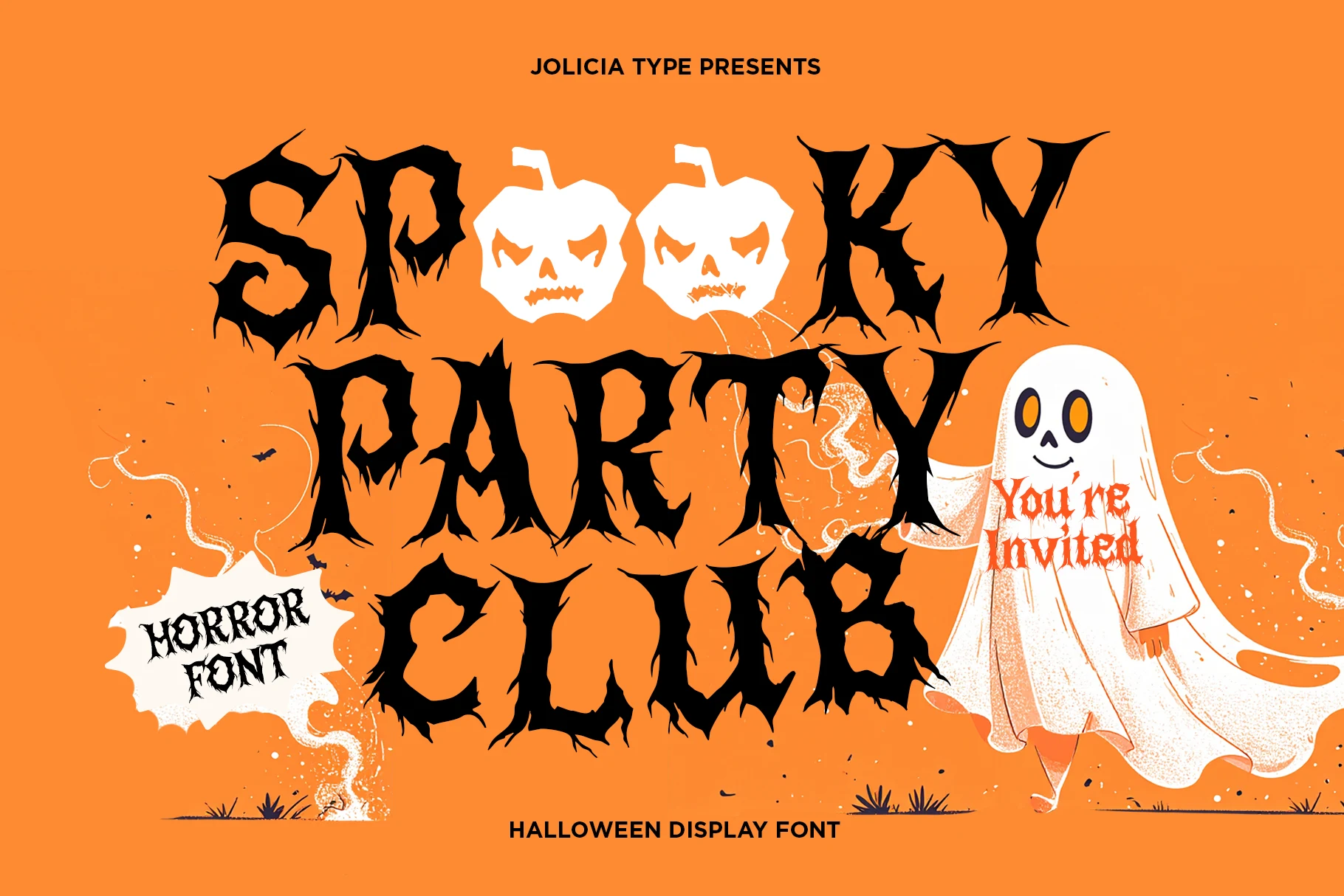
Best For: posters, invitations, headlines
Spooky Party Club Font extends twig-like projections and root details beyond its heavy strokes, giving every character an organic, thorned construction. That growth motif can distinguish invitations and poster titles from more conventional Horror Halloween Fonts. Intricate edges lose definition at small sizes, so preserve scale and spacing around the letters.
Skull Ghost Font
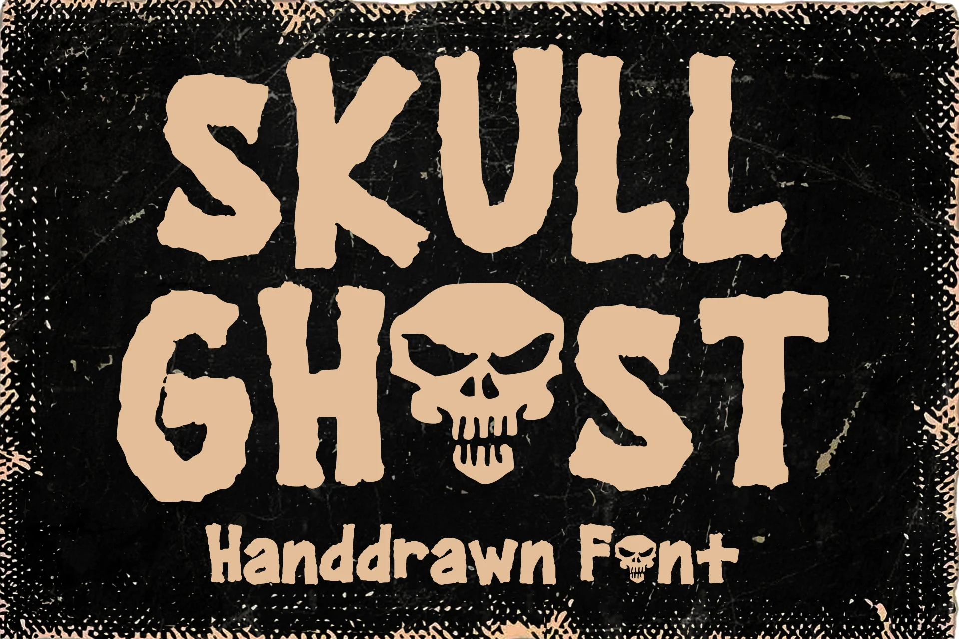
Best For: posters, merch design, signage
Skull Ghost Font changes the word itself by replacing the O with a skull, turning an all-caps title into a built-in pictorial mark. Heavy distressed strokes make it especially effective for merch, signage, and posters. The skull adds immediate recognition as an image, though it can interrupt literal word reading.
Magicluzzk Font
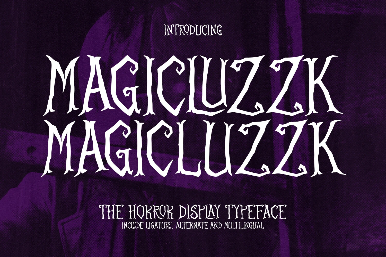
Best For: posters, headlines, T-shirts
Magicluzzk Font combines shaky stroke weight, pointed terminals, irregular proportions, and disconnected characters into a distorted Gothic outline. Its monster-movie and underground-music associations suit posters and T-shirts, while inconsistent shapes deliberately slow reading at small sizes. It is strongest when the title can function as an expressive graphic.
How to Choose the Right Font
Choose among these Horror Halloween Fonts by matching construction to the job: use slab or condensed serifs for a firmer silhouette, brushes and organic forms for unstable texture, and drips for immediate liquid drama. Check joins, contrast, flourishes, and counters at the intended size; nearly all are display faces, so reserve readable supporting text for a simpler companion font.