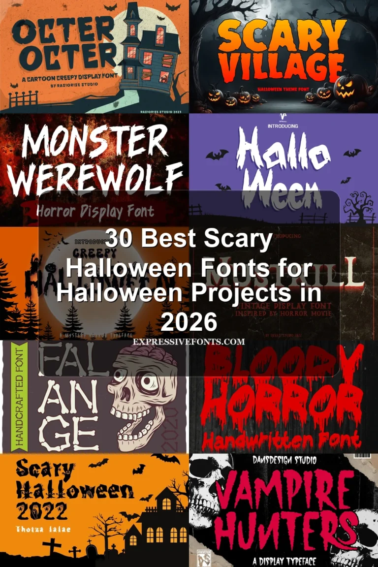
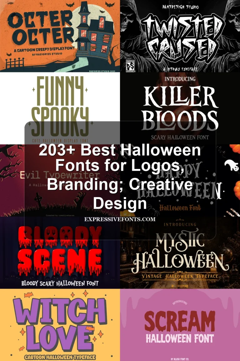
30 Best Spooky Halloween Fonts for Halloween Posters in 2026
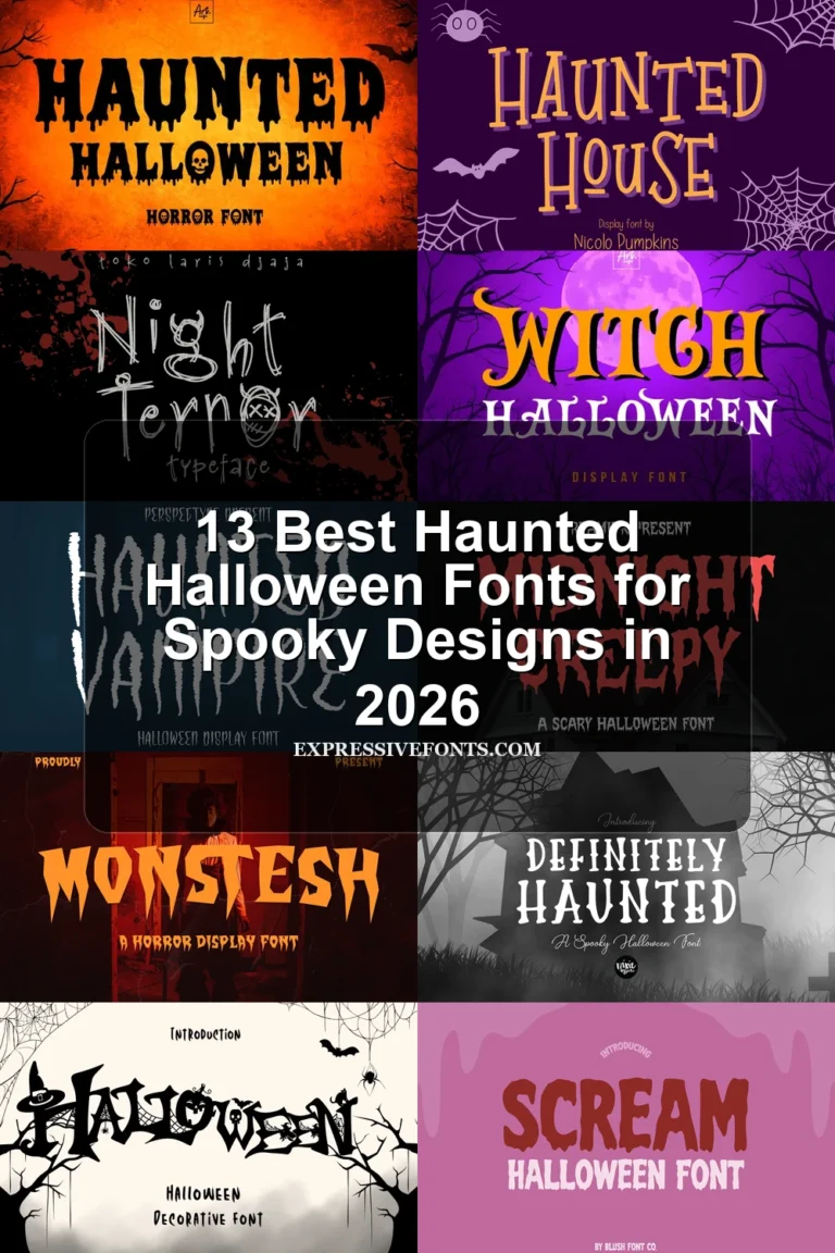
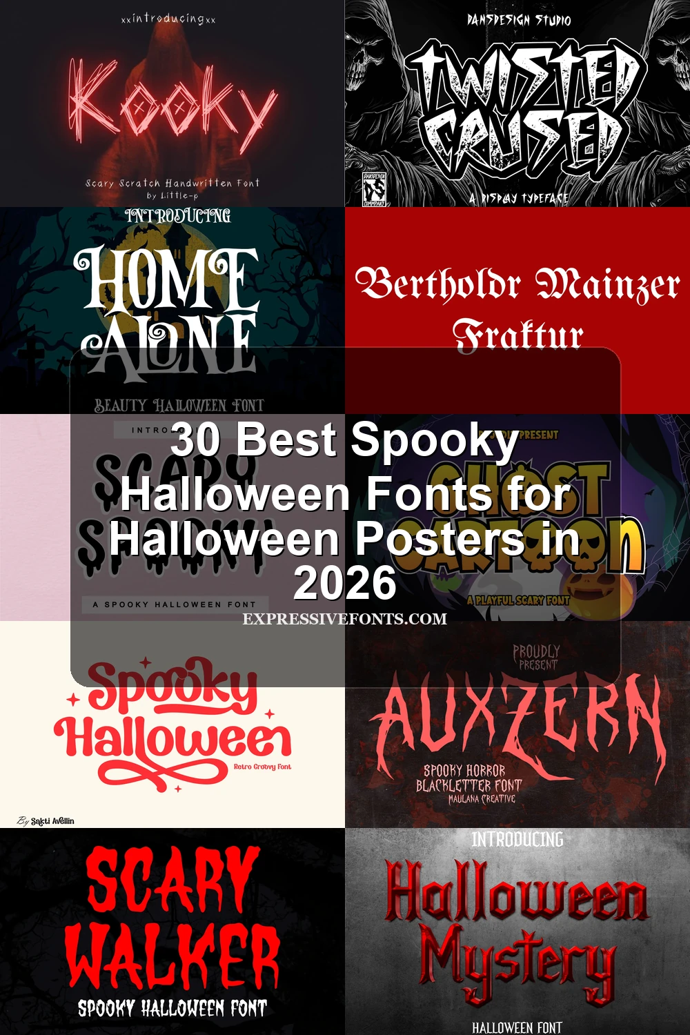
This collection spans dripping monsters, jagged Gothic silhouettes, webbed and illustrated capitals, distressed textures, and expressive scripts. These Spooky Halloween Fonts suit posters, invitations, shirts, stickers, social graphics, logos, and haunted-house signage, with most designs intended for short text at generous display sizes.
Looking for more halloween fonts? Browse our complete Halloween Fonts collection to compare vintage, cute, scary, spooky, and creepy halloween styles.
Spooky Halloween Fonts: Melting and Monster Forms
These Spooky Halloween Fonts use melting bottoms, liquid drips, pumpkins, ghosts, and rounded monster forms. They feel more playful and immediately seasonal than the sharper Gothic groups.
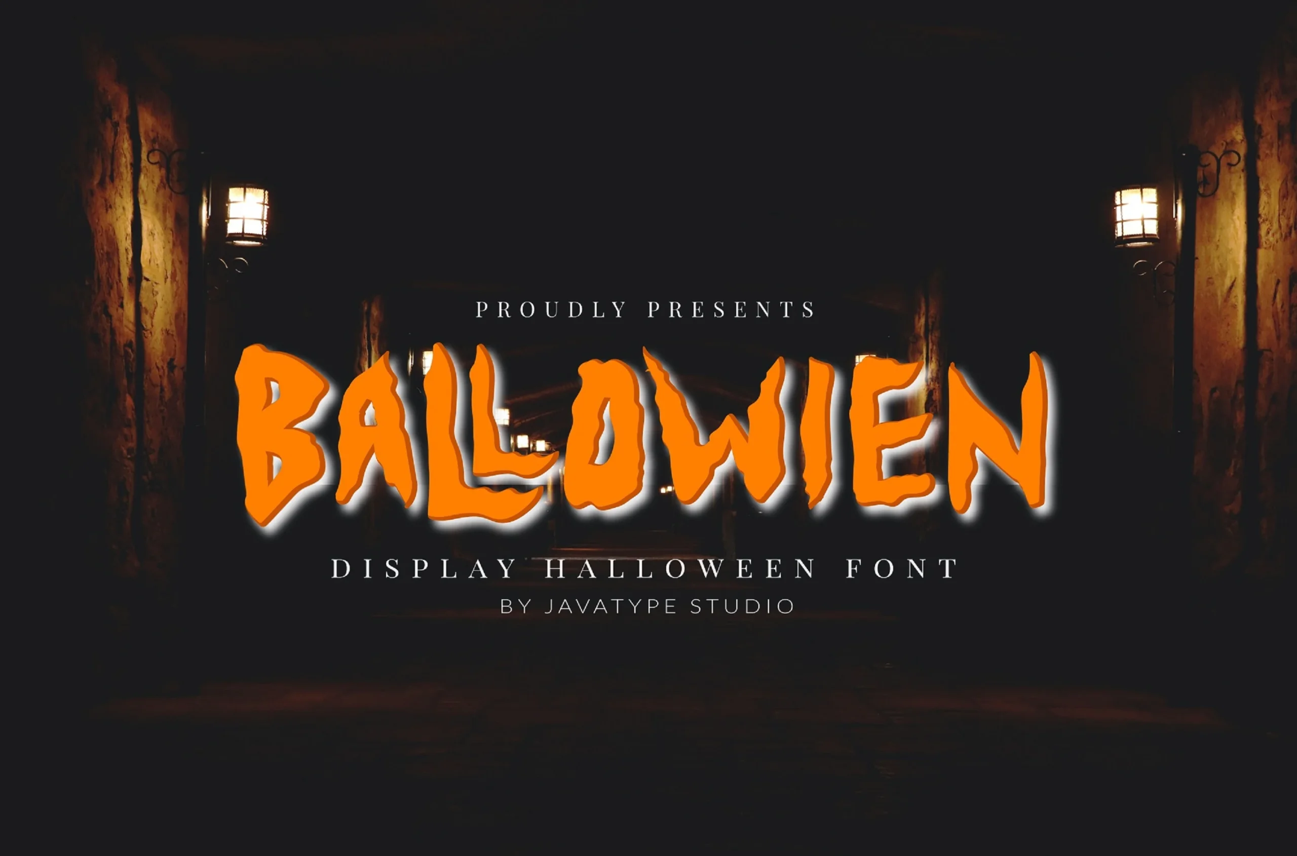
Ballowien Font
Best For: posters, display text, headlines, signage
Ballowien Font combines jagged outlines with thick melting drips and uneven stroke weight. Its irregular proportions make it an ominous choice for large posters, headlines, or signage, but those distortions quickly weaken reading in body-sized text.
Dripping Season Font
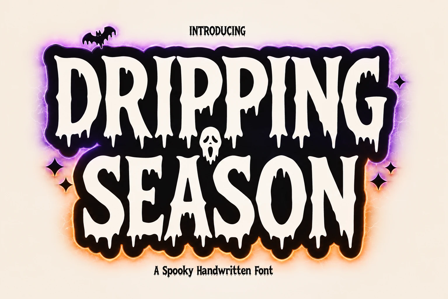
Best For: posters, headlines, short phrases, T-shirts
Dripping Season Font keeps its condensed upright capitals comparatively readable while allowing the lower edges to dissolve into irregular drips. Use it for short headings, posters, or T-shirts; the melting effect is too disruptive for extended copy.
Spooky Halloween Font
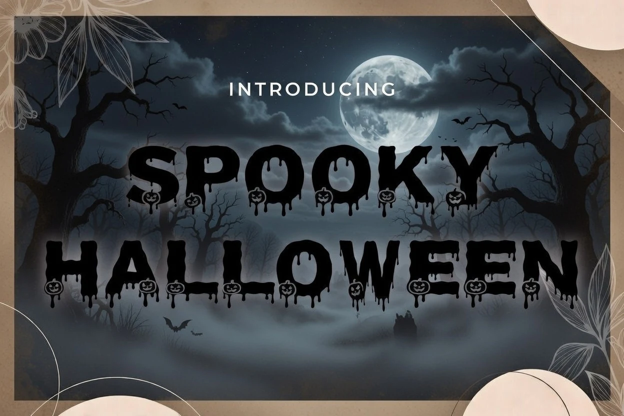
Best For: headlines, posters, stickers, display text
Spooky Halloween Font builds pumpkin silhouettes into a heavy block sans-serif frame, then adds decorative drips along the bottoms. The integrated icons deliver instant recognition for large headlines, posters, and stickers, but not fine-sized text.
Scary Walker Font
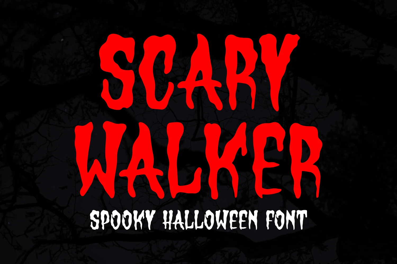
Best For: posters, headlines, display text, T-shirts
Scary Walker Font turns thick lettering into a crawling edge of dripping ink-blot terminals and uneven stroke thickness. That fluid, menacing construction gives large titles strong presence, while reduced sizes lose character recognition and reading speed.
Halloween Ghost Font
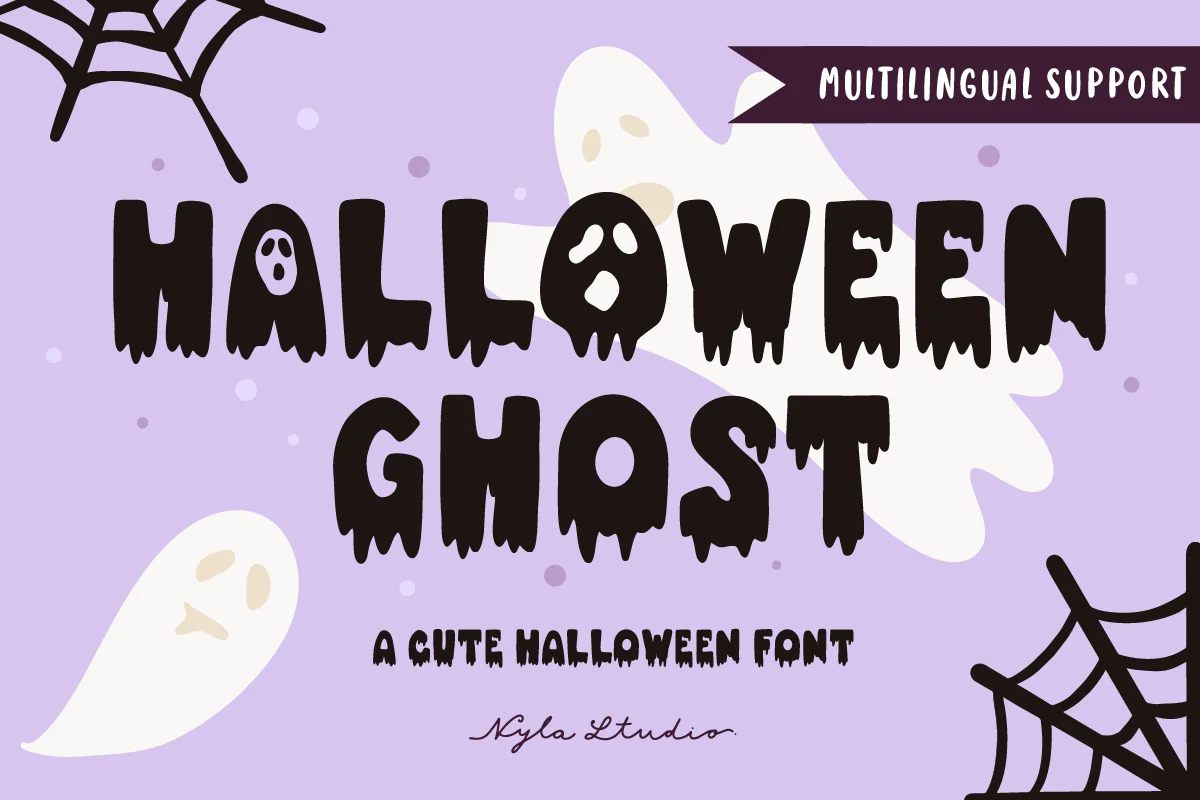
Best For: T-shirts, retro designs, stickers, posters
Halloween Ghost Font embeds ghost-like facial features inside bold geometric letters and finishes them with dripping terminals. Its character substitutions make shirts, stickers, and posters memorable, while the decorative bottoms reduce clarity at smaller sizes.
Scary Spooky Font
Best For: invitations, website headers, posters, display text
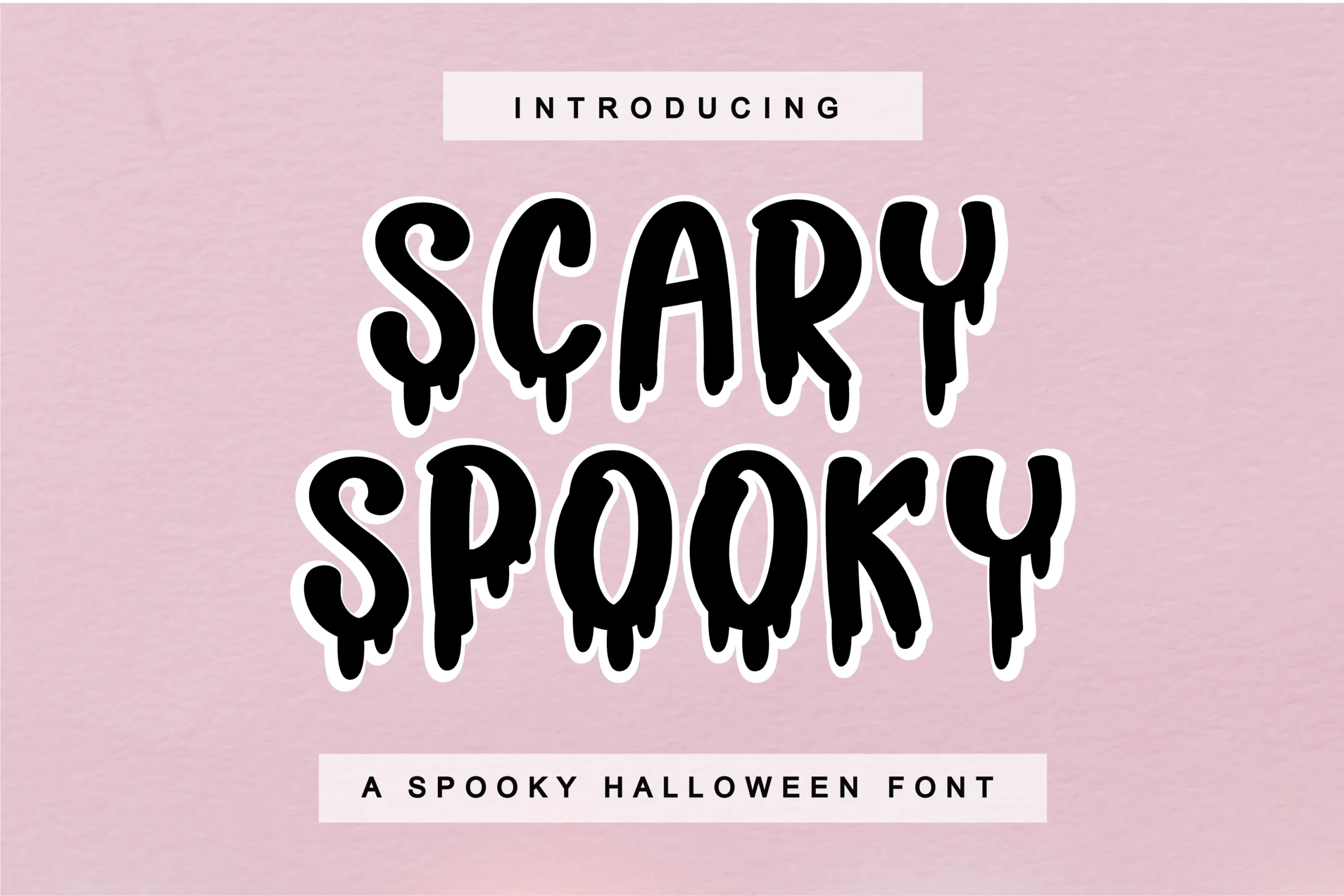
Scary Spooky Font rounds out heavy letters with liquid-effect drips and a bouncy baseline. The uneven movement balances playful and menacing qualities for invitations, website headers, and posters, while short decorative wording remains easier to read.
Halloween Font
Best For: posters, social media graphics, stickers, display text
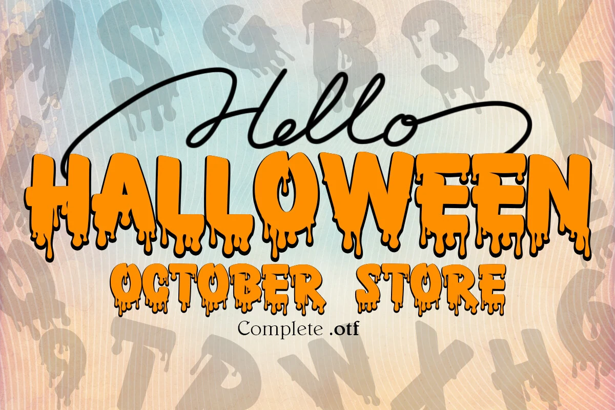
Halloween Font combines bubbly rounded contours with irregular liquid drips, producing a friendly seasonal voice for large stickers and social graphics. Its complex bottoms are visually effective, but paragraphs and small captions will lose clarity.
Monster Halloween Font
Best For: posters, display text, headlines, T-shirts
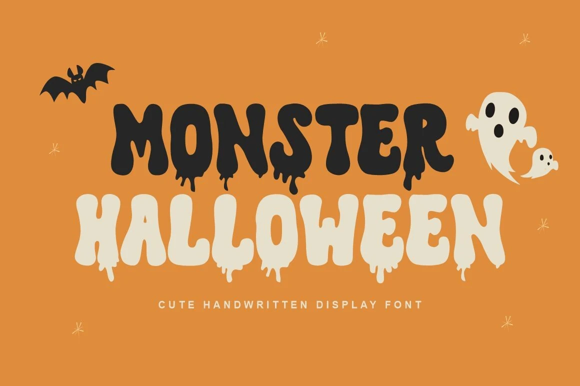
Monster Halloween Font softens its heavy upright letters with rounded corners and thick melt-effect drips. The friendly monster tone stays legible in large T-shirt lettering and posters, but irregular bottoms make small labels less dependable.
Gothic and Jagged Horror Lettering
Condensed blackletter structures, thorned terminals, angular joins, and strong contrast define this group. Compared with the dripping styles, these faces create a more ceremonial, ominous, theatrical presence.
Auxzern Font
Best For: logos, branding, posters, display text
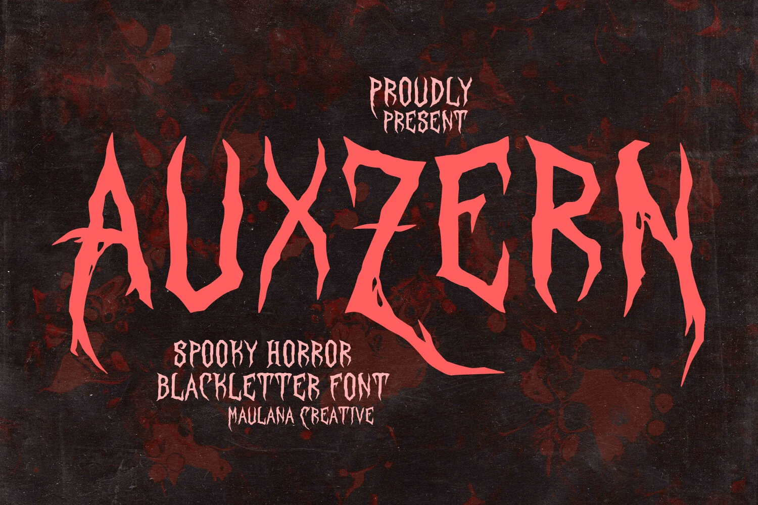
Auxzern Font compresses a high-contrast Gothic blackletter silhouette into narrow proportions, finishing it with thorn-like terminals and jagged edges. The menacing structure suits logos and haunted-house branding, but short, oversized wording is essential for recognition.
Twisted Crused Font
Best For: posters, display text, headlines
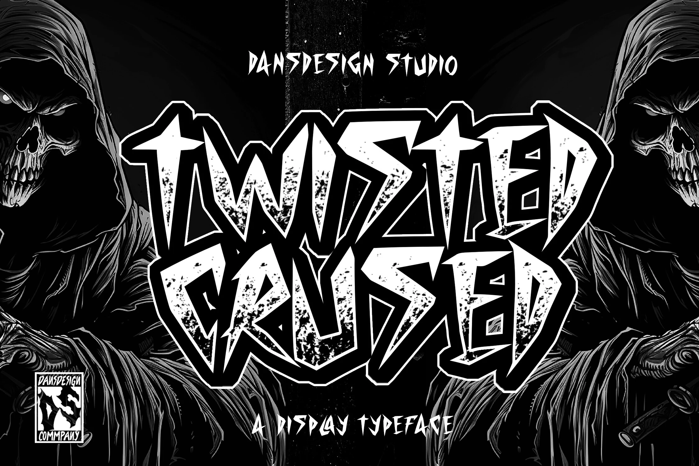
Twisted Crused Font pairs heavy condensed proportions with sharp angular terminals and gritty texture inside the forms. Its compressed silhouette brings a menacing impact to haunted-house posters, though the distressing makes small-format Spooky Halloween Fonts harder to decode.
Harry Poster Regular Font
Best For: posters, headlines, display text, creative projects
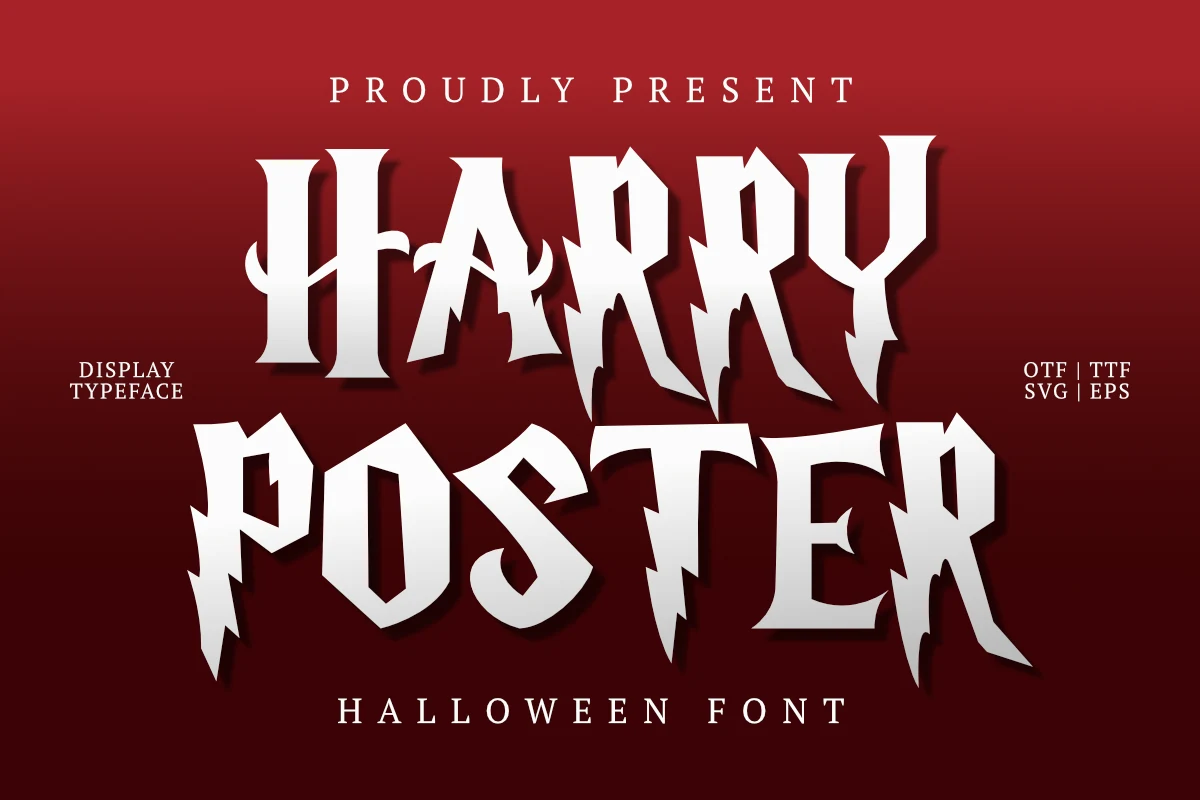
For fantasy-led posters, Harry Poster Regular Font combines lightning-bolt terminals with high contrast and an ornamental swash on the capital H. Its disconnected capitals and jagged strokes need display scale to retain their theatrical Spooky Halloween Fonts character.
Bertholdr Mainzer Fraktur Font
Best For: posters, display text, headlines, decorative designs
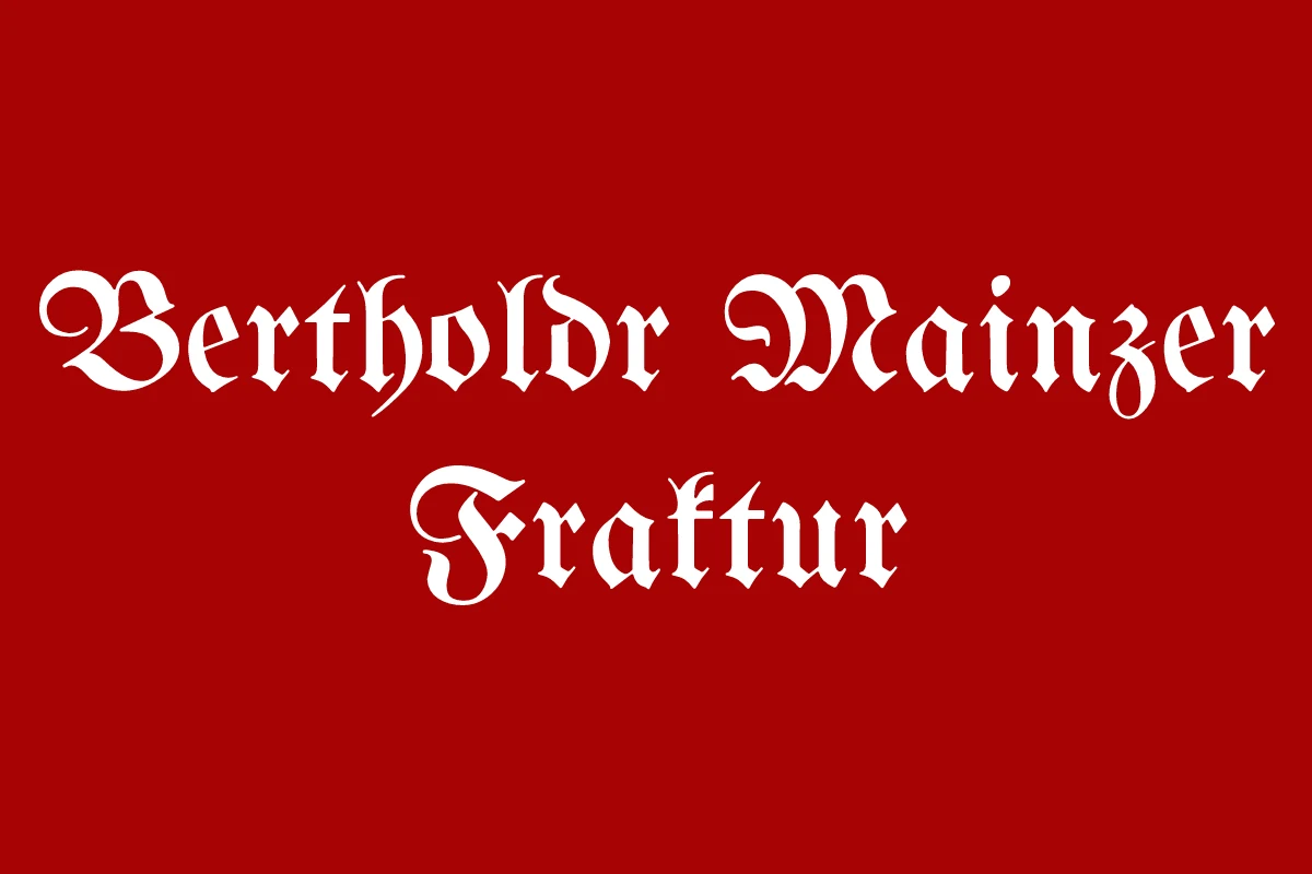
Bertholdr Mainzer Fraktur Font brings pointed arches, delicate flourishes, condensed vertical proportions, and strong contrast to a traditional Fraktur structure. It supplies historical authority for theatrical posters and decorative headings, but its complex, ornate construction makes body copy impractical.
Spooky Frights Font
Best For: posters, display text, headlines, stickers
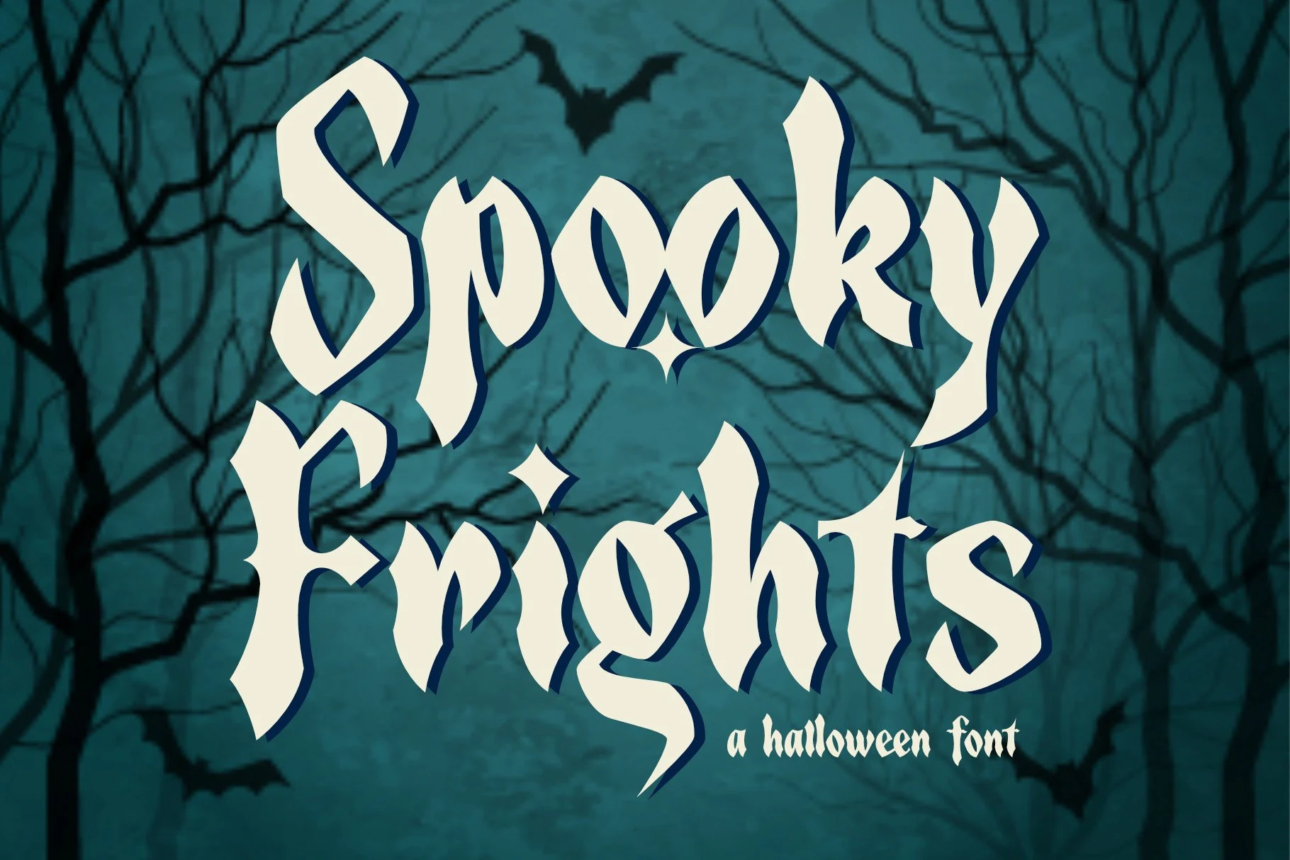
Spooky Frights Font sharpens Gothic angular construction with thorn-like terminals, high contrast, and deliberately irregular outlines. The ominous silhouette works well in theatrical headings and stickers, although smaller settings can collapse its distinctive details.
Halloween Mystery Font
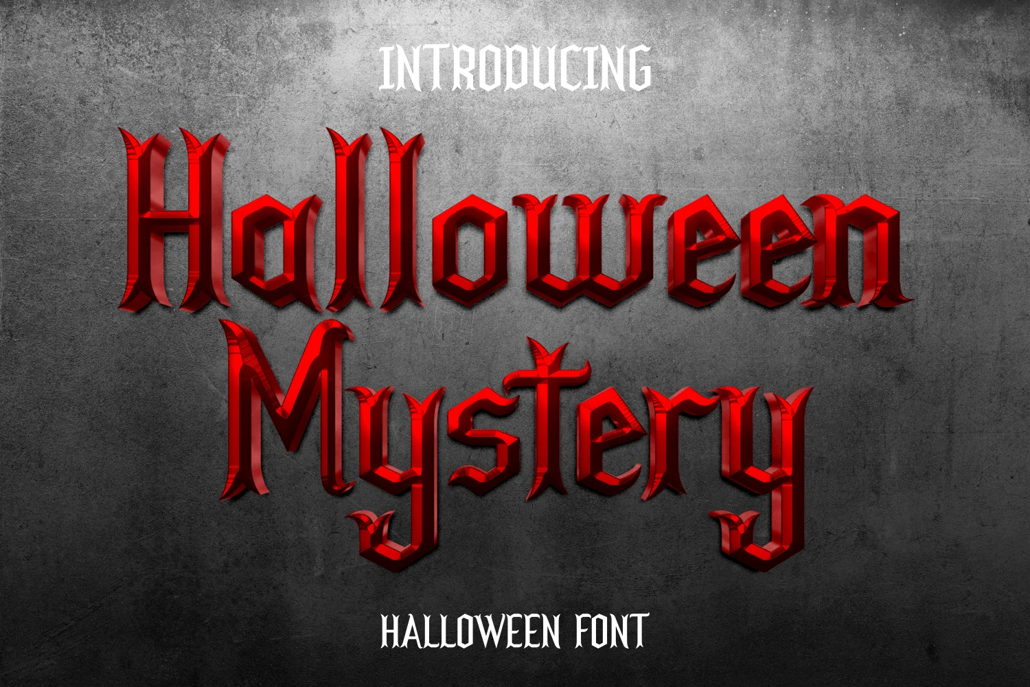
Best For: posters, headlines, display text, invitations
Halloween Mystery Font establishes a strong vertical blackletter rhythm through bold angular forms, high contrast, and flared pointed terminals. It creates a ceremonial tone for party titles, but its joins need generous scale for reliable recognition.
Home Alone Font
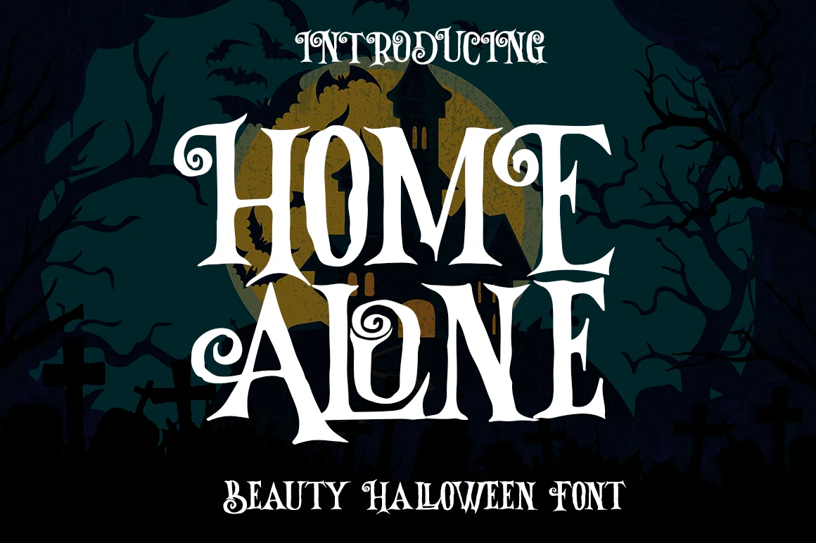
Best For: display text, headlines, posters, decorative designs
Home Alone Font stretches Gothic lettering vertically and adds scroll-like terminals, pointed serifs, mixed widths, and high contrast. Its theatrical ornament suits decorative poster headlines, but the flourishes require generous scale and careful spacing.
Illustrated and Textured Display Styles
Webbing, brush grain, skulls, bats, cutouts, curls, and irregular outlines become part of the letter construction. These illustrated Spooky Halloween Fonts function as visual artwork as much as lettering.
Spooky Halloween Font
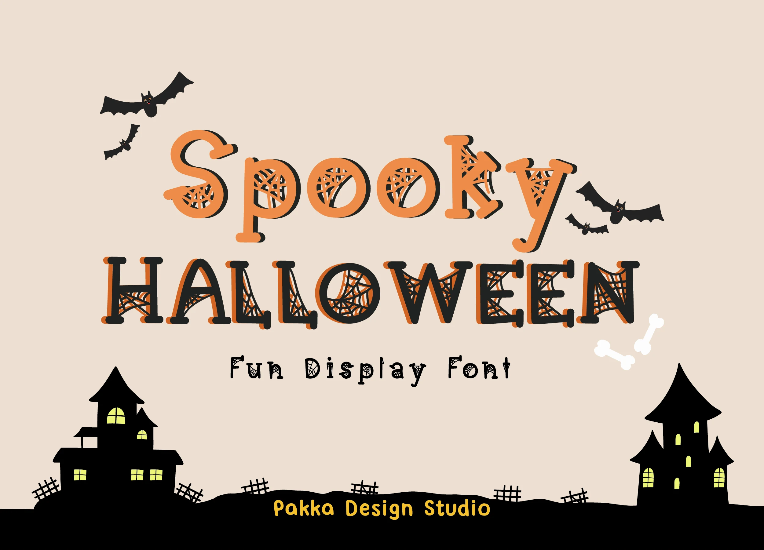
Best For: display text, headlines, posters, children’s designs
Spiderweb texture fills the slab-serif-inspired bodies of Spooky Halloween Font, reinforced by a high-contrast drop shadow. Give it generous scale so the internal webbing remains visible; it adds a playful seasonal surface to posters and children’s designs.
Scary Light Font
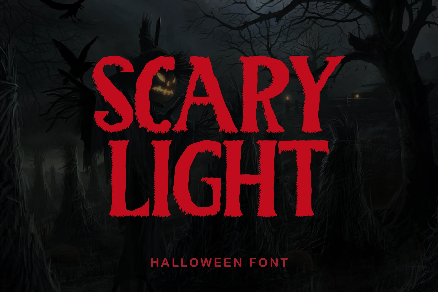
Best For: display text, posters, headlines, creative projects
For a large poster title, Scary Light Font lays furry, ragged texture over heavy block capitals with a slab-serif influence. The distressed perimeter supplies immediate horror character, although it loses clarity when reduced and works best with short phrases.
Gritluef Font
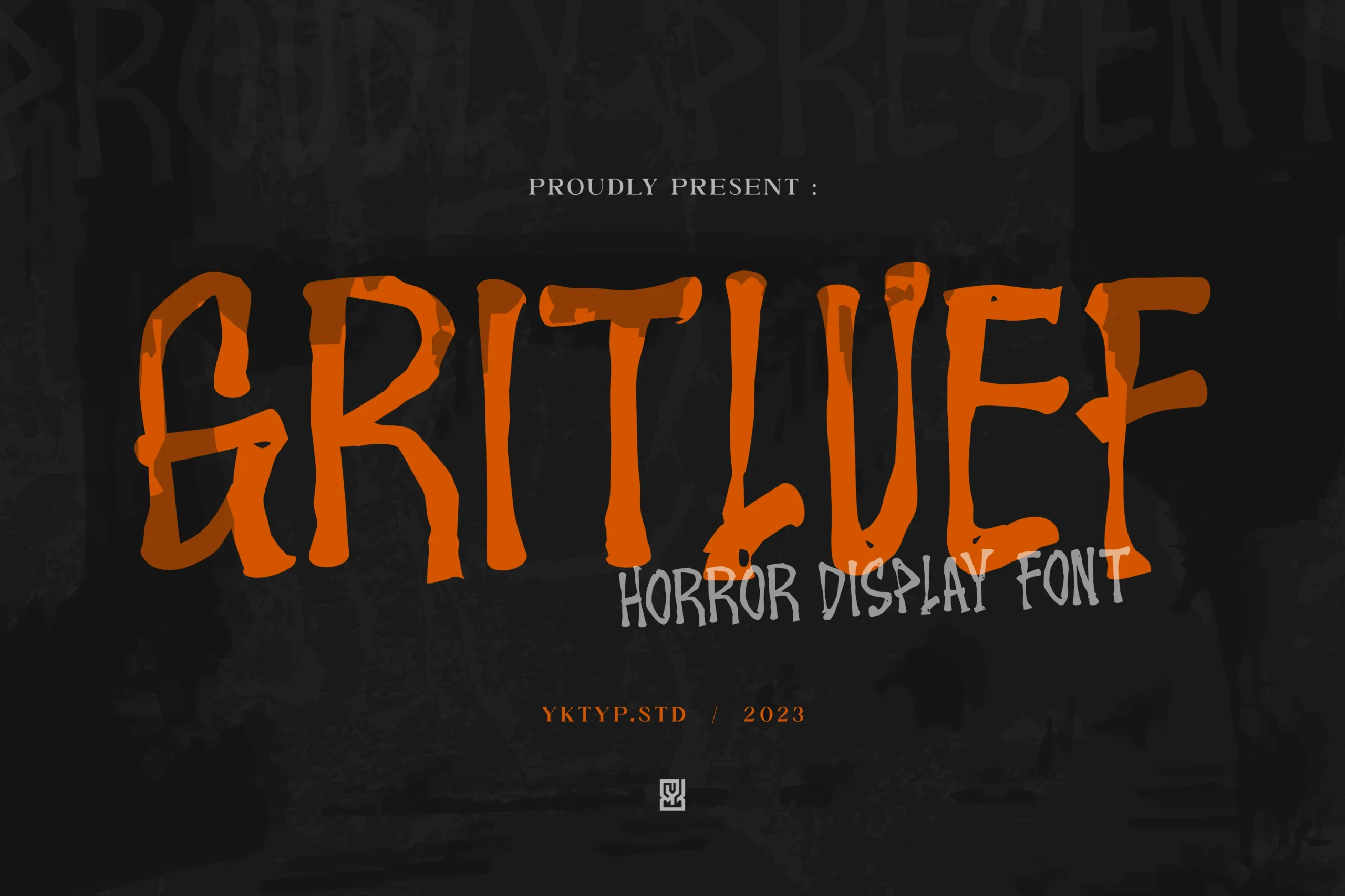
Best For: headlines, display text, posters, branding
Gritluef Font uses shaky letter shapes, rough edges, varied cap heights, and an unstable baseline to create an uncanny title treatment. Its intentional distortion is strongest in large headlines, display text, posters, or branding rather than small copy.
Scary Atmosphere Font
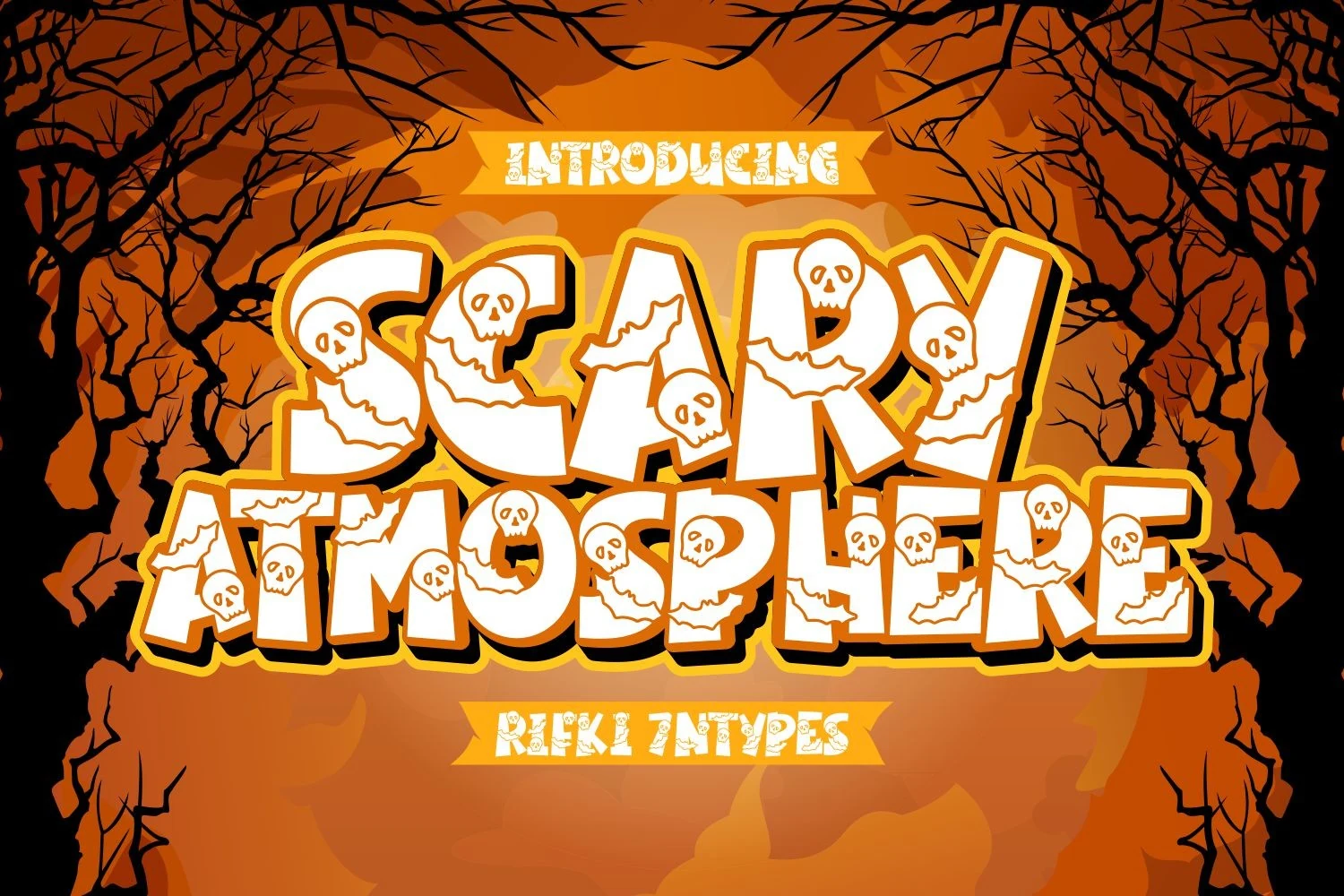
Best For: posters, headlines, display text, stickers
Scary Atmosphere Font integrates skull and bat motifs into heavy block lettering with layered shadows and jagged contours. The illustrated construction can carry a spooky poster or game-cover graphic on its own, provided the final output is large.
Spooky Halloween Font
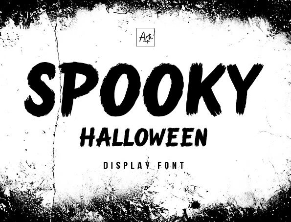
Best For: posters, headlines, display text, stickers
For raw poster or sticker work, Spooky Halloween Font disrupts heavy sans-serif construction with dry-brush grain and jagged edges. Its eerie, grungy texture gives titles an inked surface, but the roughness reduces reading comfort when scaled down.
Curly Nightmare Demo Font by Kelik 7ntypes Font
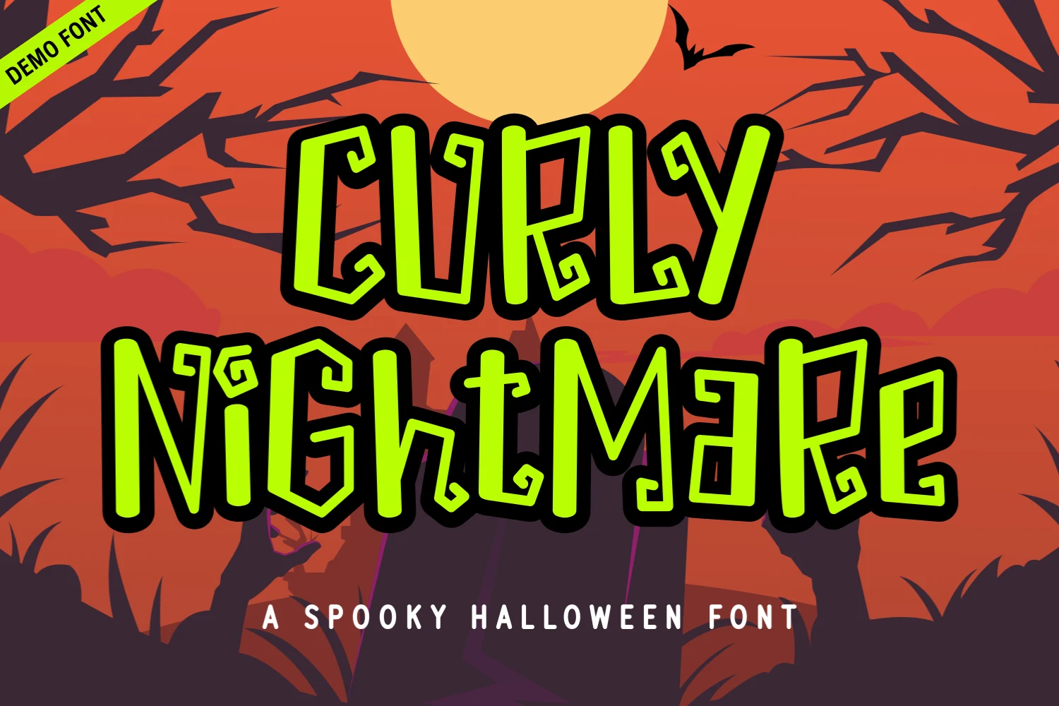
Best For: invitations, merch design, children’s designs, display text
Curly Nightmare Demo Font by Kelik 7ntypes Font disrupts its hand-drawn rhythm with exaggerated curls, twists, uneven weights, and shifting heights. The playful construction fits children’s designs and merchandise, while its terminals need display scale to stay defined.
Spooky Halloween Font
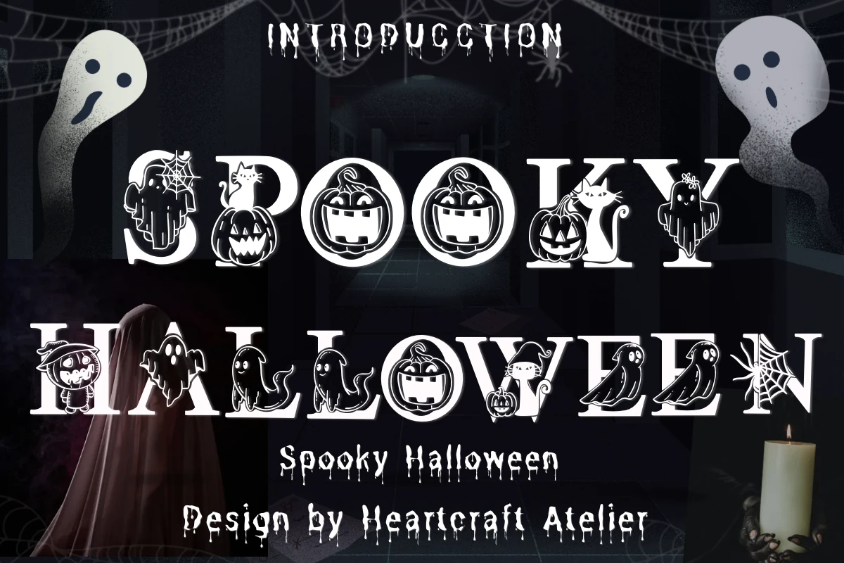
Best For: display text, headlines, social media graphics, posters
Spooky Halloween Font uses high-contrast decorative serifs containing internal silhouettes and negative-space cutouts. The crafted effect suits greeting-card-like banners, social graphics, and posters, although those internal shapes can interfere with character recognition below display sizes.
Spooky Halloween Font
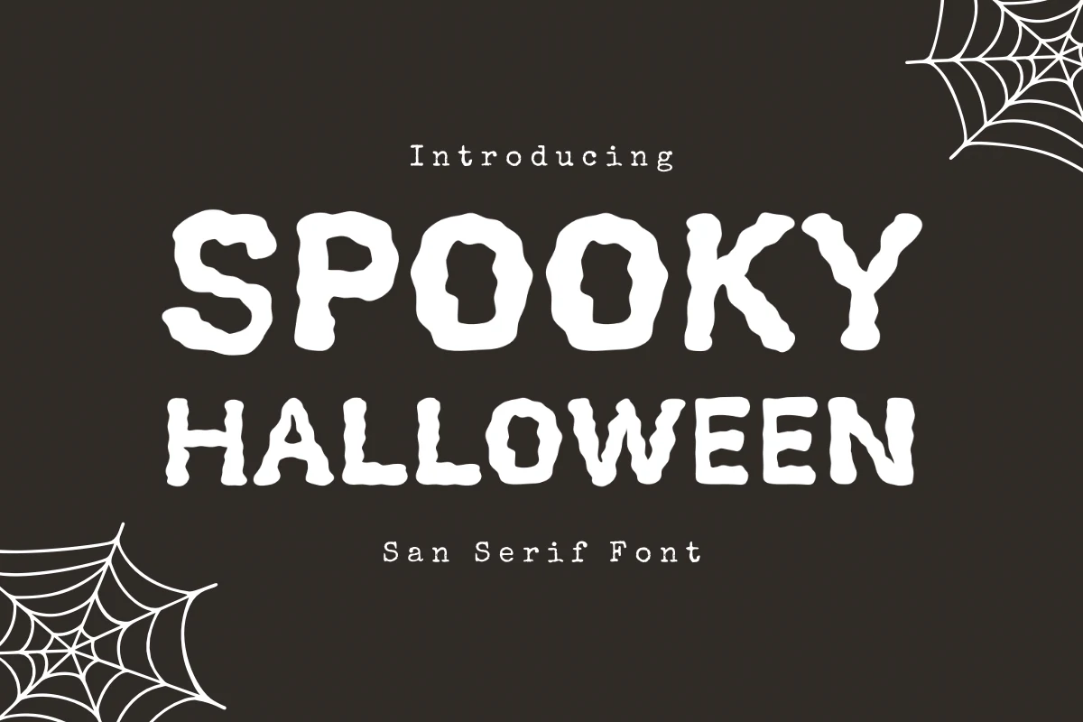
Best For: invitations, display text, headlines, signage
Spooky Halloween Font offers caps-only sans-serif forms with thick monoline strokes, softened terminals, and bumpy outlines. It is among the more readable choices for flyers and signage, though irregular edges still make it unsuitable for fine print.
Horror Struck Font
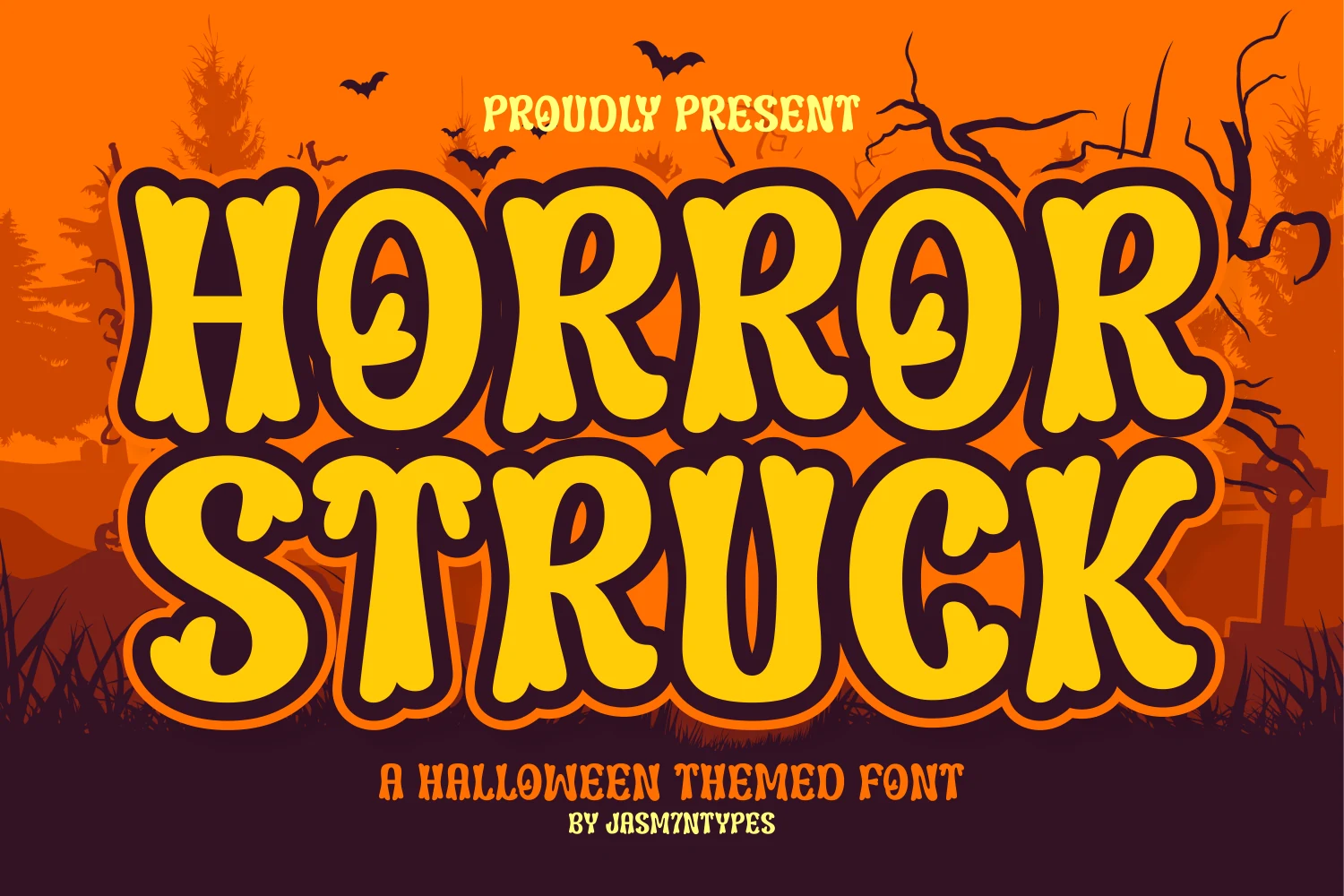
Best For: invitations, signage, quotes, creative projects
Horror Struck Font uses bubbly terminals, thick strokes, slight stem variation, and disconnected forms for a cartoon-led spooky voice. It works for invitations, quotes, and haunted-house signage, with readability dropping as the size decreases.
Flowing and Hand-Drawn Halloween Styles
Connected scripts, scratchy strokes, sketch lines, swashes, and cartoon substitutions give this group a handmade voice. They are less severe than Gothic faces and more expressive than block display styles.
Kooky Font
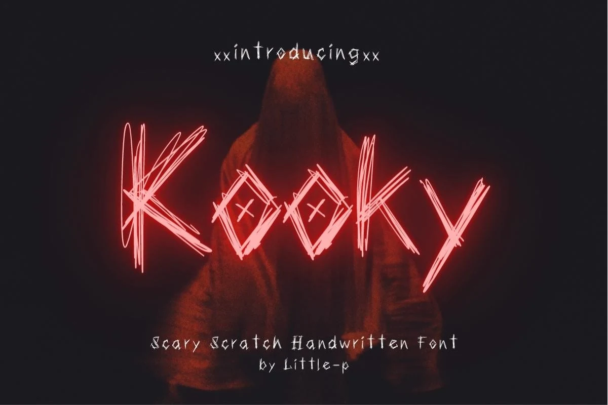
Best For: display text, headlines, posters, stickers
Kooky Font’s scribbled, disconnected strokes shift between capitals, heights, and alignments, creating an aggressive scratchy rhythm. That instability suits short Spooky Halloween Fonts headlines, posters, or stickers, while longer messaging becomes difficult to follow.
Spooky Halloween Font
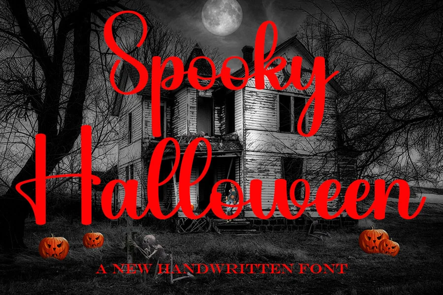
Best For: logos, branding, posters, short phrases
Spooky Halloween Font follows connected cursive movement, with prominent loops, extended ascenders and descenders, and a slight rightward slant. The expressive flow suits logos, branding, and short phrases, but its decorative joins slow reading in compact headers.
Night Terror Font
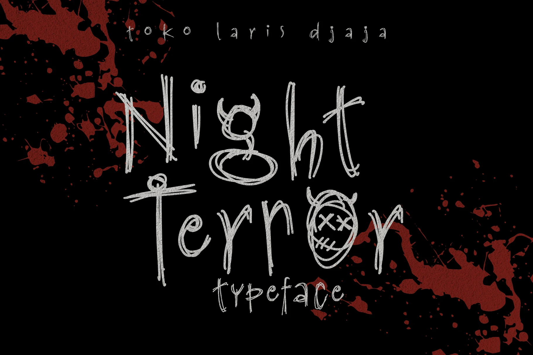
Best For: posters, display text, headlines, T-shirts
Night Terror Font layers sketchy multi-stroke outlines with integrated illustrative elements and an uneven baseline. That unsettled, handmade quality can make a poster feel haunted without extra decoration, but the visual noise rules it out for continuous copy.
Spooky Halloween Font
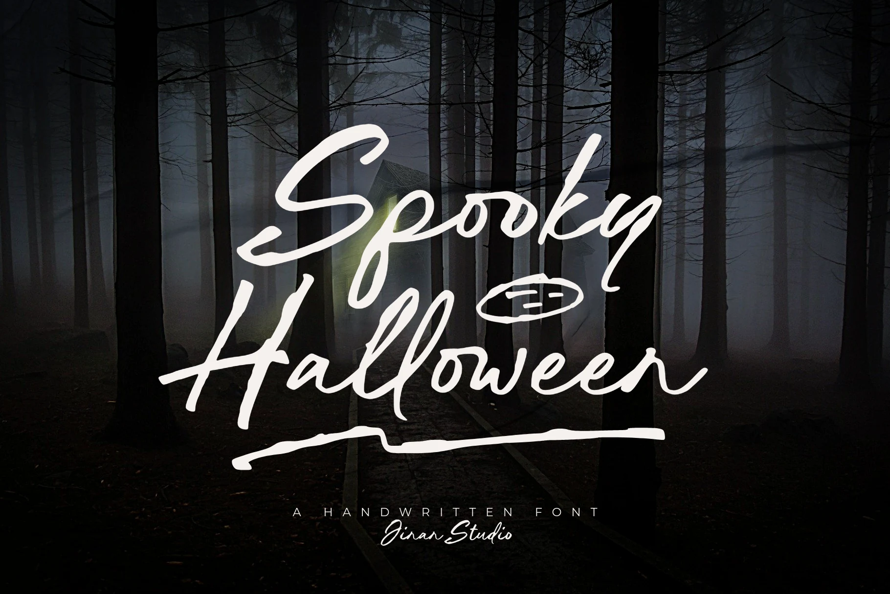
Best For: posters, invitations, display text, short phrases
Spooky Halloween Font brings connected brush-script joins, variable strokes, a rightward slant, and ink-bleed-like texture to short phrases. The spontaneous handmade movement works for invitations and posters, while uneven strokes limit longer reading.
Spooky Halloween Font
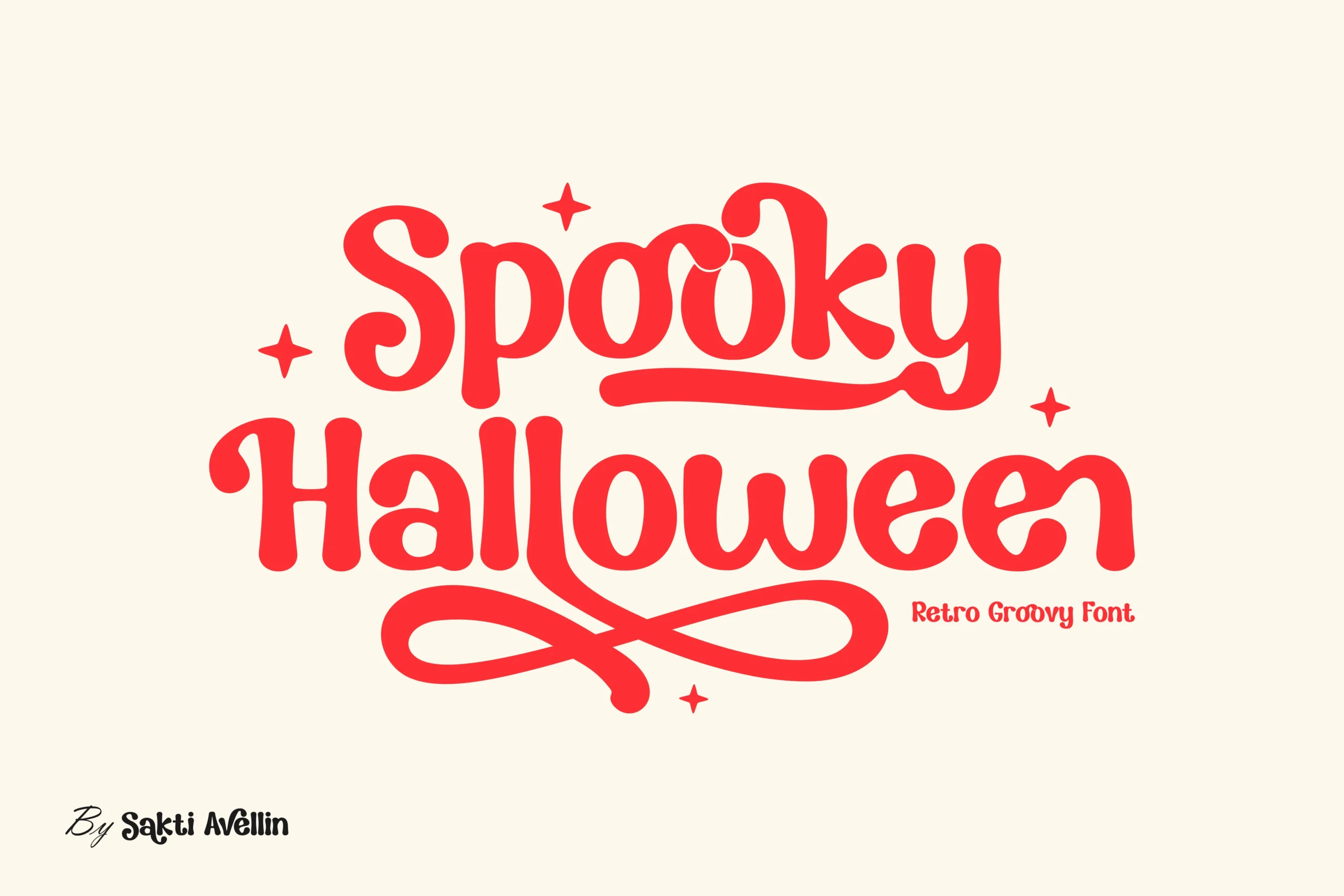
Best For: branding, T-shirts, invitations, posters
Spooky Halloween Font is a wide retro display script built from rounded strokes, extended swashes, alternates, and ligatures. Its feature-rich construction supports merchandise and branding variations, but overlapping swashes can reduce clarity in compact headlines.
Ghost Cartoon Font
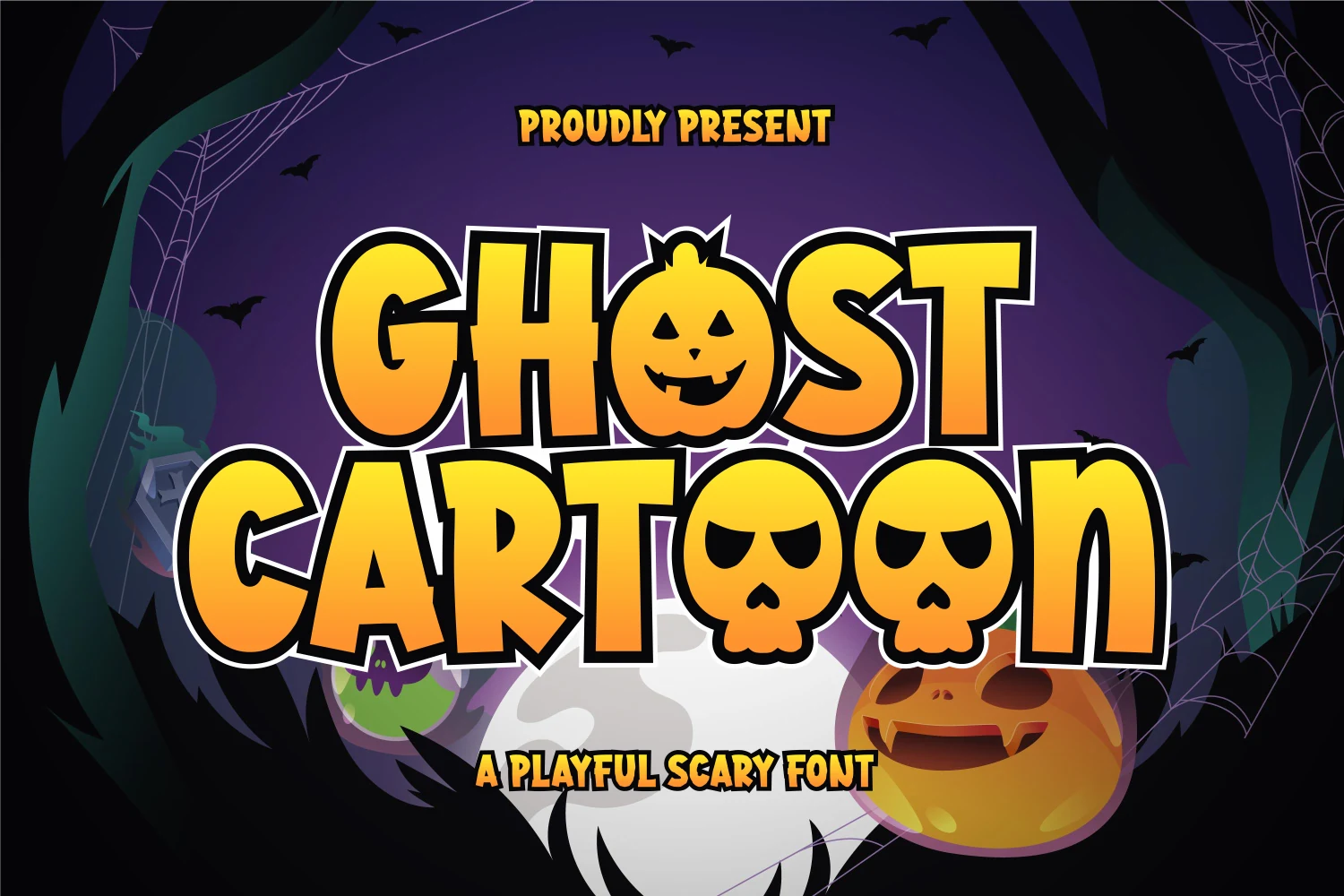
Best For: headlines, display text, posters, invitations
Ghost Cartoon Font uses bubbly condensed forms and heavy strokes, replacing some characters with jack-o’-lantern and skull imagery. Those substitutions turn short invitations and party headlines into illustrations, though the dense construction is unsuitable for long text.
How to Choose the Right Font
Choose dripping or icon-integrated faces when Halloween recognition matters immediately, Gothic styles when you need ceremony and menace, and textured or illustrated designs when lettering must act as artwork. For friendlier Spooky Halloween Fonts, favor rounded forms or scripts; always test joins, flourishes, contrast, and decorative bottoms at the final size.