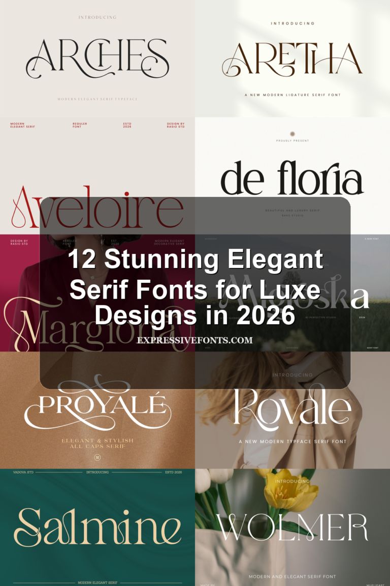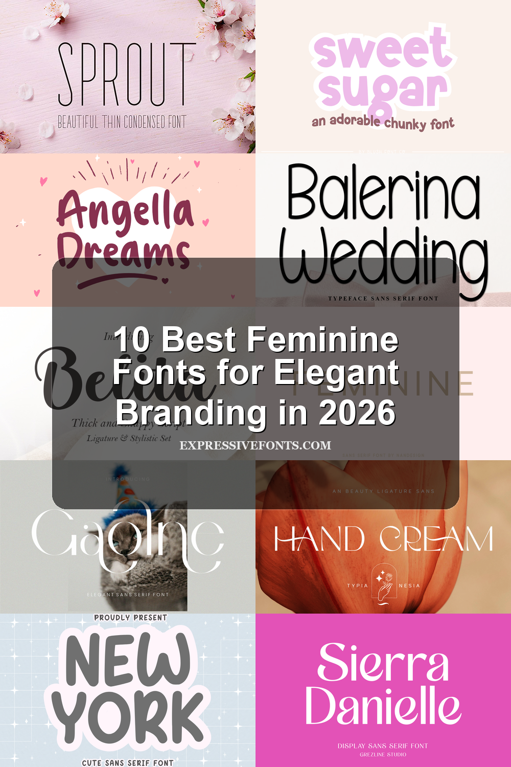
10 Best Feminine Fonts for Elegant Branding in 2026
Feminine Fonts are a strong choice for designs that need softness, elegance, charm, or a more personal visual tone. This collection brings together 10 stylish fonts for logos, beauty branding, invitations, packaging, social media graphics, wedding designs, and other creative projects.
From delicate condensed sans serifs to bold scripts and cute rounded display fonts, these options cover different feminine styles without feeling repetitive. Each font is available on Creative Fabrica, making it easier to find a polished typeface for your next design.
Sprout Font
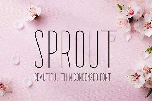
Best For: feminine designs, wedding designs, invitations, beauty branding
Sprout Font uses very tall, narrow sans serif letters with a thin monoline build and softly rounded movement through the curves. Its delicate vertical rhythm gives titles a quiet, airy look, which fits Feminine Fonts collections where the typography needs to feel refined without becoming decorative.
The condensed proportions make it strongest in short names, headings, invitation wording, and website accents. Keep contrast high and avoid crowding the tracking too tightly; the slim strokes need clean space around them so the elegant shape stays readable.
Sweet Sugar Font
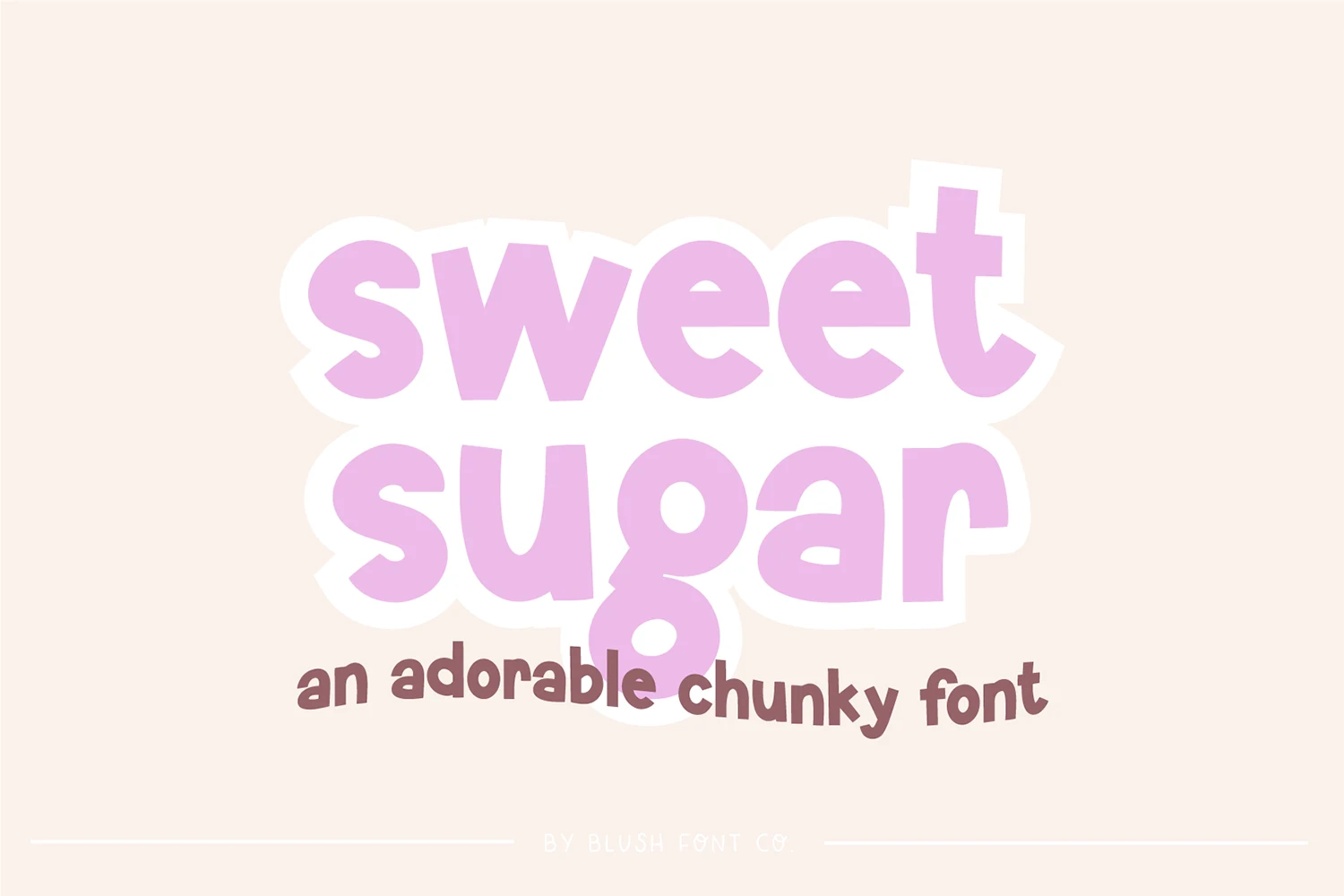
Best For: social media graphics, invitations, feminine designs, cute designs
Sweet Sugar Font has thick rounded letters, soft curves, and a slightly bouncy rhythm that makes the words feel friendly and approachable. The wide, chunky shapes give it strong display energy, so it fits Feminine Fonts roundups that lean cute rather than delicate.
It works best in short phrases, branding callouts, invitation titles, and social graphics where you want immediate warmth. Keep the text brief and let the bold shapes do the work; tighter layouts can handle it well, but longer lines will start to feel heavy and crowded.
Angella Dreams Font
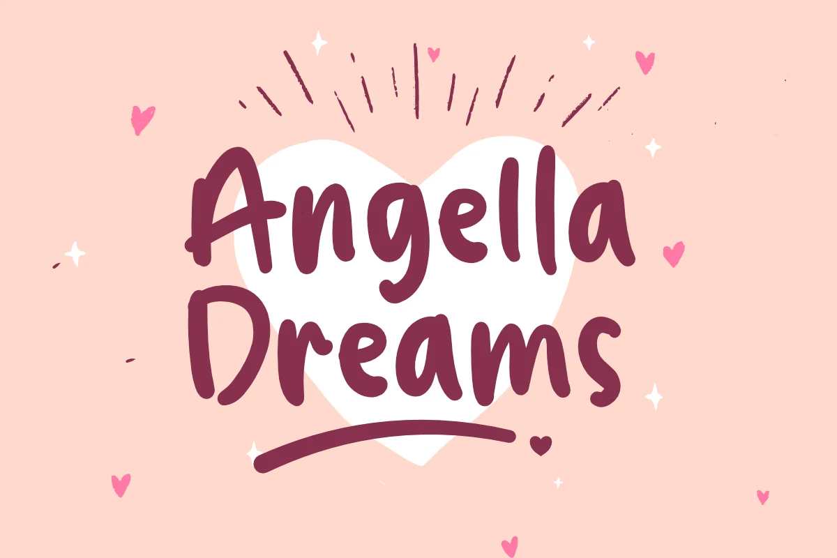
Best For: feminine designs, cute designs, quotes, branding
Angella Dreams Font has a hand-drawn look with thick rounded strokes, loose curves, and an uneven baseline that keeps the lettering casual. Its soft marker-like shapes bring a playful side to Feminine Fonts, especially when the design needs personality rather than polish.
The weight gives short quotes, magazine accents, and brand names strong visibility, but the irregular shapes work better in compact wording than long paragraphs. Pair it with cleaner supporting type and keep enough contrast around the letters so the chunky forms stay clear.
New York Font
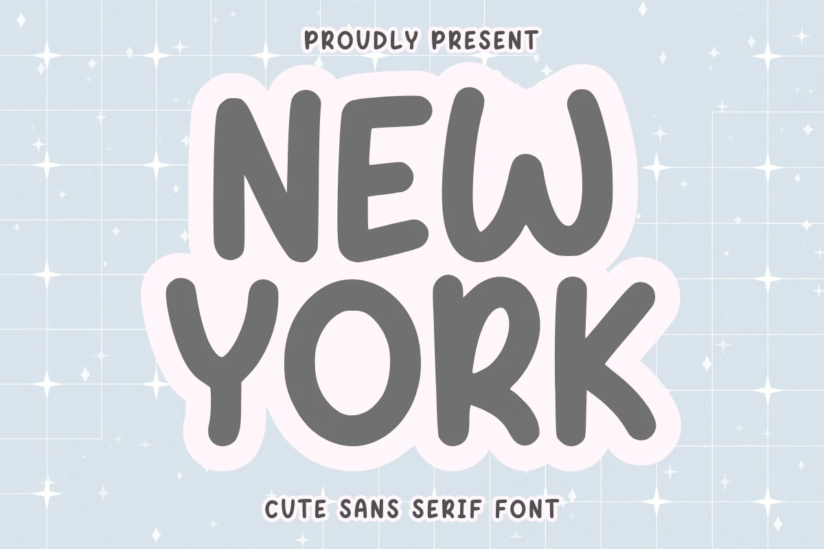
Best For: stickers, quotes, T-shirts, feminine designs
New York Font has chunky rounded sans serif letters, soft irregular curves, and a hand-drawn bounce that makes the words feel instantly cheerful. The thick strokes and open shapes keep it easy to read, giving it the kind of friendly personality that suits Feminine Fonts with a cute, casual slant.
Its playful weight works especially well for stickers, short quotes, planner headings, and T-shirt phrases where the lettering needs to stand on its own. Try it in compact layouts or stacked lines, and pair it with simpler supporting text so the quirky rhythm stays clear instead of crowded.
Balerina Wedding Font
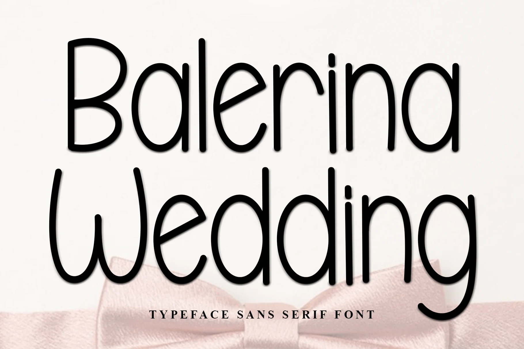
Best For: wedding designs, invitations, logos, feminine designs
Balerina Wedding Font has a clean rounded sans serif structure with long vertical strokes, open counters, and smooth curves that feel soft without turning decorative. Its graceful proportions give Feminine Fonts a polished option for designs that need warmth, clarity, and a bridal tone.
The letterforms stay readable in names, invitation titles, simple logos, and baby shower card headings, especially when the layout leaves enough white space around the taller shapes. Use moderate tracking rather than tight spacing so the rounded strokes and descenders keep their calm rhythm.
Belita Font
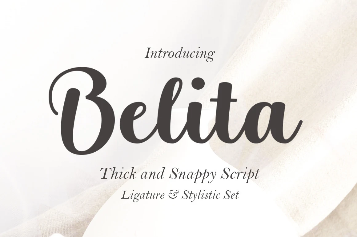
Best For: branding, invitations, wedding designs, product labels
Belita Font is a bold script with rounded strokes, smooth joins, and a generous opening flourish that gives the wordmark immediate presence. The lettering feels polished but soft, making it a strong option in Feminine Fonts when you want something more expressive than a plain signature look.
Its thick connected forms read well on branding, invitation names, labels, and packaging, especially when the main word gets room to stand apart from the supporting copy. Keep line spacing comfortable and pair it with a restrained serif or sans so the curves stay crisp instead of visually crowding the layout.
Feminine Font
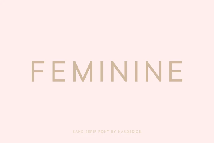
Best For: feminine designs, minimal designs, beauty branding, logos
Feminine Font is a light uppercase sans serif with clean straight stems, soft geometric proportions, and generous letter spacing. Its quiet structure gives Feminine Fonts a restrained, modern option where the mood comes from spacing and proportion rather than ornament.
The thin strokes suit logos, beauty branding, website headers, and refined packaging when the layout has enough negative space. Keep contrast high and avoid compressing the tracking; the wide rhythm is the detail that makes the lettering feel polished and calm.
Hand Cream Font
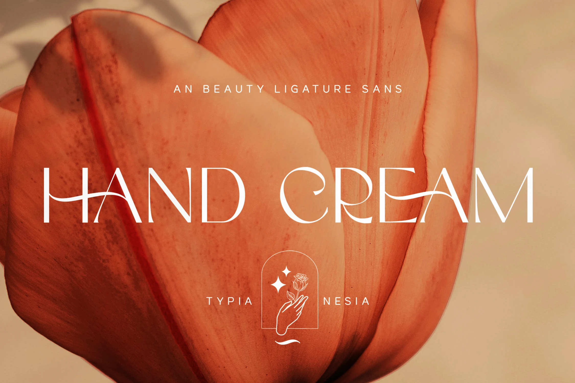
Best For: logos, branding, beauty branding, elegant designs
Hand Cream Font combines slim uppercase sans serif letters with sweeping cross-strokes and graceful ligature-style details that give the words a polished, high-end rhythm. It brings a more sculpted look to Feminine Fonts, with elegance that feels expressive rather than delicate or sugary.
The long horizontal movement makes it especially effective for logos, beauty branding, and short packaging titles where a few words can carry the whole mood. Keep the wording brief and pair it with a quieter secondary font, so the decorative joins and airy proportions stay sharp.
Gaolne Font
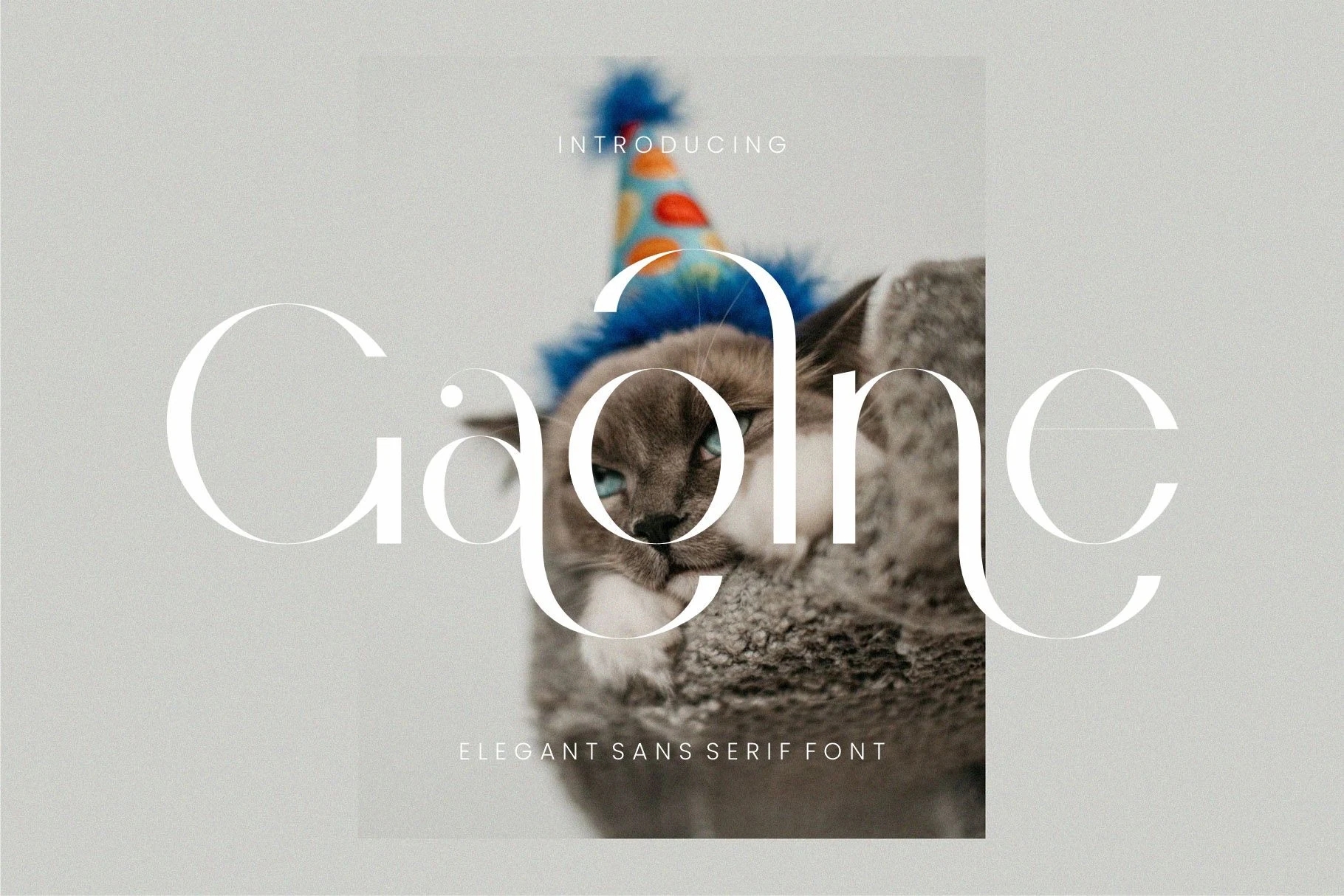
Best For: luxury designs, elegant designs, beauty branding, logos
Gaolne Font has a refined high-contrast sans serif style, with thin hairlines, rounded bowls, and tall elegant letterforms that feel more editorial than casual. Its fashionable structure gives Feminine Fonts a polished option for designs that need softness without losing a premium tone.
The delicate strokes work best in short brand names, logo marks, beauty layouts, and chic packaging where the type can sit at a generous size. Keep background contrast clean and avoid dense copy; the open spacing and curved details need room to stay sharp.
Sierra Danielle Font
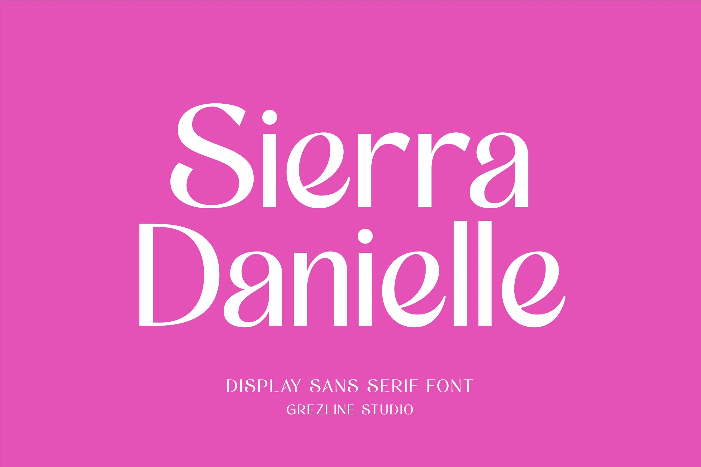
Best For: headlines, branding, packaging, editorial designs
Sierra Danielle Font has tall, high-contrast letterforms with crisp curves and a polished display rhythm that feels stylish and poised. Its elegant proportions give Feminine Fonts a sharper editorial direction, balancing softness with enough structure to make titles look clean and intentional.
This one shines in headlines, packaging, wedding branding, and editorial layouts where a few words need presence without turning heavy. Use it at generous sizes and keep the supporting type restrained, since the refined contrast and spacing already carry most of the visual interest.
The right Feminine Fonts can change the tone of a project quickly, whether you need something elegant, romantic, playful, minimal, or premium. Use these fonts for branding, logos, invitations, packaging, social media posts, wedding designs, and other layouts where typography needs to feel intentional.
All 10 fonts in this collection are available on Creative Fabrica, so you can explore the full previews, test the style, and choose the one that best fits your project.