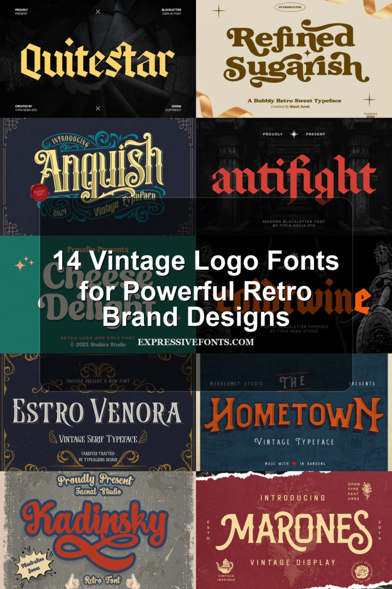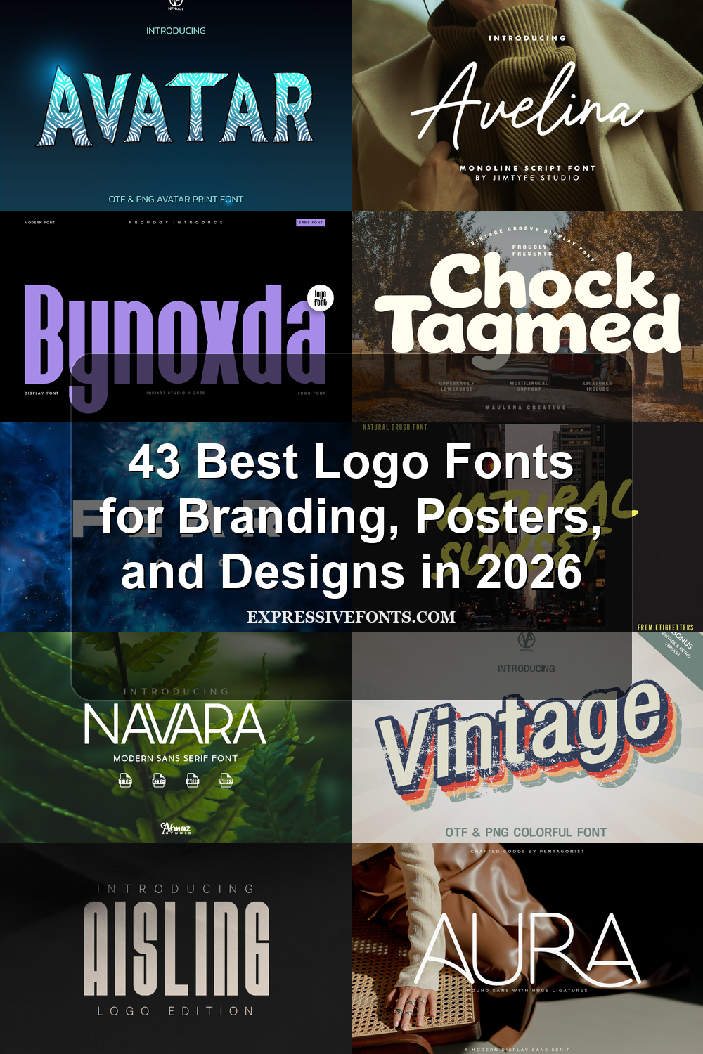
43 Best Logo Fonts for Branding, Posters, and Designs in 2026
Logo Fonts are one of the fastest ways to give a brand mark stronger identity, clearer personality, and better visual recall. This 2026 collection brings together 43 styles, from bold display lettering and luxury serifs to signature scripts, retro fonts, and clean modern sans options for branding, posters, packaging, labels, and web headers.
Bynoxda Font
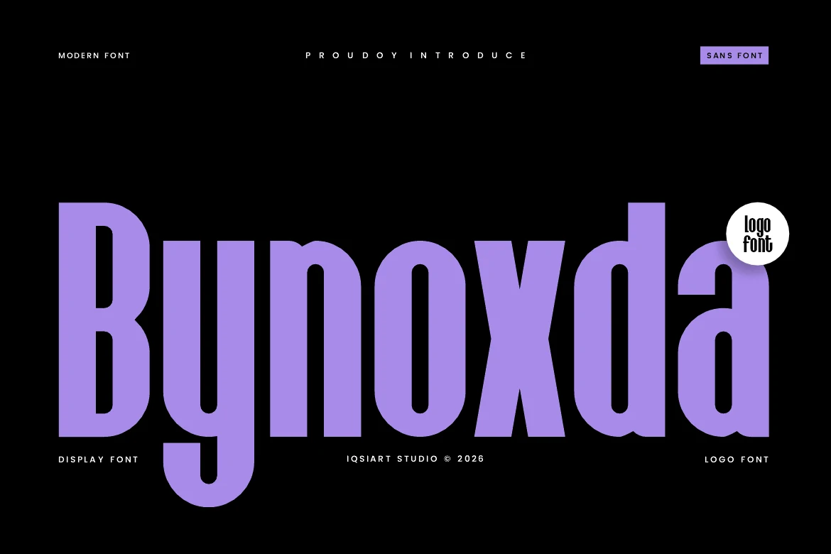
Best For: logos, branding, headlines, posters
Bynoxda Font uses a towering sans structure with heavy vertical strokes, compressed proportions, and rounded internal counters that keep the massive letters from feeling rigid. The tight rhythm gives words a dense architectural look, making it useful when Logo Fonts need strong recognition from just a few characters.
Its scale works best in short names, title marks, and poster-style layouts where height can become part of the composition. Keep spacing controlled rather than loose; the font gains impact from its compact forms, while high contrast around the letters prevents the deep counters and thick stems from closing up.
Davetica Font
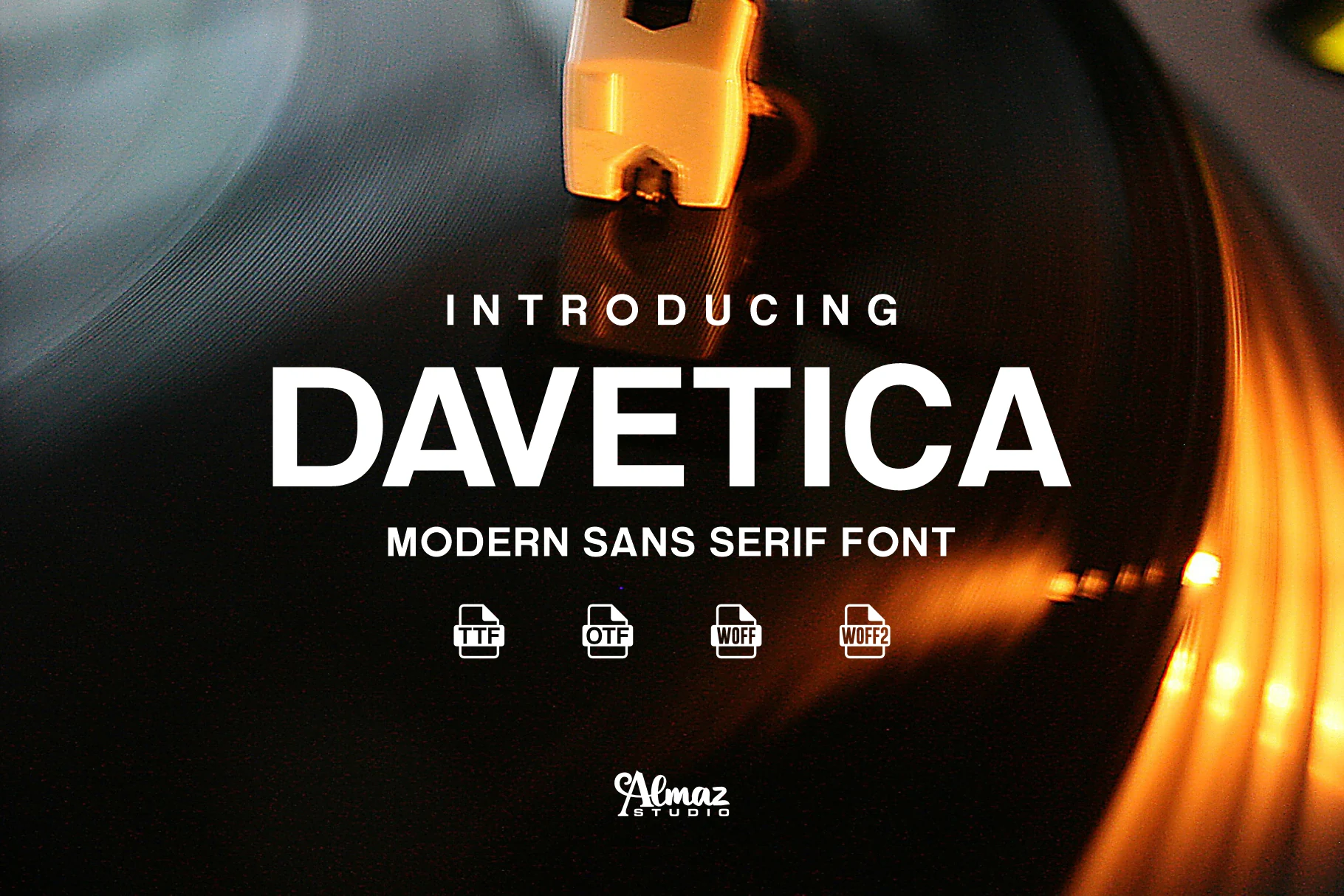
Best For: logos, branding, posters, website headers
Davetica Font has a clean modern sans serif voice, with even strokes, open counters, and balanced proportions that keep large words crisp and easy to scan. Its restrained geometry gives Logo Fonts a polished contemporary feel, so short names and title lines read bold without becoming harsh.
The broad Latin language support helps maintain a consistent look across multilingual layouts, while the steady rhythm makes it practical for posters, web graphics, and identity work. It performs best when the main wordmark stays fairly tight, then supporting text can open up with more spacing to create a clearer hierarchy.
Bardy Font
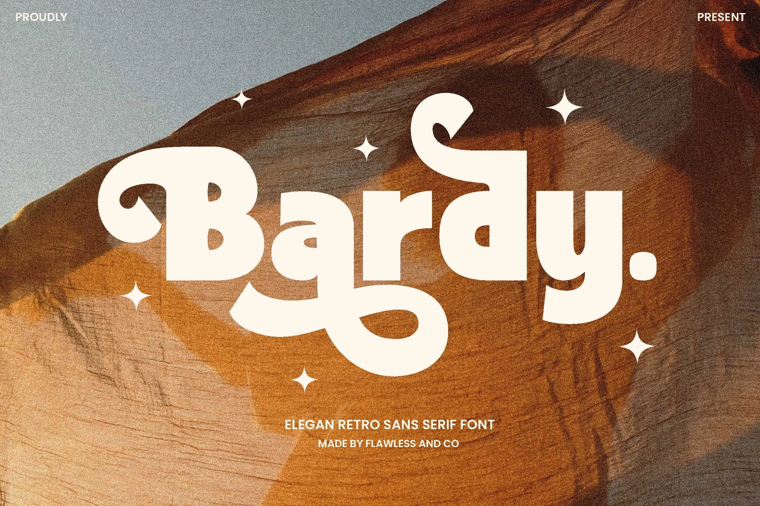
Best For: logos, branding, retro designs, headlines
Bardy Font brings a retro sans shape into a softer, more expressive direction, with chunky rounded forms, curled details, and a sweeping descender that gives the wordmark real movement. The letters feel bold without becoming mechanical, which makes Logo Fonts with vintage character easier to turn into memorable short names.
Because the forms are wide, decorative, and tightly shaped, Bardy works best when the main text stays compact. Use it for primary titles or brand marks, then keep supporting type simpler and more spaced out so the curved terminals, heavy strokes, and playful rhythm stay in control of the composition.
Twoswash Font
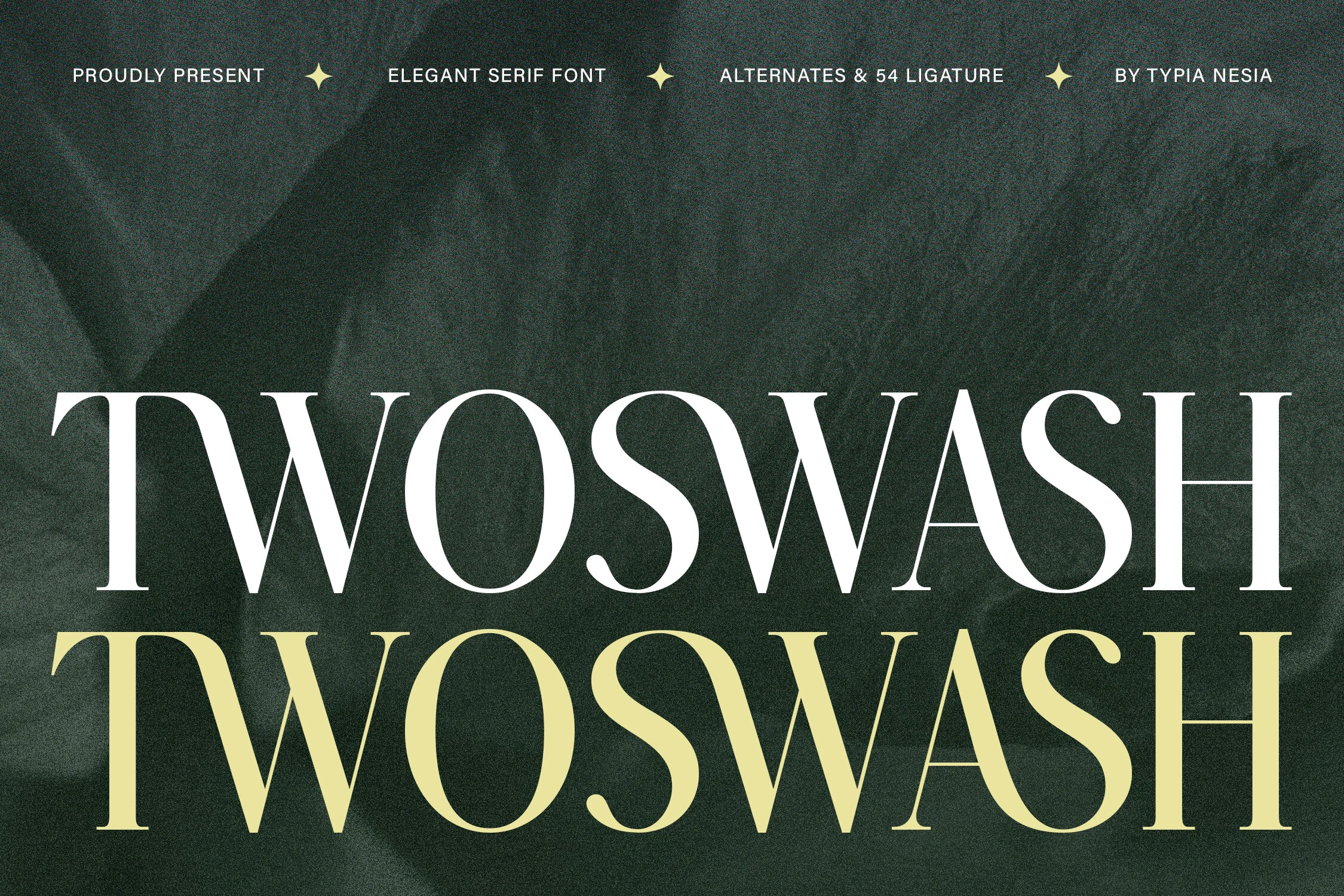
Best For: logos, branding, beauty branding, high-end designs
Twoswash Font leans into a refined display serif look, with tall proportions, crisp hairlines, and sweeping curves that give each word a polished sense of movement. The contrast feels luxurious rather than stiff, so it suits Logo Fonts that need elegance, presence, and a slightly royal tone.
Its decorative rhythm is strongest in short names and statement titles, where the swash-like shaping can stay clear and intentional. Give it generous scale and clean surrounding space, then pair it with a restrained secondary typeface so the delicate strokes and graceful ligature-style flow remain the focal point.
Chock Tagmed Font
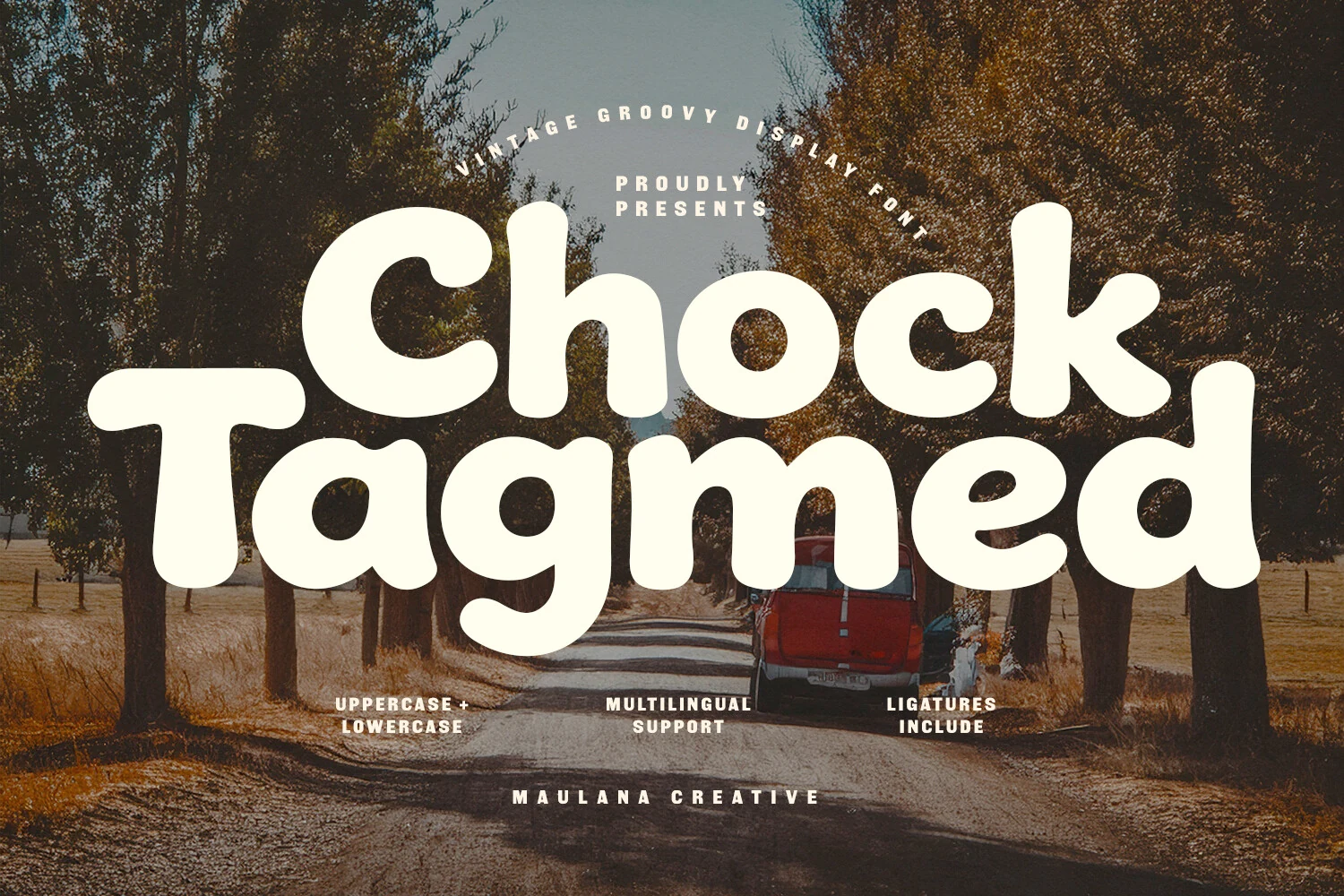
Best For: logos, branding, retro designs, posters
Chock Tagmed Font has a thick groovy build, with soft rounded edges, inflated curves, and uneven organic shaping that gives each word a relaxed 1970s rhythm. It fits Logo Fonts that need warmth and instant personality rather than a clean corporate tone.
The unique ligatures help the bulky letters connect into more compact display words, while multilingual support keeps the same retro voice usable across broader branding systems. Keep it large and short; the heavy counters and playful proportions work best as a main title, not as dense supporting copy.
Logo Font
Best For: logos, branding, headlines, short phrases
Logo Font pushes a chunky display style with towering rounded stems, tight inner spaces, and a compact vertical build that gives each letter a strong blocky silhouette. The soft corners keep it from feeling harsh, while the heavy weight helps Logo Fonts read instantly in short names and bold identity work.
It performs best when you let a single word do the work. Use it for marks, packaging titles, or punchy headers, then pair it with a light script or simple sans for contrast; that mix keeps the thick forms from feeling flat and gives the layout a clearer hierarchy.
Vintage Font
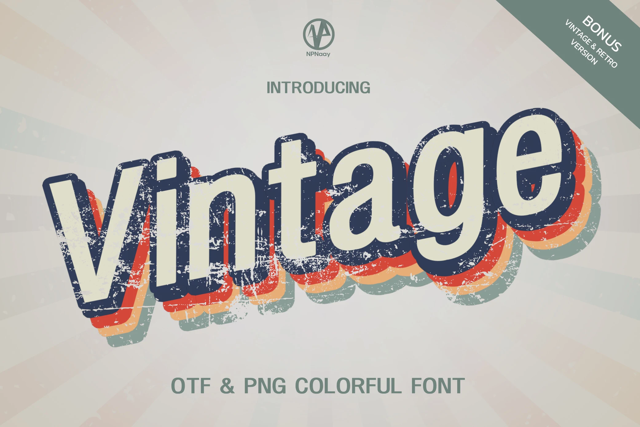
Best For: logos, branding, retro designs, eye-catching designs
Vintage Font uses a thick retro display build with rounded sans shapes, distressed edges, and layered color-shadow styling that gives the letters a worn poster look. The forms are broad, tilted, and highly graphic, so Logo Fonts with a nostalgic tone can feel finished without needing much extra illustration.
Treat it as a headline asset rather than a text face. The color treatment and rough texture work best at larger sizes, while simple spacing and strong contrast keep the stacked shadows readable across branding, social graphics, invitations, and packaging-style layouts.
Moretimes Font
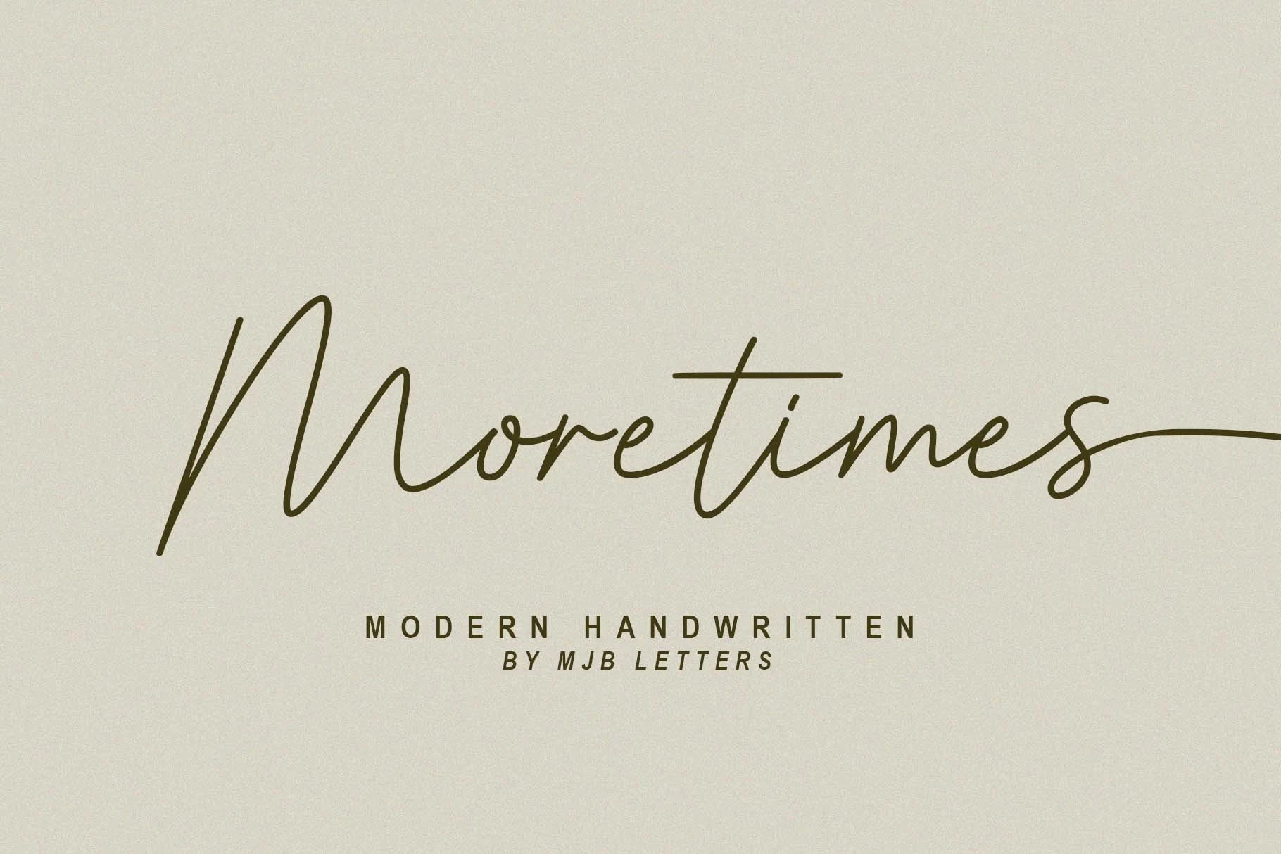
Best For: logos, branding, wedding designs, quotes
Moretimes Font has a light monoline script style with tall opening strokes, relaxed loops, and a smooth handwritten rhythm that feels polished without looking overworked. Its long horizontal movement and airy spacing give Logo Fonts a personal signature feel, especially for names, boutiques, or fashion-led branding.
The alternate uppercase and lowercase letters are especially useful here, since they let you refine the flow of a word instead of settling for one fixed shape. Keep the wording short and give the capitals room to stand out, then pair it with a quiet sans serif so the slim strokes and extended terminal flourishes stay clean.
Vintage Super Font
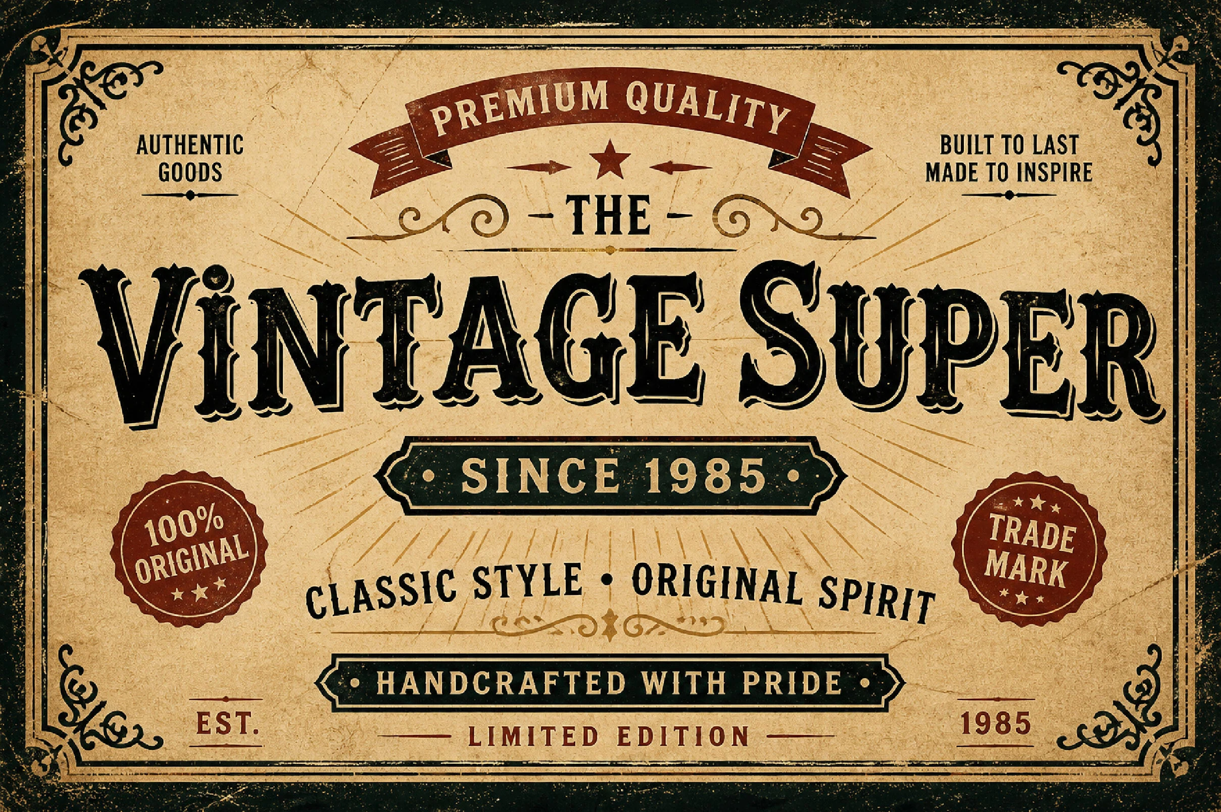
Best For: logos, product labels, badges, vintage designs
Vintage Super Font is built for old-style display work, with ornate serif caps, heavy decorative outlines, and a rugged printed texture that gives words the feel of a classic label or trade sign. Its strong contrast and carved details make Logo Fonts look bold, aged, and immediately recognizable.
The dense ornamentation works best in short names, badges, and headline compositions where each letter has enough room to show its inner cuts and shadowed edges. Keep supporting text simpler and narrower so the main wordmark stays dominant rather than competing with other vintage elements.
Natural Sunset Font
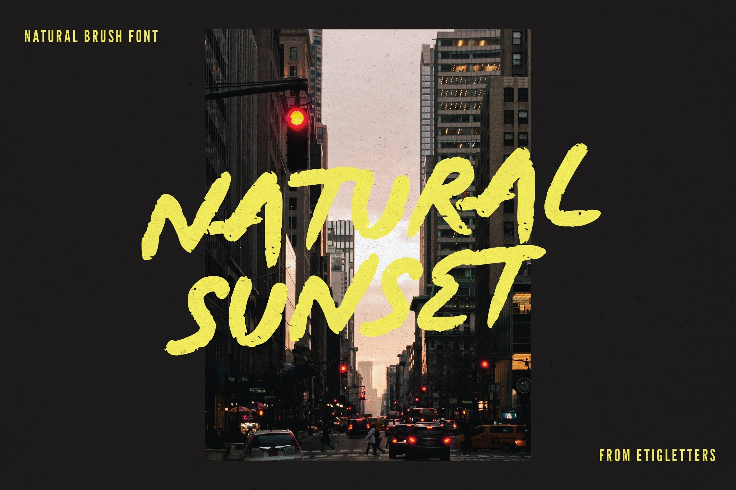
Best For: logos, posters, display text, short phrases
Natural Sunset Font has a raw brush-painted look, with thick pressure shifts, broken edges, and quick angled strokes that make the lettering feel spontaneous and full of motion. That textured rhythm gives Logo Fonts a more expressive, street-poster energy, especially when you want the wordmark to feel handmade rather than polished.
Because the forms are uneven and highly gestural, it performs best in short titles, poster lines, and bold branding statements. Let the letters sit large against a clean high-contrast background, and keep supporting text simple so the rough terminals and painted joins stay readable instead of turning muddy.
Bingar Font
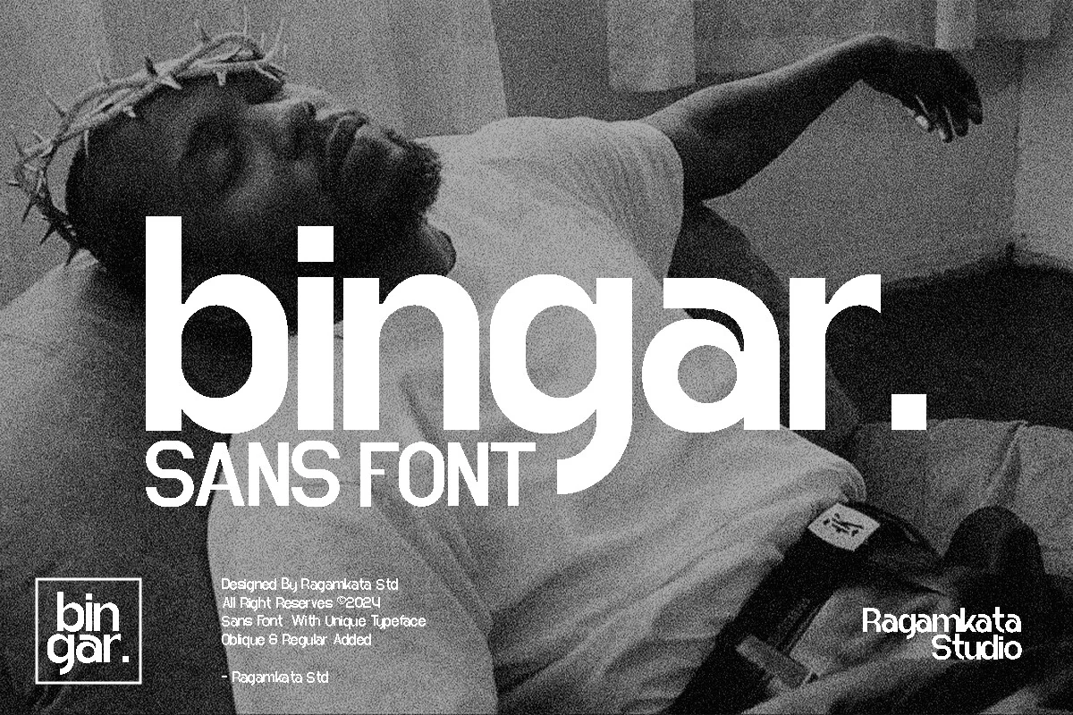
Best For: logos, branding, editorial designs, posters
Bingar Font has a smooth modern sans look, with rounded bowls, broad lowercase forms, and a compact rhythm that keeps the wordmark bold without feeling blunt. The clean geometry gives Logo Fonts a confident editorial edge, especially when the design needs a simple shape that still carries personality.
Its uppercase and lowercase range makes it easier to build hierarchy across headings, packaging, magazine layouts, and brand systems. Keep the main word spacing tight enough to preserve the linked rhythm, then use generous contrast around it so the wide curves and heavy terminals stay crisp.
Nura Font
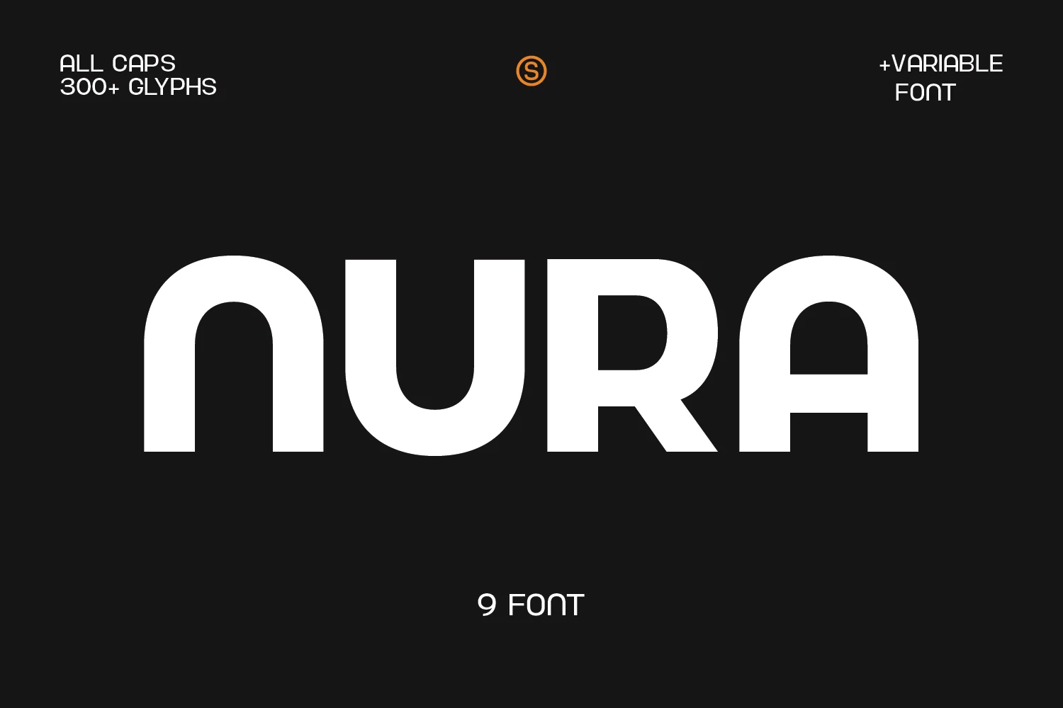
Best For: logos, branding, headlines, minimal designs
Nura Font has a clean geometric sans structure, with broad strokes, rounded inner corners, and smooth curved terminals that keep big words feeling modern rather than mechanical. That stripped-back construction gives Logo Fonts a confident, professional presence, especially when you want clarity without losing character.
The shapes are bold enough for posters and headlines, yet the even rhythm also helps with subheadings and short brand lines. Keep the spacing fairly controlled so the wide arches stay visually connected, then use a lighter secondary typeface beside it to sharpen the hierarchy and let the large forms hold the focus.
Ferrum Font
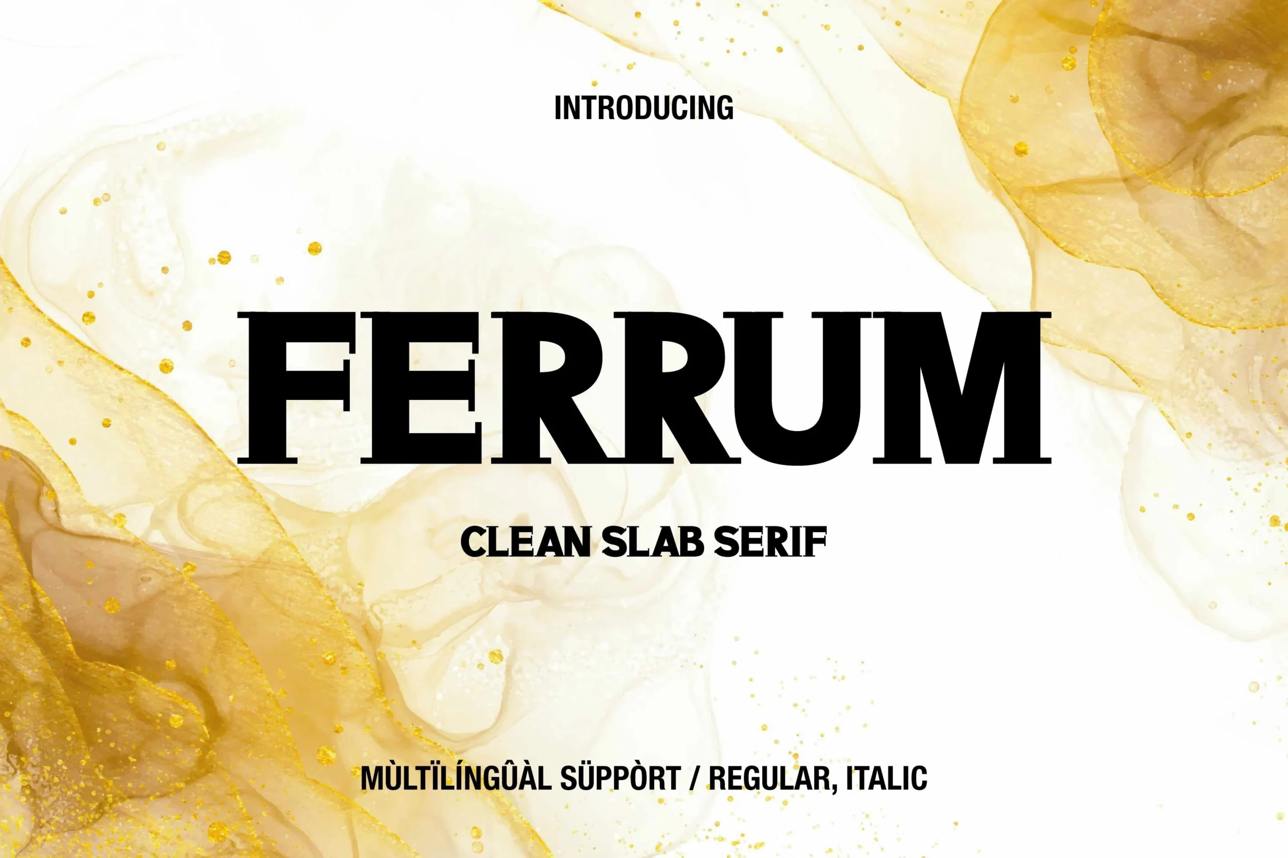
Best For: logos, branding, headlines, professional designs
Ferrum Font takes a clean slab serif approach, with heavy rectangular serifs, broad uppercase proportions, and firm vertical stems that create a serious editorial tone. The bold weight gives Logo Fonts a solid, authoritative feel, especially when a mark needs to look stable rather than decorative.
Its structure is best handled with controlled spacing and strong contrast, since the slab terminals can crowd if the wordmark is too tight. Use it for compact names, headline blocks, or packaging titles, then pair it with a lighter sans serif to keep the hierarchy clear and the main word grounded.
Marquise Font
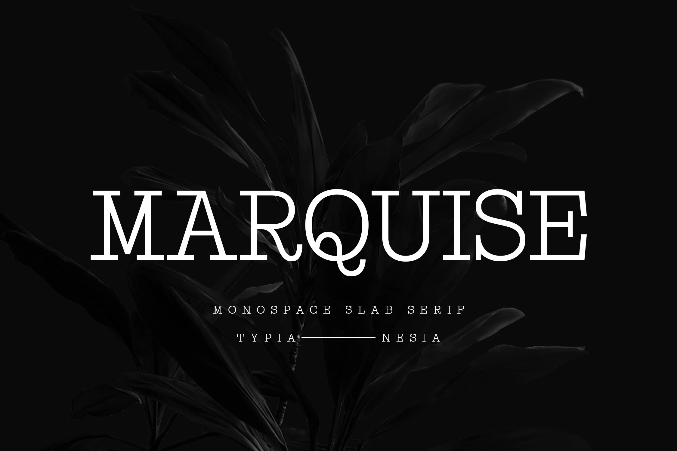
Best For: logos, branding, editorial designs, high-end designs
Marquise Font presents a refined monospace serif style with disciplined spacing, crisp slab terminals, and a distinctive curled Q that softens the otherwise architectural forms. The even letter widths give Logo Fonts a poised, high-end feel, especially when a wordmark needs structure without looking cold.
Its strength lies in calm, deliberate composition. Use it at a generous size and keep surrounding text restrained, so the measured rhythm and sharp serif details stay visible. Paired with a minimal sans or light editorial copy, it creates a clear hierarchy with a classic but polished edge.
College Black Font
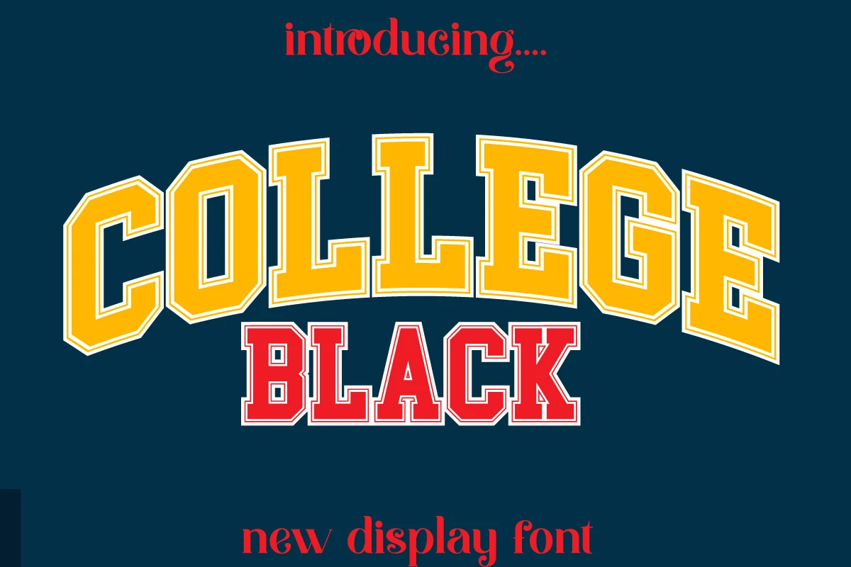
Best For: logos, posters, merch design, bold designs
College Black Font uses a classic varsity display style, with heavy block serifs, angular corners, and strong inline detailing that makes each letter feel built for impact. Its arched rhythm and layered outline treatment give Logo Fonts a team-driven, athletic identity without needing much extra decoration.
The wide capitals work best in short names, jersey-style marks, posters, and headline layouts where the outline can stay sharp. Keep spacing controlled and avoid small supporting copy in the same style; a simpler sans beside it will make the collegiate forms look cleaner and more deliberate.
Navara Font
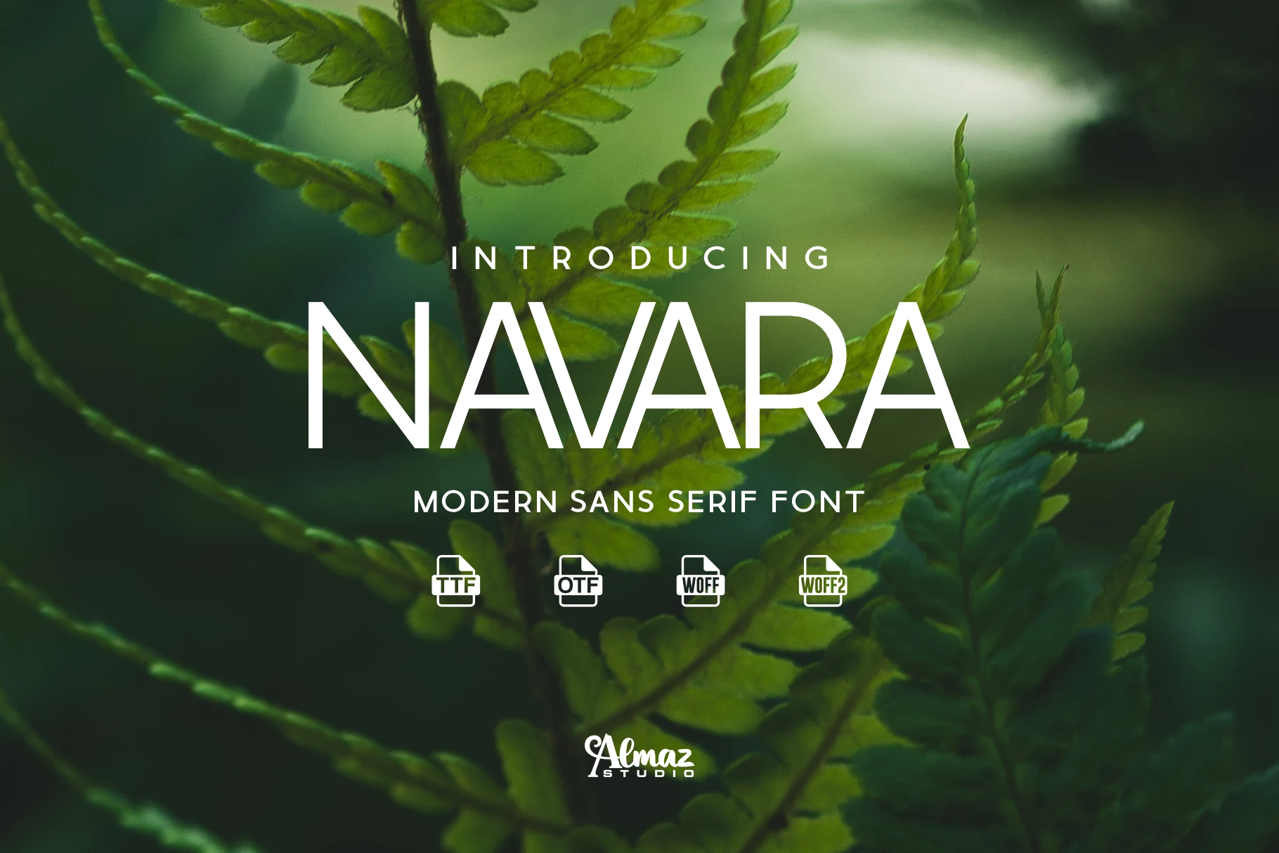
Best For: logos, branding, website headers, modern designs
Navara Font brings a sharp, architectural voice to Logo Fonts, with wide geometric capitals, clean monoline strokes, and distinctive cuts through letters like A and V. The inward-turning terminals keep the structure from feeling too mechanical, giving the alphabet a controlled but slightly friendlier finish.
Its strong character works best when the wordmark has enough horizontal space, because the broad proportions and angular counters need room to read clearly. The built-in alternatives are useful for logo refinement, letting you adjust key letters without breaking the modern sans serif rhythm.
Brittany Signature Script Font
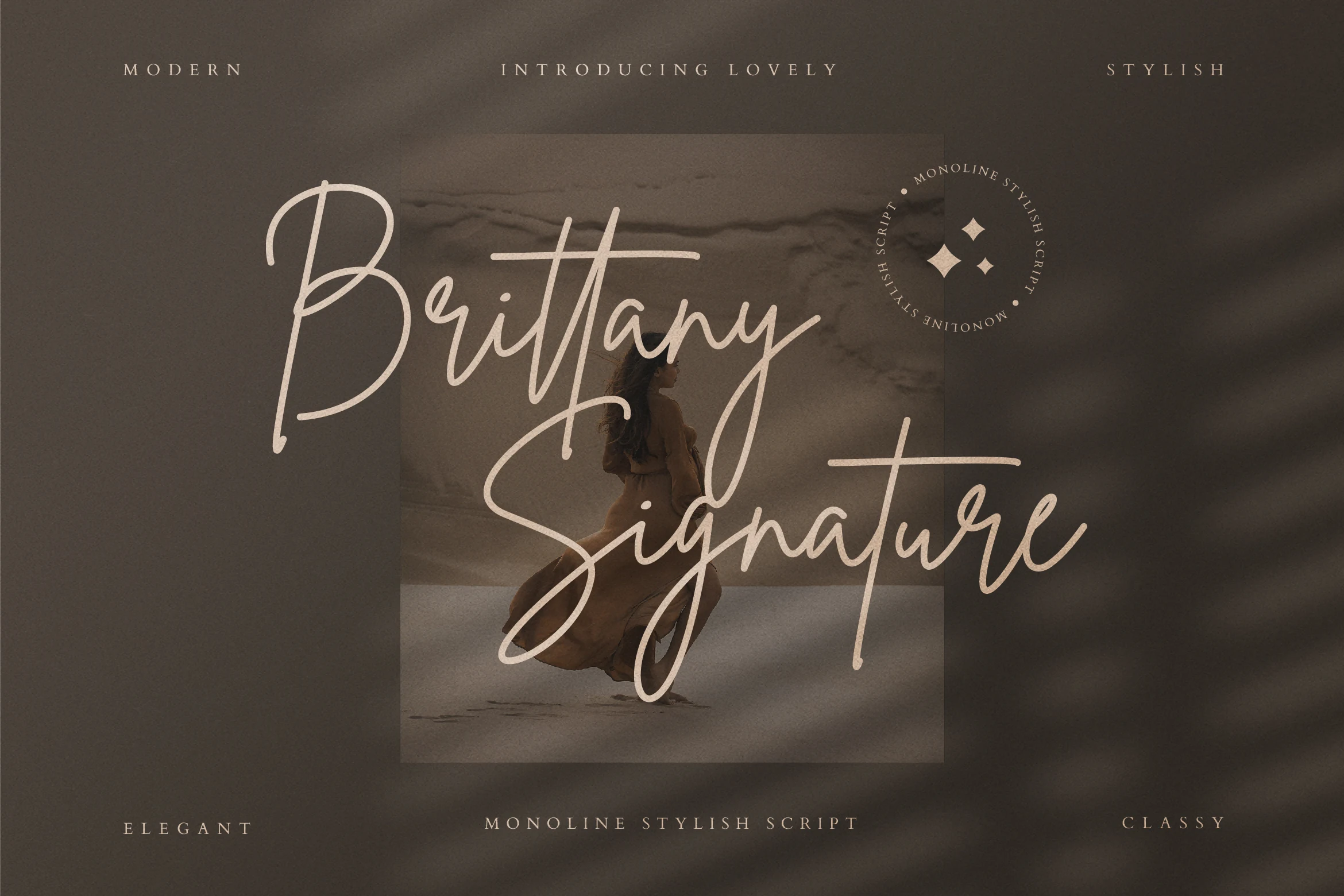
Best For: logos, personal branding, invitations, beauty branding
Brittany Signature Script Font has a poised monoline signature look, shaped by tall looping capitals, slim strokes, and sweeping crossbars that give the lettering a fluid handwritten rhythm. The soft inky flow feels polished rather than overly formal, which helps it stand out in Logo Fonts that need personality without looking busy.
It works best in short names and headline-style wording, where the long ascenders and descenders have space to stretch cleanly across the layout. Pair it with simple supporting text and slightly open spacing, since that contrast keeps the elegant curves readable and lets the signature character do the visual work.
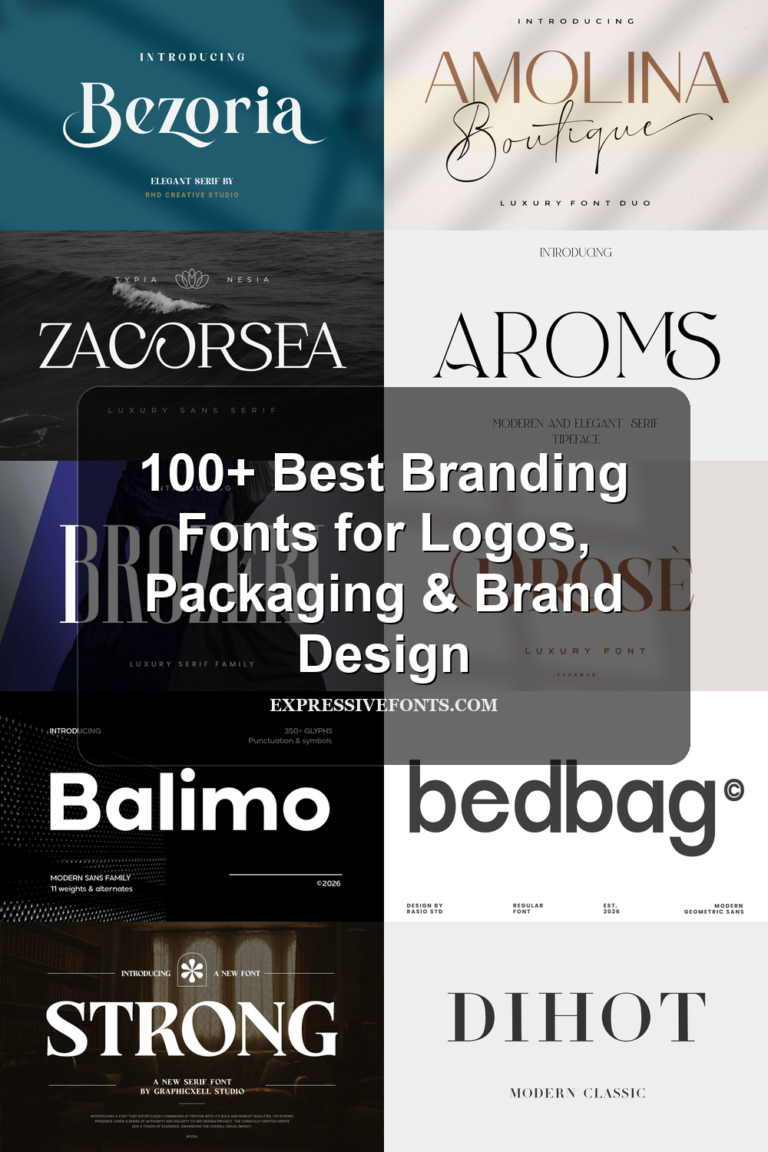
Aura Font
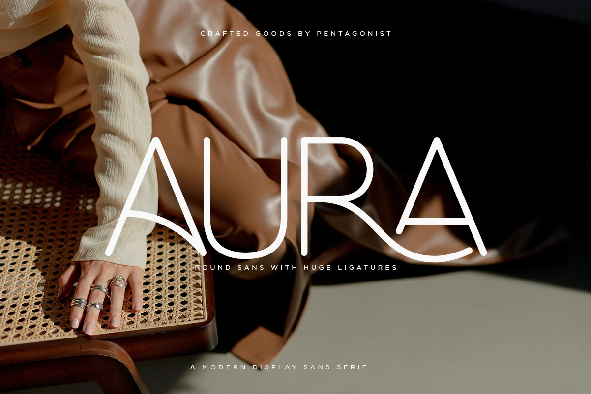
Best For: logos, branding, fashion branding, website headers
Aura Font takes a round sans-serif base and pushes it into Logo Fonts territory with oversized curves, slim monoline strokes, and dramatic ligature connections. The preview shows wide, airy capitals where the A and R feel almost ribbon-like, giving the wordmark a polished fashion-editorial rhythm without losing basic readability.
The huge ligatures are the main design tool here: they help turn short brand names into custom-looking marks, but they need generous spacing around them so the curves do not crowd the layout. Its PUA encoding also makes the extra glyphs and swashes easier to reach when refining a logo, title, or web header.
Vogue Font
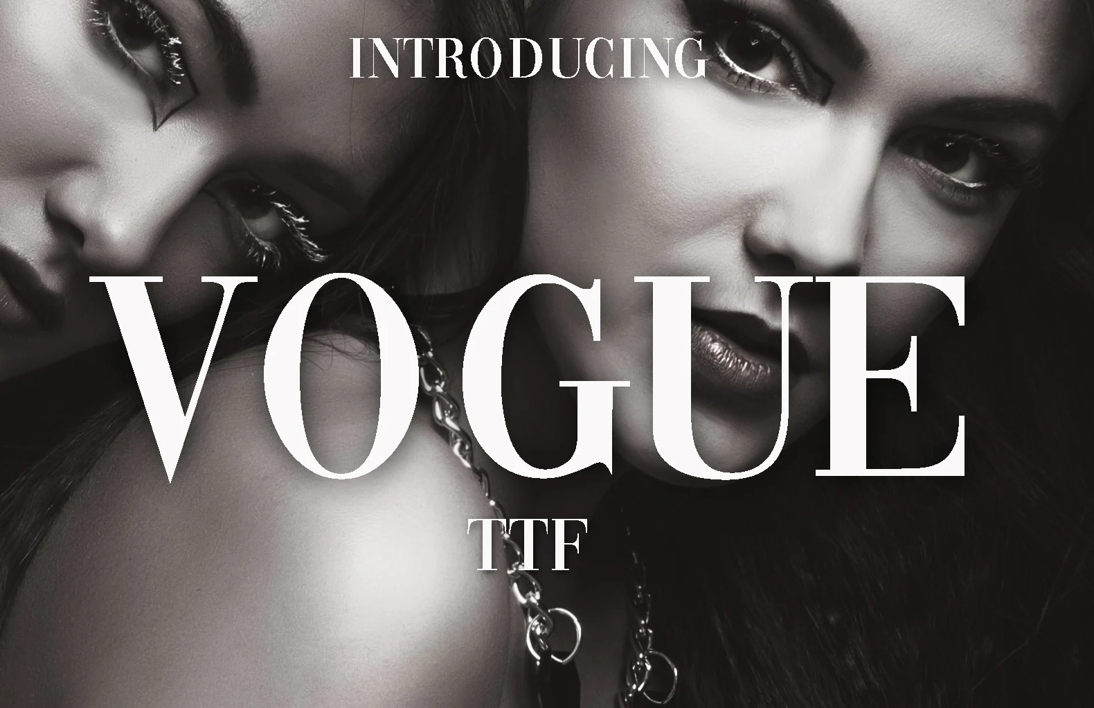
Best For: logos, magazine covers, headlines, fashion branding
Vogue Font has the kind of high-contrast drama that feels instantly editorial, with tall verticals, fine hairlines, and crisp serif details that give it a polished fashion tone. Within Logo Fonts, it brings a refined, cover-worthy presence to names and titles without needing extra decoration.
Its narrow proportions and delicate strokes work best in short text, where the elegant contrast stays sharp and visible. Use it to build strong title hierarchy, then support it with a quiet sans or small uppercase secondary line so the letterforms remain the main statement.
Globe Logo
Best For: logos, branding, professional designs, minimal designs
Globe Logo uses a clean rounded sans style with heavy, stable letters and open counters, giving the wordmark a direct corporate look. In a Logo Fonts roundup, its strength is the balance between the bold “Globall” lettering and the thinner slogan line, which creates a clear hierarchy without making the layout feel crowded.
The fully editable vector format makes it practical for resizing across signs, cards, and web graphics while keeping the icon and type edges sharp. AI, PDF, and EPS files also help when adjusting color contrast or spacing, especially if the globe mark needs to sit tighter beside the business name.
Into the Wild Font
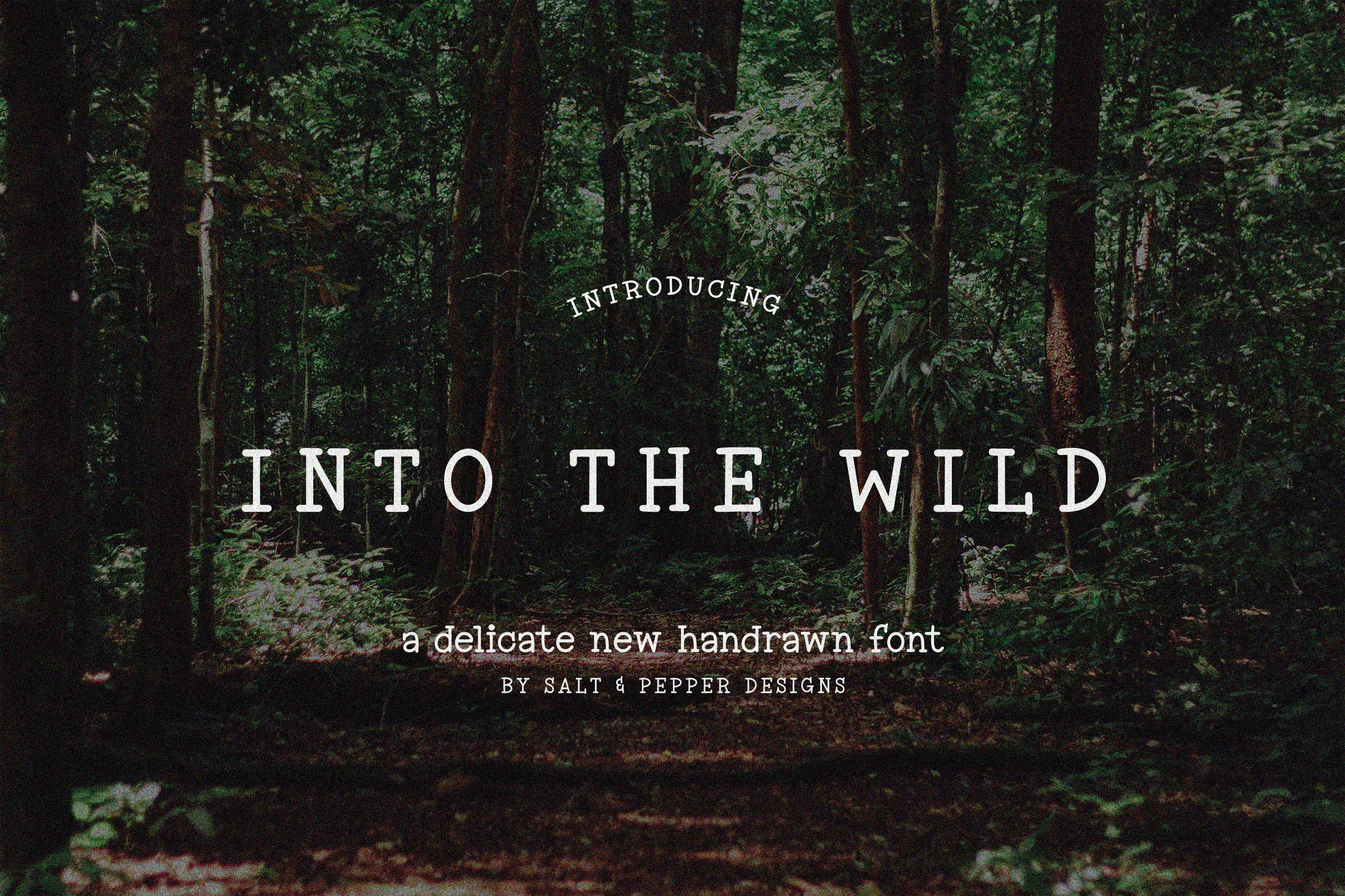
Best For: logos, posters, signage, vintage designs
Into the Wild Font has a rugged slab serif voice with softly worn edges, sturdy stems, and a slightly hand-rendered texture that keeps the capitals from feeling too rigid. In Logo Fonts, that mix of structure and weathered warmth gives it a trail-sign, heritage feel that suits bold names and outdoor-minded branding.
The wide uppercase spacing works especially well on short lines, where the chunky serifs and irregular texture can stay visible instead of crowding together. Use it at display size and let the weight carry the message, especially for titles that need a vintage tone without slipping into something overly ornate.
Galviory Font
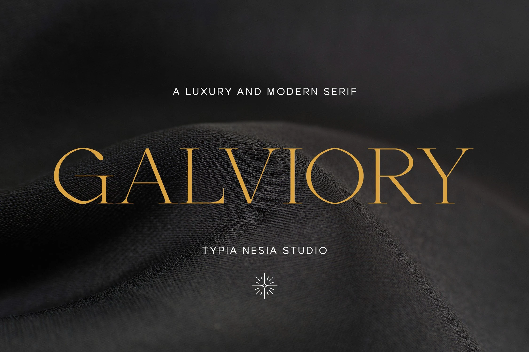
Best For: logos, branding, luxury designs, fashion branding
Galviory Font has a refined high-contrast serif structure, with tall uppercase forms, slim hairlines, and sharp bracketed details that give each letter a luxury editorial profile. It fits naturally among Logo Fonts for brands that need a polished nameplate rather than a loud decorative display face.
The wide spacing and delicate stroke contrast work best in short titles, where the thin joins and elegant serifs stay crisp. Use it with strong background contrast and restrained supporting type, because the font’s value comes from proportion, spacing, and clean title hierarchy rather than extra ornament.
Blackboard Font
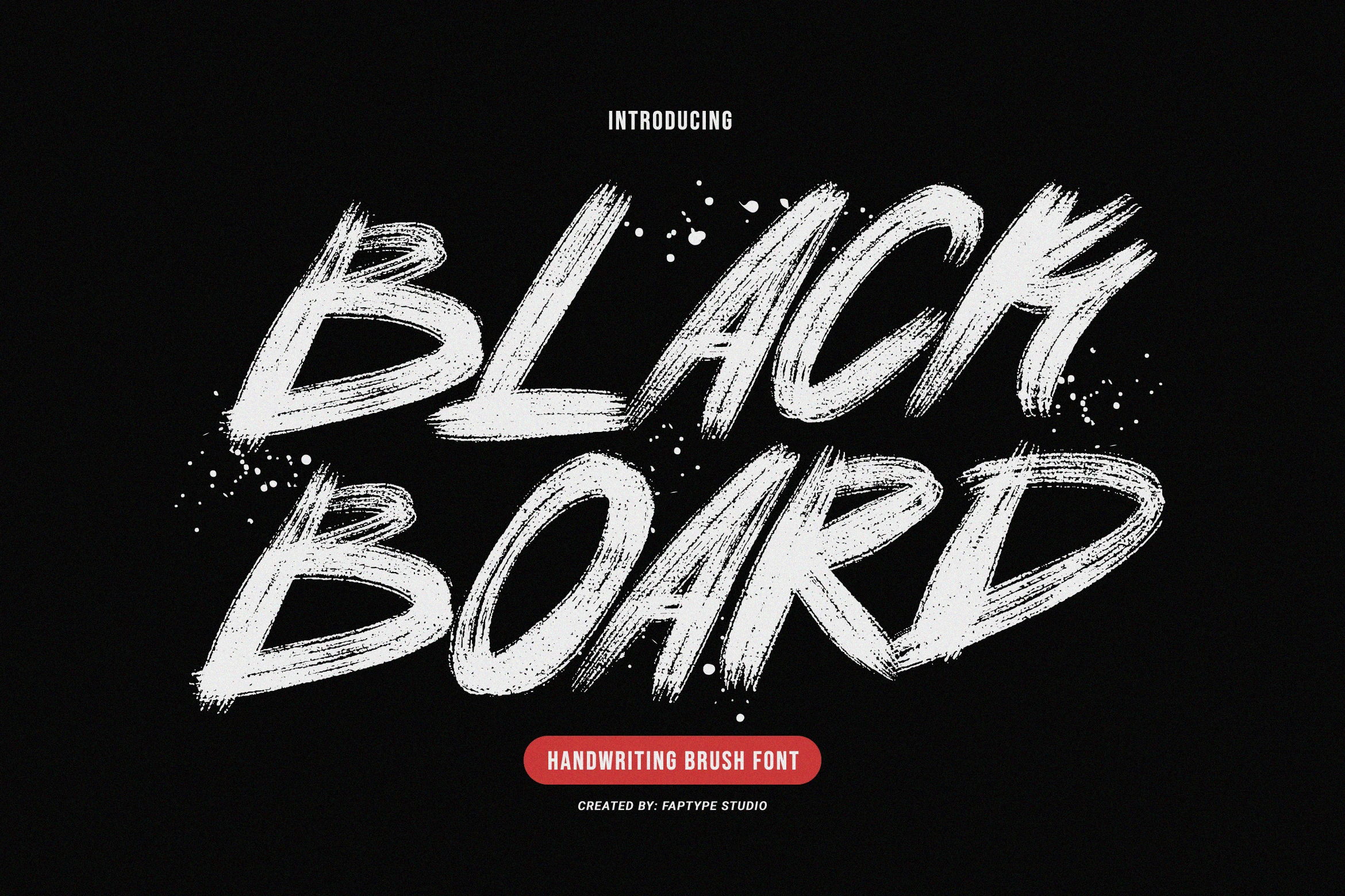
Best For: logos, posters, headlines, T-shirts
Blackboard Font hits with thick brush pressure, rough dry-stroke texture, and jagged endings that keep every letter feeling painted by hand. In Logo Fonts, it reads loud and immediate, with the kind of raw movement that gives short names and titles a punchy street-poster character.
This style works best when you keep the wording brief and let the heavy strokes carry the impact. A little breathing room between letters helps the textured edges stay clear, and a plain secondary font underneath creates cleaner contrast without softening the font’s bold brush energy.
Vancouver Font
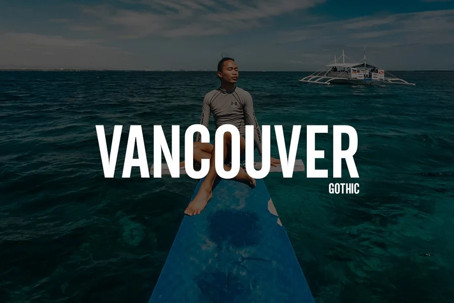
Best For: logos, headlines, posters, signage
Vancouver Font uses a tall condensed sans serif build, with heavy vertical strokes, tight counters, and clean squared endings that give the lettering a direct cinematic feel. It fits Logo Fonts where the goal is strength and clarity rather than decorative detail, especially for names that need to read fast across a poster or header.
The narrow proportions let long words hold visual weight without taking over too much horizontal space. Keep tracking controlled but not cramped, and pair it with smaller plain text when building hierarchy, since the bold uppercase rhythm already supplies most of the impact.
Unesa Font
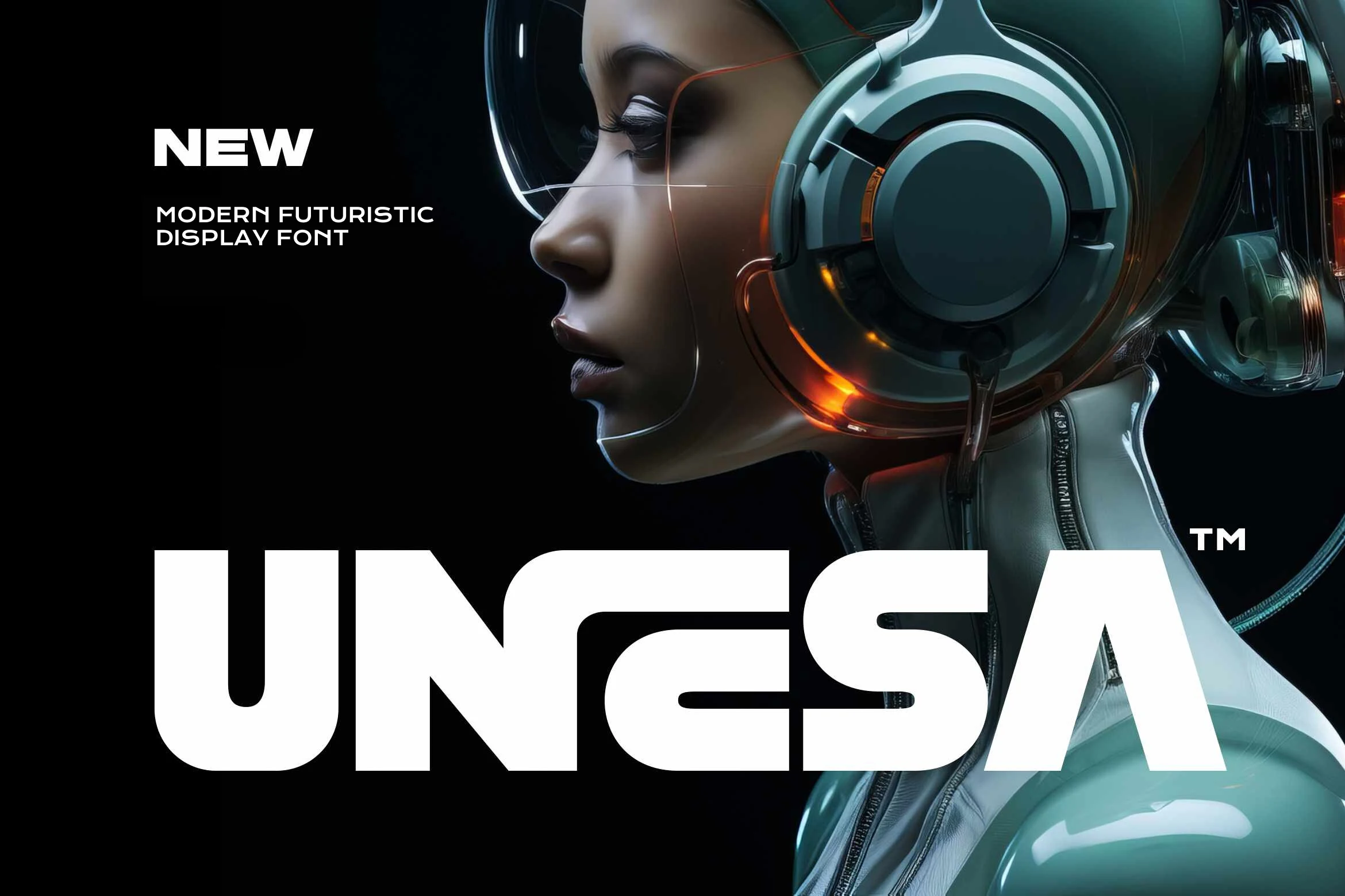
Best For: logos, posters, headlines, T-shirts
Unesa Font pushes a futuristic display style with thick geometric construction, clipped corners, and smooth internal curves that keep the heavy forms from feeling static. Within Logo Fonts, it has the sharp sci-fi presence needed for bold wordmarks, especially when you want a clean tech feel rather than a decorative one.
The mix of rounded shaping and hard-edged uppercase structure gives it a distinctive rhythm for short names, poster titles, and streetwear graphics. Keep the wording brief and give the letters room to sit, because the broad width and dense shapes read best when the layout stays simple and the silhouette does most of the work.
Zacorsea Font
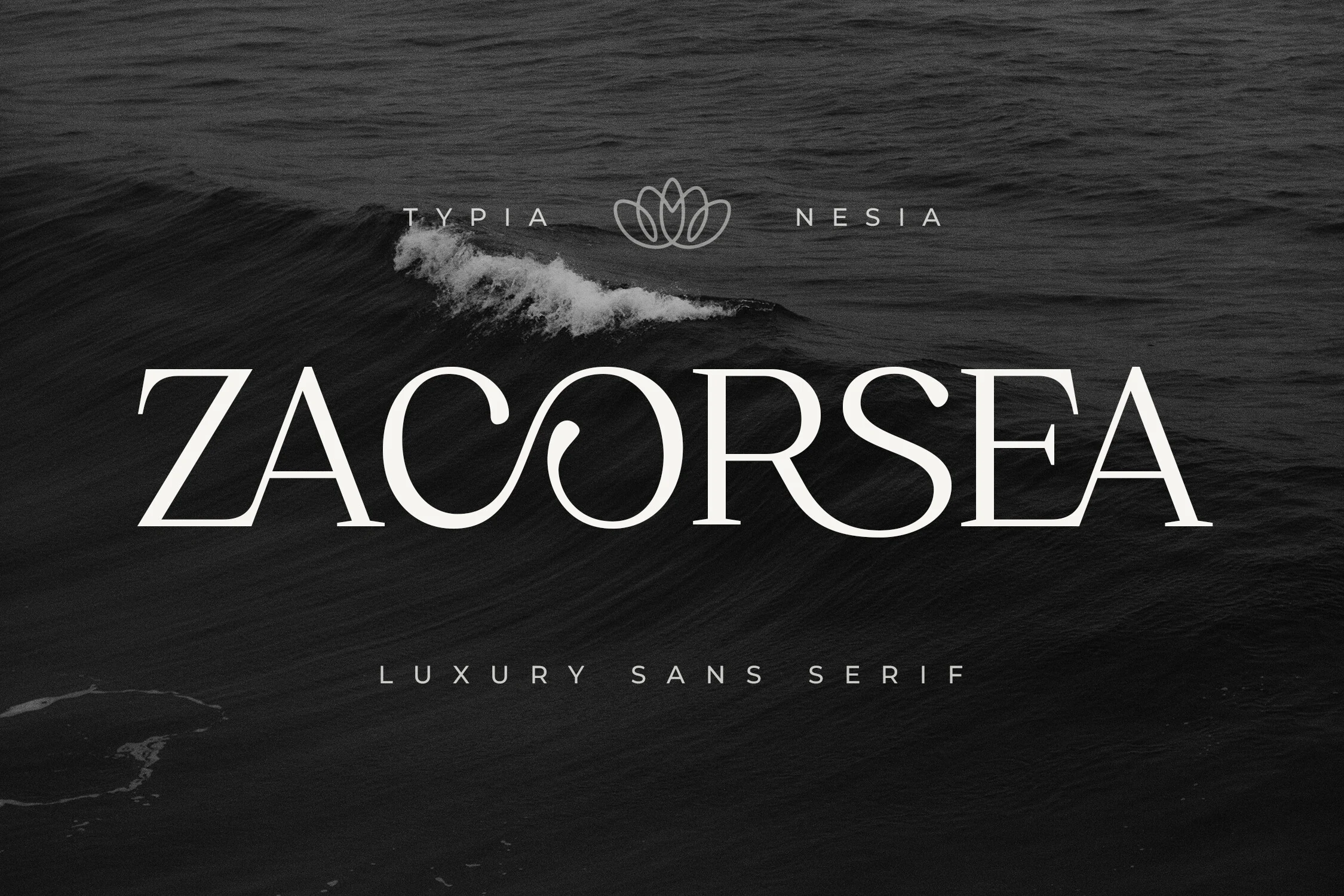
Best For: logos, luxury designs, beauty branding, fashion branding
Zacorsea Font uses a refined luxury serif style, with slender high-contrast strokes, sharp terminals, and wide uppercase spacing that gives the wordmark a calm premium rhythm. In Logo Fonts, its strongest detail is the graceful ligature work, especially where rounded forms create a more custom, polished identity.
The delicate serifs and thin joins need strong contrast and enough scale to stay crisp, so it works best for short names, packaging titles, and brand marks rather than dense copy. Keep supporting text minimal and widely tracked to preserve the elegant spacing and avoid competing with the font’s soft editorial curves.
Darkgray Font
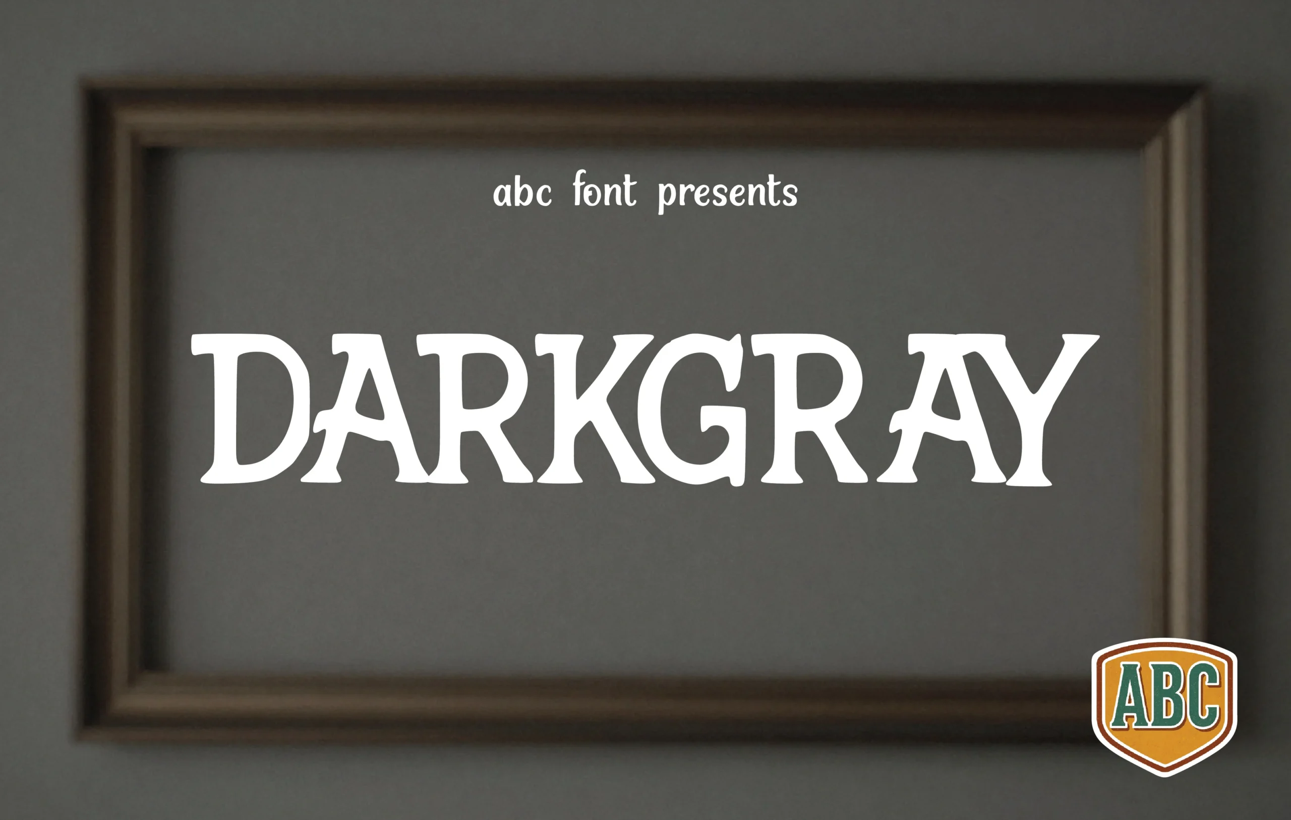
Best For: logos, headlines, posters, vintage designs
Darkgray Font has a sturdy, serif-inspired build with chunky stems, flared terminals, and slightly uneven curves that keep it feeling hand-drawn rather than formal. In Logo Fonts, that balance gives it a grounded vintage character that feels solid on the page without turning stiff or overly polished.
The felt-tip look reads best at display size, where the broad proportions and quirky details stay visible. It works especially well for short names and title lines, and pairing it with a simpler secondary font helps the handmade structure carry the hierarchy without making the layout feel heavy.
Kindred Youth Font
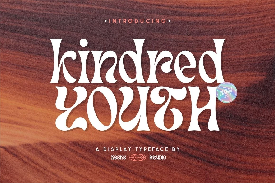
Best For: logos, product labels, book covers, retro designs
Kindred Youth Font brings a vintage-modern display voice to Logo Fonts, with soft flared strokes, rounded counters, and playful serif shapes that feel more hand-shaped than rigid. The letterforms have a 1970s rhythm, especially in the curved descenders and chunky lowercase forms that give short words immediate character.
Use it where the title needs to be the main visual element, because the decorative proportions can get dense in longer copy. Tight wordmarks, labels, tickets, and book titles benefit from moderate spacing and strong contrast, letting the curves stay readable while keeping the retro personality intact.
Avelina Font
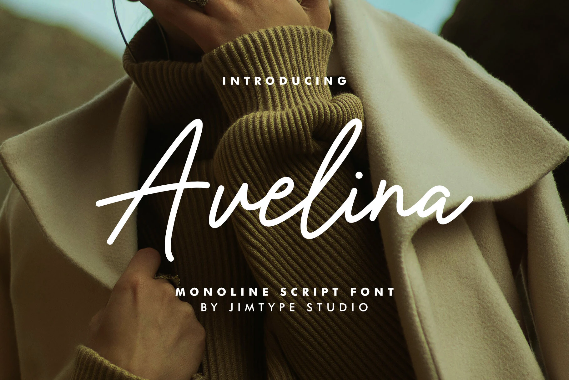
Best For: logos, personal branding, beauty branding, social media graphics
Avelina Font has a poised monoline script look, with a tall looping capital, slim even strokes, and smooth joins that keep the lettering airy instead of crowded. It sits comfortably in Logo Fonts, especially for branding that needs a handwritten feel without losing polish or clarity.
The long opening and exit strokes give it elegant movement, so it works best on short names, product marks, and headers where the word has room to breathe. Pair it with a restrained sans and leave extra space around the first and last letters to keep the flowing silhouette crisp.
Betriciya Signature Font
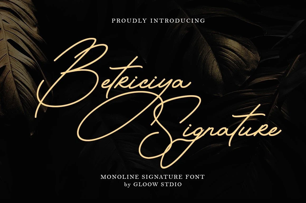
Best For: logos, personal branding, beauty branding, invitations
Betriciya Signature Font has a dramatic monoline script style, with oversized capital loops, long underline strokes, and smooth connected letters that create a polished handwritten signature. It stands out in Logo Fonts when a brand name needs elegance, motion, and a more personal mark.
The large swashes need open space around the word, so this font works best for short names, headers, cards, and social media graphics rather than compact text blocks. Keep supporting type small and simple, letting the sweeping curves set the hierarchy without crowding the layout.
Avatar Font
Best For: logos, posters, packaging, display text
Avatar Font is a bold display face with heavy uppercase forms, rough black edging, and carved interior striping that gives each letter a graphic print effect. Its wide stance and sharp irregular cuts make it better for loud title treatments than quiet branding systems.
Use it where Logo Fonts need instant impact: packaging names, poster headers, label graphics, or short blog visuals. Keep the wording compact and give the letters enough contrast, because the internal texture works best when it is not fighting small scale or busy surrounding details.
Lighters Font
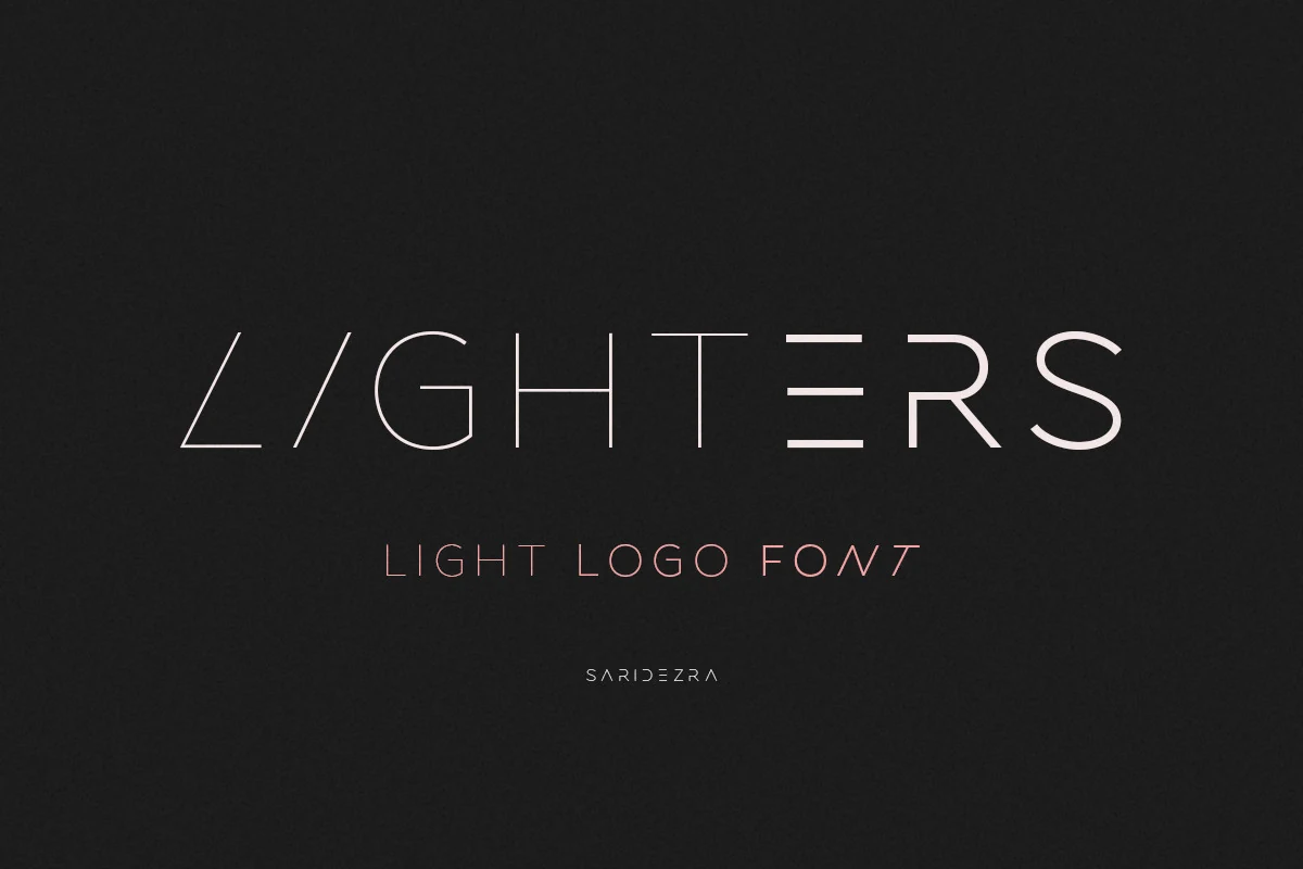
Best For: logos, branding, posters, website headers
Lighters Font is a stripped-back minimalist family built around ultra-thin strokes, wide spacing, and sleek geometric forms. The stylized construction of letters like A and E gives it a polished futuristic edge, while the light rhythm keeps the overall look calm rather than loud.
For Logo Fonts, it works best on short names and clean poster lines where the spacing can stay open and deliberate. The three weights help build a subtle hierarchy, and mixing uppercase with lowercase can make a mark feel more custom without losing the precise, airy character that gives this font its appeal.
Fast Rogue Font
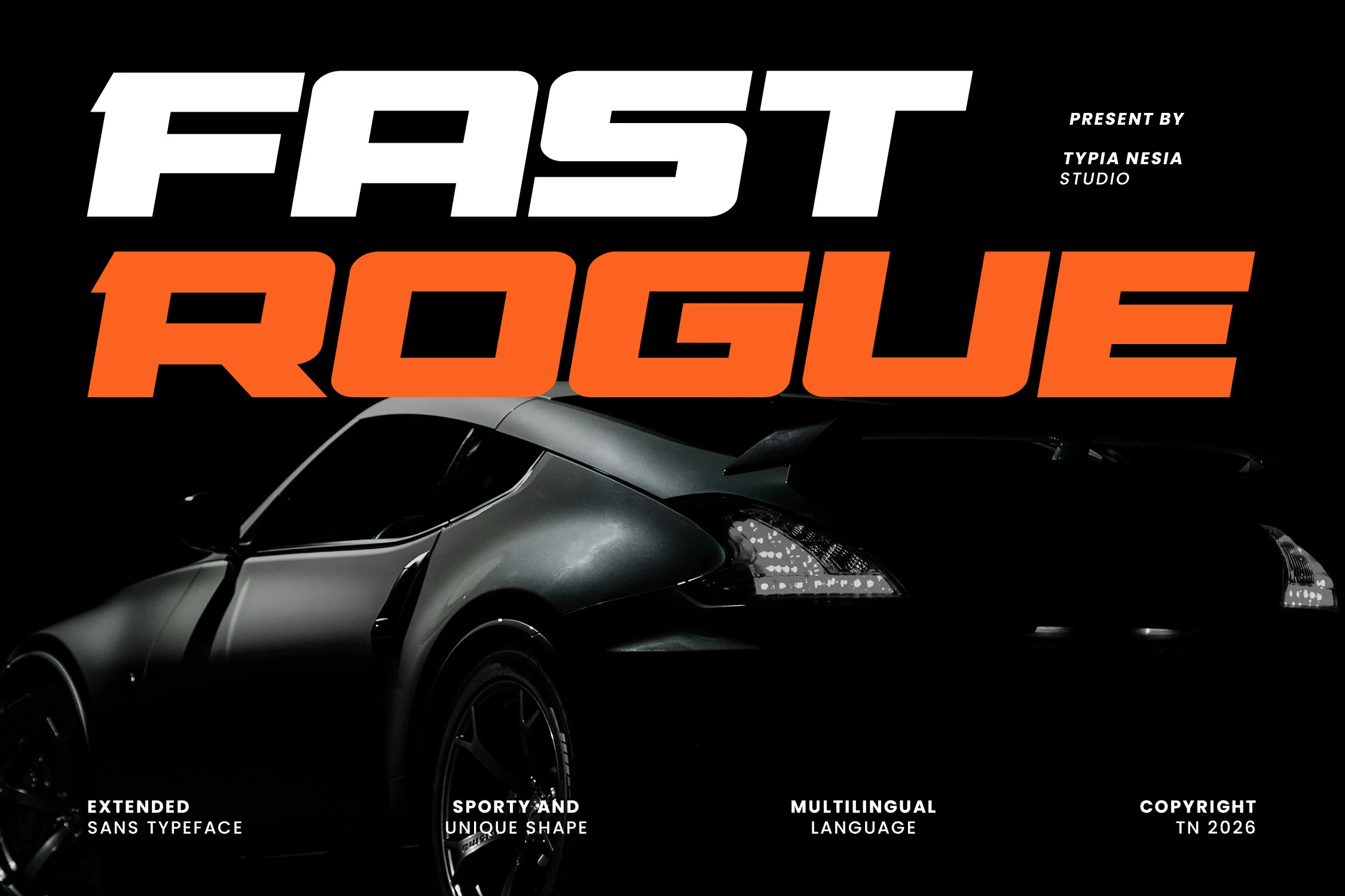
Best For: logos, posters, website headers, merch design
Fast Rogue Font is a wide italic sans with heavy block shapes, squared counters, and a forward-driving slant. Its expanded proportions make each word feel fast and mechanical, while the rounded corners keep the aggressive racing style from becoming too harsh.
Use it when Logo Fonts need speed, weight, and immediate recognition in short names, esports headers, posters, or automotive-style branding. The alternate characters help adjust key letters for a sharper custom mark, and the broad forms need firm contrast so the italic movement stays readable.
Premium Signature Font
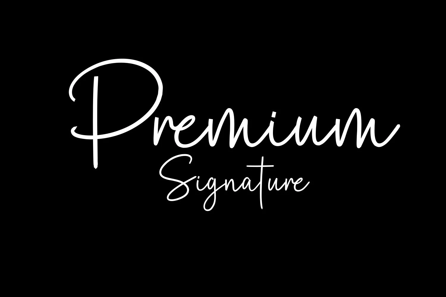
Best For: logos, wedding designs, personal branding, website headers
Premium Signature Font has a smooth handwritten flow with a tall looping capital P, rounded joins, and relaxed monoline strokes that keep the script airy rather than ornate. The larger first word paired with the lighter Signature line gives it a polished, personal feel that reads clearly while still looking expressive.
For Logo Fonts, it works especially well on short names, photography watermarks, and refined website headers where the long ascenders can stay open and clean. Give it a little breathing room and pair it with a quiet sans or small serif for supporting text, so the signature movement stays elegant instead of turning fussy.
Airfly Font
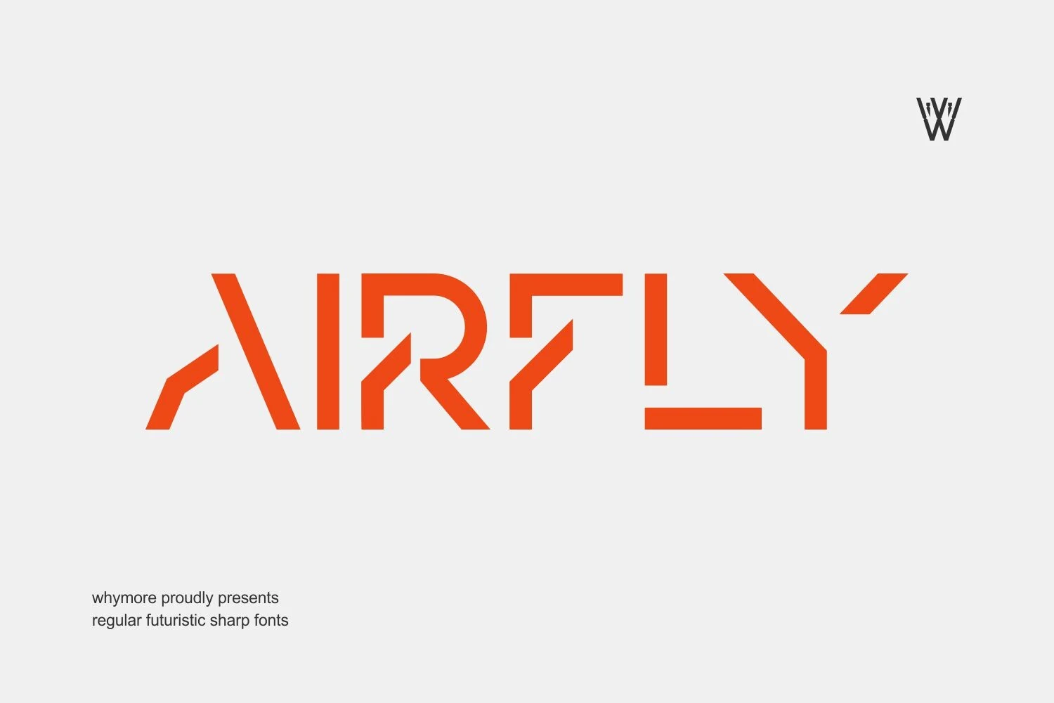
Best For: logos, branding, website headers, modern designs
Airfly Font uses sharp geometric cuts, segmented strokes, and compact futuristic proportions to create a precise digital look. The angular gaps inside letters like A, R, and F give the wordmark a technical rhythm, while the clean weight keeps the shapes readable at display sizes.
For Logo Fonts, it fits tech branding, modern headers, and identity marks that need structure rather than decoration. Keep the spacing controlled and avoid cramped layouts, because the sliced letterforms need clear negative space for the futuristic details to register cleanly.
Beardsons Font
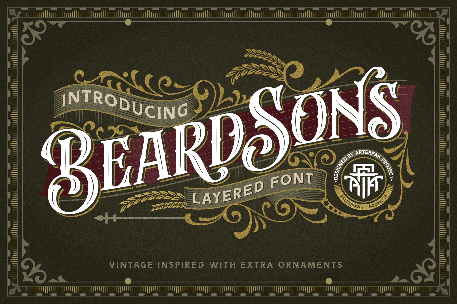
Best For: logos, posters, badges, vintage designs
Beardsons Font blends blackletter drama with a vintage sign-painter mood, using tall serifed capitals, curled terminals, and a layered engraved look that feels rich and theatrical. The sweeping B and S bring strong character, while the sharp inner cuts stop the ornament from feeling loose.
For Logo Fonts, it works best in short names, poster titles, and badge-style layouts where the decorative details stay visible. Keep the wording concise and pair it with simpler supporting text, so the flourishes and contours lead the hierarchy instead of crowding the design.
Pogonia Font
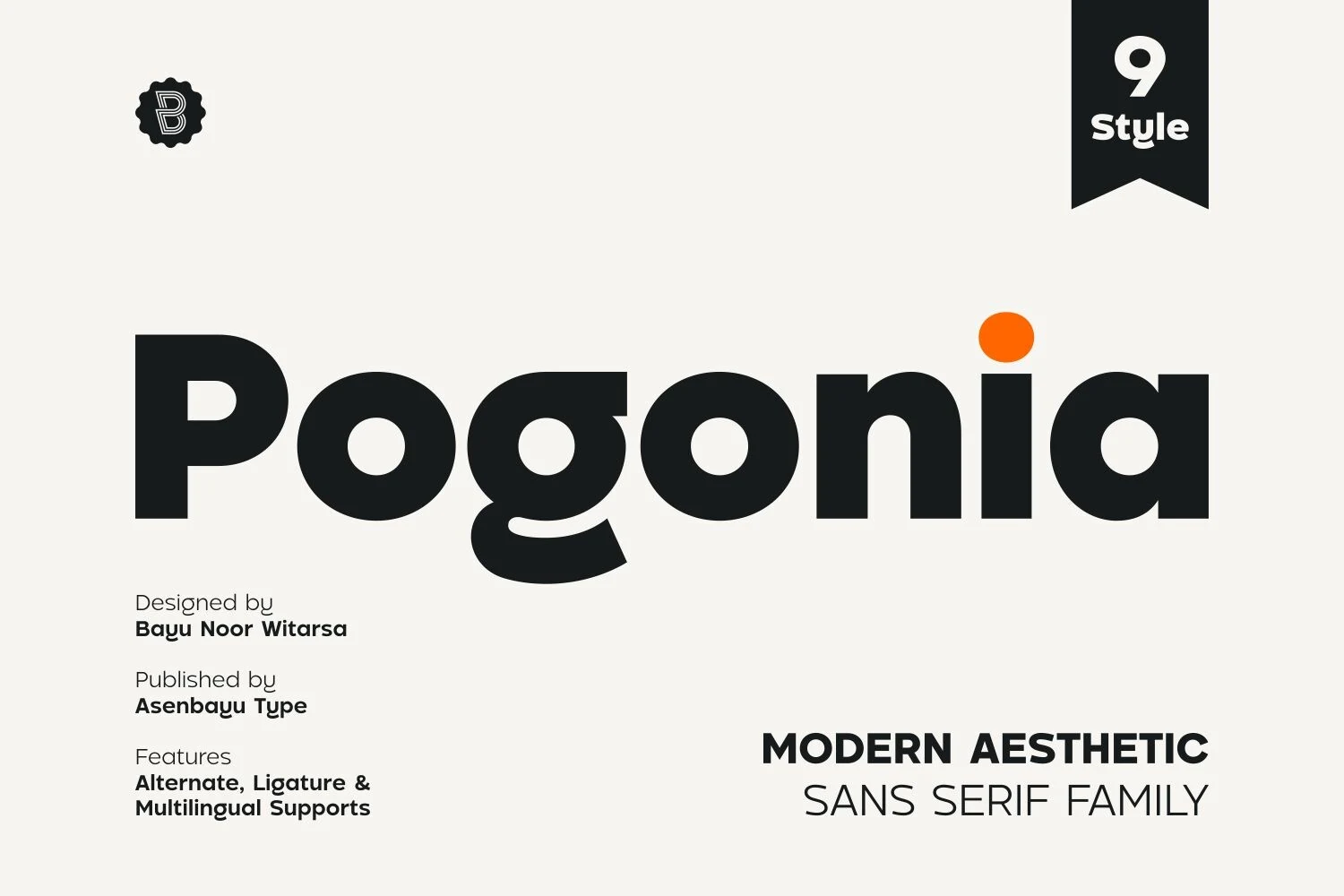
Best For: logos, branding, posters, social media graphics
Pogonia Font is a bold rounded sans serif with geometric bowls, soft terminals, and a distinctive single-storey g that gives the wordmark a more human rhythm. Its heavy weight feels confident without turning rigid, so the letterforms suit clean identity work and strong display lines.
Use it when Logo Fonts need a modern aesthetic rather than sharp tech aggression. The open counters and generous proportions hold up well in posters, social graphics, and fashion-oriented branding; keep supporting text lighter so the main wordmark carries the hierarchy.
Whiskey Font
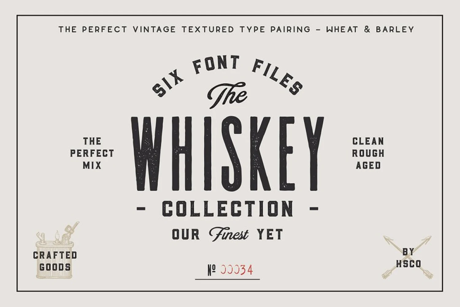
Best For: logos, packaging, posters, vintage designs
Whiskey Font is a tall condensed sans serif with a worn texture, narrow proportions, and a sturdy vintage print feel. The straight-sided capitals and slightly aged finish give it the character of old packaging and label work, while the overall structure stays clean enough to read clearly in bold display settings.
Within Logo Fonts, it suits badge marks, bottle labels, posters, and packaging that need a nostalgic shop-made tone. Keep it on short words or stacked lines, then pair it with a small script or a simpler secondary sans so the textured letters carry the hierarchy without making the layout feel heavy.
Cloud Font
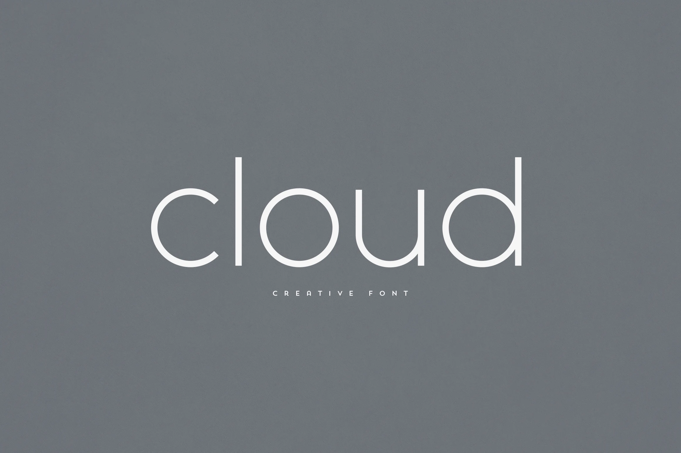
Best For: logos, branding, website headers, minimal designs
Cloud Font is a light rounded sans serif with slim monoline strokes, open spacing, and soft circular forms. The open c, wide o, and tall d give the wordmark a calm modern rhythm, making the style feel clean without becoming sterile.
For Logo Fonts, it works best in minimal branding, website headers, and short headline settings where the thin strokes can stay crisp. Use generous letter spacing and strong background contrast; the airy proportions lose impact when crowded by dense layouts or heavy supporting type.
Slathers Font
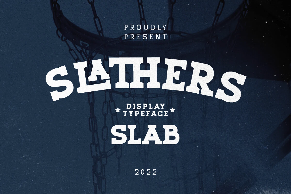
Best For: logos, branding, T-shirts, signage
Slathers Font has the weight and attitude of a classic varsity slab serif, with chunky block forms, arched display energy, and sturdy square serifs that make every word feel athletic and grounded. The family comes in Regular and Bold, and the extra ligatures help common letter pairs sit more smoothly in team-style names and custom-looking marks.
Within Logo Fonts, it shines in sports branding, merch, and bold headline work where short words need to feel strong at a glance. Use the Bold cut for the main name and the Regular for supporting lines; that split creates a clear hierarchy while keeping the rugged collegiate rhythm intact, and its multilingual support helps carry the same look across different languages.
Fear Logo Font
Best For: logos, branding, website headers, modern designs
Fear Logo Font uses bold geometric capitals, wide letter spacing, and clean sci-fi cuts to create a sharp digital identity style. The open A, squared E, and compact R give the wordmark a futuristic rhythm that feels controlled rather than decorative.
Use it when Logo Fonts need a direct technology signal for artificial intelligence, robotics, digital interfaces, or sci-fi campaigns. Keep the word count short and the contrast strong; the spaced construction works best when the letters have enough room to read as a precise system.
Aisling Logo Edition Font
Best For: logos, branding, posters, editorial designs
Aisling Logo Edition Font is a tall condensed display sans with broad vertical strokes, narrow counters, and a clean monoline build that gives it an assertive modern presence. The simplified geometry keeps the weight controlled, so even at a large scale it feels polished rather than bulky.
For Logo Fonts, it works especially well in short brand names, bold headlines, and editorial title lines where height can drive the hierarchy. Keep surrounding text lighter and slightly more open, because the compressed proportions create the strongest contrast when they sit against smaller, quieter support type.
Designer Font
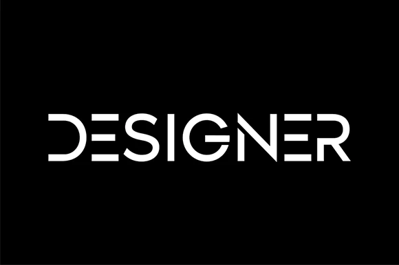
Best For: logos, branding, website headers, modern designs
Designer Font is a clean display sans with segmented strokes, rounded terminals, and a controlled futuristic rhythm. The broken E, open D, and angular N give the wordmark a technical edge, while the even stroke weight keeps the overall arrangement simple and readable.
Use it when Logo Fonts need a modern identity without heavy ornament or aggressive styling. It works best on short names, tech headers, and clean brand marks; keep letter spacing deliberate and avoid crowded supporting text so the stencil-like cuts remain clear.
The right Logo Fonts can change how quickly a design feels recognizable, professional, or memorable. Whether you need a bold poster title, a refined brand mark, a vintage label style, or a clean modern wordmark, these 43 fonts give you a wide range of directions to test in your next project.
All of these designs are available on Creative Fabrica, so you can explore the full font files, try different styles, and choose the one that fits your brand concept best. Use this collection as a starting point, compare the letterforms carefully, and build logo designs with stronger typography and clearer visual impact.