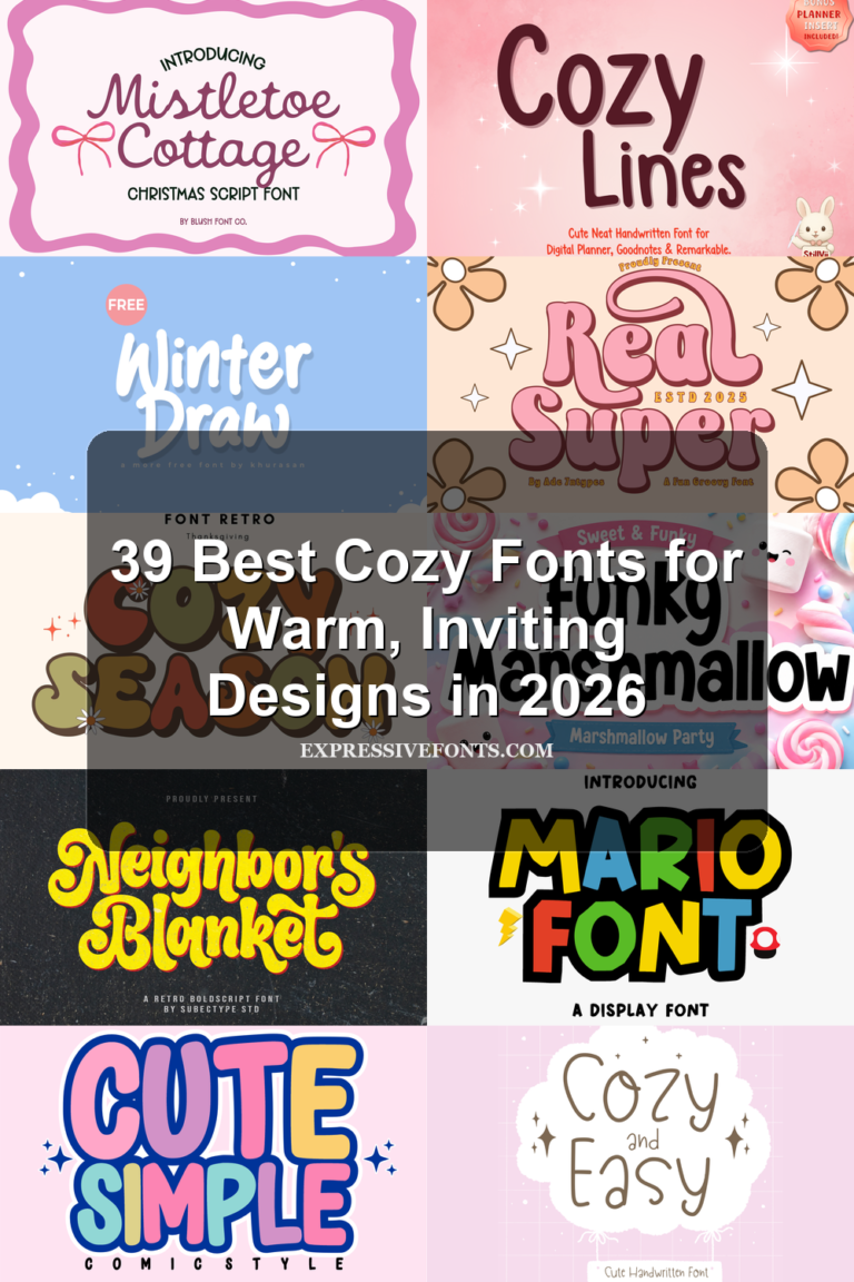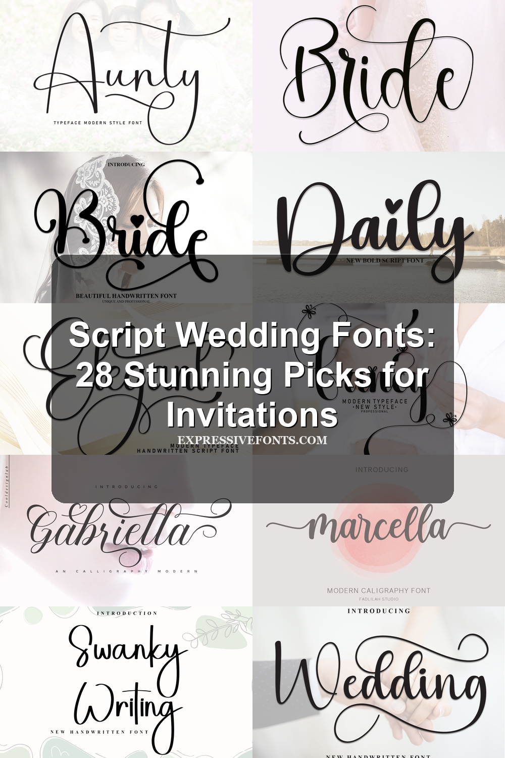
Script Wedding Fonts: 28 Stunning Picks for Invitations
Script Wedding Fonts help designers choose graceful, romantic type for invitations, signage, logos, and wedding stationery. This collection covers elegant calligraphy, bold handwritten scripts, sweet decorative styles, and display-ready options for polished event designs.
Looking for more wedding fonts? Browse our complete Wedding Fonts collection to compare elegant, romantic, modern, vintage, boho, script, and calligraphy styles.
Flourished & Calligraphy Script Wedding Fonts
These ornate scripts use dramatic swashes, tall loops, and calligraphy contrast for formal invitations, name layouts, and elegant wedding stationery.
Wedding Font
Best For: invitations, wedding designs, romantic designs, feminine designs
Wedding Font uses a bold handwritten script with tall rising strokes, smooth rounded joins, and a dramatic underline swash that gives short words a finished composition. Its classic calligraphy influence is visible, but the fuller weight and contemporary curves keep it from feeling overly formal.
For Script Wedding Fonts, this one works best when the swashes are treated as part of the layout rather than decoration added afterward. Keep surrounding text lighter and more spaced out so the thick downstrokes, looped descenders, and long horizontal flourish can carry the title hierarchy cleanly.
Fancy Font
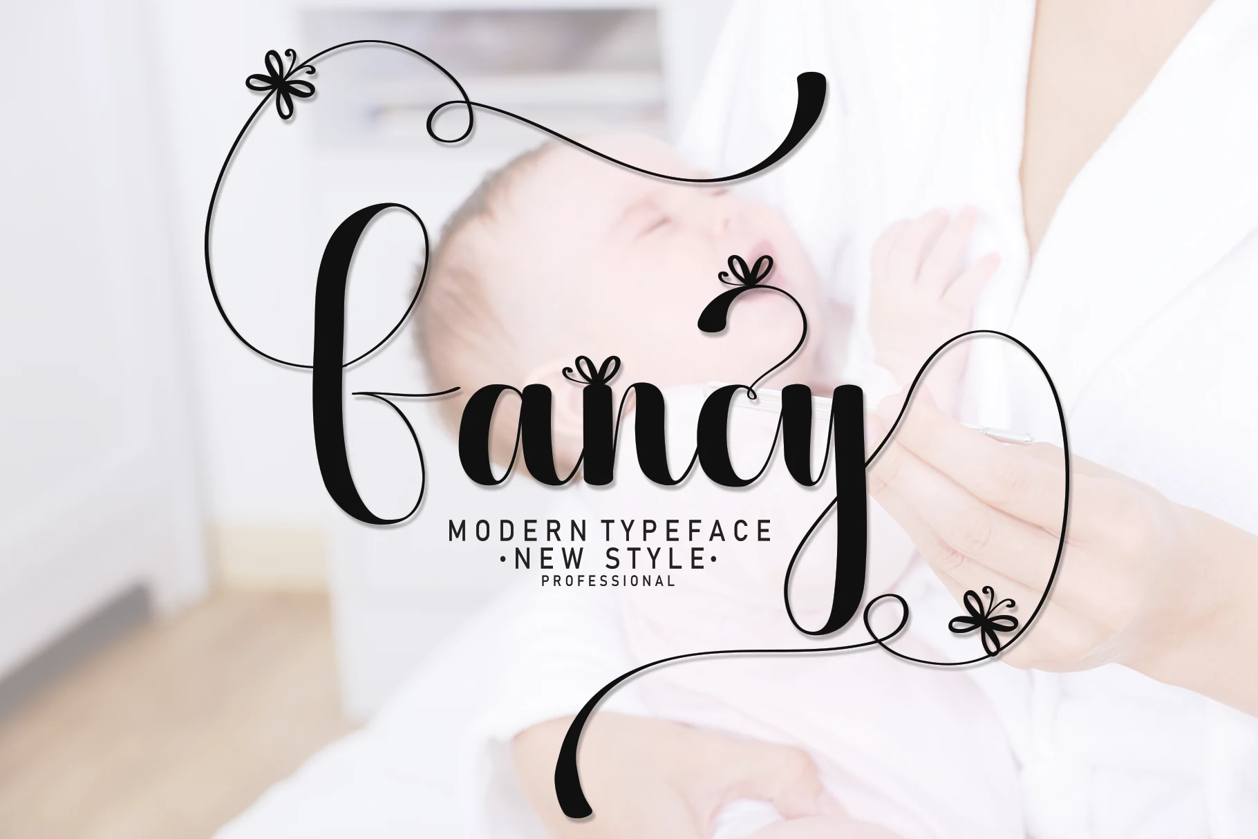
Best For: invitations, wedding designs, romantic designs, feminine designs
Fancy Font has a flowing handwritten look with dramatic contrast, pairing full rounded strokes with hairline connectors that keep the wordshape smooth and polished. The standout feature is its ornamental flourishes: long looping swashes and tiny flower-like accents that make the letterforms feel decorative rather than casual.
In Script Wedding Fonts, this style works best as a focal display face for names, monograms, or short headings. Give the swashes room to frame the composition, and keep supporting text simple and compact so the tall stems, deep descenders, and delicate curls stay crisp instead of competing for space.
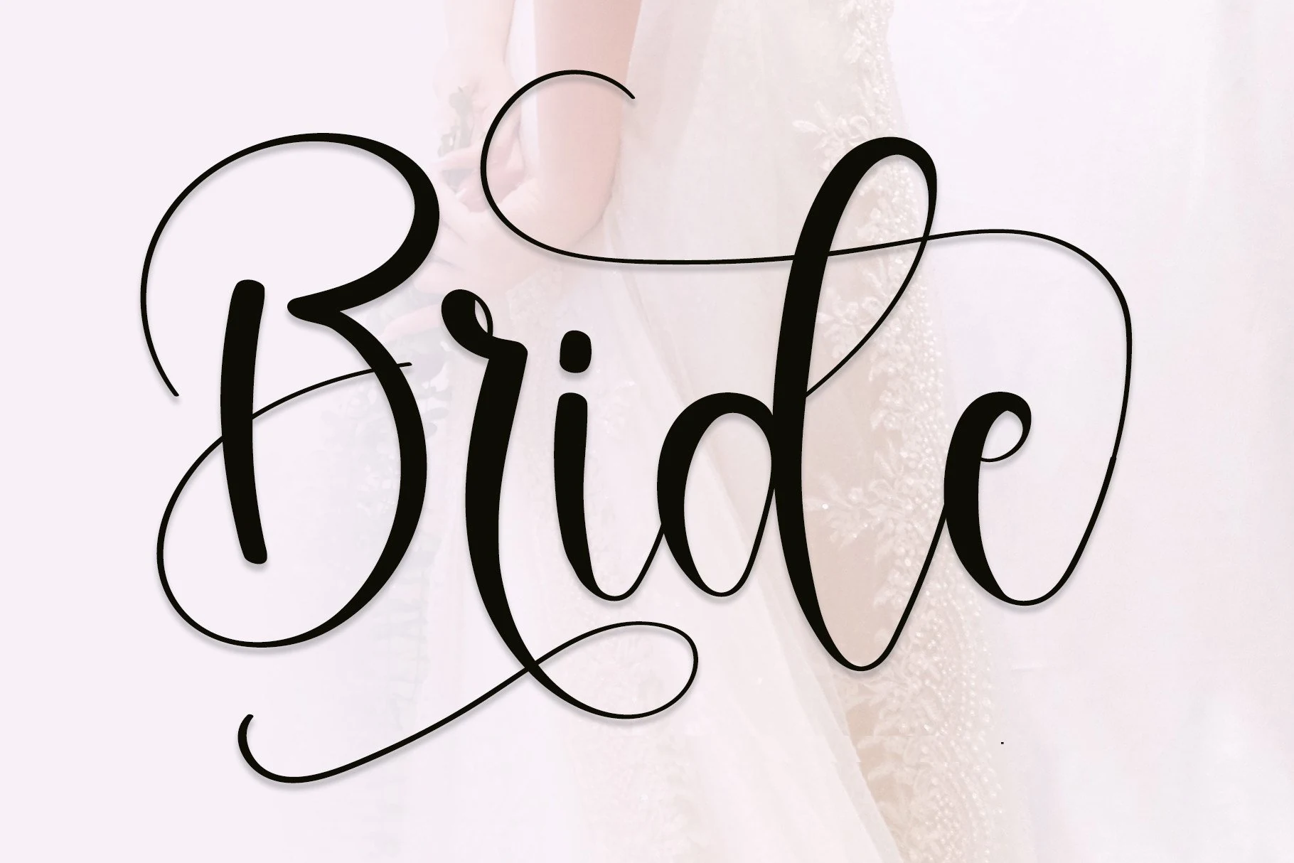
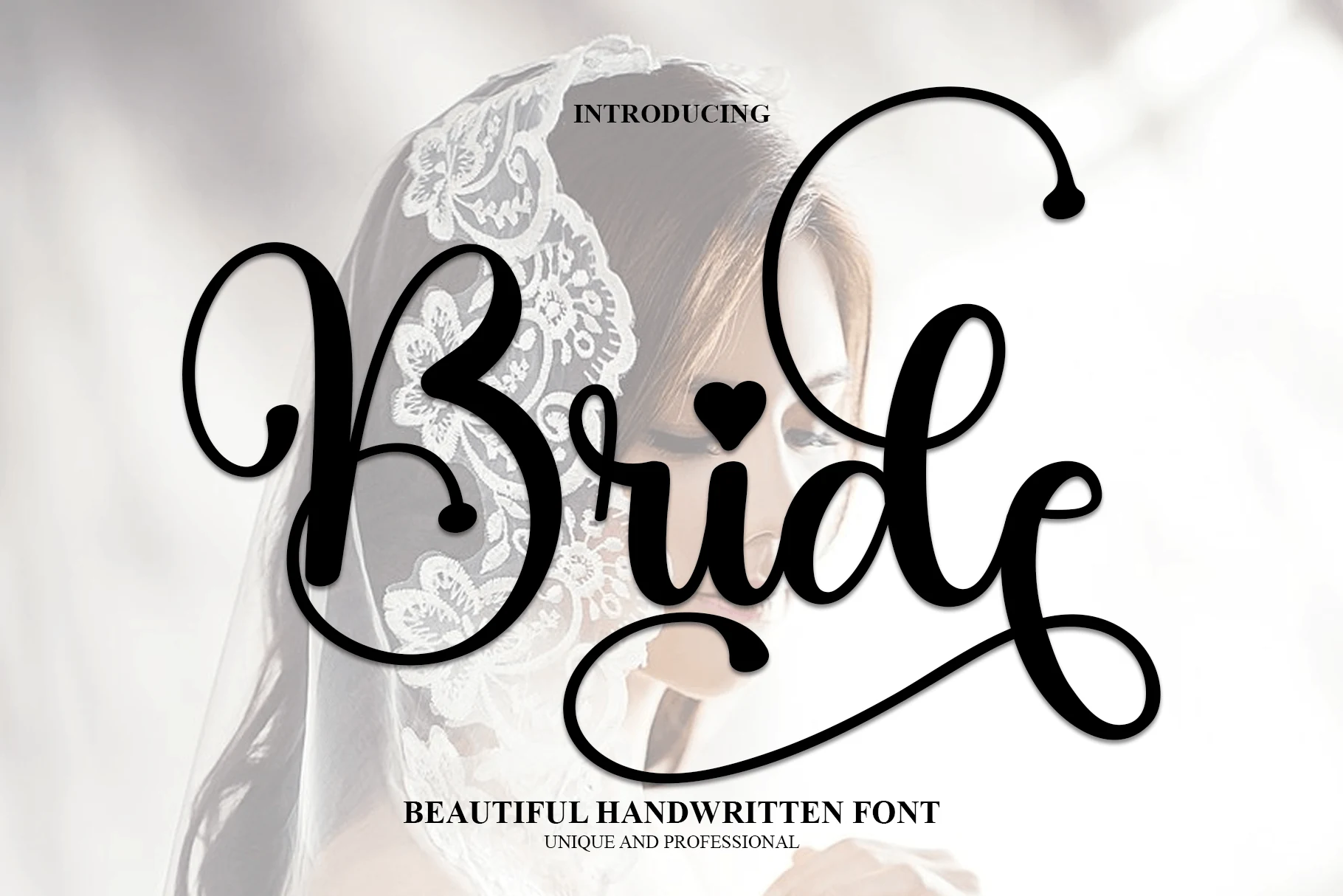
Bride Font
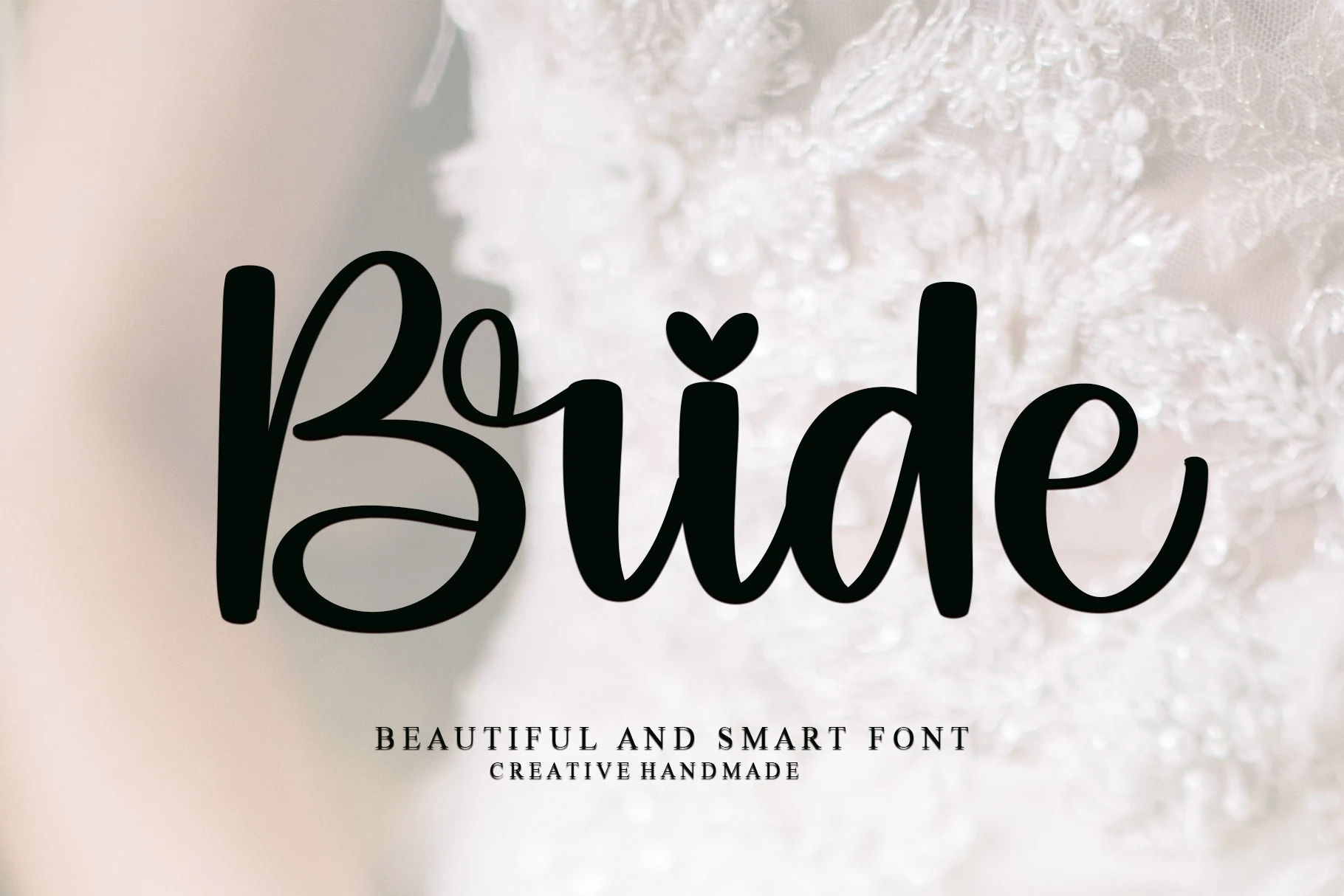
Best For: invitations, wedding designs, romantic designs, feminine designs
Bride Font has a high-contrast handwritten style with slender hairlines, weighty vertical strokes, and sweeping swashes that turn a single word into a full composition. The oversized capital B and extended terminal strokes give it a romantic, airy rhythm, while the smooth curves keep the script polished rather than fussy.
Within Script Wedding Fonts, it reads best in short lines where the flourishes have room to travel without tangling into nearby elements. Pair it with restrained small caps or a clean serif, and leave generous side margins so the long cross-strokes and looped descenders frame the layout instead of crowding it.
Fantasy Font
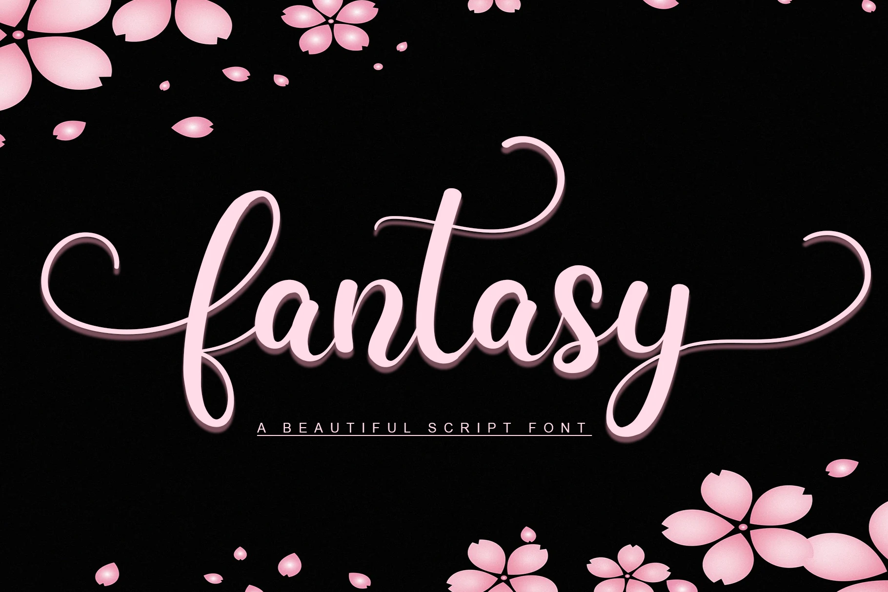
Best For: invitations, wedding designs, romantic designs, feminine designs
Fantasy Font leans into a polished script look with rounded strokes, a soft slant, and sweeping flourishes that stretch from the opening f through the tall t and final y. The fuller curves keep it readable, while the calligraphic movement gives the lettering a graceful, dressed-up tone.
For Script Wedding Fonts, this one works best when you let the swashes shape the composition, especially in names, invitation titles, or short quote lines. Keep surrounding text lighter and well spaced so the extended crossbar, looped descenders, and smooth joins can create hierarchy without tangling the layout.
Elegant Font
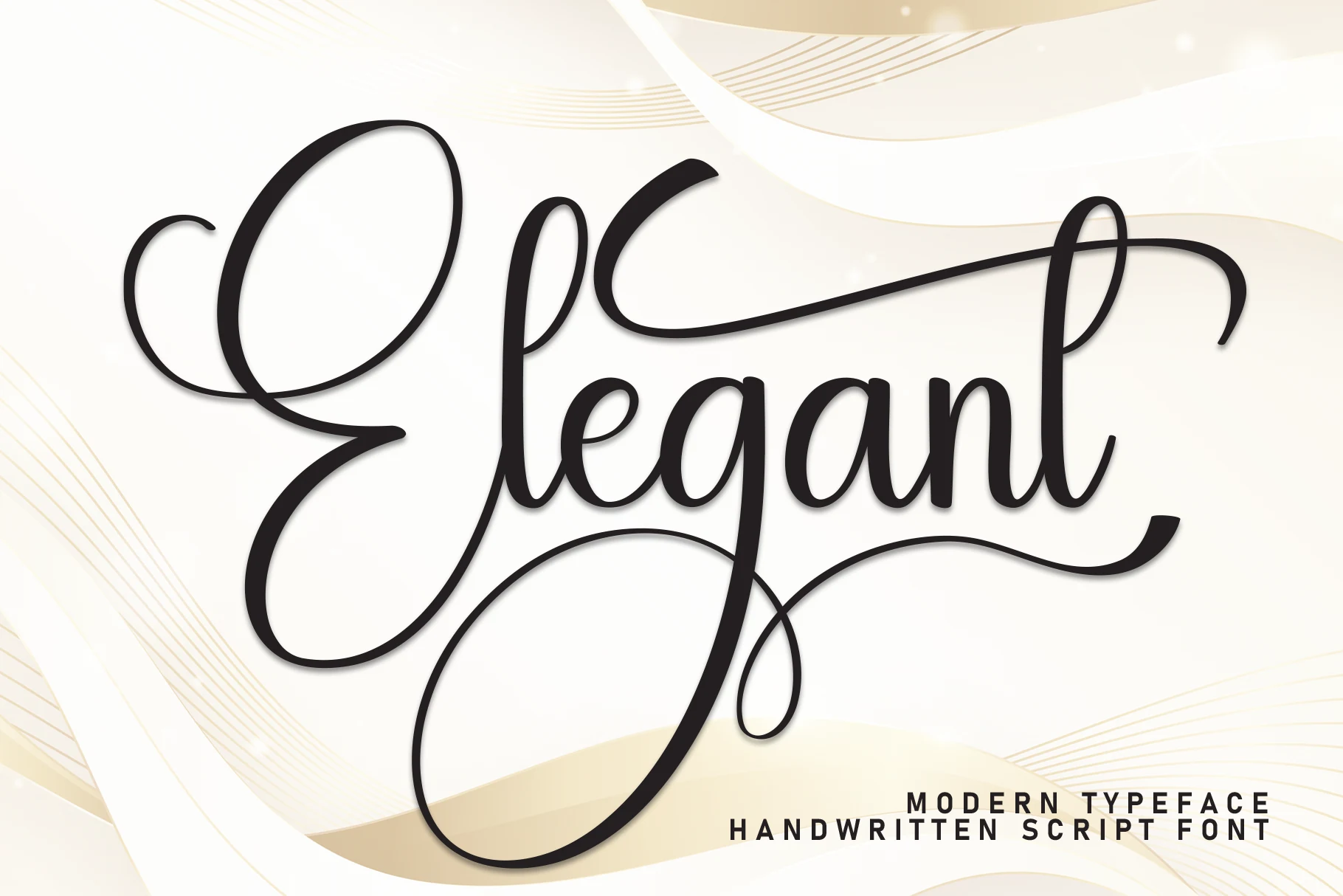
Best For: invitations, wedding designs, romantic designs, feminine designs
Elegant Font has a refined script structure with a towering capital E, narrow oval counters, and smooth strokes that keep the lettering airy but controlled. The long top flourish and deep looping descender add movement, while the clean rhythm stops it from feeling overly ornate.
In Script Wedding Fonts, it works especially well for names, invitation headers, and signage where the swashes can shape the composition. Keep the wording short and the supporting text restrained, because the extended upper stroke and large lower loop already create a strong title hierarchy on their own.
Gabriella Script Font
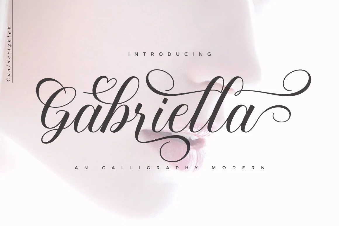
Best For: invitations, wedding designs, romantic designs, feminine designs
Gabriella Script Font has a polished calligraphy look with fine hairlines, fuller downstrokes, and bold swashes that stretch confidently across the word. The tall ascenders and curled terminals give it a graceful silhouette, while the connected rhythm keeps the lettering smooth and expressive rather than overly formal.
For Script Wedding Fonts, this one works best when you let the flourishes do part of the layout work, especially in names, invitation titles, and statement headings. Keep supporting text smaller and simpler, because the long entry strokes and looping finish already create strong movement and a clear focal point.
Bride Font
Best For: wedding designs, invitations, logos, short phrases
Bride Font uses a high-contrast script style with heavy downstrokes, narrow joins, and long hairline swashes that wrap around the word with a formal, decorative rhythm. Its oversized loops give it strong display presence, while the tighter middle letters keep the name shape compact enough for covers, tags, and headline-style wedding pieces.
For Script Wedding Fonts, this one works best when the swashes are treated as part of the layout rather than extra ornament. Keep surrounding text clear of the capitals and descenders, and use strong contrast between the lettering and background so the thin strokes do not disappear at smaller sizes.
Intelligent Font
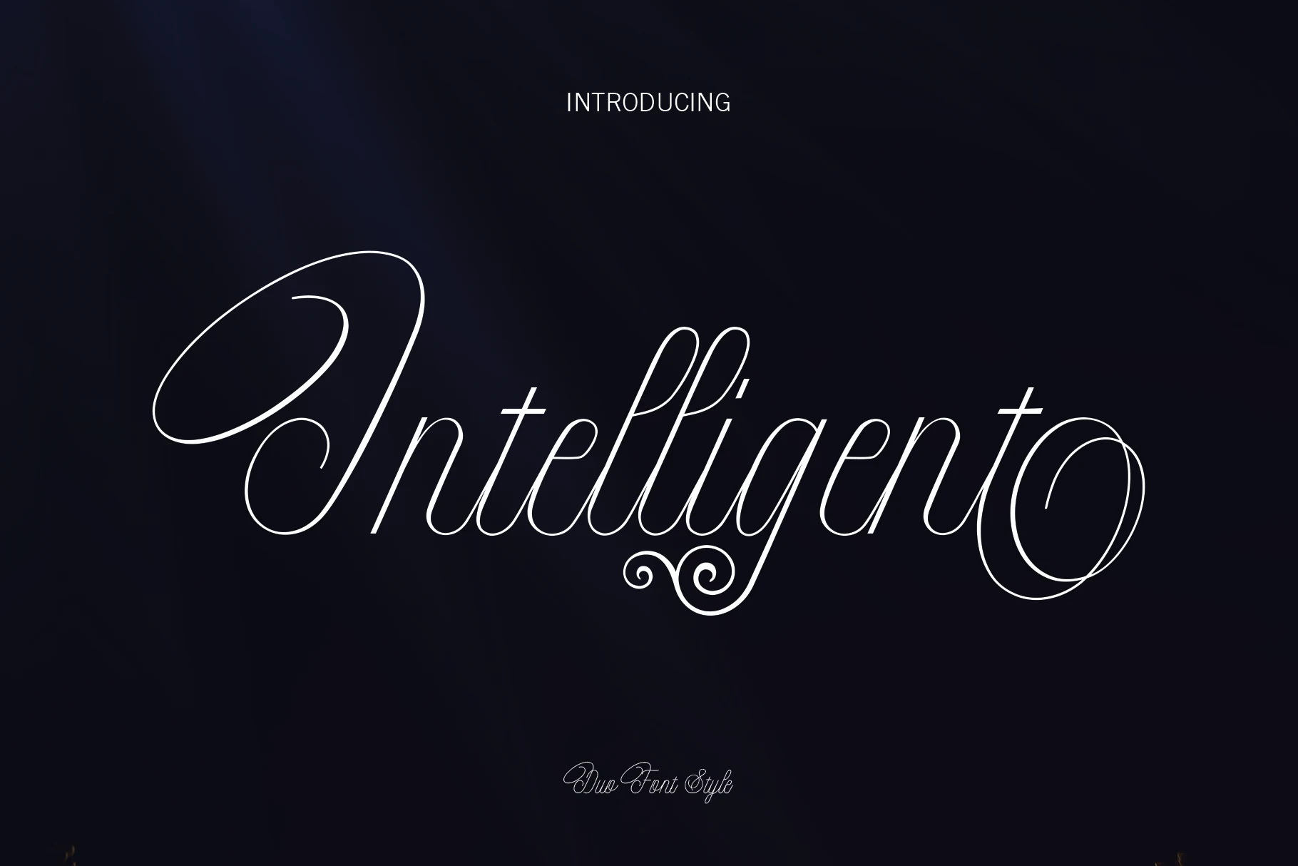
Best For: wedding designs, invitations, social media graphics, romantic designs
Intelligent Font has a refined calligraphic look built from very thin strokes, tall ascenders, and long sweeping swashes that stretch the word into an elegant signature. The generous oval loops and light contrast give it an airy rhythm, while the ornamental curl beneath the center adds decoration without crowding the main letterforms.
Within Script Wedding Fonts, it works best for names, invitations, and headline-style stationery where the alternates can shape a more custom finish. Keep it at display size and pair it with a restrained serif or sans, because the hairline terminals and extended flourishes need contrast and breathing room to stay crisp.
Romantic & Sweet Script Wedding Fonts
These softer scripts bring rounded strokes, heart accents, watercolor texture, and gentle movement for affectionate cards, quotes, and romantic event designs.
Be Mine Font
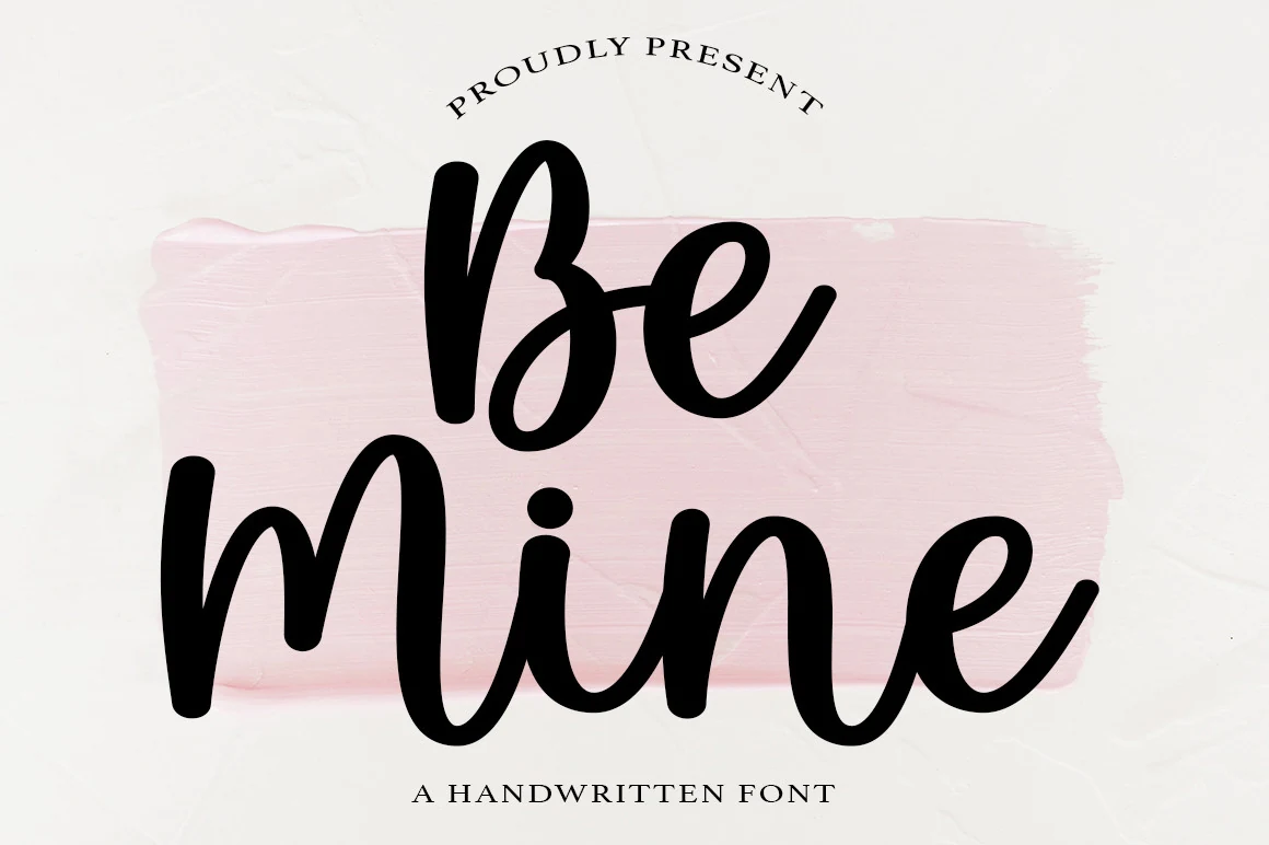
Best For: invitations, wedding designs, romantic designs, social media graphics
Be Mine Font has a bold handwritten look with rounded strokes, open counters, and a smooth connected rhythm that keeps it friendly and easy to read. The letterforms feel relaxed rather than delicate, with enough weight to hold up clearly in display settings and enough softness to keep the overall tone romantic.
For Script Wedding Fonts, it works especially well when you want a warmer, less formal title style for invitations or love-themed branding. Keep the wording short and pair it with a lightly spaced serif or simple uppercase secondary line, which helps the thick curves and clean joins stay prominent without making the layout feel heavy.
Daily Font
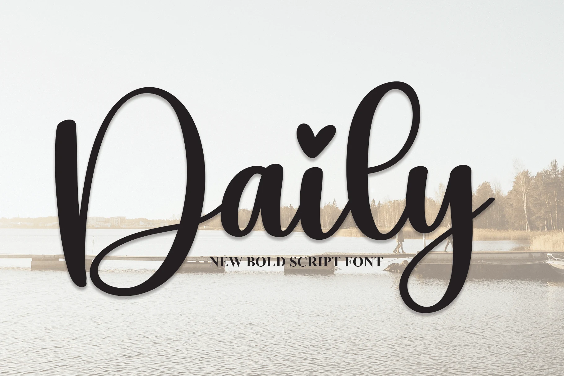
Best For: invitations, wedding designs, social media graphics, wall art
Daily Font has a bold handwritten style with broad strokes, rounded joins, and an oversized looping capital that gives it an easy, welcoming presence. The heart-shaped dot over the i adds a sweet accent, while the smooth rhythm keeps the wordmark readable even at a large display size.
In Script Wedding Fonts, this one works well for headings that need warmth without heavy ornament. Use it for names, invitation titles, or signage, then balance it with a crisp serif or spaced uppercase line so the sweeping entry stroke and long y descender can anchor the hierarchy without crowding the layout.
Bride and Groom Font
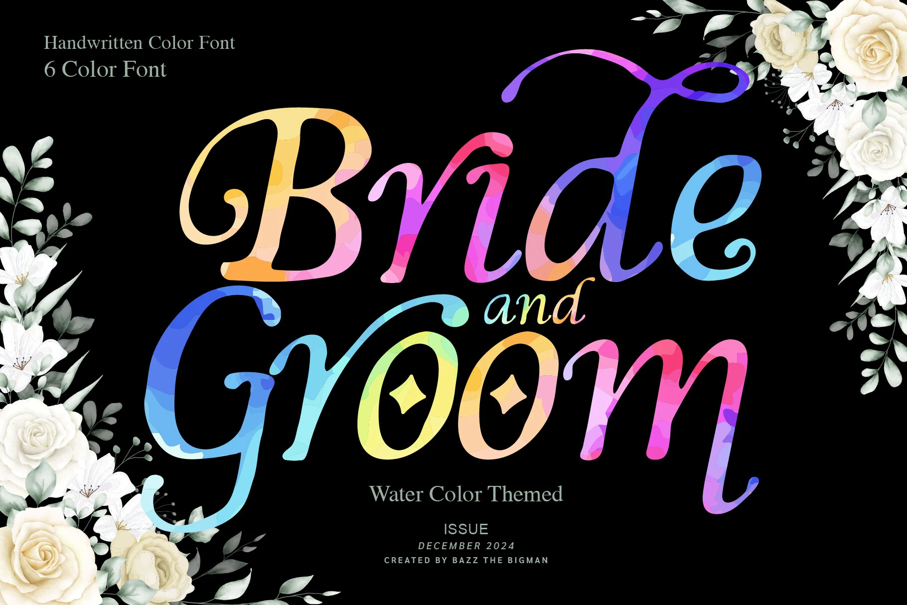
Best For: invitations, wedding designs, artistic designs, romantic designs
Bride and Groom Font stands out with broad script curves, long rising swashes, and a watercolor color fill that makes the lettering feel painterly rather than flat. The thick-to-thin rhythm stays graceful, while the multicolor treatment gives even simple words a more celebratory, decorative presence.
In Script Wedding Fonts, this style is strongest when the lettering itself becomes the artwork, especially on cards, quotes, or event pieces with minimal extra decoration. As a color font, it already carries texture and contrast, and the included swashes and glyph access help when you want a more customized headline without building the flourish work by hand.
Melissa Font
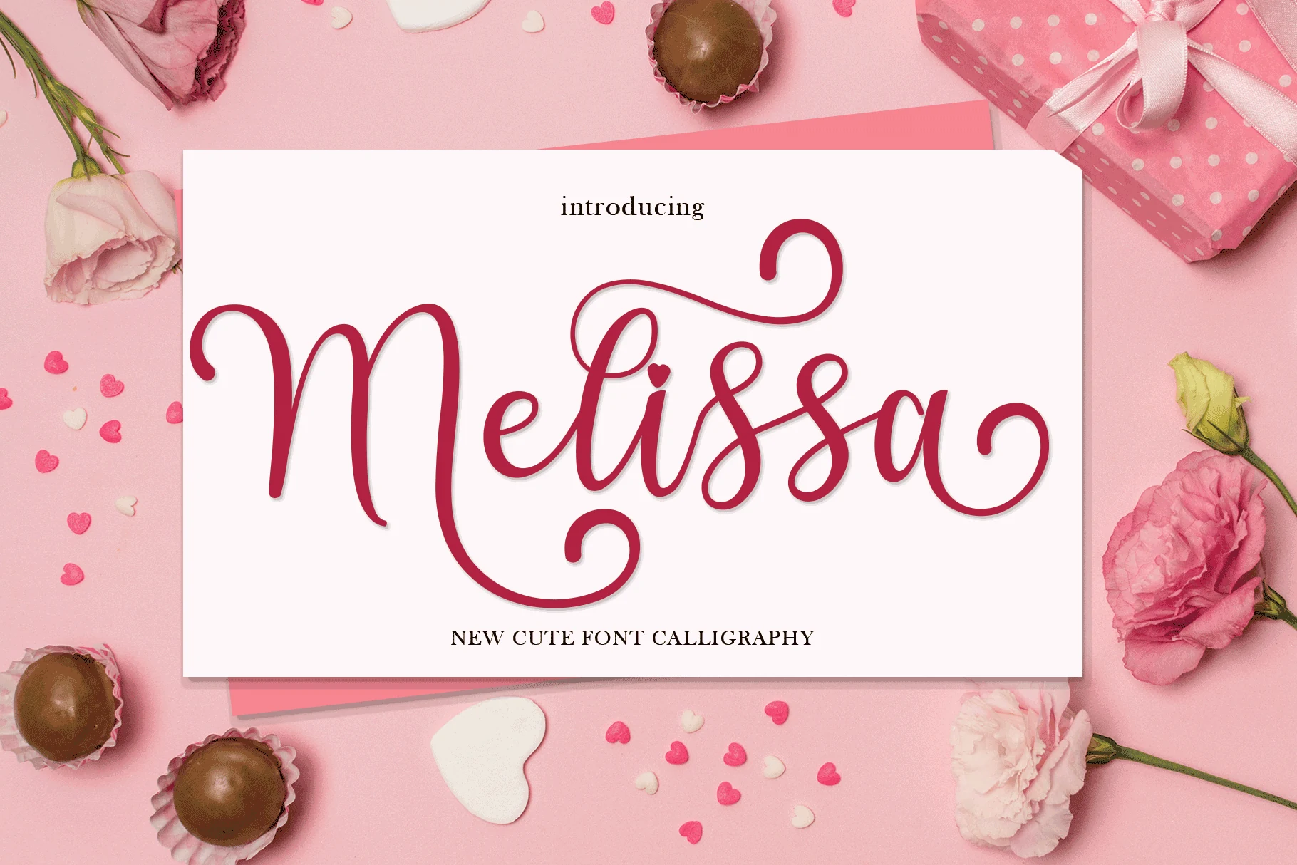
Best For: invitations, wedding designs, romantic designs, feminine designs
Melissa Font has a sweet calligraphy style with rounded downstrokes, loose connecting lines, and curled terminals that give the lettering a soft romantic rhythm. The heart accent over the i reinforces its affectionate tone, while the tall initial M adds enough scale to make a name or short phrase feel complete.
For Script Wedding Fonts, it works best in short titles where the flourishes can sit cleanly around the main word instead of colliding with extra copy. Use generous line spacing and a quiet secondary font so the thin entry strokes, looped descenders, and decorative curls stay readable on invitations, cards, or social graphics.
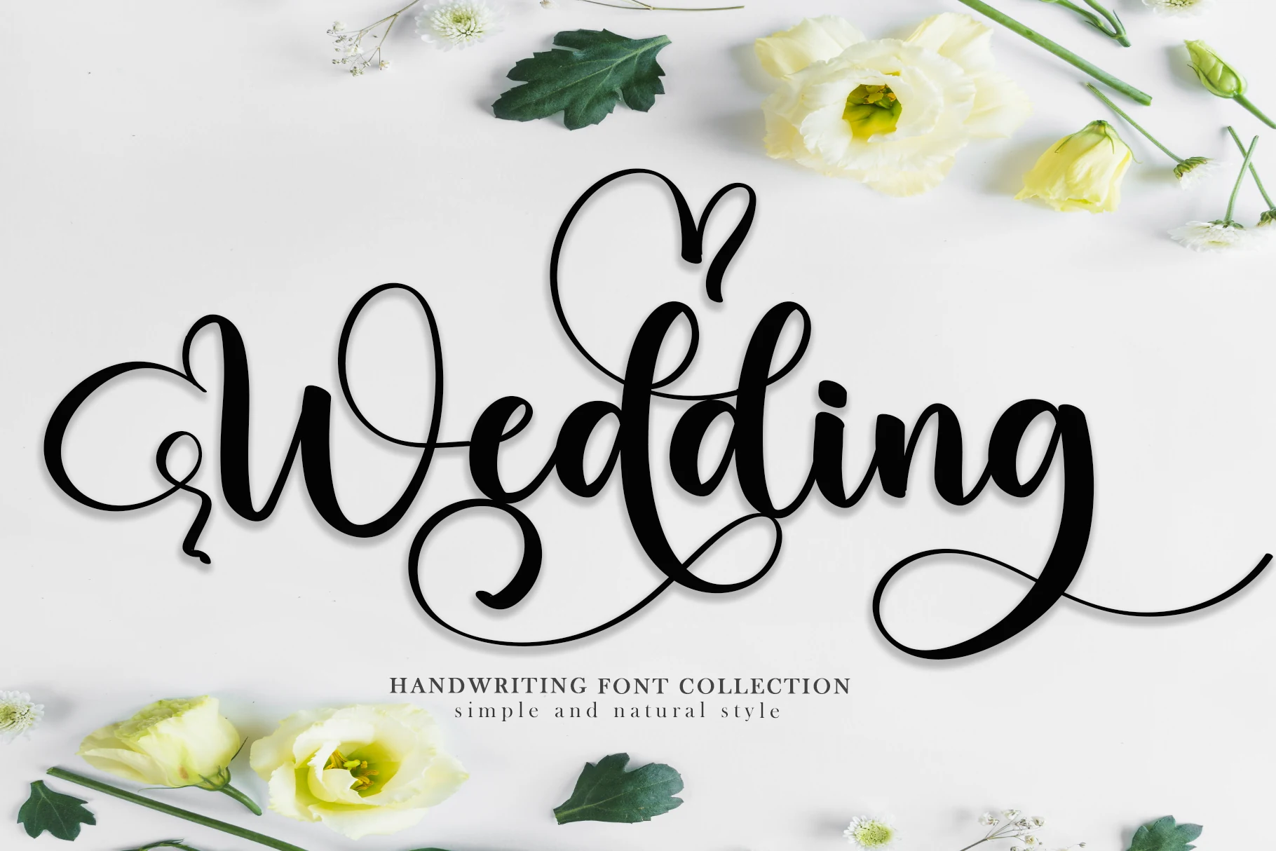
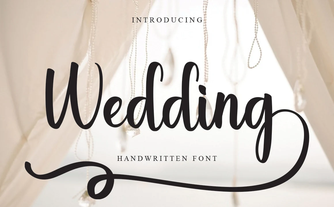
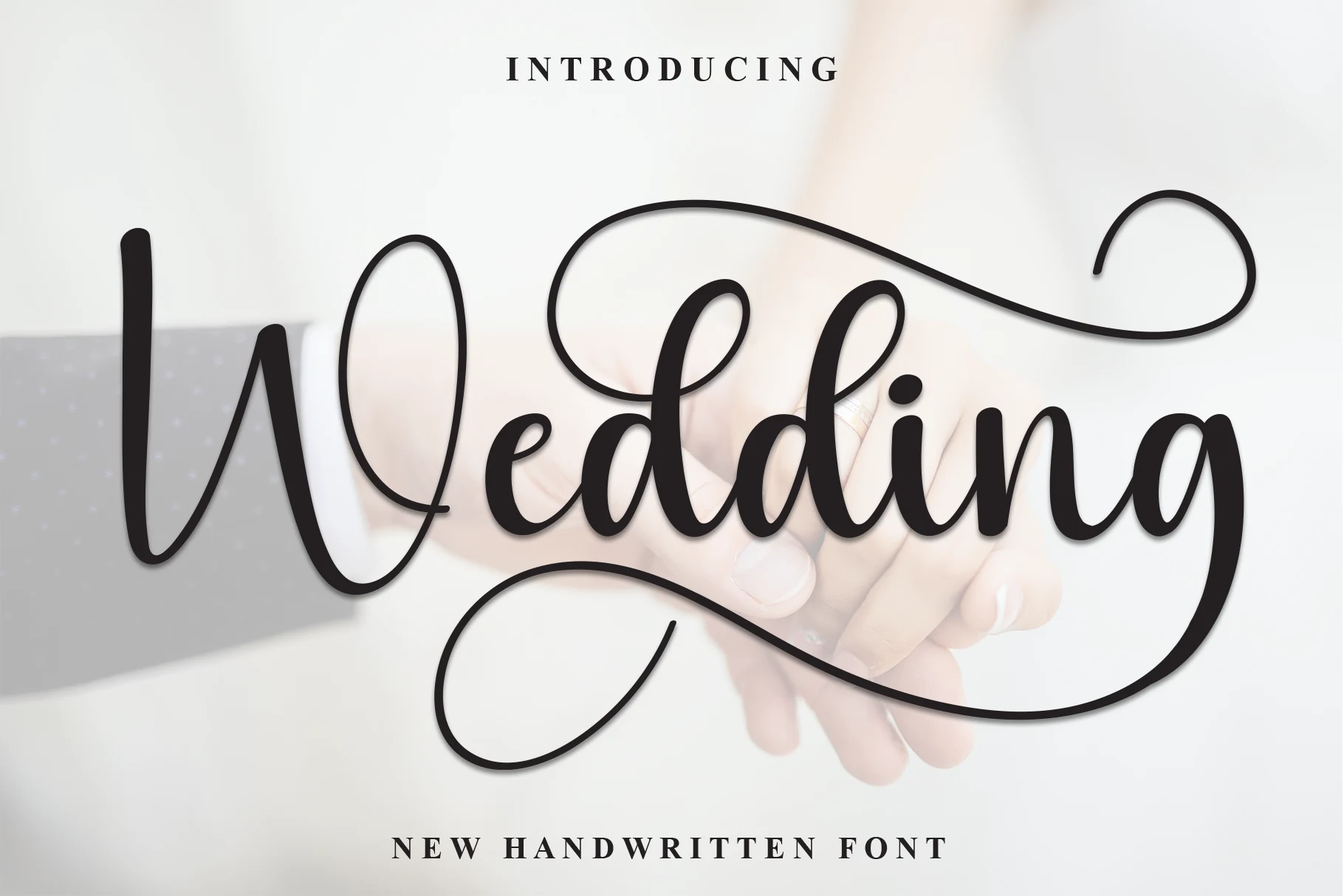
Wedding Font
Best For: wedding designs, invitations, short phrases, romantic designs
Wedding Font has a cheerful handwritten style with broad rounded strokes, tall upright forms, and a smooth connected rhythm that keeps the word easy to read. The oversized opening swash and long finishing underline give it a playful sense of movement, so even a single name feels dressed for the page.
Within Script Wedding Fonts, this one is especially effective for invitations and short phrases where the flourish can frame the layout. Let the script carry the spotlight, and keep the secondary text smaller and well spaced so the underline and deep descender have enough room to breathe.
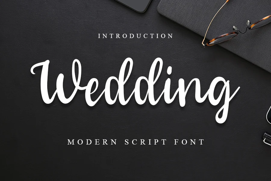
Wedding Font
Best For: wedding designs, invitations, wall art, social media graphics
Wedding Font has a smooth handwritten look with thick rounded strokes, tall upright forms, and a flowing baseline that keeps the word readable even with its dramatic finish. The oversized opening swash and long underline create a framed, display-ready shape that feels romantic without becoming overly ornate.
For Script Wedding Fonts, it works especially well on invitation titles, wall art, and logo-style social posts where the flourish can anchor the composition. Give the descender and underline plenty of room, and pair it with simple secondary text so the delicate flow stays clear instead of crowding the layout.
Airy & Modern Script Wedding Fonts
These cleaner scripts use open spacing, lighter strokes, and long horizontal swashes for modern invitations, editorial layouts, and refined feminine branding.
Swanky Writing Font
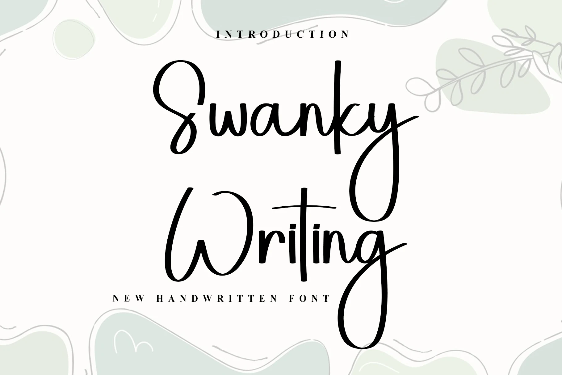
Best For: invitations, wedding designs, feminine designs, elegant designs
Swanky Writing Font has a tall handwritten script structure with slim upstrokes, fuller downstrokes, and open spacing that keeps the lettering light on the page. Its looping capital forms and extra-long descenders create a graceful vertical rhythm, giving the font a polished look without pushing it into heavy ornament.
For Script Wedding Fonts, it works especially well for names, invitation titles, and signage where the long y and g can help frame the composition. The refined ligatures keep connections smooth, but it benefits from restrained secondary text and enough line clearance so the swashes stay elegant rather than tangled.
Bride Font
Best For: invitations, wedding designs, feminine designs, social media graphics
Bride Font pairs slender hairlines with weighty vertical strokes and oversized swashes, giving the lettering a poised, feminine shape. The capital B opens wide into a looping entrance stroke, while the long top flourish and deep descender turn a short headline into a full composition.
For Script Wedding Fonts, it shines in invitation titles, florist branding, and elegant packaging where the flourishes can help frame the layout. Keep supporting copy smaller and well spaced, so the narrow counters and extended terminal strokes stay clear instead of crowding nearby text.
Aunty Font
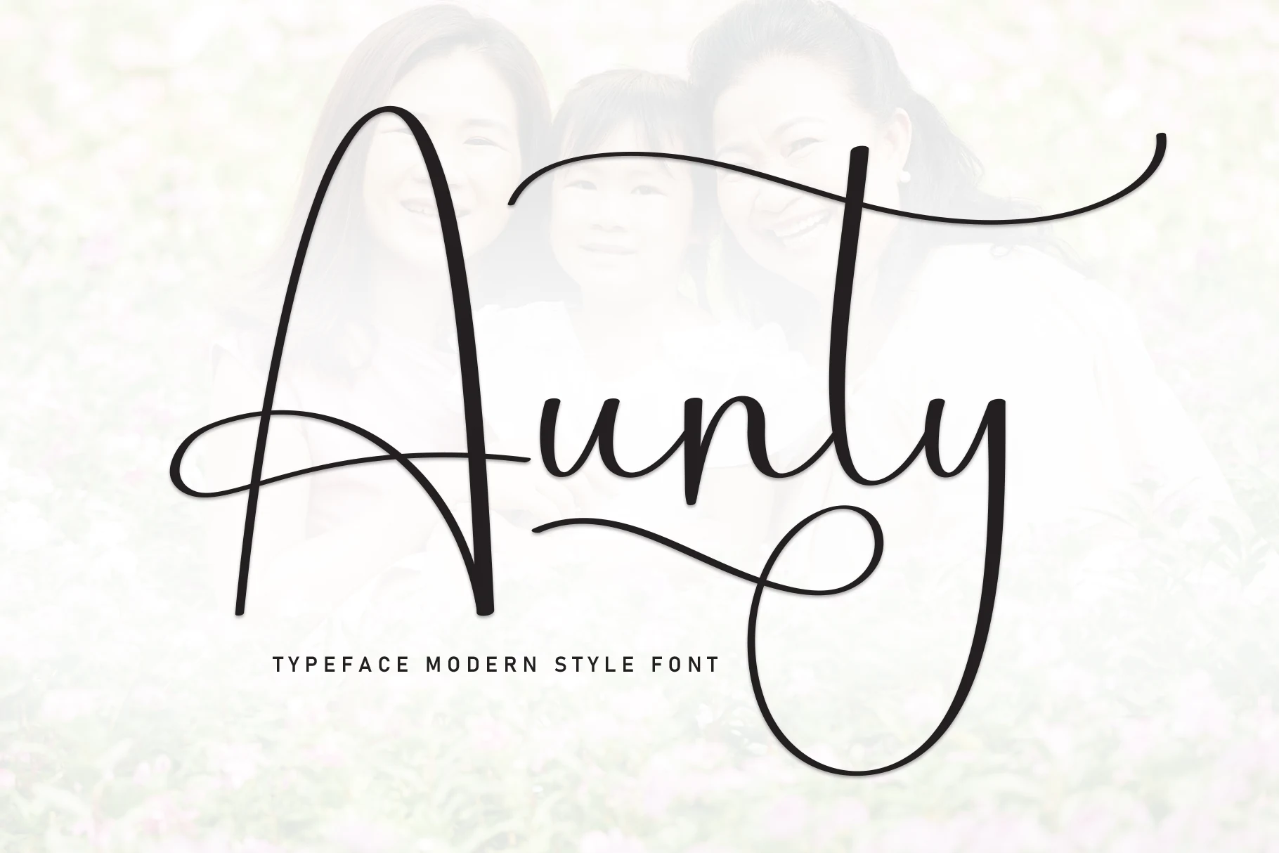
Best For: invitations, wedding designs, social media graphics, wall art
Aunty Font has a tall, airy handwritten style with slim strokes, rounded joins, and oversized swashes that give the wordmark a light modern rhythm. The capital A creates a strong first impression, while the high t and looping y keep the silhouette elegant without feeling stiff.
In Script Wedding Fonts, this one works best for short headlines where the long cross-stroke and lower loop can shape the layout. Leave extra side space and pair it with quiet supporting text, which helps the thin structure stay clear on invitations, wall art, and social media graphics.
Kamila Font
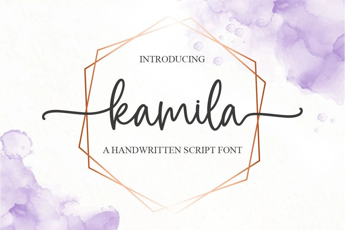
Best For: fashion branding, editorial designs, wedding designs, invitations
Kamila Font has a clean handwritten script style with smooth curves, even stroke weight, and long horizontal swashes extending from both sides of the word. The lowercase letters stay open and balanced, giving it a softer editorial feel than a highly ornamental calligraphy font.
For Script Wedding Fonts, Kamila works best when the swashes are used to frame names, invitation headers, or fashion-style titles. Its PUA encoding helps access glyphs and swashes for custom word shapes, but the layout still needs clear spacing around the side strokes so the line stays elegant rather than cramped.
Our Wedding Font
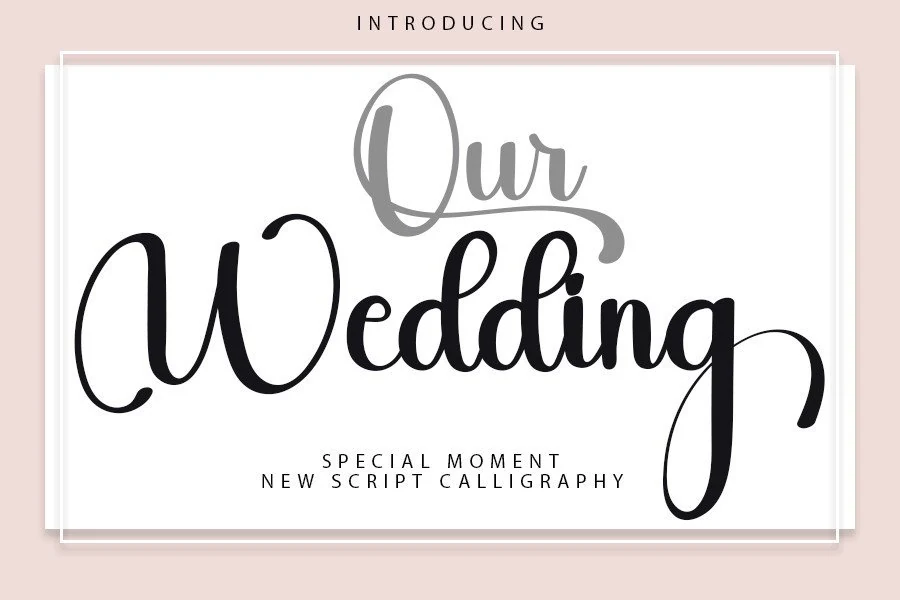
Best For: wedding designs, invitations, logos, romantic designs
Our Wedding Font blends classic calligraphy influence with a cleaner modern finish. The letterforms have smooth rounded bowls, balanced stroke weight, and a long descending g that gives the word a graceful tail, while the lighter “Our” layer shows how well the script handles overlap and decorative hierarchy.
In Script Wedding Fonts, this one feels especially polished for invitation titles, logos, and short romantic headings. It reads best when you give the descenders and upper swash enough clear space, and it pairs nicely with a restrained serif or spaced sans so the script keeps its elegant shape without looking crowded.
Marcella Font
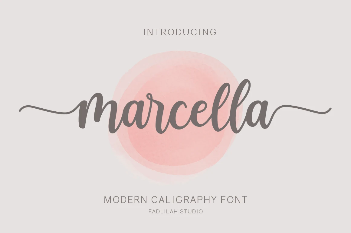
Best For: wedding designs, invitations, quotes, logos
Marcella Font has a smooth handwritten rhythm with rounded joins, medium weight strokes, and long side swashes that stretch the word into a calm, graceful shape. The letters stay open and friendly, so it feels polished without becoming formal or overly decorative.
Marcella fits naturally into Script Wedding Fonts thanks to its balanced flow and clean readability. It works especially well for invitation names, quote graphics, and small logo marks, and it benefits from airy spacing around the first and last letters so the horizontal swashes can frame the layout instead of crowding it.
Bold & Signature Script Wedding Fonts
These heavier handwritten scripts work when the title needs stronger presence, clear readability, and a personal signature feel across signage, logos, and headers.
Biography Font
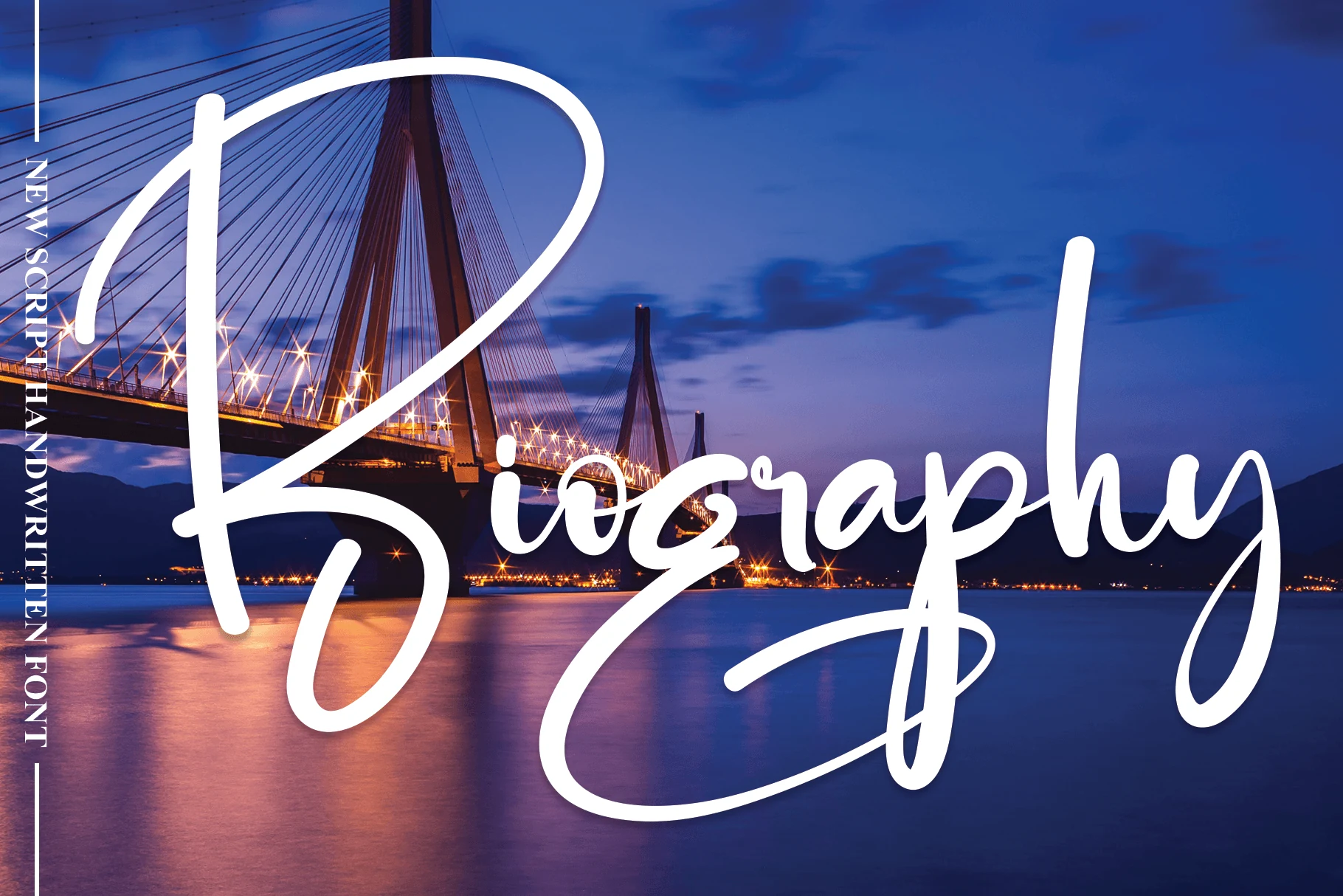
Best For: invitations, wedding designs, social media graphics, wall art
Biography Font has a bold handwritten look with a towering capital B, rounded stroke endings, and generous looping swashes that stretch across the word. The line weight stays smooth and even, which gives it a confident signature feel while keeping the letters easy to read at display size.
For Script Wedding Fonts, it works best when you let the long entrance and exit strokes define the layout. Keep the phrase short and leave extra side space, so the broad curves and sweeping descenders can frame invitations, signage, or social graphics without running into nearby text.
Wedding Font
Best For: wedding designs, invitations, logos, social media graphics
Wedding Font has a smooth, high-impact script look with thick rounded strokes, soft curves, and a flowing baseline that keeps the wordmark feeling polished rather than fussy. The letters connect cleanly, while the long finishing swash adds movement and gives short names or titles a more complete, signature-like shape.
In Script Wedding Fonts, this one stands out for its balance of warmth and clarity. It pairs well with a spaced serif for supporting text, and it benefits from generous room below the line so the underline flourish can read clearly instead of colliding with other elements in the layout.
Fantastic Font
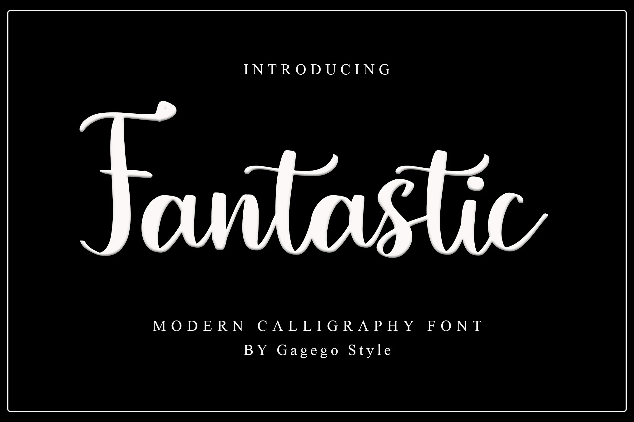
Best For: wedding designs, invitations, logos, signage
Fantastic Font has a lively handwritten rhythm with tall verticals, rounded joins, and a softly bouncing baseline that keeps the script warm rather than stiff. The capital F brings a gentle flourish, while the long cross-strokes and smooth connections give words a full, flowing shape that reads clearly at headline size.
For Script Wedding Fonts, this one works especially well on names, invitation titles, and logo-style wordmarks. Pair it with a spaced serif for the supporting text, and leave a bit of room around the ascenders and descenders so the dancing letterforms stay open instead of feeling cramped.
Playlist Font
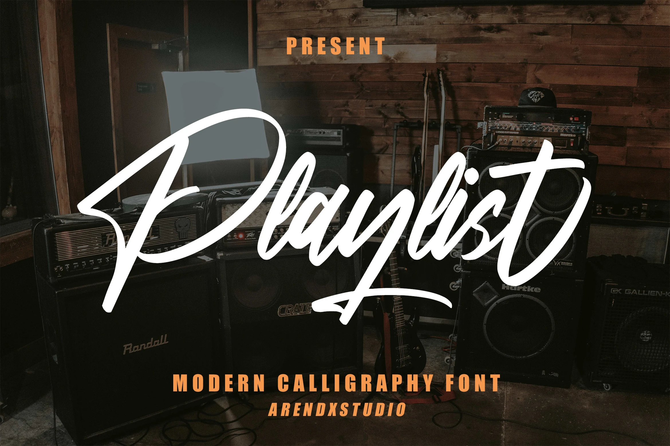
Best For: logos, branding, signage, headlines
Playlist Font has an energetic handwritten script style with broad white strokes, a sharp angled entry on the capital, and connected lowercase letters that move quickly across the line. Its weight is steady enough for logos and signage, while the varied pressure gives the wordmark a casual, performance-driven feel rather than a delicate calligraphy look.
As a Script Wedding Fonts pick, it suits informal names, reception signage, and themed invitation titles more than quiet stationery. Keep the supporting type compact and simple, then leave extra room around the long first stroke and low underline so the script keeps its speed without crowding the composition.
Vanilla Flavor Font
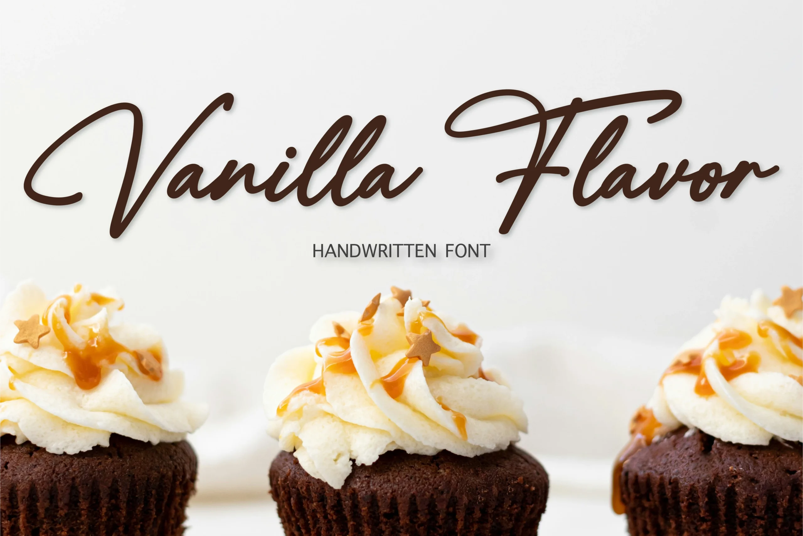
Best For: packaging, wedding designs, logos, invitations
Vanilla Flavor Font has a smooth handwritten script style with slim-to-medium strokes, a relaxed rightward slant, and long opening and crossbar swashes that give names a confident, signature-like shape. The capitals feel airy rather than ornate, while the connected lowercase keeps words readable and warm, which helps it sit comfortably on packaging, logos, and invitation titles.
If you’re browsing Script Wedding Fonts, this one works well when you want something personal without losing clarity. Use it at medium to large sizes, and pair it with clean supporting type so the wide V and extended T can lead the layout instead of competing with other decorative elements.
Retro & Display Script Wedding Fonts
These more graphic picks add chunky retro shapes, layered font pairing, and display contrast for wedding-adjacent branding, posters, labels, and standout headlines.
Gil Rose Font
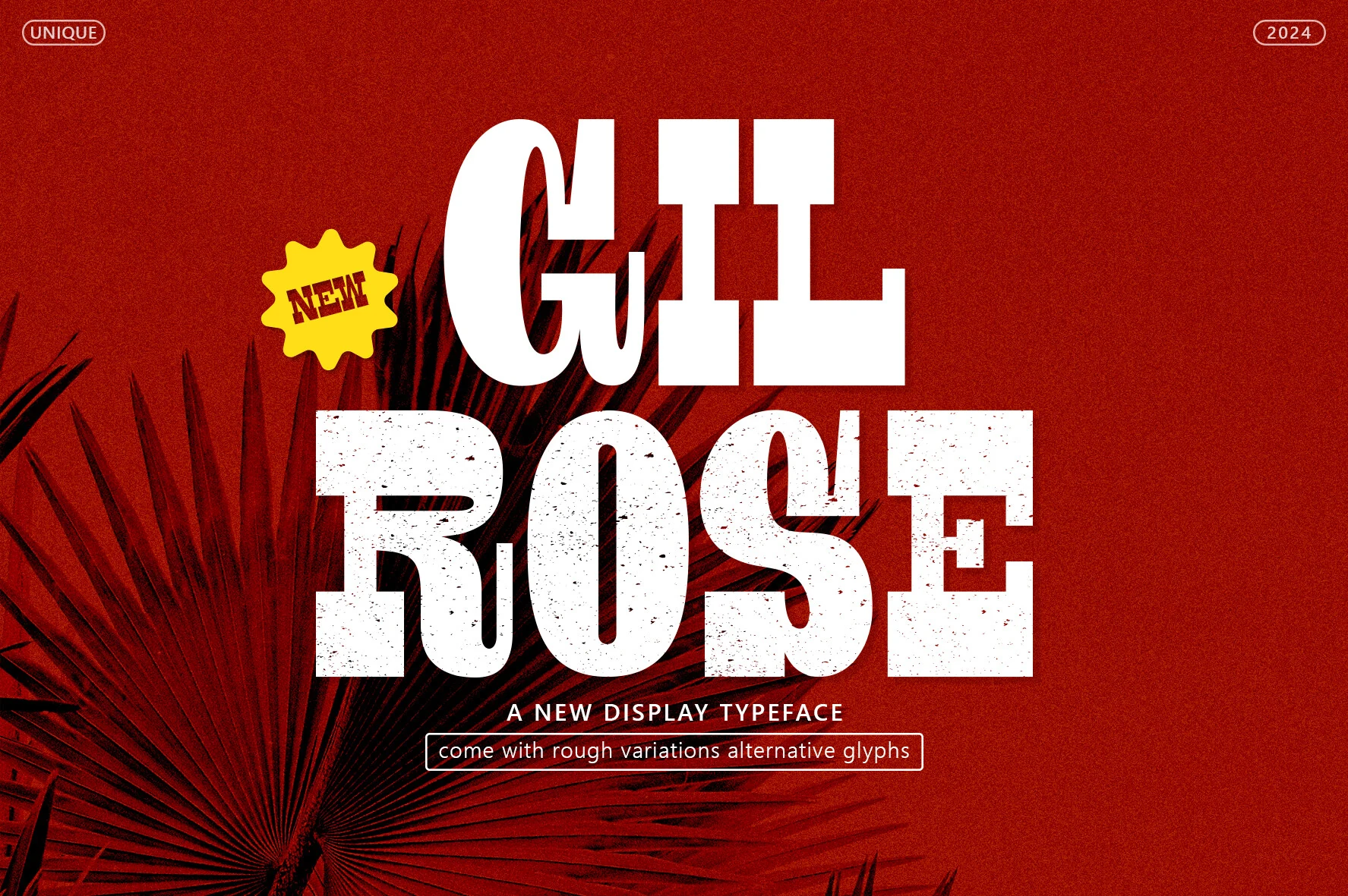
Best For: logos, posters, headlines, fashion branding
Gil Rose Font is a bold display style with chunky slab-like shapes, compact proportions, and a rough printed texture that gives large words immediate punch. The broad verticals and softened curves keep it lively rather than rigid, so it feels graphic and attention-grabbing without losing readability.
If your Script Wedding Fonts roundup needs contrast, this one works well as a supporting display face for headers, signage, or branded pieces around a more delicate script. Keep it to short phrases and larger sizes so the distressed texture stays clear, and pair it with a lighter font to balance its visual weight.
Reconcile Font
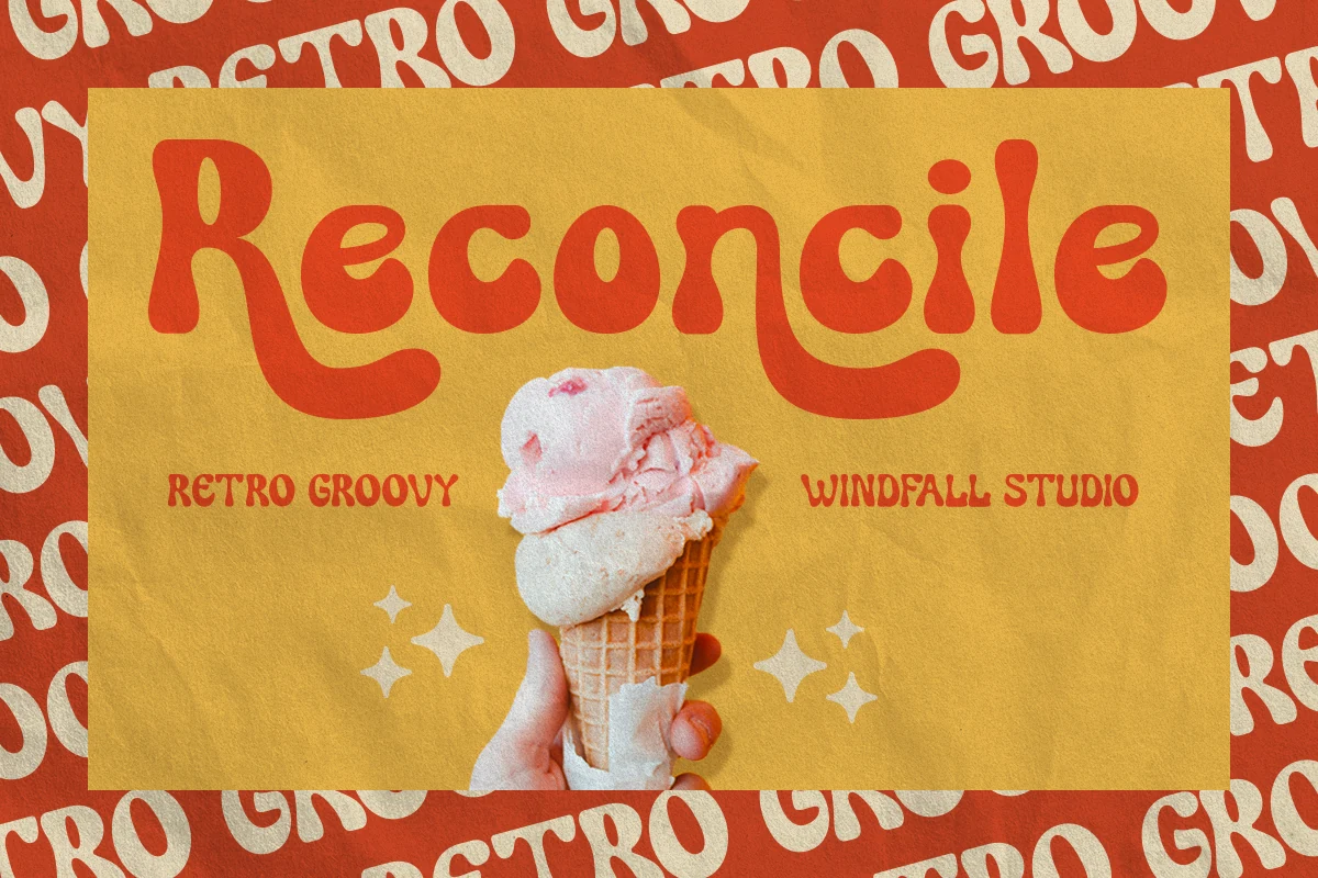
Best For: retro designs, posters, logos, playful designs
Reconcile Font leans into a retro groovy rhythm with chunky rounded strokes, soft inward curves, and exaggerated descenders that give each word a relaxed bounce. The wide bowls and slightly uneven flow keep it friendly and bold, so it lands best in large titles where the nostalgic shape of the letters can do most of the visual work.
In a Script Wedding Fonts roundup, Reconcile feels like the playful outlier rather than a formal calligraphy pick. Its thick forms carry color and texture well, which makes it especially useful for posters, labels, or branding where you want a warm vintage mood and enough spacing for the quirky terminals and sweeping tails to stay clear.
Beauty Calinea Font
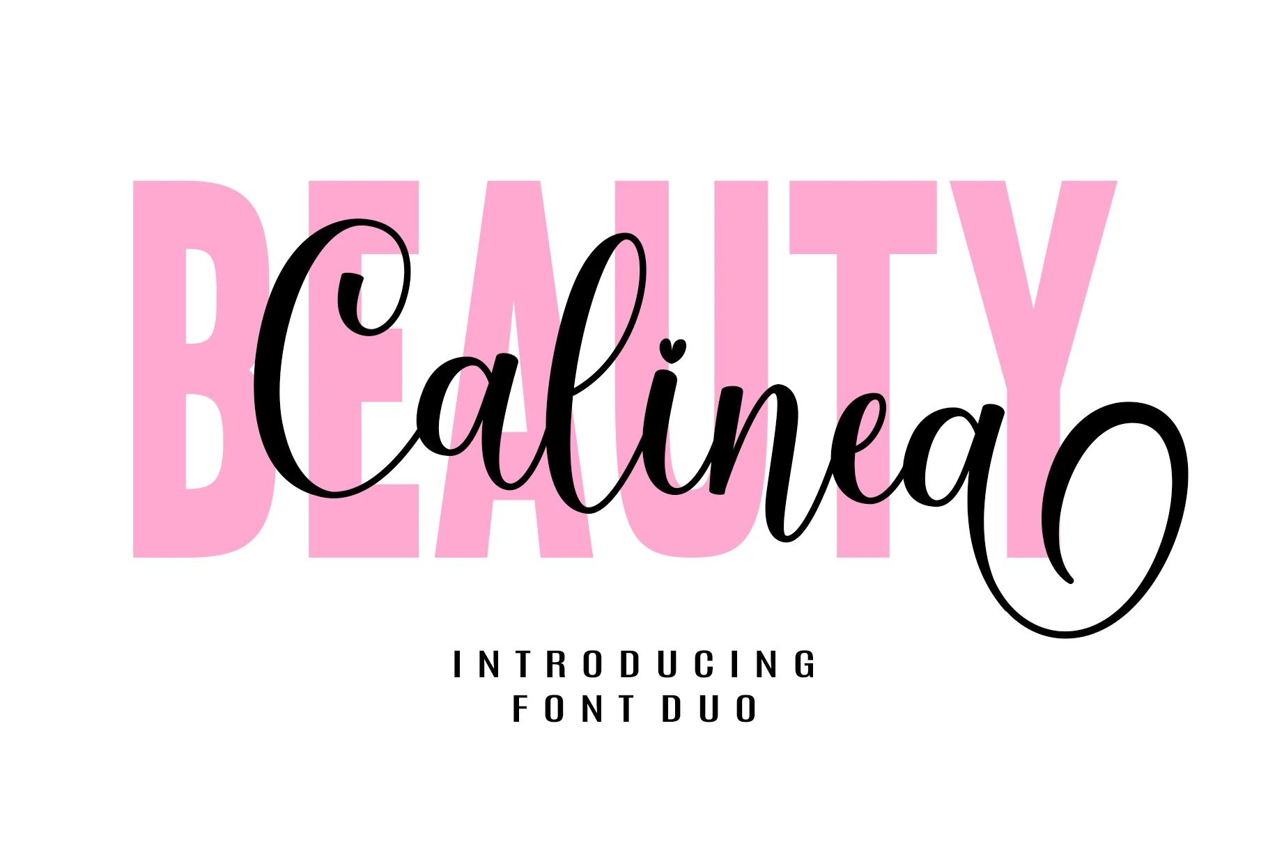
Best For: beauty branding, logos, invitations, social media graphics
Beauty Calinea Font pairs a flowing script with a tall bold sans serif, giving it a built-in contrast between softness and structure. The script has smooth oval loops, subtle stroke contrast, and a playful heart accent, while the uppercase companion brings a clean, graphic base that makes layered headlines feel polished and modern.
For Script Wedding Fonts, this duo is especially useful when you want clear hierarchy without adding extra typefaces. Let the sans carry the base word or secondary emphasis, then place the script over it for names, logos, or hero text so the layout keeps its romantic tone while staying easy to read.
Conclusion
Choose flourished calligraphy fonts for formal invitations, sweet scripts for romantic cards, airy modern styles for refined layouts, and bold signature fonts when titles need stronger visual weight.