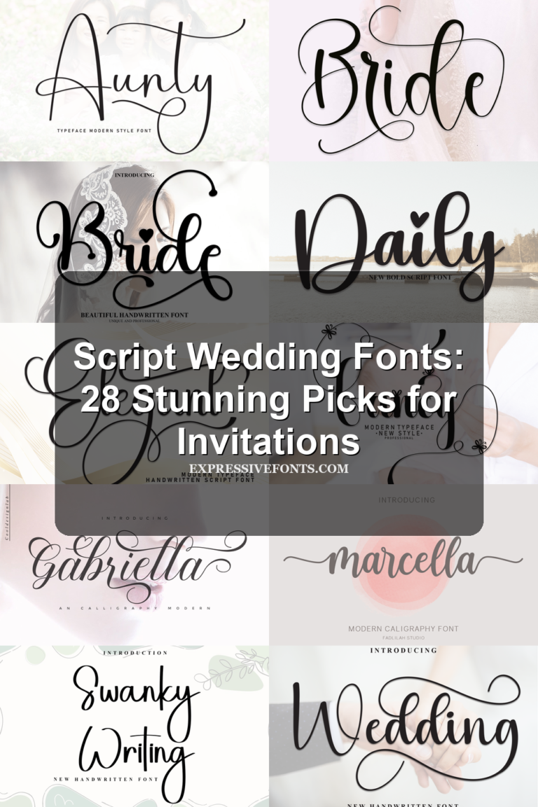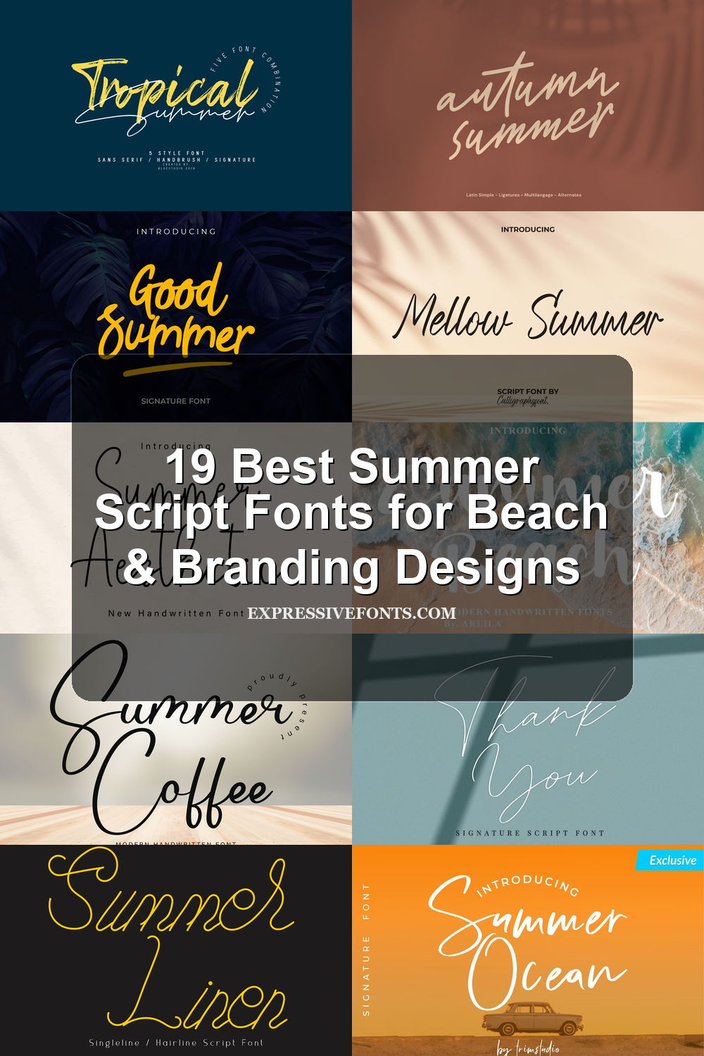
19 Best Summer Script Fonts for Beach & Branding Designs
These summer script fonts are for designers, crafters, and brand owners who need relaxed handwritten lettering for seasonal projects. The 19-font collection fits beach logos, summer posters, invitations, quote graphics, stickers, T-shirts, packaging, and social media designs where the type needs to feel warm, casual, and expressive.
Good Summer Font
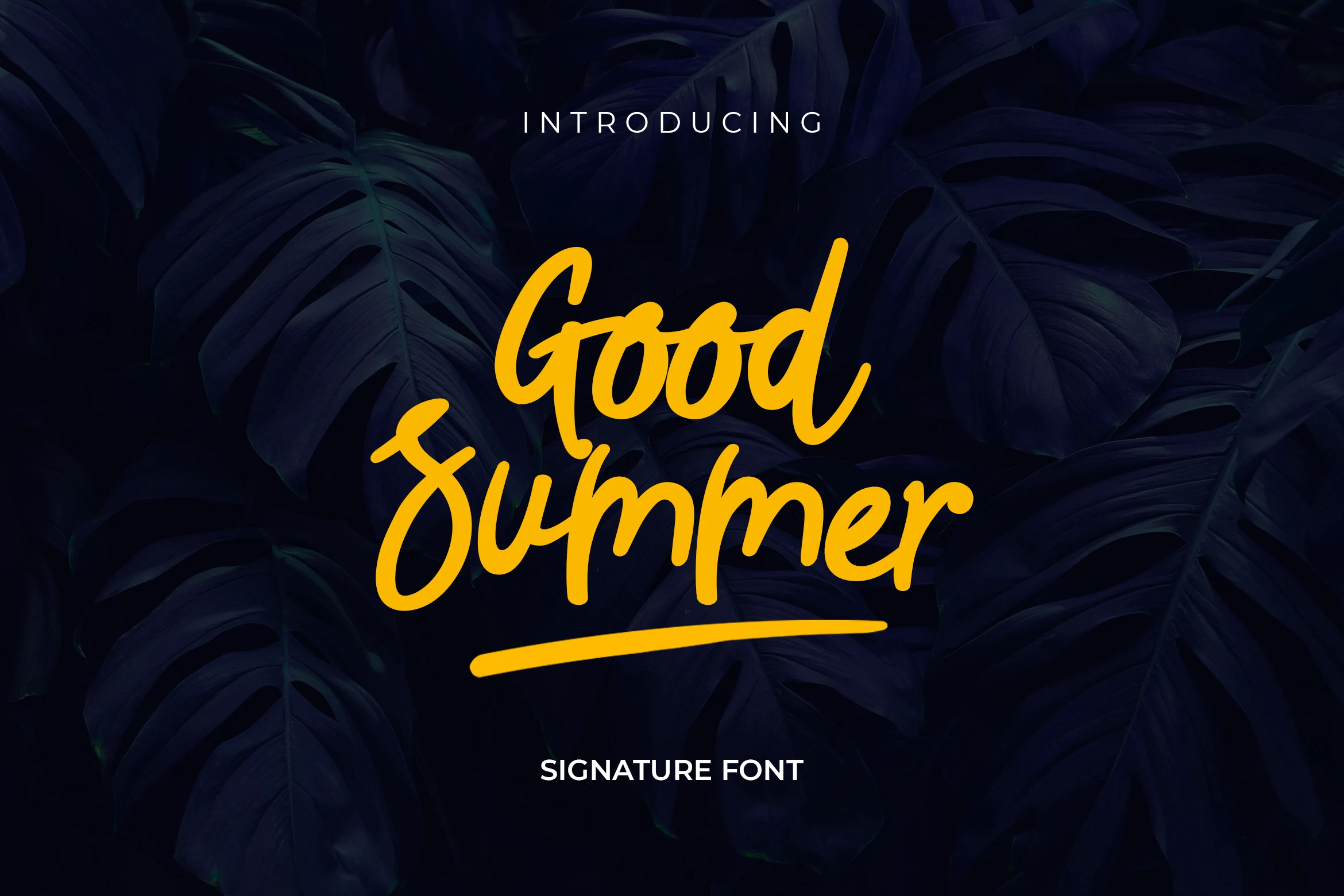
Best For: logos, quotes, social media graphics, eye-catching designs
Good Summer Font has a thick, rounded handwritten style with smooth joins, slightly angled strokes, and a confident marker-like finish. It sits on the bolder side of Summer script fonts, so short words stay clear and lively while still feeling relaxed rather than formal.
The weight gives headlines immediate presence, and the long underline swash helps anchor a logo or quote without needing extra decoration. Use it where you want a strong first line and simple supporting text underneath; tighter layouts can work, but a little spacing keeps the script from feeling heavy.
Endless Summer Font
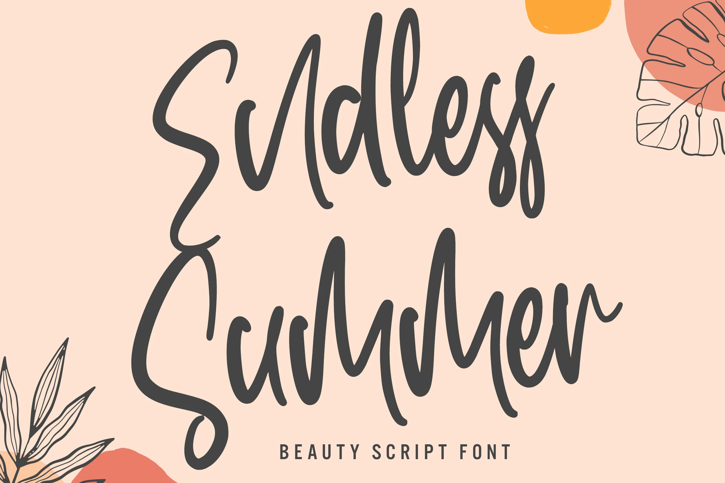
Best For: logos, beauty branding, social media graphics, packaging
Endless Summer Font has a loose handwritten rhythm with tall upright strokes, rounded terminals, and long looping descenders. Its dark, brush-like weight gives short words a relaxed but confident presence, making it a strong fit for Summer script fonts collections that lean toward branding rather than novelty lettering.
The generous vertical movement needs careful line spacing, especially in stacked titles where the high ascenders and sweeping lower strokes can collide. Use it for logos, headings, packaging, quotes, or social graphics where the phrase stays compact and the script can carry the main title hierarchy without being crowded by smaller text.
Happy Summer Font
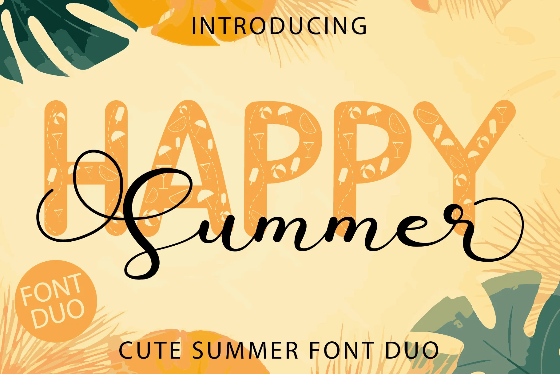
Best For: social media graphics, posters, invitations, cute designs
Happy Summer Font pairs a bubbly all-caps display style with a flowing script, giving it a bright layered look that feels instantly seasonal. The contrast between the chunky letterforms and the long, smooth swashes makes it a memorable pick for Summer script fonts where you want both a headline and a decorative accent in one set.
The script works best as the softer overlay while the display font holds the main message, so title hierarchy comes together quickly without extra styling. Its accessible swashes and glyphs help when you want a more customized finish, but the wide loops read best in short phrases, covers, and promo graphics with plenty of open space.
Summer Aesthetic Font
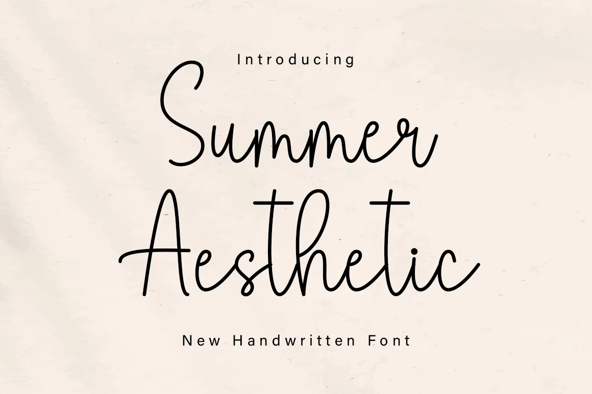
Best For: quotes, social media graphics, personal branding, clean designs
Summer Aesthetic Font has a light monoline script with rounded strokes, tall ascenders, and an easy handwritten flow. The letters stay open and evenly spaced, so it feels calmer and cleaner than many Summer script fonts, with enough personality for a title without losing readability.
Its long crossbars and soft curves work best when the wording stays short, especially in quotes, social posts, and logo-style headers. The included glyphs and swashes give you room to refine the finish, while a little extra white space helps the script breathe and keeps the linework from feeling cramped.
Summer Faith Font
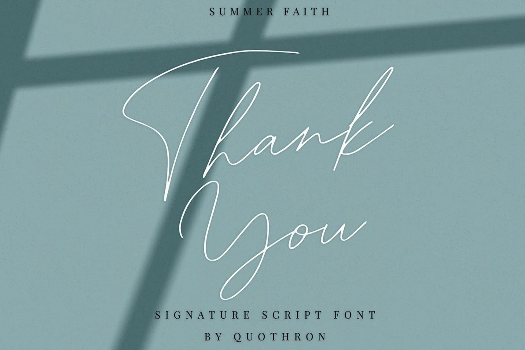
Best For: logos, personal branding, beauty branding, invitations
Summer Faith Font is a thin signature script with dramatic capitals, airy connections, and long sweeping strokes that give even simple words a refined handwritten shape. It sits on the more delicate side of Summer script fonts, with fine monoline curves and open spacing that feel personal rather than decorative-heavy.
The large ligature set helps repeated letter pairs look less mechanical, which matters in names, thank-you cards, and boutique logo marks. Keep the wording compact and allow extra margins around the flourished capitals; the tall entry strokes and looping descenders need room to stay graceful instead of tangled.
Summer Beach Font
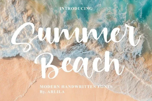
Best For: social media graphics, posters, quotes, T-shirts
Summer Beach Font has a full, rounded handwritten style with thick strokes, soft joins, and a slightly bouncy rhythm that keeps it friendly without looking childish. Compared with more delicate Summer script fonts, this one reads faster at a glance, so it works especially well when you want a breezy title that still feels solid and easy to notice.
The broad letterforms give short words real presence, which helps on posters, quote graphics, and merch where the font needs to do most of the visual work. Keep supporting text simple and smaller beneath it, and let the script lead the hierarchy; its smooth weight and open shapes already provide enough texture on their own.
Bright Summer Font
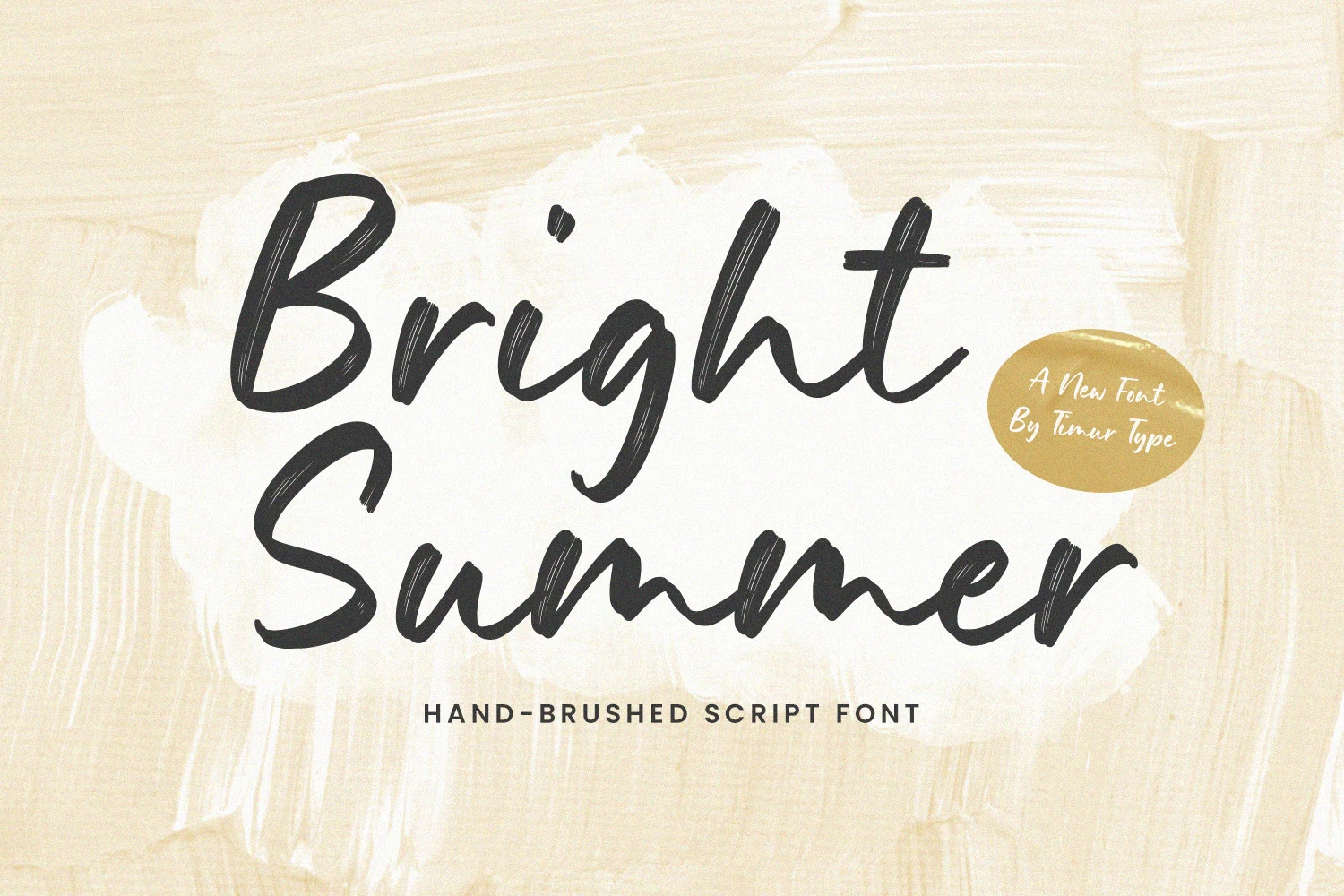
Best For: logos, packaging, social media graphics, T-shirts
Bright Summer Font is a bold hand-brushed script with thick downstrokes, loose cursive movement, and visible dry-brush texture through the letters. It brings a stronger, more graphic voice to Summer script fonts, especially where a casual headline needs weight instead of delicate calligraphy.
The rough stroke edges are part of its character, so high contrast and clean surrounding type will make the texture read more clearly. Use it for short titles, packaging, logo marks, and merch layouts; avoid crowding the baseline because the wide capitals and low sweeping curves need space to keep their rhythm.
Vintage Summer Font
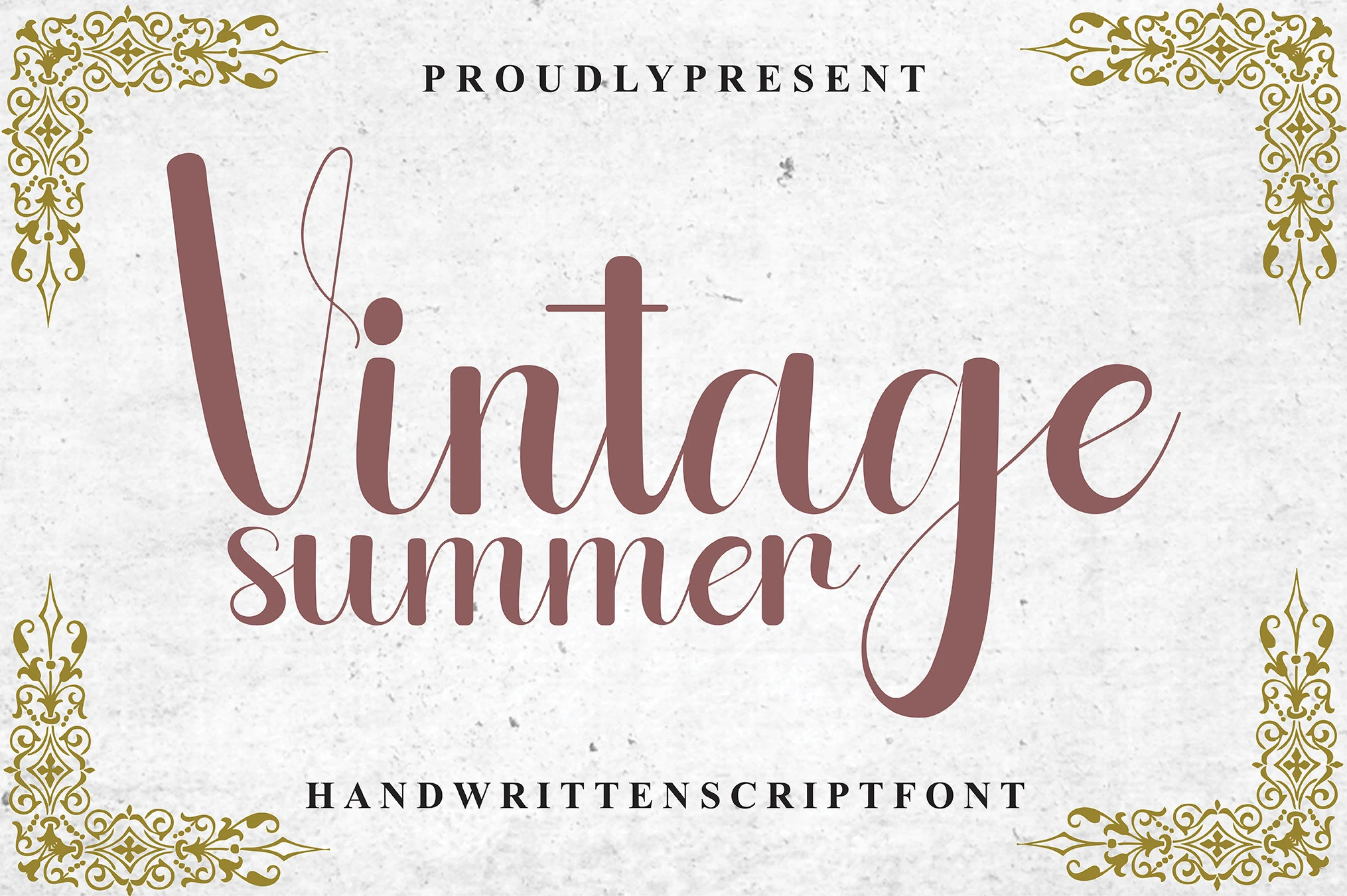
Best For: wedding designs, invitations, logos, business cards
Vintage Summer Font blends broad, graceful strokes with whisper-thin flourish lines, creating a script that feels poised rather than rustic. In collections of Summer script fonts, it stands out for its tall proportions, soft curves, and refined contrast between the solid main letters and the airy decorative swashes.
Those long terminal lines give names and short phrases a polished finish, but they need breathing room so the loops do not tangle with nearby text. It suits invitations, thank-you cards, logos, and business cards best, especially when paired with a restrained serif and a clear hierarchy that lets the script carry the elegant mood.
The Summer Days Script Font
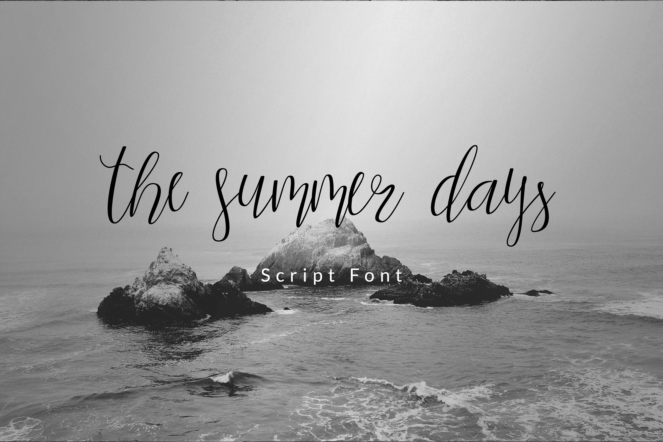
Best For: branding, social media graphics, invitations, wedding designs
The Summer Days Script Font has a slim handwritten line, tall loops, and loose spacing that gives each word an airy coastal rhythm. It belongs with Summer script fonts that feel relaxed and editorial, with enough movement for blog headers, social graphics, and brand marks without turning overly decorative.
The thin strokes need strong contrast against the background, especially when placed over photography or textured layouts. Keep phrases short and give the ascenders room above the line; the open letter shapes and long descenders work best when the script is treated as the main title rather than packed into dense copy.
Summer Coffee Font
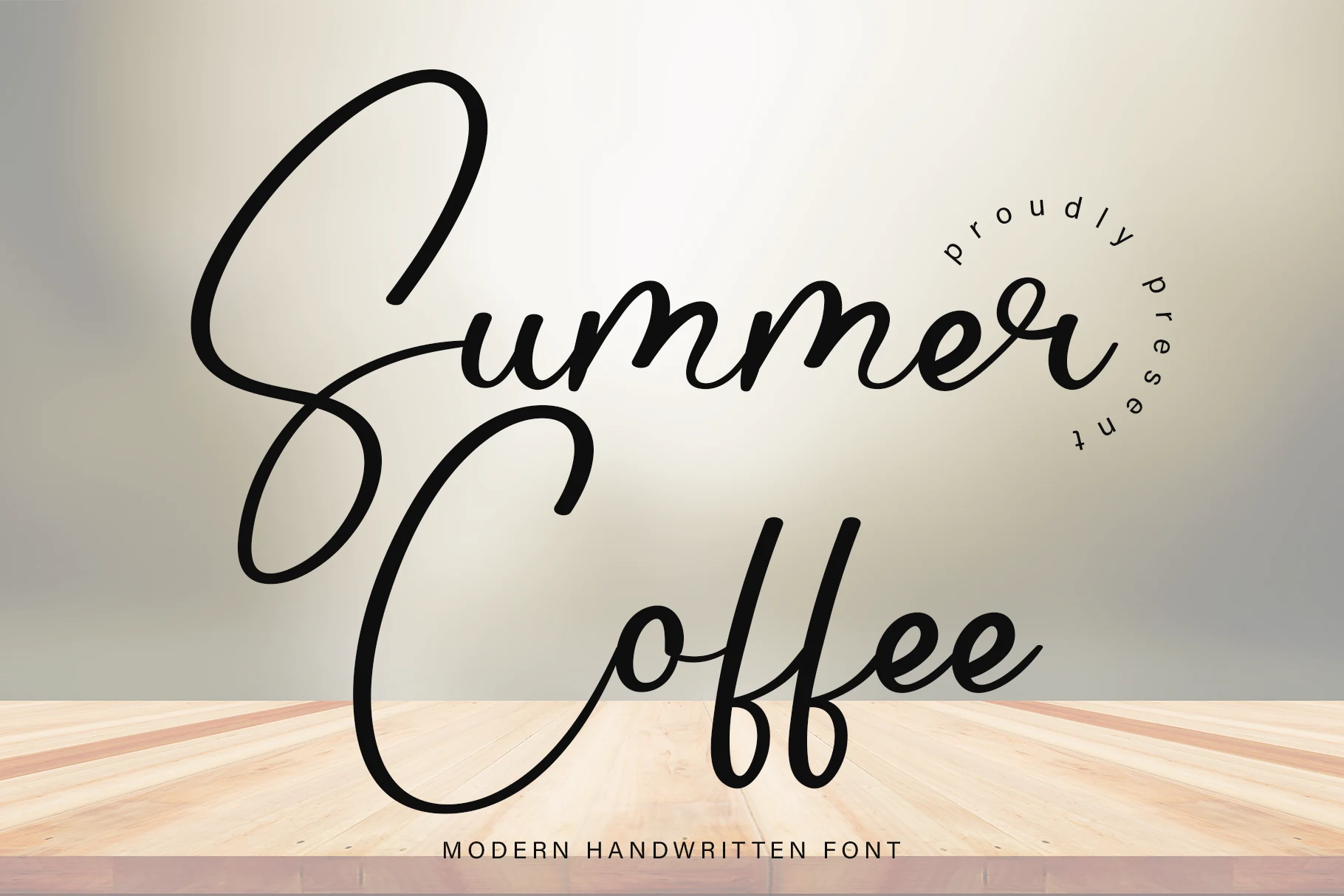
Best For: invitations, wedding designs, quotes, social media graphics
Summer Coffee Font has oversized looping capitals, smooth monoline strokes, and rounded joins that give it a warm, easygoing personality. Among Summer script fonts, it feels more welcoming than delicate, with broad curves and open shapes that keep short words readable while still giving the lettering a decorative presence.
The large opening letters naturally pull focus, so this script works best when the first word leads the hierarchy on invites, cards, and quote graphics. Give those capitals extra room and pair the script with a clean secondary font; that contrast keeps the flourishes from crowding the layout and lets the handwritten rhythm stay clear.
Autumn Summer Font
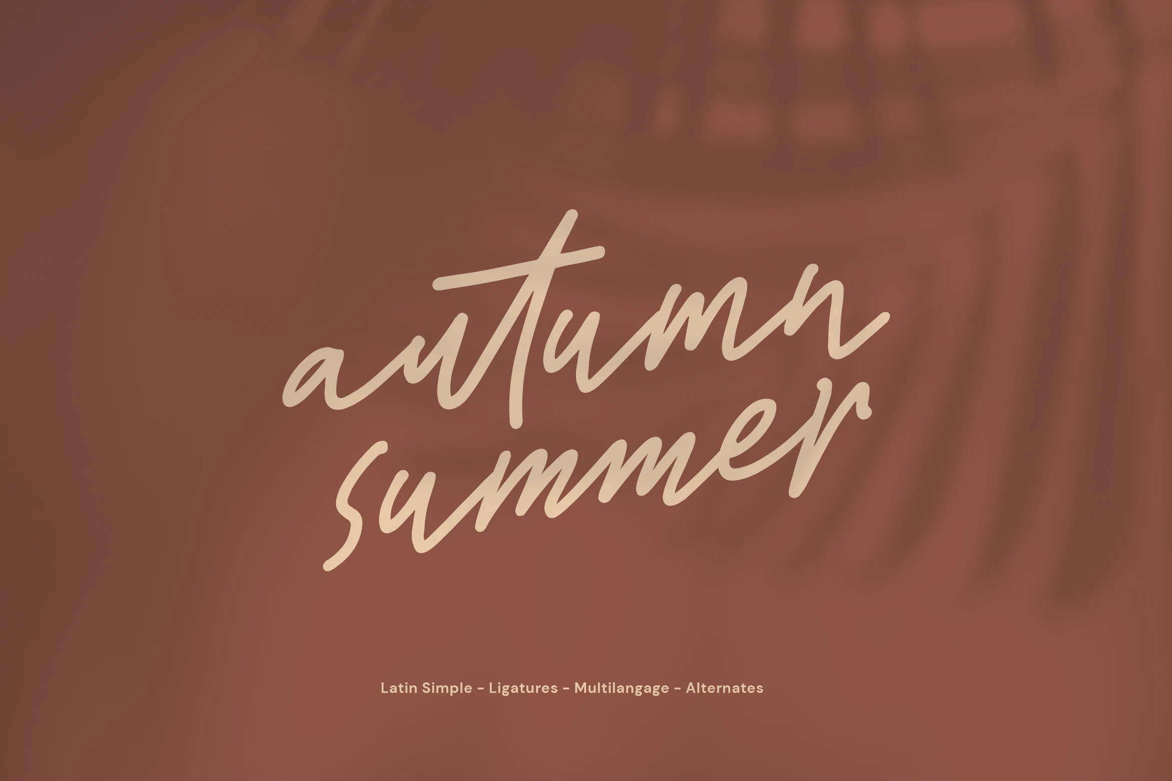
Best For: quotes, personal branding, social media graphics, handmade designs
Autumn Summer Font has a loose handwritten slant with quick tapering strokes, narrow proportions, and an easy marker-like rhythm. It fits Summer script fonts that feel personal rather than polished, with enough movement to keep a title lively while still reading cleanly.
Because the letters lean forward and connect tightly, it works best in short phrases, quote graphics, and simple identity pieces where the script can stay prominent. Give supporting text more spacing and keep the layout uncluttered; the natural stroke flow already brings texture and authenticity without needing extra decoration.
Gento Summer Font
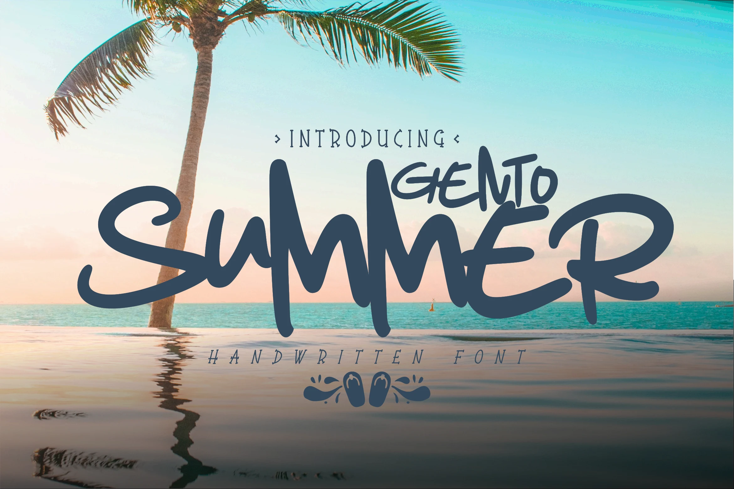
Best For: T-shirts, posters, social media graphics, fun designs
Gento Summer Font has thick marker-style strokes, oversized verticals, and a broad handwritten rhythm that gives it instant beach-poster energy. In a roundup of Summer script fonts, it stands out for its graphic weight and playful scale, making short words feel bold, sunny, and easy to notice at a glance.
The chunky structure works especially well for summer events, T-shirt graphics, and promo layouts where the lettering needs to carry the whole message. Keep the phrase compact and let the wide capitals drive the title hierarchy; a simpler secondary font underneath helps the script stay punchy instead of overcrowded.
Summer Vibes Font
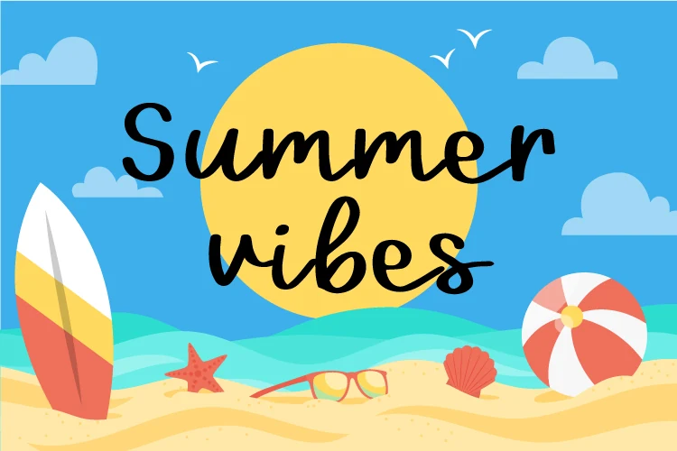
Best For: social media graphics, posters, stickers, fun designs
Summer Vibes Font uses a relaxed handwritten script with rounded strokes, soft joins, and a loose baseline that gives the words an easy beach-day feel. The letters stay fairly open, so it reads clearly for Summer script fonts aimed at cheerful seasonal graphics rather than formal branding.
The long connecting stroke in the top line and the low sweep through the second word help tie a short title together, but they work best with generous spacing around the phrase. Use it for posters, stickers, social posts, and casual promo layouts where the script can sit as the main focal point against simple supporting elements.
Beloved Summer Font
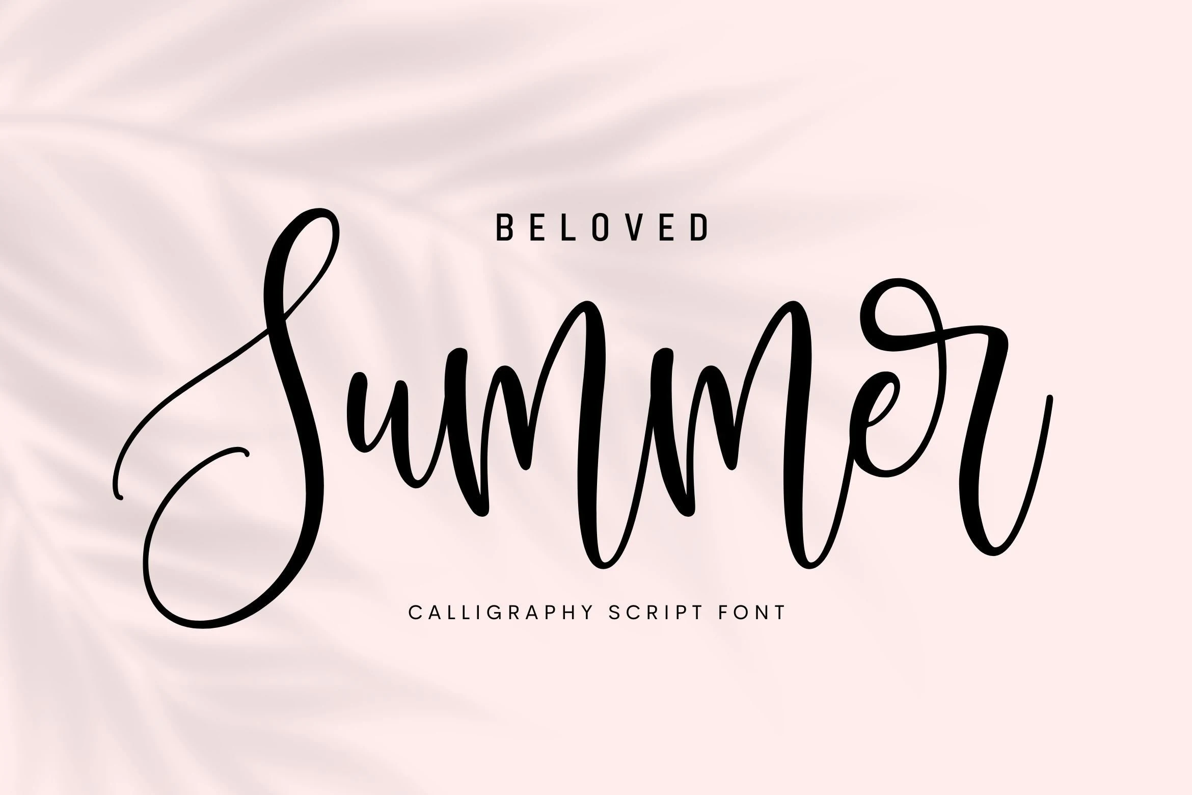
Best For: invitations, wedding designs, logos, social media graphics
Beloved Summer Font has a bouncy calligraphy rhythm with rounded strokes, tall loops, and smooth curves that keep the lettering lively without feeling messy. Its well-balanced shapes give Summer script fonts a softer, more polished tone, so short titles feel warm and personal while staying easy to read.
The long opening swash and high vertical movement work best when the wording stays short and the layout leaves breathing room around the script. Use it for invitations, names, logos, or social graphics, and pair it with a simple secondary font so the playful baseline and elegant loops remain the clear focal point.
Summer Berry Style Font
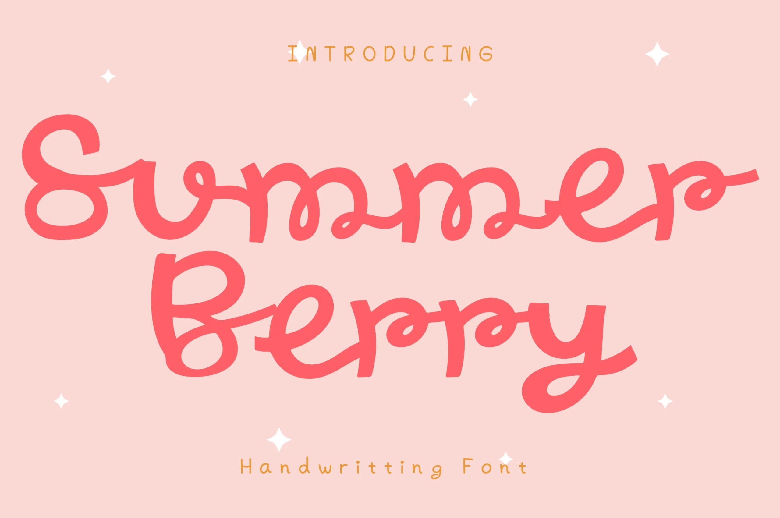
Best For: social media graphics, stickers, cute designs, playful designs
Summer Berry Style Font has a chunky handwritten flow with rounded bowls, looping joins, and a slightly quirky baseline that makes the lettering feel lighthearted. Its clean stroke edges keep the playful shapes readable, giving Summer script fonts a softer, candy-bright look without becoming too messy.
The wide curves and connected strokes work best in short titles where the rhythm can stay open and fun. Use it for stickers, cute social graphics, playful headers, or casual product labels, and keep surrounding text simple so the bold script shape carries the main visual energy.
Summer Ocean Font
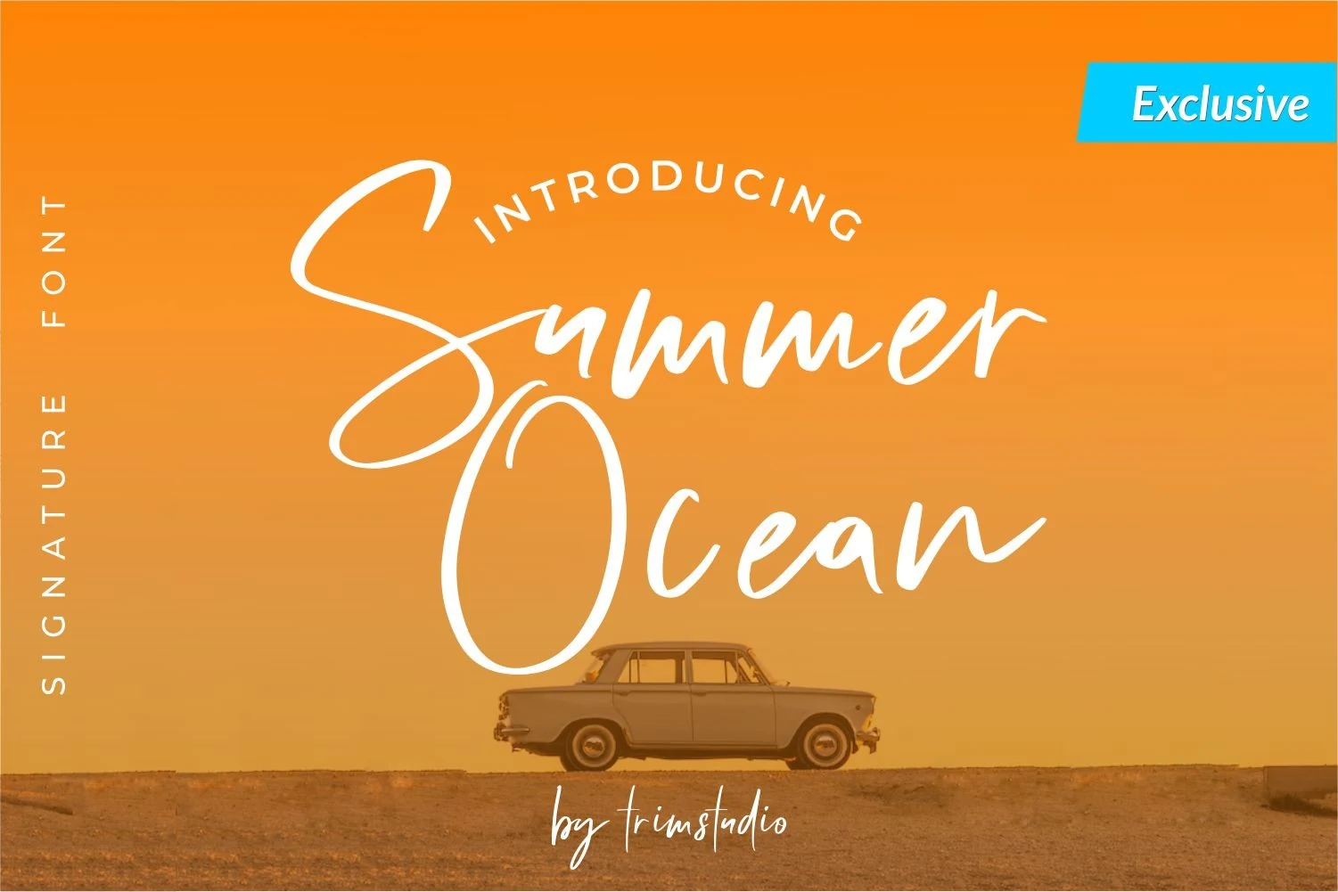
Best For: logos, social media graphics, invitations, quotes
Summer Ocean Font moves like a relaxed signature script, with broad capital swashes, tall loops, and soft uneven pressure that gives the lettering a casual beach-handwritten feel. The large opening strokes add drama, while the narrower lowercase rhythm keeps the words light instead of heavy.
For Summer script fonts that need a breezy personal tone, this one works best in short phrases where the flourishes can stretch without crowding the layout. Keep contrast strong behind the thin strokes, and let the capitals define the title hierarchy rather than forcing it into tight spacing.
Summer Linen Font
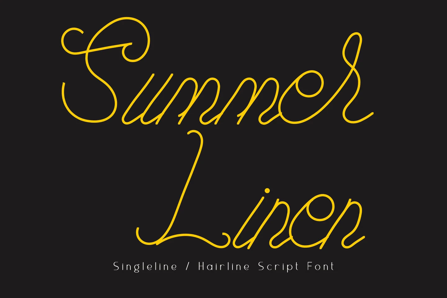
Best For: invitations, wedding designs, social media graphics, quotes
Summer Linen Font has a true hairline script look, built from ultra-thin monoline strokes, generous loops, and sweeping capitals that give it an airy, elegant rhythm. The oversized S and L carry most of the drama, while the slimmer lowercase forms keep the lettering light and graceful rather than dense.
It stands out from many Summer script fonts because the long flourishes still feel controlled, which helps headings look refined instead of fussy. Use it for short lines where the swashes can stretch into open space, and pair it with a quiet sans serif for supporting text so the delicate linework stays clear.
Tropical Summer Font
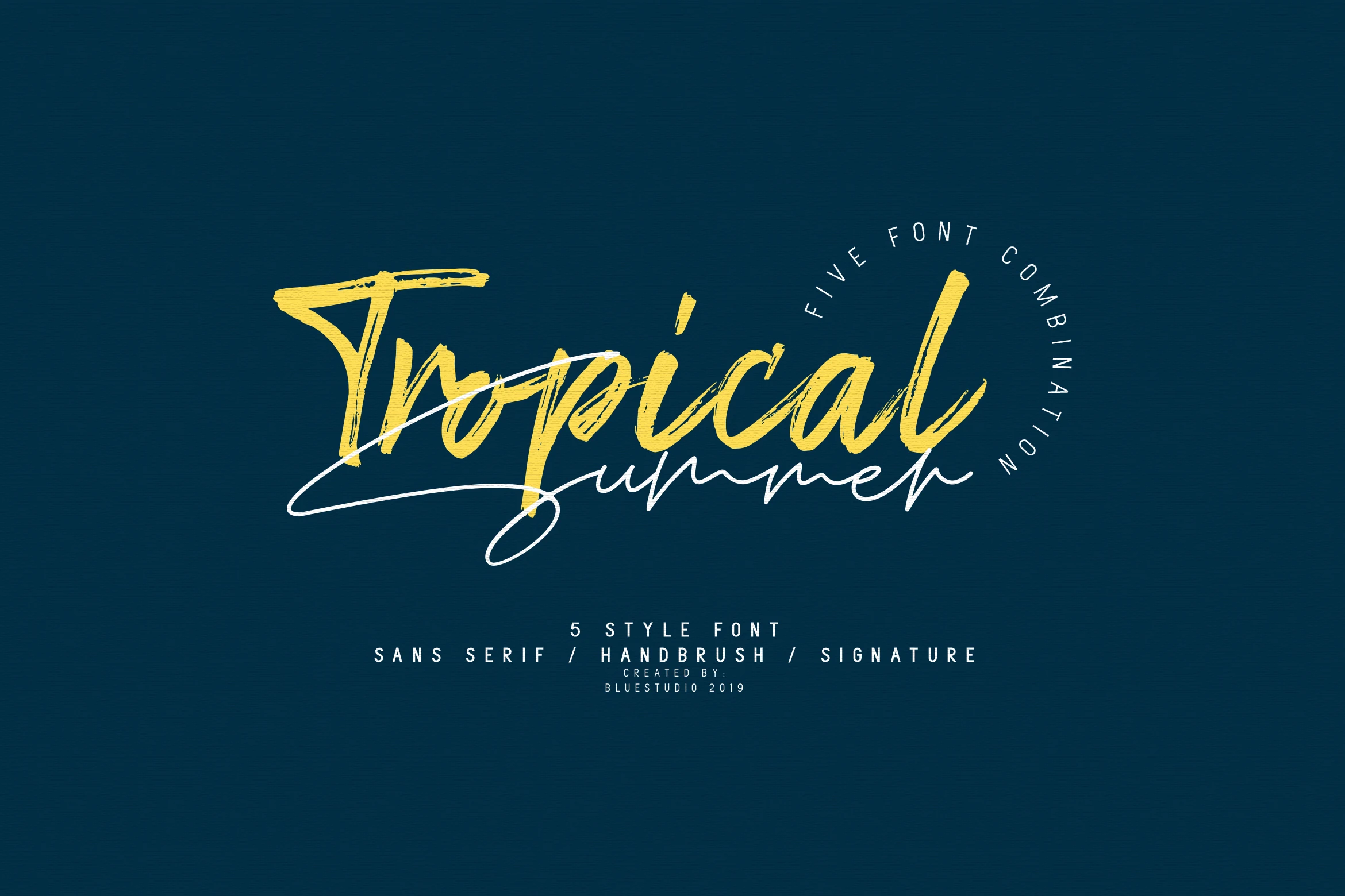
Best For: logos, posters, social media graphics, T-shirts
Tropical Summer Font mixes a rough handbrush display style with a loose signature script and narrow supporting sans forms. The main brush letters have angled strokes, dry texture, and energetic slant, while the script layer adds long underlines and quick loops for a more casual summer rhythm.
For Summer script fonts with stronger logo potential, this collection gives you useful contrast between bold texture and thin handwritten movement. Keep the brush word as the visual anchor, then use the lighter script only as a secondary line so the composition does not become tangled.
Mellow Summer Font
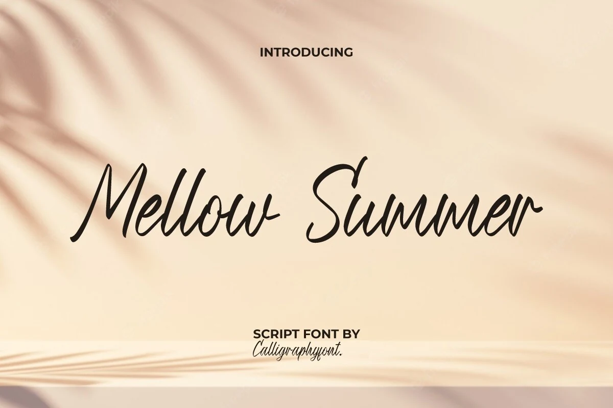
Best For: beauty branding, fashion branding, social media graphics, website headers
Mellow Summer Font has a smooth handwritten rhythm with rounded joins, softly tapered strokes, and a relaxed slant that feels polished without looking formal. The capitals are broad and fluid, while the lowercase stays open and readable, giving the script a clean silhouette that works well across elegant but approachable branding.
Compared with more decorative Summer script fonts, this one keeps its charm through restraint, which makes it easier to use in real layouts. It looks strongest at medium to large sizes where the stroke flow stays clear, and it pairs especially well with crisp sans serif text for product labels, headers, and refined promotional graphics.
This collection works best when the script style matches the role of the design. Use bold brush and marker-style fonts for posters, T-shirts, stickers, and promo graphics. Choose thin signature scripts for invitations, beauty branding, and refined social posts. For logos and packaging, the strongest options are the balanced handwritten fonts that stay readable while still giving the layout a relaxed summer feel.