14 Best Surf Fonts for Beach Logos & Coastal Designs
This collection is for designers, crafters, and coastal brands that need surf fonts with real beach character. The 14 font blocks cover chunky wave lettering, rough brush styles, retro scripts, decorative tropical capitals, and vintage serif looks for beach logos, posters, T-shirts, stickers, signage, packaging, and summer merch.
Homie Waves Font
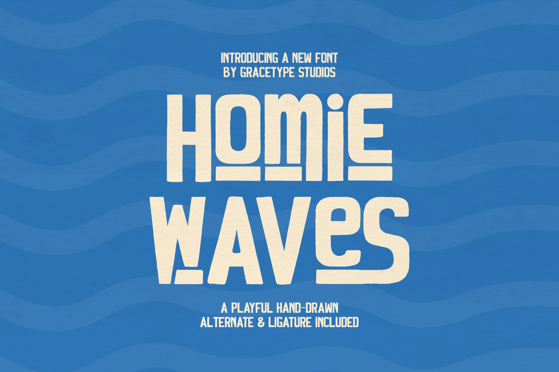
Best For: posters, T-shirts, stickers, merch design
Homie Waves Font uses chunky hand-drawn capitals with soft slabby corners, compressed counters, and slightly uneven baseline details. The wide cream-filled shapes feel sturdy rather than slick, giving Surf Fonts a relaxed coastal tone without losing headline clarity.
Its weight works best in stacked title layouts, where the letters can sit close and create a dense graphic mass. Keep contrast high and avoid long sentences; the blocky rhythm is built for short slogans, merch graphics, poster headers, and logo marks that need an informal ocean-side punch.
Bosgen Font
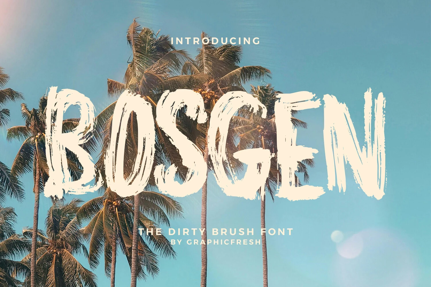
Best For: posters, T-shirts, logos, merch design
Bosgen Font has a loud brush-painted presence, with tall uppercase forms, rough edges, and dry-stroke texture that looks scraped straight across the page. The uneven pressure and broken terminals give Surf Fonts a grittier direction, leaning more streetwise than polished.
It works best when you let the texture do the heavy lifting in short, high-impact lines. Use it for bold title hierarchy, pair it with a clean secondary sans, and keep spacing slightly open so the distressed strokes stay readable in logos, posters, and energetic seasonal graphics.
Pacifico Script Font
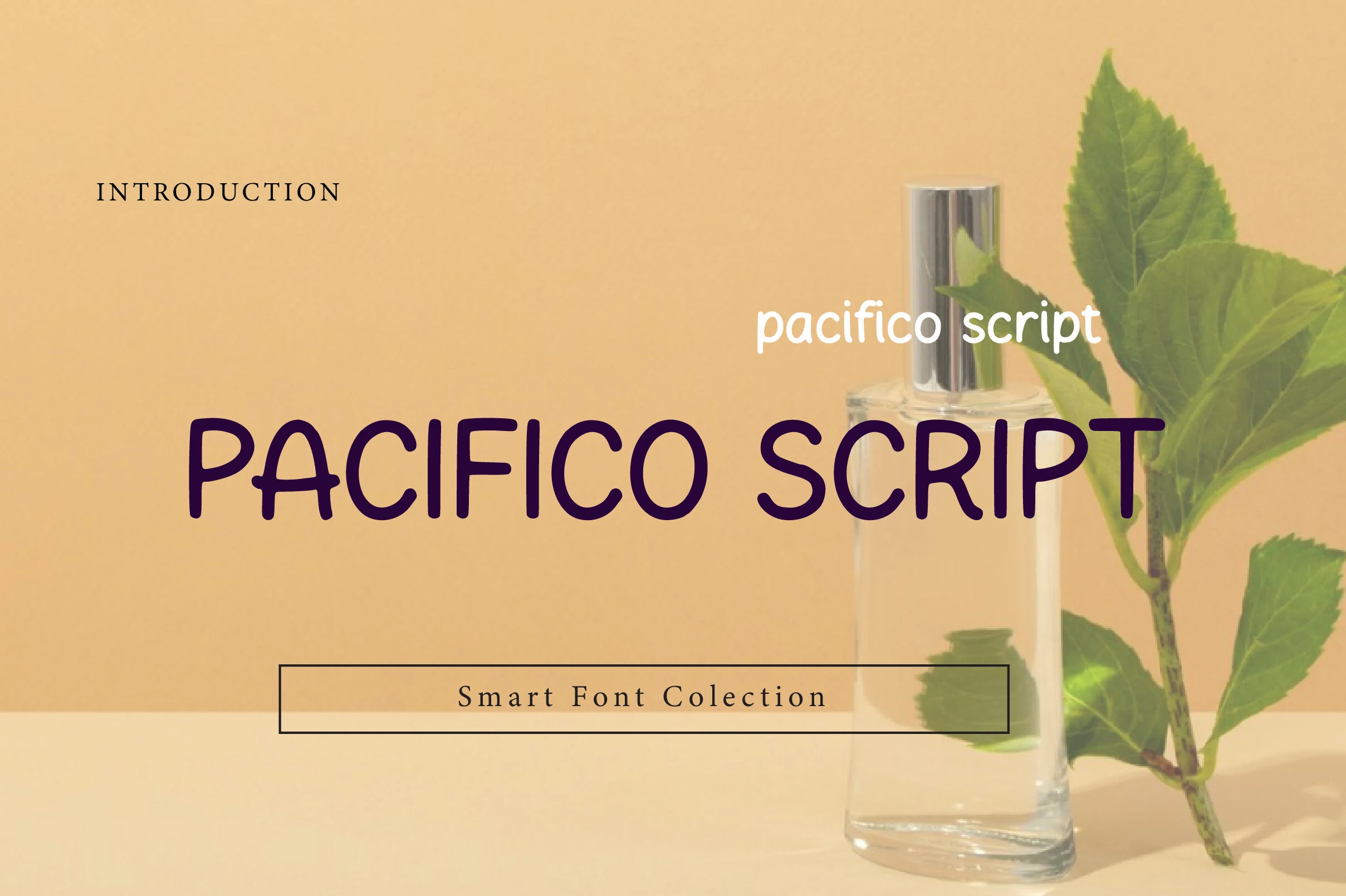
Best For: logos, posters, retro designs, branding
Pacifico Script Font brings a rounded brush-script mood with smooth curves, soft terminals, and a relaxed rhythm rooted in 1950s American surf culture. Its friendly shapes make Surf Fonts feel approachable rather than aggressive, especially in casual branding and beach-inspired display work.
The letterforms need contrast and enough horizontal space so the curves do not blur together at smaller sizes. Use it for short names, logo marks, poster lines, and packaging accents, then pair it with a restrained serif or clean sans to keep the title hierarchy controlled.
Laguna Tropic Font
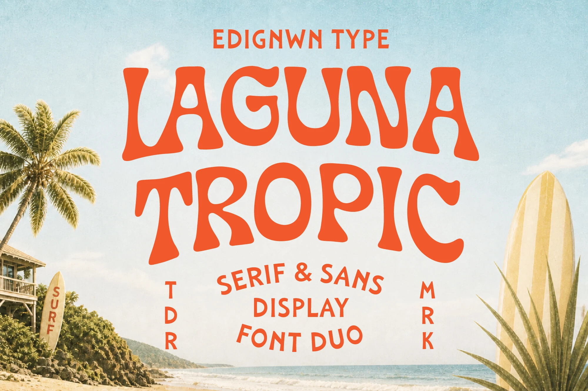
Best For: logos, posters, packaging, T-shirts
Laguna Tropic Font leans into retro resort signage with swollen curves, flared terminals, and a gently wavy rhythm that feels sun-soaked and handmade. As a serif and sans display duo, it gives Surf Fonts a broader visual range while keeping the same warm beachside character.
The more decorative style is strong for hero words, while the companion face helps structure subheads and secondary copy without breaking the vintage mood. Use the pair to build contrast in logos, poster titles, and packaging, and keep the bold shapes on short lines where their rounded proportions stay clear.
Fronge Waven Font
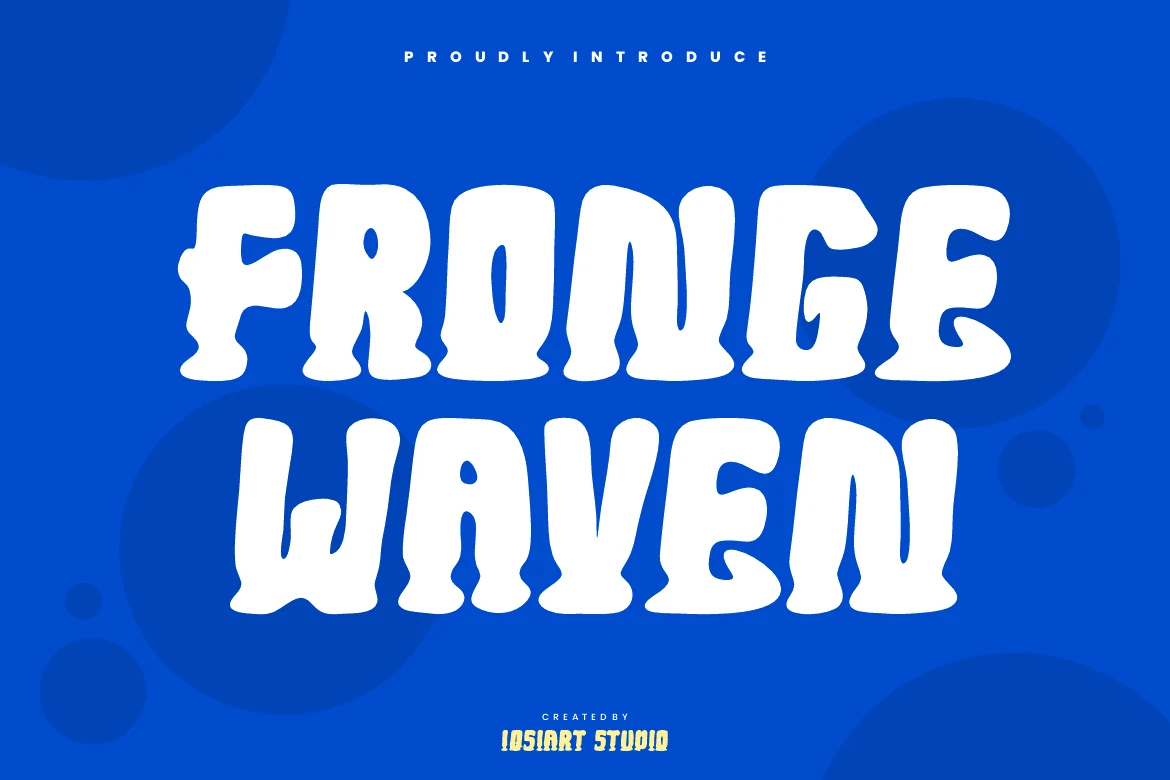
Best For: headlines, posters, logos, merch design
Fronge Waven Font pushes a chunky display style through soft, blobby letterforms with wavy sides and rounded corners. The white preview shows heavy uppercase shapes with tight inner spaces and a subtle baseline wobble, giving Surf Fonts a bold liquid look rather than a clean geometric finish.
Its puffed forms are built for loud wordmarks and short headlines where the letters can fill the layout with minimal supporting type. Keep spacing controlled but not cramped, use strong color contrast, and avoid long phrases so the playful wave rhythm stays readable in posters, stickers, and apparel graphics.
Hydration Font
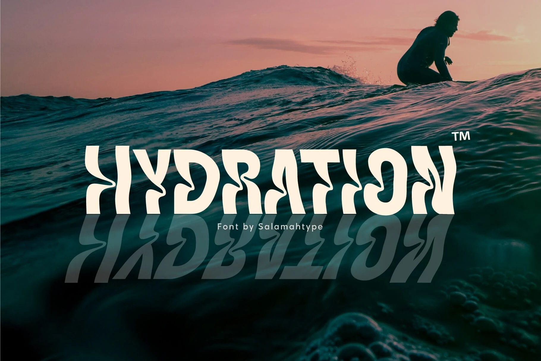
Best For: logos, posters, signage, T-shirts
Hydration Font turns watery movement into bold display lettering, with rippling edges, curling inner cuts, and sharp bends that make each character feel pulled by a wave. That irregular silhouette gives Surf Fonts a more graphic, high-energy direction than the usual laid-back beach script.
Because the shapes are so stylized, it works best in short titles where the unusual counters and wave-like joints stay clear. Pair it with a plain sans for secondary copy, and give the wordmark a little breathing room so the liquid rhythm reads cleanly across posters, logos, and apparel.
Light Beach Font
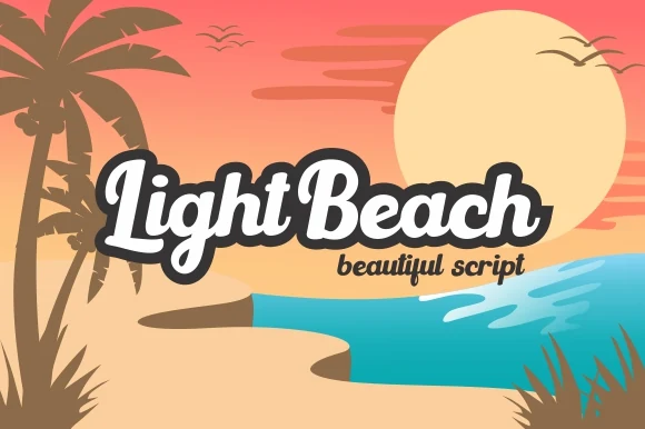
Best For: logos, posters, retro designs, signage
Light Beach Font has a thick retro script style with rounded strokes, connected lettering, and a strong shadow-ready silhouette. The compact curves and soft terminals bring a 60s surf-culture feel to Surf Fonts without making the word shapes too loose or messy.
Use it where the title needs to feel friendly, nostalgic, and immediately readable. The heavy script benefits from clean contrast behind it, while moderate spacing and short phrases help the loops, joins, and bold swashes stay clear in logos, signs, poster headers, and beach-themed branding.
Surf Breaks Font
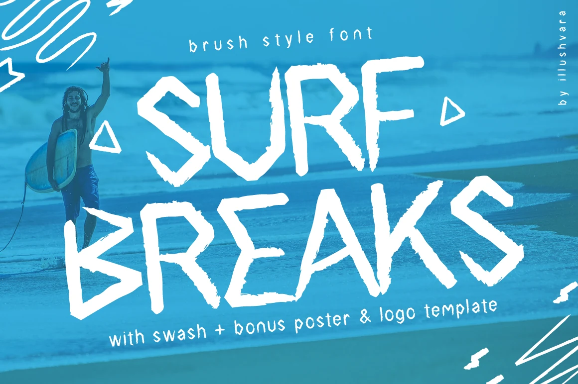
Best For: posters, logos, T-shirts, display text
Surf Breaks Font has a dry brush look with angular strokes, chipped edges, and a loose hand-painted rhythm that feels sun-bleached and spontaneous. Its narrow uppercase shapes give Surf Fonts a raw, breezy tone, closer to a beach poster scrawl than a polished studio script.
The texture works best when you keep the wording short and let the irregular edges stay visible. Use it for titles, logo ideas, and bold summer graphics, and pair it with a simple secondary font so the rough brush character carries the energy without crowding the layout.
Surf Boards Font
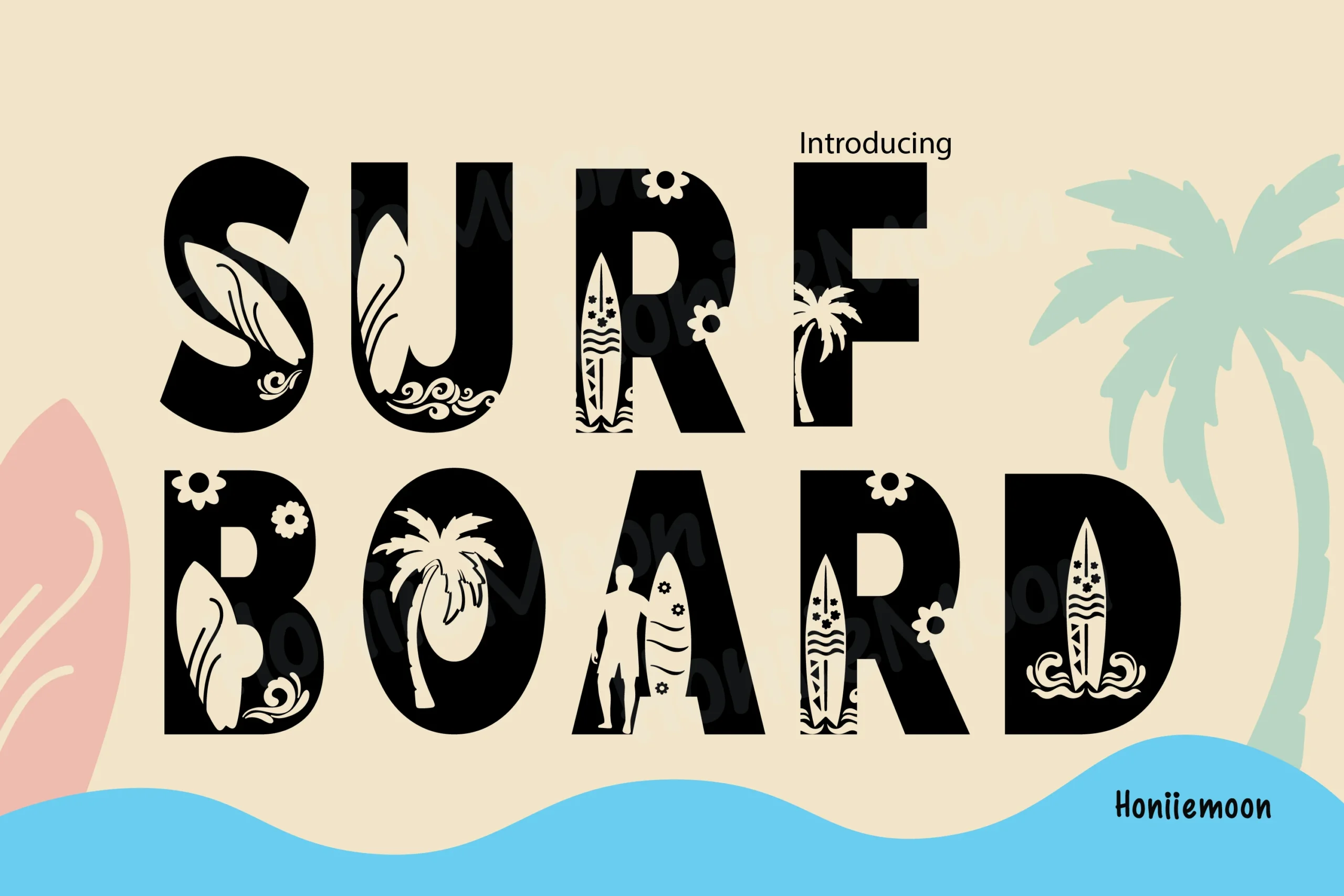
Best For: logos, posters, T-shirts, signage
Surf Boards Font is a bold decorative display face with heavy block capitals, wide proportions, and carved tropical details inside the letter shapes. The surfboard-like openings, floral marks, and palm silhouettes push Surf Fonts toward a loud beach-club style rather than a plain coastal headline.
Because the internal decoration carries most of the personality, it needs scale and strong contrast to stay readable. Use it for short names, poster titles, apparel graphics, and signage, then keep supporting text simple so the patterned letter interiors do not fight with the rest of the layout.
Rude Brush Font
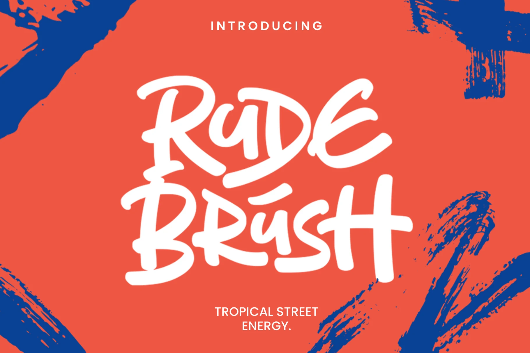
Best For: logos, posters, packaging, T-shirts
Rude Brush Font has thick hand-painted strokes, rounded bends, and a loose stacked rhythm that feels direct and unfussy. The letters read like fast brush lettering rather than polished calligraphy, which gives Surf Fonts a punchier street-to-shore attitude with plenty of display strength.
Its ligatures help words lock together into a more custom wordmark, especially in short names and bold packaging fronts. Keep the hierarchy simple and let the brush texture lead; this style lands best in poster headlines, streetwear-inspired branding, and logos where strong contrast and scale can carry the energy.
Big Surf Font
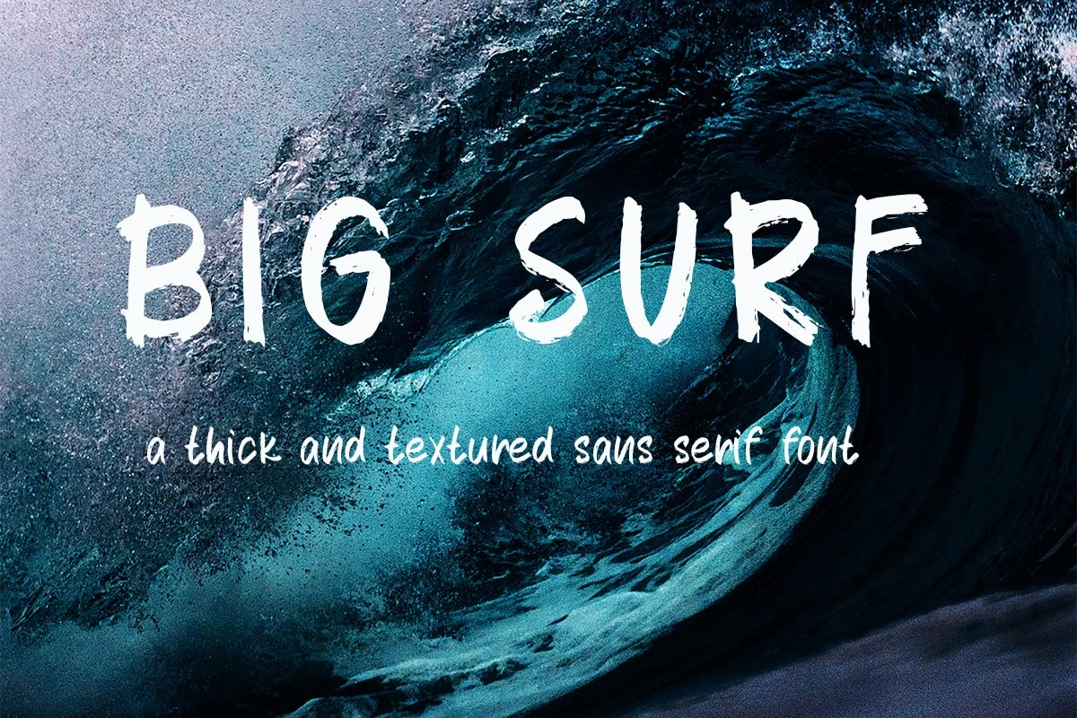
Best For: logos, posters, headlines, T-shirts
Big Surf Font has a rough brush-pen texture with thick handwritten capitals, uneven edges, and slightly irregular spacing. The letterforms feel direct and weathered, giving Surf Fonts a raw ocean-poster mood without turning the shapes into heavy decorative clutter.
Its readable structure makes it useful for short display lines, especially when the texture can stay visible at headline size. Keep contrast strong, avoid tight tracking, and pair it with a quiet supporting font so the brushed strokes remain the main visual signal in logos, posters, and apparel layouts.
The Wave Font
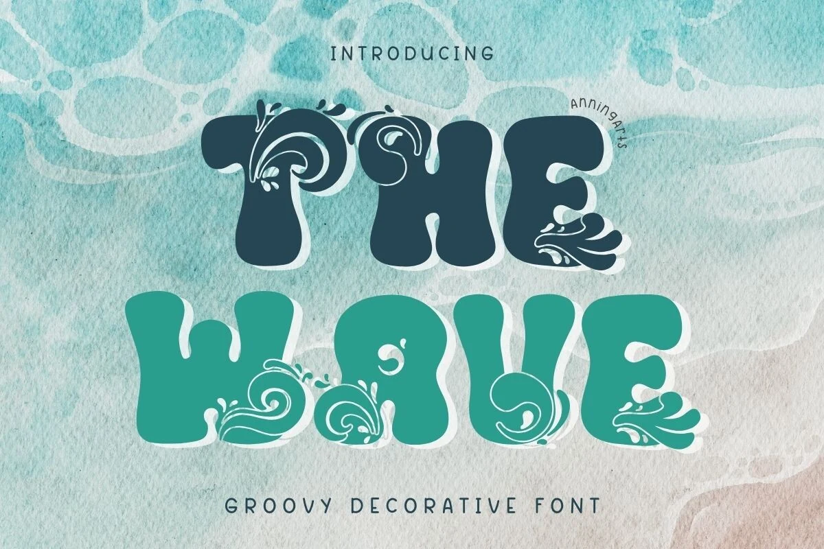
Best For: logos, posters, merch design, editorial designs
The Wave Font leans into a retro display look with thick rounded shapes, soft swelling curves, and decorative wave curls worked straight into the letters. That built-in ornament gives Surf Fonts a more thematic coastal feel than a standard groovy face, while keeping the word shapes bold and easy to spot.
Because the swirls are part of the character design, this font performs best in short titles and larger settings where the details stay clear. Use it for logo concepts, poster headlines, and merch graphics, then pair it with a clean secondary font so the watery flourishes can hold the visual hierarchy without feeling crowded.
Surf Boards Font
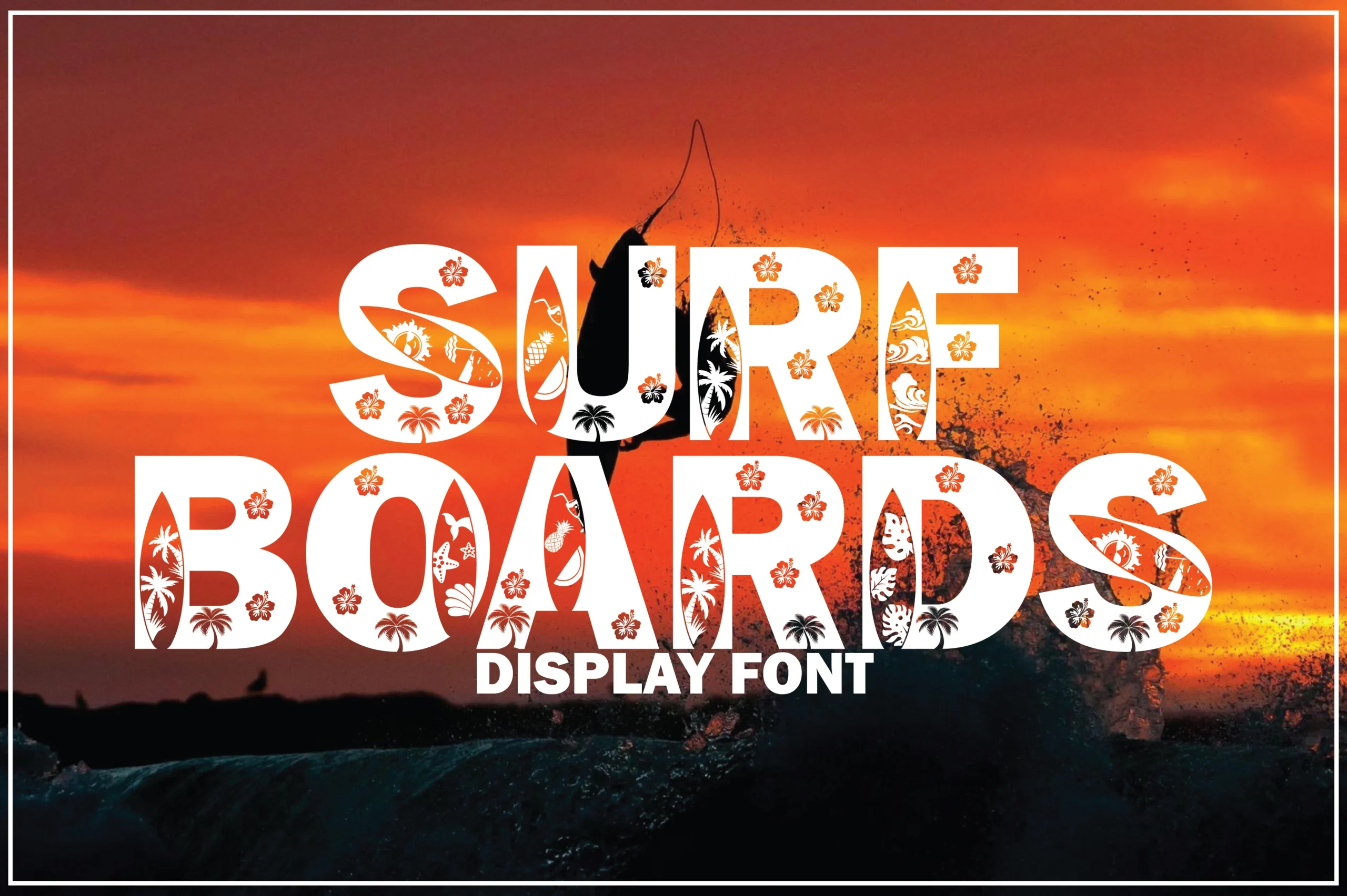
Best For: logos, posters, T-shirts, signage
Surf Boards Font is a dramatic decorative display face with broad block capitals and dense tropical cut-ins that turn the counters into mini surf scenes. Palms, flowers, wave marks, and board-shaped details give Surf Fonts a louder, more graphic personality than a plain beach headline.
The heavy silhouettes read best at larger sizes, where the internal patterning stays clear instead of closing up. Use it for short titles and statement words, then keep surrounding text simple so the carved decoration can carry the hierarchy in posters, signs, apparel, and logo concepts.
Saltcrest Font
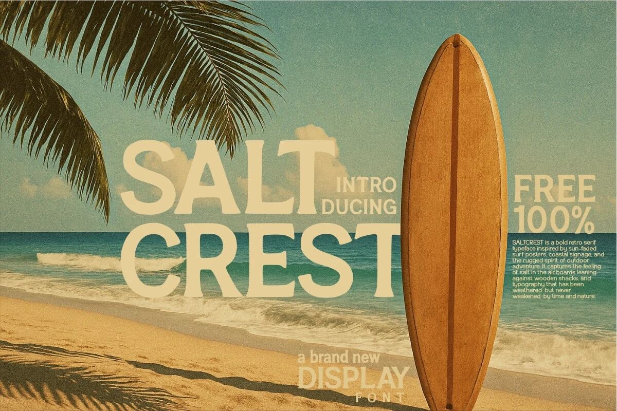
Best For: logos, posters, signage, retro designs
Saltcrest Font uses bold retro serif capitals with broad proportions, softened slab-like terminals, and a sun-faded poster presence. Its sturdy shapes give Surf Fonts a weathered coastal tone without losing the clean structure needed for readable display typography.
The weight is strongest in short stacked titles, where the wide letters can build a calm but rugged hierarchy. Use generous spacing around the wordmark, keep contrast high, and pair it with a narrow sans or small serif captions for resort branding, coastal signage, and vintage outdoor graphics.
The best surf font depends on the mood of the project. Use chunky wave fonts for loud merch and posters, rough brush fonts for raw beach energy, retro scripts for nostalgic surf branding, and decorative tropical fonts when the lettering needs to become the main visual element.