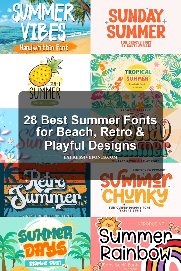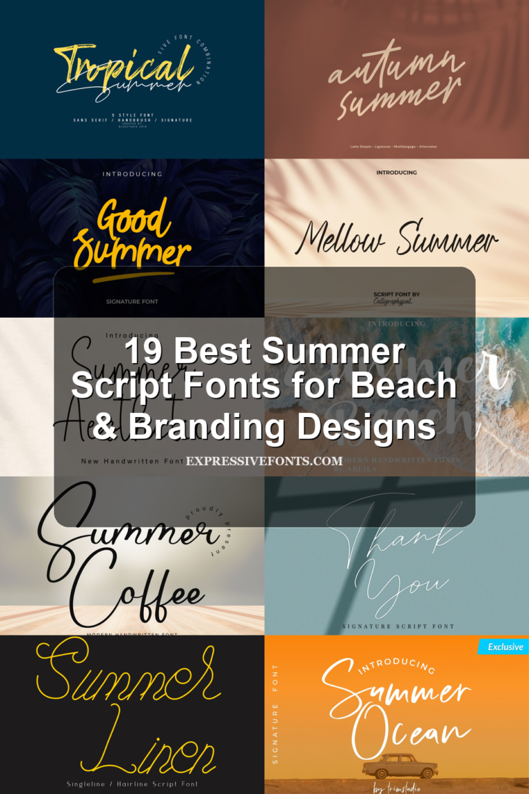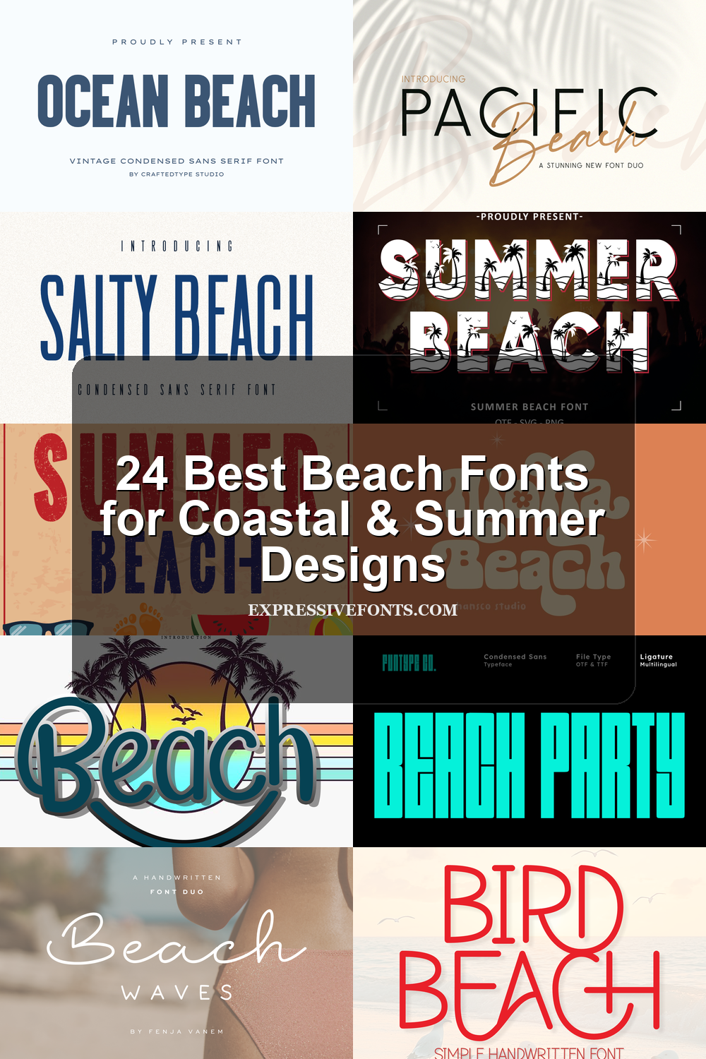
24 Best Beach Fonts for Coastal & Summer Designs
This collection is for designers, crafters, and brand owners looking for Beach fonts with a clear coastal mood. The 24 fonts cover script, condensed sans, retro display, playful hand-drawn, and decorative styles for logos, summer posters, T-shirts, stickers, invitations, packaging, and social graphics.
Beach Waves Duo Font
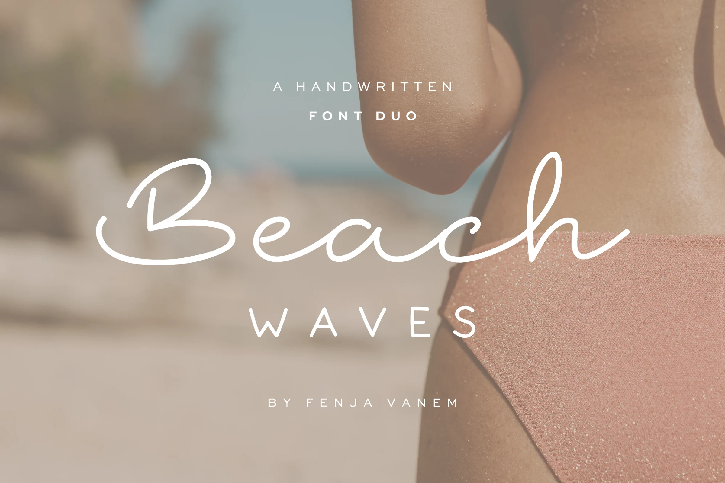
Best For: logos, branding, invitations, social media graphics
Beach Waves Duo Font combines a smooth handwritten script with a clean spaced uppercase companion, giving the layout contrast without visual noise. The script has thin monoline strokes, long rounded loops, and a relaxed baseline, while the sans style adds airy structure for subtitles, labels, and secondary text.
For Beach fonts with a softer editorial feel, this duo is useful when a design needs both personality and order. Let the script carry the main wordmark, then use the uppercase style with generous tracking beneath it; that balance keeps logos, invitations, and social graphics readable while preserving the light coastal mood.
Blue Ocean Font
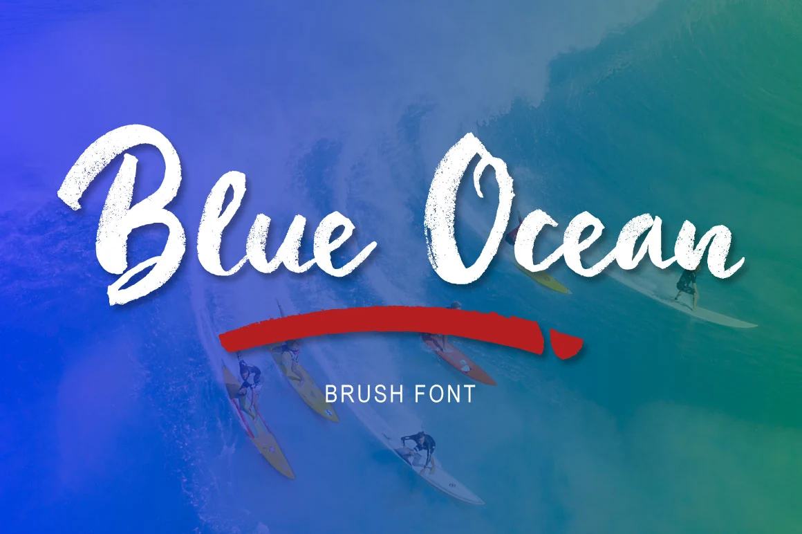
Best For: logos, signage, T-shirts, stickers
Blue Ocean Font uses a loose cursive brush style with thick downstrokes, rough dry edges, and rounded connections that keep the lettering relaxed rather than polished. The oversized capitals give the word shape strong display presence, while the smaller lowercase letters move with a casual wave-like rhythm.
For Beach fonts, this one works best when the texture is allowed to stay visible: use it in short titles, logo marks, shirt graphics, or signage where the brush grain can read cleanly. Avoid tight tracking; the connected strokes need enough contrast around them so the open loops and soft terminals do not blur together.
Ocean Beach Font
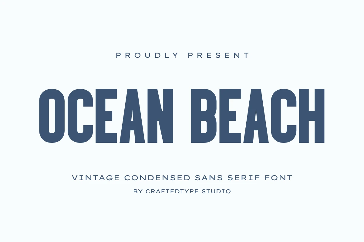
Best For: logos, posters, T-shirts, packaging
Ocean Beach Font has the kind of condensed structure that feels instantly poster-ready: tall capitals, narrow proportions, and sturdy strokes that keep every letter crisp and emphatic. The preview shows a confident vintage sans serif with clean edges and a steady rhythm, so it reads bold without feeling bulky or overly decorative.
If you are browsing Beach fonts with a cleaner, less script-driven mood, this one offers a sharper direction for logos, merch, and editorial headers. Its slim width is especially useful when a title needs impact in a tight space; add a touch of tracking and let it lead the hierarchy, because the compact forms hold attention best in short lines and stacked layouts.
Bird Beach Font
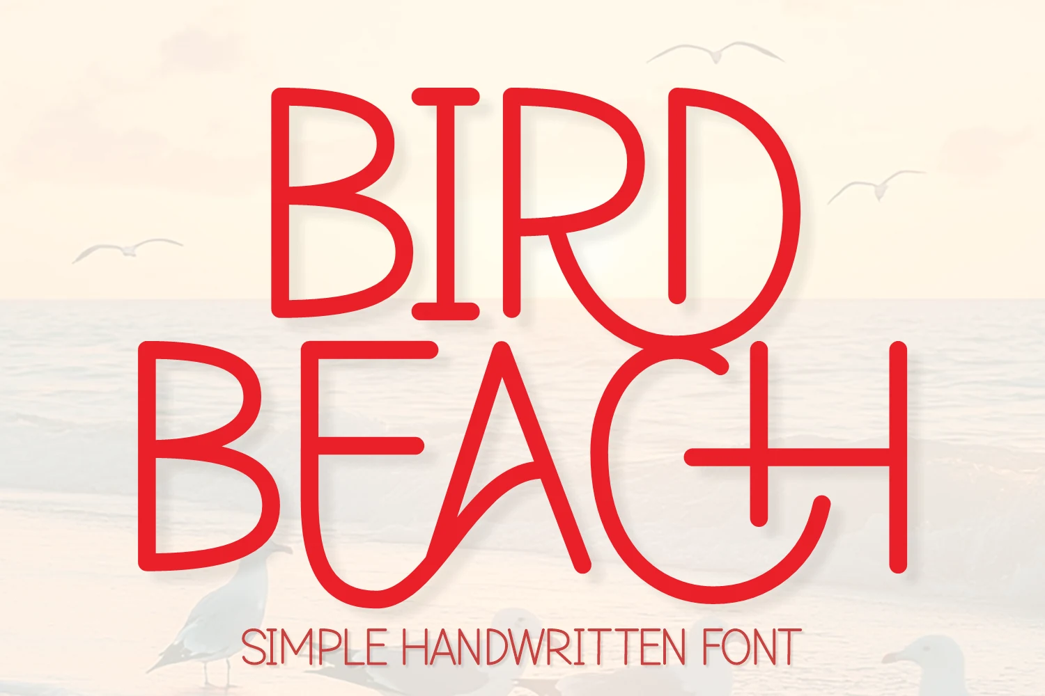
Best For: display text, headlines, T-shirts, stickers
Bird Beach Font has a simple monoline handwritten build with tall letterforms, rounded corners, and playful internal curves. The preview’s red capitals show a decorative but clean rhythm: the wide B bowls, curved R leg, and open A shape give the font a friendly display feel without relying on brush texture.
Within Beach fonts, it suits cheerful titles, cut-style graphics, kids’ merch, and casual quote designs where the lettering needs to stay light and readable. Keep spacing moderate rather than tight; the narrow vertical strokes and oversized curves need clear separation so stacked words do not collapse into one shape.
Dream Beach Font
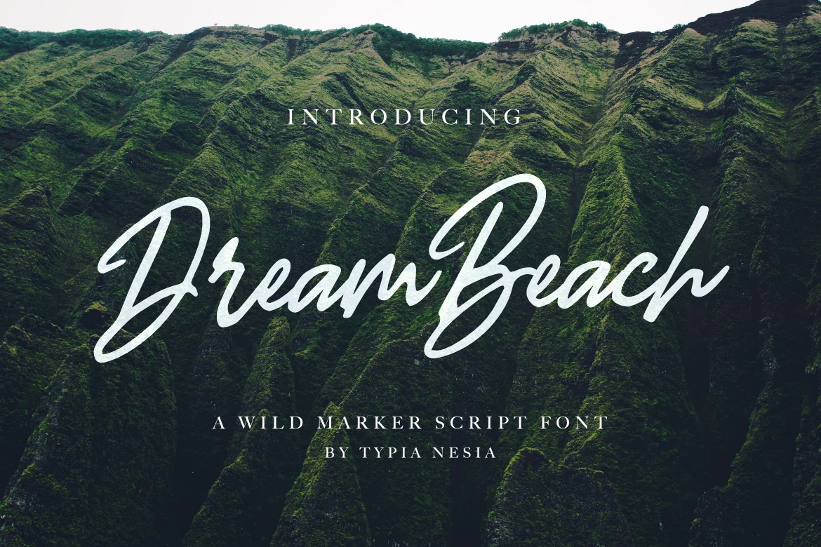
Best For: logos, branding, posters, T-shirts
Dream Beach Font has a loose marker-script attitude with broad strokes, quick tapering turns, and oversized capitals that give the lettering a bold sweep across the page. The connected lowercase forms stay readable, but the real character comes from the energetic entry strokes and the slightly rugged handwritten rhythm.
If you want Beach fonts with more movement than polish, this one works especially well for logos, packaging, and statement headlines. Keep it in short phrases or title lines where the long swashes can breathe, and pair it with a restrained serif or sans so the script remains the main source of texture and hierarchy.
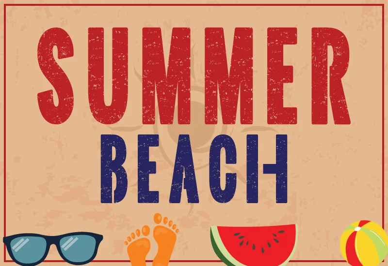
Summer Beach Font
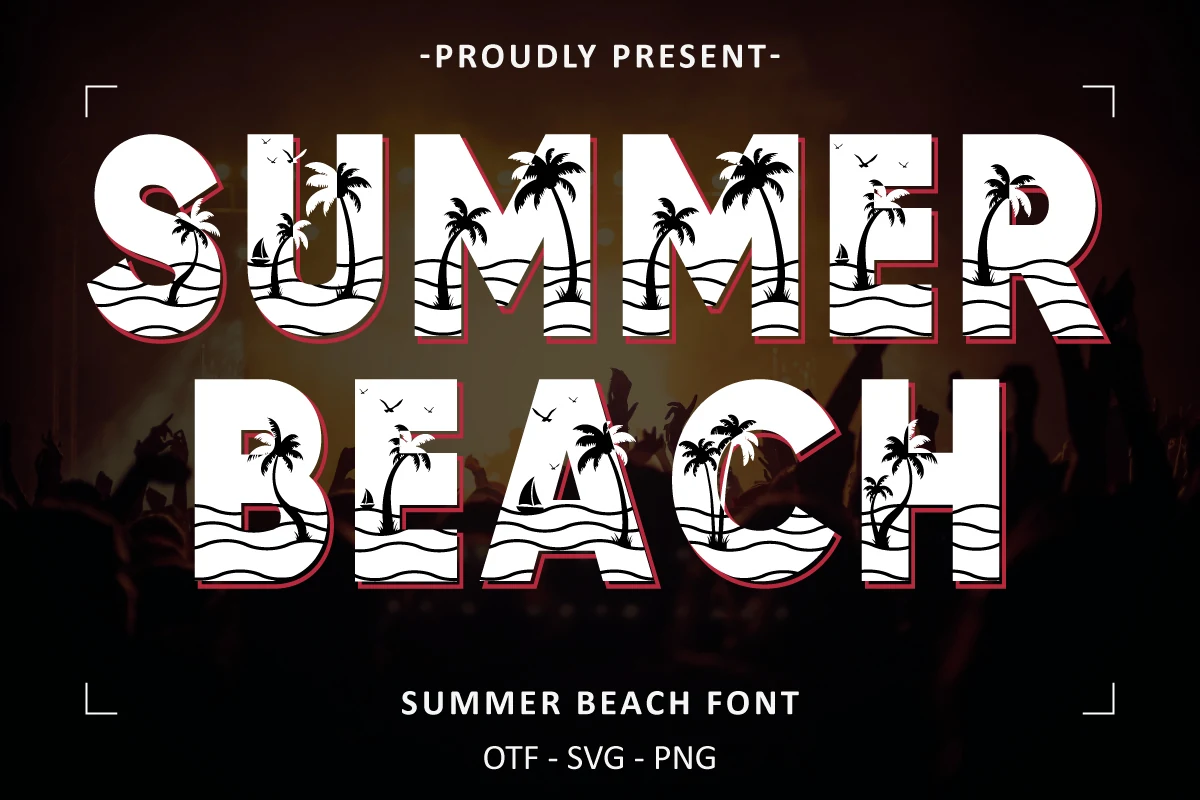
Best For: posters, T-shirts, restaurant menus, stickers
Summer Beach Font uses tall condensed block capitals with a worn print texture that gives it the feel of a retro boardwalk sign. The sturdy shapes stay clear and emphatic, while the distressed surface keeps the lettering from feeling too flat or generic.
For Beach fonts with a louder, poster-driven look, this one works best in short headlines where the texture can stay visible. Let it handle the main title, then keep the supporting copy simple underneath; the narrow capitals already build strong hierarchy for menus, merch, and summer event graphics.
Beach Circle Font
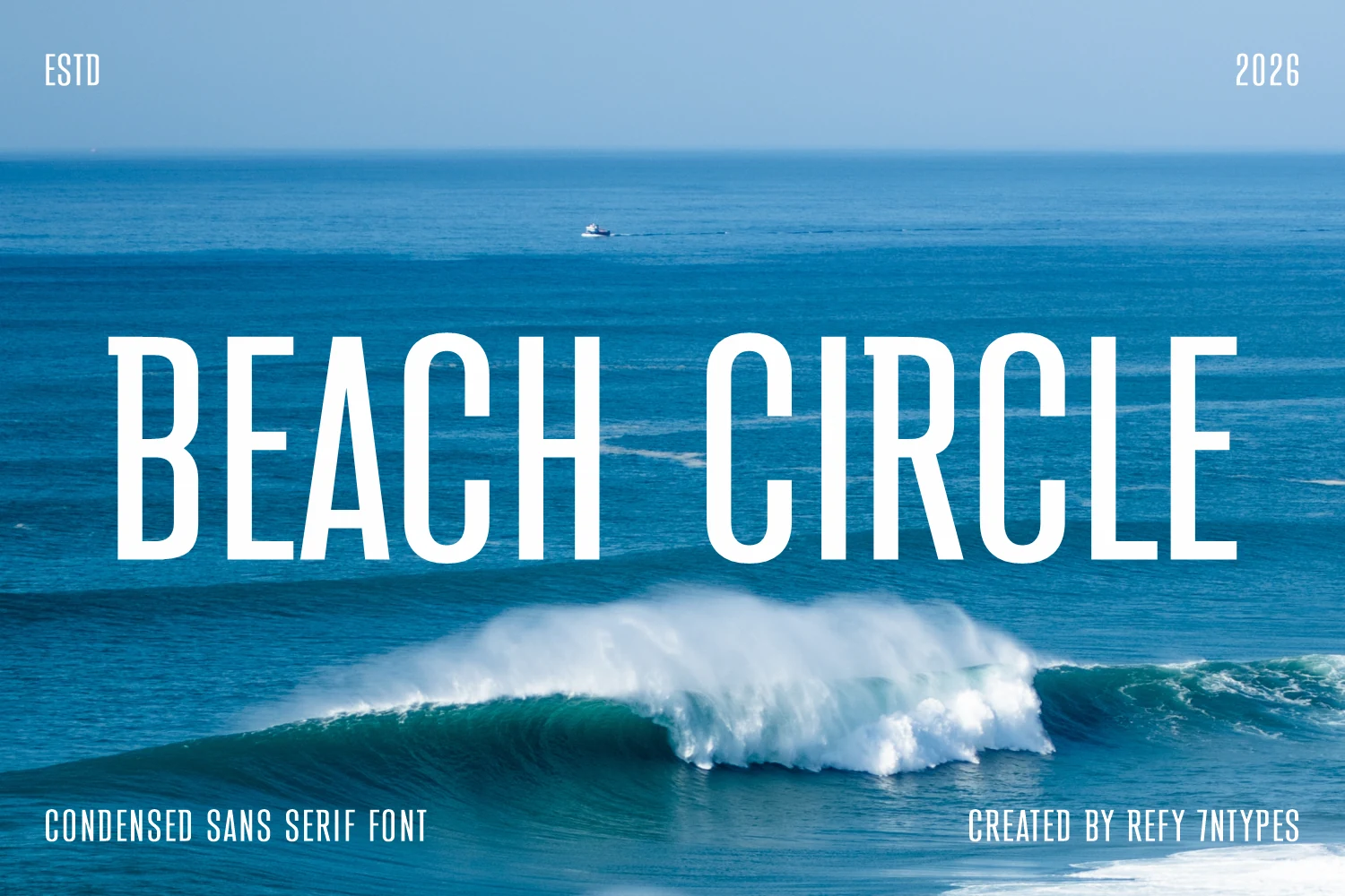
Best For: headlines, posters, website headers, branding
Beach Circle Font is a narrow sans serif with tall verticals, clean terminals, and compressed spacing that gives headlines a sharp coastal-poster feel. The letterforms are plain enough to stay readable, but the exaggerated height makes the title feel cinematic and assertive rather than casual.
For Beach fonts that need a modern minimalist tone, this one is strongest in large titles, mastheads, and brand marks. Use generous margins around it and avoid crowding the line; the condensed proportions create impact through scale, while light tracking helps the slim counters and straight stems stay crisp.
Beach Ocean Font
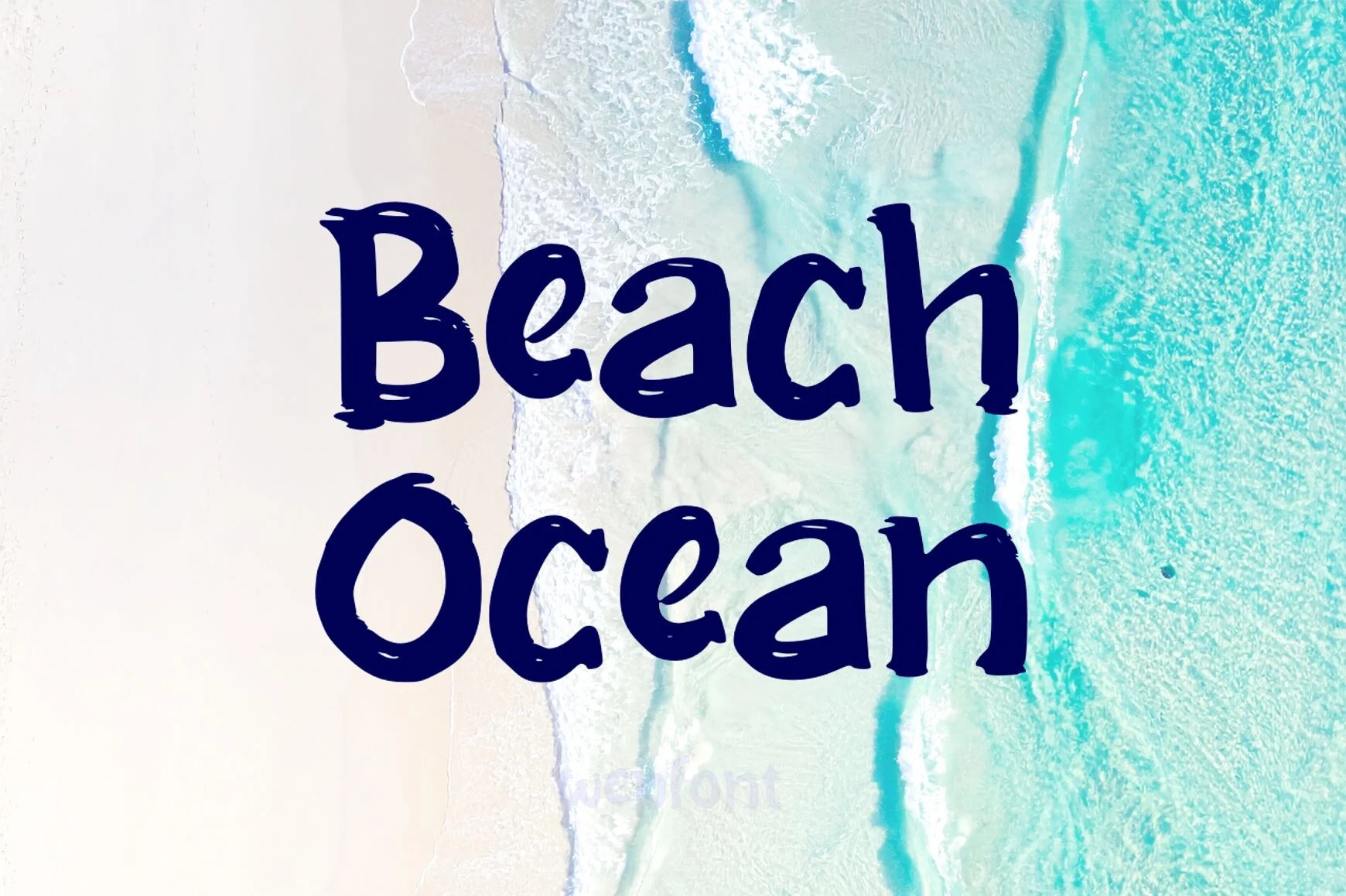
Best For: stickers, quotes, T-shirts, fun designs
Beach Ocean Font has a rounded hand-drawn look with thick uneven strokes, softened serifs, and slightly rough edges that keep the lettering cheerful rather than polished. The large counters and bouncy proportions give the words a playful beach-sign feel, while the solid fill helps the shapes stay clear and readable.
For Beach fonts that need a friendlier display style, it works best in short titles, stickers, and casual merch where the chunky shapes can stay open and legible. Give it a little breathing room and avoid long lines; the wide bowls and compact spacing create a stronger silhouette when the hierarchy stays simple.
Ocean Hugs Font
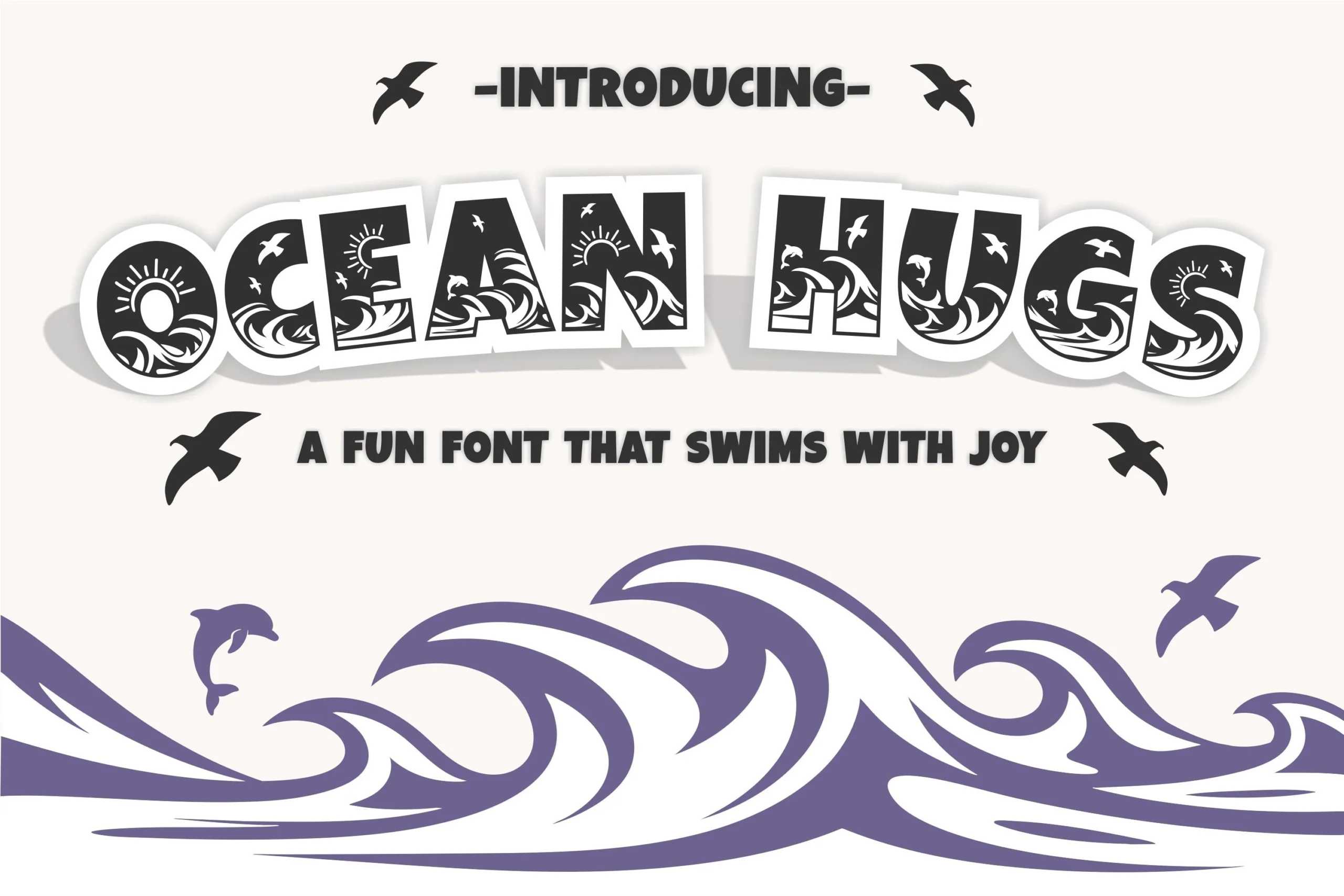
Best For: children’s designs, T-shirts, stickers, invitations
Ocean Hugs Font is built like a cheerful display alphabet, with chunky rounded letters, soft corners, and a bold silhouette that stays readable even with its decorative detail. The preview gives each character its own seaside scene—waves, birds, sunbursts, and dolphins—so the font feels lively and illustration-led rather than purely typographic.
Among Beach fonts, this one is best treated as the hero element in kids’ party graphics, summer tees, or playful signage. Keep the wording short and let the internal artwork do the work; because the letters already carry texture and motion, a simple secondary font underneath helps maintain clear hierarchy.
Summer Beach Font
Best For: posters, T-shirts, stickers, retro designs
Summer Beach Font has a tall condensed display build with heavy vertical strokes, rounded block shapes, and a distressed surface that mimics worn ink on an old summer poster. The narrow proportions make the words stack cleanly, while the red and navy preview shows how strongly the letters hold color contrast.
For Beach fonts with a vintage event-graphic mood, this one is strongest in short headlines for posters, shirts, stickers, and seasonal promos. Keep supporting text smaller and cleaner; the textured capitals already create the main hierarchy, and extra decorative elements can crowd the rough letter edges.
Pacific Beach Font
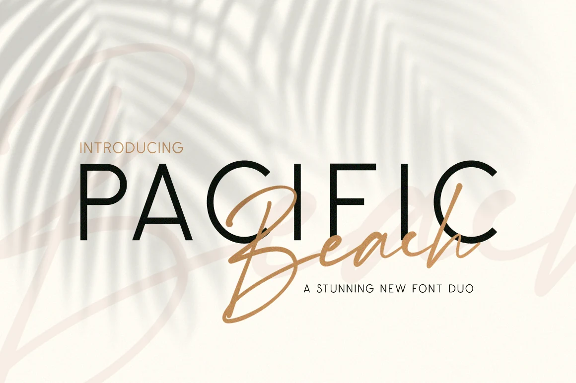
Best For: logos, branding, invitations, beauty branding
Pacific Beach Font pairs crisp uppercase sans letters with a flowing calligraphic script, creating contrast that feels polished without turning stiff. In the preview, the tall clean strokes of “PACIFIC” set a calm structure, while “Beach” sweeps across it with long loops and soft joins that add warmth and motion.
For Beach fonts with a more refined direction, this duo works especially well when the sans handles the anchor word and the script adds emphasis or a secondary name. That contrast helps logos, invitations, and beauty branding keep a clear hierarchy, especially if you give the script enough space so its descenders and crossing strokes stay readable.
Salty Beach Font
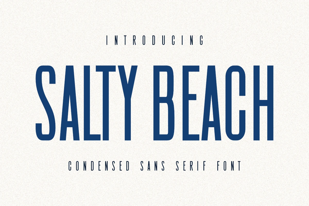
Best For: branding, posters, T-shirts, packaging
Salty Beach Font keeps things clean and assertive with tall condensed letterforms, straight sides, and tight internal proportions that make headlines feel instantly architectural. The preview shows crisp blue capitals with a steady rhythm and generous vertical reach, so the font reads modern, uncluttered, and confident at a glance.
If you are collecting Beach fonts with a sharper, less decorative mood, this one is especially strong for posters, branding marks, and packaging where space is limited but impact still matters. Its narrow build lets you fit more title into a compact area, while a touch of extra tracking in supporting lines helps the composition stay airy and polished.
Favorite Beach Font
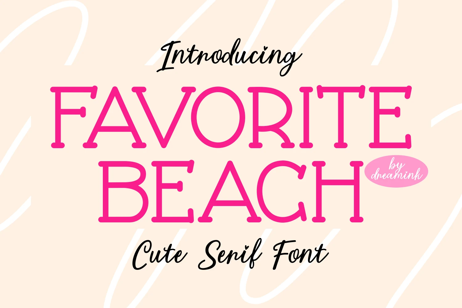
Best For: cute designs, invitations, social media graphics, feminine designs
Favorite Beach Font has a cute serif structure with rounded slab-like terminals, soft curves, and wide open counters that keep the large pink capitals friendly rather than formal. The letterforms are clean and smooth, but the playful proportions give words a light greeting-card energy.
For Beach fonts with a sweeter mood, it fits short titles, social graphics, invitations, and feminine product layouts where charm matters more than rugged texture. Keep the tracking fairly open and avoid dense paragraphs; the rounded serifs and tall shapes read best when the title has clear spacing and a simple supporting type style.
Aussie Ocean Font
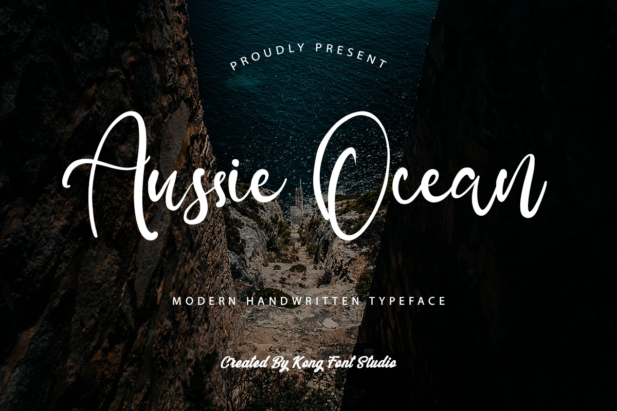
Best For: logos, invitations, quotes, social media graphics
Aussie Ocean Font has a modern handwritten style with tall looping capitals, rounded joins, and smooth monoline strokes that keep the script open and readable. The oversized A and O add sweep and contrast, while the lighter lowercase rhythm gives the lettering an easy, relaxed movement.
For Beach fonts that need a casual polished look, it works well in logos, invitations, and quote graphics where the script can stretch across the layout. Keep it to short phrases and give the capitals room; the long entry strokes and wide curves carry more impact when they are not crowded by tight spacing or busy supporting type.
Beach Font
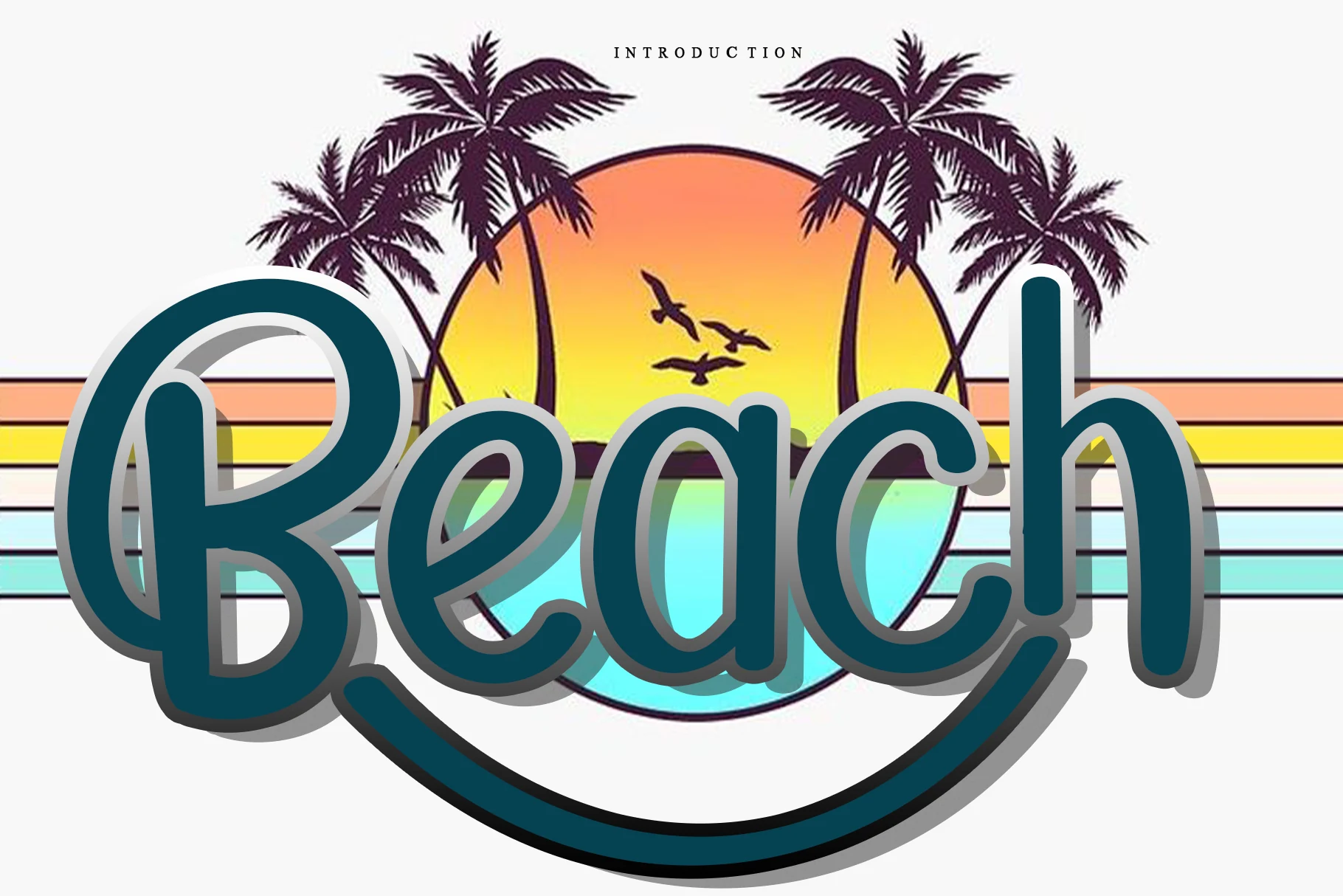
Best For: logos, stickers, T-shirts, fun designs
Beach Font has a rounded handwritten style with thick smooth strokes, oversized loops, and a long underline swash that makes the wordmark feel playful and bold. The capital B carries most of the personality, while the connected lowercase letters keep the rhythm soft and friendly.
For Beach fonts aimed at cheerful craft or merch layouts, this one works best as a short display word rather than body text. Keep the surrounding elements simple and give the underline enough clearance; the heavy curves and shadowed silhouette need space so the lettering stays readable.
Ocean Aubrey Font
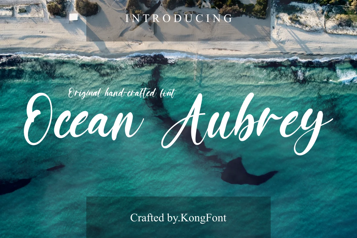
Best For: logos, T-shirts, short phrases, handmade designs
Ocean Aubrey has a loose handcrafted script rhythm, with broad rounded downstrokes, narrow joins, and oversized capitals that pull attention fast. The looping O and long Aubrey tail give it a relaxed coastal character without turning the letters into decoration.
Use it where Beach fonts need to feel casual but still readable: logo marks, T-shirt slogans, and short branding lines. Keep the word count tight and let the swashes sit away from hard edges, because the capitals and descenders need horizontal space to keep their shape.
Beach Story Font
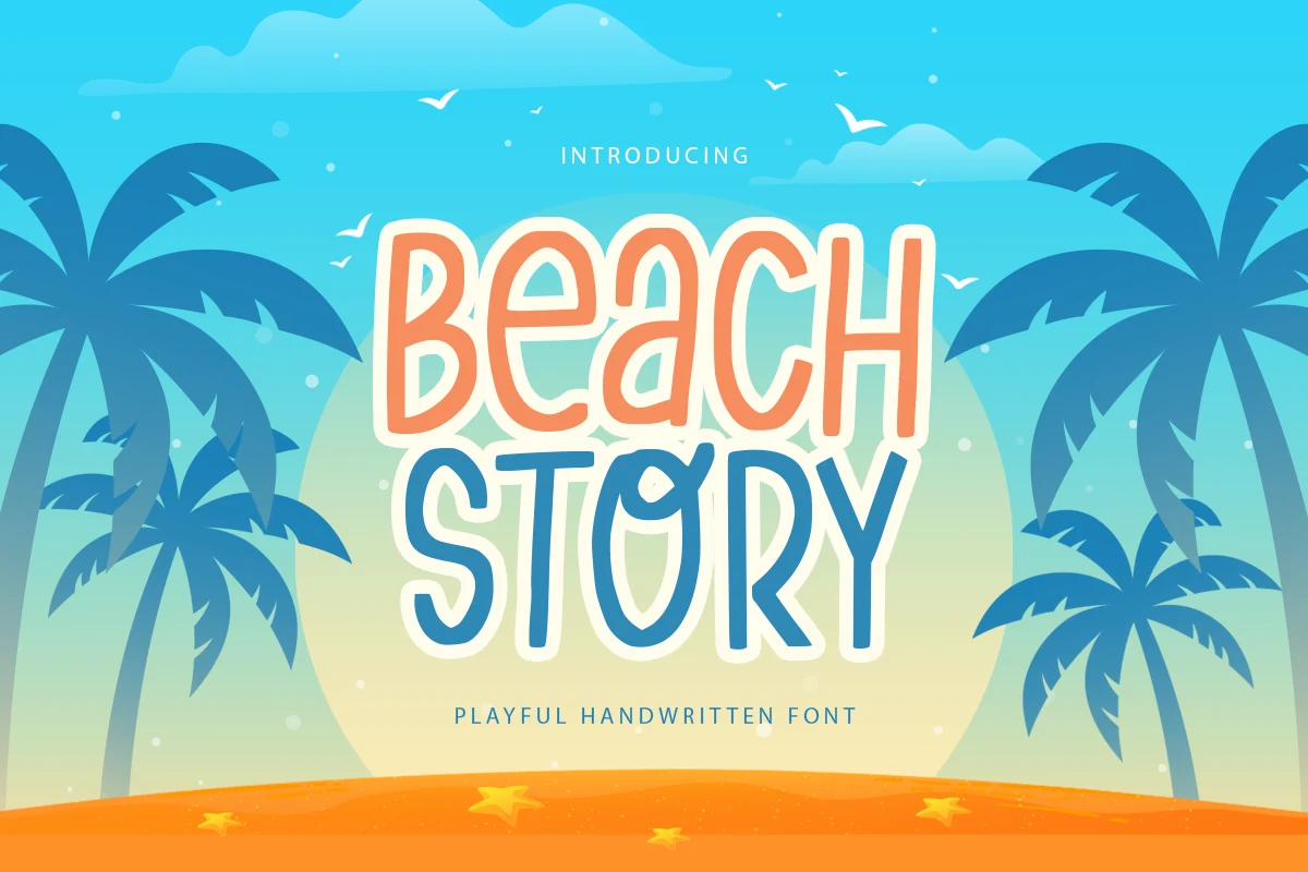
Best For: posters, social media graphics, playful designs, children’s designs
Beach Story has a cheerful handwritten look built from tall, narrow letterforms, rounded terminals, and slightly irregular strokes that keep the rhythm lively. The capitals feel especially friendly and open, which gives short titles a bright, breezy presence without making them hard to read.
For Beach fonts, this one works best when you want a light, youthful tone rather than a textured surf style. Use it on short poster headlines, greeting card lines, or social graphics, and pair it with a clean sans serif so the playful shapes stay in focus and the hierarchy remains easy to scan.
Love Beach Font
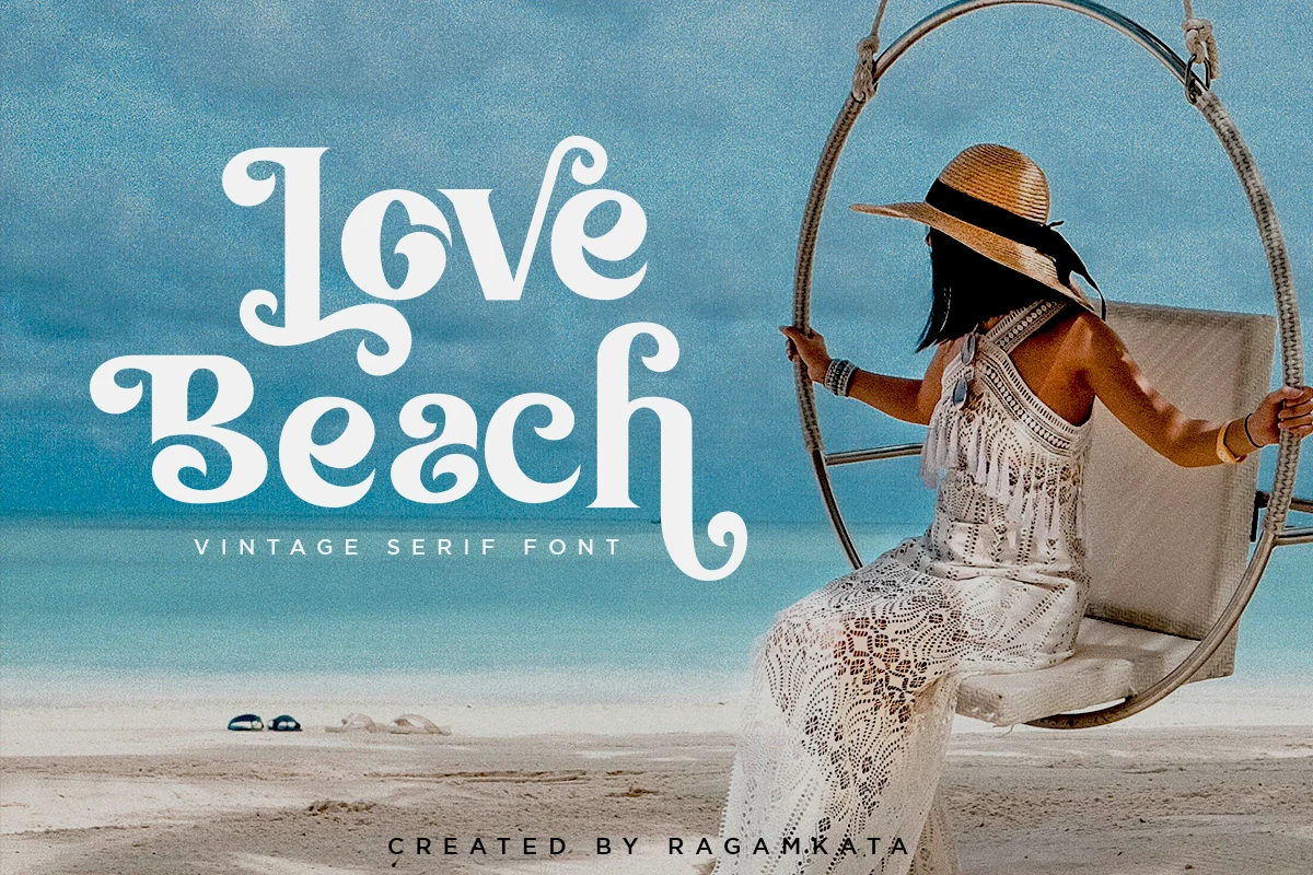
Best For: logos, branding, display text, retro designs
Love Beach uses a vintage serif structure with heavy verticals, soft wedge-like serifs, and curled terminals that make the words feel decorative before any extra styling is added. The rounded counters and sweeping lower strokes give it a nostalgic beach-poster mood while keeping the main letter shapes clear.
In a set of Beach fonts, this is the stronger choice for retro logos, boutique branding, and display titles rather than casual handwritten layouts. Its OpenType features and alternate glyphs help vary repeated letters, but the ornate curls need controlled spacing so the composition does not become crowded.
Salty Ocean Font
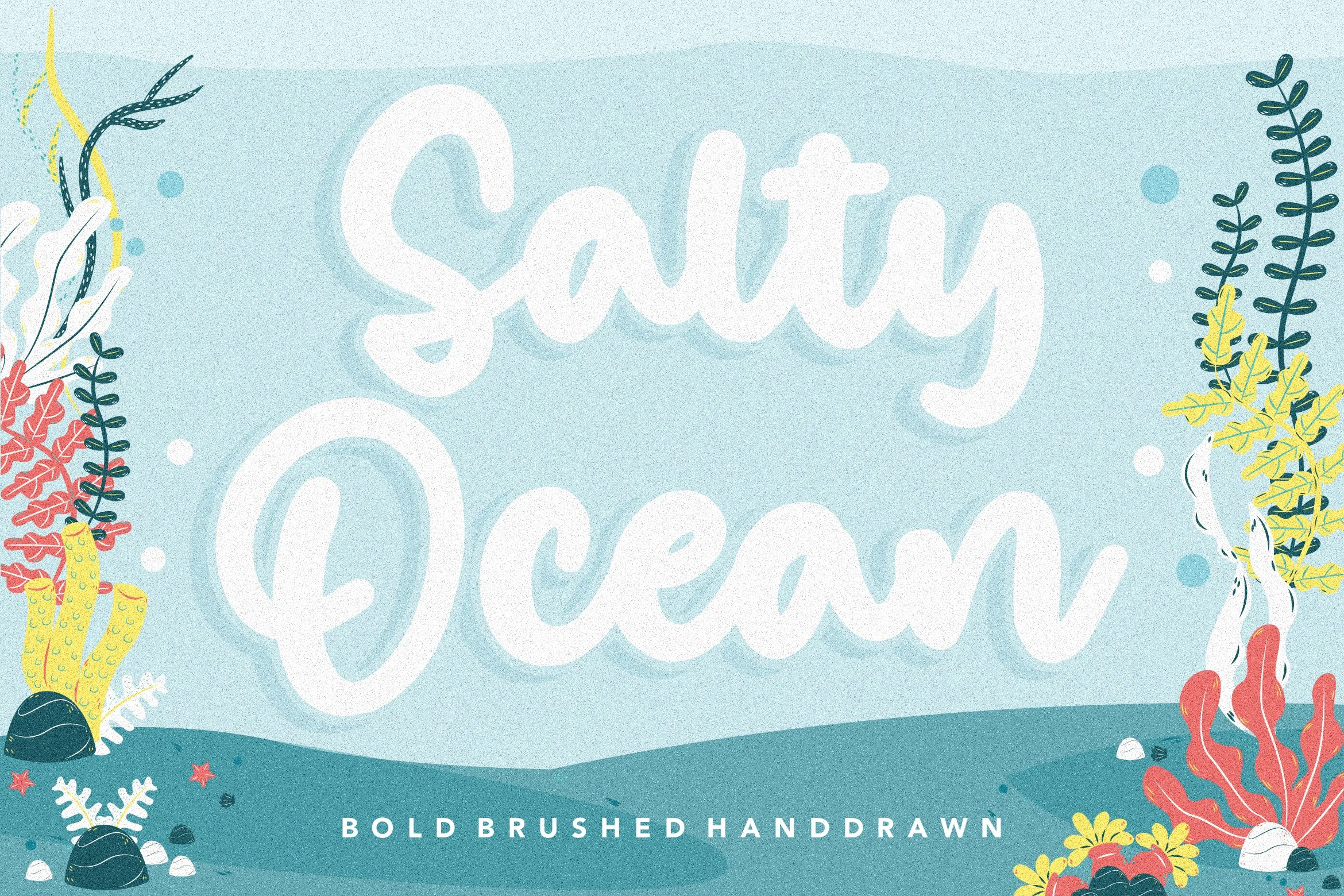
Best For: posters, social media graphics, display text, signage
Salty Ocean has thick brushed strokes, rounded terminals, and a soft connected rhythm that makes the lettering feel breezy and immediate. The broad capitals and slightly uneven curves keep it hand-drawn rather than polished, giving short words a warm coastal character.
If you are collecting Beach fonts with a casual graphic feel, this one works best in display settings like posters, shop signs, and social graphics. Keep it to short lines and bold title treatment, since the chunky script carries strong visual weight and looks best with a little space around it.
Aloha Beach Font
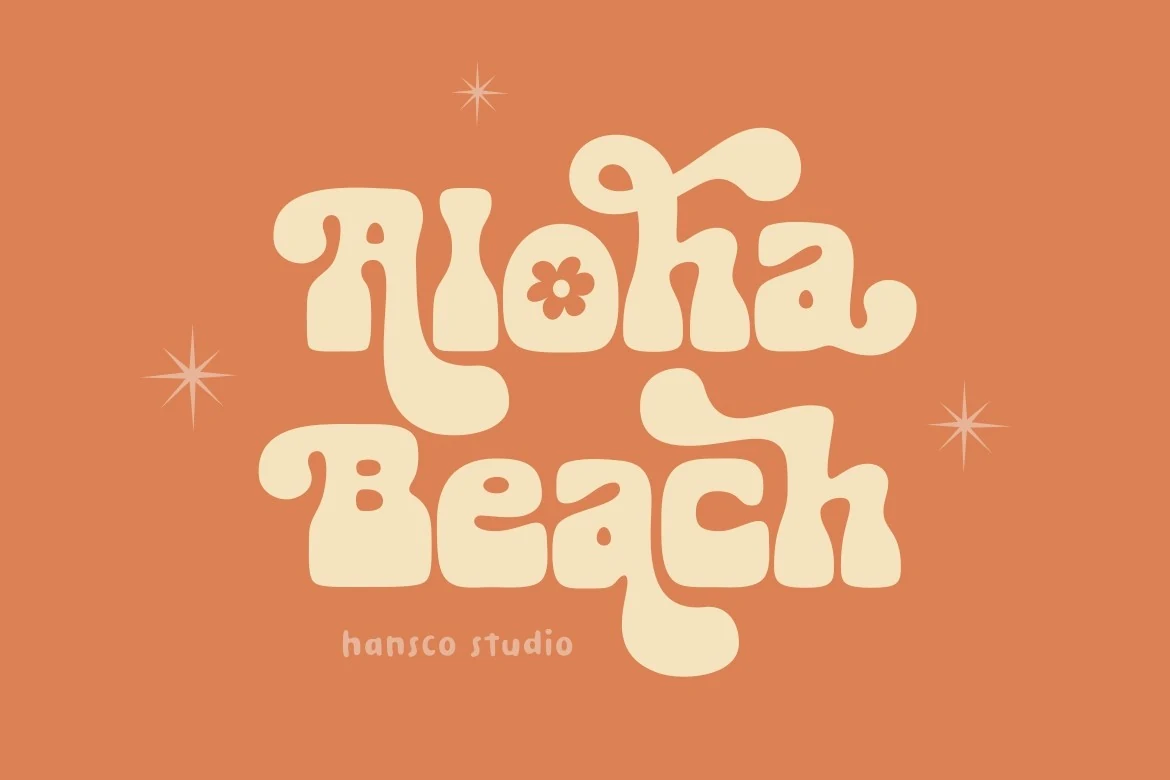
Best For: logos, stickers, packaging, retro designs
Aloha Beach has thick slab-style letters with rounded corners, soft bulbous serifs, and playful curls that push it toward a true retro display look. The compact counters and wavy baseline give the words a sunny, slightly groovy rhythm that feels bold without turning harsh.
For Beach fonts, this one is strongest when you want a 70s postcard mood in logos, stickers, or packaging. Keep it in short headlines and give the letters breathing room, because the chunky proportions and decorative bends do more work when the composition is simple.
Cool Beach Font
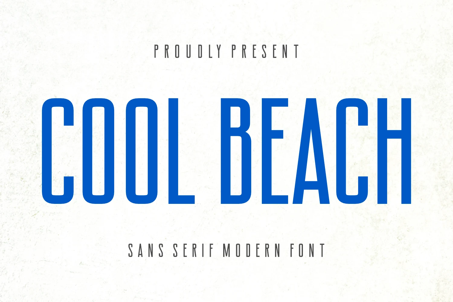
Best For: logos, branding, website headers, clean designs
Cool Beach is a tall condensed sans serif with firm vertical strokes, narrow counters, and squared proportions softened by slightly rounded corners. Its clean uppercase structure gives headlines a crisp modern feel instead of the usual script or retro direction found in many Beach fonts.
Use it when a layout needs strong height, clear spacing, and a sharper brand tone: logo text, packaging labels, book covers, or website headers. The letters read best with generous tracking and high contrast, because the narrow forms can feel dense when packed too tightly.
Beach Party Font
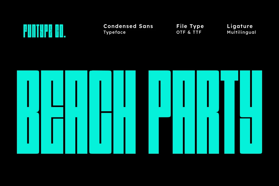
Best For: posters, headlines, branding, bold designs
Beach Party has an ultra-condensed build with heavy vertical strokes, squared edges, and narrow inner spaces that give it a hard geometric punch. The letters feel tall and tightly packed, so even a short word takes up space quickly and lands with a strong poster-like presence.
Within Beach fonts, this one goes for impact over softness, making it a smart pick for headlines, event posters, and bold brand statements. Keep the wording short and add a little tracking or line spacing when stacking text, so the dense shapes stay crisp instead of visually clumping.
Coconut Beach Font
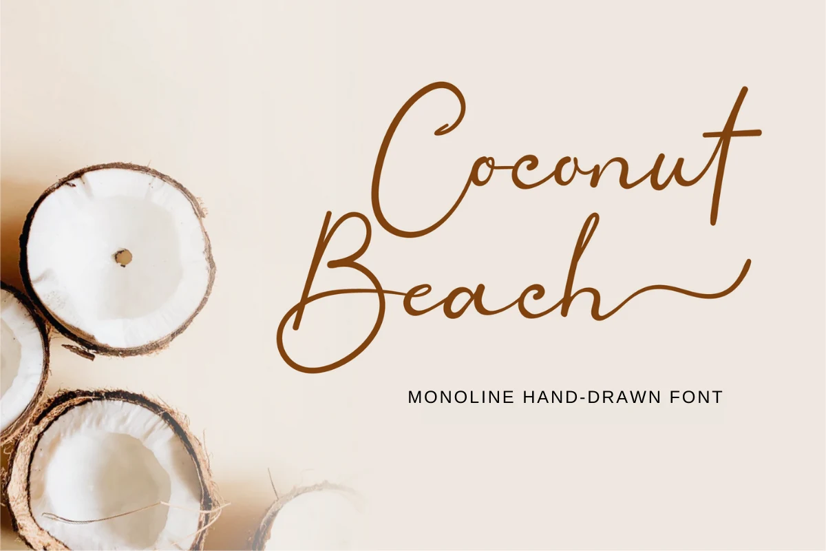
Best For: logos, branding, invitations, soft designs
Coconut Beach is a light monoline script with airy loops, a tall opening capital, and long finishing strokes that give it a graceful handwritten rhythm. The even line weight keeps it clean, while the wide curves and open joins stop it from feeling too formal.
If you want Beach fonts with a softer, more refined mood, this one suits logos, invitations, and calm branding pieces. Keep it at display size and leave room around the swashes, especially on capitals and end letters, so the elegant movement stays visible instead of tangling into nearby text.
The Beach Font
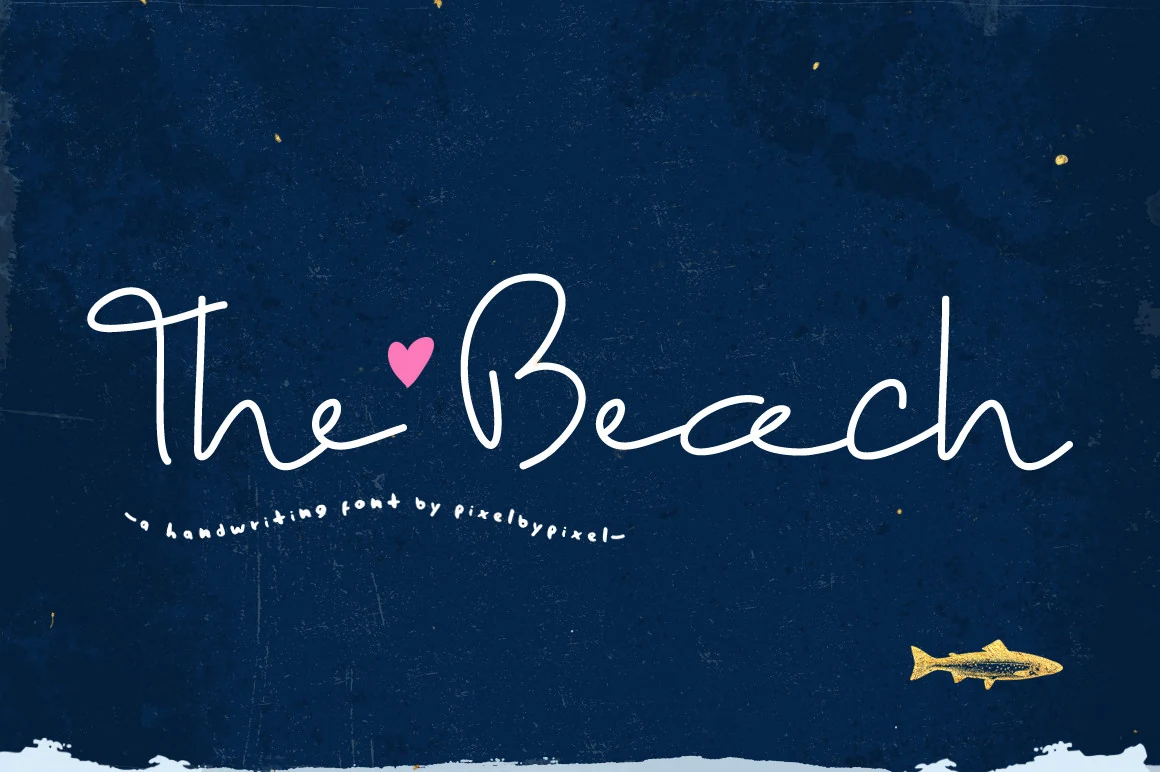
Best For: social media graphics, quotes, personal branding, soft designs
The Beach is a thin handwritten script with long loose strokes, open spacing, and an intentionally unfinished baseline. Its tall ascenders and extended cross strokes make the words feel personal and airy, closer to quick marker lettering than polished calligraphy.
Use it when Beach fonts need a soft, casual note for social posts, quotes, or relaxed personal branding. The fine monoline weight needs contrast behind it, and longer phrases should stay lightly spaced so the sweeping letters do not lose their delicate rhythm.
The strongest choice depends on the design role. Use condensed sans fonts such as Ocean Beach, Salty Beach, Cool Beach, or Beach Party when you need clean headline impact. Choose script fonts like Beach Waves Duo, Dream Beach, Aussie Ocean, Coconut Beach, or The Beach for softer coastal branding and invitations. Pick retro or decorative options such as Aloha Beach, Love Beach, Ocean Hugs, or Summer Beach when the lettering should become the main visual element. For the broadest article angle, this works best as a Beach fonts collection for seasonal design, merch, branding, and social content.