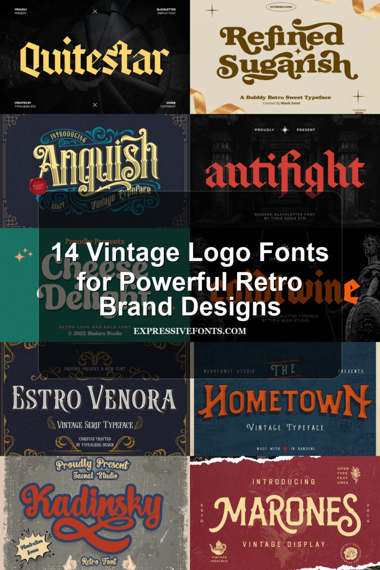
24 Best Decorative Display Fonts for Bold Designs in 2026
Decorative Display Fonts are built for designers who need type that behaves like a visual asset, not plain text. This collection covers bold, retro, luxury, graffiti, sport, stencil, and playful fonts for logos, posters, packaging, apparel, social graphics, signage, and editorial headlines where one strong wordmark can carry the whole layout.
Looking for more display fonts? Browse our complete Display Fonts collection to compare bold, retro, playful, poster, groovy, creative, vintage, cartoon, headline, and decorative display styles.
Browse by Category
Refined & Futuristic Decorative Display Fonts
These decorative display fonts use sharp structure, editorial contrast, or modular cuts for premium logos, fashion layouts, tech marks, and high-end headlines.
Focsio Font

Best For: magazine covers, editorial designs, luxury designs, fashion branding
Focsio is built around towering, condensed capitals with heavy vertical stress, narrow counters, and squared serif cuts that make the word shape feel architectural rather than ornate. Its rigid proportions give headlines a severe editorial presence, while the curved bowls keep the face from becoming purely mechanical.
For luxury titles, magazine covers, and fashion branding, use it as the dominant wordmark rather than a supporting text face. Focsio brings the more editorial side of Decorative Display Fonts into view; keep tracking controlled, give the tall forms strong contrast, and avoid long phrases where the narrow counters start to compress readability.
Designer Font

Best For: logos, branding, website headers, modern designs
Designer Font is a clean futuristic sans built from thin monoline strokes and deliberate breaks across letters like D, E, and R. Its rounded curves and open spacing keep the word readable, while the segmented cuts create a technical logo-system feel without adding ornamental clutter.
Within Decorative Display Fonts, it works best where the typography needs to look engineered and spare: tech logos, website headers, and short brand marks. Keep contrast high, avoid tight tracking that closes the gaps, and let the broken strokes sit at a generous size so the modular construction stays clear.
Volta Font

Best For: logos, luxury designs, high-end designs, modern designs
Volta Font uses a modern stencil structure with sharp geometric breaks, circular dot terminals, and high-contrast cut-outs that make each letter feel deliberate and architectural. The wide spacing and clean silhouettes give it a refined display presence, while the split forms add tension without making the wordmark chaotic.
Its place among Decorative Display Fonts is more luxury editorial than rough industrial stencil. Use it for short brand names, premium labels, or sophisticated signage, and keep the background quiet so the negative-space cuts stay crisp; small sizes will weaken the dot details and triangular joins.
Bold & Condensed Decorative Display Fonts
Use this group when a design needs dense, oversized lettering that reads fast in posters, packaging, signage, merch graphics, and dominant brand headlines.
North Hype Font

Best For: posters, merch design, social media graphics, fashion branding
North Hype hits with huge blocky forms, ultra-tight spacing, and rounded corners cut by deep junctions that make the letters feel packed under pressure. The heavy silhouette and slightly unruly baseline give it a loud street-poster rhythm with a raw, zine-like edge.
For Decorative Display Fonts, this one leans hard into impact rather than refinement. Keep it to short headlines, logos, or statement words where the dense fit can stay intentional, and pair it with quieter secondary text so the thick shapes hold their swagger without turning the layout muddy.
Nexora Font

Best For: logos, posters, editorial designs, packaging
Nexora has a tall, compressed build with broad vertical strokes, tight counters, and clean curves that keep the letters bold without feeling blunt. The shaped joins add a subtle industrial tension, so the face feels precise and commanding instead of generic.
It suits the sharper side of Decorative Display Fonts, especially when a layout needs impact in a narrow width. Use it for mastheads, posters, or brand headlines, and keep tracking modest—the condensed structure already carries plenty of density, so too much spacing weakens its strong vertical rhythm.
Bold Font

Best For: logos, headlines, posters, T-shirts
Bold Font uses massive sans serif capitals with soft outer curves, thick stems, and compact spacing that turns each word into a single heavy shape. The rounded O and D keep the tone modern rather than industrial, while the squared joins and blunt terminals give the face a stable headline weight.
For Decorative Display Fonts, it is a direct choice when the layout needs clear impact without extra ornament. Use it for short logos, posters, packaging marks, or T-shirt text, and keep the surrounding typography lighter so the fat letterforms can dominate without making the composition feel overfilled.
Notre Font

Best For: posters, signage, branding, headlines
Notre Font has a heavy condensed sans structure with huge vertical strokes, tight spacing, and rounded counters that stop the face from feeling rigid. The slightly playful curves in the N and lowercase-style forms give it a vintage advertising tone, while the mass of each letter keeps the headline loud and direct.
It fits the bolder end of Decorative Display Fonts when a layout needs one dominant word rather than a delicate typographic system. Use it for signage, poster titles, or brand graphics, and keep surrounding type small and restrained so the compressed orange-block effect stays intentional instead of crowded.
Titan Font

Best For: logos, packaging, headlines, bold designs
Titan uses oversized blocky proportions, broad counters, and flat terminals to build a dense, confident silhouette. The curves are smooth and full rather than sharp, which gives Decorative Display Fonts a friendlier punch and keeps the weight feeling modern instead of rigid.
This is the kind of face that lands fast in branding, packaging, and poster work where a few words need to carry the composition. Pair it with smaller, lighter supporting text and keep the hierarchy clear—the thick strokes already provide plenty of presence, so contrast does more than extra effects.
Retro & Surf Decorative Display Fonts
These fonts lean into nostalgic curves, worn print texture, and beach-sign rhythm for vintage posters, apparel, resort branding, labels, and retro packaging.
Coastal Delight Font

Best For: logos, merch design, posters, retro designs
Coastal Delight pairs a swollen retro sans with a relaxed connecting script, giving the typeface a strong split between blocky impact and casual movement. The sans has soft corners, heavy stems, and tight interior shapes, while the script brings long loops and rounded joins that loosen the composition.
It fits the nostalgic end of Decorative Display Fonts best when the sans handles the main title and the script adds a secondary phrase or brand note. Keep the two styles in clear hierarchy, avoid crowding the script below small caps, and use generous line spacing so the loops do not fight the chunky headline weight.
Laguna Tropic Font

Best For: logos, posters, packaging, signage
Laguna Tropic Font has a warm surf-sign character built from chunky serif forms, flared terminals, and uneven organic curves. The main letters feel hand-cut rather than polished, with wide counters and soft wobble that give the display face a vintage beach-motel rhythm.
Its Decorative Display Fonts appeal comes from the duo structure: the bolder serif can carry resort names, poster titles, or packaging marks, while the simpler companion style works for small support text. Keep the curved baseline intentional and avoid tight stacking, because the wide flares need space to stay readable.
Thankful Font

Best For: posters, merch design, retro designs, vintage designs
Thankful has tall, chunky retro capitals with tight vertical proportions, softened corners, and deep notches that keep the heavy build from feeling stiff. The letterforms lock together with playful ligature-style joins, giving headlines a continuous rhythm that feels warm, nostalgic, and slightly 70s without losing clarity.
Within Decorative Display Fonts, it works best when one or two words carry the composition. Use it for posters, vintage apparel, or seasonal branding, and keep the supporting text lighter and simpler—the condensed width and linked shapes already create a dense texture, so extra breathing room around the headline helps the forms stay crisp.
Retro Distressed Font

Best For: logos, T-shirts, posters, vintage designs
Retro Distressed brings a worn poster texture to Decorative Display Fonts, with tall condensed capitals, blunt slab-like cuts, and chipped gaps running through the strokes. The narrow proportions make the words feel packed and loud, while the rough surface keeps the letterforms from looking too clean or corporate.
Use it for titles, shirt graphics, music artwork, and logo marks that need a printed, weathered finish without adding separate texture overlays. Keep supporting type cleaner and lighter; the distress already creates visual noise, so strong contrast helps the headline stay readable.
Bubble & Playful Decorative Display Fonts
Choose these decorative display fonts for rounded, cartoon-like, or handmade impact in stickers, kids’ graphics, fun merchandise, social posts, and playful logos.
Sugar Peachy Font

Best For: logos, posters, headlines, retro designs
Sugar Peachy gives Decorative Display Fonts a bright 70s mood with plush curves, rounded terminals, and a thick, puffy silhouette that feels almost hand-molded. The letterforms are wide and friendly, with soft joins and compact counters that create a dense, candy-like texture.
It shines in short headlines, logos, and headers where that chewy shape can do the visual work. For stacked words, add a little more line spacing rather than extra tracking—the deep lower curves and broad bowls need room between lines to keep the composition clear.
Summer Flower Font

Best For: T-shirts, stickers, children’s designs, fun designs
Summer Flower pushes Decorative Display Fonts into a soft cartoon direction, with inflated uppercase shapes, rounded terminals, and slightly uneven hand-drawn edges. The thick black contour gives each letter a sticker-like boundary, while the compact counters keep the words bold and easy to recognize.
Use it for short seasonal phrases, decals, T-shirt graphics, or playful headers where the type can carry most of the layout. Keep tracking fairly tight so the chunky forms feel connected, but avoid cramped stacking because the heavy shadow needs clear space between lines.
Weird Vault Font

Best For: logos, quotes, branding, posters
Weird Vault leans into Decorative Display Fonts with oversized, hand-cut shapes, swollen curves, and slightly uneven edges that keep the bold weight feeling informal rather than mechanical. The letters have a sturdy silhouette, but the softened joins and rounded counters give the font a warm, human-made rhythm.
That mix works especially well for short logos, quotes, and posters where you want impact without a polished corporate finish. The alternate regular and rounded styles give you a useful way to shift tone, and pairing it with a simpler secondary font helps the chunky forms hold the headline while the rest of the layout stays clear.
Street & Brush Decorative Display Fonts
This set focuses on graffiti, handstyle, extruded, and fast brush lettering for streetwear, music artwork, stickers, posters, and expressive merchandise.
Death Subway Graffiti Font

Best For: posters, merch design, T-shirts, stickers
Death Subway Graffiti Font has the quick, aggressive rhythm of handstyle tagging, with slanted strokes, uneven line weight, and long drippy terminals that make each word feel freshly painted. The letters stay readable, but the loose joins and raw contours keep the texture restless rather than polished.
It lands on the rougher side of Decorative Display Fonts, where attitude matters as much as legibility. Use it for short headlines, streetwear graphics, or bold label art, and leave enough spacing around the baseline and descenders so the drips stay visible instead of turning the composition into a dense block.
Street Drips Font

Best For: posters, stickers, T-shirts, playful designs
Street Drips has oversized comic-graffiti letterforms with chunky curves, jagged corners, and a thick extruded shadow that makes every word pop off the page. The shapes are tightly packed but still readable, giving the font a playful wall-tag energy rather than a rough handstyle feel.
Its regular and extrude pairing makes it easy to build layered titles with real punch, especially for posters and branded graphics. Street Drips brings a louder, cartoon-leaning mood to Decorative Display Fonts, and it works best in short phrases where the heavy outline and tilted rhythm can stay bold without overcrowding the layout.
Raither Display Font

Best For: posters, logos, merch design, expressive designs
Raither Display Font moves like fast brush lettering, with sharp entry strokes, tapering ends, and long crossbars that stretch the word across the layout. The weight shifts feel hand-painted rather than polished, which gives the script a tense, high-speed rhythm and a strong street-racing attitude.
Among Decorative Display Fonts, this one works best when the headline needs motion more than neatness. Use it for posters, automotive branding, or music artwork, and keep the phrase short so the sweeping terminals stay readable; pairing it with a compact sans helps anchor the loose brush texture without flattening its energy.
Sport & Racing Decorative Display Fonts
These fonts use sliced details, athletic cuts, and speed-driven geometry for team branding, esports titles, motorsport graphics, event posters, and logos.
JP Sliced Sport Font

Best For: logos, posters, signage, headlines
JP Sliced Sport Font uses tall condensed capitals, blunt terminals, and a strong athletic stance that reads instantly from a distance. Its defining move is the horizontal slice pattern cutting through the lower half of each letter, giving the design a fast striped rhythm with a clear stadium feel.
In Decorative Display Fonts, this one is most effective when the word count stays short and the sliced detail has room to stay sharp. Use it large for team names, event titles, or bold branding, and pair it with a plain secondary sans so the striped sections do not compete with smaller supporting text.
Nezag Font

Best For: logos, branding, posters, modern designs
Nezag turns Decorative Display Fonts toward a racing-tech direction, using wide geometric capitals, sliced inner cuts, and hard angled terminals that suggest speed without relying on texture. The heavy strokes stay clean, while the open breaks inside the letters keep the futuristic shapes readable at headline scale.
It fits motorsport-style logos, esports titles, automotive graphics, and poster systems where a single word needs a strong horizontal push. Keep tracking moderate: the letters are already broad, and too much spacing weakens the connected, high-speed rhythm built into the forms.
Champion Font

Best For: headlines, posters, branding, logos
Champion gives Decorative Display Fonts a competitive edge with tall condensed capitals, clipped inner corners, and firm vertical strokes that echo modern sports lettering. The narrow width lets big words stretch across a layout without losing punch, while the angular cuts keep the heavy forms feeling quick and disciplined.
It works especially well for team-style branding, football graphics, and poster titles that need to read fast from a distance. Keep tracking slightly open and let the font handle the impact; with proportions this strong, a simpler secondary face is usually enough to keep the hierarchy clean.
Stencil & Thematic Decorative Display Fonts
Use these display fonts when the theme needs to be obvious: tactical stencil texture, stamped industrial weight, or carved mythic lettering for strong title work.
Military Steel Font

Best For: posters, badges, merch design, masculine designs
Military Steel Font uses wide stencil capitals with blunt slab-like cuts, heavy horizontal bars, and chipped distress marks across the letter faces. The squared construction gives each word a rigid tactical stance, while the rough texture keeps it from looking too clean or digital.
For Decorative Display Fonts, this one is built for command-heavy layouts rather than quiet branding. Use it for posters, badges, apparel graphics, or tactical-style packaging, and keep the distress visible at larger sizes; tight tracking or small captions will flatten the stencil gaps and weaken the rugged effect.
Industrial Font

Best For: logos, headlines, signage, vintage designs
Industrial gives Decorative Display Fonts a stamped, utilitarian character through heavy uppercase shapes, rough ink breaks, and blunt block proportions. The distressed texture sits inside the strokes rather than only on the edges, so the letters feel pressed onto the surface with uneven pressure.
Use it for compact headings, label-style logos, badges, or signage where a worn industrial mark makes sense. Keep contrast high and avoid long lines; the broken texture adds atmosphere, but short words and clear spacing keep the stamped effect readable.
Greek Odyssey Font

Best For: logos, signage, headlines, decorative designs
Greek Odyssey brings a mythic angle to Decorative Display Fonts, using hard triangular cuts, wide angular capitals, and open wedge-shaped counters that feel carved rather than drawn. The rhythm is rigid and ceremonial, with sharp diagonals giving each word a shield-like structure.
Use it where the lettering can behave as the main graphic element: logos, title cards, posters, or signage with short wording. Tight spacing reinforces the ancient-stone character, but generous line spacing helps the tall uppercase forms stay readable when stacked.
Conclusion
For premium branding, start with refined or futuristic styles. For loud posters and merch, use bold, street, sport, or bubble fonts. For theme-heavy work, stencil, industrial, and mythic display faces give the strongest signal.