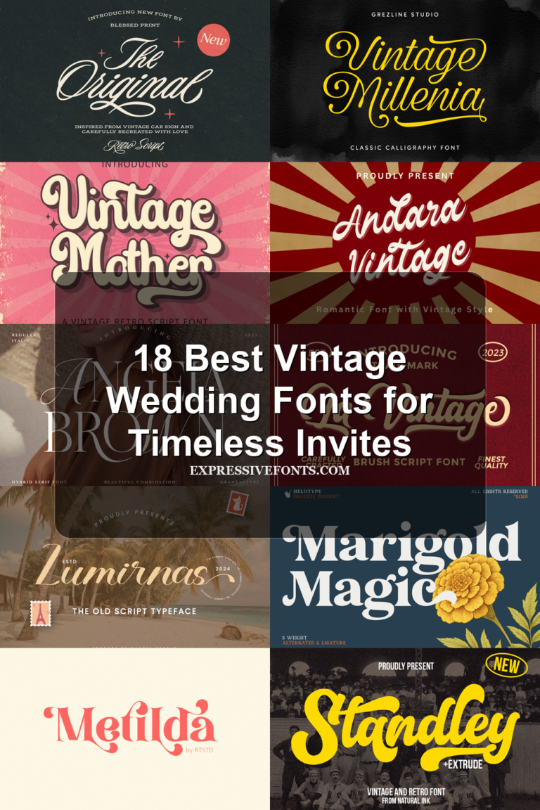
39 Best Cozy Fonts for Warm, Inviting Designs in 2026
Cozy Fonts work best when a design needs warmth without losing personality. This collection focuses on soft handwritten scripts, rounded display letters, playful retro shapes, and gentle seasonal styles that can make cards, stickers, posters, packaging, and branding feel more personal.
Some fonts in this roundup are quiet and note-like, while others are chunky, colorful, and clearly display-focused. Use them where the lettering should set the mood quickly: short headlines, quote graphics, product labels, invitations, Cricut projects, and friendly social media visuals.
Cozy Lines Font
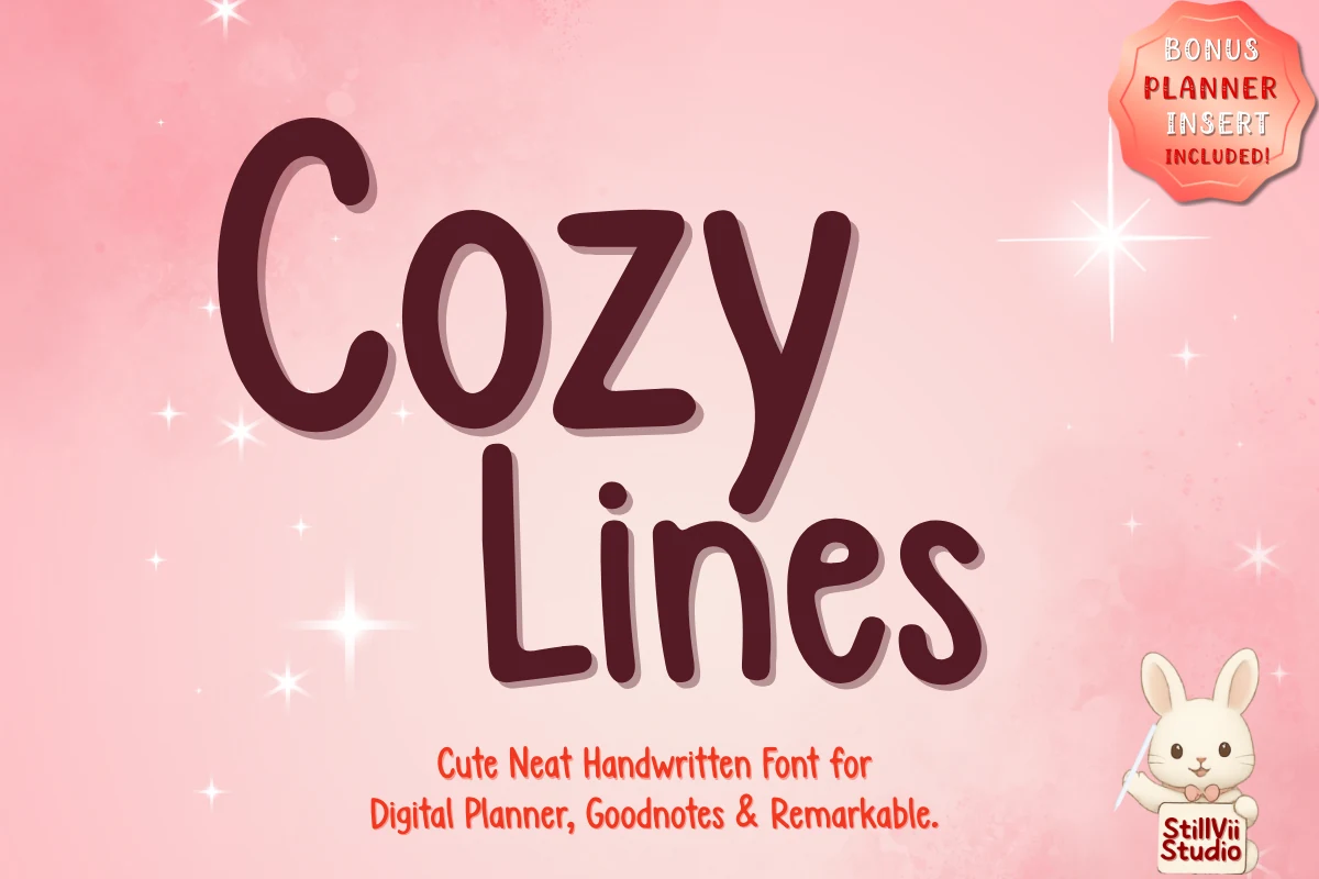
Best For: handmade designs, cute designs, casual designs, quotes
Cozy Lines Font sits on the tidy side of Cozy Fonts: rounded handwritten letters, an upright rhythm, and soft curled terminals give it a warm planner-note look without the messiness of loose script.
Use it for digital planner tabs, Goodnotes headings, study notes, and short outlines where legibility matters. Keep tracking moderate and give longer lines a little extra line spacing, because the thick strokes and tall lowercase forms work best when the words are not packed too tightly.
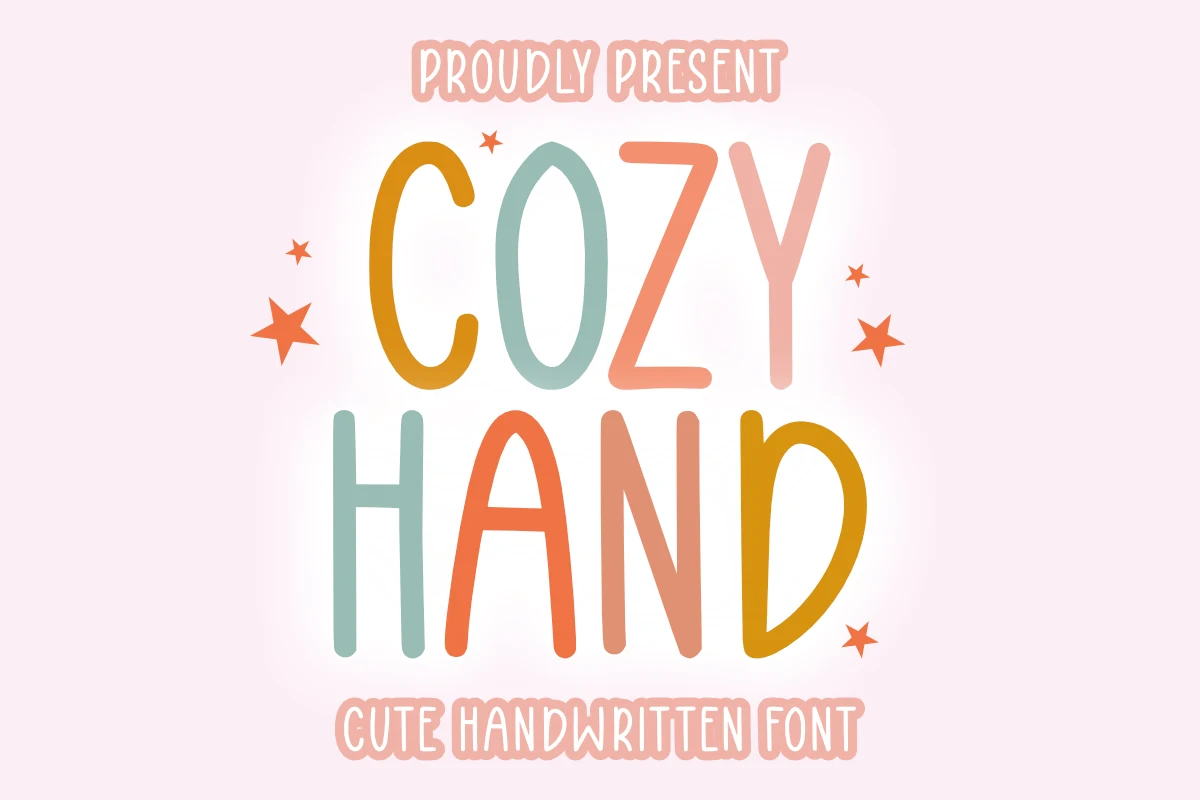
Cozy Hand Font
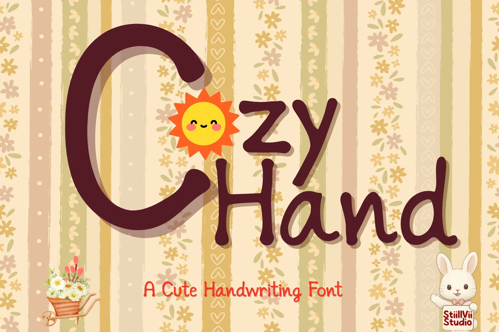
Best For: cute designs, children’s designs, handmade designs, casual designs
Cozy Hand Font has a light, easygoing handwritten look built from tall, narrow letterforms and smooth monoline strokes. The rounded ends keep it soft rather than sketchy, which gives Cozy Fonts a gentler, more relaxed voice for cheerful titles and personal projects.
Its uneven proportions add charm without hurting readability, so it works well for short headings, labels, and quote graphics. Try pairing it with airy spacing and simple layouts, where the slim vertical shapes can stand out without feeling crowded or overly busy.
Cozy Vibes Font
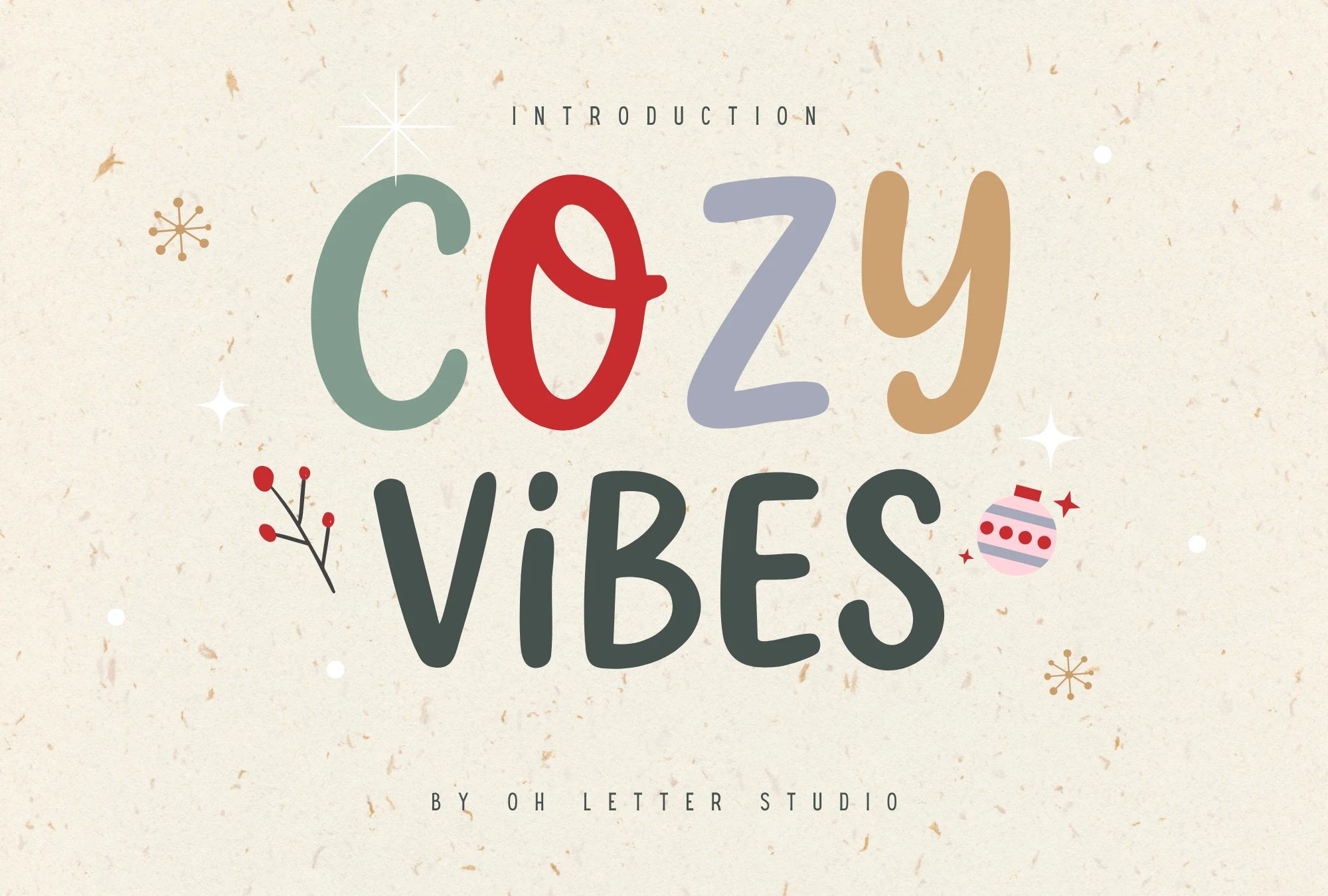
Best For: stickers, children’s designs, playful designs, handmade designs
Cozy Vibes Font leans into cheerful hand-drawn lettering with thick rounded strokes, uneven heights, and a soft doodle rhythm. The large caps feel friendly rather than polished, giving Cozy Fonts a casual display style for warm, handmade-looking titles.
Use it for stickers, planner covers, kids’ graphics, mugs, and short poster lines where the chunky shapes can carry the message. Keep word counts low and spacing open; the playful proportions work best as a headline layer, not as dense paragraph text.
Mocha Cherry Font
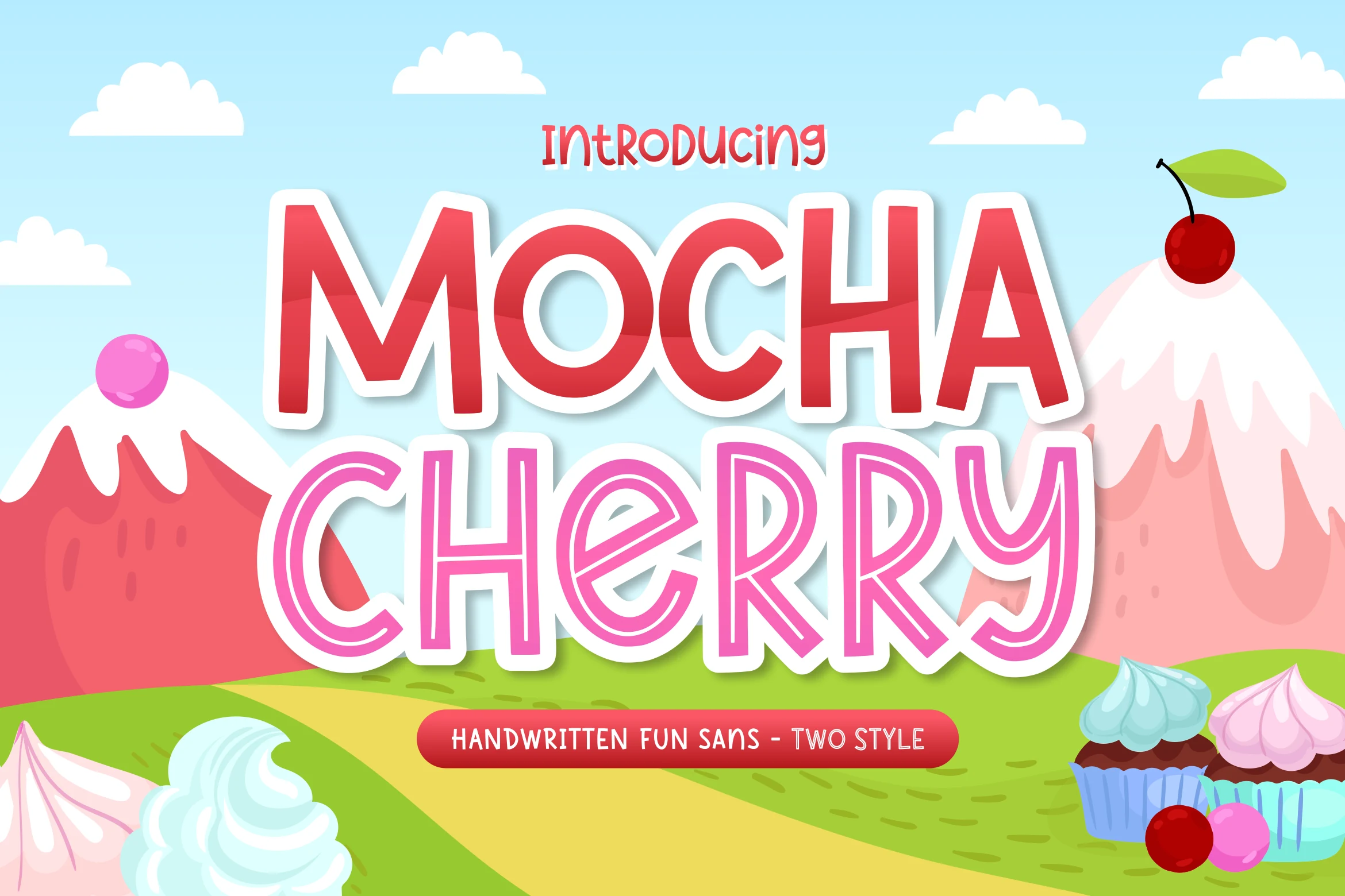
Best For: stickers, headlines, children’s designs, fun designs
Mocha Cherry Font brings a candy-bright display style with chunky rounded capitals, thick outlines, and a bouncy hand-drawn feel. Within Cozy Fonts, it reads sweet and high-energy rather than delicate, so the letterforms instantly suit playful headings and kid-focused artwork.
The two-style setup helps you build easy title contrast: use the solid uppercase look for the main word and the outlined style for a secondary line. Keep it to short phrases and bold hierarchy, where the wide shapes and soft curves stay crisp on packaging, stickers, or party graphics.
Hello Autumn Font
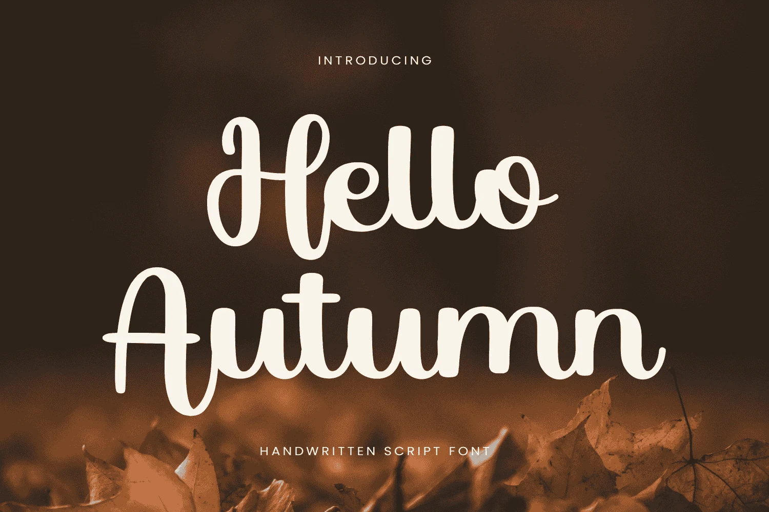
Best For: invitations, handmade designs, soft designs, quotes
Hello Autumn Font uses a smooth handwritten script with broad monoline strokes, tall looping capitals, and soft entry and exit swashes. Its rounded curves give Cozy Fonts a warmer seasonal tone without becoming too decorative or hard to read.
Use it for Thanksgiving invitations, greeting-card titles, fall quotes, and rustic labels where a single phrase needs a gentle handmade voice. Keep the words fairly short and leave open margins around the swashes, because the extended strokes need space to stay graceful instead of tangled.
Winter Draw Font
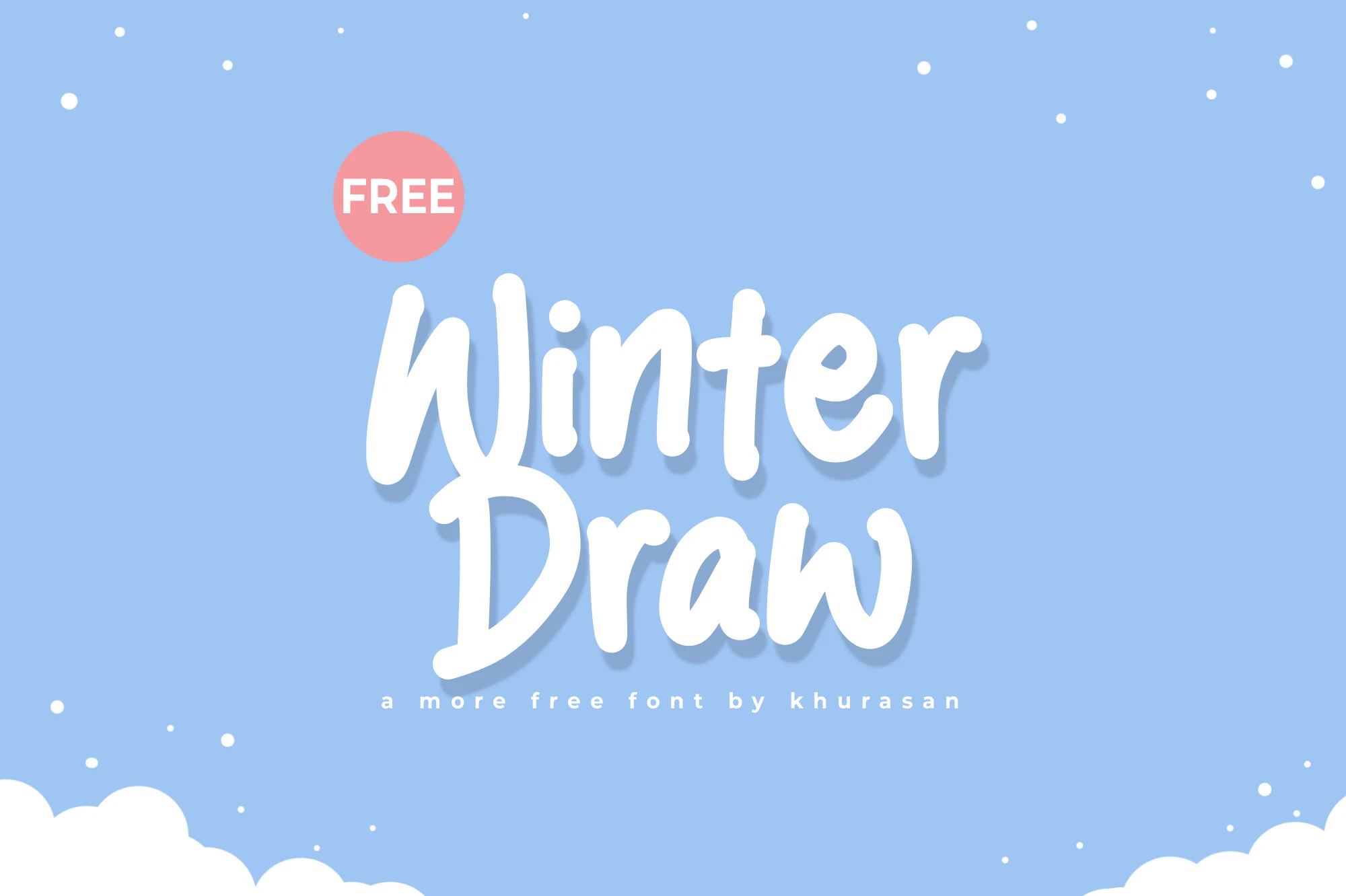
Best For: quotes, social media graphics, soft designs, casual designs
Winter Draw Font has a rounded brush-handwritten style with thick monoline strokes, a soft bounce, and smooth joins that keep each word friendly and easy to read. It sits on the sweeter side of Cozy Fonts, with enough weight to feel warm and noticeable in seasonal headings.
It works best for short winter titles, quote graphics, and cards where the broad shapes can stay open and clear. Pair it with a simple sans for supporting text, and give the lines a little breathing room so the chunky curves keep their hand-drawn charm instead of looking heavy.
Holly Note Font
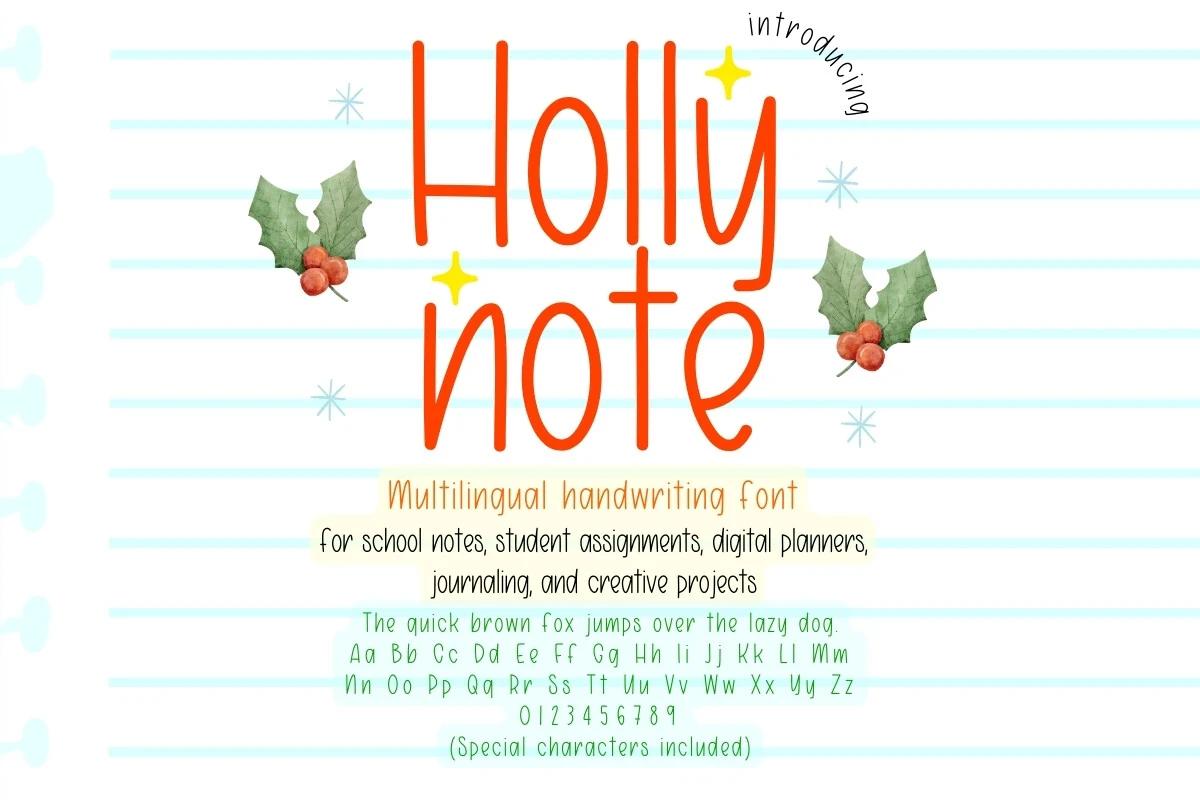
Best For: handmade designs, cute designs, casual designs, quotes
Holly Note Font has a slim handwritten look with tall vertical forms, rounded ends, and a light notebook-style rhythm. It brings Cozy Fonts into a cleaner planner direction, with enough festive softness to feel seasonal without turning into a decorative holiday display face.
The narrow letters make it useful for journal headings, school-note labels, digital planner sections, and short personal quotes. Keep line spacing generous and avoid squeezing the tracking too tightly, because the thin strokes need open space to stay readable at small note-taking sizes.
Cozy Corner Art Deco Font
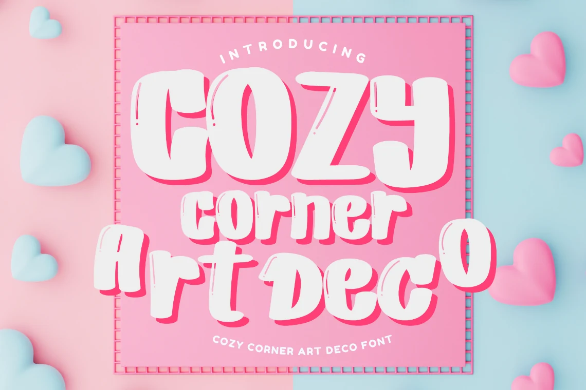
Best For: posters, branding, retro designs, eye-catching designs
Cozy Corner Art Deco Font uses chunky display lettering with rounded corners, blocky proportions, and small distressed nicks that keep it from feeling too polished. The heavy shapes and bright offset shadow give Cozy Fonts a playful retro punch, closer to candy-shop signage than a strict geometric deco face.
It works best when you let the bold forms lead the layout on posters, branding, or invitations with just a few words at a time. Keep supporting text simple and smaller, because the wide letterforms and strong silhouette already create the hierarchy on their own.
Real Super Font
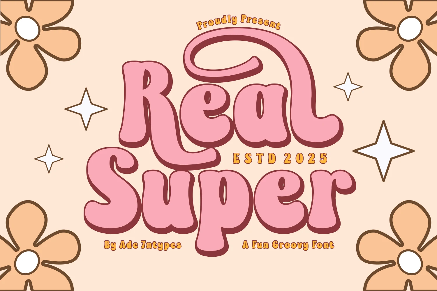
Best For: retro designs, vintage designs, stickers, display text
Real Super Font pushes a groovy 70s mood through swollen pink letterforms, heavy rounded serifs, and deep shadowed outlines. Its curled uppercase R and chunky lowercase shapes make Cozy Fonts feel retro, playful, and loud enough for display-first artwork.
Use it for Cricut cuts, SVG graphics, sublimation pieces, stickers, and short display phrases where the thick curves can stay readable. Keep the layout simple and let the shadowed lettering carry the hierarchy, because tight spacing or long lines will make the bubbly forms feel crowded.
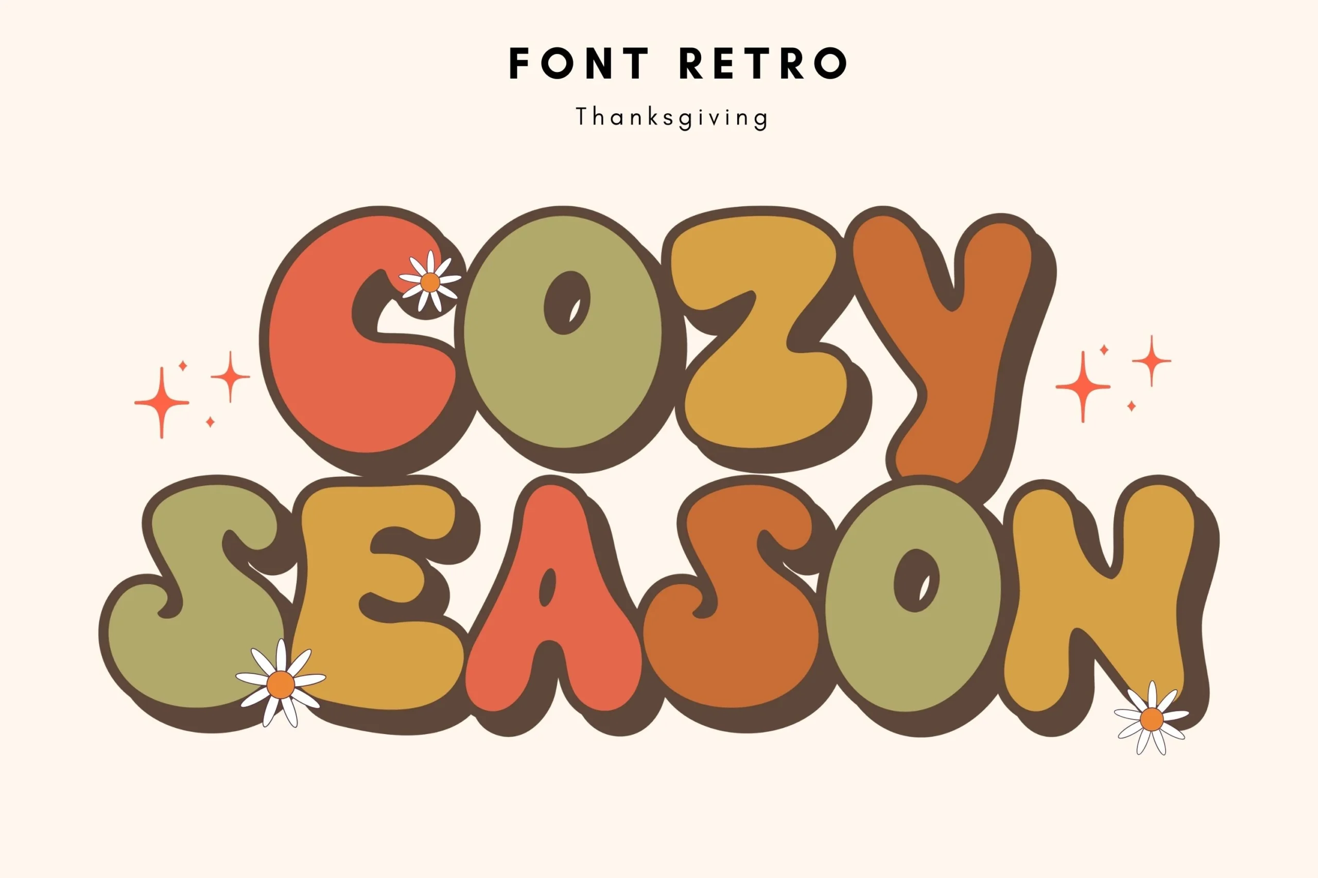
Cozy Season Font
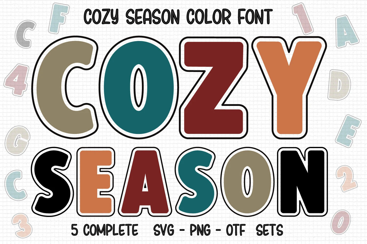
Best For: invitations, posters, retro designs, playful designs
Cozy Season Font uses oversized retro letterforms with soft corners, thick brown edging, and built-in color blocks that give the words a cheerful 70s-style bounce. In Cozy Fonts, it stands out for its bold silhouette and friendly uneven curves, so even a short headline feels bright and full of personality.
It works best on invitations, seasonal posters, and youth-focused graphics where the chunky shapes can do most of the talking. Keep supporting text simple and give the title plenty of room, because the heavy outline and multicolor fills already create the contrast and hierarchy on their own.
Chunky Pop Font
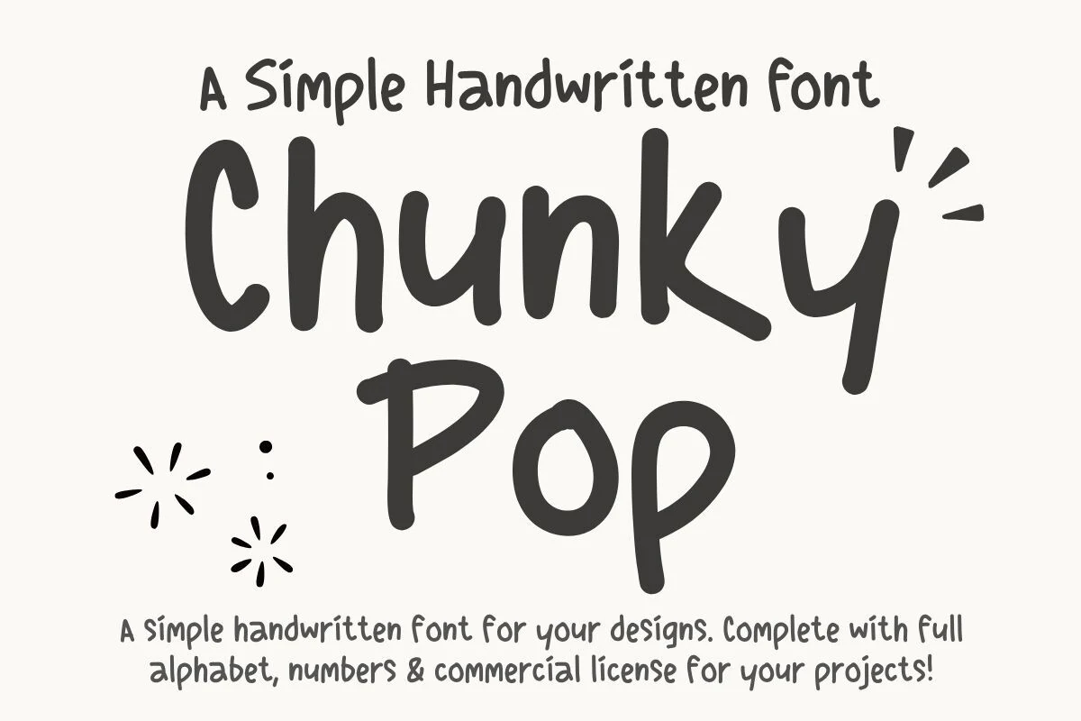
Best For: handmade designs, children’s designs, social media graphics, casual designs
Chunky Pop Font has a simple marker-written look with thick black strokes, soft rounded ends, and uneven handmade proportions. It brings Cozy Fonts into a casual, friendly direction where the letters feel direct, human, and easy to read.
The bold weight makes it useful for kids’ headings, lifestyle graphics, classroom-style notes, and short social posts that need a warm handwritten voice. Keep spacing relaxed and avoid long blocks of text; the chunky strokes work better as title lettering than dense copy.
Sugar Peachy Font
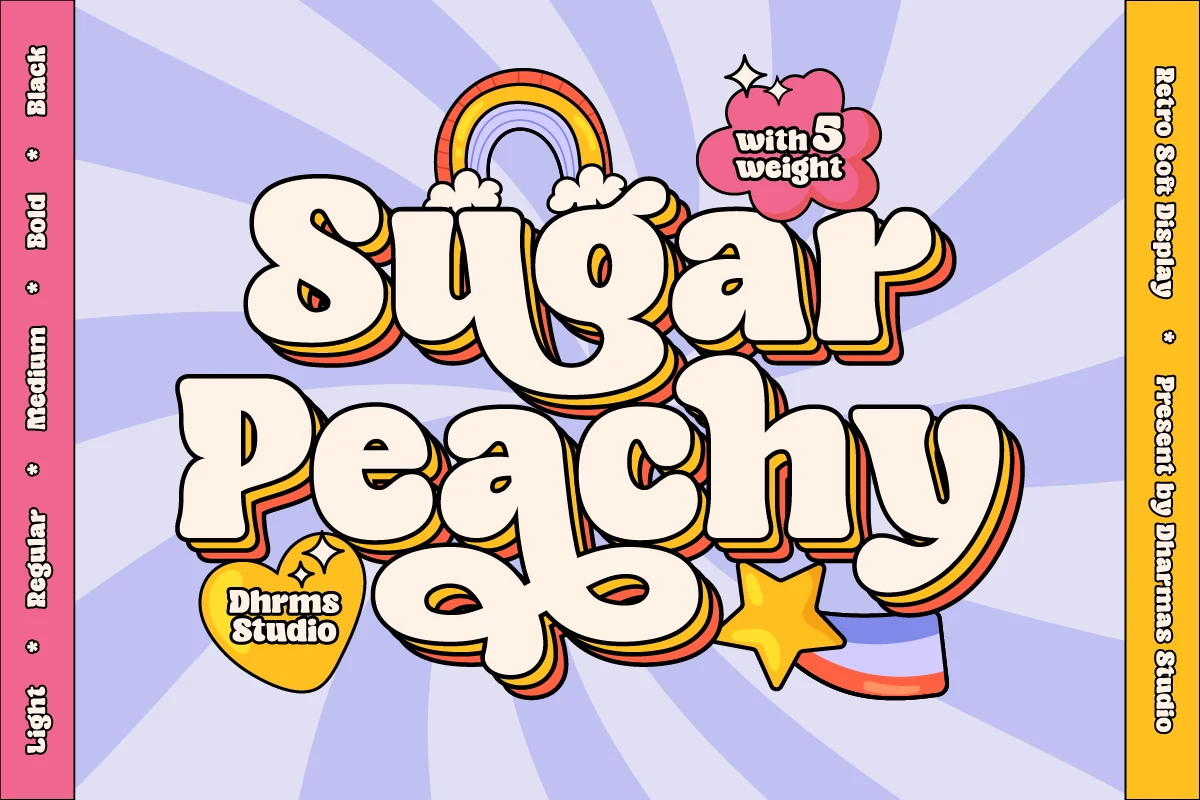
Best For: retro designs, display text, logos, website headers
Sugar Peachy Font leans into a chewy retro display style, with swollen rounded letterforms, tight counters, and a thick outline that makes every word feel soft and bouncy. Within Cozy Fonts, it stands out for its layered shadow stripes, which add instant 70s energy without losing readability.
It works best for logos, headers, and short titles where the bulky shapes can take center stage. Keep the wording brief and give the lines generous spacing, because the low-contrast forms and deep stacked shadow create their own hierarchy and can feel crowded in longer phrases.
Finest Things Font
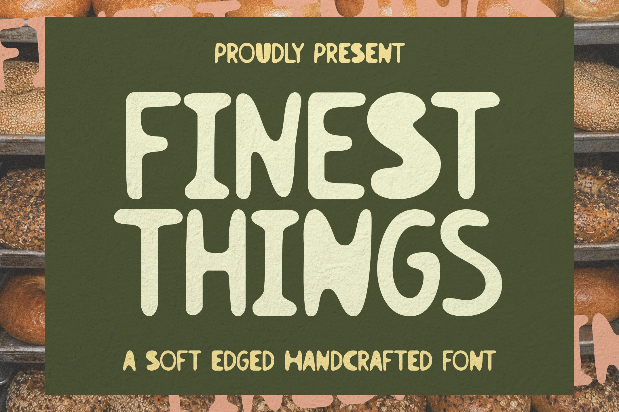
Best For: packaging, product labels, signage, restaurant menus
Finest Things Font gives Cozy Fonts a grounded handcrafted feel through broad letterforms, soft corners, and smooth organic curves. The thick shapes feel friendly rather than polished, which makes the font sit naturally in bakery branding, café visuals, and other designs that need warmth without looking fussy.
Its wide rhythm works best in short lines, where the rounded terminals and sturdy weight can carry the message on their own. Use it for packaging, menus, or shop signage with generous spacing, then keep the supporting text lighter so the headline keeps its rustic emphasis and stays easy to scan.
Cozy Nap Font
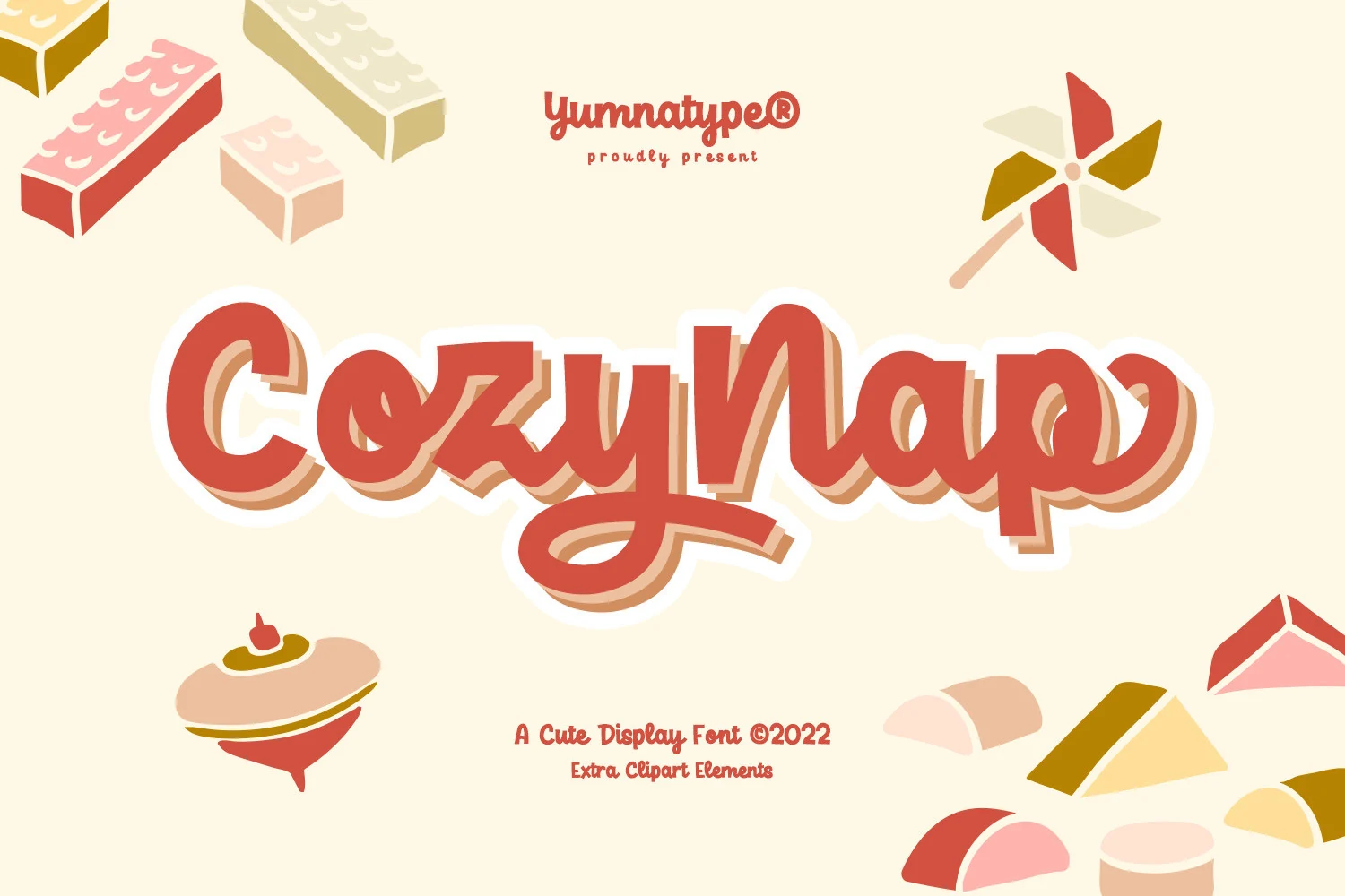
Best For: headlines, posters, children’s designs, cute designs
Cozy Nap Font has a bold, rounded display look with thick strokes, soft corners, and a few curvy letterforms that loosen the heavy weight. That balance gives Cozy Fonts a sweeter, more playful tone when you want a title to feel friendly instead of rigid.
The dramatic weight makes it strongest in headers, posters, and short packaging-style titles, where the broad shapes stay clear at a glance. Give the words a little room so the curves can breathe, then use the extra illustrations to support the layout without pulling focus from the lettering.
Cozy Hand Font
Best For: stickers, quotes, handmade designs, cute designs
Cozy Hand Font uses tall, softly rounded handwritten letters with a light monoline build and relaxed uneven spacing. The pastel preview shows a gentle, crafty tone, giving Cozy Fonts a clean but playful option for cheerful titles and personal design pieces.
It fits planners, stickers, cards, quotes, journaling pages, and Cricut crafts where a handmade feel matters more than formal structure. Keep the tracking open and use it in short lines, because the narrow vertical shapes stay clearest when the words are not packed together.
Cozy Bliss Font
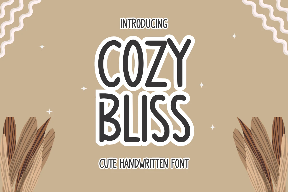
Best For: stickers, quotes, handmade designs, cute designs
Cozy Bliss Font uses chunky handwritten capitals with rounded corners, narrow inner counters, and a loose marker-like rhythm. The white outline in the preview reinforces its sticker-ready personality, making it one of the more playful Cozy Fonts for designs that need a soft but highly visible headline.
Its tall, compressed letters work best in short stacked words where the curves can stay readable. Keep tracking slightly open and use strong contrast around the outline; long phrases will feel crowded, but centered titles, labels, and craft graphics can use its bold silhouette effectively.
Cozy and Bright Font
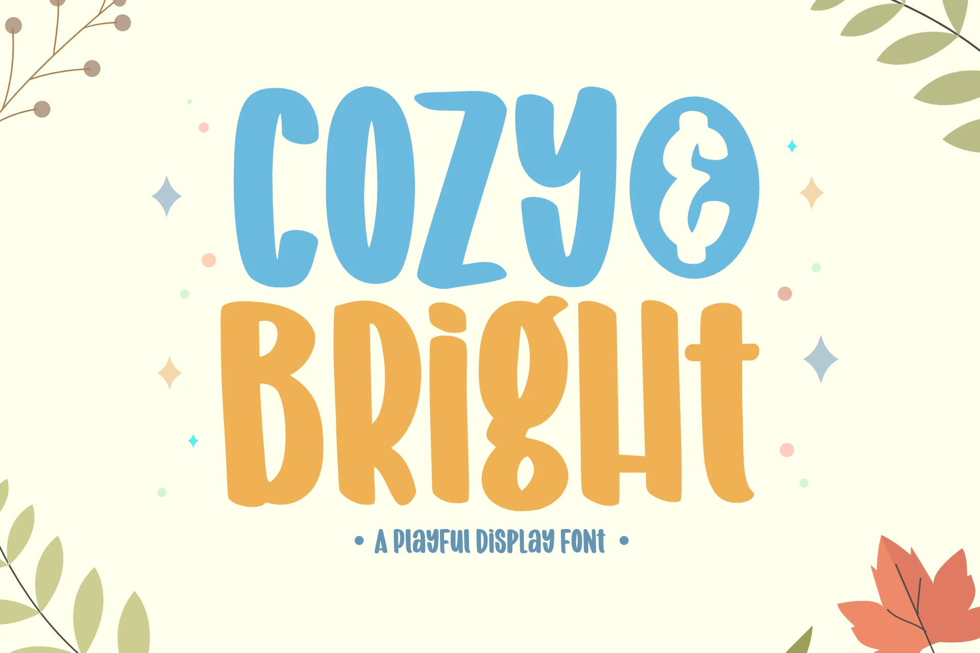
Best For: posters, quotes, book covers, children’s designs
Cozy and Bright Font uses tall, chunky letterforms with rounded corners, soft wobble, and quirky inner shapes that keep the words feeling cheerful instead of polished. It has the warmth people expect from Cozy Fonts, but the overall look is bolder and more cartoon-leaning, so headlines immediately feel upbeat and friendly.
The compressed proportions make it strongest in short titles, where the playful rhythm stays clear and punchy. Give it enough scale and a little breathing room between lines, then pair it with a plain supporting font; that contrast helps the irregular shapes carry posters, kids’ book covers, and quote graphics without turning cluttered.
Funky Marshmallow Font
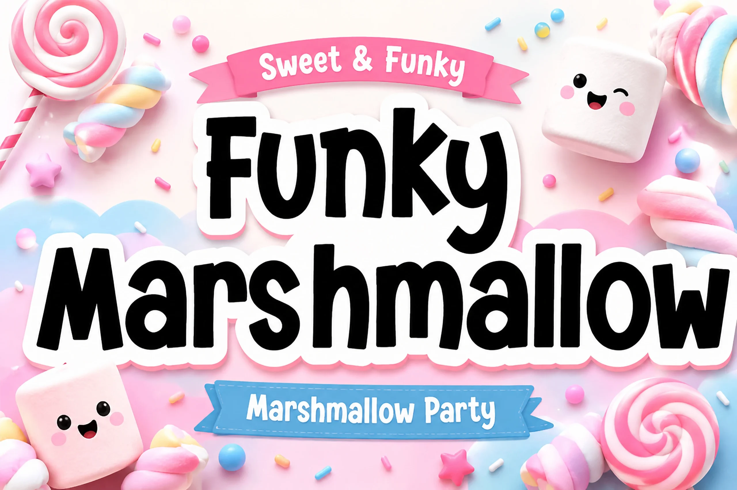
Best For: packaging, signage, children’s designs, playful designs
Funky Marshmallow Font is an ultra-thick rounded sans with pillowy strokes, blunt terminals, and a bouncy baseline that makes each word look soft rather than heavy. Within Cozy Fonts, it sits on the candy-bright side: bold enough for instant impact, but still friendly through its inflated curves and uneven playful rhythm.
Use it for short stacked titles where the white contour or shadow can separate the black letters from busy colors. Tight word spacing suits the squishy style, but line spacing needs more room; otherwise the oversized curves start to merge, especially in party graphics, packaging, and shop signage.
Double Line Cozy Font
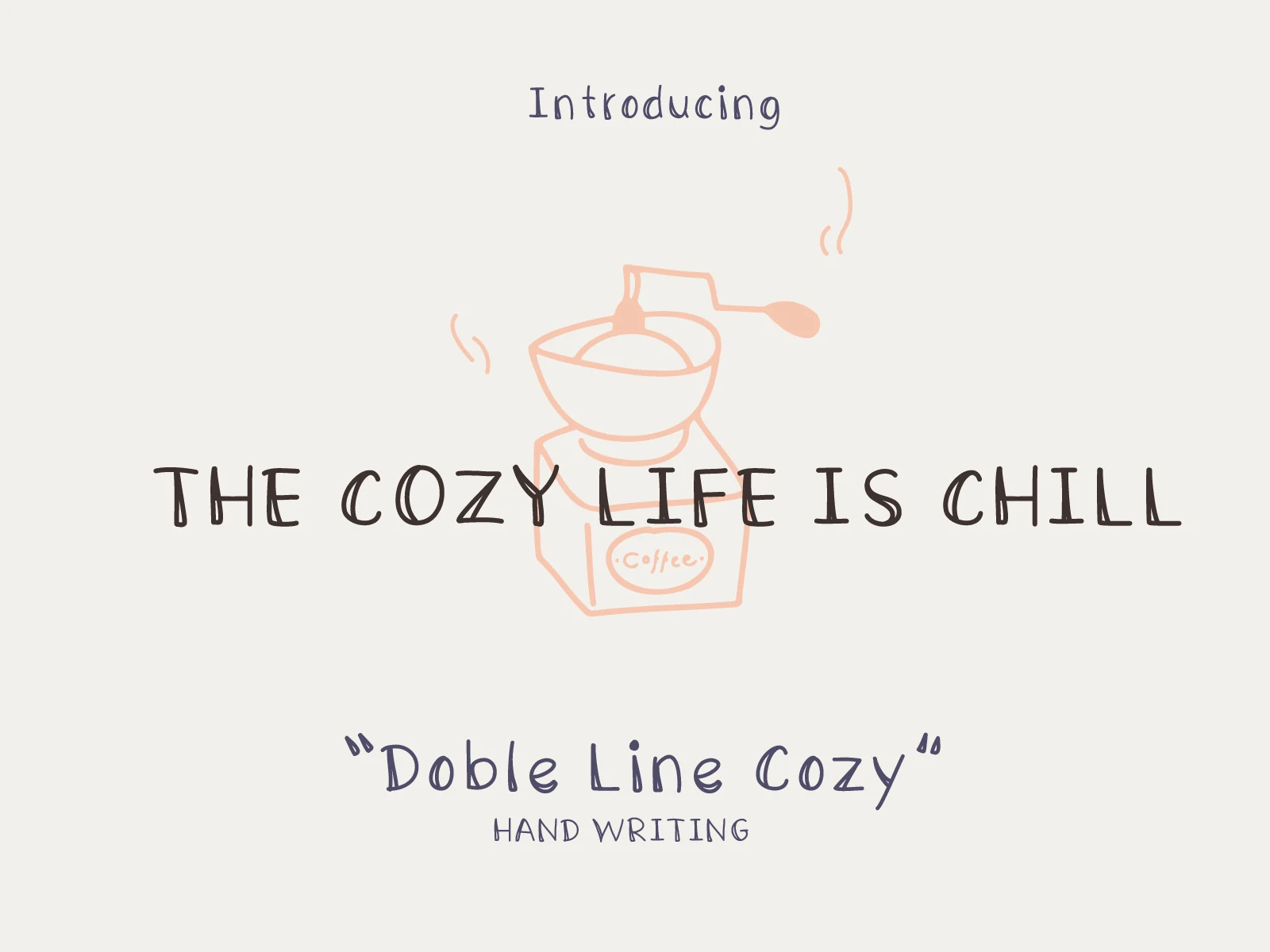
Best For: quotes, short phrases, handmade designs, casual designs
Double Line Cozy Font has a light handwritten feel built from narrow, slightly wobbly strokes and simple rounded forms. The letters stay airy and unfussy, which gives it the relaxed charm people usually want from Cozy Fonts without pushing into overly decorative territory.
Its even rhythm makes short lines easy to read, especially in titles, labels, or crafty printed pieces. Keep the spacing a touch open and let the font sit with plenty of blank space around it; that helps the slim strokes hold their warmth instead of looking faint in a busy layout.
Cozy Font
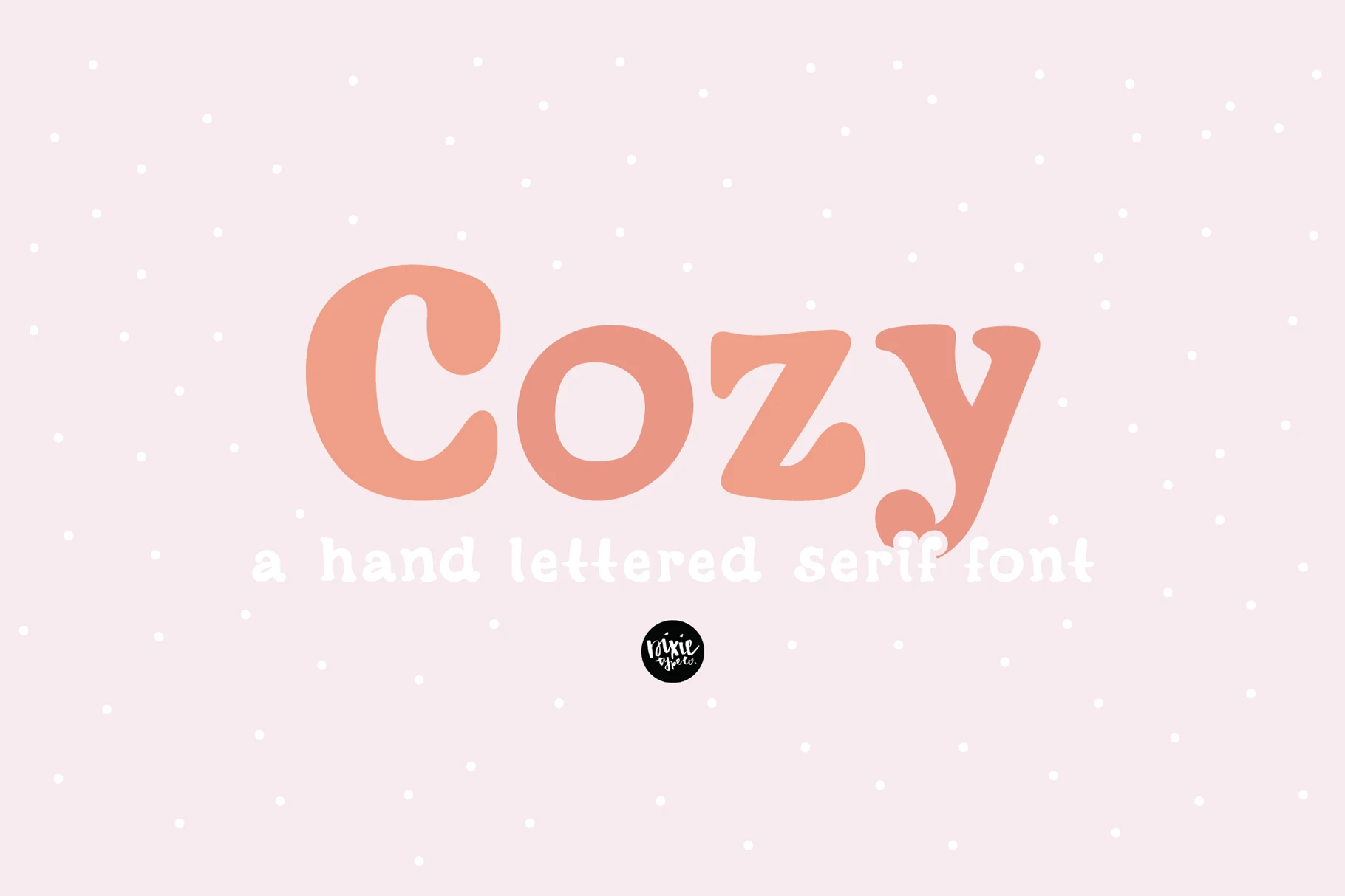
Best For: headlines, short phrases, handmade designs, soft designs
Cozy Font has a chunky hand-lettered serif shape with rounded stress, soft curves, and playful curled details in letters like the C and y. It feels more crafted than formal, giving Cozy Fonts a gentle display option for titles that need weight without looking rigid.
The thick strokes and small counters make it strongest in short words or compact headlines. Keep the background simple and avoid tight tracking; a little extra spacing lets the bulbous serifs stay readable while preserving the warm, hand-drawn rhythm.
Thick Honey Duo Font
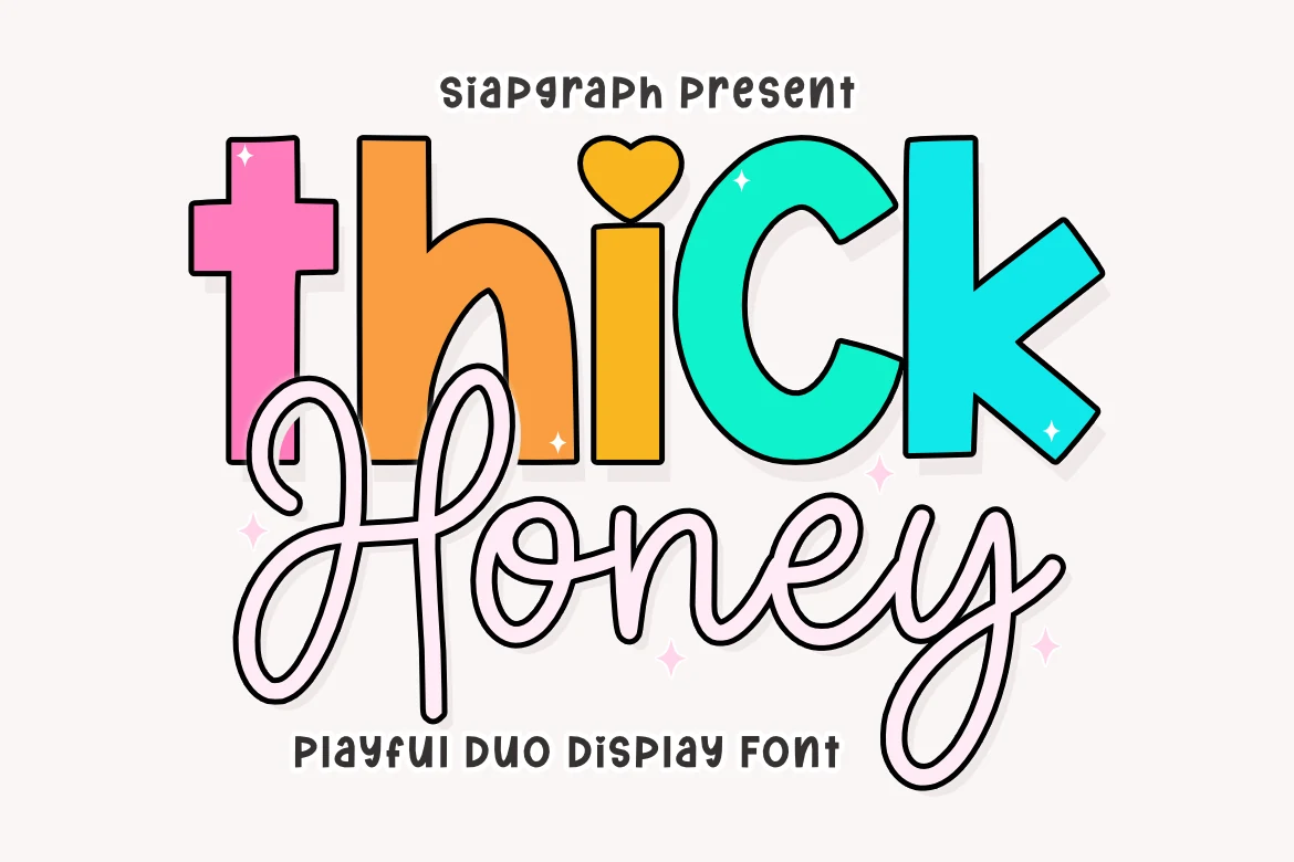
Best For: headlines, posters, children’s designs, playful designs
Thick Honey Duo Font pairs a chunky rounded display face with a loose looping script, so the contrast feels instantly cheerful. The upright sans letters have thick strokes, simple counters, and a toy-like presence, while the second style brings in long curves and a handwritten bounce. If you’re browsing Cozy Fonts with more personality, this duo leans bright, sweet, and clearly display-first.
Use the bold style for the main word and the script as a softer accent instead of spreading both styles evenly through a long line. That kind of hierarchy keeps the layout readable and lets the swashes do their work on packaging, kids’ titles, or poster headlines without crowding the composition.
Rabbit Hole Font
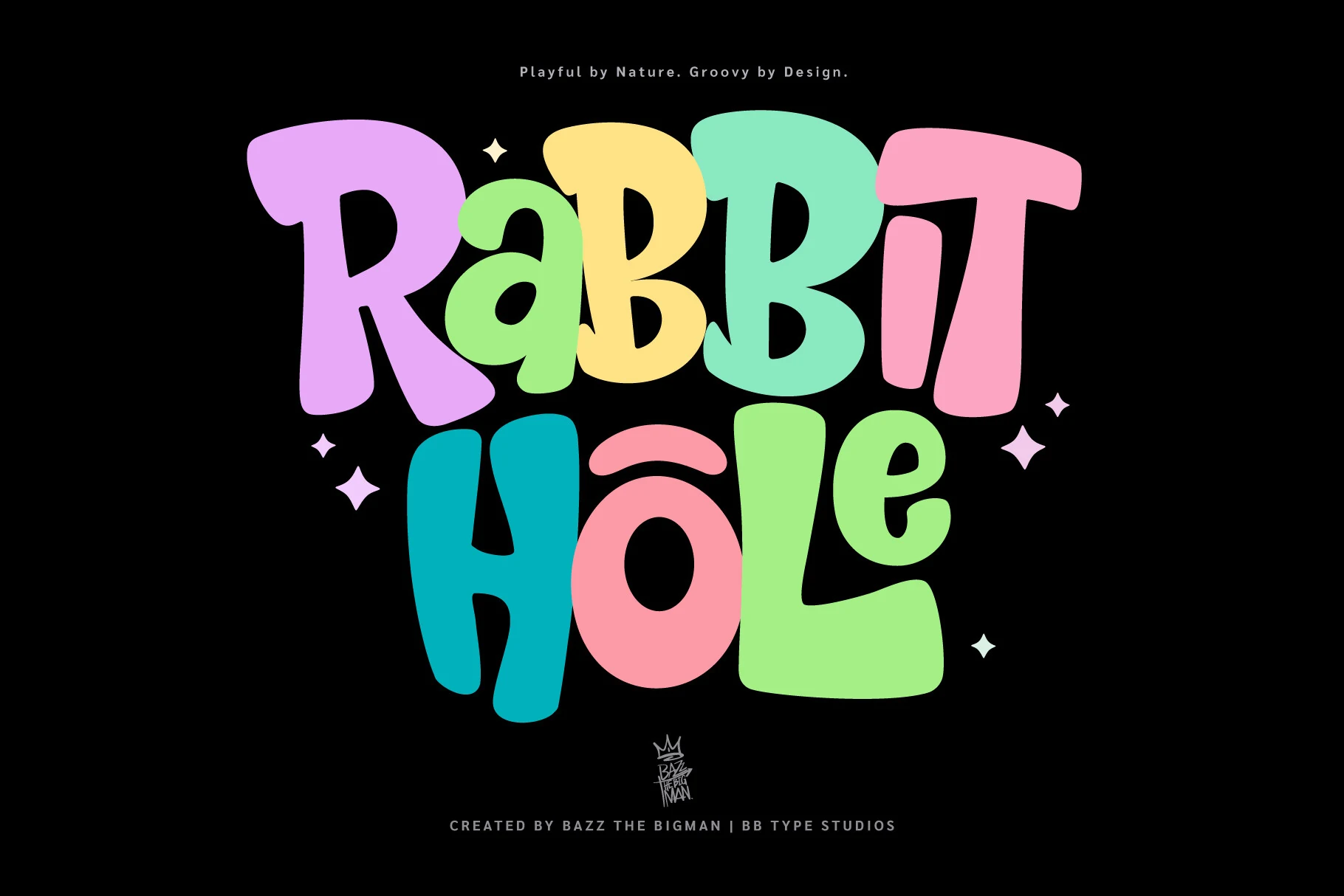
Best For: posters, packaging, merch design, playful designs
Rabbit Hole Font uses oversized groovy letterforms with rounded corners, uneven widths, and a loose retro bounce. The thick shapes feel playful without becoming delicate, placing it among Cozy Fonts that work best when the headline needs immediate color, movement, and a strong graphic silhouette.
Its irregular proportions are the main design asset, so short stacked words will read better than long sentences. Keep contrast high and avoid squeezing the letters too tightly; the wide curves and chunky counters need room to stay bold on posters, packaging, and merchandise.
Neighbor’s Blanket Font
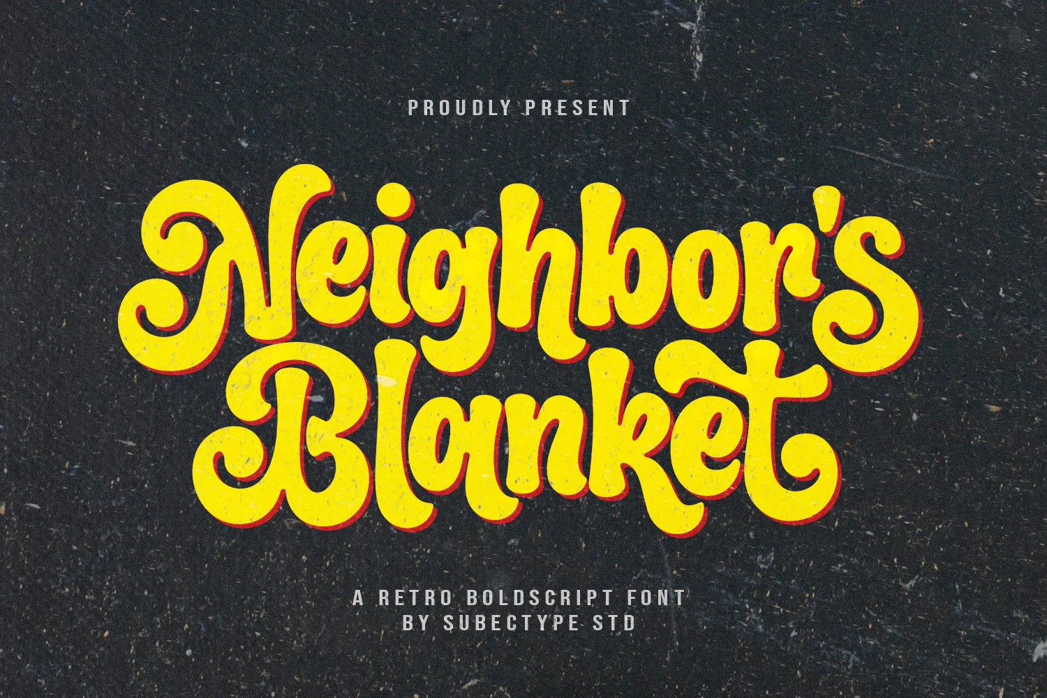
Best For: branding, packaging, posters, retro designs
Neighbor’s Blanket Font leans into a bold retro script style with thick strokes, rounded edges, and oversized swashes that give each word a relaxed, familiar pull. Among Cozy Fonts, it stands out for its warm vintage weight rather than delicacy, making short phrases feel inviting while still holding plenty of shelf presence.
The connected rhythm works best when you let the curves stay open and avoid cramming too many words into one line. Use it where the first read matters—packaging, poster titles, or branding—because the soft terminals and broad shapes keep the nostalgic mood clear even at a distance.
Honey Font
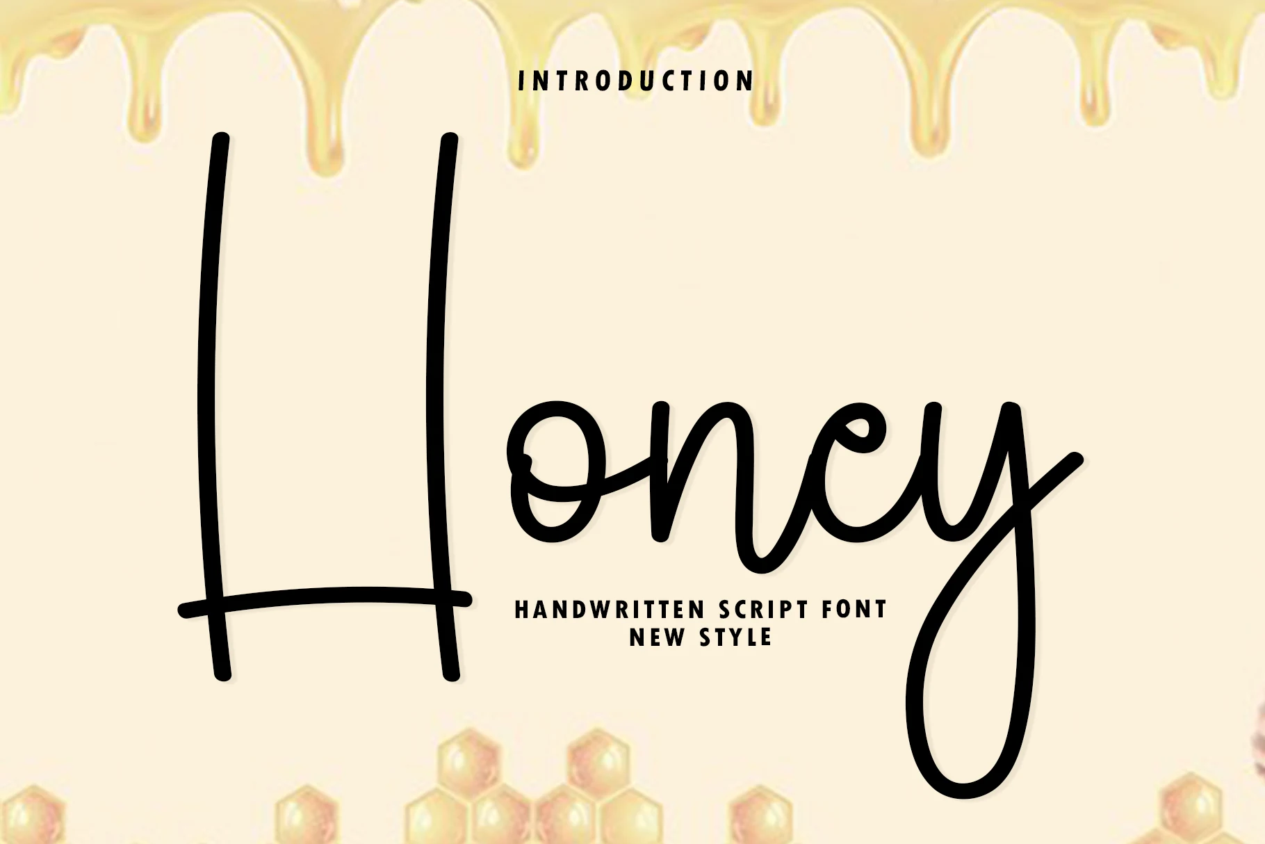
Best For: invitations, quotes, personal branding, soft designs
Honey Font uses a clean handwritten script structure with an extremely tall capital H, smooth lowercase loops, and a steady felt-tip style line. It brings a softer voice to Cozy Fonts, leaning casual and organic rather than ornate, with enough openness in the lowercase forms to stay clear in short phrases.
The dramatic height difference between the capital and lowercase letters works best when the first word is allowed to become the visual anchor. Keep surrounding text compact and simple; the long vertical strokes and sweeping y descender need space so invitations, quotes, and personal branding marks do not feel clipped.
Cookies Font
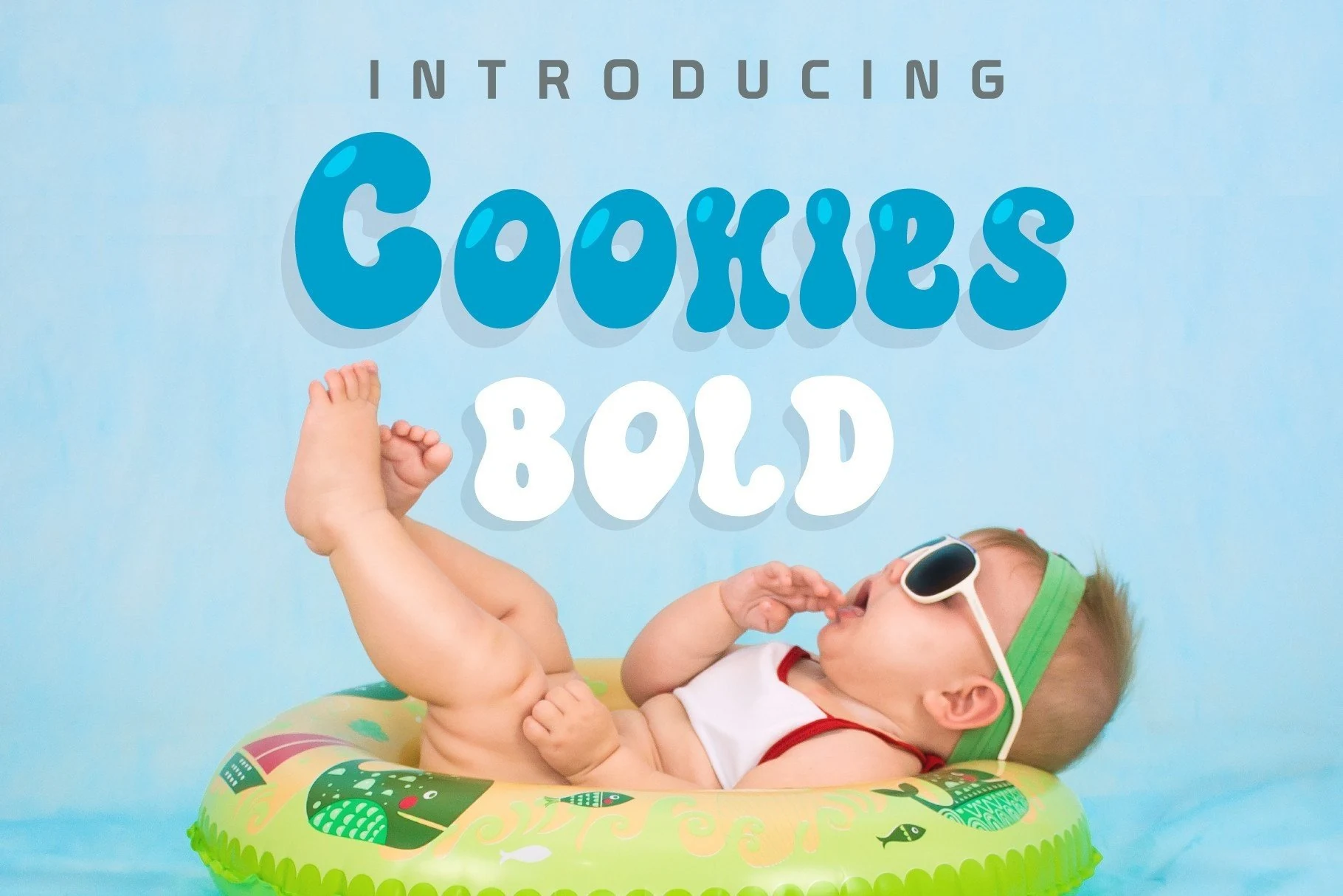
Best For: headlines, stickers, children’s designs, playful designs
Cookies Font has plump, bubble-like letterforms with rounded terminals, soft inner counters, and a slightly melty rhythm that keeps the wordmark feeling cheerful. Within Cozy Fonts, it brings a brighter, kid-friendly energy, with enough weight to read clearly while still looking gentle and pillowy.
It works best in short headlines where the swollen shapes can stay open and distinct. Use a little extra line spacing and keep surrounding type simple; that contrast helps the chunky silhouette hold up on stickers, party graphics, and children’s layouts without becoming visually heavy.
Cozy Fall Font
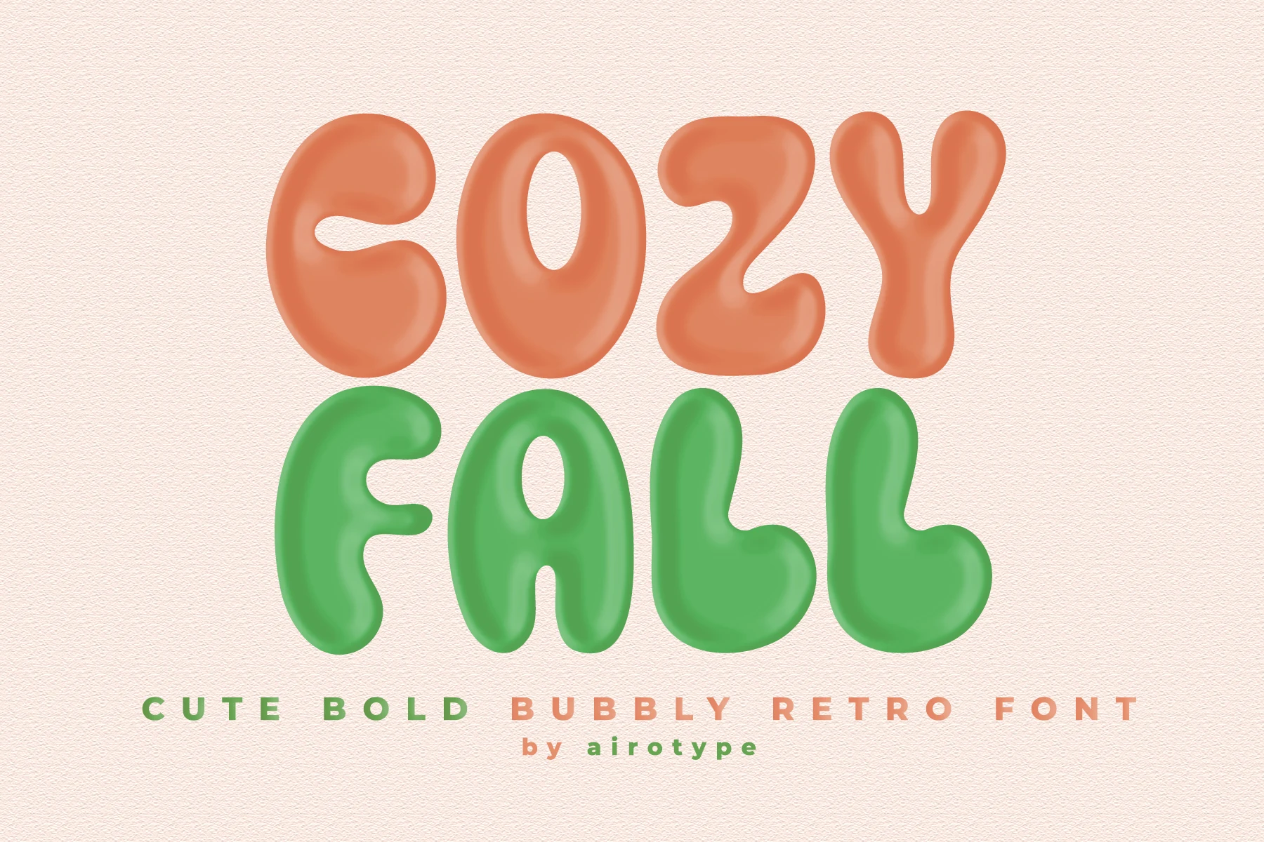
Best For: headlines, posters, retro designs, playful designs
Cozy Fall Font has inflated, rounded letterforms with soft bulbous ends, thick strokes, and a groovy retro rhythm. It gives Cozy Fonts a bouncy display option that feels cute and vintage without relying on fine decoration or delicate script details.
The wide shapes and small inner counters need scale, so keep it to short headlines or stacked words where each letter can stay distinct. Strong color contrast and relaxed line spacing will help the bubbly forms carry posters, seasonal graphics, and playful title layouts without looking cramped.
Cozy Season Font
Best For: invitations, posters, retro designs, playful designs
Cozy Season Font leans into thick retro display shapes with rounded corners, deep dark outlines, and soft inward curves that make each letter feel bouncy and friendly. The chunky silhouette gives Cozy Fonts a more festive direction, with enough weight to keep cheerful titles bold and easy to notice.
It works best in short stacked words, where the broad counters and heavy outline can stay clear. Let the letters handle the color and keep supporting text simple; that contrast helps invitations, party signage, or seasonal headings feel lively without turning visually crowded.
Mario Font
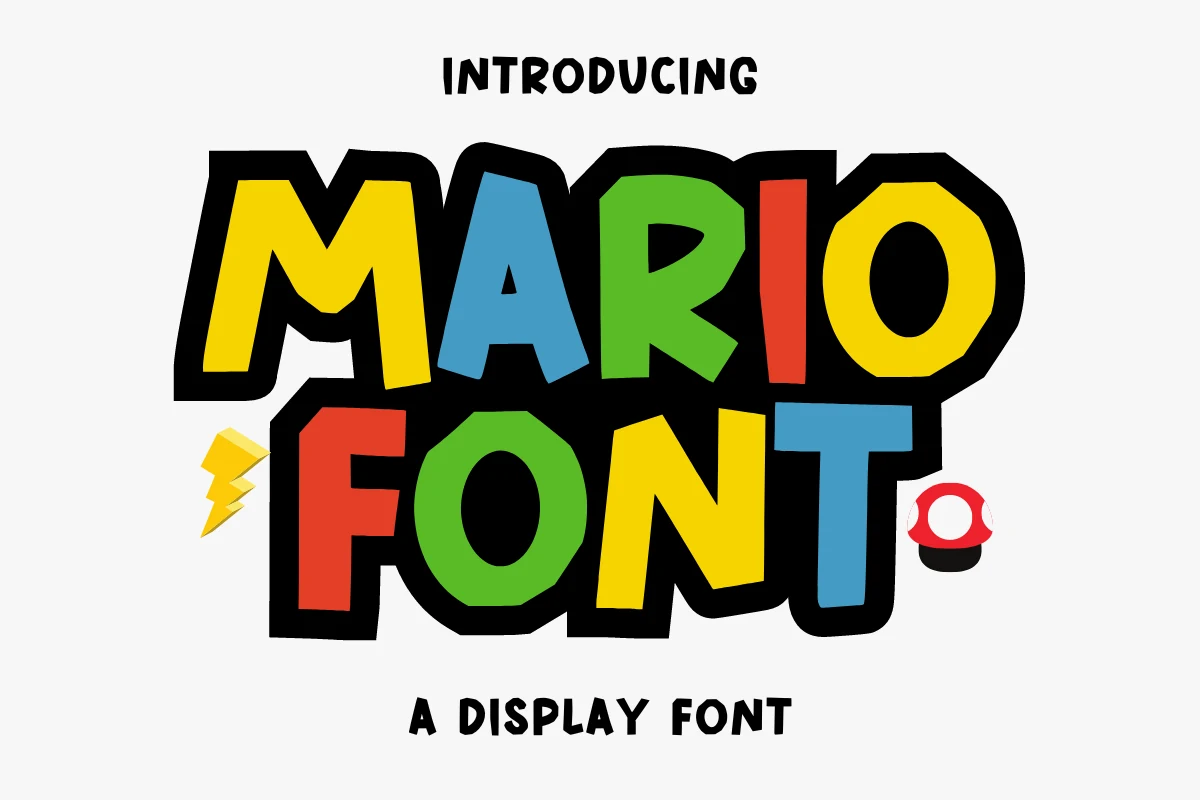
Best For: T-shirts, quotes, children’s designs, playful designs
Mario Font uses bold angular display letters with uneven cuts, thick strokes, and a heavy black shadow that gives each word a loud cartoon-game presence. It brings a more energetic edge to Cozy Fonts, with bright block shapes that feel playful, punchy, and built for quick recognition.
The compact forms work best in short names, slogans, and stacked headlines where the shadow can act as part of the design. Keep the supporting text plain and avoid narrow spacing; the sharp corners and dense fills need clear contrast to stay readable on T-shirts, kids’ graphics, and quote layouts.
Winter Camping Font
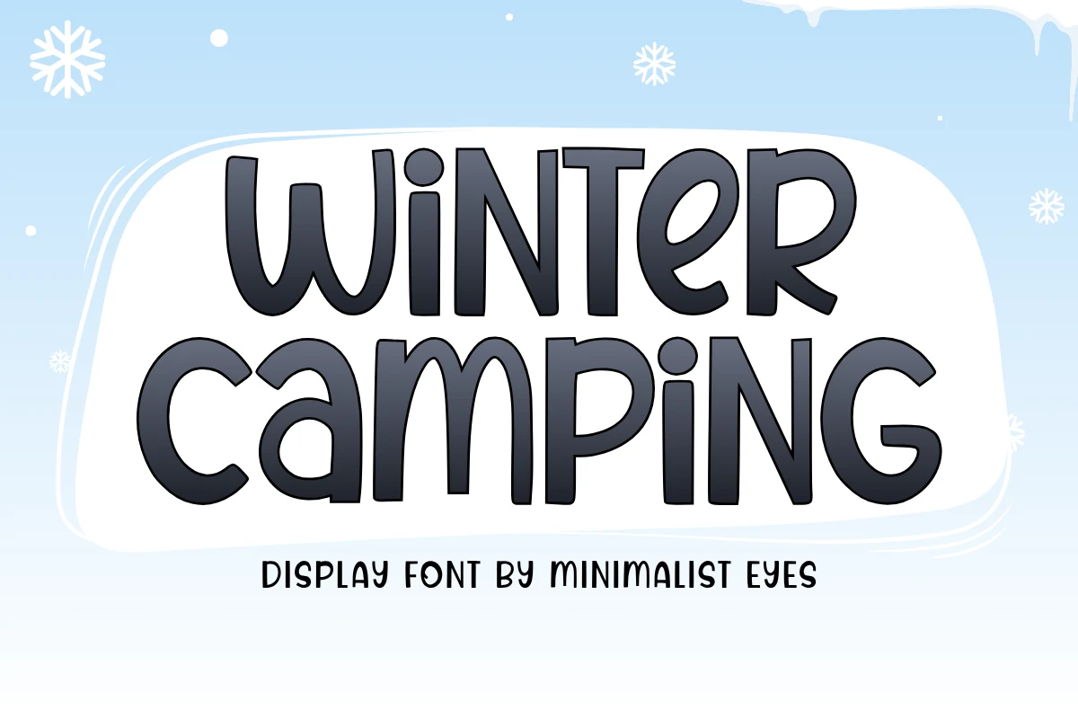
Best For: headlines, posters, children’s designs, playful designs
Winter Camping Font uses plump rounded letters with soft corners, tall proportions, and broad counters that keep the words friendly and easy to read. In Cozy Fonts collections, it feels more clean and cheerful than rustic, which makes the winter mood approachable rather than heavily themed.
The slightly condensed shapes work especially well in short two-line headlines, where the even weight keeps the layout tidy. Give it a bit of line spacing and plenty of contrast around the text; that helps the smooth curves stay open on posters, kids’ graphics, and seasonal title treatments.
Amber Whirl Font
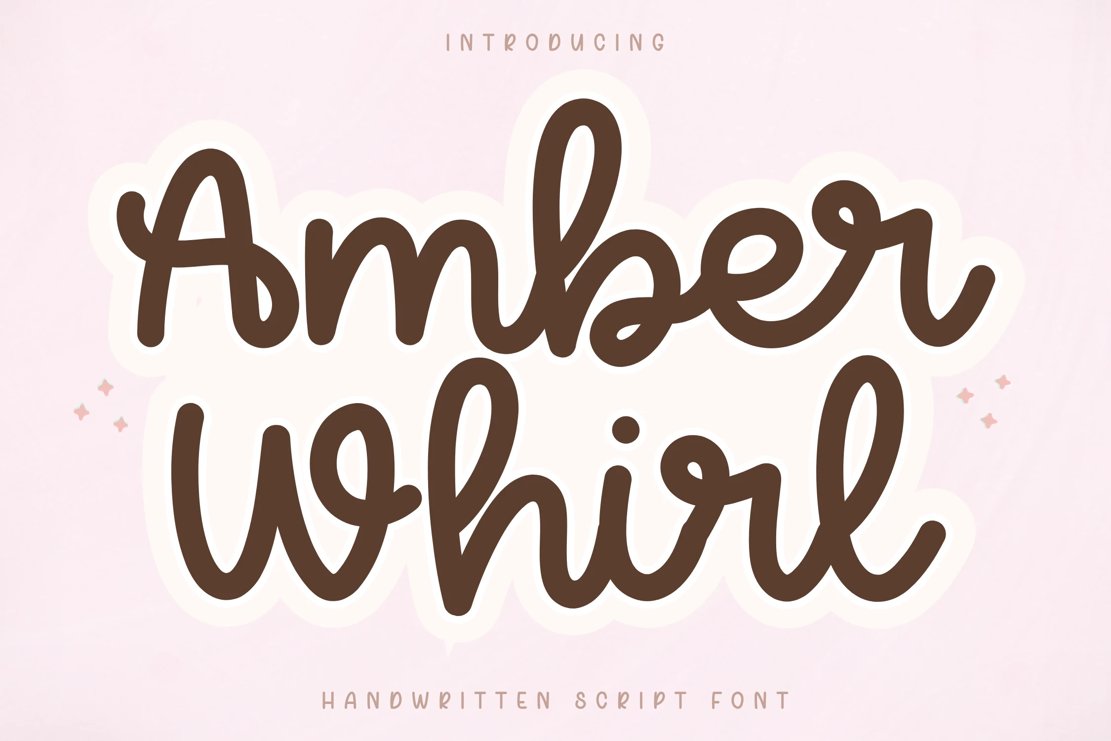
Best For: quotes, invitations, beauty branding, soft designs
Amber Whirl Font has a bold handwritten script style with thick rounded strokes, smooth joins, and generous loops that keep the word shape soft instead of sharp. For Cozy Fonts that need a fuller handwritten feel, it reads warm and friendly, with enough weight to stay clear even when the letters overlap slightly.
Its tall ascenders and broad lowercase curves work best in short phrases, names, or headline-sized quotes where the rhythm can breathe. Keep tracking natural and pair it with a quiet sans or small uppercase support line; that contrast helps invitations, beauty branding, or social graphics feel polished without losing the casual charm.
Cute Simple Font
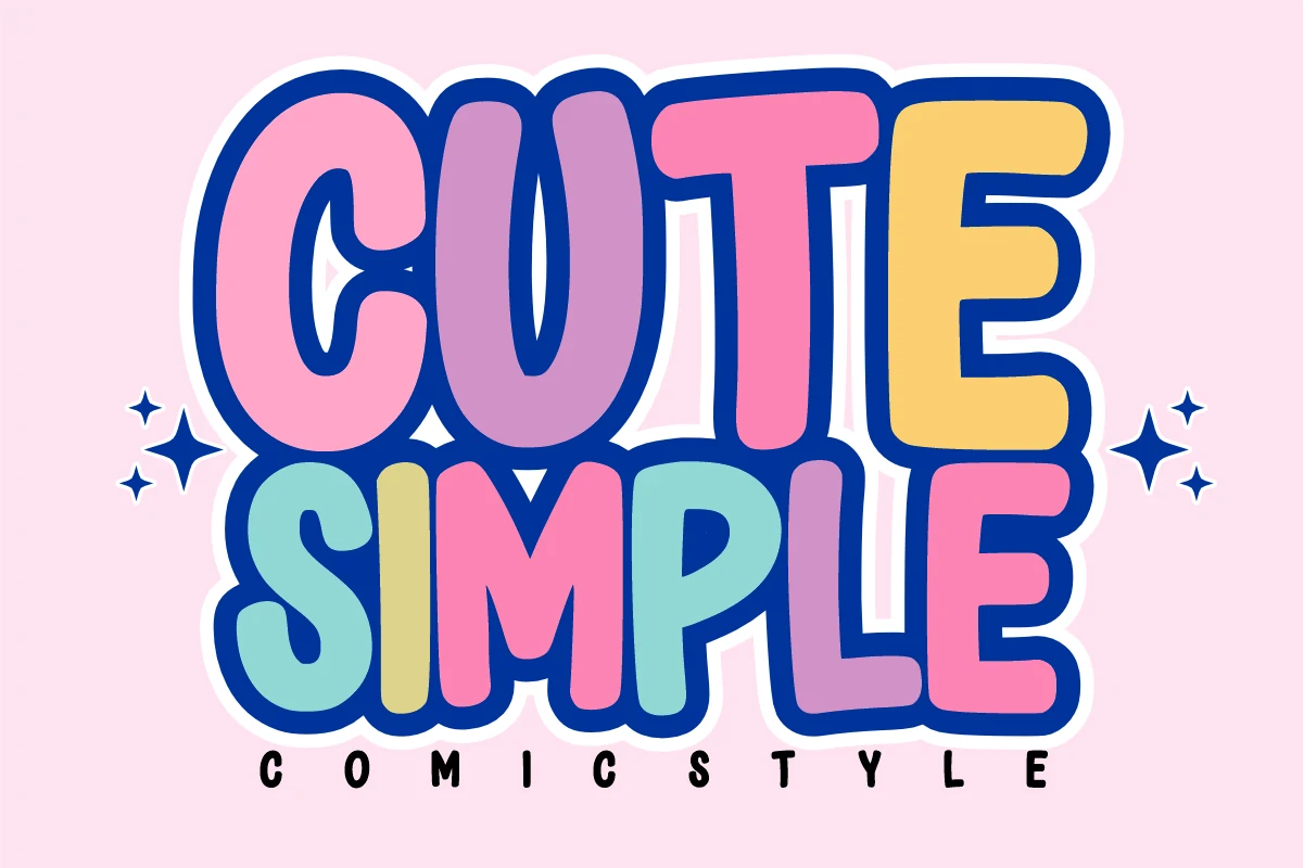
Best For: children’s designs, stickers, playful designs, bold designs
Cute Simple Font uses oversized comic-style capitals with rounded corners, thick outlines, and slightly uneven inflated shapes. For Cozy Fonts with a brighter cartoon mood, it brings more bounce than softness, so the strongest results come from short words, stacked titles, and layouts that can handle heavy letter weight.
The wide forms and playful rhythm make it useful for kid-focused graphics, sticker artwork, party headers, and cheerful product labels. Keep the surrounding elements simpler than the lettering itself; strong contrast, compact line breaks, and controlled spacing help the chunky shapes stay readable instead of turning into visual noise.
Cute Homework Font
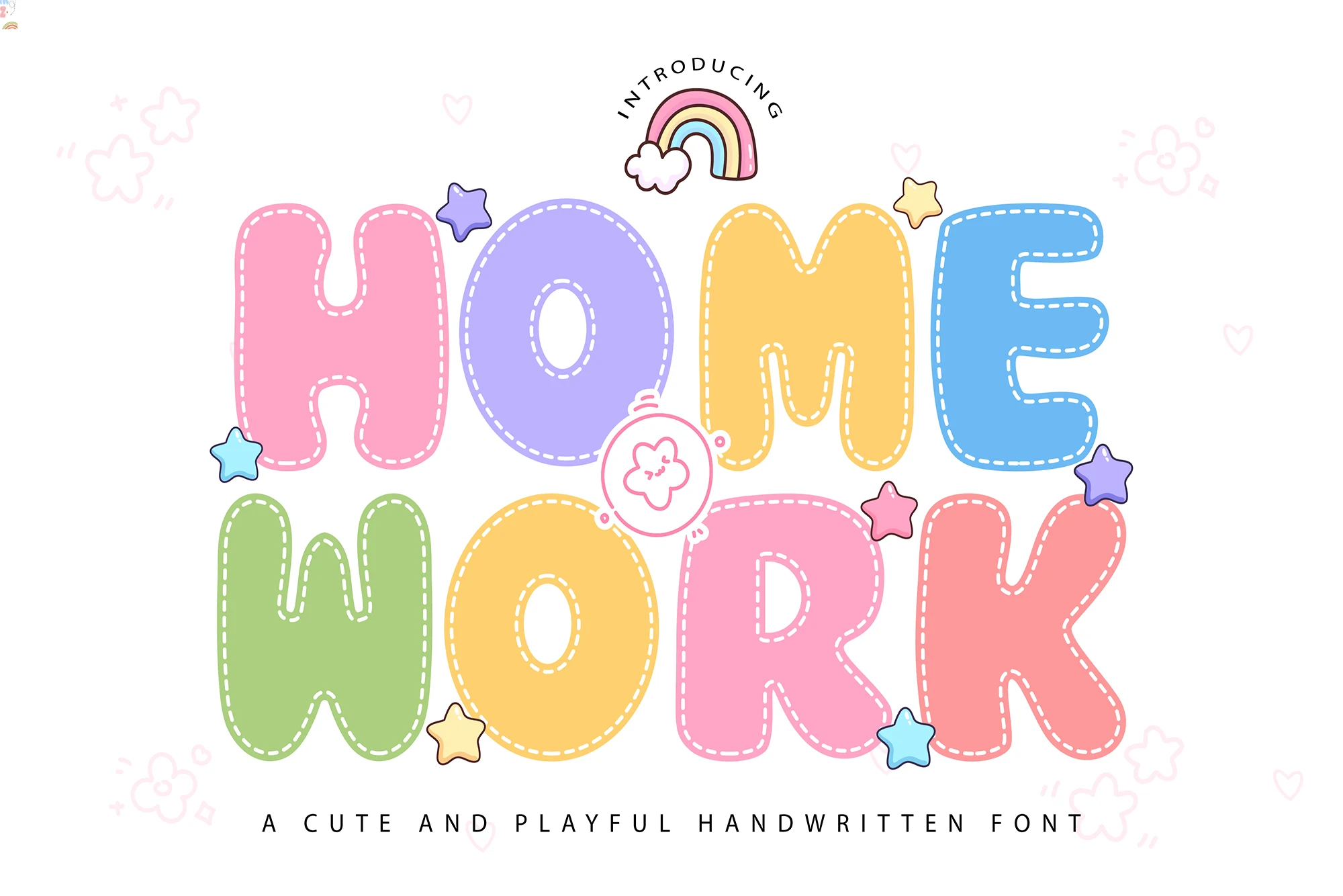
Best For: children’s designs, playful designs, stickers, headlines
Cute Homework Font has soft bubble letters with rounded corners, generous width, and a stitched dashed inline that makes each word feel padded and handmade. Within Cozy Fonts, it leans playful rather than sleepy, bringing warmth and instant friendliness while keeping the letterforms bold enough to read at a glance.
The open counters and chunky proportions help short headlines stay clear even with the decorative outline. It works especially well for classroom printables, kids’ labels, and cheerful packaging; pair it with simple supporting text and give it a little spacing so the puffy shapes stay airy instead of crowded.
Honey Notes Font
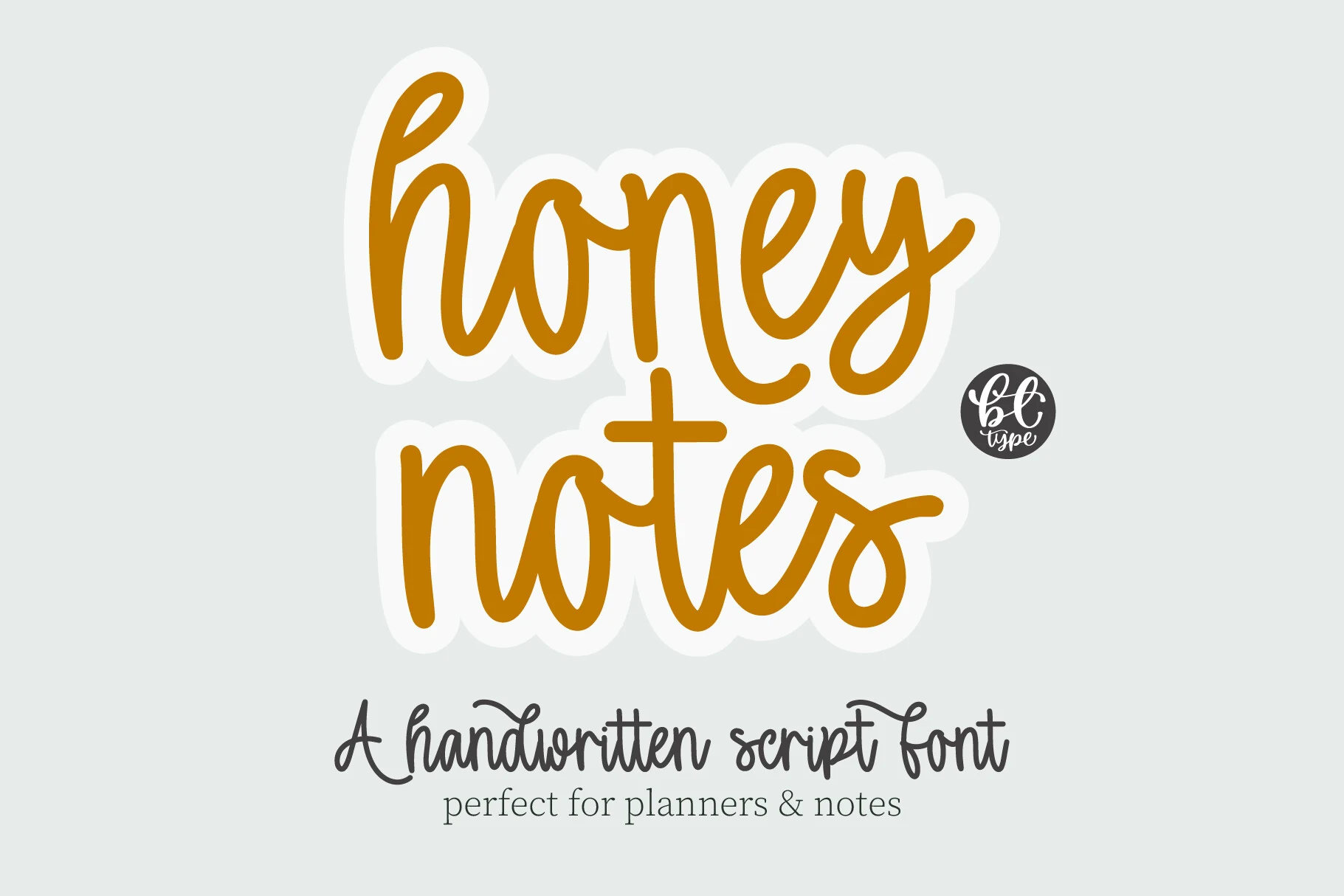
Best For: handmade designs, quotes, stickers, casual designs
Honey Notes Font is a rounded handwritten script with smooth connected strokes, tall loops, and a relaxed baseline that feels closer to a personal note than a polished logo script. In a Cozy Fonts collection, it brings warmth through soft curves and steady thickness rather than heavy decoration.
The letters stay friendly and readable in short planner headers, labels, quote cards, and note-style graphics. Keep word spacing clear and avoid squeezing lines too tightly; the connected forms need enough room around ascenders and descenders so the script keeps its easy handwritten rhythm.
Thickster Font
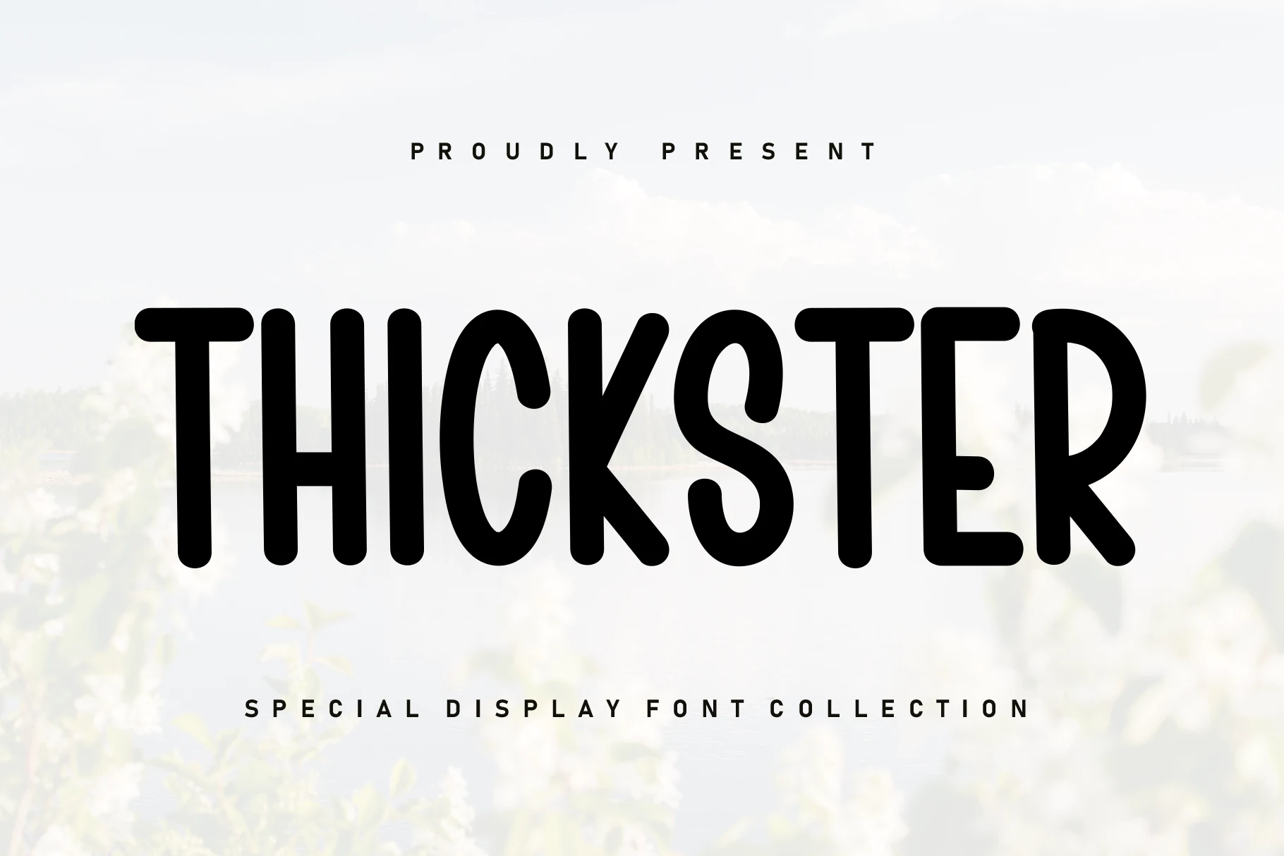
Best For: headlines, display text, posters, short phrases
Thickster Font reads as a bold display hand with tall narrow proportions, heavy monoline strokes, and rounded terminals that keep the texture soft instead of harsh. In a Cozy Fonts roundup, it stands out by pairing chunky weight with a slight handwritten bounce, so the overall look feels friendly, relaxed, and easy to notice.
The thick strokes and compact width make it strongest in titles, labels, and other short lines where clear impact matters more than long-form reading. Let it carry the main headline, then pair it with a simpler supporting font; that contrast keeps the playful shapes crisp and stops the layout from feeling too dense.
Cozy Blanket Font
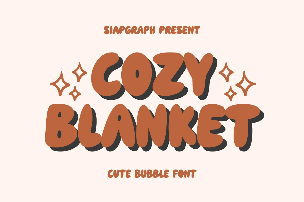
Best For: children’s designs, social media graphics, playful designs, headlines
Cozy Blanket Font has thick rounded bubble letters with soft corners and a compact all-caps build, finished with a bold offset shadow that gives it extra pop. Within Cozy Fonts, it feels upbeat and snug rather than delicate, so it works best when you want cheerful impact from the first glance.
The weight and simple shapes keep short headlines easy to read, while the shadow adds separation without needing extra effects. Use it for kids’ graphics, social posts, or craft-friendly branding, and leave a bit more line spacing around it so the chunky forms do not crowd each other.
Sweet Nook Font
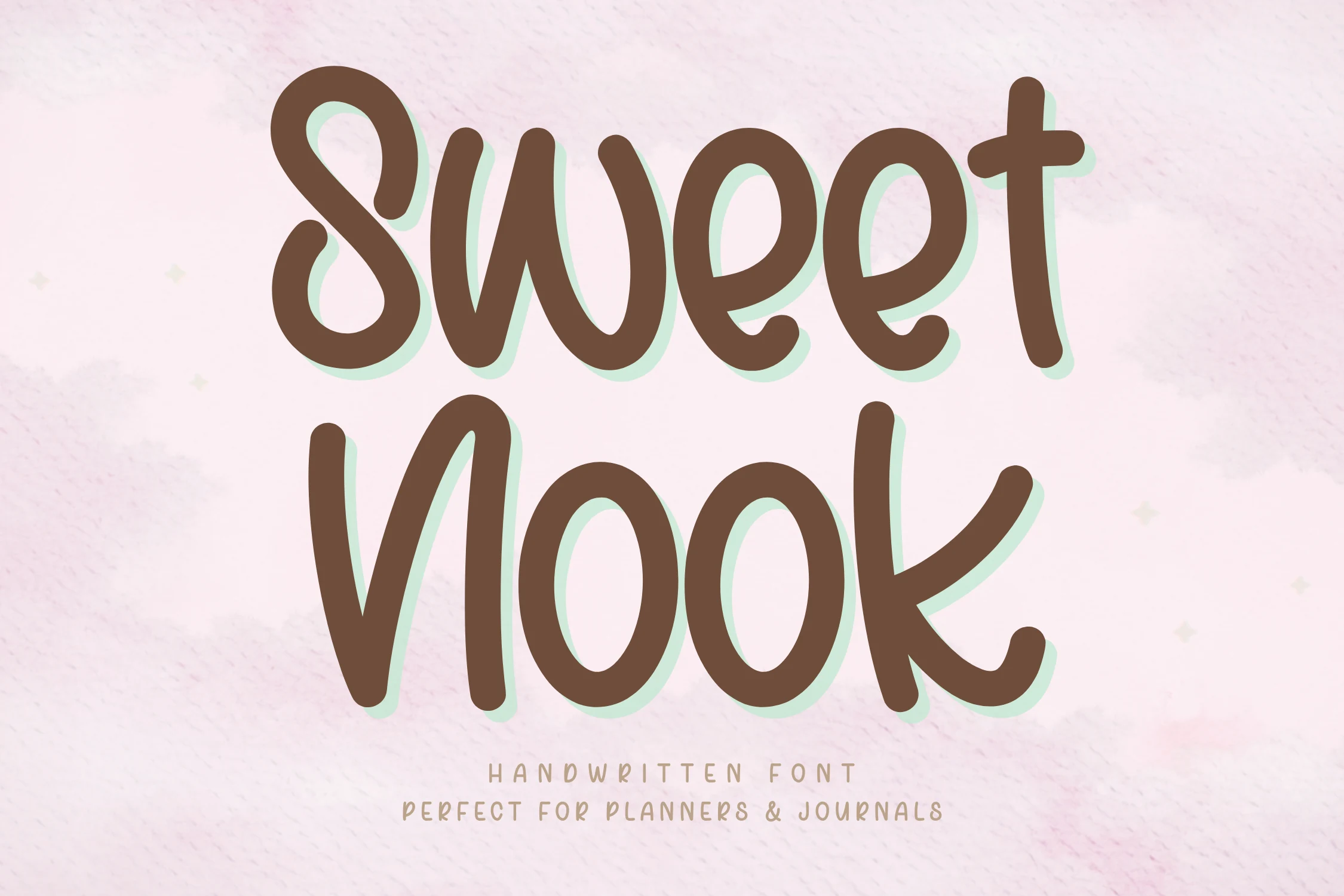
Best For: handmade designs, quotes, stickers, soft designs
Sweet Nook Font carries a rounded handwritten rhythm with thick monoline strokes, open counters, and softly leaning letters that keep the word shape relaxed. In a Cozy Fonts lineup, it reads as warm and casual without becoming messy, using smooth curves and simple forms to keep the lettering clear.
The tall lowercase shapes and loose bounce make it useful for planner covers, journal-style titles, labels, and short quote graphics. Keep the spacing moderate and avoid overly narrow text blocks; the rounded strokes need enough side room so the handwritten flow stays readable and not compressed.
Cozy and Easy Font
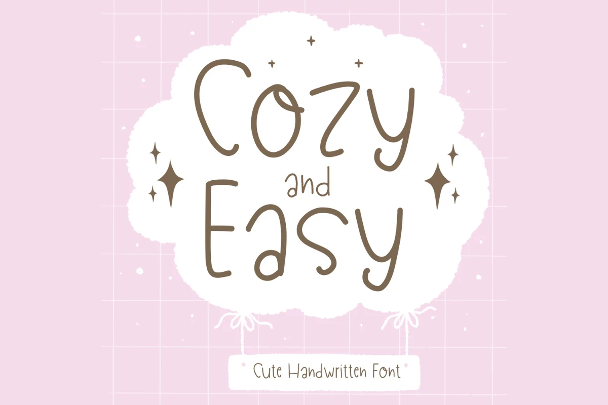
Best For: quotes, posters, soft designs, handmade designs
Cozy and Easy Font has a light monoline handwritten style with tall rounded letters, open spacing, and a slightly uneven rhythm that keeps it friendly rather than polished. In Cozy Fonts roundups, it sits on the softer side, with airy shapes that feel relaxed and approachable in gentle display settings.
Because the strokes stay thin and clear, it works best for short phrases, quote graphics, invitations, and casual posters where the lettering has room to breathe. Keep line breaks loose and avoid dense text blocks; a simple secondary font underneath helps the handwritten forms stay calm and readable.
Cozy Autumns Font
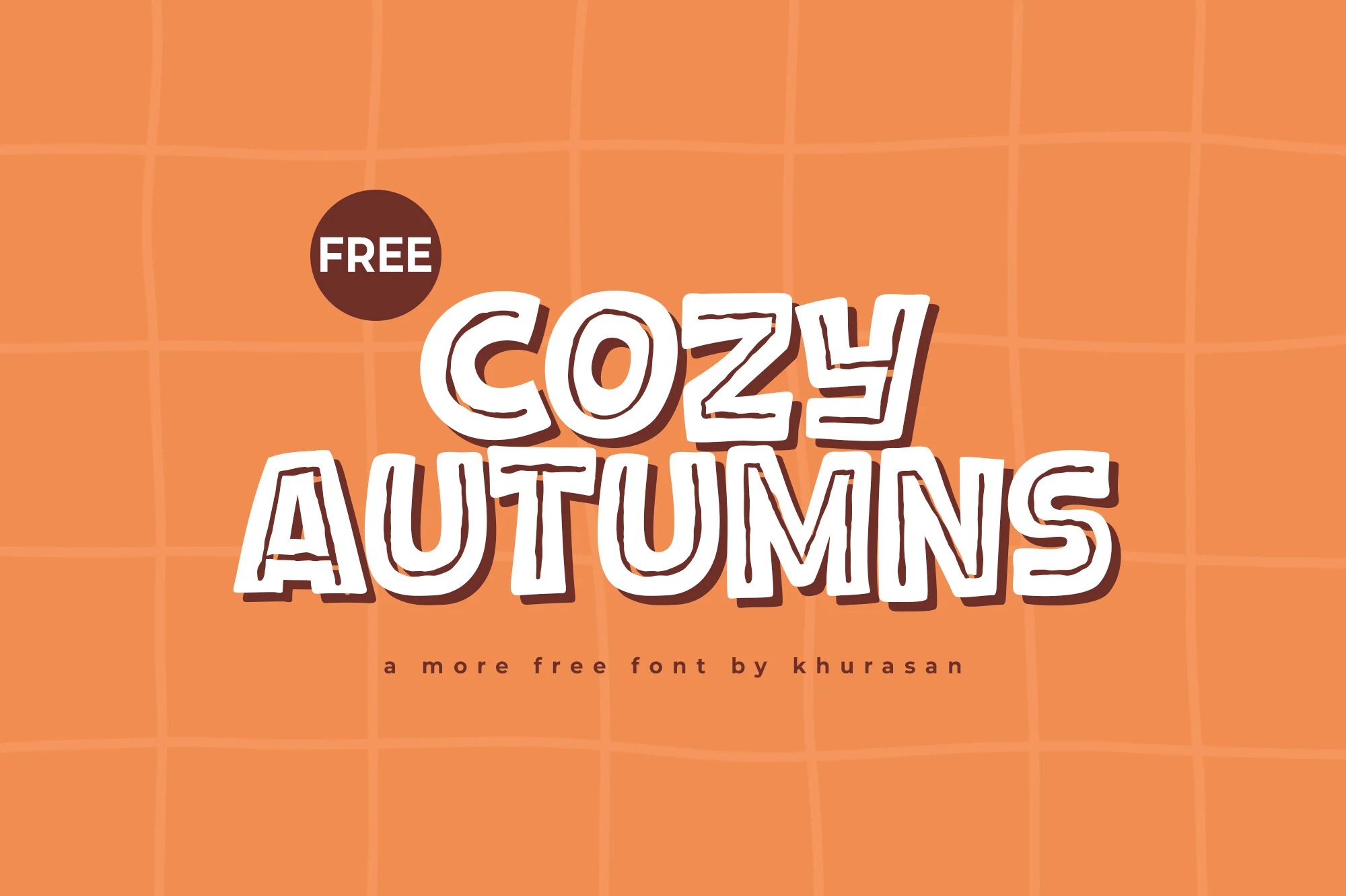
Best For: posters, logos, book covers, headlines
Cozy Autumns Font uses chunky uppercase display letters with irregular hand-drawn outlines, firm shadowing, and playful block proportions. In Cozy Fonts, it adds a more graphic and energetic kind of warmth, built for bold title moments rather than quiet handwritten softness.
The rough inner strokes give the letters a casual marker-like edge, while the broad white fills keep the word shape clear at poster scale. Use it for short headlines, logo marks, covers, and seasonal graphics; strong background contrast matters because the outlined detail loses definition if the layout is too busy.
Mistletoe Cottage Font
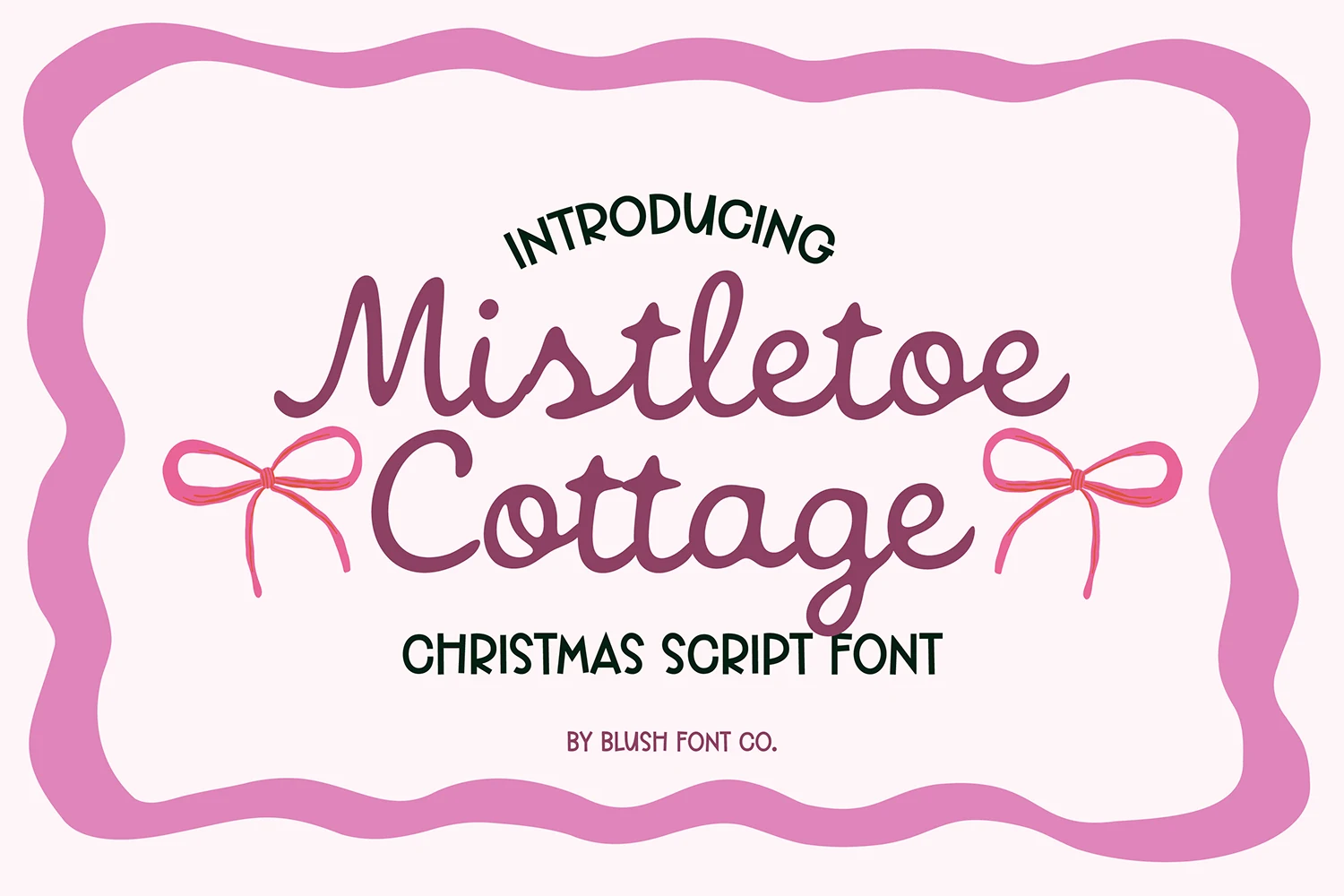
Best For: invitations, quotes, handmade designs, soft designs
Mistletoe Cottage Font has a relaxed vintage cursive style with smooth monoline strokes, rounded loops, and soft joins that give the lettering an easy handmade rhythm. In Cozy Fonts roundups, it feels festive without becoming overly ornate, so it brings warmth and nostalgia while keeping short words pleasantly readable.
The flowing connections and open lowercase shapes work especially well for cards, seasonal headers, and gift-ready phrases where personality matters more than strict formality. Let it lead the title line, then pair it with a plain sans or small uppercase companion so the script keeps its charm without competing with extra decorative text.
The best cozy font is not always the softest one. For calm layouts, choose thin handwritten styles with open spacing. For stickers, posters, and kid-friendly graphics, use rounded bubble or chunky display fonts with stronger contrast. For seasonal work, script and retro styles usually create the warmest first impression.
Keep the layout simple around these fonts. Most cozy typefaces rely on soft curves, thick strokes, or handmade rhythm, so they work better with clear spacing, short phrases, and plain supporting text.