15 Best Vintage Halloween Fonts for Posters in 2026
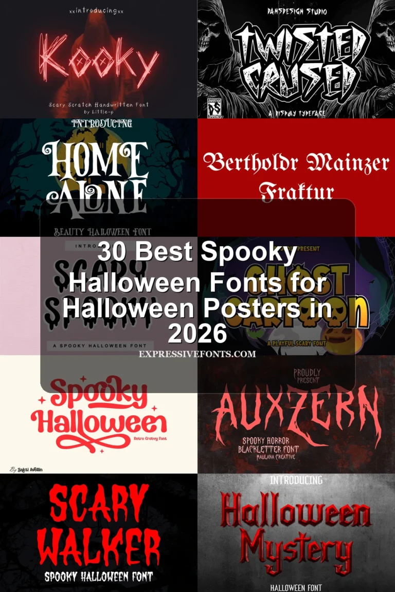
This collection ranges from chunky illustrated capitals and distressed Gothic serifs to connected scripts with sweeping flourishes. Vintage Halloween Fonts can anchor posters, invitations, shirts, logos, stickers, packaging, and social graphics, but their construction and readability vary sharply by size and design role.
Looking for more halloween fonts? Browse our complete Halloween Fonts collection to compare vintage, cute, scary, spooky, and creepy halloween styles.
Vintage Halloween Fonts: Bold Display Forms
These Vintage Halloween Fonts rely on broad, upright display forms, stable or playful spacing, and strong silhouettes. They are generally clearer than distressed styles, while remaining too heavy for sustained reading.
Retro Spooky Font
Best For: posters, logos, invitations, T-shirts
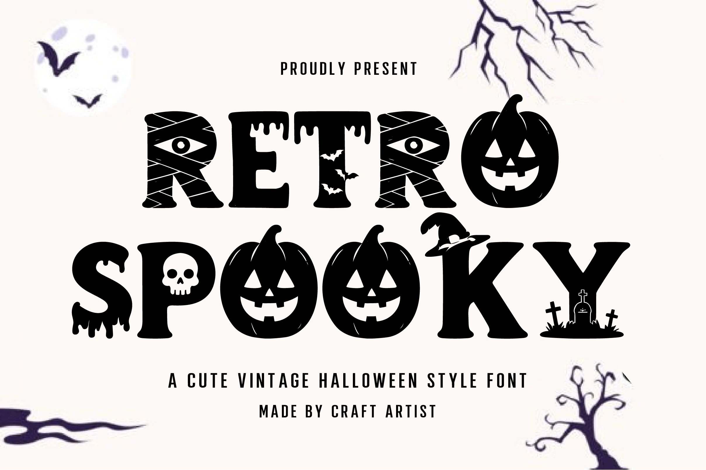
Retro Spooky Font builds chunky, wide letters with Halloween illustrations integrated into their aligned forms. The heavy, low-contrast construction suits prominent Vintage Halloween Fonts treatments such as posters, shirts, invitations, and logos, though embedded artwork can obscure the characters when reduced.
Scary Days Font

Best For: invitations, stickers, T-shirts, logos
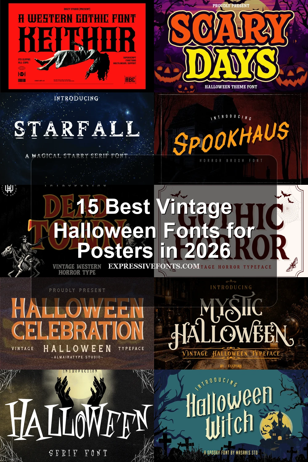
For invitations, stickers, and shirts, Scary Days Font offers wide, rounded slab-like forms with thick strokes, chunky corners, and clear separation between letters. Its heavy, low-contrast structure stays readable at display size and supports Eastern European multilingual typesetting, but the broad proportions make it unsuitable for body copy.
Spooky Retro Font
Best For: invitations, display text, posters, nostalgic designs
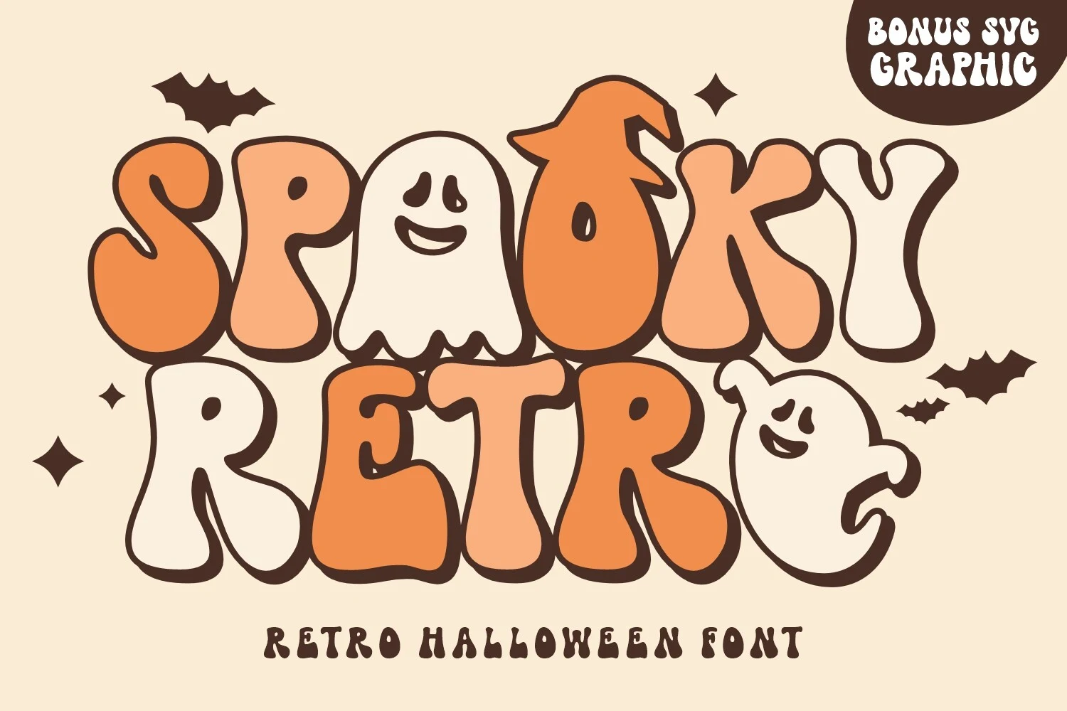
Spooky Retro Font creates a party-sign effect through bubbly rounded letters, uniform thick strokes, uneven vertical placement, and an interlocking layout. The irregular rhythm gives large headlines a nostalgic character, while overlaps and spacing reduce dependable reading in smaller applications.
Halloween Celebration Font
Best For: logos, headlines, signage, packaging
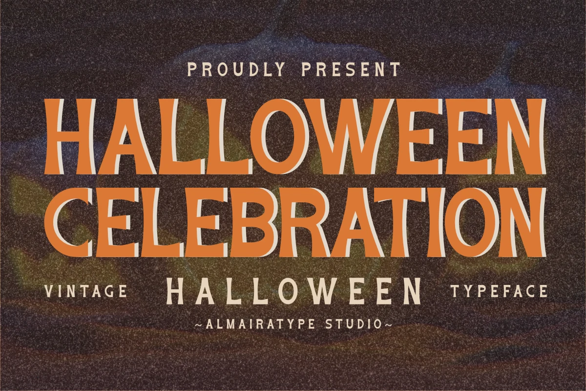
Halloween Celebration Font is particularly useful for logos, signage, packaging, and headlines that need compact width. Its condensed proportions, flared serifs, curved stems, and high contrast recall mid-century sign lettering, while bold forms preserve clear reading in large titles and posters.
Vintage Halloween Font
Best For: T-shirts, social media graphics, merch design, display text
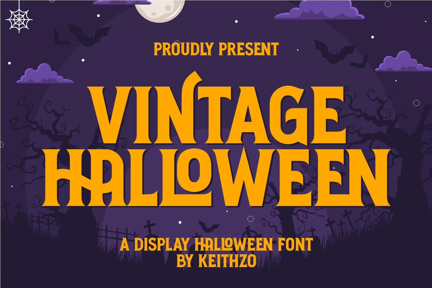
Vintage Halloween Font uses condensed slab-serif capitals, high contrast, and a distinctive merged “LL” construction. That tight thematic structure makes it useful for T-shirts, merchandise, social media graphics, and other display treatments, although smaller words may not be immediately clear.
Distressed, Gothic, and Ornamental Displays
This Vintage Halloween Fonts group emphasizes sharp serifs, Gothic geometry, weathered texture, flourishes, and theatrical effects. Compared with the bold forms, these faces offer more surface detail but demand larger sizing.
The Starfall Font
Best For: display text, headlines, posters, vintage designs
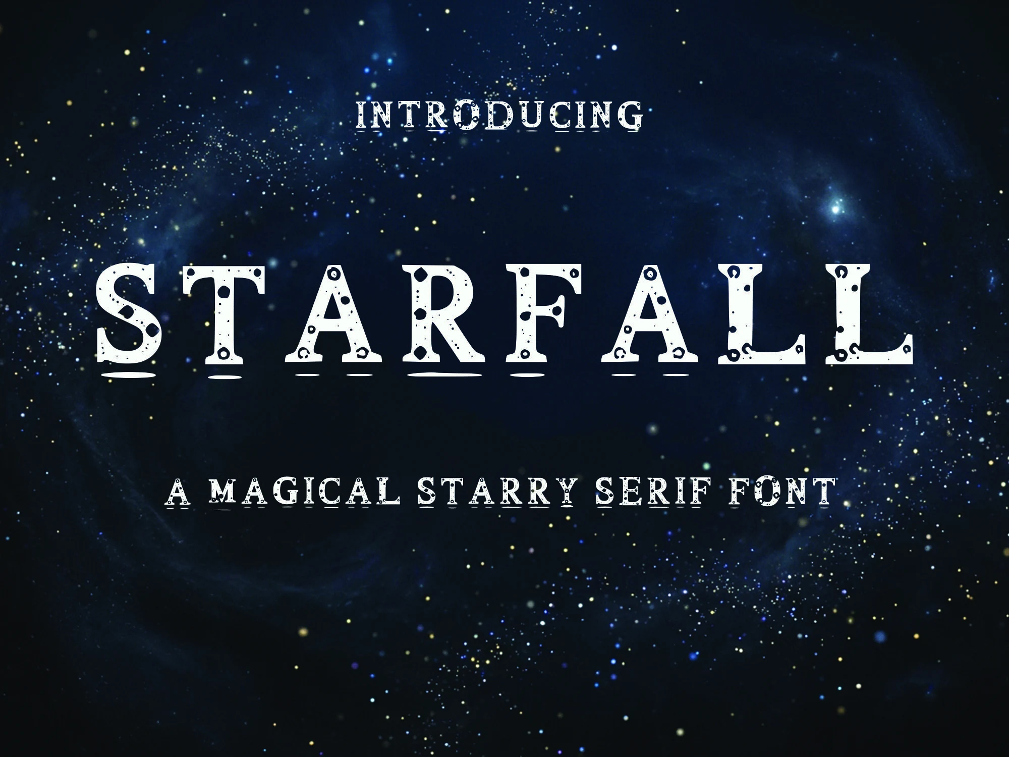
The Starfall Font pairs bold uppercase serifs with pronounced rectangular ends, strong thick-to-thin contrast, and circular cutouts scattered through each character. That dot texture creates a decorative heading surface, but it weakens recognition at small sizes, so reserve it for display text, posters, and vintage designs.
Keithor Font
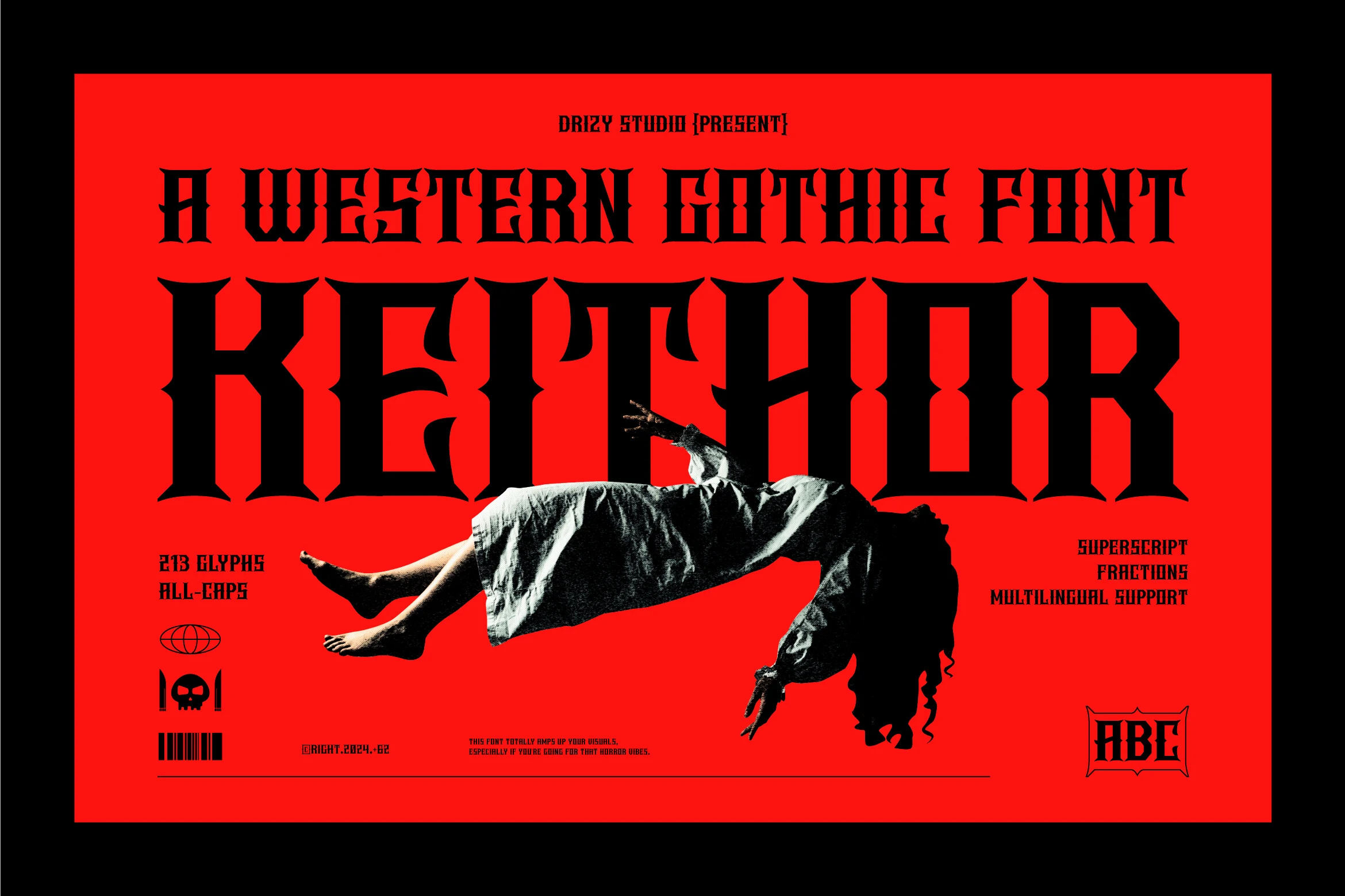
Best For: posters, invitations, merch design, display text
Keithor Font makes its presence through angular, block-like Gothic construction, heavy verticals, pointed terminals, and pronounced stroke contrast. The stark geometry works effectively in posters, invitations, merchandise, and other short headings, but its complex forms become tiring across extended text.
Spookhaus Font
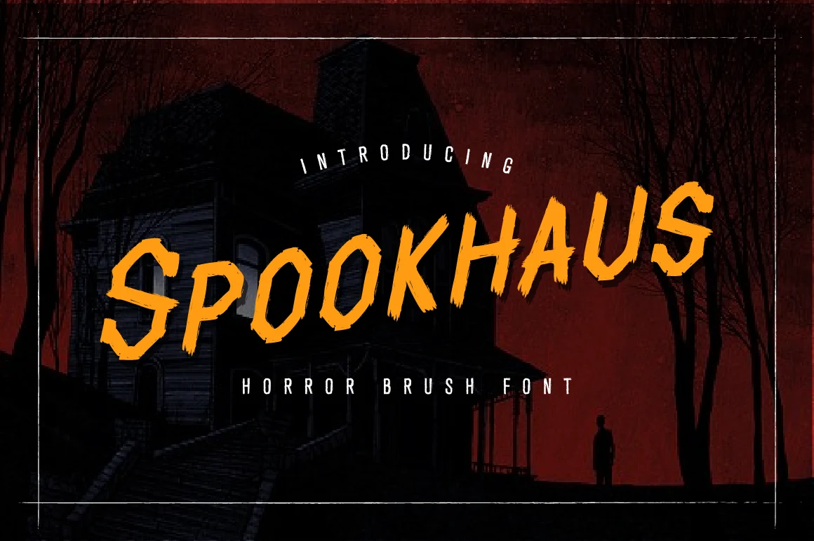
Best For: posters, headlines, display text, short phrases
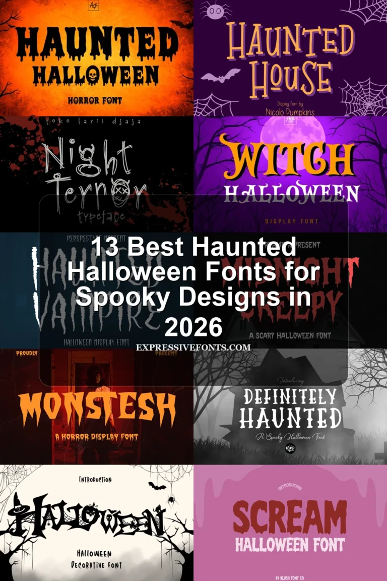
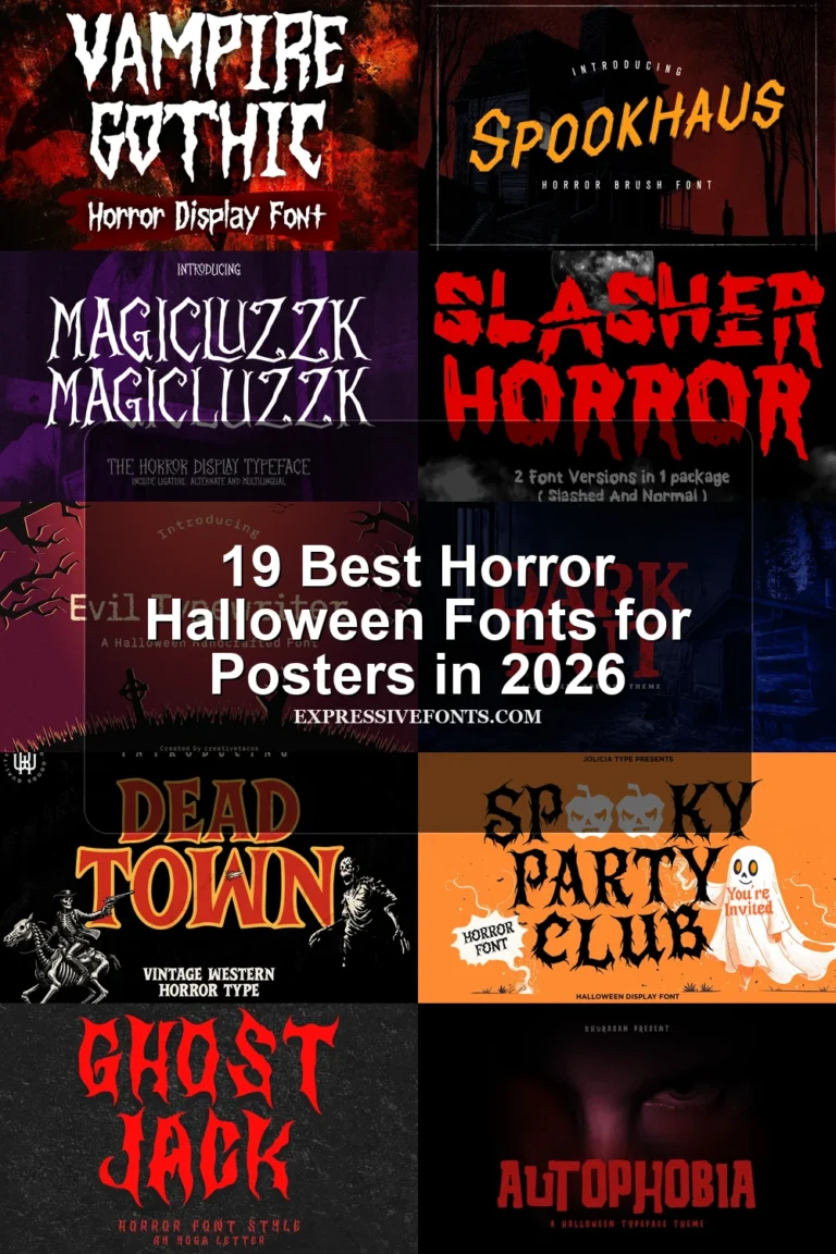
Spookhaus Font replaces smooth contours with brush-built strokes, jagged edges, and distressed painted texture. Inspired by vintage horror movie posters, it gives short phrases a forceful heading treatment; however, the irregular surface compromises clarity when the lettering is reduced or used at length.
Halloween Witch Font
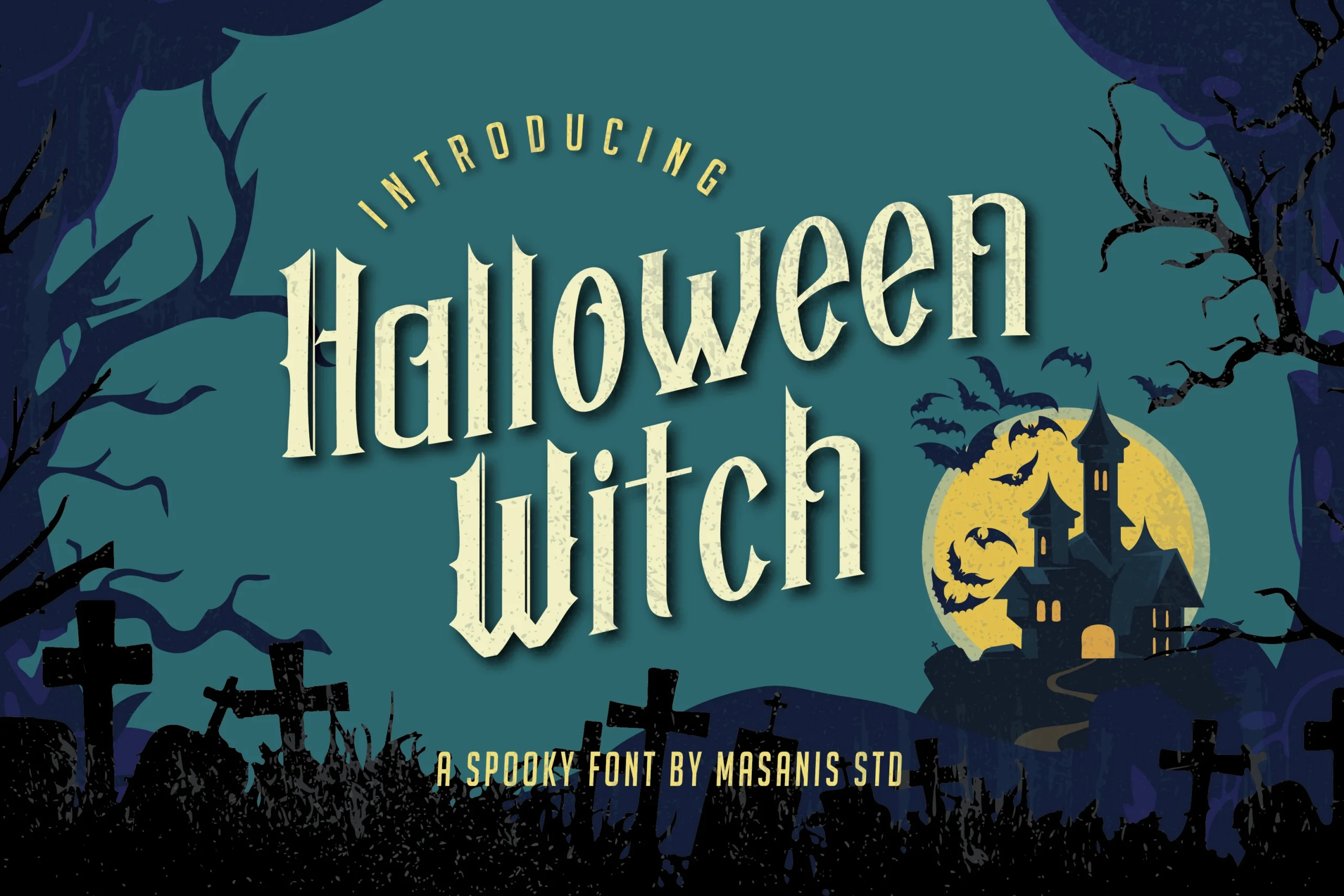
Best For: posters, headlines, display text, stickers
Halloween Witch Font combines sharp triangular serifs with high-contrast strokes and distressed marks inside the letters. Those internal details give large titles and stickers a weathered thematic surface, but fine contrast and texture can disappear quickly when the design is scaled down.
Mystic Halloween Font
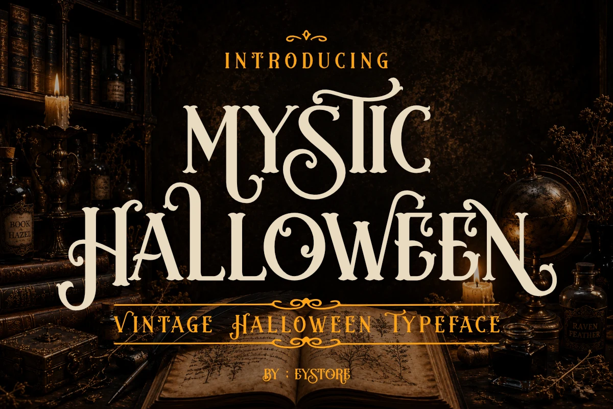
Best For: posters, headlines, quotes, decorative designs
Mystic Halloween Font extends upright Victorian-inspired letters with curving swashes and flourishes, producing distinctive title silhouettes reminiscent of old spell books and haunted libraries. The extensions add decorative impact to posters, quotes, and headers, though they slow reading in compact layouts.
Gothic Horror Font
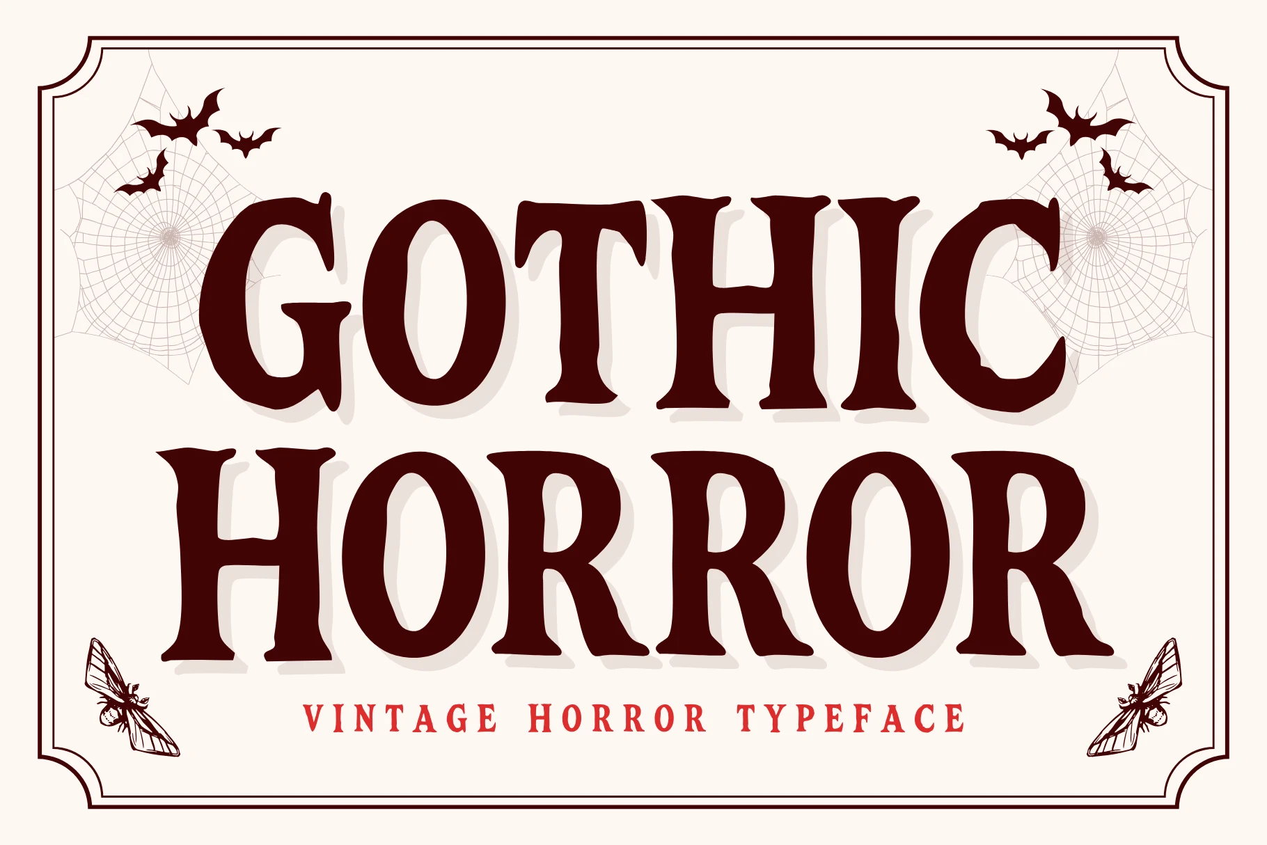
Best For: posters, headlines, display text, T-shirts
Gothic Horror Font combines high-contrast strokes with chiseled distressed terminals, jagged ink edges, and a built-in drop shadow. The shadow adds poster depth and the hand-drawn construction stays legible at large sizes, while rough edges make it a poor choice for small text.
Halloween Font
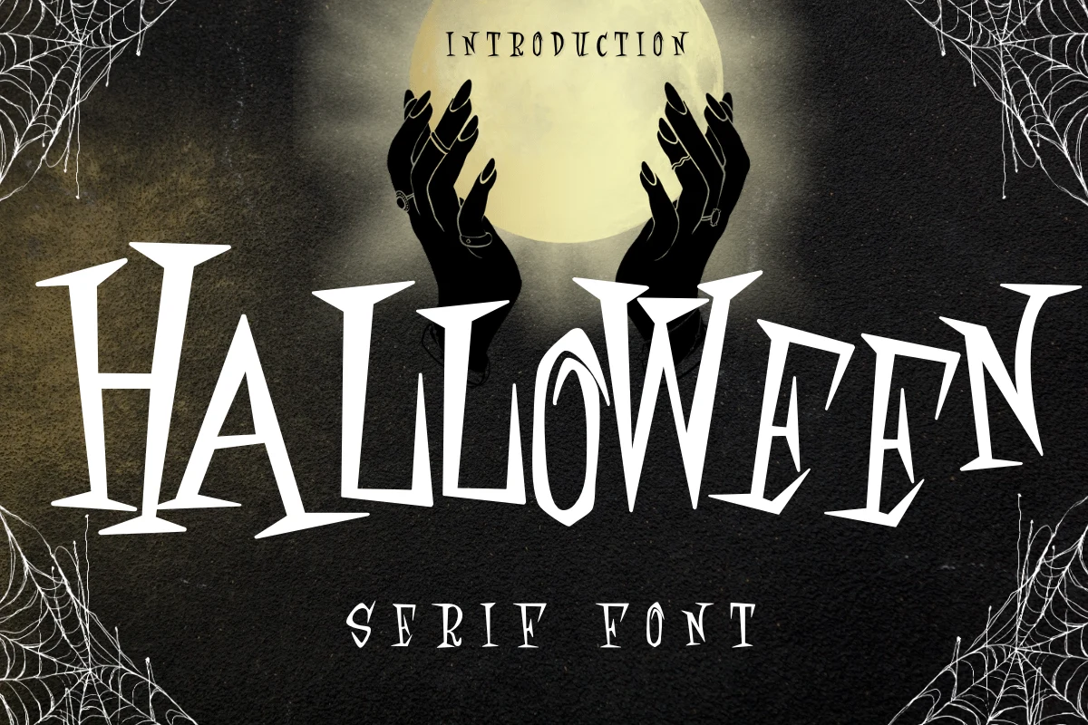
Best For: invitations, posters, merch design, headlines
Halloween Font suits invitations, posters, merchandise, and titles where an irregular silhouette matters more than effortless reading. Elongated vertical strokes, sharp triangular serifs, thin contrasting parts, and a jagged baseline create an uneven rhythm that loses usefulness in continuous or small text.
Dead Town Font
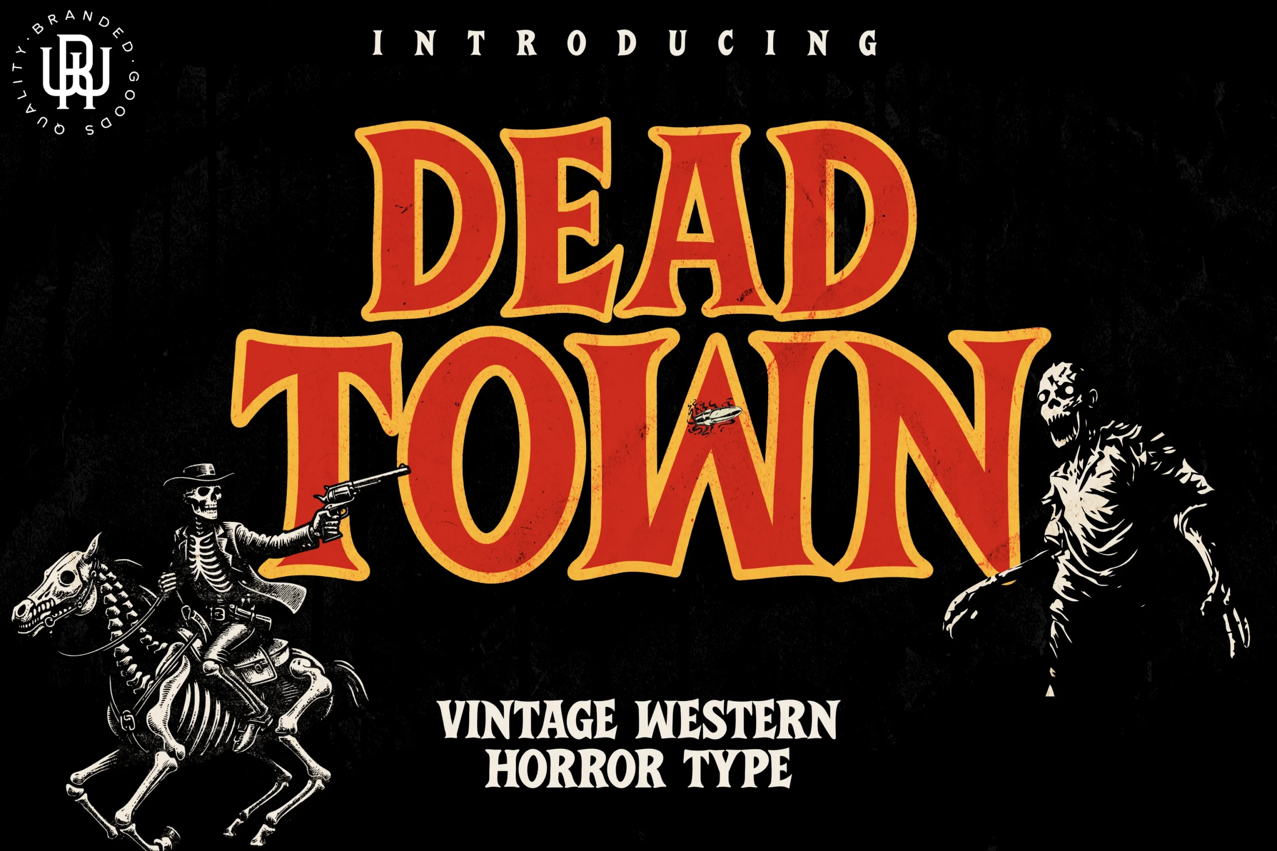
Best For: display text, headlines, posters, vintage designs
Dead Town Font merges flared slab serifs and blocky characters with an eroded surface texture. The broad structure remains readable in display text, headlines, and posters, while the weathering supplies a worn sign effect that reduces precision once words become small.
Connected Retro and Calligraphic Scripts
Connected scripts distinguish this group through joined strokes, loops, swashes, and expressive baselines. They create more movement than the upright displays, but their joins and flourishes limit wording length and small-scale clarity.
Haunted Barn Font
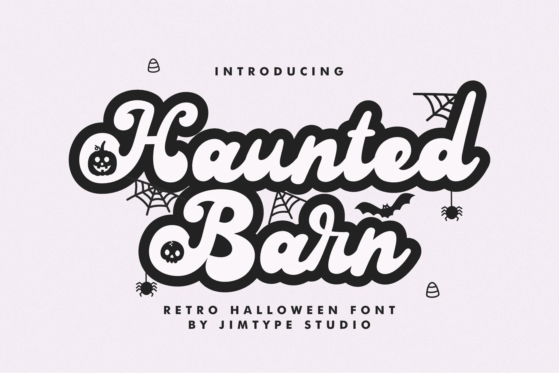
Haunted Barn Font uses thick monolinear strokes, connected letters, rounded terminals, exaggerated loops, and a bouncy baseline. Its 1970s-inspired movement gives large titles and posters a lively Halloween character, but crowded joins and flourishes can reduce readability at small sizes.
Vintage Halloween Font
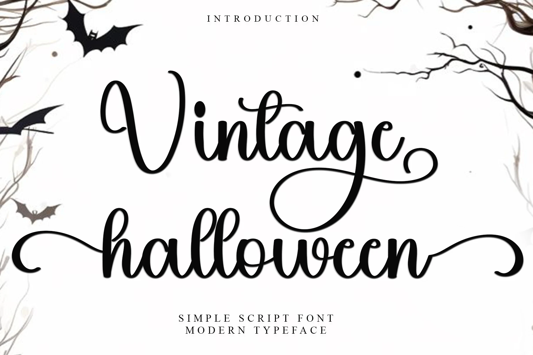
Best For: display text, headlines, logos, invitations
Vintage Halloween Font brings high-contrast connected cursive, fluid curves, and extended swashes to short display wording. The decorative finish works well for logos, invitations, and headlines, but prominent joins and flourishes restrict it to concise phrases rather than long-form reading.
How to Choose the Right Font
Choose broad, separated forms when invitations, shirts, or stickers need dependable reading, and choose condensed lettering when space is tight. Distressing, internal marks, irregular baselines, and flourishes should stay large and brief. For Vintage Halloween Fonts with the clearest hierarchy, test the actual wording at its final size before committing.