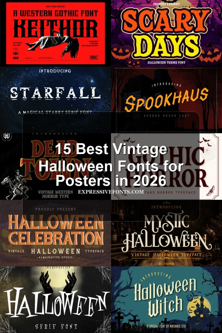
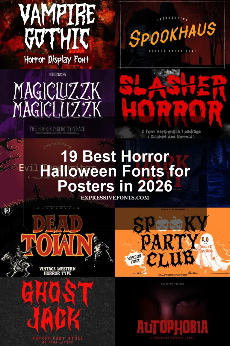
22 Best Creepy Halloween Fonts for Posters in 2026
This collection spans liquid drips, jagged erosion, etched serifs, scratchy strokes, and fragmented letterforms, giving Creepy Halloween Fonts distinct levels of menace and theatrical detail. Use them for posters, invitations, merchandise, book covers, stickers, signage, and other short display messages.
Looking for more halloween fonts? Browse our complete Halloween Fonts collection to compare vintage, cute, scary, spooky, and creepy halloween styles.
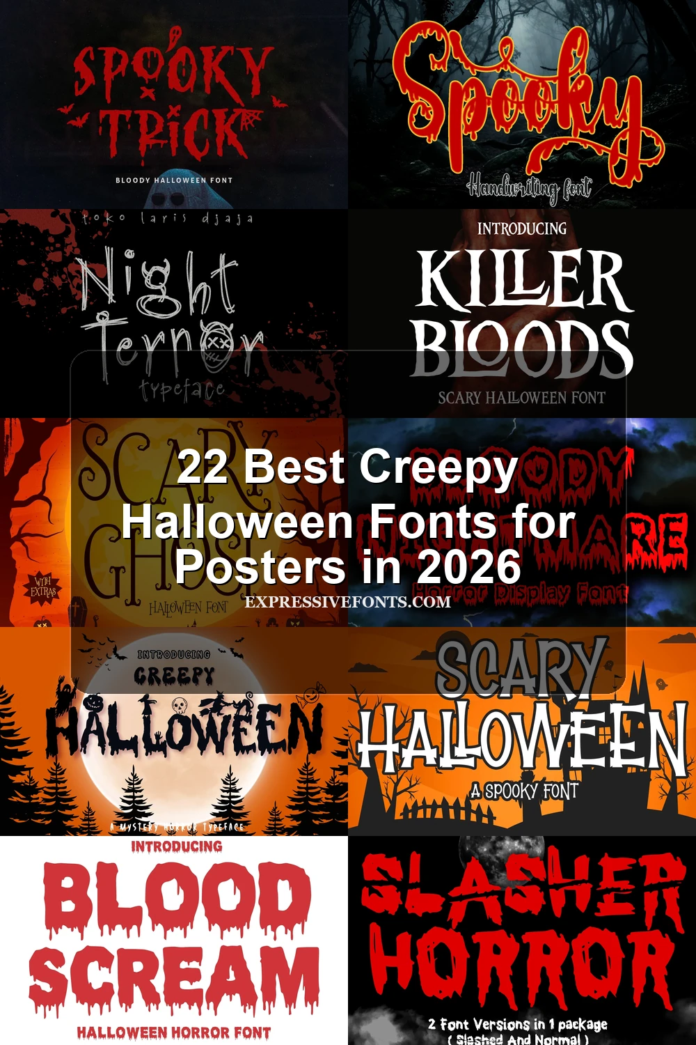
Creepy Halloween Fonts: Dripping and Melting
Creepy Halloween Fonts in this group use heavy forms with melting, dripping, or slime-like terminals; unlike the sharper groups, their horror cue comes mainly from liquid distortion.
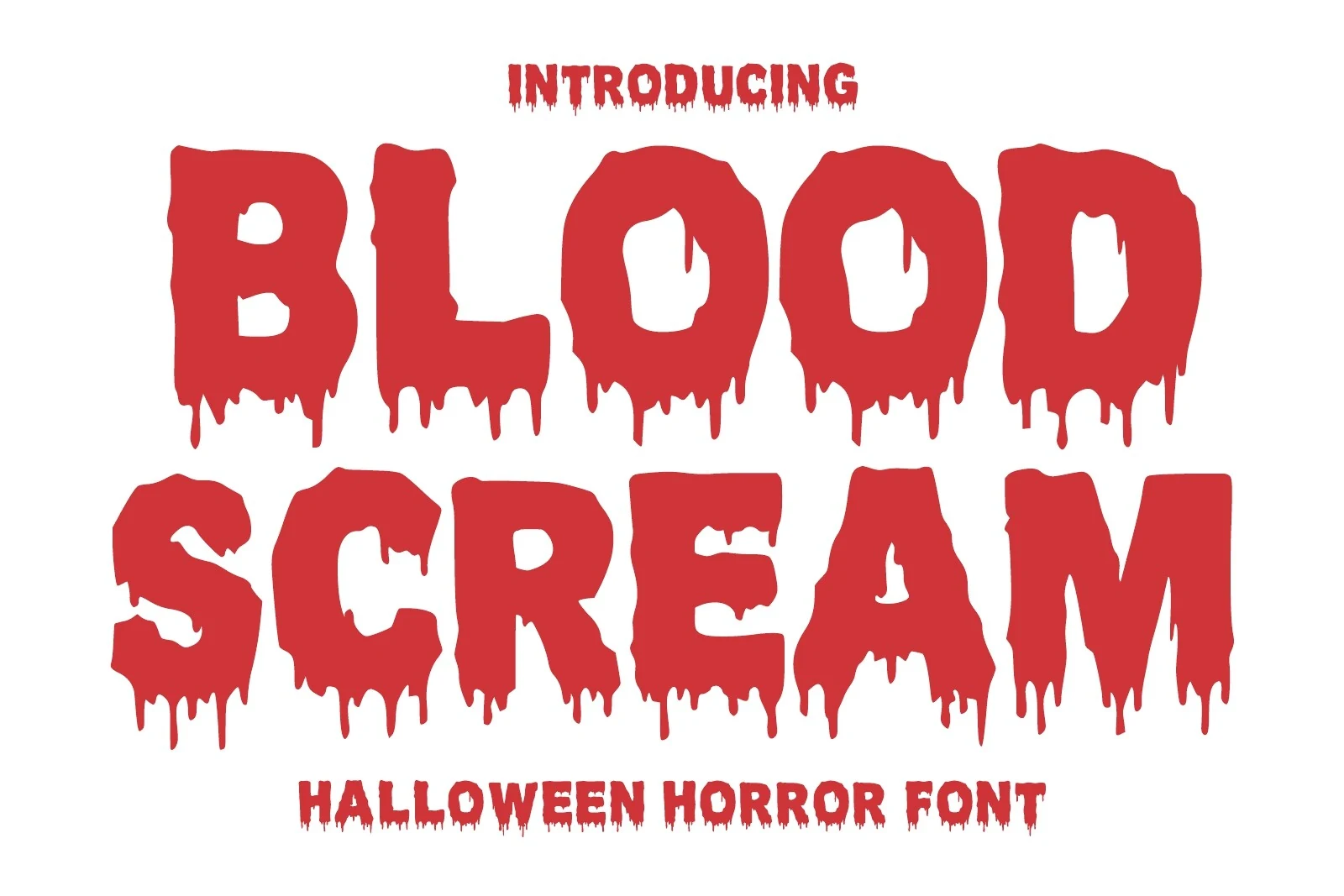
Blood Scream Font
Best For: posters, invitations, T-shirts
Blood Scream Font combines heavy geometric blocks with high-contrast liquid terminals and irregular melting contours. The theatrical construction suits large horror posters, invitations, apparel graphics, game titles, and covers, but the complex edges need generous sizing for clear reading.
Scary Halloween Font
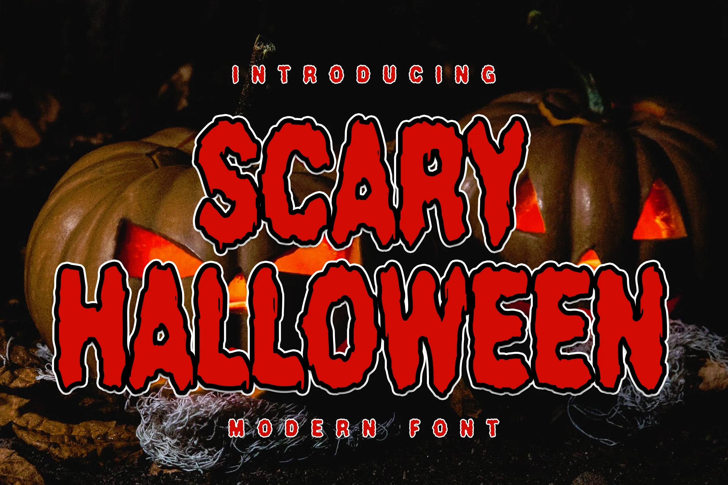
Best For: display text, posters, stickers, signage
Scary Halloween Font keeps its drip treatment on thick, uniform uppercase forms, giving titles a forceful block silhouette. It stays comparatively clear at poster scale and suits stickers or signs, although melting edges lose definition in small text.
Creepy Halloween Font
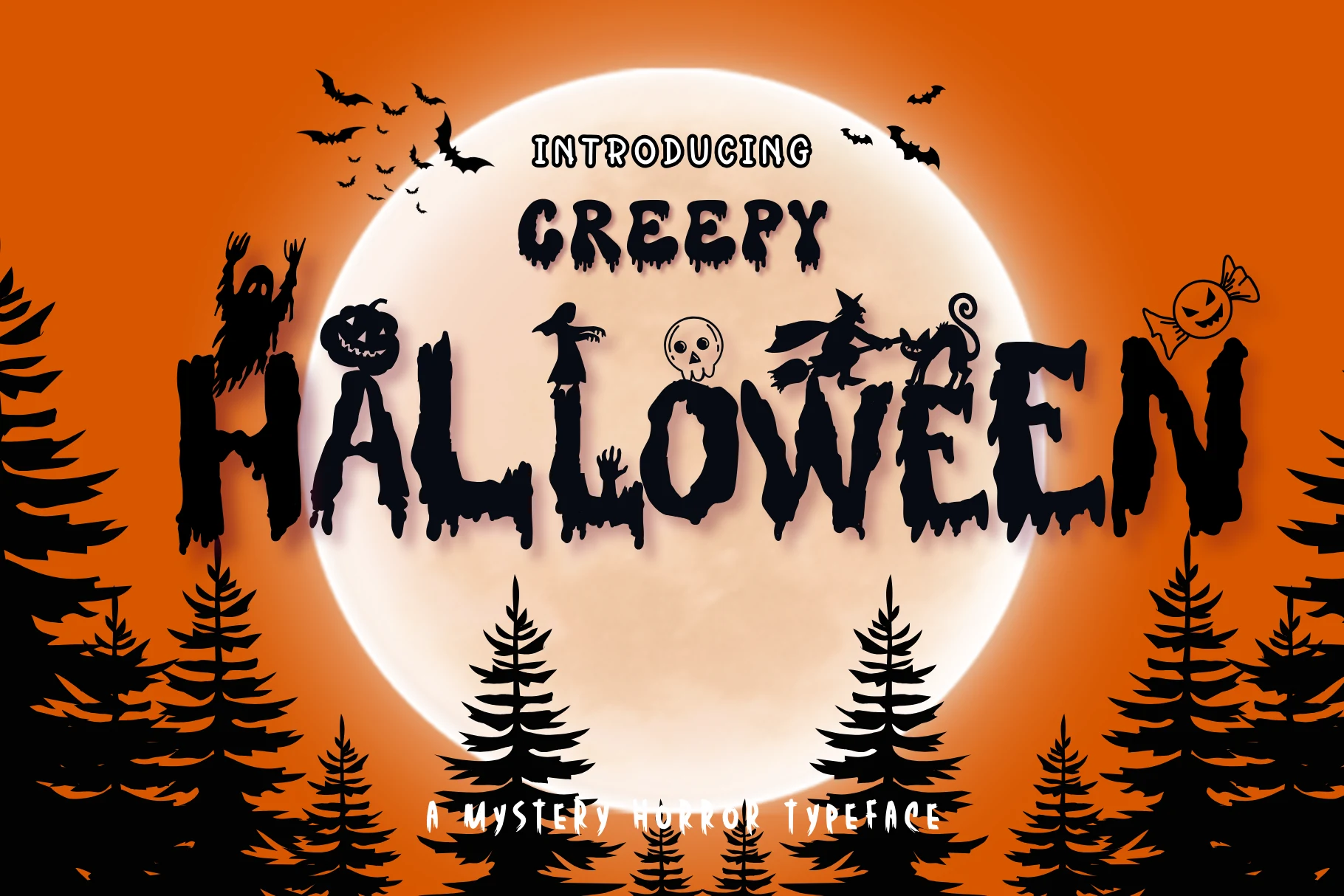
Best For: posters, display text, headlines, stickers
Creepy Halloween Font builds its mood from heavy irregular letters, slime-like terminals, jagged edges, and integrated Halloween silhouettes. Those icons add playful personality to posters and stickers, but they introduce enough visual noise to limit compact headlines.
Bloody Horror Font
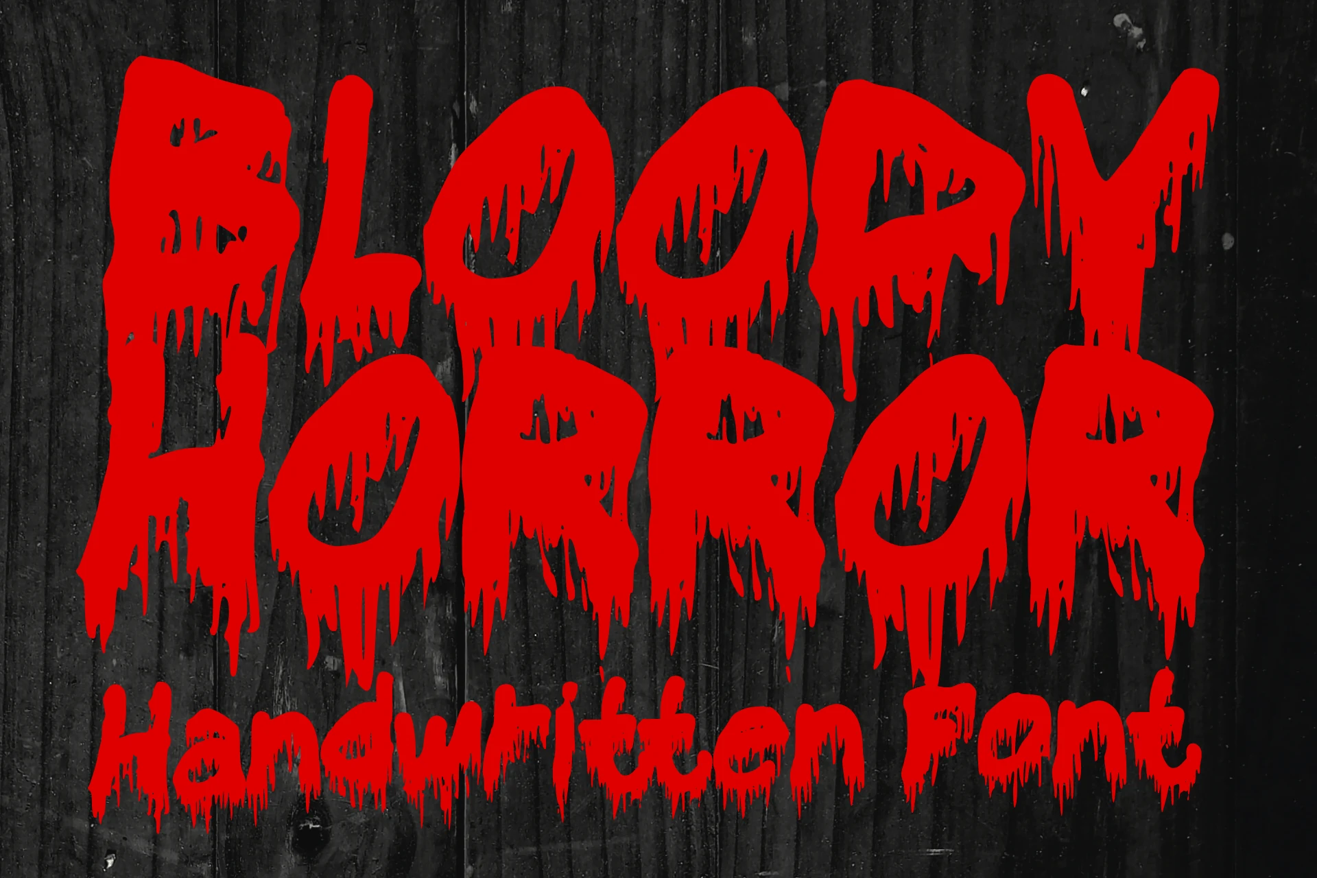
Best For: posters, T-shirts, stickers, book covers
Bloody Horror Font gives the strongest liquid-ink impression here, using thick organic shapes and non-geometric melting terminals. Reserve it for prominent covers, posters, stickers, or apparel graphics, since the irregular edges are too disruptive for secondary text.
Spooky Trick Font
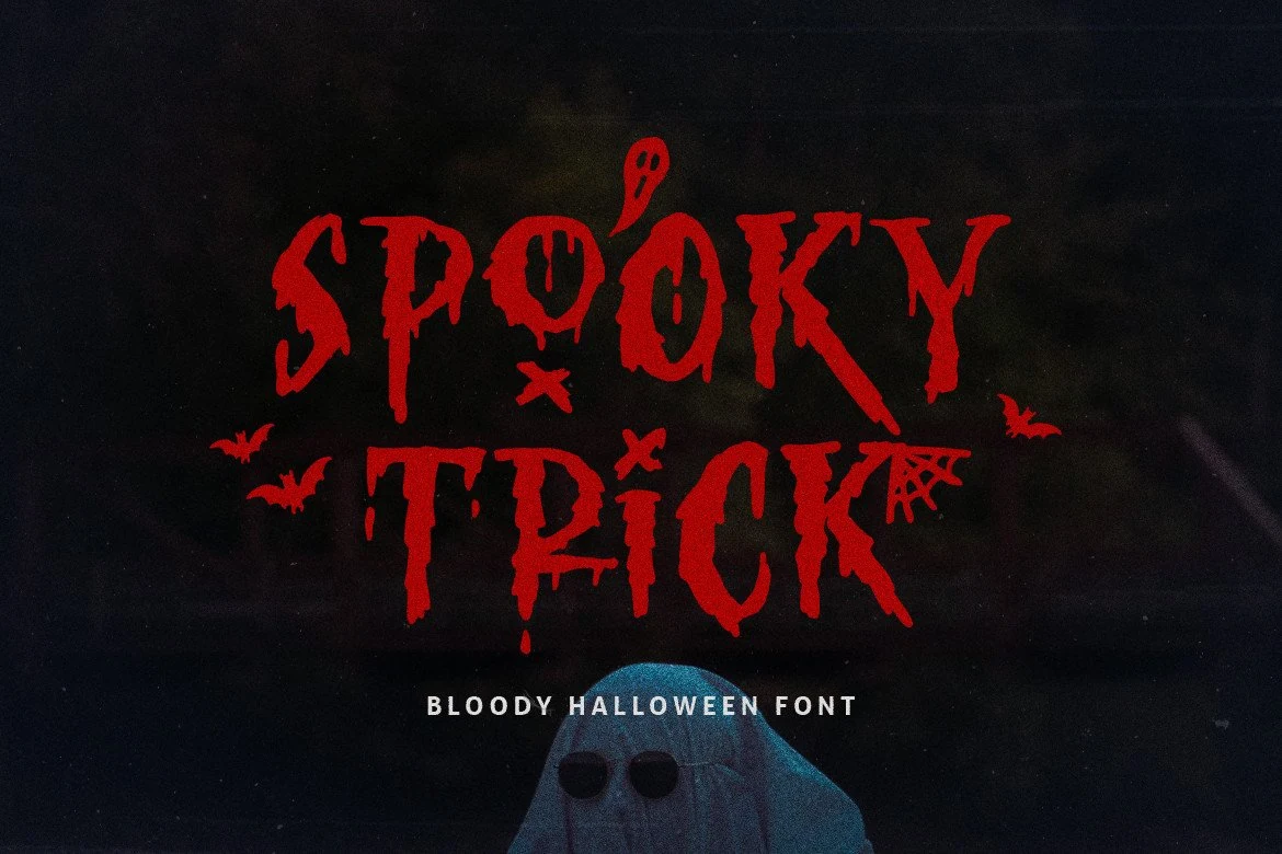
Best For: posters, headlines, display text
Spooky Trick Font suits thriller posters needing heavy dripping strokes, jagged serif-like terminals, and distinctive lowercase characters. Its irregular outlines create a more specific, uneasy voice than simple block lettering, but the liquid texture makes small headlines slower to read.
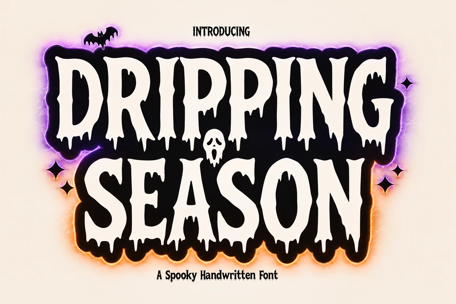
Dripping Season Font
Best For: logos, posters, headlines, short phrases
Dripping Season Font concentrates its liquid treatment at the bottoms of otherwise heavy, hand-drawn letters. That controlled placement works well for logos, short phrases, and headlines, while the irregular terminals make paragraphs or extended titles impractical.
Haunted Halloween Font
Best For: posters, display text, headlines, stickers
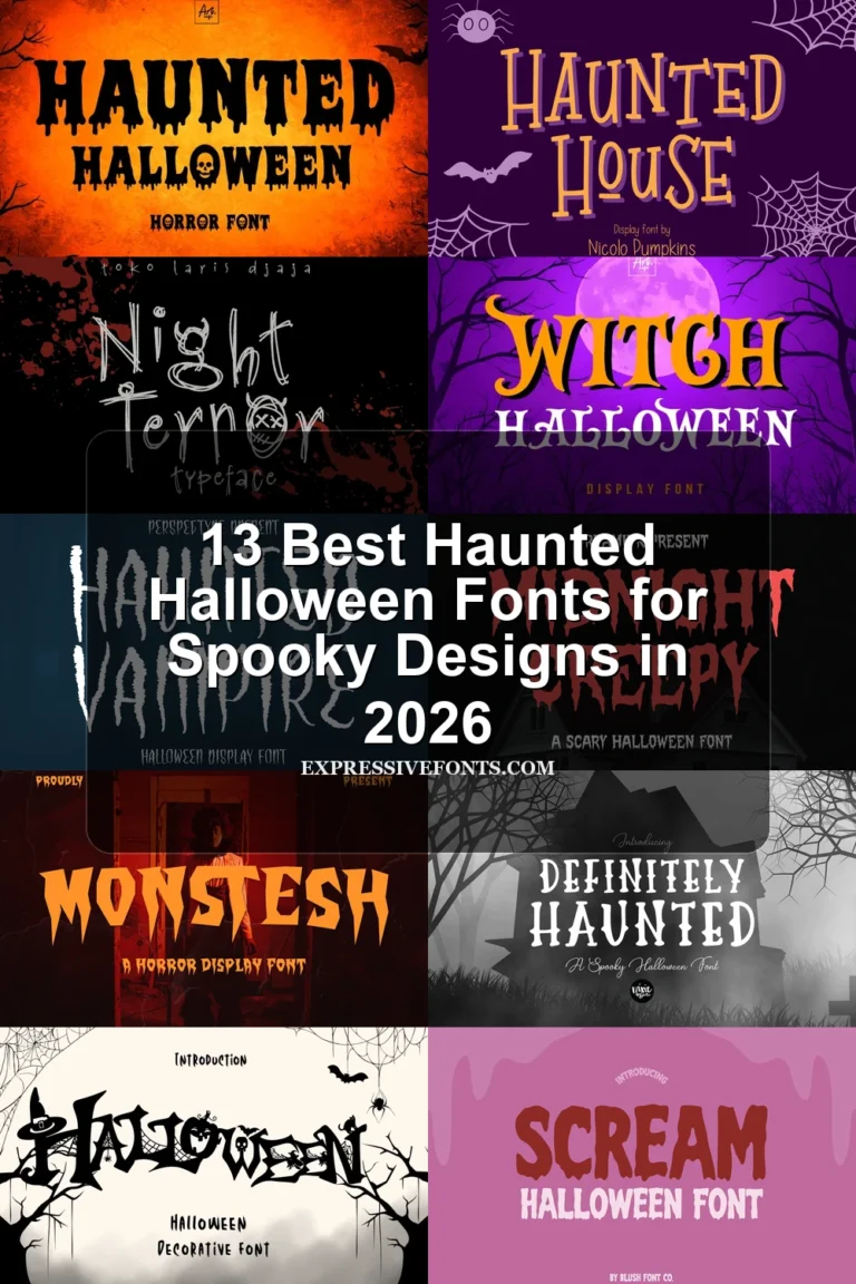
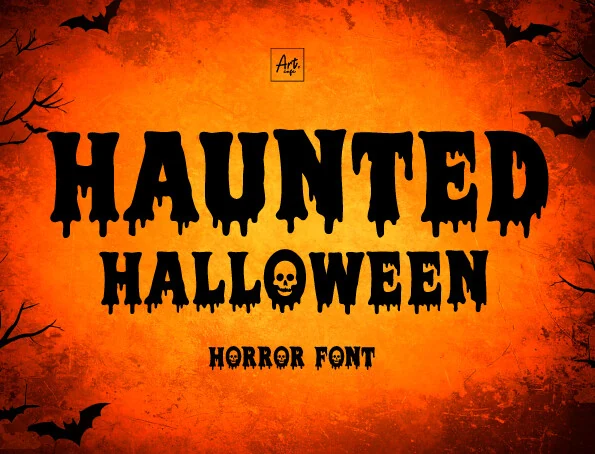
Haunted Halloween Font pairs condensed block letters and dripping lower terminals with a skull integrated into the O. That built-in symbol delivers an immediate Halloween cue for posters, stickers, and headlines, but adds noise when the lettering is scaled down.
Bloody Nightmare Font
Best For: T-shirts, book covers, posters, stickers
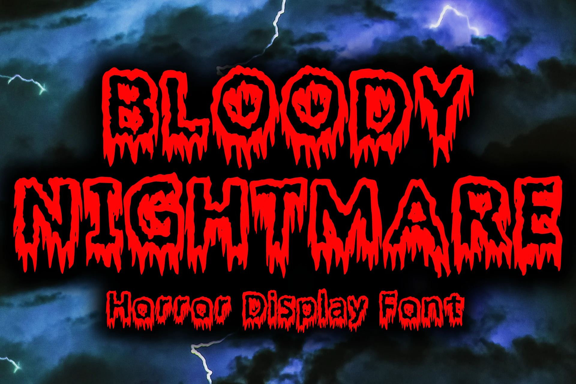
Bloody Nightmare Font uses thick, uniform strokes with broad melting edges influenced by vintage horror movies, comics, and metal imagery. Its strong merchandise and book-cover presence works at large scale, while complex contours limit smaller titles.
Scary Horror Font
Best For: T-shirts, book covers, stickers, posters
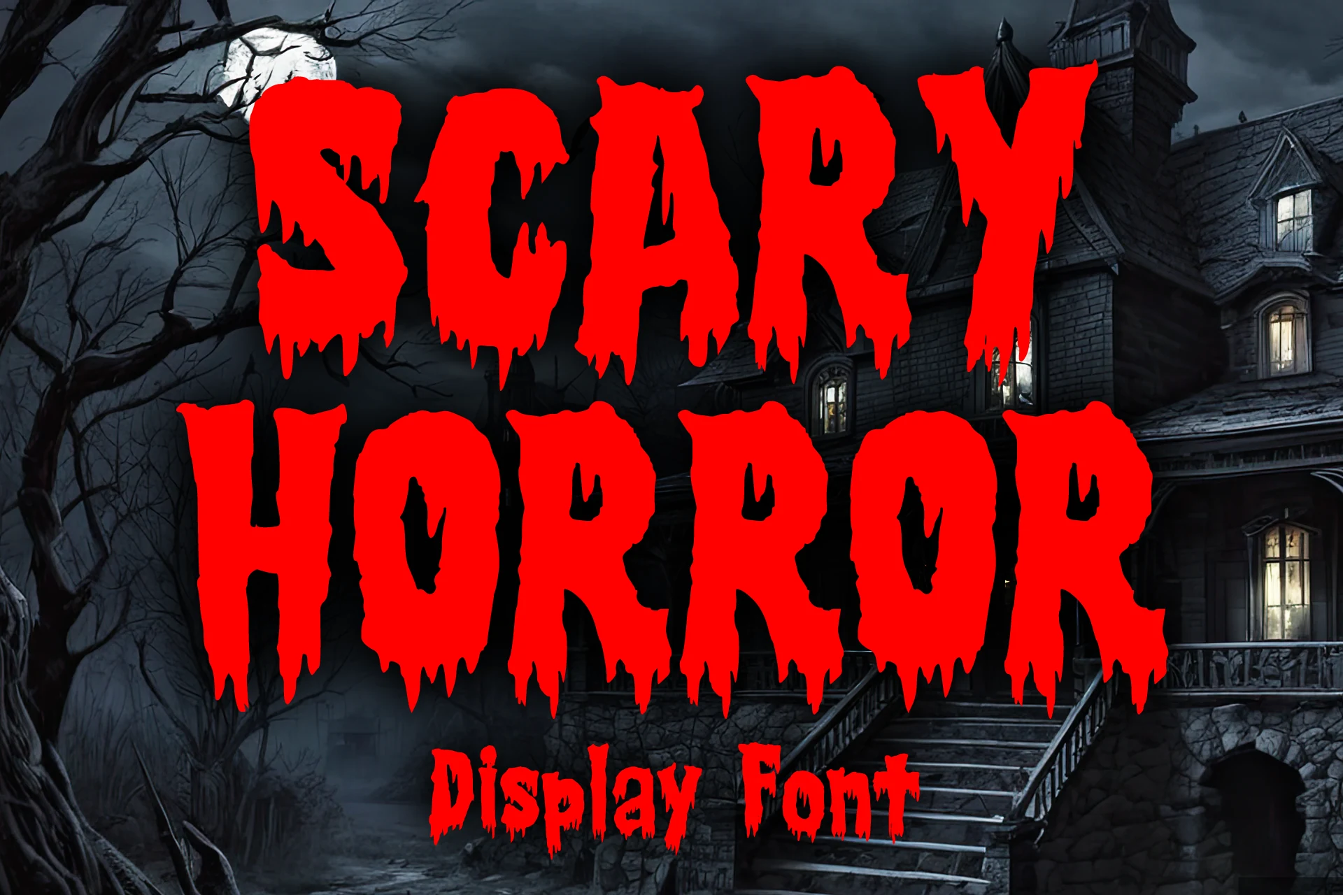
Scary Horror Font combines bold strokes with downward-dripping terminals and rough jagged texture. The strong silhouette holds up on large posters, banners, stickers, and merchandise, but the edges lose readability in small text or against busy backgrounds.
Expressive and Multi-Style Halloween Lettering
These designs vary from connected script to condensed serifs and multi-style lettering, offering more expressive construction than the focused drip, scratch, or slash treatments elsewhere.
Spooky Font
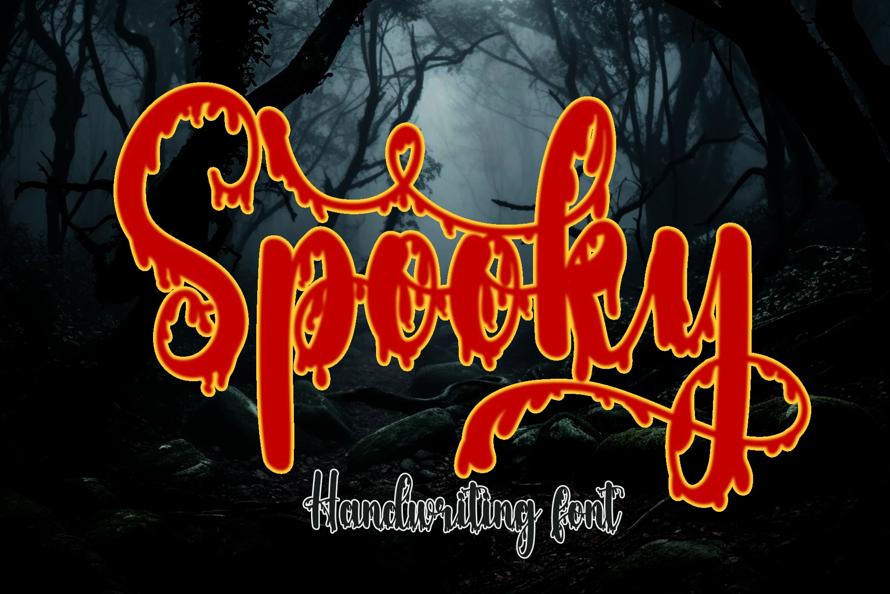
Best For: invitations, signage, display text
Spooky Font is most effective when a short invitation or sign needs connected, flowing script with a sinister twist. Bold strokes, liquid distortion, and extended opening and closing swashes create movement, while the irregular baseline makes long wording difficult to scan.
Scary Halloween Trio Font
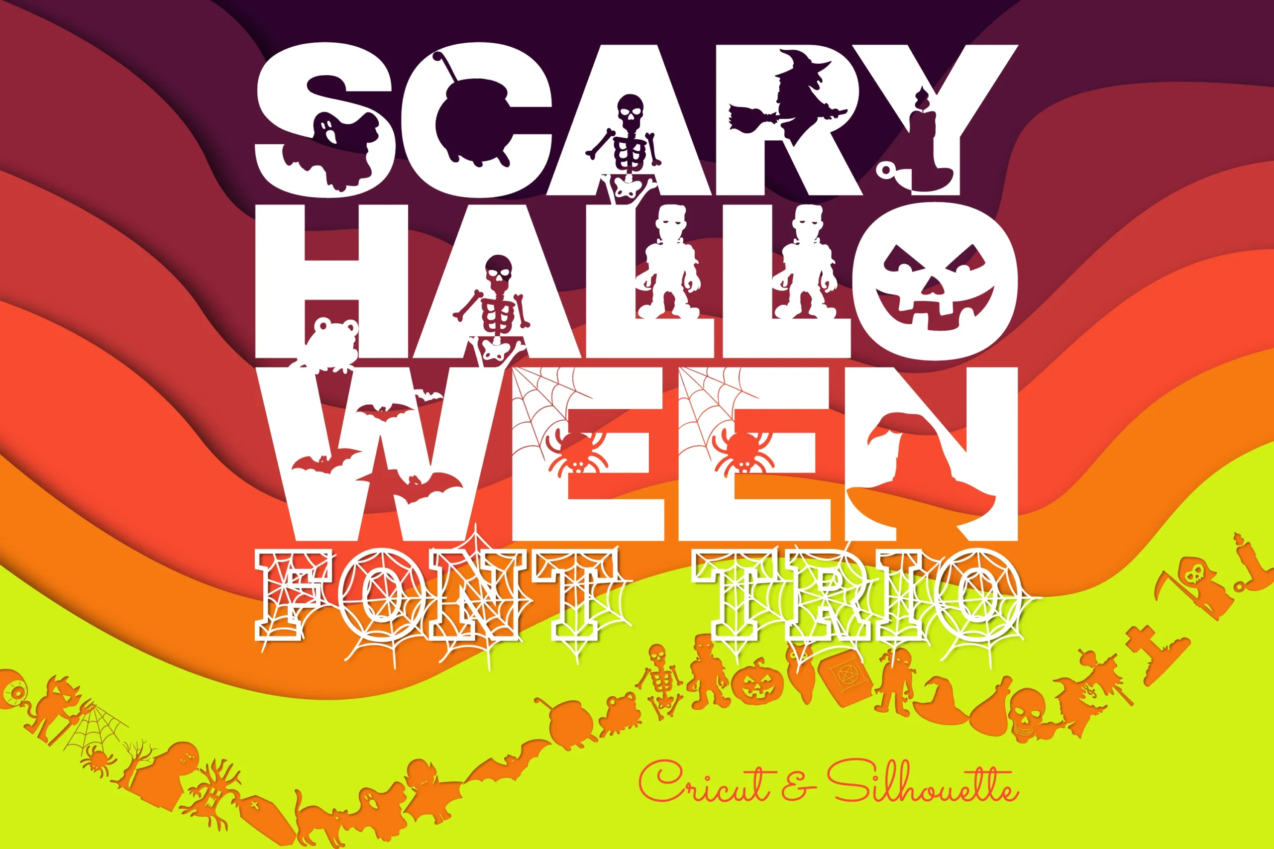
Best For: posters, children’s designs, display text, creative projects
Scary Halloween Trio Font offers three contrasting constructions: heavy slab-serif capitals, stenciled cutouts, and spiderweb-filled script. That range supports varied poster and children’s treatments; the slab styles remain more readable, while the detailed script needs extra display space.
Scary Ghost Font
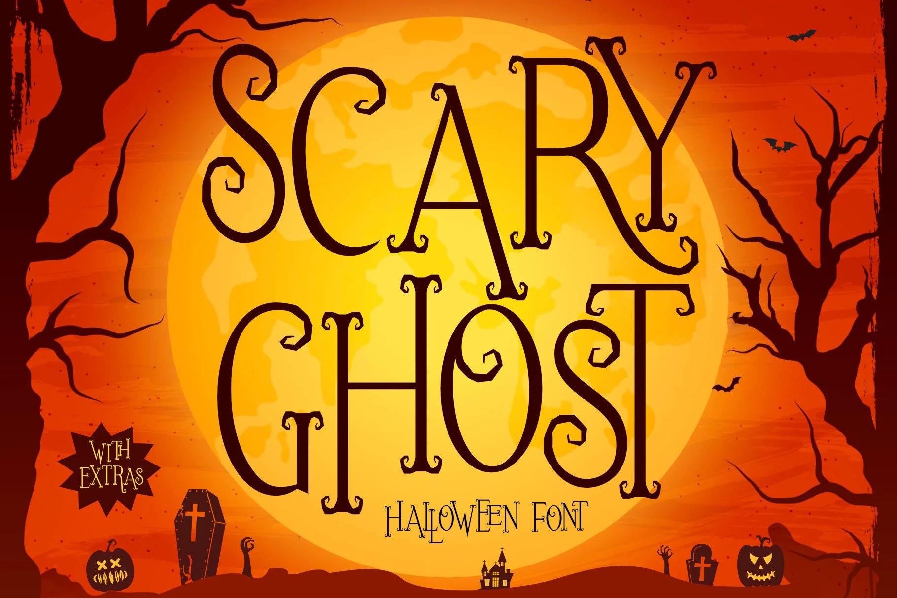
Best For: display text, posters, decorative designs, expressive designs
Scary Ghost Font uses tall, narrow proportions, hook-like serifs, tight spacing, and slightly hand-drawn contours. Its compact footprint helps poster titles fit restricted widths, while pointed details and high contrast require large sizing to preserve their definition.
Jagged and Distressed Horror Fonts
Jagged edges, eroded surfaces, uneven baselines, and sharp terminals create an intentionally unrefined texture, making this group harsher and more weathered than the liquid styles.
Scary Halloween Font
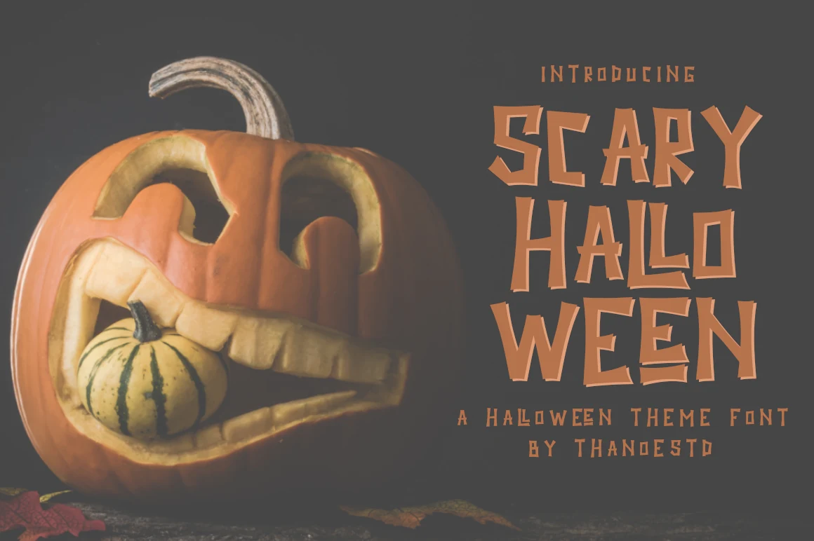
Best For: posters, headlines, display text, stickers
Scary Halloween Font relies on asymmetrical weights, shifting character placement, and distressed jagged outlines rather than a smooth, controlled finish. Its chunky isolated letters create an uncanny poster presence, but the variable construction needs large display sizing.
Sleepy Terror Font
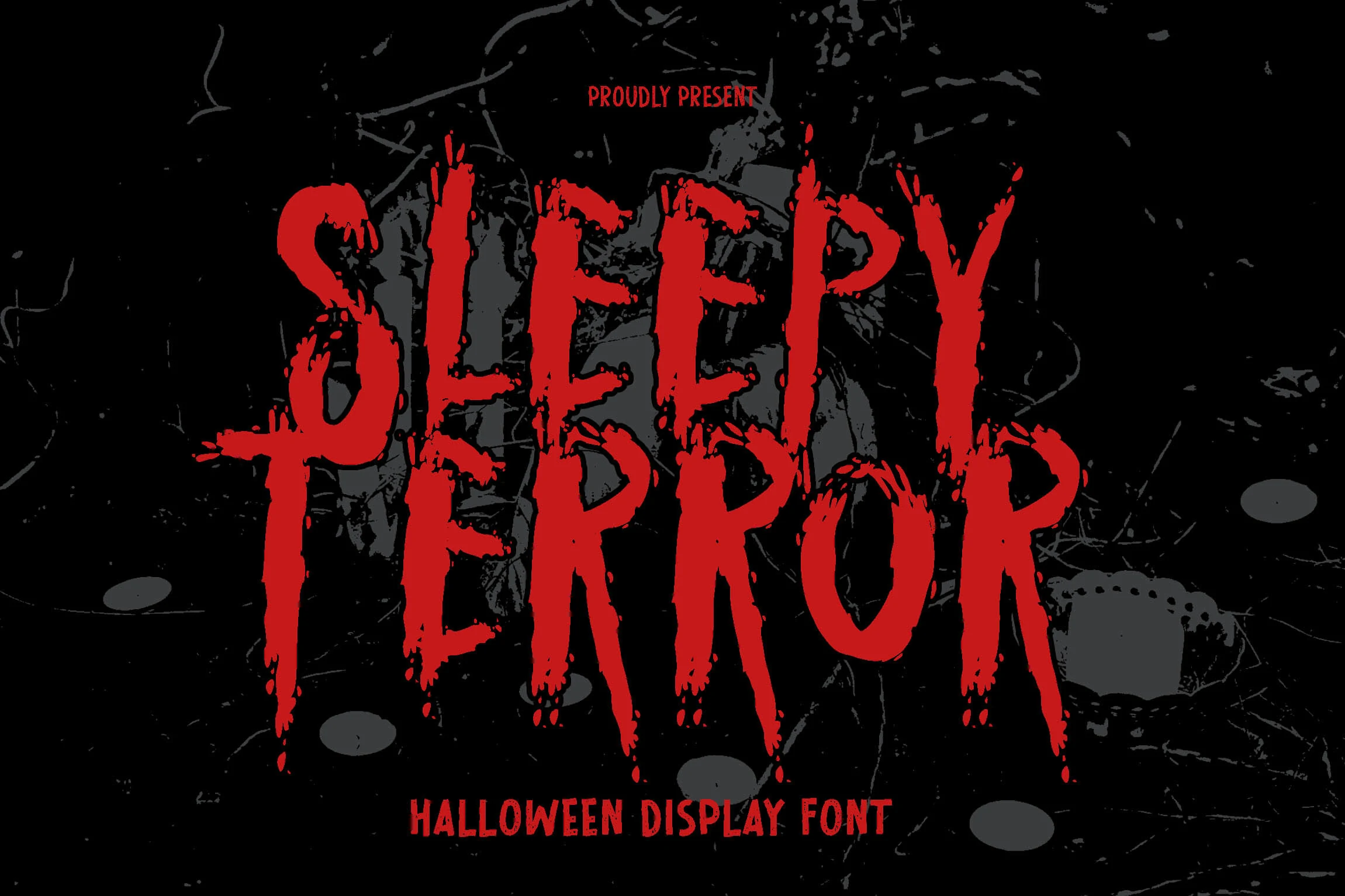
Best For: posters, display text, headlines, creative projects
Sleepy Terror Font brings gritty instability to movie-poster titles through sharp terminals, strong weight variation, dripping edges, and a distressed baseline. The uneven rhythm feels menacing and deliberate, though its textured contours make smaller headlines harder to decode.
Vampire Hunters Font
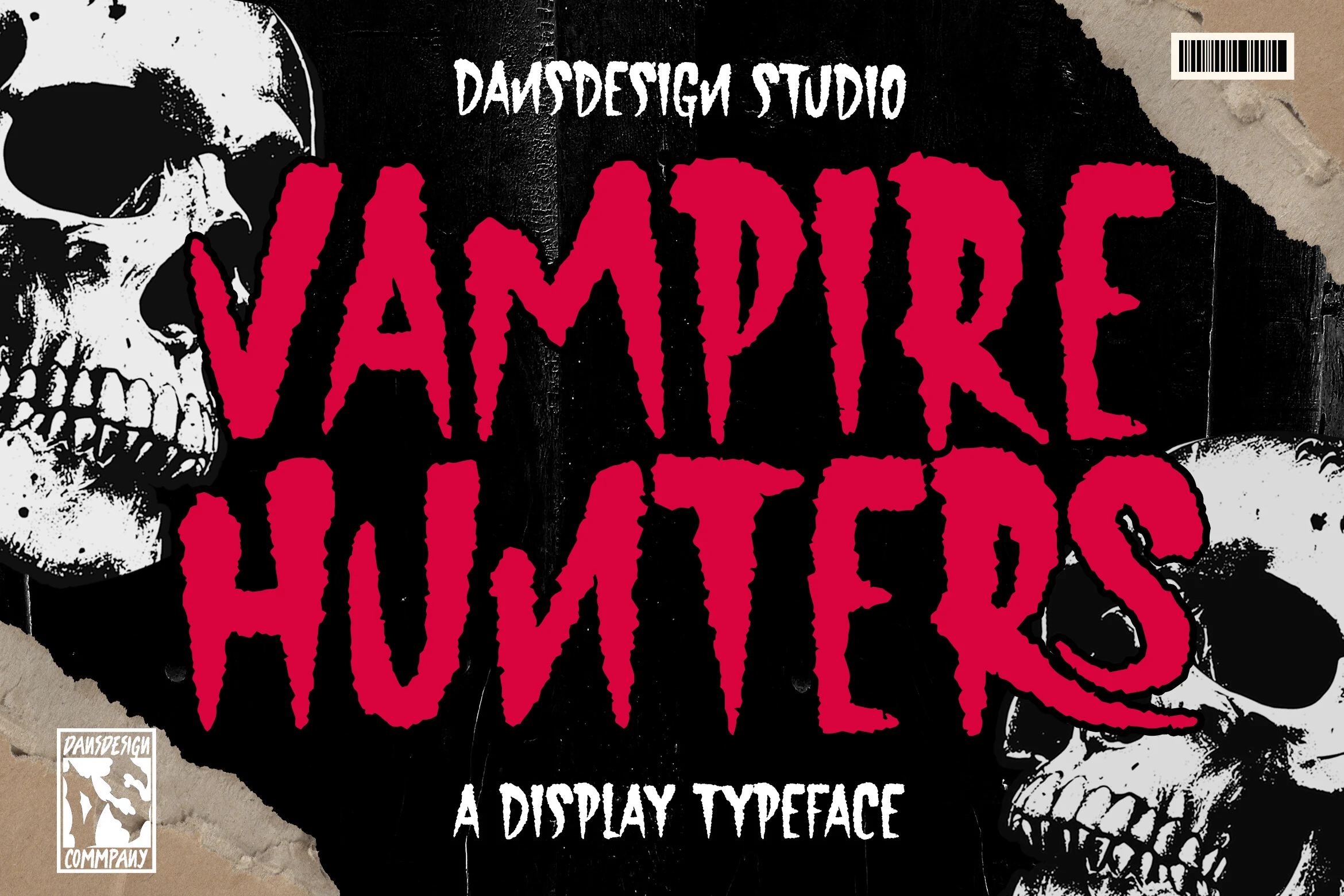
Best For: posters, display text, headlines
Vampire Hunters Font suggests weathered horror signage with heavy strokes, scratched surfaces, eroded edges, and jagged organic terminals. It has an aggressive large-scale silhouette for haunted-house headings and posters, while shrinking the text quickly weakens character definition.
Scary Halloween Font
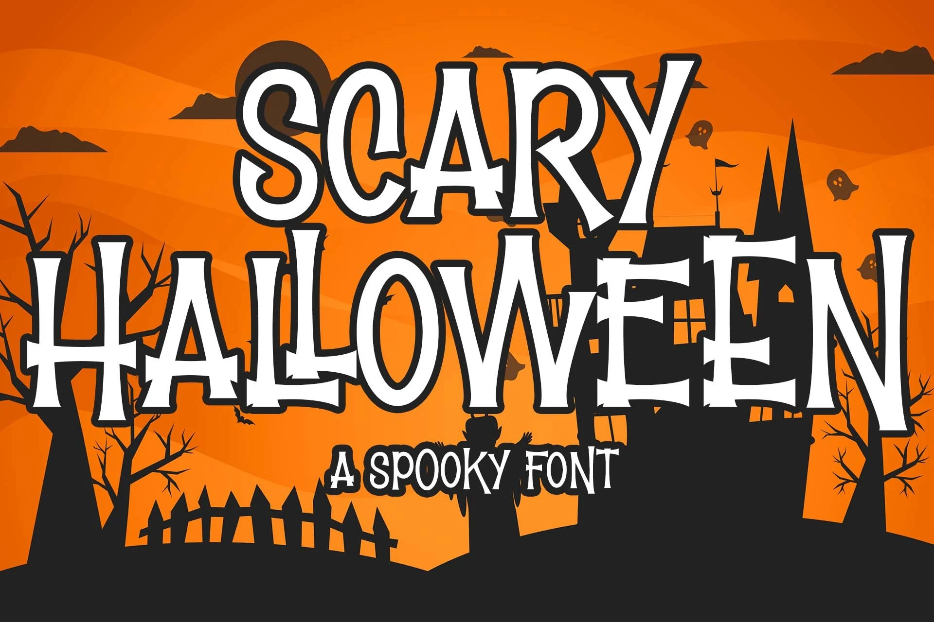
Best For: posters, headlines, display text, stickers
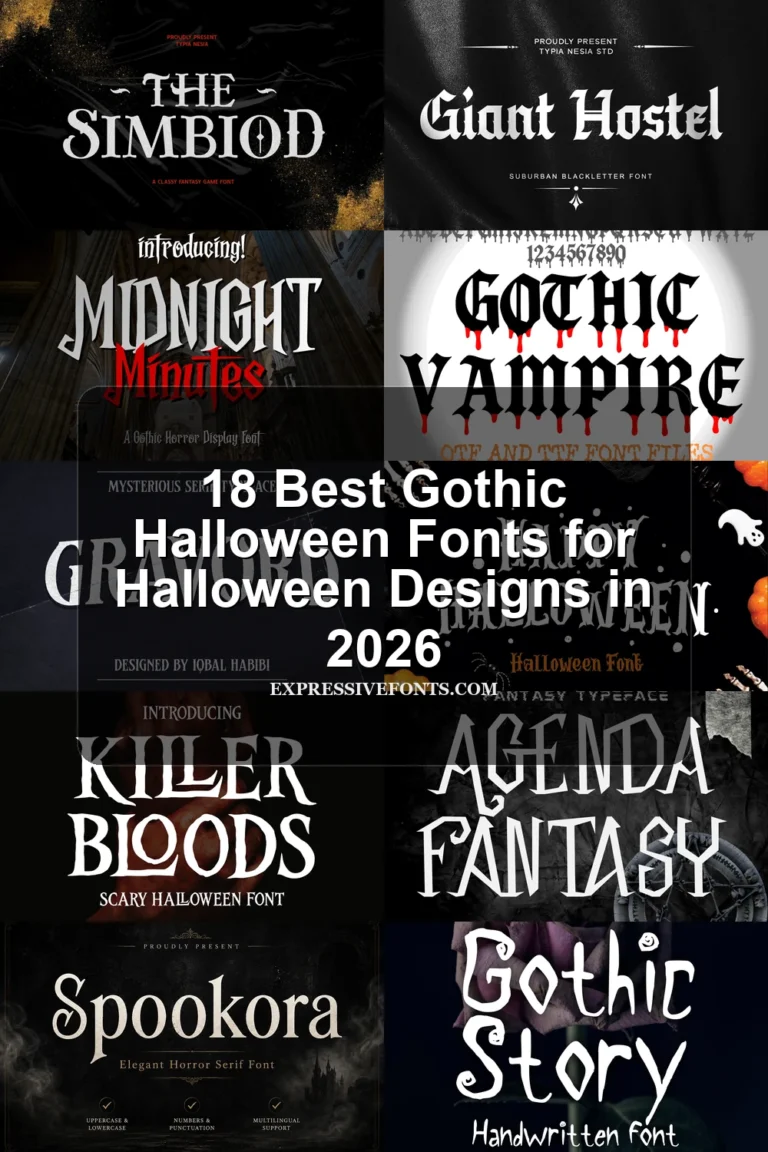
Scary Halloween Font combines condensed proportions with flared serifs, thorn-like edges, high contrast, and an uneven baseline. It gives theatrical poster headers more structure than a liquid treatment, but its distressed details keep it firmly out of body-text territory.
Ghosoul Abigael Font
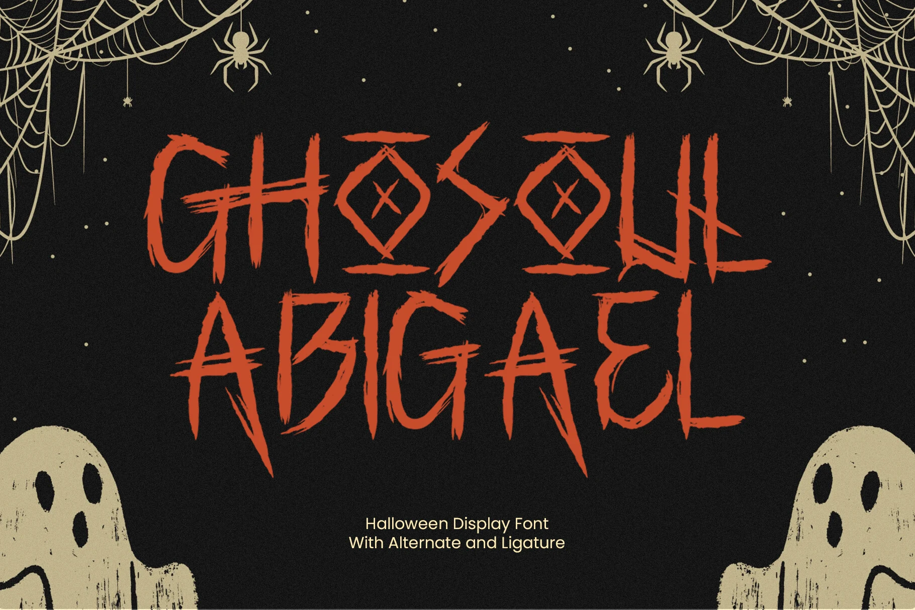
Best For: posters, packaging, headlines, invitations
Ghosoul Abigael Font uses scratchy brush-like texture, angular joins, and circular-accent crossbars for an aggressive custom-lettered appearance. Alternate characters and spooky ligatures add variation for titles, packaging, or invitations, though the rough surface needs generous scale.
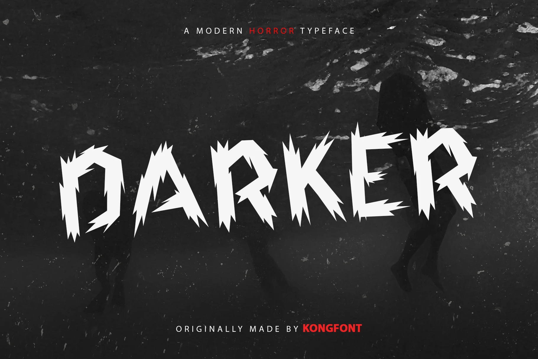
Darker Font
Best For: posters, display text, headlines, creative projects
Darker Font makes splintered all-caps outlines and sharp stroke variation the main visual event. Its forceful silhouette reads as a large Halloween title or poster header, but the intricate edges overwhelm compact wording and lose clarity when reduced.
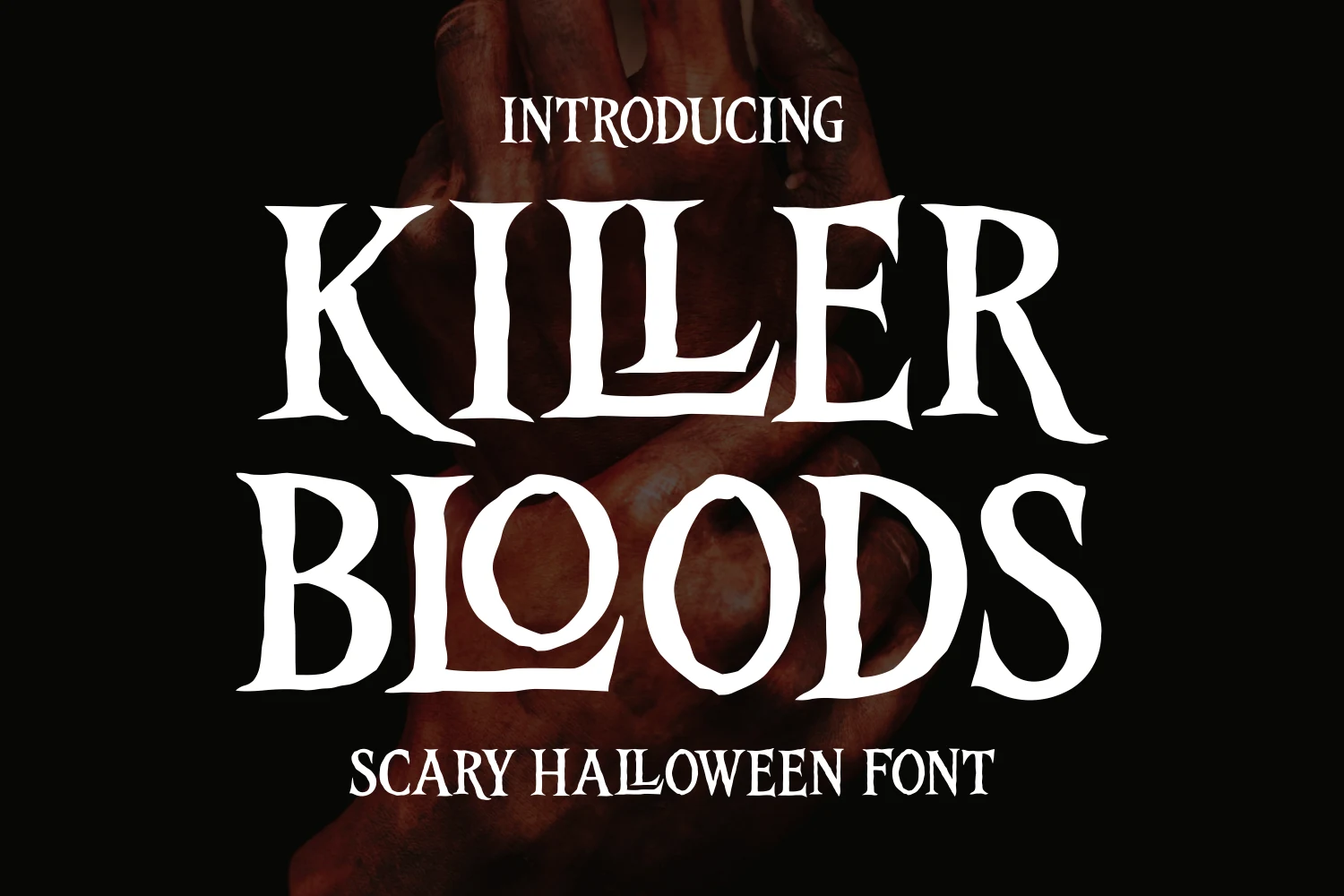
Killer Bloods Font by Dreamink 7ntypes Font
Best For: posters, headlines, display text, T-shirts
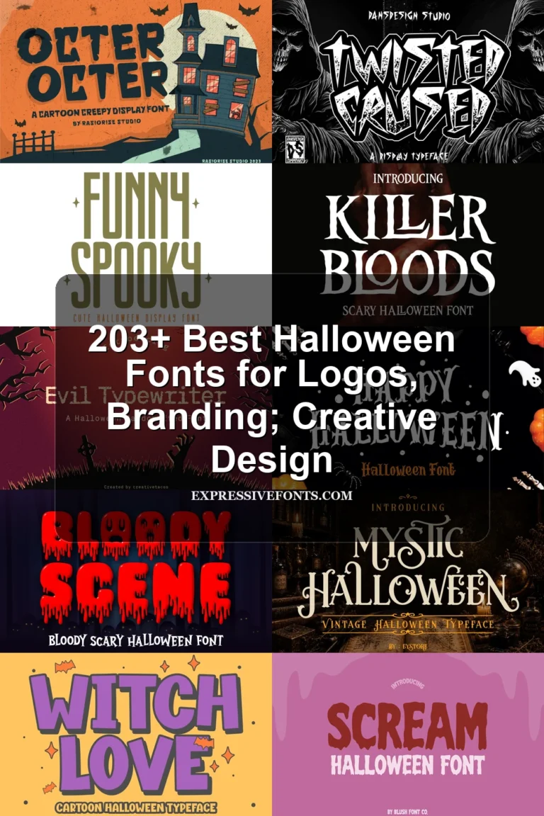
Killer Bloods Font by Dreamink 7ntypes Font combines condensed proportions with pointed serifs and raw, uneven outlines. Its narrow width helps headings occupy less horizontal space, but sharp curves and distressed edges still call for large titles.
Scratchy and Slashed Horror Fonts
Scratch marks, disconnected strokes, and horizontal fragmentation define this group, producing a broken, hand-rendered menace rather than the melting or eroded effects found above.
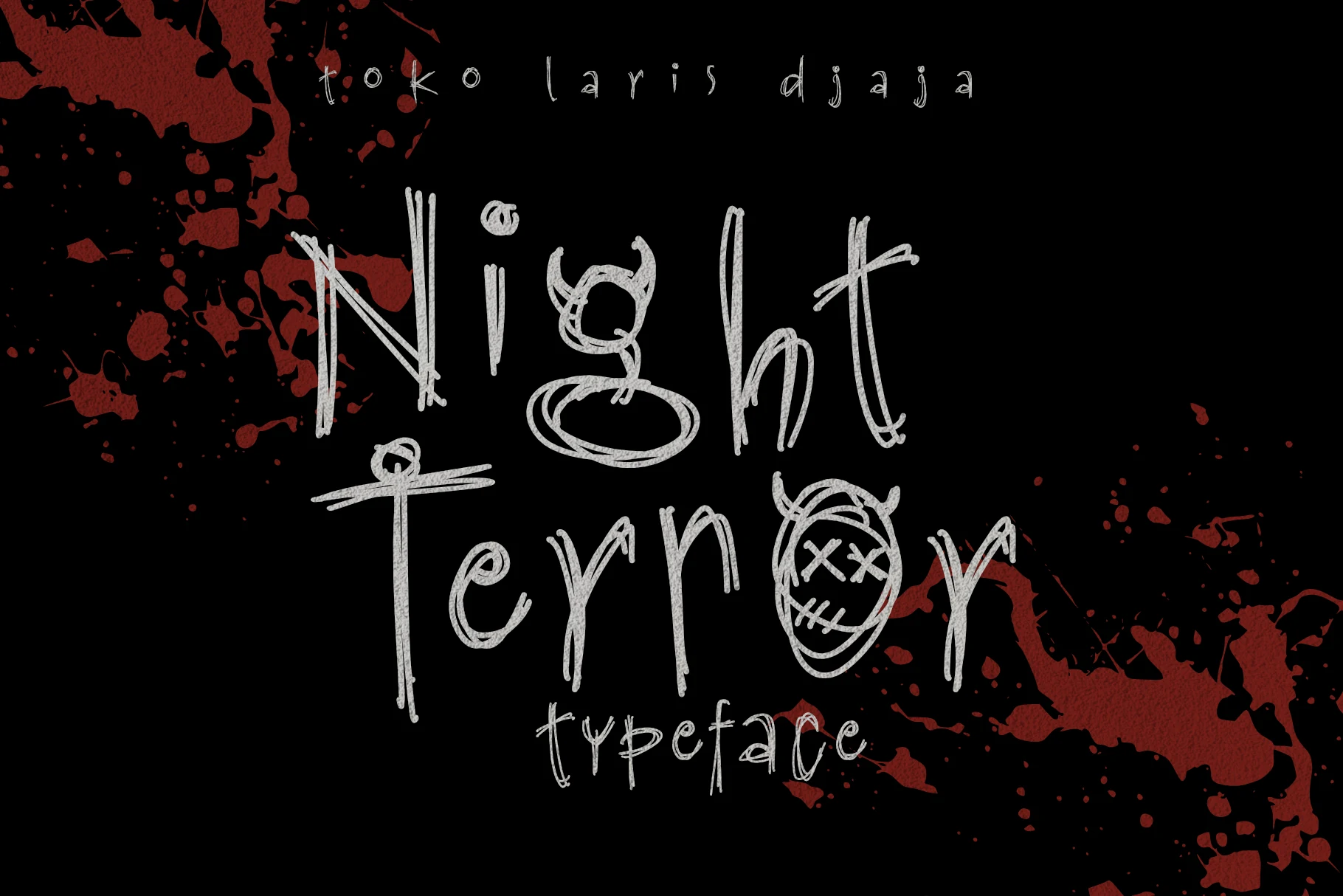
Night Terror Font
Best For: posters, display text, headlines, stickers
Night Terror Font uses disconnected scratchy strokes, variable sizing, and horn or stitched-mouth embellishments to make the lettering feel illustrated and rebellious. It brings expressive character to stickers and posters, although the irregular details slow reading at smaller sizes.
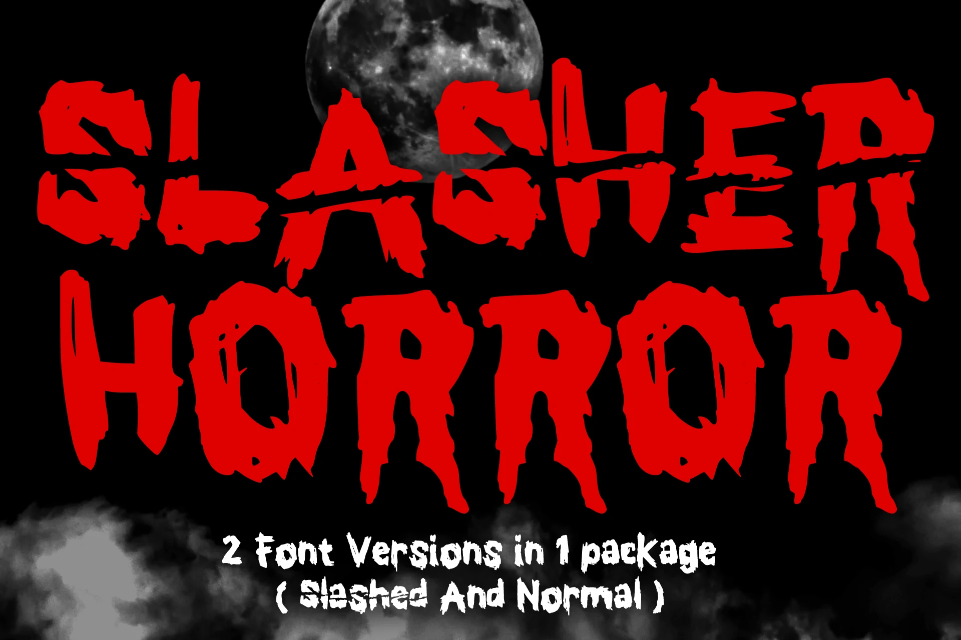
Slasher Horror Font
Best For: posters, T-shirts, book covers, stickers
Slasher Horror Font cuts horizontal slashes through heavy condensed forms, producing a fragmented texture instead of a liquid one. Its two combinable versions add design flexibility for apparel and covers, but the interruptions reduce character recognition in small wording.
Scary Halloween Font
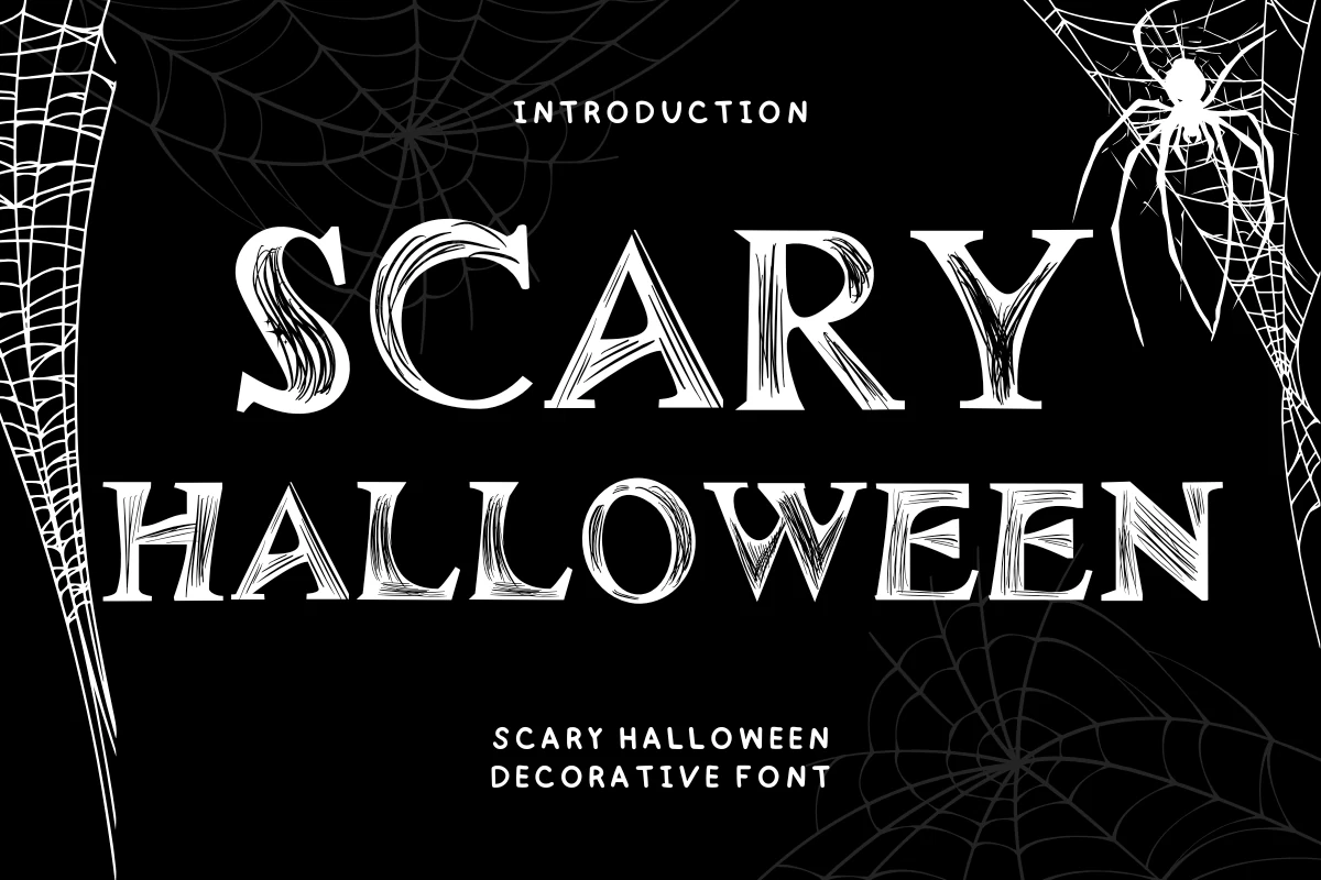
Best For: social media graphics, T-shirts, display text, creative projects
Scary Halloween Font uses sharp wedge serifs, strong stroke contrast, and etched texture inside the letterforms. Its upright decorative structure works as a prominent headline for social graphics, shirts, banners, or other creative projects, rather than small supporting copy.
How to Choose the Right Font
Choose liquid styles when the drip itself should carry the design, and pick jagged or slashed options when you want abrasion, instability, or fragmentation. Connected script and condensed serifs offer different space-saving solutions, but all Creepy Halloween Fonts here work best as large titles; test joins, contrast, flourishes, and background contrast before committing.