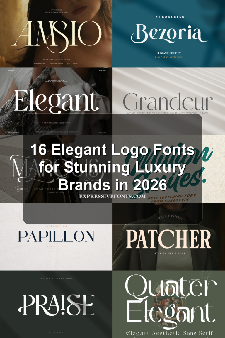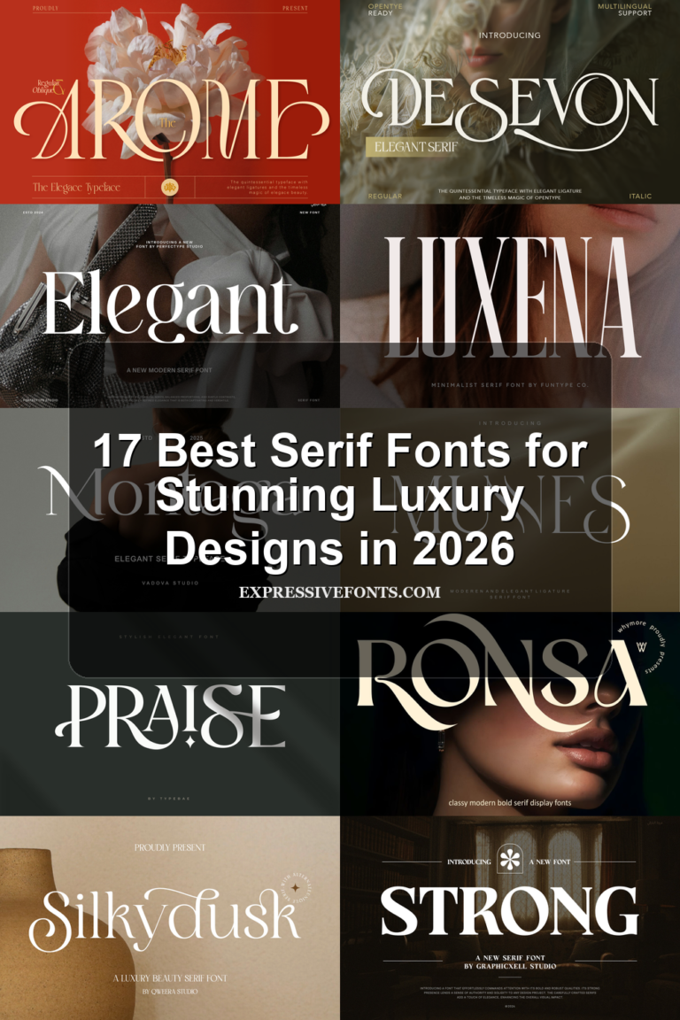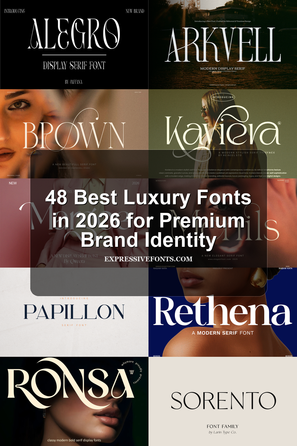
48 Best Luxury Fonts in 2026 for Premium Brand Identity
Luxury Fonts are a strong choice in 2026 for designers working on premium logos, fashion branding, packaging, magazine covers, and polished editorial layouts. This collection brings together 48 refined serif, decorative, and high-contrast typefaces that can help you build a more expensive visual identity without wasting time searching through endless font pages.
Gitrong Font
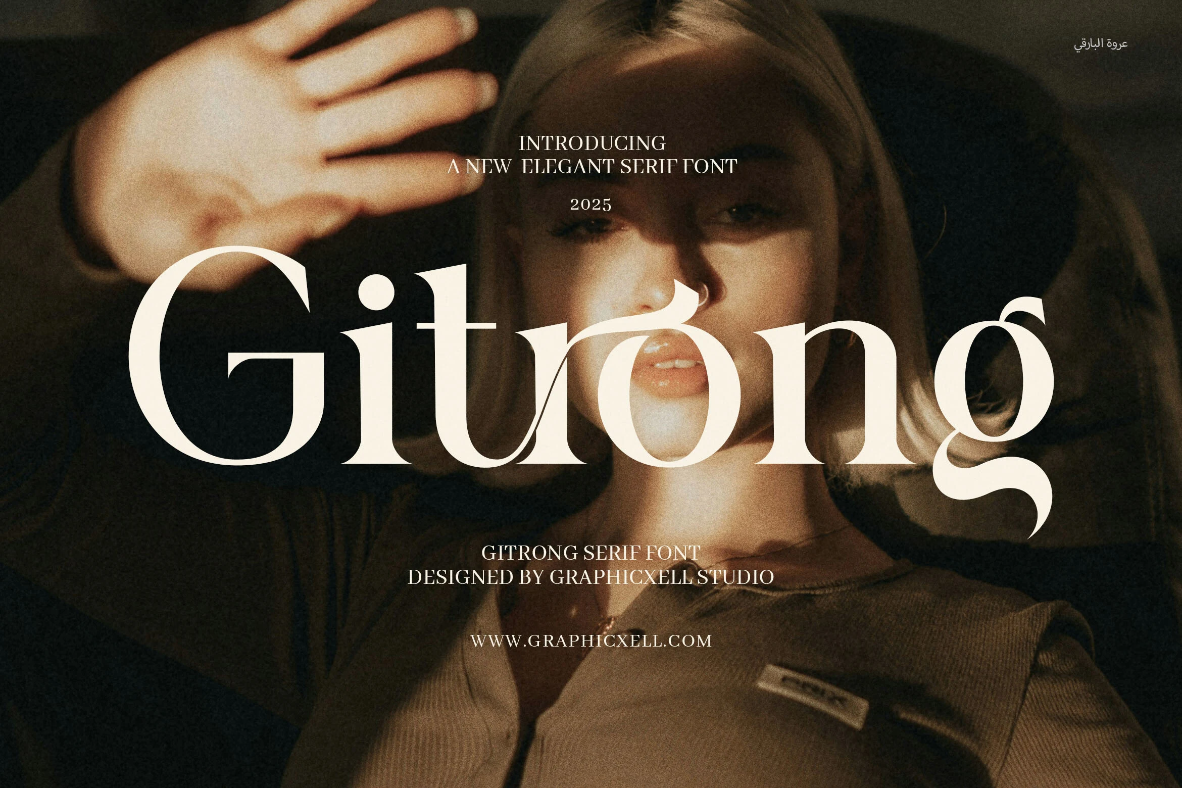
Best For: logos, luxury designs, fashion branding, editorial designs
Gitrong Font uses a high-contrast serif structure with broad sculptural curves, sharp bracketed serifs, and a distinctive flowing detail through the center letters. The large lowercase forms feel refined rather than fragile, giving Luxury Fonts projects a dramatic editorial voice without losing clarity in short titles.
For best results, let the thick verticals and thin hairlines lead the composition: keep tracking slightly open, use strong background contrast, and reserve it for logos, fashion headers, packaging names, or magazine-style hero text where the unusual curves can become the main visual cue.
Monarch Heritage Font
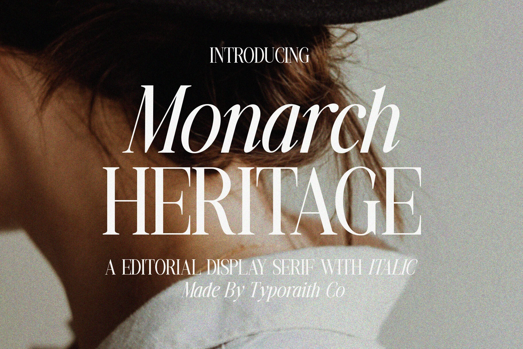
Best For: headlines, magazine covers, editorial designs, luxury designs
Monarch Heritage Font pairs a sweeping italic with stately uppercase serif forms, using crisp hairlines, sharp serifs, and graceful curves to create a polished editorial rhythm. It has the poised, high-fashion presence designers usually want from Luxury Fonts, especially when a headline needs both motion and structure.
The contrast between the slanted wordmark and the upright caps is what makes it work so well in title hierarchy. Give the main line generous space, keep surrounding text restrained, and use clean contrast behind it so the thin strokes stay elegant rather than getting lost in busy layouts.
Dlosh Luxury Font
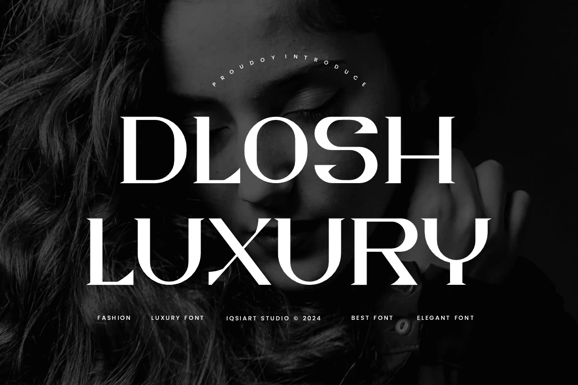
Best For: logos, packaging, luxury designs, fashion branding
Dlosh Luxury Font is built around wide uppercase forms, bold contrast, and sharp cut-in details that give each word a polished fashion-house edge. The letters feel smooth and controlled, but the angled joins and sculpted curves keep it from looking plain, making it a strong pick for Luxury Fonts with a modern editorial mood.
Use it where the word itself carries the design: logos, packaging names, invitation headers, or campaign titles. Its heavy proportions need generous spacing and clean contrast, while shorter phrases will show the distinctive cuts more clearly than dense text or small supporting copy.
Nemonty Font
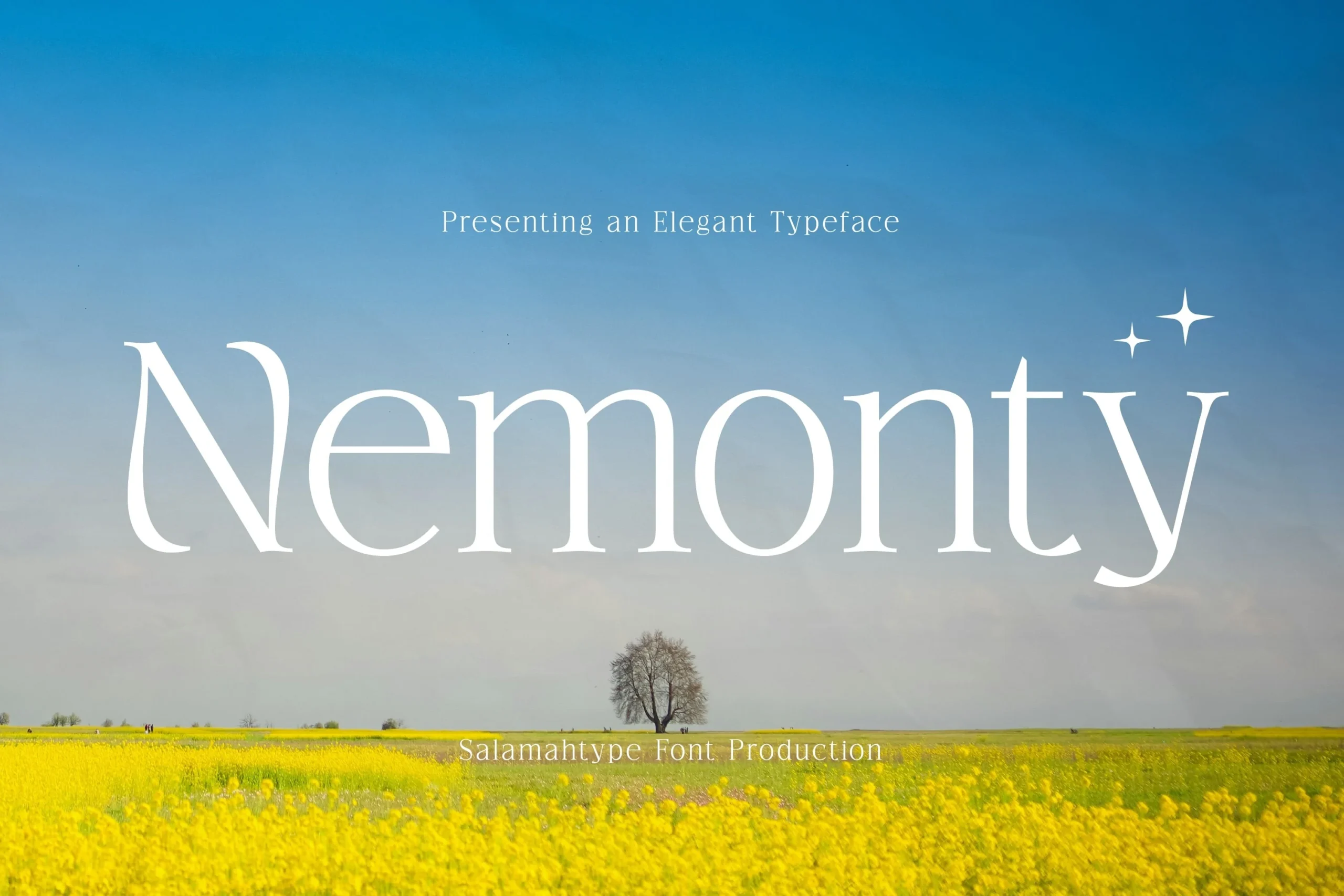
Best For: logos, branding, beauty branding, luxury designs
Nemonty Font has a light, graceful serif structure with tapered stems, rounded counters, and open spacing that gives the lettering a calm, polished rhythm. Its thin strokes make Luxury Fonts feel more understated and boutique, which works especially well when you want elegance without the stiffness of a sharper editorial serif.
This style reads best in short names and display lines, where the delicate shapes stay crisp and intentional. Keep the layout airy, use clear contrast behind the text, and pair it with a restrained sans for supporting copy so the refined proportions can carry logos, packaging, or beauty-led branding on their own.
Quick Moncky Font
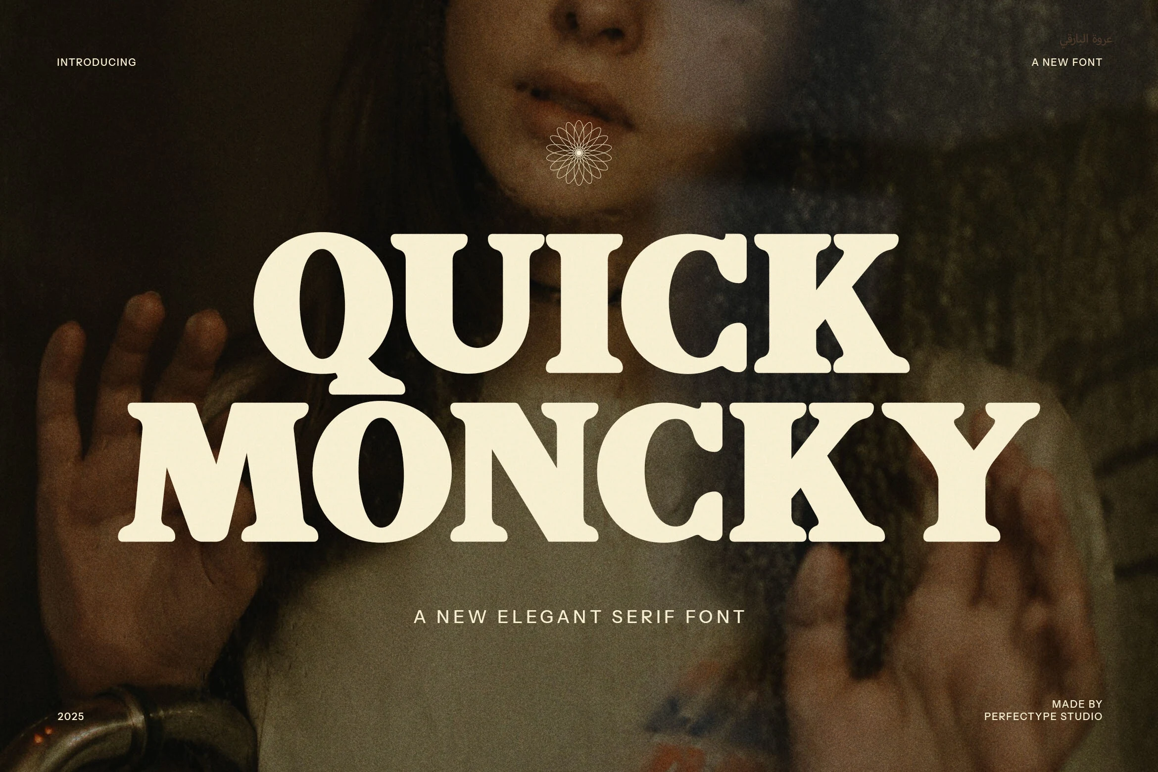
Best For: logos, packaging, bold designs, luxury designs
Quick Moncky Font has a heavy serif build with rounded terminals, compact spacing, and bold slab-like details that make each word feel confident and tactile. It brings Luxury Fonts into a warmer, more retro direction, less sharp fashion serif and more memorable brand mark with strong display weight.
The distinctive ligatures and alternate letterforms are useful for building custom-looking logos without overcomplicating the layout. Keep it large, control the spacing carefully, and use a quiet supporting typeface so the chunky curves, balanced serifs, and dense title rhythm stay readable in packaging, labels, and hero headers.
Mahalini Font
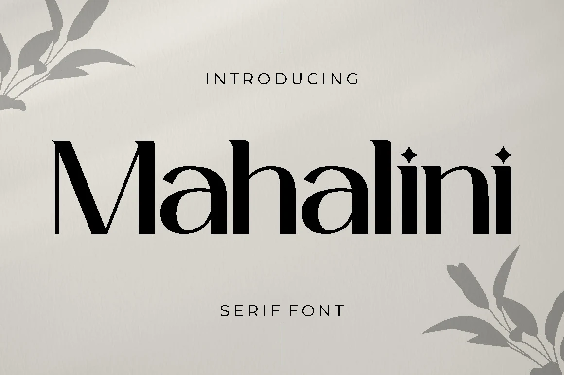
Best For: logos, beauty branding, fashion branding, luxury designs
Mahalini Font has a poised serif structure with tall stems, soft contrast, and sculpted curves that keep the lettering polished without feeling stiff. The diamond-shaped dots on the is add a subtle signature detail, giving Luxury Fonts a cleaner, more contemporary edge while still reading as classic.
It works best when the spacing stays open and the rest of the layout is restrained. Use it for fashion labels, beauty packaging, or refined logo lines where those decorative accents can stand out, then pair it with a quiet sans for secondary text so the main wordmark keeps its elegant presence.
Papillon Serif – Elegant Modern Luxury Font
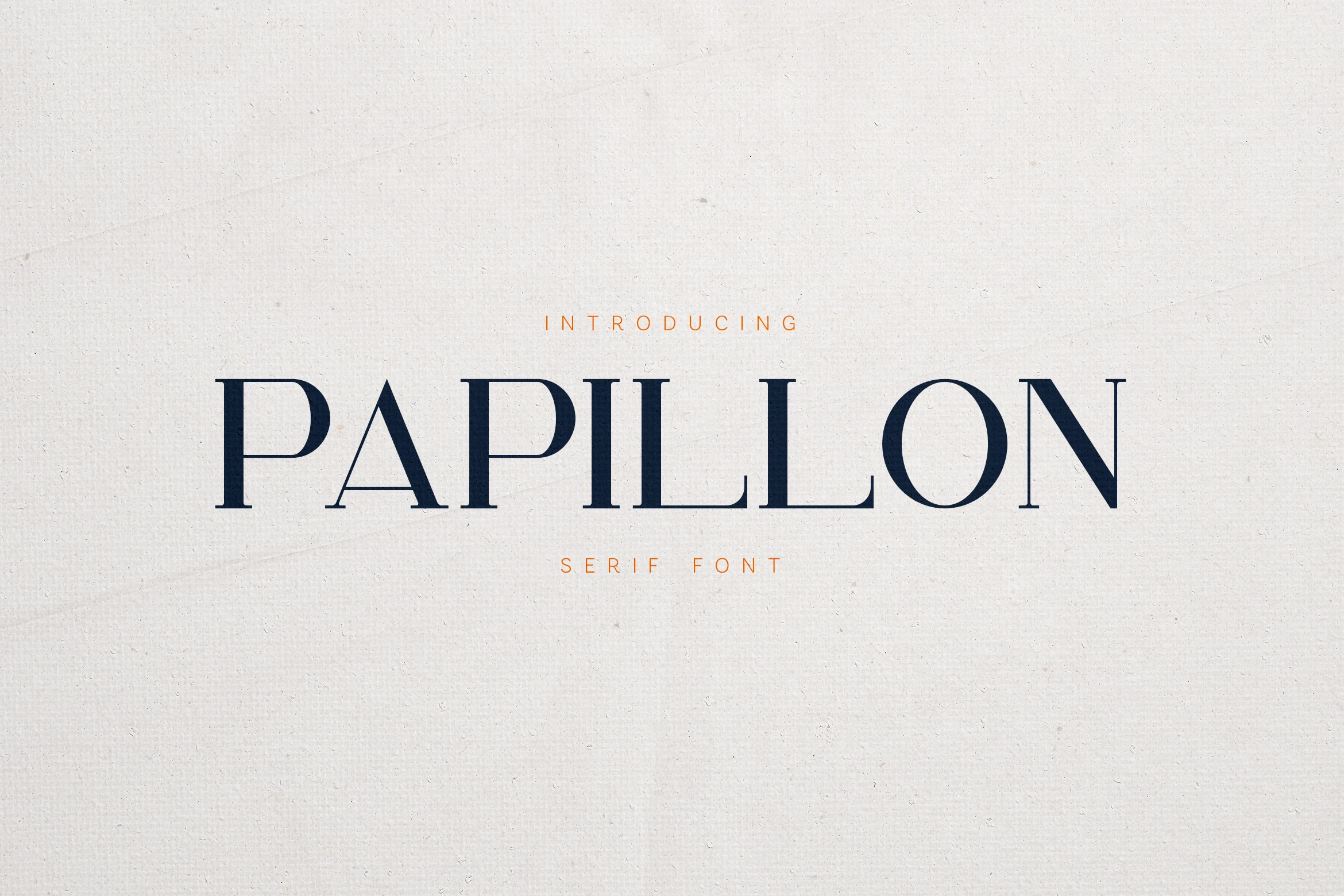
Best For: logos, branding, editorial designs, luxury designs
Papillon Serif – Elegant Modern Luxury Font uses refined uppercase forms, slim serifs, and a restrained contrast that gives the wordmark a calm editorial tone. The open spacing and distinctive triangular A add enough character for Luxury Fonts projects without pushing the design into heavy decoration.
Its strength is precision: keep the tracking generous, use a quiet background, and let the letter spacing create the premium rhythm. This works especially well for high-end branding, magazine-style titles, product labels, and logo systems where clean proportions matter more than ornate detail.
Montega Font
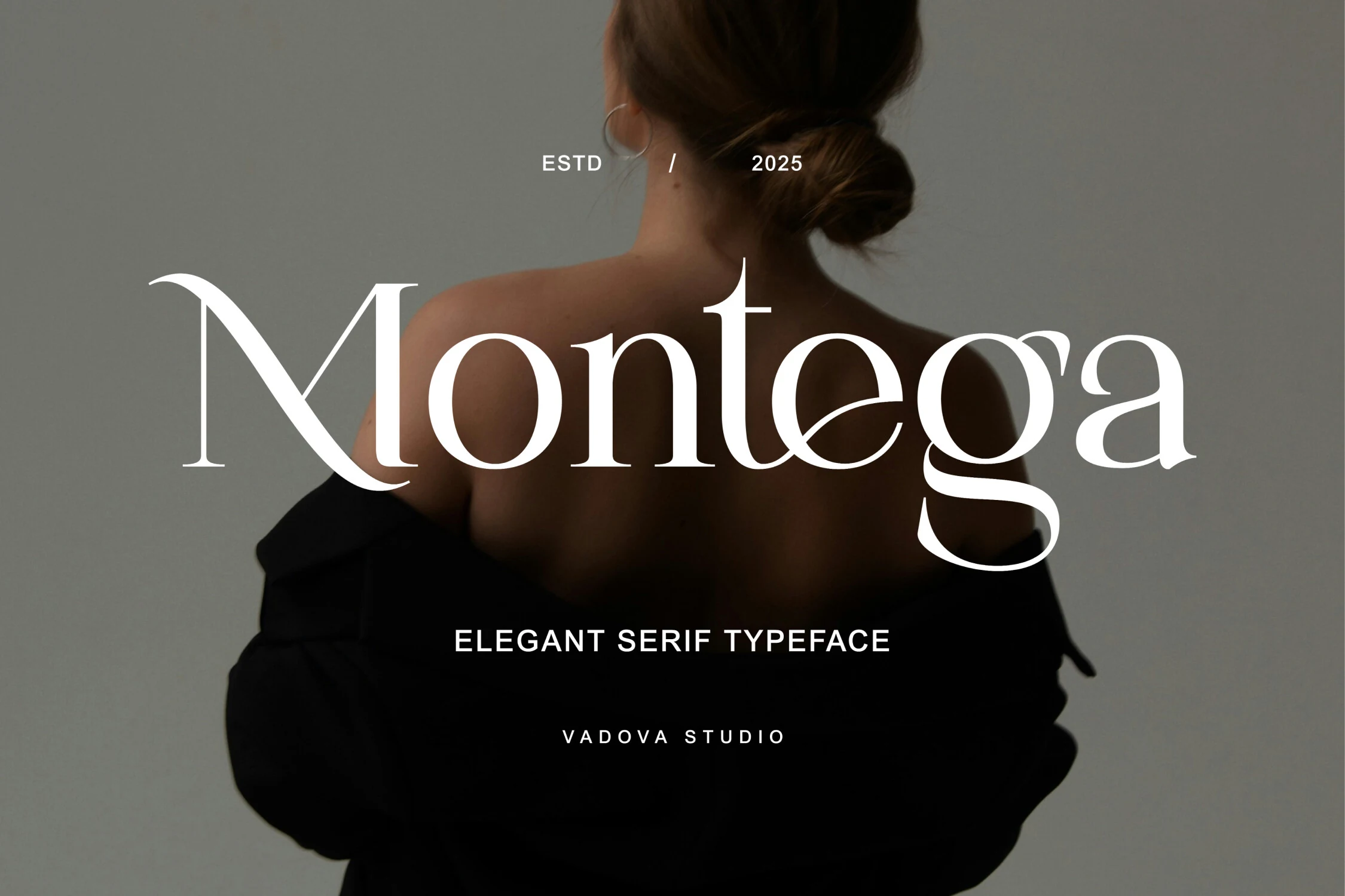
Best For: logos, beauty branding, fashion branding, luxury designs
Montega Font leans into a polished serif look with elegant contrast, smooth bowls, and a sweeping lowercase g that gives the wordmark a distinctive finish. The letterforms feel poised and feminine without becoming delicate, which makes it a strong fit for Luxury Fonts that need a confident, upscale tone.
Its signature shapes work best when the type has room to breathe. Use it for logos, beauty packaging, fashion labels, or editorial headings, and keep the supporting text simple so the refined curves and crisp serifs can carry the hierarchy instead of competing with busy secondary typography.
Dringk Font
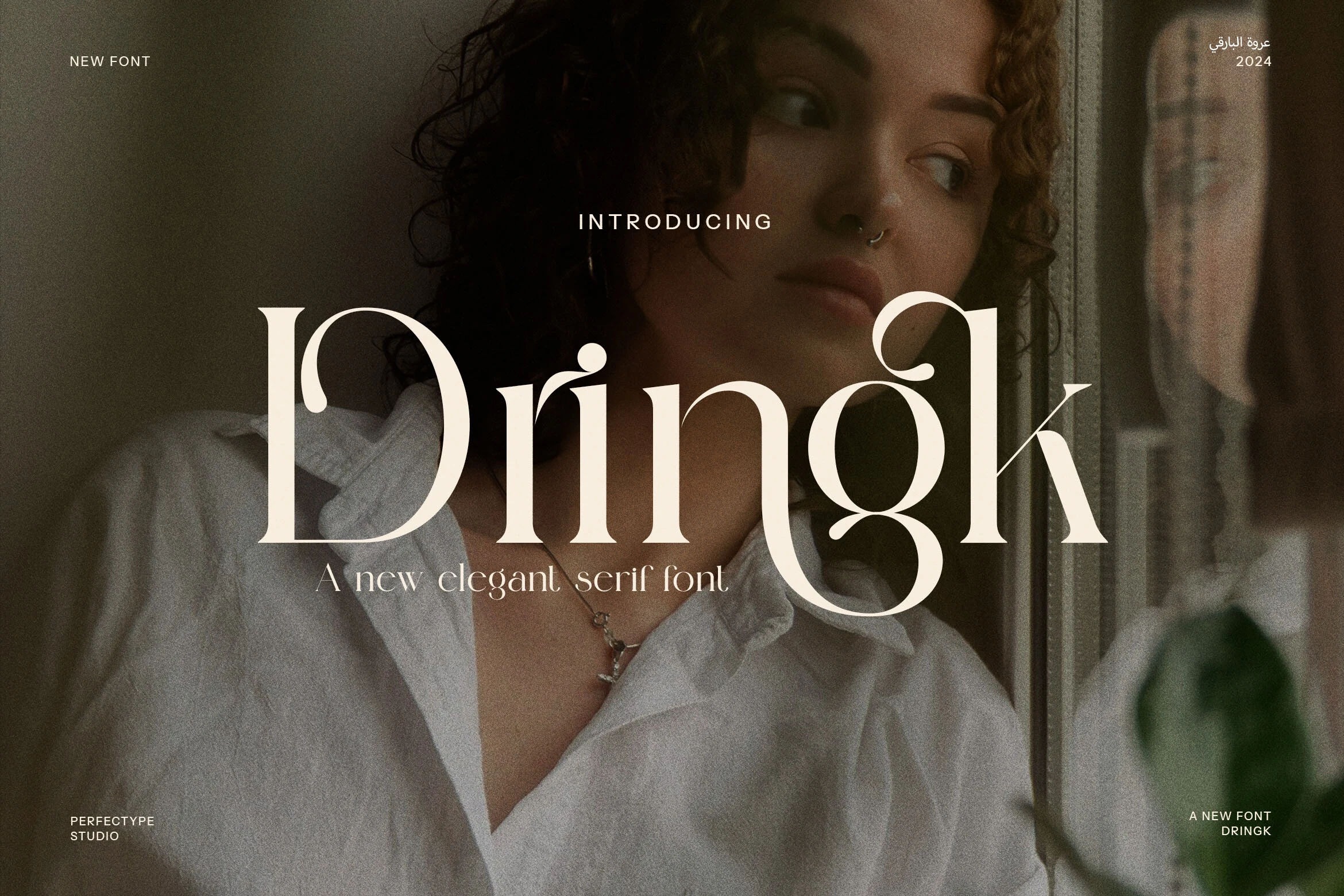
Best For: logos, fashion branding, editorial designs, luxury designs
Dringk Font uses a dramatic serif structure with thin hairlines, large rounded bowls, and expressive ligatures that pull letters into custom-looking shapes. The sweeping forms around the D, g, and k give Luxury Fonts a distinctive fashion-editorial character rather than a plain classic serif finish.
Its alternates and ligatures are most useful in short brand names, where the unusual connections can become the identity mark. Keep spacing controlled, avoid crowded backgrounds behind the fine strokes, and use restrained supporting type so the ornate curves remain readable in logos, covers, and premium packaging.
Menils Font
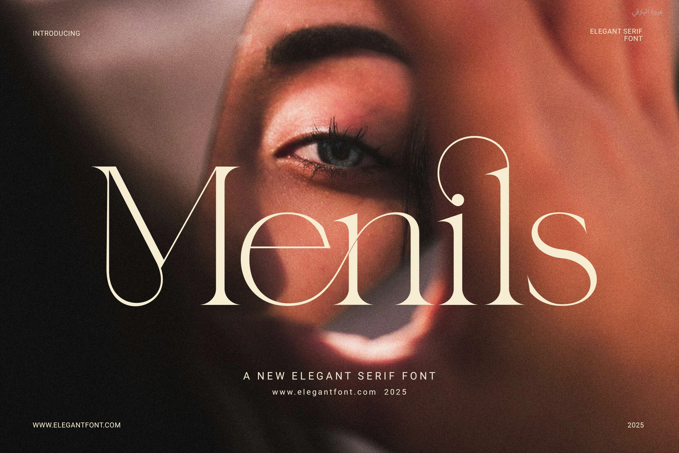
Best For: logos, magazine covers, website headers, luxury designs
Menils Font combines slim high-contrast strokes, smooth curves, and balanced proportions that keep the lettering poised and airy. It brings a cleaner, more current direction to Luxury Fonts, while the functional ligatures help character pairs flow more naturally and give headlines a polished editorial finish.
This one works best when the layout stays calm and spacious. Use it for logos, magazine covers, or website headers, then keep supporting text simple so the delicate contrast stays sharp. A little extra breathing room around the wordmark helps its elegant rhythm read clearly in both print and digital settings.
Margoe Font
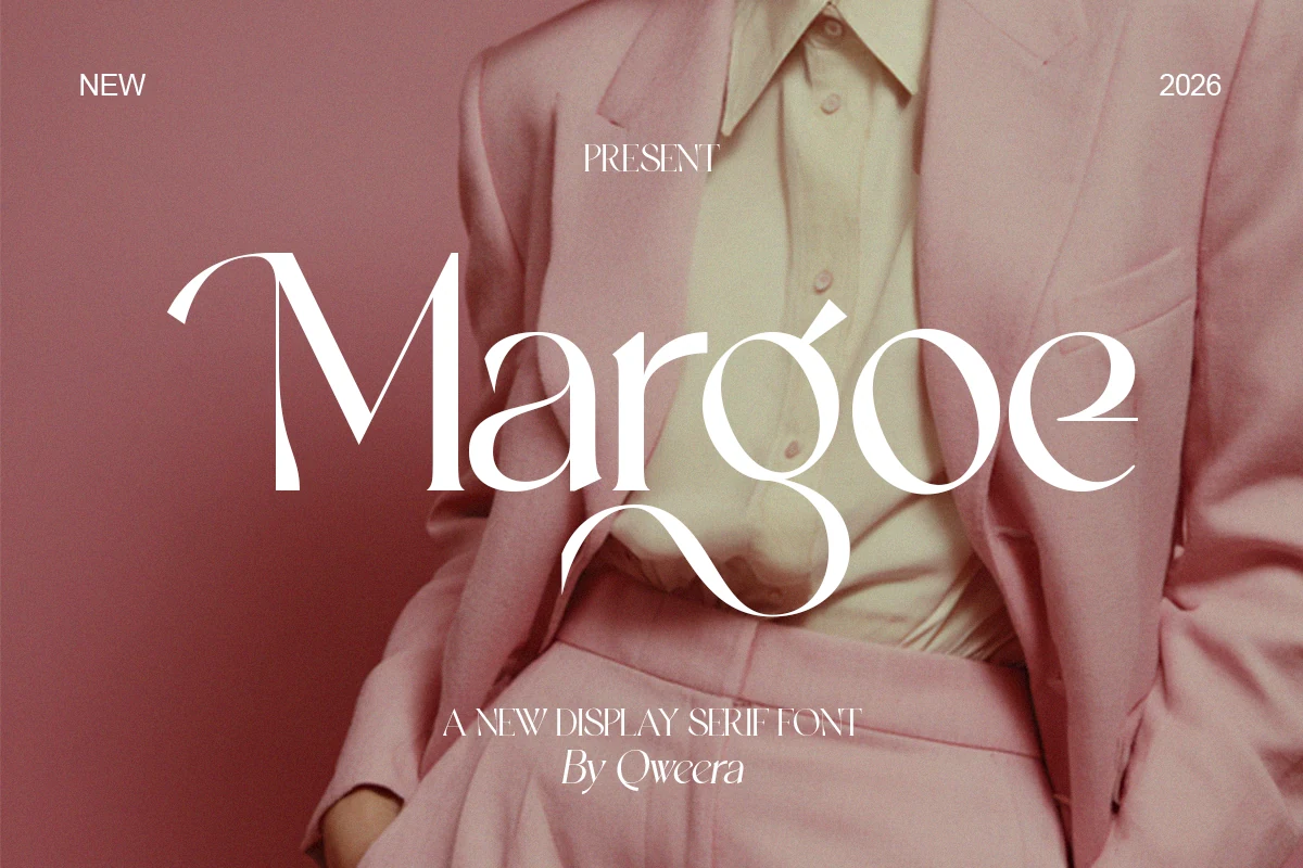
Best For: logos, invitations, beauty branding, luxury designs
Margoe Font has a refined display serif shape with high contrast, slim hairlines, and soft feminine curves that give the wordmark a polished fashion tone. The sweeping lowercase g, angled accent details, and narrow serifs make it feel expressive without becoming overly ornate, which suits Luxury Fonts with a modern beauty-brand mood.
Use it for short names, invitations, packaging, and editorial titles where the decorative curves can become the main identity detail. Keep tracking moderate, avoid crowded backgrounds behind the thin strokes, and pair it with a clean sans so the graceful serif rhythm stays clear in premium layouts.
Champers Font
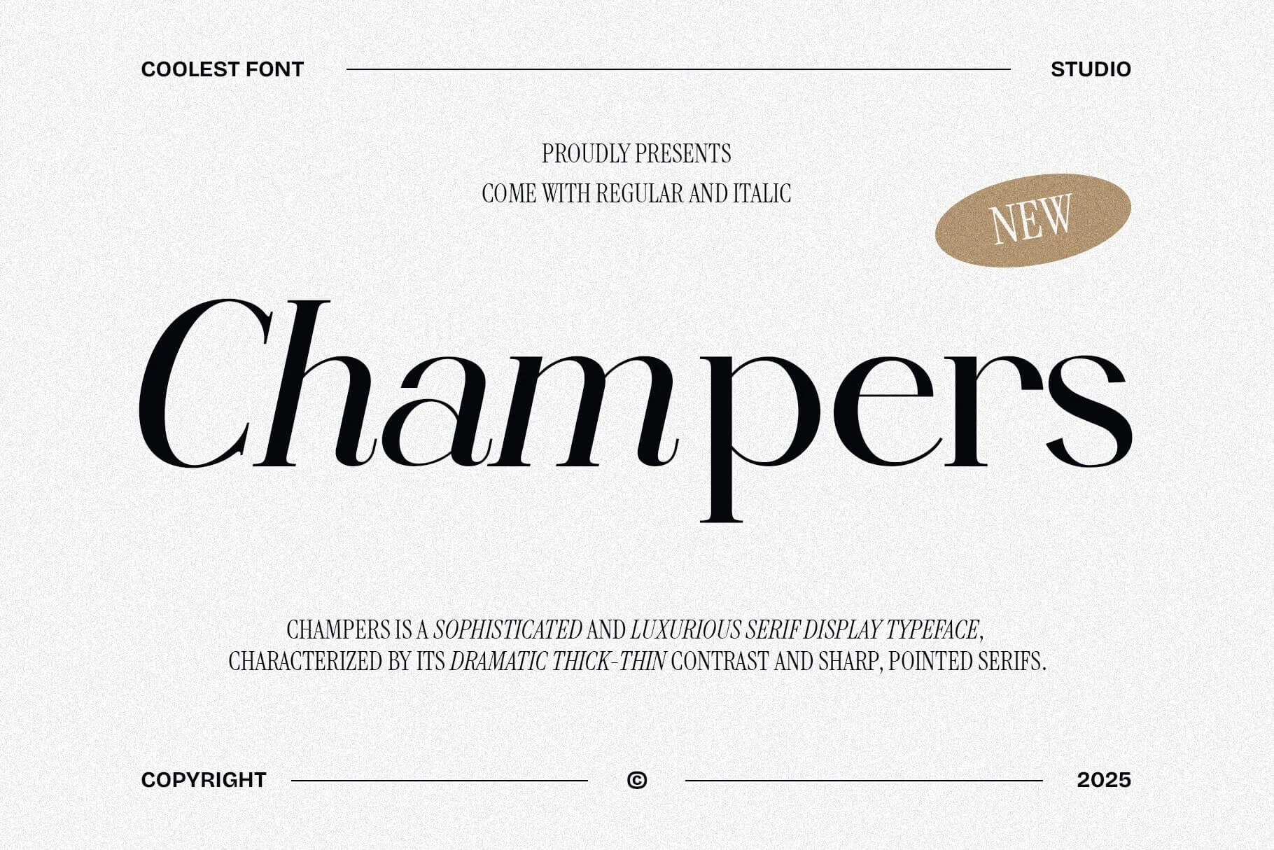
Best For: invitations, social media graphics, headlines, luxury designs
Champers Font has a dramatic display serif look, with steep thick-thin contrast, pointed serifs, and an italic rhythm that gives the lettering a stylish, high-fashion pull. It brings a more theatrical edge to Luxury Fonts, especially when you want elegance that feels bold and noticeable rather than quiet.
The long descenders and narrow joins make it strongest in short lines, where the shapes have space to show. Use it for invitations, statement headlines, or polished social graphics, and keep the supporting text simple so the sharp contrast and flowing proportions stay crisp instead of crowded.
Marlyn Tomorrow Font
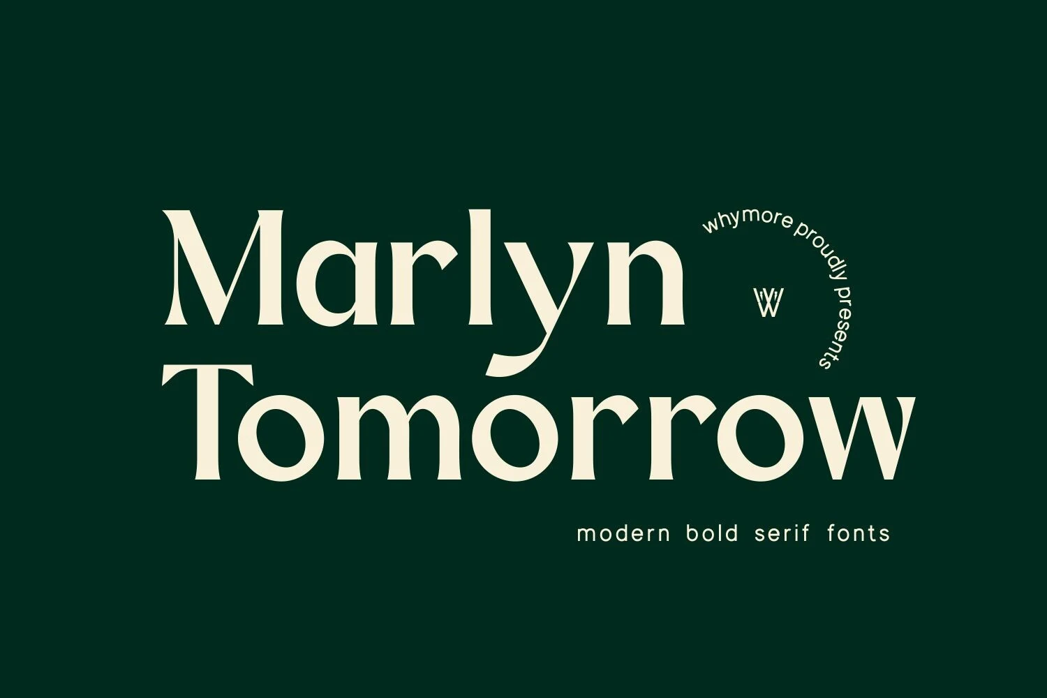
Best For: logos, branding, minimal designs, luxury designs
Marlyn Tomorrow Font has a bold minimal serif build with broad stems, crisp wedge serifs, and rounded counters that give the lettering a clean but substantial presence. It brings Luxury Fonts into a more modern brand direction, where strength comes from proportion and spacing rather than ornate decoration.
The large lowercase forms and tight vertical rhythm work best in short names, logo lockups, and display headlines. Keep the composition spacious, use strong contrast, and avoid overloading the layout with decorative elements so the serif weight and refined curves can carry the identity clearly.
Gibs Font
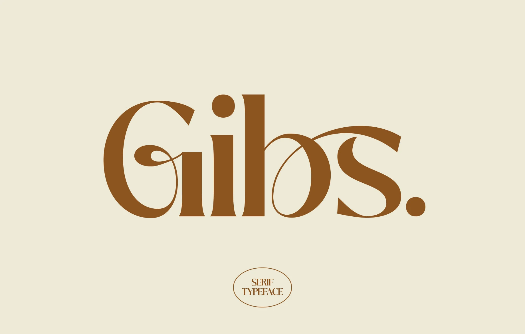
Best For: logos, branding, editorial designs, luxury designs
Gibs Font has a polished serif structure with sturdy verticals, rounded bowls, and sweeping curves that give the wordmark a sculpted, graceful rhythm. The proportions feel classic, but the fuller shapes keep it from looking stiff, which places it comfortably in Luxury Fonts for branding and editorial work.
Use it where the letterforms can carry the styling on their own: logos, mastheads, packaging, or title lines. A clean layout and moderate spacing help the broader curves stay readable, while a restrained sans alongside it keeps the serif details looking intentional rather than crowded.
Brown Font
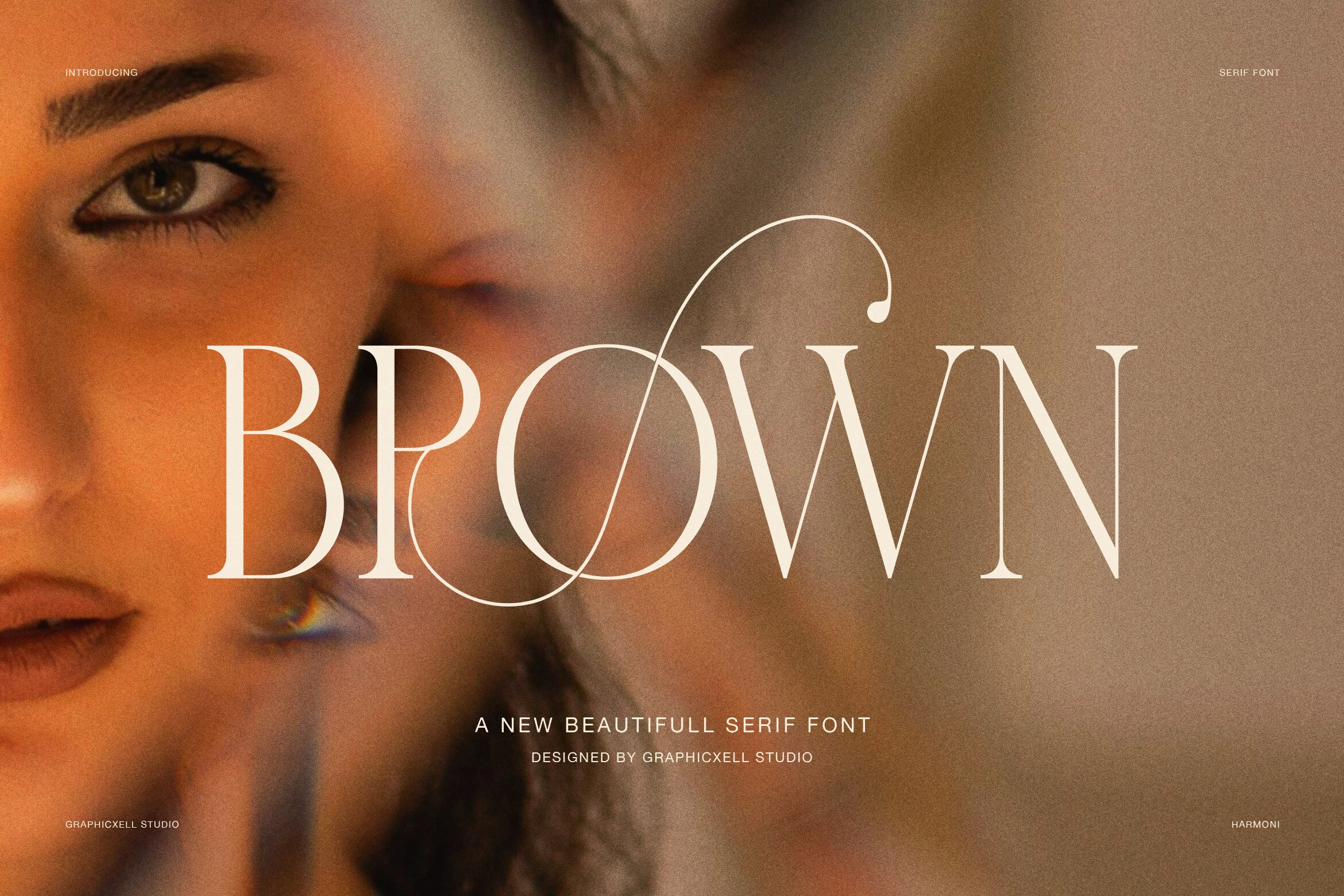
Best For: logos, fashion branding, editorial designs, luxury designs
Brown Font has a refined display serif build with tall uppercase forms, thin hairlines, and flowing decorative details that cut through the wordmark with a fashion-editorial feel. The oversized O rhythm and long swash give Luxury Fonts a more artistic voice, while the classic serif skeleton keeps the title grounded.
Use it where a short word can act as the main visual asset: brand marks, magazine covers, beauty campaigns, or premium packaging. Keep the spacing controlled and the background low in visual noise, because the fine strokes and looping detail need contrast to stay sharp rather than turning into texture.
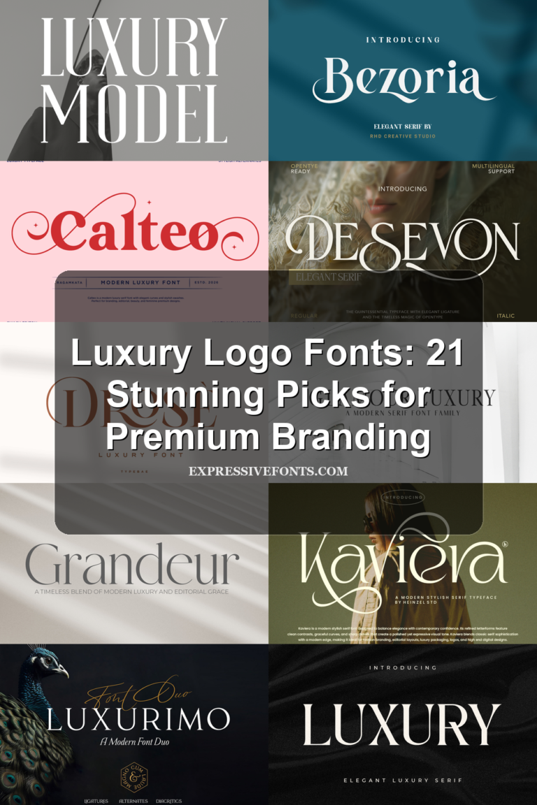
Luxury Model Font
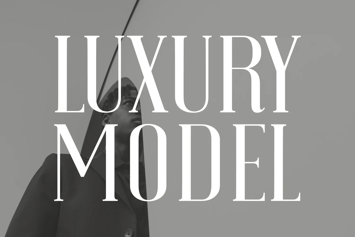
Best For: luxury designs, fashion branding, magazine covers, logos
Luxury Model Font uses tall, high-contrast serif letters with thin hairlines, firm vertical stems, and crisp wedge-like terminals. Its narrow proportions give headlines a fashion-editorial rhythm, while the smooth curves keep the word shape polished rather than severe.
For Luxury Fonts, this one works best where scale and hierarchy matter: magazine mastheads, premium packaging, fashion logos, and refined book covers. Keep the spacing controlled but not tight, and pair it with restrained body type so the contrast and height stay dominant.
Emerale Font
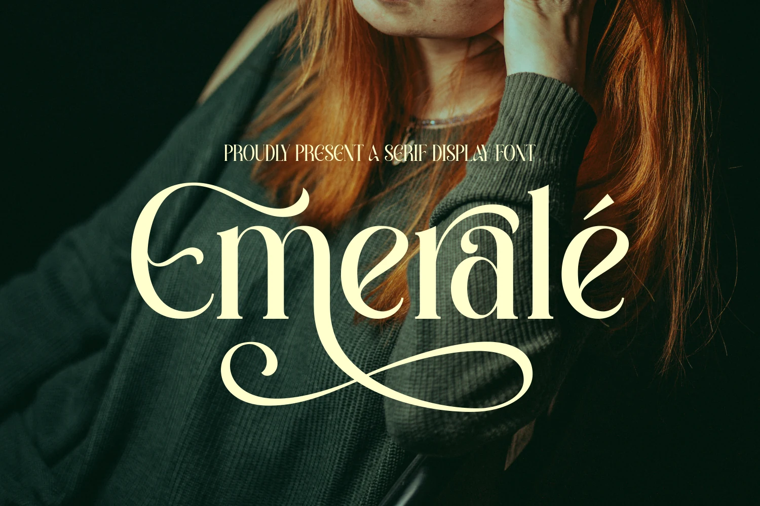
Best For: logos, beauty branding, luxury designs, magazine covers
Emerale Font has a graceful display serif structure with tall proportions, smooth contrast, and finely shaped serifs that feel polished without turning stiff. Its dramatic flourishes stretch from the opening capital and across the baseline, giving short words a flowing, almost couture-like rhythm.
If you are browsing Luxury Fonts for logos, beauty labels, or editorial covers, this one is strongest when the swashes have room to breathe. Let it carry the main headline, keep supporting text restrained, and avoid crowding the line so the ornamental curves stay crisp and intentional.
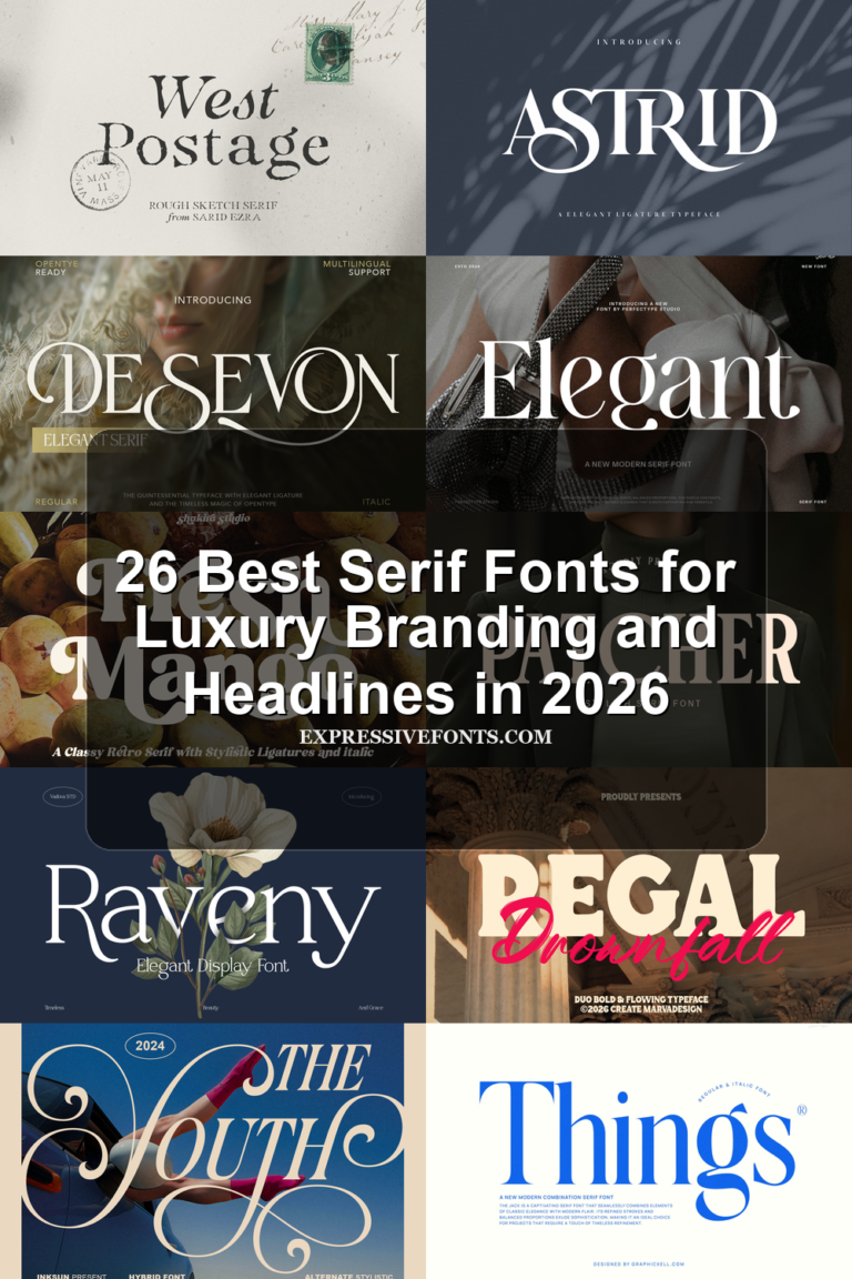
Patcher Font
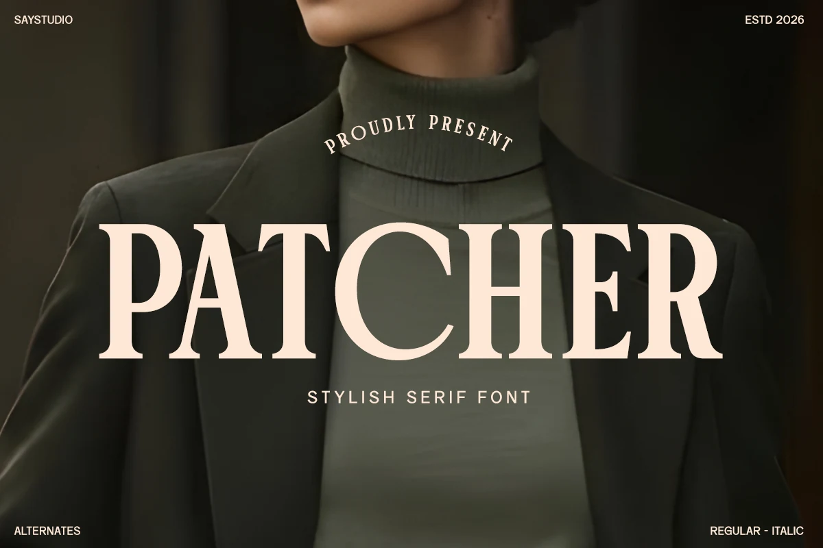
Best For: fashion branding, luxury designs, magazine covers, logos
Patcher Font is a bold serif display face with broad uppercase shapes, sharp bracketed serifs, and a confident fashion-magazine stance. The thick verticals give it weight, while the clean counters and controlled contrast keep the lettering readable in large editorial titles.
For Luxury Fonts used in branding, packaging, or campaign graphics, Patcher works best as the main typographic anchor. Let the letters sit with generous tracking and pair them with small, spaced sans text to strengthen the hierarchy without weakening the serif impact.
Favora Font
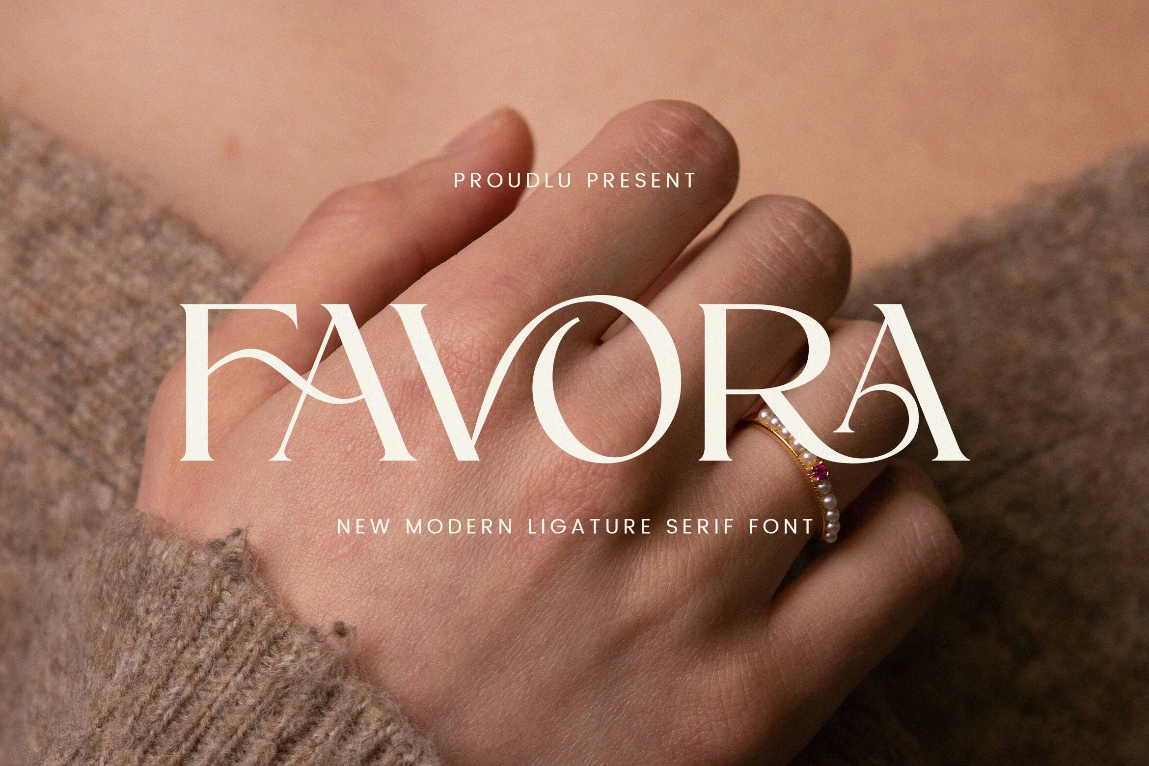
Best For: logos, fashion branding, invitations, luxury designs
Favora Font has a refined high-contrast serif look, mixing crisp stems with sculpted curves and decorative ligature joins that soften the word shape. The sweeping connection between letters and the elegant terminal on the final A give it a polished, jewelry-like finish that suits short display text.
If you are curating Luxury Fonts for branding or packaging, Favora works best in short names and headlines where its ligatures stay visible. Give the letters a little space, keep line lengths brief, and pair it with restrained supporting type so the refined contrast and swash details stay clear.
Merside Font
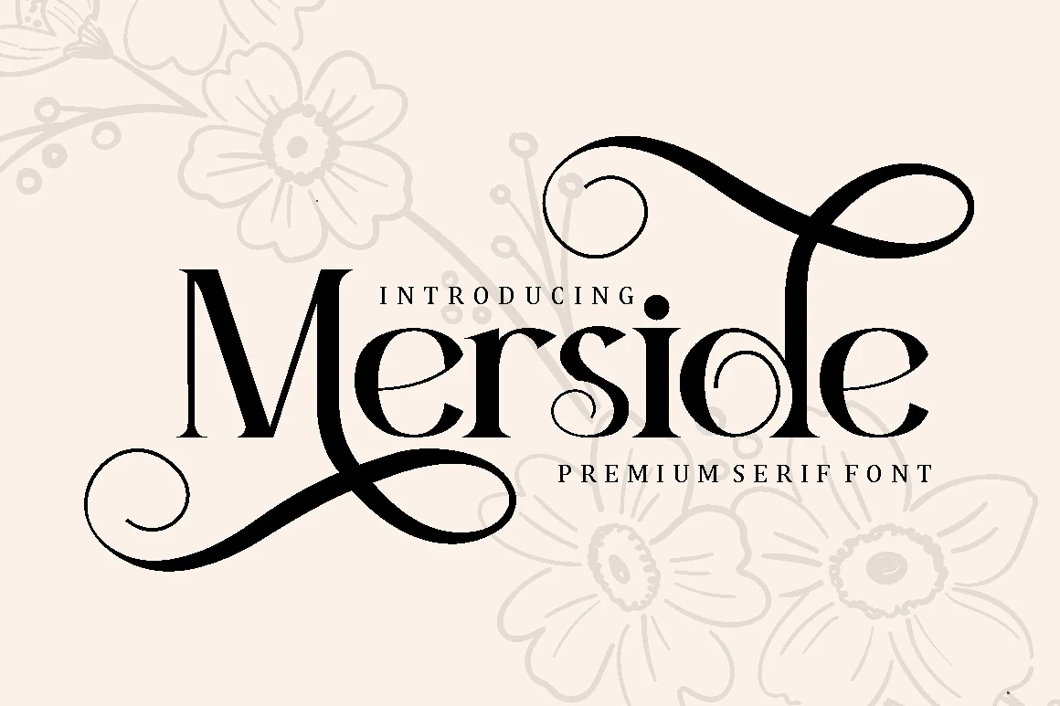
Best For: logos, luxury designs, book covers, posters
Merside Font brings a premium serif structure into a more ornamental direction, with crisp vertical strokes, thin internal curves, and long swashes that extend far beyond the letter width. The contrast is sharp enough for polished branding, while the oversized loops make each short word feel decorative and intentional.
For Luxury Fonts used in logos, book covers, or poster titles, Merside needs space around the first and last letters so the swashes do not collide with nearby text. Use it as the main display line and keep secondary typography narrow, quiet, and evenly spaced to preserve the refined hierarchy.
Arkvell Font
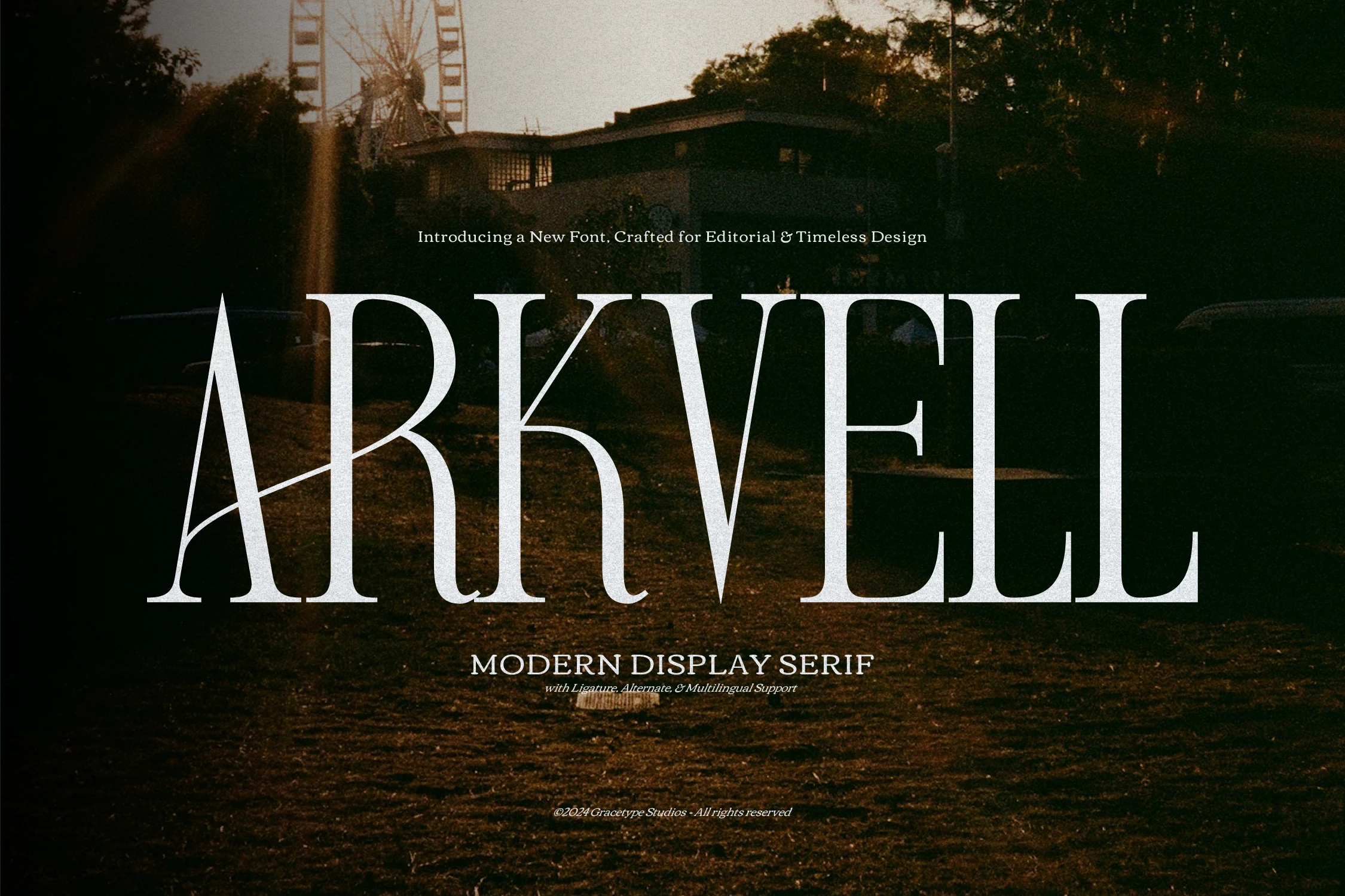
Best For: magazine covers, fashion branding, logos, book covers
Arkvell Font has a striking display serif look built around tall proportions, sharp contrast, and very fine hairlines that give headlines a polished editorial finish. The narrow structure keeps large words compact, while the sweeping A and refined curves add just enough drama without losing clarity.
Within Luxury Fonts, this one suits magazine mastheads, fashion marks, and elegant cover lines where height and contrast can lead the composition. Keep it at generous display size, leave a little air between letters, and let quieter supporting text sit below so the ligatures and alternates stay clean and deliberate.
Gidora Font
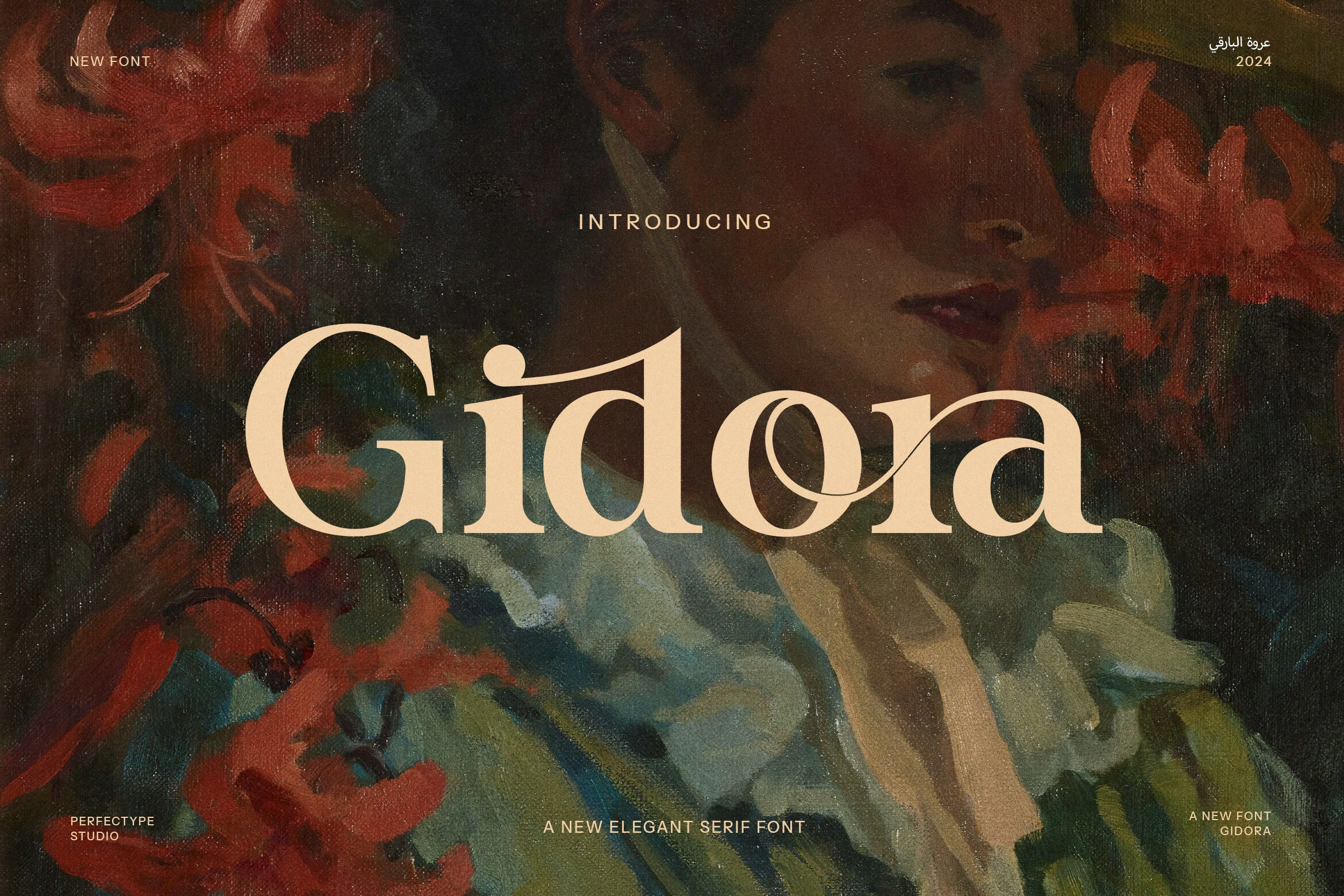
Best For: logos, luxury designs, editorial designs, fashion branding
Gidora Font has a contemporary serif base with rounded bowls, firm stems, and soft bracketed serifs that keep the wordmark refined rather than rigid. Its ligature detail cuts through the middle of the lettering, adding movement and a custom editorial feel without making the main shapes hard to read.
For Luxury Fonts in logos, fashion campaigns, or premium labels, Gidora works best when the headline is short and the ligature can become the focal point. Use measured spacing, avoid dense supporting copy nearby, and let a restrained secondary font handle smaller information.
Cornelia Font Duo Font
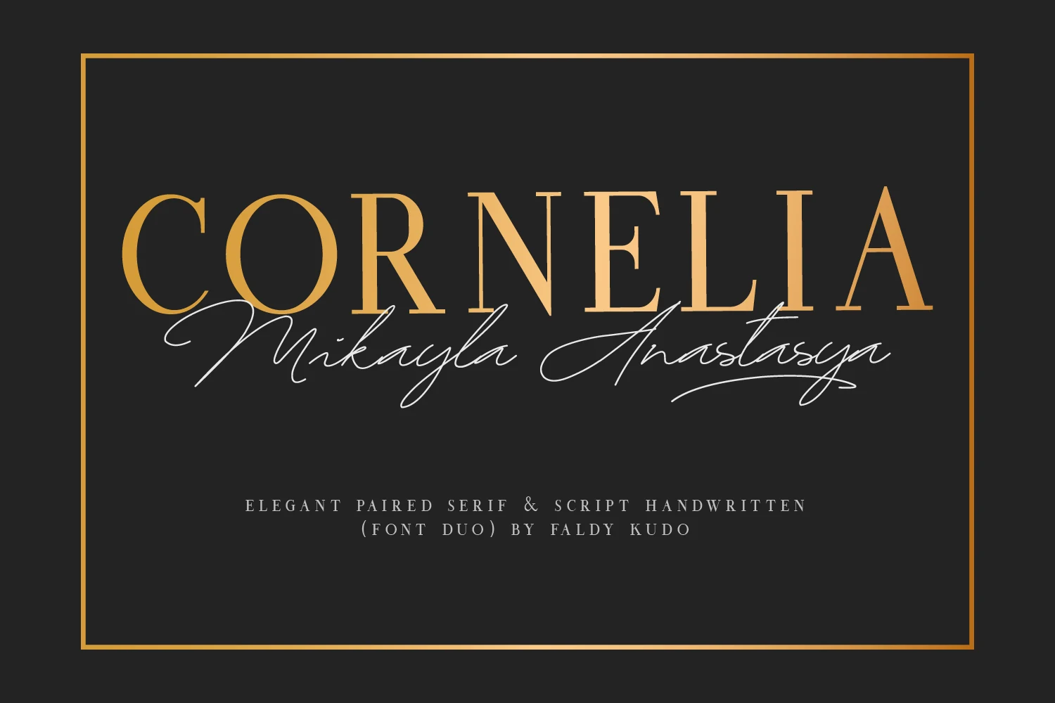
Best For: invitations, social media graphics, quotes, luxury designs
Cornelia Font Duo pairs a refined high-contrast serif with a light handwritten script, creating built-in contrast that feels polished and personal at the same time. The serif uses tall capitals and crisp terminals for structure, while the script adds long flowing strokes that soften the composition.
Among Luxury Fonts, this duo is especially useful when you want an instant title-and-signature hierarchy without hunting for a second typeface. Let the serif carry names or headlines, then use the script as an accent line so invitations, quote graphics, and stationery keep a clean focal point.
Desevon Font
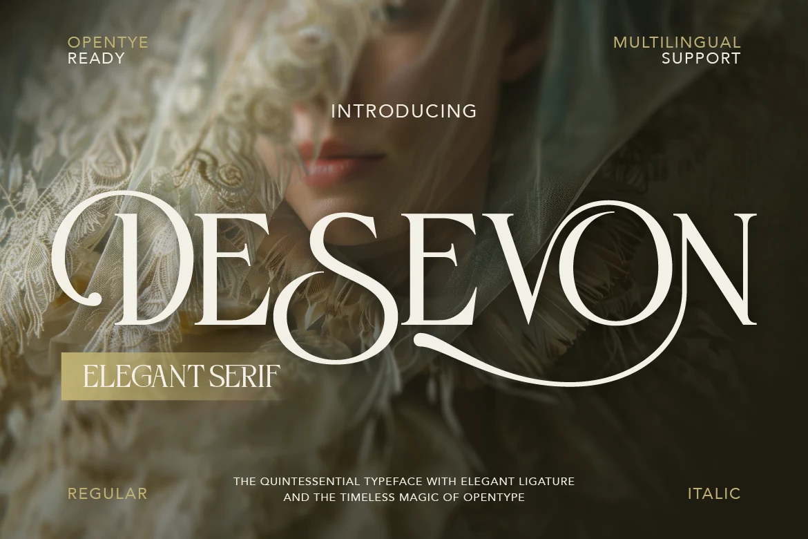
Best For: logos, luxury designs, beauty branding, fashion branding
Desevon Font uses a refined high-contrast serif structure with slim hairlines, graceful curves, and sweeping ligatures that turn the word shape into a strong visual mark. The oversized D and looping transitions create a soft luxury rhythm while the upright stems keep the lettering composed.
Use it in Luxury Fonts layouts where the headline needs to feel polished rather than loud: beauty packaging, fashion logos, editorial covers, and premium labels. Keep line lengths short and contrast high, because the ligature swashes need open space to stay elegant and readable.
Drose Font
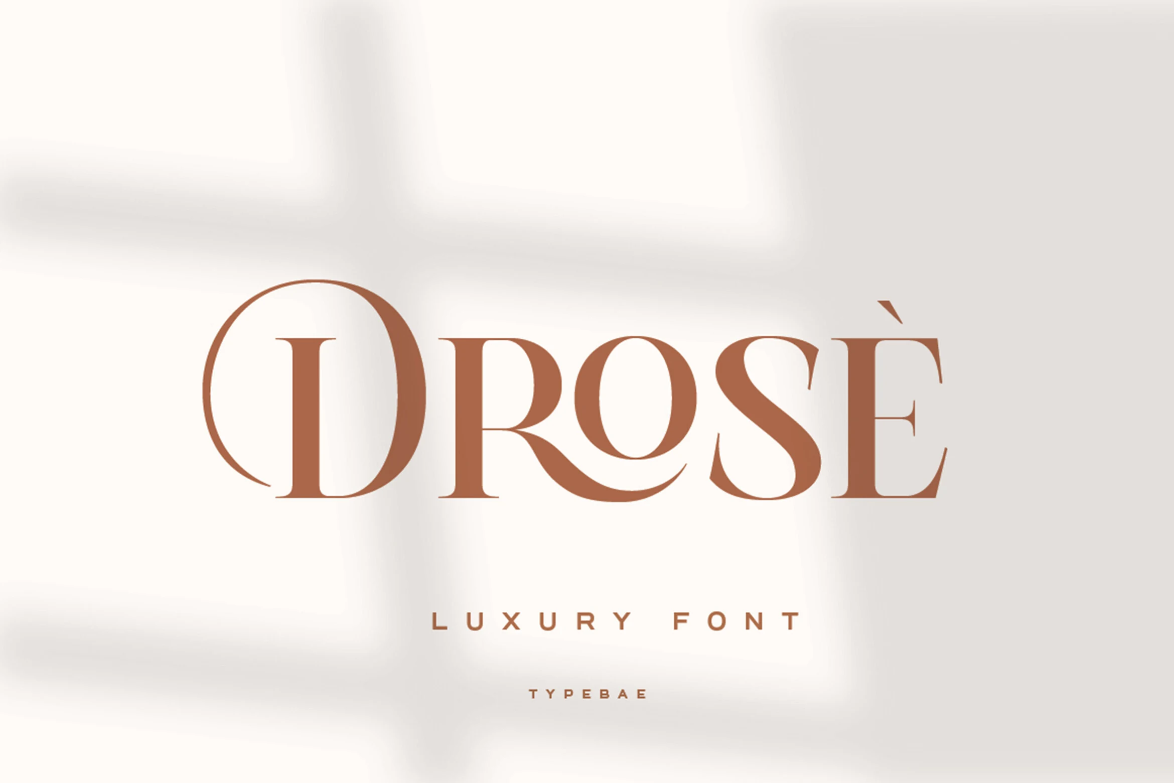
Best For: logos, fashion branding, magazine covers, luxury designs
Drose Font has a polished display serif look with crisp high-contrast strokes, broad rounded bowls, and graceful curves that keep the wordmark smooth rather than rigid. The sculpted R and flowing S give it a refined rhythm, while the clean spacing helps the letters stay clear at headline size.
For Luxury Fonts, Drose fits best where you want elegance without excess, especially in logos, fashion identities, editorial titles, and premium packaging. Let it lead the hierarchy in short lines, and pair it with restrained supporting text so the contrast and curved terminals remain the focus.
The Youth Font
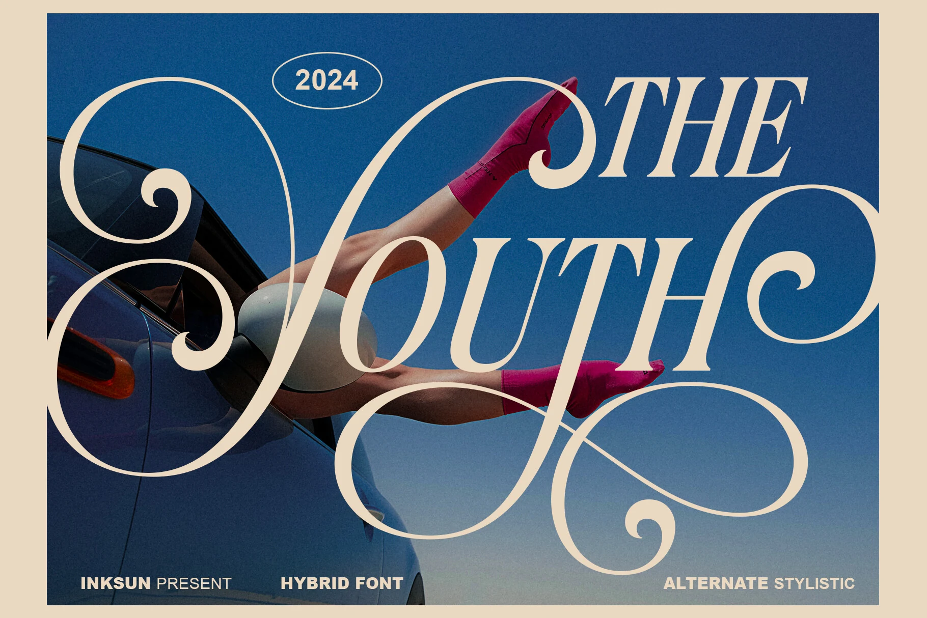
Best For: fashion branding, magazine covers, editorial designs, luxury designs
The Youth Font is a hybrid display face with italic editorial bones, ultra-fine hairlines, and oversized swashes that move far beyond the normal letter frame. Its dramatic loops create a strong fashion-photography overlay effect, while the serif structure keeps the main word shapes recognizable.
Use it in Luxury Fonts layouts where ornament is the point: magazine spreads, campaign titles, high-end lifestyle graphics, and experimental brand marks. Keep the text short, avoid tight crops, and give the swashes generous margins so the decorative movement looks deliberate instead of tangled.
Ragam Luxury Font
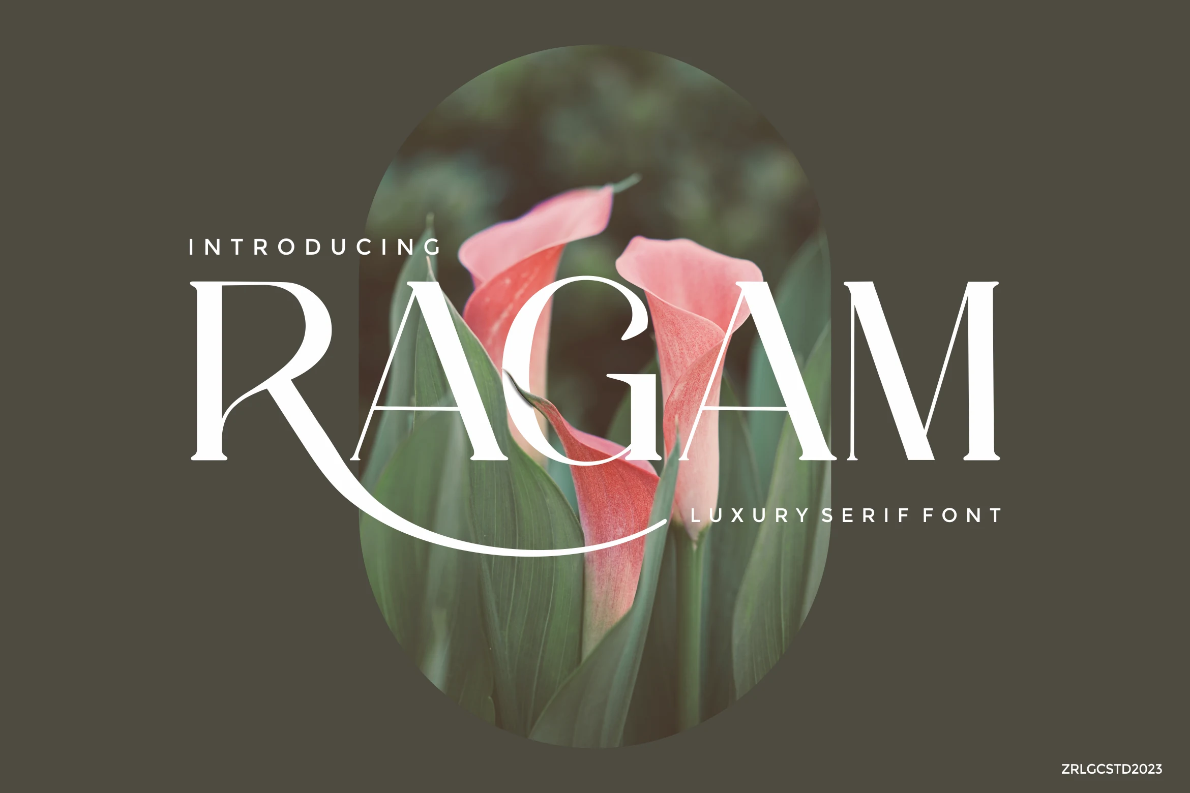
Best For: logos, fashion branding, beauty branding, magazine covers
Ragam Luxury Font has a polished display serif look, built on tall capitals, crisp high contrast, and a sweeping R swash that carries the word across the baseline. The slim hairlines and softly rounded bowls keep the letterforms graceful, giving short titles a calm but distinctly upscale presence.
For Luxury Fonts, Ragam feels especially strong in logos, beauty branding, and magazine covers where a single word needs to do most of the visual work. Keep it at display size and leave generous surrounding space, so the long flourish and delicate contrast stay clean instead of competing with nearby text.
Stanza Font
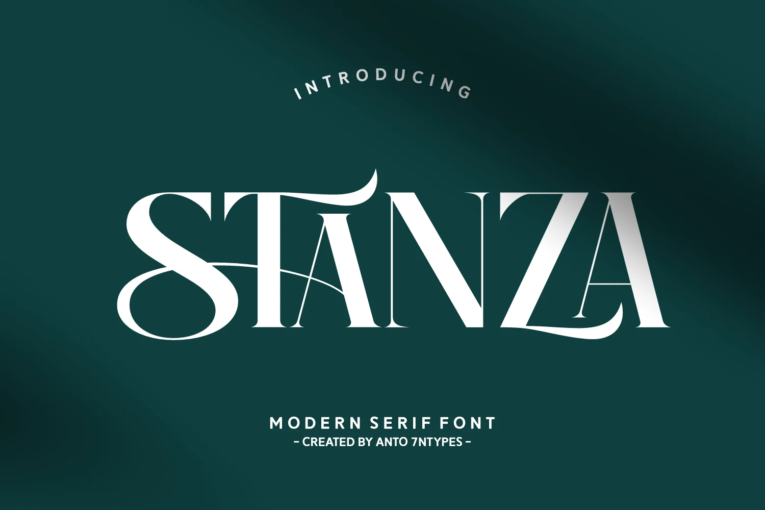
Best For: logos, luxury designs, romantic designs, posters
Stanza Font is a bold modern serif with sharp contrast, wide uppercase forms, and oversized swashes that cut through the word with a dramatic display rhythm. The heavy curves on the S and the thin internal strokes give it a decorative, fashion-forward edge without hiding the main letter shapes.
For Luxury Fonts with a more expressive mood, Stanza works well in logos, romantic posters, and statement headlines where the swash can become the central graphic element. Keep the wording short, avoid tight line spacing, and use a clean secondary font so the ornamental strokes stay controlled.
Drak Sistem Font
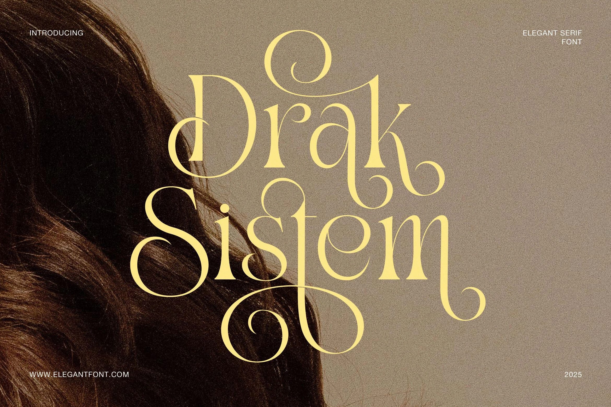
Best For: logos, beauty branding, invitations, luxury designs
Drak Sistem Font leans into an ornamental serif style, with smooth weight transitions, rounded terminals, and long looping swashes that turn each word into a decorative centerpiece. The classic structure keeps the letters balanced, while the exaggerated curls give short titles a custom, almost hand-drawn finish.
If you are browsing Luxury Fonts for elegant branding, this one works best when the swash alternates have room to breathe. Use it for logos, invitations, or beauty packaging, and keep supporting type restrained so the curves stay crisp instead of crowding the layout.
Silkydusk Font
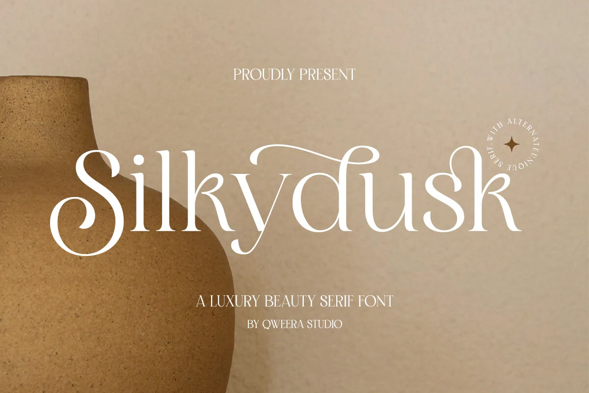
Best For: logos, beauty branding, packaging, luxury designs
Silkydusk Font has a smooth luxury serif style with rounded terminals, delicate curves, and soft ligature connections that give the wordmark a calm, refined rhythm. The letterforms feel minimal at first glance, but the curled S, tall ascenders, and graceful alternates add just enough ornament for premium branding.
Use it in Luxury Fonts layouts where elegance needs to stay light rather than heavy: beauty logos, packaging, boutique labels, and refined stationery. Keep the spacing open and the supporting type simple so the ligatures remain visible without making the composition feel crowded.
Zagstone Font
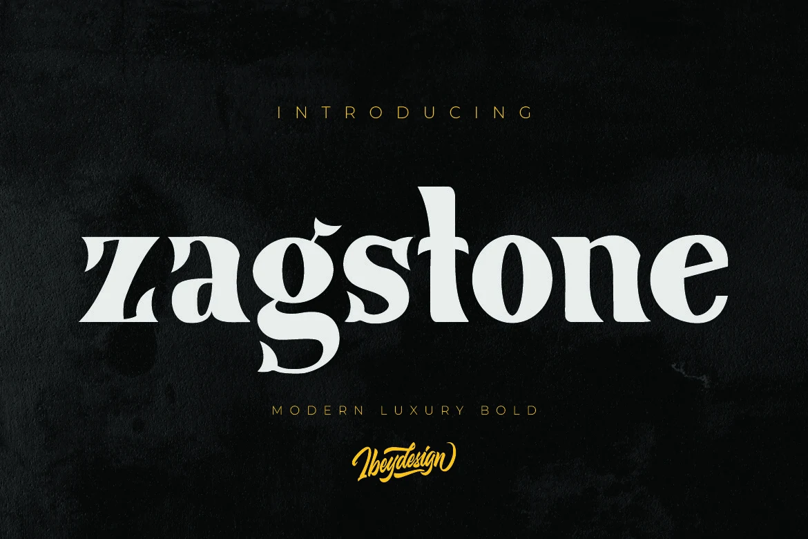
Best For: logos, branding, luxury designs, headlines
Zagstone Font uses a heavy serif structure with broad curves, sharp bracketed cuts, and decorative lowercase details that make the word shape feel assertive rather than delicate. The curled descender on the “g” and sculpted terminals give it a custom editorial character, making it a strong fit for Luxury Fonts collections built around presence and authority.
Keep Zagstone in short titles, logos, and premium packaging marks where its dense weight can hold attention without crowding the layout. Slightly wider letter spacing helps the bolder forms stay readable, while high contrast between type and background keeps the curved serif details from flattening at smaller display sizes.
Grandeur – Elegant Classic Serif Font
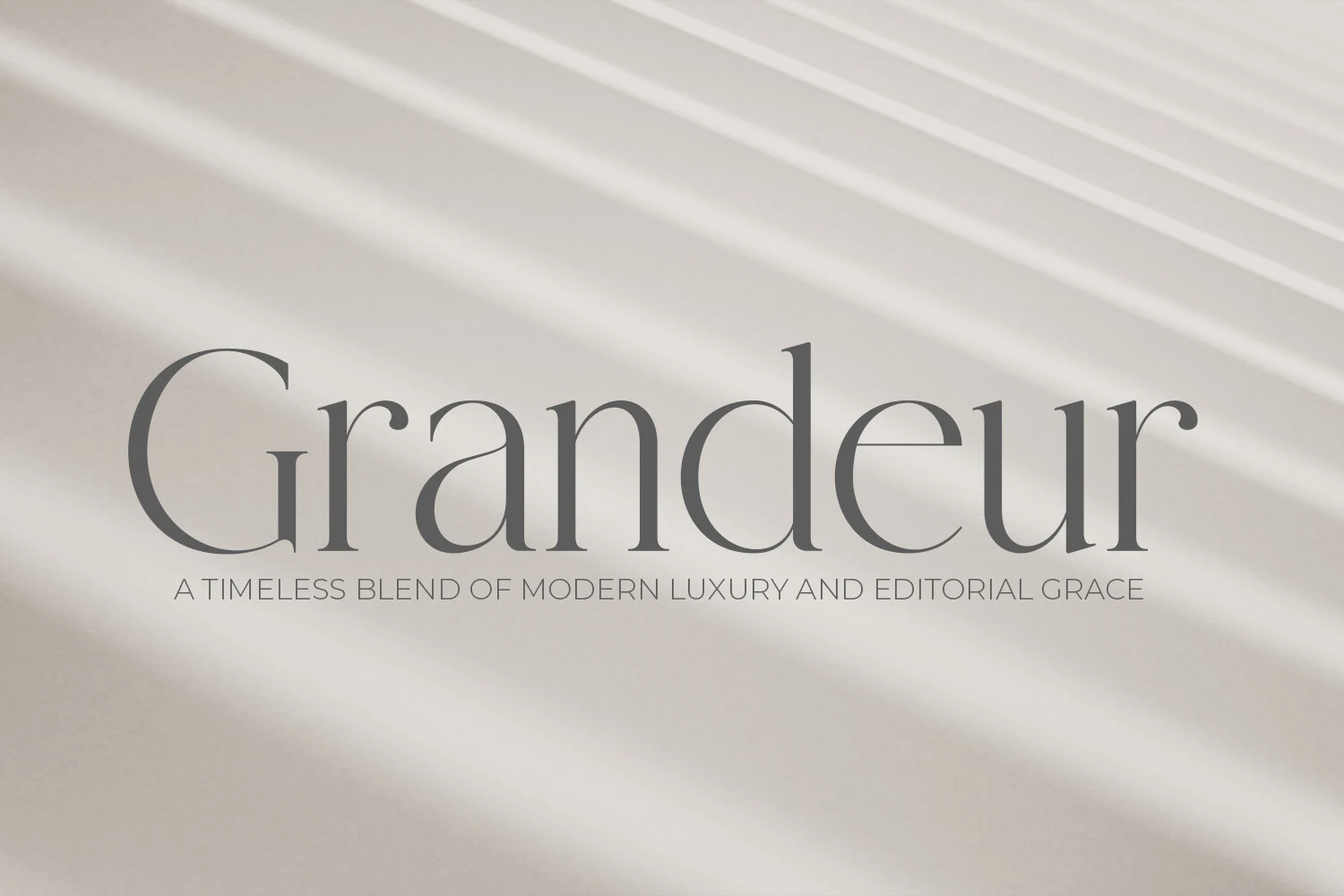
Best For: branding, magazine covers, editorial designs, luxury designs
Grandeur – Elegant Classic Serif Font has a refined high-contrast look, with long vertical strokes, rounded bowls, and slim serifs that keep the letterforms graceful without feeling fragile. It fits naturally into Luxury Fonts collections because the overall rhythm feels polished and editorial, with a calm presence that reads as expensive rather than ornate.
This style works especially well in larger headings where its thin joins and open curves stay crisp. Give it breathing room and keep supporting typography restrained; a simple sans or quiet secondary serif helps the narrow proportions and classic details hold attention in branding, covers, and upscale layouts.
Backgirl Font
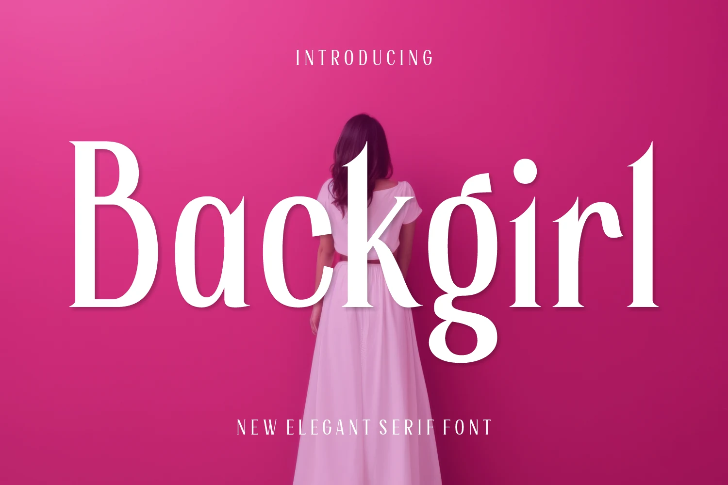
Best For: logos, fashion branding, luxury designs, editorial designs
Backgirl Font is a high-contrast serif with tall verticals, wide curves, and fine tapered serifs that give the lettering a fashion-led display feel. The oversized “B,” sculpted “a,” and looping descender on the “g” add drama without turning the font into a decorative novelty, which makes it a clean fit for Luxury Fonts with a modern editorial edge.
Use it for short names, logo marks, magazine-style titles, and packaging where the thin hairlines can stay visible. Tight tracking works for compact wordmarks, but longer headlines need extra spacing and strong contrast so the slender joins and rounded counters do not blur together.
Rethena Font
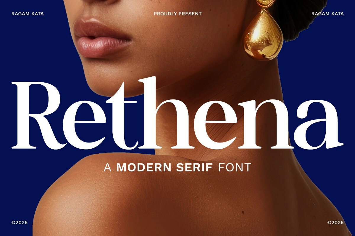
Best For: branding, beauty branding, magazine covers, luxury designs
Rethena Font has tall high-contrast strokes, generous curves, and slim hairlines that give it a polished editorial presence. The crisp serif cuts and open counters keep the word shape poised and readable, so it sits naturally in Luxury Fonts roundups focused on premium identities with a strong visual voice.
It performs best in short headlines, branding, and cover-style layouts where the contrast can stay sharp. Give it enough scale and a little breathing room between letters; that keeps the thin joins from crowding and lets the elegant proportions build hierarchy without relying on extra ornament.
Sorento Regular Font
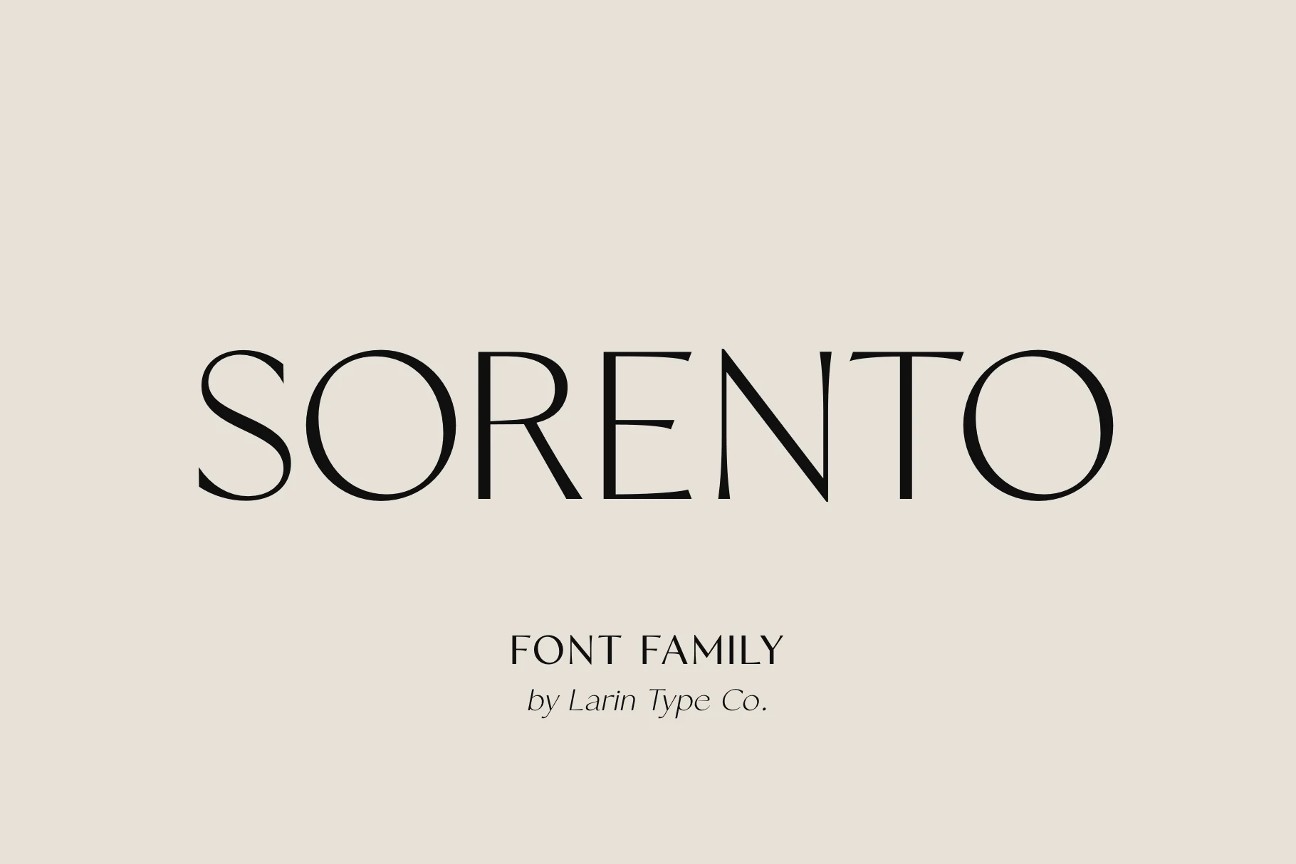
Best For: branding, packaging, editorial designs, luxury designs
Sorento Regular Font is a refined serif family with tall proportions, delicate contrast, and clean spacing that gives each word a composed editorial rhythm. Its thin strokes and sharp serif details place it firmly within Luxury Fonts, especially for designs that need quiet sophistication instead of heavy ornament.
The preview shows how well Sorento handles wide tracking, making it useful for premium wordmarks, packaging names, and magazine-style titles. Keep the background contrast clean and avoid cramped paragraph settings; the fine joins and narrow terminals need scale to stay precise.
Modernvogue Font
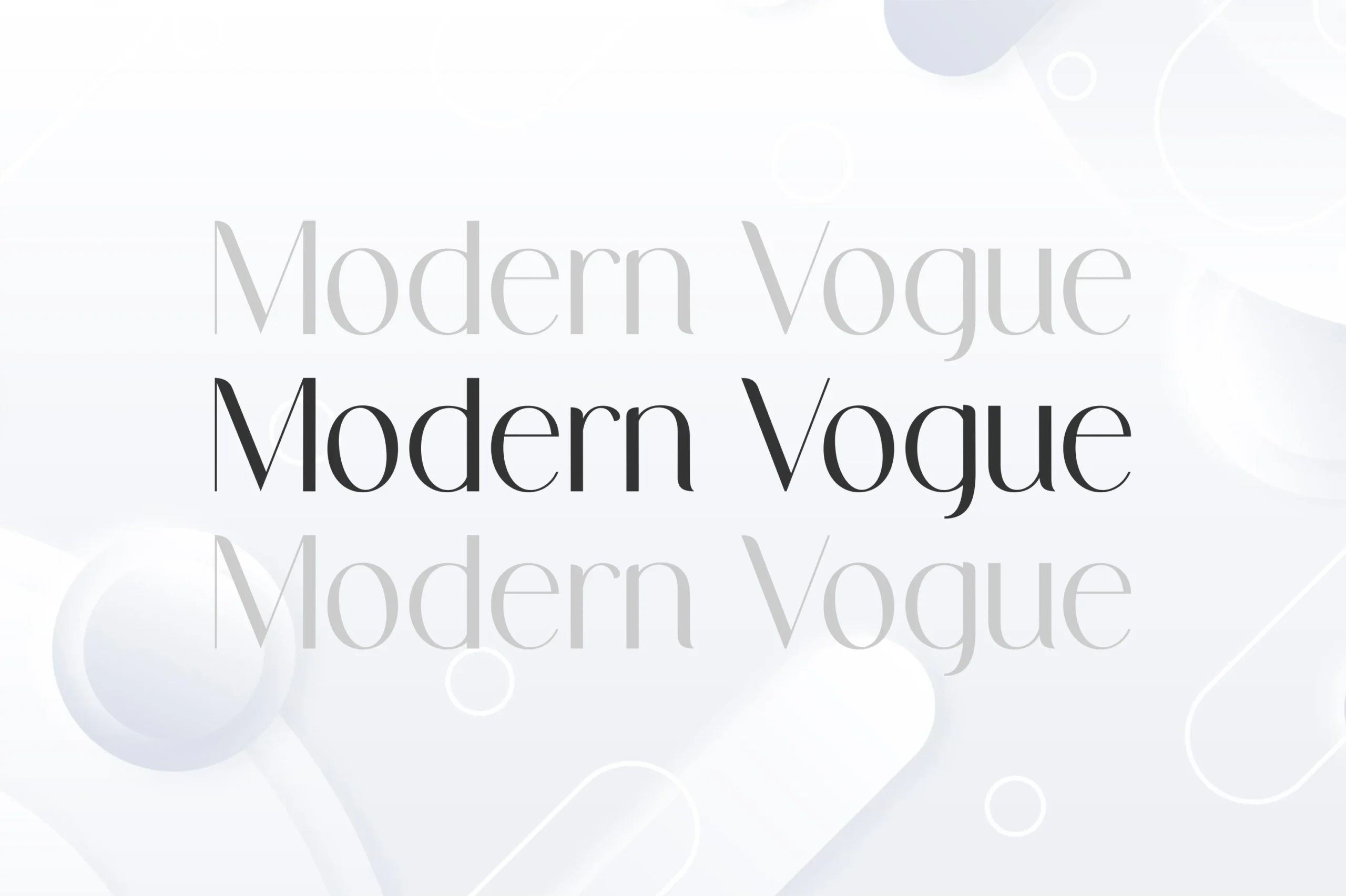
Best For: fashion branding, magazine covers, editorial designs, luxury designs
Modernvogue Font has a fashion-led serif voice, with slim verticals, soft curves, and fine contrast that keeps the letters airy rather than severe. The elongated strokes and clean, lightly sculpted serifs give the preview a polished editorial rhythm, which makes it a natural pick for Luxury Fonts when you want refinement without excessive decoration.
It shines in mastheads, packaging, and upscale branding where the tall proportions have room to breathe. Keep the setting generous and avoid crowding the letters; a little spacing helps the thin joins stay crisp, especially when you pair it with a quieter sans for supporting text.
Spadore Font
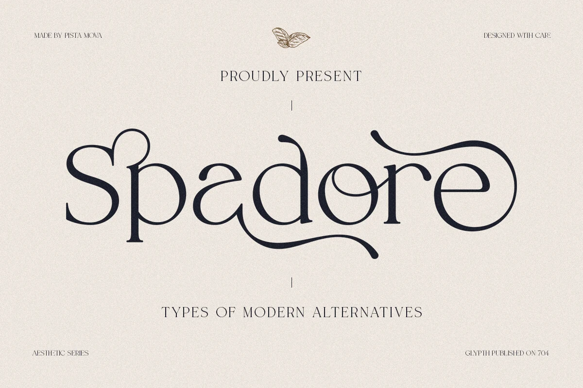
Best For: logos, branding, website headers, luxury designs
Spadore Font has a decorative display rhythm, with rounded loops, thin serif-like strokes, and long sweeping terminals that give the wordmark a custom boutique feel. Its alternate-style letter shapes make it stand out in Luxury Fonts roundups where the goal is a logo or header with more personality than a standard classic serif.
This is not a font to bury in dense text. Use it for short names, monograms, and website headers where the curves can stay large and controlled. Keep spacing moderate: too tight will tangle the swashes, while too loose can break the connected visual flow that gives Spadore its strongest identity.
Soothe Font
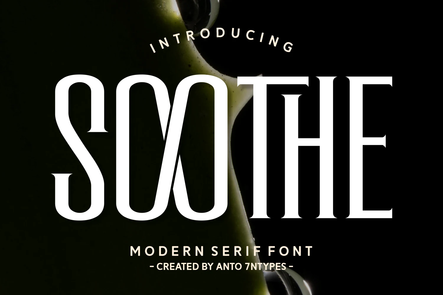
Best For: logos, invitations, wedding designs, luxury designs
Soothe Font mixes dramatic display proportions with tall narrow counters, crisp serif edges, and sculpted curves that make the lettering feel polished but lively. The stylized “OO” structure and custom opening “S” give it a distinctive voice, so it stands out in Luxury Fonts roundups that need more personality than a standard modern serif.
This one works best in short logo text, invitation headings, and celebration-focused branding where the decorative forms can stay large and clear. If you use its heart swash or alternate shapes, keep the surrounding layout restrained and give the letters space so the contrast and unusual inner forms stay clean instead of crowded.
Glamour Luxury Family Font
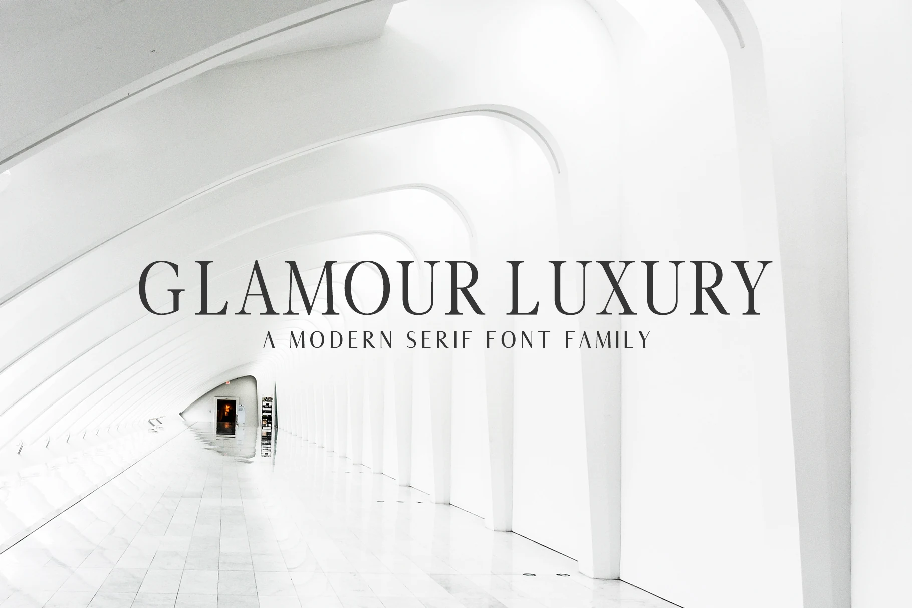
Best For: branding, packaging, headlines, luxury designs
Glamour Luxury Family Font has a clean modern serif structure, with slim contrast, sharp vertical rhythm, and uppercase forms that feel architectural rather than decorative. Its restrained details make it a strong fit for Luxury Fonts where the design needs polish, spacing, and authority without ornate flourishes.
The family format gives designers room to adjust hierarchy across headlines, packaging, and branding systems without switching typefaces. Use generous tracking for title work and keep supporting text minimal; the narrow serifs and tall proportions look strongest when the layout preserves clean contrast and open space.
Ronsa Font
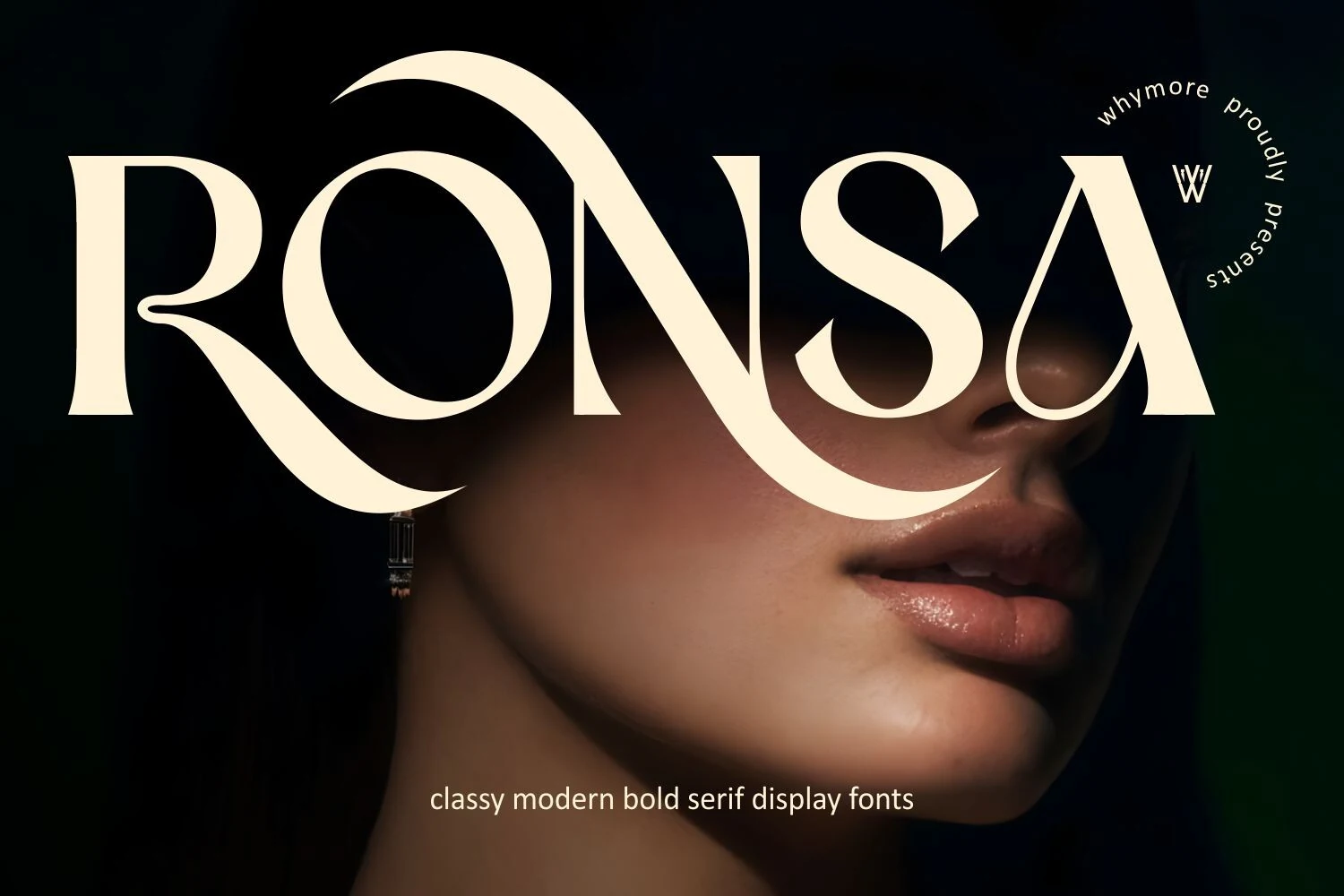
Best For: logos, fashion branding, magazine covers, luxury designs
Ronsa Font has a bold display serif look built on thick stems, sharp contrast, and sweeping curves that give the capitals a dramatic fashion presence. The oversized swash movement in the “R” and “N” makes it especially memorable, so it fits naturally into Luxury Fonts collections aimed at branding that needs confidence as much as polish.
It works best in short mastheads, logo concepts, and cover lines where those sculpted terminals have room to show. Keep the wording tight and pair it with a quiet sans for secondary text; that contrast helps the bold shapes stay elegant instead of visually heavy.
Swagume Font
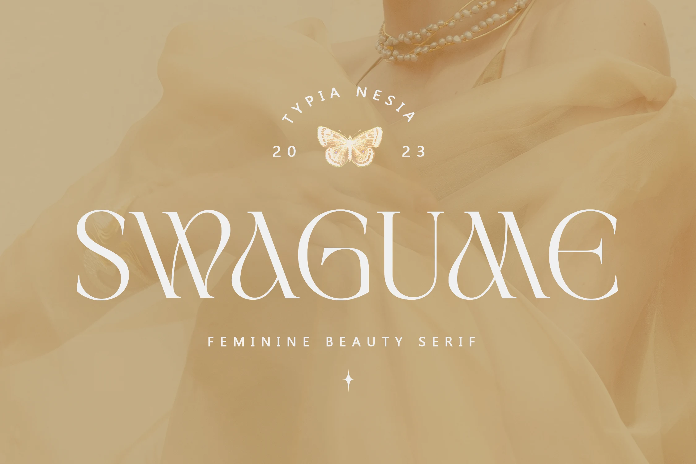
Best For: beauty branding, fashion branding, editorial designs, luxury designs
Swagume Font carries a feminine luxury serif style with wide uppercase forms, thin hairlines, and flowing inward curves that make the letters feel sculptural. The “S,” “A,” and “G” use sweeping cuts and soft terminals, placing it among Luxury Fonts that need beauty-brand polish without looking overly traditional.
Its ligatures and alternates are useful for custom wordmarks because they let you soften repeated shapes and build a more distinctive title rhythm. Keep it large, with controlled tracking and high contrast; the narrow joins and decorative curves lose precision when crowded into long text.
Milk Kantig Font
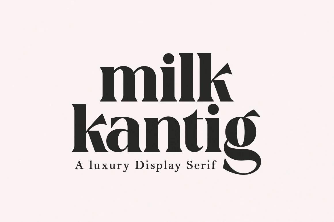
Best For: branding, posters, badges, display text
Milk Kantig Font has a dense display serif look, with thick verticals, rounded counters, and pointed wedge terminals that give the letters a confident retro-editorial snap. The stacked preview shows how its compact proportions create a strong block of type, making it a striking option in Luxury Fonts when you want boldness rather than delicate refinement.
For designers, this one works best in short headlines, poster titles, and badge-style branding where the heavy shapes can carry the layout on their own. Keep supporting text lighter and give the lines a little room, so the tight rhythm and sharp cuts stay legible instead of turning muddy at smaller sizes.
Glojean Font
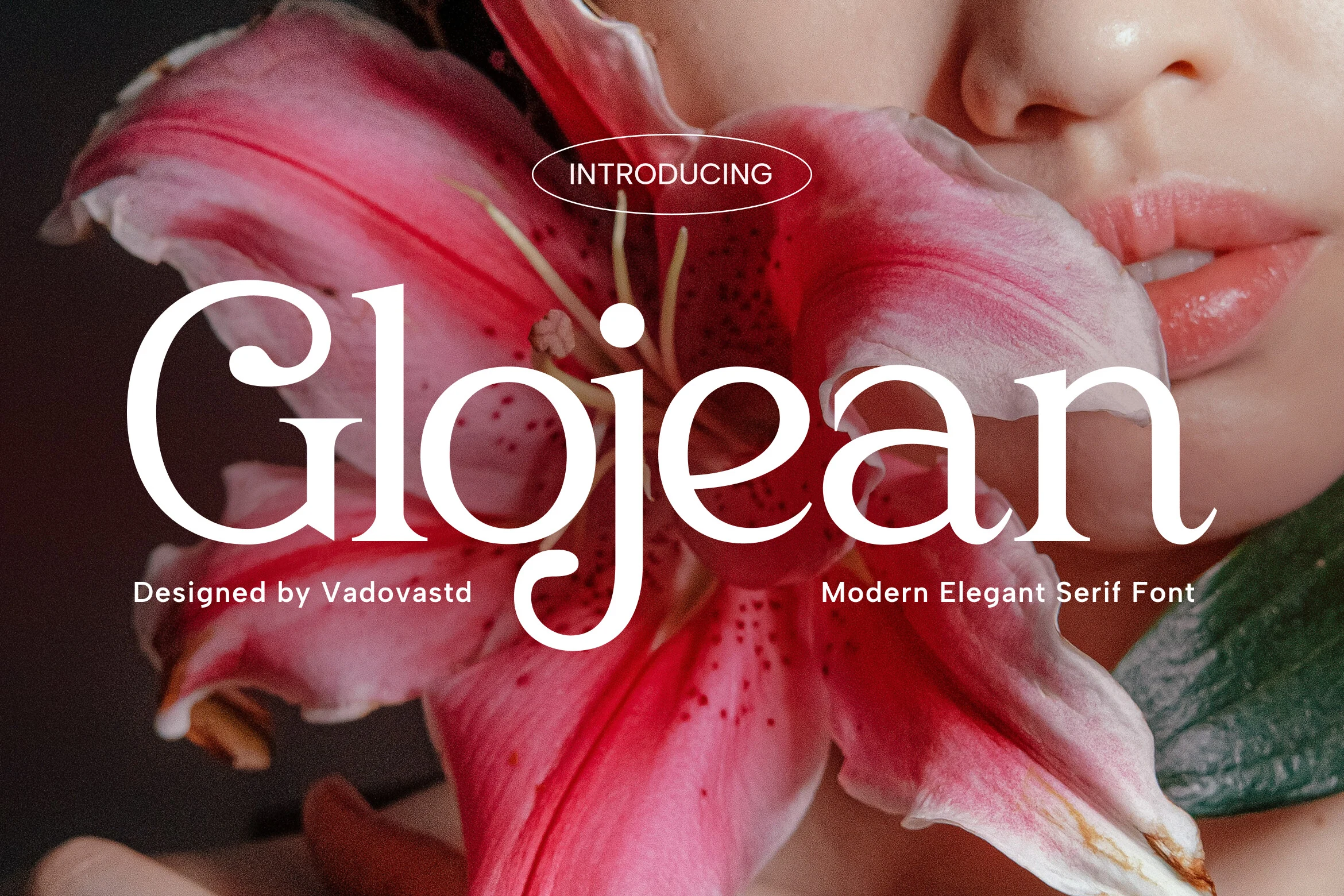
Best For: beauty branding, fashion branding, product labels, luxury designs
Glojean Font brings a soft high-contrast serif style, with rounded bowls, slender serifs, and smooth organic curves that feel refined without becoming stiff. Its graceful “G” and long descender on the “j” give the wordmark a beauty-editorial rhythm, making it a natural fit for Luxury Fonts aimed at skincare, perfume, and boutique identity work.
Use it for short titles, labels, and fashion-led layouts where the thin serifs can stay crisp against a clean background. Moderate spacing works better than tight tracking here; it protects the delicate joins while keeping the elegant curves connected enough for a polished logo or packaging composition.
Kaviera Font
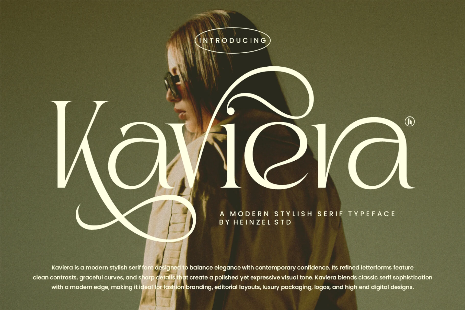
Best For: logos, fashion branding, editorial designs, luxury designs
Kaviera Font has a polished fashion-editorial voice, with sharp contrast, slim serifs, and long flowing curves that make the word shape feel poised and expressive. The oversized swash on the capital K gives it a signature look, while the rest of the letters stay refined enough for Luxury Fonts roundups built around elegance with a stronger visual hook.
It works best in short branding lines, covers, and high-end packaging where the swash can stretch without colliding with nearby elements. Give it generous margins and keep supporting text quieter; that contrast lets the decorative opening letter lead the hierarchy instead of overwhelming the whole layout.
Eryndor Font
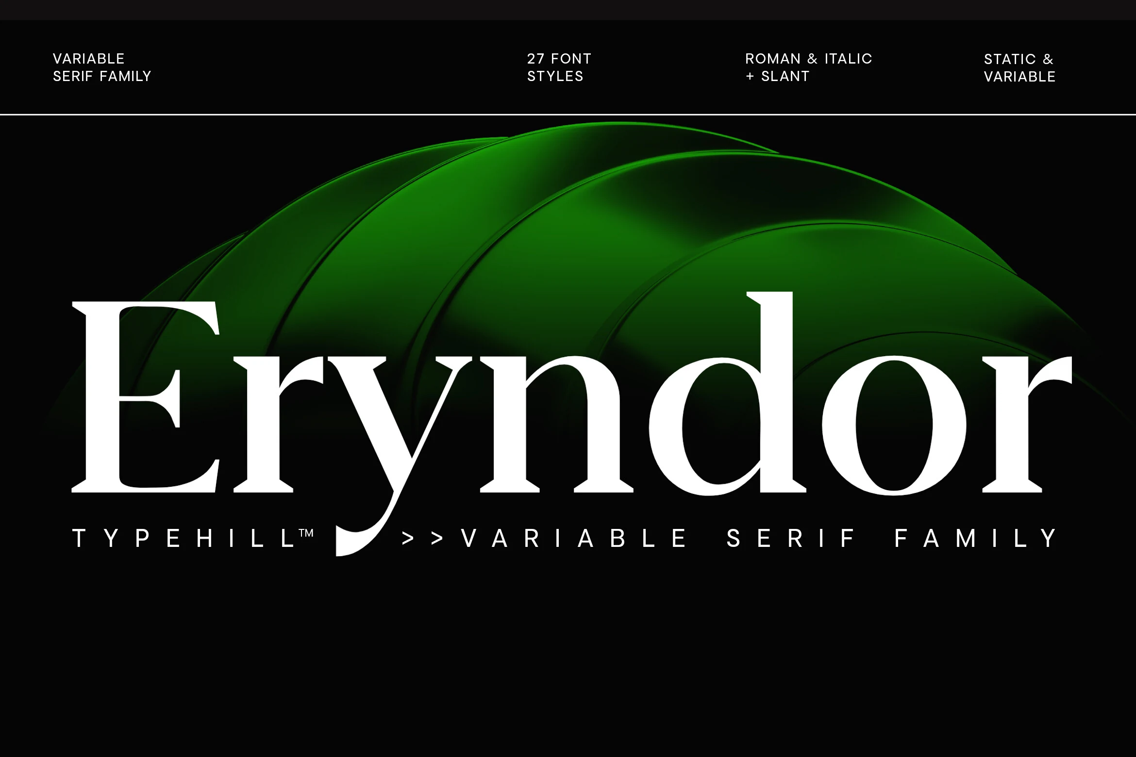
Best For: branding, editorial designs, packaging, luxury designs
Eryndor Font has a bold variable serif structure, with strong vertical stems, sharp bracketed serifs, and smooth high-contrast curves that give the wordmark a controlled premium weight. It belongs naturally in Luxury Fonts because the letterforms feel polished and architectural, with enough contrast to hold attention in large editorial or brand settings.
The variable family format makes it useful for building hierarchy across packaging, campaigns, and title systems without losing the same typographic voice. Use larger sizes and clean spacing so the heavy strokes, narrow joins, and crisp terminals stay defined rather than closing up in compact layouts.
Alegro Font
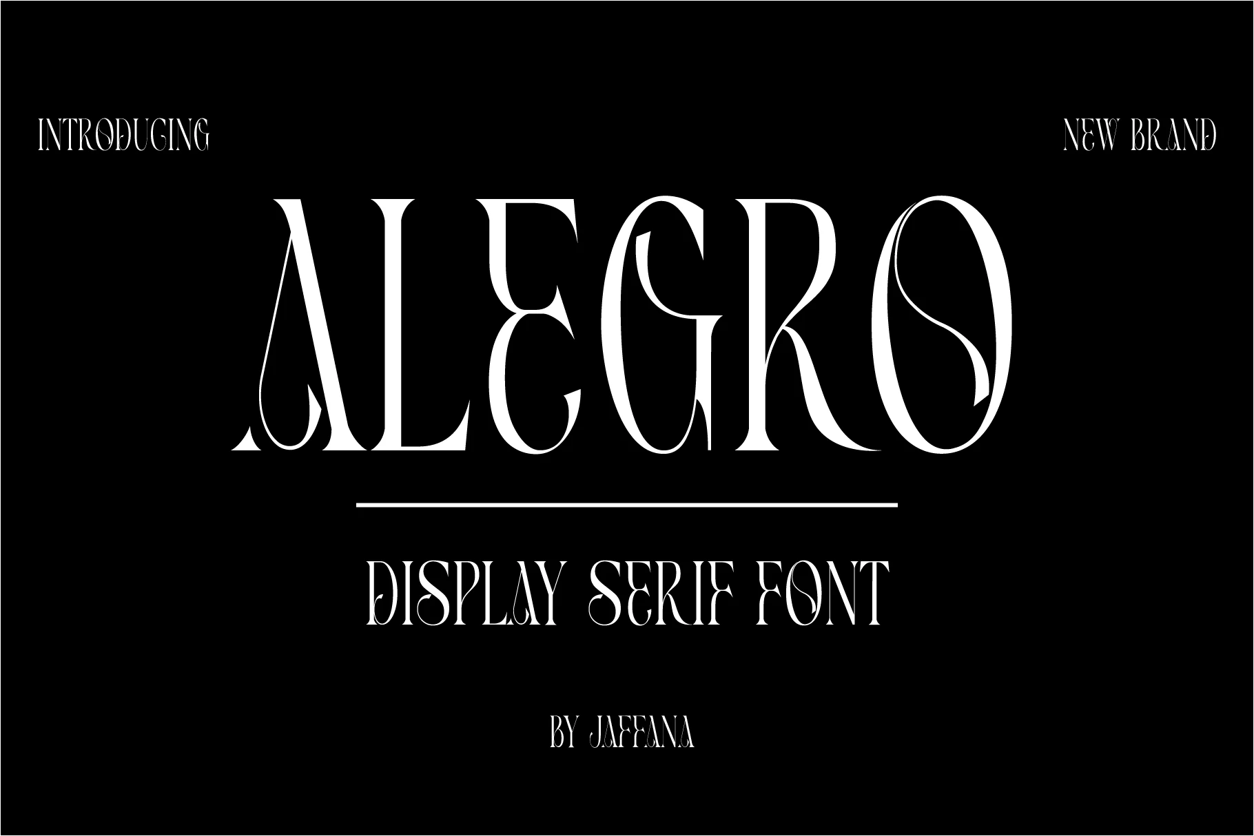
Best For: branding, magazine covers, posters, luxury designs
Alegro Font leans into a tall display serif style, with narrow proportions, sharp contrast, and decorative inner curves that give the capitals an unmistakable Art Deco flavor. The elongated stems and sculpted bowls create a polished vertical rhythm, which makes it a striking entry in Luxury Fonts when a layout needs elegance with a more theatrical edge.
Use Alegro in short headlines, mastheads, and upscale branding where its long serifs and open spacing can stay visible. It handles generous tracking well, but smaller settings lose the fine internal details, so pair it with a quieter secondary typeface and let the display line carry the personality.
Luxury Duo Font
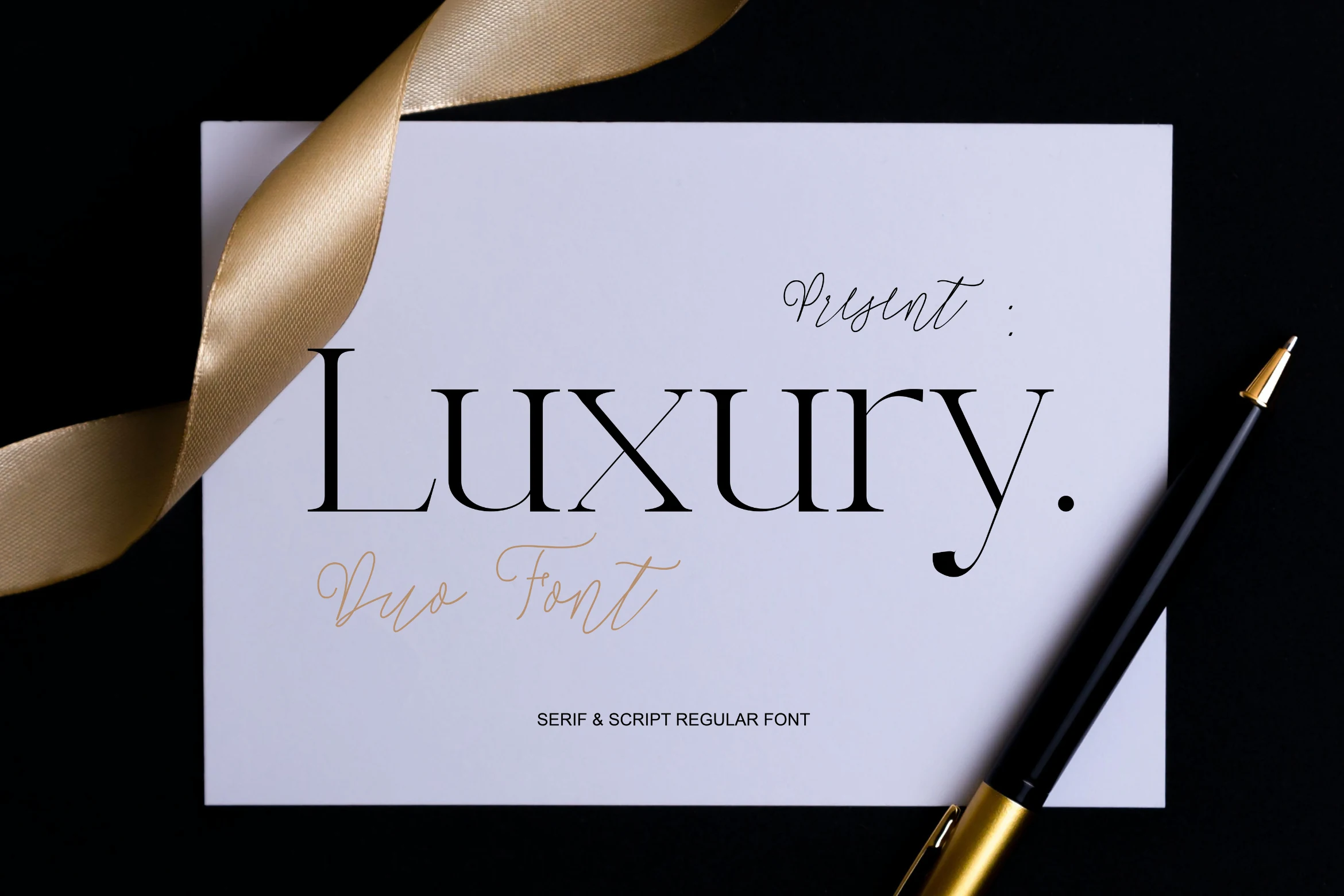
Best For: branding, invitations, wedding designs, luxury designs
Luxury Duo Font pairs a poised high-contrast serif with a thin handwritten script, giving designers a ready-made contrast between formal structure and fluid detail. The serif’s long verticals, sharp hairlines, and curved “y” descender place it naturally among Luxury Fonts for branding that needs restraint with a polished ceremonial tone.
Use the serif for the main name and keep the script as a small accent, signature line, or invitation detail. That hierarchy prevents the delicate handwriting from competing with the display wordmark, while the serif keeps enough authority for upscale packaging, wedding stationery, and editorial layouts.
Wenssep Font
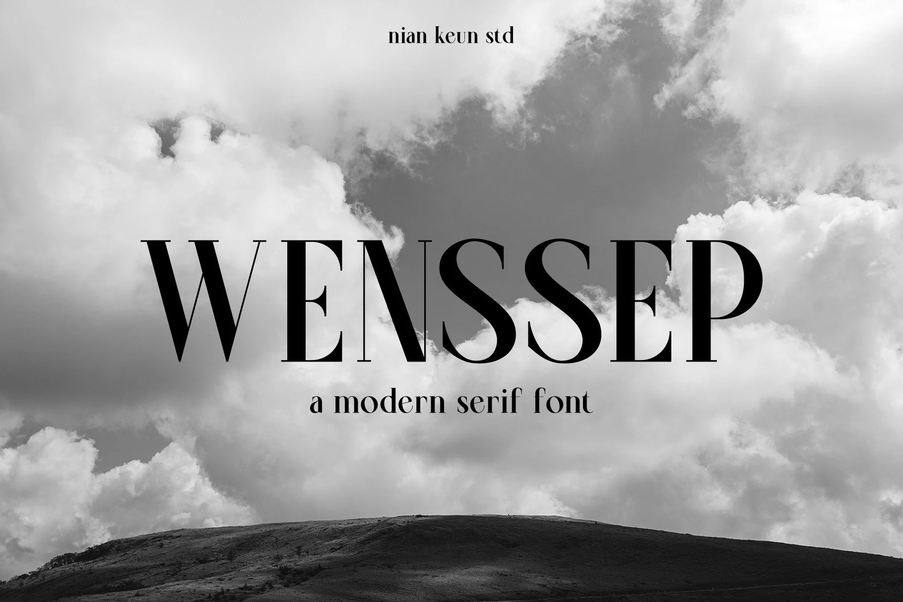
Best For: logos, branding, magazine covers, luxury designs
Wenssep Font has a firm modern serif look, with tall capitals, strong vertical strokes, and thin hairlines that sharpen the whole word shape. The clean contrast and crisp serif cuts give it a composed editorial feel, so it sits comfortably in Luxury Fonts collections that lean polished rather than ornate.
It works best in short mastheads, identity marks, and magazine-style titles where the narrow details stay visible. Slightly looser tracking helps the bold strokes and fine joins breathe, especially when you want the lettering to feel upscale without losing clarity on covers or branding pieces.
Luxury Fonts work best when the typography itself becomes part of the brand identity: sharp contrast, elegant spacing, sculpted serifs, and distinctive swashes can instantly make a logo, label, cover, or campaign feel more premium. The 48 fonts in this collection give you a wide range of options, from clean editorial serifs to dramatic decorative display styles.
All of these fonts are available on Creative Fabrica, so you can explore the styles, compare the previews, and choose the typefaces that fit your next branding, packaging, or luxury design project.