24 Best Cool Bold Fonts in 2026
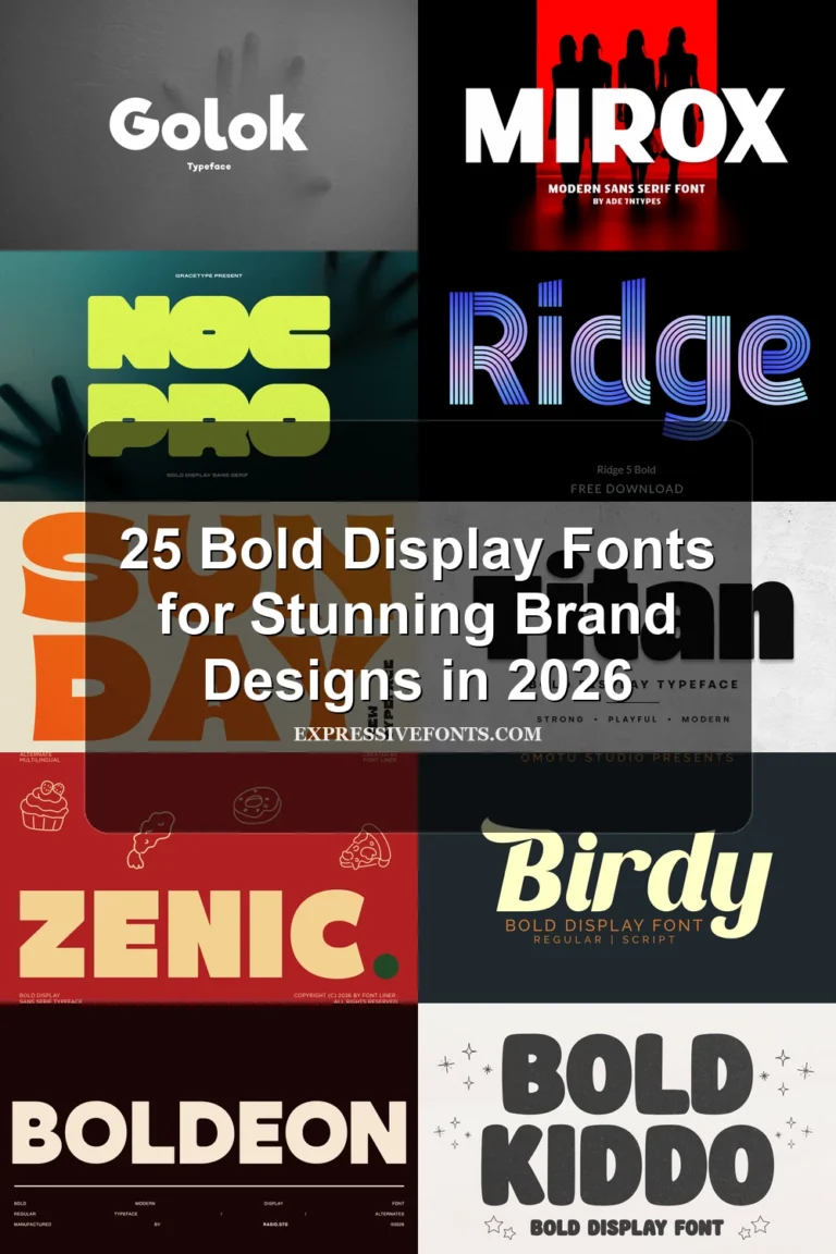
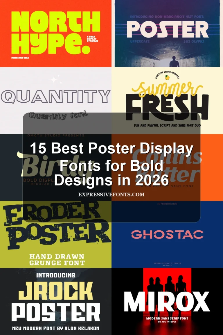
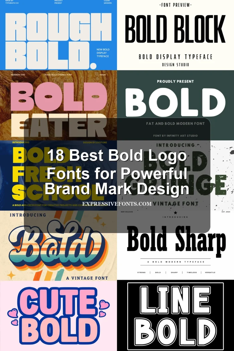
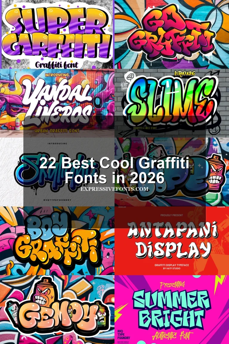
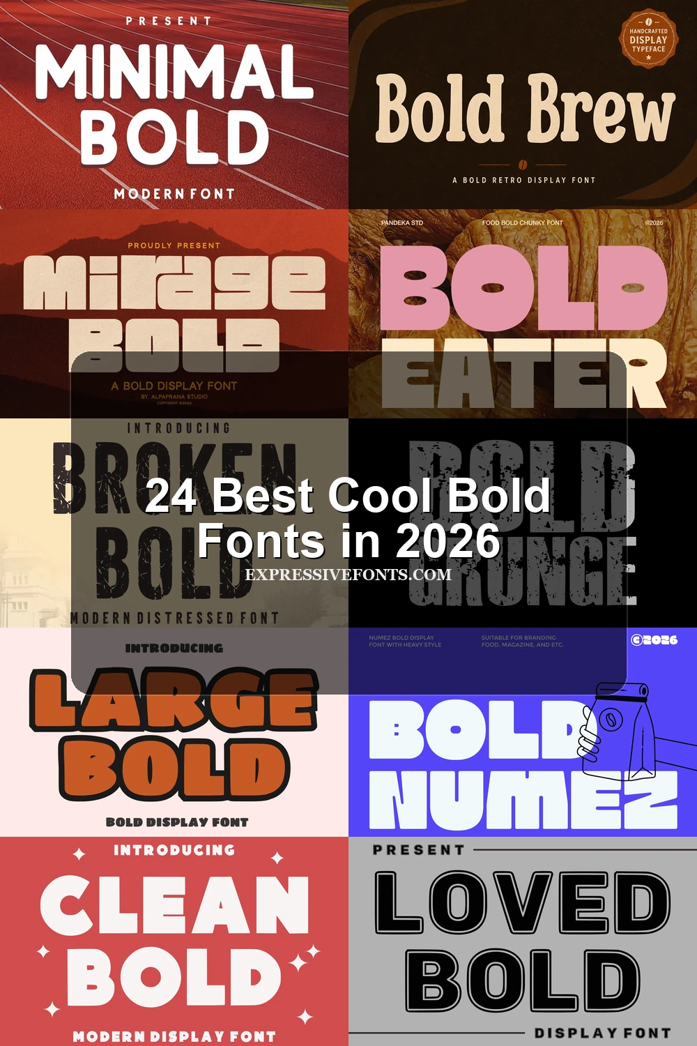
This collection of Cool Bold Fonts moves from rounded bubble capitals and geometric blocks to layered shadows, distressed surfaces, and expressive brush marks. These visible constructions make the typefaces useful for posters, logos, packaging, merchandise, social graphics, and other short display applications rather than extended reading.
Looking for more cool fonts? Browse our complete Cool Fonts collection to compare bold, vintage, retro, script, and gothic cool styles.
Cool Bold Fonts: Rounded Displays
Cool Bold Fonts in this rounded group use soft corners, heavy uniform strokes, and mostly upright forms, ranging from orderly bubble lettering to wobbly, wave-cut display treatments.
Bold Heart Font
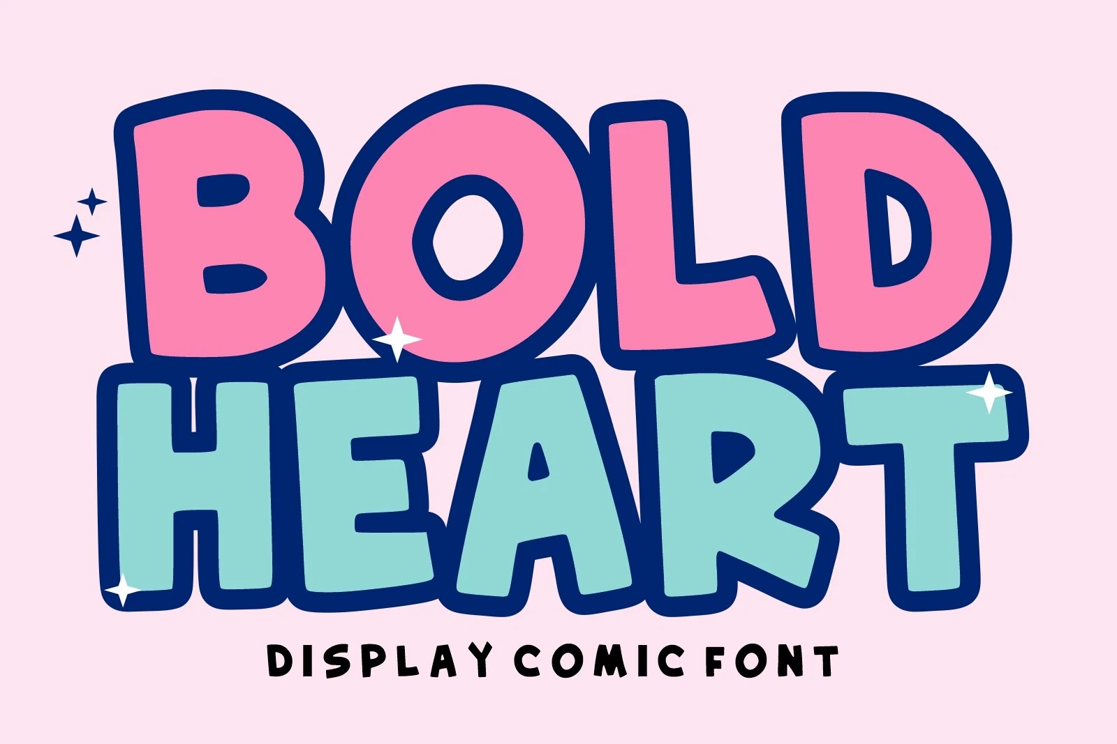
Best For: posters, social media graphics, stickers
Bold Heart Font uses wide, upright bubble capitals with thick, uniform strokes and rounded terminals. Its disconnected comic construction stays clear on posters and stickers at large sizes, but feels too informal for extended text.
Dream Bold Font
Best For: logos, branding, posters
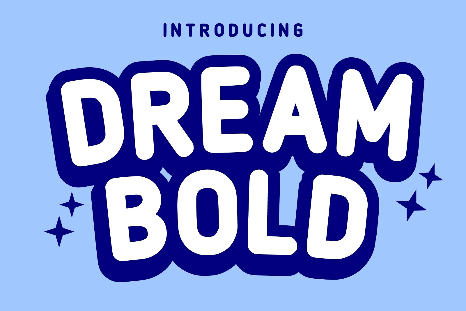
Dream Bold Font has chunky, upright capitals with soft corners and an even bubble silhouette. Its consistent strokes remain readable in logos and social graphics at display scale, though the rounded voice is less appropriate for formal communication.
Black Bold Font
Best For: children’s designs, social media graphics, T-shirts
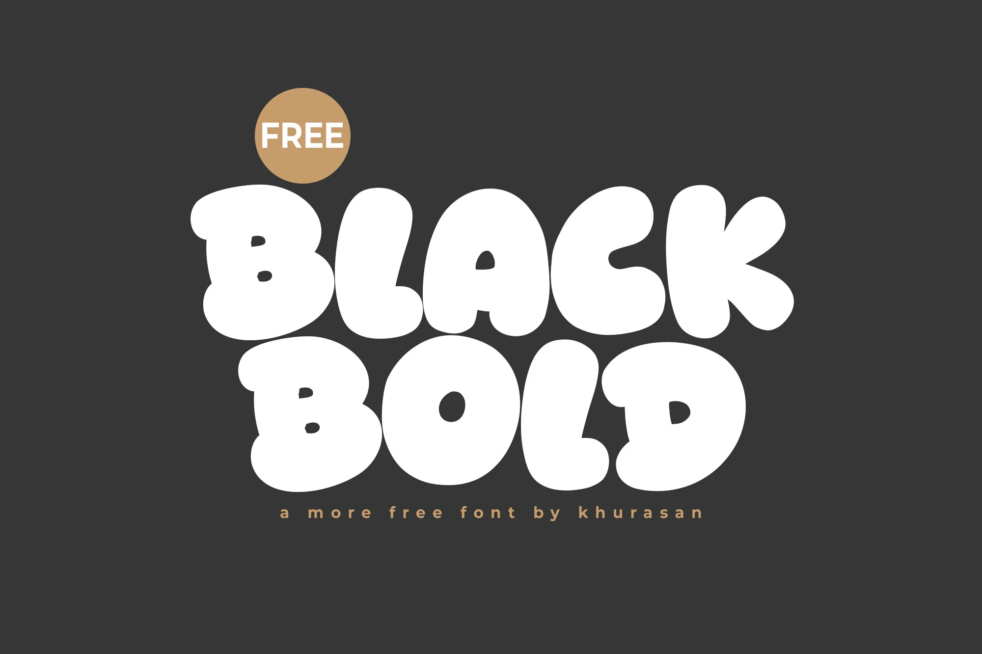
Black Bold Font combines pillowy bubble forms, extra-heavy weight, and compact wide spacing. Its soft terminals work naturally on shirts and social graphics, though tight apertures need generous display sizing to keep characters distinct.
Bold Reson Font
Best For: headlines, logos, branding
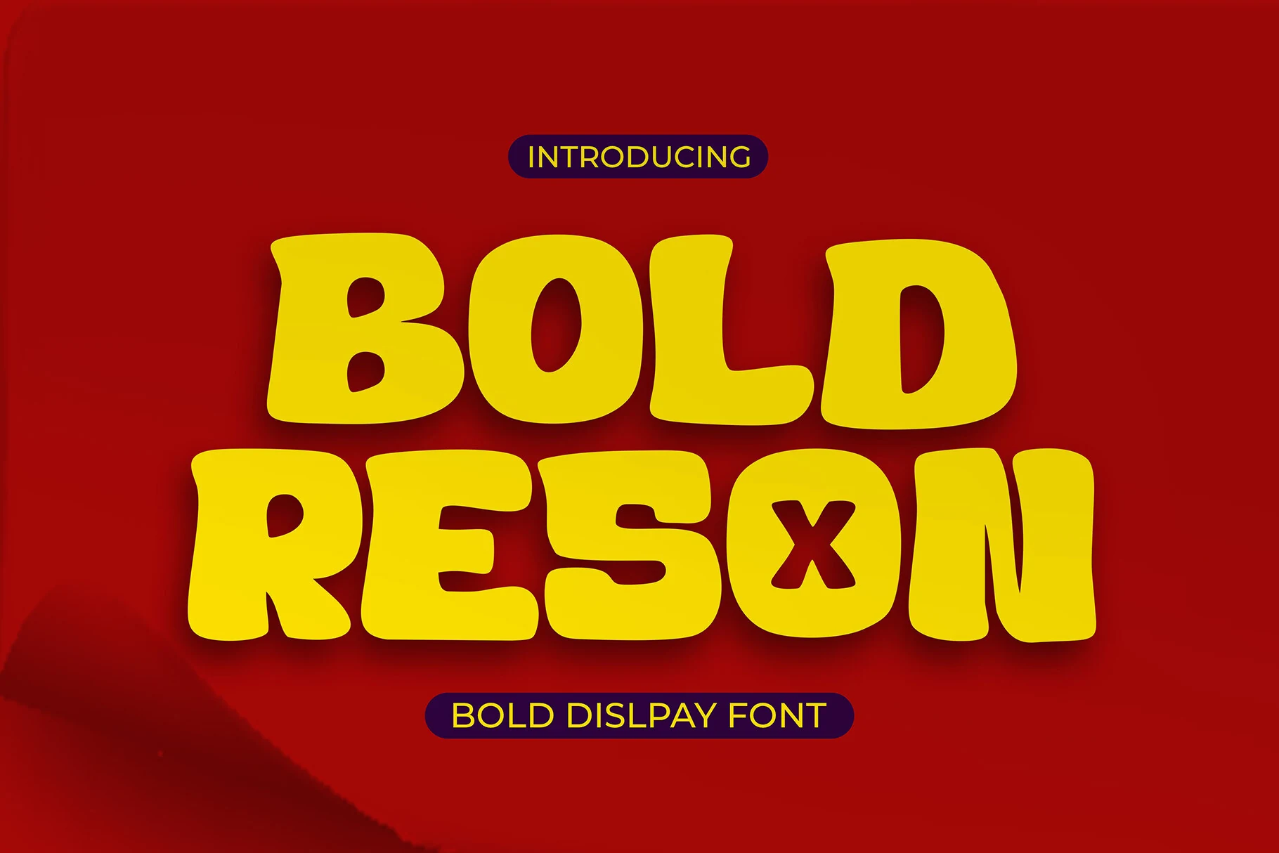
Bold Reson Font uses bubbly wide capitals with heavy strokes, minimal contrast, and blunt terminals. Its rounded construction can anchor a logo or headline, but the dense treatment is less adaptable for neutral text settings.
Dream Bold Font
Best For: headlines, posters, display text
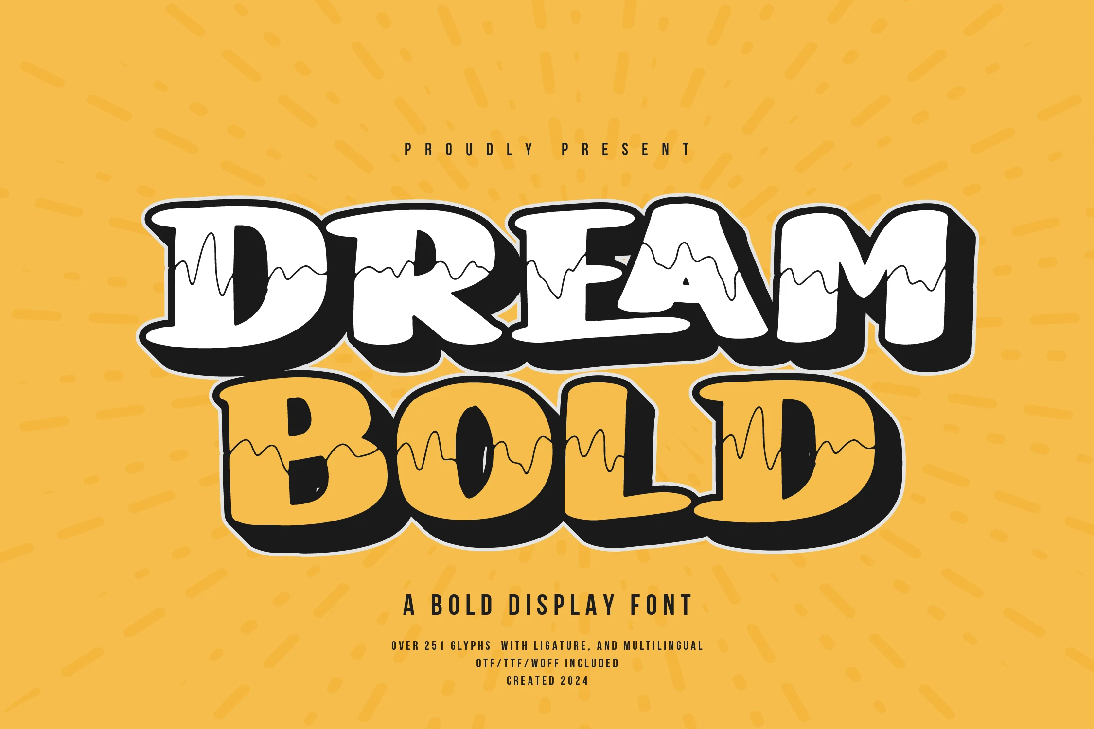
Dream Bold Font cuts an irregular horizontal wave through chunky rounded capitals, giving Cool Bold Fonts a youthful internal motion. It stands out in posters and headlines, although the wave detail can disappear when the lettering is reduced.
Minimal Bold Font
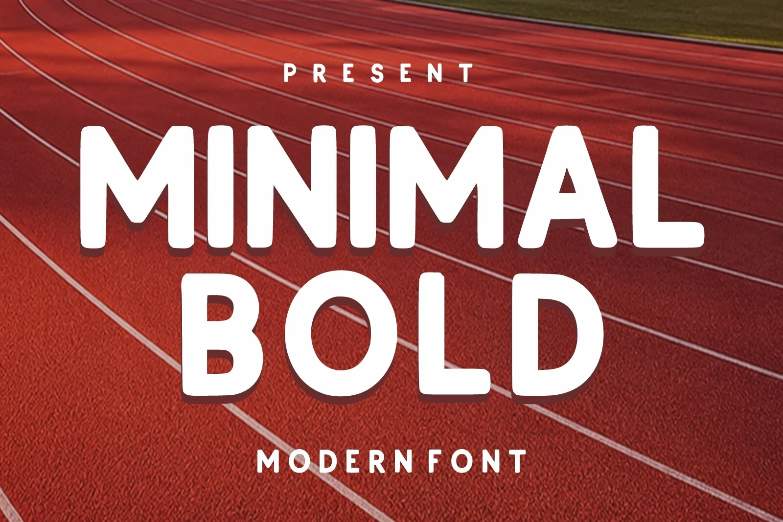
Best For: logos, branding, headlines, signage
Minimal Bold Font is a more restrained rounded option, balancing geometric proportions, soft corners, and stable upright construction. Its dependable shape adapts to logos, signage, and headlines, though it remains a display face rather than body text.
Lucky Chunks Font
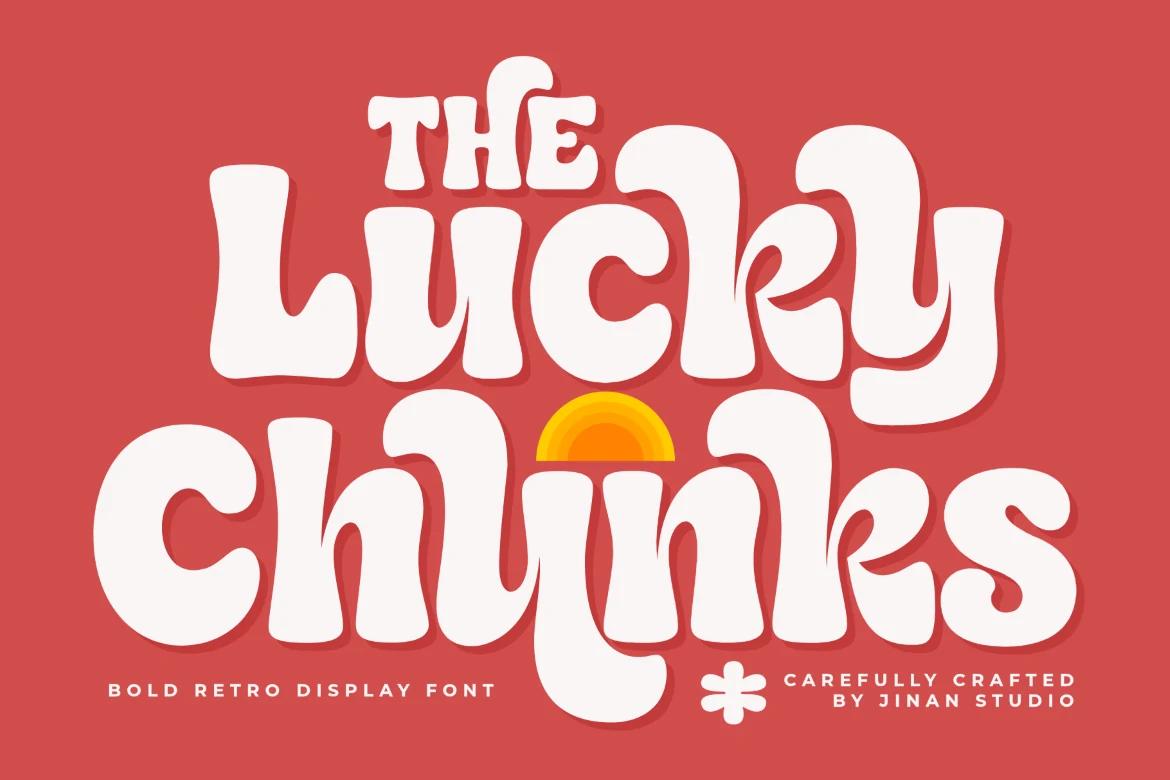
Best For: branding, posters, packaging, social media graphics
Lucky Chunks Font interrupts heavy rounded construction with wobbly baselines and wave-like curves. The irregular rhythm creates nostalgic energy for packaging and social graphics, but makes the lettering less suitable for orderly text settings.
Layered and Shadowed
These faces build their identity through inline, outline, or offset-shadow layers over geometric capitals, adding graphic depth that plain solid lettering does not provide.
Be Bold Font
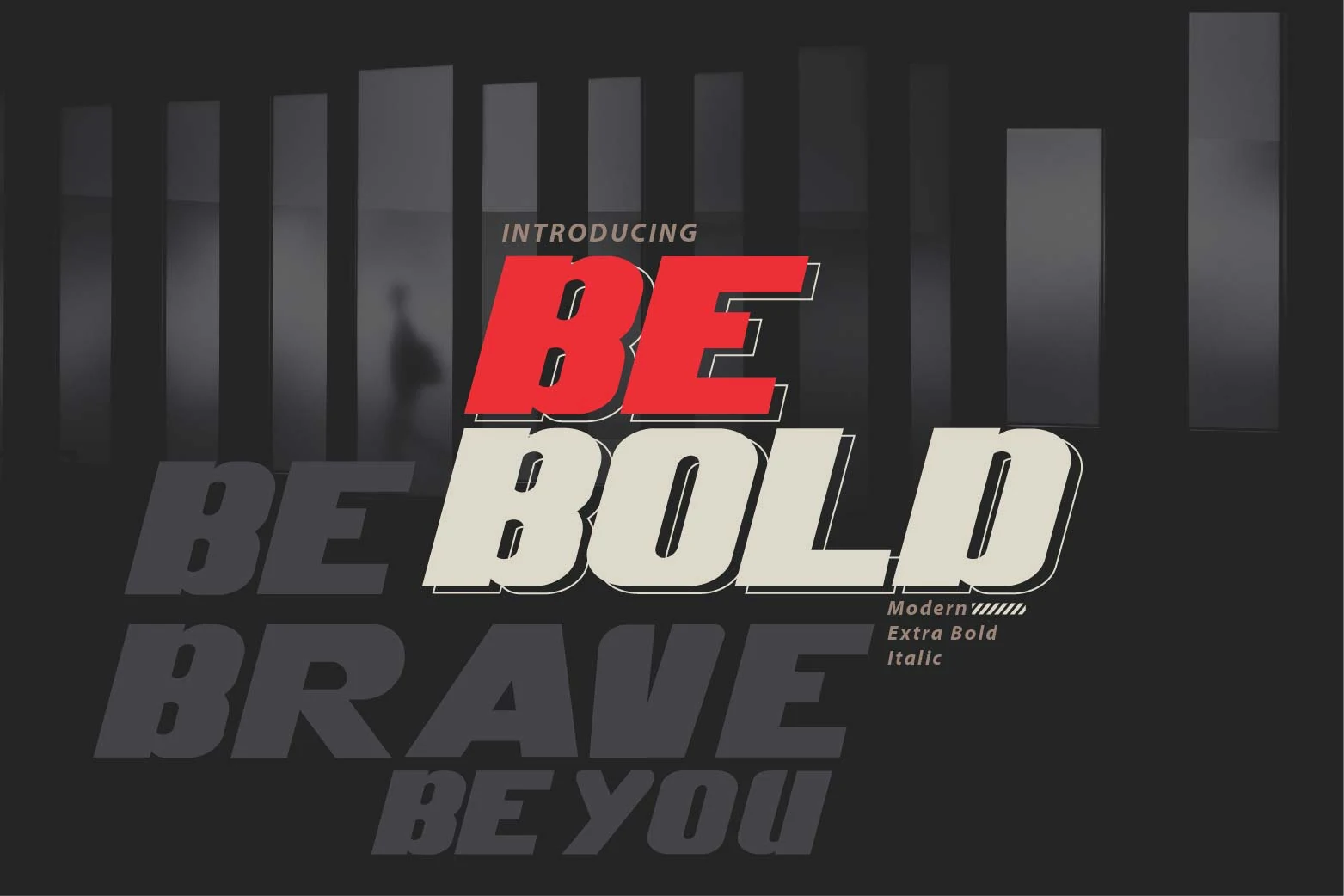
Best For: headlines, posters, signage
For Cool Bold Fonts with forward motion, Be Bold Font pairs right-leaning geometric capitals with an offset drop shadow. The extra-heavy construction gives headlines and posters immediate force, but the slant and layered effect are best reserved for short display text.
Loved Bold Font
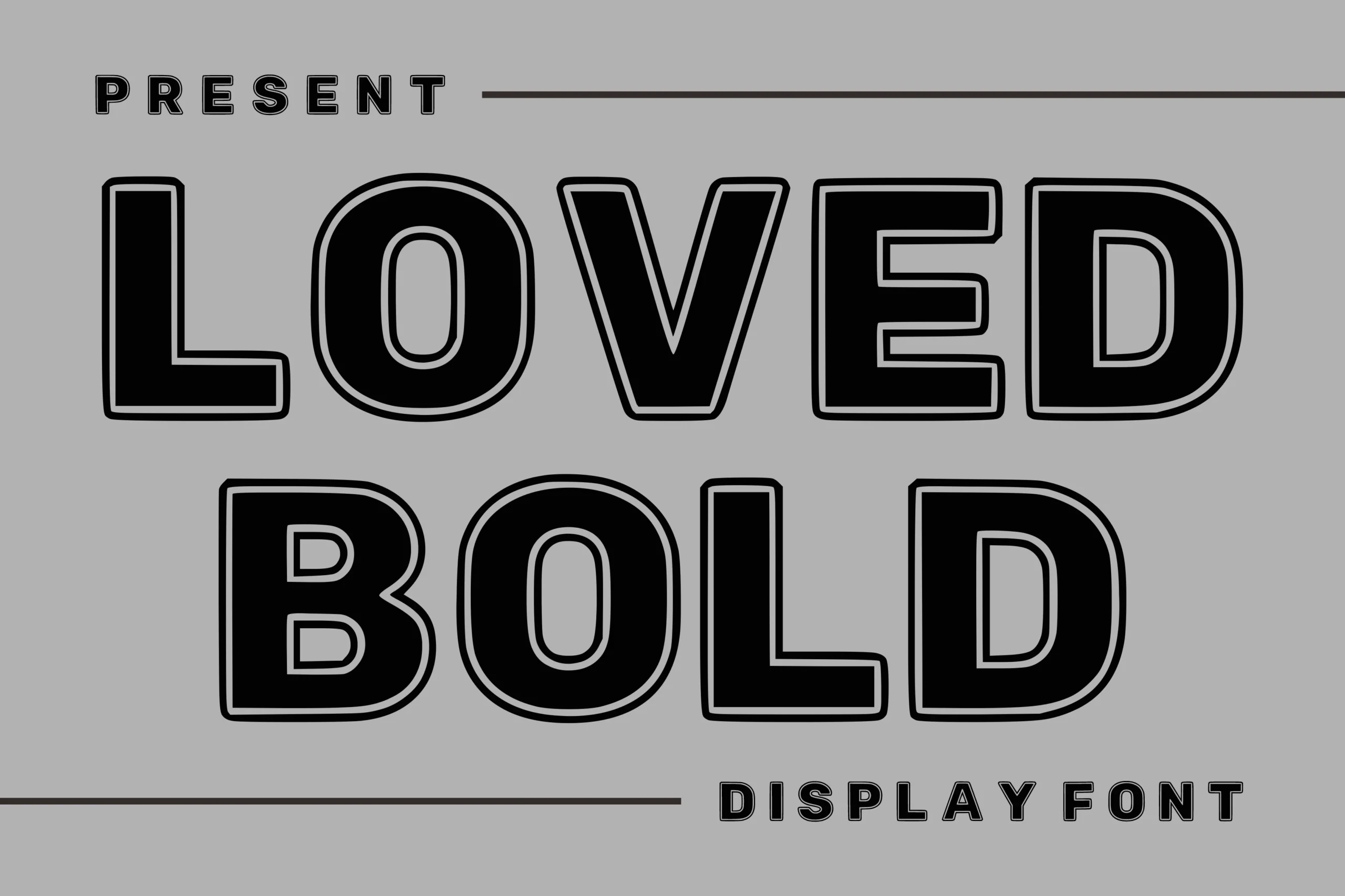
Best For: headlines, branding, posters, merch design
Loved Bold Font replaces a plain fill with wide, rigid capitals and a dual-layer inline treatment. Its inner accent supplies built-in branding character for posters and merchandise, although the added detail can become cluttered in smaller applications.
Double Bold Font
Best For: logos, branding, posters, packaging
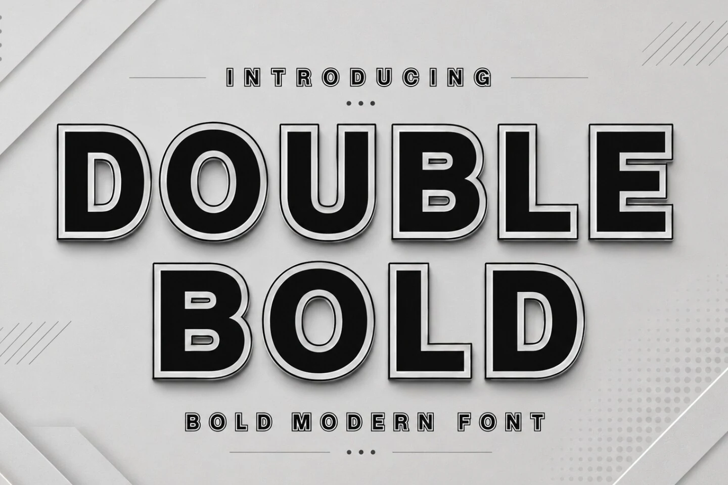
Double Bold Font adds a double-outline layer to monolinear geometric capitals, creating Cool Bold Fonts with a ready-made graphic treatment. The effect adds presence to packaging and posters, but remains most controlled at large sizes.
Bold Sans Font
Best For: headlines, posters, retro designs
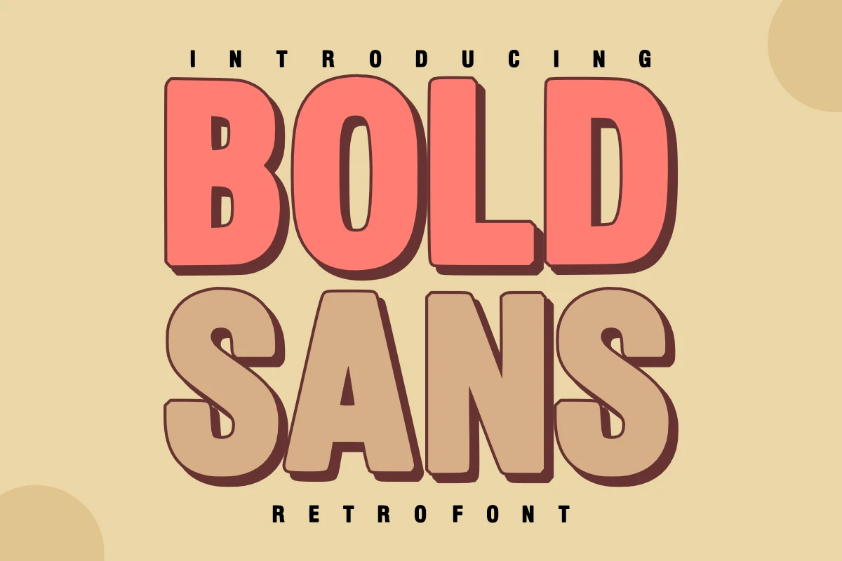
Bold Sans Font pairs rounded retro sans forms with a pronounced 3D offset shadow. The layered construction gives posters and headlines period-specific character, but its visual treatment is too loud for small or quiet text.
Blocky and Geometric
Blocky and geometric designs emphasize wide proportions, dense weight, open or compressed counters, and engineered junctions, creating a more structured presence than the rounded groups.
Brave Treat Font
Best For: display text, headlines, children’s designs
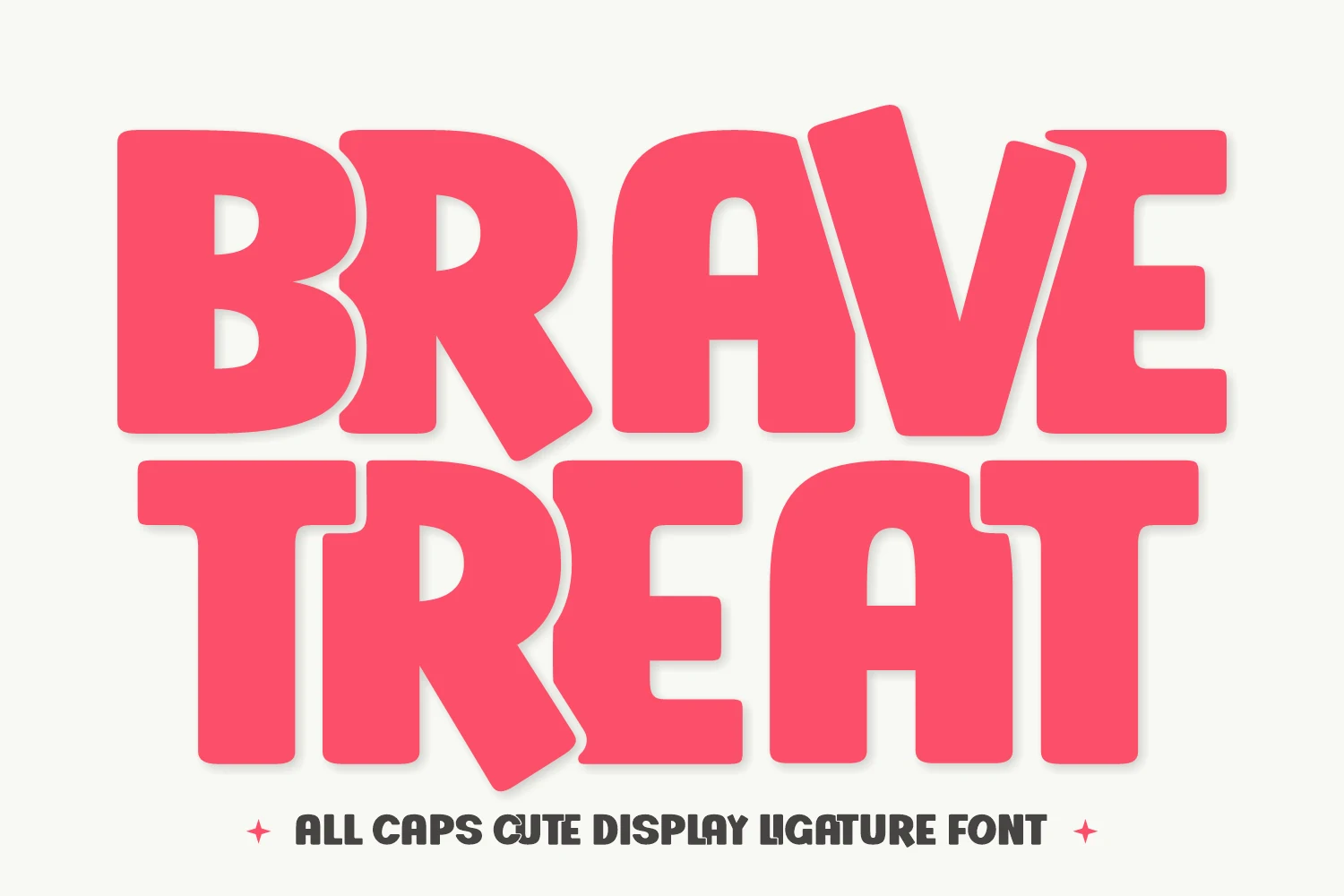
Brave Treat Font turns all-caps block forms into compact custom lettering through overlapping ligatures and mixed construction. This Cool Bold Fonts option suits children’s designs and playful headlines, but tight joins can merge when reduced.
Mirage Bold Font
Best For: logos, branding, packaging
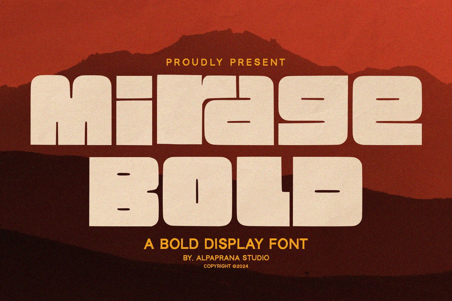
Mirage Bold Font creates a monolithic word shape with extended geometric capitals, broad proportions, and compressed apertures. It delivers Cool Bold Fonts impact for logos and packaging, but its extreme thickness loses clarity when scaled down.
Clean Bold Font
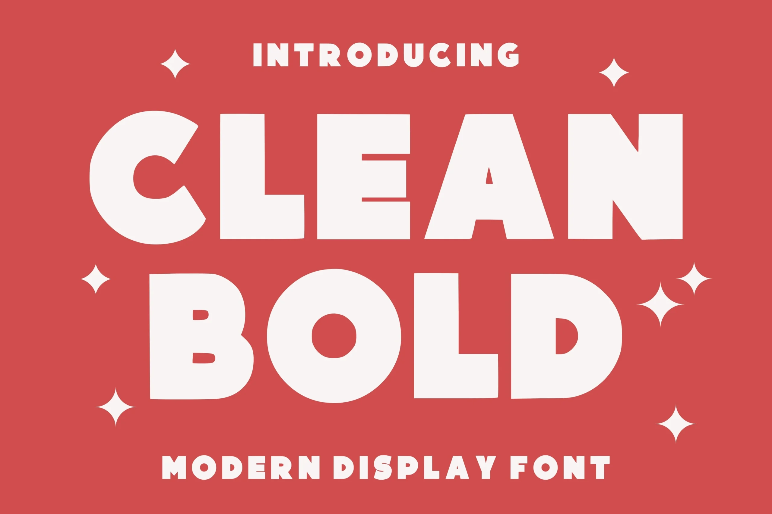
Best For: logos, branding, posters
Clean Bold Font separates itself from denser block faces through large open counters inside heavy, wide geometric forms. The extra interior space supports display readability for logos and branding, provided the layout can accommodate its expansive width.
Rough Bold Font
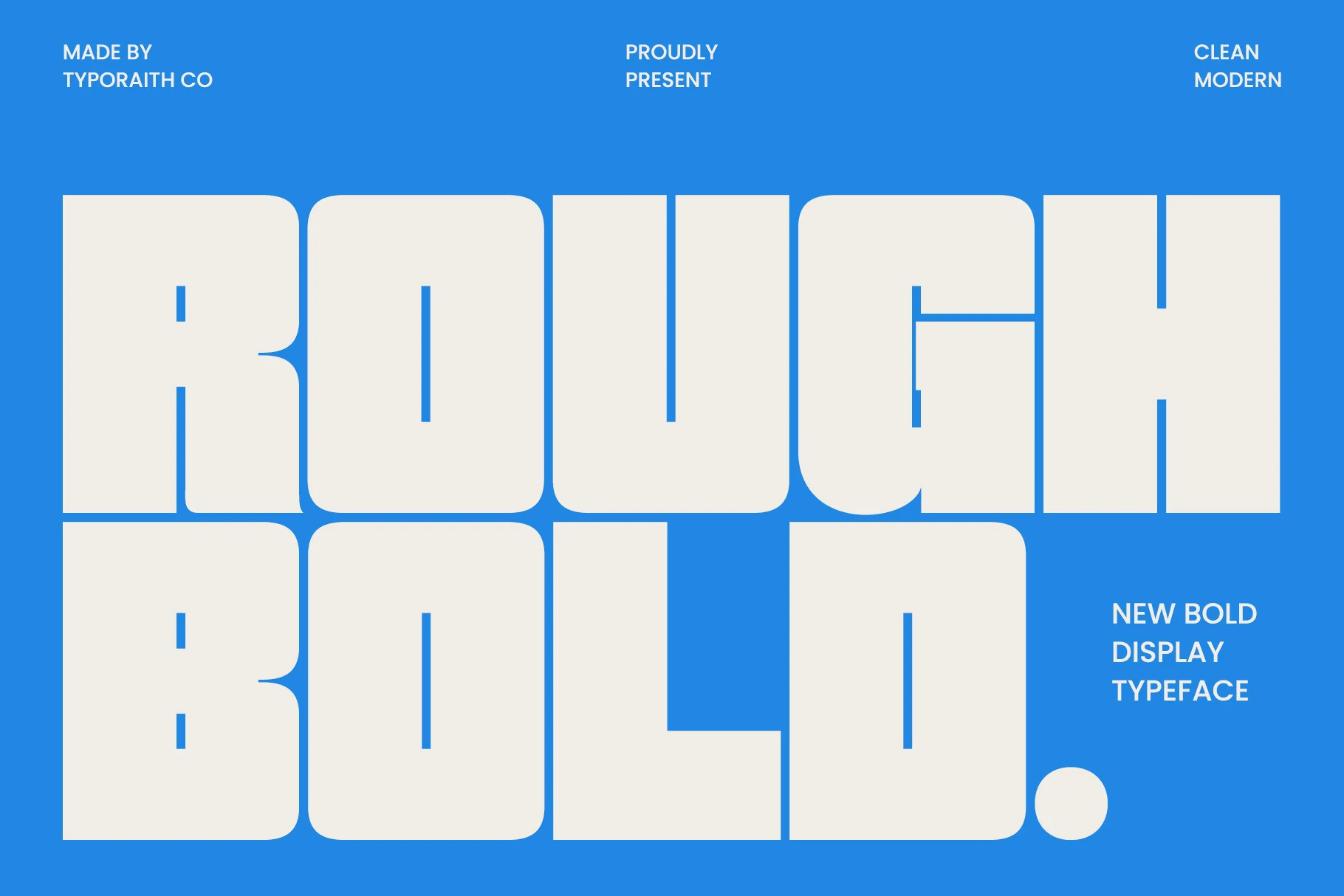
Best For: posters, headlines, branding, packaging
Rough Bold Font combines ultra-bold extended letters with notched horizontal junctions and rounded outer corners. Those engineered interruptions add structural character to headlines and packaging, while tight intersections lose definition at reduced sizes.
Bold Numez Font
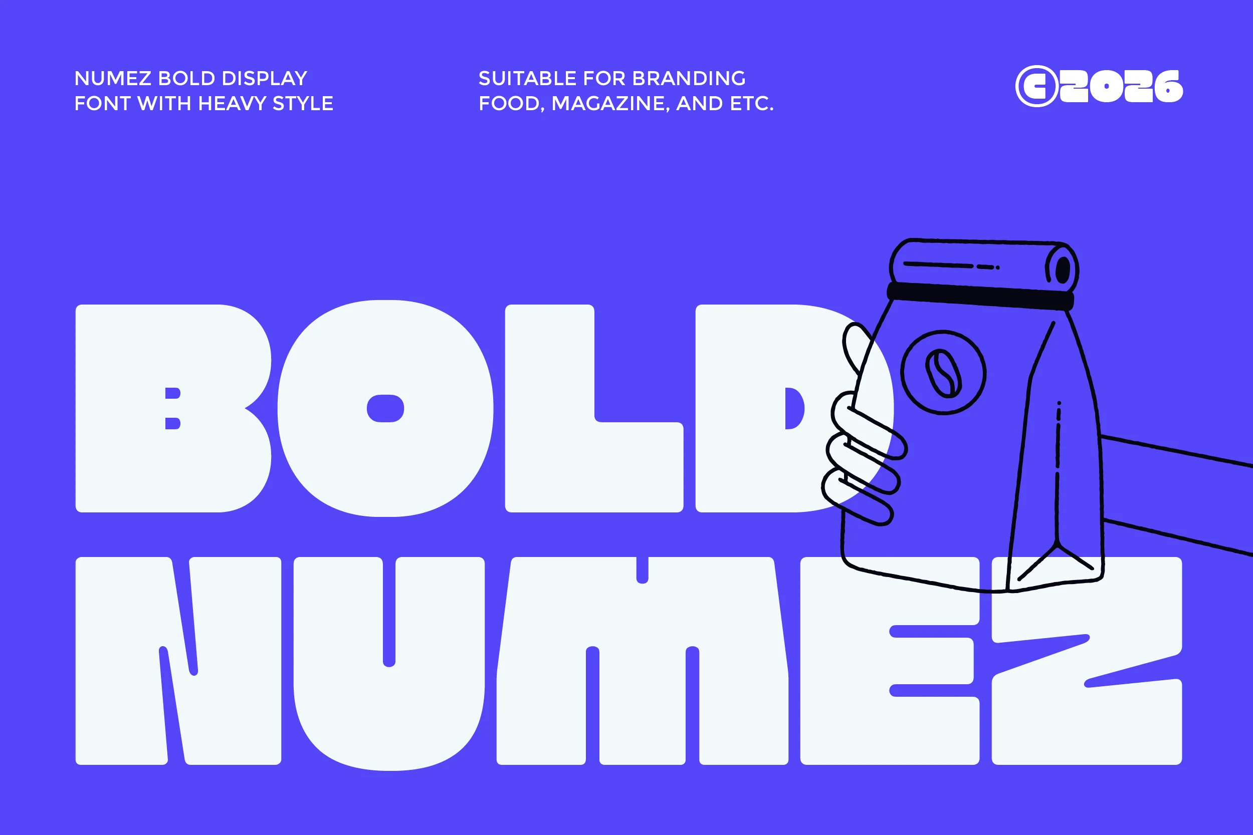
Best For: logos, branding, headlines
Bold Numez Font compresses ultra-heavy geometric letters into a dense, solid word shape. The resulting visual mass works for logos, branding, and headlines, while minimal internal spacing rules out comfortable long-form reading.
Bold Eater Font
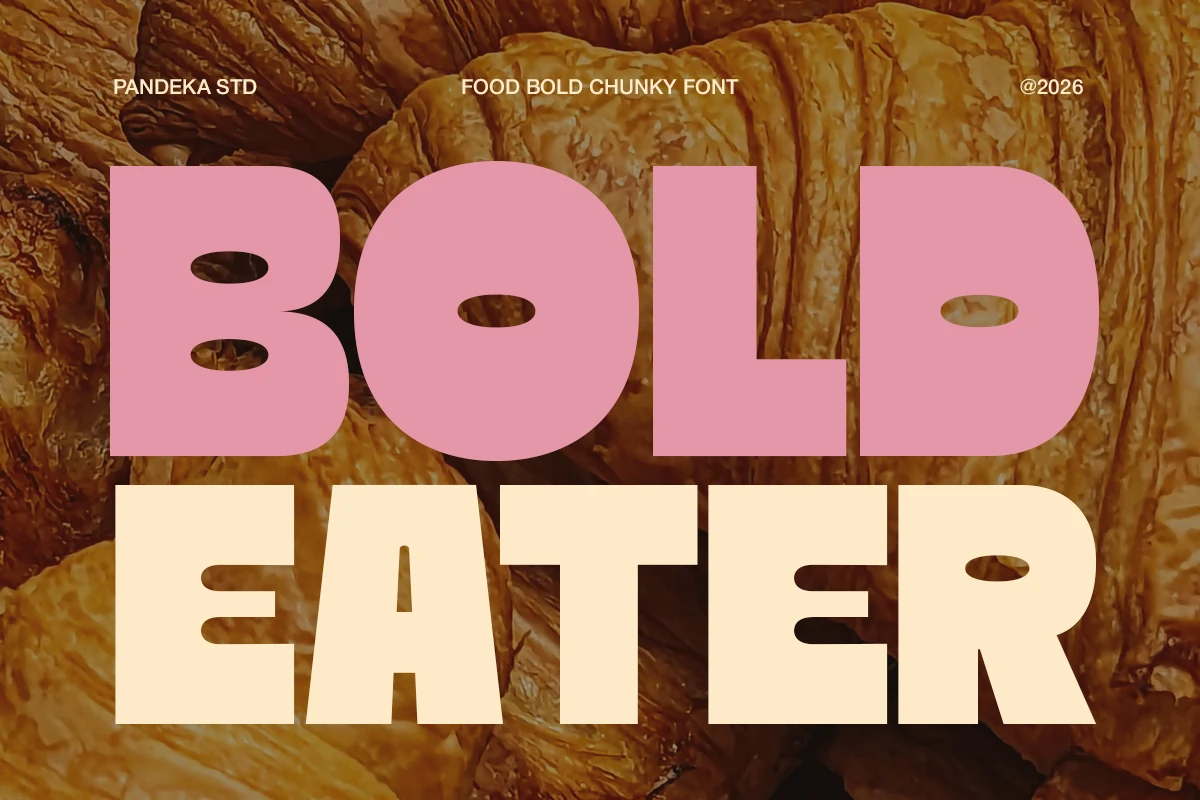
Best For: packaging, product labels, restaurant menus
Bold Eater Font uses extremely thick, wide letters with rounded corners and minimal negative space, giving Cool Bold Fonts a substantial packaging presence. It suits labels and menus, though small counters can close outside large display sizes.
Textured and Retro
Textured and retro options introduce serifs, chipped surfaces, blotches, or brush marks, trading uniform clarity for vintage, industrial, or visibly handmade character.
Bold Brew Font
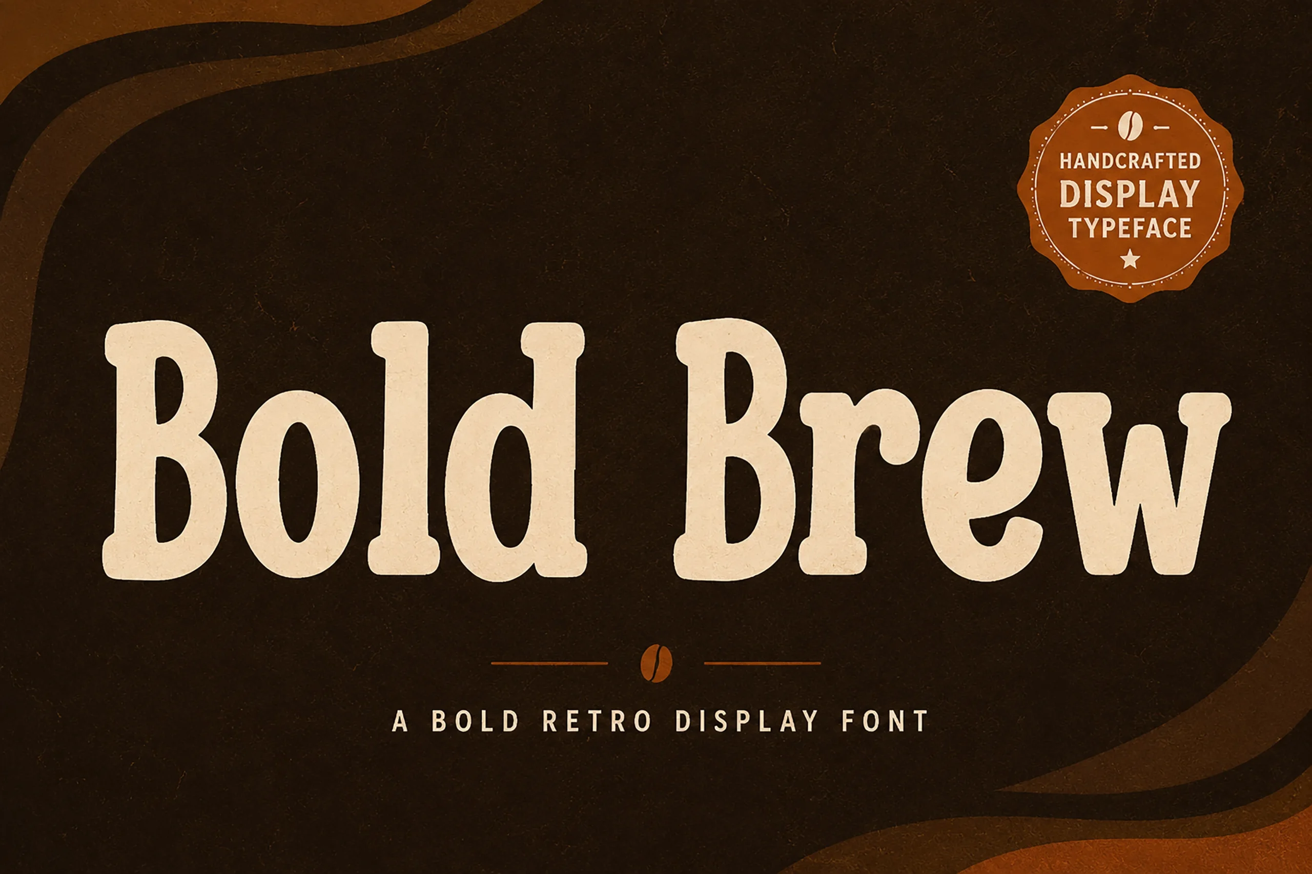
Best For: posters, signage, packaging, product labels
Bold Brew Font combines heavy rounded slab serifs with organic curves and a gently vintage contour. The simplified shapes read clearly on signage, packaging, and labels, while its handcrafted display personality is not suited to body copy.
Christmas to Bold Font
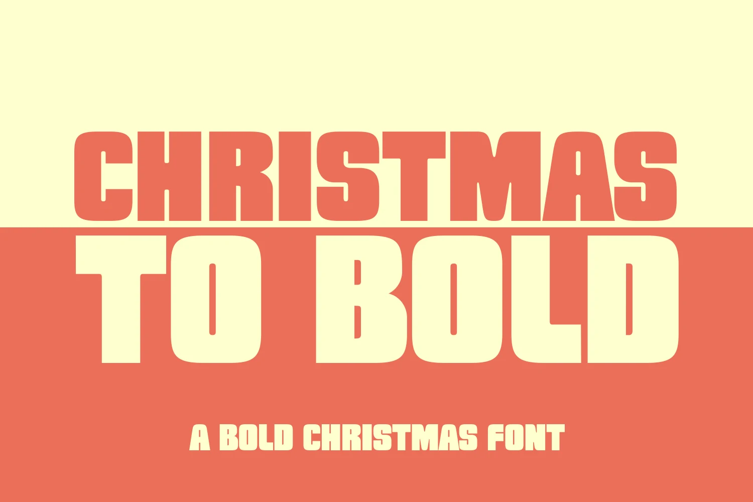
Best For: headlines, posters
Christmas to Bold Font uses condensed, heavy capitals with rounded rectangular terminals, making Cool Bold Fonts in this style useful when seasonal headlines must fit narrow spaces. Minimal interior room, however, weakens reading at small sizes.
Large Bold Font
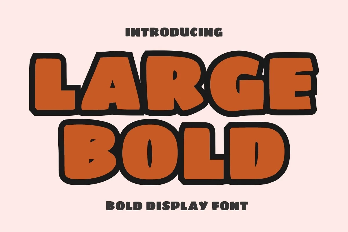
Best For: headlines, posters, logos
Large Bold Font gives wide block letters an irregular hand-drawn outline and a dark outer stroke. That contrast keeps posters, logos, and headlines visible, while the uneven contours become tiring across longer blocks.
Bold Grunge Font
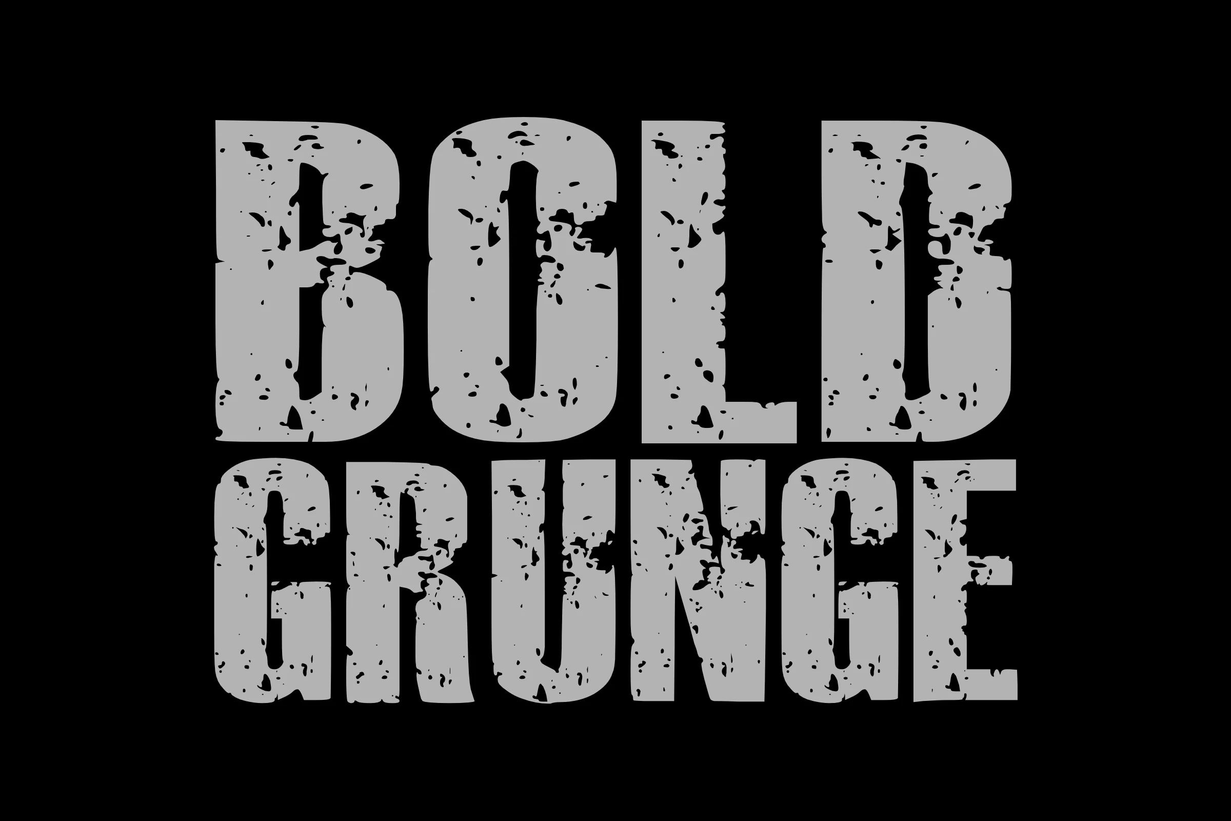
Best For: T-shirts, merch design, display text
Bold Grunge Font overlays squared slab-serif forms with a blotchy, weathered texture. This Cool Bold Fonts treatment directly supports rugged shirts, mugs, and totes, but surface distress interferes with fine character detail at small sizes.
Rich Bold Font
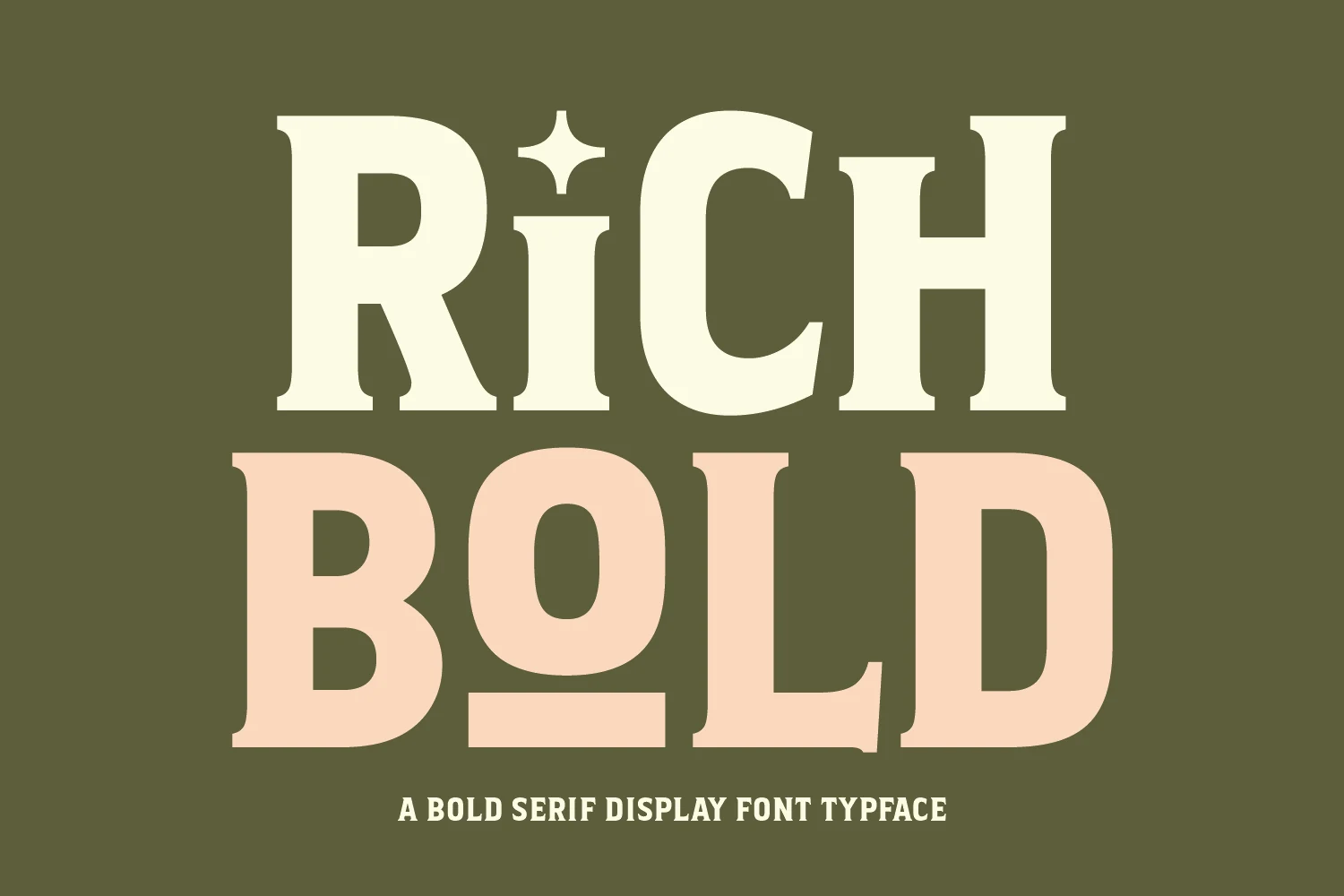
Best For: logos, packaging, headlines
Rich Bold Font brings sharper contrast through bracketed serifs and wide proportions, distinguishing it from low-contrast rounded faces. A star integrated into the i adds branding potential, while the detailed contrast favors headlines over small copy.
Broken Bold Font
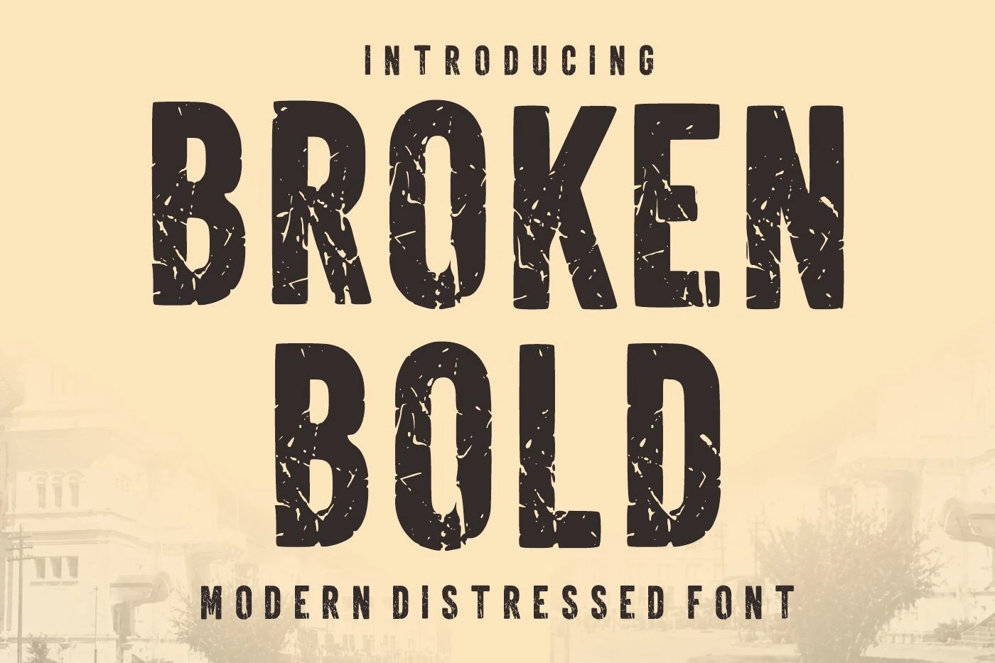
Best For: branding, headlines, posters, signage
Broken Bold Font fits condensed geometric capitals with chipped, cracked distressing, making Cool Bold Fonts practical for narrow signage and branding layouts. Its rough surface erodes character recognition when the design is used at small scale.
Temur Amorak Urban Bold Brush Font
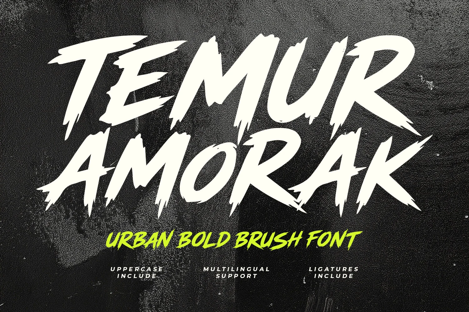
Best For: branding, posters, headlines
Temur Amorak Urban Bold Brush Font combines disconnected brush capitals, dry-brush texture, angular terminals, and high contrast. The aggressive marks suit urban posters and branding, while rough edges and mixed slant make dense text difficult to parse.
How to Choose the Right Font
Choose among these Cool Bold Fonts by matching construction to scale: open counters and stable joins help logos and signage read more reliably, while shadows, inline layers, distress, and brush texture demand larger display sizes. Use rounded faces for approachable projects, geometric blocks for mass, and retro or textured options when surface character matters most.