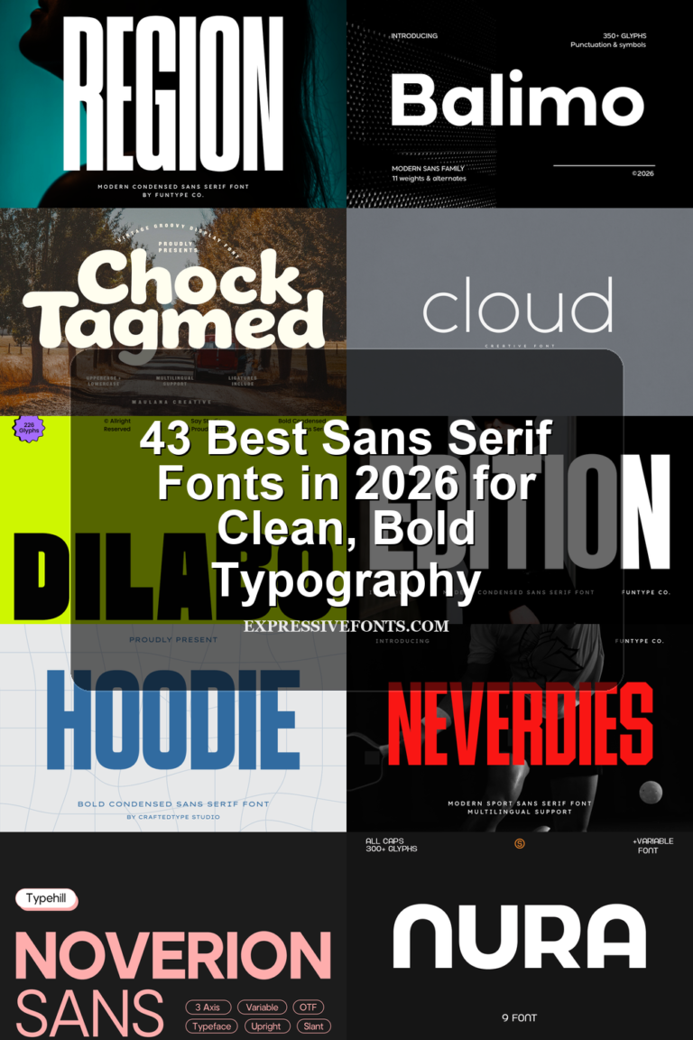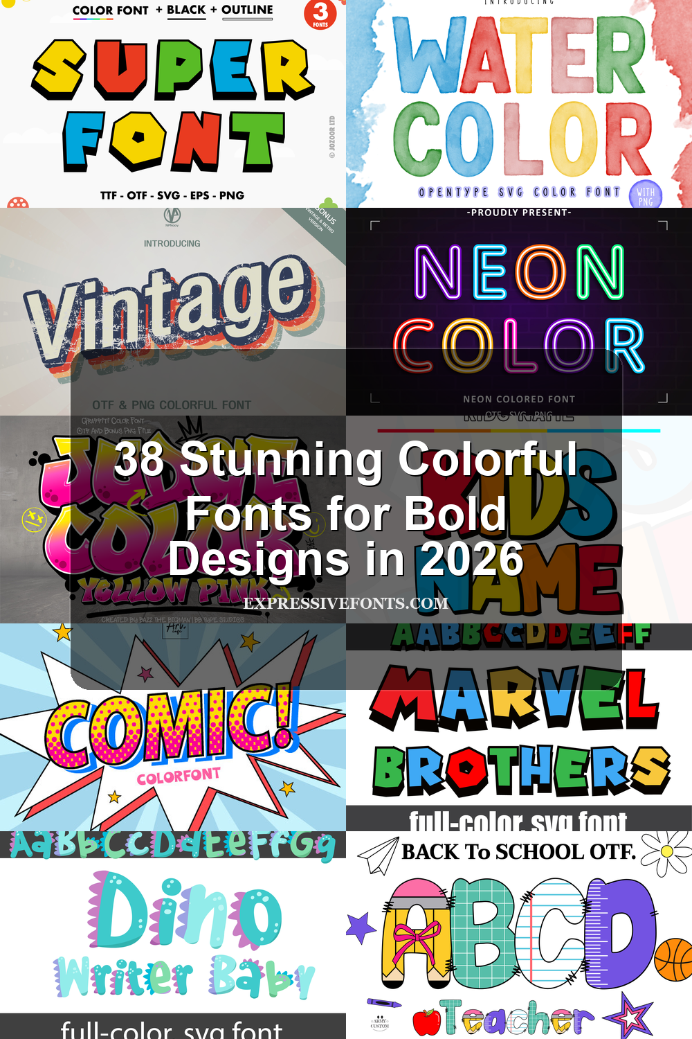
38 Stunning Colorful Fonts for Bold Designs in 2026
Colorful Fonts are useful when typography needs to act as the main visual element, not just support the design. This roundup brings together 38 fonts with bold fills, textured outlines, playful patterns, SVG effects, graffiti shapes, toy-block forms, patriotic details, beach themes, comic energy, and kid-friendly lettering.
Most of these fonts are display-focused, so they work best in short titles, stickers, T-shirts, posters, party graphics, classroom projects, social media headers, and merch-style designs. The main handling rule is simple: keep the wording brief, give the letters enough space, and avoid cluttered backgrounds that fight with the color, shadow, texture, or internal pattern.
Pastel Urban Art Font
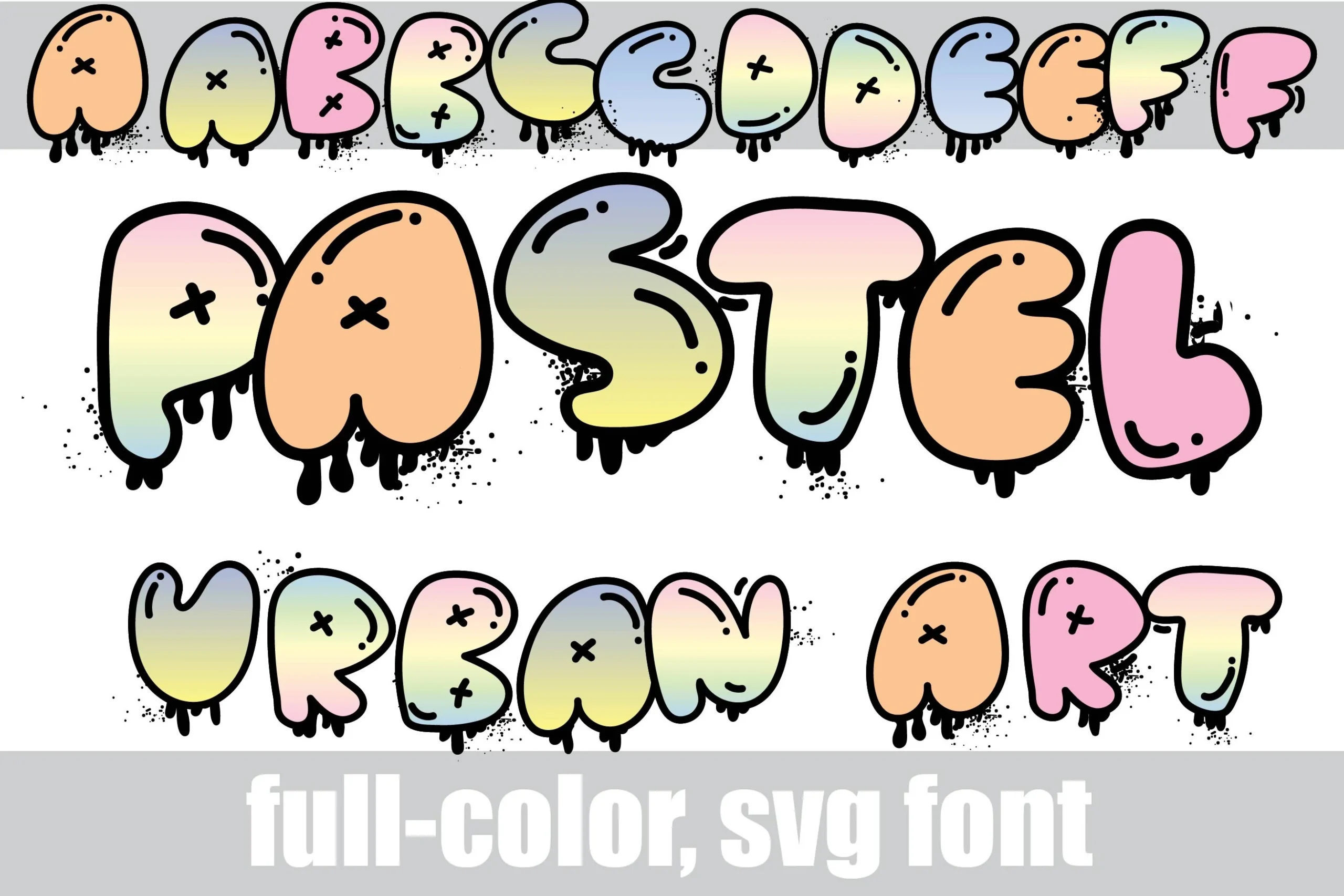
Best For: stickers, T-shirts, social media graphics, headlines
Pastel Urban Art Font turns graffiti bubble lettering into soft candy-colored display type, with thick black outlines, rounded inflated shapes, x-mark details, shiny inner strokes, splatter marks, and heavy dripping edges. The full-color SVG treatment gives the letters an already-built visual texture, so the font reads more like finished lettering than a plain outline alphabet.
Use it where Colorful Fonts need immediate impact: short names, sticker text, streetwear graphics, or social headers. Its wide forms and decorative drips need strong spacing and simple surrounding elements; tight layouts will blur the splatter texture and weaken the cartoon-graffiti rhythm.
Hand Drawn Color Font
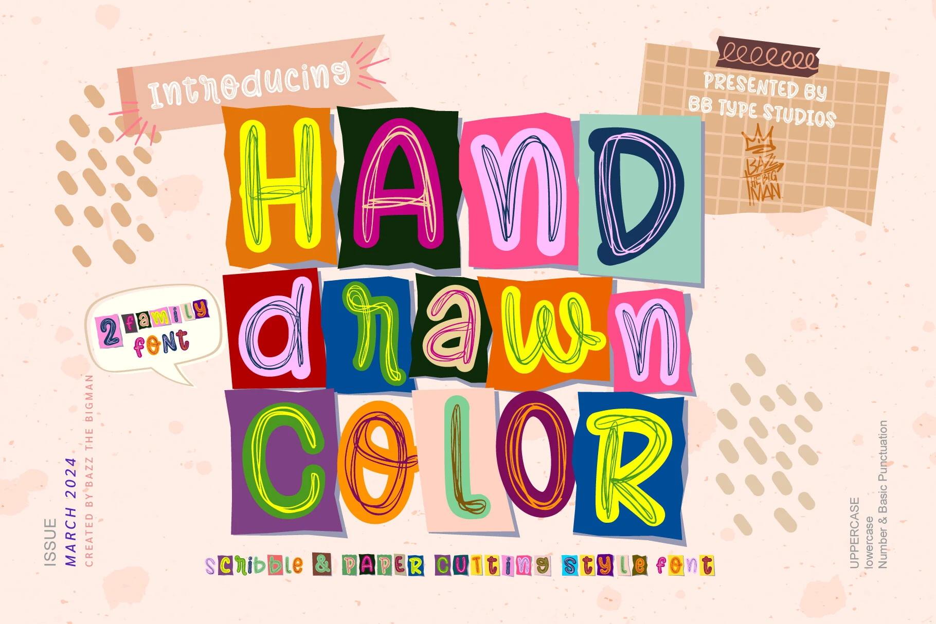
Best For: book covers, posters, invitations, children’s designs
Hand Drawn Color Font has a cheerful cut-paper look, with uneven blocky backgrounds, loose scribbled strokes, and simple letter shapes that feel handmade rather than polished. The mix of tall narrow forms, rounded counters, and sketchy interior lines gives it a lively classroom-collage rhythm that suits playful display work.
If you want Colorful Fonts that feel crafty and informal, this one works best for short titles where the two-color family can do the heavy lifting. Keep the wording brief and leave a bit of spacing between letters or words, so the scribble texture and quirky proportions stay clear instead of turning busy.
Watercolor Font
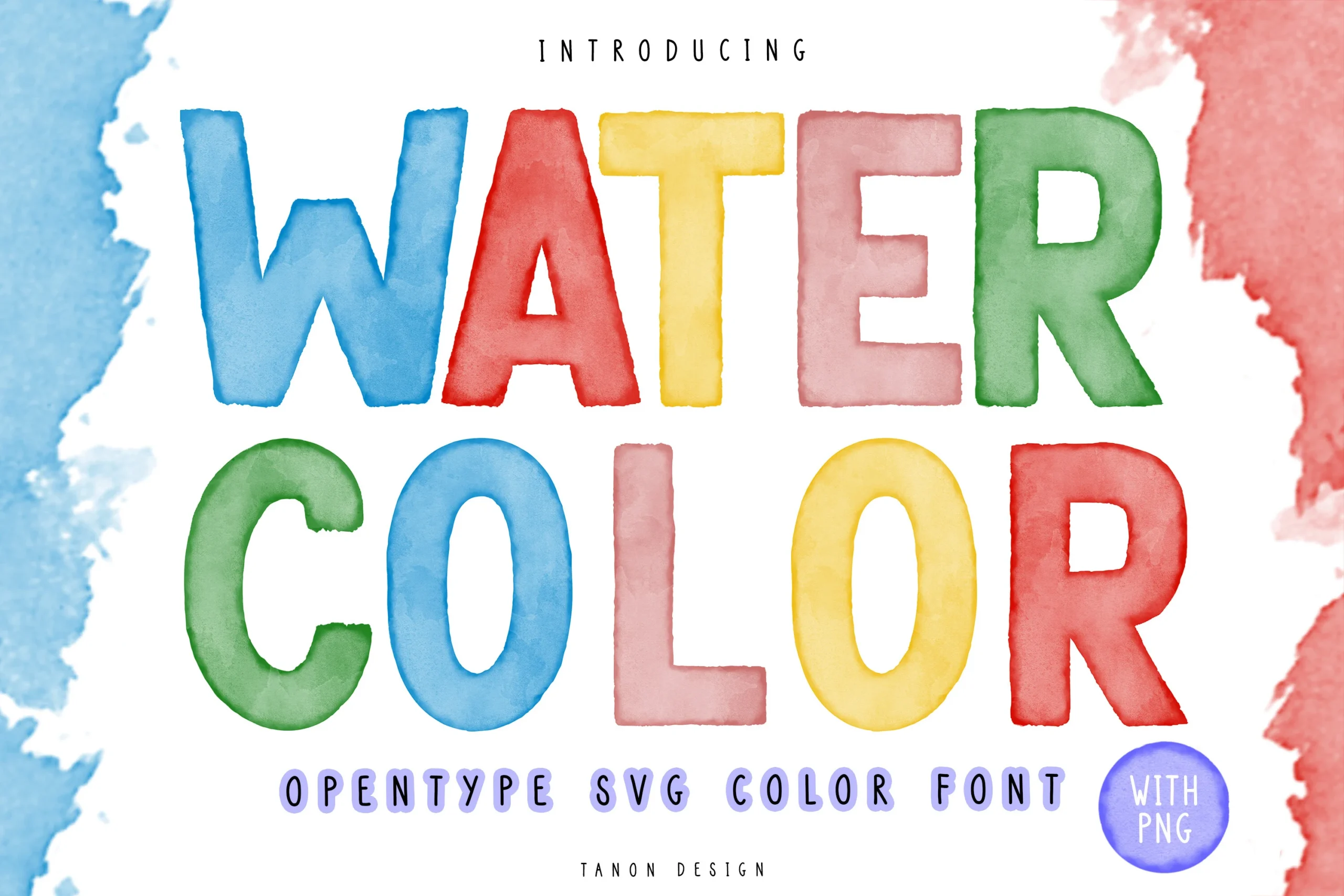
Best For: posters, book covers, headlines, social media graphics
Watercolor Font uses broad uppercase letters with soft brush-stroke edges, visible pigment variation, and a slightly cloudy fill that feels like real paint on paper. The shapes are simple and sturdy, so the texture stays decorative without hurting readability, especially in short titles where the washed color can stay fully visible.
For Colorful Fonts, this one brings a more handcrafted mood than a loud novelty look. It works best at medium to large sizes on clean backgrounds, where the watercolor texture has room to breathe; tight layering or long lines will flatten the painted effect and make the letters feel less distinct.
Army Baseball Font
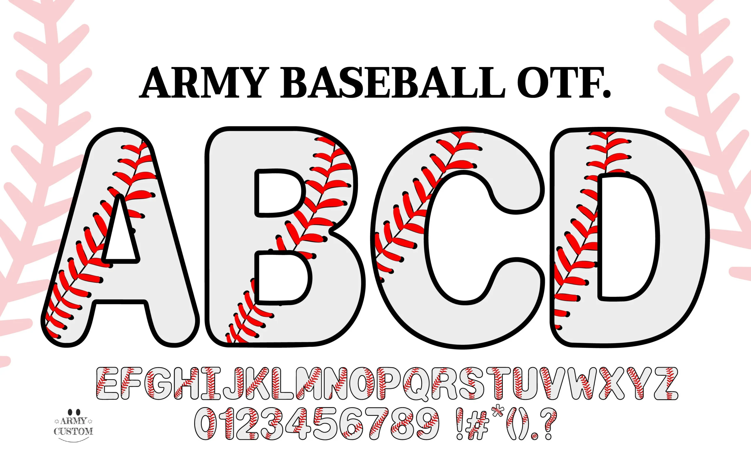
Best For: T-shirts, stickers, posters, merch design
Army Baseball Font leans into a chunky rounded silhouette, then cuts through it with bright red baseball stitching that instantly defines the theme. The wide uppercase forms and black outline keep the letters bold and easy to read, while the stitching adds enough detail to make each character feel like part of a jersey graphic rather than plain display type.
For Colorful Fonts, this one is highly specific in a good way: it gives sports designs a ready-made visual hook. Use it for short names, team slogans, or event headers where the stitching can stay visible; tight tracking or long lines will make that interior detail feel crowded and reduce the impact.
Vintage Font
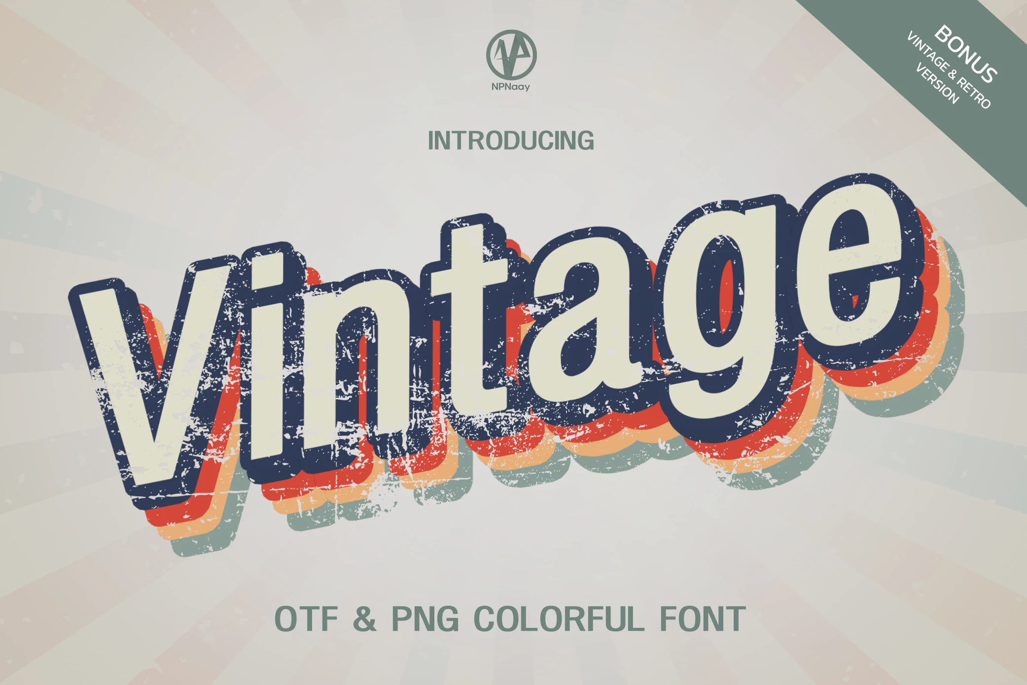
Best For: logos, branding, posters, social media graphics
Vintage Font has the kind of bold retro presence that does the styling for you. The letterforms are thick and rounded, with a cream fill, dark navy outline, and stacked color shadows in warm orange, yellow, and muted mint. That layered build gives the type real depth, while the worn texture keeps it from feeling too clean or digital.
If you’re browsing Colorful Fonts for throwback branding, this one works especially well in short titles where the offset layers stay crisp and readable. Let it lead the hierarchy and keep nearby text simple; the distressed finish and multicolor shadow already create enough movement without competing details.
Joy Boy Font
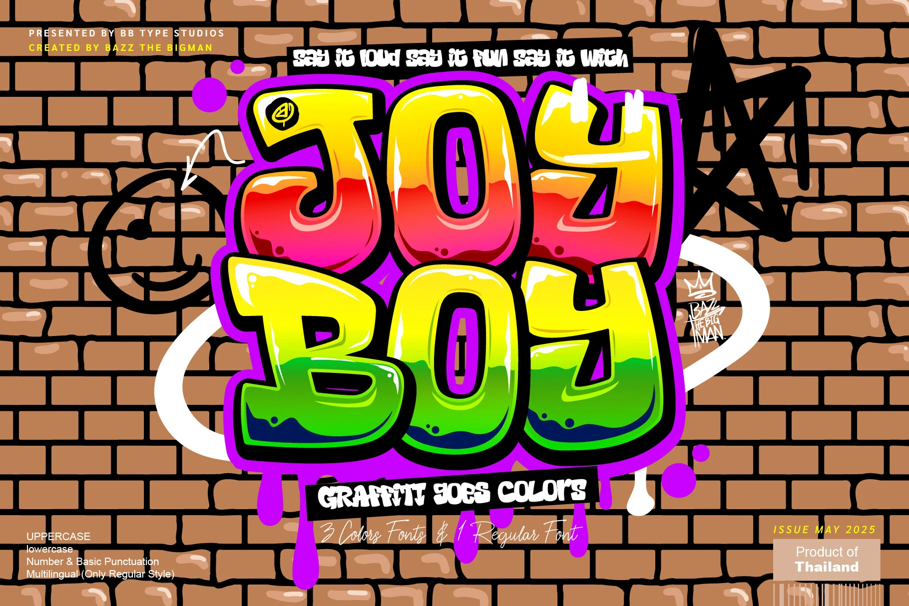
Best For: logos, posters, merch design, social media graphics
Joy Boy Font is a graffiti-heavy color display face with swollen block letters, glossy highlights, sharp black contouring, and neon gradient fills that shift through yellow, red, pink, and green. The thick purple shadow and paint-drip details make the words feel sticker-like, with enough outline contrast to keep short phrases readable.
Use it when Colorful Fonts need a loud urban hook for logos, posters, or music merch. Keep the composition simple around it: the heavy outline, stacked shadows, and drips already create motion, so extra textures or tight tracking will crowd the letter edges and weaken the punch.
Color of Christmas Font
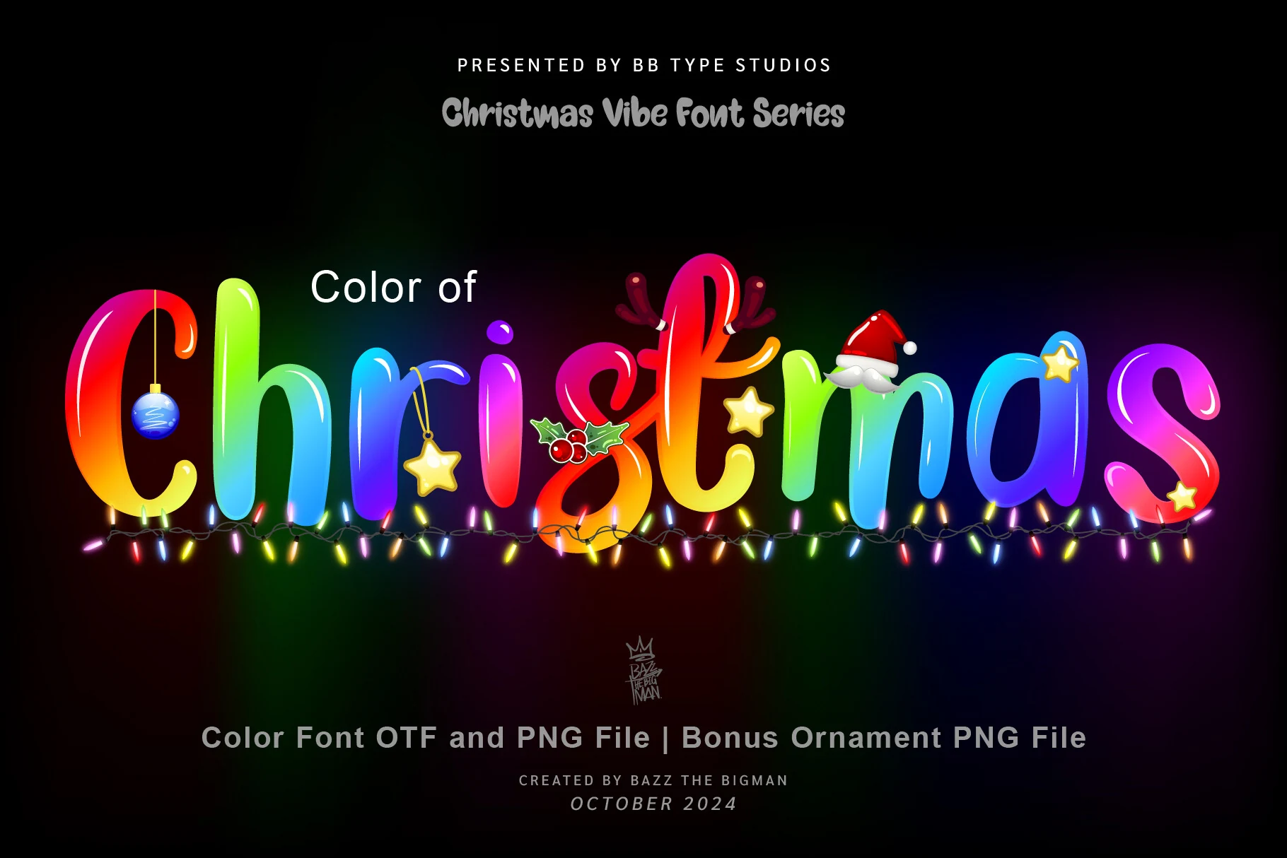
Best For: T-shirts, invitations, stickers, display text
Color of Christmas Font has a plump, rounded display style with glossy highlights and rainbow gradients that make the letters feel almost illuminated. Small festive details like hanging ornaments, holly, stars, antlers, and a Santa hat turn the alphabet into a playful holiday graphic instead of a plain seasonal heading.
If you want Colorful Fonts with a strong Christmas mood, this one works best in short headlines, card fronts, and T-shirt graphics where those details stay visible. Give it room around each word and keep supporting text simple, because tight layouts will crowd the ornaments and weaken the cheerful rhythm.
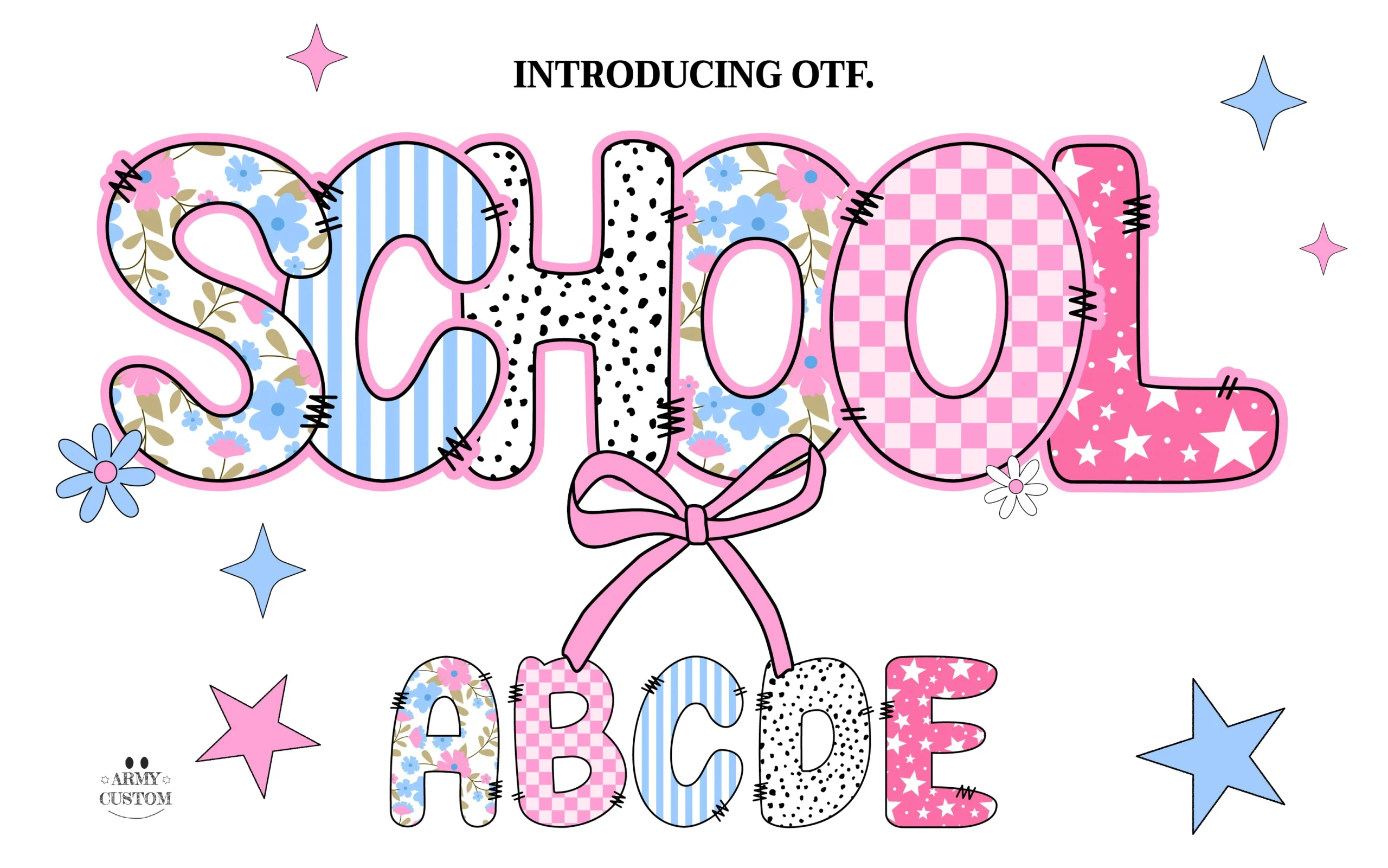
Back to School Font
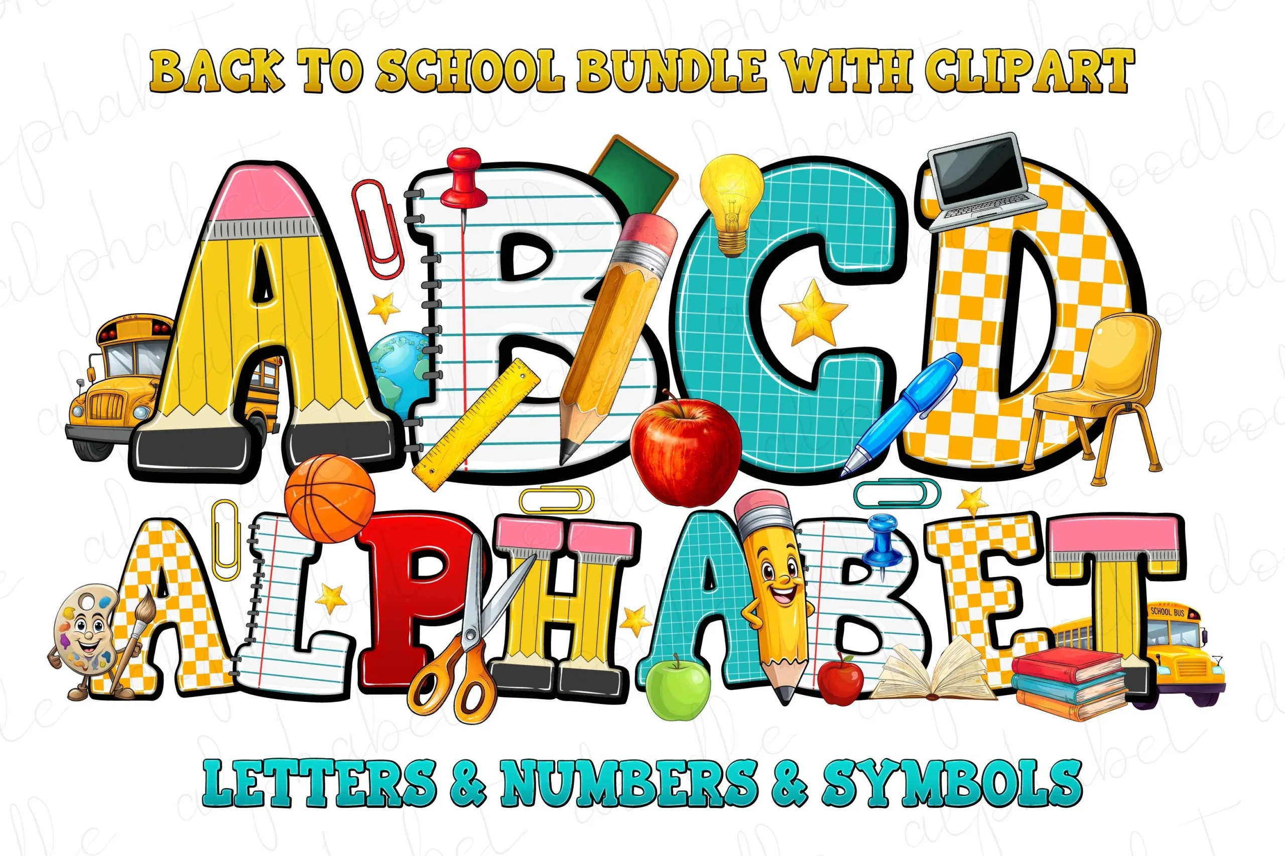
Best For: children’s designs, book covers, posters, display text
Back to School Font builds its personality from classroom materials, turning chunky block letters into pencils, ruled notebook paper, graph grids, and ruler markings. That mix of bold shapes and sketched details gives it a lively handmade rhythm, while the clear proportions keep the alphabet easy to read at headline size.
For Colorful Fonts with a built-in school theme, this one is strongest in short titles where each texture can be seen clearly. Use simple line breaks and avoid crowding the words; giving the letters a bit of space helps the stitched edges, measurement marks, and pencil points stay crisp instead of blending together.
Summer Beach Font
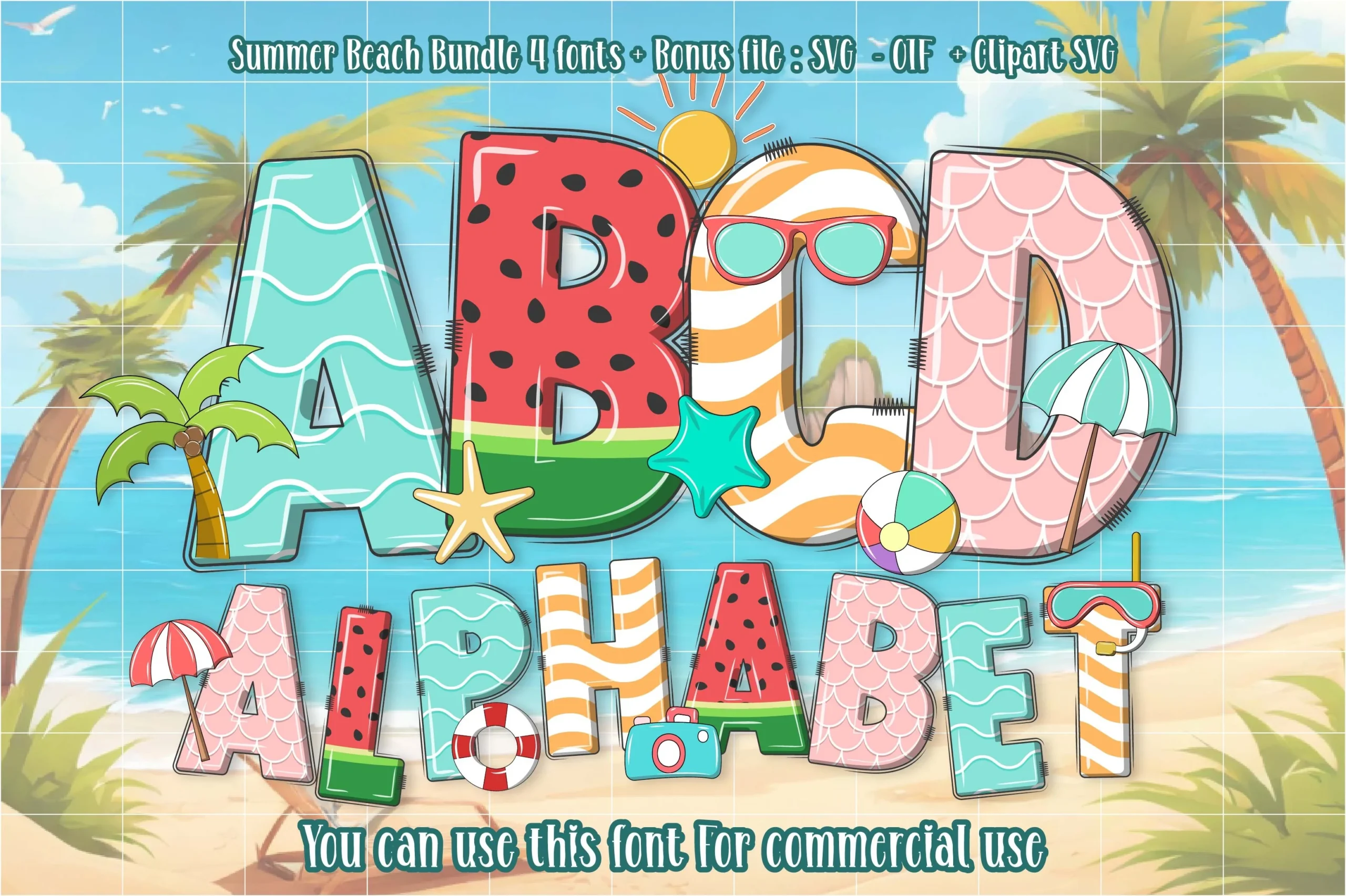
Best For: T-shirts, posters, stickers, children’s designs
Summer Beach Font turns each letter into a little vacation postcard, using chunky rounded shapes filled with wave lines, watermelon seeds, sunny stripes, and shell-like scales. The sketchy outline and stitched edge details keep it playful, while the bold proportions give the alphabet enough weight to hold up in cheerful display layouts.
If you’re exploring Colorful Fonts for summer promos or holiday crafts, this one works best in short titles where the individual patterns stay visible. Keep the hierarchy simple and give the words some breathing room, so the themed textures read clearly instead of blending together in a busy composition.
Wafer Ice Cream Font
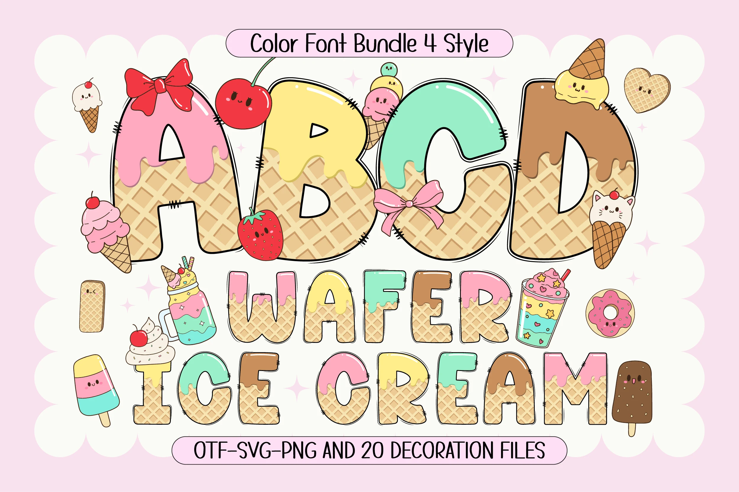
Best For: T-shirts, posters, branding, cute designs
Wafer Ice Cream Font uses chunky outlined letters filled with waffle texture, soft pastel icing, and glossy dessert colors. The rounded shapes feel cute and approachable, while the black sketch-style outline keeps the forms readable even with bows, cherries, cones, and dripping details around the letter edges.
For Colorful Fonts with a sweet craft look, this set is strongest in short names, party titles, and playful product graphics. The 4 color styles and 20 matching clip arts make it easier to build a coordinated layout, but the letter texture needs open spacing so the waffle pattern and icing layers stay clear.
Summer Vibes Font
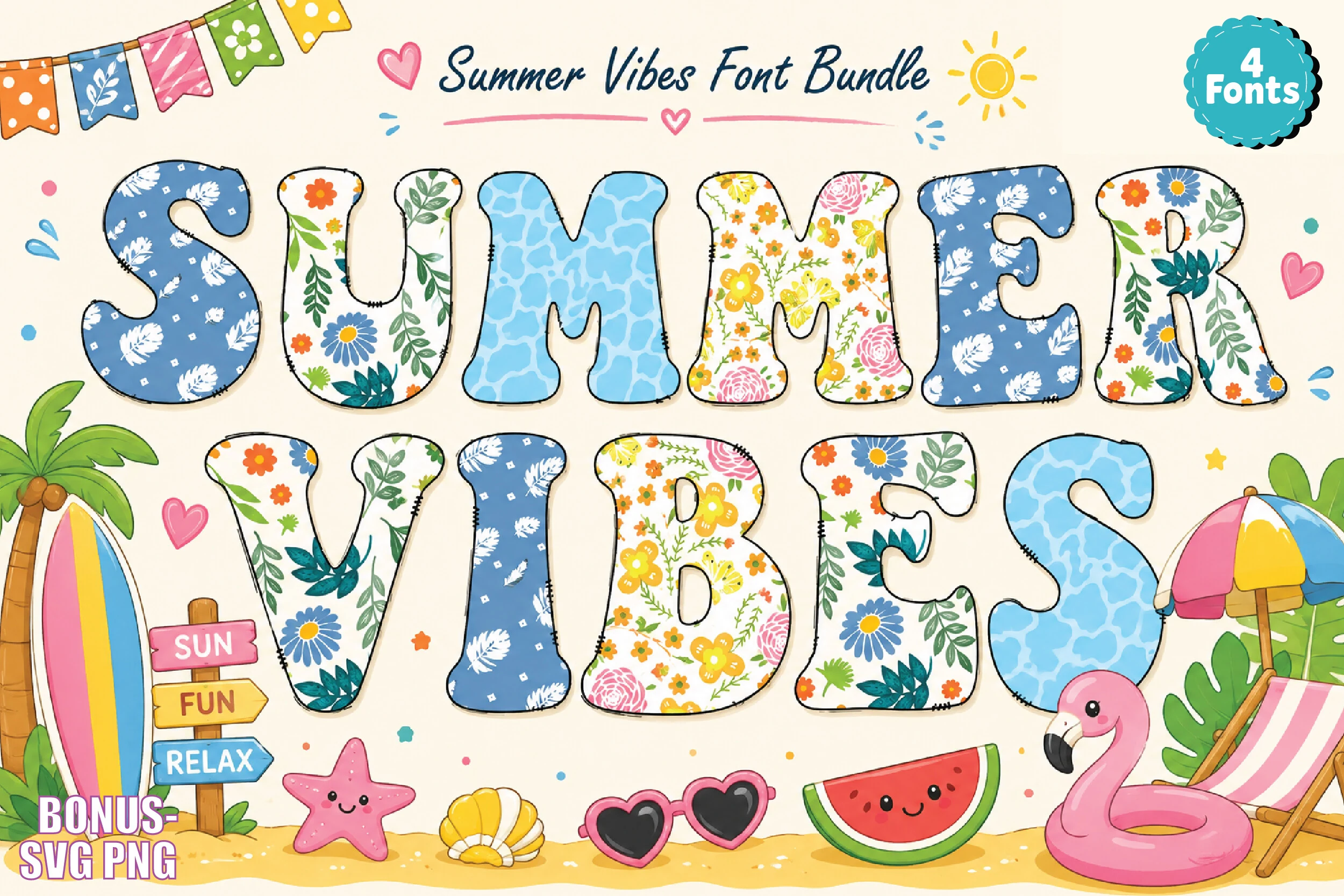
Best For: T-shirts, posters, stickers, fun designs
Summer Vibes Font uses plump rounded letters filled with alternating pool-blue textures, floral prints, and tropical doodle patterns. The soft curves and slightly sketchy outline keep it friendly, while the mix of repeating motifs gives each word a scrapbook-like summer feel instead of a flat solid-color look.
If you’re browsing Colorful Fonts for beach promos or party graphics, this one works best in short headlines where each pattern stays visible. Give the letters a little space and keep nearby copy plain; the busy fills already carry the mood, so cleaner supporting text helps the wordmark stay bright and readable.
Pastel Stripes and Dots Font
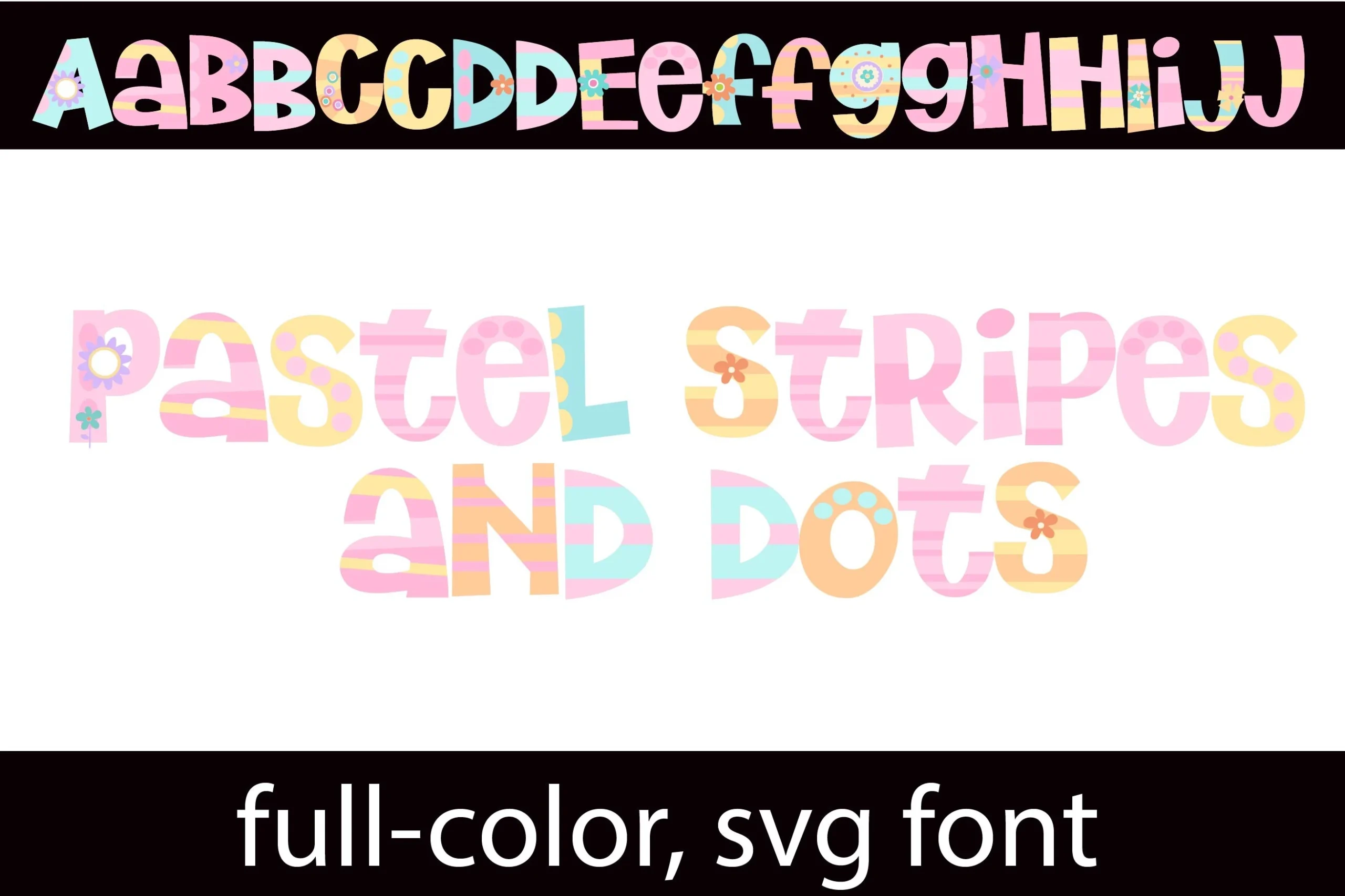
Best For: children’s designs, invitations, stickers, cute designs
Pastel Stripes and Dots Font uses chunky sans serif letters with rounded corners, playful proportions, and a cheerful mix of candy stripes, soft polka dots, and tiny daisy flourishes. The full-color SVG treatment gives each character its own pastel personality, so the alphabet feels lively without losing clarity in short display words.
If you’re picking Colorful Fonts for children’s designs or sweet event pieces, this one works best when you let the surface pattern do the styling. Use it at display size with a little breathing room and plain supporting text; the bold shapes read well, but tighter layouts can make the dots and floral accents compete.
Spiderweb Army Font
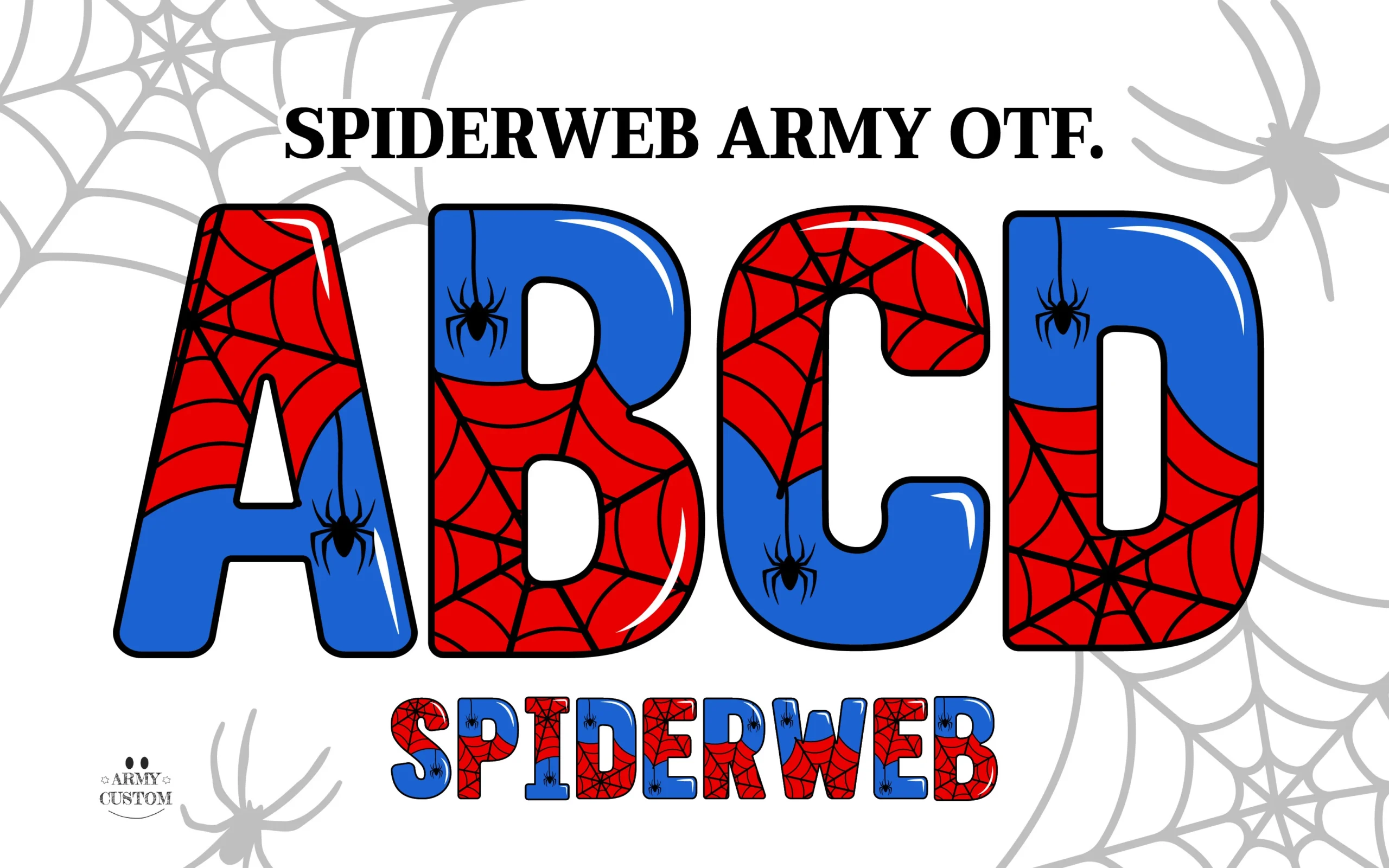
Best For: T-shirts, posters, stickers, merch design
Spiderweb Army Font uses heavy rounded block letters split into vivid red and blue sections, then layered with black web lines, tiny spider icons, and glossy white highlights. The broad shapes keep it readable, while the web pattern gives the alphabet a comic-book, action-driven feel that looks built for bold display text.
Within Colorful Fonts, this one works best when you want instant theme recognition for party graphics or apparel. Keep it to short words and strong hierarchy: the internal web detail and high-contrast palette already carry plenty of energy, so simpler supporting text helps the letterforms stay sharp.
Neon Colored Font
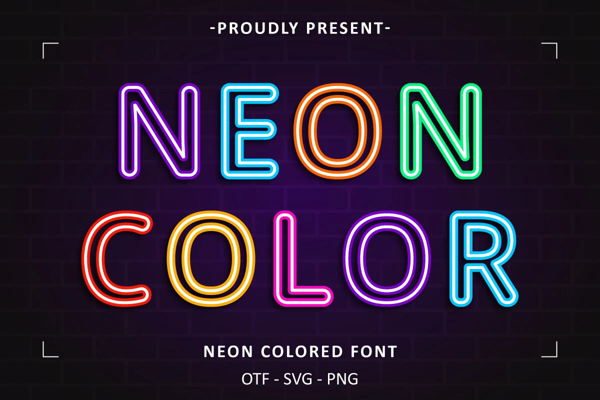
Best For: signage, posters, social media graphics, logos
Neon Colored Font is built around clean rounded sans shapes that mimic bent neon tubing, with double-line strokes and bright glow-like color outlining each letter. The even weight and open counters keep the forms clear, while the vivid blue, orange, pink, green, and red palette gives the alphabet the crisp punch of lit storefront signage.
If you’re sorting through Colorful Fonts for nightlife branding or event graphics, this one works best on dark backgrounds where the outline effect can read properly. Use it for short headlines and keep surrounding text restrained; generous spacing and simple layouts help the neon illusion stay bright instead of getting lost in visual noise.
American Coquette Font
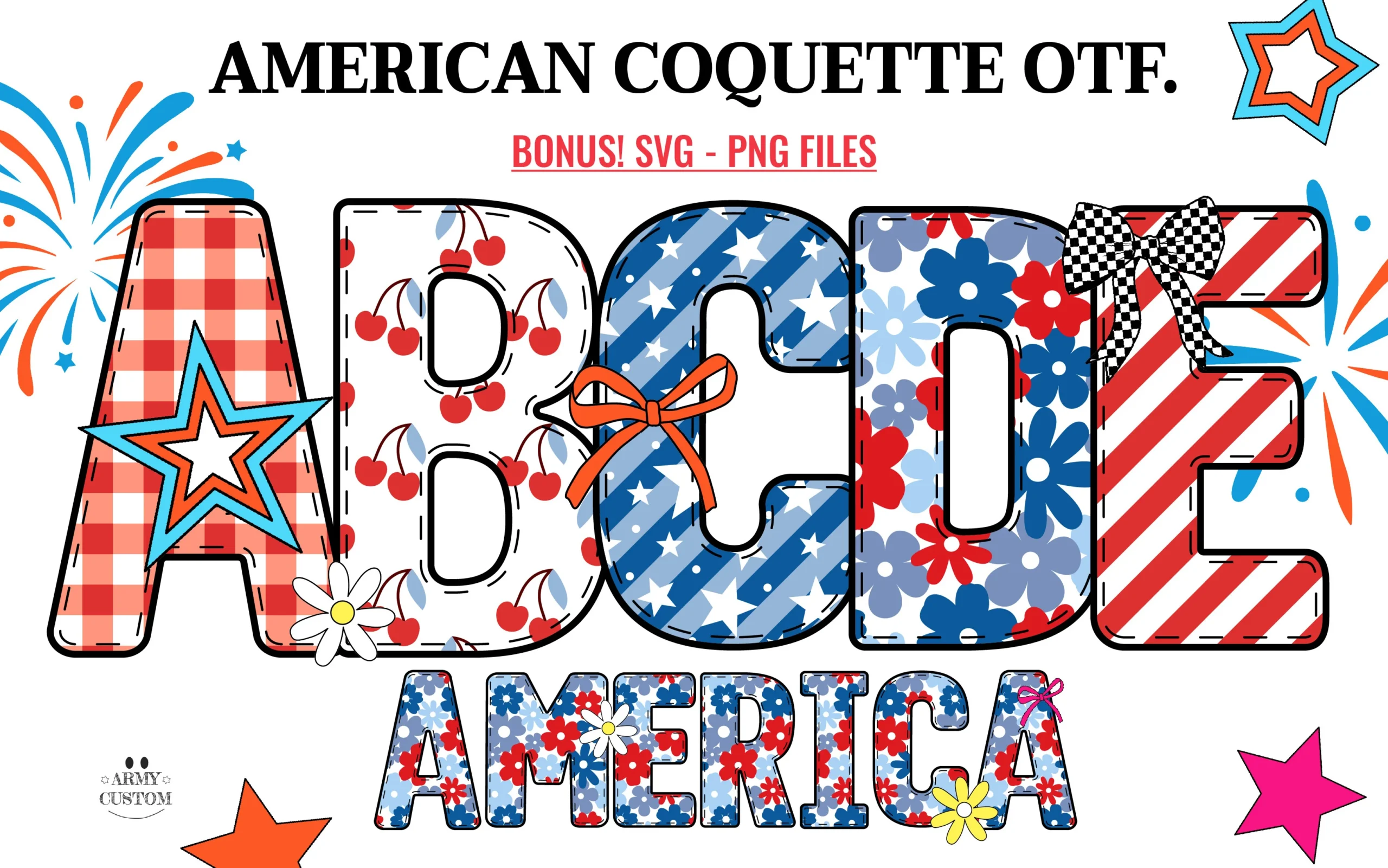
Best For: T-shirts, stickers, posters, display text
American Coquette Font turns bold rounded block letters into a bright patriotic mix of gingham, cherries, stars, diagonal stripes, florals, and bow details. The thick black outline keeps the alphabet readable, while the red, white, and blue patterns give each character a different decorative role inside the same lively display system.
For Colorful Fonts with a festive American theme, this one fits short names, celebration graphics, and apparel headlines. Use generous spacing and a simple background so the inner patterns stay distinct; tight tracking or extra decorative layers will compete with the cherries, stars, and floral fills.
Super Font
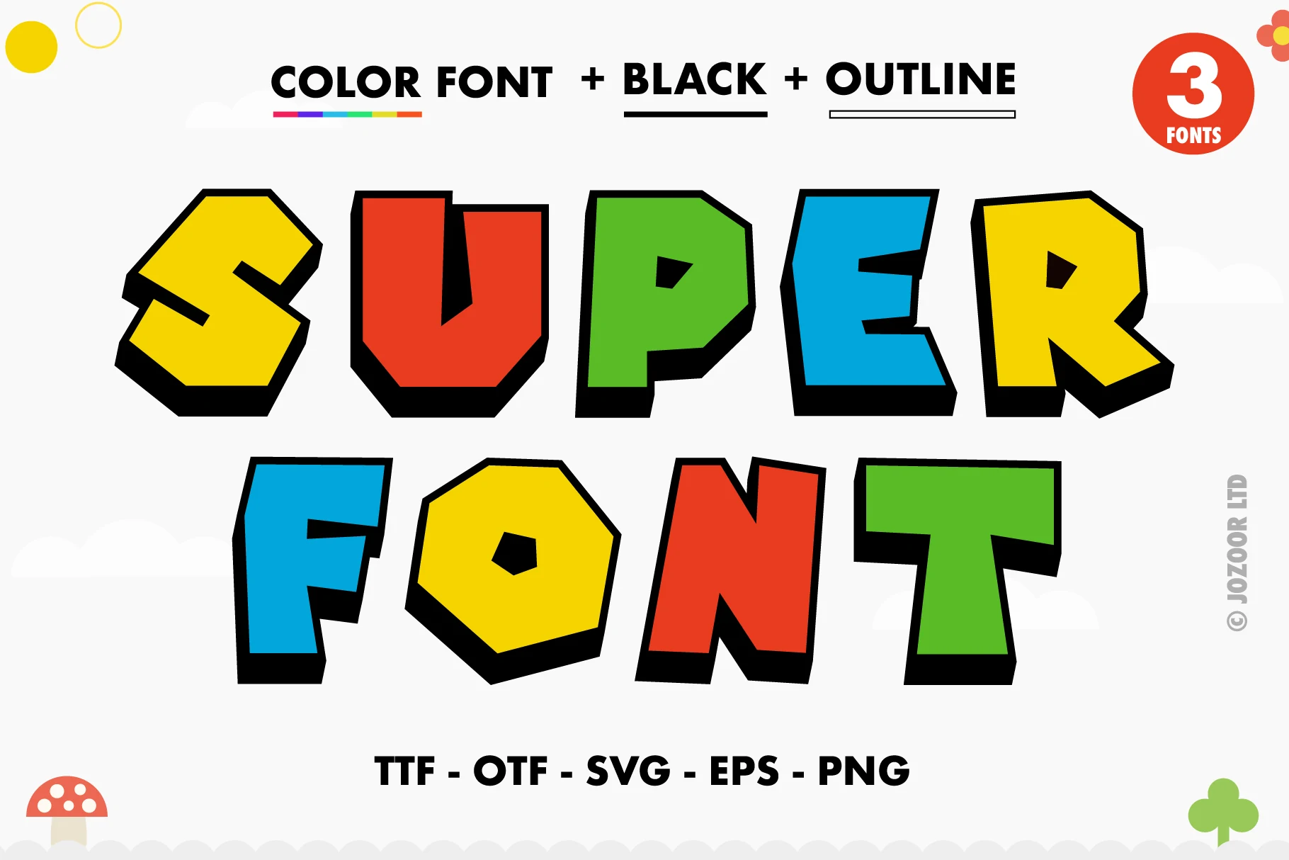
Best For: children’s designs, bold designs, eye-catching designs, fun designs
Super Font uses heavy cartoon block letters with uneven angles, thick black shadowing, and high-saturation fills that make each word feel loud and game-like. In a roundup of Colorful Fonts, it sits firmly on the playful display side rather than the decorative script side.
The chunky proportions work best when the word count stays short, because the heavy outline and tilted shapes need enough spacing to avoid visual crowding. Its PUA encoding helps access the included glyphs and swashes, which is useful when building punchy titles, kids’ graphics, stickers, or bright product labels with extra character.
The Beach Font
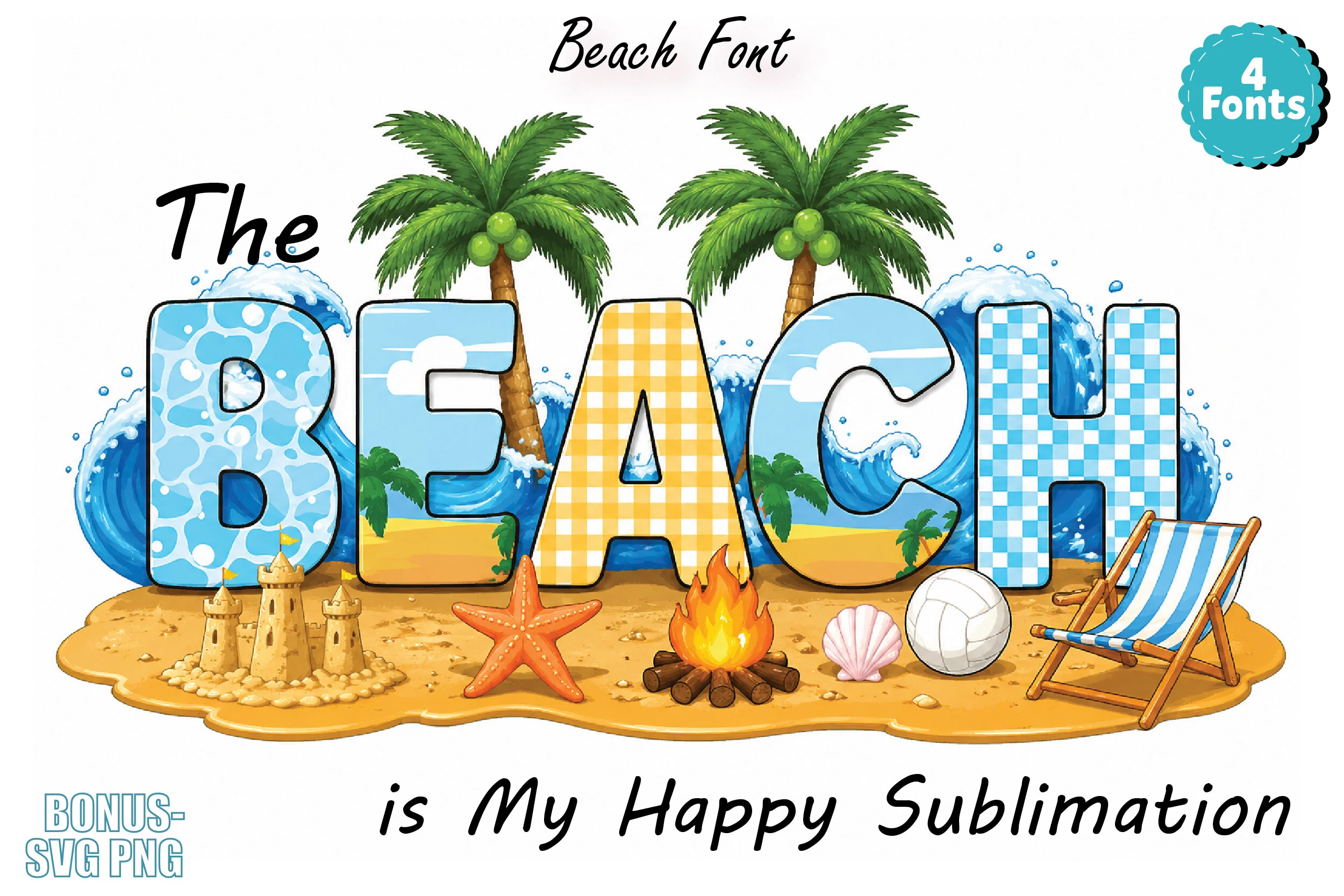
Best For: T-shirts, stickers, fun designs, eye-catching designs
The Beach Font uses broad display capitals with thick outlines and playful scene-filled interiors, from foamy water and sky bands to gingham and checker textures. In a roundup of Colorful Fonts, it stands out for its postcard-like summer mood and chunky proportions, which keep the word readable while still feeling decorative.
This is a display-first choice, so it performs best in short titles, tags, or merch graphics where each letter has space to show its detail. Let it carry the visual energy, then pair it with plain supporting text and open spacing so the beach imagery does not crowd the composition.
Comic Jam Font
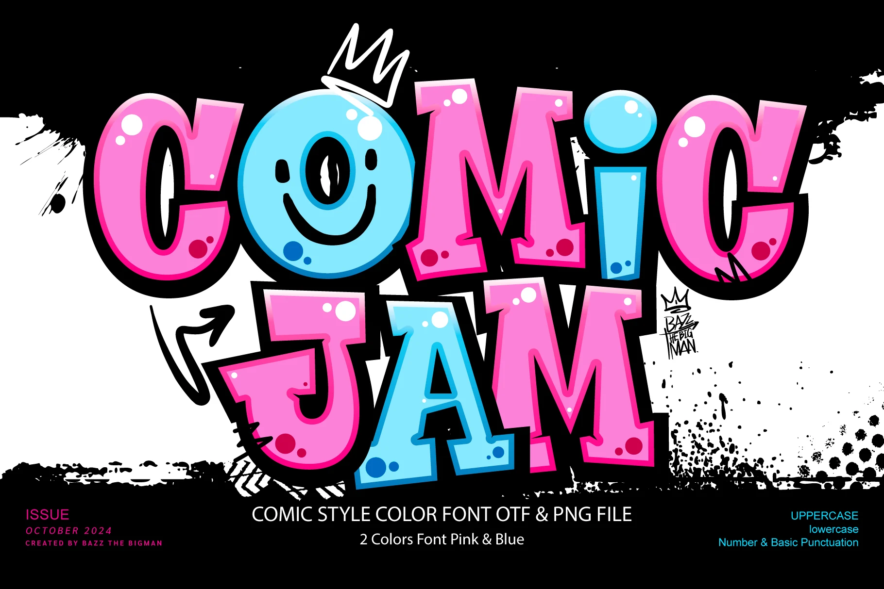
Best For: posters, headlines, children’s designs, fun designs
Comic Jam Font has a loud comic-book presence, with chunky rounded capitals, glossy highlights, and a candy-bright pink-and-blue palette pushed forward by a thick black outline. Within Colorful Fonts, it reads as bold and mischievous rather than polished, which gives titles instant personality.
The wide shapes hold up best in short words, where the heavy contour and deep shadow can stay crisp instead of crowding the line. Use it as the main headline and keep supporting text simple and smaller, so the playful rhythm, bright contrast, and cartoon energy do the work.
Popper Sparkle Font
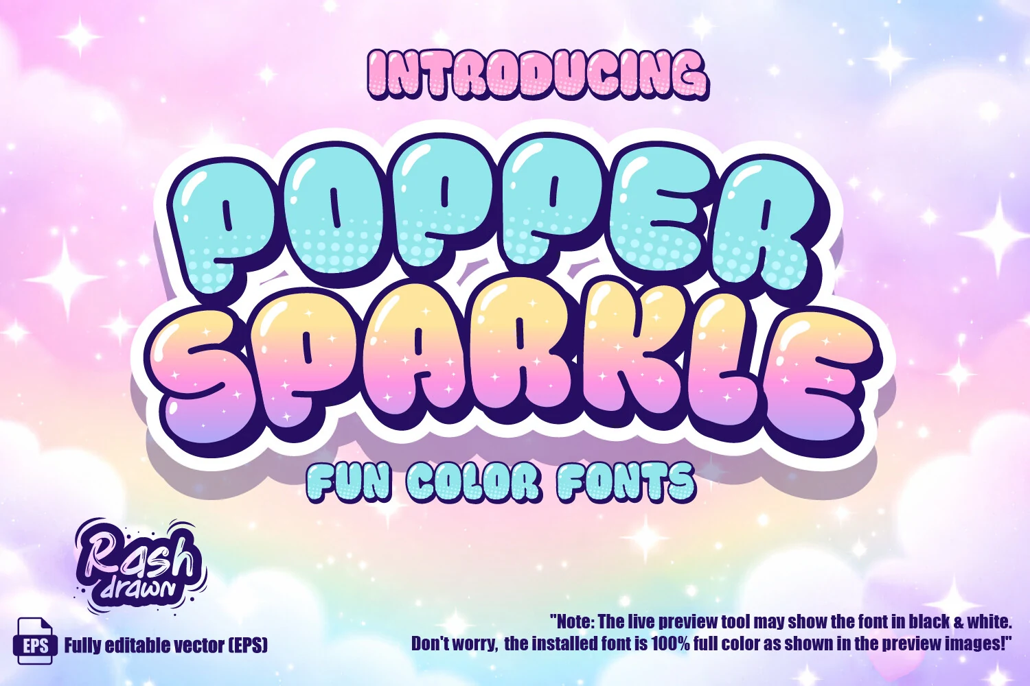
Best For: stickers, children’s designs, fun designs, eye-catching designs
Popper Sparkle Font is built from inflated bubble letters with glossy highlights, soft dotted texture, and thick dark outlines that make the pastel fills feel more defined. Its mix of blue, yellow, pink, and purple places it firmly among Colorful Fonts with a candy-like, magical display tone.
The rounded shapes are friendly but visually busy, so they work best as large title words rather than long lines. The star-studded gradients and patterned interiors give the lettering enough surface detail for stickers, kid-focused graphics, and playful headers, while generous spacing keeps the outlines from merging.
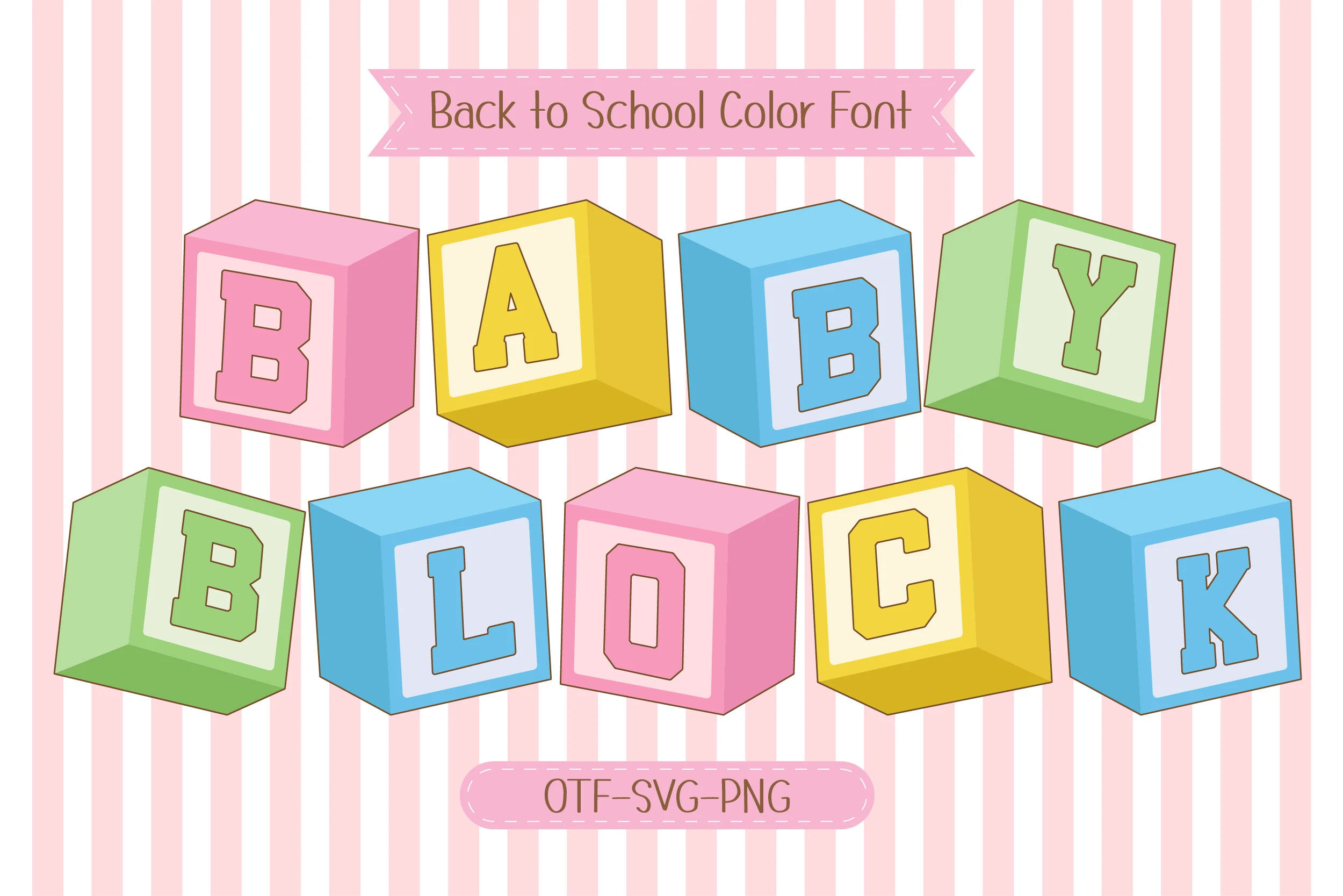
Baby Blocks Font
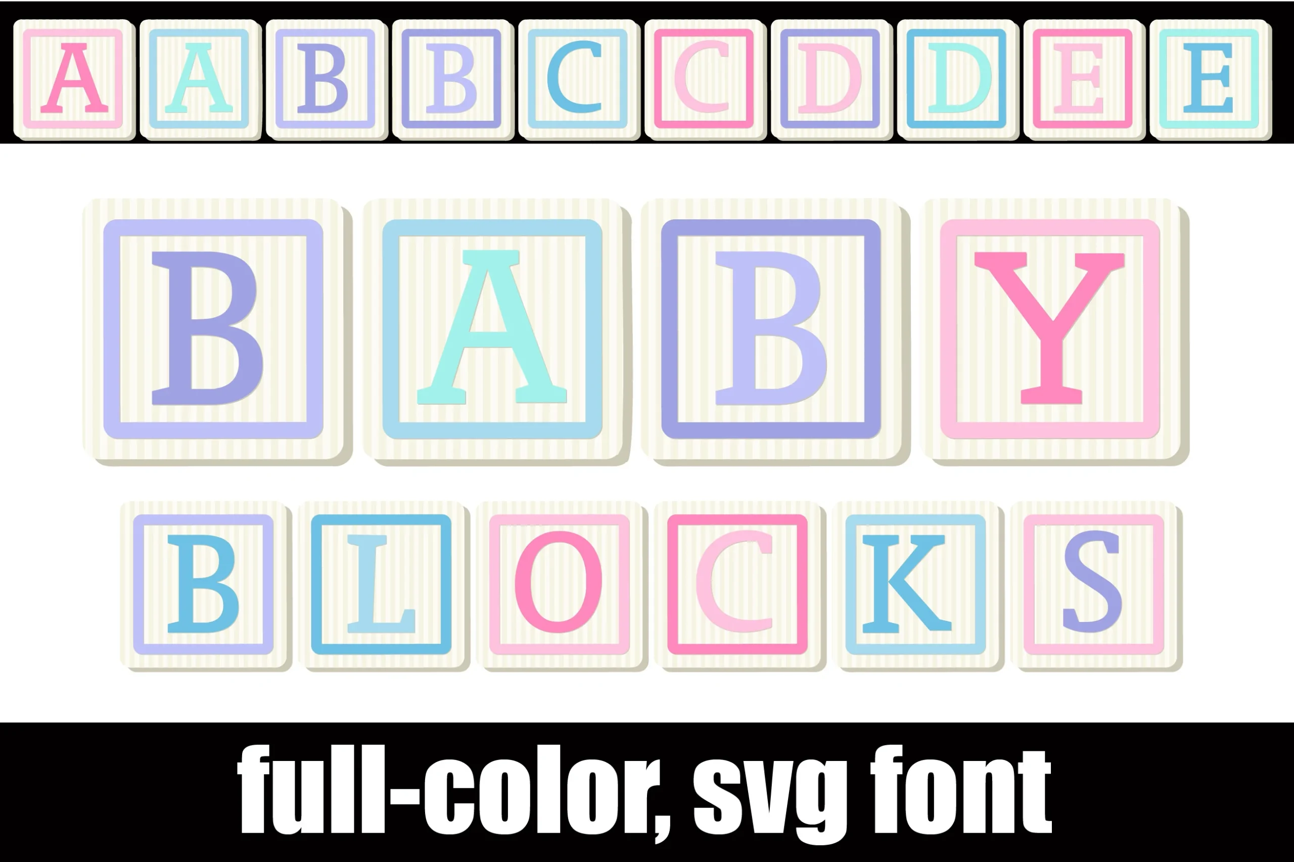
Best For: children’s designs, invitations, wall art, playful designs
Baby Blocks Font turns each letter into a nursery block, with slab-serif capitals framed inside cream squares, soft pinstripe texture, and pastel borders in pink, lavender, and sky blue. In a Colorful Fonts roundup, it feels gentle and nostalgic rather than flashy, with the 3D shading giving every character a toy-like presence.
The SVG construction keeps that dimensional block effect intact, which matters when you want the letters to read like real objects instead of flat type. It works especially well for short names and single-word titles, where a little extra spacing helps each block stay distinct and the handcrafted rhythm stays clear.
Sugar Polka Dot Font
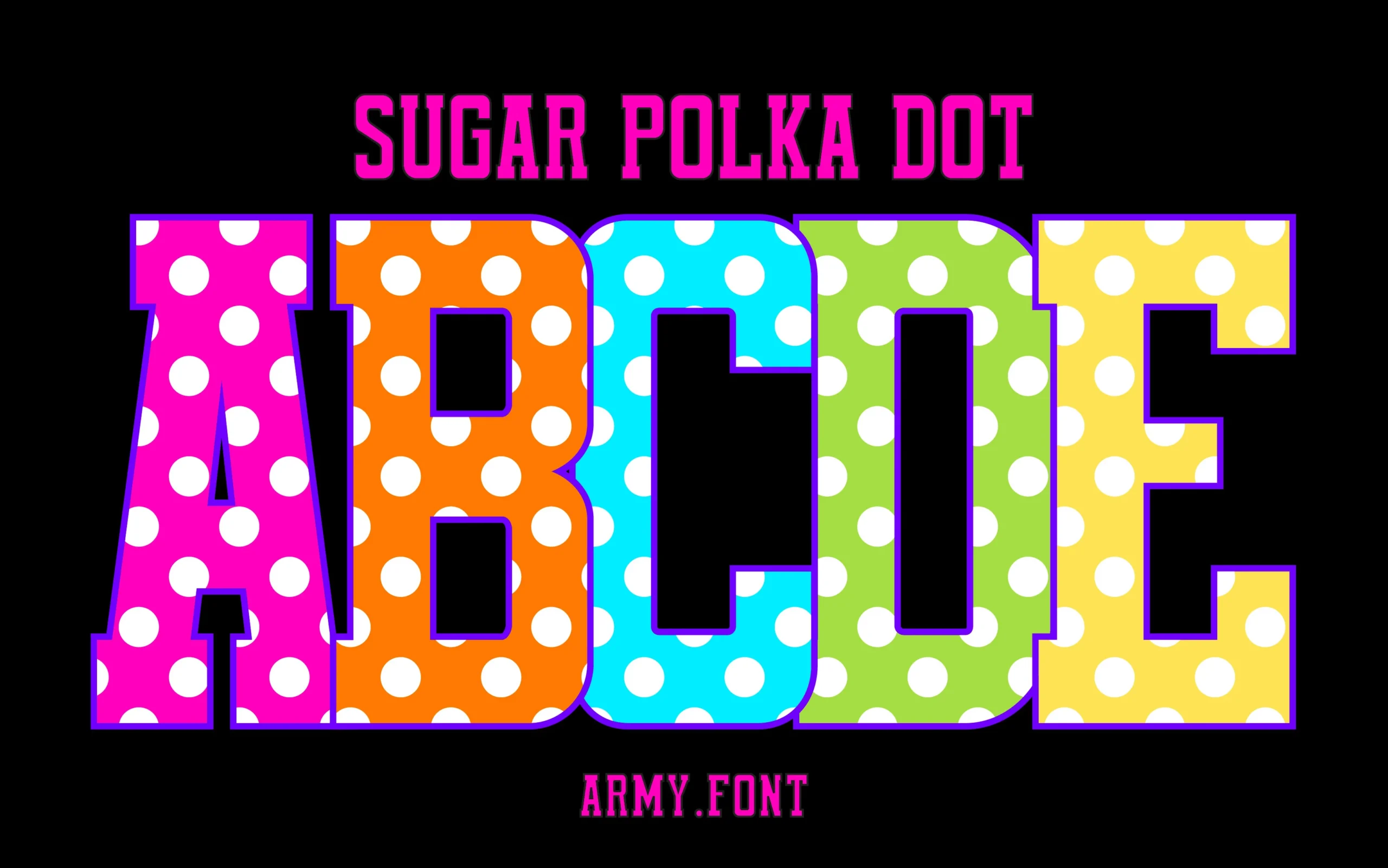
Best For: children’s designs, bold designs, eye-catching designs, fun designs
Sugar Polka Dot Font uses oversized block capitals filled with hot pink, orange, cyan, lime, and yellow, then repeats large white dots across each face. A purple edge and black drop shadow sharpen the letter boundaries, giving it a loud classroom-poster feel inside a Colorful Fonts roundup.
The tall, heavy letterforms are readable because the interiors stay simple despite the pattern. Keep it to short words, names, labels, or display headers; longer lines will turn crowded quickly, while generous spacing lets the bright color blocks and polka-dot rhythm stay clean.
Bubble Rainbow Scribble Font
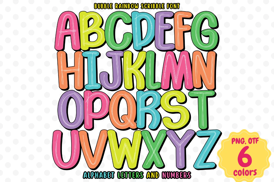
Best For: children’s designs, invitations, posters, fun designs
Bubble Rainbow Scribble Font has plump handwritten letterforms, a cheerful rainbow palette, and sketchy interior lines that keep the shapes from feeling too slick. In a roundup of Colorful Fonts, it reads as bright, friendly, and kid-focused, with rounded proportions that give each letter a soft, bouncy rhythm.
The thick black edging helps the colors stay clear, so it holds up well in posters, party pieces, and short headings where you want instant energy. Keep the wording brief and give the letters a little breathing room, because the chunky shapes and scribble texture do their best work when each character stays easy to spot.
Judge Color Yellow Pink Font
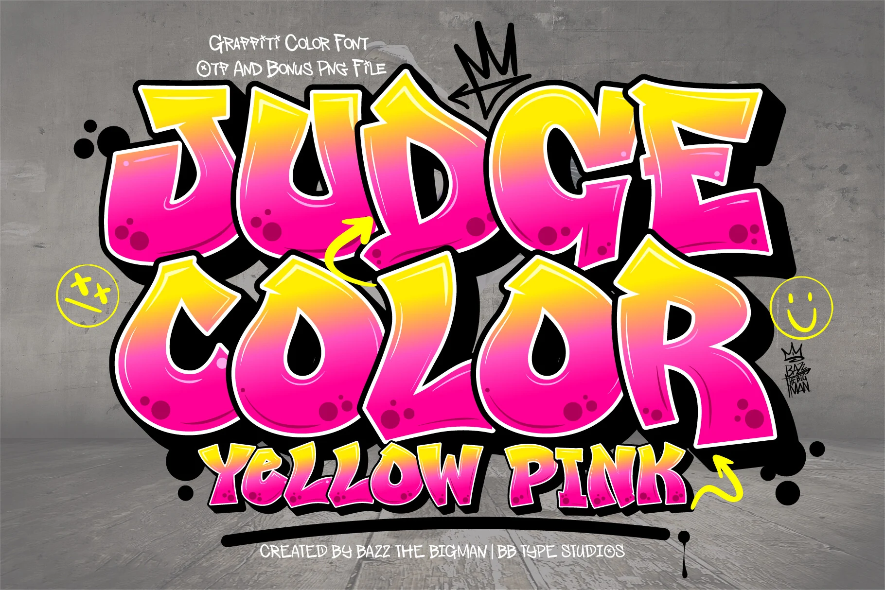
Best For: posters, social media graphics, T-shirts, eye-catching designs
Judge Color Yellow Pink Font pushes a graffiti look with swollen letterforms, sharp bends, and a loud yellow-to-pink gradient wrapped in thick white and black edging. In a Colorful Fonts roundup, it lands on the bold urban side, with the deep shadow and glossy highlights giving every word a sprayed-wall kind of punch.
The broad shapes work best in short, high-impact lines where the gradient and outline stay clean at a glance. Let it carry the headline, then keep the supporting type simpler and tighter so the rebellious rhythm, contrast, and street-style energy stay in control.
Kids Name Font
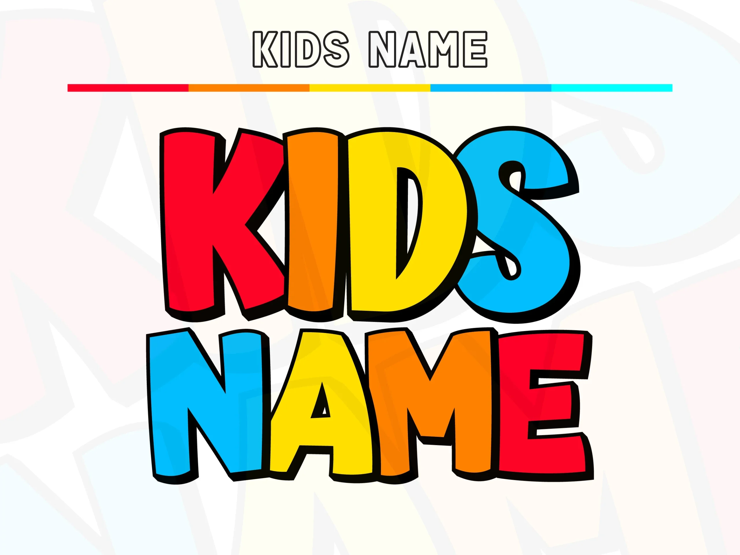
Best For: children’s designs, display text, headlines, fun designs
Kids Name Font uses chunky rounded capitals, deep counters, and a punchy black outline that gives each letter a sticker-like edge. The bright red, orange, yellow, and blue fills make it a strong fit for Colorful Fonts, while the simple shapes keep the look cheerful rather than busy.
Its generous proportions help short names read clearly, especially in stacked layouts like the preview. The offset shadow adds extra pop, so you can keep backgrounds simple and let the lettering carry the design; a little spacing between words is enough to keep the bold forms from crowding each other.
Bubble Rainbow Font
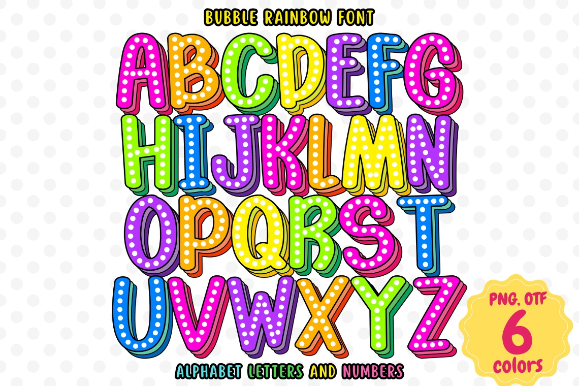
Best For: children’s designs, invitations, posters, fun designs
Bubble Rainbow Font leans into rounded bubble capitals with bright rainbow fills, white polka dots, and a dark offset shadow that gives each letter extra lift. In a roundup of Colorful Fonts, it feels cheerful and busy in a good way, with enough contrast to stay readable while still looking playful.
The forms are thick and compact, so this one works best in short titles, names, and party-style wording rather than long lines. The dotted texture already adds plenty of energy, so pair it with simple supporting text and leave a bit of spacing between words to keep the rhythm clean.
Fourth Star Font
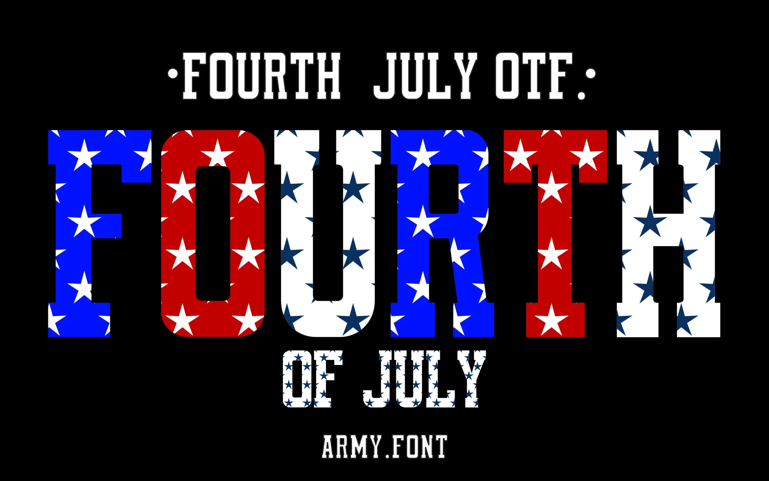
Best For: posters, T-shirts, signage, bold designs
Fourth Star Font is a condensed slab-serif display face with square shoulders, strong verticals, and a crisp all-caps rhythm that feels straight out of parade signage. In a roundup of Colorful Fonts, its red, white, and blue star pattern does most of the work, turning even a single word into a patriotic graphic rather than plain type.
Because the counters are narrow and the surface pattern is busy, it works best in short words, stacked lines, or large headline settings where the star fill stays clear. Give it simple supporting text and plenty of contrast, so the bold proportions and flag-inspired texture can carry the composition without feeling crowded.
Patriotic Font
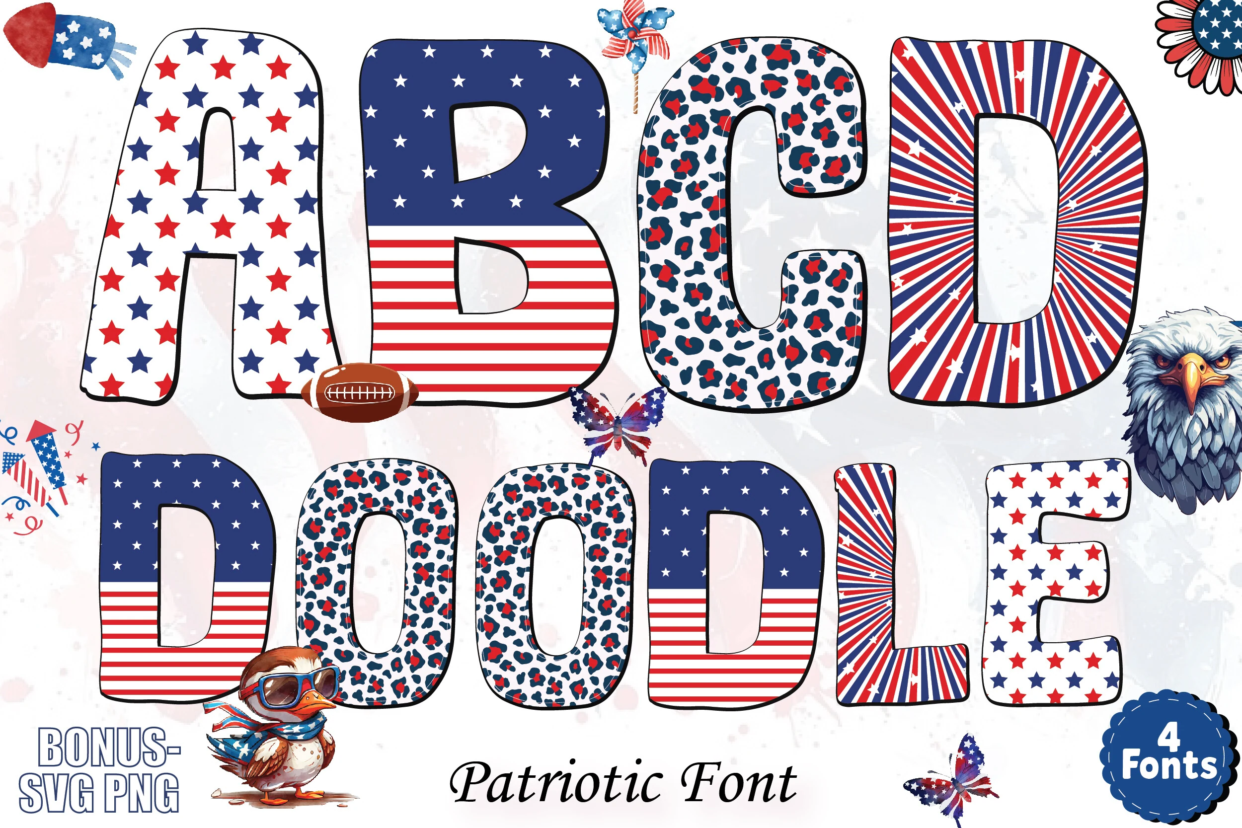
Best For: T-shirts, stickers, posters, eye-catching designs
Patriotic Font uses thick rounded block letters filled with red, white, and blue patterns: stars, flag stripes, leopard spots, and radial bursts. Within Colorful Fonts, it has a festive Independence Day look with black outlines that keep the busy interiors readable.
The bundle structure gives designers multiple patriotic textures to mix without changing the basic letter weight. Use it for short names, slogans, and merch-style headings; the patterns need generous scale and clean surrounding space so each letter stays distinct instead of turning into visual noise.
Comic Font
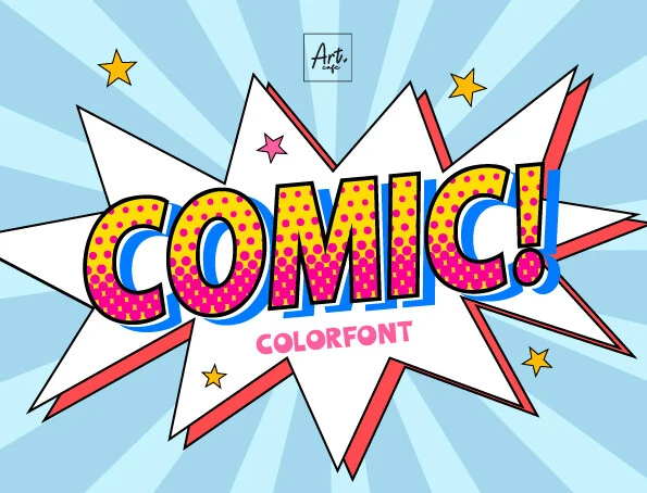
Best For: posters, headlines, children’s designs, retro designs
Comic Font leans into chunky pop-art lettering with rounded, slightly bouncy capitals, a bright yellow fill, pink dot texture, and a blue offset shadow that gives the word a printed-comic snap. In a roundup of Colorful Fonts, it stands out for its retro energy and strong outline, which keeps the surface detail readable.
This is a display choice for short headlines, party graphics, and poster titles rather than long text. Let the font handle the drama, then keep supporting type plain and give it enough spacing so the shadow and dot pattern stay crisp instead of blending together.
Marvel Brothers Font
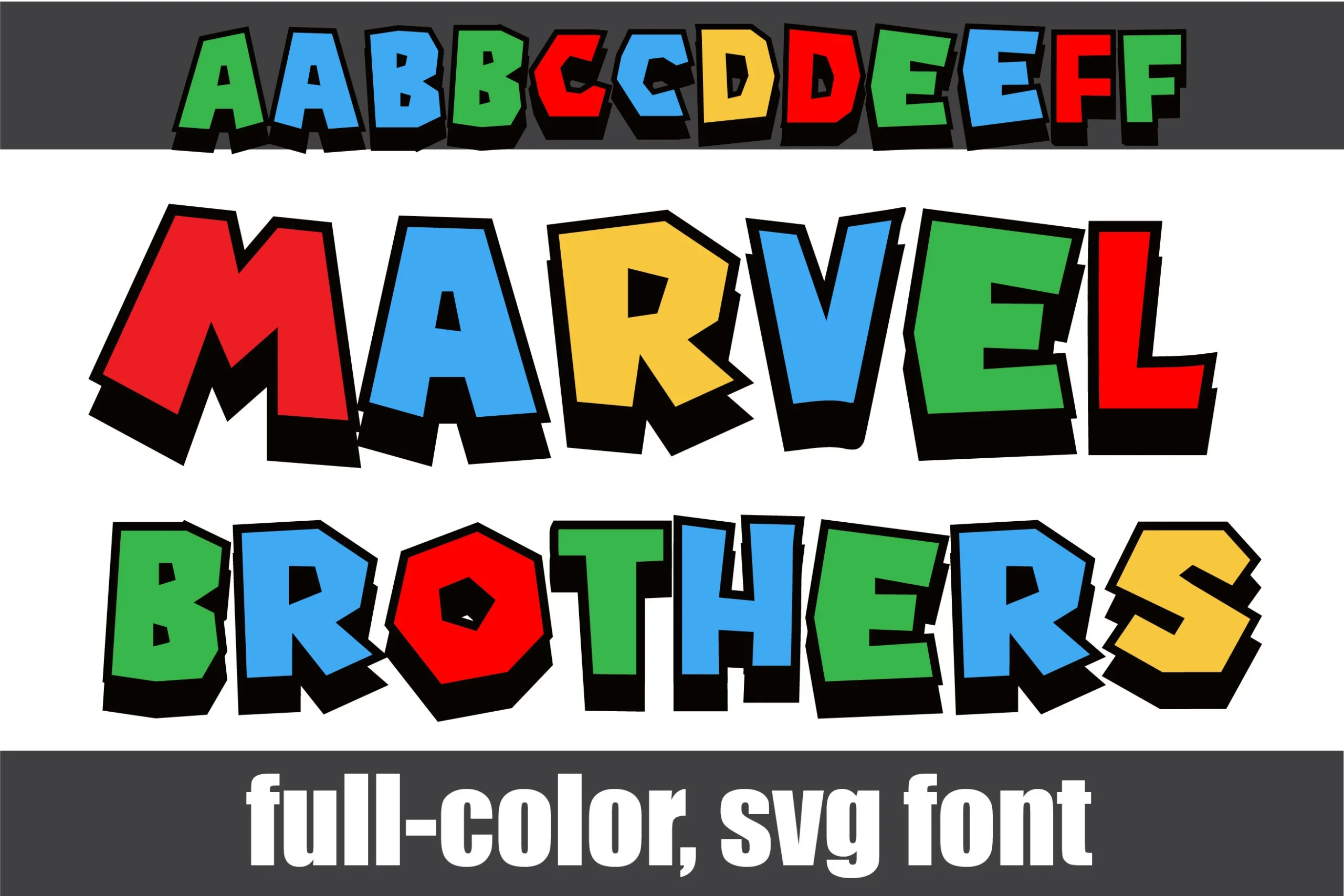
Best For: headlines, posters, children’s designs, fun designs
Marvel Brothers Font has chunky, off-kilter block letters with clipped corners, deep black shadows, and a bright red, blue, green, and yellow palette that gives it instant arcade-cartoon energy. In a roundup of Colorful Fonts, it feels loud and playful, with enough weight to make short words hit hard.
The irregular silhouettes keep the rhythm lively, so it works best for big titles, kids’ graphics, and punchy display lines rather than long text. The alternate upper and lower case characters are useful when you want a less repetitive look in names or short phrases, especially if you vary spacing to keep the shadows from crowding.
Dino Writer Baby Font
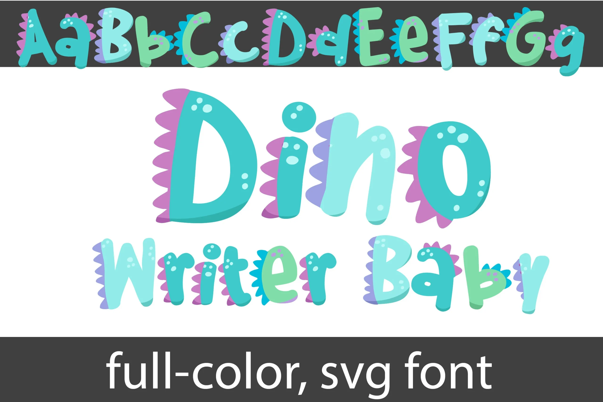
Best For: children’s designs, stickers, playful designs, cute designs
Dino Writer Baby Font uses rounded, wobbly letterforms in teal, aqua, and mint, with purple dinosaur spikes tucked behind the strokes and small white spots adding a toy-like texture. It gives Colorful Fonts a softer nursery angle, more cute and prehistoric than loud or comic-heavy.
The full-color SVG format helps preserve the layered spikes and shaded fills, which matters when the letters need to feel illustrated rather than flat. Use it for short names, labels, and kid-focused titles with clean spacing, so the organic shapes stay readable and the dino details do not merge together.
Toy Brick Font
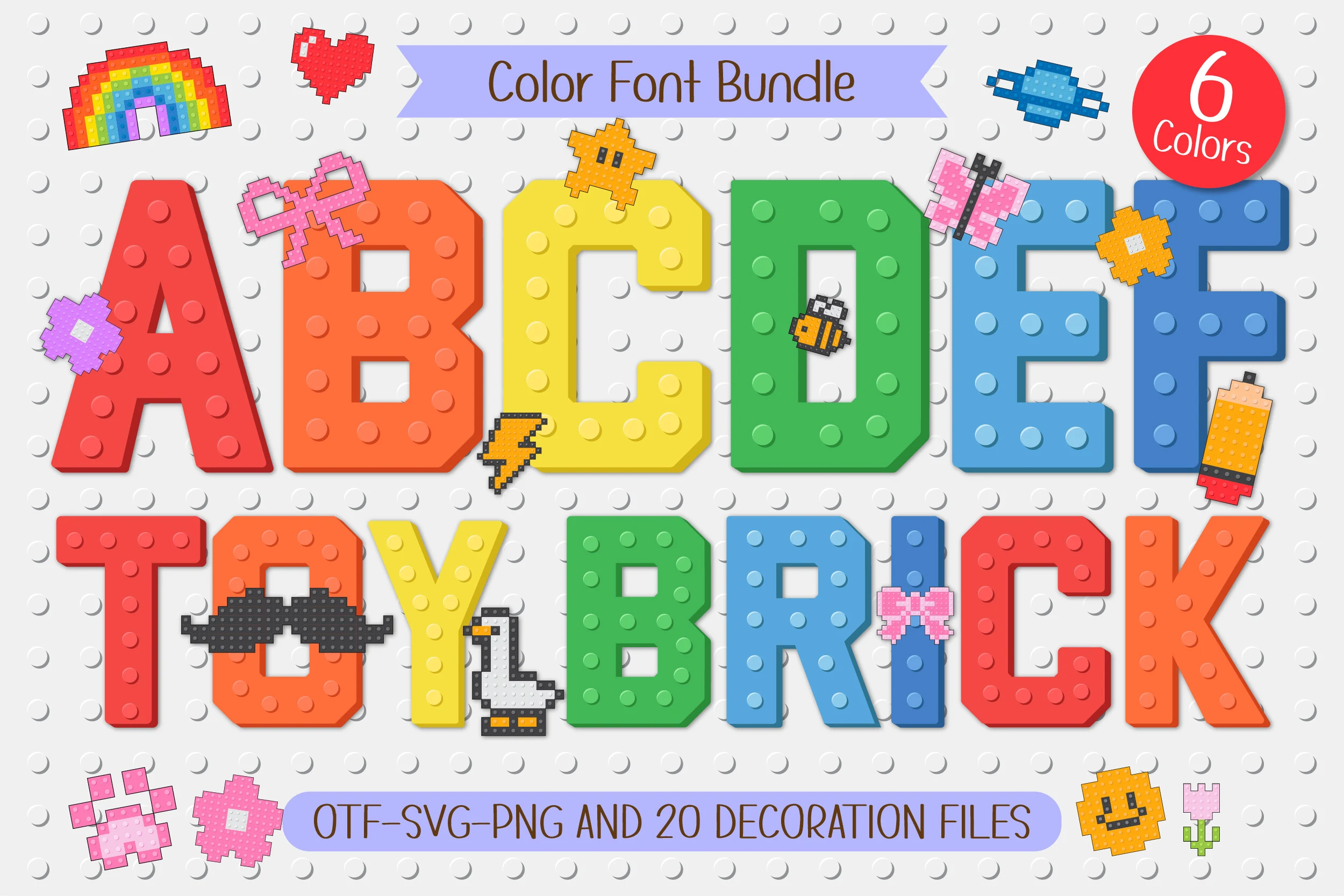
Best For: children’s designs, stickers, fun designs, eye-catching designs
Toy Brick Font turns each character into a chunky building-block shape, with raised stud details that make the letters feel tactile rather than flat. The bright six-color palette keeps the alphabet loud and easy to spot, while the squared proportions give these Colorful Fonts a strong display rhythm for names, labels, and kid-focused headlines.
The wide block forms need contrast around them, especially when paired with the included pixel doodles such as bows, butterflies, flowers, and lightning bolts. Use the decorations as accents rather than filling every gap; the font already carries a dense texture, so cleaner spacing helps the playful brick effect stay readable.
Sparkle Stripes Font
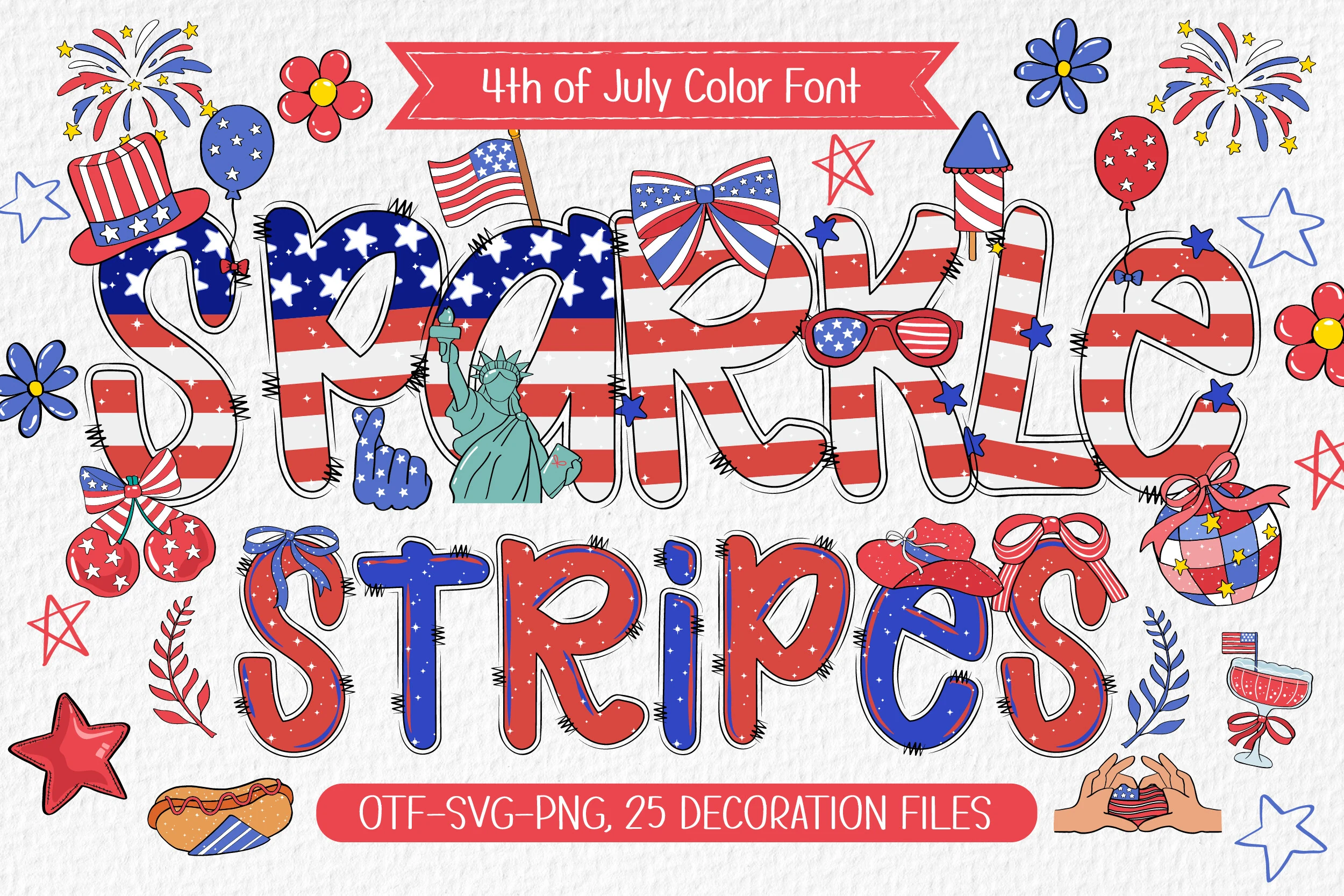
Best For: posters, T-shirts, invitations, stickers
Sparkle Stripes Font mixes rounded hand-drawn letterforms with flag-inspired stripes, scattered stars, and sketchy black edging that gives the alphabet a lively doodled finish. The red, white, and blue palette makes it instantly seasonal, but the shapes stay open enough to keep these Colorful Fonts readable in big celebratory titles.
Because the letters already carry pattern, sparkle texture, and strong contrast, it works best in short headlines with a cleaner layout around them. Use the extra bows, fireworks, balloons, and other clipart as framing accents rather than filling every gap, so the striped rhythm and playful preppy mood stay clear.
Rope Font
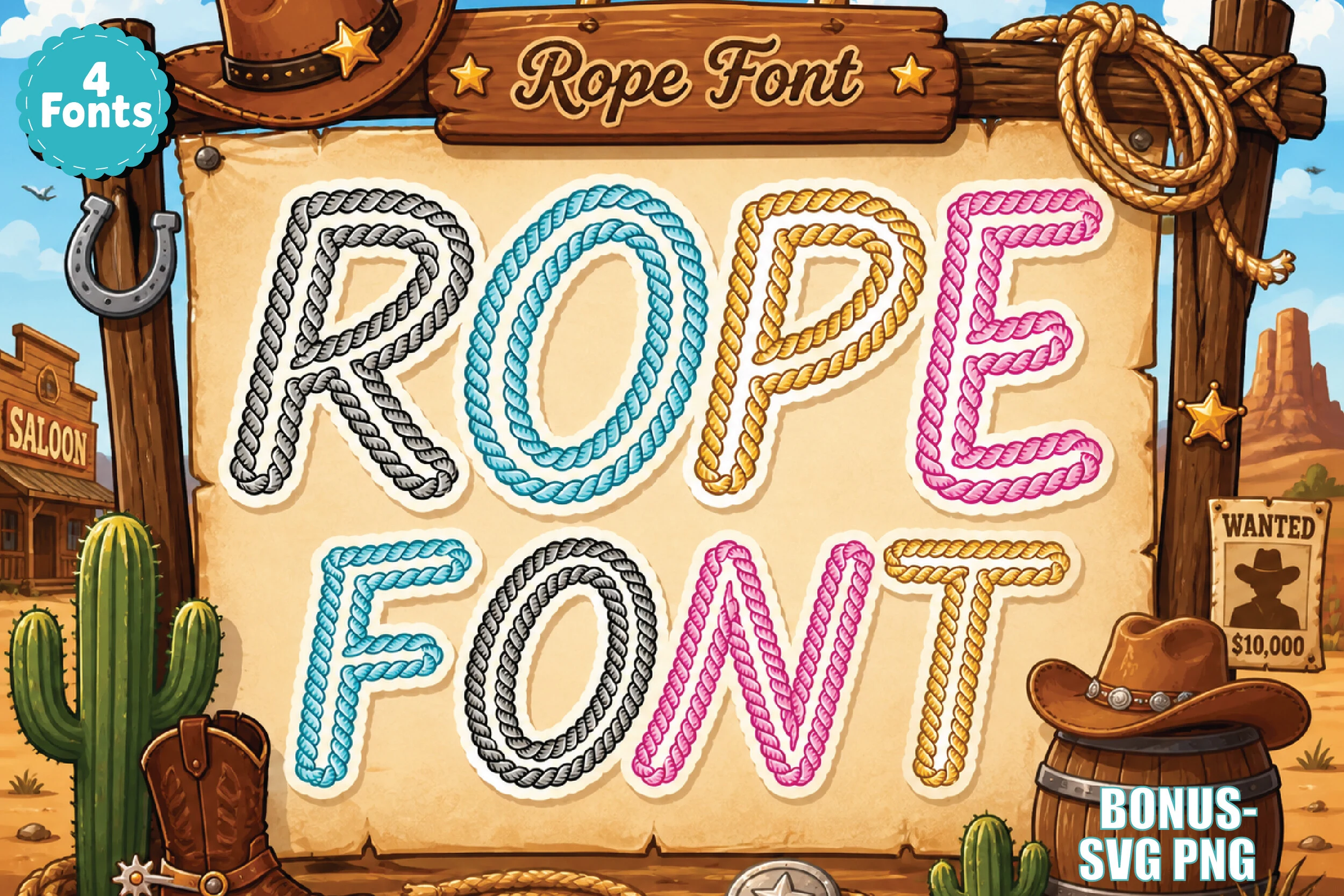
Best For: posters, T-shirts, stickers, retro designs
Rope Font turns each letter into a twisted lasso shape, with thick loops, rounded bends, and bright color options that keep the western theme feeling playful instead of dusty. The cowboy sign influence gives these Colorful Fonts strong novelty appeal, especially in bold titles that need a retro ranch character at first glance.
Because the rope texture already adds a lot of detail, it works best in short words and headline-length phrases where the curves stay clear. Give the letters a bit of breathing room and pair them with a plain supporting font for smaller text, so the rope pattern holds the focus without tangling the hierarchy.
Game over Font
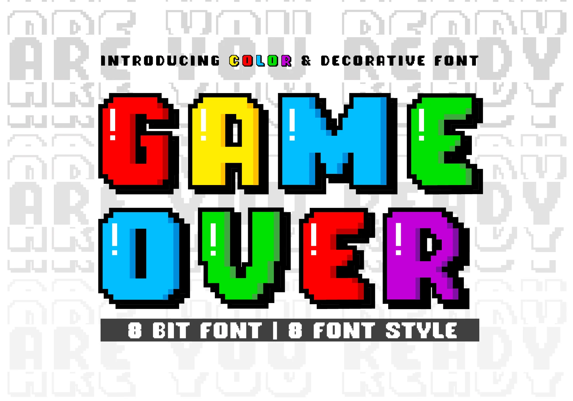
Best For: T-shirts, book covers, children’s designs, fun designs
Game over Font leans into classic 8-bit arcade energy, with chunky square letterforms, stepped pixel edges, and a heavy black shadow that gives each character a crisp screen-era punch. The bright red, yellow, blue, green, and purple fills make these Colorful Fonts feel instantly playful, while the simple block structure keeps short words easy to read.
Its thick proportions work best for titles, names, and other quick hits where the retro gaming mood can lead the design. Leave enough space around the letters and pair them with cleaner supporting text; the bold outline and shadow already create strong contrast, so crowded layouts can make the pixel details feel noisy.
Back to School Army Font
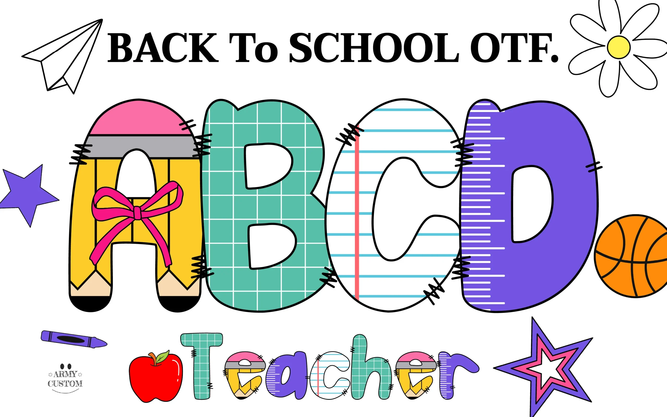
Best For: children’s designs, invitations, wall art, playful designs
Back to School Army Font builds each letter from familiar classroom materials: a pencil-shaped A, grid-paper B, notebook-rule C, and ruler-like D, all wrapped in thick black outlines and playful stitch marks. That mix gives Colorful Fonts a clear school-theme personality without losing readability, since the shapes stay broad and rounded even with the internal patterns.
It works best when you let a few letters do the storytelling, especially in invitations, class signs, or name-based layouts. The decorative textures already add plenty of movement, so simpler surrounding text and roomy spacing help the pencil, grid, and ruler details stay distinct instead of blending together.
Baby Block Font
Best For: children’s designs, cute designs, playful designs, T-shirts
Baby Block Font turns each letter into a chunky toy cube, using soft pink, yellow, blue, and green faces with simple inset capitals that feel straight out of an alphabet set. The 3D block construction gives these Colorful Fonts a clear educational mood, while the bold sans-style letters stay easy to read at a glance.
Because the cubes already create depth and spacing, this font works best in short words, names, and headers where each block can stand on its own. Keep supporting elements simple and let the pastel palette do the work; crowded layouts can weaken the clean block rhythm that makes the design feel so playful.
Preppy Coquette Font
Best For: cute designs, playful designs, feminine designs, retro designs
Preppy Coquette Font uses rounded bubble letters with stitched outlines, then fills each shape with pastel florals, candy stripes, tiny dots, checkerboard squares, and star prints. That patchwork treatment gives Colorful Fonts a sweet preppy mood, while the thick silhouettes keep the letterforms clear enough for bold display work.
The mix of patterns gives it plenty of personality, so it looks strongest in short words where each fill can stay distinct. A simple layout helps the bow detail and soft pink edging stand out, and a cleaner companion font keeps the hierarchy tidy instead of letting the decorative textures compete.
Sideways Font
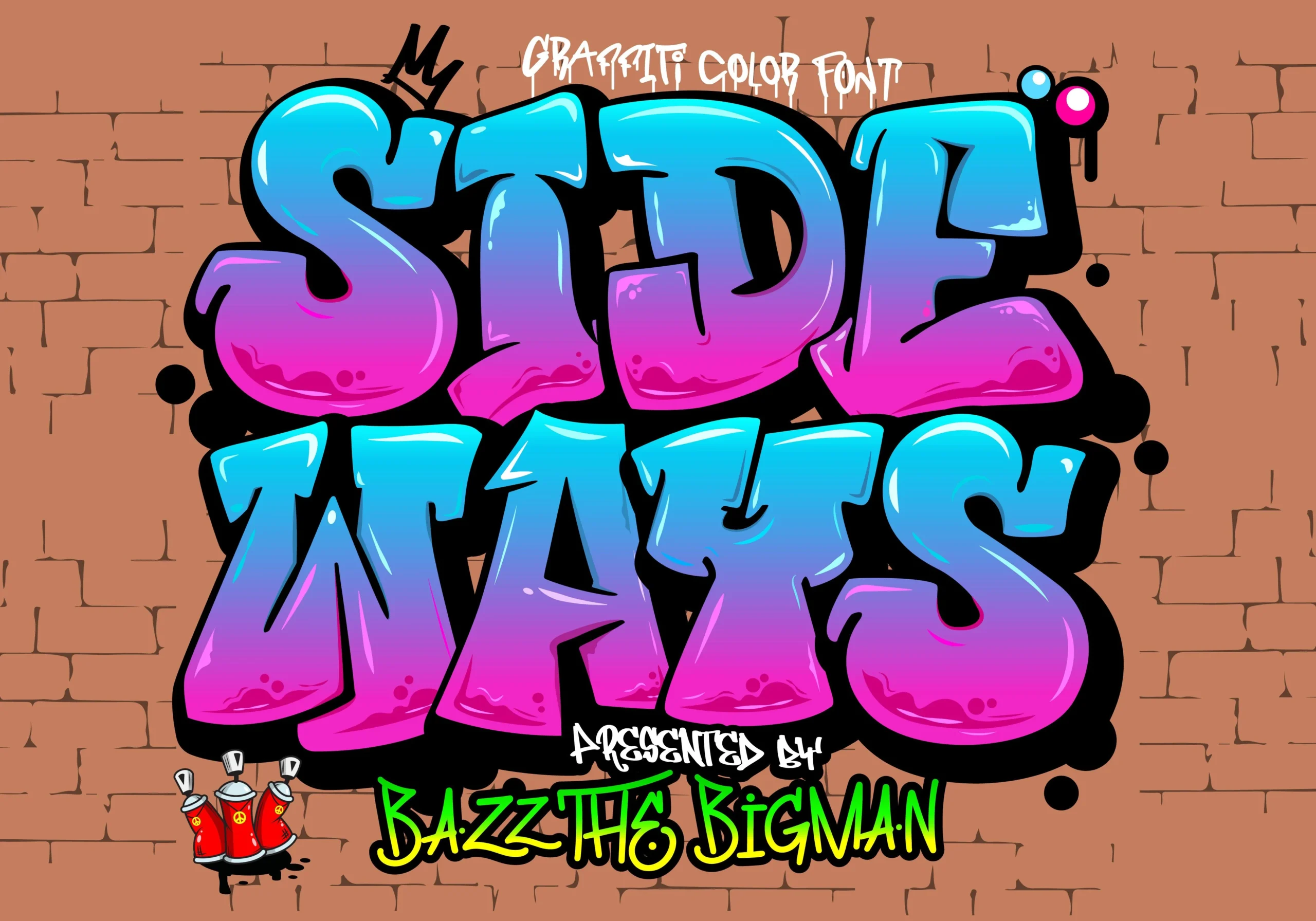
Best For: logos, T-shirts, merch design, eye-catching designs
Sideways Font uses oversized graffiti letterforms with swollen curves, sharp inner cuts, and a glossy blue-to-magenta fill that pushes the words forward like sprayed wall art. The heavy black outline and drop-shadow mass give these Colorful Fonts strong impact for streetwear graphics, logo marks, and loud title treatments.
The letters are intentionally dense, with uneven angles and highlight strokes that create movement across the line. Keep the wording short and the background contrast high; when the layout gives the outline room, the graffiti shape reads with more force instead of turning into a crowded color block.
The strongest colorful fonts in this list are not just bright; they have a clear visual role. Some are built for children’s designs and classroom graphics, others lean into graffiti, retro posters, beach layouts, comic titles, patriotic artwork, or playful product labels.
Use them where the font can carry the composition. For long copy, they will usually become too dense. For short words, names, headlines, and graphic-led layouts, they give you ready-made color, texture, and personality without needing much extra decoration.