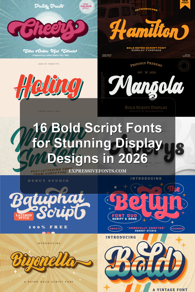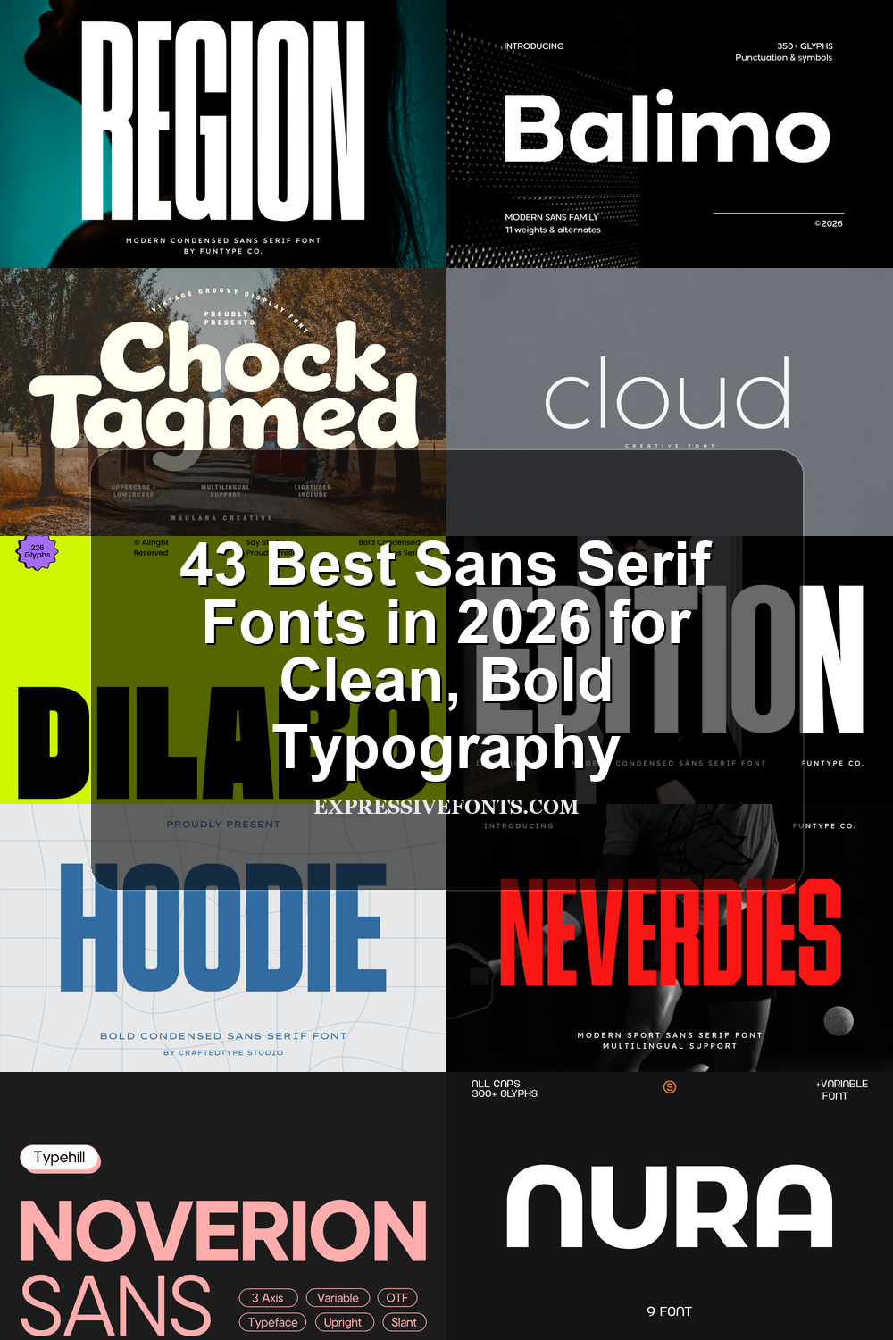
31 Best Sans Serif Fonts in 2026 for Clean, Bold Typography
Sans Serif Fonts remain one of the most practical choices for modern design in 2026, especially for branding, posters, packaging, websites, and social media graphics. This collection brings together 31 clean, bold, playful, retro, and professional styles to help you find the right typography faster without sorting through endless font pages.
Hoodie Font
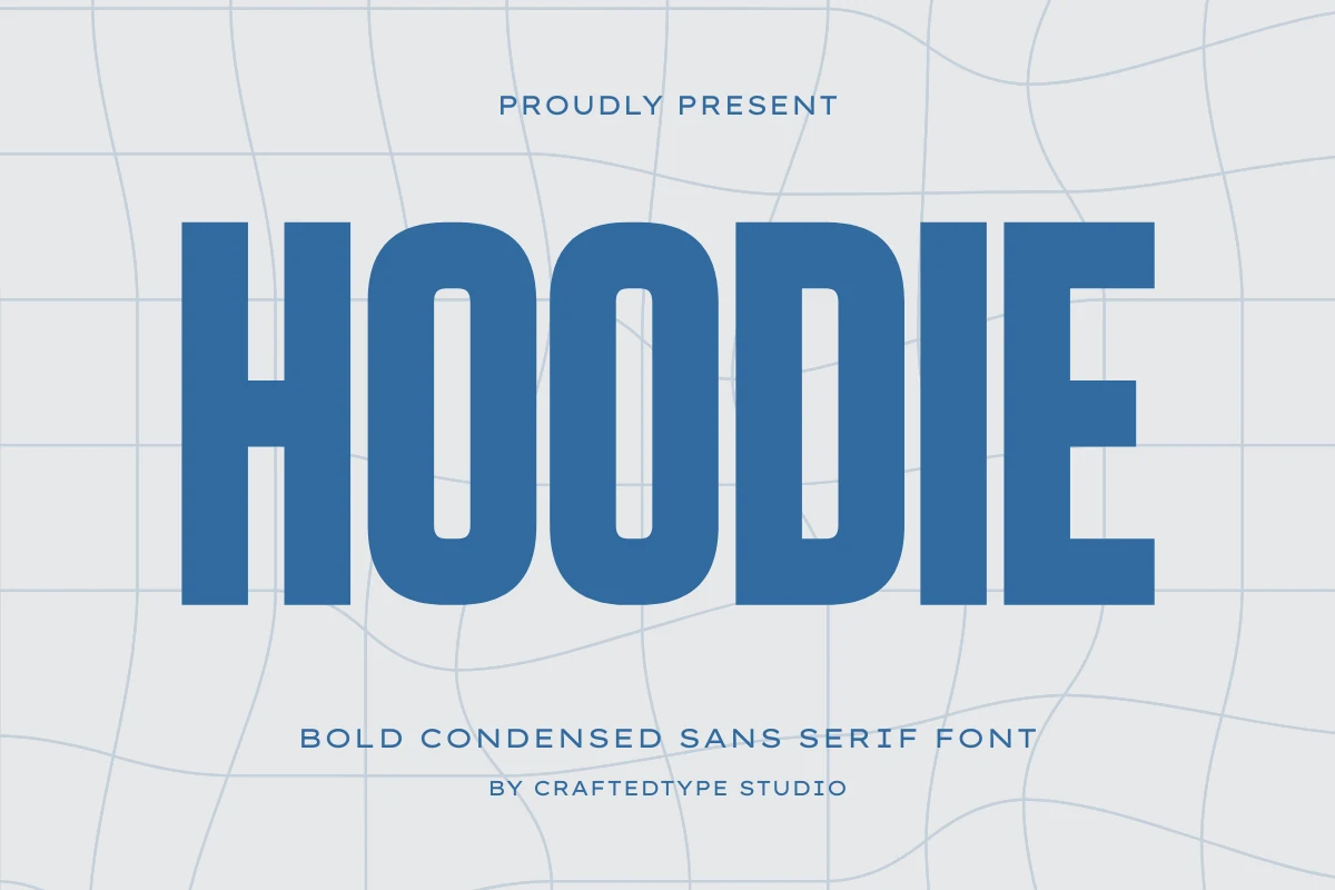
Best For: headlines, posters, signage, T-shirts
Hoodie Font has the dense pressure of tall block lettering, with compact proportions, thick vertical strokes, and rounded counters that keep the word shape readable despite its heavy build. In a Sans Serif Fonts roundup, it sits on the industrial and athletic side rather than the neutral corporate side.
Use it where the title needs to dominate first: jersey-style graphics, streetwear marks, event posters, or hard-edged branding. The condensed width lets large words fit into tight horizontal spaces, but the weight still needs strong contrast around it so the shapes do not turn into a solid slab.
Mansory Font
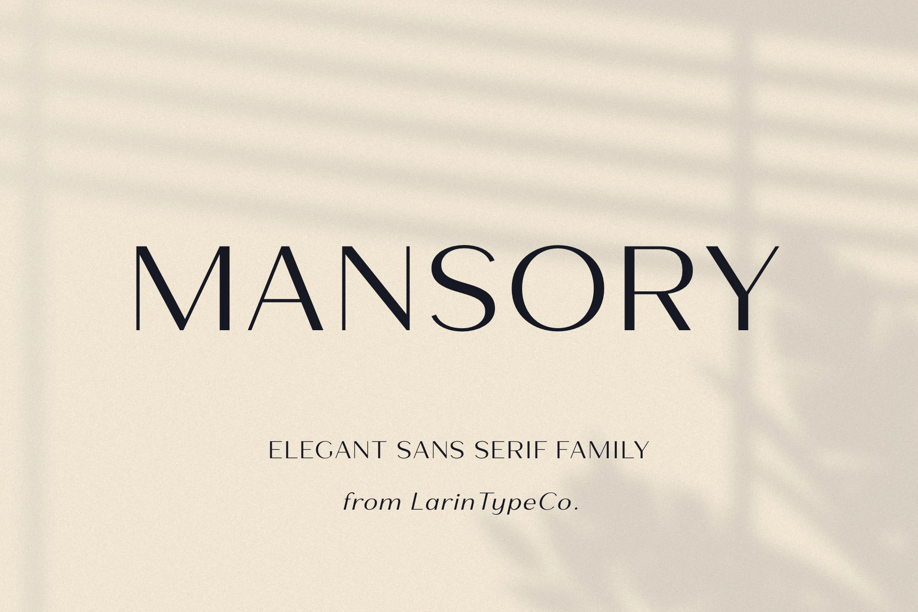
Best For: logos, fashion branding, editorial designs, luxury designs
Mansory Font is a light, refined sans with long verticals, slender horizontal strokes, and open spacing that gives each capital letter a quiet architectural presence. Its rounded forms and thin geometry keep the wordmark polished rather than rigid, placing it on the luxury side of Sans Serif Fonts.
It works best when the composition leaves space around the title: editorial covers, fashion marks, boutique packaging, and website headers can use its wide rhythm without crowding. Keep supporting text darker or heavier, because the fine strokes need clear contrast to stay sharp.
Perfect Lemonade Font
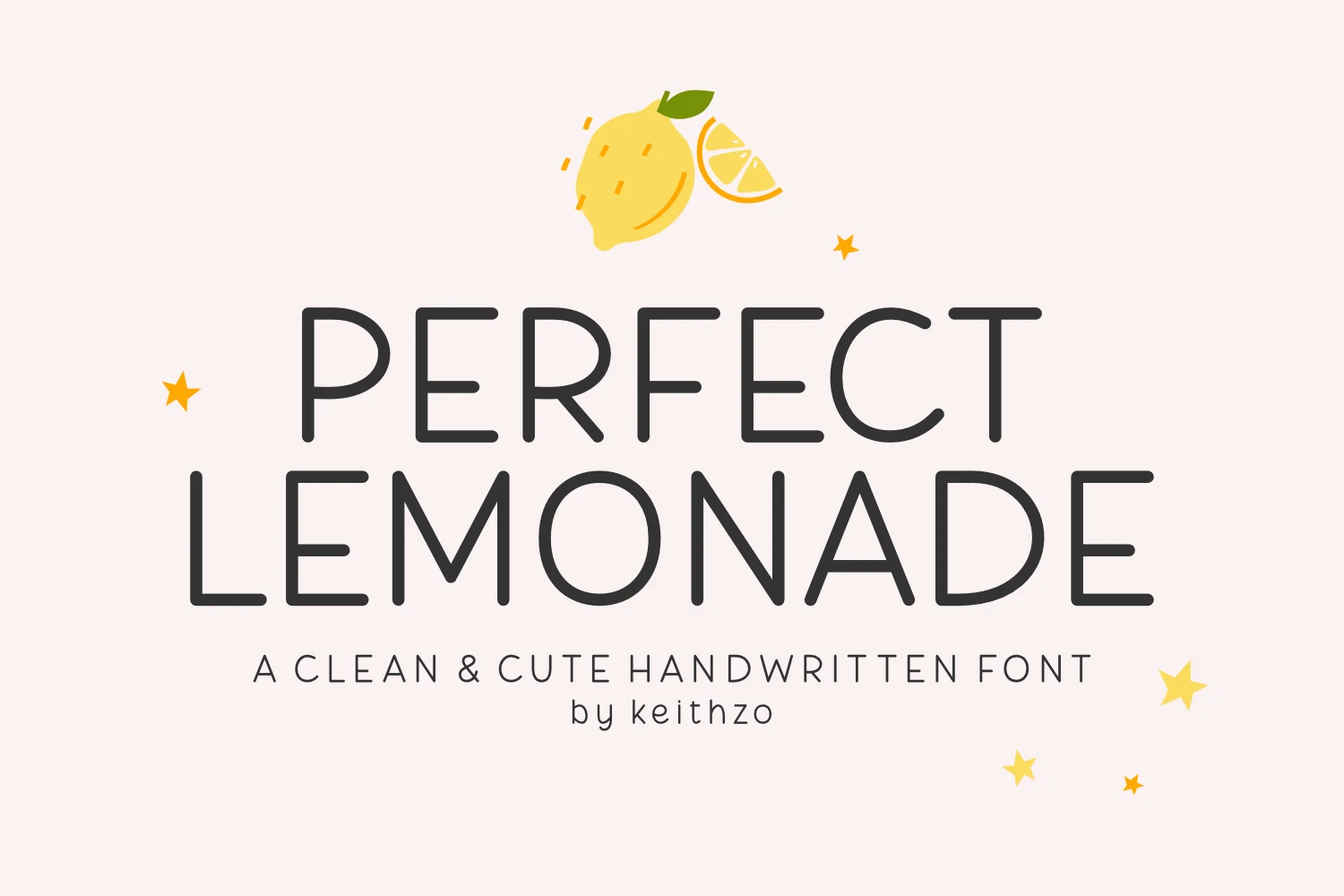
Best For: stickers, quotes, social media graphics, children’s designs
Perfect Lemonade Font has a soft monoline look with rounded corners, open shapes, and an easy rhythm that feels cheerful without becoming messy. Even though it leans handwritten in mood, its clean structure gives it a tidy place in playful Sans Serif Fonts collections.
The letters stay clear at a glance, which helps on planner labels, card fronts, sticker text, and light social graphics. Its spacing is relaxed enough to keep short phrases friendly, and it looks best when paired with simple layouts that let the bubbly strokes carry the personality.
Modern Heritage Font
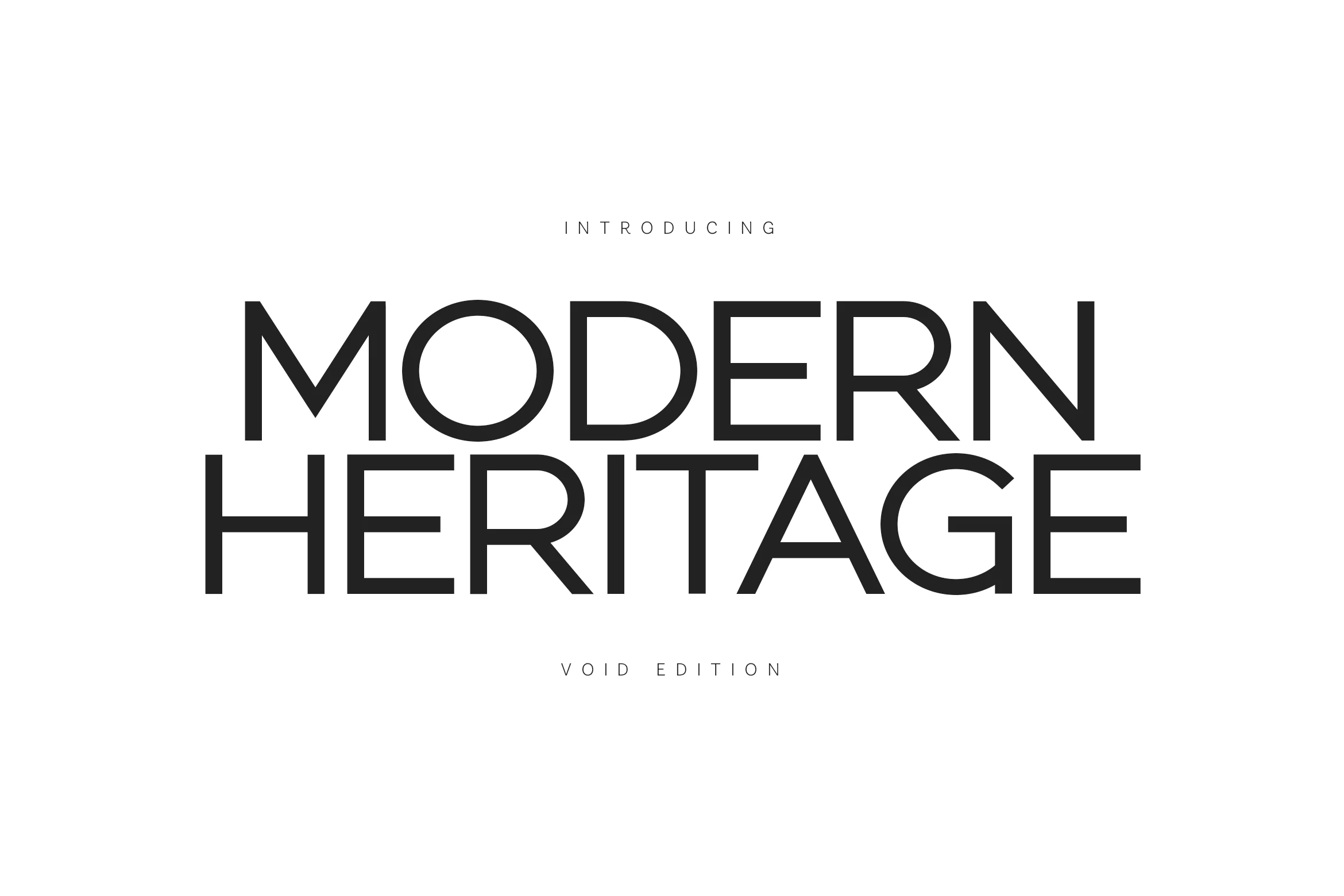
Best For: minimal designs, professional designs, fashion branding, website headers
Modern Heritage Font has a clean Swiss-inspired structure with broad uppercase forms, sharp diagonals, and open counters that make the heavy display setting feel spacious rather than crowded. Its monoline strokes and controlled geometry give it a precise, architectural place within Sans Serif Fonts.
The font is built for titles that need authority without decorative noise: studio branding, fashion labels, portfolio headers, and minimalist presentation layouts. Keep the hierarchy simple and let the negative space work, because the letterforms rely on scale, contrast, and alignment more than texture.
Marshmallow Font
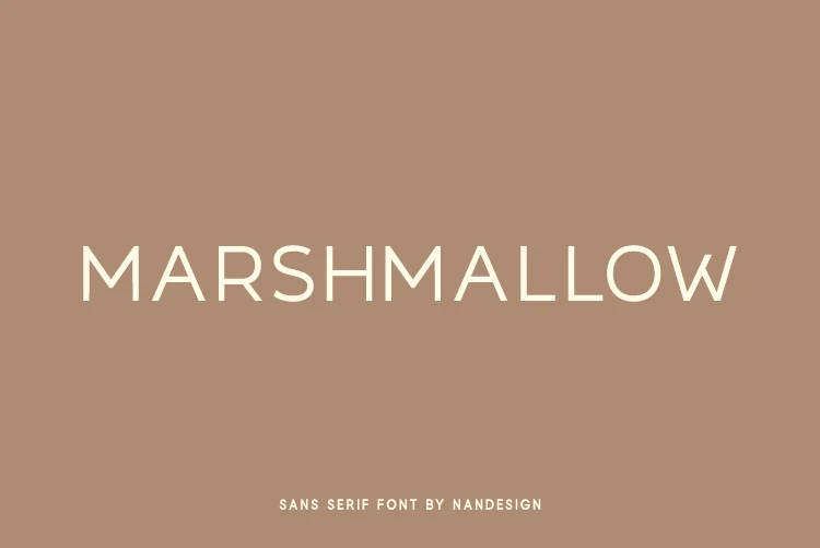
Best For: logos, branding, minimal designs, clean designs
Marshmallow Font has a light all-caps look with slim strokes, rounded curves, and generous spacing that keeps the word shape airy and polished. Within Sans Serif Fonts, it leans toward a refined minimalist mood, with clean geometry that feels calm rather than technical.
It suits short branding lines, logo concepts, and uncluttered headers where negative space does part of the work. The narrow stroke weight benefits from clear contrast and a restrained layout, so it performs best when you avoid crowding it with heavy surrounding elements or dense supporting text.
Mango Dream Font
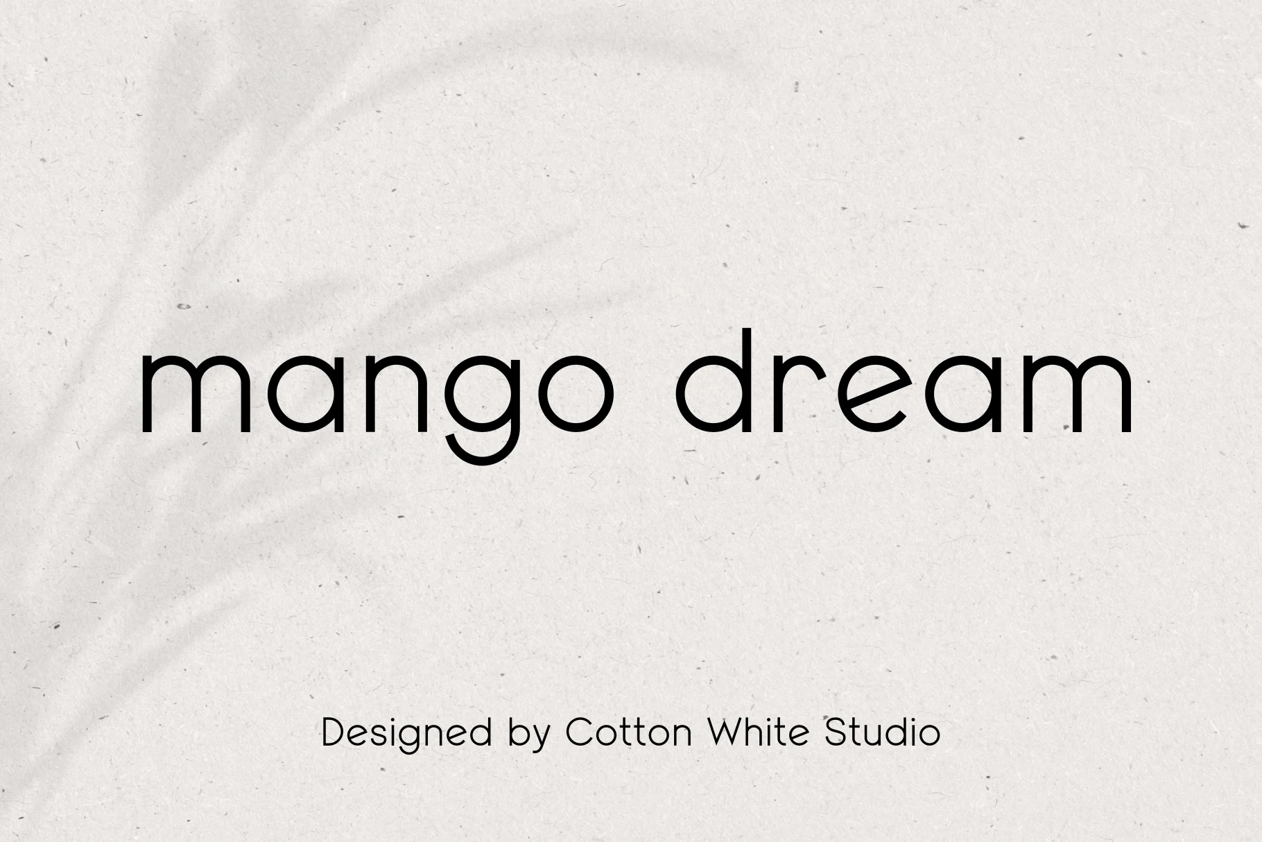
Best For: logos, branding, website headers, minimal designs
Mango Dream Font is a rounded lowercase sans with smooth monoline strokes, circular bowls, and a soft rhythm that keeps the wordmark clean without looking sterile. Its minimal shape gives it a calm, contemporary role within Sans Serif Fonts, especially when the design needs friendliness rather than sharp corporate formality.
The open spacing and simple curves make it useful for website headers, brand names, and marketing layouts where readability needs to stay relaxed. Multilingual support adds practical value for identity systems that need consistent typography across different language settings.
Muffin Font
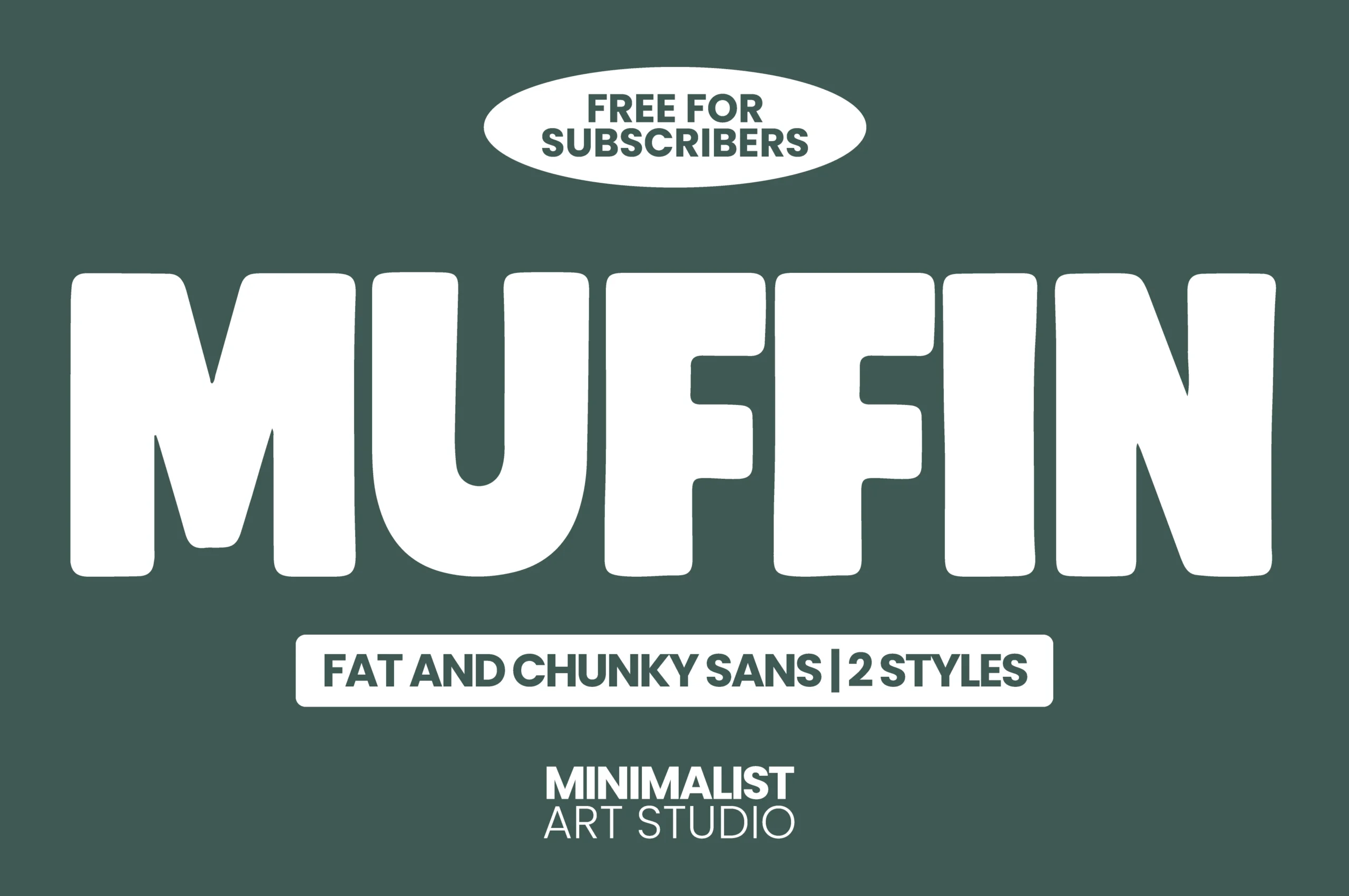
Best For: headlines, posters, merch design, social media graphics
Muffin Font is a fat display sans with rounded corners, soft inner curves, and oversized proportions that give every word a cheerful heavyweight presence. In a Sans Serif Fonts roundup, it stands out for its chunky silhouette: bold enough to grab attention, yet clean enough to stay readable.
It works especially well for short text that needs instant impact, from poster titles to playful merch and punchy promo graphics. Keep the hierarchy simple and let the width of the letters carry the message, because this style looks strongest when it has room to breathe instead of competing with busy details.
Mirano Extended Font
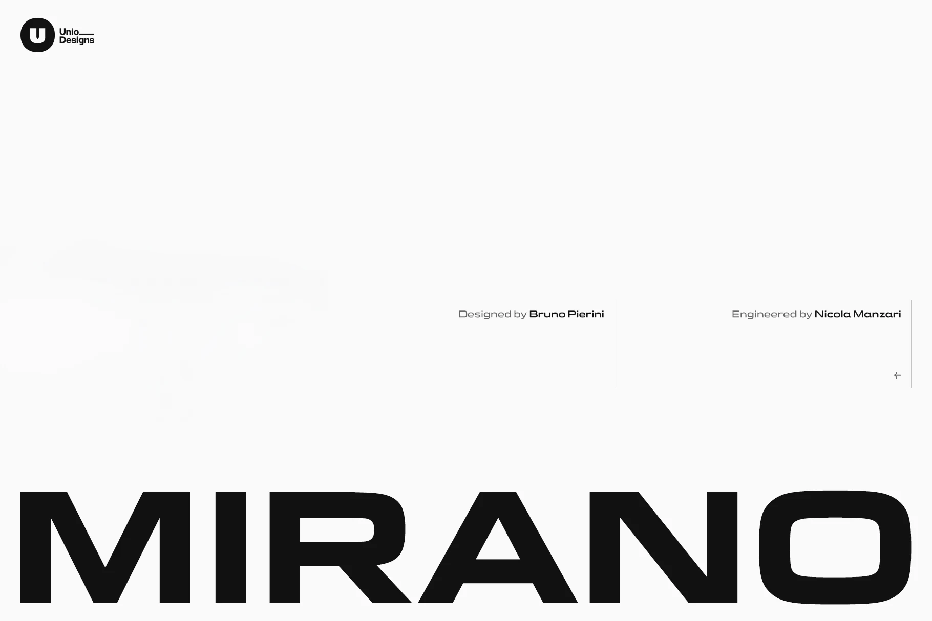
Best For: logos, branding, signage, masculine designs
Mirano Extended Font has a stretched, heavyweight sans structure with broad letterforms, tight vertical pressure, and squared cuts that feel engineered rather than decorative. Its low, wide stance gives it an automotive edge inside a Sans Serif Fonts collection, especially where the title needs to look fast, mechanical, and firm.
Use it for badge-style logos, garage branding, motorsport graphics, signage, or poster headers that need a strong horizontal footprint. The extended proportions work best with short words and disciplined spacing, because the width creates impact only when the surrounding layout stays clean.
Edition Font
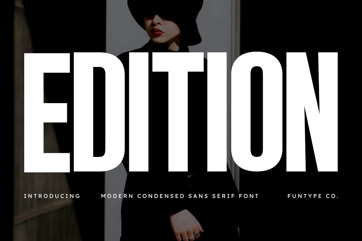
Best For: headlines, posters, magazine covers, branding
Edition Font brings a sharper display edge to Sans Serif Fonts with its towering proportions, ultra-condensed width, and solid block strokes. The letterforms feel tight and forceful, with clean vertical rhythm and minimal shaping that keeps the impact direct rather than decorative.
It performs best when the message is short and the scale is big: poster titles, cover lines, campaign graphics, and branding that needs immediate punch. Let it lead the hierarchy and keep secondary text lighter or more open, so the dense structure has contrast instead of turning the whole layout heavy.
Balimo Font
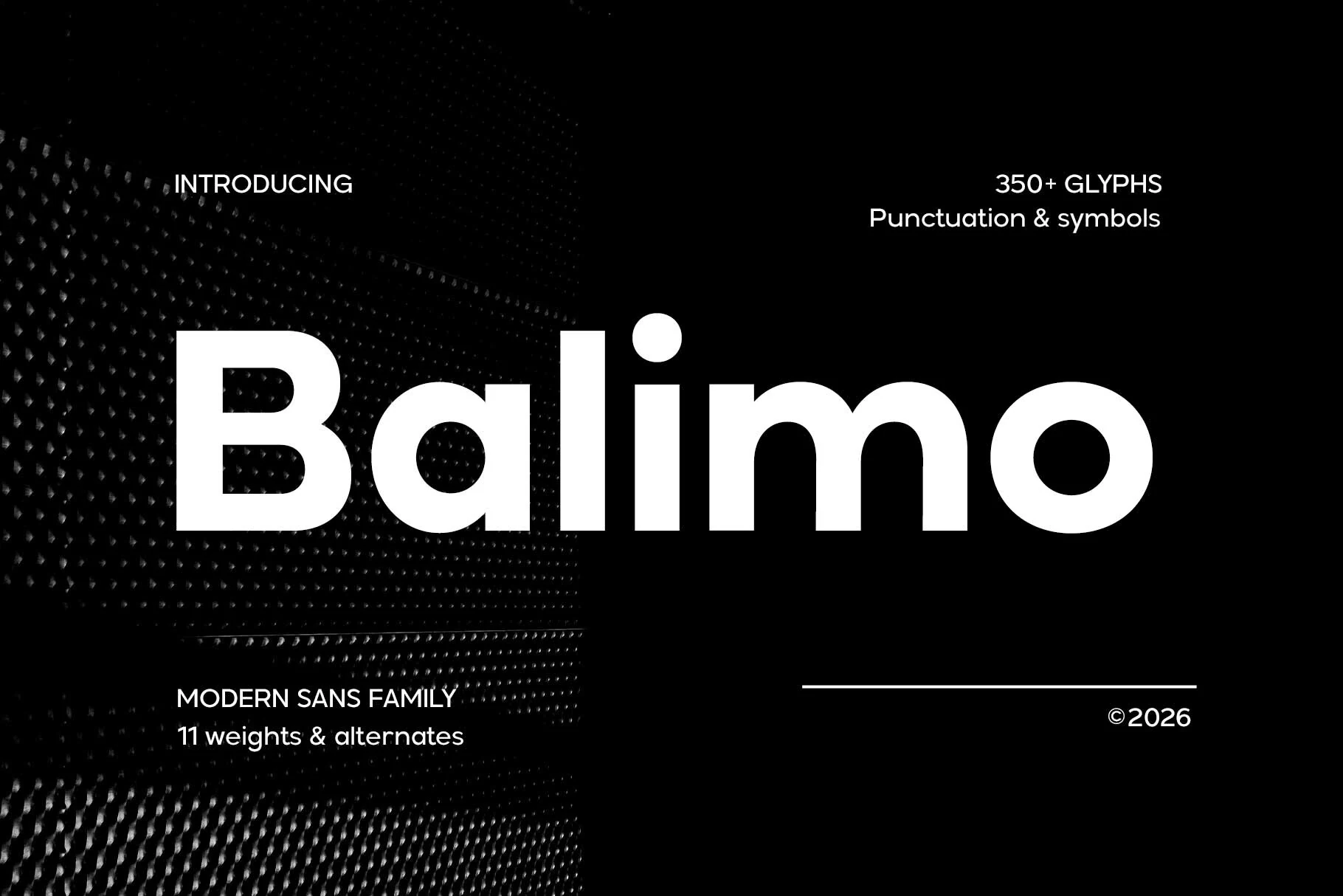
Best For: branding, headlines, website headers, professional designs
Balimo Font uses a clean geometric build with rounded bowls, steady spacing, and thick strokes that give the wordmark a confident modern weight. In Sans Serif Fonts, it reads as polished and direct, with enough softness in the curves to avoid a harsh corporate feel.
Its balanced rhythm makes it suitable for brand systems, editorial headlines, UI labels, and marketing layouts that need clarity across different scales. Use the heavier styling for strong title hierarchy, then keep supporting type lighter so the rounded forms stay crisp instead of visually dense.
Gaglio Font
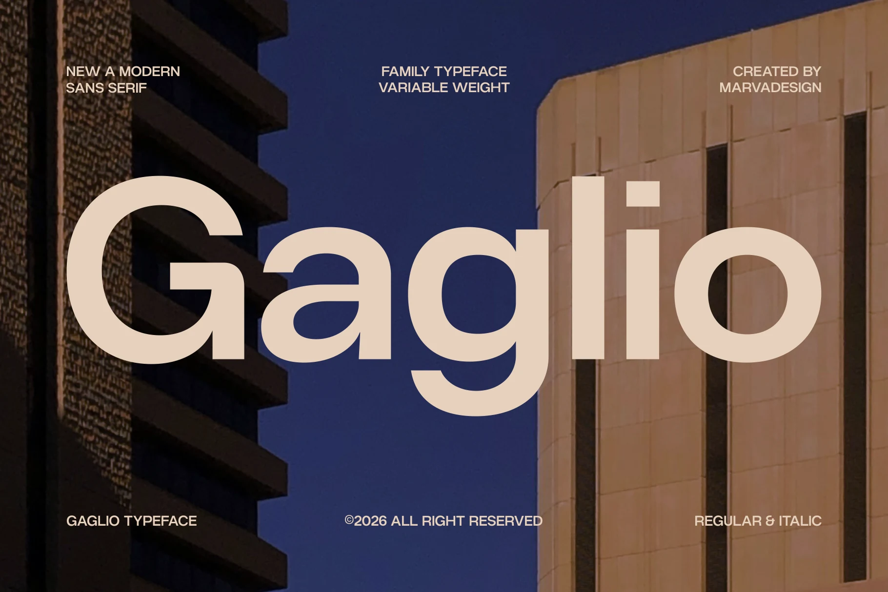
Best For: branding, editorial designs, website headers, professional designs
Gaglio Font has a broad geometric build with a large x-height, open apertures, and rounded terminals that make the heavy setting feel modern without losing readability. Among Sans Serif Fonts, it leans architectural: clean, structured, and firm, but softened by the smooth curves in letters like a, g, and o.
The variable weight system and regular/italic styles give designers more control over hierarchy across brand systems, editorial layouts, and interface headers. Use heavier weights for confident titles, then shift to lighter cuts or italic accents when the layout needs contrast without changing the typeface voice.
Brooklyn Font
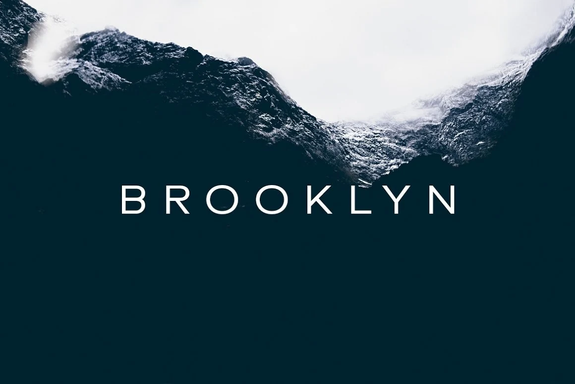
Best For: logos, website headers, minimal designs, clean designs
Brooklyn Font is a thin uppercase sans with wide tracking, clean vertical strokes, and open letter spacing that gives short words a quiet, cinematic feel. Its neat monoline structure places it on the restrained side of Sans Serif Fonts, where clarity and atmosphere matter more than heavy impact.
Use it for minimalist logos, refined headers, travel-style titles, and calm brand marks that need space around the typography. The fine stroke weight works best with strong contrast and simple composition, while the generous spacing helps the letters stay readable without adding decorative detail.
Godplan Font
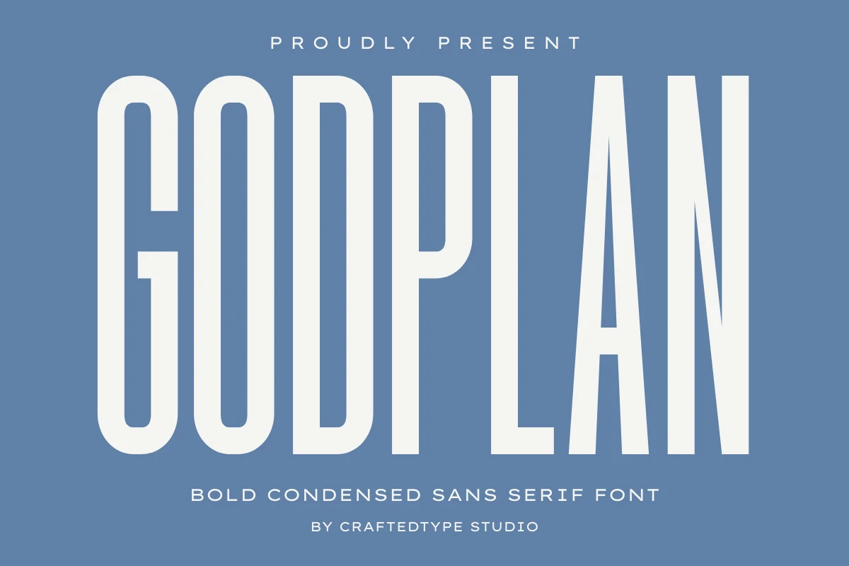
Best For: headlines, posters, signage, branding
Godplan Font is an ultra-condensed display face with towering capitals, thick monoline strokes, and narrow counters that give every word a rigid architectural rhythm. In Sans Serif Fonts, it sits on the forceful end of the spectrum, built for layouts where vertical scale and clean pressure need to do the talking.
Its compressed width is especially useful when a headline has to look big without taking over the whole canvas. Use it for poster titles, signage, or bold brand statements, and pair it with lighter, more open supporting text so the dense letterforms stay crisp instead of visually crowding the layout.
Noverion Sans Font
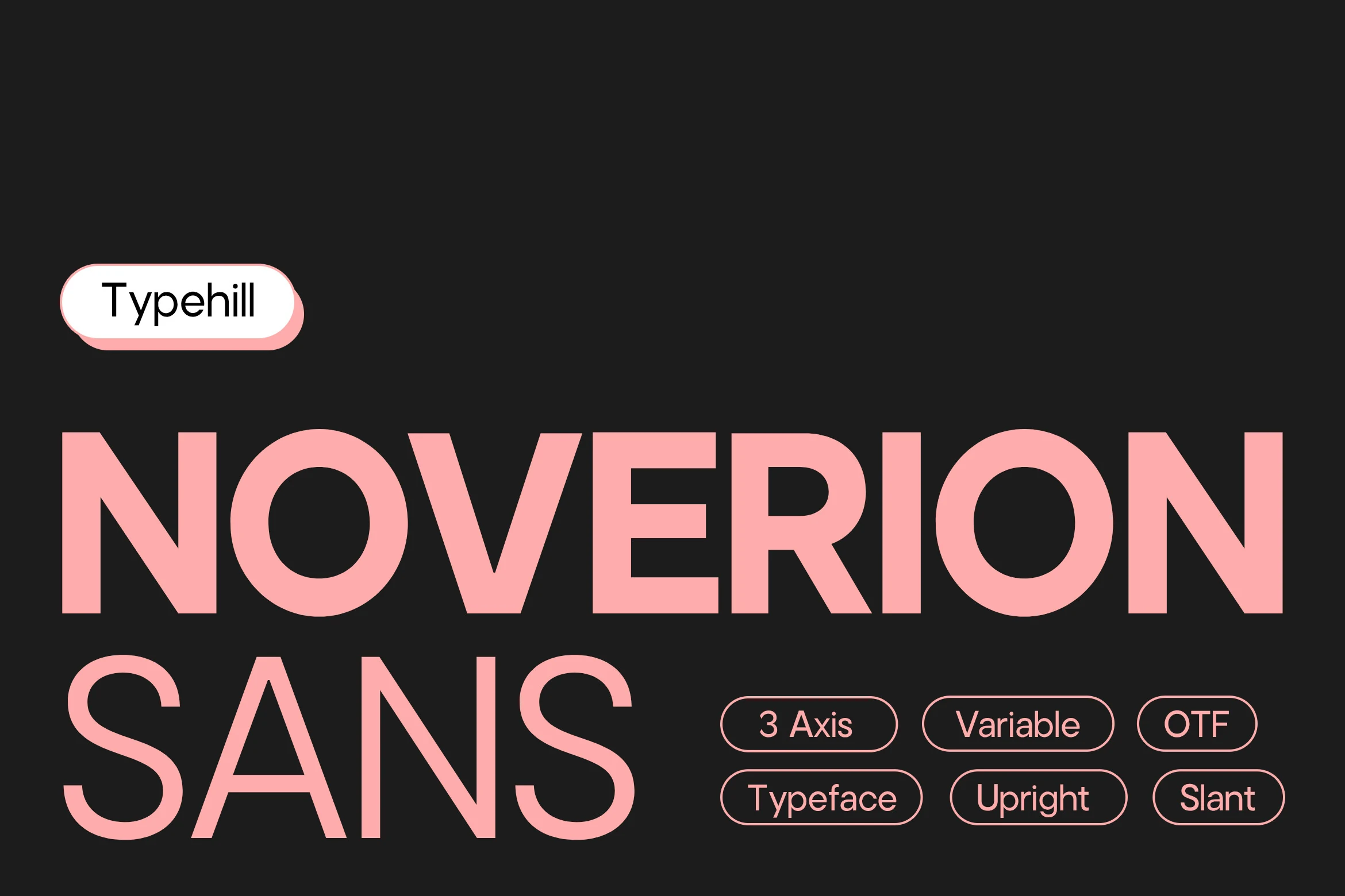
Best For: branding, editorial designs, website headers, bold designs
Noverion Sans Font has a heavy geometric build with broad capitals, tight horizontal rhythm, and sharply cut diagonals that make the wordmark feel precise rather than soft. For Sans Serif Fonts, it brings a contemporary display voice: bold enough for large titles, but clean enough to keep the structure controlled.
Use it when a layout needs authority across branding, editorial covers, interface headers, or large-scale promotional type. Its balanced proportions help the letters hold together at size, while the strong weight works best with clear margins and lighter secondary text for contrast.
Region Font
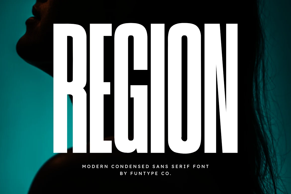
Best For: headlines, posters, branding, bold designs
Region Font is built around a tall, compressed structure with heavy vertical strokes, squared shoulders, and tight internal spacing. The result is direct and forceful, giving headlines a block-like presence without adding decorative noise.
For Sans Serif Fonts that need impact, Region works best in short titles, poster lines, sports identity marks, and industrial-style branding. Keep tracking under control rather than spreading it too far; its condensed proportions rely on vertical density for their strongest effect. OTF and TTF files support practical use across common design platforms.
Chock Tagmed Font
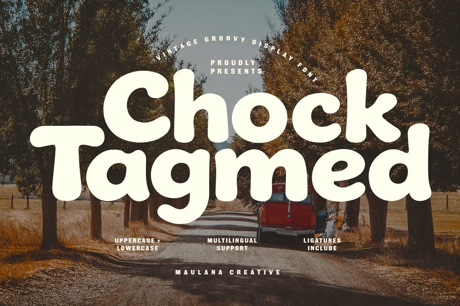
Best For: posters, branding, book covers, packaging
Chock Tagmed Font has a chunky retro voice built from rounded strokes, broad bowls, and soft terminals that keep the lettering warm instead of heavy. Its inflated shapes and easy rhythm give it that unmistakable 1970s display feel, with enough personality to carry a title on its own.
If you are browsing Sans Serif Fonts for nostalgic statement work, this one shines in short headlines where the curves stay open and readable. The included ligatures help smooth out awkward letter pairings, while multilingual support makes it easier to keep the same friendly tone across different language versions of a design.
Think Loved Font
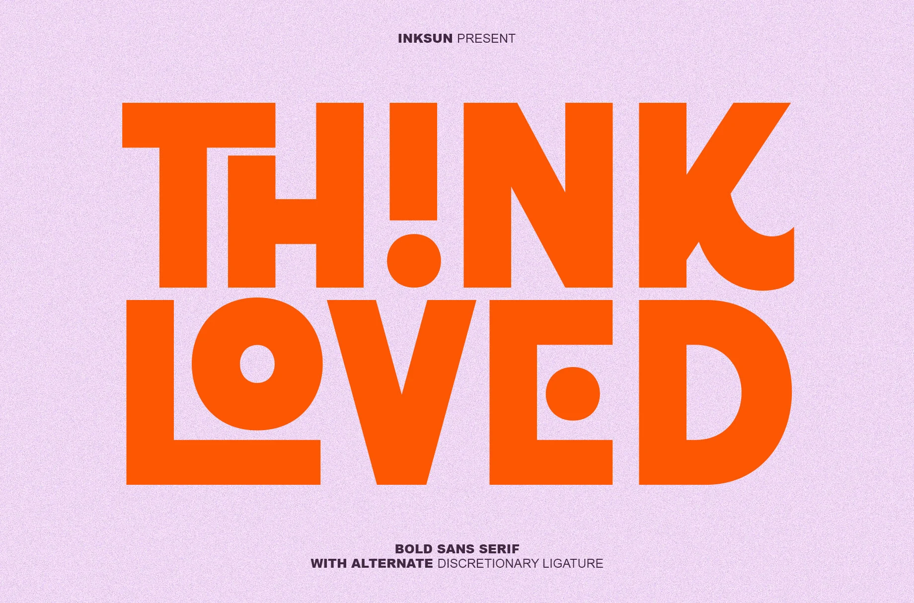
Best For: branding, headlines, merch design, bold designs
Think Loved Font uses an ultra-heavy geometric build with blunt edges, oversized counters, and circular cutout details that break up the mass of each word. Its alternate ligature style gives selected letters a more graphic, interlocked rhythm instead of a standard block-sans flow.
For Sans Serif Fonts aimed at loud modern branding, streetwear graphics, or digital ad headlines, this one needs short wording and strong contrast. Keep line breaks deliberate, because the dense spacing and custom joins work best when each word reads as a compact visual unit.
Dilabo Font
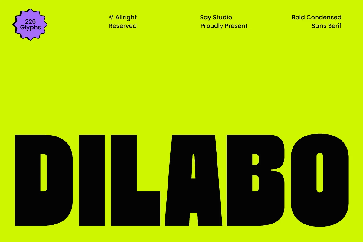
Best For: branding, posters, headlines, bold designs
Dilabo Font is all about vertical force. Its tall condensed build, dense weight, and broad rounded bowls make each letter feel packed and deliberate, while the narrow counters keep the overall look sharp and compact rather than soft.
For Sans Serif Fonts with a harder urban edge, Dilabo works best in short headlines and identity pieces where the heavy structure can do the talking. Keep tracking fairly tight and let the large shapes fill the space; if you stretch it across long lines, the texture gets too dense and loses some of its punch.
Neverdies Font
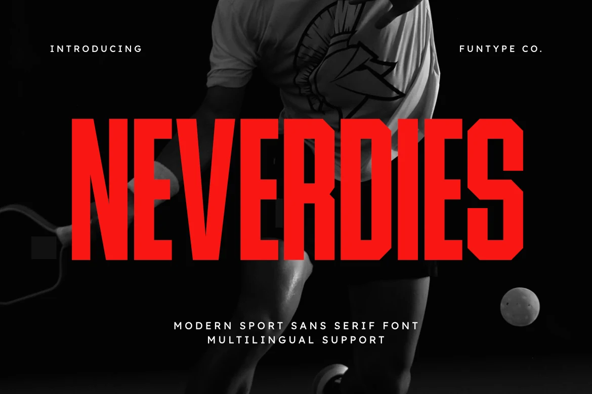
Best For: logos, headlines, posters, bold designs
Neverdies Font is a condensed sport sans with hard vertical stems, squared counters, and angled cuts that make the word shape feel fast and mechanical. The letters sit tall and tightly packed, creating a solid headline block with a sharp competitive edge.
Use it when Sans Serif Fonts need to feel aggressive, controlled, and built for impact: sports logos, gaming marks, poster titles, and digital campaign headers. Keep the wording short and the contrast high; its narrow proportions perform best when the layout lets the vertical rhythm dominate. OTF and TTF files keep it practical across common design software.
Ocean Beach Font
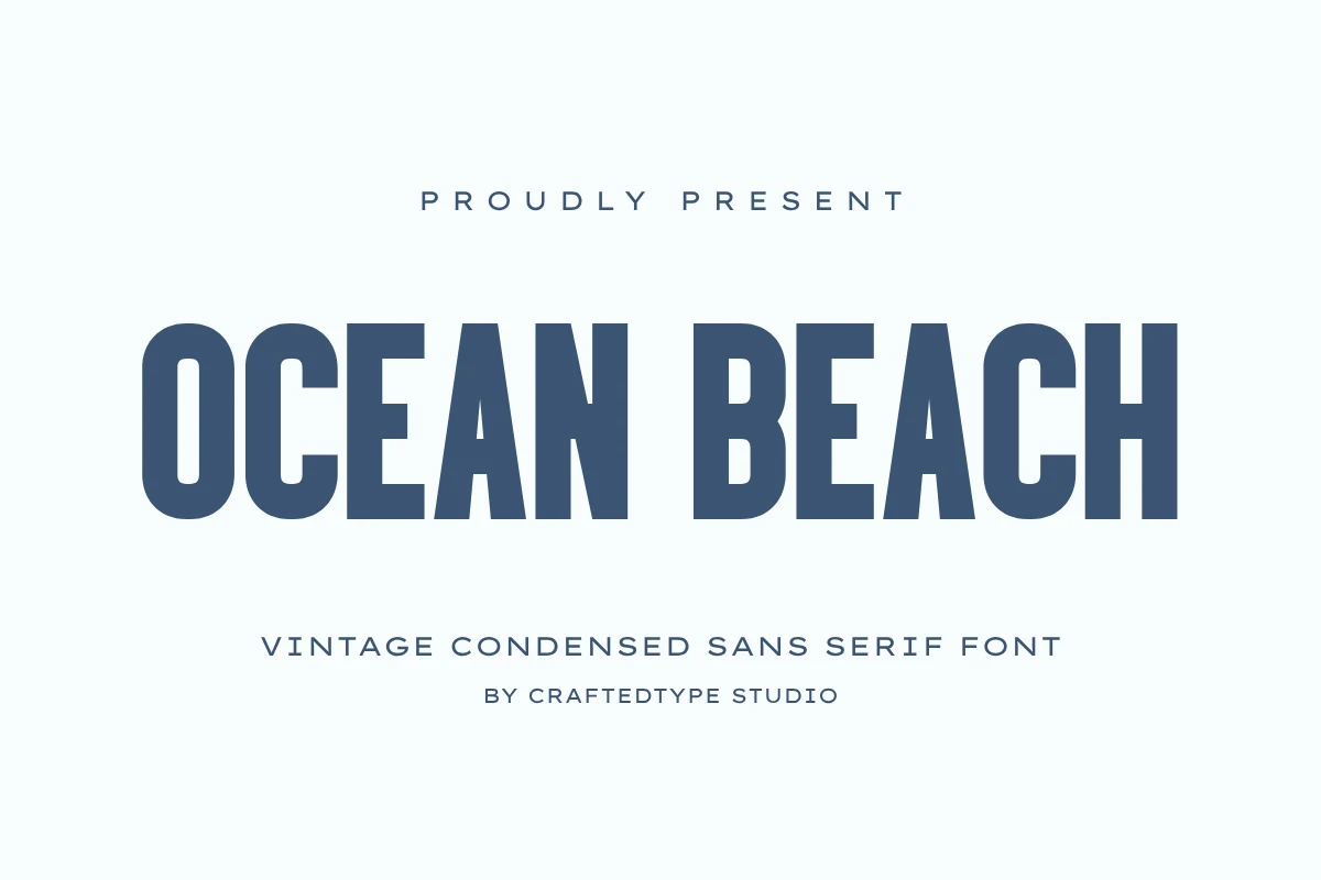
Best For: logos, branding, posters, T-shirts
Ocean Beach Font has a tall condensed build with sturdy vertical strokes, compact counters, and a lightly vintage tone that feels polished rather than novelty-driven. The narrow proportions give headings a clean, upright rhythm, while the softened curves keep the overall texture approachable and easy on the eye.
If you are browsing Sans Serif Fonts for retro branding or print-led layouts, Ocean Beach works especially well in short titles, packaging fronts, and merch where space is tight but presence still matters. Keep it at medium to large sizes so the condensed structure stays crisp, and its PUA encoding makes character access simpler in everyday design software.
Pogonia Font
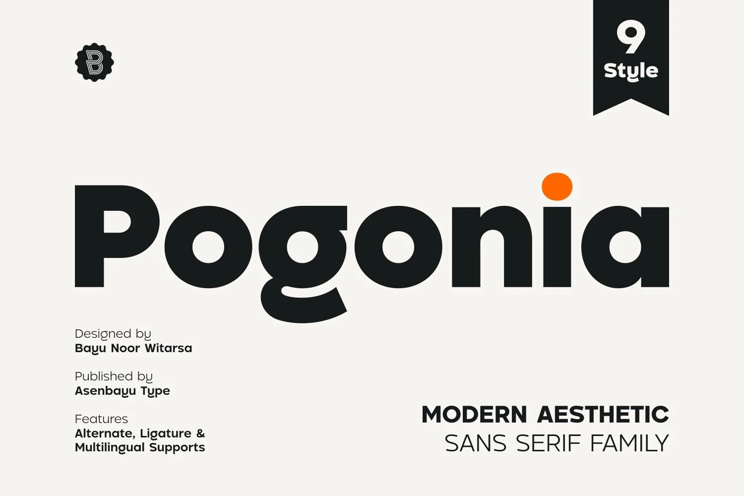
Best For: logos, posters, social media graphics, website headers
Pogonia Font pairs a geometric sans base with softer humanist curves, giving the heavy letters a cleaner and more approachable rhythm. The rounded bowls, compact counters, and distinctive single-storey forms keep the wordmark bold without making it feel rigid.
For Sans Serif Fonts built around modern branding, Pogonia works best when the layout lets its thick shapes create the hierarchy. Use firm contrast, moderate spacing, and short title lines so the rounded geometry stays clear in logos, posters, social media graphics, and web headers.
Pencil Beautiful Font
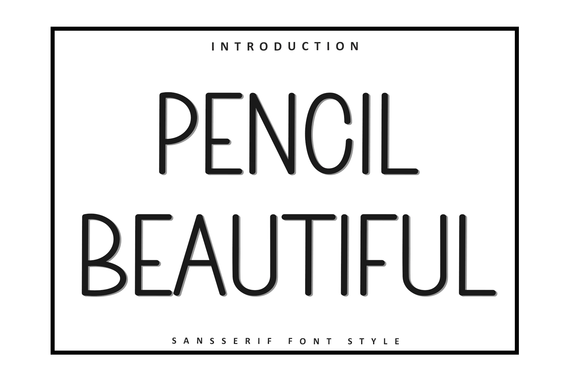
Best For: logos, website headers, clean designs, minimal designs
Pencil Beautiful Font has a light monoline build with rounded terminals, tall proportions, and airy spacing that make it feel calm and refined. The letters stay simple, but the softened corners and narrow structure give the face a distinctive personality instead of a neutral sans look.
Within Sans Serif Fonts, this one suits minimal titles and identity work where a clean outline can carry the composition without visual weight. It performs best at medium to large sizes with generous spacing and plenty of contrast, since the thin strokes can lose presence in dense layouts or long text.
Intrade Font
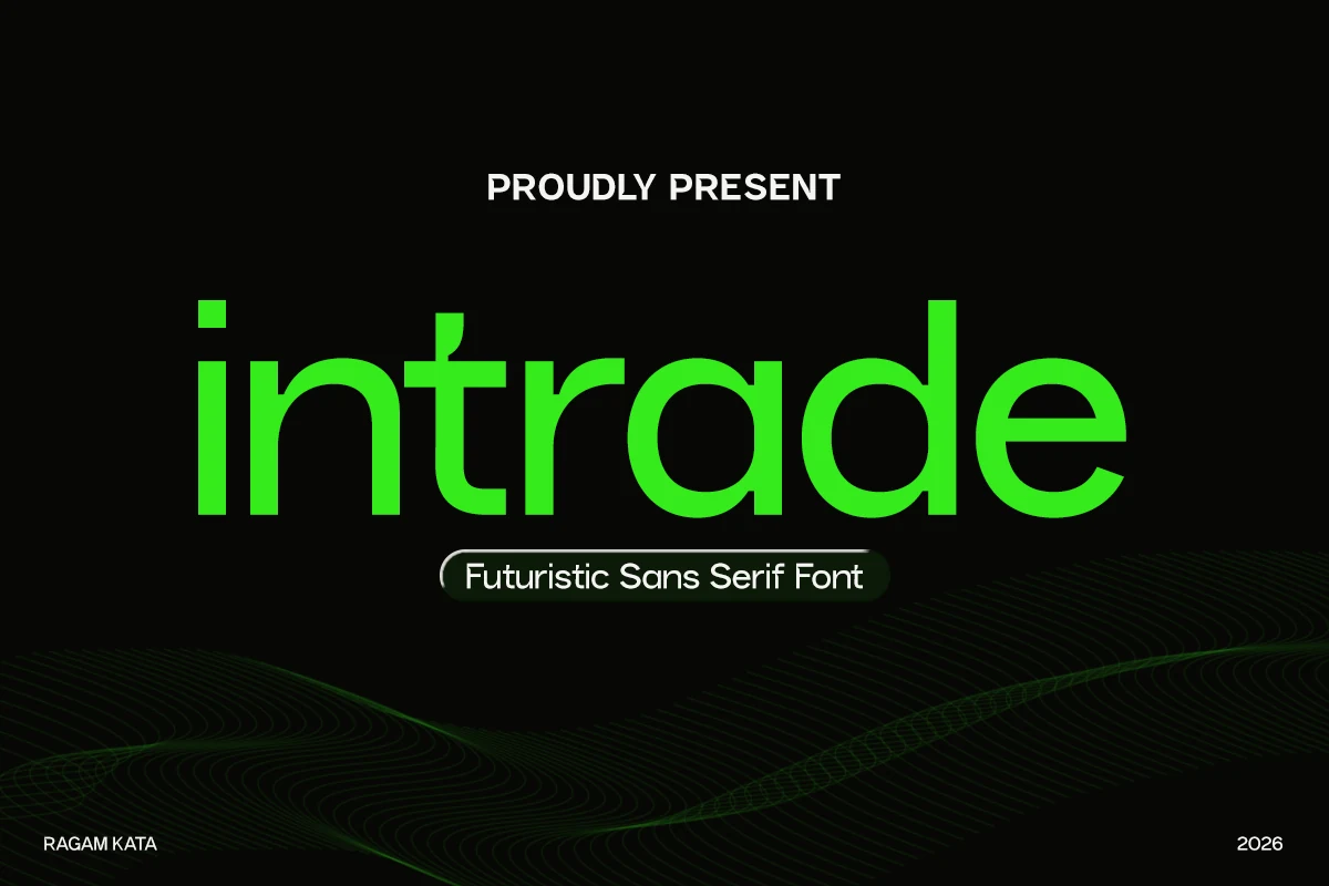
Best For: logos, branding, website headers, modern designs
Intrade Font has a smooth futuristic build with rounded geometric bowls, clean terminals, and a low, steady rhythm across the lowercase forms. The wide curves and simplified strokes keep the design minimal, while the tall ascenders give the word shape a stronger tech-oriented profile.
For Sans Serif Fonts aimed at digital identity work, Intrade is strongest in logos, interface-style headers, and modern brand systems that need a controlled but distinctive voice. Use firm contrast and moderate tracking; too much spacing weakens the connected visual flow that makes its rounded structure feel precise.
Nura Font
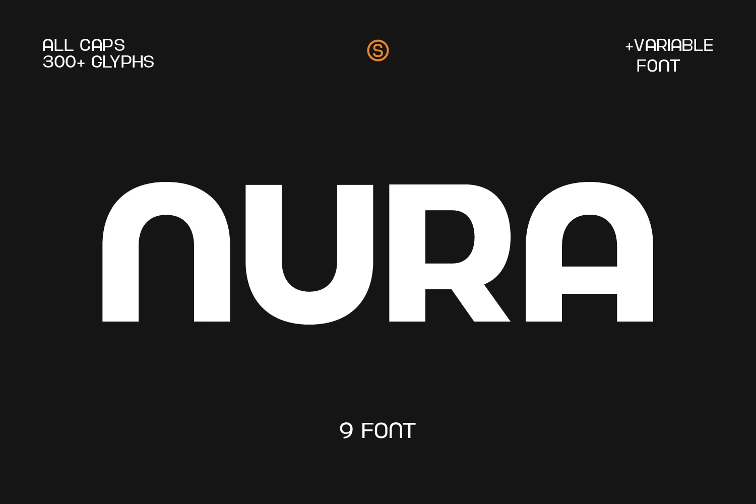
Best For: posters, headlines, logos, branding
Nura Font has a clean geometric build with broad curves, even stroke weight, and softly squared terminals that keep the letters looking neat without feeling plain. The wide bowls and simplified shapes give it a polished, modern tone, while the generous proportions help each character read clearly at display size.
For Sans Serif Fonts that need a professional but contemporary edge, Nura works especially well in posters, subheadings, and logo systems with short, high-visibility text. Keep the tracking moderate and let the large forms breathe, because its rounded structure looks strongest when the word shape stays open and crisp.
Cloud Font
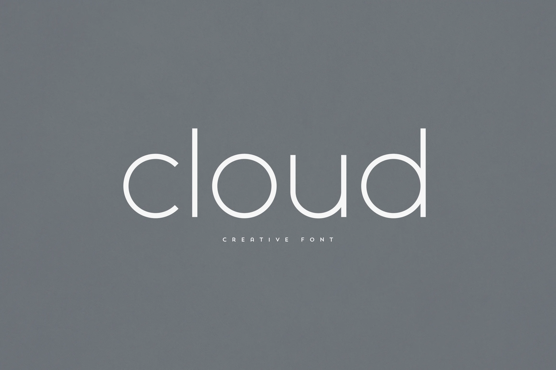
Best For: logos, branding, website headers, minimal designs
Cloud Font has a very light monoline structure with rounded curves, tall stems, and open spacing that gives the lowercase forms a quiet, polished rhythm. Its thin strokes make the lettering feel minimal and airy, while the smooth bowls keep the word shape soft rather than technical.
For logos, brand marks, and clean website headers, Cloud brings a refined option to Sans Serif Fonts without relying on heavy contrast or decoration. Keep the background simple and the scale generous; the slender weight needs clear contrast and enough space to stay sharp.
Maison Cronne Font
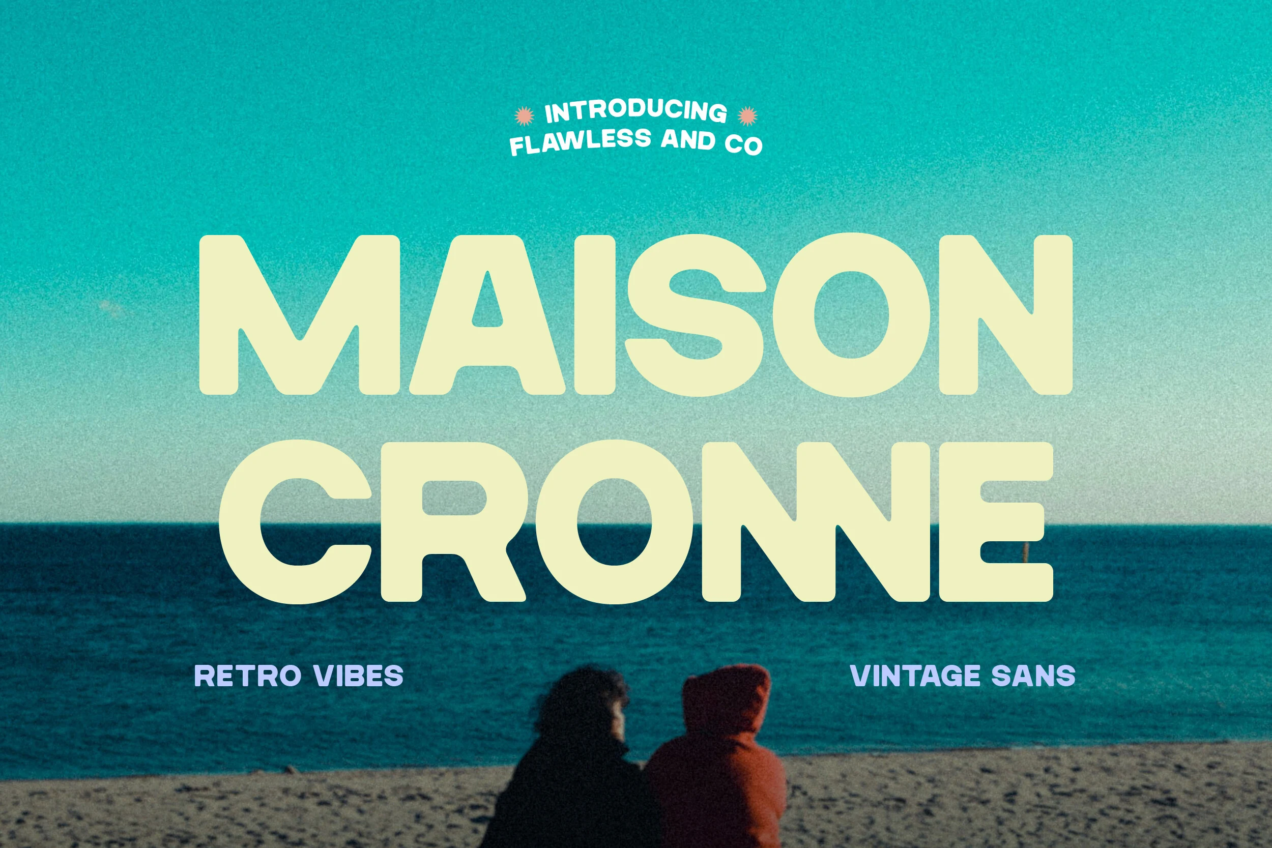
Best For: branding, posters, packaging, social media graphics
Maison Cronne Font brings a chunky retro voice through broad bowls, softened corners, and thick strokes that feel cheerful rather than hard-edged. The letterforms carry a clear vintage rhythm, yet the construction stays clean enough to keep the overall look polished and current.
For Sans Serif Fonts with a nostalgic pull, Maison Cronne works especially well in poster headlines, packaging names, and branding that needs instant personality. Keep it at larger sizes and avoid crowding the lines too tightly; its wide curves and dense weight read best when each word has room to stand out.
Chunk Font
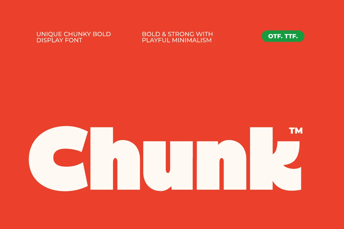
Best For: logos, posters, headlines, social media graphics
Chunk Font has a heavy rounded build with compressed counters, blunt terminals, and playful cut-in shapes that keep the letters bold without turning them stiff. The thick strokes create strong visual mass, while the curved details in characters like C and k add a more graphic, brand-ready personality.
For Sans Serif Fonts with a loud display voice, Chunk works best in short words, poster titles, social media graphics, and logo marks where the chunky rhythm can dominate the layout. Use high contrast and controlled spacing; its ligatures can help smooth selected letter combinations, and multilingual support keeps the same tone across broader campaigns.
Minimalist Font
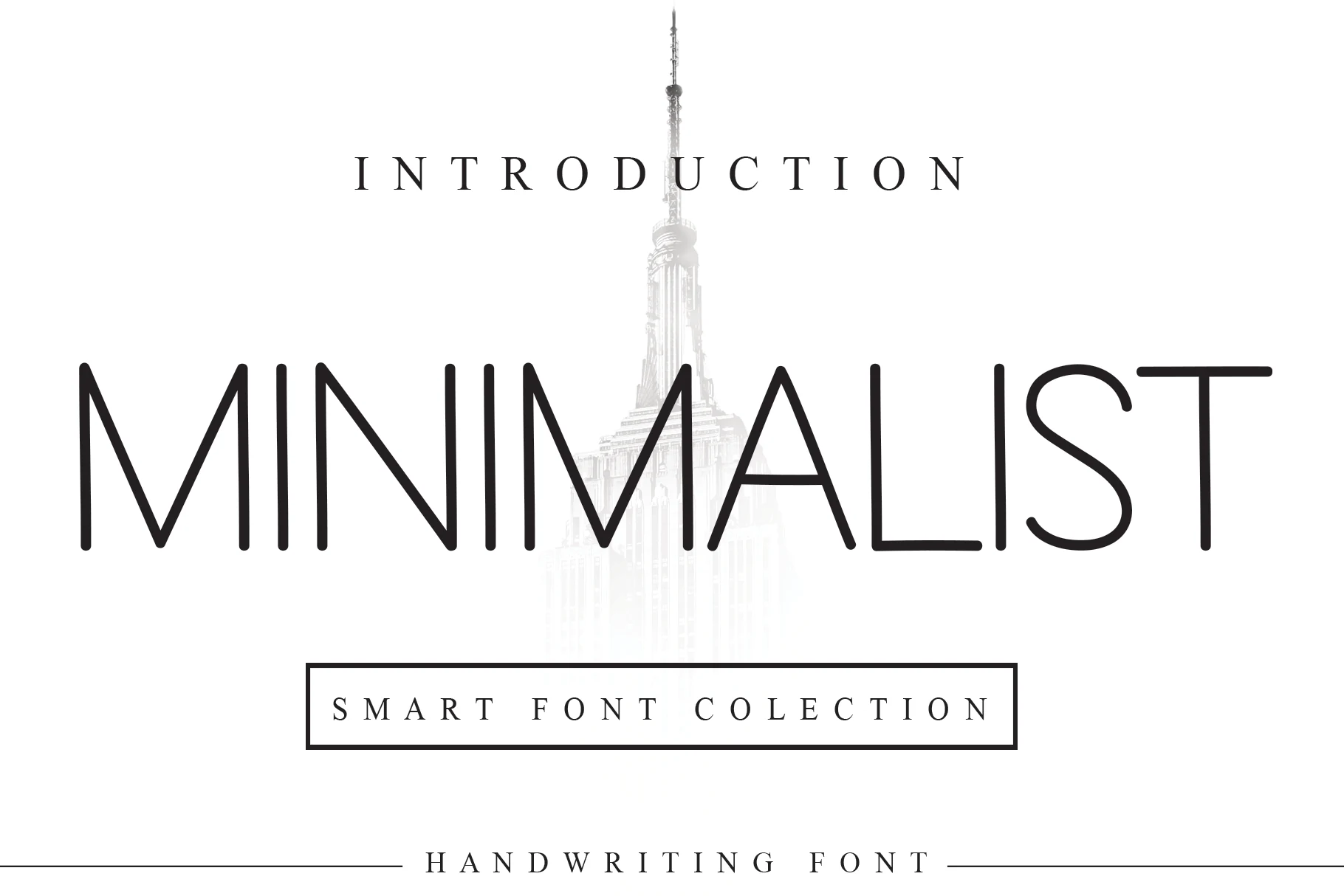
Best For: logos, website headers, minimal designs, editorial designs
Minimalist Font has a slim monoline build with tall proportions, rounded turns, and plenty of breathing room between forms. That light, airy structure gives it a refined presence, so the lettering feels clean and deliberate rather than decorative.
If you are exploring Sans Serif Fonts for pared-back branding or elegant headings, this one works best at medium to large sizes where its thin strokes stay crisp. Leave it generous whitespace and avoid cramped settings, because the open spacing is what makes the overall rhythm look polished.
Limited Font
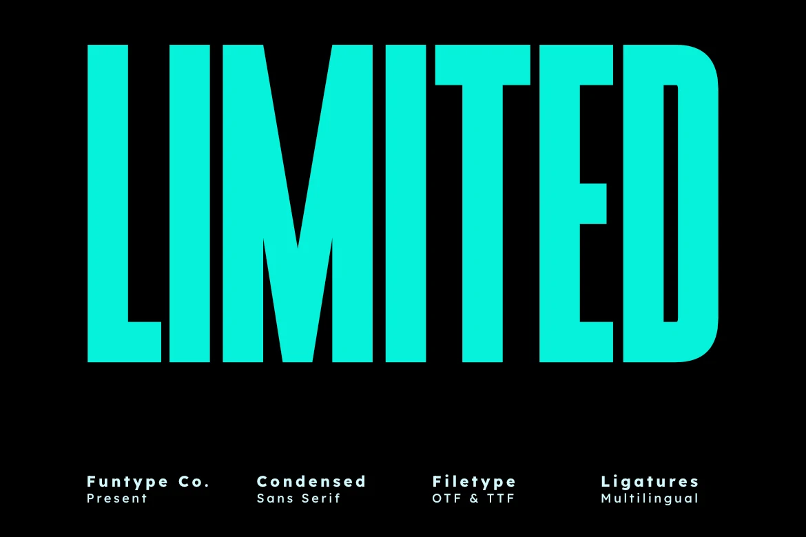
Best For: headlines, posters, branding, bold designs
Limited Font uses a tall ultra-condensed structure with heavy vertical strokes, narrow counters, and blunt rectangular terminals. The letters feel packed and industrial, giving each word a strong block shape that reads with immediate force in display settings.
For Sans Serif Fonts built around impact, Limited is strongest in short headlines, poster titles, sports graphics, and brand marks where vertical density matters more than subtle texture. Keep spacing controlled and avoid long phrases; the compressed width works best when the layout turns a few words into a bold central anchor.
TRT Burn Font
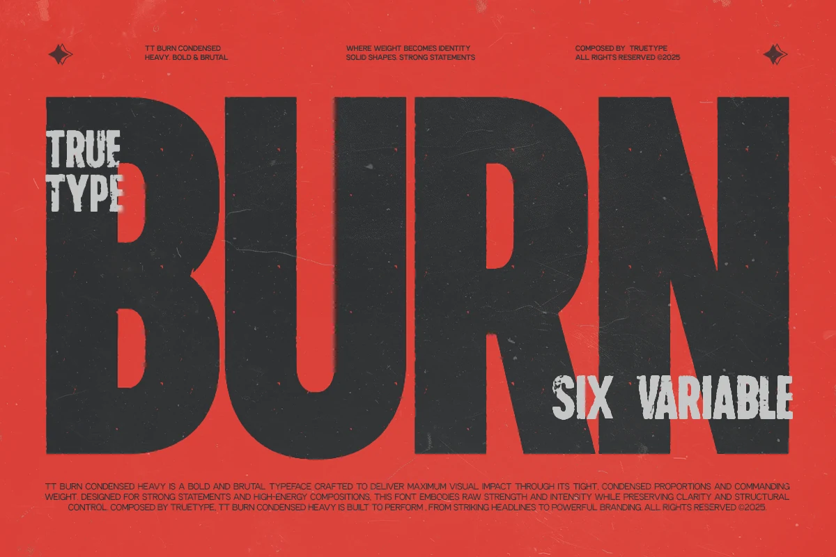
Best For: headlines, posters, branding, bold designs
TRT Burn Font is built around a hard condensed skeleton with towering verticals, dense weight, and tight counters that create a blunt, high-pressure word shape. It feels forceful and efficient at once, giving large headlines a solid block of impact rather than a loose line of text.
If you are browsing Sans Serif Fonts for branding or poster work, TRT Burn suits short headlines and space-conscious layouts where width is limited but presence still matters. Keep tracking fairly tight and use it for brief, high-contrast phrases; its compact proportions are strongest when the layout lets that compressed rhythm do the heavy lifting.
Salty Beach Font
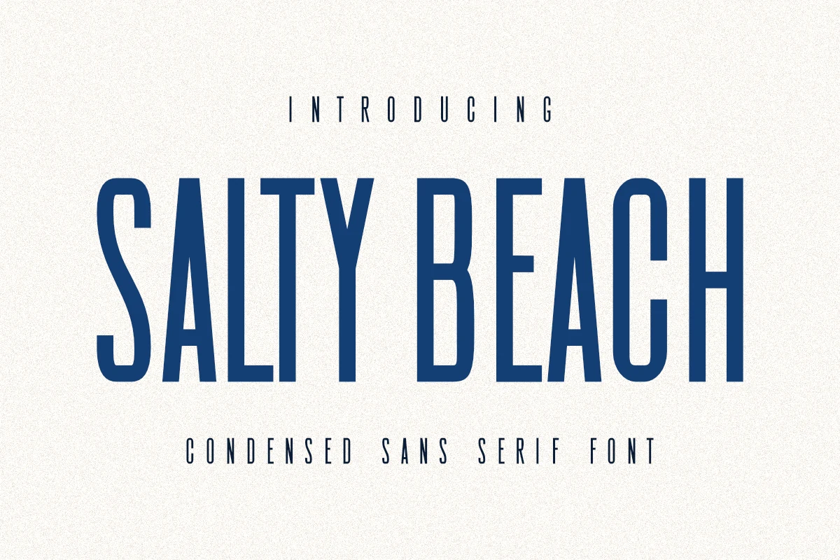
Best For: posters, T-shirts, branding, packaging
Salty Beach Font uses tall condensed capitals, narrow counters, and slightly softened vertical strokes to create a clean coastal display style. The letterforms feel sleek and structured, but the slim proportions give titles a relaxed vintage rhythm instead of a rigid industrial tone.
For Sans Serif Fonts suited to print-on-demand graphics, film-style titles, and minimalist branding, Salty Beach works best when the spacing is treated as part of the design. Use it in short lines with generous tracking and strong contrast so the narrow shapes stay clear across posters, apparel, packaging, and logos.
The right Sans Serif Fonts can make a design feel cleaner, stronger, and more intentional, whether you are building a logo, headline, product label, website header, or print-on-demand graphic. All of these fonts are available on Creative Fabrica, so you can explore the full collection, choose the styles that match your project, and start creating with typography that fits your visual direction. Good luck with your next creative project.