16 Best Summer Display Fonts for Fun Seasonal Designs
This collection is for designers, crafters, and small brands that need summer display fonts with strong visual impact. These 16 fonts work best for posters, stickers, T-shirts, packaging, party graphics, kids’ designs, retro layouts, and beach-inspired headlines where the type needs to carry the mood fast.
Summer Motion Font
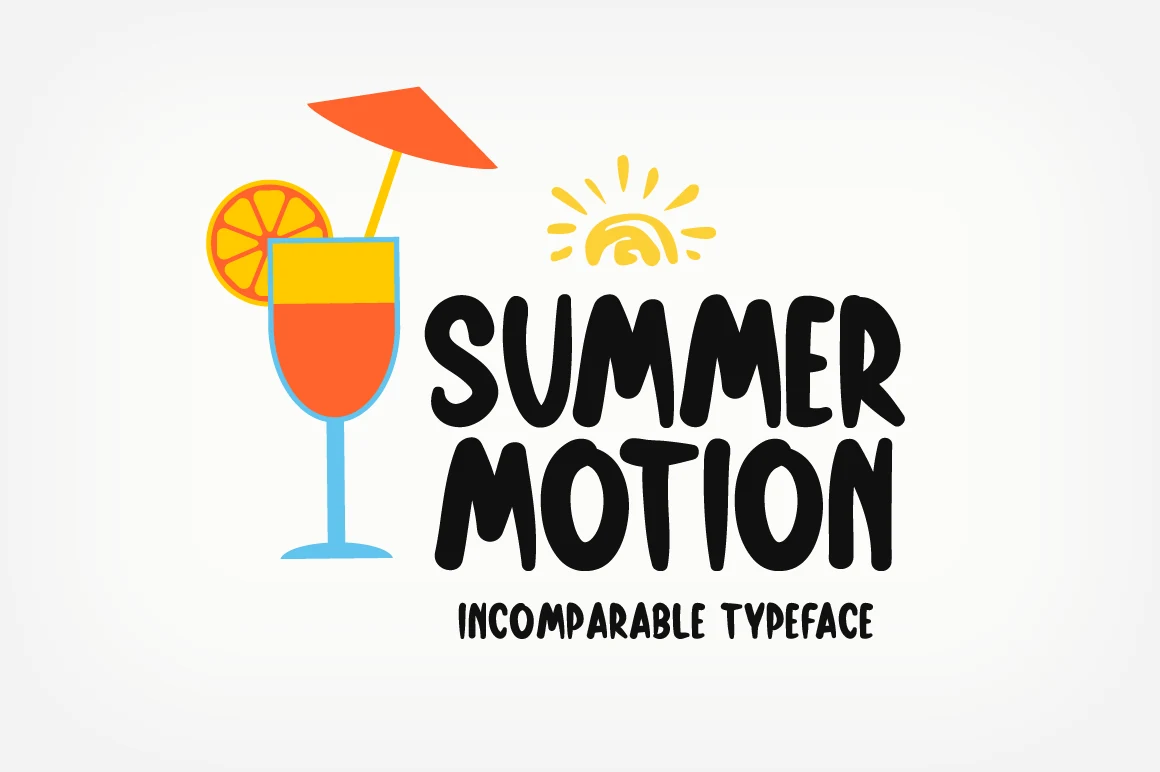
Best For: posters, T-shirts, stickers, playful designs
Summer Motion Font has the blunt, cheerful weight that suits Summer Display Fonts without turning rigid. The letters are thick and rounded, with uneven hand-drawn edges, soft counters, and a squeezed rhythm that makes the words feel active rather than polished.
Use it where the headline needs to carry the design: titles, stationery accents, letterheads, craft graphics, or short product text. The chunky proportions work best with generous line spacing and strong contrast, while longer phrases need careful tracking so the playful forms do not crowd each other.
Intimate Summer Font
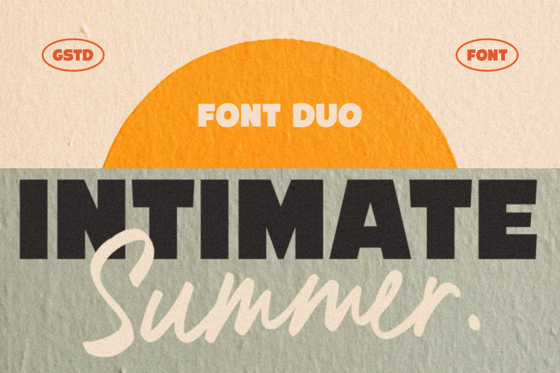
Best For: branding, posters, social media graphics, retro designs
Intimate Summer Font pairs two very different energies: a heavy all-caps sans with square shoulders and tight structure, and a loose script with long, sweeping strokes. That contrast gives Summer Display Fonts a clear hierarchy, so the bold line grabs attention first while the handwritten layer softens the mood.
This duo works especially well for titles, posters, packaging, and branded graphics where you want both impact and warmth. Keep the sans for short anchor words and let the script play a secondary role underneath or across it, which helps the layout stay readable while still feeling relaxed and seasonal.
Stay Disney Font
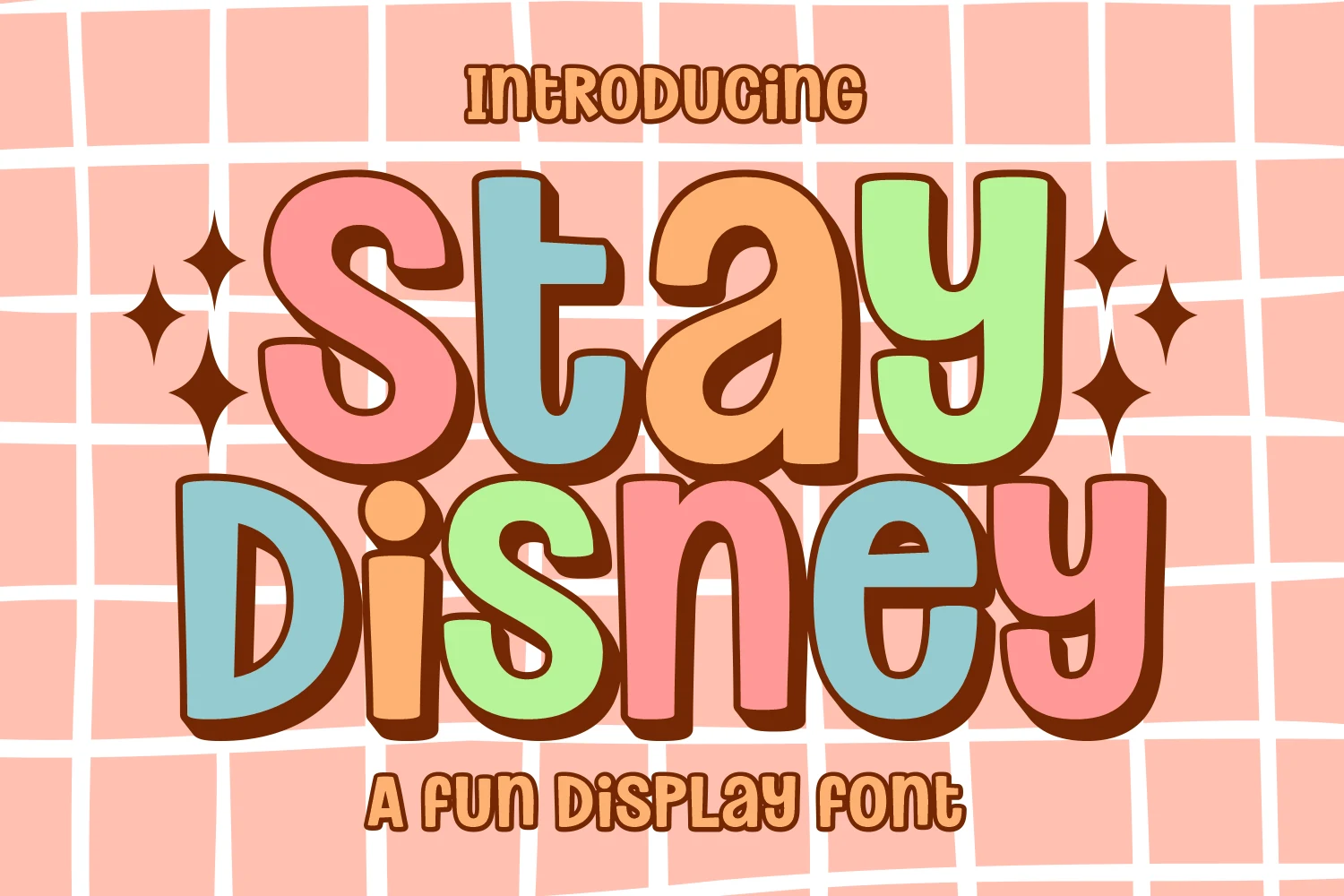
Best For: stickers, T-shirts, children’s designs, playful designs
Stay Disney Font uses oversized bubble letters with rounded terminals, chunky stems, and a heavy shadowed outline that gives each word a sticker-like edge. Within Summer Display Fonts, it sits on the playful retro side, with soft 70s curves and a candy-store rhythm built for quick visual impact.
The letterforms are readable because the counters stay open despite the inflated shapes, but the style is still best kept to short names, thumbnails, packaging fronts, and printable phrases. Its SVG, PNG, and ProCreate styles help preserve the colorful, outlined look when moving between digital artwork and print layouts.
Summer Hot Font
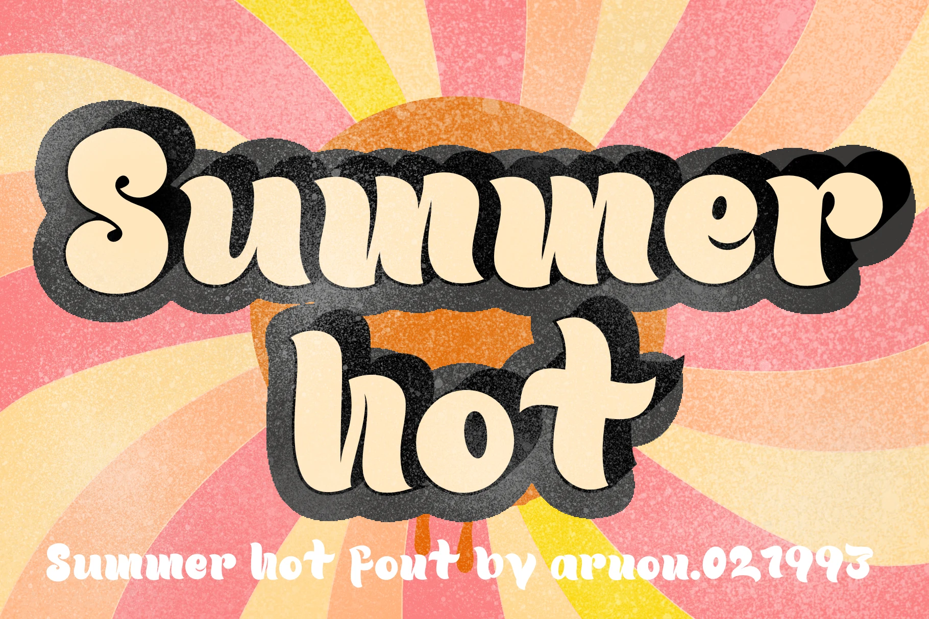
Best For: posters, stickers, T-shirts, retro designs
Summer Hot Font leans into retro display drama with wide, cushioned letterforms, soft curves, and a thick shadowed edge that gives the words real presence. Within Summer Display Fonts, it feels closer to a 70s poster mood than a clean modern headline, so the style lands best when the lettering carries the composition.
Use it for short headlines, merch, stickers, posters, or playful packaging where that vintage tone needs to read fast. The rounded shapes stay bold at a glance, but the heavy shadow adds visual weight, so keep your wording brief and give the lines enough space to avoid a crowded block.
Summer Explore Font
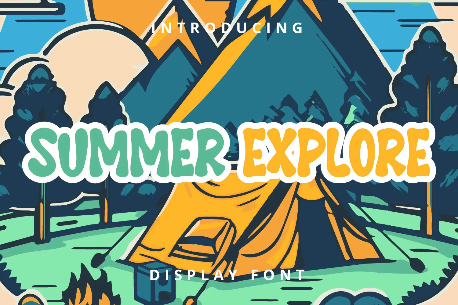
Best For: stickers, posters, children’s designs, fun designs
Summer Explore Font has thick, rounded shapes with a soft bounce that makes every word feel upbeat. The letters are broad and slightly uneven rather than rigid, which gives Summer Display Fonts a friendlier tone and helps short headlines look lively without becoming messy.
It fits best where the type needs to do the charm work on its own, from kids’ graphics to stickers and playful poster titles. Because the forms are wide and compact, it works better in short phrases with a little extra spacing around the layout so the chunky rhythm stays clear and cheerful.
Summer Bubble Font
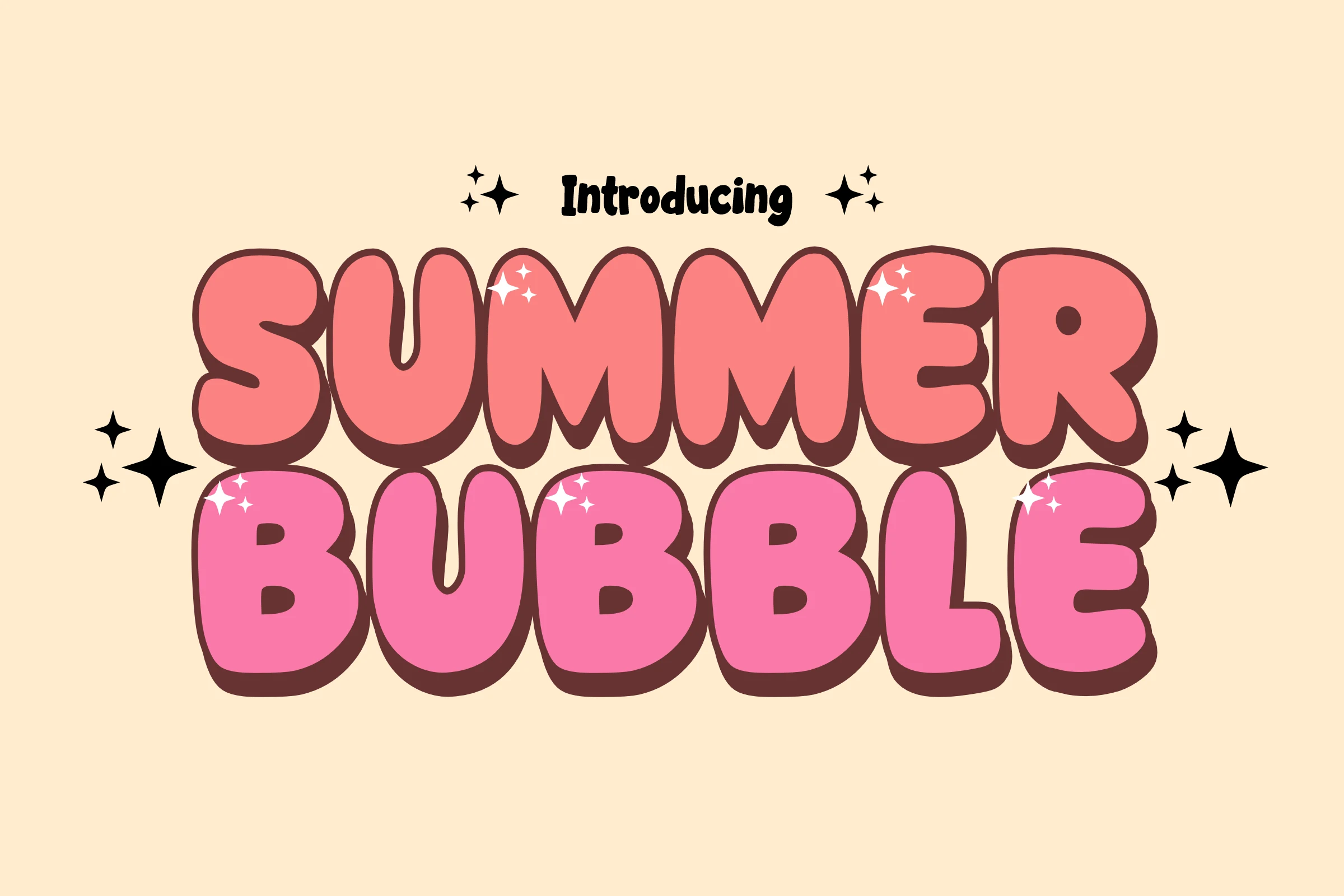
Best For: T-shirts, children’s designs, cute designs, fun designs
Summer Bubble Font uses oversized rounded letters with soft corners, heavy weight, and a deep offset shadow that makes each word pop. In Summer Display Fonts, it stands out for its inflated shapes and friendly rhythm, keeping the style playful while the characters stay easy to read.
That balance makes it a strong fit for children’s products, comic-style titles, sublimation graphics, and merch where the lettering needs to feel cheerful at a glance. Keep it to short headlines or names, and let the shadow do part of the hierarchy so the bubbly forms stay crisp instead of crowding the layout.
Summer Beach Font
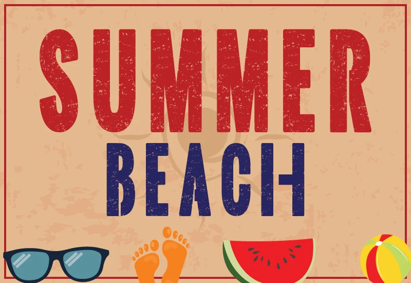
Best For: posters, T-shirts, signage, vintage designs
Summer Beach Font takes a tall, condensed approach with straight-sided capitals, blunt corners, and a worn print texture that gives the letters a sun-faded, vintage edge. In Summer Display Fonts, it reads less like a bubbly seasonal style and more like a retro boardwalk headline with strong vertical rhythm.
That narrow build helps when you want a large title to fit into tighter widths for posters, T-shirts, signage, or stacked layouts. Keep it at display sizes so the distressed detail stays visible, and pair it with a quieter supporting font so the texture carries the styling without making the composition feel busy.
Summer Days Font
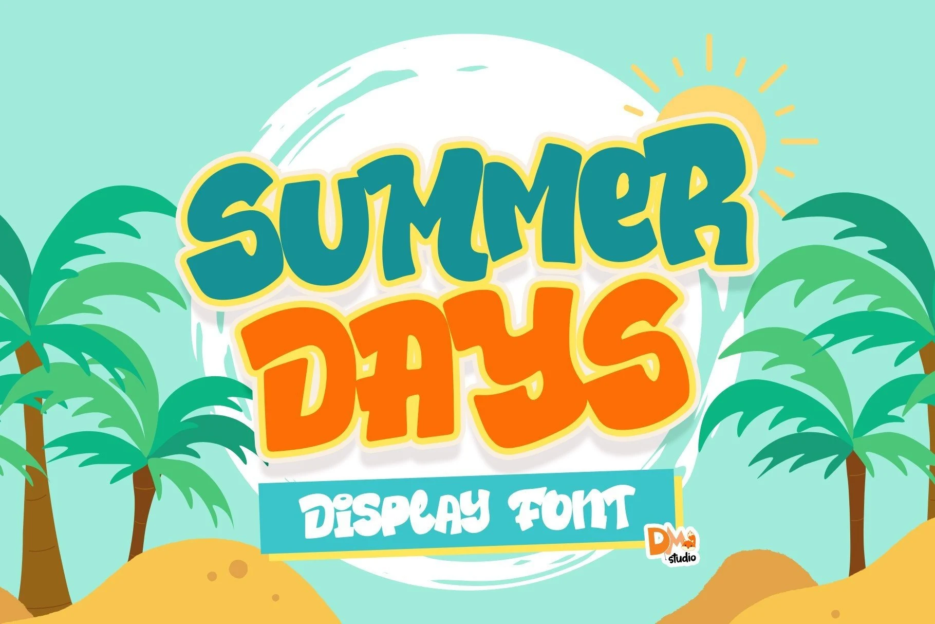
Best For: invitations, children’s designs, cute designs, fun designs
Summer Days Font has thick, rounded letters with a buoyant bounce, soft corners, and a puffy silhouette that feels instantly cheerful. For Summer Display Fonts, it brings a bright vacation mood without losing clarity, because the forms stay open and bold even with their playful rhythm.
It suits invitations, kid-friendly titles, pool party graphics, and other short headlines where the type should set the mood fast. The broad shapes hold up best at medium to large sizes, and pairing it with a simpler support font helps the bubbly lettering stay lively without overwhelming the layout.
Aplicia Summer Font
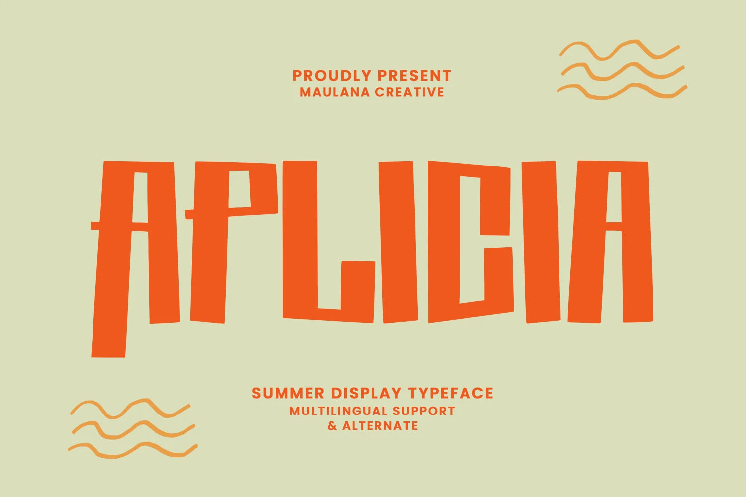
Best For: logos, social media graphics, book covers, headlines
Aplicia Summer Font gives Summer Display Fonts a sharper, more architectural direction. Its tall uppercase letters use straight vertical pressure, angled sides, and narrow cutout counters, creating a bold poster rhythm that feels structured without becoming plain.
The compact width helps large words fit into logos, social graphics, book titles, and stacked headline layouts. Multilingual support for more than 100 languages makes it practical for recurring brand systems, while the rigid shapes pair cleanly with script or serif text when you need contrast.
Super Summer Font
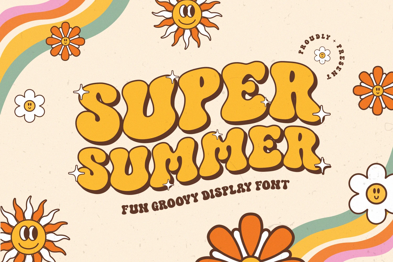
Best For: posters, stickers, retro designs, fun designs
Super Summer Font leans fully into the 60s and 70s mood with swollen, rounded letterforms, deep curves, and a compact groovy rhythm. Among Summer Display Fonts, it stands out for its heavy bubble structure and offset shadow, which give short words a bold, cheerful presence.
The style is strongest in headlines, stickers, and poster text where the lettering can act as the main graphic element. Keep the wording short and give it enough space around the edges, because the thick shapes and close fit create the best impact when the composition stays simple.
Chunky Summer Font
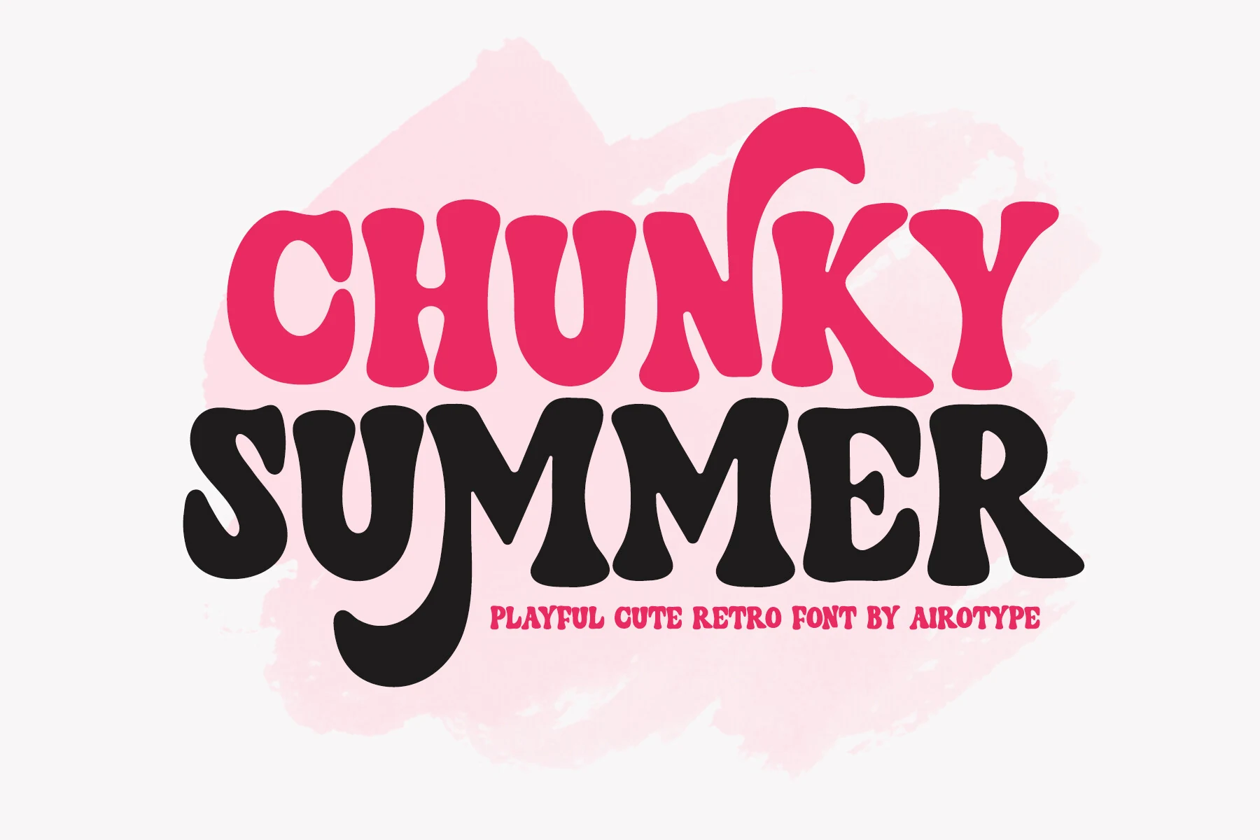
Best For: T-shirts, stickers, children’s designs, retro designs
Chunky Summer Font pushes Summer Display Fonts into a cute retro space with thick, swollen letters and soft wavy edges. The bold weight, rounded counters, and uneven vertical rhythm make each word feel bouncy without looking chaotic.
It suits back-to-school graphics, kids’ designs, birthday invitations, stickers, T-shirts, crafts, and sublimation work where the type needs to carry the mood quickly. Keep it to short phrases and use strong contrast around the letters, especially with the heavy black forms, so the playful shapes stay readable.
Summer Vibes Font
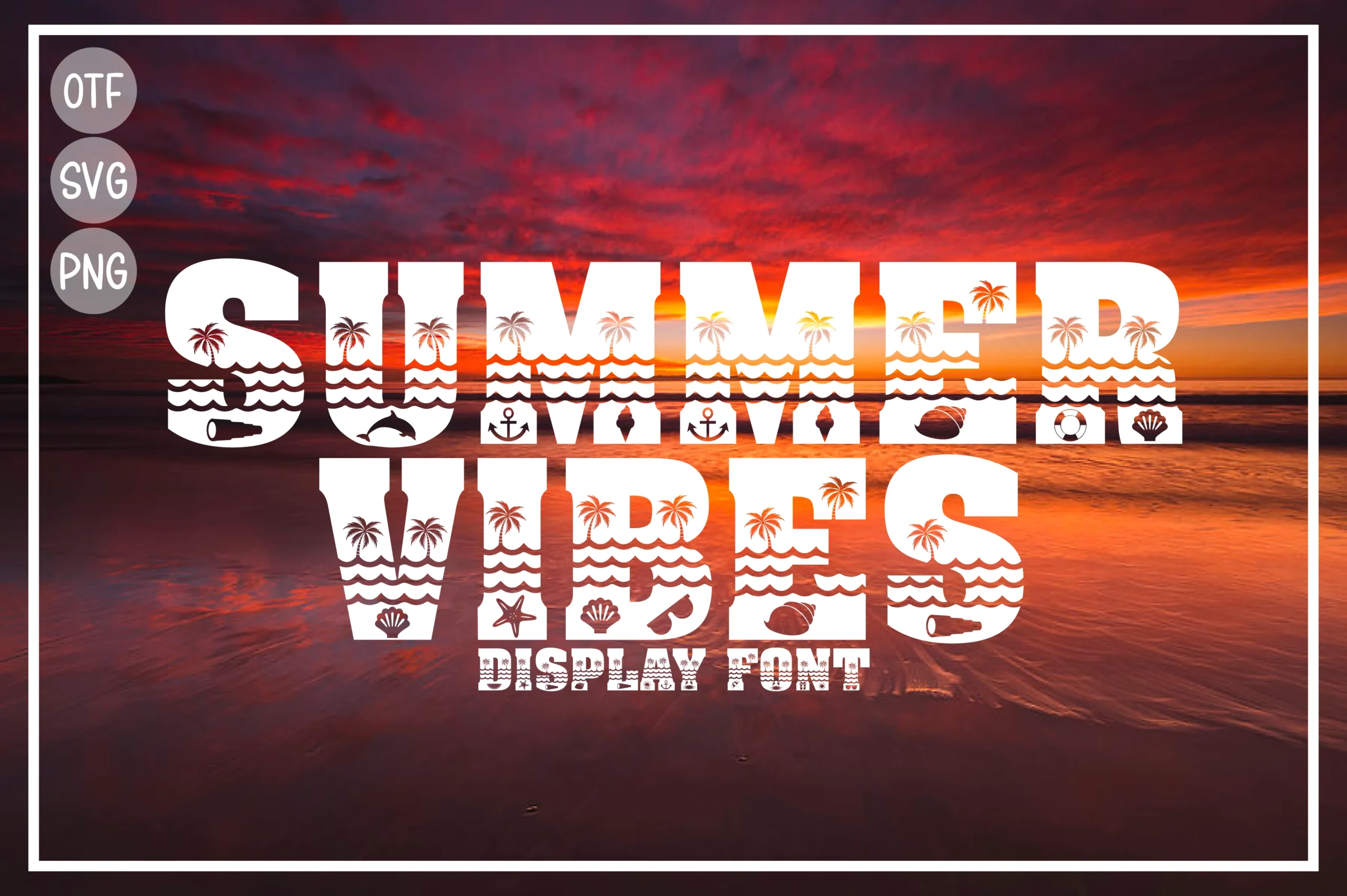
Best For: T-shirts, stickers, social media graphics, packaging
Summer Vibes Font is a decorative block display face built around beach motifs rather than plain counters. Thick uppercase forms are packed with wave bands, palm trees, shells, anchors, and other seaside cutouts, giving Summer Display Fonts a more graphic, souvenir-style personality.
Because the internal details do part of the styling, it works best in short words for T-shirts, stickers, packaging, or social posts where the letters can stay large. Use it as the hero headline and pair it with a simple secondary font so the icon-filled shapes remain legible instead of visually crowded.
Summer Chunky Texture Font
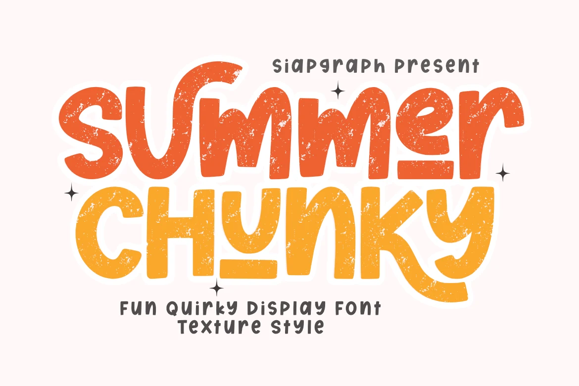
Best For: stickers, T-shirts, merch design, retro designs
Summer Chunky Texture Font uses bold, rounded strokes with a quirky hand-drawn wobble and a rough speckled texture across the letter surfaces. The uneven curves and underlined accents give Summer Display Fonts a casual retro feel, while the heavy shapes keep each word strong and easy to catch.
It fits stickers, T-shirts, sublimation work, and DIY craft layouts where the headline needs personality without thin fragile details. The thick, smooth outlines are useful for cleaner cutting on digital craft machines, but the distressed texture still reads best at display sizes with short wording and clear contrast.
Summer Holiday Font
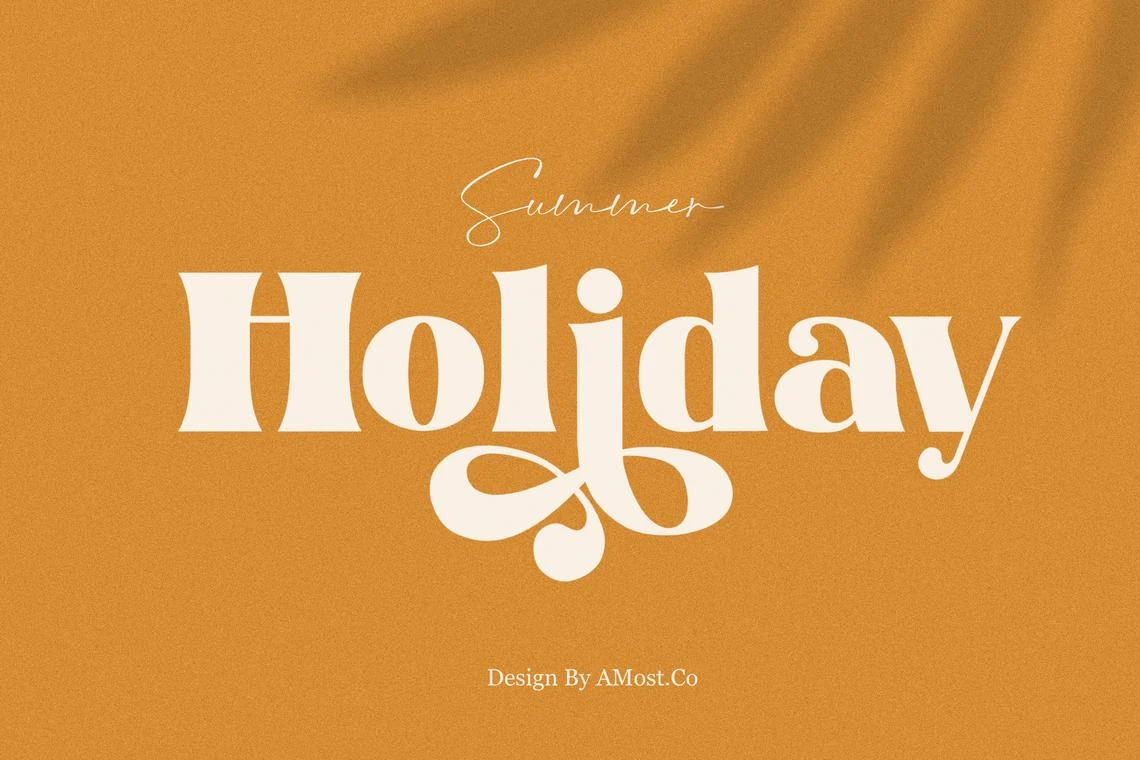
Best For: branding, posters, magazine covers, headlines
Summer Holiday Font brings a fuller, more polished look to Summer Display Fonts with wide serif shapes, sturdy verticals, and soft flared terminals. The standout detail is the sweeping lowercase j, which adds movement beneath the baseline and keeps the bold build from feeling too static.
It works especially well for branding, cover-style headlines, and short poster text where one word needs to feel rich and prominent. Let the decorative descenders have room below the line, and keep surrounding text simpler so the contrast between the chunky forms and elegant curves does the visual work.
Summer Fun Font
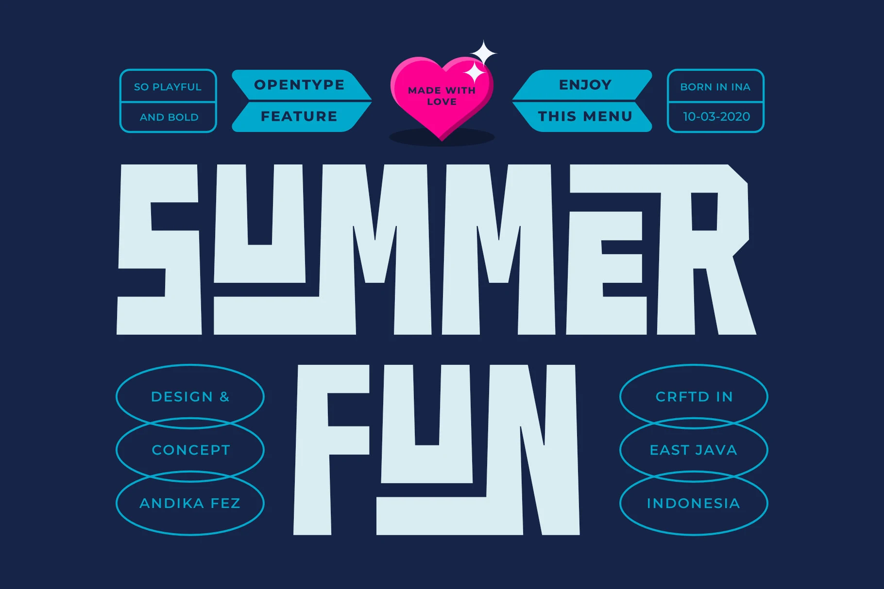
Best For: posters, headlines, merch design, eye-catching designs
Summer Fun uses massive block lettering with squared corners, compressed counters, and sharp stepped cuts that make each word feel built rather than written. Its chunky geometry gives Summer Display Fonts a stronger arcade-poster edge, with enough irregularity to keep the capitals from looking mechanical.
Use it where the title needs to dominate the layout fast: wide headers, shirt graphics, stickers, and event posters. The heavy shapes benefit from firm color contrast and loose letter spacing, especially when the wording is short and the surrounding design needs a clear typographic anchor.
Stay Lucky Font
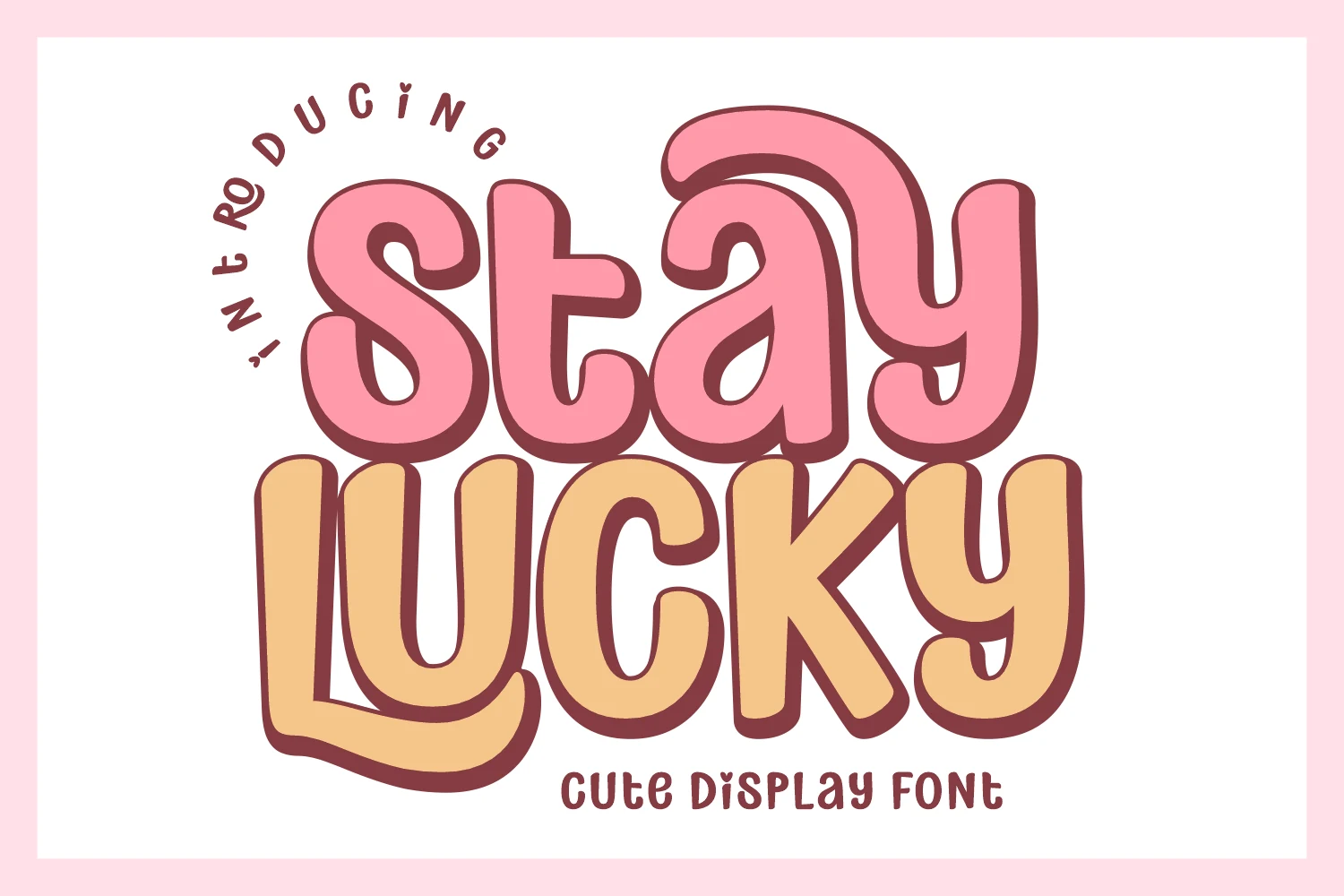
Best For: stickers, product labels, playful designs, cute designs
Stay Lucky has a bubbly retro look with thick rounded strokes, soft inward curves, and a friendly bounce between letters. The candy-like color preview suits the font well: it feels cheerful, easygoing, and highly legible, which gives Summer Display Fonts a sweeter, more character-driven option.
The shapes stay clear even at a glance, so it works well for stickers, packaging, party graphics, and thumbnail-style titles. Keep it on short wording and pair it with simple supporting text, letting the broad curves and chunky outline carry the hierarchy without crowding the layout.
Summer display fonts work best when the lettering is meant to lead the design, not just support it. Choose bubbly and chunky fonts for stickers, kids’ graphics, and playful merch, textured or condensed styles for vintage posters and T-shirts, and more structured display fonts when you need stronger branding or headline control.