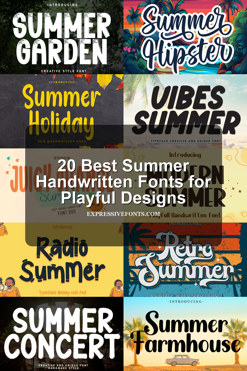
20 Best Summer Handwritten Fonts for Playful Designs
This collection is for designers, crafters, and small brands looking for summer handwritten fonts with a relaxed, playful feel. The 20 fonts work best for beach posters, T-shirts, stickers, invitations, product labels, social posts, and casual seasonal branding where the lettering needs to feel handmade and cheerful.
Summer Holiday Font
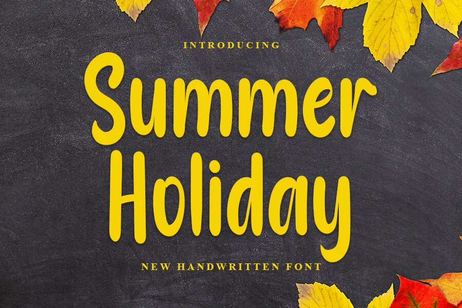
Best For: handmade designs, casual designs, playful designs, quotes
Summer Handwritten Fonts often lean thin or overly loose; Summer Holiday takes a sturdier route with rounded, upright letters, soft terminals, and a friendly bounce in the baseline. The weight sits in a useful middle range, giving the font enough presence for display work without turning the strokes into heavy bubble lettering.
Its tall proportions make short headlines feel open and cheerful, while the repeated rounded stems need controlled spacing so words do not blur together. Use it where the title can stay compact, with strong contrast behind the yellow-like energy of the forms and a clean supporting typeface for secondary text.
Radio Summer Font
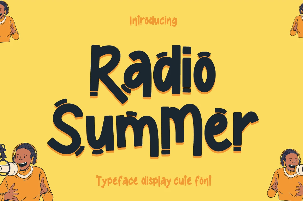
Best For: children’s designs, playful designs, headlines, stickers
Radio Summer Font has a chunky handwritten look with rounded corners, uneven curves, and quirky little cuts at the stroke ends that make the lettering feel lively and informal. It gives Summer Handwritten Fonts a bolder, more cartoonish direction, with enough weight to hold attention fast while still feeling friendly and approachable.
The dense, dark shapes make it strongest in short titles where the playful rhythm can stay clear instead of crowded. A bit of extra spacing helps the letters breathe, and a plain secondary typeface works best beside it so the cheerful, cutout-style forms remain the visual lead.
Summer Concert Font
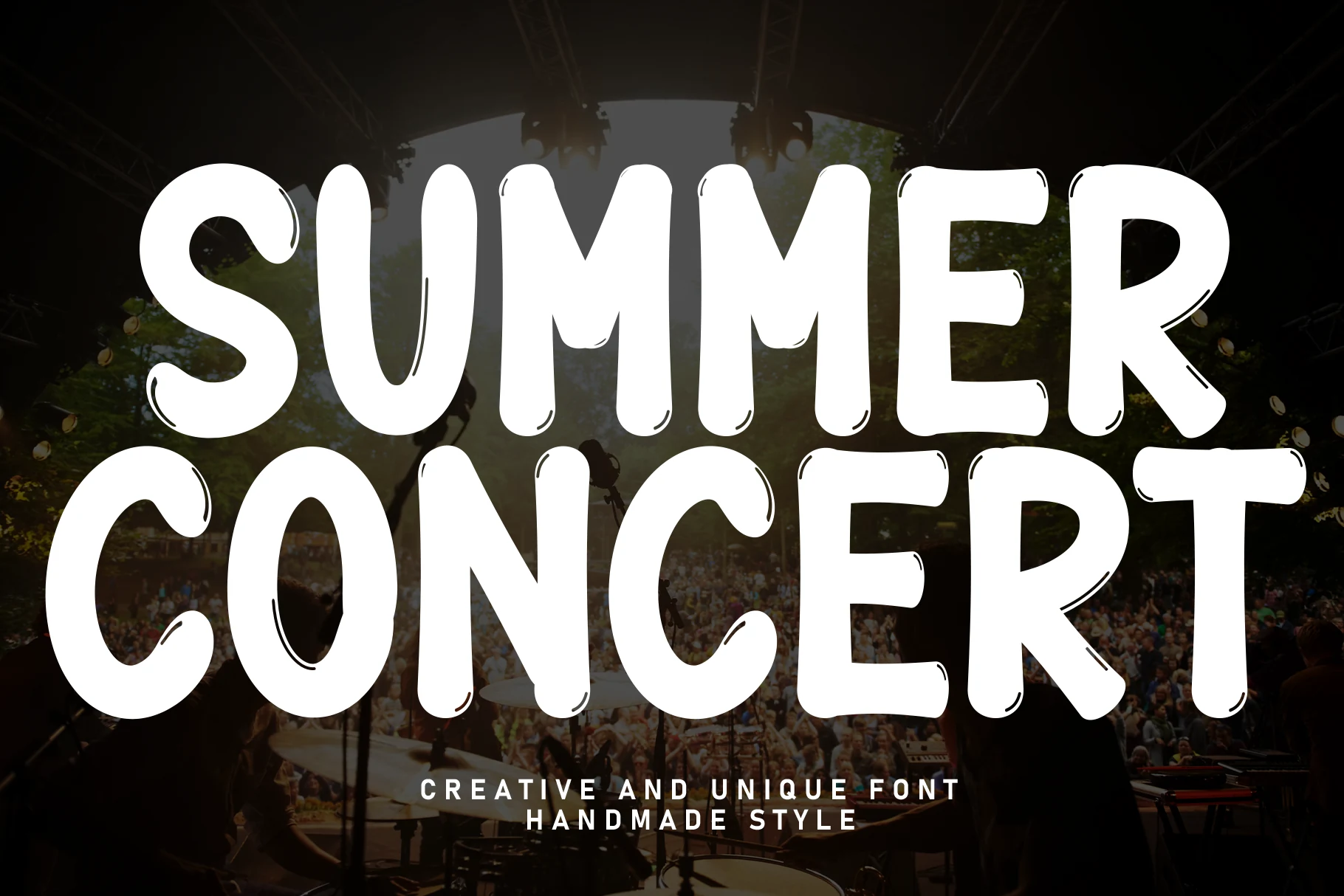
Best For: posters, headlines, merch design, bold designs
Summer Concert Font reads like a loud, hand-drawn display face: thick capitals, rounded verticals, irregular counters, and small sketch-like accent cuts that keep the heavy shapes from looking mechanical. It brings a stage-poster attitude to Summer Handwritten Fonts, with enough mass for logos, covers, and headline art that needs to be seen fast.
Because the letters are wide and densely filled, it works best in short stacked phrases rather than long copy. Tight line height gives the words impact, but the side spacing should stay slightly open so curved letters like C, S, and R do not visually crowd the straighter forms.
Summer Hipster Font
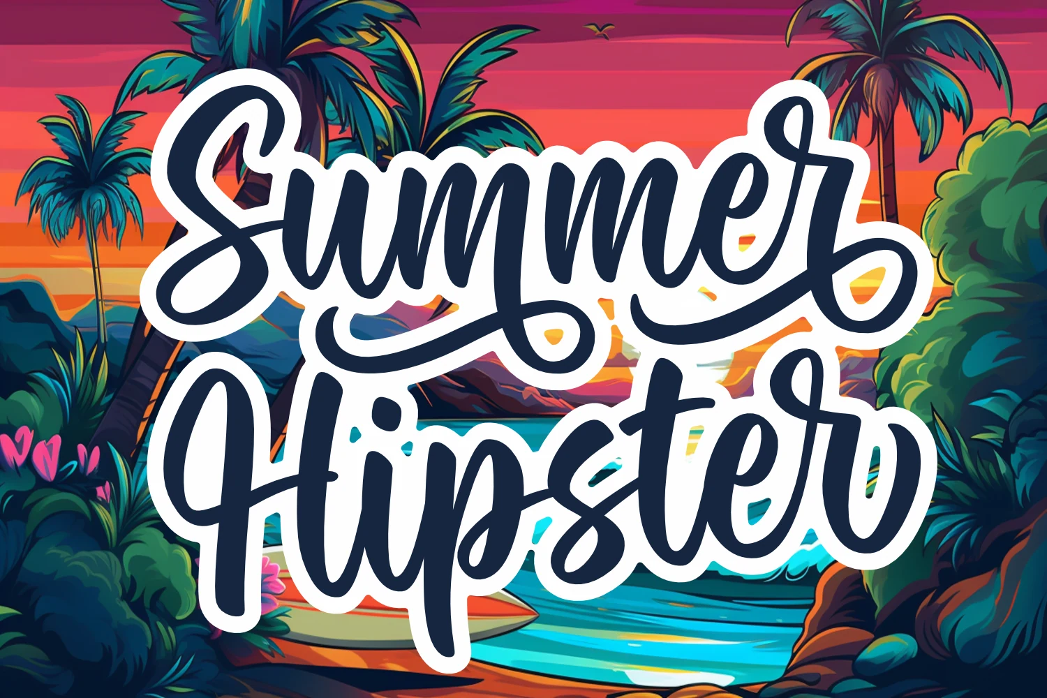
Best For: logos, branding, packaging, headlines
Summer Hipster Font leans into a bold script style with thick monoline strokes, oversized entry swashes, and long looping terminals that keep the words moving across the page. Within Summer Handwritten Fonts, it feels closer to custom lettering than casual handwriting, which gives titles a polished but upbeat personality.
The heavy stroke and compact joins make it strongest at medium to large sizes, where the counters and loops stay clear. Use it as the lead element in a logo or headline, then pair it with a simple sans serif so the broad curves and underline-like flourishes carry the layout without visual competition.
Summer Smile Font
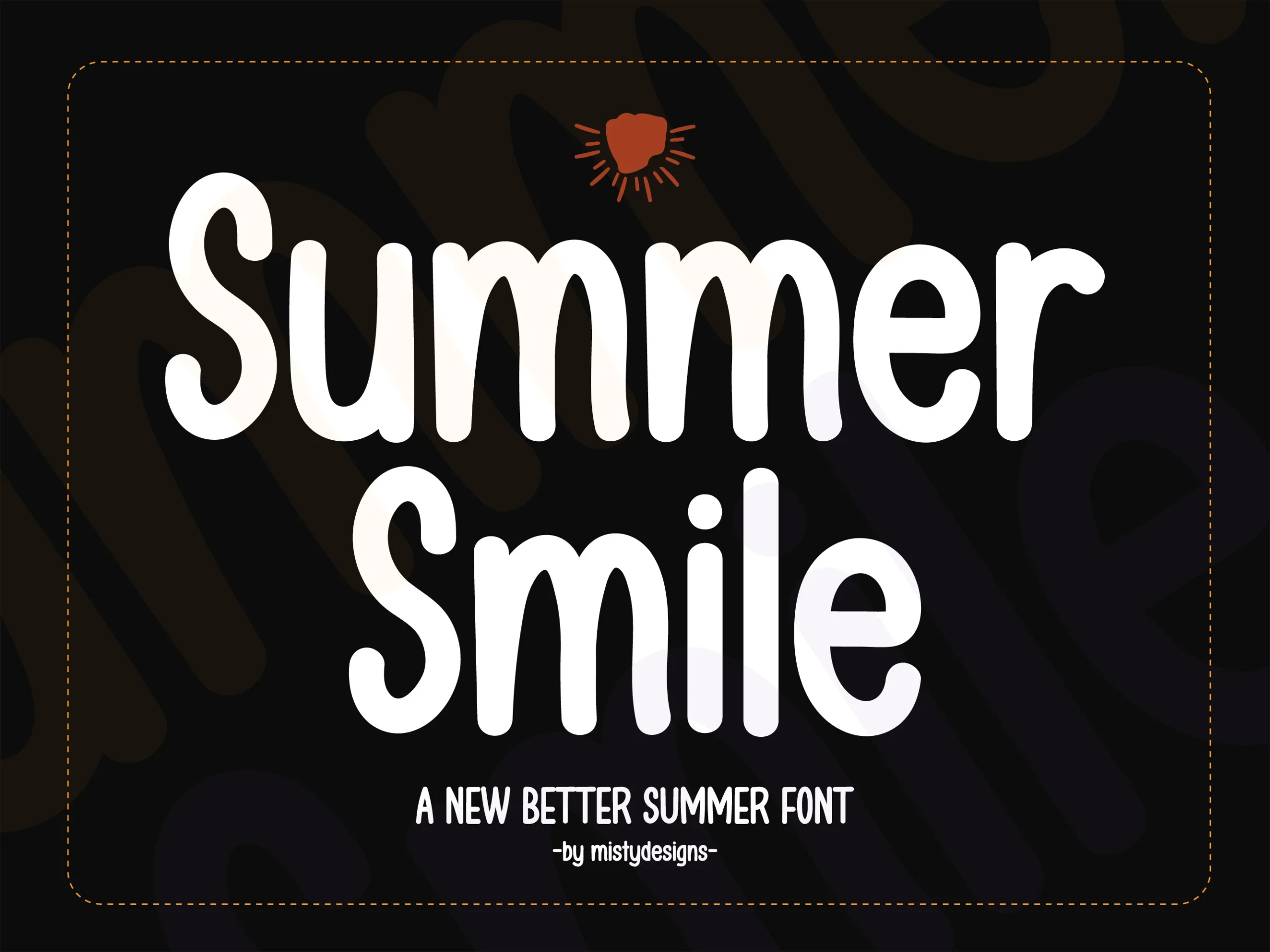
Best For: social media graphics, product labels, short phrases, playful designs
Summer Smile Font has tall rounded letters, smooth monoline strokes, and a slightly uneven handmade rhythm that keeps the clean shapes from feeling stiff. Among Summer Handwritten Fonts, it leans toward a playful display look, with narrow proportions that let big words stack neatly while staying easy to read.
The simple stroke structure gives it strong impact in short copy, especially when the design needs a bold title without sharp edges. Use a little extra line spacing and keep supporting text plain, so the long vertical forms stay open and friendly instead of crowding each other.
Summer Vibes Font
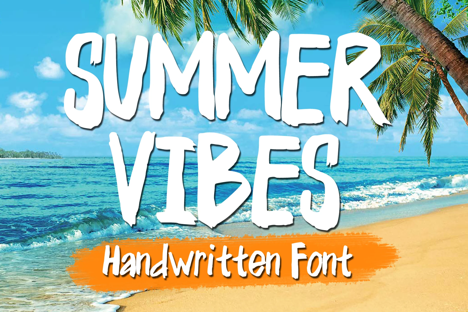
Best For: posters, T-shirts, stickers, headlines
Summer Vibes Font has a hand-painted look with tall uppercase letters, rough edges, and uneven stroke endings that keep the texture loose and beachy. In Summer Handwritten Fonts, it stands out for its narrow proportions and dry-brush feel, giving big titles a casual energy without slipping into messy novelty.
The condensed width helps longer words fit comfortably, while the chipped terminals add enough texture to keep simple layouts from feeling flat. Set it large and keep the supporting type clean, because the irregular edges and tight vertical rhythm do their best work in short, high-contrast display text.
Summer Handwriting Font
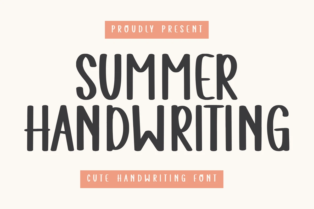
Best For: invitations, social media graphics, branding, cute designs
Summer Handwriting Font uses tall, narrow hand-drawn capitals with rounded bends, soft stroke contrast, and slightly irregular spacing that keeps the words personal rather than rigid. It fits the softer side of Summer Handwritten Fonts, especially where a clean handmade title needs warmth without heavy brush texture.
The slim vertical rhythm lets longer words sit neatly across invitations, labels, and social posts, but the tall forms need clear leading when stacked. Pair it with a restrained sans serif and keep the color contrast firm so the playful curves stay readable at smaller display sizes.
Juicy Orange Summer Font
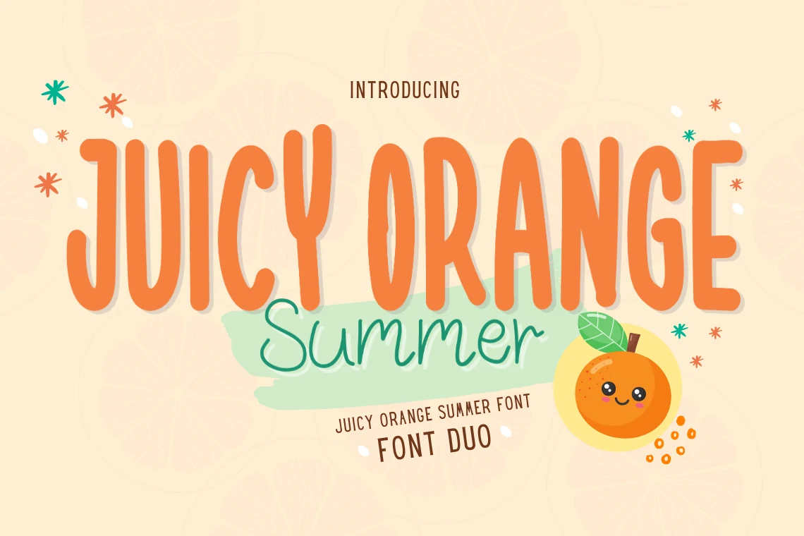
Best For: invitations, posters, social media graphics, playful designs
Juicy Orange Summer is a lively font duo built around contrast: a tall, rounded display face for “Juicy Orange” and a looser handwritten script for “Summer.” That mix gives Summer Handwritten Fonts a brighter, more layered feel, with the blocky uppercase setting the headline and the script adding a softer, breezier note underneath.
The two styles make hierarchy easy to control in one layout. Use the condensed caps for the main message, then drop the script in as a subline or accent word so the composition feels playful without losing clarity. It works especially well when you need a cheerful title with a clear focal point and a lighter secondary rhythm.
Summer Garden Font
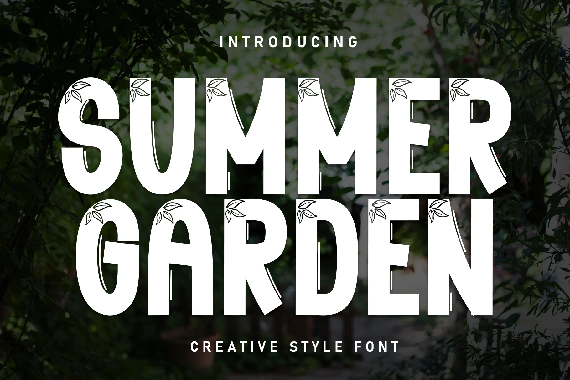
Best For: logos, product labels, posters, decorative designs
Summer Garden Font uses bold uppercase shapes with broad stems, clipped angles, and small botanical line details tucked into the letterforms. It gives Summer Handwritten Fonts a more decorative display direction, balancing clean blocky weight with leaf accents that make the words feel tied to garden, nature, and outdoor branding themes.
The heavy structure makes short titles clear from a distance, while the internal leaves and thin accent strokes need enough scale to stay visible. Keep the layout simple around it, use strong background contrast, and avoid dense copy so the decorative details can read as intentional rather than visual noise.
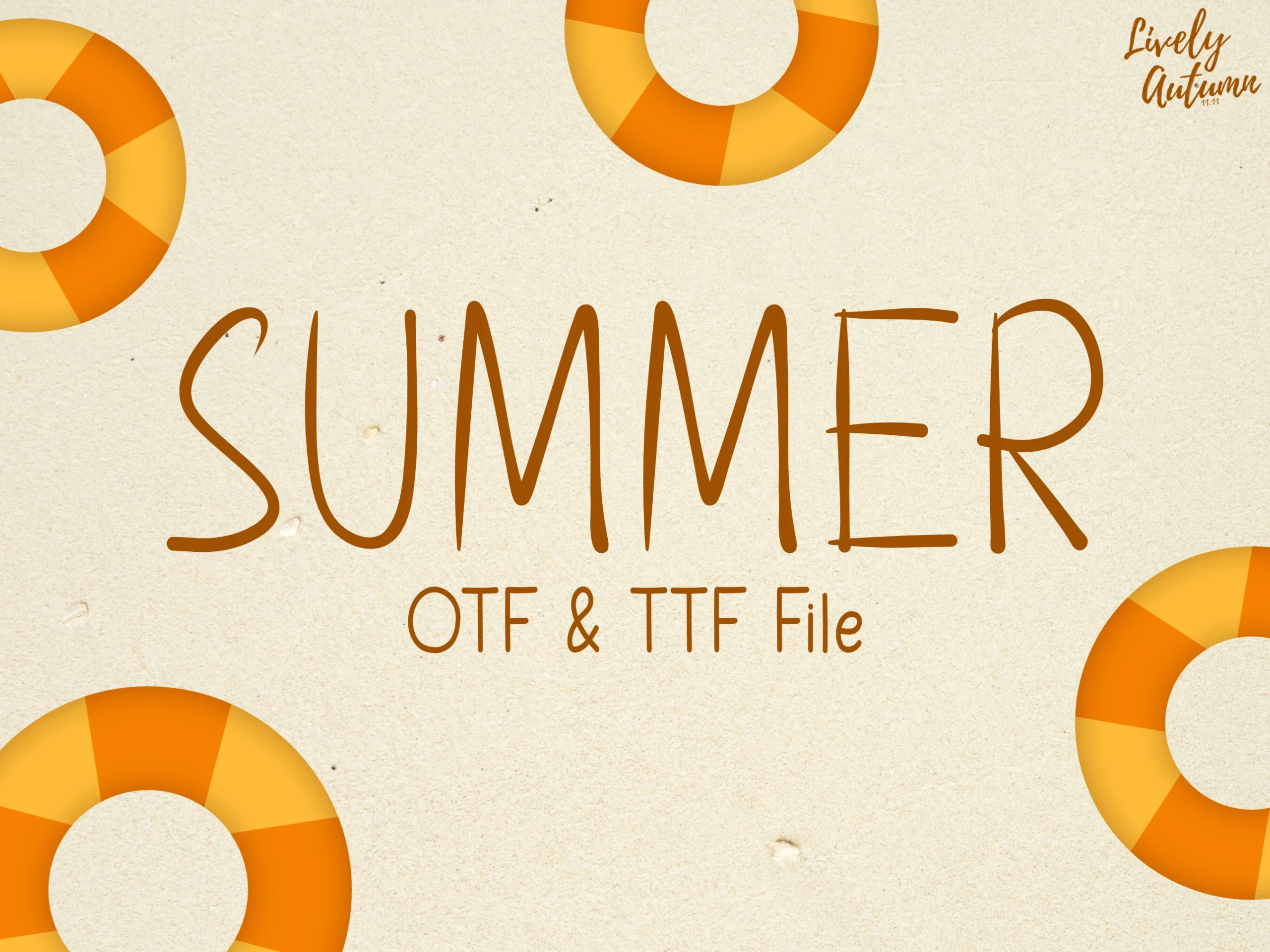
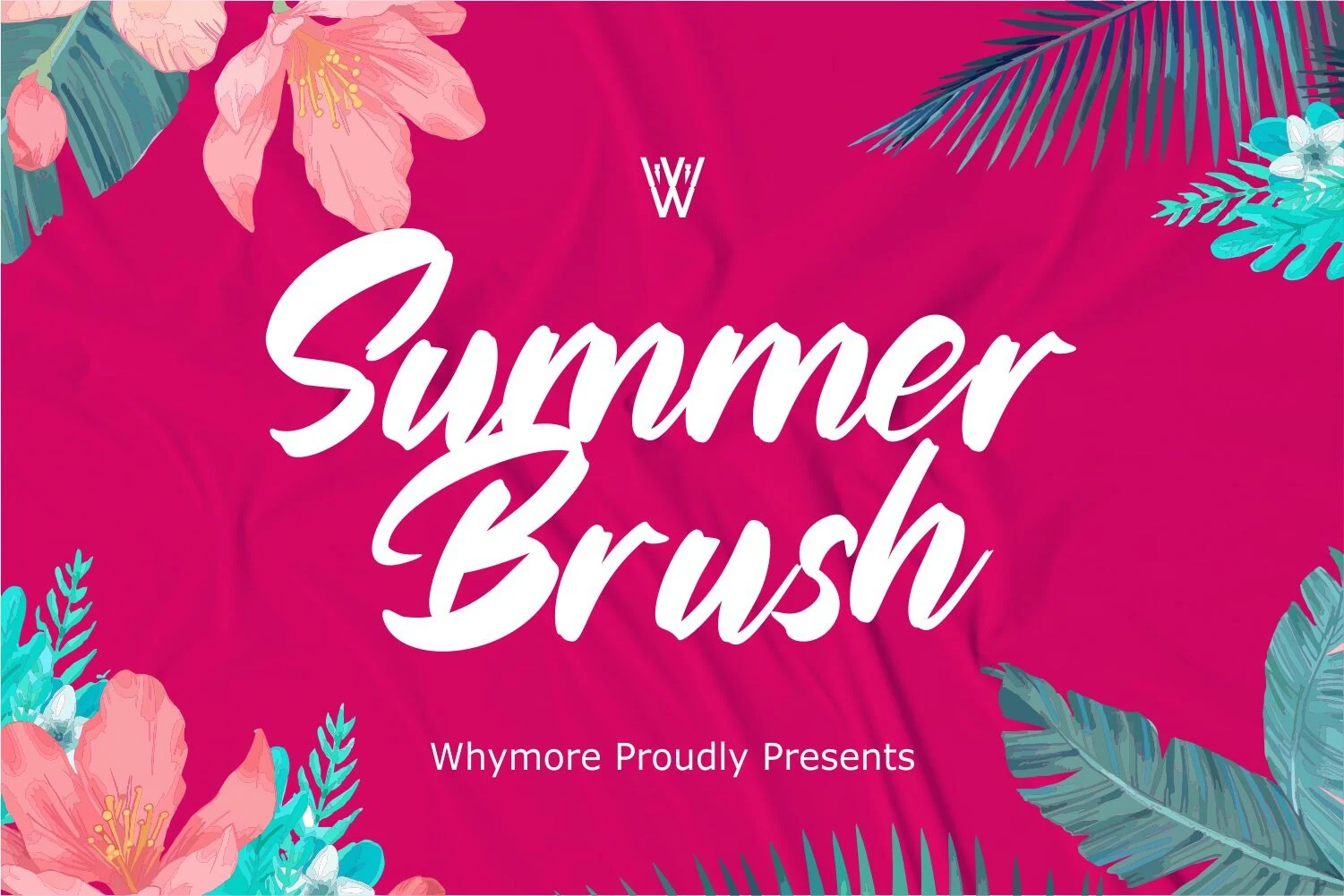
Summer Brush Font
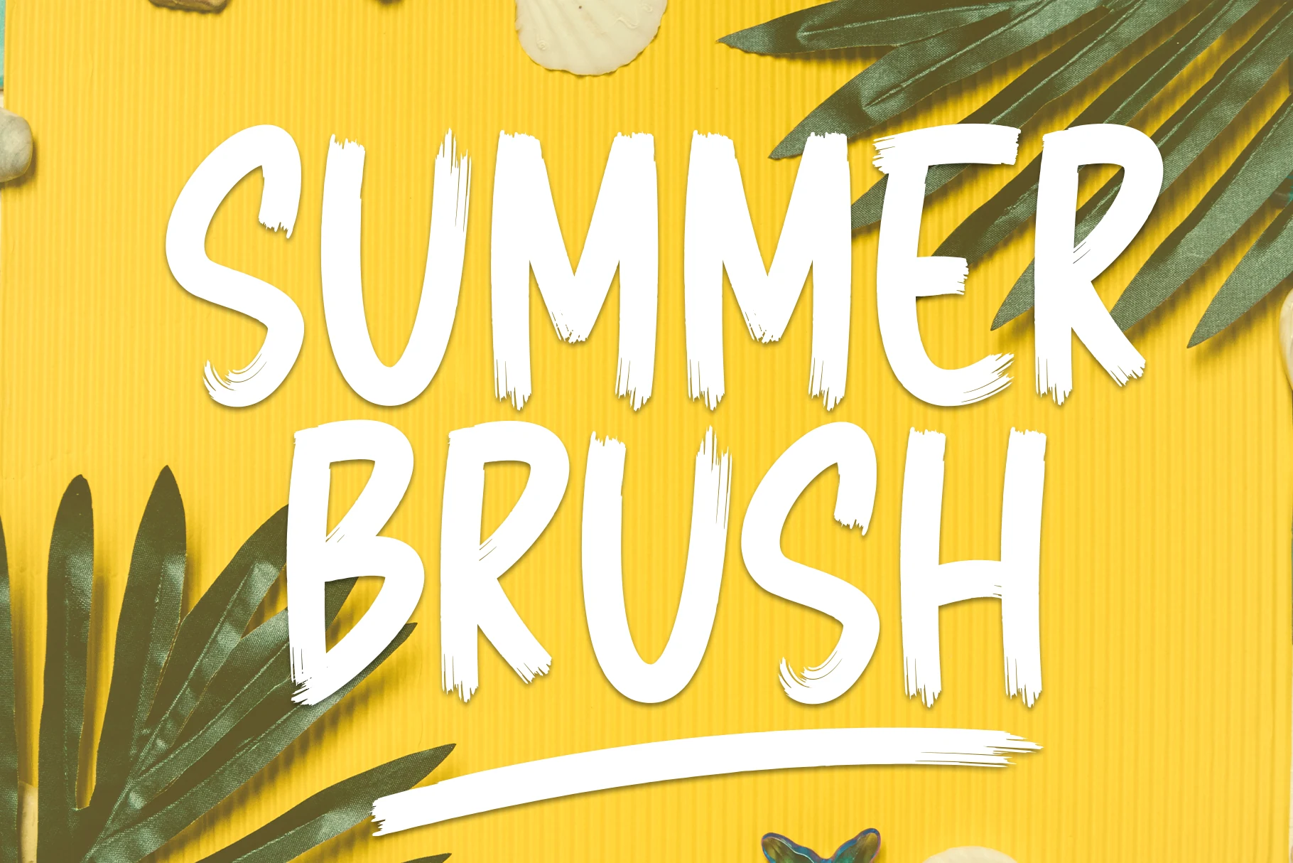
Best For: invitations, quotes, logos, wedding designs
Summer Brush Font has the relaxed flow of a brush script, with angled joins, full downstrokes, and broad entry and exit swashes that give the words a smooth handwritten sweep. Within Summer Handwritten Fonts, it leans refined rather than rough, so the letters feel expressive without losing their polished shape.
The contrast between thick strokes and tapered connections helps short phrases stand out, especially in invitations or logo work where the script can take the lead. Keep it at medium to large sizes and pair it with restrained supporting text, because the long curves and overlapping rhythm look best when the line has room to breathe.
Summer Notes Font
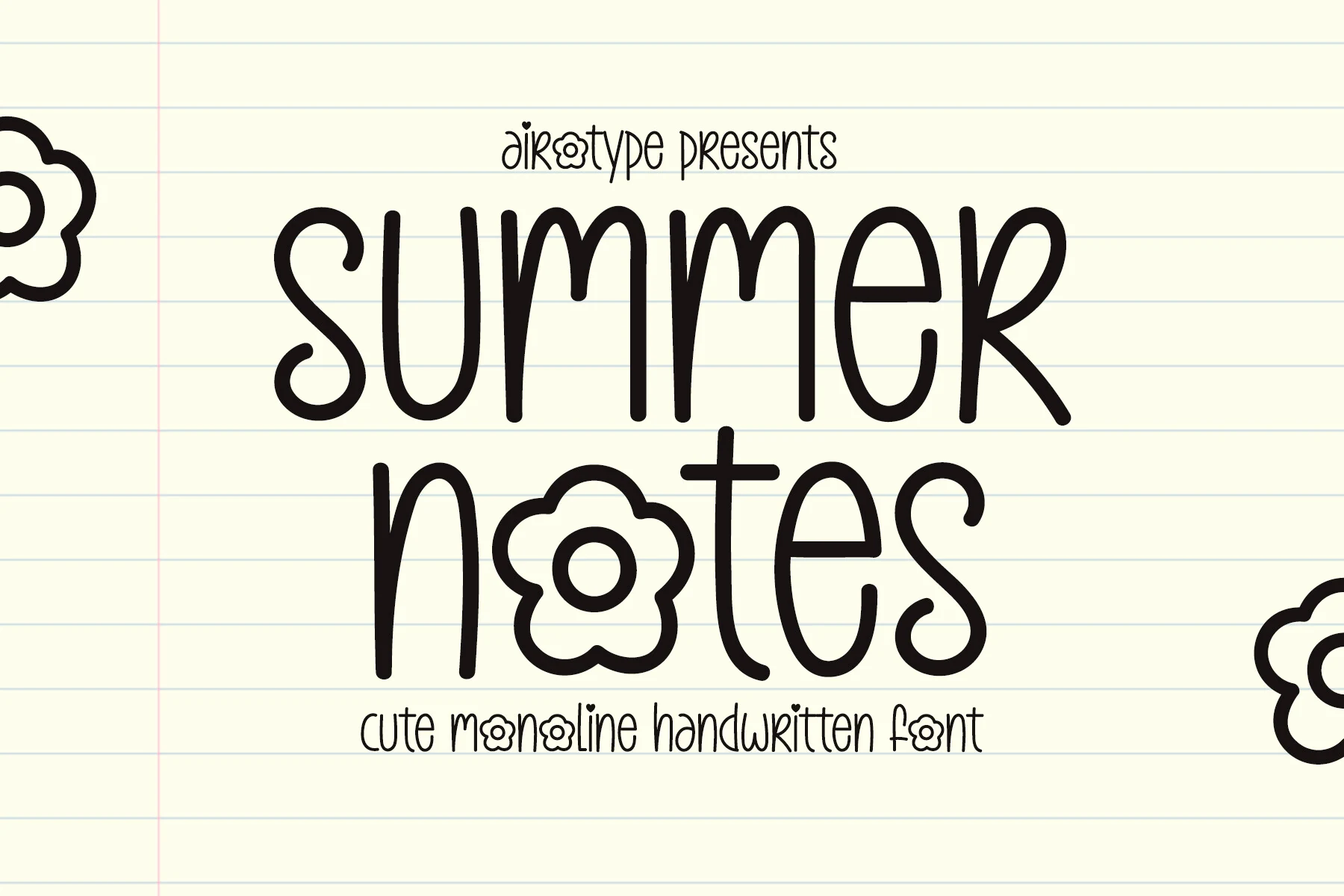
Best For: social media graphics, quotes, cute designs, handmade designs
Summer Notes Font uses a thin monoline handwritten style with tall rounded forms, soft loops, and small flower details that replace some circular letters. It brings a clean notebook-like mood to Summer Handwritten Fonts, keeping the strokes simple enough for casual titles while adding a cute decorative accent.
The narrow letters and light weight work best with generous spacing and clear contrast, especially when the flower shapes need to stay recognizable. Use it for short captions, quote graphics, or friendly branding where the line can remain open instead of compressed into dense text.
Modern Summer Font
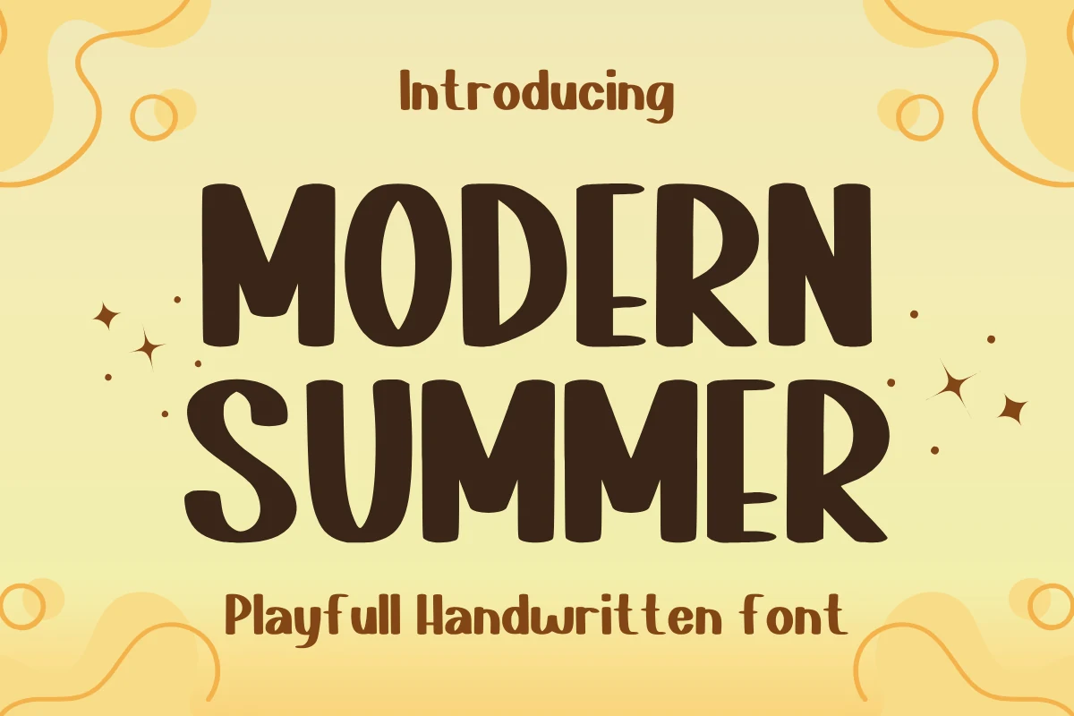
Best For: stickers, children’s designs, cute designs, fun designs
Modern Summer has chunky uppercase letters, rounded corners, and slightly uneven widths that keep the heavy shapes feeling friendly instead of rigid. It gives Summer Handwritten Fonts a bolder, more playful tone, with enough weight to stand out quickly on craft labels, sticker designs, and cheerful display work.
The compact, thick forms work best in short titles where the word shape can stay clear and lively. Give it a little space between words and pair it with a simpler secondary font, so the broad strokes and cute rhythm do the visual work without making the layout feel crowded.
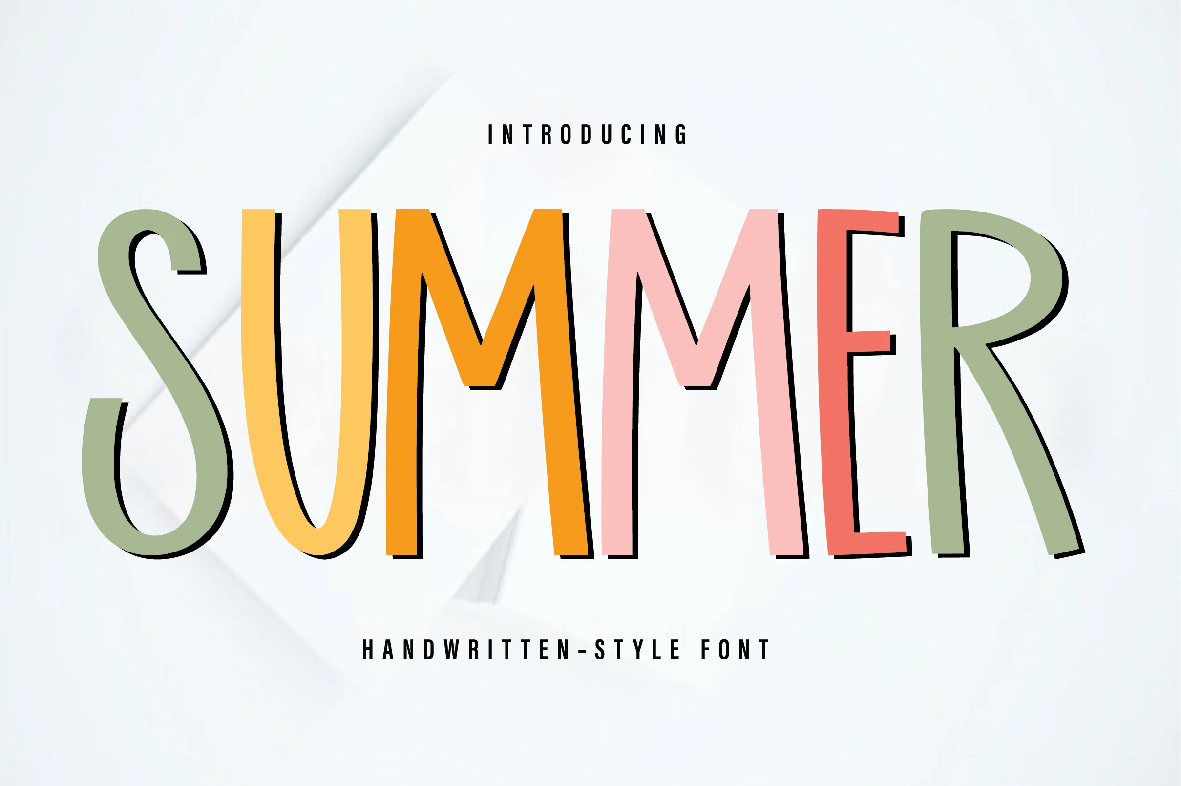
Summer Font
Best For: branding, social media graphics, headlines, playful designs
Summer Font uses tall hand-drawn capitals with narrow proportions, rounded curves, and uneven stroke widths that make the word feel relaxed rather than geometric. It brings a clean, colorful display angle to Summer Handwritten Fonts, with playful letter shapes that still keep the main word easy to scan.
The long vertical rhythm helps headlines feel light and modern, but the slim forms need solid contrast so the thinner sections do not disappear. Use it for short titles or brand marks, with moderate spacing and a simple supporting typeface to keep the irregular shapes from competing with other decorative elements.
Summer Font
Best For: branding, social media graphics, headlines, fun designs
Summer Font brings a light, upbeat feel to Summer Handwritten Fonts with tall uneven letters, smooth strokes, and a relaxed hand-drawn rhythm. The shapes stay narrow and friendly, which gives the font a playful display character without making it look messy or overworked.
Its slim proportions are especially useful for wide headlines and stacked titles, where longer words need to fit comfortably without losing impact. Give it a little surrounding space and pair it with a plain sans serif, so the irregular line movement keeps the layout lively instead of crowded.
Tropical Summer Font
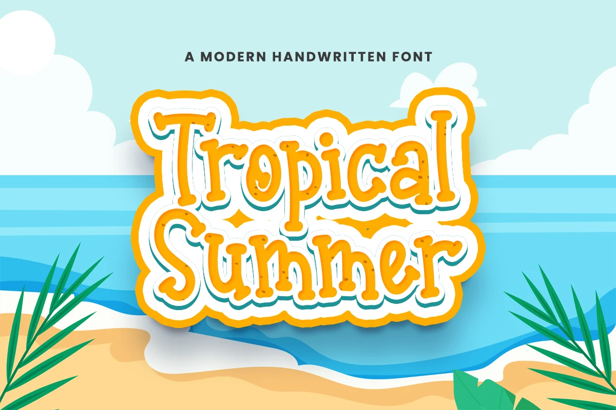
Best For: stickers, posters, playful designs, branding
Tropical Summer Font has a chunky handwritten display style with rounded slab-like strokes, soft corners, and playful bulb terminals. It brings a sticker-ready look to Summer Handwritten Fonts, with a bouncy rhythm that feels casual but still clear enough for bold seasonal titles.
The thick letter shapes work best when the wording stays short and the hierarchy is simple. Use it as the main title for posters, beach invitations, or playful branding, then keep secondary text lighter so the rounded forms and decorative energy remain the center of the layout.
Summer Dear Font
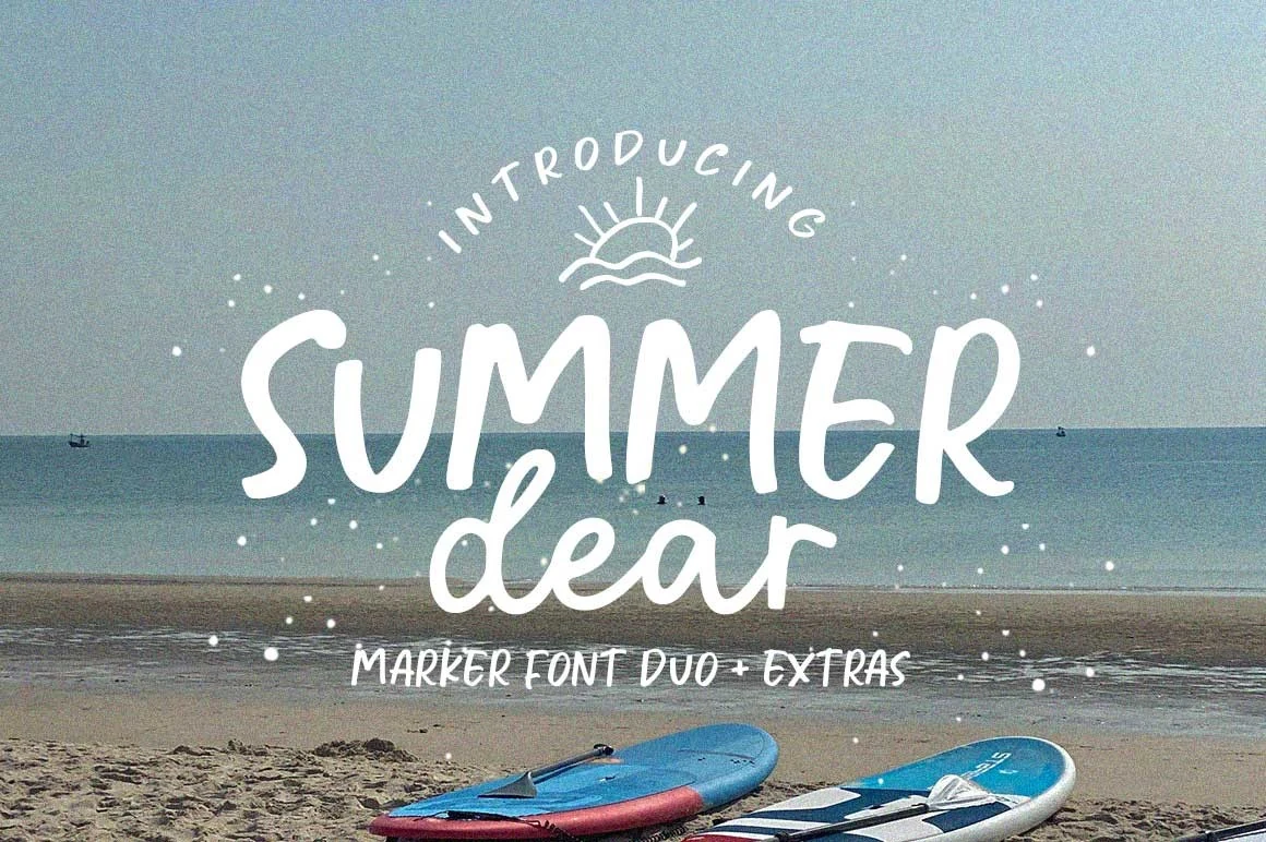
Best For: handmade designs, casual designs, T-shirts, stickers
Summer Dear Font has a loose marker look, with fat rounded strokes, uneven terminals, and a relaxed bounce that keeps the word shapes informal rather than polished. In the preview, the heavy “Summer” lettering carries the layout while the softer connected “dear” adds a second handwritten rhythm, which helps Summer Handwritten Fonts land with a casual beach-poster voice.
The duo format helps separate headline and support copy without changing the mood: use the bolder style for the main phrase, then keep smaller words spaced out so the rough marker texture does not crowd. It works best in short stacked compositions where contrast, curved text, and small decorative extras can build the title hierarchy.
Retro Summer Font
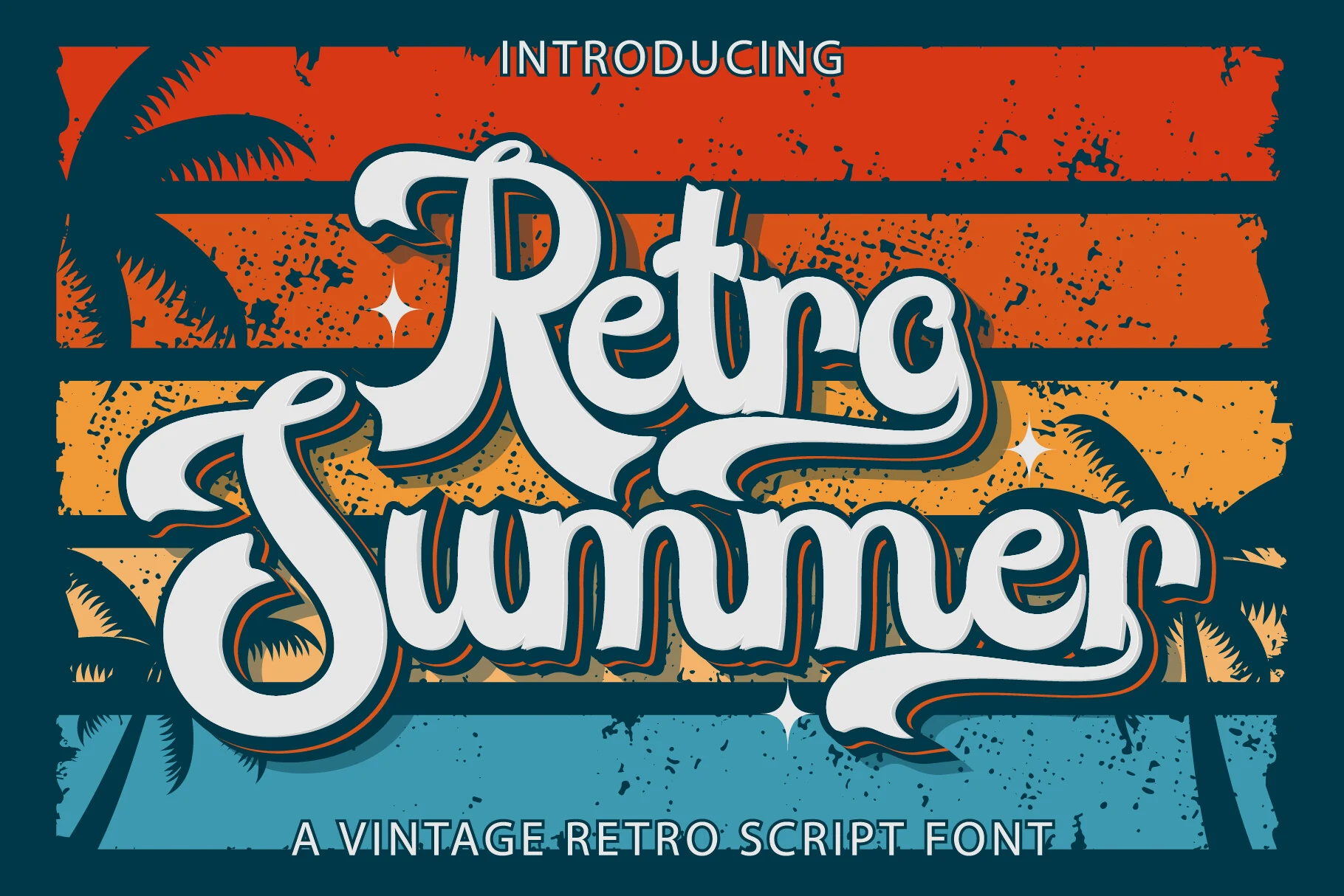
Best For: logos, posters, headlines, retro designs
Retro Summer Font leans into a chunky script silhouette with rounded joins, deep curves, and long sweeping swashes that give the words a strong vintage pull. The capitals do most of the visual work, especially the oversized R and S, so it fits Summer Handwritten Fonts that need a nostalgic title style rather than a light casual note.
Because the strokes are broad and the flourishes stretch outward, this font works best when you let short phrases sit large and keep surrounding elements simple. It holds up especially well in stacked layouts, where the heavy rhythm and decorative tails can create a clear focal point without needing extra illustration.
Vibes Summer Font
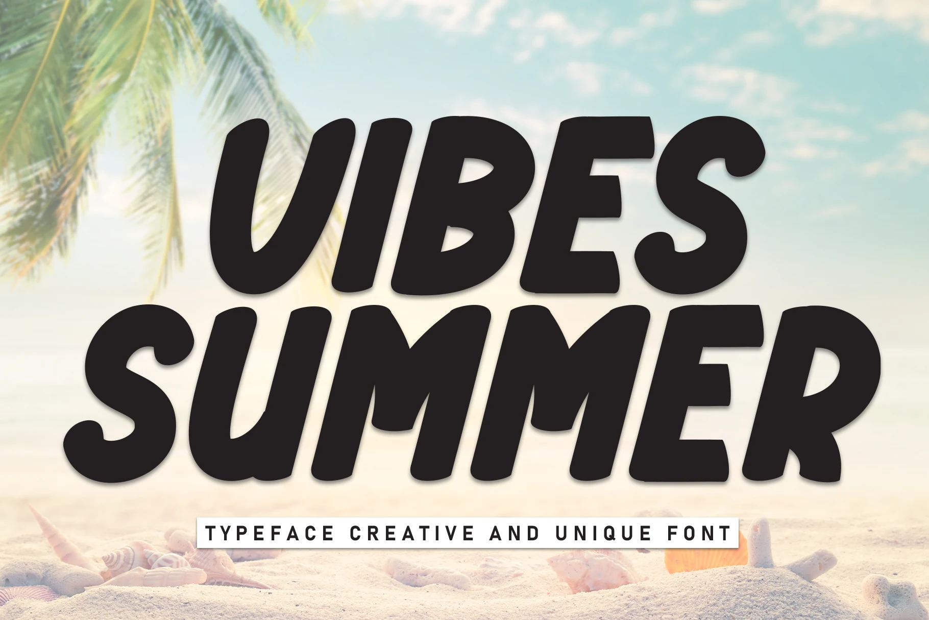
Best For: headlines, posters, T-shirts, bold designs
Vibes Summer Font has a thick handwritten style with rounded black letterforms, compact curves, and a steady casual rhythm that gives the words strong display weight. It sits on the bolder side of Summer Handwritten Fonts, making it useful for titles that need a handmade look without losing quick readability.
The dense strokes work best in short phrases, especially where the layout uses clear contrast and simple supporting text. Keep the spacing slightly open around heavy letters like V, S, and m so the rounded forms stay distinct instead of turning into one dark shape.
Summer Brush Font
Best For: signage, posters, social media graphics, headlines
Summer Brush Font has the easy sweep of a painted sign, with slanted strokes, tapered ends, and broad curves that keep the script lively without feeling messy. The capitals open wide and the connected rhythm gives the line real movement, so Summer Handwritten Fonts like this one read with energy rather than softness.
Its brush structure stays full and readable, which makes it strongest in short display lines where the entry strokes and angled joins have room to breathe. Use it as the lead phrase in a poster or sign, then pair it with a plain sans for secondary copy so the script remains the focal point.
Summer Farmhouse Font
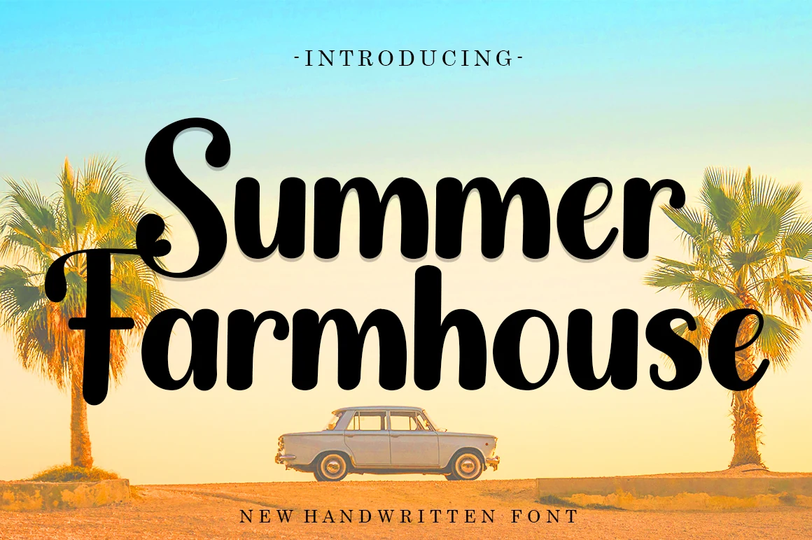
Best For: logos, signage, product labels, T-shirts
Summer Farmhouse Font uses thick rounded handwritten letters with soft corners, a curled capital S, and compact lowercase shapes that feel friendly without turning childish. Its weight gives Summer Handwritten Fonts a clear headline presence, while the slightly uneven curves keep the lettering from looking like a standard bold sans.
Keep it for short names, labels, and sign-style phrases where the black shapes can sit large with generous line spacing. The heavy strokes need contrast around them; pair with narrow letter-spaced caps for small supporting text so the main wordmark remains readable and centered.
Summer handwritten fonts work best when the style matches the job: use chunky marker fonts for posters and stickers, brush scripts for logos and invitations, thin monoline styles for cute quotes, and decorative tropical or garden fonts when the lettering needs to become the main visual element.