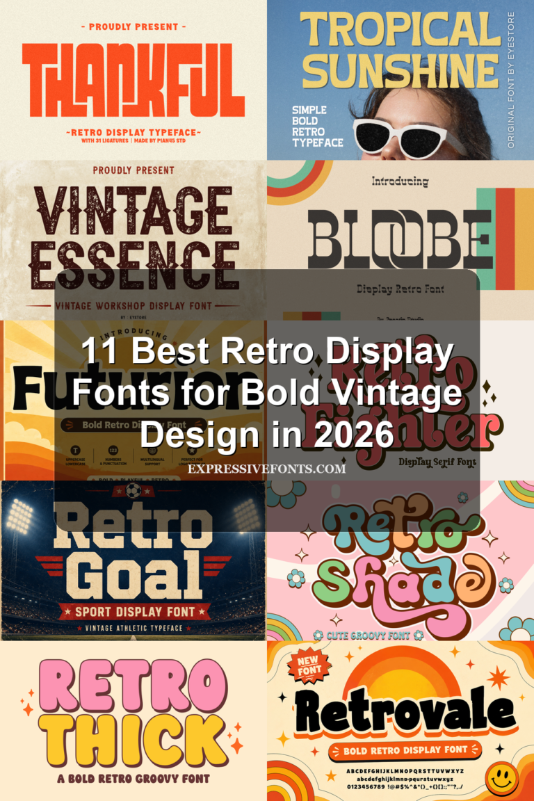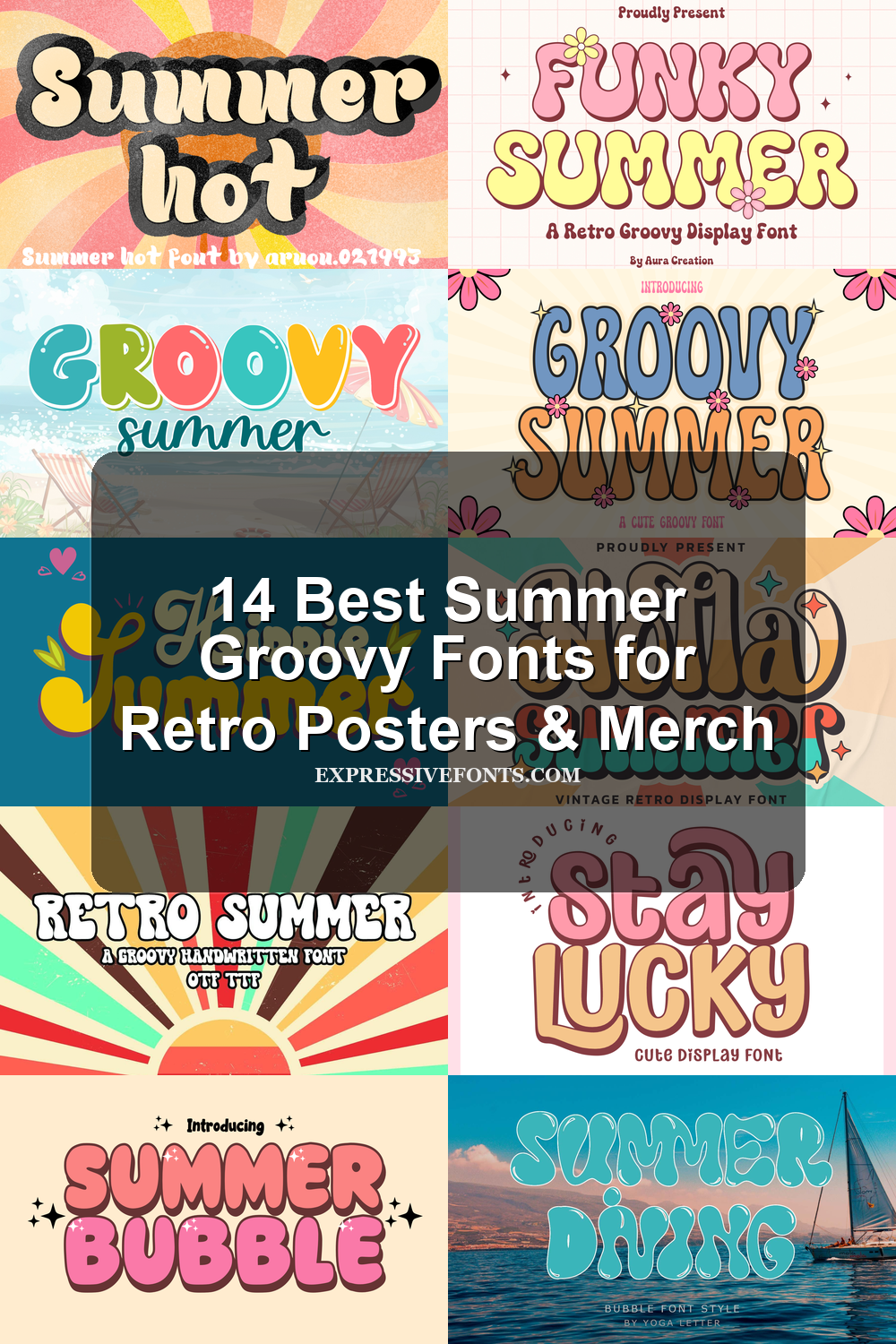
14 Best Summer Groovy Fonts for Retro Posters & Merch
This collection is for designers, crafters, and brand owners who need summer groovy fonts for retro posters, stickers, T-shirts, invitations, packaging, and playful social graphics. It focuses on chunky bubble letters, hippie scripts, vintage shadows, and bright 70s-style display type.
Holla Summer Font
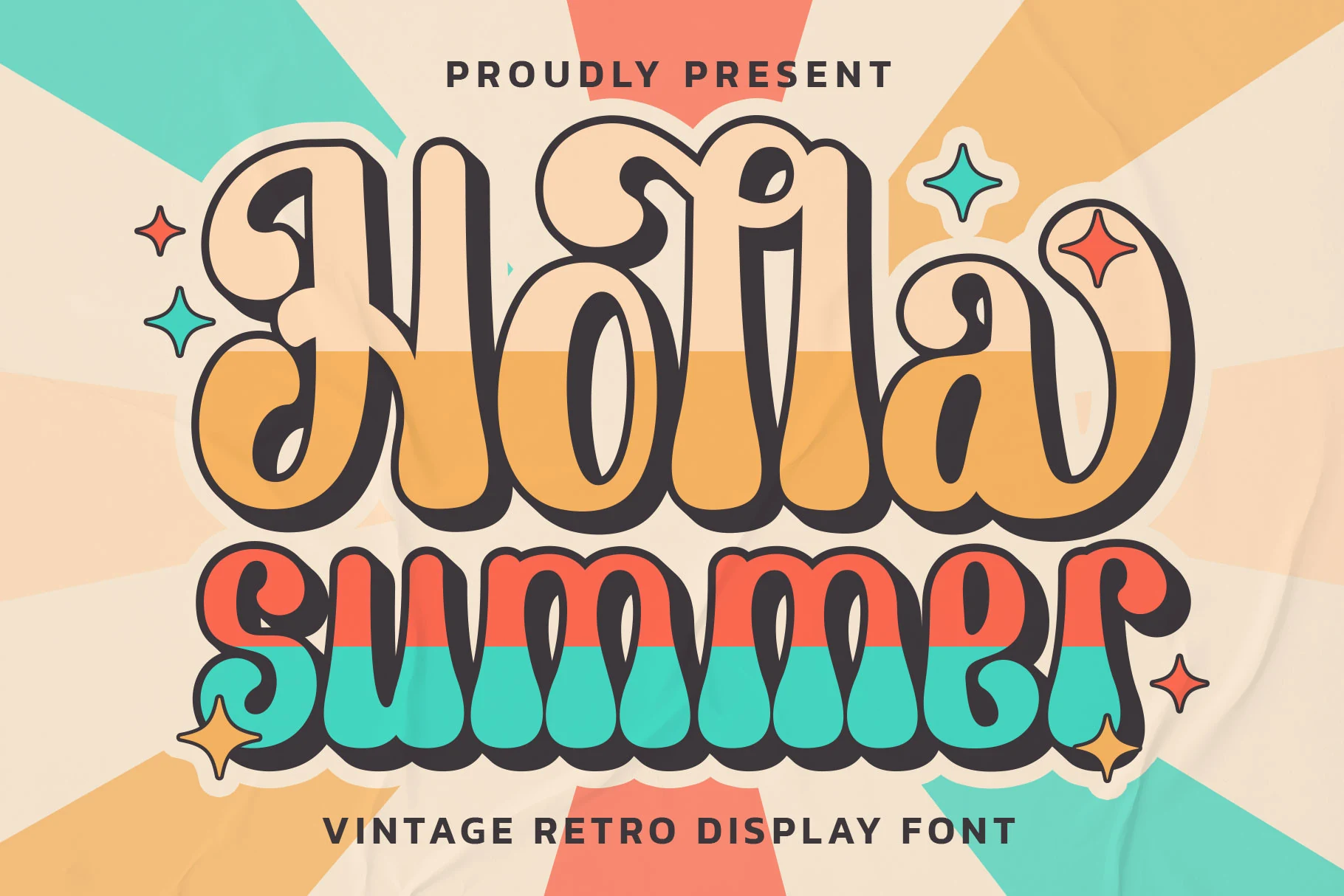
Best For: logos, branding, invitations, social media graphics
Holla Summer Font has a vintage poster feel shaped by chunky stems, deep inner curves, and exaggerated swash endings that give the letters a lively, almost hand-painted rhythm. The thick dark outline keeps the decorative forms readable, while the soft rounded weight adds warmth instead of sharpness.
For Summer Groovy Fonts, this one stands out when the main phrase needs personality without losing impact at a glance. Use it as the hero line in a title hierarchy and keep the supporting text simpler, since the curled terminals and broad proportions already supply enough movement and retro character on their own.
Retro Summer Font
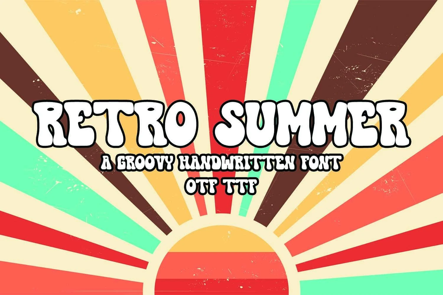
Best For: retro designs, posters, stickers, T-shirts
Retro Summer Font has a chunky groovy build, with swollen verticals, rounded cut-ins, and uneven hand-drawn curves that keep the letters loose rather than polished. The thick black outline gives the white letter shapes strong separation, which helps the font hold up against busy retro patterns or saturated color palettes.
For Summer Groovy Fonts, this one works best when the wording is short and the title needs a 1970s poster feel. Keep the spacing fairly tight so the bubbly shapes read as one graphic unit, but avoid long sentences because the decorative rhythm and heavy outline are built for display text, not extended copy.
Summer Stussy Font
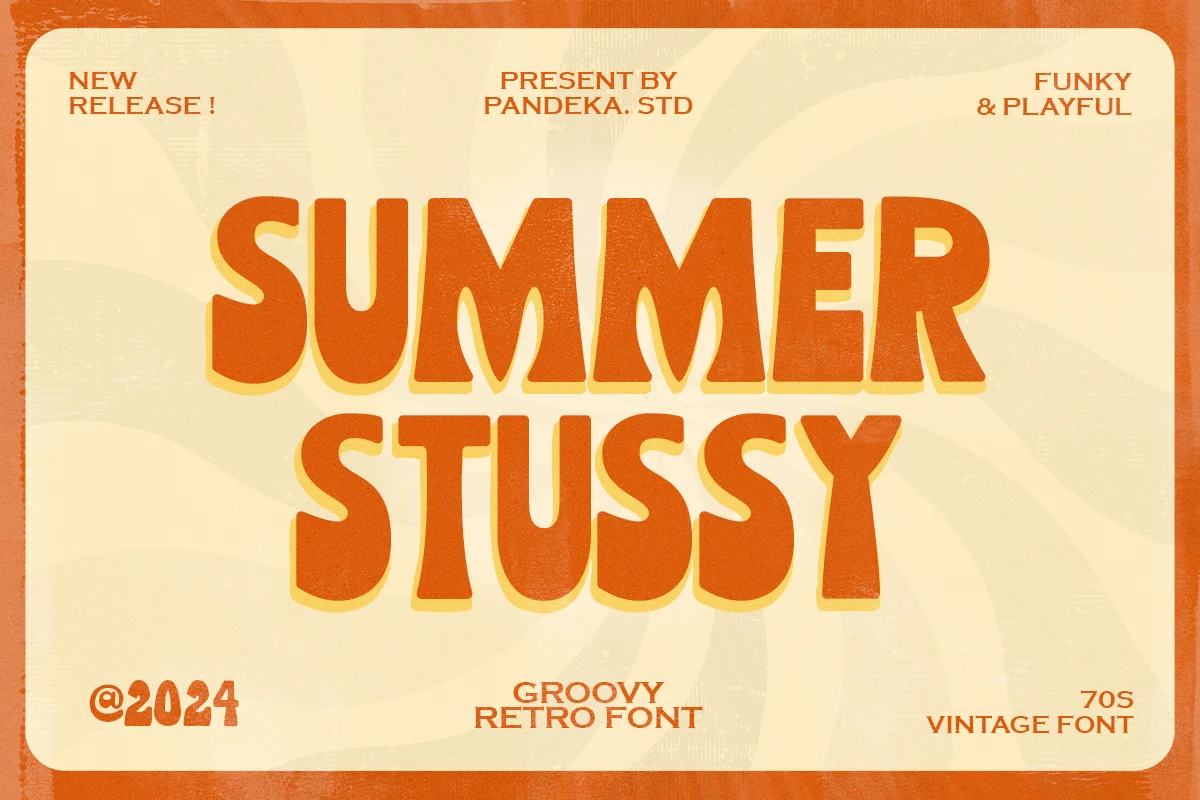
Best For: retro designs, posters, T-shirts, headlines
Summer Stussy Font leans fully into a 70s mood with tall all-caps forms, rounded corners, and bellbottom-style terminals that widen at the base. Those thick silhouettes and soft inner curves give the lettering a friendly funky rhythm, while the broad shapes make the words read as one strong retro statement.
If you’re curating Summer Groovy Fonts, this one works best in short headlines where its weight can anchor the whole composition. Give it room in the hierarchy and pair it with a cleaner supporting face, because the compact spacing and exaggerated proportions look strongest when they are not competing with other decorative text.
Summer Rainbow Font
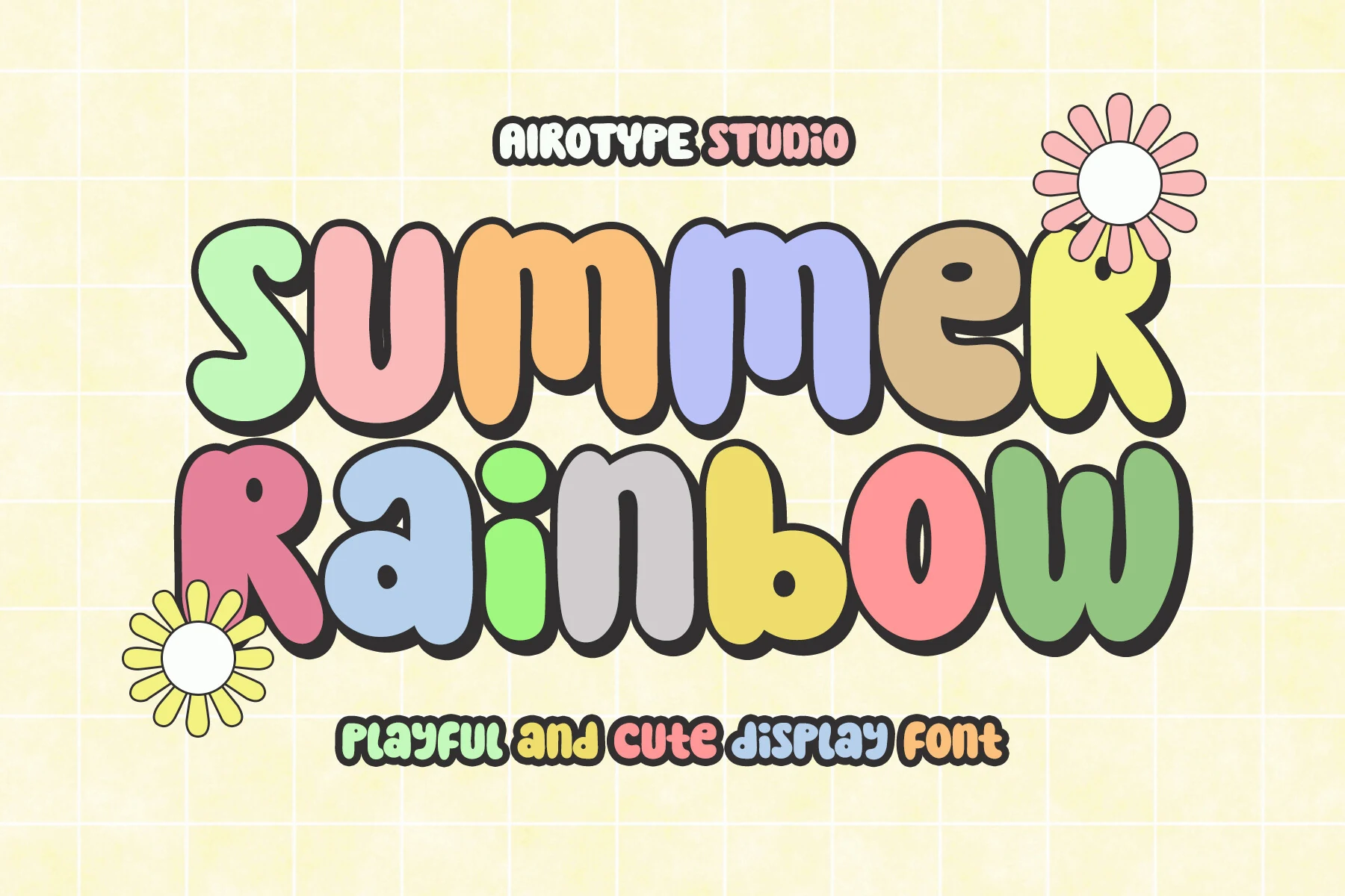
Best For: playful designs, cute designs, stickers, children’s designs
Summer Rainbow Font uses oversized bubble letters with soft, inflated curves, uneven widths, and a thick black outline that makes each character feel like a sticker. The rounded counters and bouncy proportions keep the style cute and readable, even with the playful distortion across the letter shapes.
For Summer Groovy Fonts, this one is better for cheerful display words than serious branding. Keep the text short and let the outline carry the contrast; tight grouping works well for stacked titles, while extra decorative elements should stay secondary so the bulky letter rhythm remains clear.
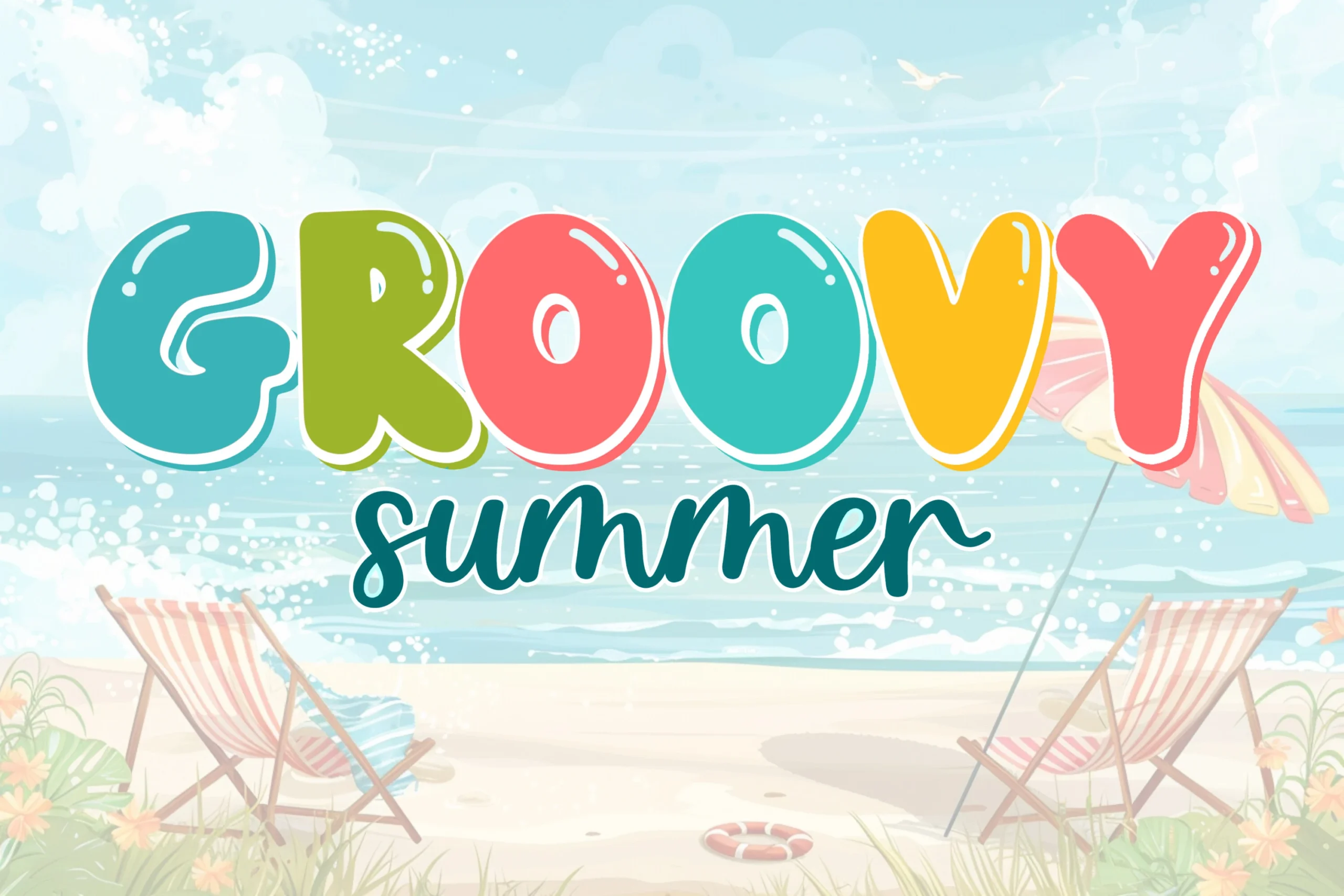
Groovy Summer Font
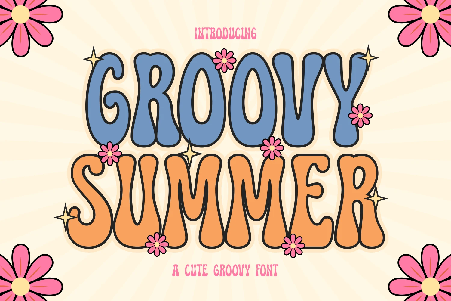
Best For: headlines, posters, branding, playful designs
Groovy Summer Font pushes a beachy retro mood through inflated letterforms, rounded terminals, and a bouncy baseline that keeps the display text loose. The thick shapes stay readable because the counters are open and the letter silhouettes are simple, while the glossy highlight details add a bright sticker-like finish.
In a set of Summer Groovy Fonts, this one is strongest for cheerful titles that need color, scale, and immediate recognition. Use the bold rounded caps for the main word and keep secondary lettering lighter or more fluid; that contrast lets the chunky display rhythm lead without making the layout feel crowded.
Groovy Summer Font
Best For: posters, packaging, merch design, book covers
Groovy Summer Font leans into a cheerful retro look with chunky bubble letters, rounded corners, and soft counters that keep the word shapes bold but friendly. The inflated proportions and clean outline give it that toy-like bounce, so the lettering feels bright and graphic rather than heavy.
Within Summer Groovy Fonts, this one works especially well when you want a playful accent that carries the whole composition. Short titles, cover lines, and front-facing packaging suit it best, and the color-blocked, low-contrast shapes hold together nicely when you give the headline enough scale and keep supporting text simpler.
The Supper Summer Font
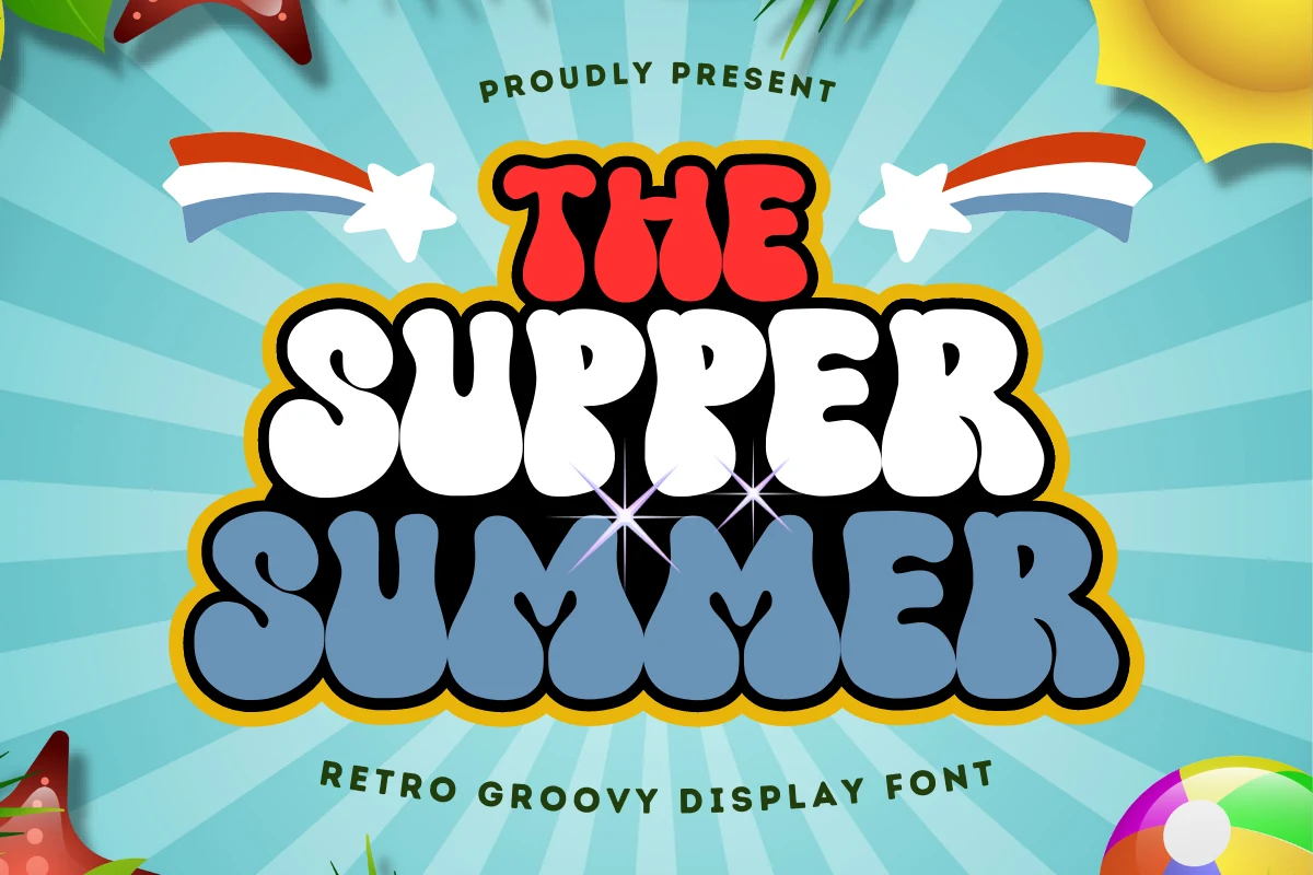
Best For: headlines, posters, stickers, playful designs
The Supper Summer Font is built from thick rounded display letters with swollen curves, curled cuts, and a heavy outline that gives each word a sticker-like edge. The stacked composition in the preview shows how strongly the font holds contrast, especially when the main letters sit against bright summer colors.
For Summer Groovy Fonts, this one suits short, loud headline work rather than long copy. Keep the spacing compact and let the outline define the hierarchy; cleaner secondary type will stop the bubbly proportions and decorative rhythm from making the layout feel overloaded.
Hippie Summer Font
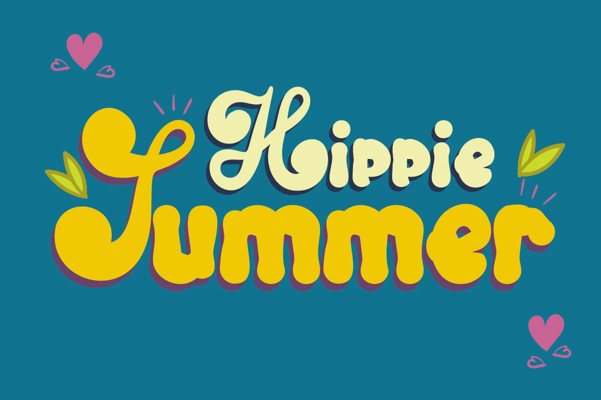
Best For: retro designs, stickers, T-shirts, playful designs
Hippie Summer Font mixes a looping retro script with thick, rounded lowercase shapes, creating a cheerful 70s feel without losing legibility. The oversized entry stroke on the first letter and the soft bulbous curves give the wordmark a relaxed handmade rhythm, while the offset shadow adds extra punch.
If you are collecting Summer Groovy Fonts, this one works best when the lettering is allowed to stay front and center. Short words, merch graphics, and bold title spots suit it well, especially with simple supporting text that lets the chunky forms and playful contrast do the visual work.
Super Summer Font
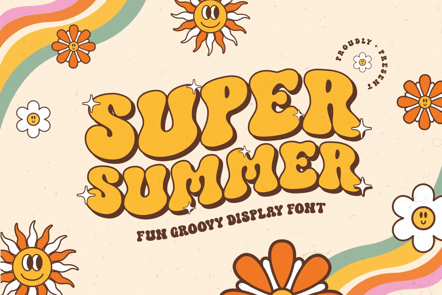
Best For: retro designs, playful designs, posters, stickers
Super Summer Font has the plump, inflated shapes that define classic hippie lettering, with soft rounded corners, compact counters, and a warm brown shadow that gives the yellow forms extra depth. The overall rhythm feels cheerful rather than heavy, so the font carries that easy 60s and 70s mood without looking stiff.
For Summer Groovy Fonts, this one works best when the type is the main attraction. Short titles, poster words, and sticker-style layouts suit it well, especially if you keep supporting text simpler and give the chunky letters enough scale, since the thick strokes and tight inner spaces are strongest in bold display use.
Summer Diving Font
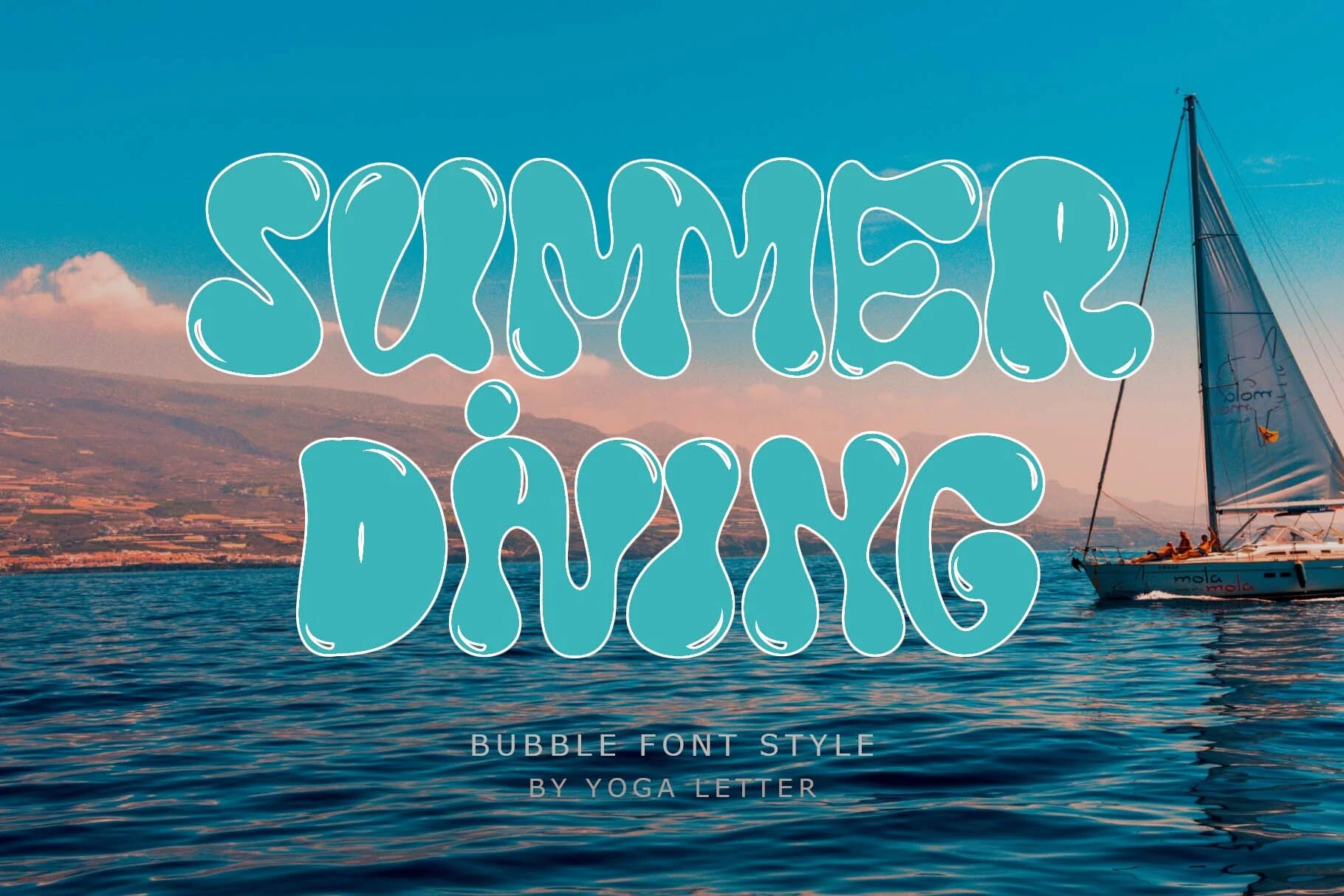
Best For: posters, book covers, display text, playful designs
Summer Diving Font has a soft bubble style, with inflated turquoise letterforms, wavy verticals, and thin white highlight strokes that make the shapes feel glossy and fluid. The rounded counters and loose curves give it a watery, cartoon-like rhythm while still keeping the large title easy to read.
Among Summer Groovy Fonts, this one fits designs that need a lighter aquatic mood instead of heavy 70s poster weight. Its ligatures and multilingual support are useful for display phrases that need smoother connections or non-English wording, but the bubbly proportions still work best at headline scale.
Summer Diving Font
Best For: posters, book covers, display text, playful designs
Summer Diving Font has a soft bubble style, with inflated turquoise letterforms, wavy verticals, and thin white highlight strokes that make the shapes feel glossy and fluid. The rounded counters and loose curves give it a watery, cartoon-like rhythm while still keeping the large title easy to read.
Among Summer Groovy Fonts, this one fits designs that need a lighter aquatic mood instead of heavy 70s poster weight. Its ligatures and multilingual support are useful for display phrases that need smoother connections or non-English wording, but the bubbly proportions still work best at headline scale.
Summer Bubble Font
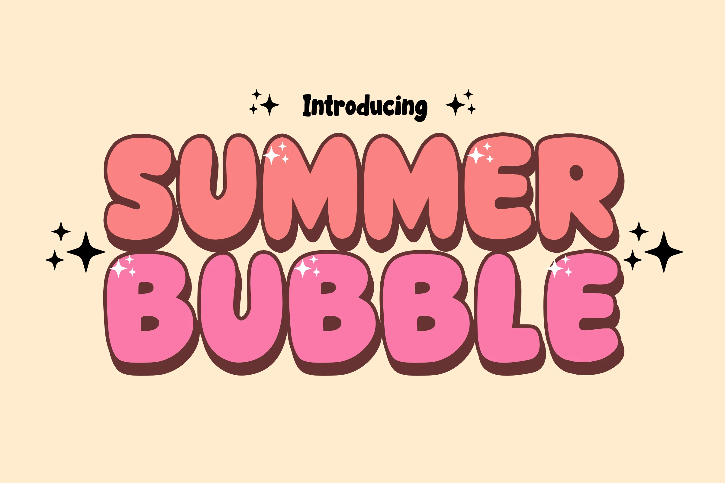
Best For: cute designs, children’s designs, T-shirts, stickers
Summer Bubble Font uses thick all-caps forms with soft inflated curves, tight counters, and a dark offset shadow that gives the letters a candy-like depth. The stacked pink lettering feels cute and readable, with small sparkle details reinforcing the bubbly display style without changing the clean basic shapes.
For Summer Groovy Fonts, this is a better fit for youthful headlines, sublimation graphics, and comic-style titles than for restrained branding. Keep the wording short and let the rounded mass carry the composition; simple supporting type will keep the heavy shadow and compact spacing from feeling crowded.
Funky Summer Font
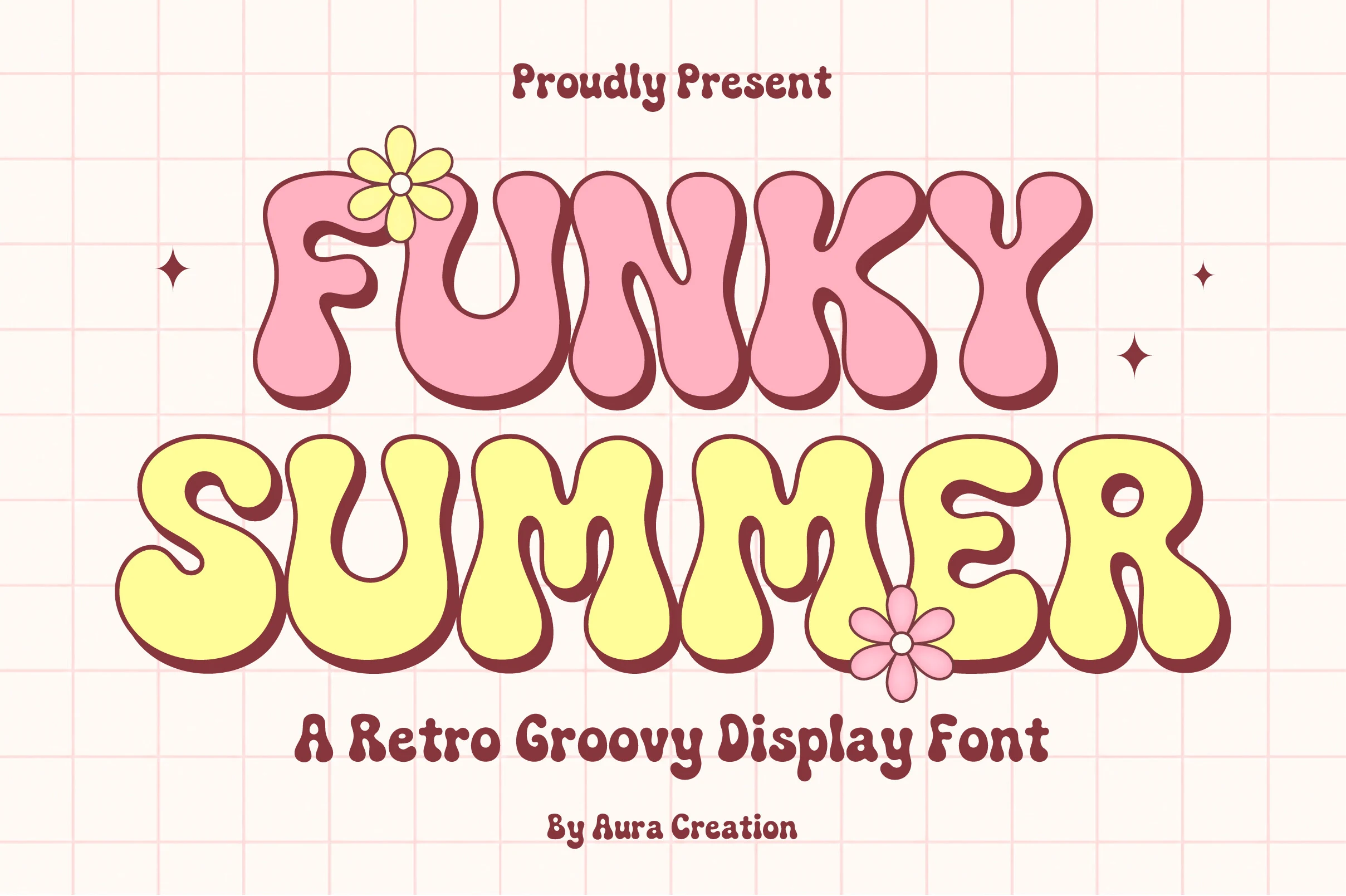
Best For: T-shirts, posters, stickers, branding
Funky Summer Font leans into a soft 70s mood with swollen bubble shapes, rounded terminals, and slightly pinched inner curves that keep the letters lively instead of blocky. The preview shows how well the broad pink and butter-yellow forms hold their shape, giving the font a cheerful presence without sacrificing readability.
If you are browsing Summer Groovy Fonts, this one works especially well for merch and poster headlines where the type needs to feel friendly rather than loud. Use it in short phrases and give it generous scale, then pair it with a simpler supporting face so the bubbly rhythm stays clear across T-shirt graphics, branding, and sticker layouts.
Summer Hot Font
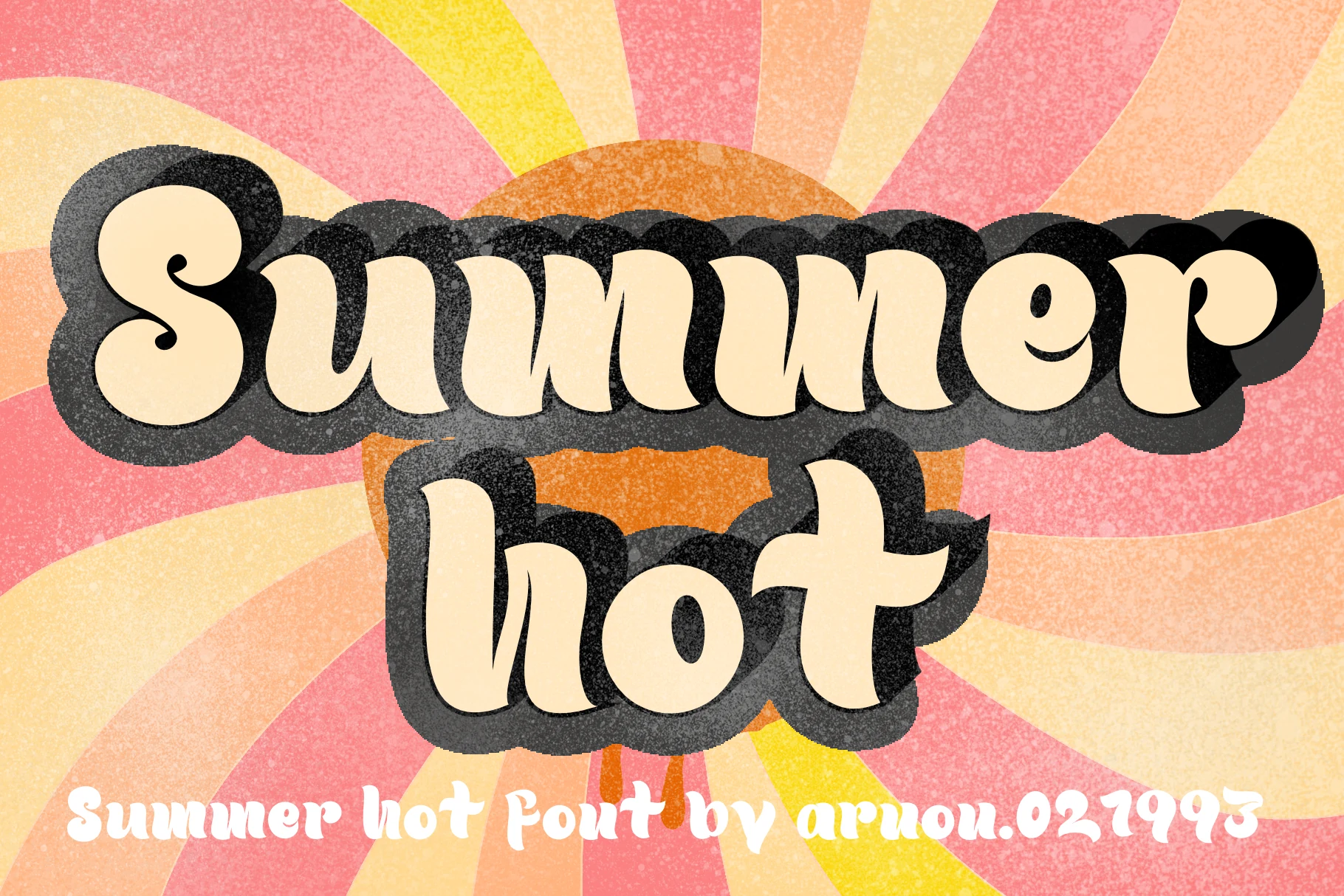
Best For: retro designs, vintage designs, posters, headlines
Summer Hot Font has a thick vintage display style, with cream letterforms, curled terminals, and a heavy black shadow that makes the words feel lifted off the page. The soft curves and slightly uneven rhythm give it a nostalgic poster look, while the textured treatment suits designs that need a worn retro finish.
For Summer Groovy Fonts, this one works best when the headline needs weight, warmth, and a strong focal point. Keep phrases short and leave enough margin around the letters, because the oversized shadow adds visual mass and can crowd nearby graphics if the layout is packed too tightly.
Summer Sunkissed Font
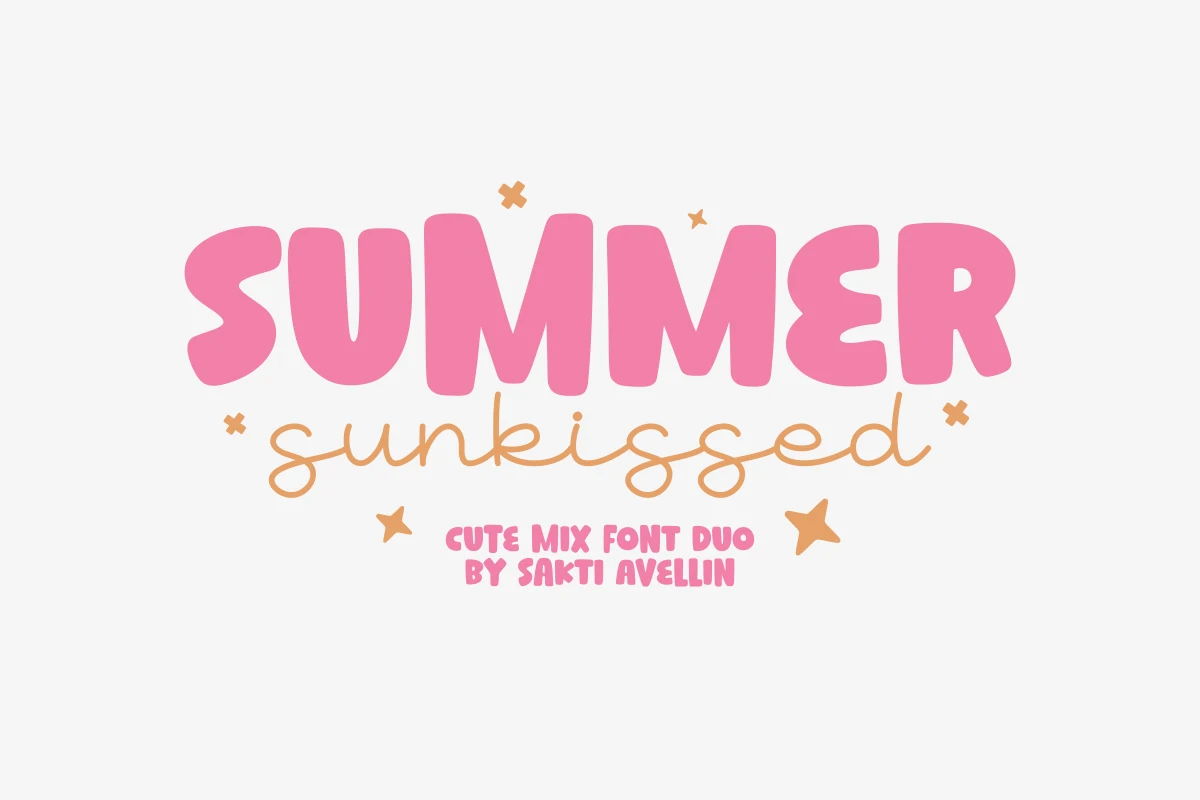
Best For: quotes, T-shirts, invitations, wall art
Summer Sunkissed Font pairs chunky rounded capitals with a light monoline script, creating a sweet handmade contrast that feels casual but polished. The display letters have soft, inflated shapes and even weight, while the script keeps a loose handwritten flow that stops the set from feeling too blocky.
Within Summer Groovy Fonts, this duo is especially useful when you want a clear title plus a softer secondary word or tagline. Let the bold style carry the main message and use the script for contrast, then keep extra text simple so the shift between thick forms and delicate strokes stays clean on merch, quotes, and invitations.
Choose chunky bubble fonts when the design needs loud retro energy, hippie scripts for softer handmade titles, and vintage shadow styles for posters or merch with stronger depth. These 14 summer groovy fonts work best as headline type, so keep supporting text clean and let the main lettering carry the mood.