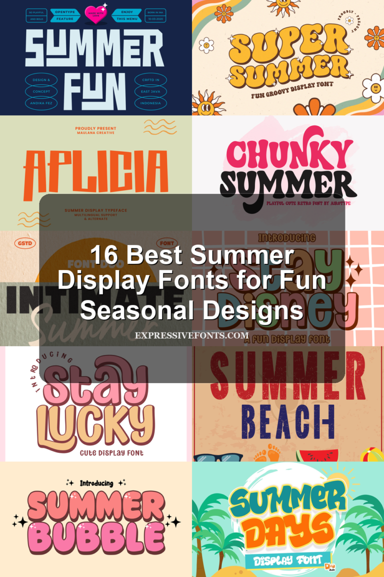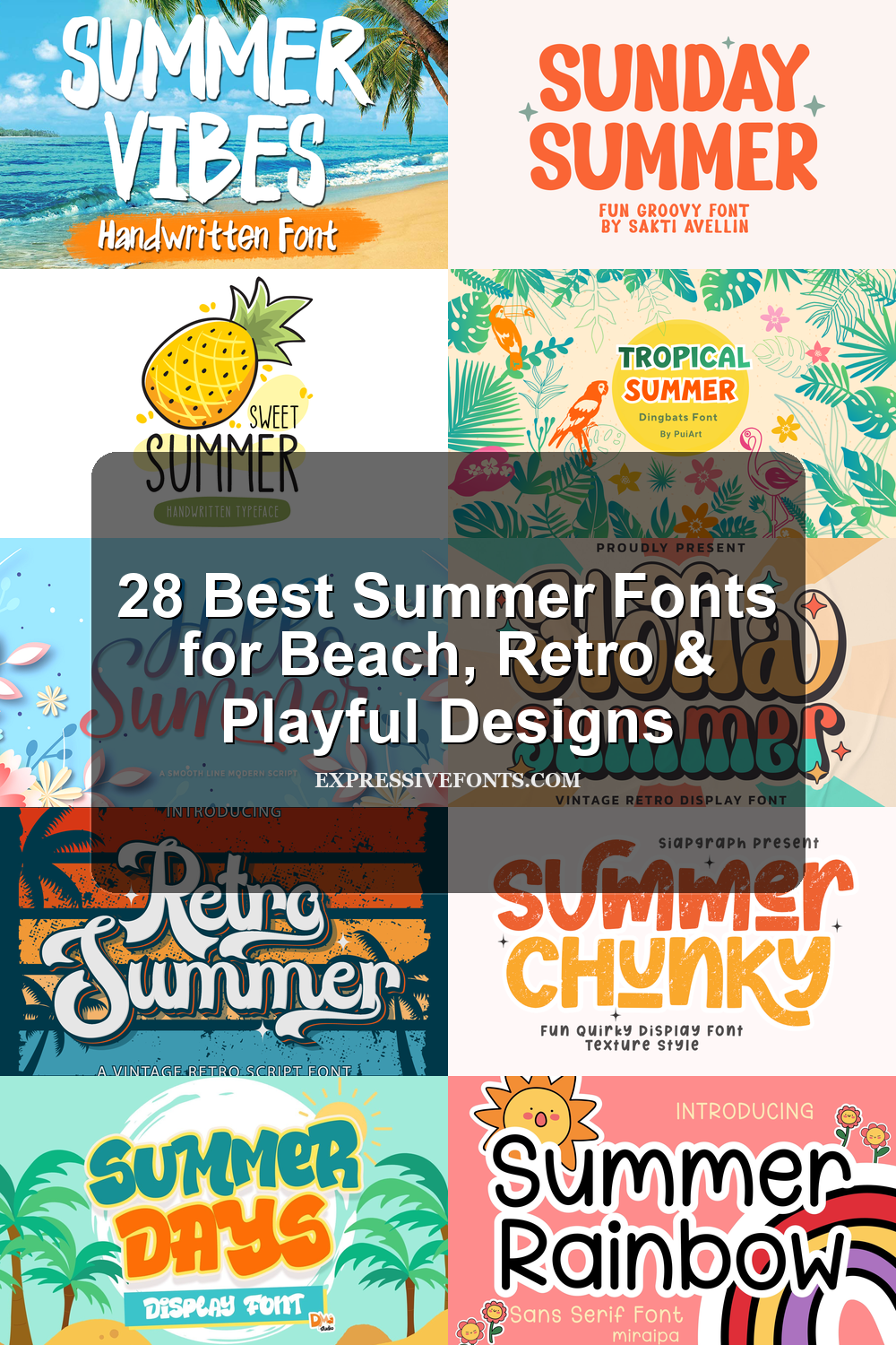
28 Best Summer Fonts for Beach, Retro & Playful Designs
This collection features 28 summer fonts for designers, crafters, and brands working on beach posters, T-shirts, stickers, invitations, packaging, social media graphics, and seasonal branding. It includes bold display fonts, retro scripts, brush lettering, playful bubble styles, tropical doodle alphabets, and font duos. Use chunky styles for impact, scripts for a relaxed coastal feel, and decorative fonts when the lettering should become the main visual.
Summer Vibes Font
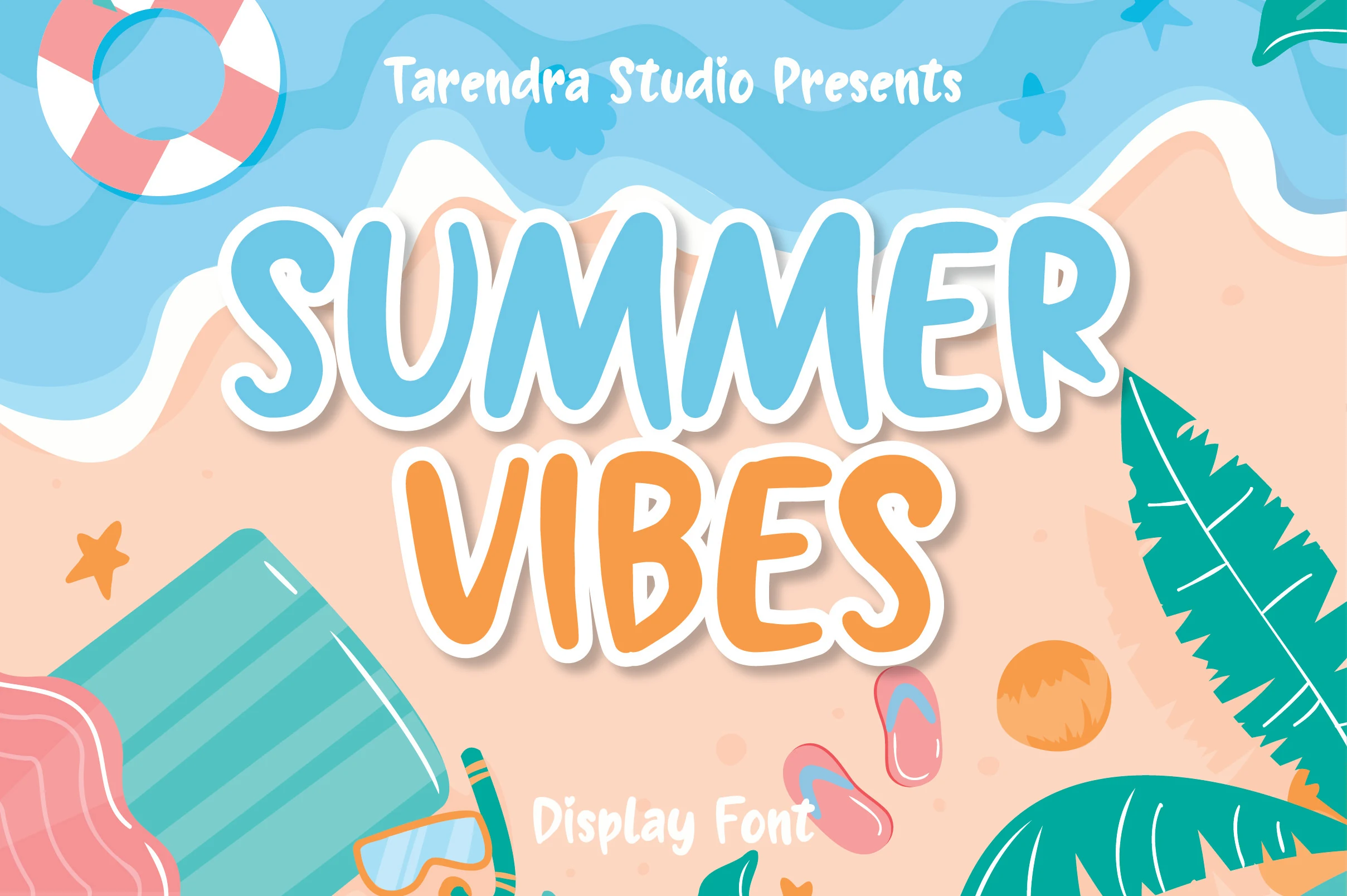
Best For: posters, merch design, display text, fun designs
Summer Vibes Font uses bold handwritten display letters with uneven edges, soft curves, and a loose cutout rhythm. The tall uppercase shapes feel loud and beach-ready without becoming sharp, making it a strong pick for Summer fonts that need instant poster-style impact.
Its thick strokes hold up well over busy imagery, but the irregular silhouettes work best in short words or stacked titles. Give the lettering firm contrast and avoid tight tracking, since the chunky forms need small pockets of space to keep the playful shapes readable.
Holla Summer Font
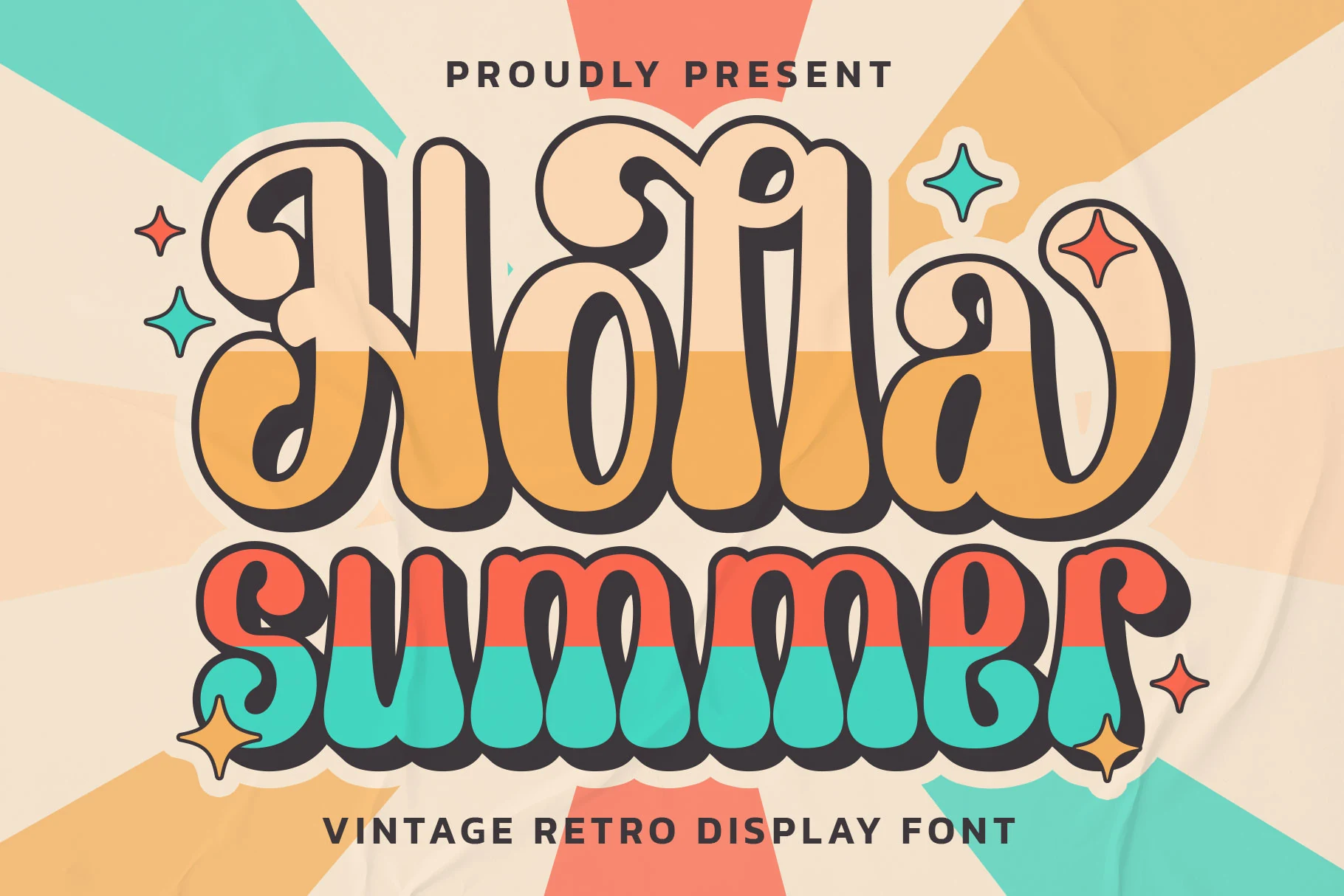
Best For: logos, branding, posters, social media graphics
Holla Summer Font leans into a warm retro mood with oversized curves, deep outline weight, and playful swashes that give each word a lively, nostalgic bounce. Its bubbly silhouette brings Summer fonts a more graphic, poster-ready feel, especially when you want something brighter and more expressive than a plain display face.
The large counters and smooth stroke rhythm keep it readable for short headlines, logo-style titles, and bold callouts. Let it carry the main hierarchy, then pair it with a clean sans serif so the curled terminals and chunky letter shapes stay crisp instead of competing with too much detail.
Summer Festive Font
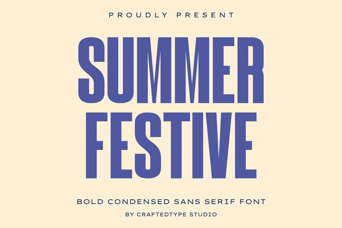
Best For: posters, headlines, merch design, T-shirts
Summer Festive Font is built around tall condensed uppercase letters, heavy vertical strokes, and clean geometric spacing. It gives Summer fonts a direct event-poster energy, with narrow proportions that let long words feel big without taking over the whole layout.
The smooth outlines make it practical for merch and cutting-machine projects, while the bold weight stays readable on apparel, mugs, and social graphics. Keep the tracking controlled rather than tight; the compressed forms need clear inner gaps to avoid closing up at smaller sizes.
Intimate Summer Font
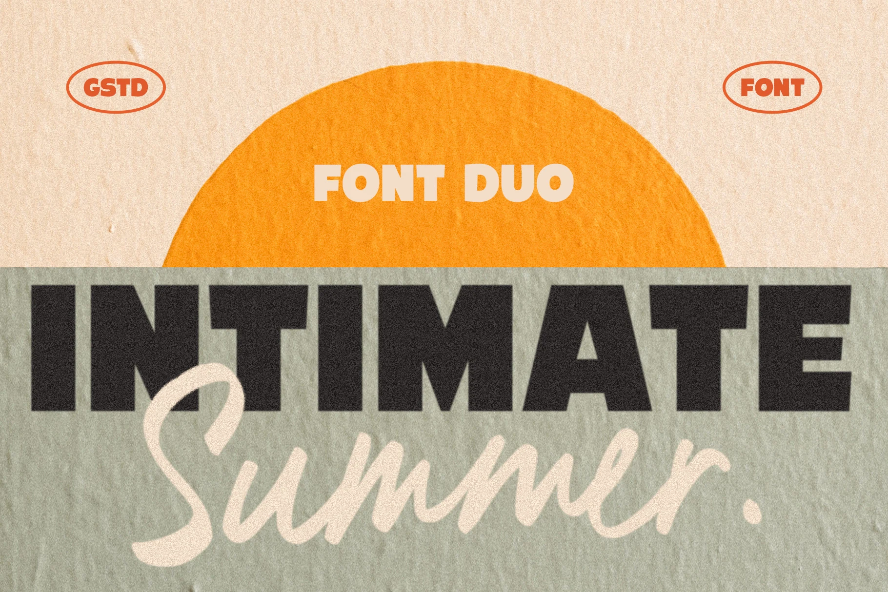
Best For: logos, branding, invitations, social media graphics
Intimate Summer Font pairs a heavy sans serif with a relaxed handwritten script, creating a built-in contrast that feels warm and approachable. That mix gives Summer fonts a clearer hierarchy: the blocky uppercase style grabs attention first, while the flowing script softens the composition and adds personality.
The duo works best when each style has a defined role, with the sans carrying the main message and the script used for emphasis or a secondary word. Keep enough space around the script strokes so they stay airy, and use the strong sans to stabilize logos, invitations, or social graphics with longer titles.
Summer Harvest Font
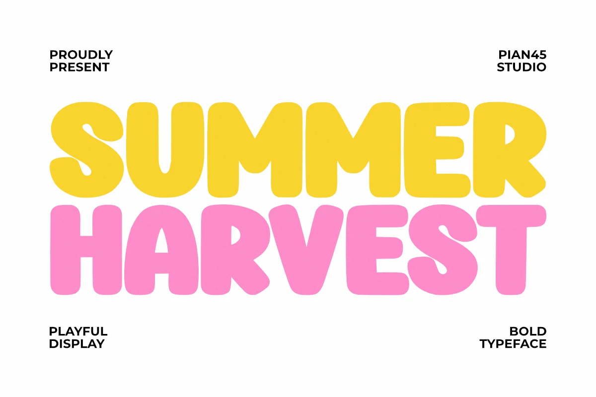
Best For: packaging, children’s designs, social media graphics, posters
Summer Harvest Font has thick rounded display letters, soft corners, and a buoyant rhythm that makes every word feel upbeat. The bold shapes carry a cheerful, almost toy-like warmth, which gives Summer fonts a friendlier direction when you want bright headlines with a clear sense of fun.
Its heavy weight keeps titles readable on packaging, posters, and kids-focused graphics, but it works best when the wording stays short and punchy. Let it lead the hierarchy, then support it with a simple sans serif and enough open space so the chunky forms stay crisp instead of crowding the layout.
Summer Chunky Texture Font
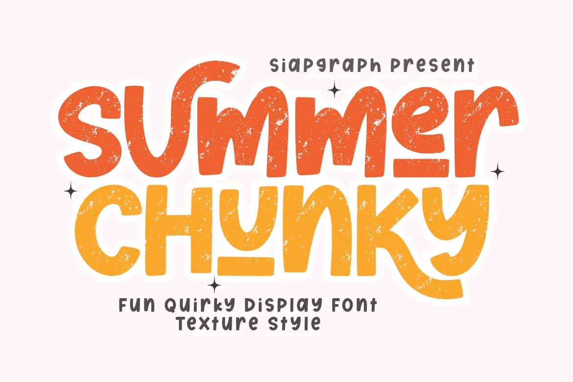
Best For: posters, stickers, T-shirts, fun designs
Summer Chunky Texture Font uses thick rounded letters, quirky uneven curves, and distressed speckling that gives the words a handmade screen-print feel. Its underlined accents add movement across the baseline, making it one of the more expressive Summer fonts for playful titles and retro-leaning graphics.
The bold shapes read quickly in stacked layouts, while the smooth outlines make it useful for DIY cutting-machine projects. Keep phrases short and leave room around the underline details; the texture needs strong contrast so the worn surface looks intentional instead of muddy.
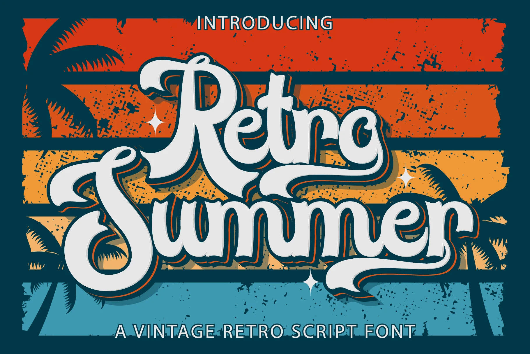
Retro Summer Font
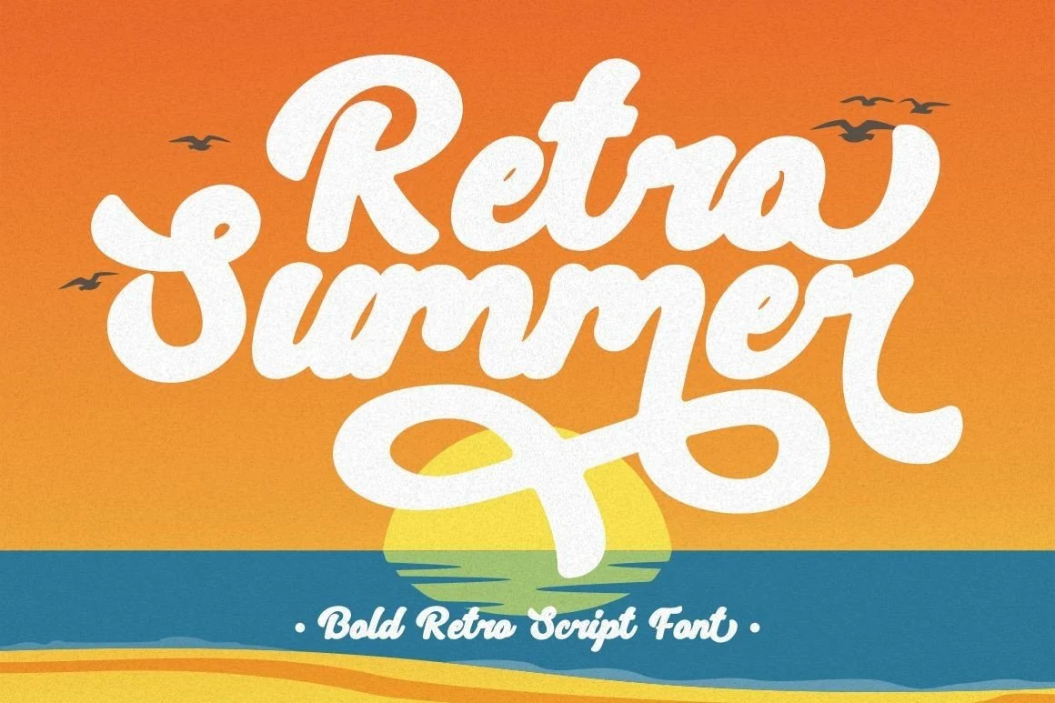
Best For: logos, branding, posters, packaging
Retro Summer Font has the kind of oversized script presence that feels lifted from vintage signage, with thick rounded strokes, dramatic entry swashes, and a layered outline that adds depth. It gives Summer fonts a richer retro voice, especially when you want a title to feel warm, bold, and full of motion.
The letterforms are wide and display-focused, so they work best in short phrases, covers, and headline settings where the long terminals can breathe. Let it take the lead, then pair it with a restrained sans serif for supporting text to keep the composition clear and the decorative curves from crowding the layout.
Summer Camp Font
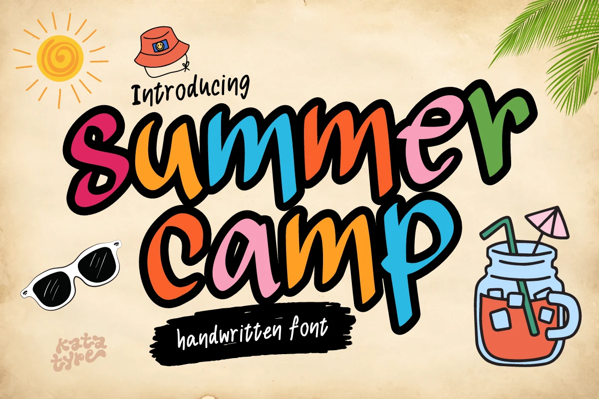
Best For: invitations, signage, children’s designs, fun designs
Summer Camp Font has a loose brush-written shape with thick black outlines, uneven letter heights, and lively curves that make the words feel casual rather than polished. The bouncy forms give Summer fonts a camp-poster mood, with enough weight to stand out in cheerful graphics and outdoor-themed titles.
Because the letters are expressive and closely packed, it works best for short names, signs, and invitation headers instead of long text. Use strong contrast behind the strokes and keep supporting type simple, so the colorful shapes and playful handwritten rhythm stay readable at a glance.
Summer Beach Font
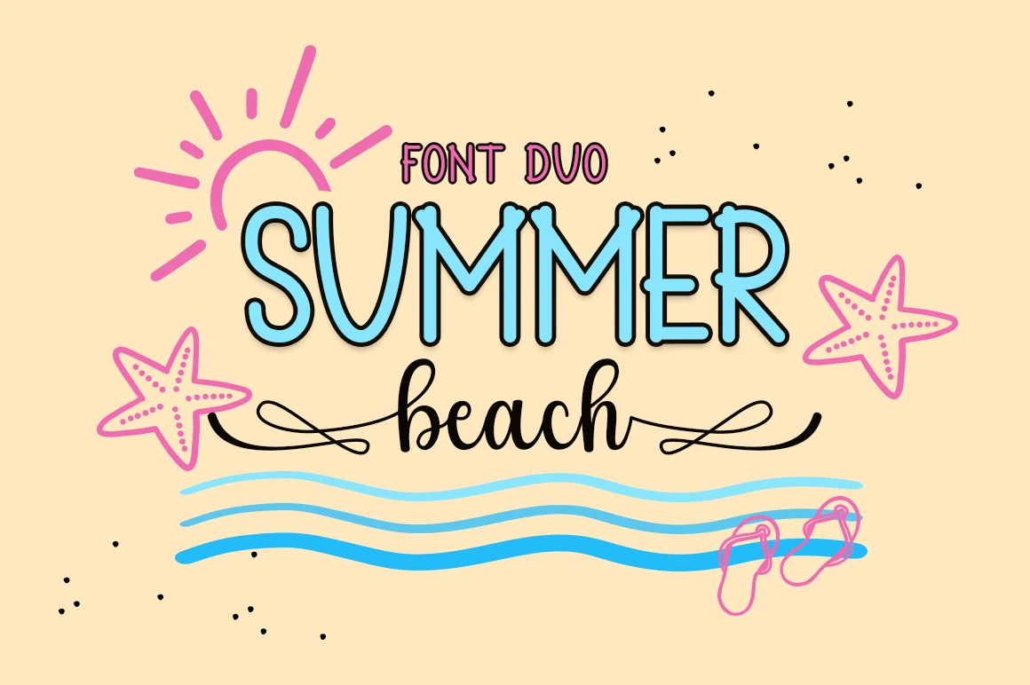
Best For: invitations, headlines, social media graphics, website headers
Summer Beach Font pairs a flowing script with a simple sans serif, giving layouts an easy built-in contrast. The script has long, airy strokes and rounded joins that feel relaxed rather than formal, making it a natural fit for Summer fonts when you want softness, movement, and a light coastal mood.
The handwritten style works best for short headlines or names, while the sans serif can handle smaller supporting lines without breaking the mood. Keep the script surrounded by a bit of open space, especially over textured photos, so the tall loops and smooth rhythm stay clear instead of getting lost in the background.
Summer Dear Font
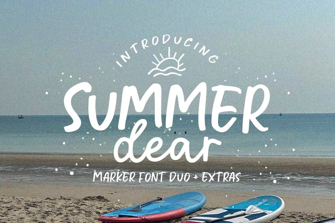
Best For: social media graphics, website headers, quotes, stickers
Summer Dear Font blends a rounded marker-style uppercase with a softer handwritten script, giving the lettering a casual beach-note rhythm. The strokes are thick but relaxed, with uneven handmade edges that make Summer fonts feel more natural than polished or decorative.
Use the taller marker letters for the main word and let the script act as a secondary accent, especially in social graphics, quotes, or laid-back headers. Keep contrast high over photos and avoid squeezing the baseline, since the loose spacing and rounded joins need room to stay readable.
Summer Rainbow Font
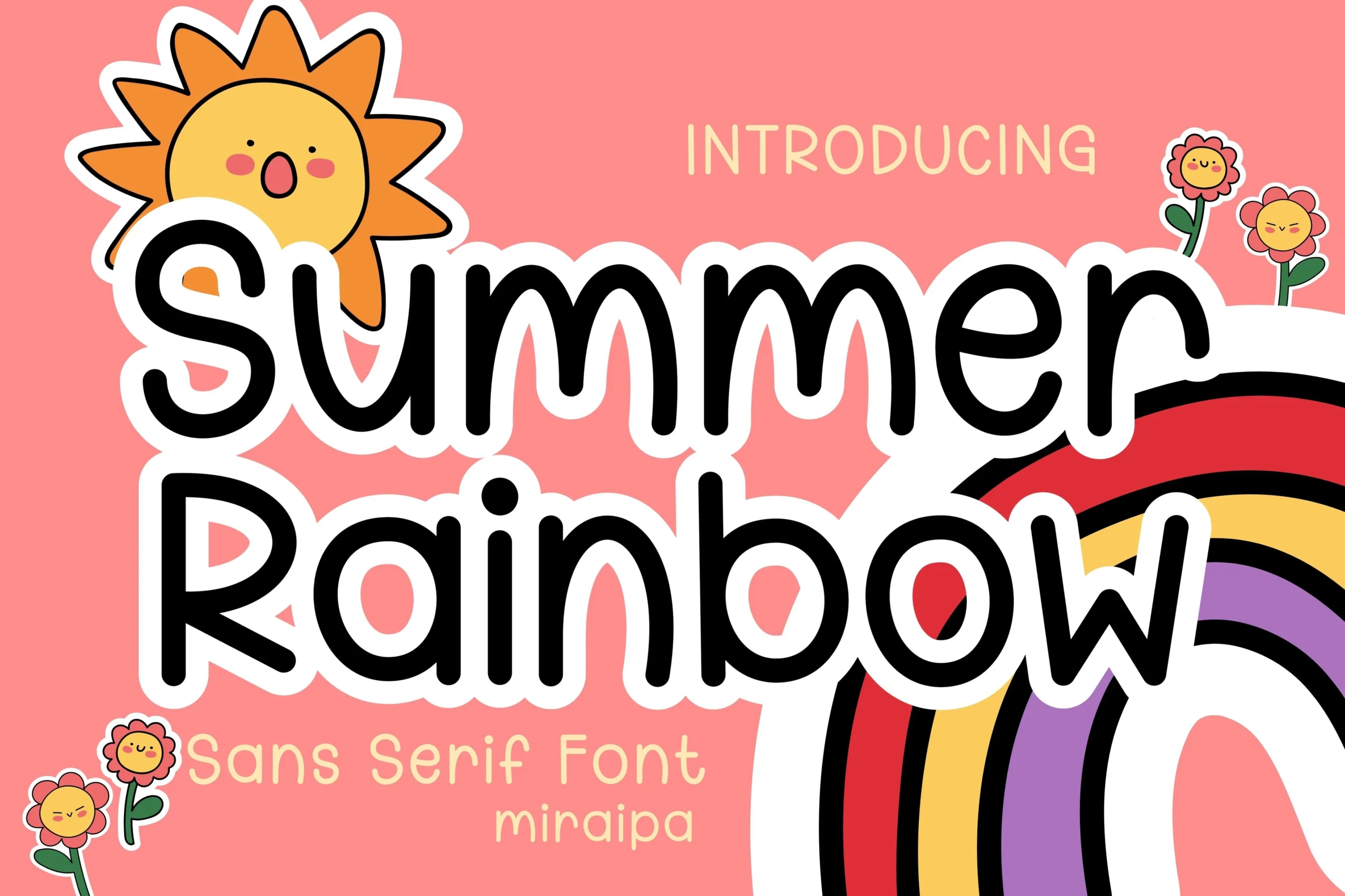
Best For: children’s designs, book covers, social media graphics, cute designs
Summer Rainbow Font leans on soft monoline strokes, rounded terminals, and wide open counters, giving the letters a cheerful hand-drawn bounce. Its friendly sans serif shapes make it a strong pick for Summer fonts that need a light, child-focused mood without losing clarity.
The thick outline helps the lettering stay visible over busy color palettes, which is especially useful for greeting cards, book covers, and playful social posts. Keep the line breaks generous and pair it with a quieter secondary font, since the bubbly rhythm already carries plenty of personality on its own.
Retro Summer Font
Best For: logos, branding, posters, retro designs
Retro Summer Font has a bold vintage script structure with rounded strokes, heavy shadowing, and sweeping terminals that stretch across the composition. Its sign-painter rhythm gives Summer fonts a strong throwback look, useful when the title needs motion instead of a flat block-letter feel.
The swashes and layered outlines make it best for short phrases, logo marks, and poster-style headers where the decorative curves have room to extend. Keep supporting text narrow and clean, and avoid cramped line spacing so the thick script forms do not merge into the background.
Hi Summer Font
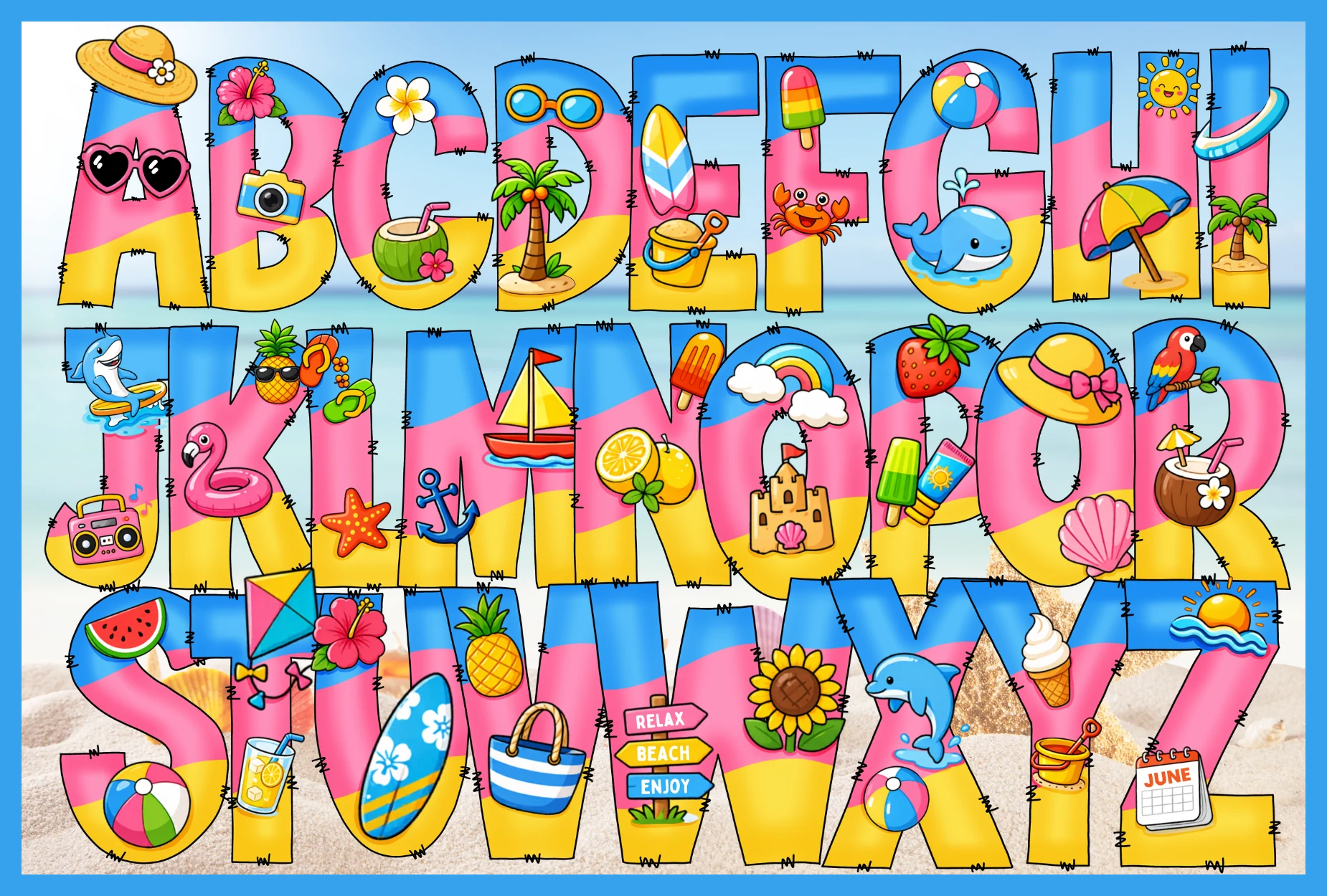
Best For: children’s designs, stickers, T-shirts, posters
Hi Summer Font turns lettering into a full beach scene, with chunky uppercase forms filled in bright blue, pink, and yellow bands, then covered with tiny summer icons from surfboards to seashells. That playful collage look gives Summer fonts a much more decorative, character-led feel than a standard display face.
Because every letter carries extra detail, it works best in short titles, names, or standout display text rather than long wording. Use it where the alphabet itself becomes the artwork, and keep surrounding elements simple so the clipart, color blocks, and stitched edges stay clear.
Tropical Summer Doodle Font
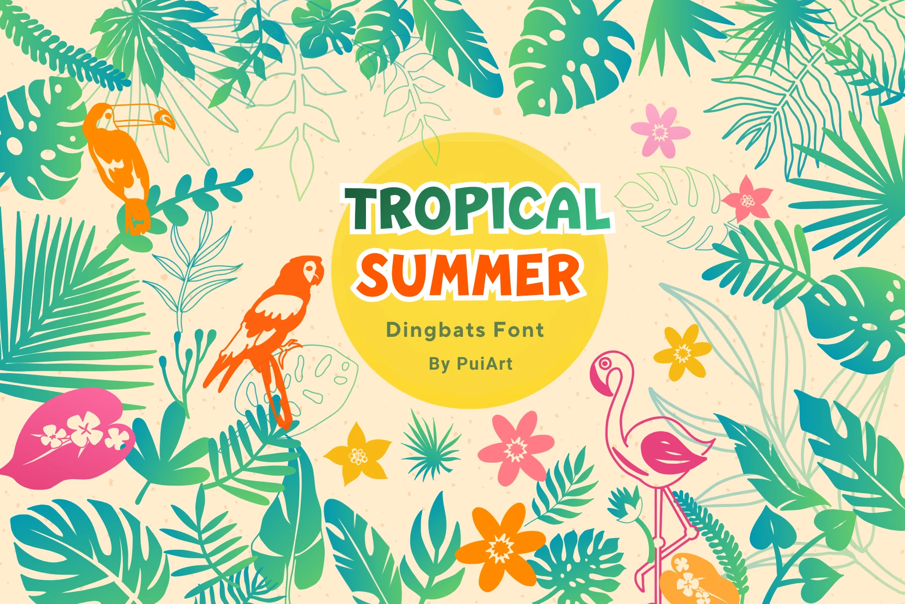
Best For: stickers, T-shirts, invitations, decorative designs
Tropical Summer Doodle Font is built around decorative leaf-inspired letter artwork and bright botanical dingbat details. It gives Summer fonts a more illustrated direction, with tropical leaves, flowers, birds, and rounded display shapes that work as part of the visual scene rather than plain text.
The doodle style is best used for short titles, initials, stickers, and craft pieces where the lettering can stay large enough to show the internal leaf shapes. Keep backgrounds simple and contrast high, especially for Cricut, Silhouette, or T-shirt layouts, so the small botanical details do not disappear.
Sunday Summer Font
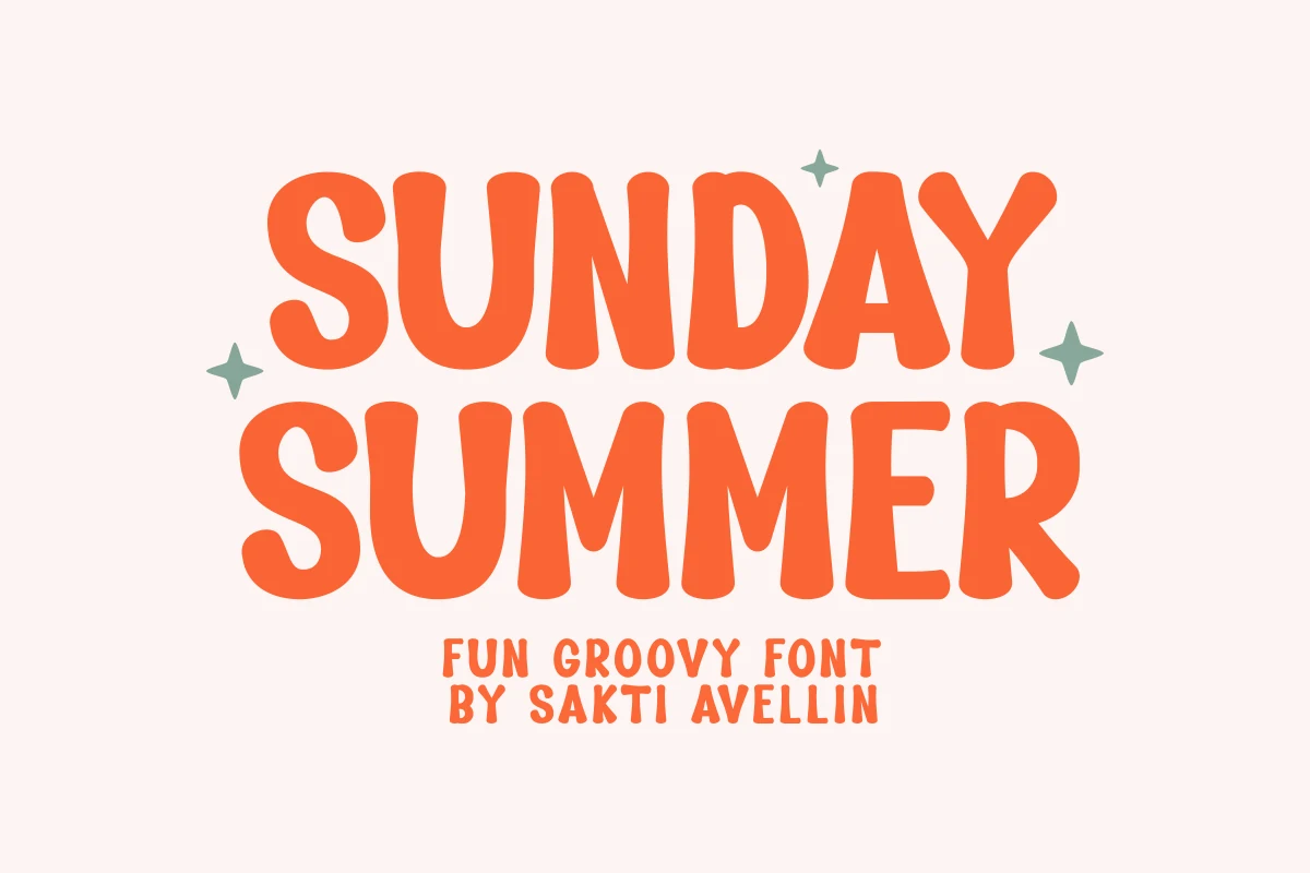
Best For: stickers, T-shirts, posters, retro designs
Sunday Summer Font has chunky retro letterforms with rounded corners, soft vertical curves, and a slightly uneven handmade rhythm that keeps the all-caps layout feeling friendly rather than rigid. It gives Summer fonts a groovy, nostalgic tone that reads fast and brings instant personality to bold display work.
The thick shapes hold up especially well on stickers, mugs, totes, and poster headlines, where the simple silhouette stays clear from a distance. Keep the wording short and the spacing a touch open, so the dense forms do not crowd each other and the playful vintage proportions can do the visual heavy lifting.
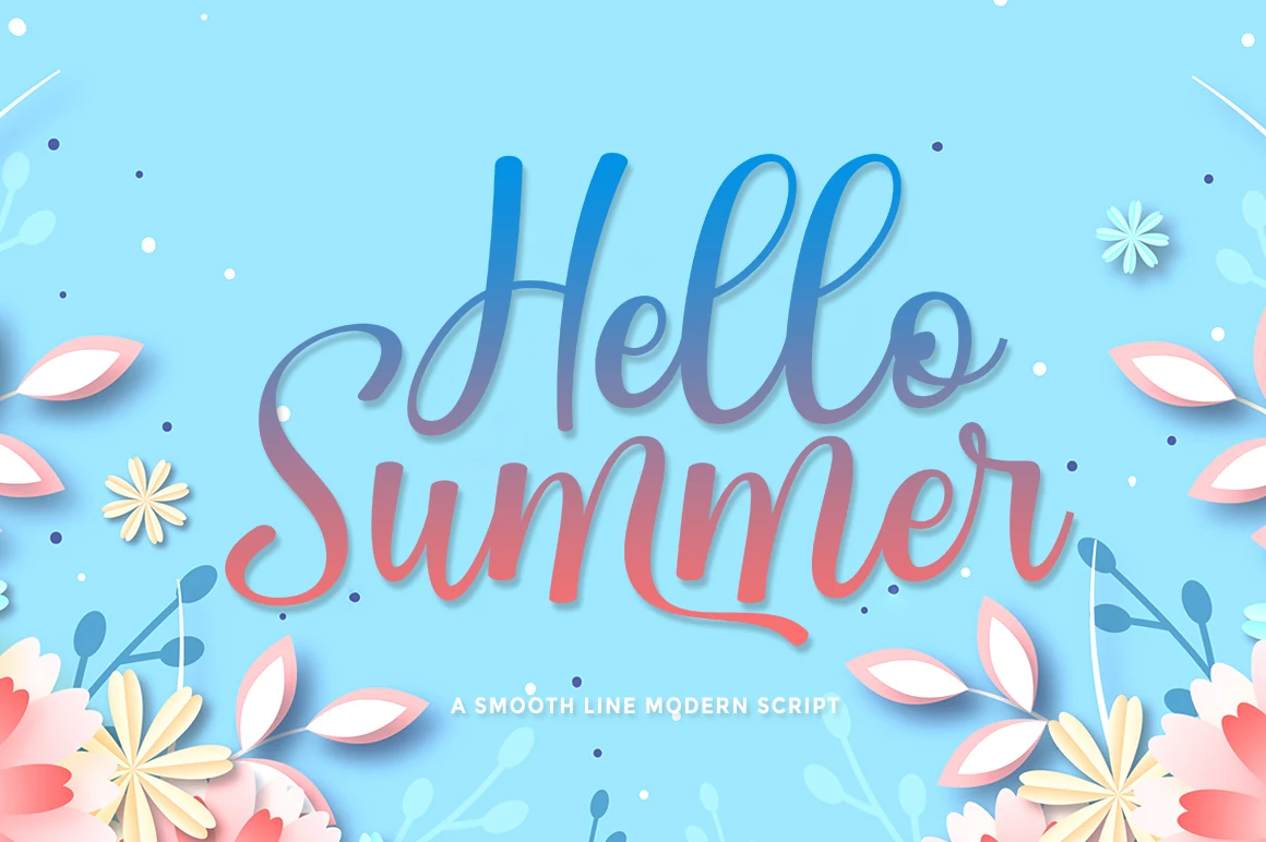
Hello Summer Font
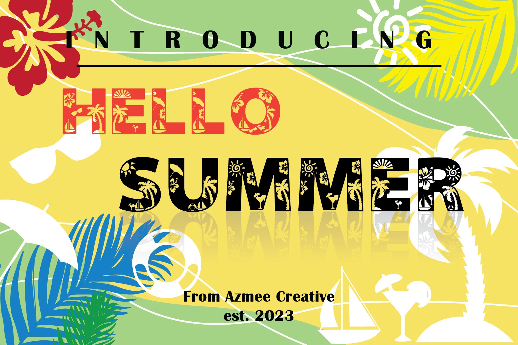
Best For: headlines, short phrases, branding, playful designs
Hello Summer Font is a smooth modern script with rounded loops, thick vertical strokes, and loose swashes that give the words a friendly hand-lettered rhythm. The connected forms feel relaxed rather than formal, which makes it a natural fit for Summer fonts built around titles, greetings, and upbeat seasonal branding.
Use it where the lettering can carry the main message: a headline, product phrase, poster title, or advertising mark. The long entry stroke on the capital shapes and the low sweeping tail need clear space around them, so keep supporting copy compact and let contrast separate the script from busier graphics.
Summer Beach Font
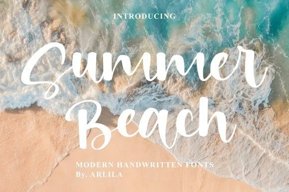
Best For: branding, social media graphics, posters, short phrases
Summer Beach Font has a breezy handwritten feel, with rounded brush strokes, soft curves, and tall capitals that keep the script open and easy to read. It brings a relaxed seaside mood without looking messy, which makes it a strong pick for Summer fonts used in cheerful titles and warm-weather branding.
The lettering has enough weight to hold up over photography, while the connected forms still benefit from generous spacing around them. Use it for short headlines, packaging, or social graphics, then pair it with a simple serif or clean sans for supporting text so the script stays clear and polished.
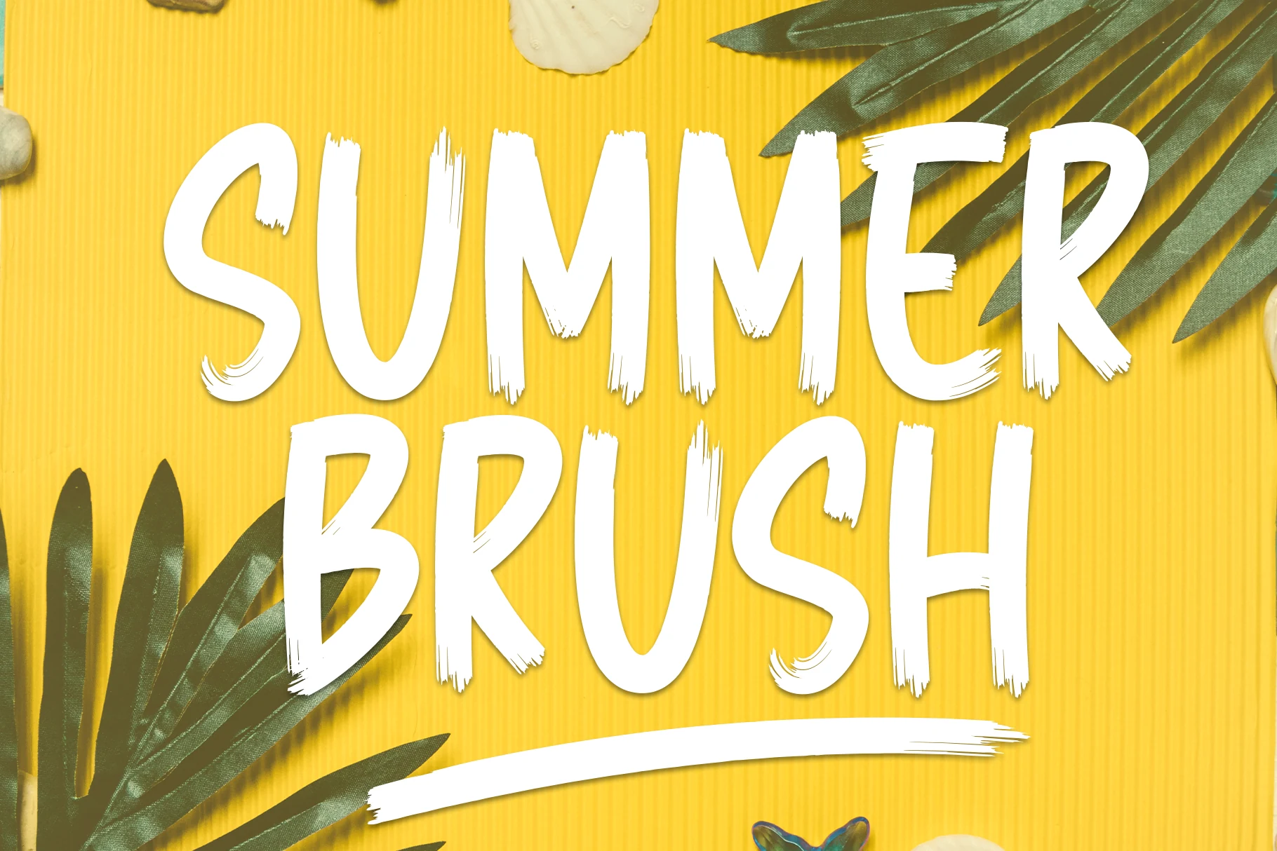
Summer Brush Font
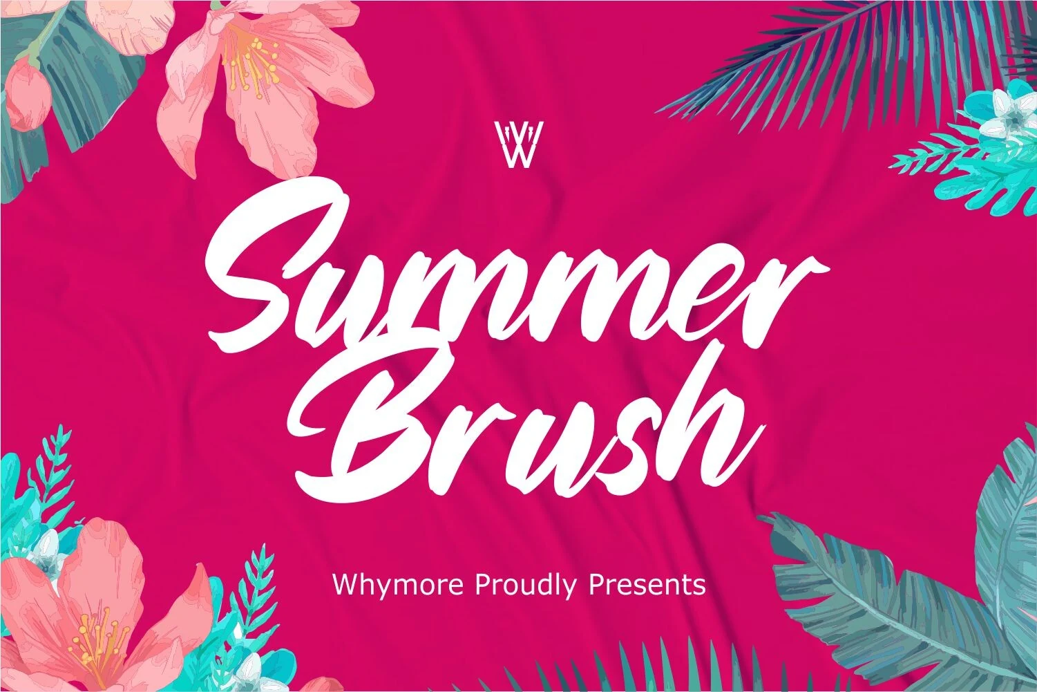
Best For: posters, signage, headlines, short phrases
Summer Brush Font has tall all-caps letterforms, rough dry-brush edges, and slightly uneven stroke endings that make it feel hand painted instead of polished. The texture gives the font movement and personality, while the upright shapes keep it readable, making it a strong fit for Summer fonts that need a louder, more casual tone.
Its compact width helps you fit bold wording into tight layouts, but the distressed details look best when the text stays short. Use it for punchy titles, packaging, or display graphics, and pair it with a cleaner secondary font so the brush texture stays sharp rather than competing with busy supporting copy.
Summer Font
Best For: stickers, T-shirts, children’s designs, playful designs
Summer Font is a chunky decorative display face with inflated letter shapes, soft corners, and a loose cartoon rhythm. The preview styling gives the word a striped vacation look with heavy black shadowing, but the core character is in the bold rounded forms and playful uneven proportions.
The mood suits Summer fonts made for vacation merch, kids’ graphics, sticker artwork, and casual event titles. Keep it in short words or compact phrases, because the thick shapes and strong outline effect need breathing room; a plain supporting font will keep the layout readable.
Sweet Summer Font
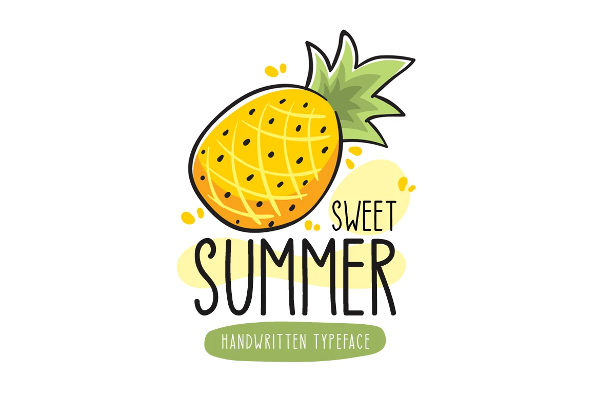
Best For: stickers, product labels, children’s designs, playful designs
Sweet Summer Font has tall, narrow letterforms with slim monoline strokes, rounded ends, and a slightly quirky rhythm that keeps the text feeling light and friendly. The upright shapes stay easy to read, which gives it the relaxed personality you want from Summer fonts without turning messy or overdone.
Its vertical proportions work especially well in stacked layouts, labels, and short titles where you need a playful tone without taking too much horizontal space. Keep tracking fairly open and pair it with simple supporting text, so the handwritten character stays crisp and the layout does not feel crowded.
More Summer Duo Font
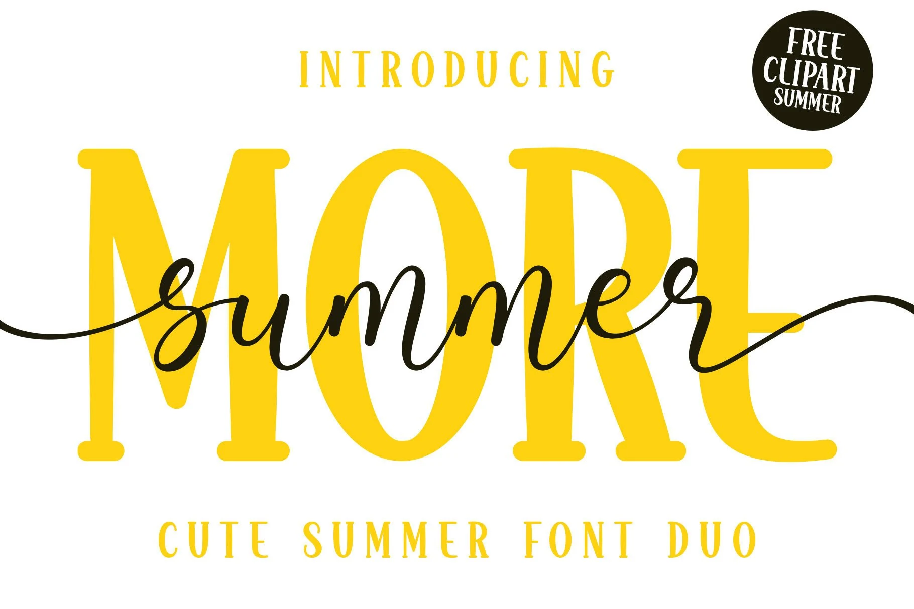
Best For: branding, logos, social media graphics, invitations
More Summer Duo Font combines two clear personalities: a tall serif display face with soft, rounded terminals and a fine script that sweeps across the layout in one fluid line. That contrast gives Summer fonts a more styled, editorial feel, with the serif handling structure while the script adds movement and charm.
This duo works best when you let each style play a separate role, using the serif for the main word and the script as an accent or layered highlight. The long connecting strokes need room to cross the composition cleanly, so keep the wording short and use the pairing to build strong title hierarchy instead of cramming both styles into equal-weight text.
Me Lighs Summer Font
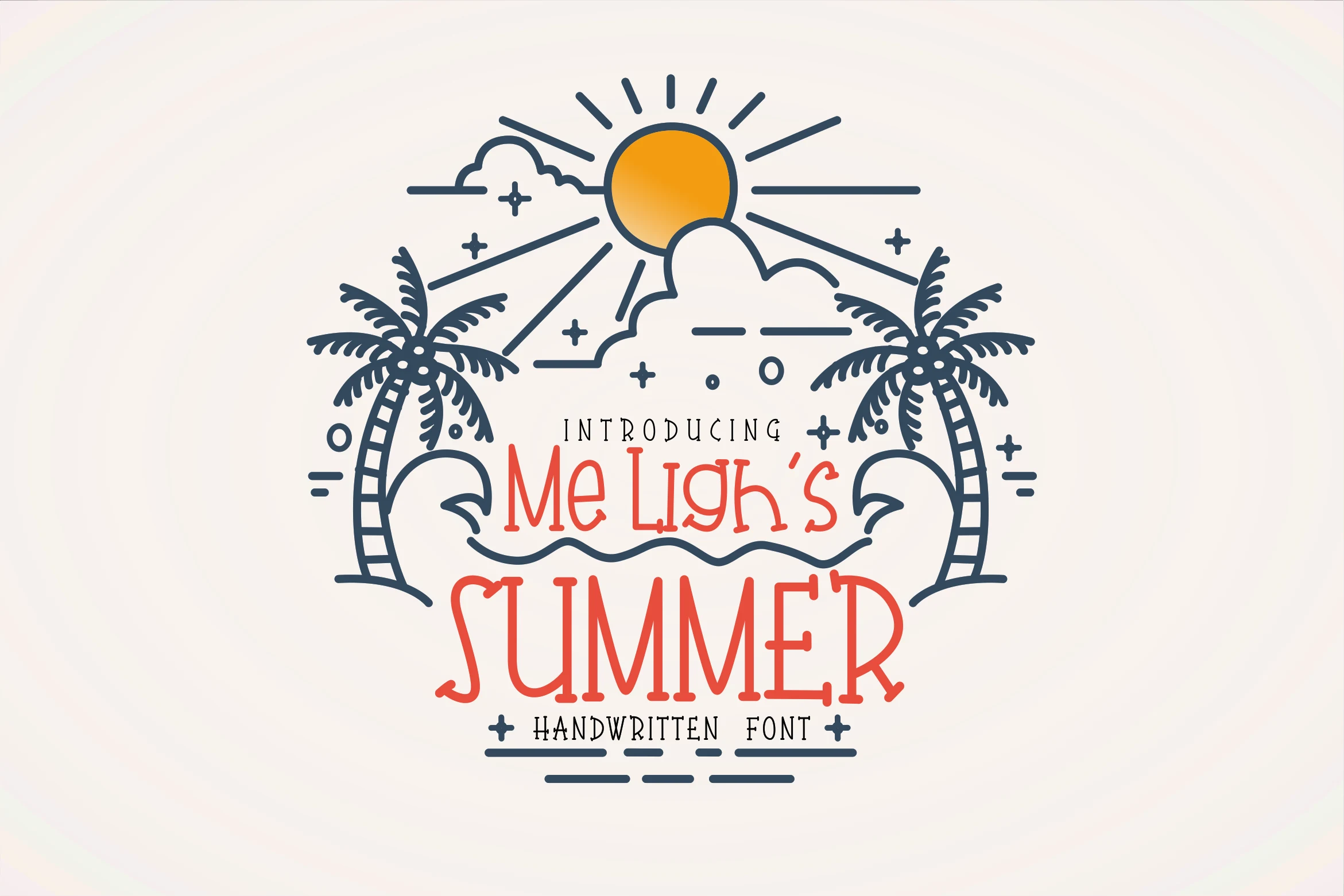
Best For: invitations, posters, decorative designs, fun designs
Me Lighs Summer Font has a hand-drawn decorative style with narrow upright letters, playful curls, and small ornamental terminals that give the words a festival-poster feel. Its uneven stroke rhythm makes it more expressive than polished, which suits Summer fonts aimed at casual events and warm-weather graphics.
The tall proportions work well for centered title layouts, especially when the main word needs height without too much width. Keep the text short and let contrast do the work; the thin interior details and curled endings can lose clarity if the font is packed into dense copy or placed over busy artwork.
Summer Days Font
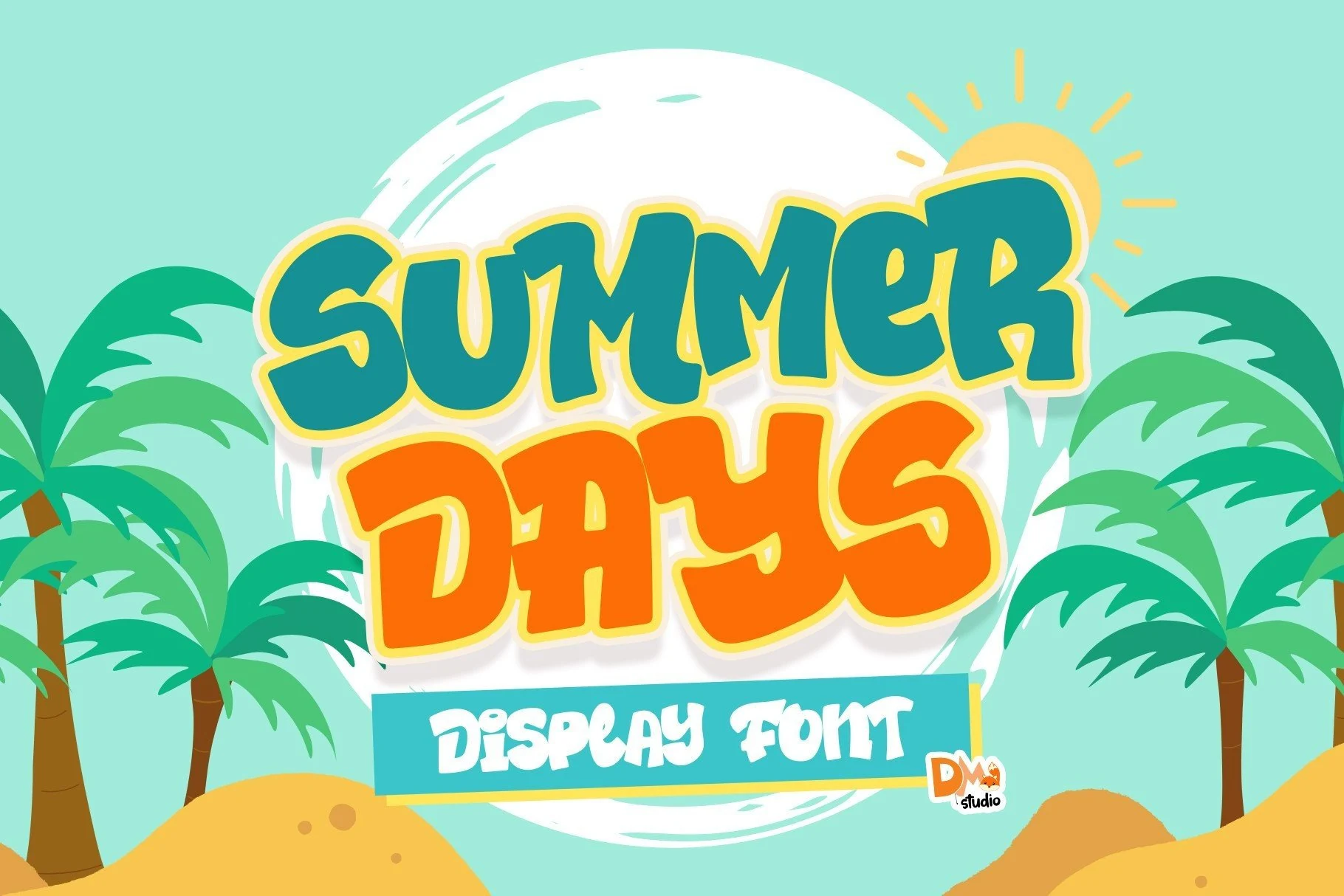
Best For: invitations, children’s designs, playful designs, fun designs
Summer Days Font is a chunky display style with rounded contours, puffy proportions, and slightly uneven character shapes that keep the lettering lively. That bubbly build gives Summer fonts a cheerful, youthful tone, while the open interiors stop the words from feeling too heavy.
It works best in short, high-impact lines where the wide shapes can stay clear and expressive. Use it for invitations, party graphics, or playful headers, and leave a bit more space between text blocks so the bold forms do not crowd each other or flatten the title hierarchy.
Summer Vibes Font
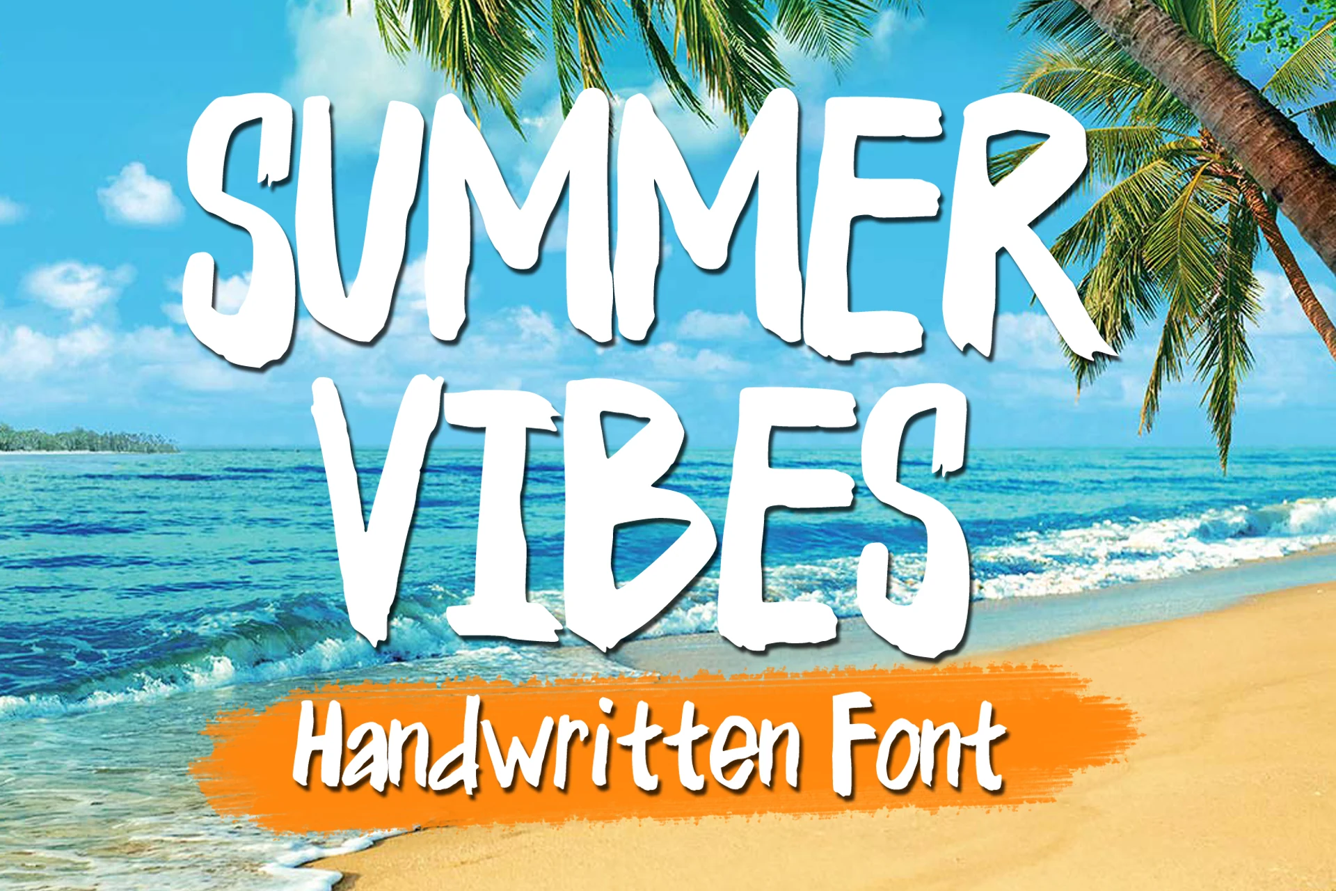
Best For: posters, T-shirts, stickers, bold designs
Summer Vibes Font uses tall, condensed uppercase letters with dry-brush edges and slightly irregular stroke widths, giving it a hand-painted look that feels loud and relaxed at the same time. That textured finish makes it a natural fit for Summer fonts when you want a headline to feel casual, sunny, and immediate.
Because the forms are narrow and fairly heavy, it handles stacked titles and short words especially well on posters, T-shirts, or sticker-style graphics. Leave some space between lines and pair it with a simple secondary font, so the rough brush texture stays clear instead of turning cluttered.
School Summer Font
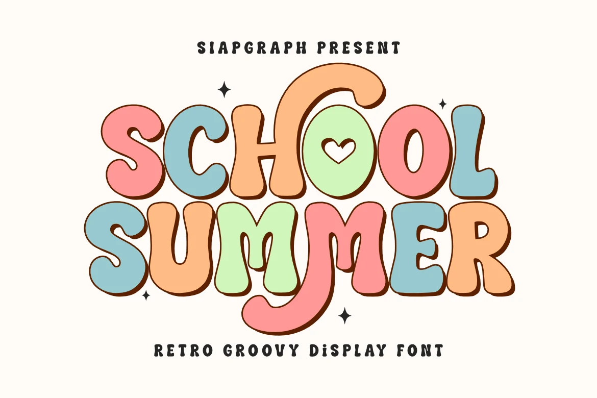
Best For: posters, social media graphics, children’s designs, retro designs
School Summer Font uses thick groovy letterforms, rounded counters, curled terminals, and a soft retro rhythm that feels cheerful without becoming hard to read. The bold outline-friendly shapes make it one of the more playful Summer fonts for designs that need instant visual weight.
It works best as a main title font, especially in stacked words, posters, classroom graphics, or bright social posts. Keep the supporting text simpler and give the letters enough vertical space, because the chunky curves and decorative bounce need clear separation to hold their friendly shape.
Hello Summer Font
Best For: invitations, logos, quotes, business cards
Hello Summer Font has a flowing monoline script with tall looped capitals, smooth connections, and soft curves that keep the lettering airy rather than formal. The long swashes give it an elegant rhythm, making it a strong choice within Summer fonts when you want something graceful but still easy on the eye.
It shines in invitations, quote graphics, logos, and other short display settings where the script can carry the mood. Let the capitals and exit strokes breathe, because the extended tails already create movement and hierarchy; a restrained secondary font will keep the composition clean.
Summer Together Font
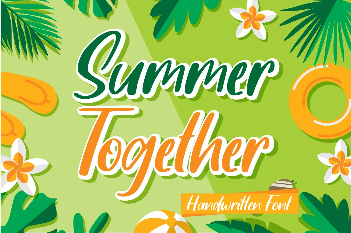
Best For: social media graphics, stickers, playful designs, fun designs
Summer Together Font has a bold handwritten script with rounded strokes, a forward slant, and thick connected letterforms that give it a bright, easygoing rhythm. The capitals are broad and expressive, while the lowercase keeps a smooth flow, making it a lively pick for Summer fonts that need personality without sacrificing readability.
Because the shapes are full and energetic, it works best in short titles where the lettering can do most of the visual work. Use strong contrast around the words and keep supporting type simple, since the sweeping script already adds enough movement and title hierarchy for packaging, stickers, or sunny social layouts.
Summer Brush Font
Best For: posters, signage, headlines, short phrases
Summer Brush Font has tall uppercase letterforms, rough dry-brush edges, and a slightly uneven painted rhythm that gives it an easy display impact. The texture is the main attraction here, so it stands out best in Summer fonts where you want a casual, hand-painted headline rather than a polished script look.
The narrow proportions help long words stay compact, while the chipped stroke endings add movement and bite. It works especially well for posters, signs, and short title treatments; keep supporting text clean and let the brush texture carry the contrast instead of crowding it with decorative secondary type.
The strongest choice depends on the role the font needs to play. For posters, merch, and stickers, start with chunky display fonts such as Summer Harvest, Sunday Summer, or School Summer because they hold attention fast. For softer beach branding, invitations, and quote graphics, the script options such as Hello Summer, Summer Beach, or Summer Together are more suitable. For kids’ designs, craft projects, and decorative artwork, Hi Summer, Summer Rainbow, and Tropical Summer Doodle give the lettering more built-in character. Keep the most detailed fonts for short words and use cleaner secondary type to protect readability.