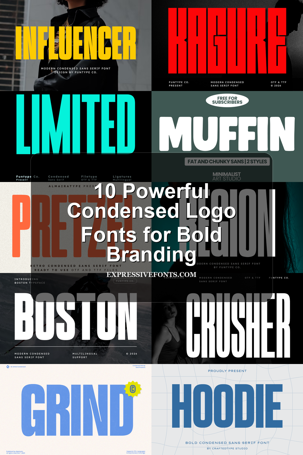
10 Powerful Condensed Logo Fonts for Bold Branding
Condensed Logo Fonts are built for designers who need narrow, high-impact lettering for logos, posters, merch, packaging, and bold brand marks. This collection focuses on tall sans serifs, compressed block styles, retro cuts, and rounded display fonts that keep wordmarks compact without losing presence.
Heavy & Industrial Condensed Logo Fonts
These fonts use dense vertical strokes, tight counters, and forceful block shapes, making them suitable for aggressive logos, sports marks, music posters, and apparel graphics.
Gc Grind Font
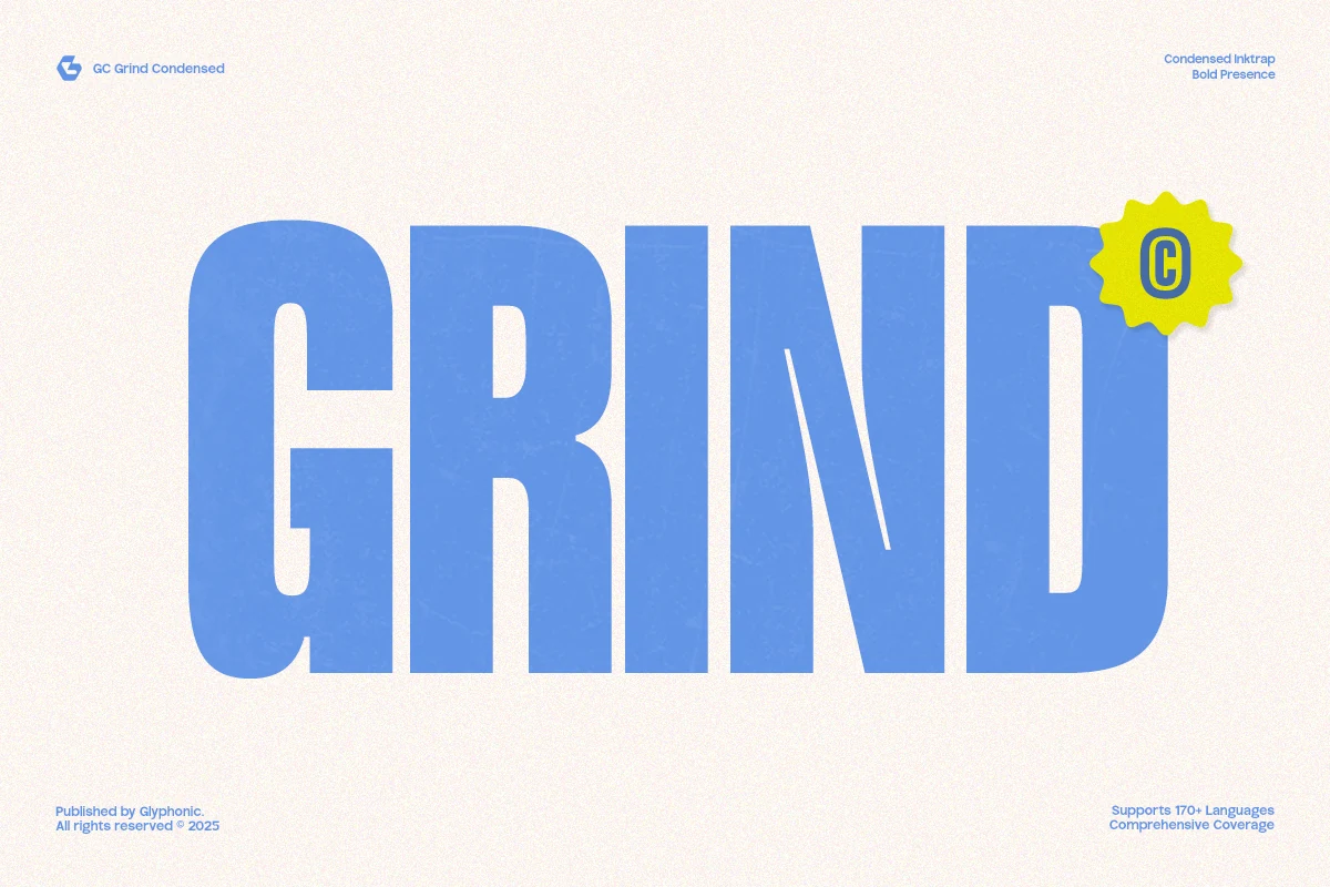
Best For: logos, headlines, posters, bold designs
Gc Grind uses tall compressed capitals with massive vertical stems, rounded outer turns, and tight internal counters. The preview shows a blocky ink-trap mood rather than a neutral condensed sans, giving Condensed Logo Fonts a louder, street-poster presence.
Its narrow width lets long brand names fit into compact marks, but the weight needs contrast: pair it with small, open-spaced supporting type and avoid cramped tracking. It is strongest in short headlines, team-style branding, and poster titles where impact matters more than paragraph readability.
Hoodie Font
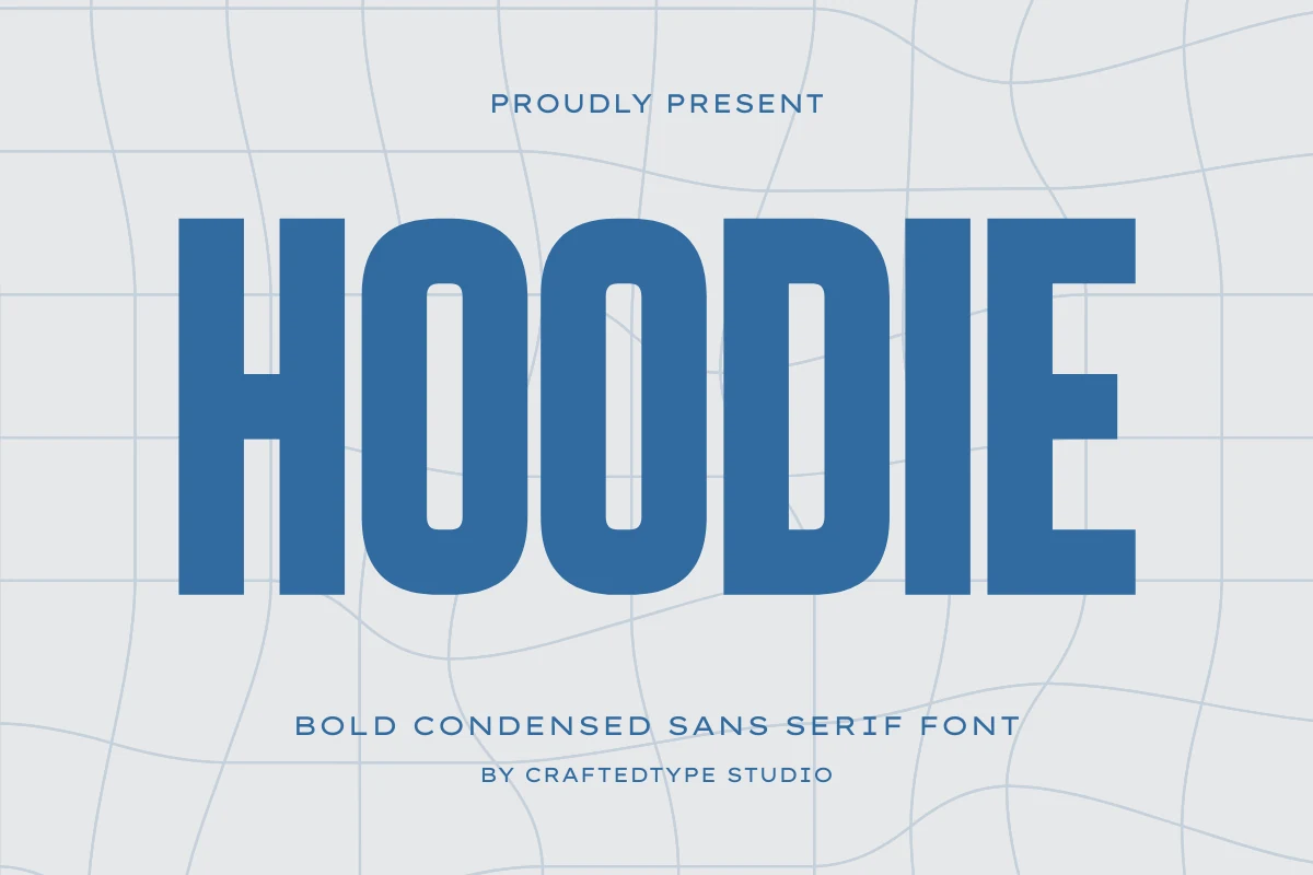
Best For: logos, headlines, posters, bold designs
Hoodie pushes a dense vertical rhythm with tall uppercase forms, thick solid strokes, and narrow counters that keep the wordmark compact. The rounded bowls soften the force slightly, giving Condensed Logo Fonts a sporty, industrial tone without making the letters feel rough.
Use it where the main word needs to occupy space aggressively: team marks, urban branding, poster headers, and apparel graphics. Its compact width can handle longer names, but spacing should stay controlled rather than loose, with lighter supporting type set smaller to keep the title hierarchy clear.
Limited Font
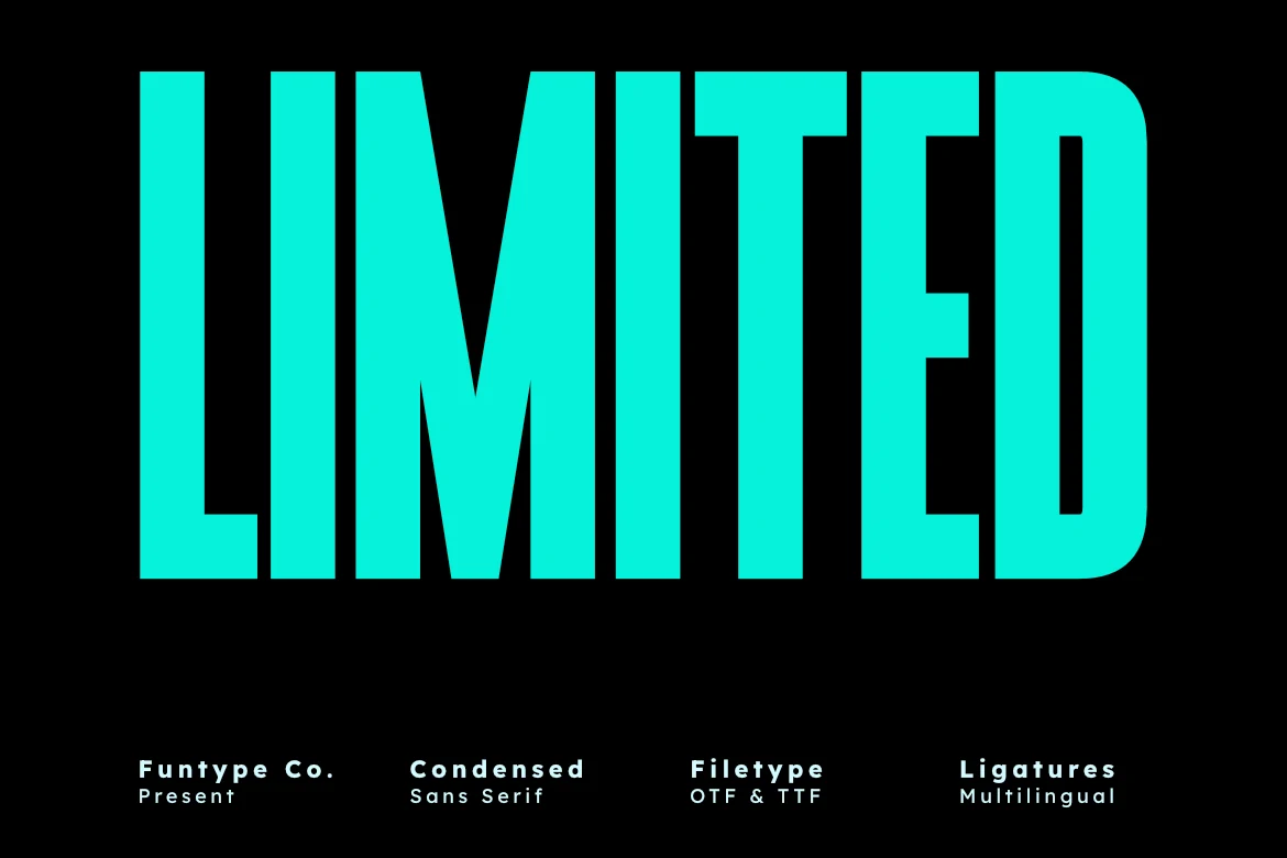
Best For: logos, headlines, posters, bold designs
Limited is extremely tall and narrow, with straight vertical stress, blunt terminals, and tight counters that give it a hard, poster-scale presence. It pushes Condensed Logo Fonts toward a sharper, more industrial look rather than a soft or retro one.
The compact width is useful when a long name still needs to feel oversized, especially in covers, ads, and stacked branding. Keep spacing controlled and pair it with a wider, quieter secondary font, so the main word stays dominant without making the whole layout feel compressed.
Kagure Font
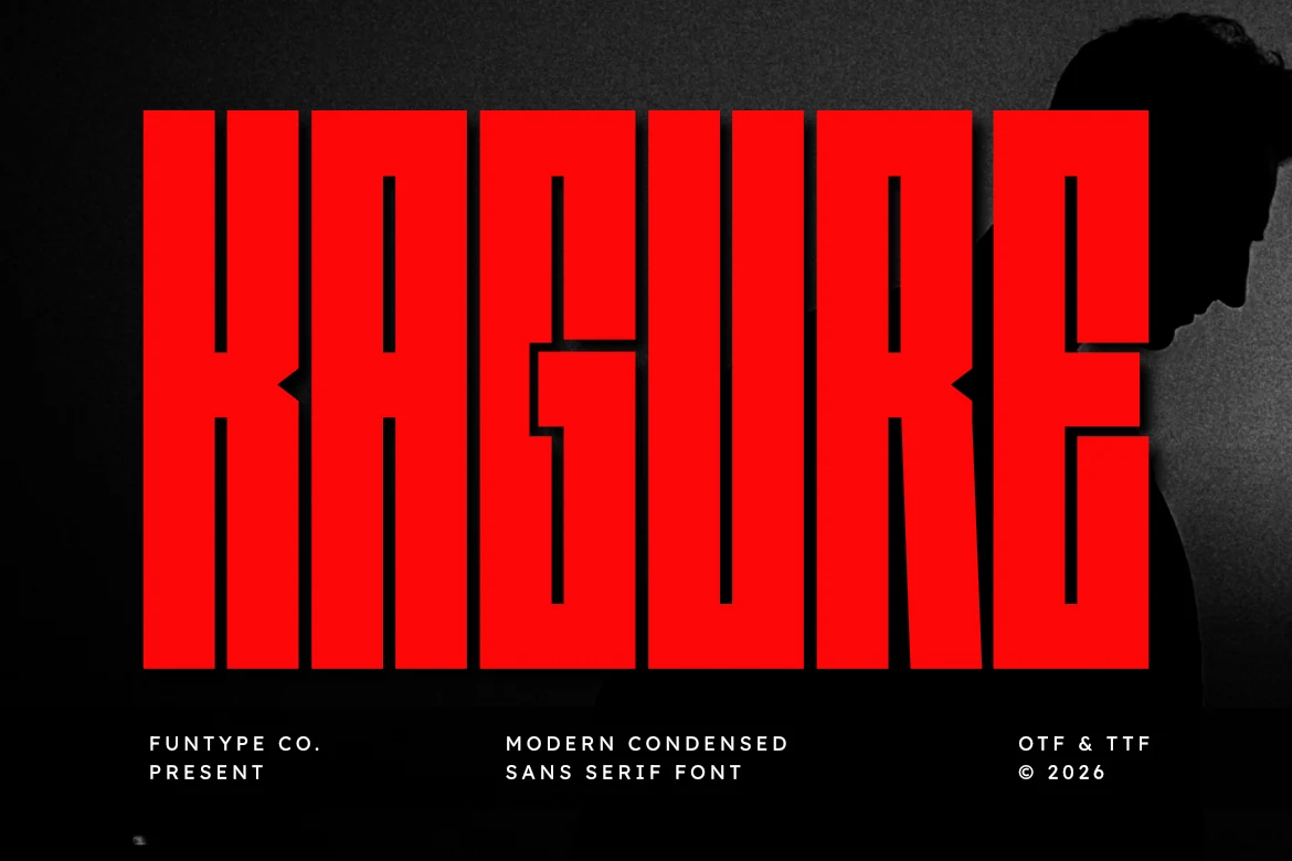
Best For: logos, headlines, posters, bold designs
Kagure is built from heavy condensed capitals with hard vertical stems, squared edges, and narrow interior cuts that make the word shape feel dense and aggressive. The red preview emphasizes its industrial force, placing it firmly in Condensed Logo Fonts for brands that need a blunt, high-pressure title style.
It works best when the main word is short and oversized, especially for sports marks, music posters, industrial branding, and digital headers. Keep supporting text thin or widely spaced to avoid visual congestion; the OTF and TTF files also make it easier to carry the same strong hierarchy across different design software.
Clean & Athletic Condensed Logo Fonts
These condensed fonts keep the structure sharper and more controlled, making them useful for polished logos, signage, editorial headlines, and professional brand systems.
Boston Font
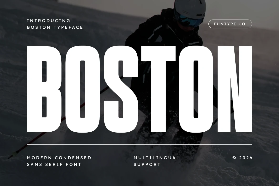
Best For: logos, headlines, posters, signage
Boston has an assertive condensed build with tall capitals, steady stroke weight, and crisp vertical rhythm. The preview gives it a clean athletic presence, so it fits Condensed Logo Fonts that need impact without looking rough or overly decorative.
Its narrow proportions help long names stay large in tight spaces, which is useful for badges, team marks, and poster titles. Keep the tracking slightly open and pair it with quieter supporting text to preserve hierarchy, because the heavy shapes do most of the visual work on their own.
Region Font
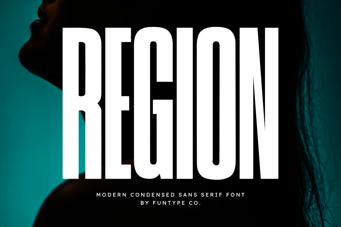
Best For: logos, headlines, posters, professional designs
Region has a tall, compressed silhouette with firm vertical strokes, tight counters, and smooth edges that keep the heavy weight looking polished rather than blunt. That crisp structure gives Condensed Logo Fonts a sharper, more contemporary attitude, especially for branding that needs impact and control.
Because the letters run narrow and dense, it handles long names well in stacked marks, posters, and sports-style headlines without losing presence. Pair it with smaller text that has more air and lighter texture, so the main wordmark stays dominant while the layout keeps a clean hierarchy. OTF and TTF files also make it easy to move between design apps.
Crusher Font
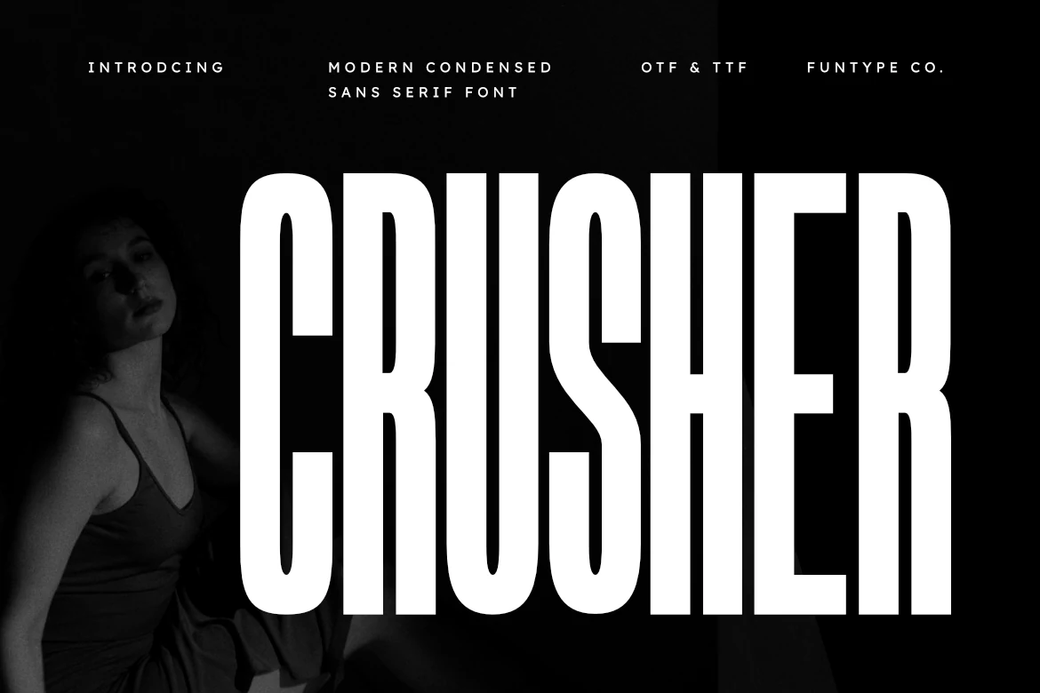
Best For: logos, headlines, posters, professional designs
Crusher combines towering condensed capitals with clean vertical strokes and narrow inner spaces, so the wordmark feels sharp, controlled, and immediately high-impact. In the preview, that stark black-and-white treatment gives Condensed Logo Fonts a sleeker, more fashion-forward edge than a rough industrial one.
Because the letters stay tall and compact, it works especially well when long names need to read large in tight layouts. Use it for headlines, branding, and poster titles, then pair it with smaller, airy supporting text to keep the hierarchy crisp. OTF and TTF files also make it easy to move between design apps.
Influencer Font
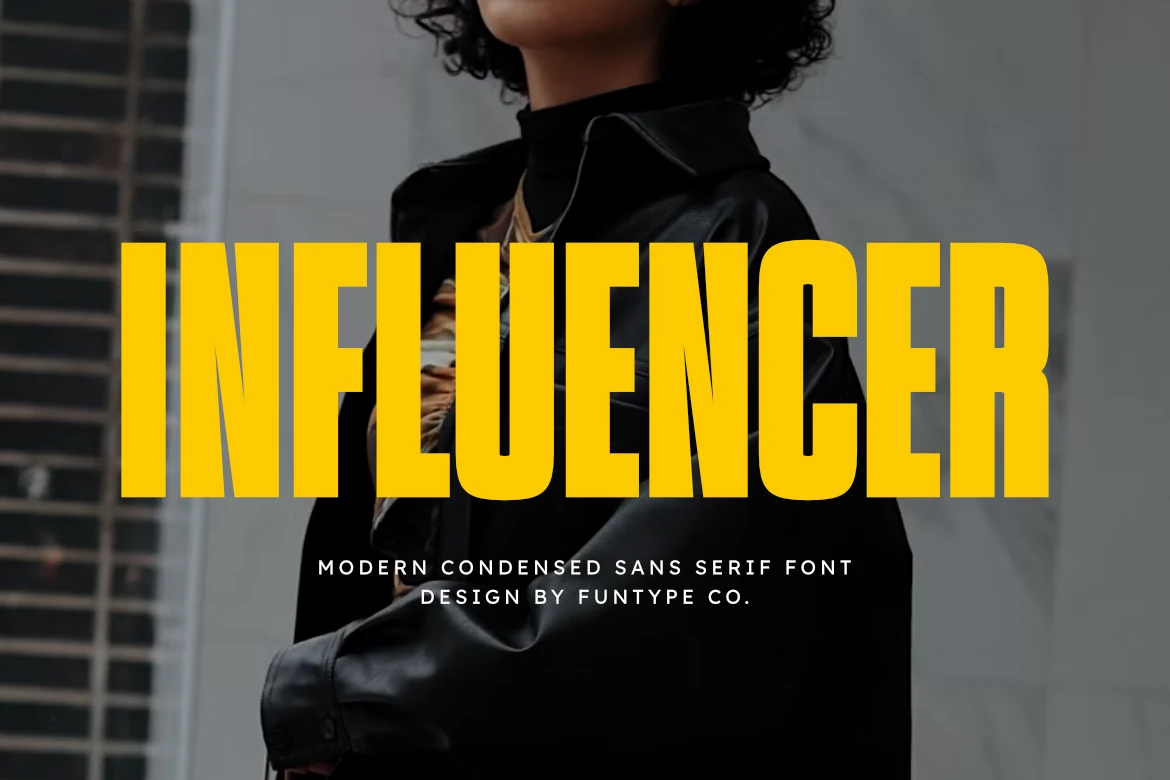
Best For: logos, headlines, posters, editorial designs
Influencer uses a tight condensed structure with tall block capitals, straight-sided strokes, and narrow counters that make the word feel loud and compressed. The yellow preview sharpens its geometric force, making it suit Condensed Logo Fonts that need a fashion-editorial edge as much as poster-scale impact.
The font works best when the main word is allowed to dominate the layout, especially in headlines, branding, and assertive campaign graphics. Keep tracking controlled, add strong contrast around the letters, and use lighter supporting type so the dense vertical forms do not flatten the hierarchy.
Retro & Rounded Condensed Logo Fonts
These fonts soften the condensed look with rounded corners, chunkier shapes, or vintage rhythm, making them better for friendly packaging, merch, and playful logo work.
Pretzel Font
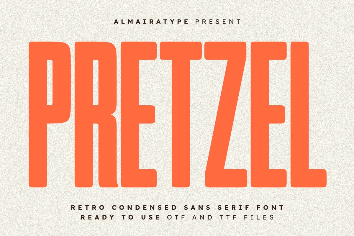
Best For: logos, headlines, T-shirts, retro designs
Pretzel has a tall compressed build with hefty strokes, soft corners, and a relaxed retro rhythm that keeps the letters bold without feeling stiff. That mix gives Condensed Logo Fonts a warmer personality, especially when you want a vintage note that still reads clean and direct.
The narrow proportions work well for stacked marks, editorial titles, and merch where you need strong coverage without wasting space. Its balanced weight also supports clean cutting for vinyl-based projects, while slightly open spacing helps the rounded shapes stay crisp on apparel and social graphics.
Muffin Font
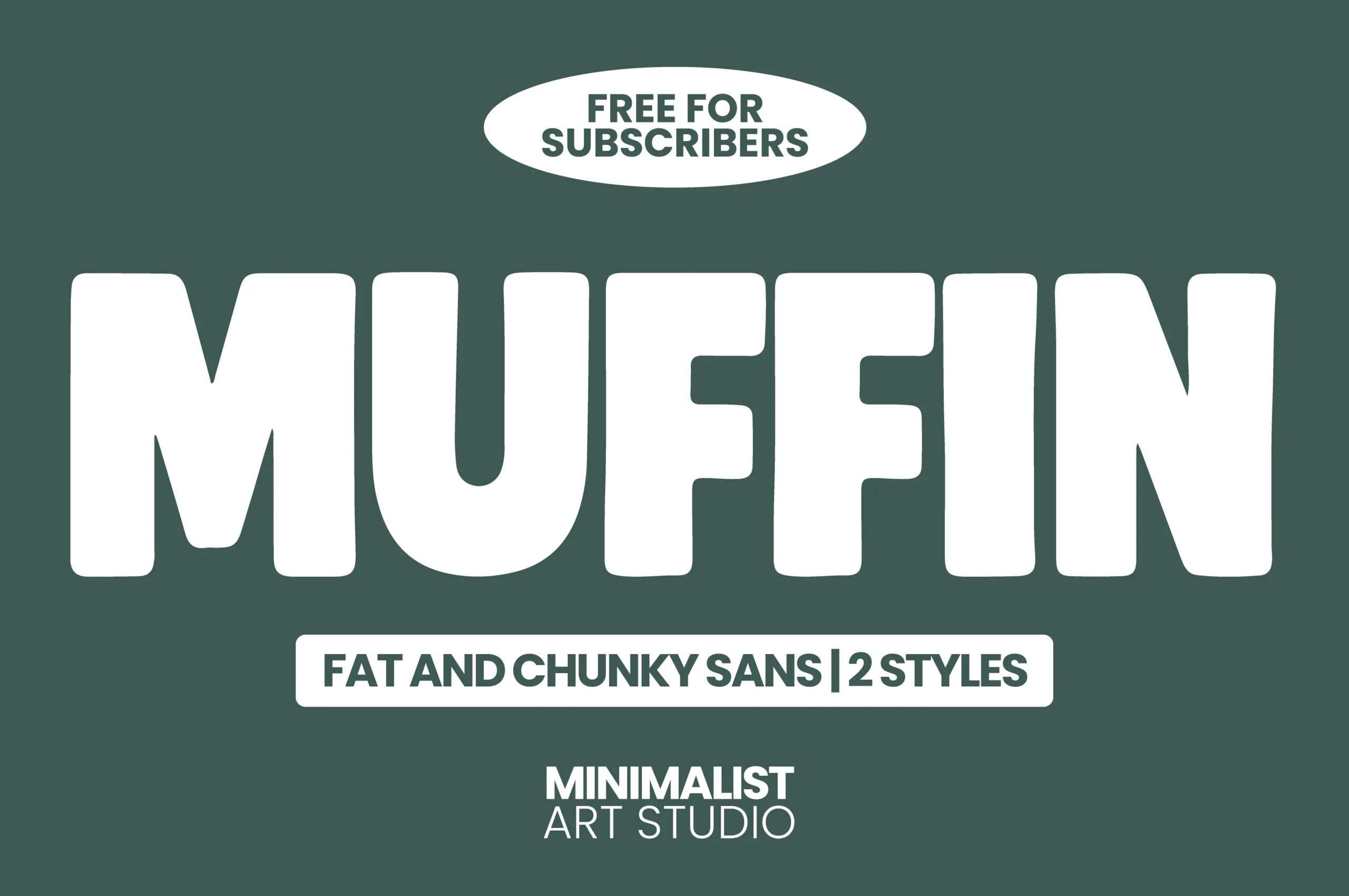
Best For: logos, social media graphics, playful designs, bold designs
Within a roundup focused on Condensed Logo Fonts, Muffin stands apart with broad, chunky letterforms, rounded corners, and a soft, inflated rhythm. The heavy shapes feel playful rather than rigid, so the font lands with real impact while keeping a clean minimalist mood.
It works best when you let the weight do the talking: short brand names, punchy packaging, and bold social graphics all suit it well. Keep supporting text simple and slimmer, and avoid squeezing too many words into one line, since the wide proportions need room to stay clear and friendly.
Conclusion
Use the heavier industrial fonts when the logo needs blunt impact, the clean athletic options for sharper brand systems, and the retro or rounded fonts when the design needs warmth. For long names, start with the narrowest styles; for friendly branding, choose the softer shapes.