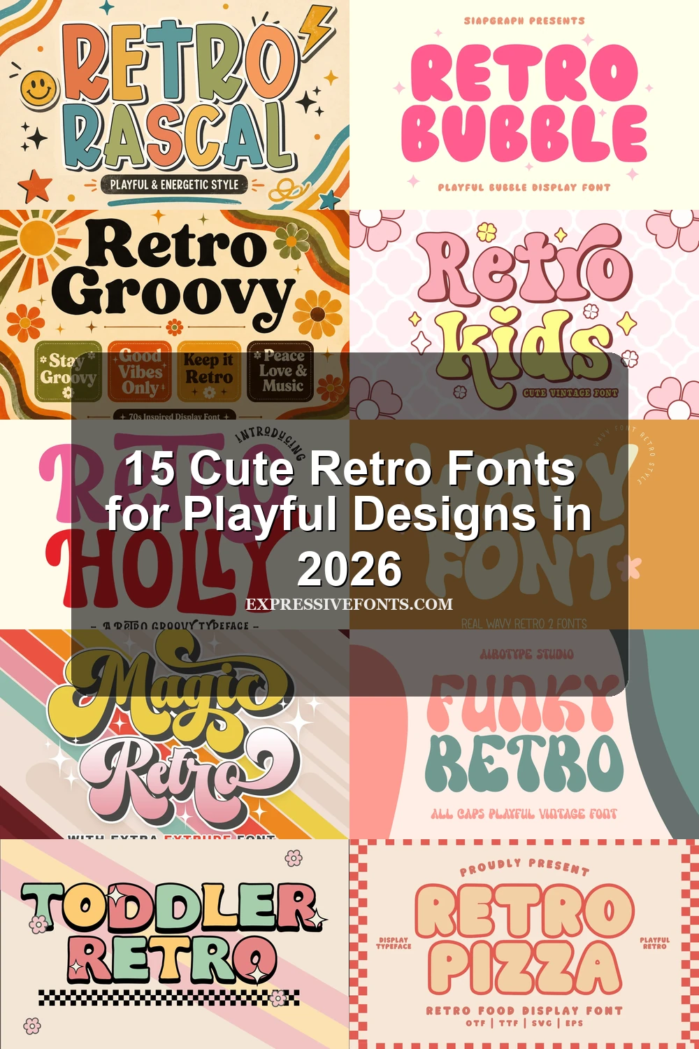
15 Cute Retro Fonts for Playful Designs in 2026
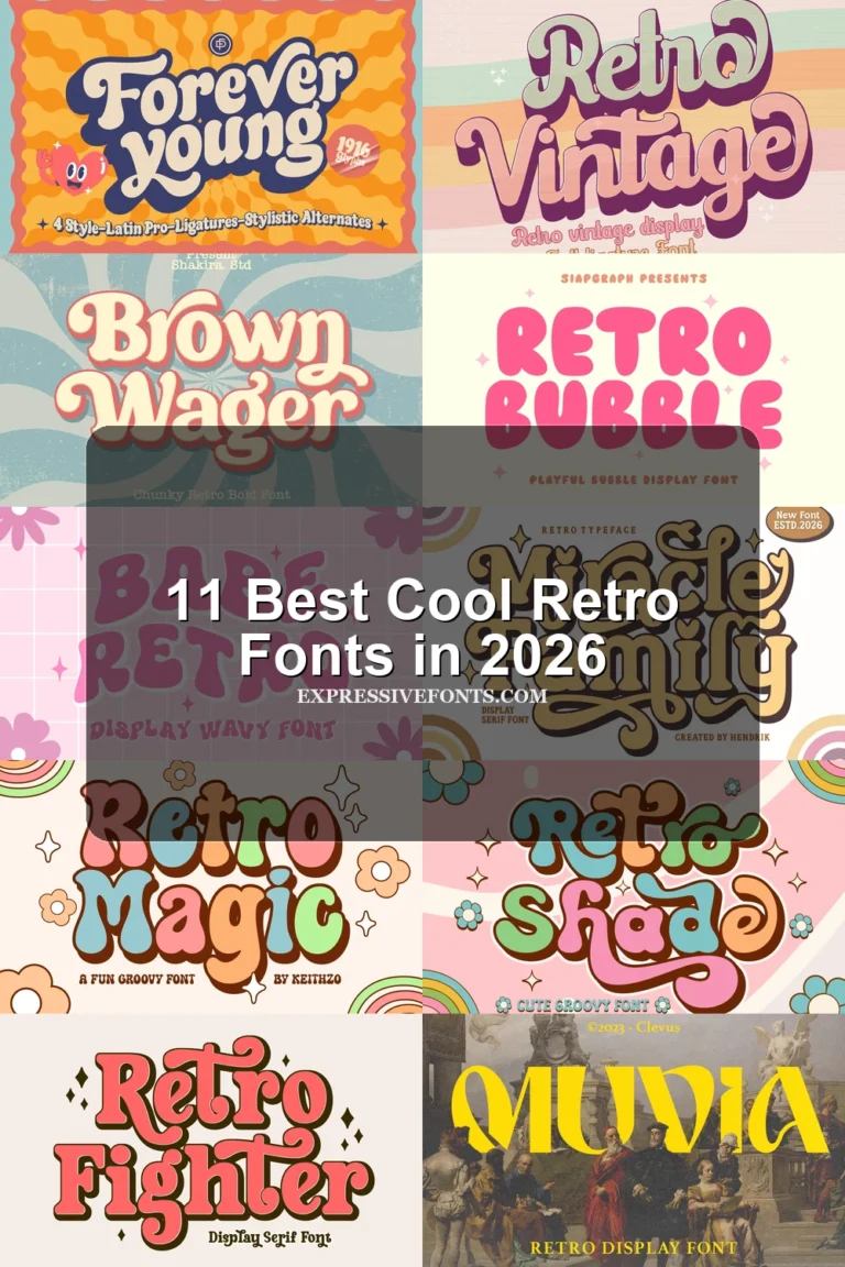
Cute Retro Fonts span thick all-caps blobs, wavy 1970s-inspired displays, connected lettering, and decorative shadowed forms. This collection suits posters, packaging, logos, invitations, apparel, children’s projects, and other short display applications where shape and personality matter more than long-form readability.
Quick Picks
- Best for Packaging: Retro Bubble Font — Wide enclosed forms stay legible at display sizes and are explicitly suited to packaging, labels, logos, and stickers.
- Best for Kids: Retro Kids Font — Irregular organic silhouettes and a back-to-school focus suit children’s designs and large educational headlines.
- Best for Invitations: Retro Script Font — A forward-slanting connected structure supports wedding invitations, logos, branding, and social posts.
- Most Distinctive: Retro Sunday Font — Integrated drop shadows and fluid stroke modulation create an unusually ornamental display treatment.
- Best for Branding: Retro Groovy Font — High-contrast rounded serifs give logos and brand identities a recognizable 1970s display structure.
Cute Retro Fonts: Bubble & Blob Displays
Cute Retro Fonts in this group rely on inflated proportions, rounded terminals, and compact silhouettes. Their strong shapes suit cheerful headlines, stickers, packaging, invitations, and children’s graphics at generous sizes.
Funky Retro Font
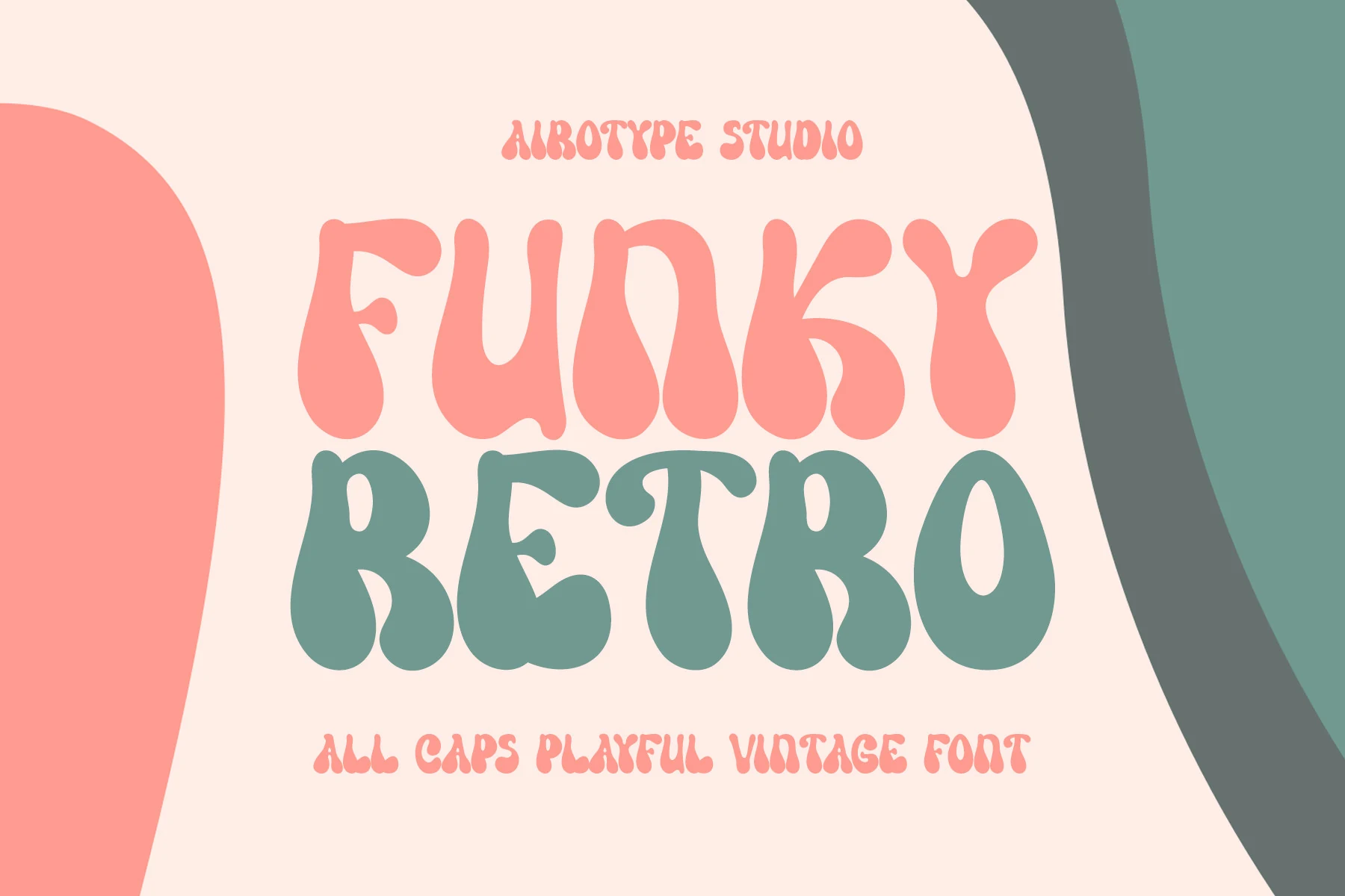
Best For: posters, display text, retro designs
Funky Retro Font uses all-caps lettering, thick strokes, and exaggerated fluid curves to create a dense, rounded display texture. This makes Cute Retro Fonts especially effective for whimsical vintage posters and headline treatments, although crowded internal spaces become harder to read when reduced. Use it for short phrases where the letter shapes remain the main visual feature.
Retro Bubble Font
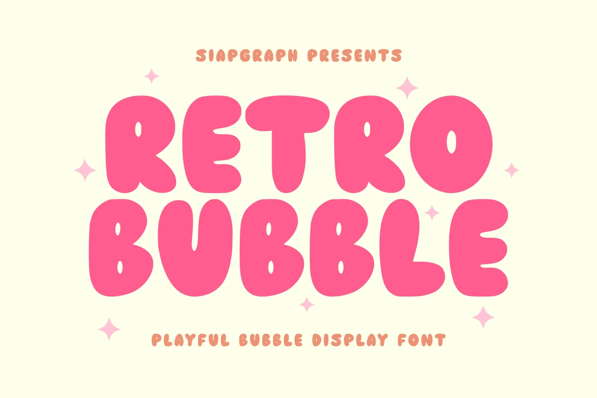
Best For: logos, stickers, packaging, headlines
Retro Bubble Font builds its identity from wide disconnected forms and enclosed spaces that remain recognizable in logos, stickers, and short headlines. The substantial shapes give packaging and labels a strong mark-like quality, while the same density makes extended copy unsuitable. Its display clarity is most useful when each word needs to function as a compact graphic element.
Retro Pizza Regular Font
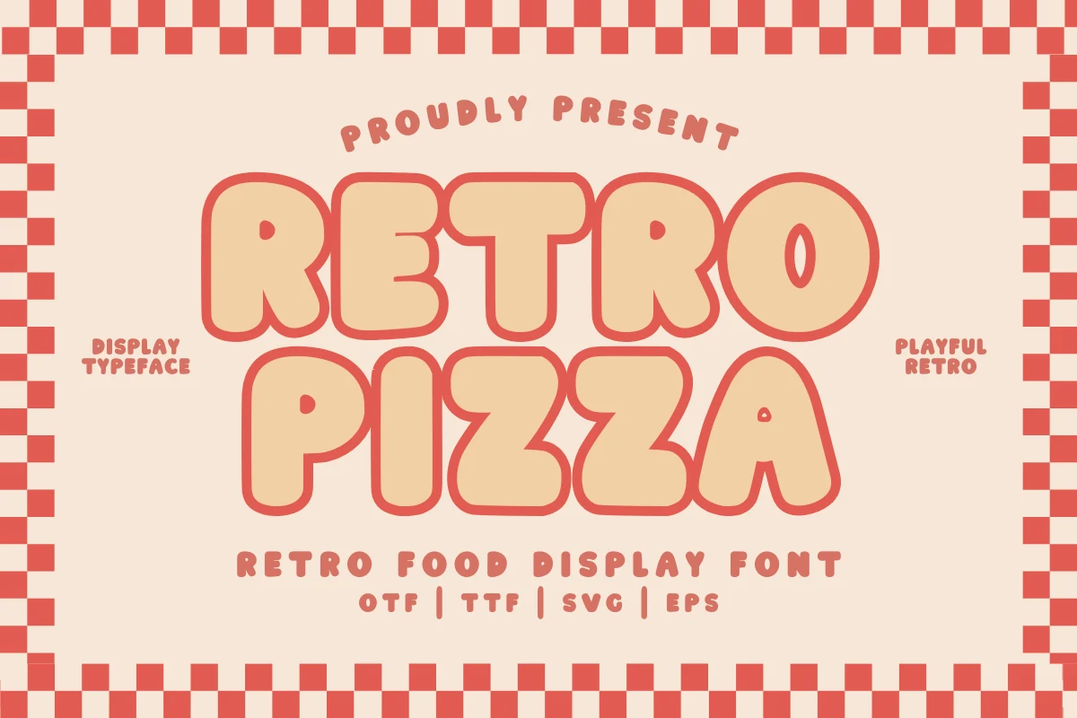
Best For: branding, packaging, signage, vintage designs
Retro Pizza Regular Font combines wide proportions with generous counters, giving its inflated construction more interior openness than many thick display styles. It remains readable for large packaging, signage, and branding, though smaller settings can feel crowded and need additional space. OTF, TTF, SVG, and EPS formats support both print and digital production.
Retro Kids Font
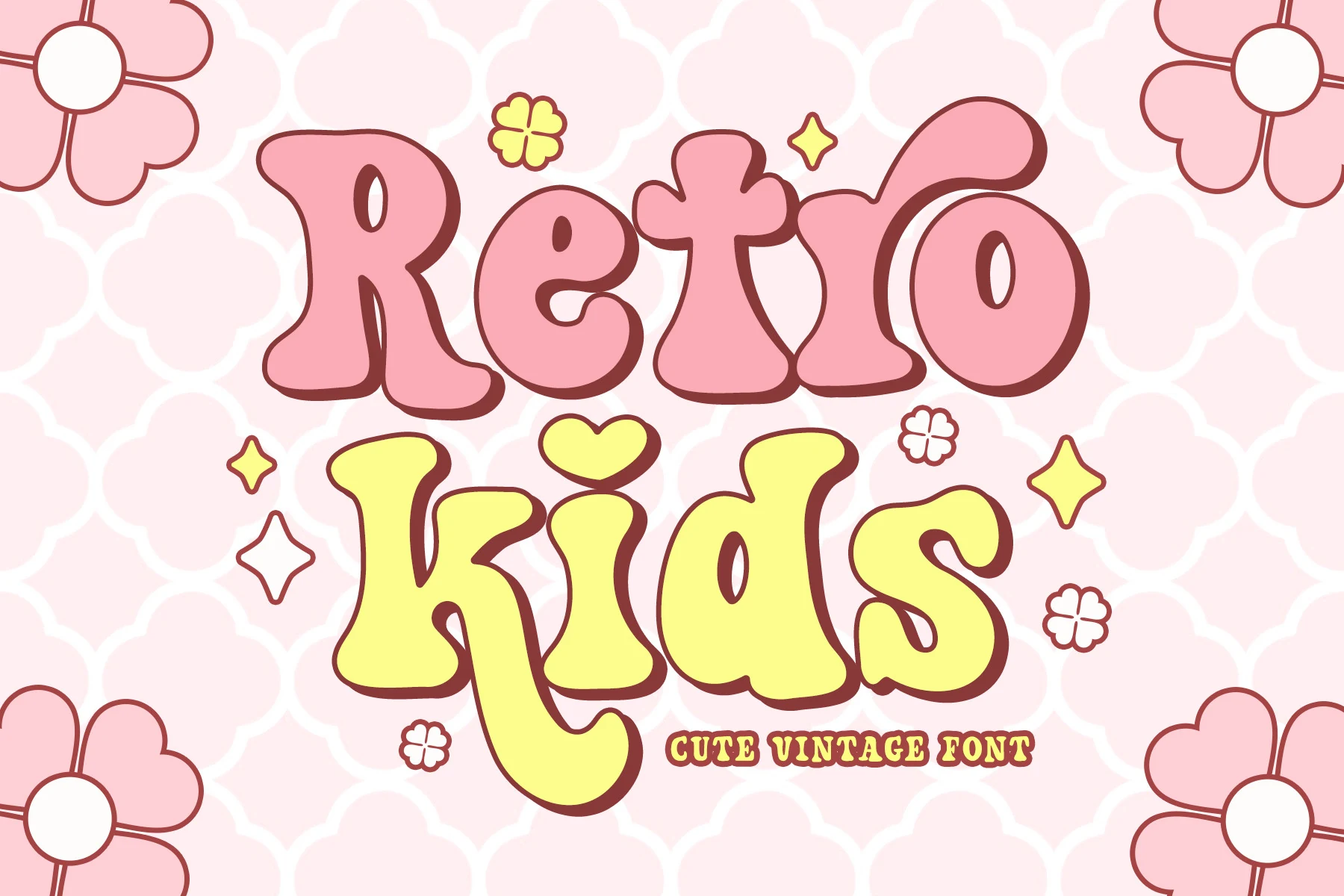
Best For: posters, headlines, children’s designs
Retro Kids Font uses irregular organic silhouettes and thick rounded forms to create a distinctly child-oriented display voice. Uneven contours keep the lettering approachable in large headlines, making it suitable for back-to-school posters and children’s designs. Its substantial shapes are intended for display use, where the unusual outlines remain visible and recognizable.
Toddler Retro Font
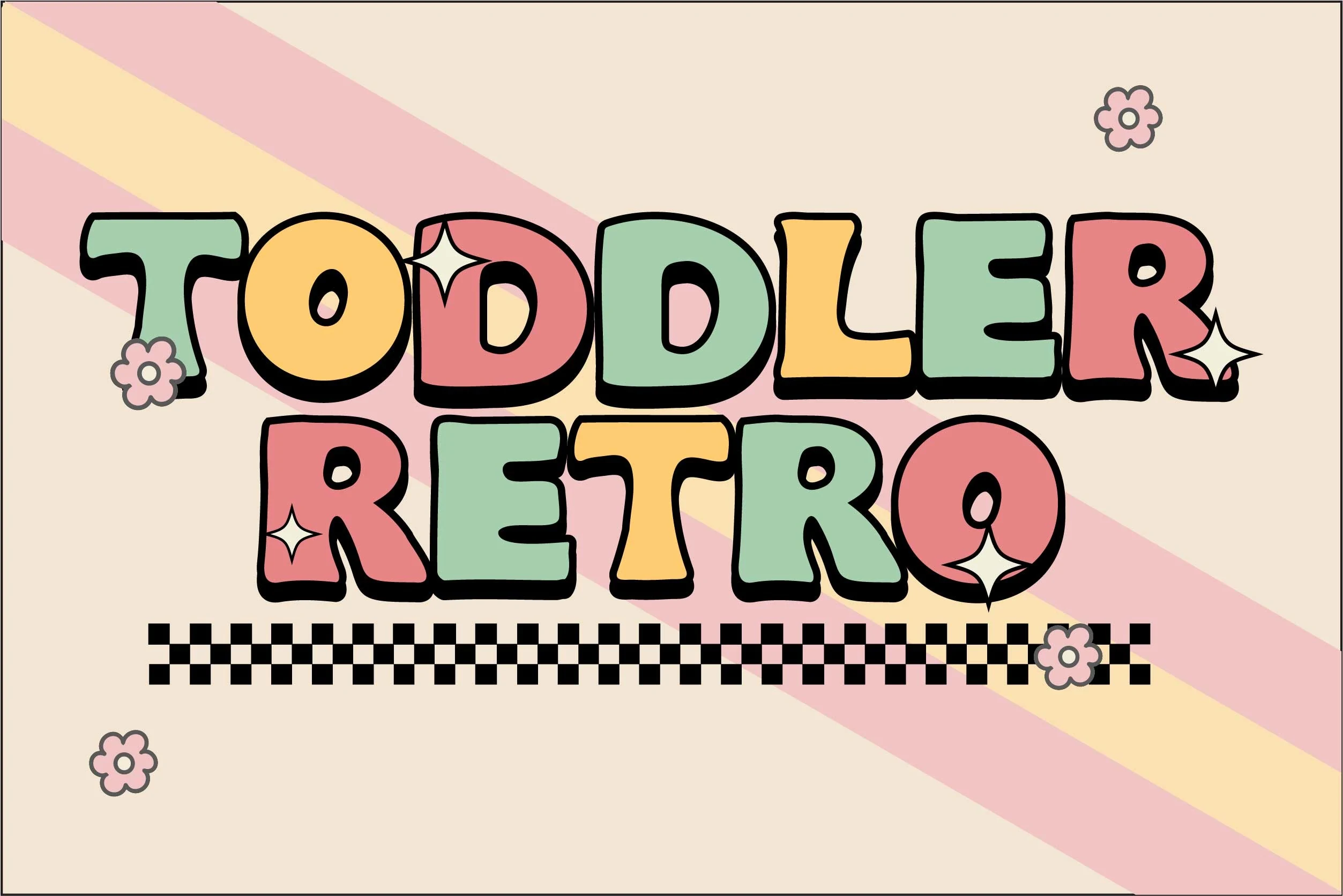
Best For: invitations, display text, nostalgic designs
Toddler Retro Font uses wide proportions, uniform weight, and blunt rounded terminals for a direct, approachable display texture. The consistent strokes keep medium-to-large lettering easy to follow in party invitations and gathering graphics. At very small sizes, its broad forms lose some separation, so short wording and generous sizing produce the strongest result.
Retro Barbie Font
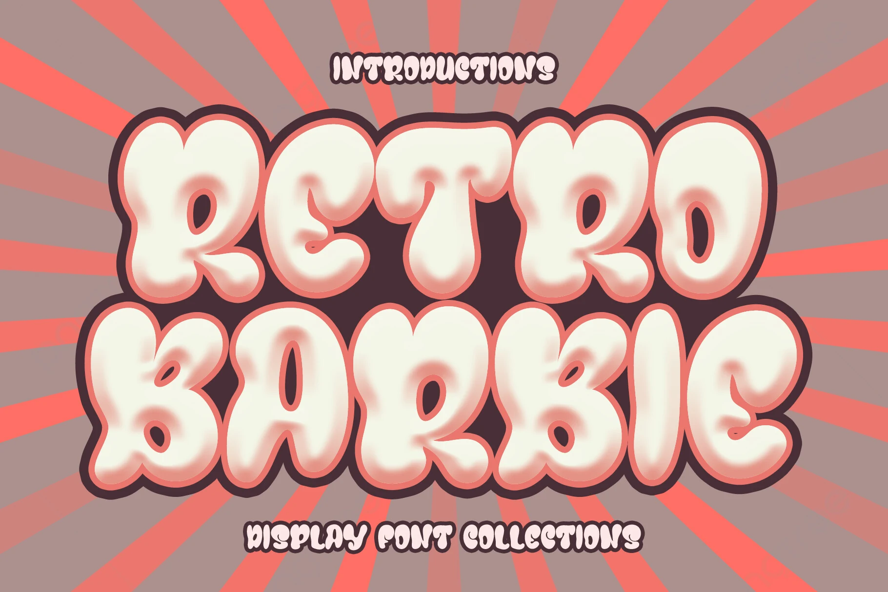
Retro Barbie Font shapes its lettering with puffy volumetric forms, irregular widths, and soft edges that suggest a gentle seventies influence. The uneven balloon-like construction supplies strong visual impact for crafters’ headings, posters, and project titles. Its broad forms are better reserved for large words, where the changing widths remain part of the design.
Retro Rascal Font
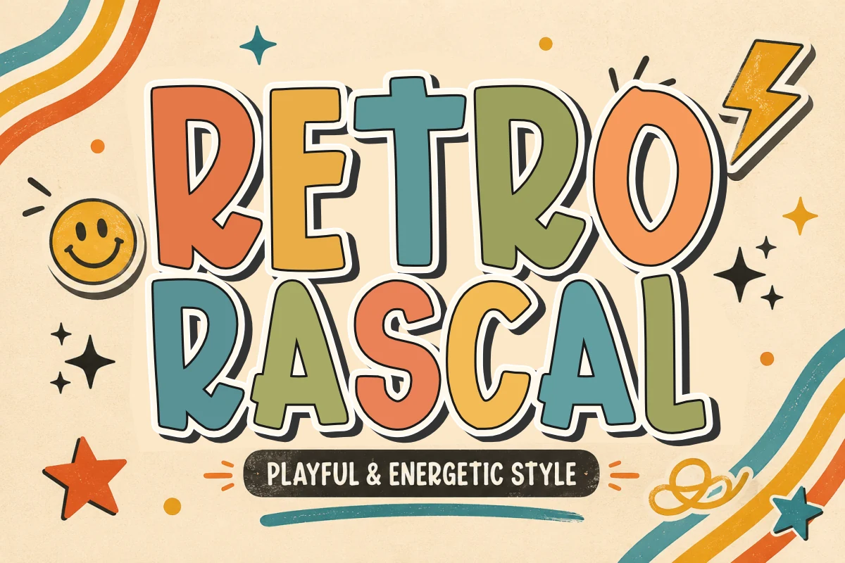
Best For: display text, headlines, posters, retro designs
Retro Rascal Font has a hand-drawn 1970s character shaped by dense spacing, uniform weight, and inflated terminals. Its compact texture suits short poster lines and period-style headlines, with thick strokes retaining definition at large sizes. Reduced scale can merge the closely set forms, so it is better used for brief statements than longer wording.
Retro Magic Font
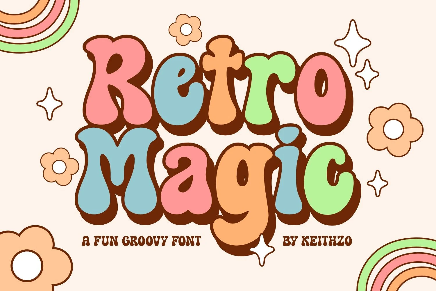
Best For: headlines, display text, romantic designs, creative projects
Retro Magic Font uses soft forms and exaggerated curves for a more romantic personality than the collection’s bluntest displays. Its thick, distorted letters read well in large headings, while smaller settings can lose definition. Greeting cards, romantic designs, and short creative messages give the curved construction enough space to communicate its decorative character.
Groovy & Psychedelic Displays
Cute Retro Fonts with fluid distortions, contrasting strokes, serif details, tapered ends, and layered shadows bring movement and period character to short branding lines, posters, apparel, and merchandise.
Wavy Retro Font
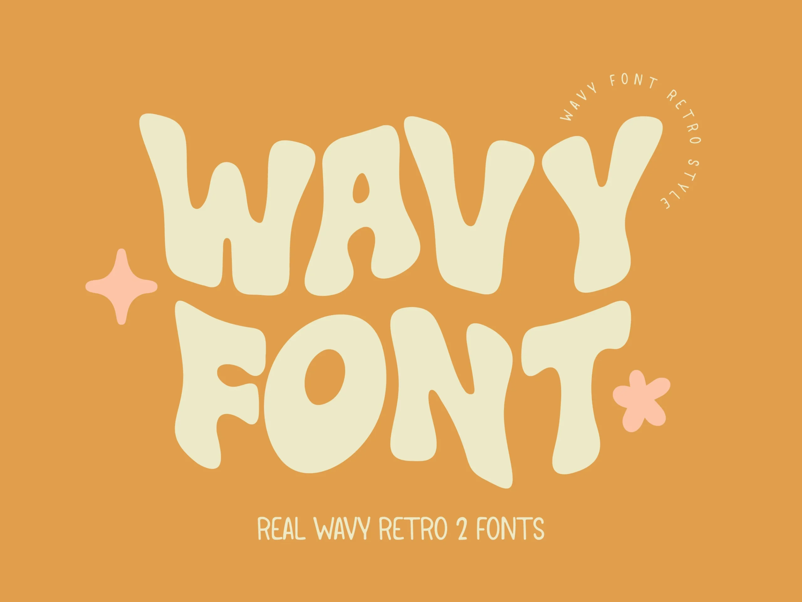
Best For: branding, posters, headlines
Wavy Retro Font distorts its thick letterforms into visibly liquid shapes, so the lettering bends and ripples rather than simply expanding outward. This fluid character gives Cute Retro Fonts immediate impact in short branding lines and poster headers. Because the forms are heavily stylized, larger settings preserve their character and keep the wording easier to interpret.
Retro Groovy Font
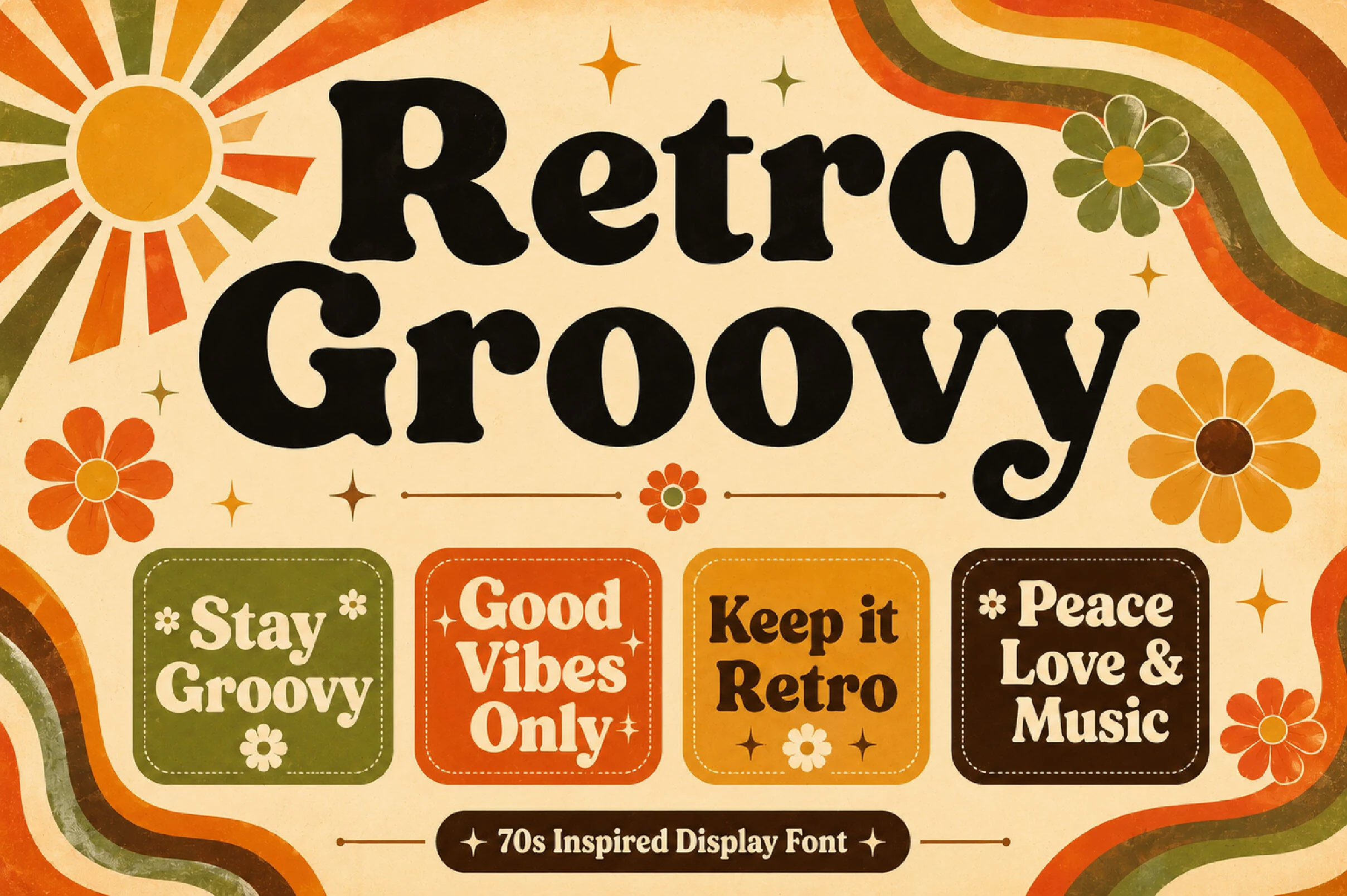
Best For: logos, branding, packaging
Retro Groovy Font introduces high stroke contrast and rounded slab-like serifs, adding a recognizable 1970s structure to its fluid curves. The serif silhouette gives logos, packaging, and apparel a firmer vintage presence than purely rounded displays. At larger sizes, its weight and contrast remain easy to read while reinforcing a deliberate period reference.
Retro Sunday Font
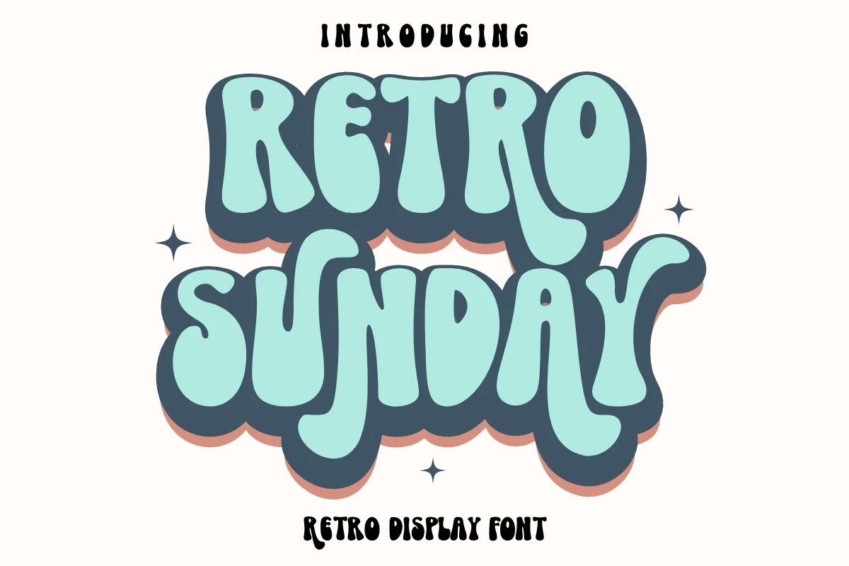
Best For: branding, posters, T-shirts, merch design
Retro Sunday Font layers fluid stroke modulation with integrated chunky drop shadows, making it one of the collection’s most ornamental displays. The shadow treatment adds depth to brand identities, T-shirts, totes, and posters, but also reduces readability when scaled down. Its combination of lowercase and uppercase styling offers additional control for handcrafted graphic work.
Retro Holly Font
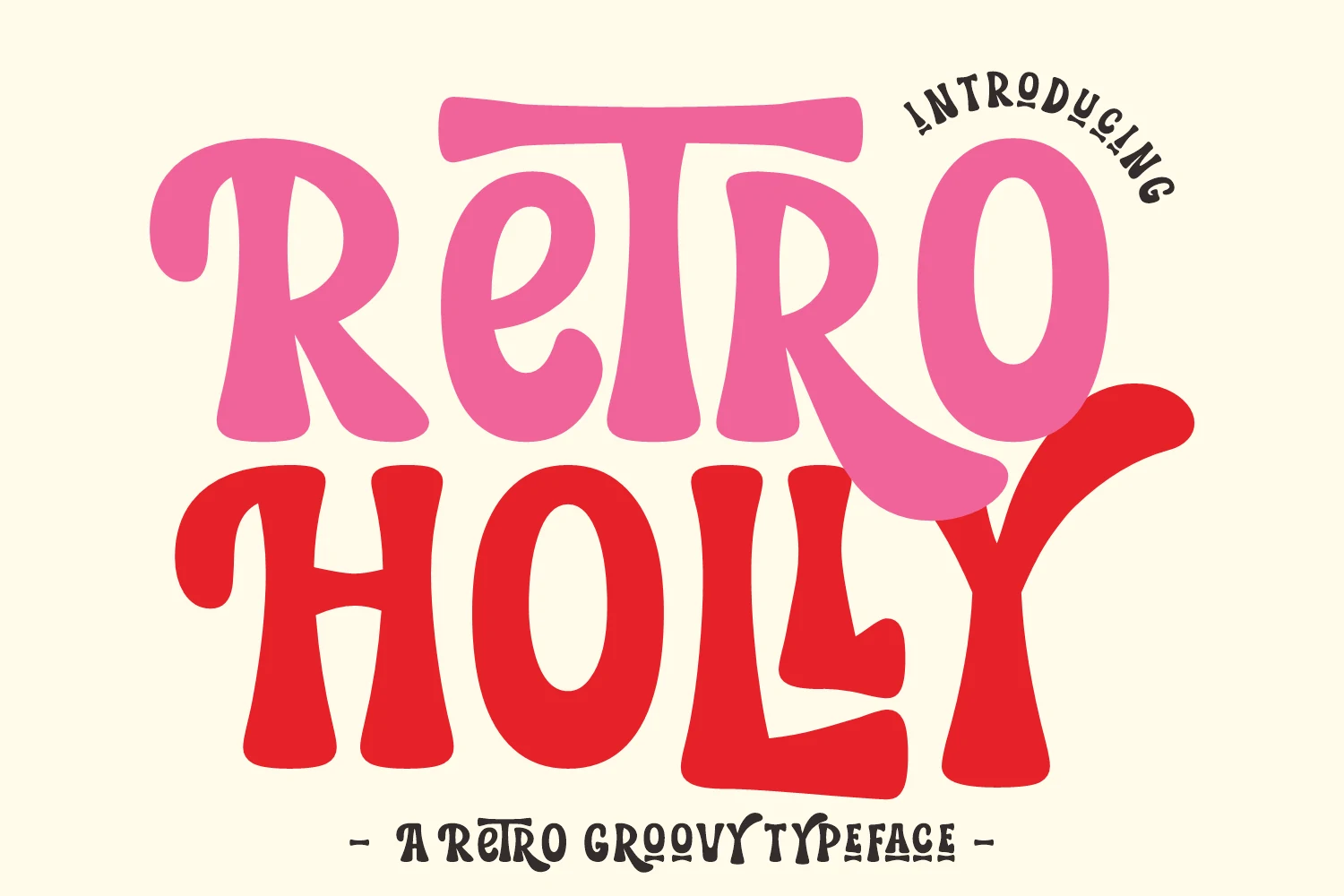
Best For: branding, posters, headlines, display text
Retro Holly Font pairs curving inflated forms with tapered endpoints, creating noticeable contrast within an otherwise soft, flowing structure. That variation gives summer and boho lettering a more energetic edge and can translate well to Cricut projects. The wide shapes are intended for headlines and other large display settings rather than small wording.
Connected Retro Lettering
Connected construction changes the collection’s rhythm, using slant, flourishes, interlocking forms, or a lively baseline. These styles suit prominent headlines, logos, invitations, and other brief lettering applications.
Retro Koogs Font
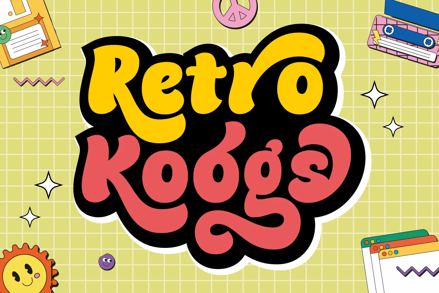
Best For: branding, magazine covers, display text, headlines
Retro Koogs Font turns connected lettering into a display script through continuous joins and an extended terminal flourish. Its smooth texture can carry magazine headlines and children’s storybook titles when set generously, while interconnected heavy strokes become cluttered at smaller sizes. The flourish adds a finished gesture to short words and prominent title treatments.
Retro Script Font
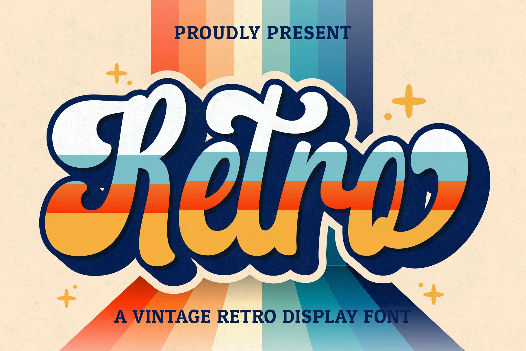
Best For: logos, branding, invitations, wedding designs
Retro Script Font combines a strong forward slant with connected cursive lettering, giving each word a lively handwritten motion. Thick strokes preserve display-size legibility while intricate curves need generous scaling for definition. The style is suited to logos, wedding invitations, branding, and social posts when a flowing title treatment is more appropriate than separate characters.
Magic Retro Font
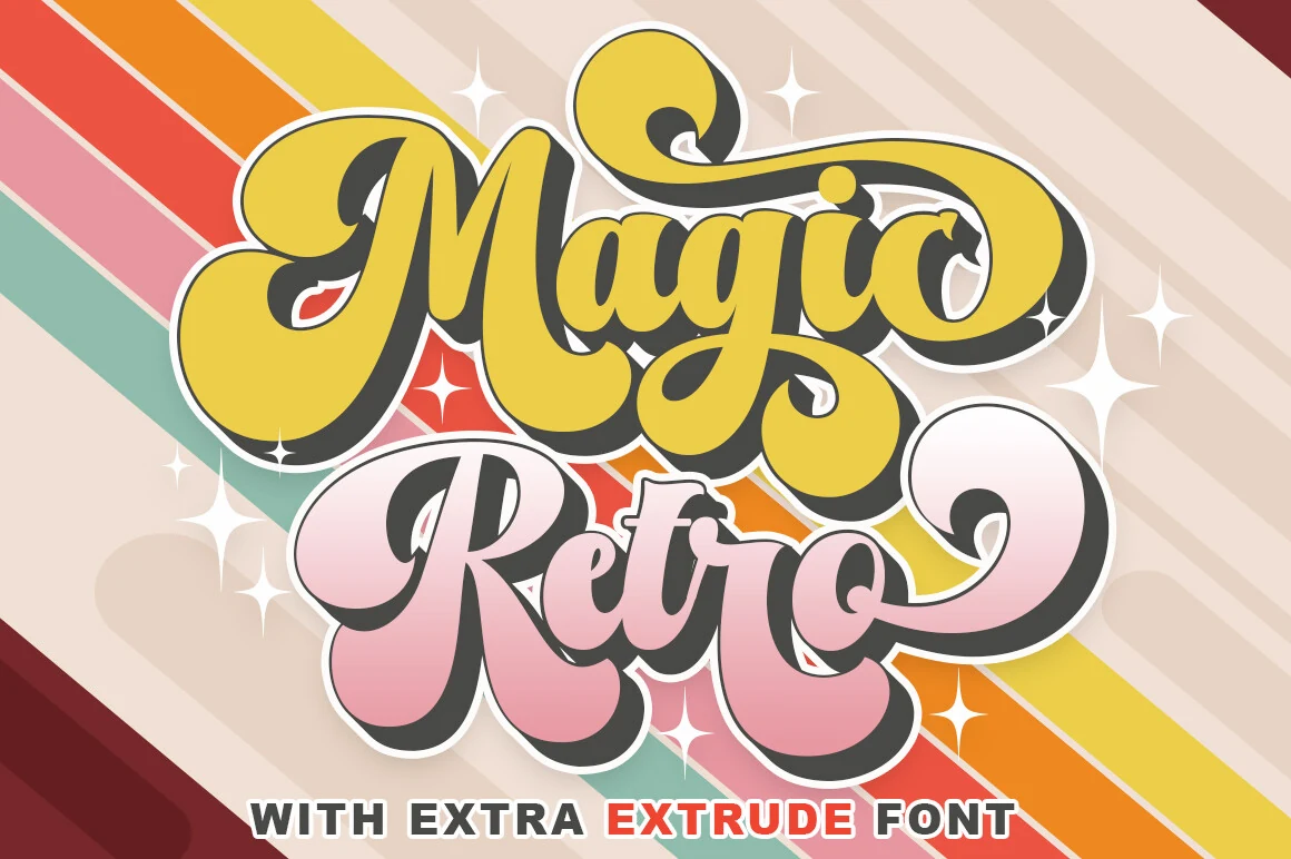
Best For: posters, display text, headlines, nostalgic designs
Magic Retro Font combines interlocking connections with a bouncy baseline, giving its lettering a fluid, animated rhythm. Overlapping forms create movement across large posters and headlines, but they can compromise readability when reduced. The heavy strokes and exaggerated curves make short phrases feel active without relying on separate decorative effects around the text.
Conclusion
Choose the thickest all-caps or inflated styles for posters, packaging, and children’s graphics; their shapes need generous sizing. Wavy and shadowed options add more decoration for apparel and merchandise, while connected lettering brings motion to logos, invitations, and titles. Within Cute Retro Fonts, the right direction depends on whether legibility, ornament, or handwritten flow leads the project.