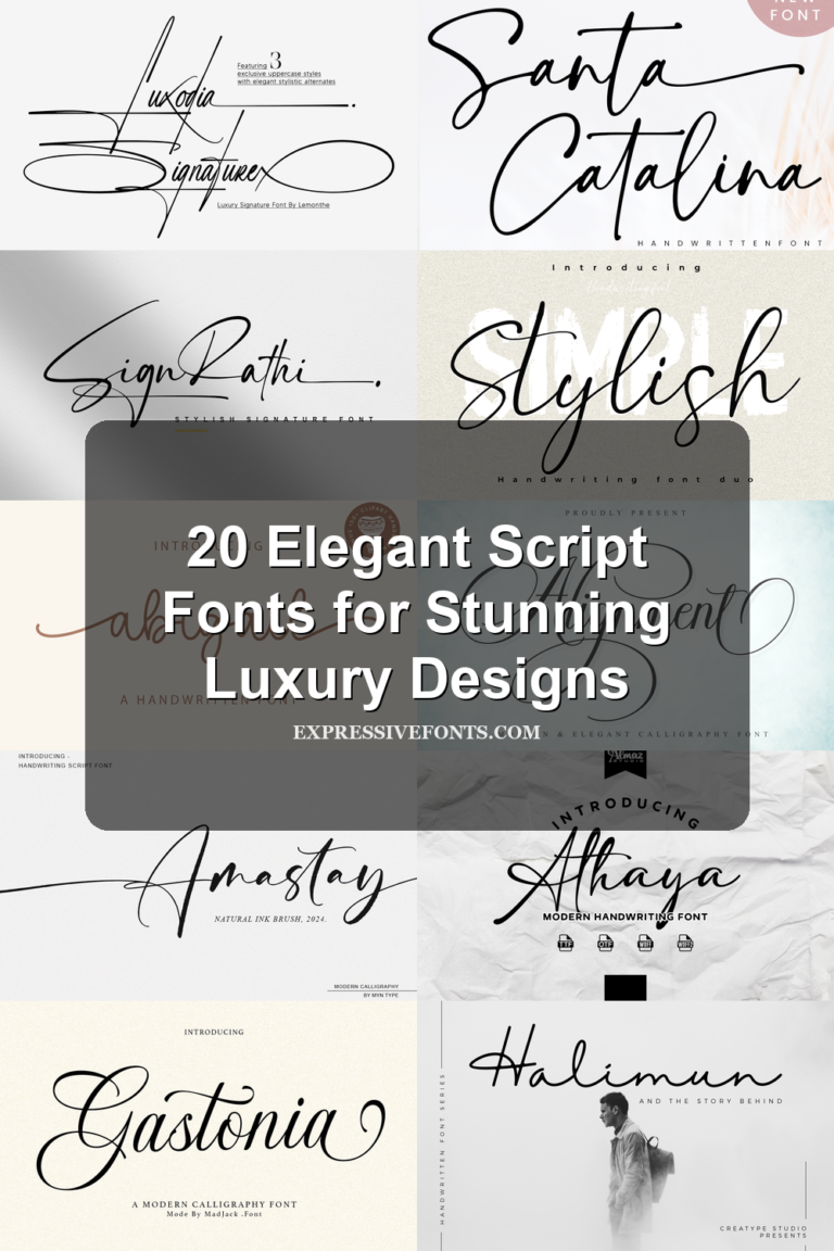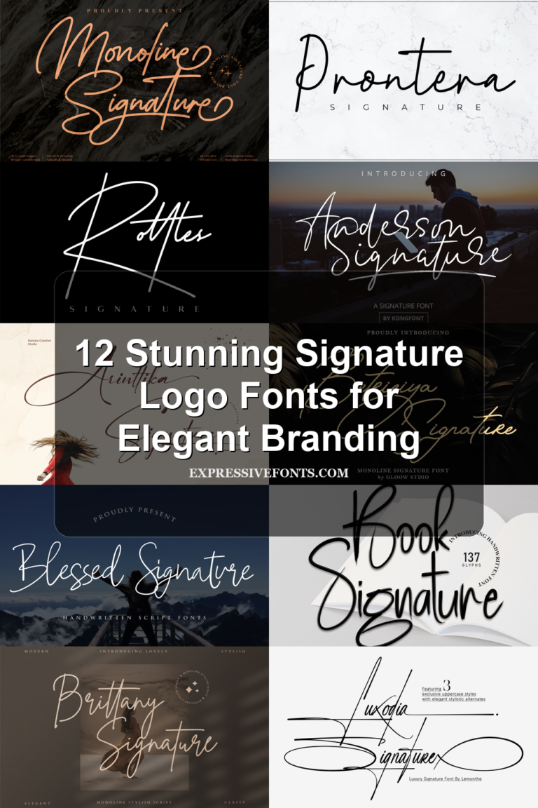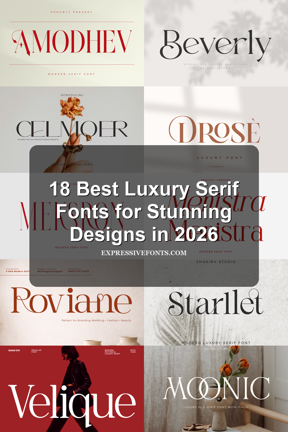
18 Best Luxury Serif Fonts for Stunning Designs in 2026
Luxury Serif Fonts are ideal for designers building refined logos, fashion editorials, beauty packaging, invitations, and premium brand systems. This collection groups high-contrast, elegant, romantic, and editorial serif styles so you can choose the right font faster.
Fashion Editorial Luxury Serif Fonts
These high-contrast serif fonts use tall proportions, sharp details, and polished rhythm for fashion campaigns, magazine covers, beauty branding, and premium editorial layouts.
Velique Font
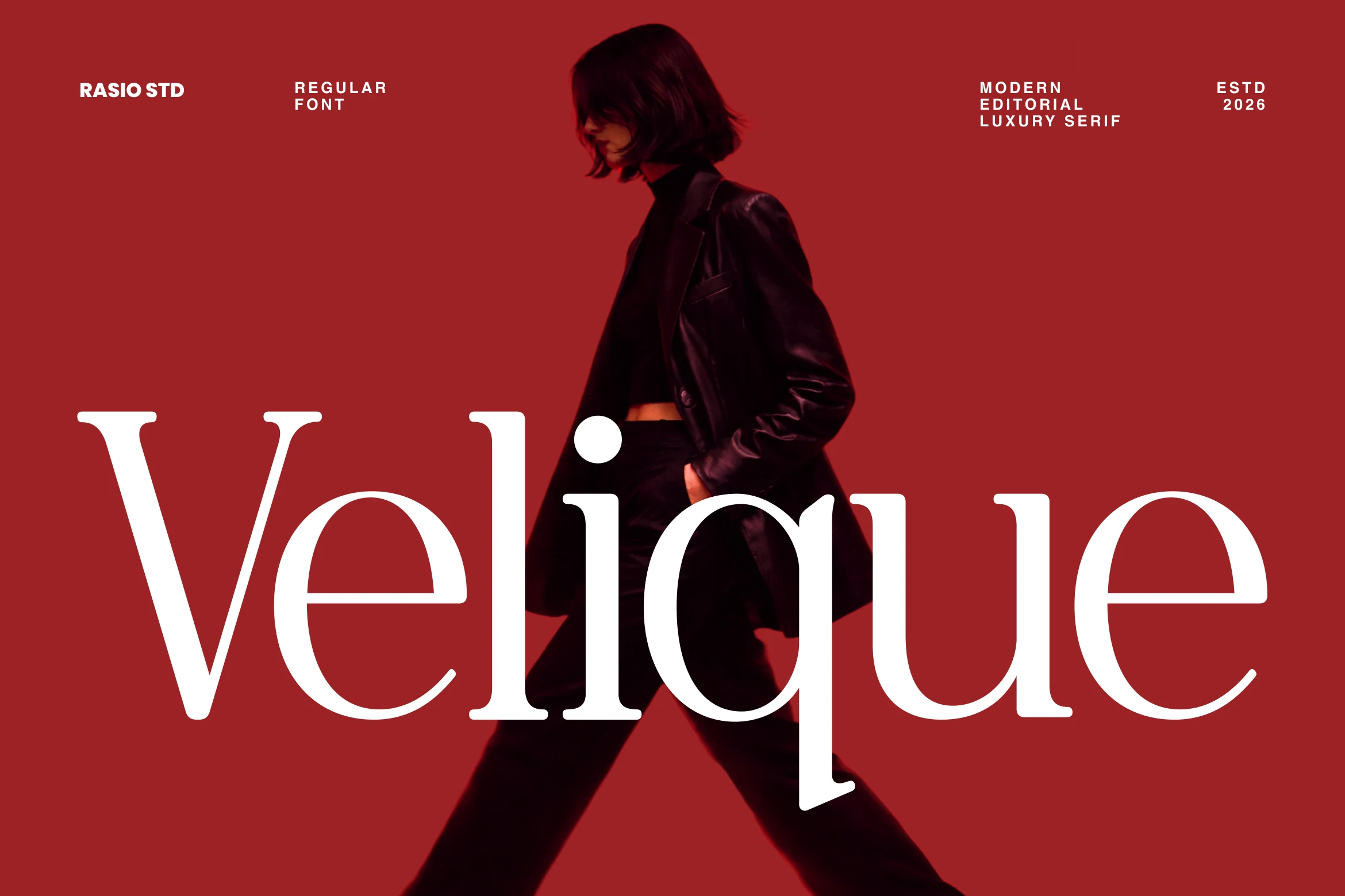
Best For: fashion branding, beauty branding, magazine covers, luxury designs
Velique Font has the crisp poise of a fashion serif, with tall proportions, fine hairlines, and broad rounded bowls that keep the letterforms light rather than dense. In the preview, the large wordmark stays striking over photography because the counters are open and the contrast is controlled, not brittle.
If you’re collecting Luxury Serif Fonts for editorial branding, this one is especially effective on magazine covers, perfume packaging, and image-led layouts. Keep the headline short and oversized, then pair it with compact supporting text so the negative space stays intentional and the elegant q descender has room to stand out.
Atfagis Font
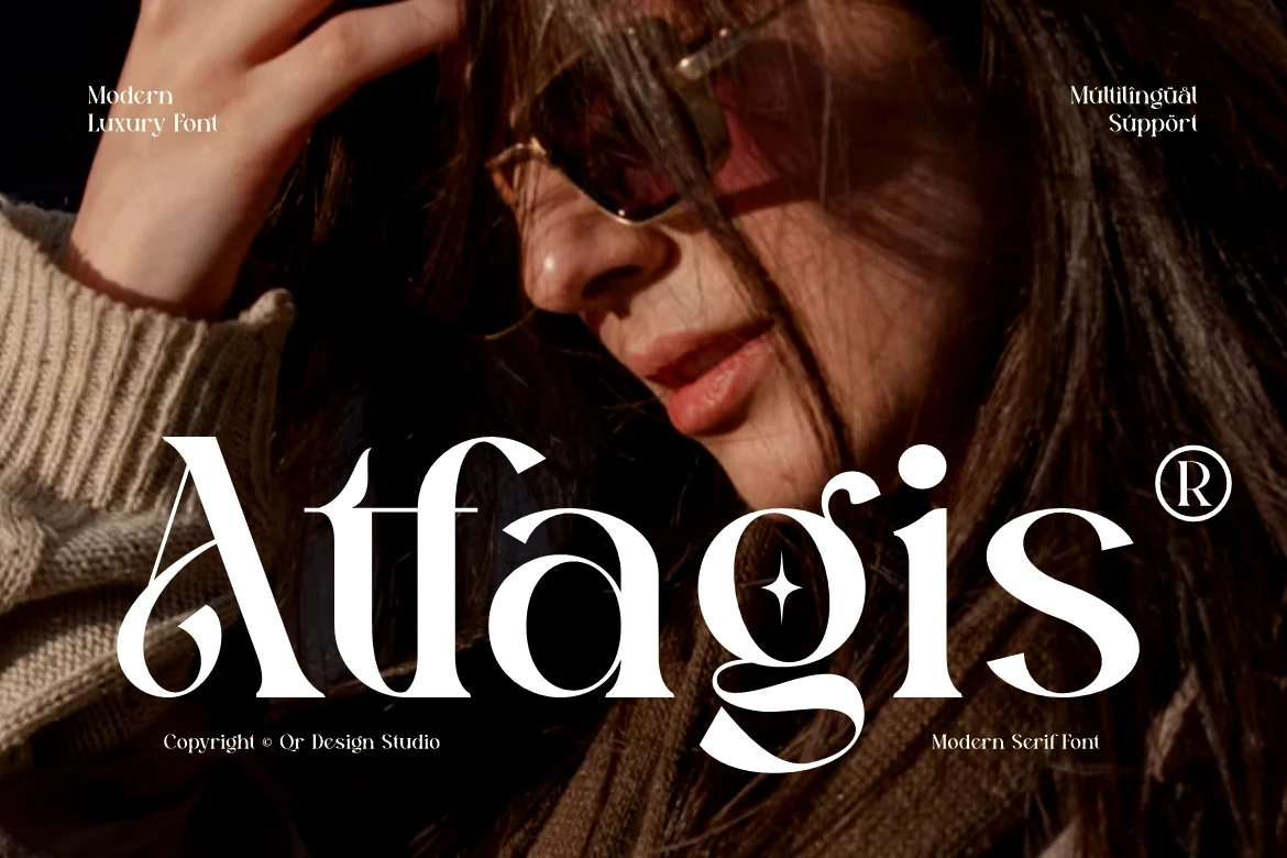
Best For: fashion branding, beauty branding, magazine covers, luxury designs
Atfagis Font leans into drama with stretched proportions, razor-thin hairlines, and sculpted curves that feel part Roman serif, part fashion display. The preview shows how its oversized forms hold attention over photography, while details like the stylized A and ornamental g keep the wordmark looking distinctly editorial.
It works best when you let the nameplate do the heavy lifting in Luxury Serif Fonts projects such as covers, jewelry packaging, or boutique branding. The multilingual support helps keep international campaigns consistent, and a short headline with compact supporting text will preserve the contrast and keep the decorative terminals from feeling crowded.
Amodhev Font
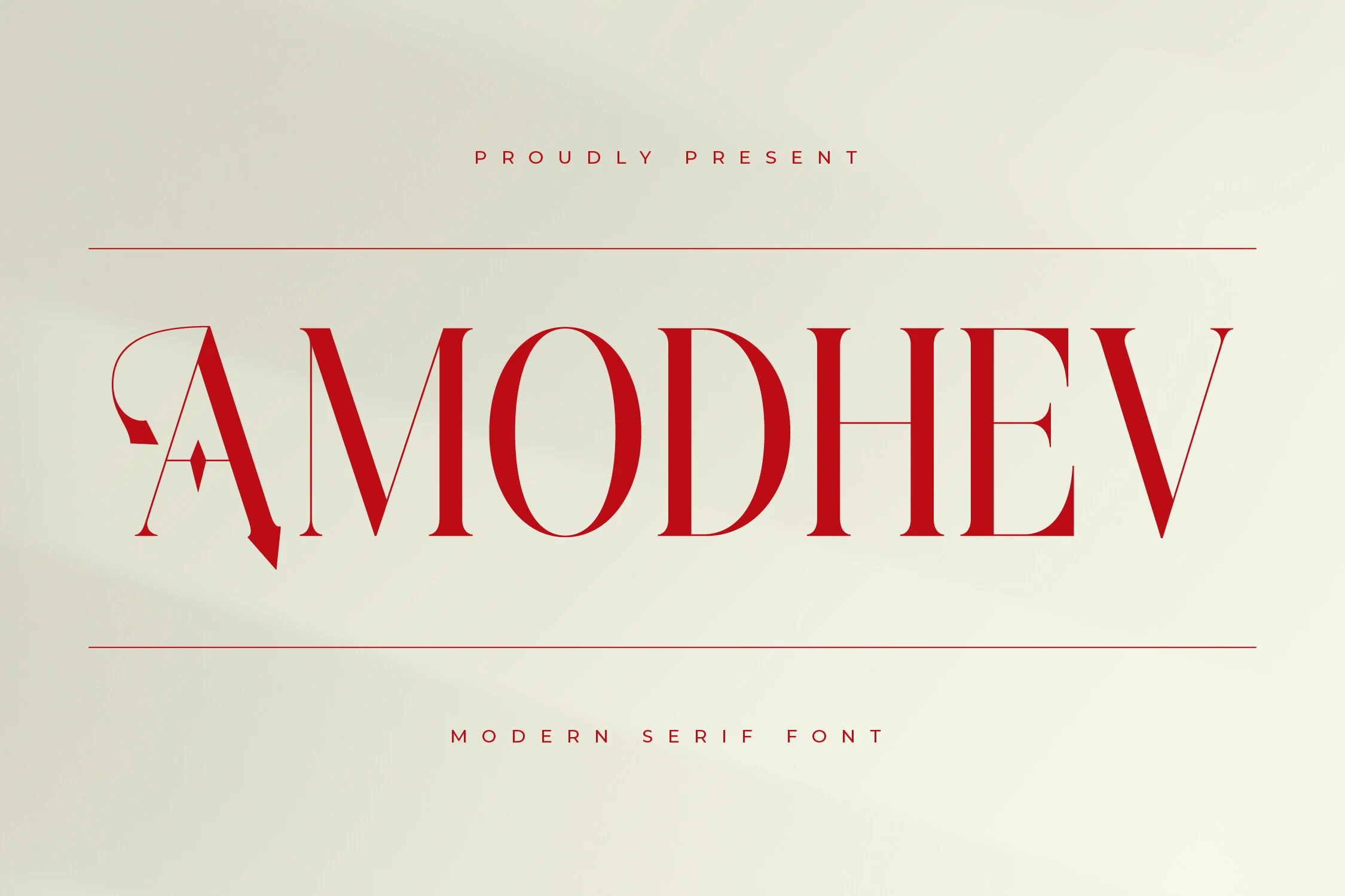
Best For: branding, book covers, editorial designs, luxury designs
Amodhev Font has a sharp editorial character, built from tall stems, crisp hairlines, and strong contrast that gives each capital a polished, high-fashion edge. The stylized A and the long crossbar in the H add a custom feel, while the generous proportions keep the wordmark elegant instead of rigid.
If you are browsing Luxury Serif Fonts for statement typography, Amodhev is most effective in short titles where its details can breathe. Use it at a generous size with restrained supporting text or wider spacing, so the delicate serifs and graphic cuts stay clear on covers, packaging, and identity work.
Cruell Font
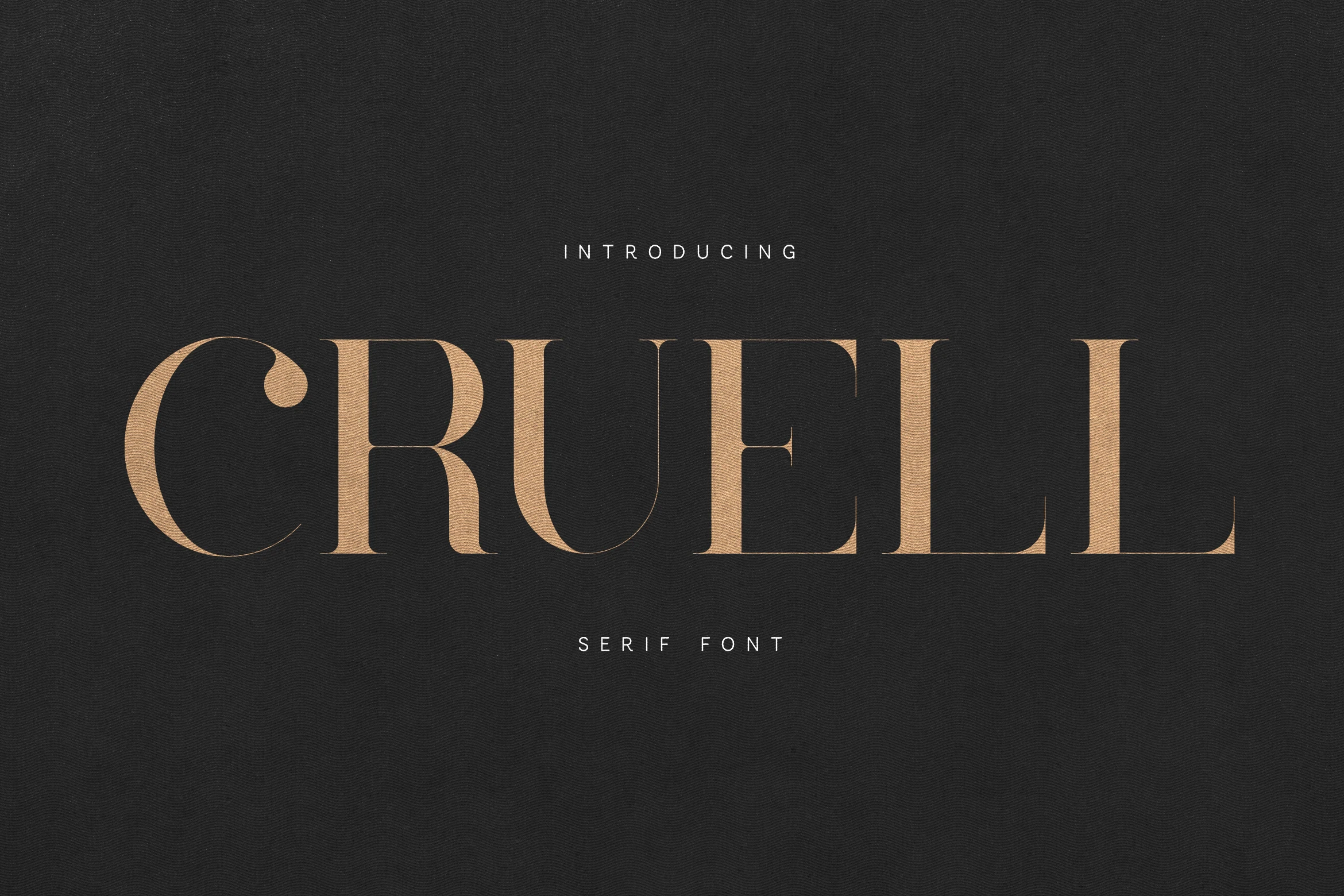
Best For: branding, editorial designs, magazine covers, luxury designs
Cruell Font pairs tall verticals with sharp contrast and clean wedge-like serifs, giving the capitals a poised editorial cadence. In the preview, the wide spacing and elongated stems keep the wordmark calm and expensive rather than ornate, so it reads with clarity even at a dramatic scale.
For Luxury Serif Fonts, Cruell is strongest in magazine titles, boutique branding, and cosmetic packaging where a short line can carry the composition. Use it large with restrained tracking and a quiet sans serif secondary line; that contrast lets the fine hairlines stay crisp and the structure do the work.
Celmoer Font
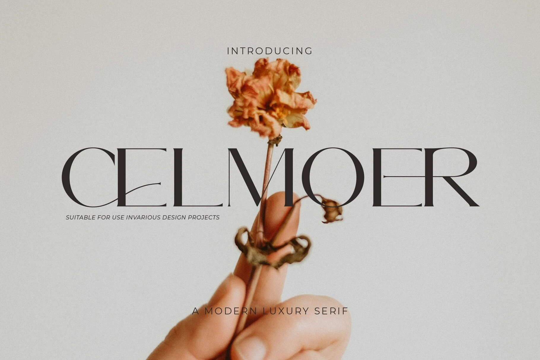
Best For: editorial designs, fashion branding, beauty branding, luxury designs
Celmoer Font has a sharp editorial silhouette, built from tall all-caps forms, long geometric stems, and extremely fine horizontal strokes. The contrast feels sleek rather than fragile, and the overlapping ligature details give the wordmark a deliberate couture finish instead of a standard serif rhythm.
For Luxury Serif Fonts, this one works best when the headline is allowed to dominate the layout. Use it in short titles, mastheads, or packaging fronts with plenty of negative space, because the thin crossbars and linked letters stay clearer and more striking when they are not compressed by dense copy.
Alvora Font
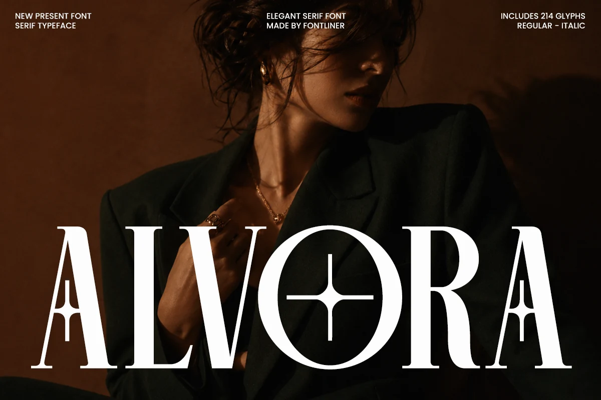
Best For: fashion branding, luxury designs, editorial designs, high-end designs
Alvora Font leans into a fashion-editorial serif look: tall capitals, sharp bracketed serifs, high contrast, and narrow counters that make the word shape feel polished rather than delicate. The distinctive A construction and circular O detail give it a signature display edge, useful when Luxury Serif Fonts need a recognizable headline instead of a neutral title.
Use it where hierarchy can stay compact and intentional—brand marks, magazine covers, perfume-style packaging, or campaign titles. The regular and italic styles help separate primary names from supporting text, while the 214 glyph set gives enough range for refined professional layouts without leaning on oversized ornament.
Geista Mond Font
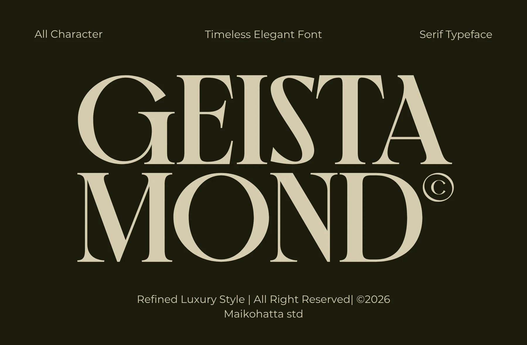
Best For: fashion branding, magazine covers, editorial designs, luxury designs
Geista Mond Font has the poised, fashion-led character that makes a display serif feel immediately expensive. The capitals are wide and sculpted, with crisp high-contrast strokes, fine hairlines, and soft curves that keep the letterforms elegant rather than severe. For Luxury Serif Fonts, it brings a polished editorial tone with strong visual presence.
This is the kind of serif that works best when you let the shapes do the talking. Its broad proportions and clean rhythm suit mastheads, packaging, and logo work, especially when spacing stays measured and the supporting typography remains understated. Use it for short lines and clear hierarchy so the contrast and graceful terminals stay sharp.
Drose Font
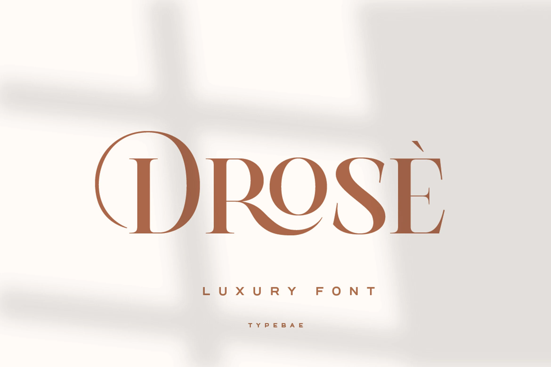
Best For: fashion branding, beauty branding, editorial designs, luxury designs
Drose Font has the kind of refined drama that works beautifully in fashion-led typography. The tall serif structure, crisp high-contrast strokes, and sweeping curves in letters like D, R, and S give it a polished editorial voice, while the overall spacing keeps it clean rather than overly ornate. It fits naturally into Luxury Serif Fonts with a softer, more graceful attitude.
Because the letterforms already carry so much style, Drose works best when the composition stays restrained. Use it for logos, covers, or packaging where short words and clear hierarchy let the curved terminals and contrast stay visible. Its classy rhythm makes it especially effective alongside minimal sans-serif support text and generous negative space.
Elegant Branding Luxury Serif Fonts
These refined serif fonts keep the mood clean and composed, making them useful for logos, packaging, website headers, boutique identities, and understated premium brand systems.
Menistra Font
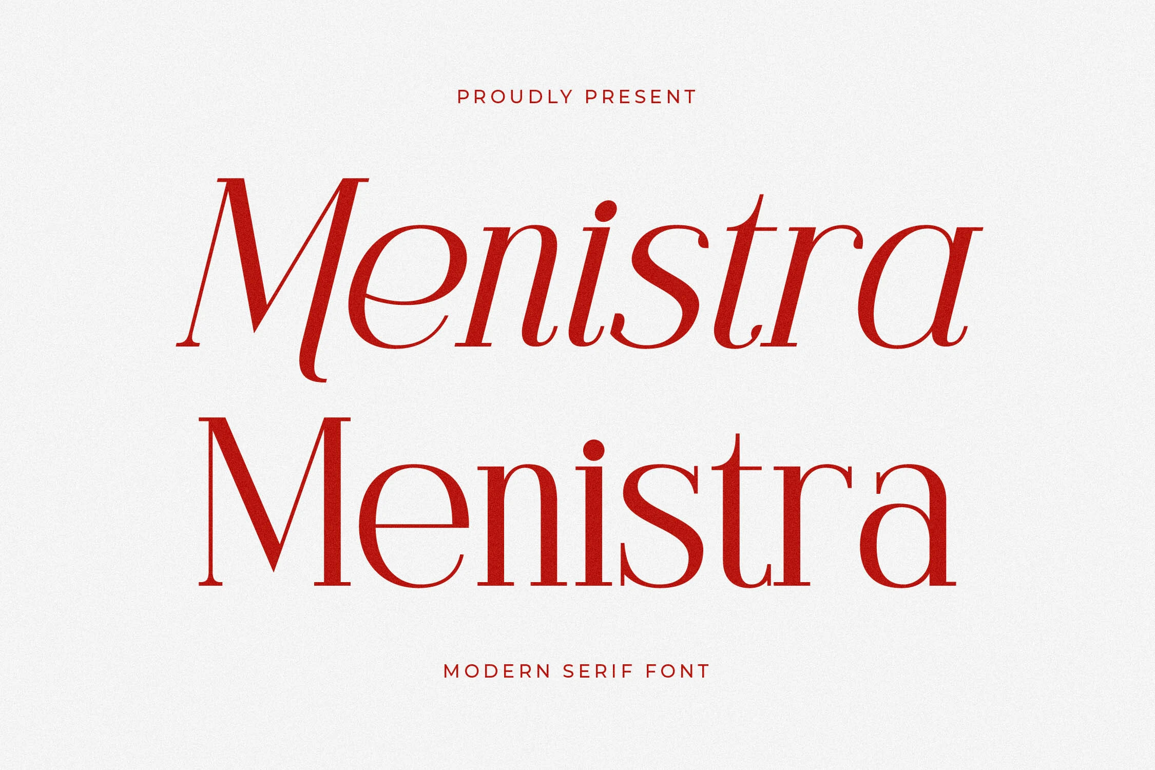
Best For: luxury designs, editorial designs, fashion branding, premium designs
Menistra Font has a polished serif profile with strong stroke contrast, slim hairlines, and crisp bracketed serifs. The italic sample gives the letters a controlled forward movement, while the upright cut keeps the word shape steadier for formal title settings.
Use it where Luxury Serif Fonts need a refined but readable presence: brand marks, fashion mastheads, packaging, or editorial covers. Keep generous tracking around all-caps support text and let the main wordmark carry the hierarchy, because the curves lose impact when crowded.
Menils Font
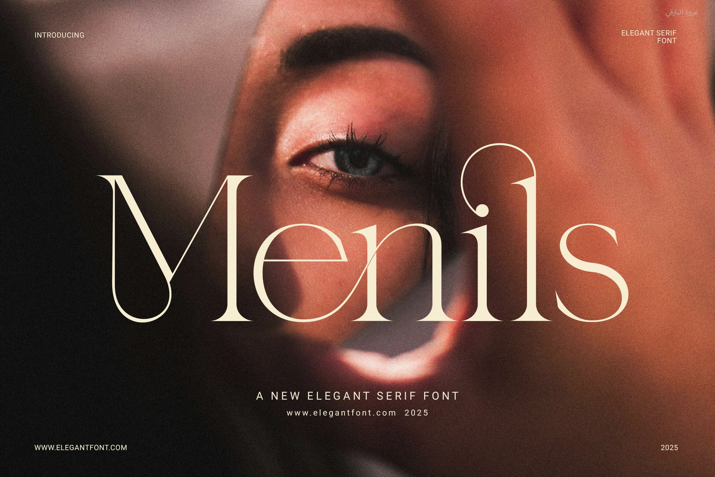
Best For: logos, magazine covers, website headers, beauty branding
Menils Font has a sleek editorial feel, with fine hairlines, elongated stems, and rounded curves that stay airy rather than sharp. The teardrop-like terminal on the M and the delicate balance in the e and s give it a polished personality that reads clearly even when set large over photography.
For Luxury Serif Fonts, Menils works especially well when you want elegance without heavy ornament. Its ligatures help logo text and mastheads flow more smoothly, and the font looks best when paired with restrained secondary type and enough spacing to let the contrast and graceful terminals stay visible.
Meksron Font
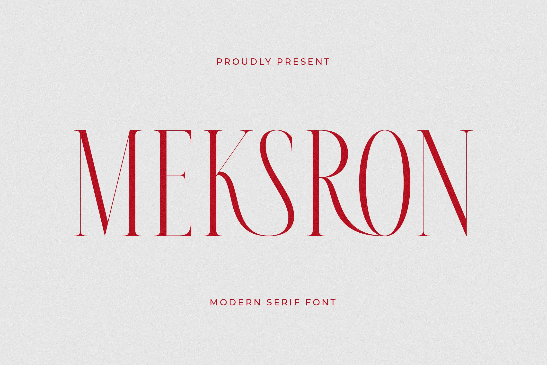
Best For: logos, packaging, book covers, luxury designs
Meksron Font has a clean display presence, with tall uppercase letterforms, fine hairlines, and narrow curves that give the serif structure a sharp editorial polish. The slender M, elongated O, and smooth S create an airy rhythm, so the wordmark feels refined rather than heavy.
If you are browsing Luxury Serif Fonts for identity work, Meksron is strongest in short titles where its contrast and spacing can stay visible. Use it for logos, packaging, or book covers with generous margins and restrained secondary type, because the thin strokes lose some of their elegance when crowded by dense copy.
Beverly Font
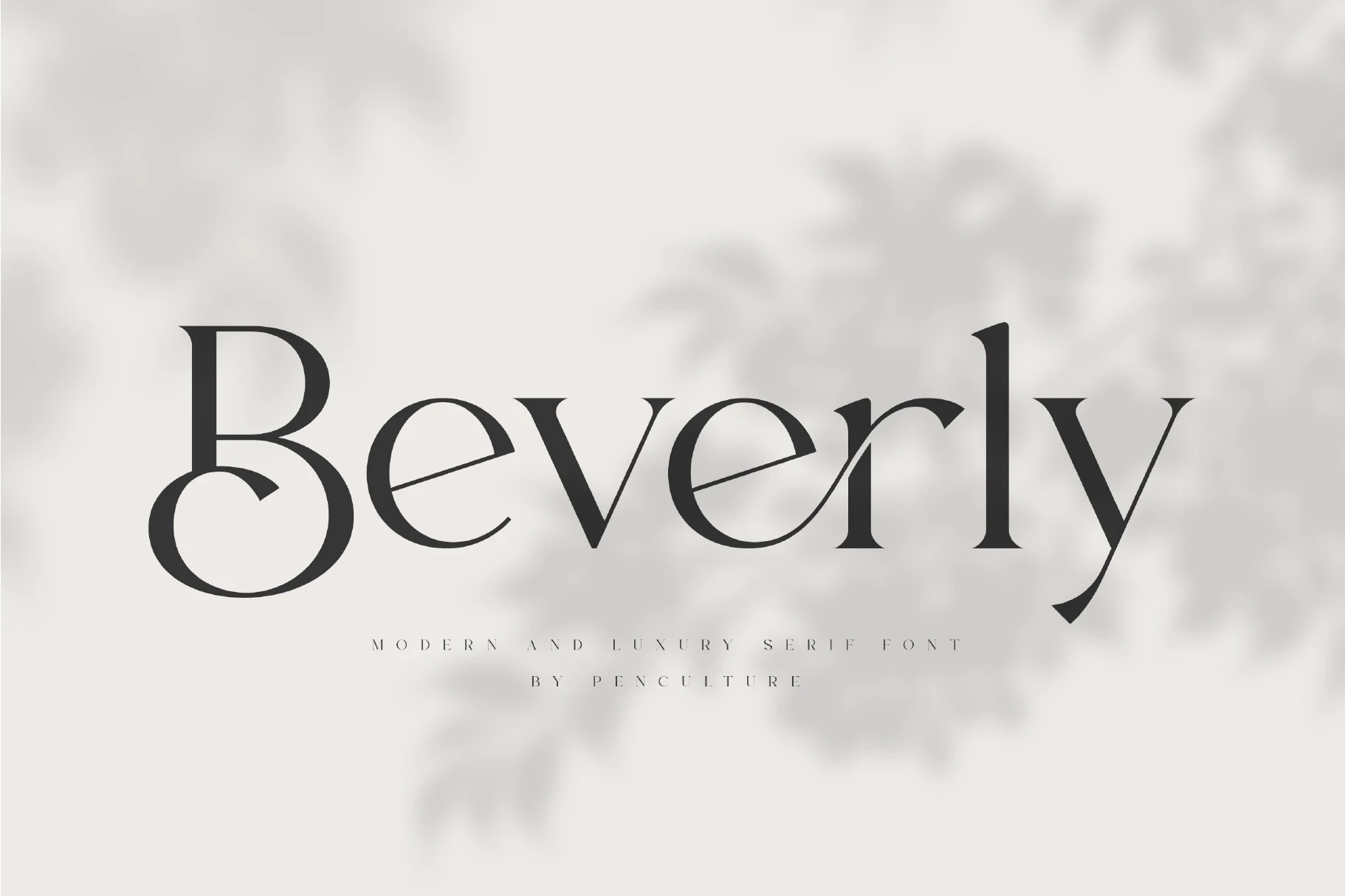
Best For: logos, magazine covers, editorial designs, luxury designs
Beverly Font has a poised, airy rhythm built from clean contrast, rounded bowls, and sharply tapered terminals. The distinctive B and the angled inner strokes in letters like e and r give it a refined custom feel, while the long y descender keeps the overall word shape elegant rather than rigid.
Beverly fits naturally into Luxury Serif Fonts selections for logos, magazine titles, and polished poster work. The included stylistic alternates and ligatures are especially useful when you want a wordmark to feel less generic, so it works best in short lines where those details have enough space to read clearly.
Acher Font
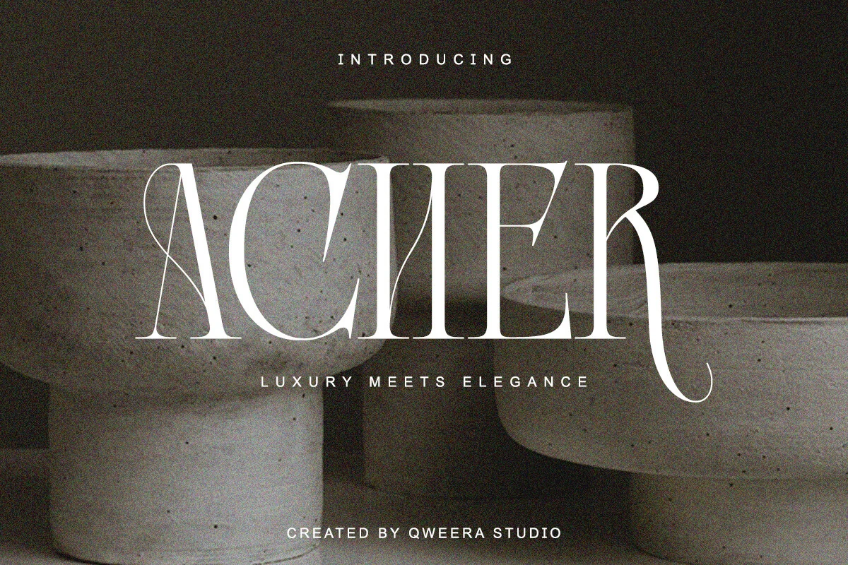
Best For: branding, editorial designs, packaging, luxury designs
Acher Font combines a refined serif skeleton with a more expressive display finish. The preview shows tall high-contrast strokes, very fine hairlines, a narrow looped A, and a long curled terminal on the R, which gives the wordmark a poised look with just enough drama.
It suits Luxury Serif Fonts collections that lean toward branding, editorial layouts, and polished packaging. The included regular and italic styles make hierarchy easier to handle, so you can keep headlines distinctive while using the companion style for accents or subheads without breaking the visual tone.
Romantic & Decorative Luxury Serif Fonts
These serif fonts add softer curves, ligatures, script accents, or vintage terminals, making them better for invitations, romantic branding, wedding suites, and ornate titles.
Starllet Font
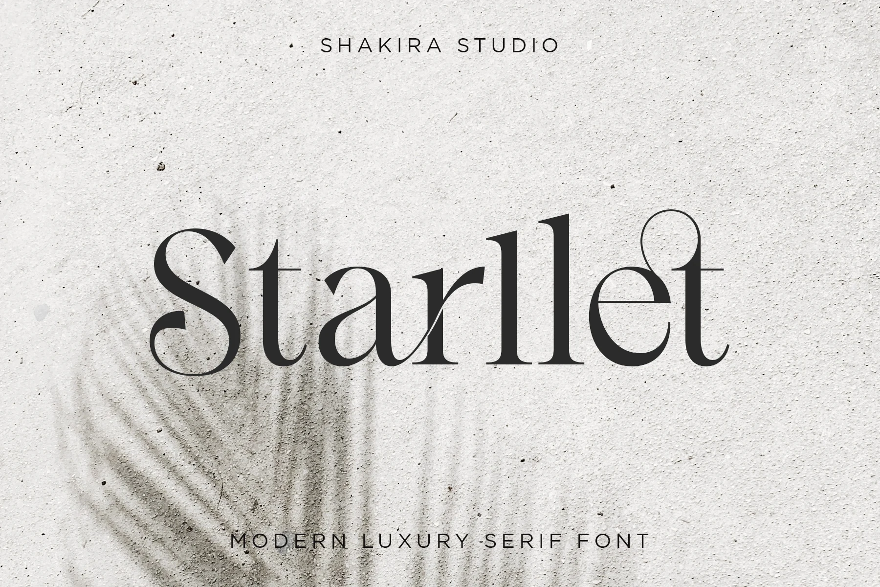
Best For: logos, invitations, elegant designs, luxury designs
Starllet Font has a refined display presence, with high contrast strokes, slim hairlines, and curled terminals that give the letters a graceful vintage edge. The sweeping S and rounded e forms add softness, while the tall stems keep the overall silhouette polished and editorial.
For Luxury Serif Fonts that need elegance without looking stiff, Starllet works especially well in short headlines, logos, and invitation pieces. Give it enough scale and breathing room so the delicate contrast stays crisp, and pair it with simple supporting text to keep the decorative curves in focus.
Roviane Font
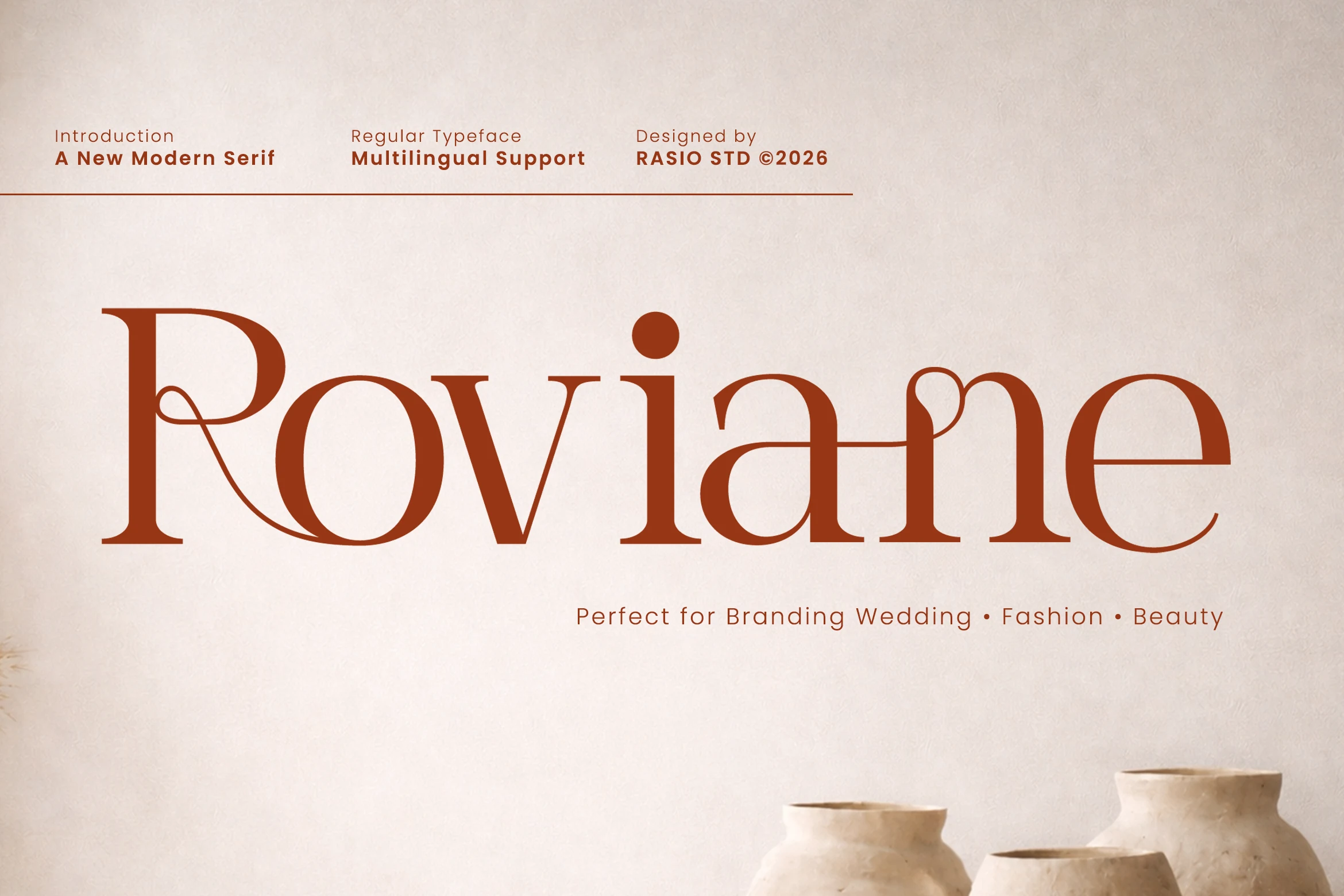
Best For: branding, wedding designs, fashion branding, beauty branding
Roviane Font mixes Roman serif structure with soft calligraphic motion: broad rounded bowls, high-contrast stems, and sweeping leg strokes give the wordmark a warm editorial rhythm. The interlocking ligatures, including the small heart-like loop between inner stems, make short names feel closer to custom lettering than a standard typed title.
Use it when Luxury Serif Fonts need a romantic but polished tone for branding, wedding suites, fashion labels, or beauty packaging. Keep words short, avoid tight tracking, and give the ligatures enough horizontal space so the loops read as intentional details instead of visual clutter.
Moonic Font
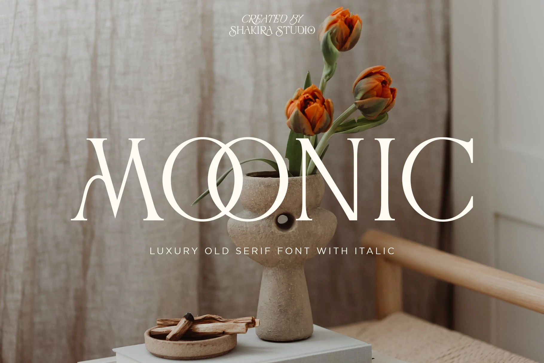
Best For: logos, wedding designs, elegant designs, luxury designs
Moonic Font has a graceful old-style serif character, with pronounced contrast, soft curved terminals, and wide rounded bowls that give the letters a calm decorative rhythm. The overlapping double O in the preview adds a custom, almost monogram-like feel, which makes the type look more distinctive than a standard display serif.
Among Luxury Serif Fonts, this one suits romantic branding and elegant stationery especially well. Keep it for short headlines, logos, or invitation titles where the contrast and curved details can stay visible, and pair it with understated body text so the vintage flair feels polished rather than busy.
Pagome Font
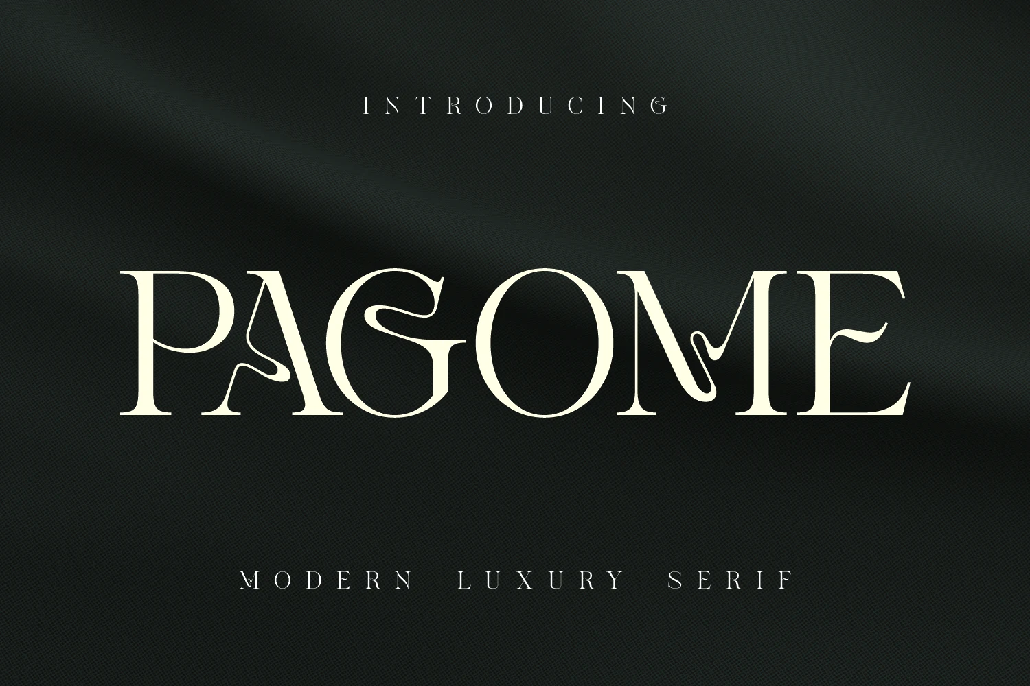
Best For: logos, editorial designs, fashion branding, website headers
Pagome Font pairs classic high-contrast serif structure with fluid ligatures that move through the letters like ink or ribbon. In the preview, those liquid details soften the rigid stems and add an organic couture edge, while the broad bowls and clear spacing keep the wordmark polished and readable.
If you are comparing Luxury Serif Fonts for editorials, logos, or chic digital headers, Pagome works best when the headline stays short and prominent. Let the ligatures shape the title into a signature-style mark, then keep the supporting text restrained so the flowing strokes and contrast stay crisp.
Cornelia Font Duo Font
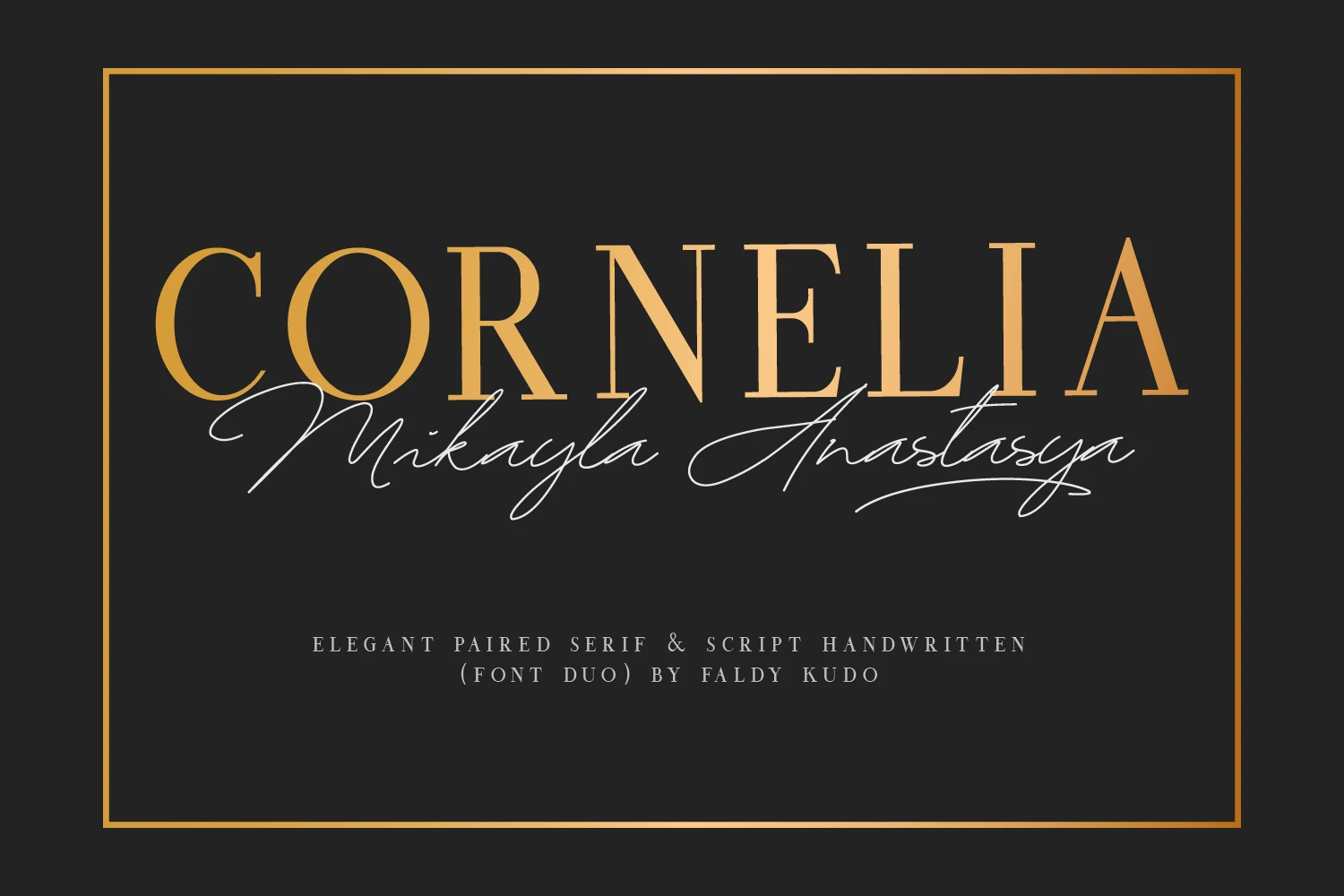
Best For: wedding designs, invitations, social media graphics, luxury designs
Cornelia Font Duo pairs a slim, high-contrast serif with an airy handwritten script, and the contrast is what gives it so much appeal. The serif feels poised and editorial, while the script moves in long, fluid strokes that add a personal signature effect. For Luxury Serif Fonts, this kind of built-in pairing is especially useful when you want polish and softness in the same composition.
The strongest approach is to let the serif carry the main title and use the script as a secondary accent for names, taglines, or short overlays. That keeps the delicate handwritten line from becoming crowded, while the serif maintains structure and readability. It’s a smart setup for invitation suites, refined branding, and social graphics with layered typography.
Conclusion
For the cleanest high-end look, choose fashion editorial serifs for covers and campaigns, branding serifs for logos and packaging, and romantic decorative serifs when you need softer, more ornamental typography.