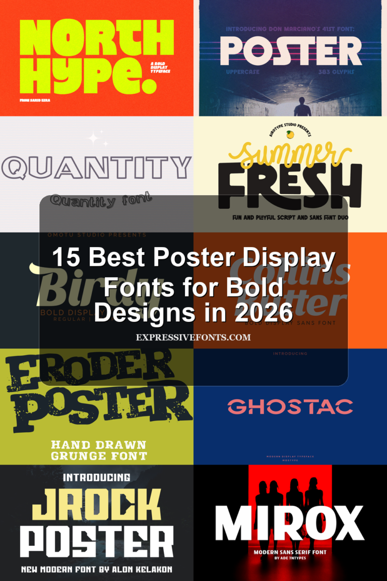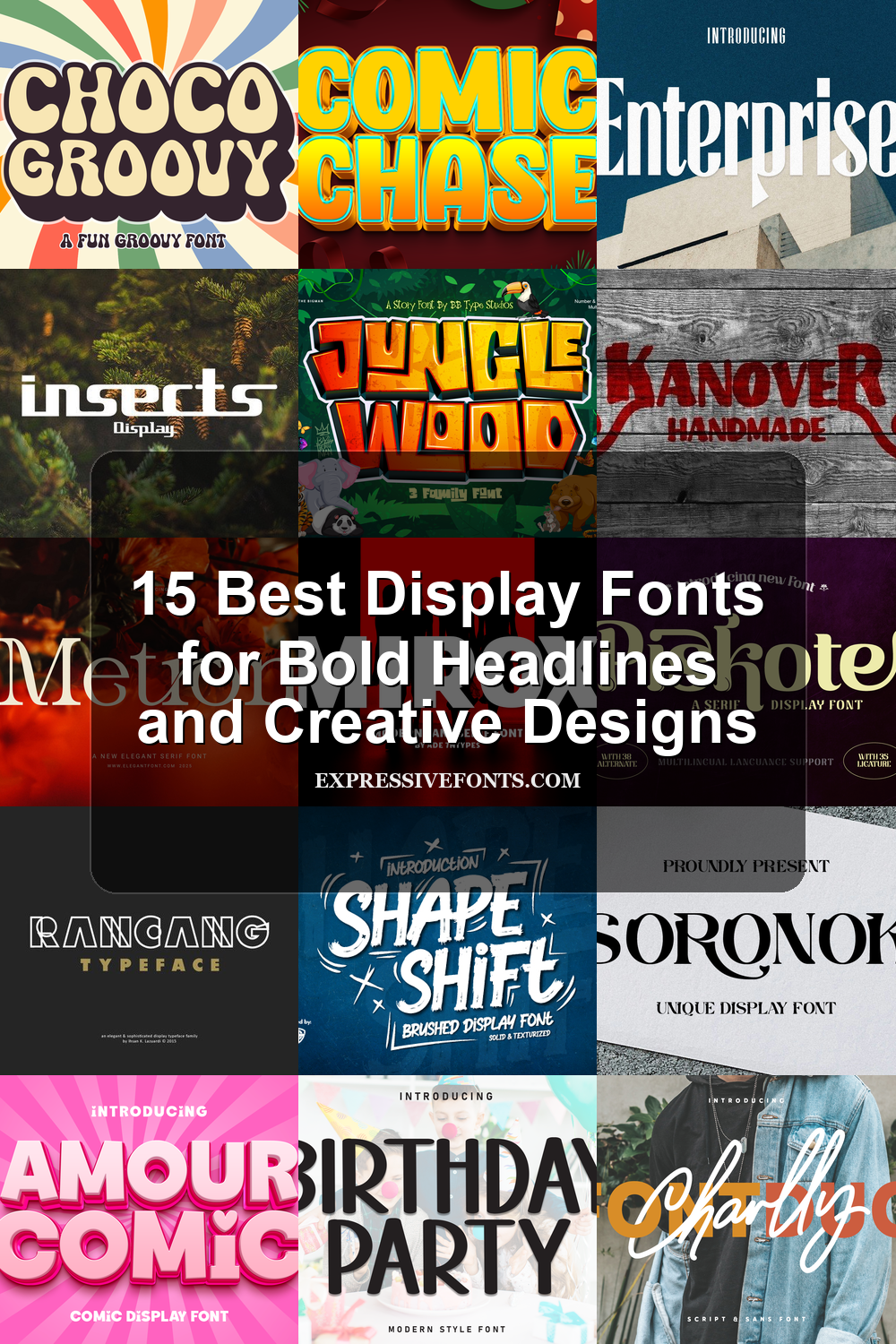
15 Best Display Fonts for Bold Headlines and Creative Designs
We selected the best display fonts to help you save time and create bold, memorable designs. This collection includes playful, retro, modern, handmade, and eye-catching typefaces that can work well for posters, branding, packaging, social media graphics, and other creative projects.
Comic Chase Font
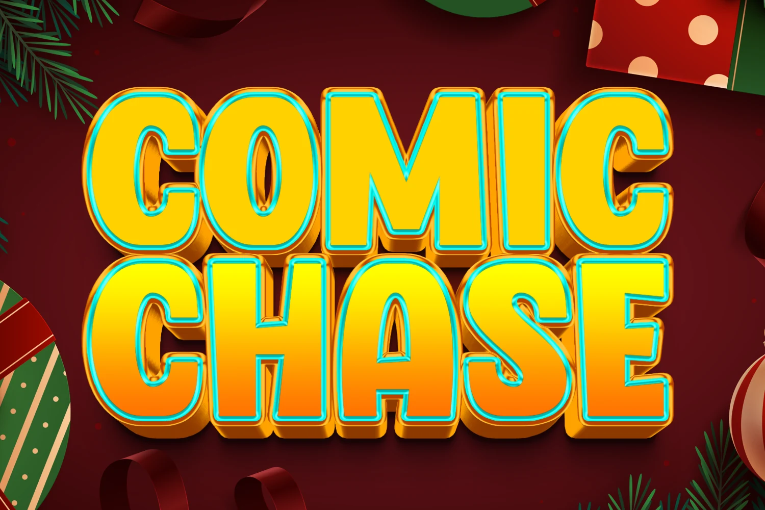
Best For: display text, headlines, short phrases, fun designs
Comic Chase Font is a loud, rounded display face built from heavy block letters, soft corners, and a high-impact comic rhythm. The chunky shapes feel festive and animated rather than polished or formal, giving Display Fonts compositions a bright, celebratory voice with strong instant recognition.
Its wide proportions and compact spacing are made for large-scale words, stacked titles, and short phrases where every letter needs visual weight. Keep it out of long text, pair it with a plain sans serif, and let the simple letter shapes carry outlines, shadows, or color treatments without losing readability.
Piskote Font
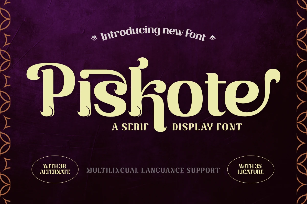
Best For: logos, branding, headlines, editorial designs
Piskote Font is a decorative serif with sweeping curves, soft weight shifts, and playful terminals that give it an old-world yet inviting presence. The letterforms feel expressive rather than strict, so it stands out among Display Fonts with a mix of elegance, warmth, and theatrical character.
It works best at larger sizes, where the unusual shapes and curved details stay crisp and intentional. Use it for short titles or identity-focused layouts, pair it with a quiet sans or classic text serif, and let the generous forms carry the styling without making the composition feel busy.
Charlly Font
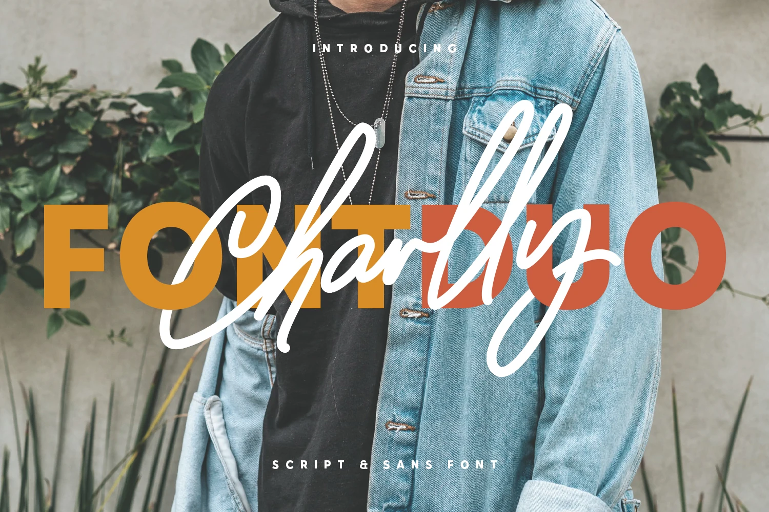
Best For: branding, social media graphics, fashion branding, headlines
Charlly Font is a duo-style display family that contrasts a heavy, compact sans with a loose handwritten script. The sans gives the layout a solid block structure, while the script cuts through it with long loops, fast strokes, and a casual fashion-label attitude. Among Display Fonts, it feels chic, urban, and expressive rather than formal.
The two styles work best when used as a layered title system: let the sans hold short words at large sizes, then use the script as the accent or signature element. Its strongest use is in brief compositions where contrast, overlap, and scale can create movement without forcing the script into long readable text.
Jungle Wood Font
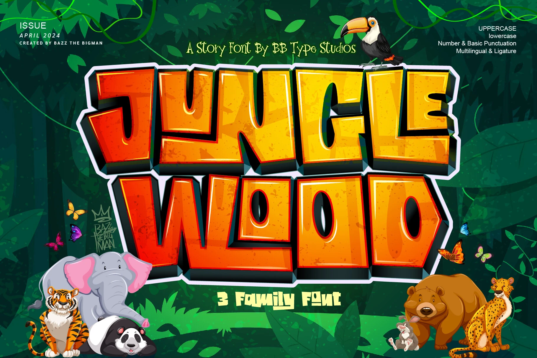
Best For: posters, book covers, T-shirts, eye-catching designs
Jungle Wood Font is a rugged trio of blocky display styles with chopped corners, deep shadowing, and a carved comic-book attitude. The letters feel loud and adventurous, balancing wild energy with enough structure to stay readable. Among Display Fonts, it leans bold, playful, and cinematic rather than polished or delicate.
It performs best in short words and oversized headlines, where the angular silhouettes and textured detail can carry the layout. The three-font setup gives you room to shift emphasis while keeping the same jungle mood, and it pairs well with simple supporting text that lets the main title stay dominant.
Choco Groovy Font
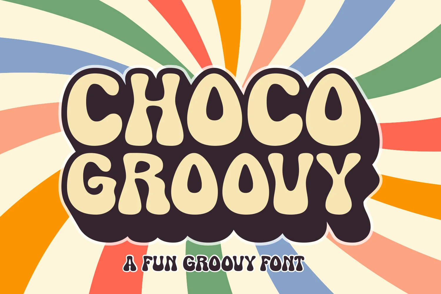
Best For: retro designs, playful designs, book covers, T-shirts
Choco Groovy Font is a chunky retro display face with swollen letterforms, rounded counters, and a soft 1970s rhythm. The shapes feel playful and candy-like without becoming thin or fragile, giving Display Fonts layouts a bold, friendly personality with strong visual mass.
Its wide, bubbly construction is best handled at large sizes, especially for short words, stacked titles, and graphic compositions that need an immediate focal point. Keep supporting type simple and spaced out, since the heavy outline-ready forms already bring enough movement and texture to the layout.
Amour Comic Font
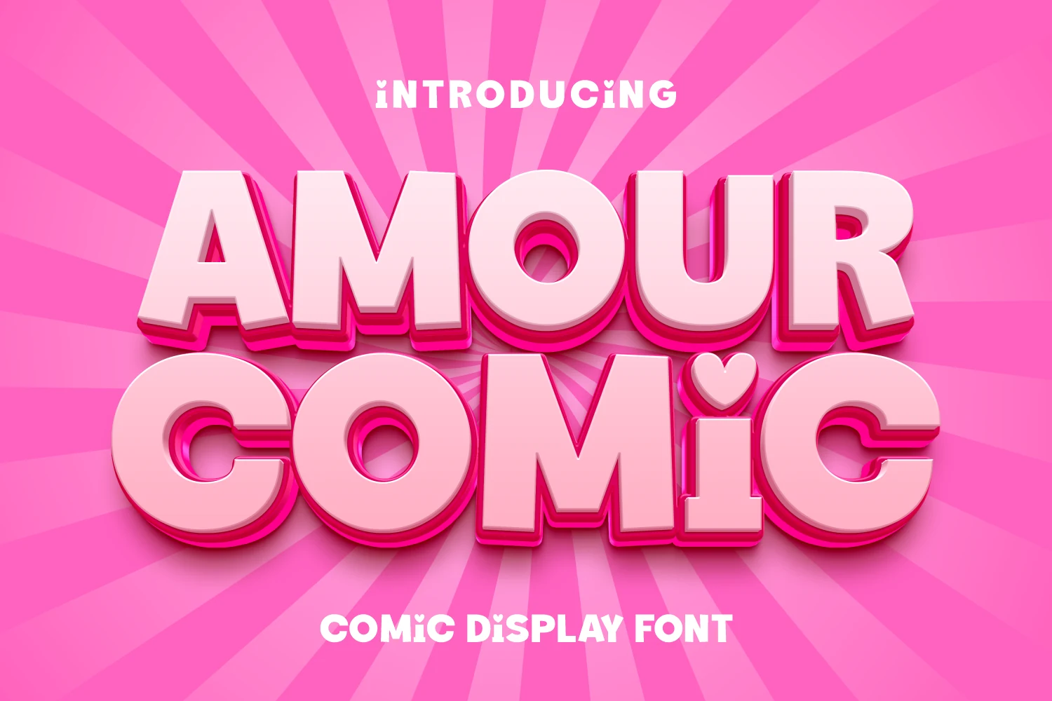
Best For: invitations, quotes, playful designs, cute designs
Amour Comic Font is a rounded comic display face with thick strokes, soft corners, and a candy-sweet silhouette that feels cheerful and affectionate. Its bubbly construction gives Display Fonts layouts a playful romantic tone, with enough weight to stay bold while still feeling warm and approachable.
The clean shapes keep short headlines, quotes, and card-style wording easy to read, while the smooth finish holds up well with outlines, shadows, and layered color treatments. Its multilingual support helps maintain the same mood across accented and Eastern European text, and the swashes add extra charm when you want a more decorative finish.
Shapeshift Font
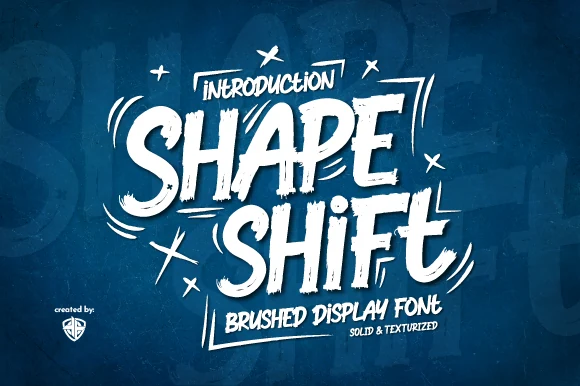
Best For: headlines, posters, display text, expressive designs
Shapeshift Font is a brushed display face with rough edges, slanted energy, and uneven stroke pressure that gives each letter a fast hand-painted feel. Its chunky uppercase shapes stay forceful and readable, while the dry-brush texture adds movement and grit to Display Fonts compositions.
It is strongest in oversized headlines, compact title blocks, and short phrases where the texture can be seen clearly. The irregular rhythm works well with simple sans serif support text, and the bold letter mass gives web, print, or motion layouts a clear focal point without needing heavy decoration.
Kanover Font
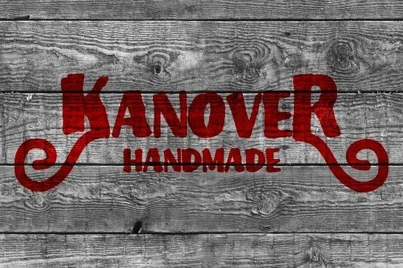
Best For: logos, signage, handmade designs, bold designs
Kanover Font has a rustic handmade feel built from thick, slightly irregular strokes and wide curled terminals that give it a folk-sign character. The letters feel sturdy rather than polished, with enough personality to stand out while keeping a straightforward silhouette. Among Display Fonts, it reads as warm, handcrafted, and bold.
Its heavy weight and simple interior shapes keep short words clear, so it works best for titles, marks, and other brief compositions where texture matters more than refinement. Pair it with a plain sans serif, give it room to breathe, and let the ornamental end curls do the styling without crowding the layout.
Gurenge Font
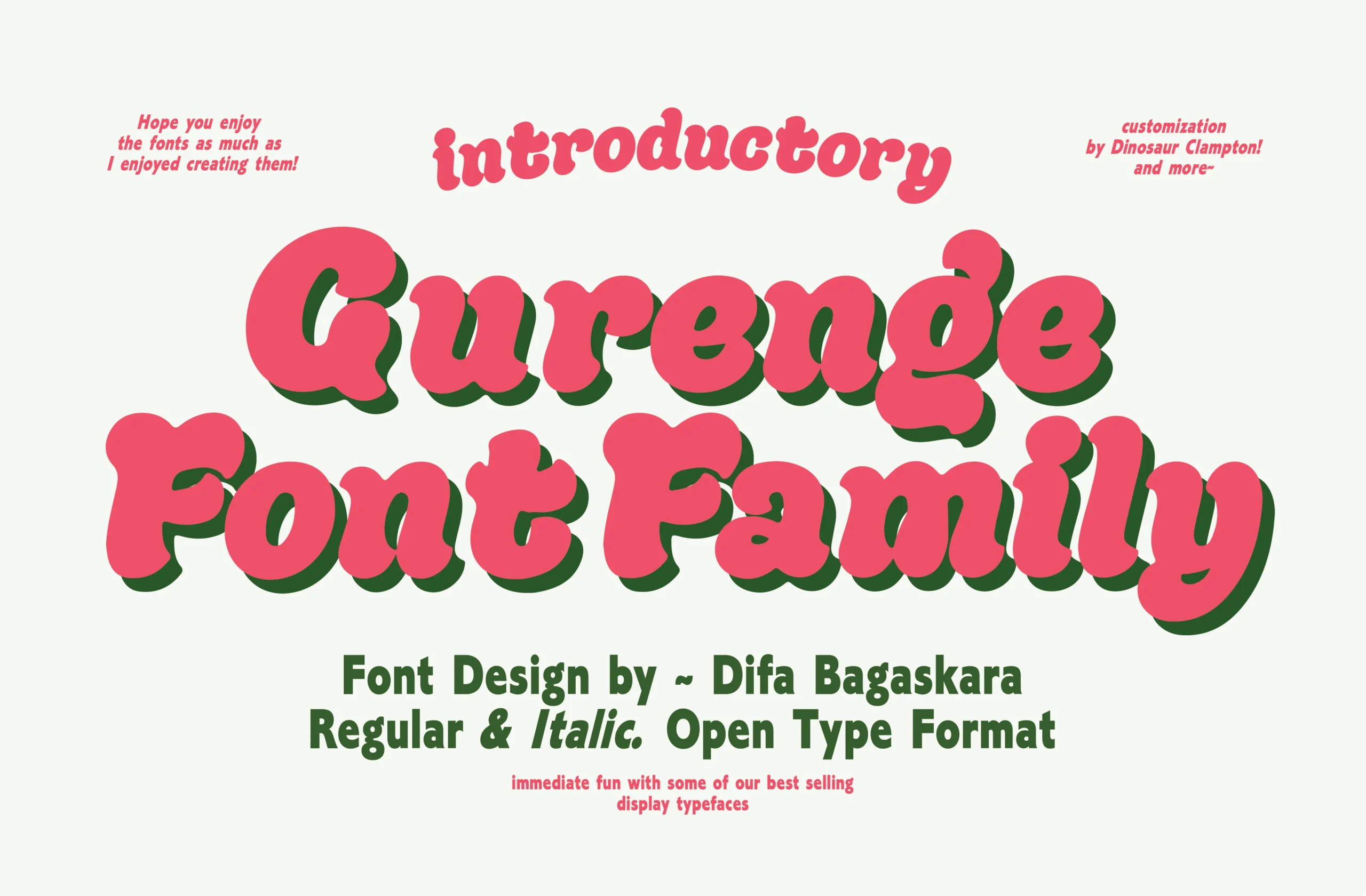
Best For: playful designs, fun designs, retro designs, headlines
Gurenge Font is a bubbly retro display family with thick rounded strokes, soft swelling curves, and a cheerful rhythm. The letters feel lively and informal, with enough weight to hold attention in Display Fonts layouts while keeping a friendly, handmade personality.
Its rounded construction works best at large sizes, especially in short words, stacked titles, and playful identity pieces. The multiple typefaces give you room to shift emphasis within the same visual mood, while simple supporting text keeps the composition clear and prevents the soft shapes from feeling crowded.
Enterprise Font
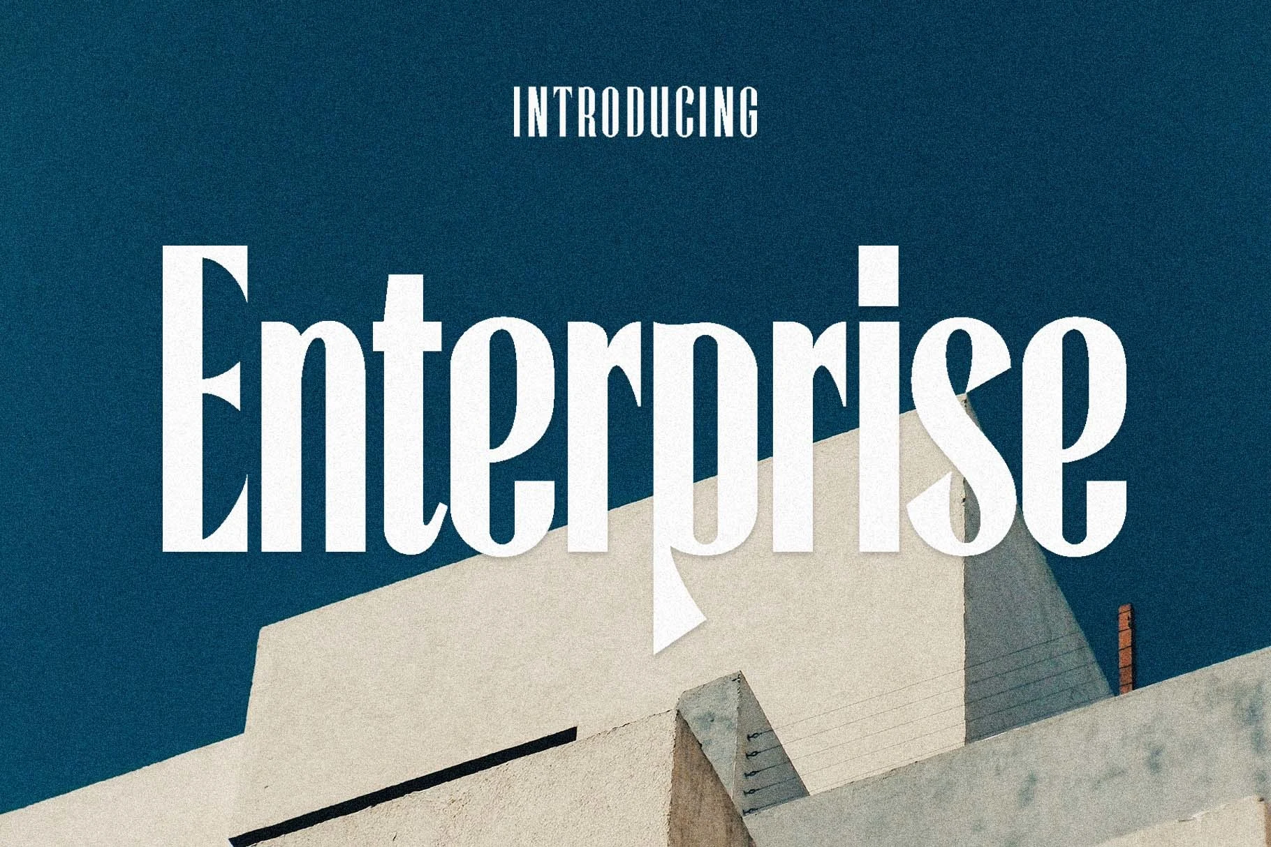
Best For: headlines, branding, magazine covers, editorial designs
Enterprise Font is a tall, condensed display face with crisp contrast, narrow proportions, and a composed architectural presence. Its long verticals and clean curves give it a classic-meets-modern tension, so it stands out in Display Fonts with an editorial, confident, and slightly formal tone.
The slim letterforms work best in large titles, mastheads, and other short settings where the vertical rhythm has room to show. It stays most effective when paired with simple body text and a bit of breathing space, since the condensed shapes create impact without needing heavy decoration or extended wording.
Insects Font
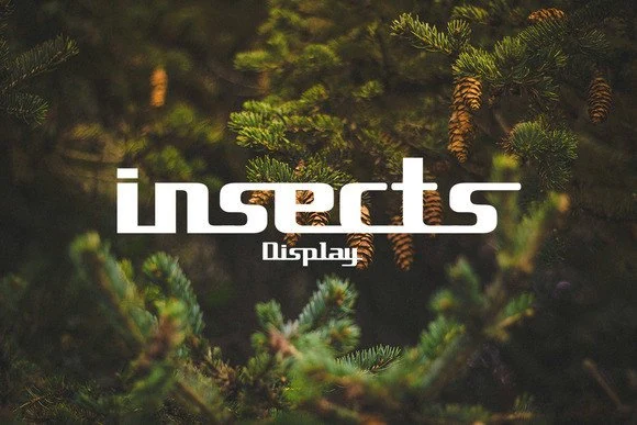
Best For: logos, website headers, display text, retro designs
Insects Font is a compact retro-futurist display face with rounded techno shapes, sliced counters, and a low, stretched rhythm. The letterforms feel clean but mechanical, giving Display Fonts layouts a clear 90s digital attitude without becoming overly decorative.
Its short x-height details and tight horizontal flow work best in large titles, logos, and interface-style headers where the unusual cuts stay visible. Keep wording brief, use generous surrounding space, and pair it with a neutral sans serif so the retro-tech character remains the main visual signal.
Birthday Party Font
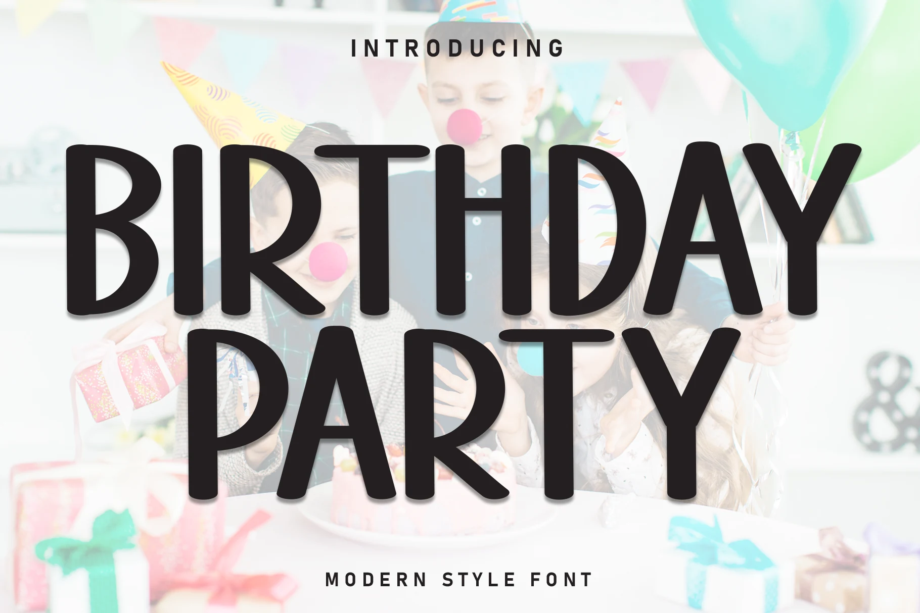
Best For: invitations, children’s designs, playful designs, headlines
Birthday Party Font has a rounded modern look built from tall, clean letterforms and smooth monoline strokes. The soft corners keep it friendly and upbeat, while the narrow proportions give it a neat contemporary feel. Among Display Fonts, it reads playful without becoming messy, so the overall impression stays bright and polished.
The even stroke weight and open shapes help it stay readable in short headlines, names, and celebration wording. It works best at medium to large sizes, where the vertical rhythm stays crisp, and it pairs easily with simple supporting type so the rounded forms can carry the composition without feeling crowded.
Mirox Font
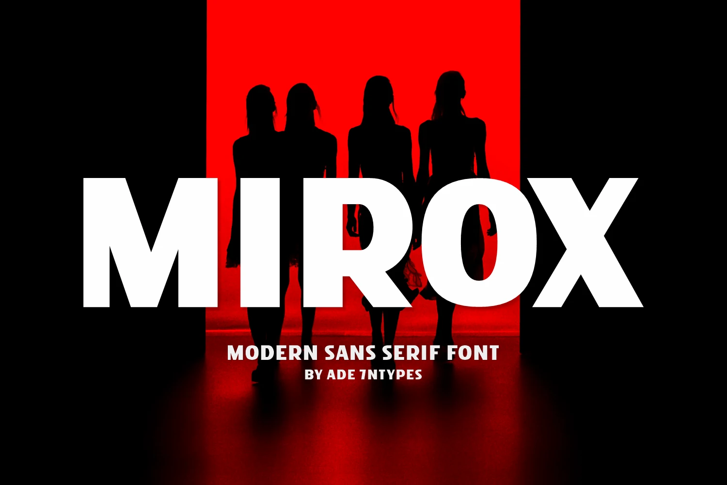
Best For: headlines, posters, branding, bold designs
Mirox Font is a heavy modern sans serif with broad uppercase forms, clean cuts, and a direct cinematic presence. The letters are built for force rather than decoration, giving Display Fonts layouts a stark, confident tone with strong contrast against photography or flat color fields.
Its massive weight works best in short words, large titles, and poster-style compositions where the type can dominate the frame. Keep supporting text small and simple, use generous spacing around the headline, and let the blocky geometry create impact without adding extra effects.
Rancang Font
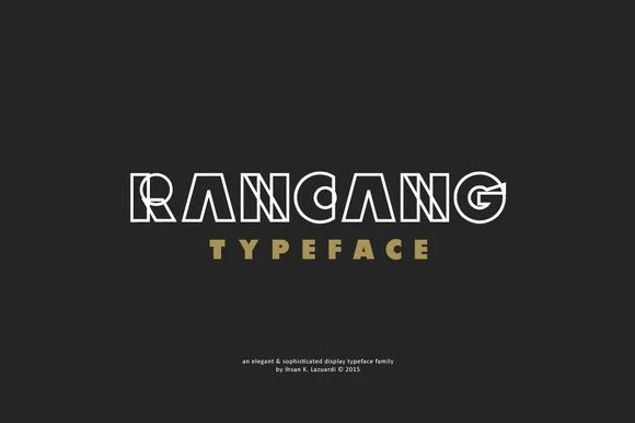
Best For: headlines, display text, modern designs, branding
Rancang Font is a bold outlined display face with clean geometric structure and a sharp, polished rhythm. Its all-caps construction feels sleek and architectural rather than decorative, giving Display Fonts layouts a crisp modern look with a touch of elegance.
The outline style works best at medium to large sizes, where the internal spacing stays clear and the letter shapes remain easy to read. Use it for headlines and short phrases, pair it with a simple solid companion font, and place it on clean high-contrast backgrounds so the linework keeps its impact.
Soronok Font
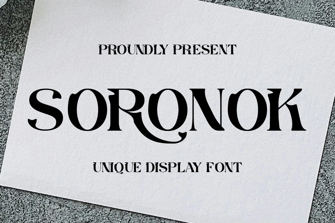
Best For: logos, branding, headlines, elegant designs
Soronok Font is a refined decorative serif with high contrast, sharp curves, and distinctive flared details that give each letter a sculpted look. Its wide uppercase forms feel elegant but not plain, making it stand out among Display Fonts with a polished, dramatic, and slightly vintage character.
The ornate shapes work best in short words, logos, and large headlines where the inner curves and unusual terminals remain clear. Pair it with restrained supporting type, avoid long paragraphs, and give the letters enough spacing so the decorative rhythm looks intentional rather than crowded.
Choose the display fonts that match your project style, whether you need bold headlines, playful lettering, retro typography, or clean modern titles. All of these font designs are available on Creative Fabrica, so you can quickly download the right option and start building your next creative layout.
Use this collection as a starting point for posters, branding, packaging, social media graphics, invitations, and other visual projects. Good luck with your designs and let these Display Fonts help you create stronger, more memorable work.