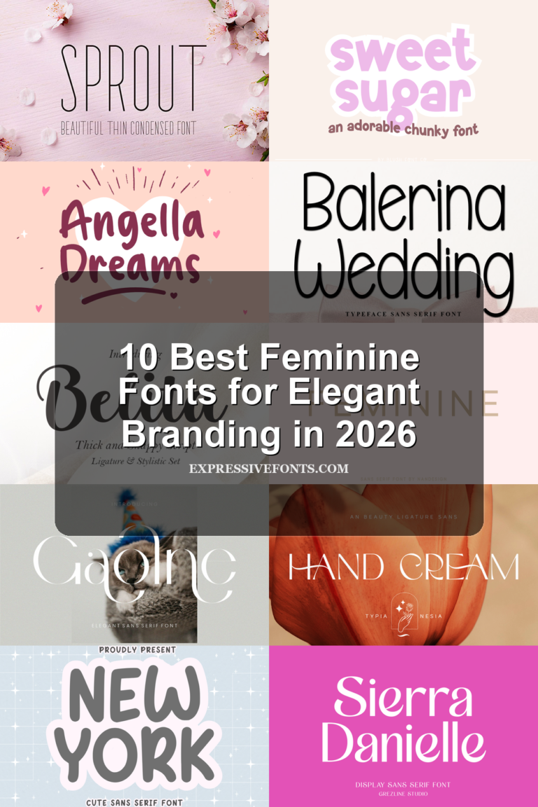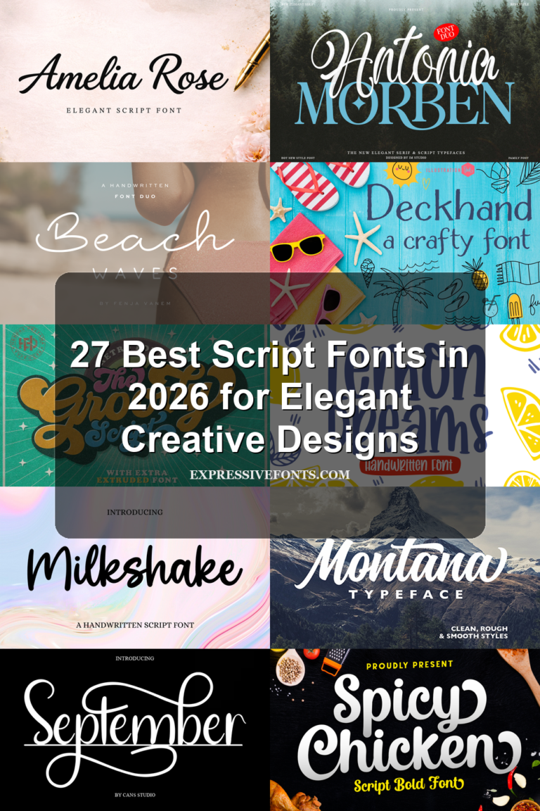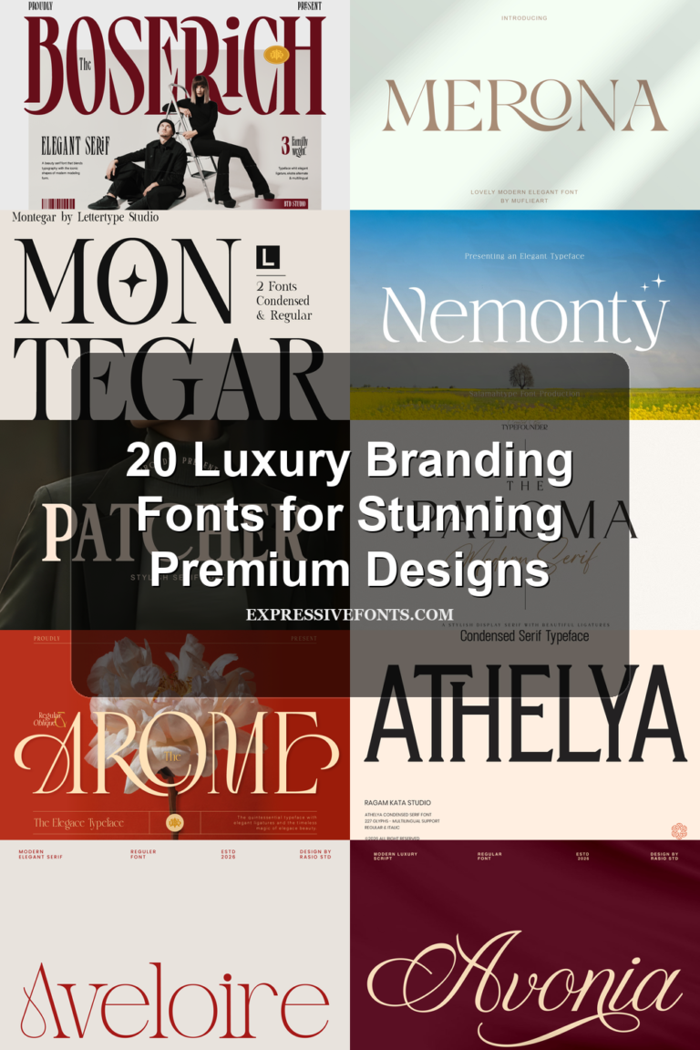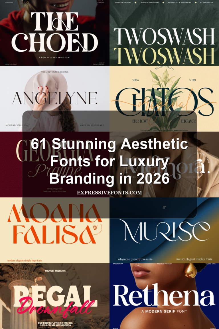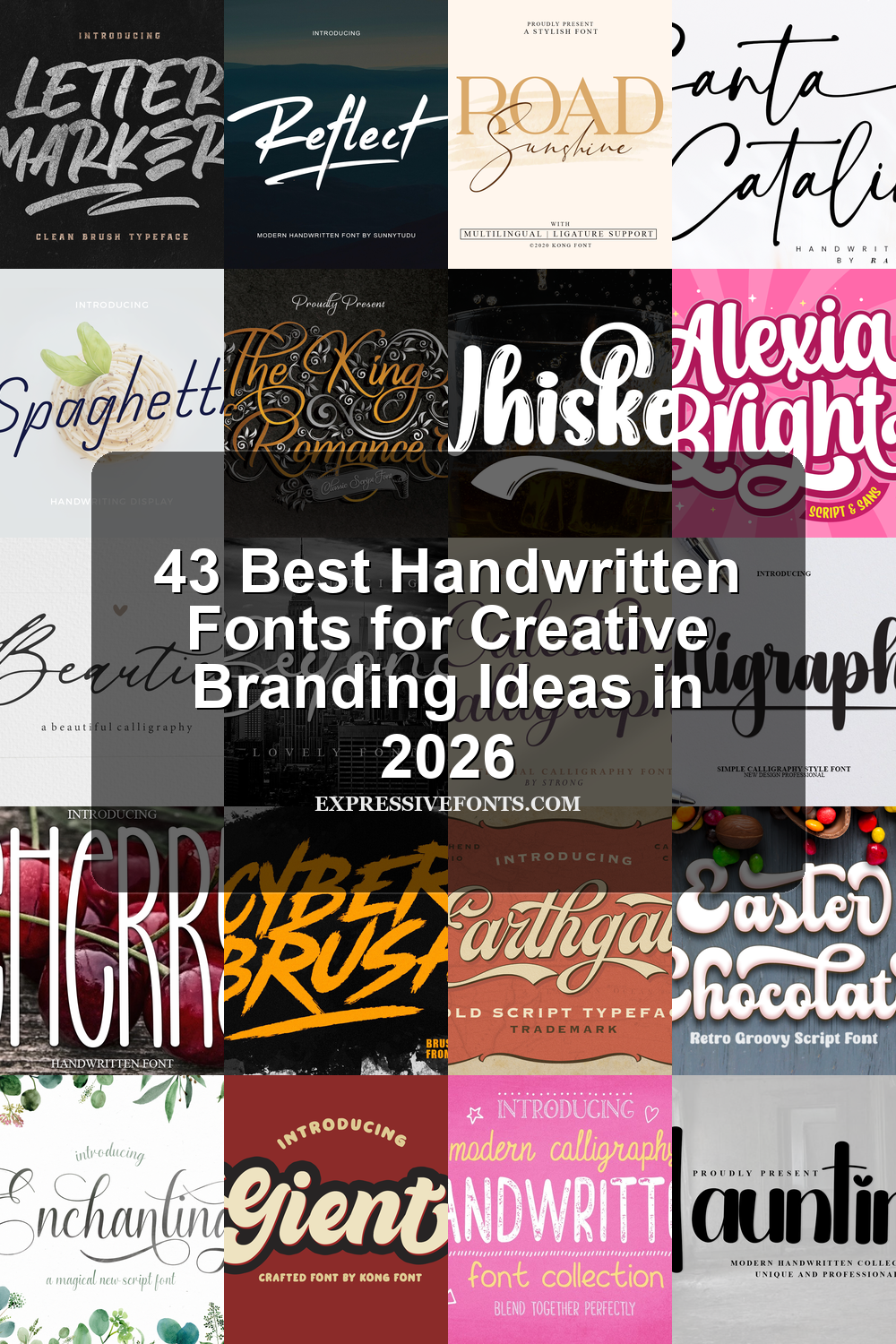
43 Best Handwritten Fonts for Creative Branding Ideas in 2026
We selected 43 handwritten fonts that help designers create expressive logos, invitations, packaging, quotes, and social media graphics faster. This 2026 roundup focuses on styles that feel current and usable, from refined signature scripts to bold brush lettering and playful handmade type.
Alanta Font
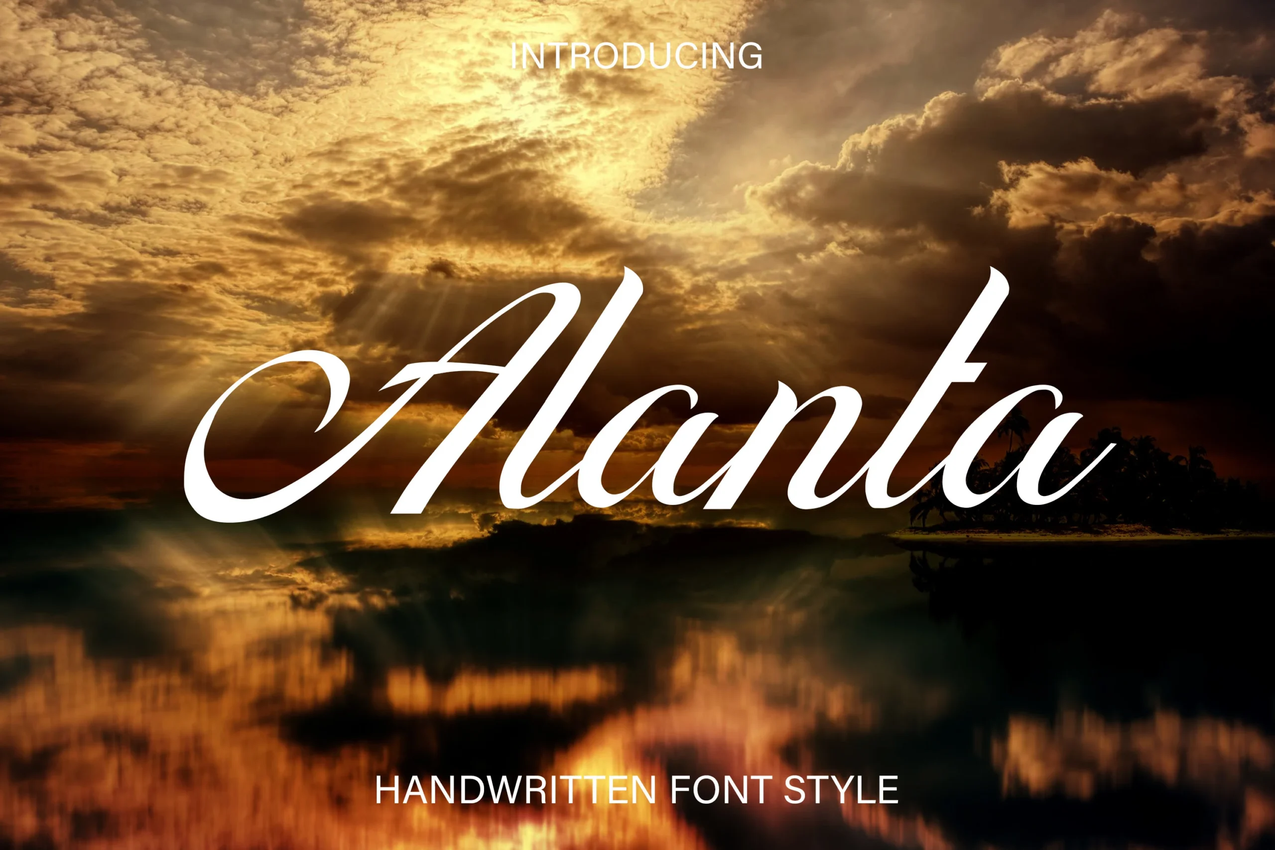
Best For: invitations, wedding designs, beauty branding, short phrases
Alanta Font has a flowing cursive shape with a dramatic opening swash, tall slanted stems, and smooth thick-to-thin movement through the lowercase letters. Its connected rhythm keeps the wordmark graceful without becoming overly tangled, which gives it a readable place among refined Handwritten Fonts.
Use Alanta where one or two words need to carry the main tone. The long entry and exit strokes need enough horizontal space, while strong contrast behind the letters helps preserve the fine curves and pointed terminals in logos, invitations, and romantic title layouts.
The King of Romance Font
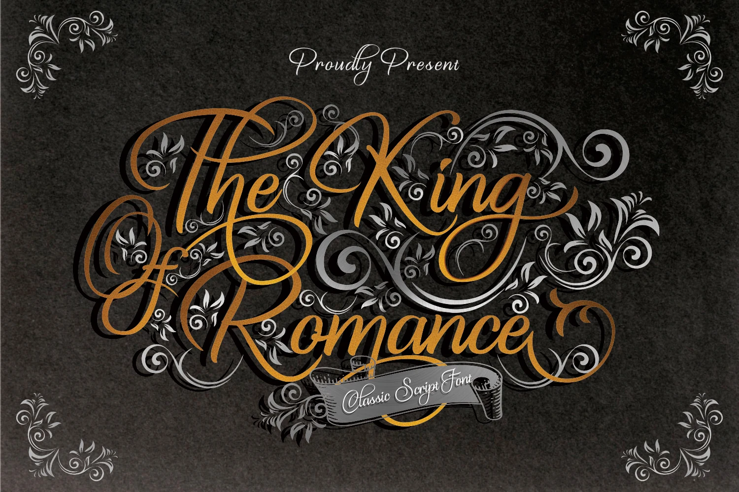
Best For: invitations, wedding designs, logos, short phrases
The King of Romance Font is an elaborate script with towering capitals, sweeping loops, and a formal calligraphic rhythm that feels ceremonial rather than casual. Its decorative swashes and high-contrast strokes give it a striking place among Handwritten Fonts, especially when a headline needs to look romantic and grand.
This is a display face for names, titles, and statement words, not long passages. The alternative characters and ligatures help you build smoother custom lettering, while the oversized flourishes need generous spacing so the details stay clear instead of crowding the composition.
Beautica Beautiful Calligraphy Font
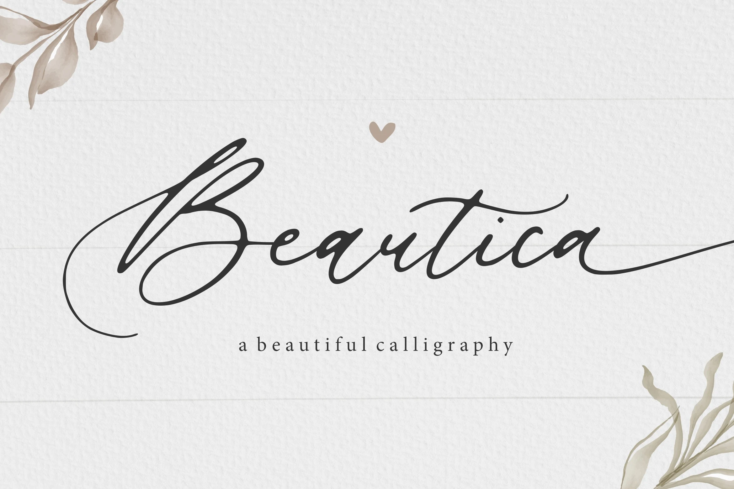
Best For: invitations, wedding designs, beauty branding, personal branding
Beautica Beautiful Calligraphy Font has a signature-style flow with a dramatic looped capital, slim entry strokes, and rounded lowercase forms that lean into a graceful rhythm. Its polished cursive shape gives Handwritten Fonts a soft, refined look without making the word structure hard to follow.
The long beginning and ending strokes work best when they are treated as part of the layout, not trimmed tightly. Keep generous side spacing, use strong contrast behind the letters, and let Beautica handle names, titles, or short romantic phrases where the calligraphic movement can stay clean.
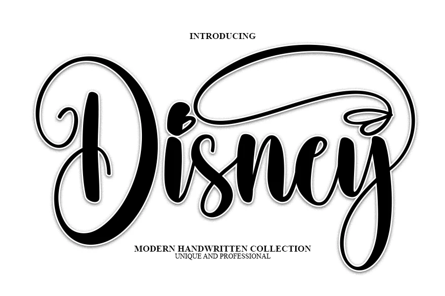
Disney Font
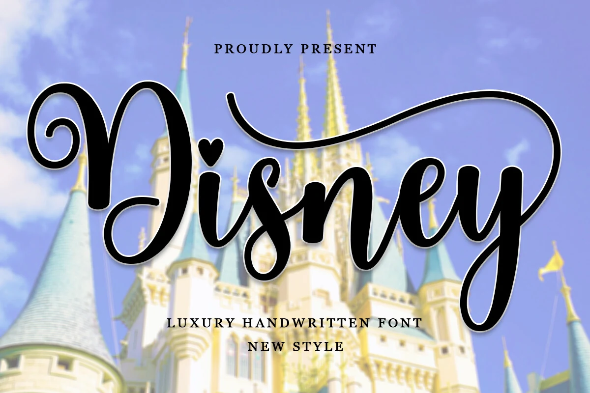
Best For: headlines, posters, children’s designs, fun designs
Disney Font has a chunky handwritten look with rounded strokes, a dramatic looping capital, and a long sweeping flourish that turns the word into a full display piece. Its varied baseline and heart-shaped dot give it extra personality, making it a lively pick within Handwritten Fonts when you want something bold and immediately recognizable.
This style works best at headline size, where the thick curves and extended swash have room to breathe. The alternates help shape a more custom wordmark feel, especially for short titles, kids-focused layouts, and playful poster compositions that need a strong focal line.
Enchanting Script Font
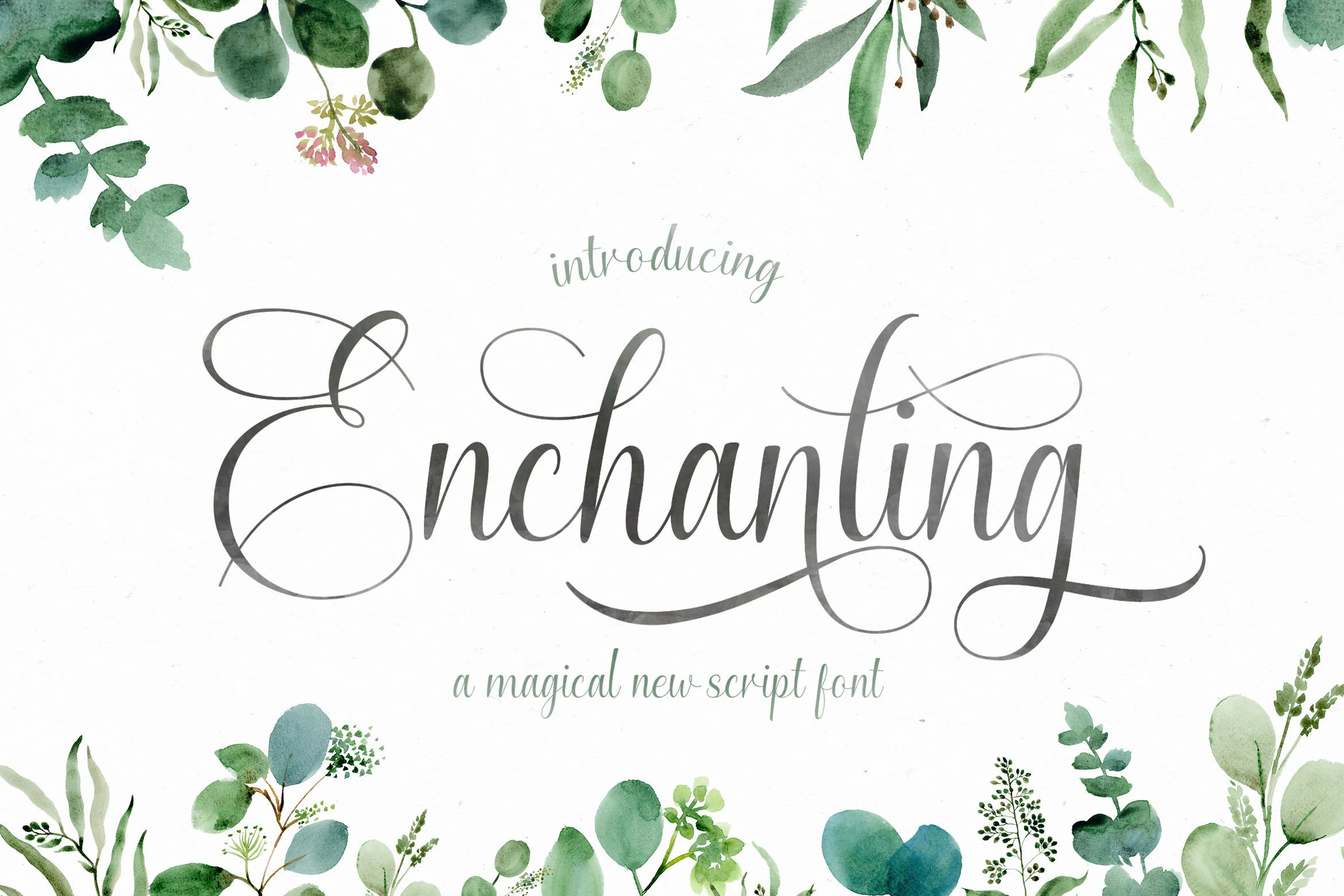
Best For: logos, branding, quotes, wedding designs
Enchanting Script Font has a light calligraphic flow with tall narrow letters, soft pressure shifts, and airy loops that keep the wordmark delicate. The sweeping capital and extended descender give it a graceful rhythm, placing it among Handwritten Fonts suited to romantic, botanical, and personal branding layouts.
The long flourishes need open margins, especially around the first and last letters. Use it for short names, quotes, or logo marks where the script can sit as the main visual line, and keep supporting text restrained so the thin curves and crossing strokes remain readable.
Letter Marker Font
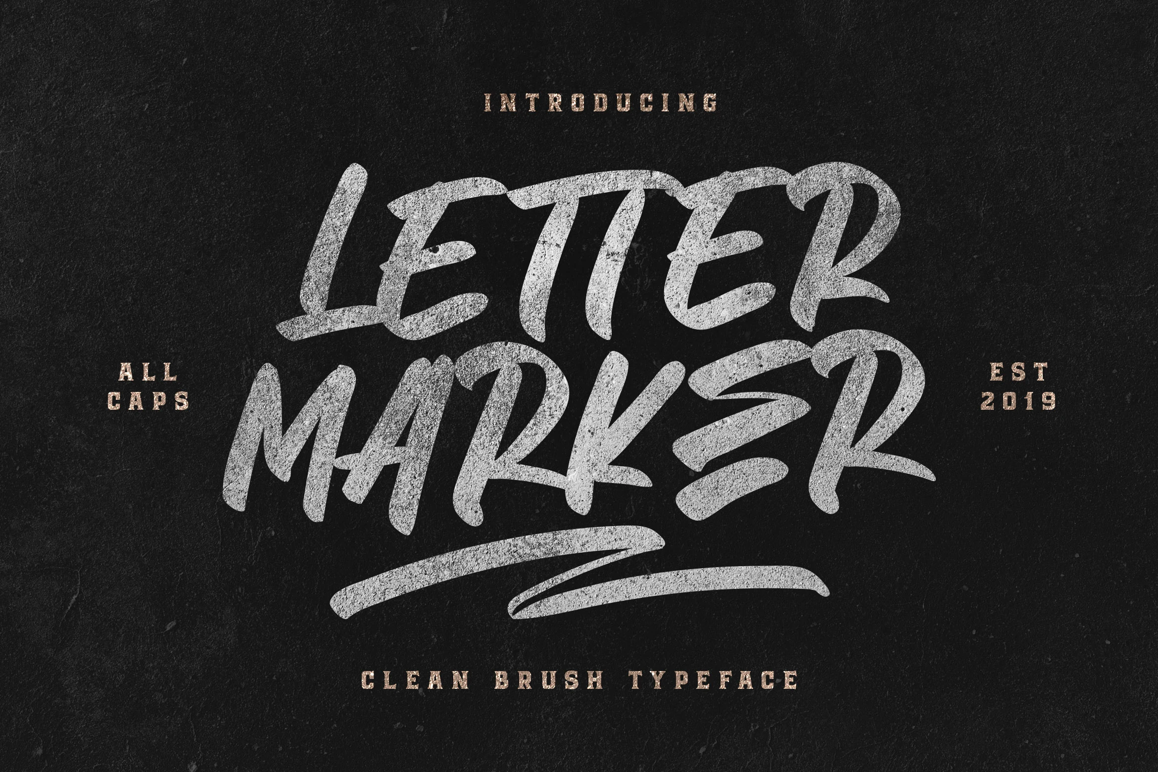
Best For: headlines, posters, social media graphics, T-shirts
Letter Marker Font has a loud all-caps brush look with broad strokes, rough texture, and a hand-drawn bounce that feels fast and urban. The chunky shapes and dry-marker edges give it a more aggressive presence than many Handwritten Fonts, so it lands best when the text needs instant impact.
It performs strongest in short stacked wording, where the uneven rhythm and heavy silhouette stay crisp. Tight line breaks work well, but give the letters enough tracking so the textured edges do not clog together, especially in posters, merch, or punchy social graphics.
Haunting Font
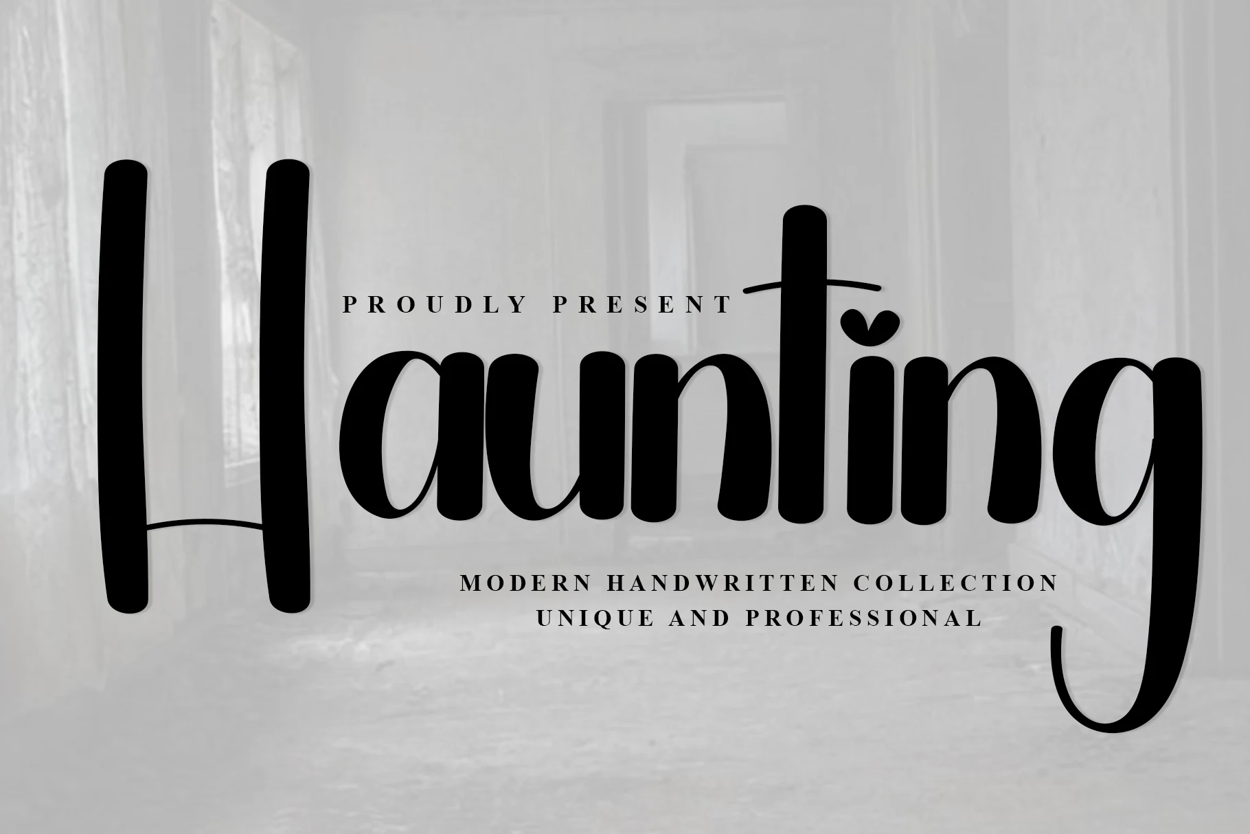
Best For: logos, branding, personal branding, editorial designs
Haunting Font uses tall vertical strokes, rounded monoline curves, and an unusually long descender that gives the word a clean but slightly mysterious profile. The heart-shaped dot softens the structure, while the elongated proportions keep it readable among modern Handwritten Fonts.
Set it with generous side margins so the high stems and sweeping terminal on the final letter do not feel cropped. Its steady rhythm works well for boutique wordmarks, editorial headers, and social signatures where a minimal layout can let the bold black shapes carry the hierarchy.
Kantilone Font
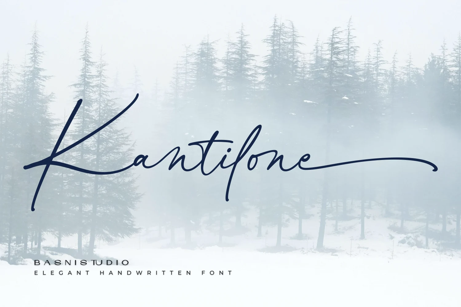
Best For: logos, wedding designs, editorial designs, high-end designs
Kantilone Font has a light, elegant script structure with long ascending strokes, narrow proportions, and a smooth cursive flow that feels poised rather than decorative. The sweeping capital and extended finishing stroke give it the polished presence many designers look for in Handwritten Fonts with a refined, signature-like character.
Its thin lines read best when the font has room to stretch, so wider layouts and shorter wording suit it better than dense text blocks. For logos, invitations, or editorial headers, keep contrast clean and surrounding typography restrained so the graceful connections and elongated terminals stay crisp.
Spring Spirit Font
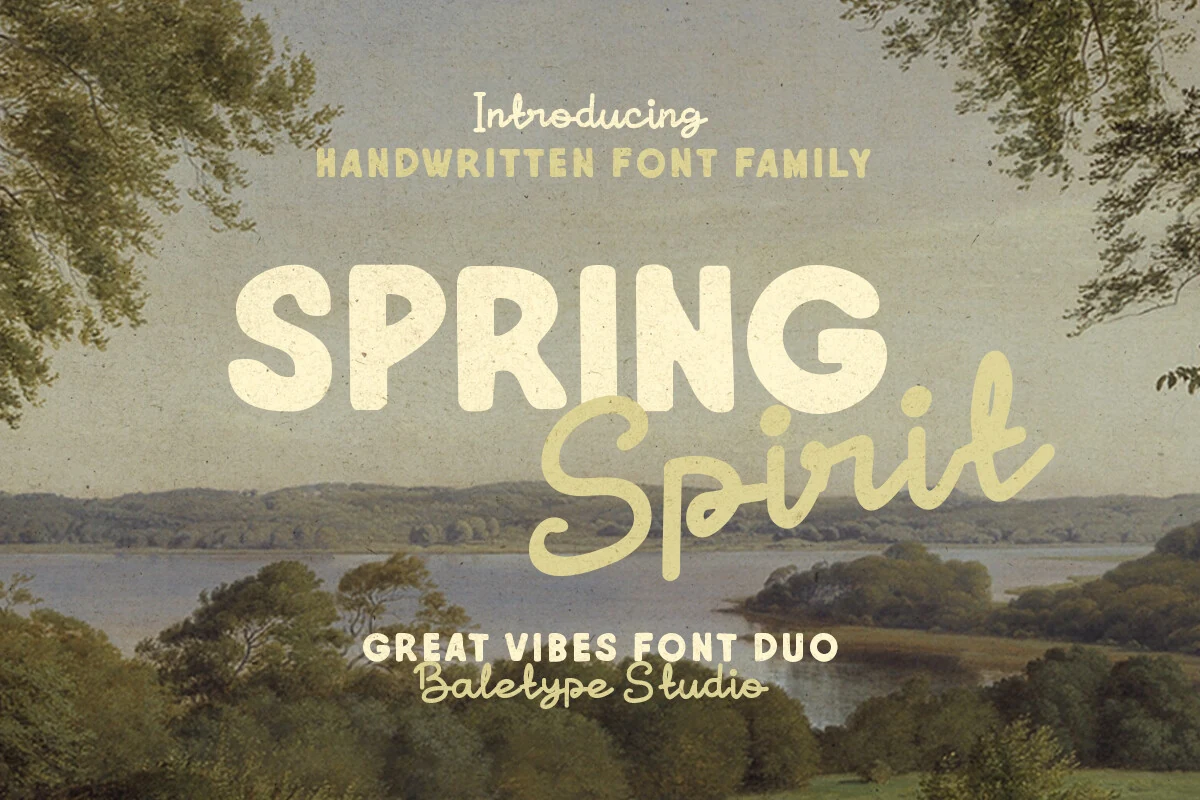
Best For: logos, branding, quotes, retro designs
Spring Spirit Font pairs a chunky rounded sans with a loose monoline script, creating a ready-made contrast between solid headline weight and casual handmade movement. The bold capitals feel warm and slightly retro, while the script adds a relaxed rhythm that fits naturally within expressive Handwritten Fonts.
The duo works best when the sans carries the main word and the script acts as the accent line. Keep the hierarchy obvious, avoid crowding the script under heavy letters, and use the mixed proportions for logotypes, quotes, or nostalgic branding that needs a friendly outdoor feel.
Better Together Font
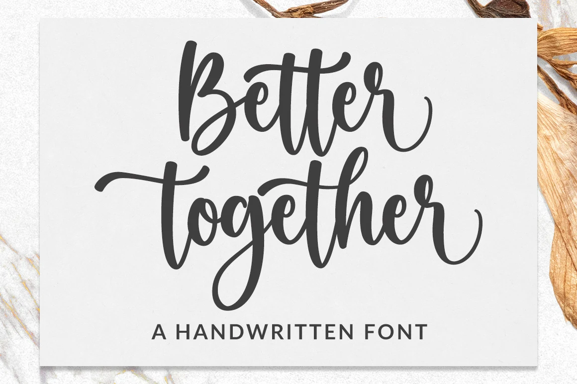
Best For: logos, branding, quotes, social media graphics
Better Together Font has rounded monoline strokes, tall looped ascenders, and broad curves that keep the script soft and easy to read. Its smooth rhythm and open counters give it a warmer, more approachable feel than many Handwritten Fonts, making it expressive without becoming fussy.
The long cross-strokes and curled exit swashes work especially well in short phrases where the lettering can do most of the visual work. Pair it with a simple supporting typeface and leave a little space around the capitals so the loops and descenders stay clean in logos, quotes, and branding layouts.
Western Font
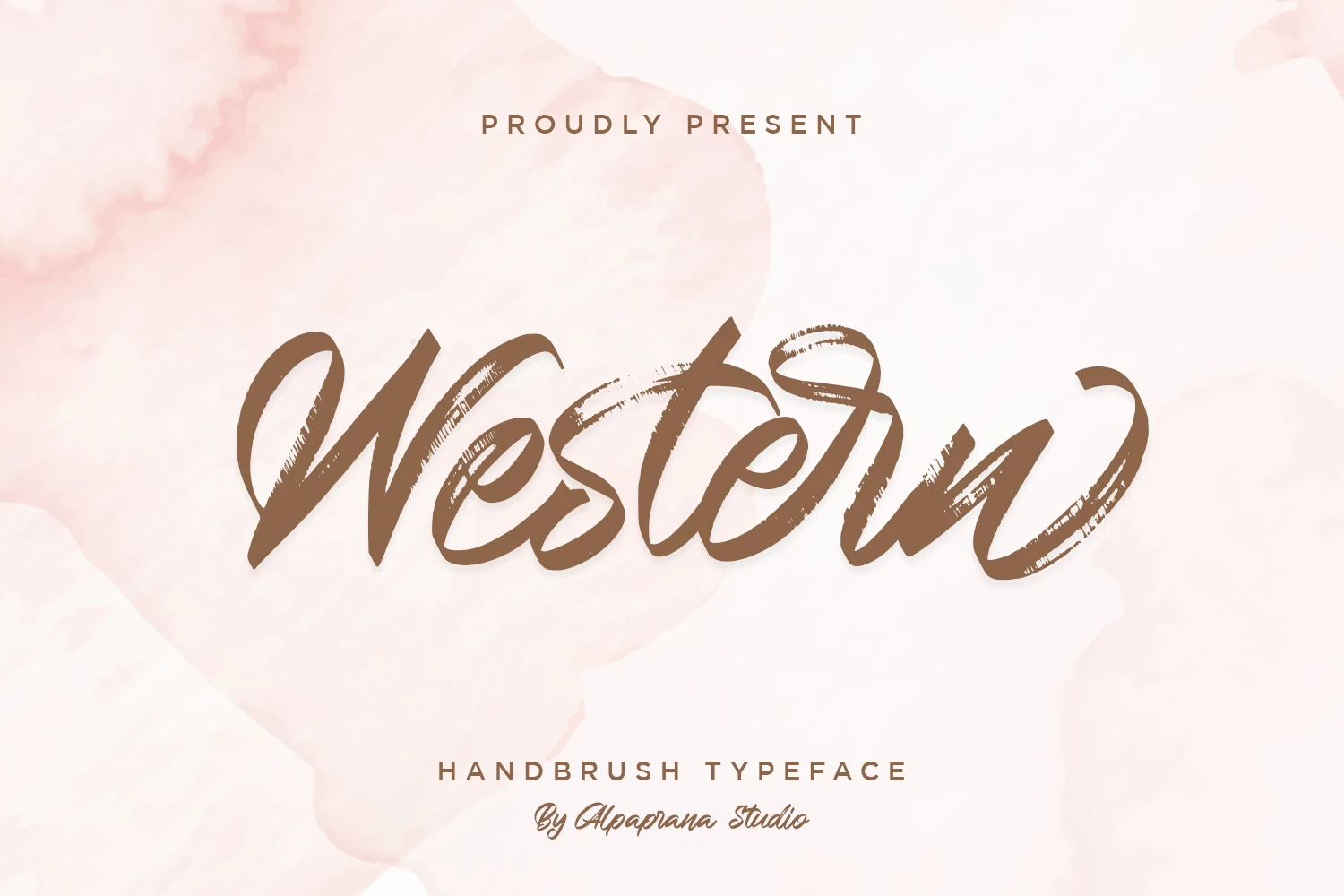
Best For: invitations, wedding designs, romantic designs, branding
Western Font has a brushed script style with wide pressure changes, rough dry-brush gaps, and angled strokes that give each word a handmade sweep. Its loose connections and looped terminals keep it expressive, placing it among Handwritten Fonts with more texture and motion than a clean monoline script.
Use it for short romantic wording where the brush texture can stay visible. Strong contrast helps the broken strokes read clearly, while generous spacing around the first and last letters prevents the curved entry and exit marks from feeling cramped in invitations, cards, and personal branding.
Sweet Nook Font
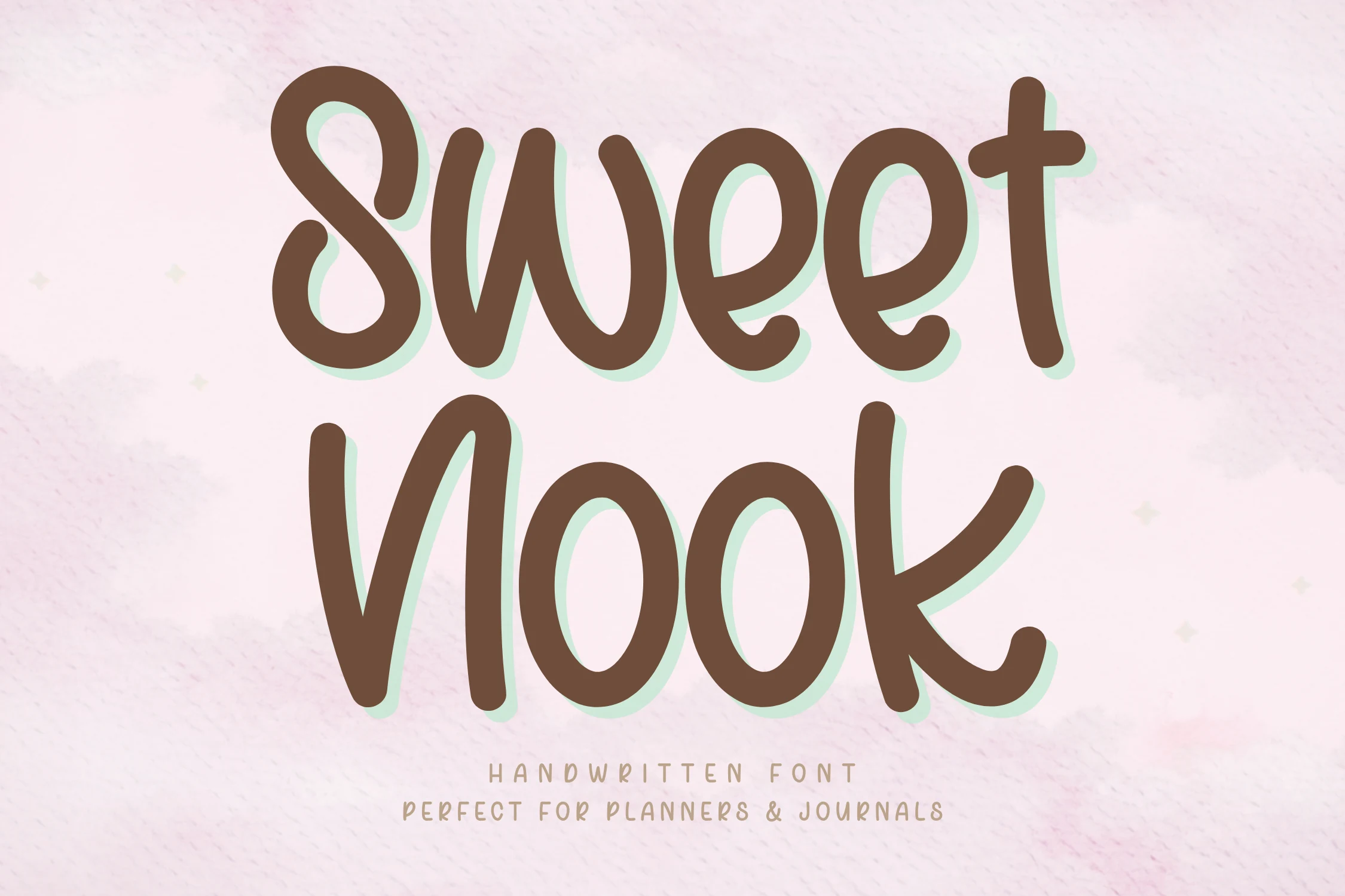
Best For: quotes, stickers, children’s designs, cute designs
Sweet Nook Font has a cheerful handwritten look built from thick rounded strokes, soft terminals, and roomy counters that keep each letter open and friendly. Its upright rhythm and smooth curves give it the cozy personality people often want from Handwritten Fonts, while the simple shapes keep words easy to read at a glance.
The big advantage here is clarity: even in playful layouts, the letters stay clean instead of turning messy. It works especially well in short stacked wording, labels, and journal-style graphics, and a little extra line spacing helps the tall forms and wide curves feel relaxed rather than crowded.
Dexotick Font
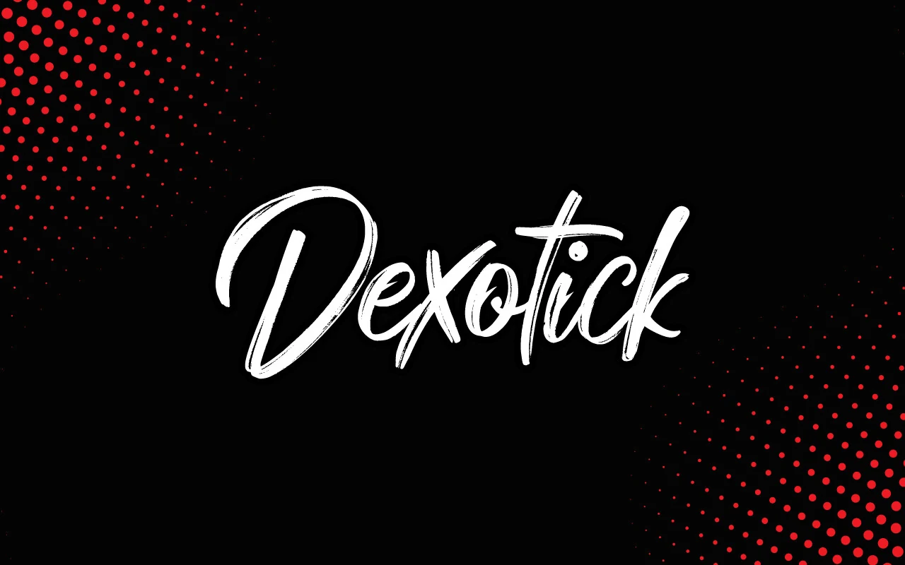
Best For: logos, posters, social media graphics, bold designs
Dexotick Font has a sharp cursive brush style with dry streaks, angled joins, and quick directional changes that make the word feel energetic. The oversized capital and tight inner curves give it more edge than softer Handwritten Fonts, while the connected flow keeps the lettering unified.
Use Dexotick where one strong word needs to sit at the center of the design. Its scratchy texture needs contrast to stay visible, and the narrow gaps inside letters like “x” and “o” work best at display sizes rather than in small captions or dense text blocks.
Handwritten Font Collection Font
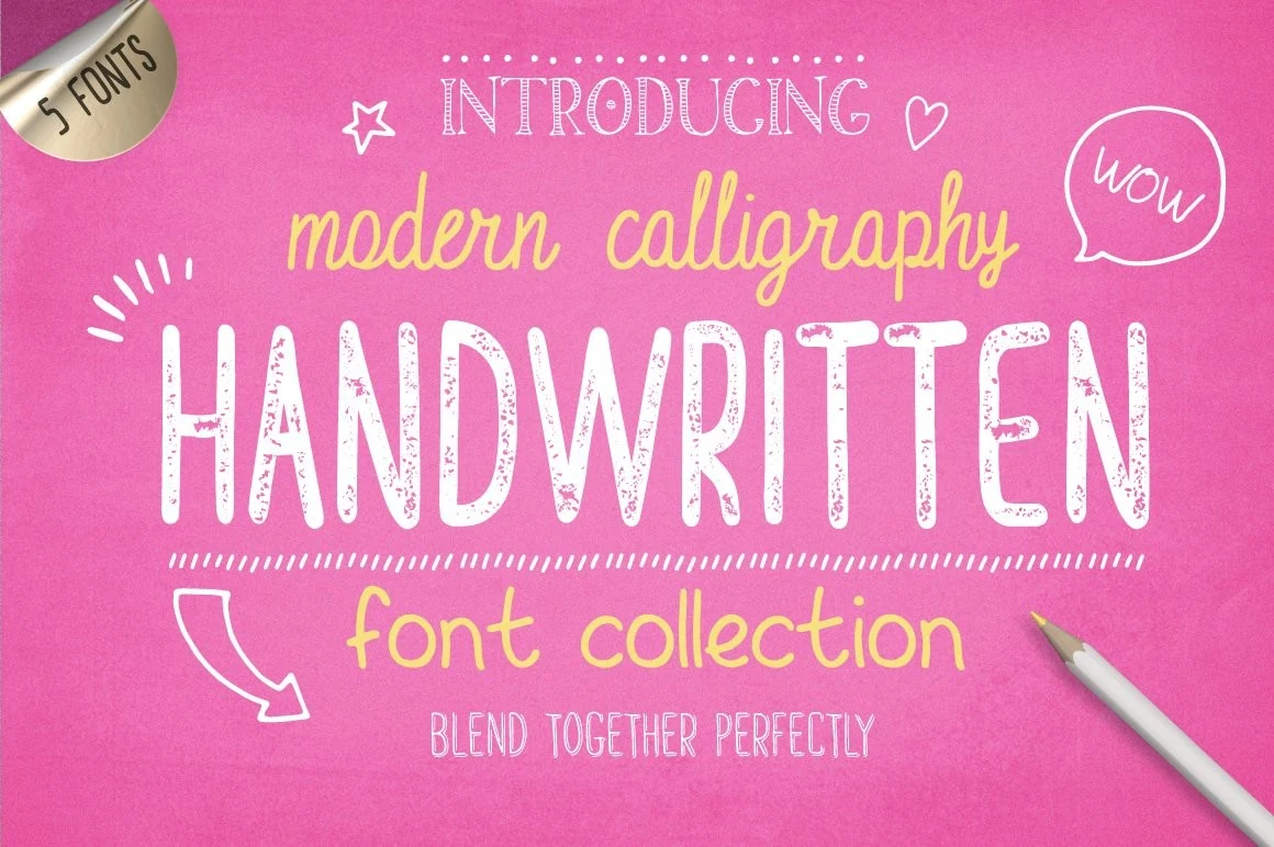
Best For: social media graphics, quotes, stickers, playful designs
Handwritten Font Collection Font has a cheerful mixed-style look, pairing tall textured caps with a loose rounded script and lighter accent lettering. That contrast gives Handwritten Fonts a more built-in layout system, so headlines, highlights, and side notes can feel coordinated without looking repetitive.
The set includes five hand-drawn fonts plus five alternative styles, which makes it easier to layer a main title with a softer secondary line in the same visual voice. Use the bolder condensed style for emphasis and let the casual script handle supporting words, especially in quotes, stickers, and bright social graphics.
Disney Font
Best For: invitations, product labels, headlines, playful designs
Disney Font is a bold cursive display script with a heavy looped capital, rounded connected letters, a heart-shaped dot, and a long top flourish that frames the word. The thick black strokes make it more playful than delicate, giving Handwritten Fonts a strong title-ready look with clear letter separation.
Treat it as a short-word font: the oversized capital, deep descender, and sweeping upper stroke need open margins so they do not crowd the layout. It works best where the lettering can become the main graphic element, especially on invitations, food labels, and cheerful title designs.
Earthgate Font
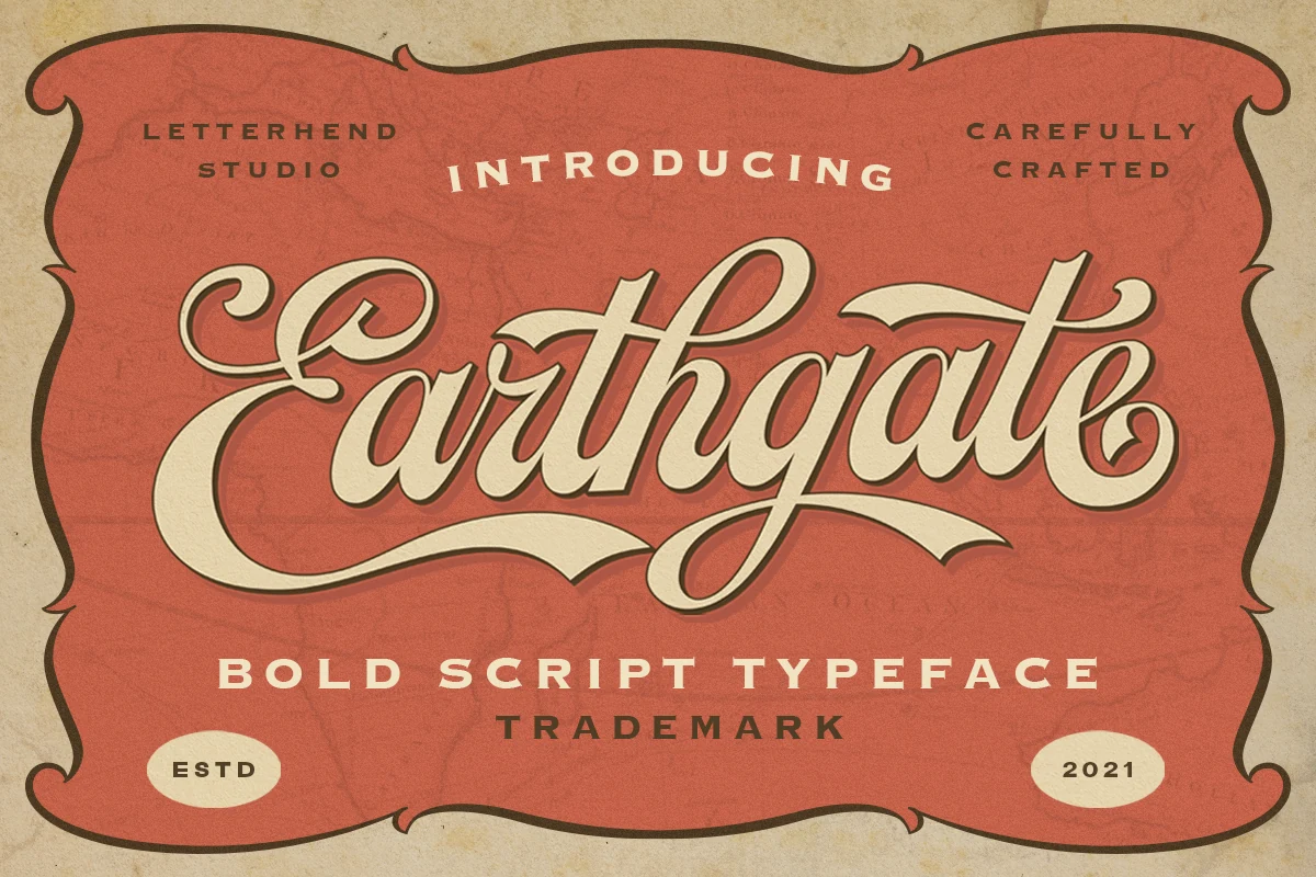
Best For: logos, branding, headlines, retro designs
Earthgate Font has a bold connected script structure with thick strokes, looped capitals, and long sweeping swashes that push the wordmark forward. Its retro rhythm gives Handwritten Fonts a stronger sign-painter feel, especially where the heavy curves meet sharp, angled terminals.
Use it where the font can own the title hierarchy: logos, headers, badges, and nostalgic packaging layouts. The extended entry and exit strokes need horizontal space, so tighter compositions work best with short words, controlled letter spacing, and enough contrast around the script to keep the inner counters readable.
Estarossa Font
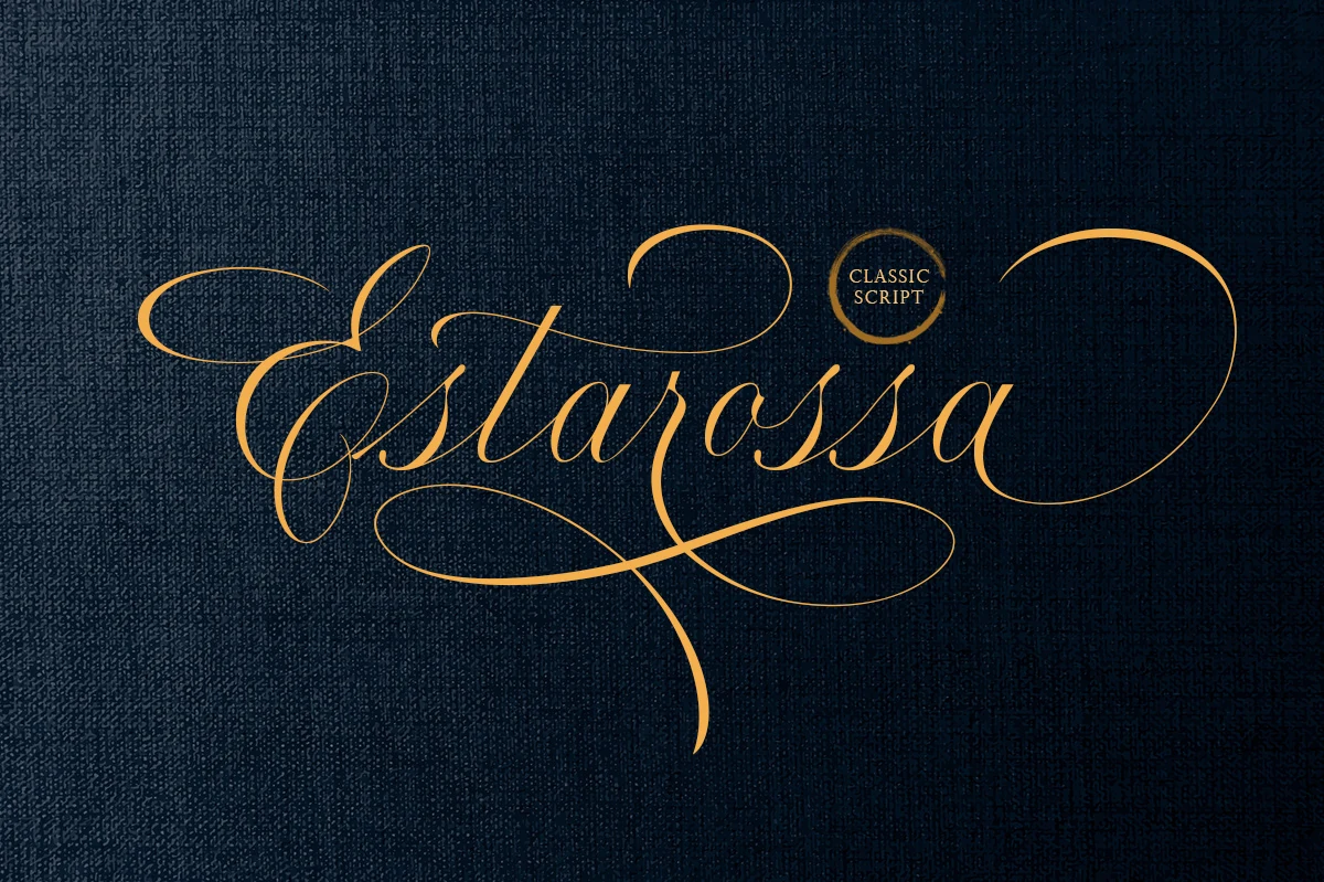
Best For: logos, invitations, beauty branding, luxury designs
Estarossa Font is a refined script with whisper-thin upstrokes, smooth contrast, and extravagant swashes that stretch far beyond the word. Its narrow italic rhythm and looping capitals give Handwritten Fonts a more formal, dressy tone, with the kind of movement that feels tailored rather than casual.
It shines best in short names and signature-length lines where the flourishes have room to breathe. For branding or invitation work, keep the surrounding layout restrained and let the script carry the hierarchy; too much nearby detail can compete with its long terminals and delicate inner spaces.
Ladybug Font
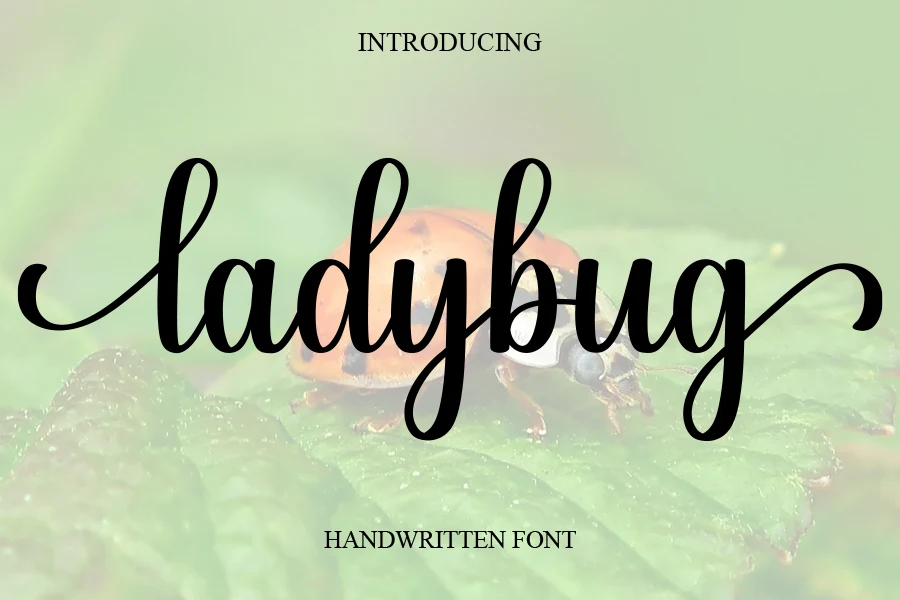
Best For: logos, branding, wedding designs, romantic designs
Ladybug Font is a smooth cursive script with rounded downstrokes, tall looped ascenders, and curled entry strokes that give each word a soft handmade flow. Its connected rhythm keeps the lettering readable while still bringing the relaxed charm expected from Handwritten Fonts.
The font works best in short names, logo marks, wedding details, and feminine branding where the long side flourishes can frame the composition. Keep the spacing open around the wordmark and avoid cramped edges, since the extended swashes need room to stay graceful instead of tangled.
Reflisatta Font
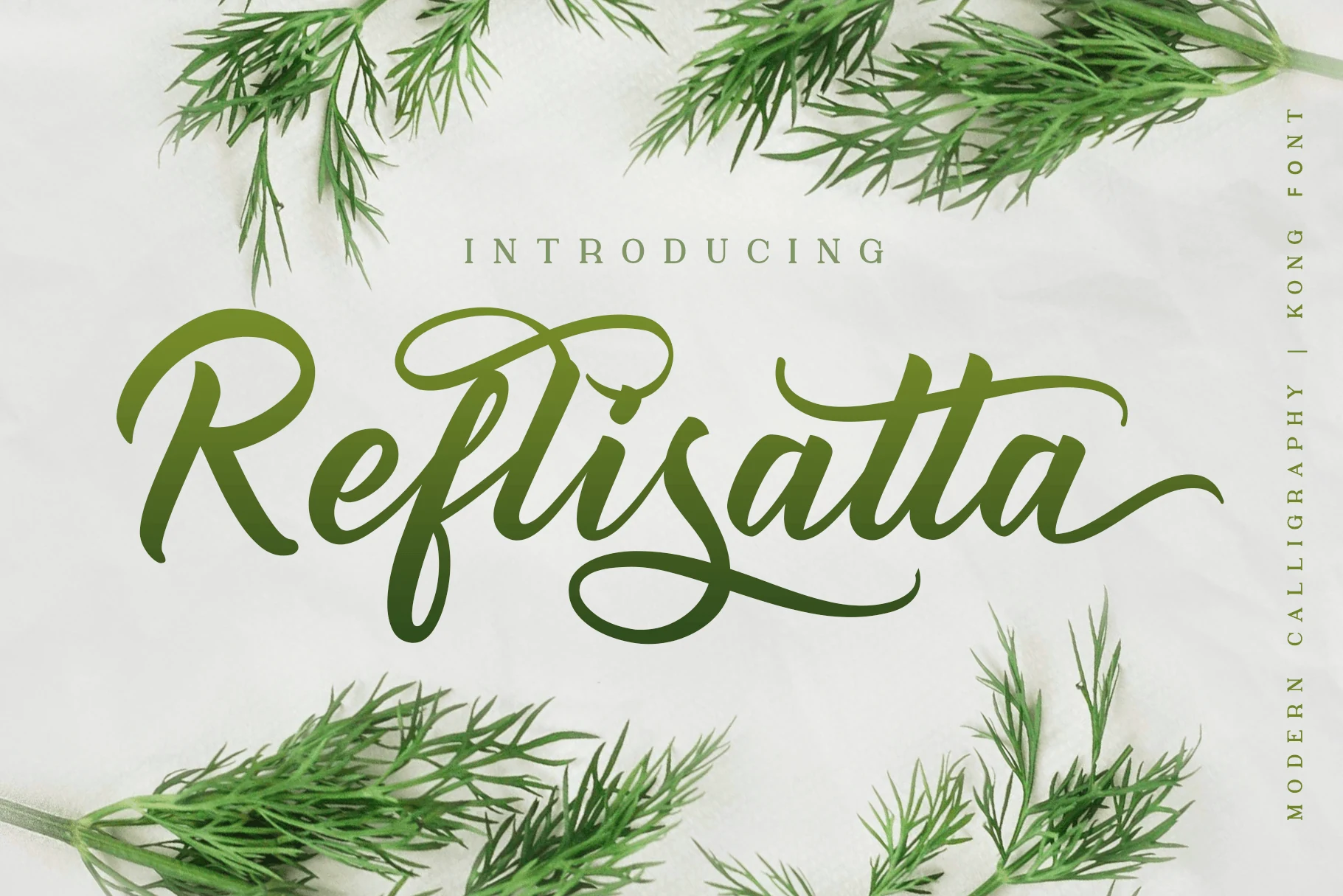
Best For: logos, branding, social media graphics, playful designs
Reflisatta Font has a buoyant brush-script feel, with broad downstrokes, rounded joins, and generous loops that keep the lettering lively without turning messy. The capitals sweep wide while the lowercase stays open and readable, giving Handwritten Fonts a fresh, upbeat character with real display presence.
It works especially well for short branding lines, labels, and social graphics where you want movement without losing legibility. The long entry and exit strokes need a bit of breathing room, so tighter layouts are easier to manage when you keep the phrase short and let simpler supporting text handle the smaller information.
Cyber Brush Font
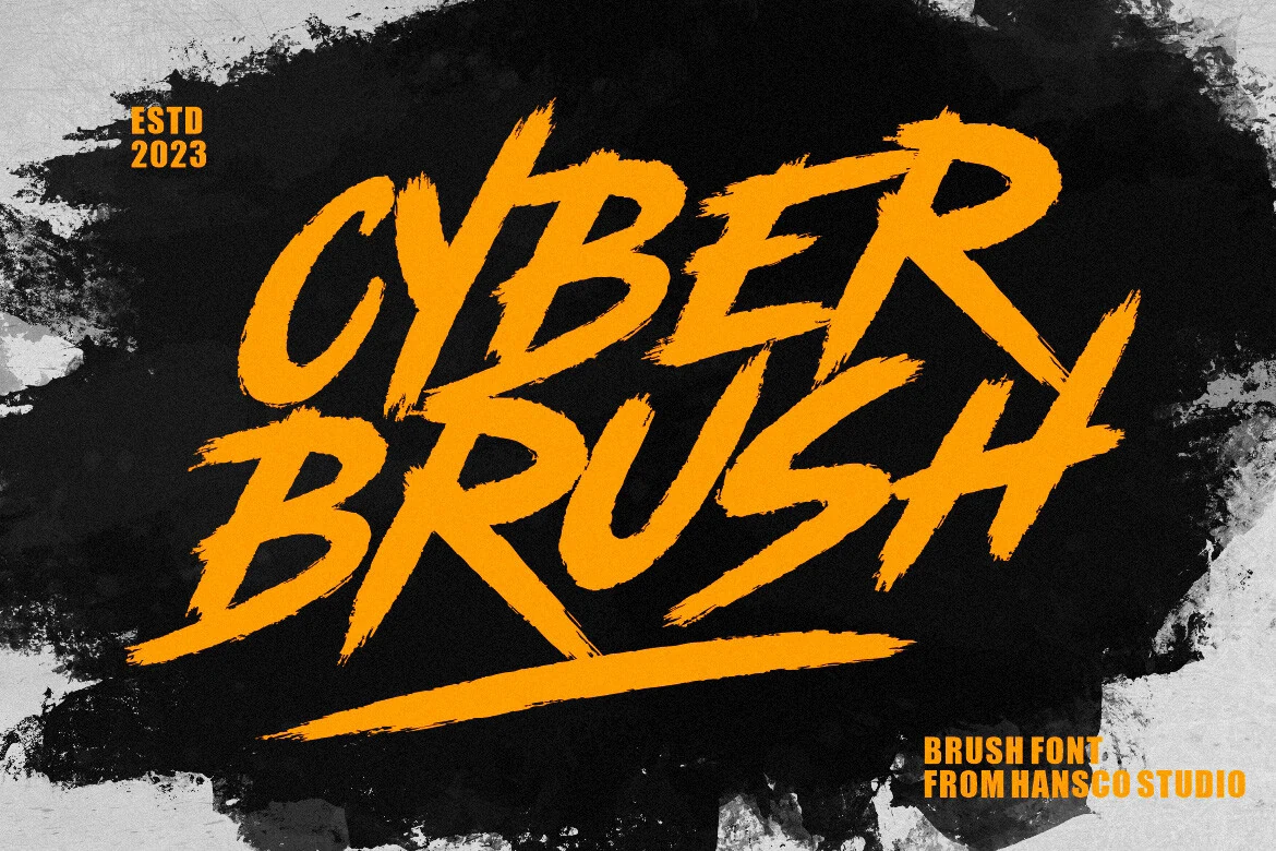
Best For: logos, branding, posters, T-shirts
Cyber Brush Font is an all-caps brush display style with jagged edges, slanted strokes, and a dry texture that makes each letter look fast and abrasive. Its heavy forms give Handwritten Fonts a louder, more action-driven direction, especially in short words where the torn bristle detail stays visible.
Use it for posters, shirt graphics, product branding, and logo marks that need impact rather than polish. The rough stroke endings already create strong motion, so it works best with simple supporting type, high contrast, and enough scale for the texture to read instead of turning into visual noise.
Wedding Signature Font
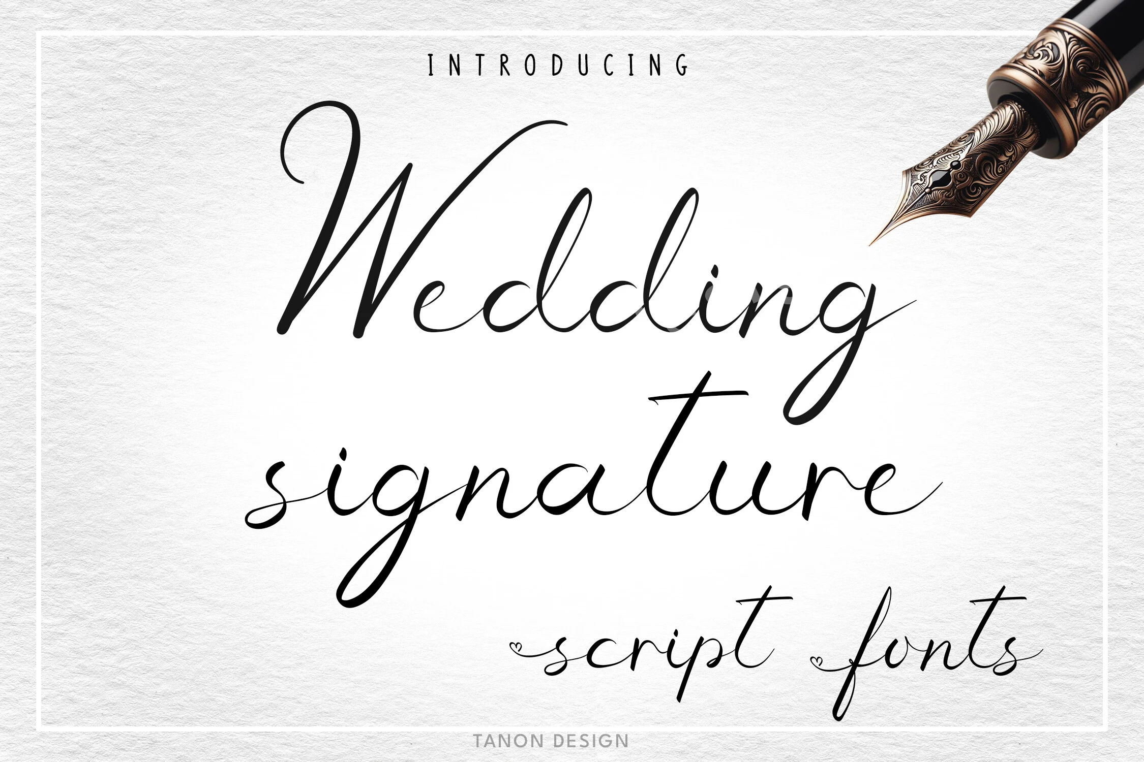
Best For: invitations, wedding designs, logos, personal branding
Wedding Signature Font is a light calligraphy script with long ascenders, narrow proportions, and smooth monoline flow that keeps the letters elegant rather than ornate. The airy spacing and delicate loops give Handwritten Fonts a refined signature look, especially in names and short phrases where the line quality stays crisp.
It works best for invitations, logos, cards, and other display uses where the text can sit cleanly on its own. Because the strokes are fine and the capitals rise tall, it benefits from generous white space and clear contrast, while smaller supporting details are better handled by a simpler companion font.
Retro Vintage Font
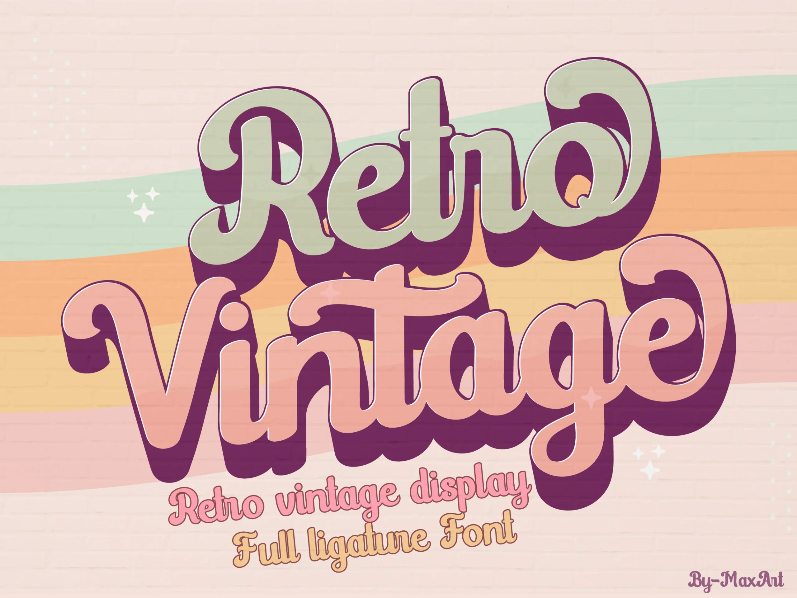
Best For: logos, branding, posters, retro designs
Retro Vintage Font has a chunky display-script shape with swollen curves, curled terminals, and a stacked rhythm that leans hard into 70s-style lettering. Its rounded forms bring Handwritten Fonts into a bolder retro space, where the letters feel decorative, friendly, and built for immediate title impact.
Use it for logos, social posts, invitations, and nostalgic brand graphics that need a strong centerpiece. The thick strokes and playful curves work best with short wording, clear color contrast, and a simpler secondary font so the display lettering can carry the main hierarchy without crowding the layout.
Spaghetti Font
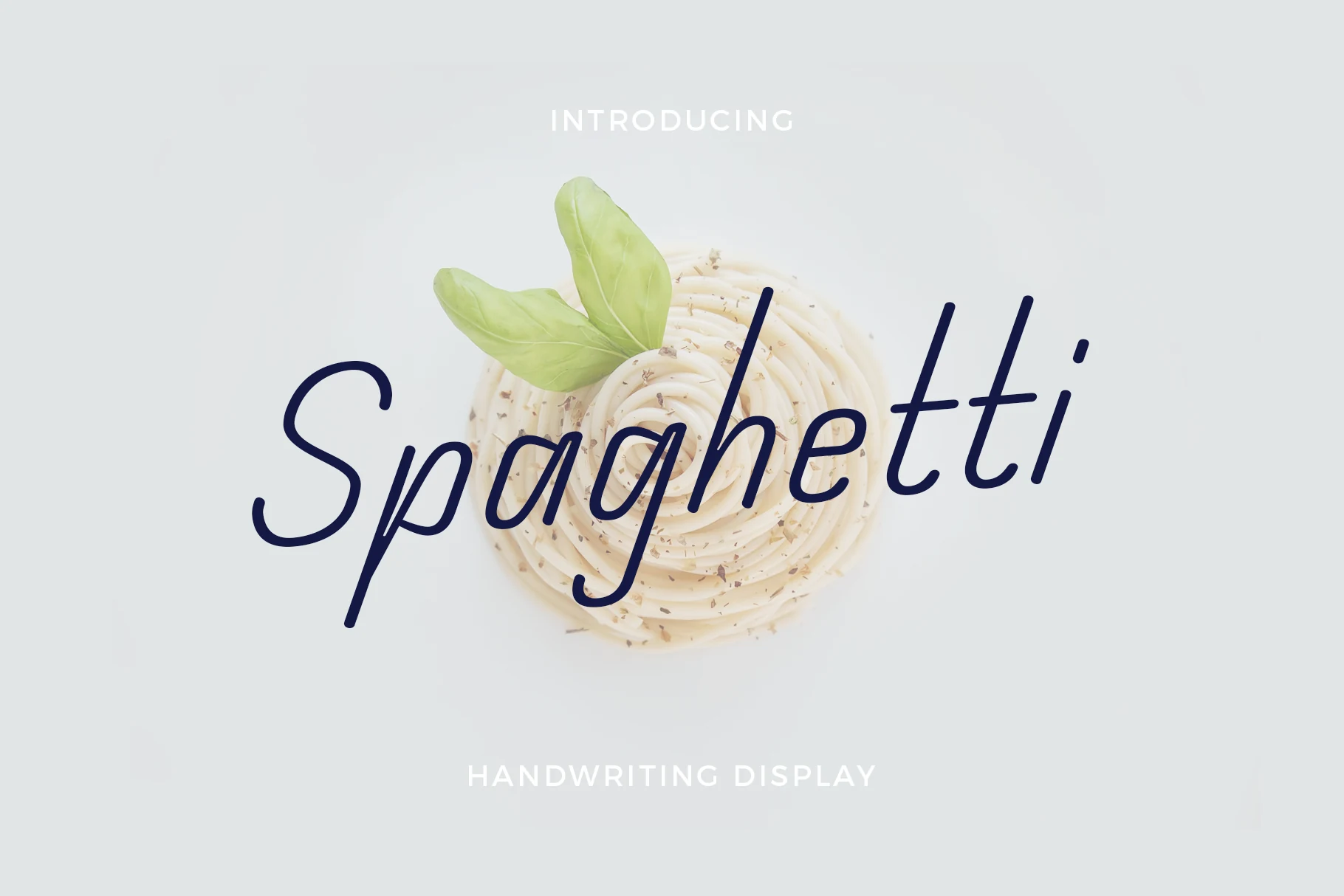
Best For: logos, branding, social media graphics, elegant designs
Spaghetti Font has a light, flowing script with slender strokes, rounded curves, and tall ascenders that keep the lettering graceful without feeling fussy. Its even rhythm gives Handwritten Fonts a cleaner, more understated mood, while the gentle slant helps short words feel relaxed and polished.
It suits logos, packaging accents, and social graphics where a delicate title needs to stay clear at first glance. Because the stroke weight is fine, it performs best at comfortable display sizes with enough contrast behind it, and a simpler companion font will keep the hierarchy tidy when extra text is needed.
Easter Chocolate Font
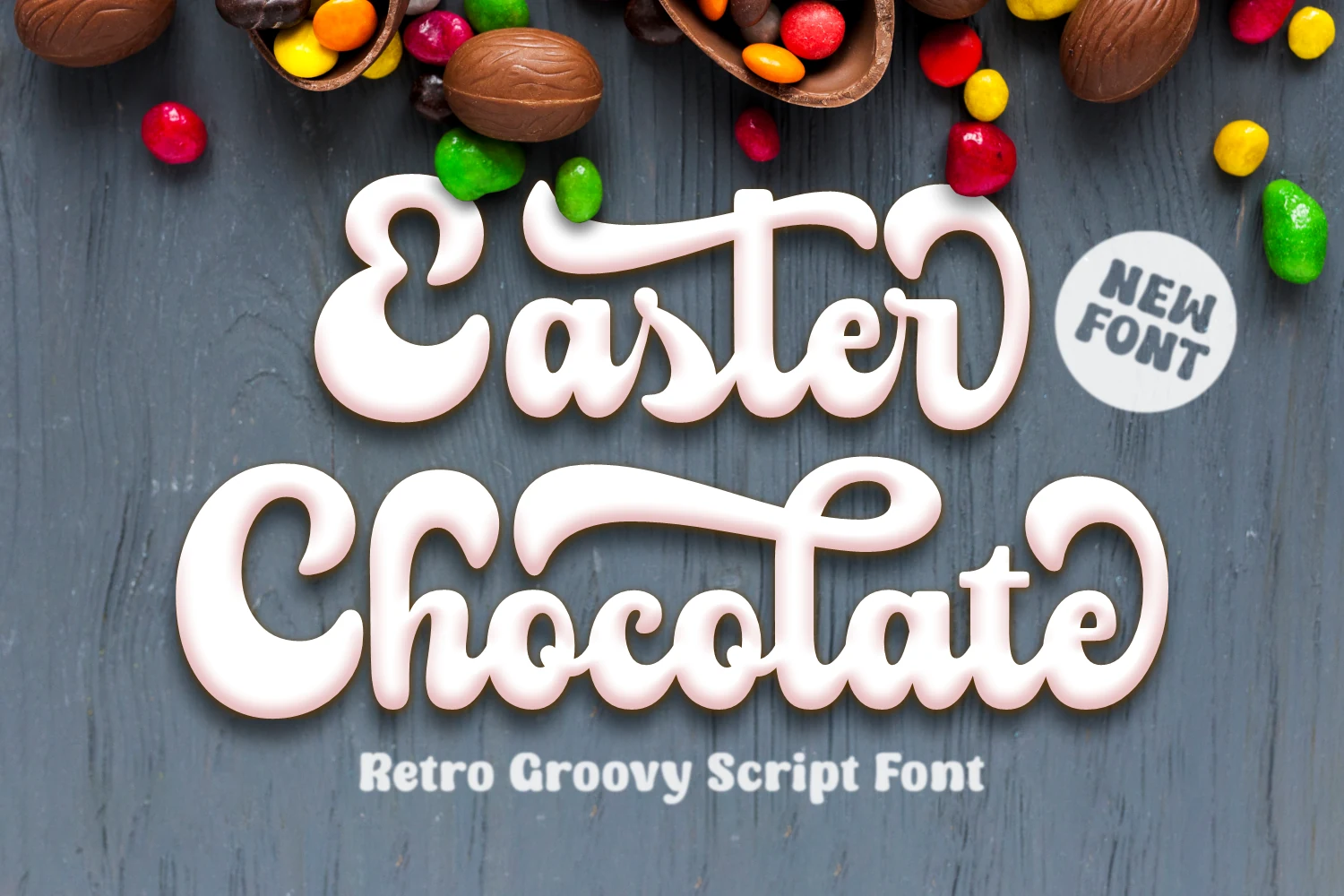
Best For: logos, branding, quotes, retro designs
Easter Chocolate Font has a thick groovy script style with rounded strokes, bulbous curves, and curled terminals that make each word feel soft and playful. Its connected rhythm gives Handwritten Fonts a candy-shop retro mood, with enough weight to hold attention in large logo and headline settings.
Use it when the title needs to feel friendly, bold, and slightly nostalgic rather than delicate. The heavy letterforms work best with short wording, open spacing around the outer curls, and clean supporting text, so the rounded script can stay readable without fighting other decorative elements.
Reflect Handwritten Font
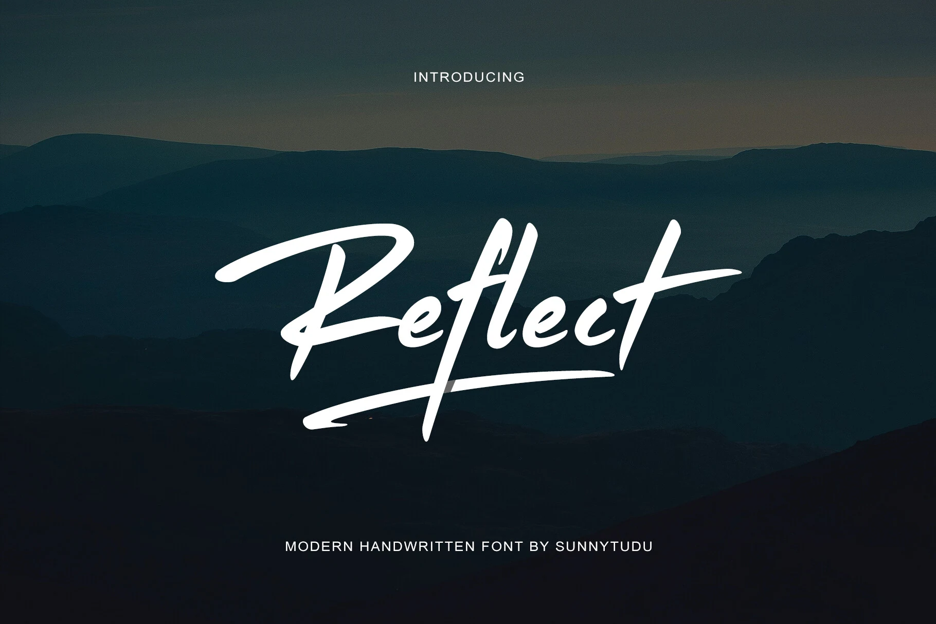
Best For: logos, branding, personal branding, social media graphics
Reflect Handwritten Font has the feel of a fast signature painted in one confident motion. The slightly slanted rhythm, sharp tapering terminals, and sweeping underline give Handwritten Fonts a more assertive, urban edge, while the dry brush texture keeps the strokes human instead of polished.
It works especially well when the wordmark needs to lead the hierarchy on its own. Short brand names, creator marks, and bold social headers benefit from its speed and attitude; pair it with clean secondary text and enough negative space so the long strokes and textured edges stay crisp.
Calestine Calligraphy Font
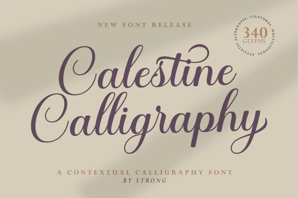
Best For: logos, invitations, wedding designs, elegant designs
Calestine Calligraphy Font has a refined calligraphic rhythm with graceful loops, tapered joins, and moderate stroke contrast that keeps the lettering polished but still warm. Its tall capitals and balanced lowercase shapes give Handwritten Fonts a formal, romantic tone without becoming overly ornate.
Use it for names, invitation headers, boutique logos, and elegant packaging where a single phrase can carry the visual focus. The decorative capitals need enough side space, so keep surrounding text quiet and let a simple serif or clean sans handle smaller details beneath the script.
Simple House Font
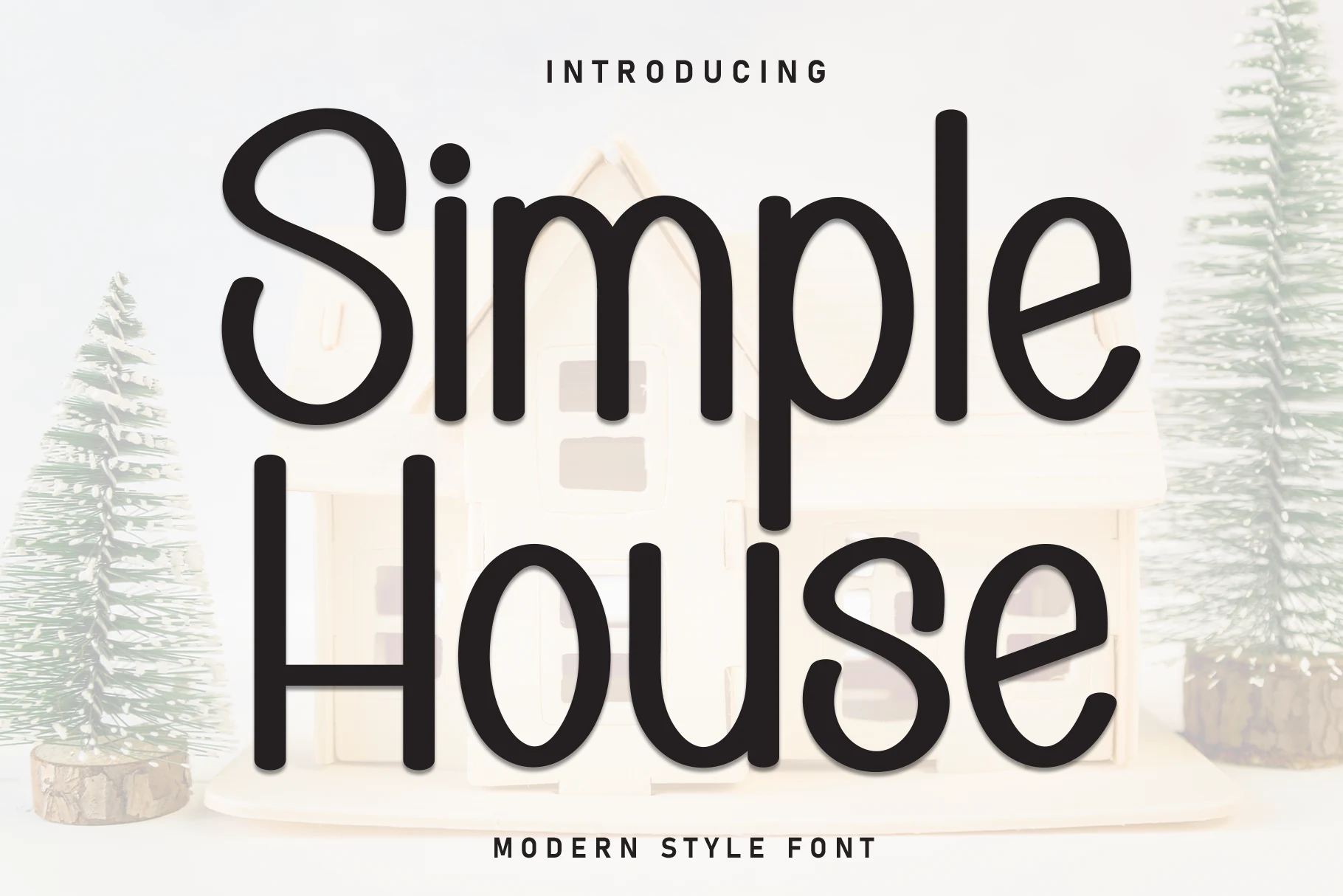
Best For: invitations, children’s designs, fun designs, cute designs
Simple House Font takes a rounded monoline approach, with soft terminals, tall proportions, and open counters that keep every letter clear at a glance. Its clean, friendly rhythm gives Handwritten Fonts a lighter, more approachable feel than a typical script, so it reads playful without looking messy.
That makes it a smart fit for invitations, kids’ designs, labels, and cheerful branding where readability matters as much as personality. The generous letter width works especially well in short titles and names, while a simpler companion font helps longer layouts stay tidy and easygoing.
Whiskey Font
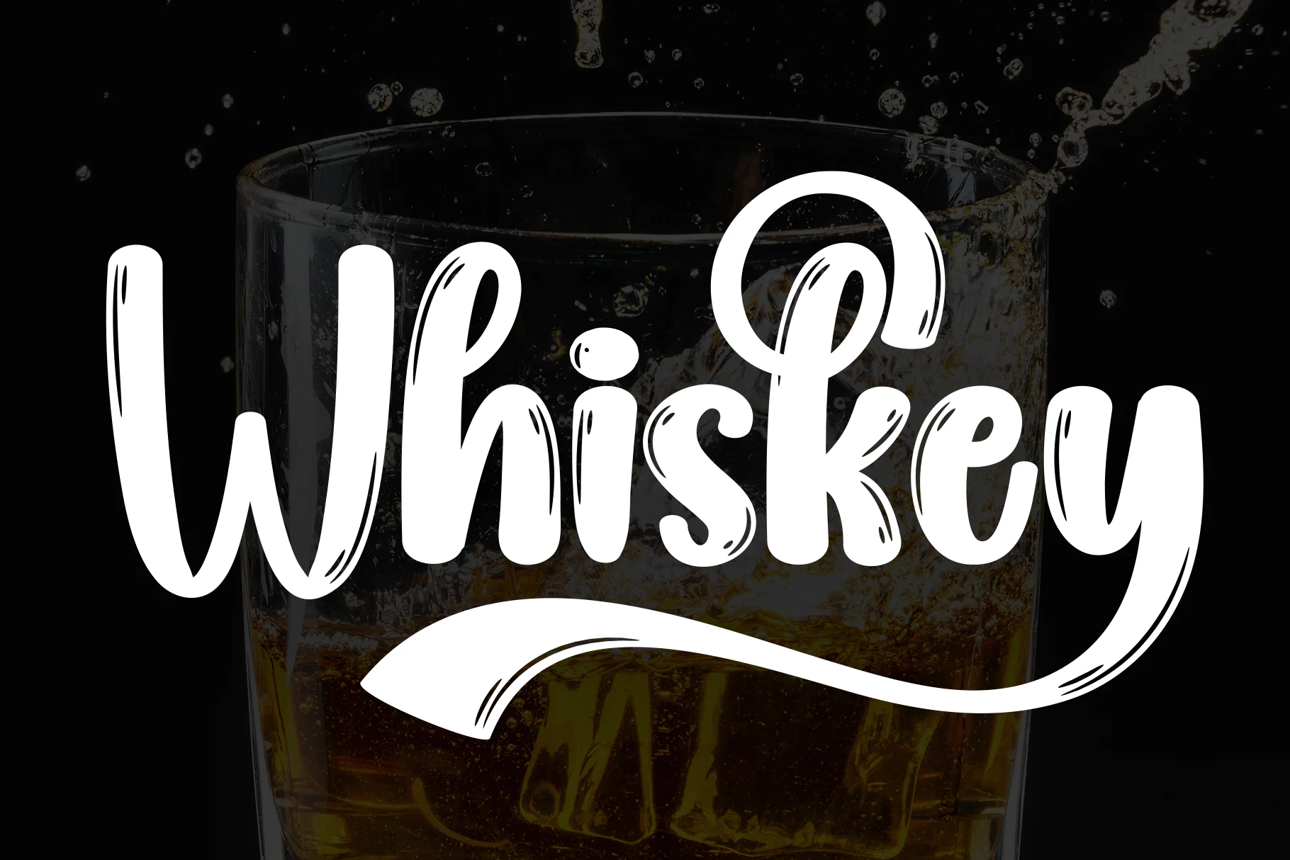
Best For: logos, branding, product labels, restaurant menus
Whiskey Font has a bold rounded script shape with thick vertical strokes, playful loops, and hand-drawn cut marks that add a slightly rustic texture. Its connected forms give Handwritten Fonts a friendly sign-style feel, while the long underline swash makes the wordmark feel complete without extra decoration.
Use it for logos, drink labels, menu headers, and casual branding where the lettering needs weight and personality. The bulky curves hold up well at display size, but longer phrases should be kept controlled; open spacing and strong contrast help the inner sketch details stay readable.
Alexia Bright Font
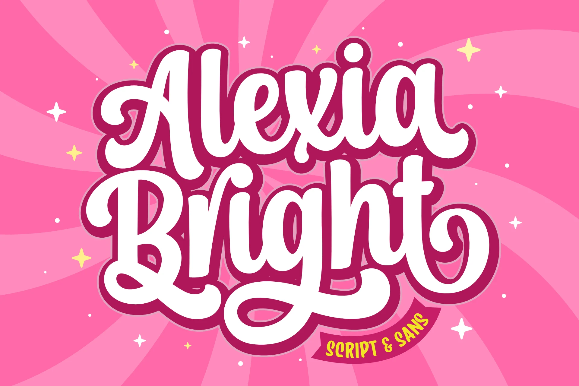
Best For: logos, branding, social media graphics, playful designs
Alexia Bright Font takes Handwritten Fonts in a groovy display direction, with thick rounded strokes, compact counters, and oversized swashes that give the lettering a lively retro bounce. The stacked rhythm feels bold and cheerful, making it more of a statement piece than a delicate script.
Its PUA encoding makes it easier to access extra glyphs and swashes when you want to fine-tune a logo or headline. Use it where the font can carry the layout on its own—short brand names, social graphics, and playful titles benefit most from its broad curves and high-contrast silhouette.
Santa Catalina Font
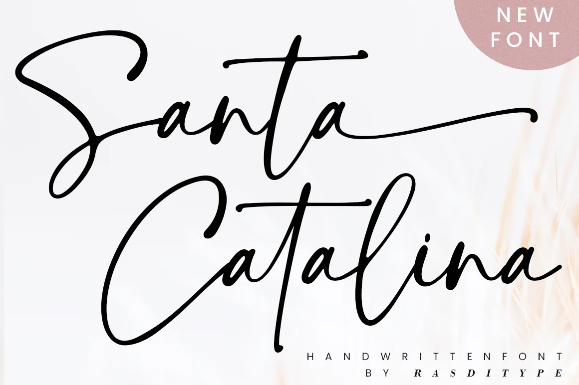
Best For: logos, wedding designs, website headers, personal branding
Santa Catalina Font is a loose signature script with long sweeping entry strokes, tall vertical accents, and thin monoline curves that make each word feel fluid and personal. Its open spacing and extended terminals give Handwritten Fonts a refined modern look without heavy ornament.
Use it for logos, wedding stationery, photography marks, and website headers where the lettering can sit wide across the layout. The dramatic capitals need generous margins, so keep supporting text minimal and let contrast, scale, and clean alignment do the work around the script.
Motherblood Font
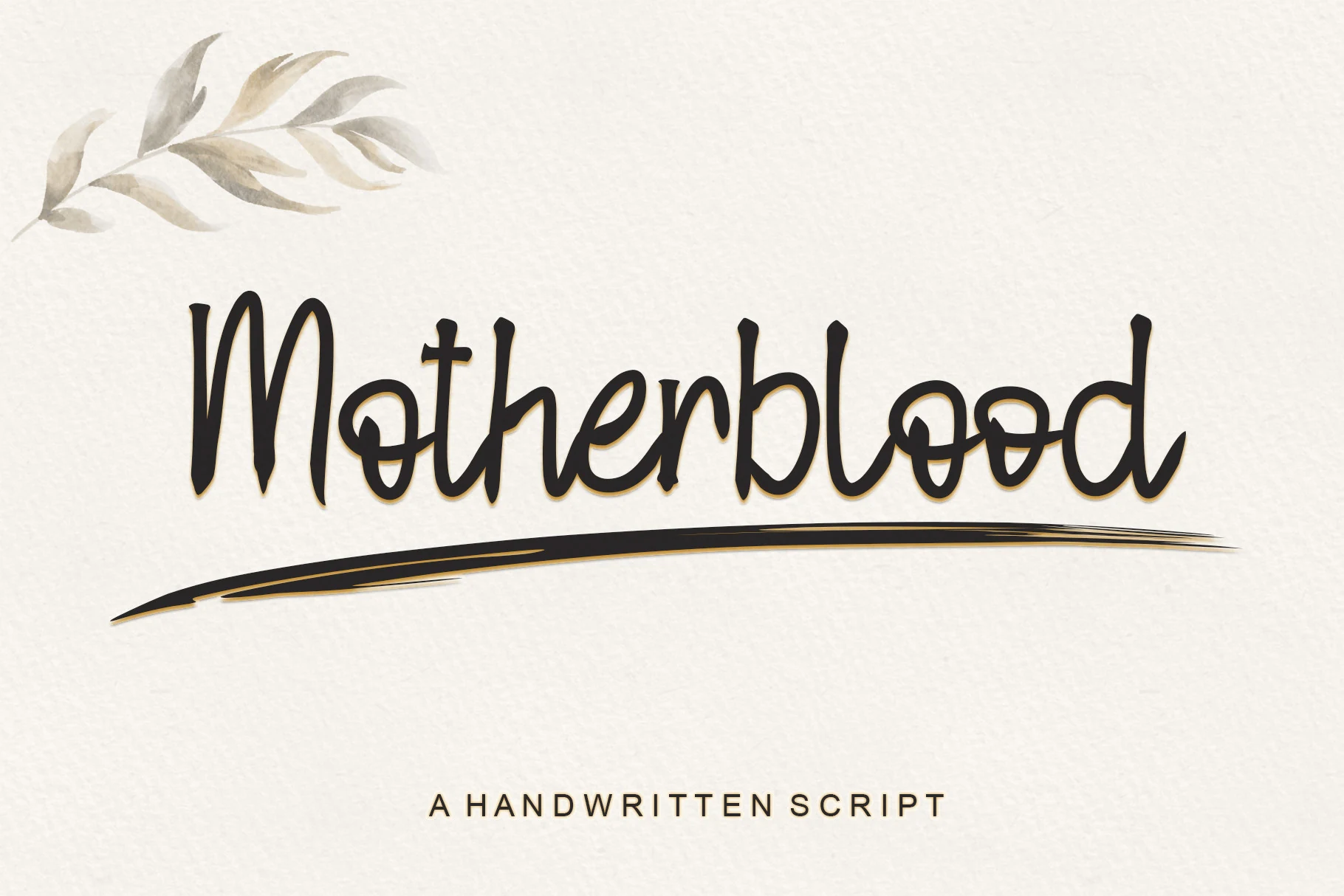
Best For: logos, invitations, quotes, personal branding
Motherblood Font has a casual handwritten rhythm with tall upright stems, rounded loops, and slightly uneven stroke edges that keep the wordmark feeling personal rather than polished. The connected forms are friendly, but the narrow proportions give it enough vertical presence for names, labels, and short title lines.
Use it where Handwritten Fonts need a warm signature feel without heavy flourishes. Keep letter spacing tight, pair it with a simple small-cap or sans serif support line, and give the word itself enough contrast so the thin inner curves stay readable.
Writing Signature Font
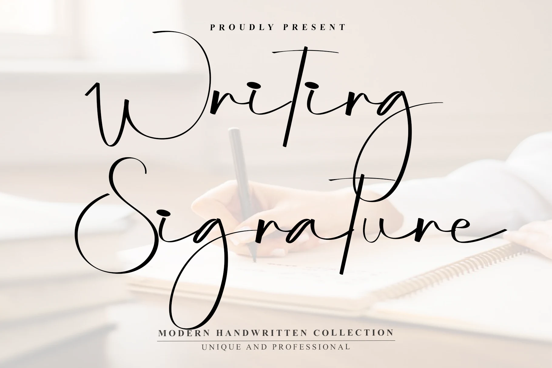
Best For: logos, personal branding, invitations, beauty branding
Writing Signature Font has the kind of airy confidence that works best when the lettering is allowed to lead. Its tall loops, sweeping entry strokes, and buoyant baseline create a polished signature look, while the heavier downstrokes keep it visible instead of disappearing into the layout.
For Handwritten Fonts, this one leans more editorial than casual, especially in logos or cover-style compositions. Use it for short names or two-word titles, and let the long ascenders and descenders overlap open space rather than crowding nearby text, otherwise its elegant rhythm starts to feel cramped.
Photoshoot Font
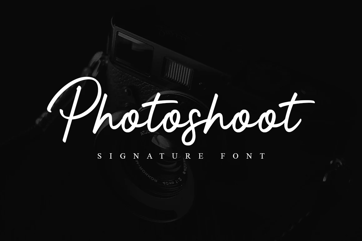
Best For: logos, personal branding, social media graphics, beauty branding
Photoshoot Font is a clean signature script with confident curves, rounded joins, and a strong sweep in the opening capital. The strokes feel smooth and controlled rather than sketchy, giving the lettering a polished personal mark while keeping the word shape easy to recognize.
It fits layouts where Handwritten Fonts need to look stylish without becoming too ornamental. Use it for short names, logo marks, or social headers, and keep enough side margin around the long entry and exit strokes so the script can stretch without pressing into nearby text.
Road Sunshine Font
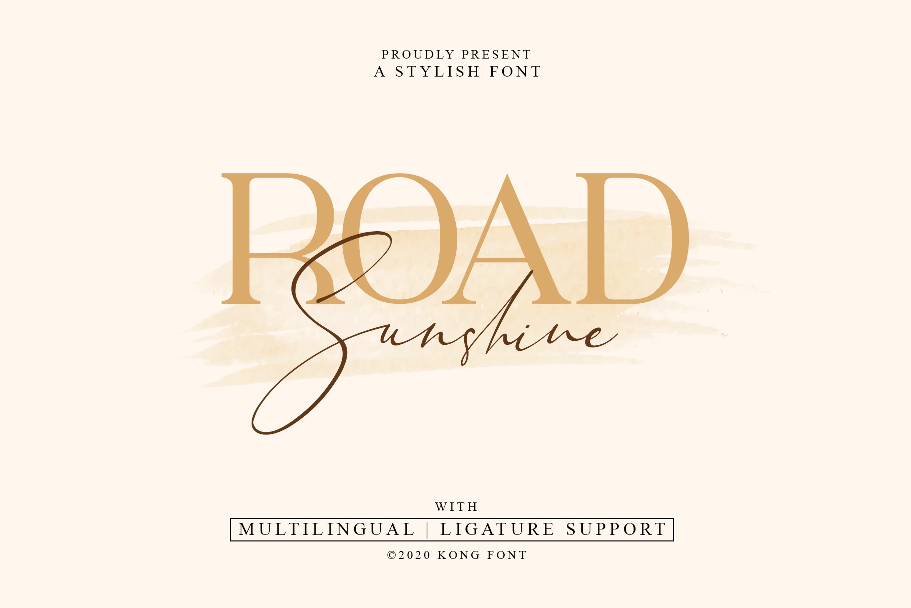
Best For: logos, personal branding, beauty branding, fashion branding
Road Sunshine Font has a slim signature style with a polished, fashion-leaning presence. The script uses light strokes, narrow joins, and a dramatic opening loop on the capital S, while the long finishing lines keep the lettering fluid and airy instead of dense.
In Handwritten Fonts, it works best as a focal accent paired with clean serif or minimalist typography. Use it for short names, titles, or layered wordmarks, and leave enough open space around the sweeping capitals so the crossing strokes stay elegant rather than cramped.
Gient Font
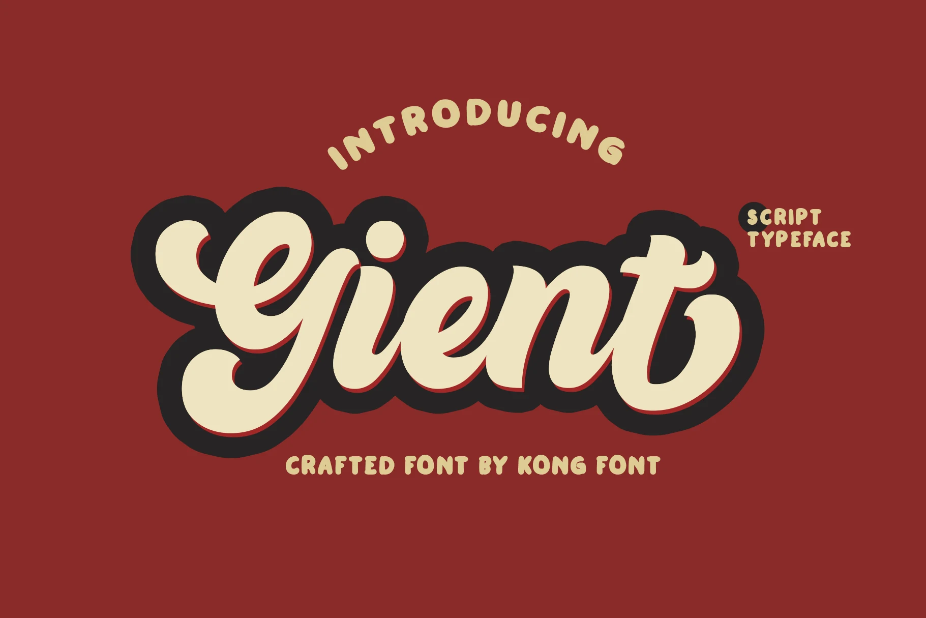
Best For: logos, stickers, T-shirts, posters
Gient Font is a heavy retro script with rounded, inflated letterforms and thick connected strokes. The large looped capital, soft terminals, and tight word shape give it a playful sign-painter feel, while the bold weight makes it strong enough for badge-style graphics and short display words.
Use it when Handwritten Fonts need a fun, high-impact personality rather than a delicate signature look. Keep the wording compact, use strong color contrast, and avoid narrow spacing; the chunky curves need enough room for the counters and overlaps to stay readable.
Beyond Font
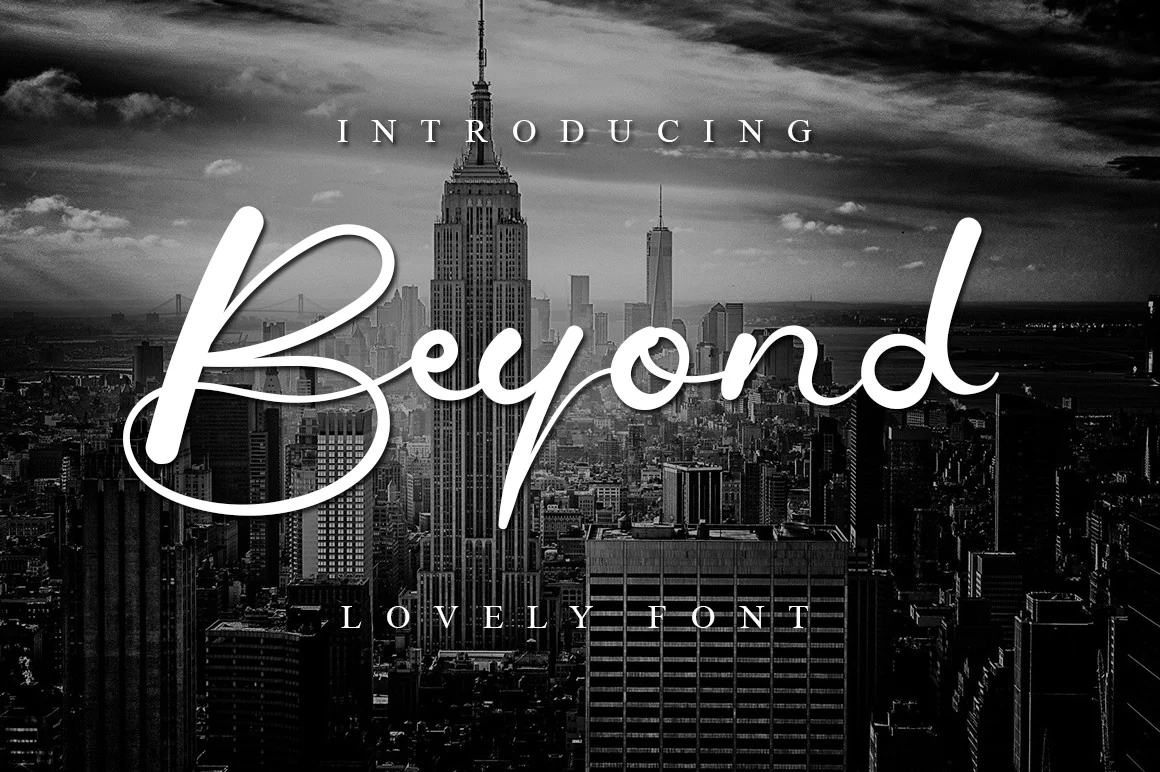
Best For: logos, personal branding, invitations, fashion branding
Beyond Font has a clean signature flow with a tall looping capital B, smooth rounded joins, and long vertical strokes that give it a polished, upscale look. The line quality stays light and even, so it feels elegant rather than ornate, with enough simplicity to sit comfortably over photography or minimalist layouts.
In Handwritten Fonts, this one works best as a featured name or short headline where the sweeping capital can carry the composition. Pair it with spaced serif or sans text for contrast, and give the letters breathing room, especially around the opening loop and final ascender, so the script keeps its crisp rhythm.
Calligraphy Font
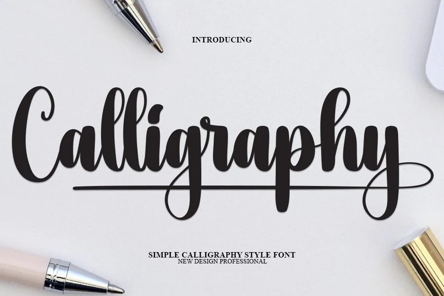
Best For: logos, invitations, product labels, headlines
Calligraphy Font uses thick connected strokes, rounded bowls, and tall looped ascenders to create a strong decorative script. The long underline and extended exit stroke give the wordmark a finished, custom-lettered feel, while the heavy weight keeps the main title readable across invitations, labels, and display graphics.
Use it when Handwritten Fonts need a formal calligraphy mood without becoming too fragile. Keep supporting text smaller and simpler, leave clear space around the underline, and avoid squeezing long phrases because the dense curves and loops work best with short, high-contrast wording.
Sparkle Shine Font
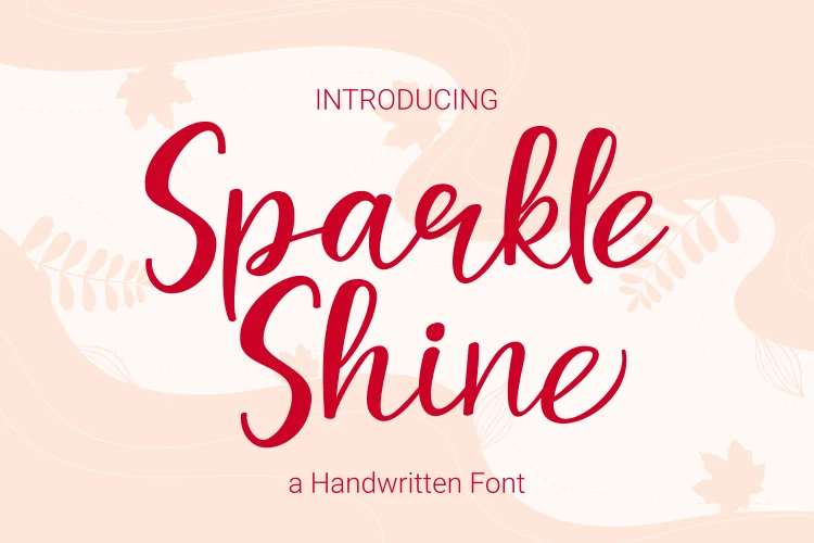
Best For: quotes, children’s designs, fun designs, social media graphics
Sparkle Shine Font has a cheerful handwritten look built from smooth rounded strokes, tall looping ascenders, and open counters that keep each word clear at a glance. The script feels simple and friendly rather than polished, which suits bright quotes, classroom-style headings, and designs that need a personal tone without looking messy.
For Handwritten Fonts, this one works best in short lines where its vertical rhythm can stay crisp. Its PUA support makes swashes and extra glyphs easier to pull into a layout, and a little extra line spacing helps the long stems and curves breathe in teaching materials or playful caption graphics.
Cherry Font
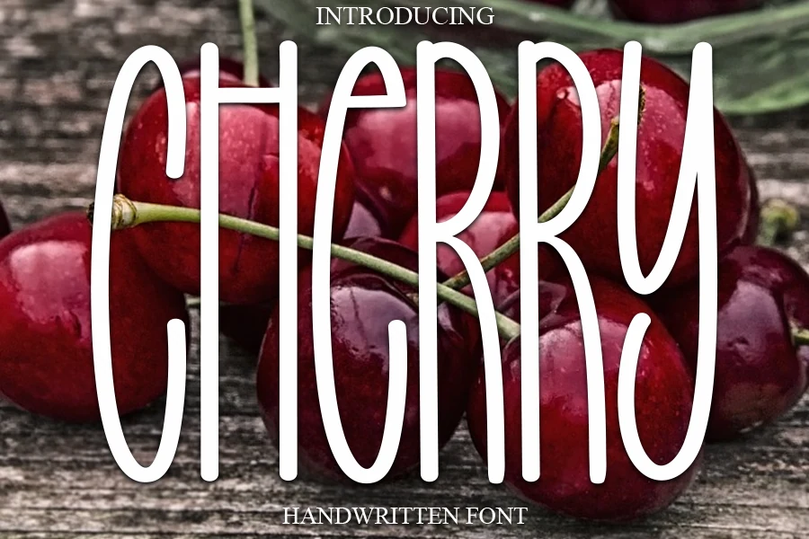
Best For: logos, product labels, packaging, fashion branding
Cherry Font has a tall, narrow handwritten shape with rounded terminals and smooth vertical strokes that make each letter feel stretched but still soft. Its condensed rhythm gives the wordmark strong shelf presence, especially for packaging, labels, and branding where a sweet but simple title needs to stand out quickly.
Use it when Handwritten Fonts need a casual romantic tone without heavy flourishes. Keep phrases short, avoid tight tracking, and place it against strong contrast so the slim counters inside letters like H, E, and R stay open instead of closing up at smaller sizes.
Better Together Font
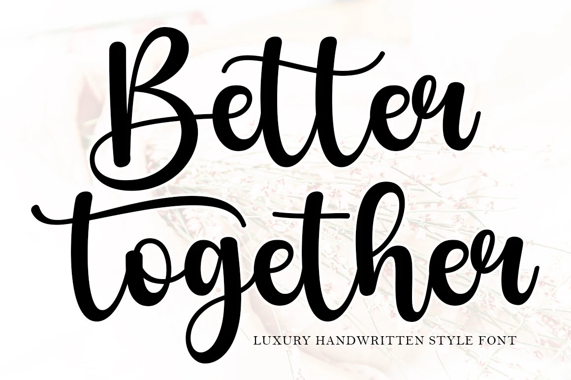
Best For: logos, branding, invitations, quotes
Better Together Font has thick flowing strokes, rounded counters, and generous loops that give it a confident handwritten presence. The oversized capital B and the long sweeping crossbar on the t add a soft luxury feel, while the smooth joins keep the script warm rather than overly formal.
Within Handwritten Fonts, this one works best when the lettering is allowed to lead the layout. Use it for short phrases or names, pair it with restrained serif or sans text, and leave breathing room around the long swashes so the descenders and cross strokes keep their shape.
Handwriting Font
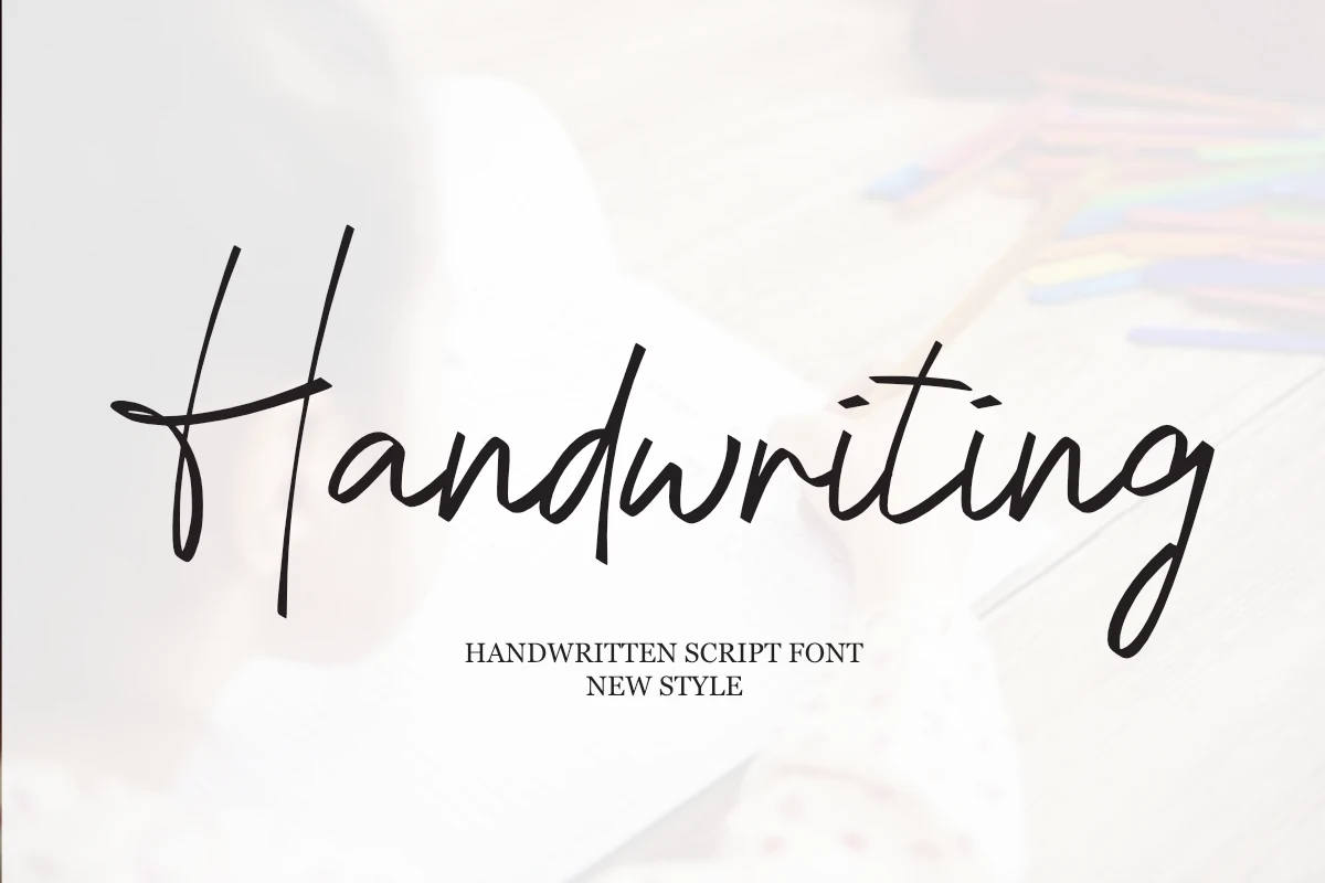
Best For: logos, invitations, wedding designs, fashion branding
Handwriting Font has a slim, modern script shape with long vertical strokes, a stretched H crossbar, and uneven handwritten connections. The letters sit on a loose baseline, giving the word a casual signature rhythm, while the open spacing keeps the thin curves readable in logos, cards, and fashion-led layouts.
Use it when Handwritten Fonts need a relaxed romantic tone without heavy decoration. Keep phrases short, pair it with small serif or clean sans support text, and leave extra space around the tall ascenders and sweeping final g so the lettering does not feel compressed.
Note Paper Font
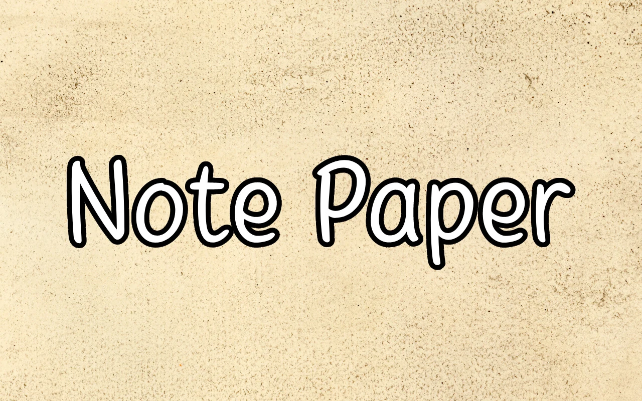
Best For: stickers, children’s designs, headlines, social media graphics
Note Paper Font has rounded monoline strokes, soft corners, and roomy counters that give it a friendly notebook feel. The letters stay upright and evenly weighted, so the playful shape reads clearly even at smaller sizes, which makes it useful for labels, kid-focused graphics, and simple display text.
For Handwritten Fonts, this one leans neat rather than loose, so it works well when you want warmth without messy texture. Keep spacing relaxed and pair it with plain supporting text; the broad rounded forms hold up especially well in short headlines, stickers, or classroom-style layouts.
Strawberry Milkshake Font
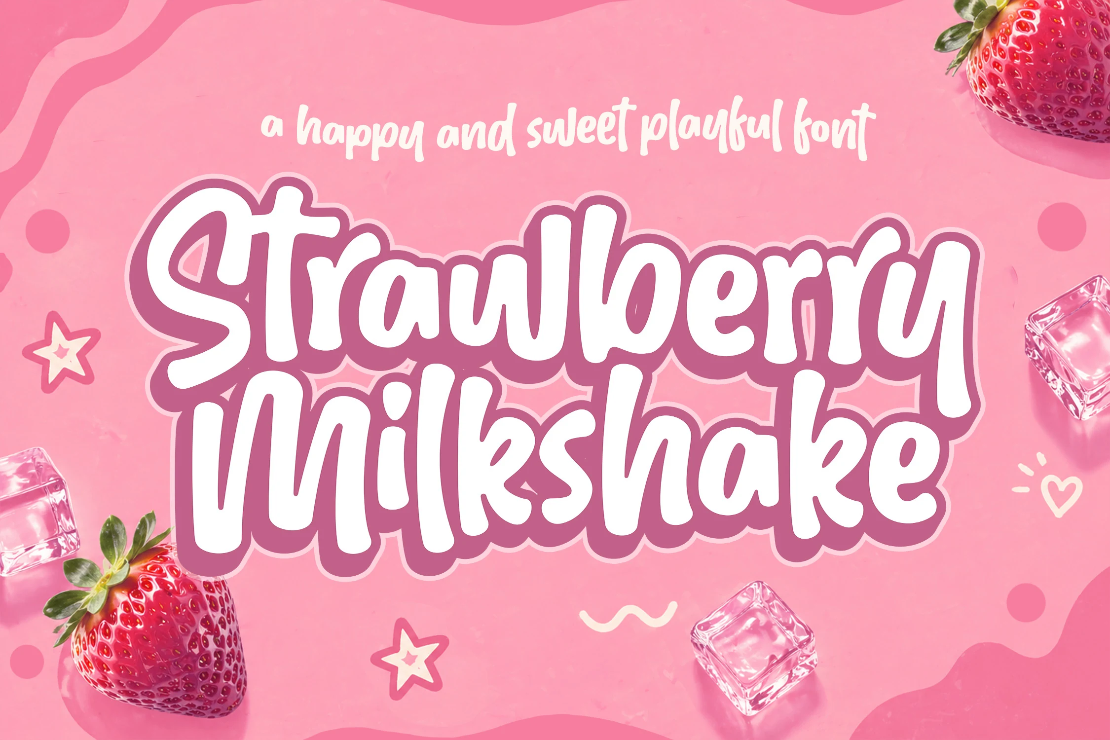
Best For: packaging, product labels, stickers, social media graphics
Strawberry Milkshake Font has a thick, rounded handwritten shape with soft terminals, compact counters, and a bouncy stacked rhythm. The letters feel bold and candy-like rather than delicate, which makes the font strong for packaging, stickers, and playful title graphics that need instant visibility.
Use it when Handwritten Fonts need a sweet, high-impact display voice. Keep the words short, use strong contrast, and avoid tight line spacing; the chunky curves need room around descenders and overlapping strokes so the friendly shape stays readable.
Ready to refresh your next project with more personality? Explore these Handwritten Fonts on Creative Fabrica and choose the styles that fit your logos, invitations, packaging, quotes, and social media designs.
All fonts in this roundup are available through Creative Fabrica, so you can quickly download your favorites and start building polished creative work. Good luck with your designs, and enjoy experimenting with these handwritten font styles in 2026.