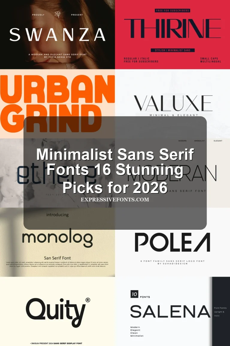
17 Best Minimalist Aesthetic Fonts in 2026
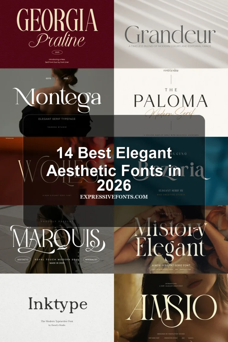
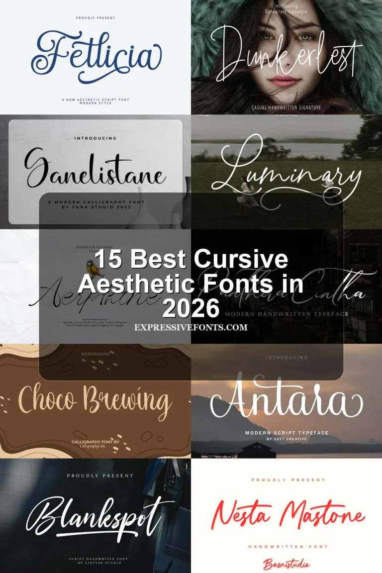
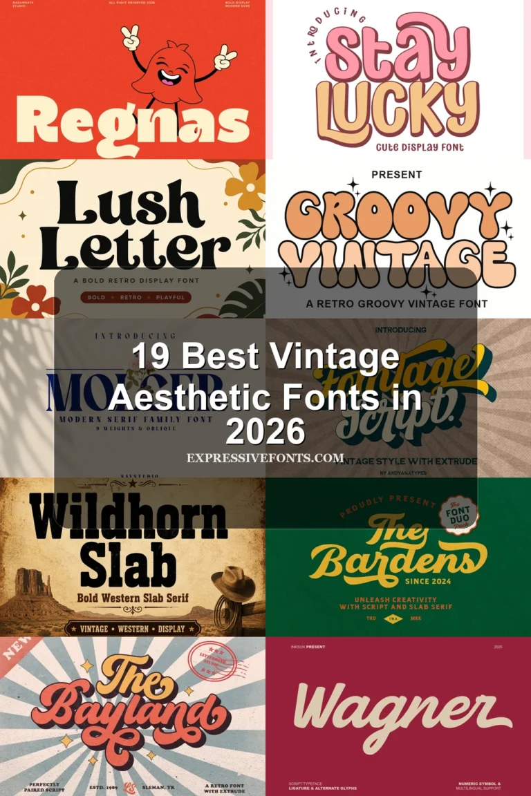
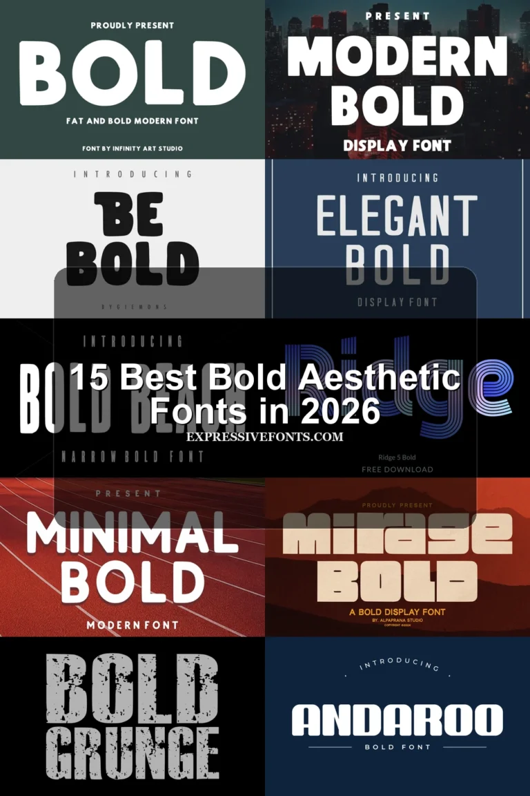
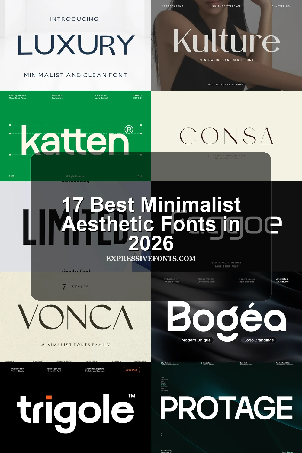
This collection moves from high-contrast display faces with hairlines and sharp terminals to low-contrast geometric forms, condensed silhouettes, and experimental apertures. These Minimalist Aesthetic Fonts are best suited to logos, packaging, editorial headlines, posters, and other applications where construction must remain clear at display sizes.
Looking for more aesthetic fonts? Browse our complete Aesthetic Fonts collection to compare modern, elegant, bold, vintage, and retro aesthetic styles.
Minimalist Aesthetic Fonts: High-Contrast Display
These Minimalist Aesthetic Fonts rely on wide proportions, pronounced thick-to-thin contrast, and crisp terminals. They create the sharpest editorial impact, but generally need larger sizes than the steadier geometric group.
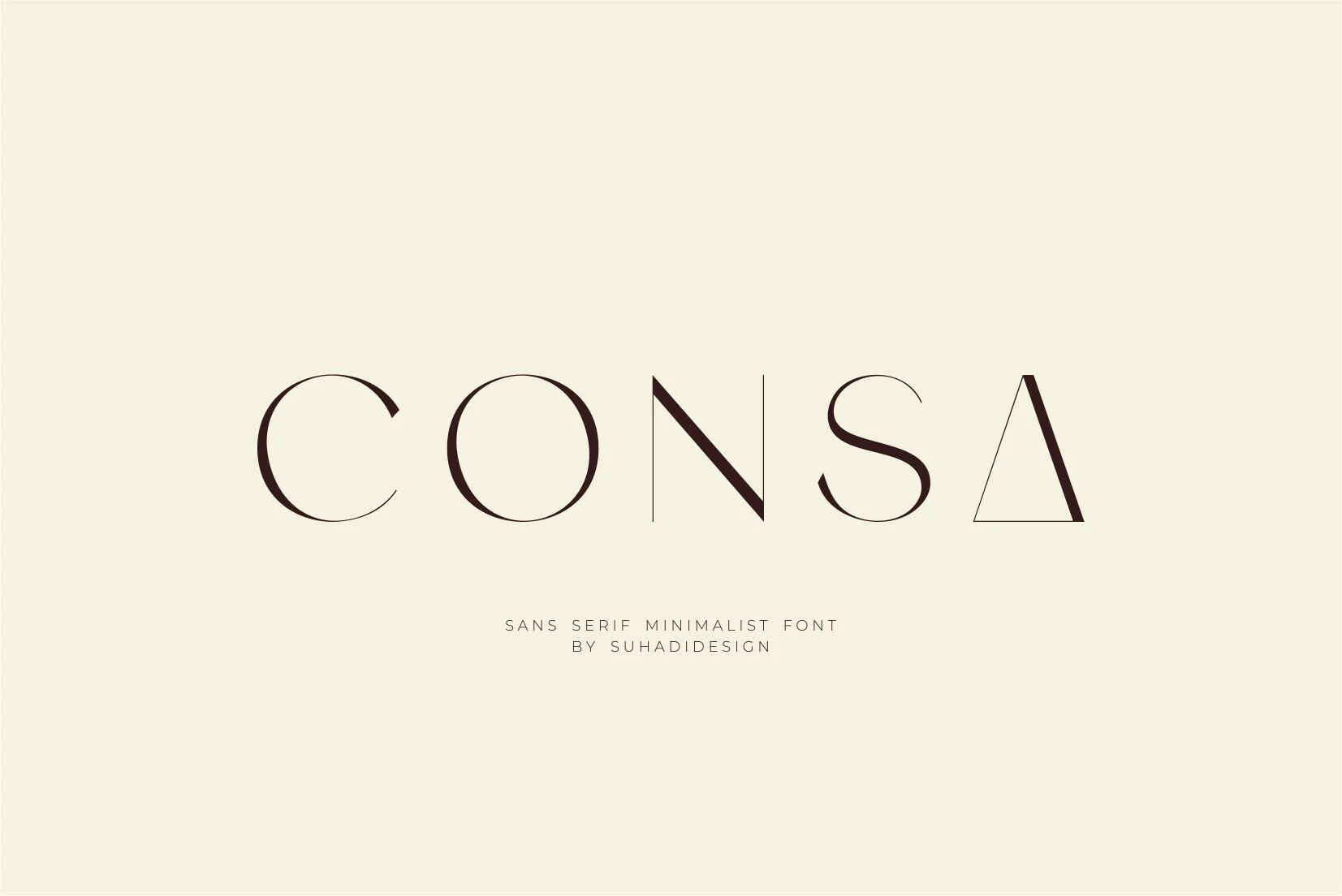
Consa Font
Best For: logos, branding, website headers
Consa Font uses wide geometric proportions and sharp thick-to-thin contrast, culminating in a distinctive triangular final A. Its ligature features add flexibility for logos and branding, though thin strokes make it most reliable for large display text rather than body copy.
Vonca Font
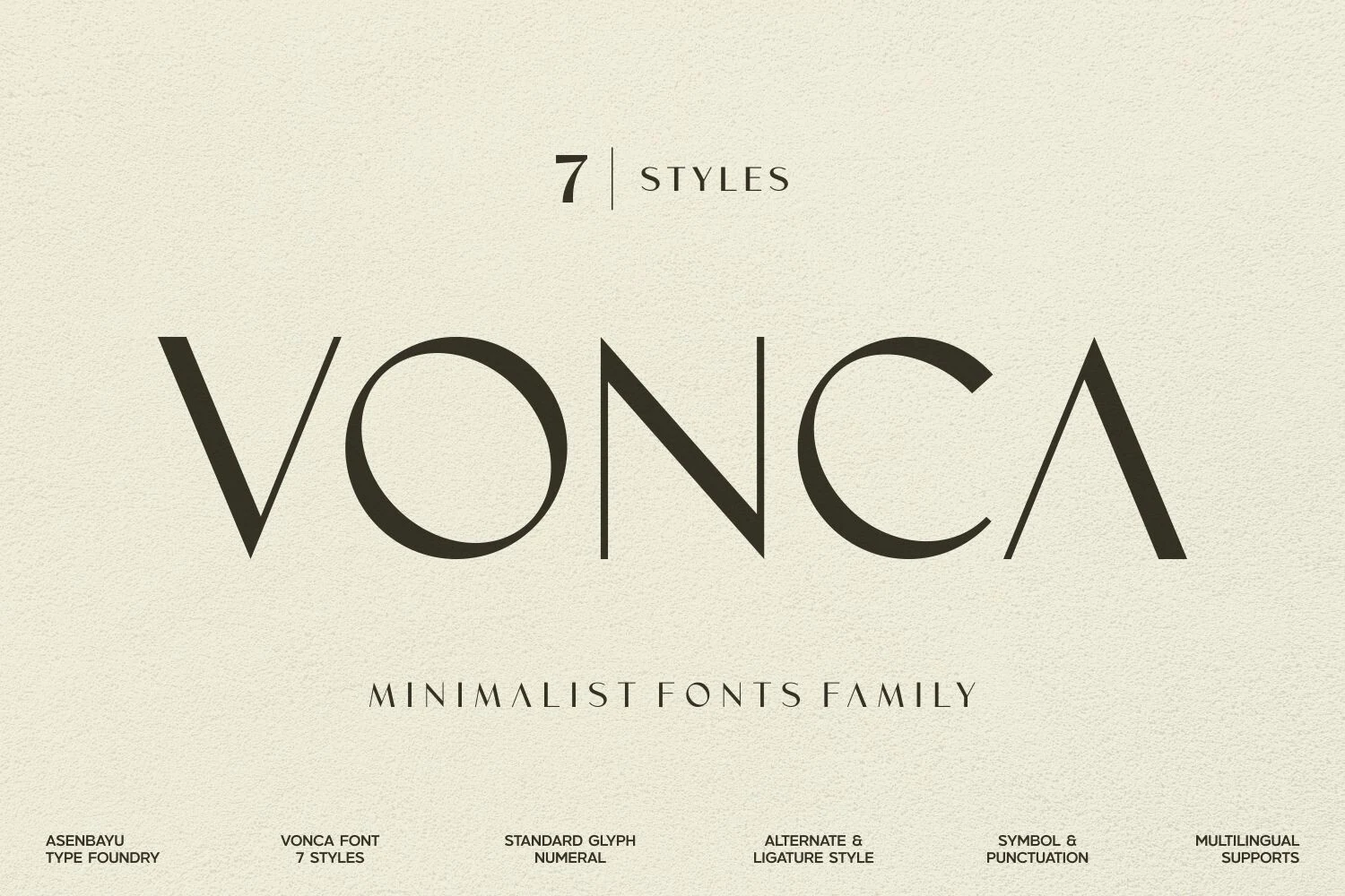
Best For: packaging, logos, posters
Wide letterforms, open negative space, and flared sharp terminals give Vonca Font an airy presence in large labels and posters. Its hairlines can weaken at small sizes, so it is better reserved for prominent branding, packaging, and short display lines.
Melora Font
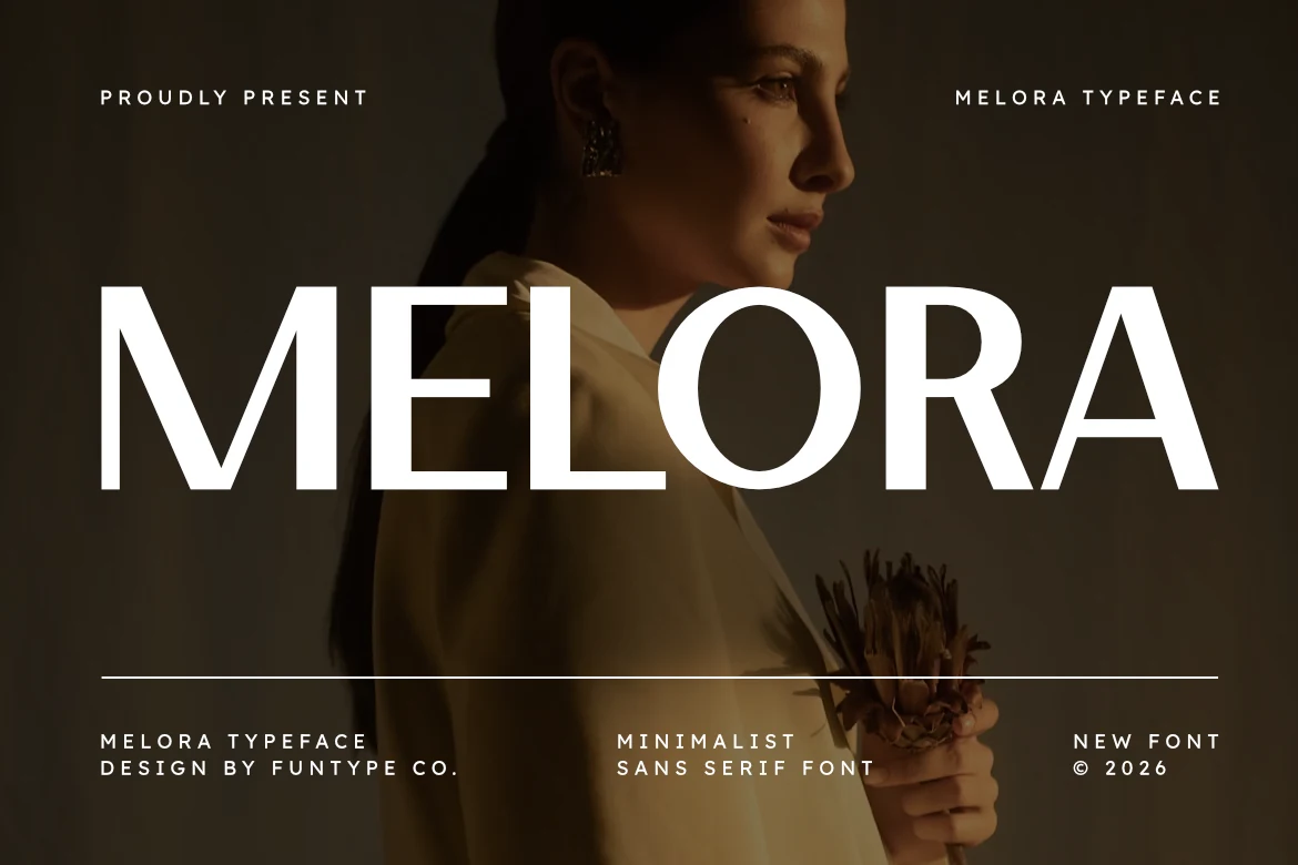
Best For: branding, posters, headlines
Melora Font is a strong choice when a headline needs a tall, compact silhouette. Its bold geometric structure, wide apertures, and sharp terminals create a forceful outline for posters, album covers, and branding, while high contrast makes tiny text less dependable.
Aurena Font
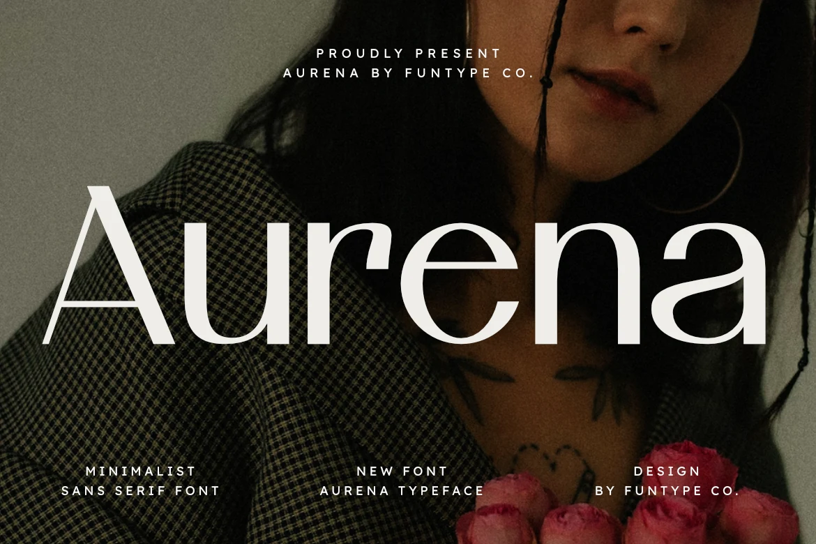
Best For: headlines, posters, branding
Aurena Font gains its clarity from open apertures and clean geometric lines, with terminals that add an editorial finish. Large headlines remain easy to read, but the high contrast is less suitable for extended small copy.
Kulture Font
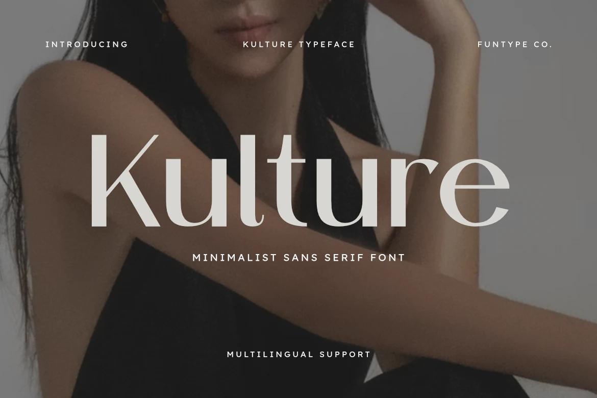
Best For: branding, headlines, posters
Kulture Font is a high-contrast serif with elongated sharp serifs, slightly wide spacing, and a fixed upright posture. Full multilingual support and OTF and TTF formats make production flexible, while its strongest role remains headlines, covers, and identity work.
Heluxa Font
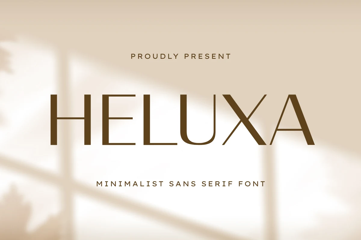
Best For: logos, branding, headlines
Sharp angled terminals give Heluxa Font a precise edge within its wide geometric sans construction. Its high contrast frames logos, short headlines, packaging, and invitations effectively, but the thin-to-thick shifts make long-form reading a poor fit.
Sunday Dreams Font
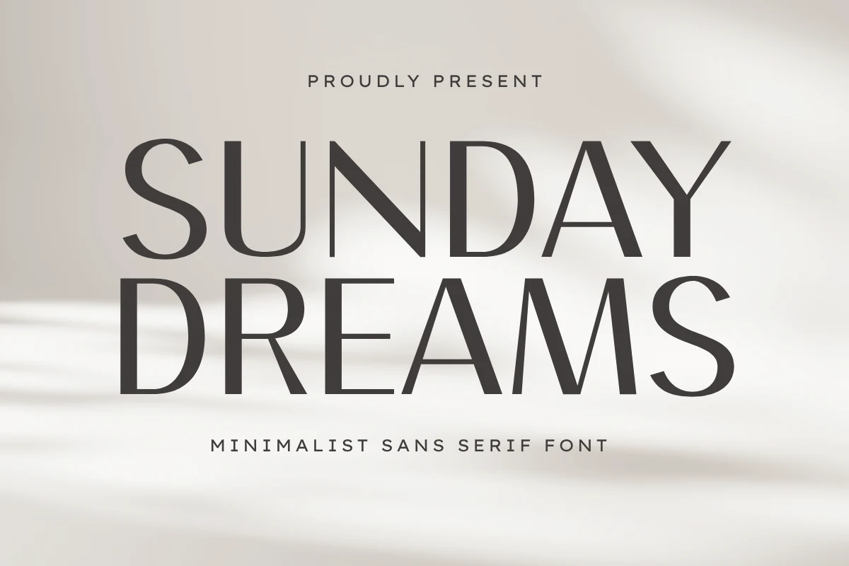
Best For: branding, editorial designs, packaging
Sunday Dreams Font combines geometric construction with a subtle humanist influence: horizontal strokes stay thin while verticals carry more weight. Its proportions suit editorial layouts, packaging, and identity work, provided the design gives its contrasting strokes generous display scale.
Geometric Clarity and Structure
This group emphasizes monoline or low-contrast geometry, open counters, and consistent spacing. Compared with the display faces, its construction is calmer and more dependable for headers, identity systems, and medium-sized text.
Protage Font
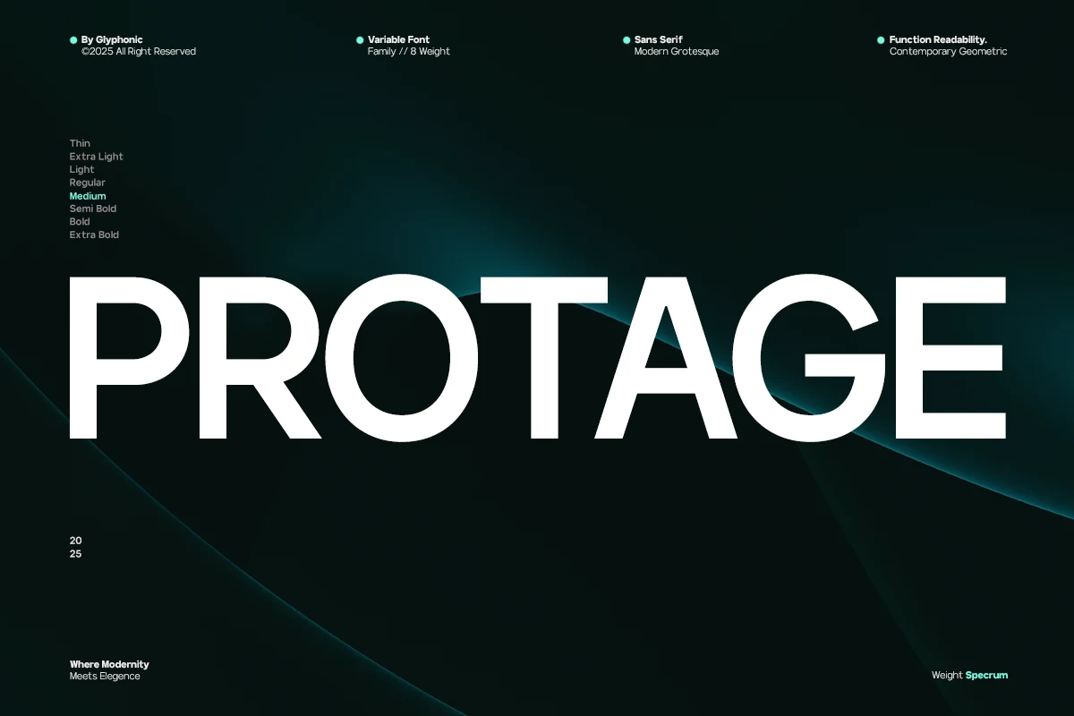
Best For: branding, editorial designs, website headers
Protage Font uses wide, low-contrast geometry, consistent strokes, and horizontal cut terminals for a technical character. Because its forms remain stable across sizes, it offers more versatility than the high-contrast options for branding, editorial layouts, digital work, and smaller text.
Faggoe Font
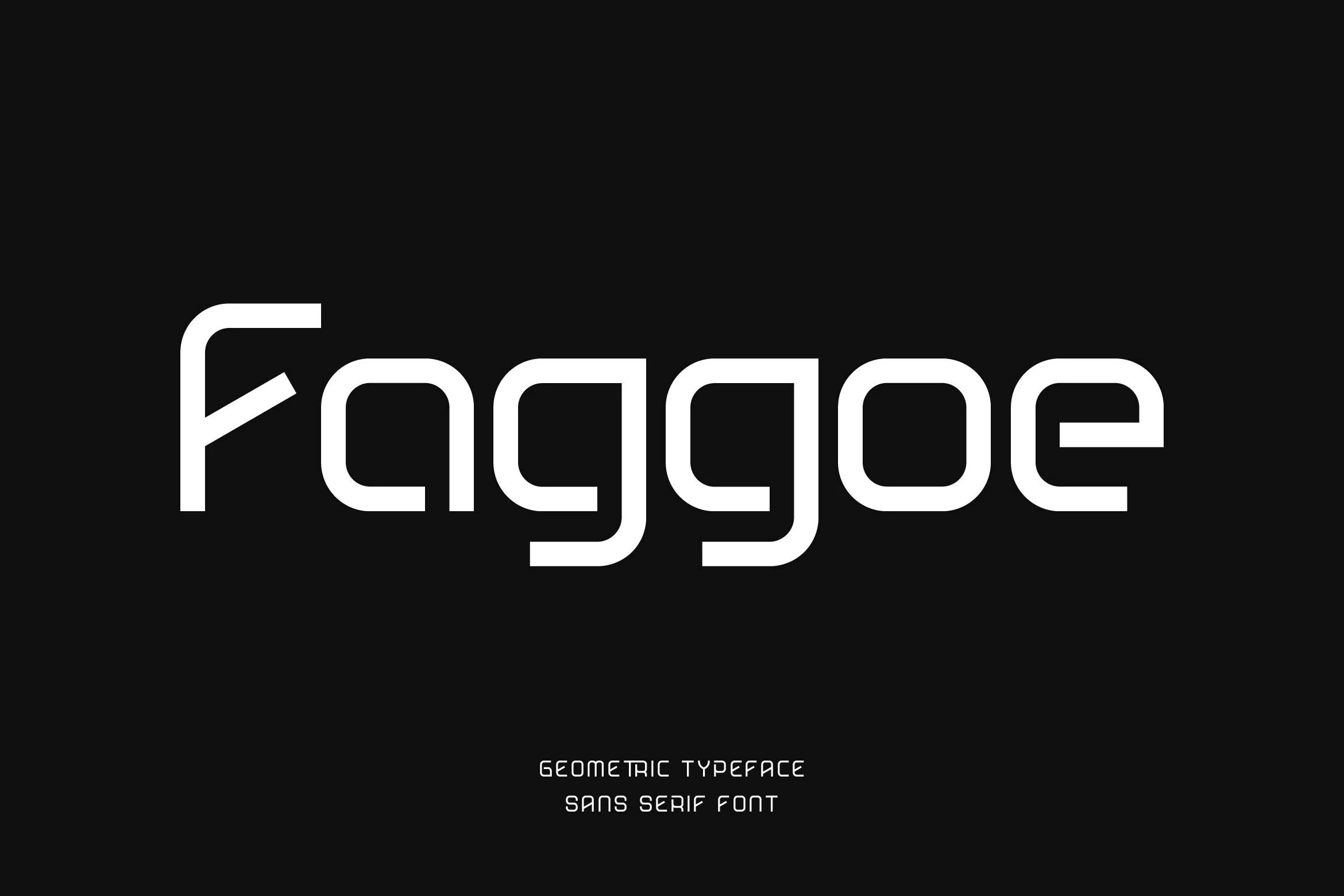
Best For: logos, branding, website headers
Faggoe Font pairs squared construction with rounded corners, open apertures, and a monoline texture. Its spacious proportions support readable headers and display text, although the width and spacing may become inefficient when the setting is very small.
Katten Font
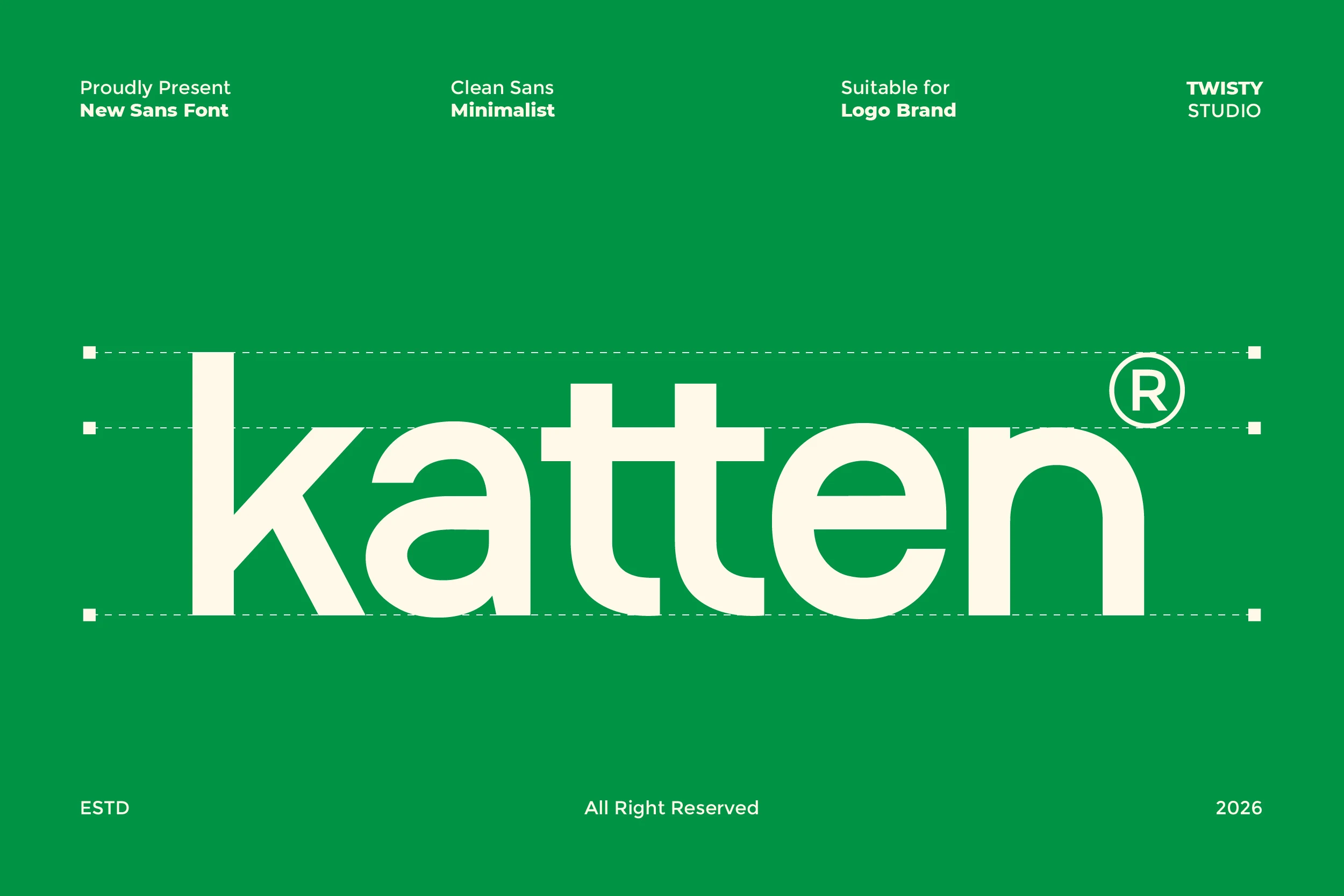
Best For: logos, branding, headlines
Katten Font is one of the more adaptable Minimalist Aesthetic Fonts here, using rounded terminals, open counters, generous spacing, and uniform strokes. Those features support branding, headlines, and medium-sized text instead of restricting it to large display use.
Lenatr Font
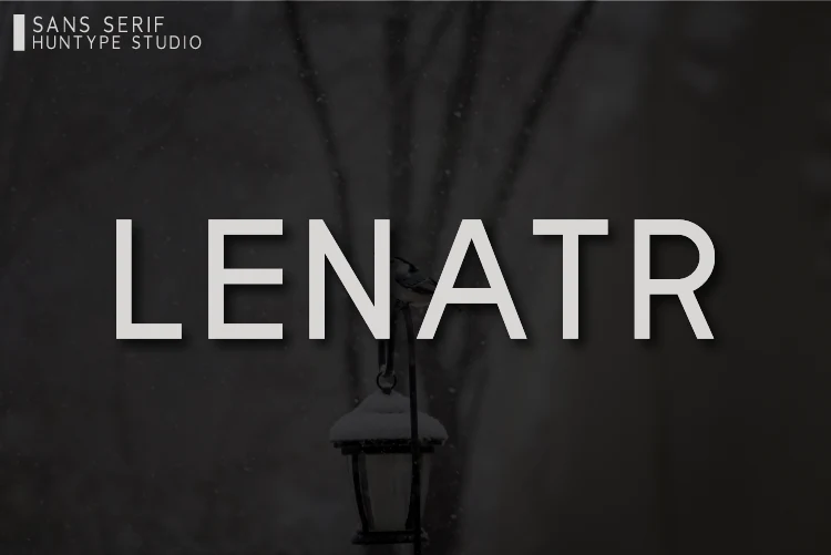
Best For: logos, headlines, quotes
Lenatr Font has a high x-height, closed apertures, and uniform strokes that create a compact reading texture. The forms stay clear in quotes, logos, and large headlines, though they offer less openness than Katten or Luxury.
Luxury Font
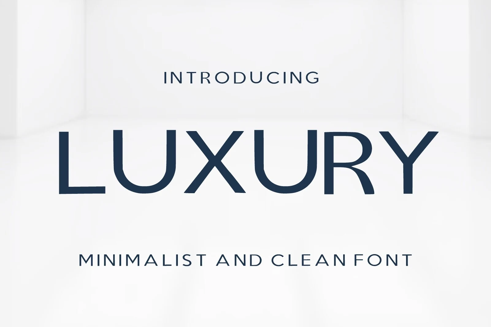
Best For: logos, branding, product labels
Luxury Font tempers geometric monoline construction with subtle humanistic proportions, flared terminals, open counters, and generous internal spacing. That combination supports readable labels and identity marks, giving it a softer alternative to more rigid geometric sans faces.
Casava Font
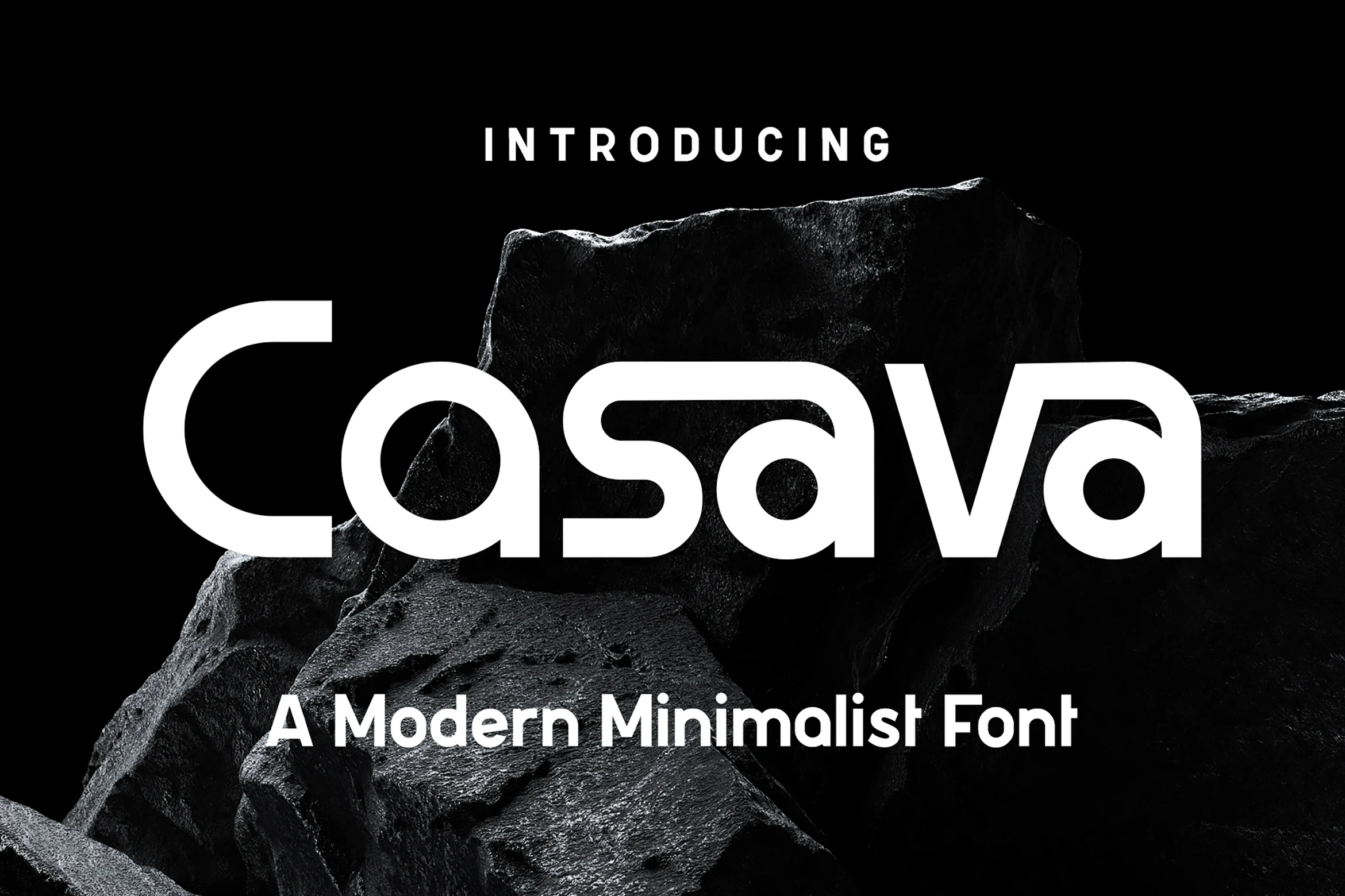
Best For: logos, branding, packaging
Casava Font combines wide rounded forms with monoline weight, open counters, distinctive alternates, and ligatures. Its expansive structure is effective across packaging and logos, but close spacing can reduce clarity when the type is reduced to very small sizes.
Trigole Font
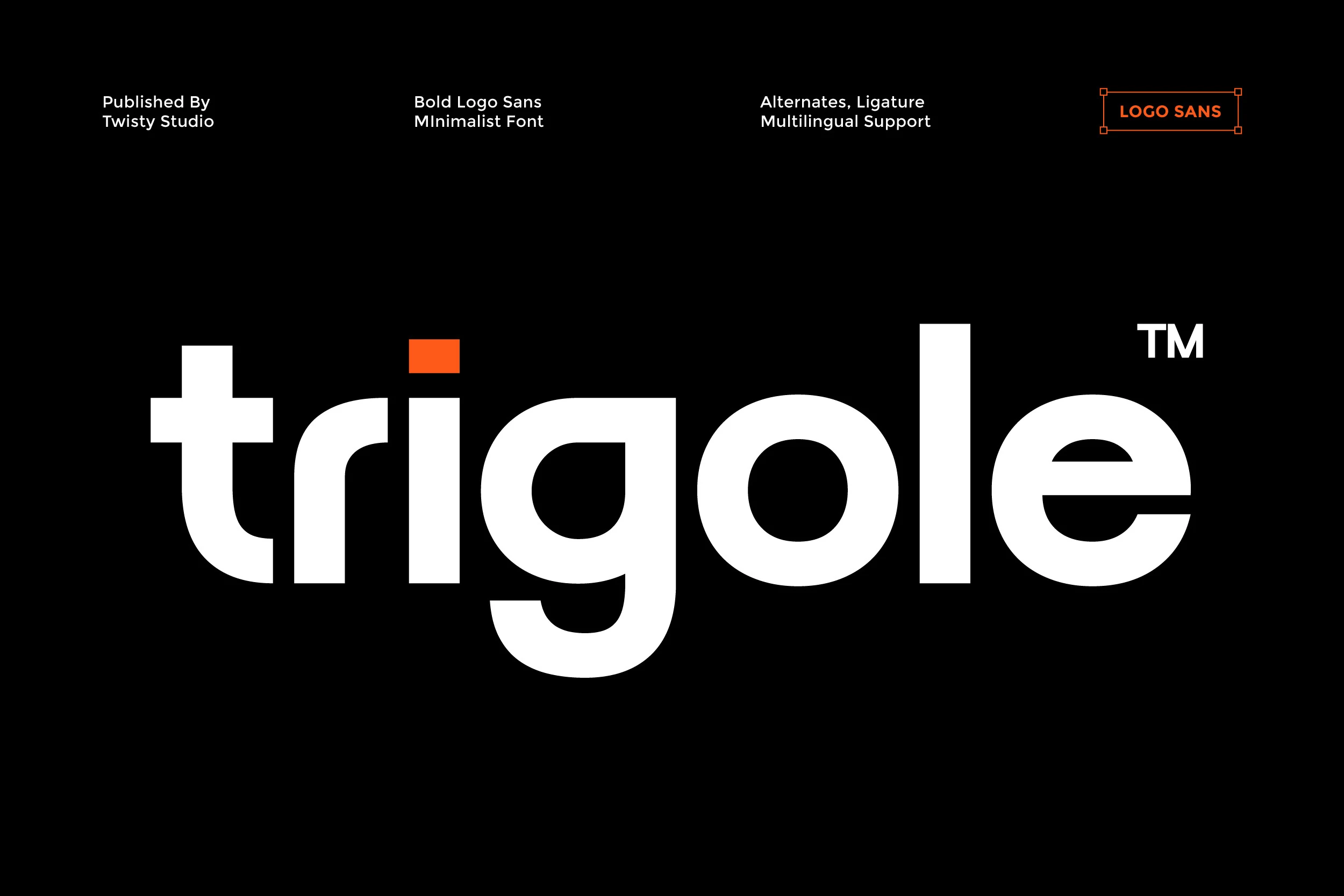
Best For: logos, branding, headlines
Trigole Font offers a straightforward geometric presence through solid monoline forms, open counters, and rounded modern shapes. Its proportions work reliably for logos and headlines, although the heavy construction keeps it primarily focused on display applications.
Condensed and Experimental Forms
Condensed proportions and unusual geometric details define this smaller group. Limited saves width, while Bogea and Apelow introduce more distinctive shapes, making all three stronger for focused display work than continuous reading.
Limited Font
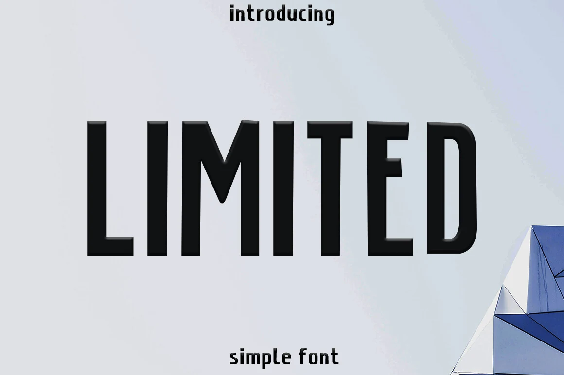
Best For: logos, branding, headlines
Limited Font compresses heavy, uniform strokes into a tall vertical silhouette. That narrow footprint helps logos and headlines fit tighter spaces, while its small-size clarity can suffer. It is a practical choice when structure and width control matter most.
Bogea Font
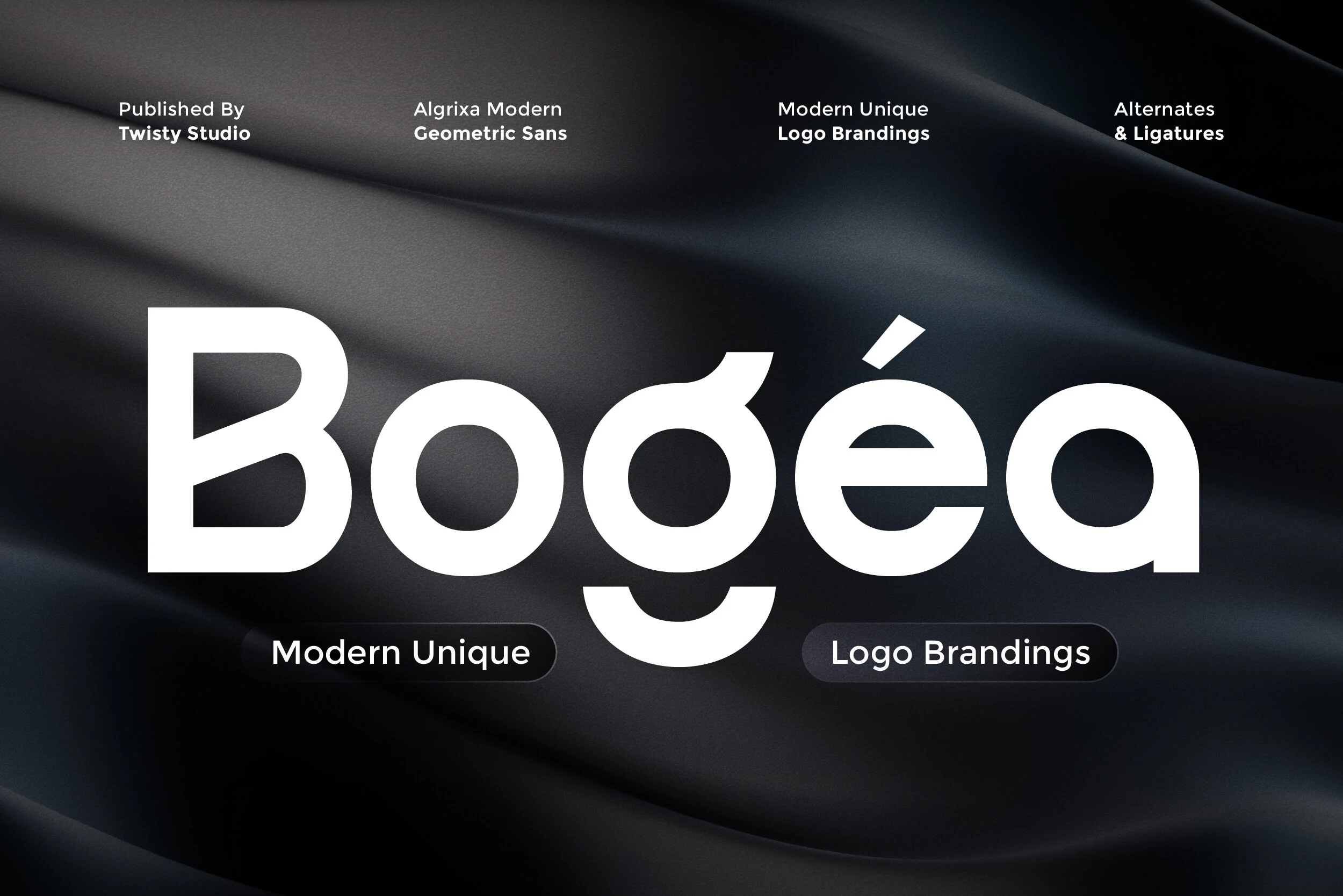
Best For: logos, branding, display text
Bogea Font pushes geometric sans lettering into experimental territory with circular constructions, stylized apertures, and unique alternates. Those non-traditional shapes can make a logo distinctive, but they are decorative enough that extended reading should be avoided.
Apelow Font
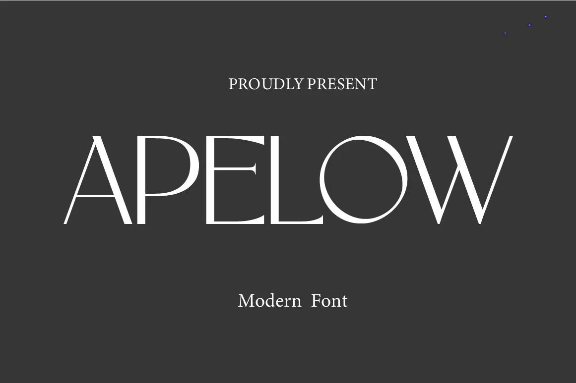
Best For: book covers, magazine covers, invitations
Apelow Font creates impact through hairline horizontals, thick verticals, pronounced bracketed serifs, and condensed proportions. Its contrast reads especially well on book and magazine covers, social graphics, and invitations, while very small settings may lose definition.
How to Choose the Right Font
Choose among these Minimalist Aesthetic Fonts by matching construction to scale: high contrast and sharp joins need generous sizing, while uniform strokes and open counters hold up better in smaller text. Condensed faces save width, alternates add identity, and wider geometric styles provide clearer spacing for packaging, headers, and editorial systems.