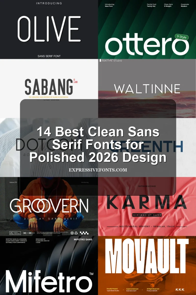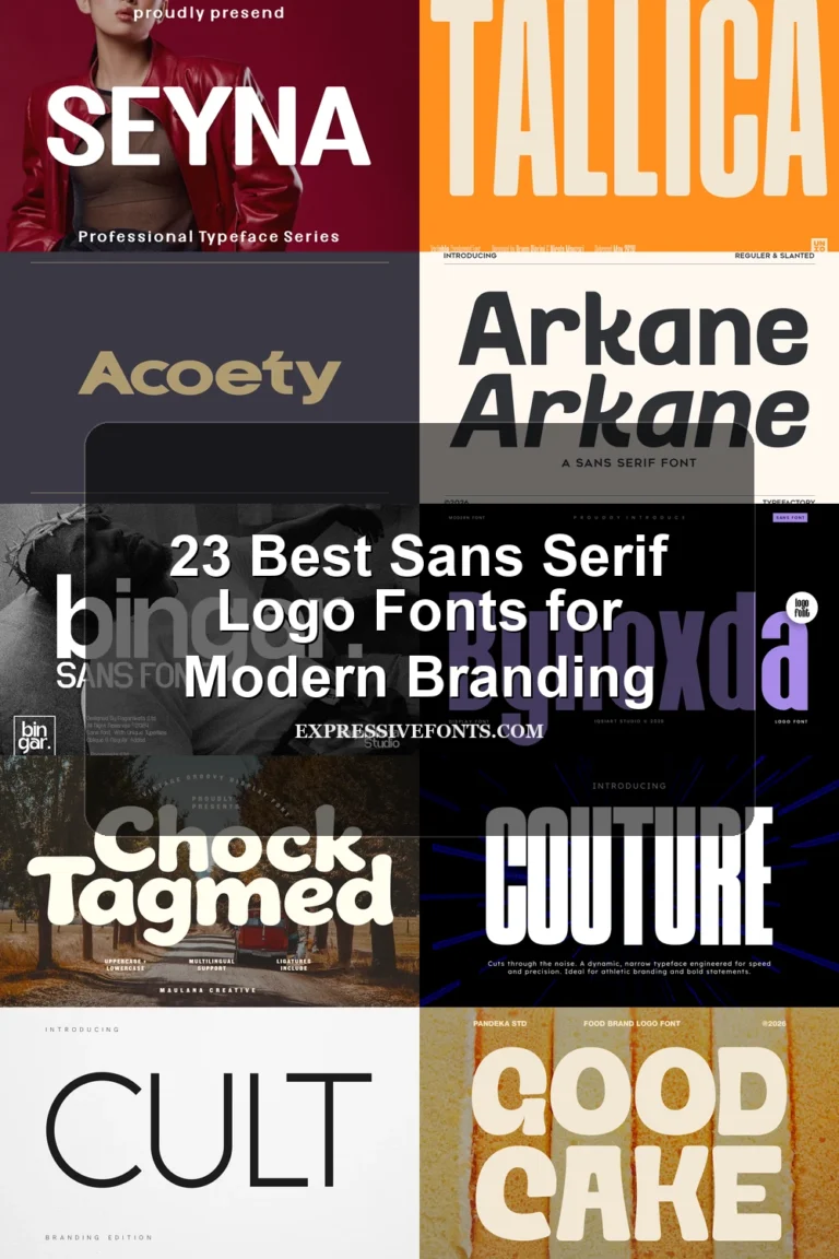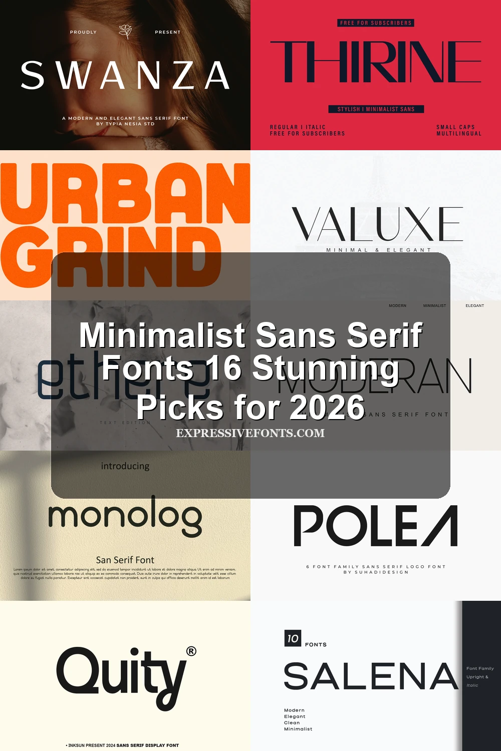
Minimalist Sans Serif Fonts 16 Stunning Picks for 2026
Minimalist Sans Serif Fonts are built for designers who need clean, modern type without visual noise. This collection works for logos, beauty branding, fashion layouts, editorial headers, packaging, websites, and social graphics where spacing, proportion, and restraint matter more than decoration.
Elegant & Luxury Minimalist Sans Serif Fonts
These refined sans serif fonts use slim strokes, wide spacing, and polished proportions for logos, beauty branding, fashion headers, and premium packaging.
Moderan Font
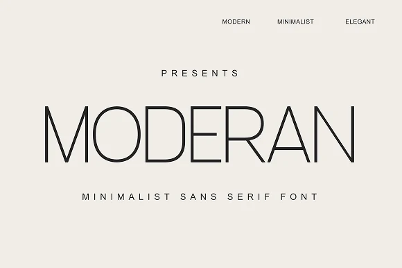
Best For: logos, branding, editorial designs, minimal designs
Moderan Font has a very light, monoline sans structure with wide uppercase proportions, clean verticals, and softly rounded curves. The generous spacing in the preview gives it a controlled editorial rhythm, so it feels refined without becoming decorative.
Use it where Minimalist Sans Serif Fonts need restraint: logos, fashion headers, beauty branding, or quiet title systems. Its thin strokes need contrast and deliberate scale, while added tracking can turn short words into a calm, premium-looking hierarchy.
Miseno Font
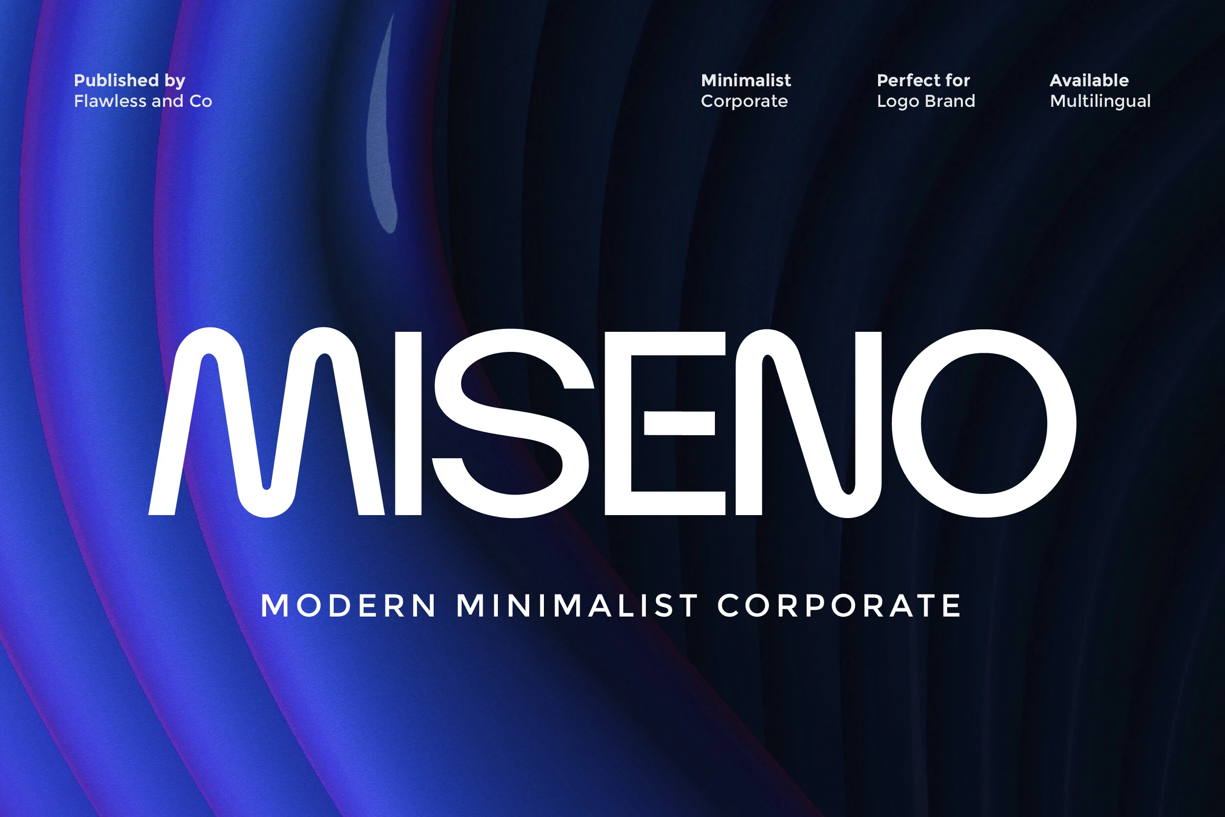
Best For: logos, branding, website headers, professional designs
Miseno Font uses light monoline strokes, open counters, and softly rounded joins that make its uppercase forms feel polished and approachable. The proportions stay even across the wordmark, giving it a calm corporate rhythm that reads cleanly without looking sterile.
If you browse Minimalist Sans Serif Fonts for branding systems or presentation-style headlines, Miseno has a particularly controlled look. A touch of extra tracking suits its airy structure, and generous negative space helps the thin strokes hold their presence in logos, headers, and other concise text settings.
Thirine Font
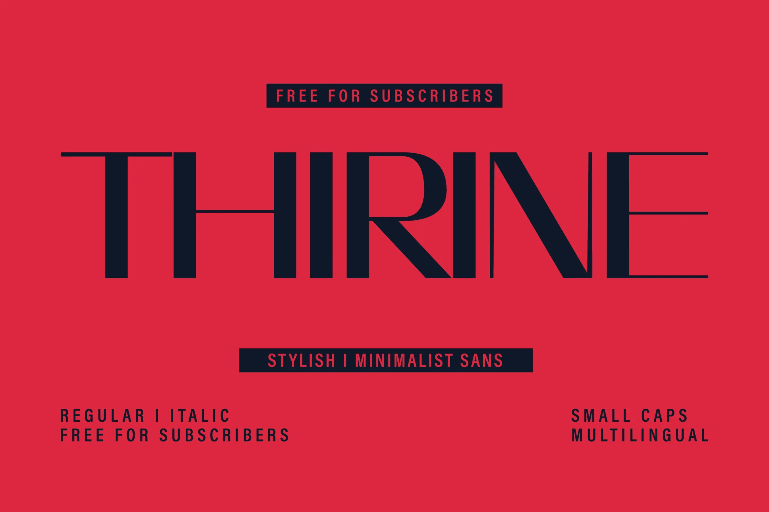
Best For: branding, editorial designs, fashion branding, minimal designs
Thirine Font has a tall, fashion-leaning silhouette with slim proportions, crisp vertical strokes, and very fine horizontals that give the wordmark a sleek editorial tension. The letterforms feel controlled and airy at once, so it reads with sophistication rather than softness.
Within Minimalist Sans Serif Fonts, Thirine stands out when you need drama without bulk. It works best in short headlines, logo treatments, and packaging where the long forms can stretch across the layout, while the included small caps help supporting lines and labels stay visually consistent.
Salena Font
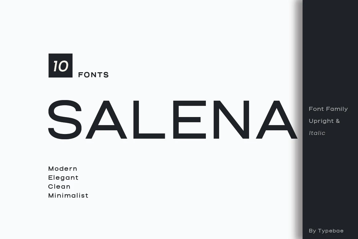
Best For: logos, branding, headlines, editorial designs
Salena Font has a crisp, elegant presence built from even strokes, wide uppercase proportions, and clean geometric shaping. The sharp apex of the A and the open, balanced structure keep it polished and highly legible, giving the overall wordmark a refined editorial feel.
When Minimalist Sans Serif Fonts need a calm, upscale tone, Salena fits beautifully. The family setup with upright and italic styles makes title hierarchy easier to manage, and slightly loose spacing helps its sleek forms stay clear in logotypes, magazine headings, and modern brand systems.
Valuxe Font
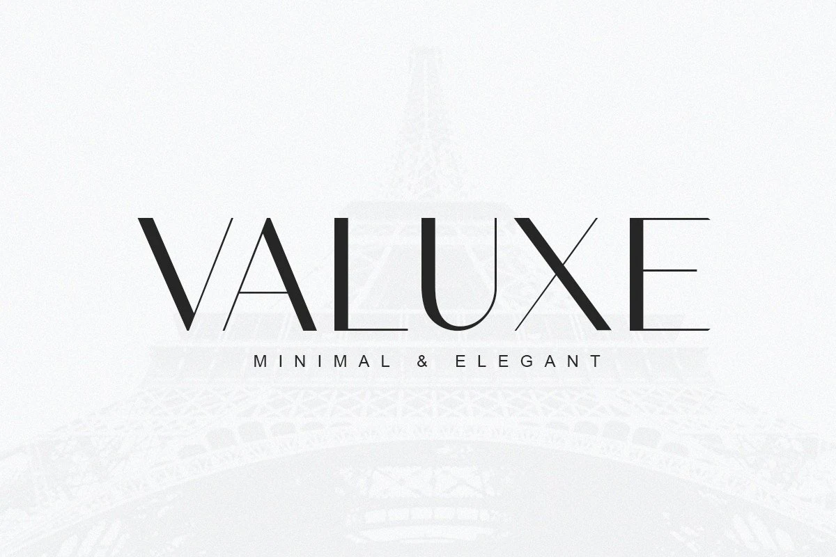
Best For: logos, branding, minimal designs, elegant designs
Valuxe Font has a sleek editorial look, with tall proportions, crisp geometric cuts, and very fine strokes that give each letter a light, polished presence. The wordmark feels airy and deliberate, especially in the narrow diagonals and extended horizontals that keep the design elegant rather than plain.
Among Minimalist Sans Serif Fonts, Valuxe works best when you let the letterforms stay prominent in short titles, logos, and refined branding. It pairs cleanly with a basic sans like Arial for supporting text, while an elegant script can add contrast without competing with its spare, linear structure.
Swanza Font
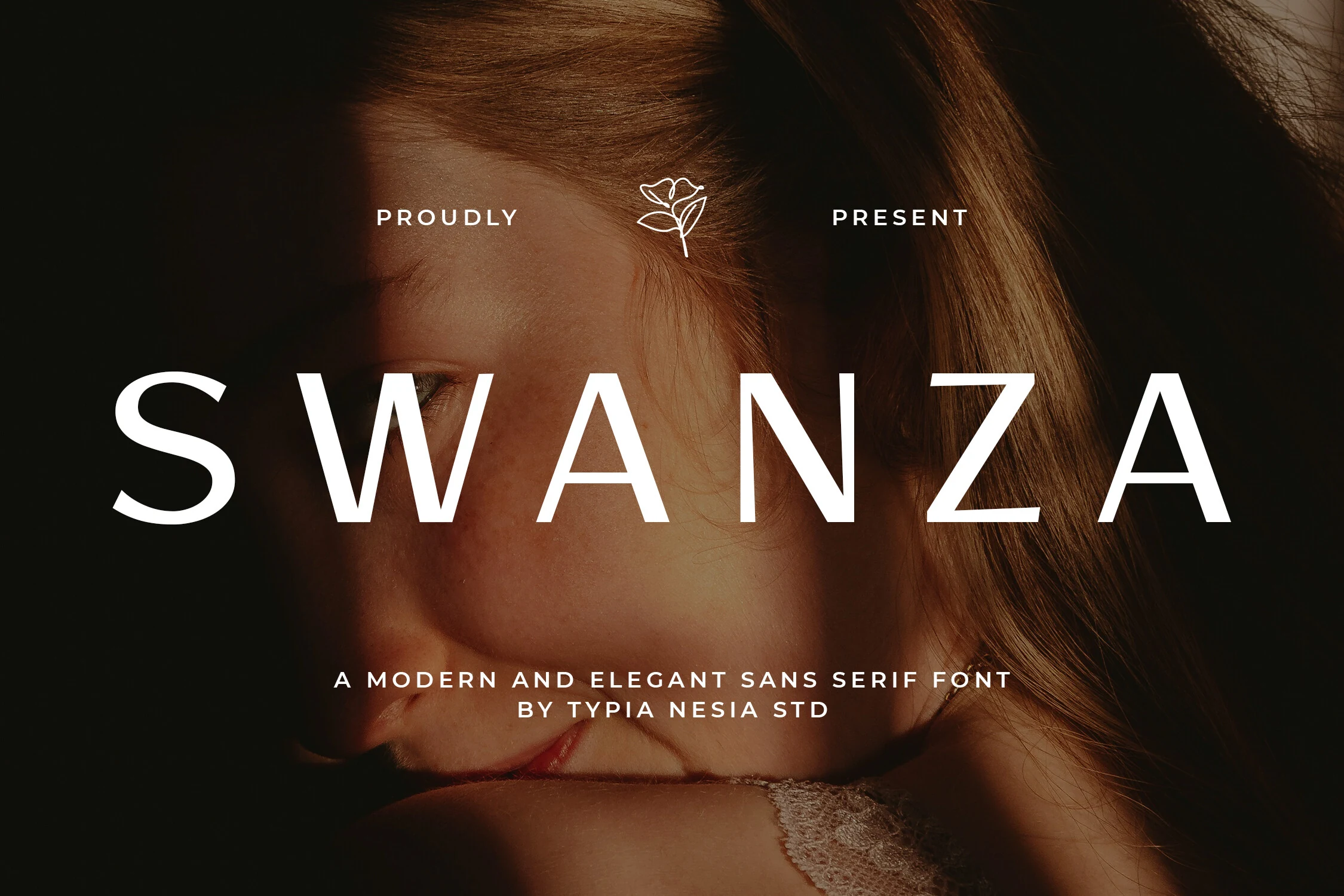
Best For: logos, beauty branding, fashion branding, luxury designs
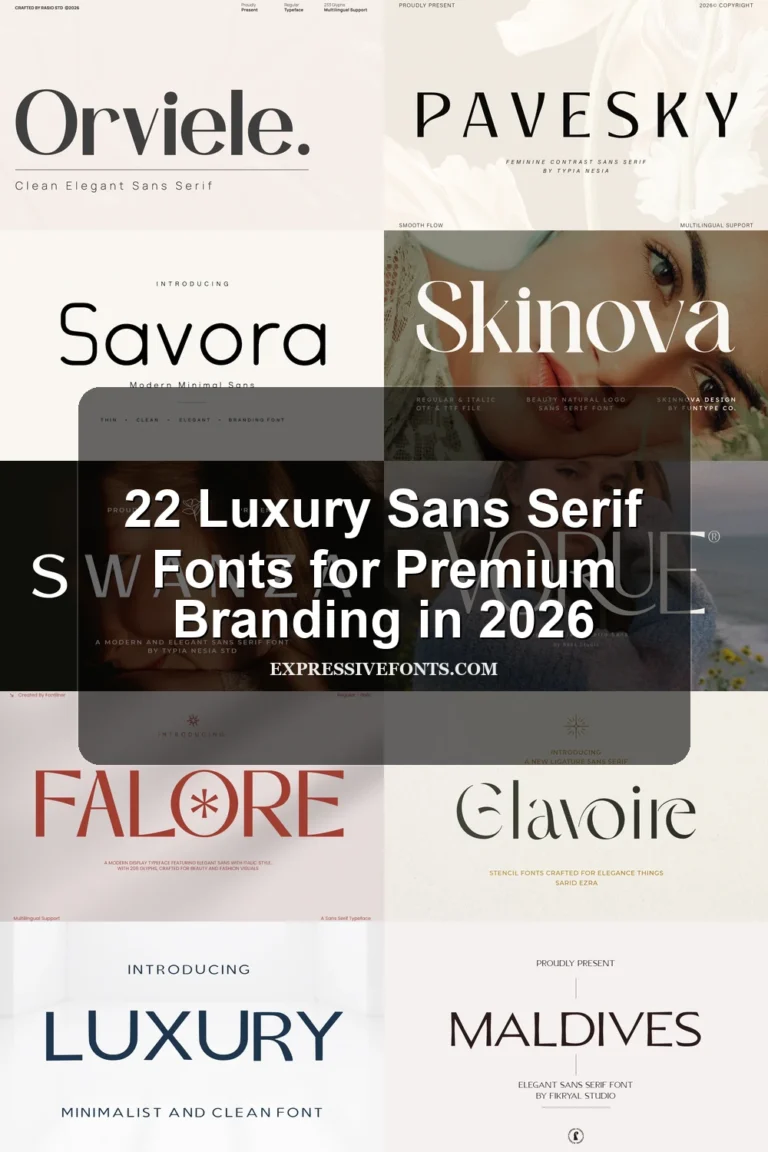
Swanza Font uses wide-tracked capitals, clean verticals, and restrained curves to create a polished minimalist look. The letterforms feel airy rather than thin, with sharp diagonal movement in the W, A, and Z giving the wordmark a controlled fashion-editorial tone.
Use it where Minimalist Sans Serif Fonts need to look refined without heavy decoration: beauty logos, skincare packaging, boutique headers, and short brand names. Keep generous spacing and strong contrast around the type; dense copy would weaken the calm, premium rhythm.
Rounded & Soft Minimalist Sans Serif Fonts
These softer minimalist fonts use rounded forms, open counters, and friendly geometry for approachable logos, web headers, invitations, and clean brand layouts.
Monolog Font
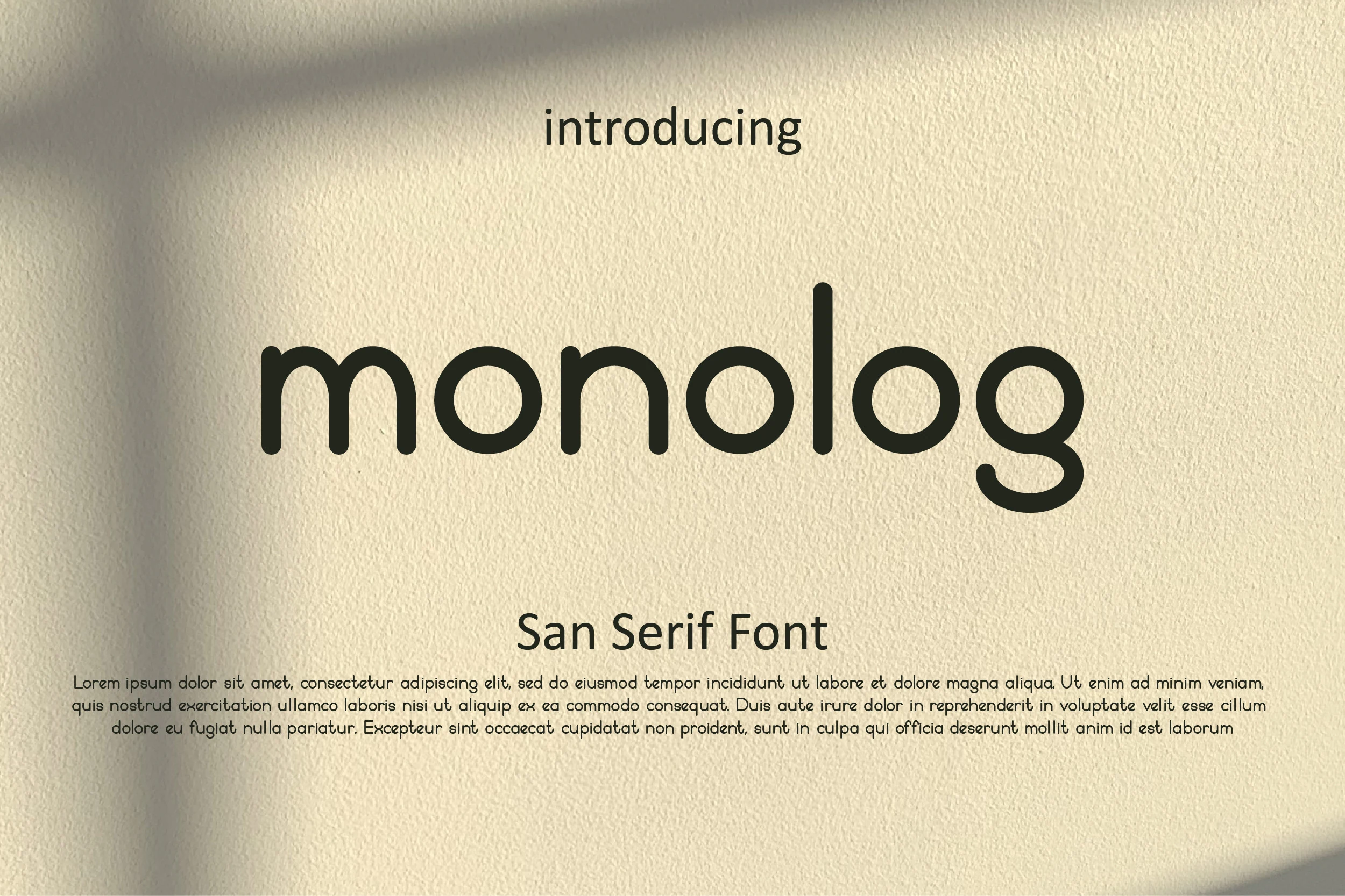
Best For: branding, website headers, wedding designs, minimal designs
Monolog Font has a soft minimalist voice, built from even monoline strokes, circular bowls, and rounded terminals that keep the lettering smooth and approachable. The lowercase forms feel tidy rather than severe, giving it a clean modern rhythm with a friendly edge.
If you are exploring Minimalist Sans Serif Fonts with a warmer tone, Monolog suits logos, web headers, and wedding layouts especially well. Its open shapes read clearly at display sizes, and a little extra spacing helps the rounded forms breathe without losing their compact, contemporary feel.
Quity Font
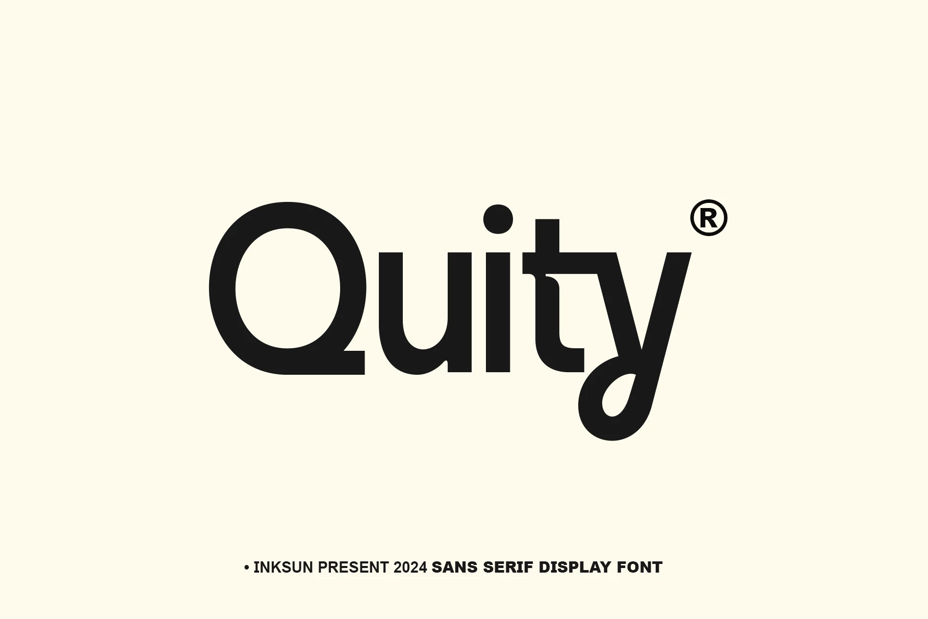
Best For: logos, branding, display text, minimal designs
Quity Font pairs broad open curves with a sturdy monoline build, giving the letters a clean display presence that still feels friendly. The standout detail is the unusual relationship between the lowercase t and y, which adds a smart geometric twist without breaking the font’s tidy rhythm.
If you are browsing Minimalist Sans Serif Fonts for logos or tech-facing identities, Quity has the right mix of restraint and character. It performs best in short words where that custom connection can be noticed, and generous spacing around the wordmark helps the distinctive shapes stay crisp.
Ethere Font
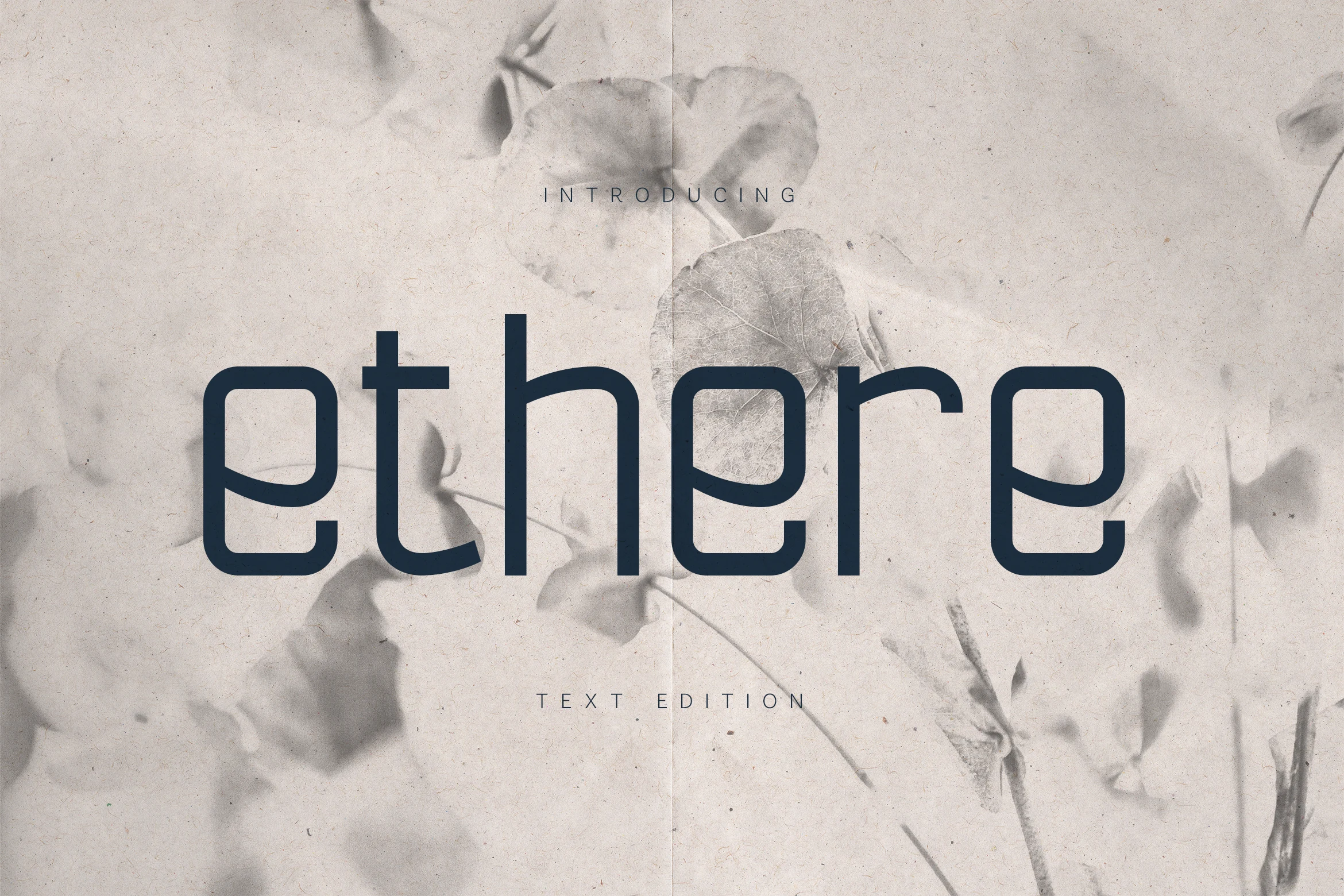
Best For: editorial designs, branding, website headers, minimal designs
Ethere Font has a gentle, text-friendly look built from rounded geometry, open counters, and smooth monoline strokes. The lowercase forms feel airy and balanced, with a calm rhythm that keeps the page looking polished without becoming cold or overly technical.
If you are comparing Minimalist Sans Serif Fonts for editorial settings, Ethere stands out for its softness and readability. It handles longer lines more comfortably than many display-led sans serifs, and slightly loose leading helps its open shapes stay clear in refined brand copy, articles, and elegant headers.
Giola Font
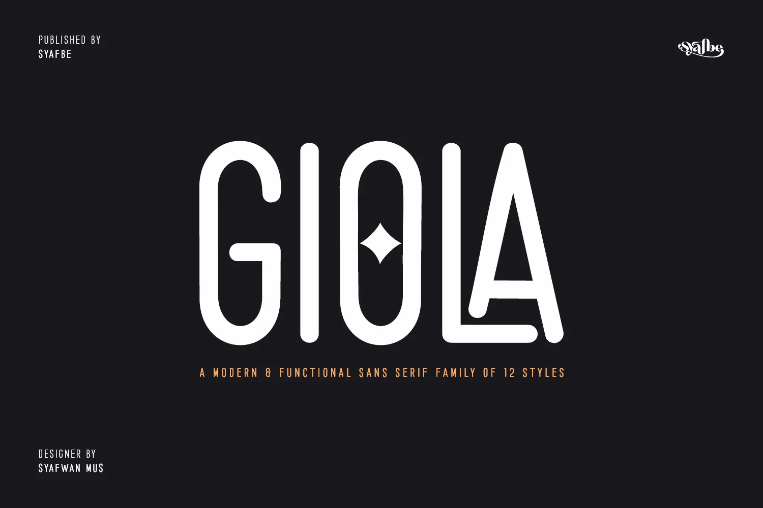
Best For: branding, website headers, professional designs, creative projects
Giola Font has a tall, streamlined build with rounded terminals, narrow proportions, and an open monoline structure that keeps the wordmark sleek. The small diamond detail inside the O adds a neat focal point, giving the font a functional look with just enough character to feel memorable.
If you are exploring Minimalist Sans Serif Fonts for presentations, branding, or greeting-card layouts, Giola brings a clear and modern rhythm. It works especially well in short headlines and nameplates, while the extra glyphs and swashes are best used sparingly so the clean vertical forms stay in control.
Bold Display Minimalist Sans Serif Fonts
These heavier sans serif fonts keep their shapes simple but use strong weight, compact rhythm, and clear silhouettes for posters, headlines, campaigns, and bold logos.
Urban Grind Font
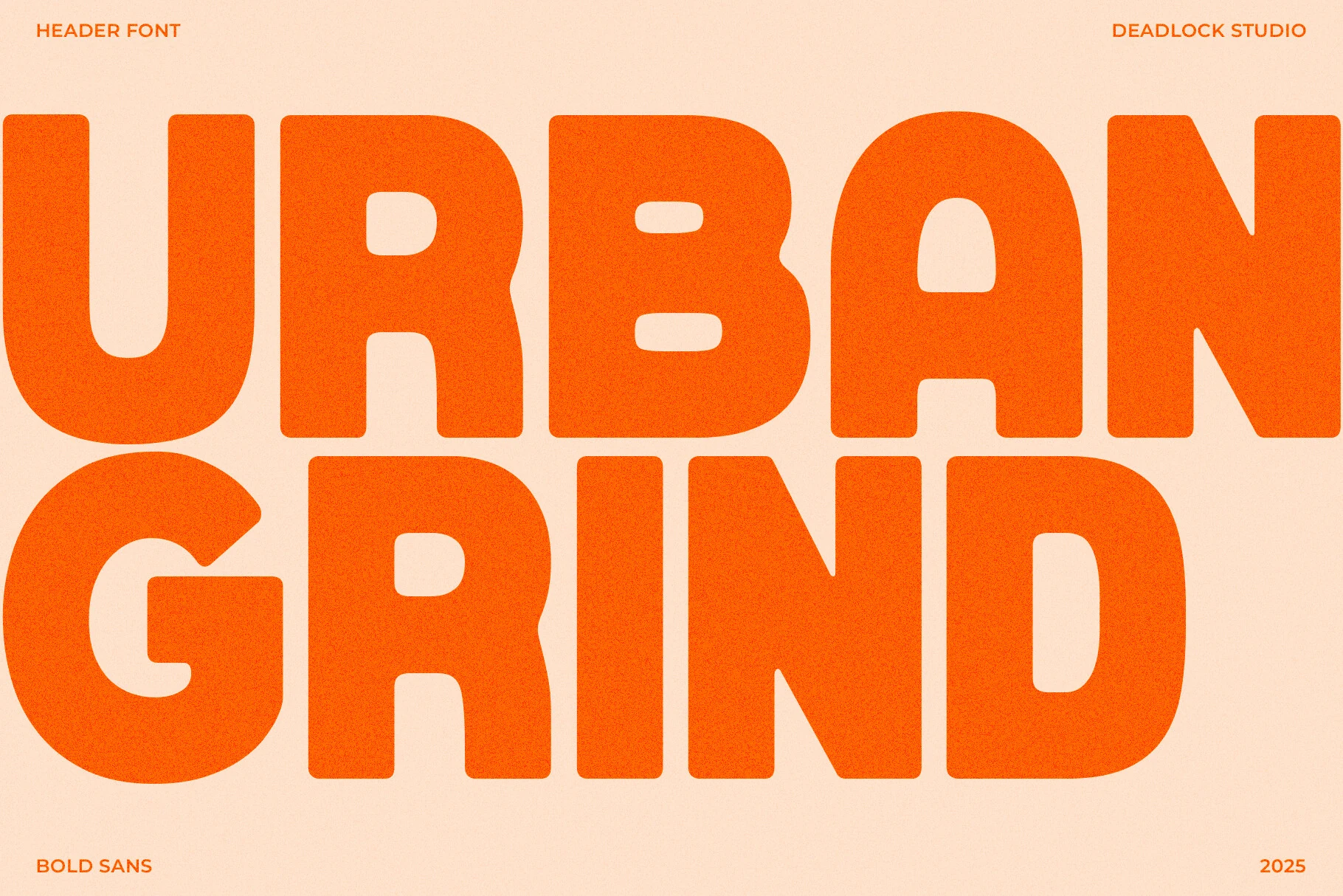
Best For: branding, posters, social media graphics, headlines
Urban Grind Font is all about mass and momentum. The preview shows oversized blocky letterforms with rounded corners, compact counters, and a steady geometric build that keeps the texture clean even at extreme weight. It feels direct and assertive rather than ornamental, which gives it a punchy street-poster presence.
For Minimalist Sans Serif Fonts, this one leans into impact through scale and simplicity. It works best when you keep the wording short and let the heavy shapes carry the composition, especially in logos, campaign headlines, and social graphics where bold hierarchy needs to read instantly.
Polea Normal Font
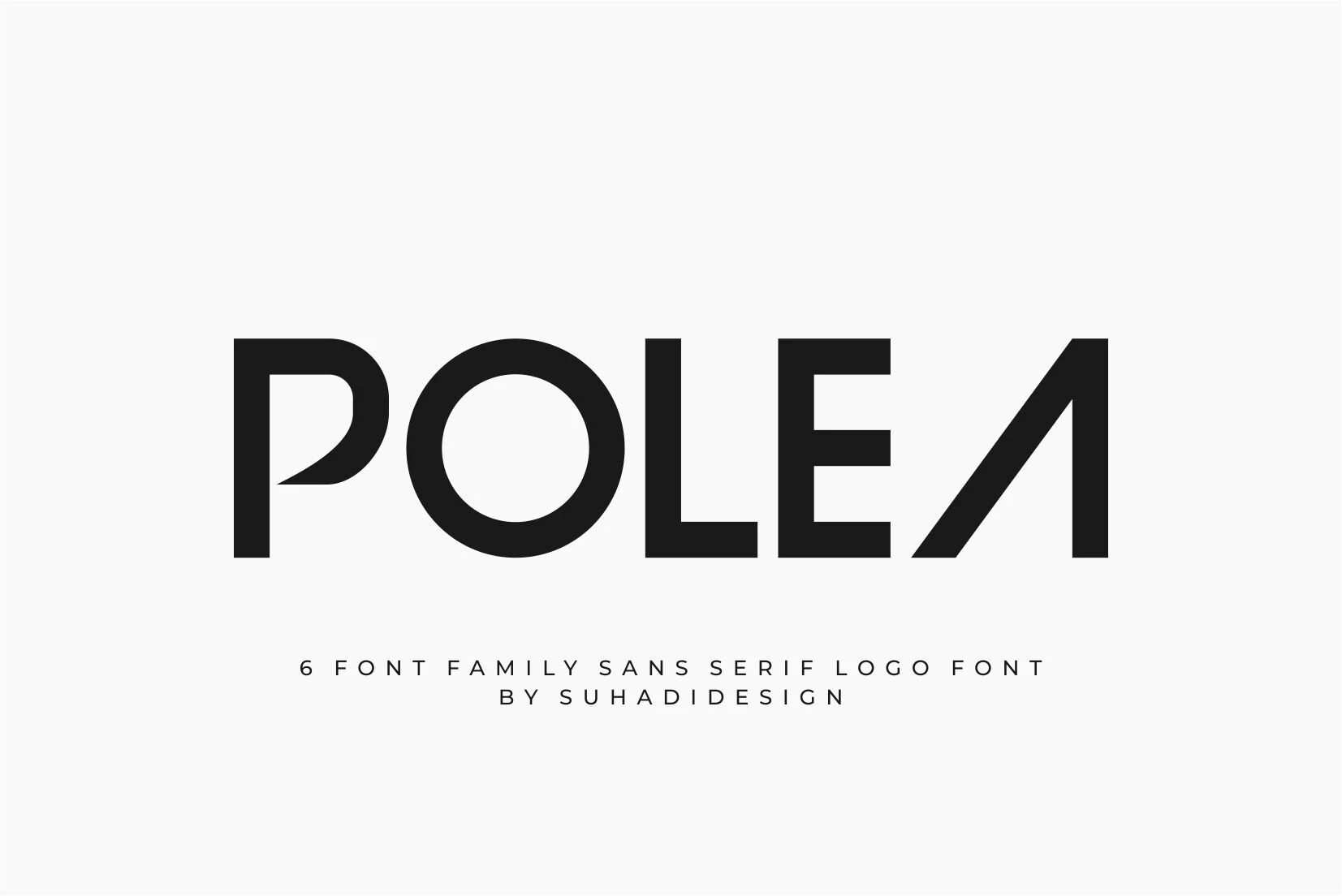
Best For: logos, branding, headlines, minimal designs
Polea Normal Font has a crisp geometric build with broad circular forms, sturdy verticals, and a striking angled A that sharpens the overall silhouette. The clean weight and generous spacing keep it modern and composed, while the custom cut in the P adds just enough character for logo work.
For Minimalist Sans Serif Fonts, Polea feels especially effective in brand marks, packaging titles, and concise headings where the structure can stay front and center. It handles short words best, and pairing its bold forms with open space helps the distinctive shapes read clearly without crowding the layout.
Zeuxis Font
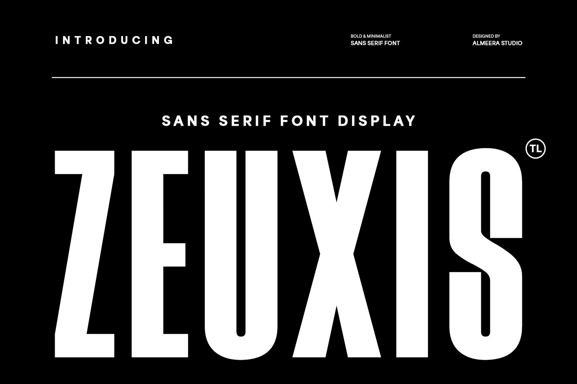
Best For: branding, headlines, display text, bold designs
Zeuxis Font is built for impact, with towering condensed proportions, thick monoline strokes, and hard-edged counters that make every letter feel forceful and controlled. The preview shows a dense, high-contrast texture that stays clean even at very large scale, giving it a confident display presence.
If you want Minimalist Sans Serif Fonts that read instantly, Zeuxis is strongest in short headlines, logos, and poster-style compositions. Its narrow width lets you fit more characters into a tight title area, while generous surrounding space keeps the heavy forms from overwhelming the layout.
Muffin Font
Best For: headlines, posters, playful designs, bold designs
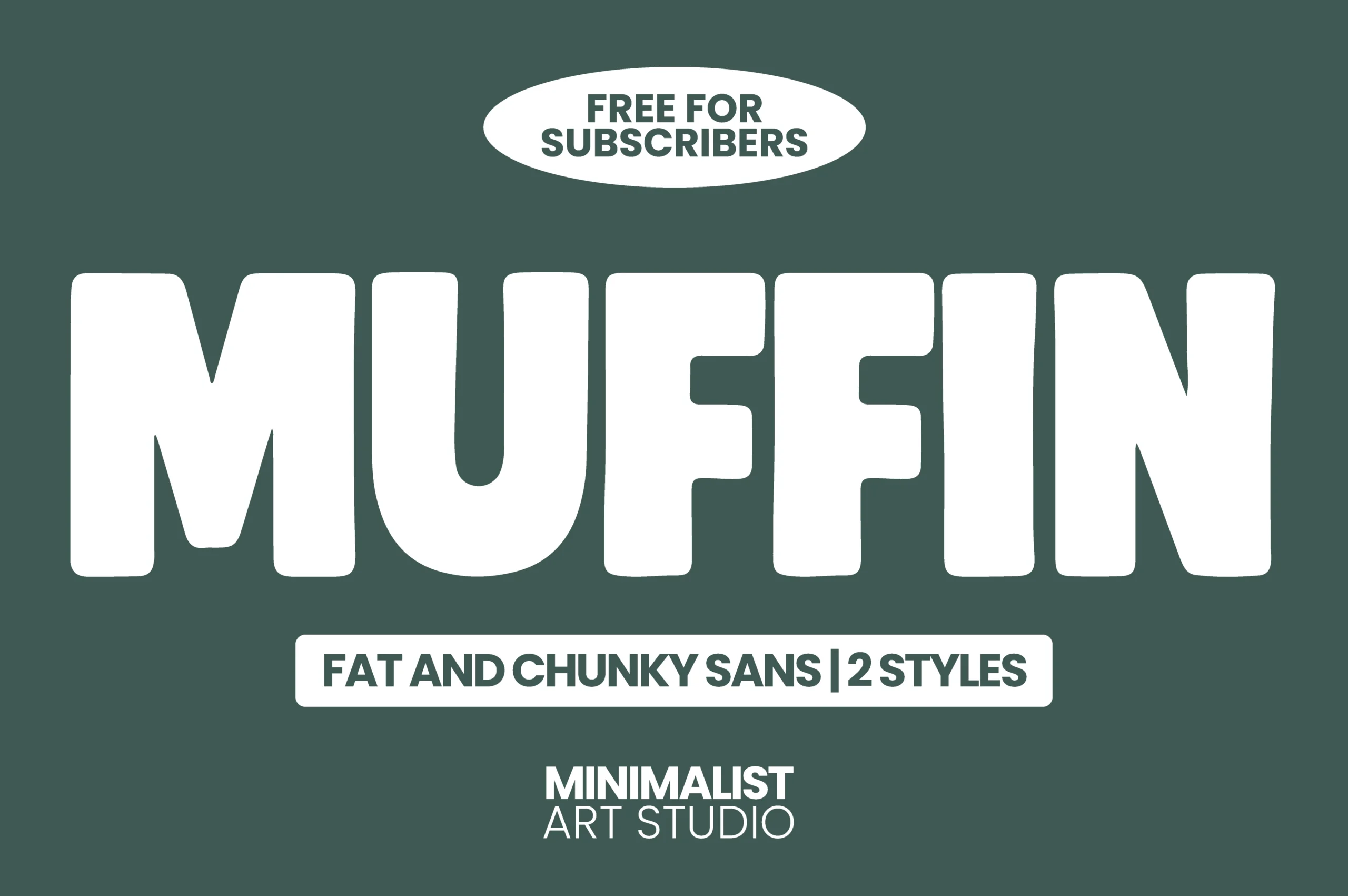
Muffin Font leans into oversized weight with rounded corners, soft inner curves, and a compact rhythm that keeps the wordmark bold without looking rigid. The thick strokes give it a friendly chunky texture, so it feels upbeat and approachable instead of heavy-handed.
If you are browsing Minimalist Sans Serif Fonts with more personality, Muffin is strongest in headlines, posters, and playful branding. Keep the wording short and pair it with a lean secondary sans for supporting text, which helps the fat letterforms stay readable and carry the hierarchy on their own.
Editorial & Professional Minimalist Sans Serif Fonts
These practical minimalist families offer cleaner hierarchy, multiple weights, and steady spacing for magazines, product labels, websites, and professional brand systems.
Remar Font
Best For: branding, editorial designs, magazine covers, product labels
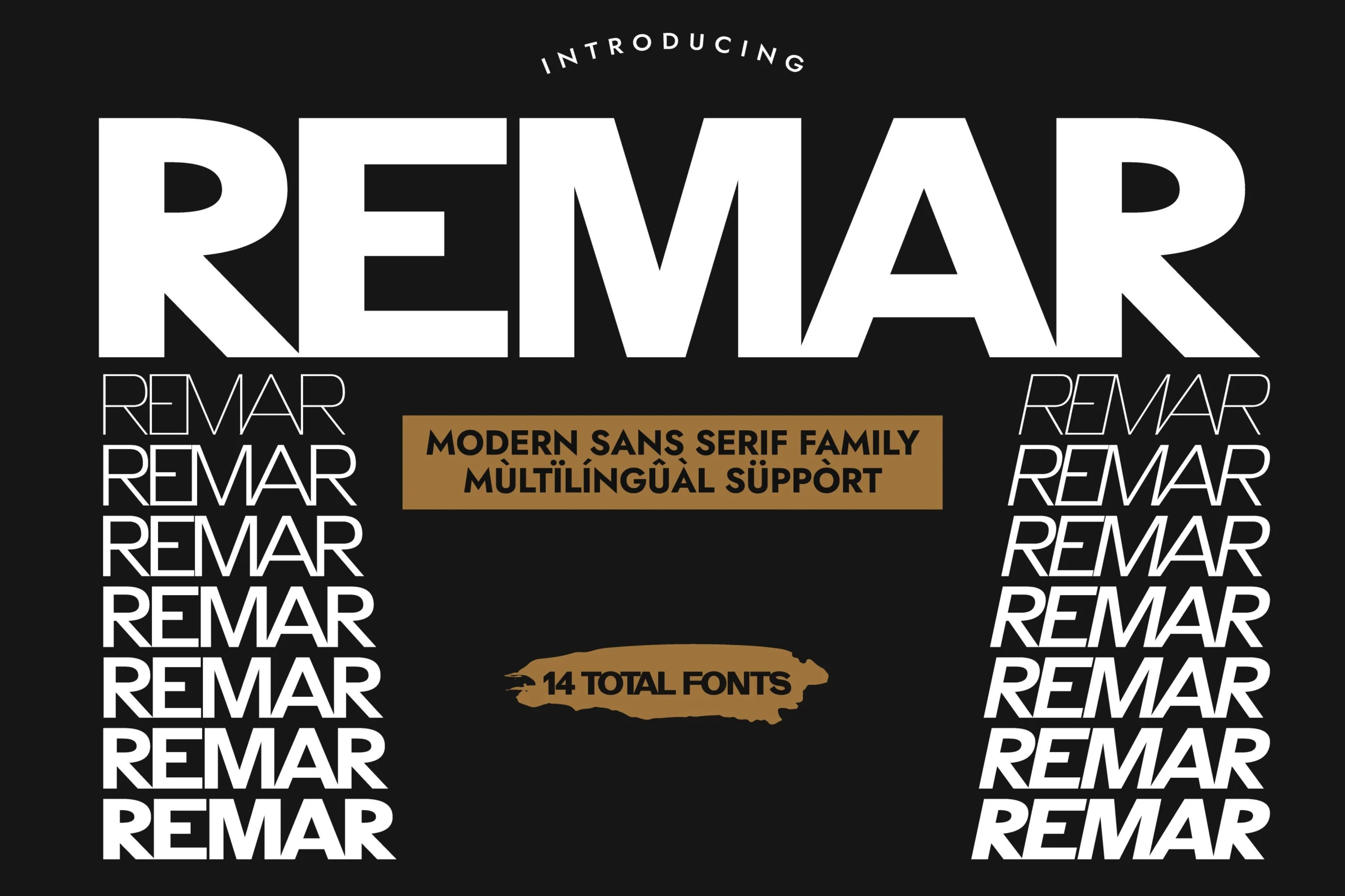
Remar Font has the steady confidence of a grotesque sans, with solid strokes, clean terminals, and a compact rhythm that feels direct on the page. The preview shows how well it holds its identity from a bold display setting to lighter and slanted cuts, giving the family a sharp editorial voice.
When you need Minimalist Sans Serif Fonts that can do more than one job, Remar is especially useful. Its seven weights with matching italics make hierarchy easier to build across covers, labels, and layouts, and switching between upright and italic styles adds contrast while keeping the system visually consistent.
Morseo Font
Best For: branding, editorial designs, website headers, professional designs
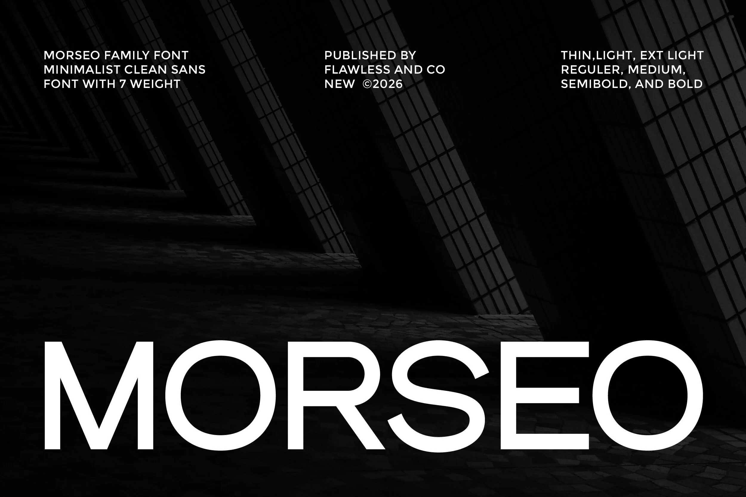
Morseo Font has a clean, architectural feel, with broad uppercase proportions, smooth monoline strokes, and open round forms that keep the wordmark crisp at large scale. The letter spacing feels controlled rather than tight, which gives it a steady, professional rhythm.
For Minimalist Sans Serif Fonts, Morseo stands out as a practical family choice. The seven weights make it easier to build clear hierarchy across headings, subheads, and body copy, while its balanced structure keeps branding, editorial layouts, and interface text looking polished without fuss.
Conclusion
Choose thin and wide minimalist sans serif fonts for luxury branding, rounded styles for warmer layouts, bold display cuts for posters, and multi-weight professional families when a full visual system needs consistent hierarchy.