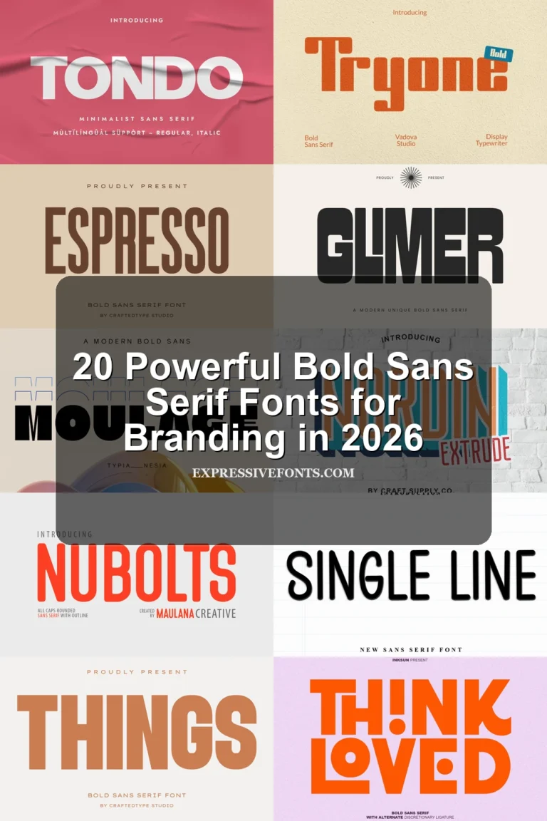
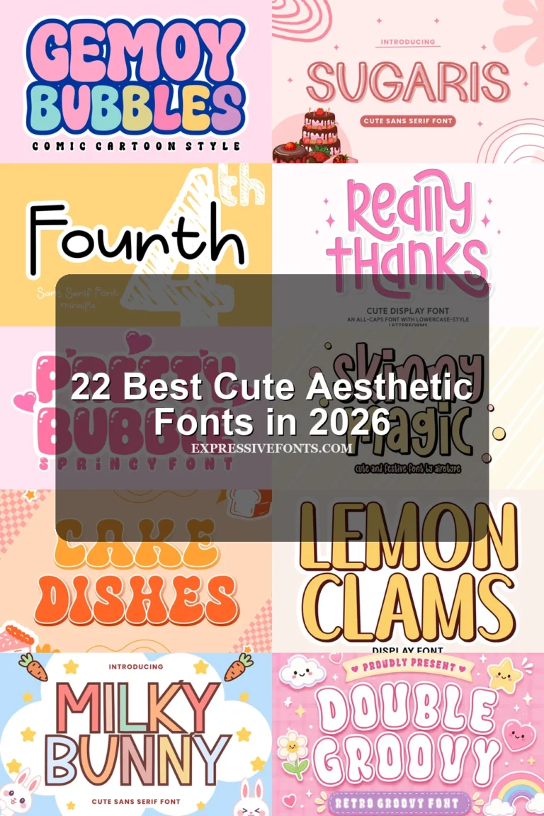
31 Best Serif Aesthetic Fonts in 2026
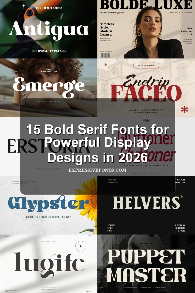
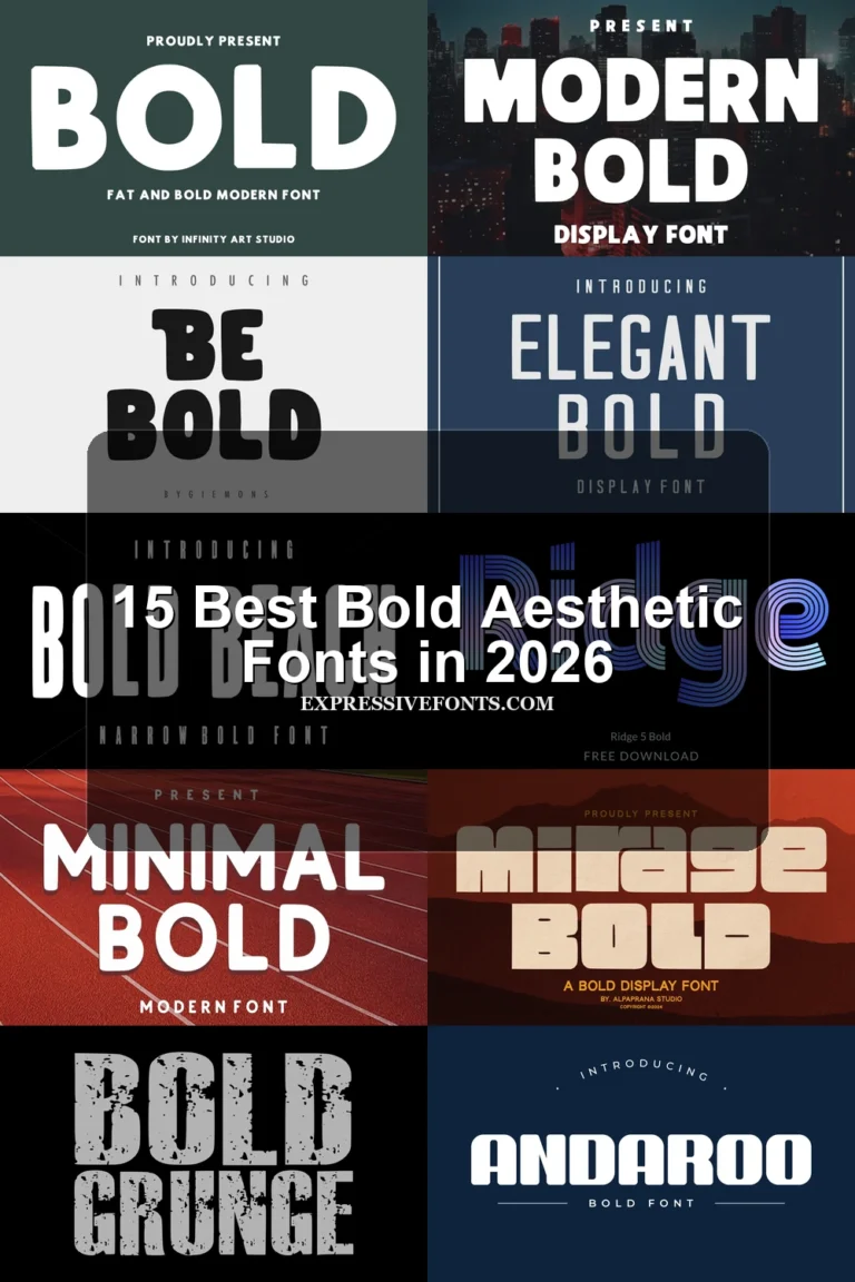
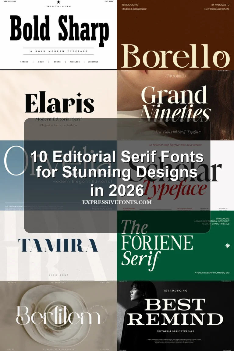
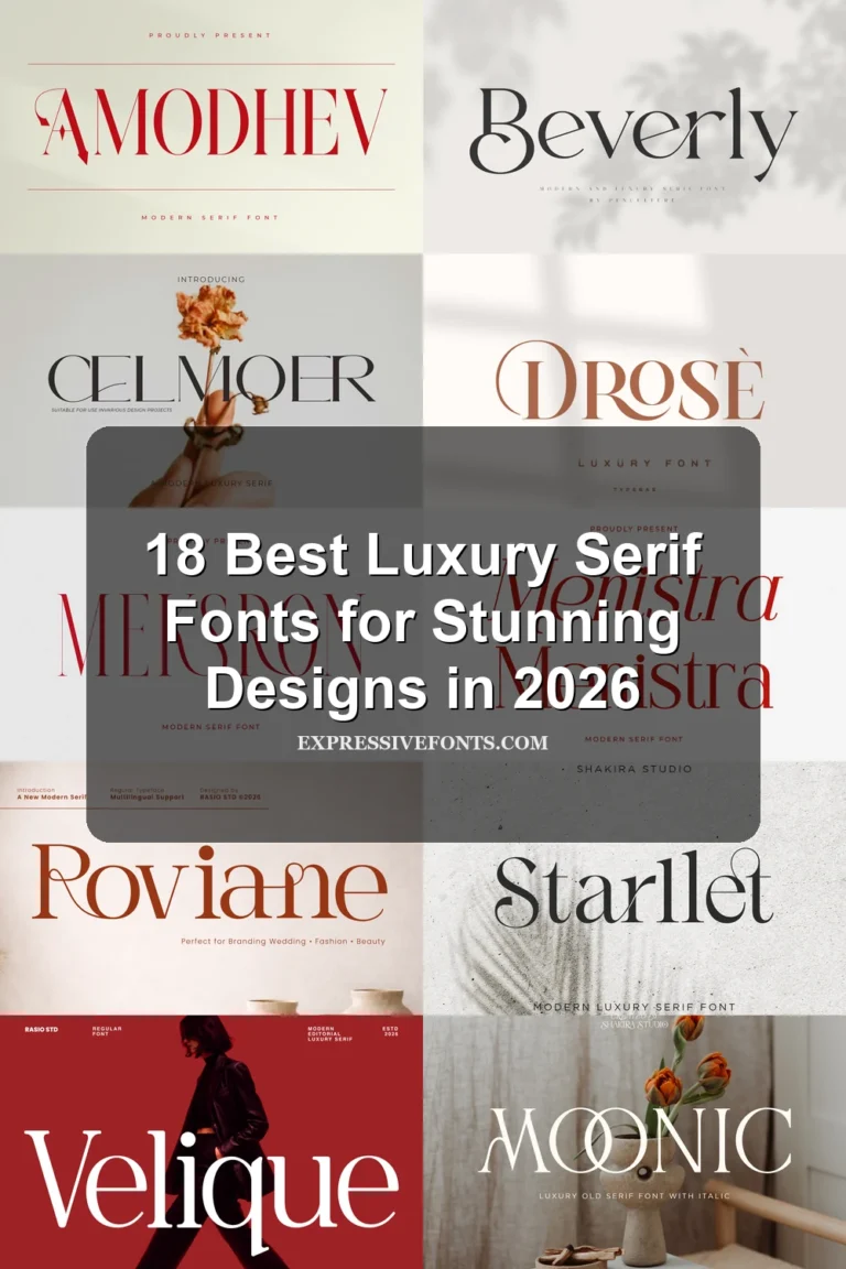
This collection of Serif Aesthetic Fonts spans narrow, high-contrast headline faces, connected ligature designs, editorial serifs, and tactile display styles. Their practical roles range from fashion logos and packaging to magazine covers, wedding stationery, posters, and short-form branding text.
Looking for more aesthetic fonts? Browse our complete Aesthetic Fonts collection to compare modern, elegant, bold, vintage, and retro aesthetic styles.
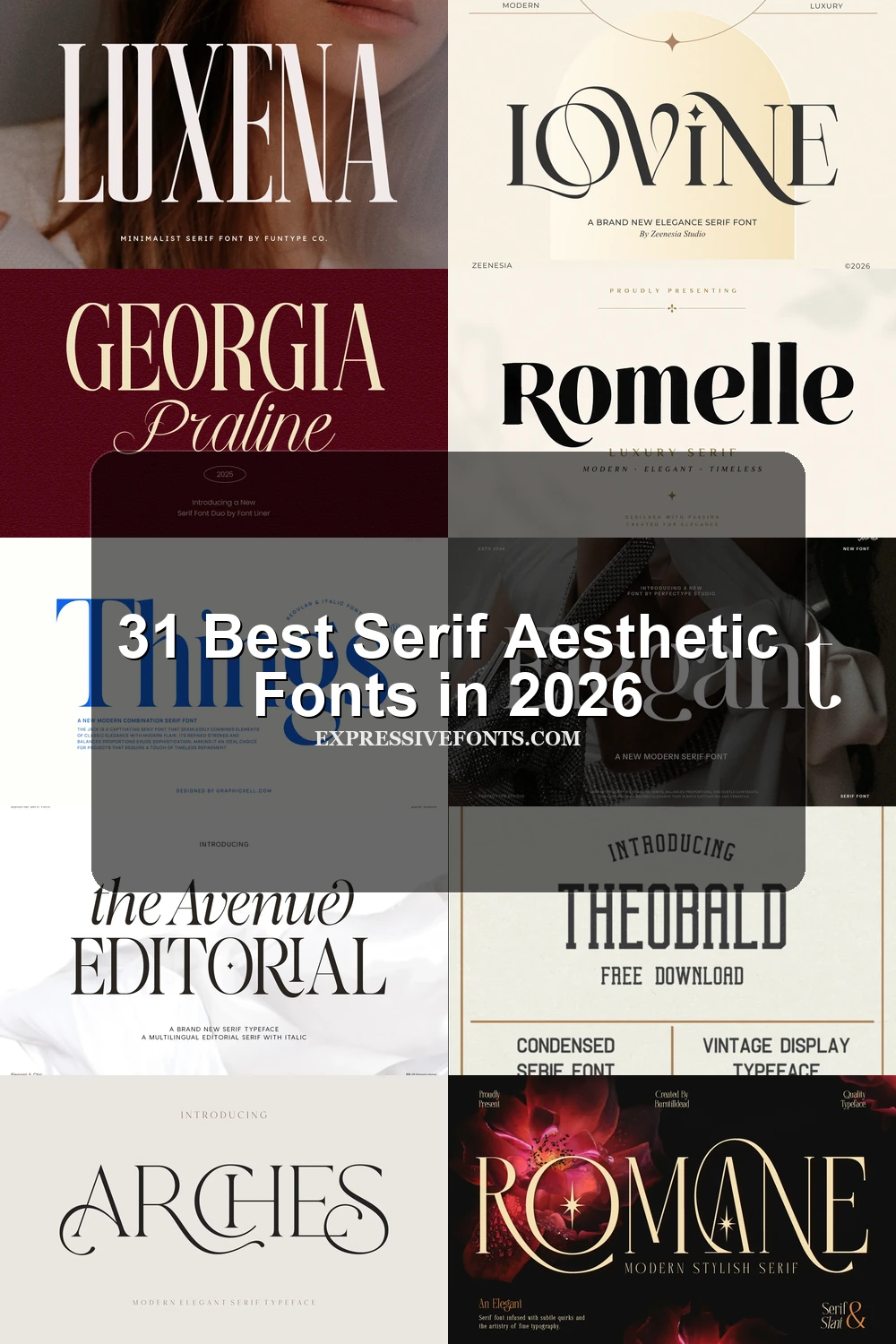
Serif Aesthetic Fonts: Condensed and Structured
These Serif Aesthetic Fonts use condensed widths, tall structures, slab construction, or strong vertical contrast to save space. They read more like posters and headlines than the broader editorial groups.
Established Font

Best For: logos, branding, headlines, display text
Established Font gives Serif Aesthetic Fonts a narrow, upright silhouette through condensed proportions, sharp serifs, and extreme thick-thin contrast. It creates polished vertical headlines and branding, but the tight forms are poor for small body copy.
Theobald Font
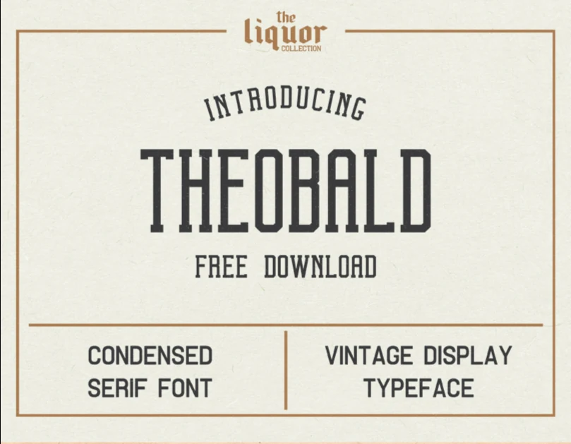
Best For: logos, branding, packaging, posters
Theobald Font uses condensed proportions, slab-like serifs, a high x-height, and nearly monoline strokes to create a sturdy sign-painting profile. It stays clear on posters, labels, packaging, and branding, with a more industrial feel than fashion-led serifs.
Epic Dope Font
Best For: headlines, editorial designs, luxury designs, high-end designs
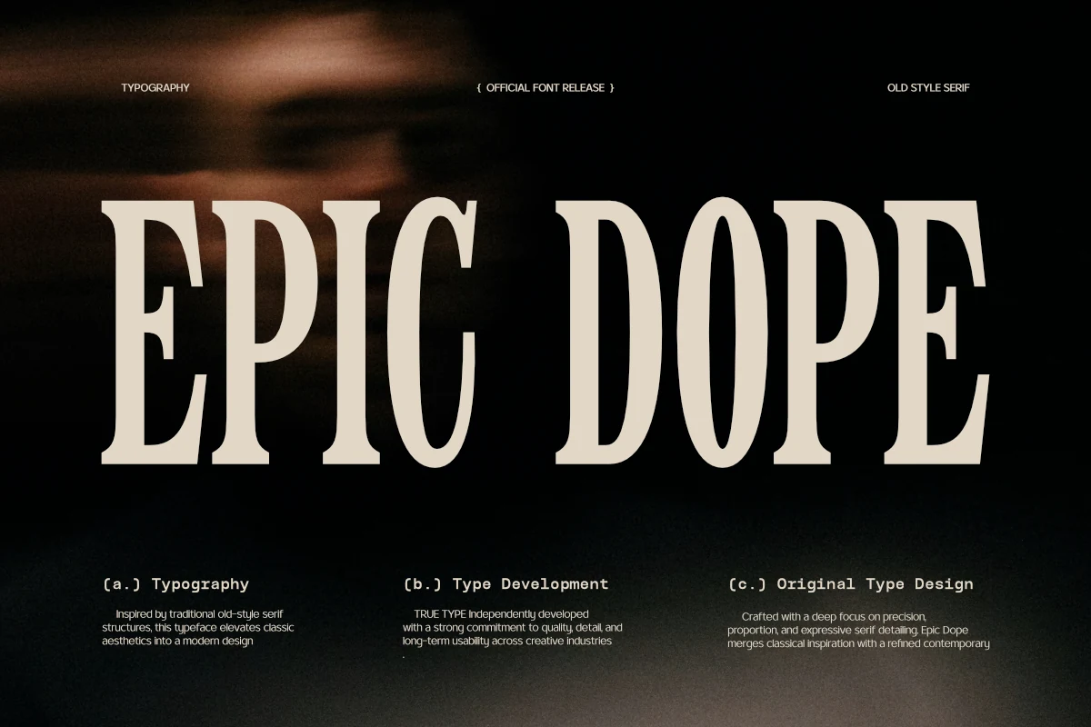
Epic Dope Font uses tall proportions, a high x-height, and condensed width to make vertical editorial headlines occupy less horizontal space. It remains clear when large, but condensation reduces comfort in small copy.
Luxena Font
Best For: logos, branding, headlines, posters
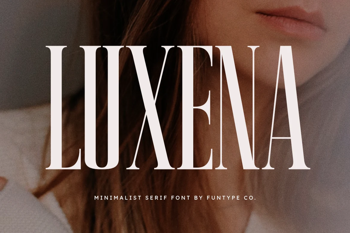
Luxena Font creates an especially space-saving silhouette through extreme condensation, tall structure, sharp serifs, and high contrast. It delivers impact in fashion logos, branding, headlines, and posters, but narrow counters restrict small applications.
Connected Flourishes and Ligatures
These Serif Aesthetic Fonts are defined by overlapping characters, ligatures, and swash connections. Their joined construction creates custom logo texture, but makes them less suitable for small or continuous reading.
Arches Font
Best For: logos, branding, invitations, display text
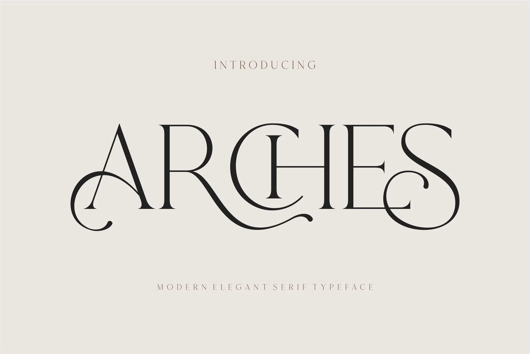
Arches Font makes connected Serif Aesthetic Fonts feel genuinely interlocked, using overlapping letters and swashed capitals to form a ligature-like texture. It gives logos and invitations a custom presence, but overlaps can reduce legibility when reduced.
Moon Creme Font
Best For: logos, branding, website headers, editorial designs
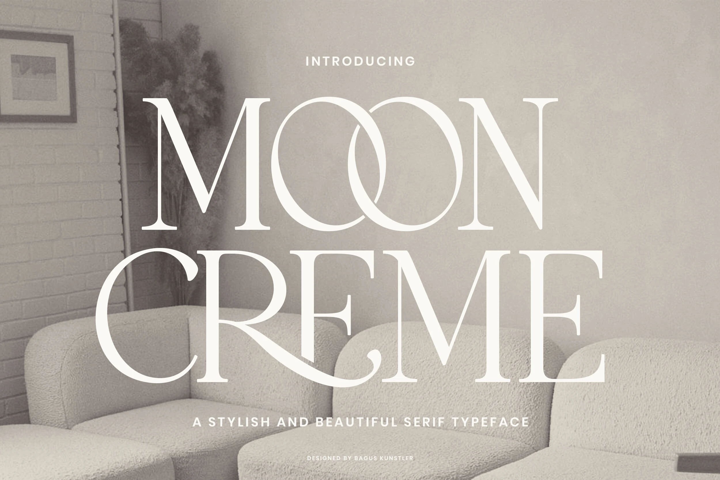
Moon Creme Font introduces connected movement through linked O forms and curved C and R swashes. The overlaps help logos and website headers feel cohesive, but neighboring forms may merge when the type is reduced.
Ethereal Font
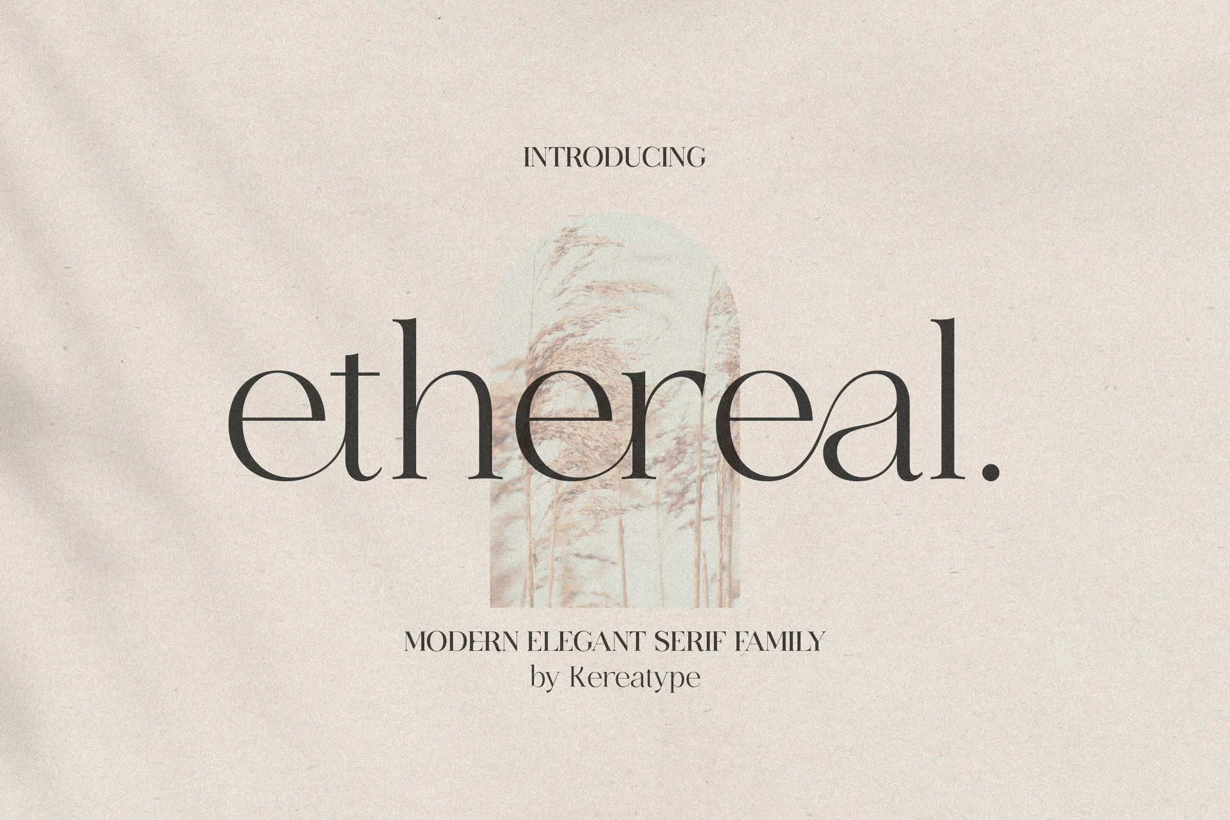
Best For: logos, branding, headlines, display text
Ethereal Font combines sharp serif edges with open, circular counters and a refined high-contrast structure. It retains some display clarity, but its intricate construction remains unsuitable for body copy.
Lovine Font
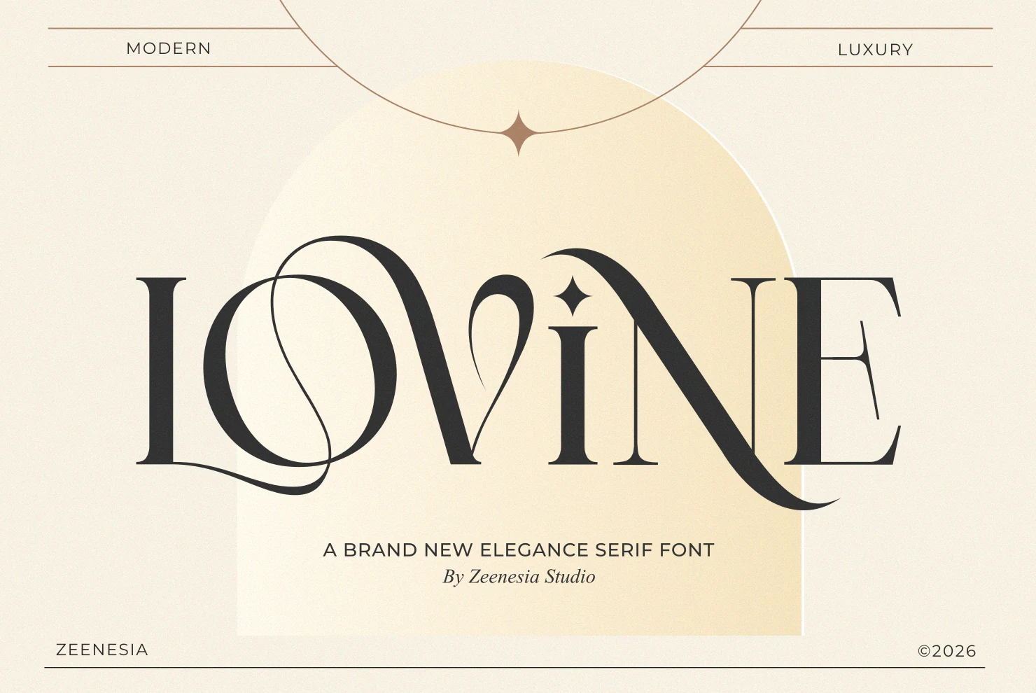
Best For: logos, branding, headlines, editorial designs
Lovine Font makes expansive calligraphic curves and a connected construction the central feature of its design. The joins suit logos, branding, and editorial titles, but complex connections slow word-by-word scanning.
Eloires Font
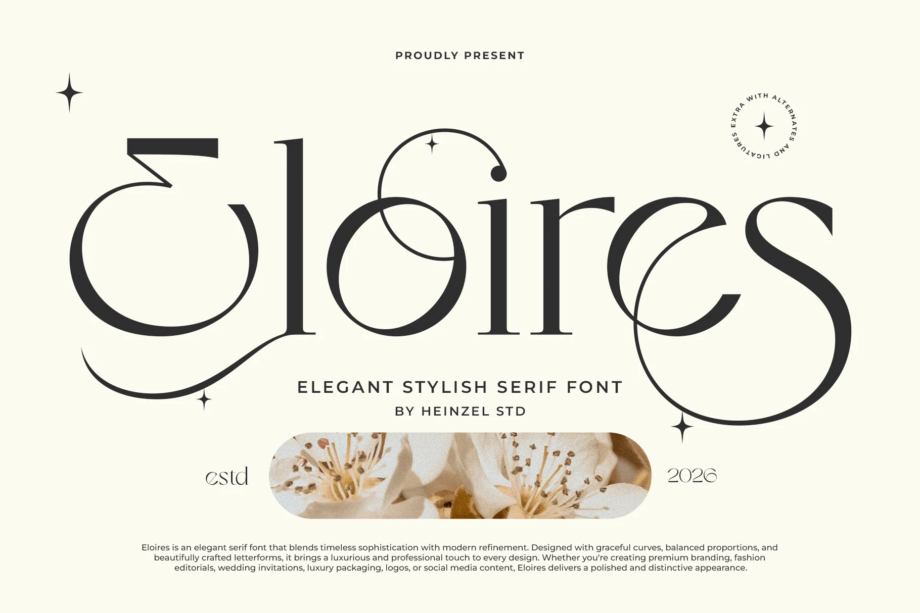
Best For: logos, branding, luxury designs, editorial designs
Eloires Font uses discretionary ligatures and swashes on the E, l, and s to customize a regular-width serif. Its alternates can shape distinctive brand marks, though the same additions compromise clarity in smaller headers.
Editorial High-Contrast Serifs
The most editorial Serif Aesthetic Fonts pair high contrast with sharp serifs, open counters, italics, or isolated signature details. They offer more structural range than the heavily connected and ornate groups.
Romelle Font
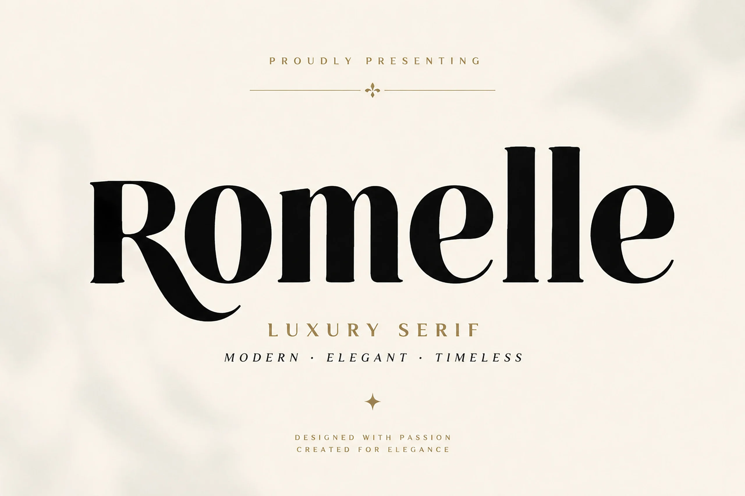
Best For: logos, branding, packaging, magazine covers
Romelle Font stands out through pronounced bracketed serifs and a tail-like lowercase r. This high-contrast construction suits packaging, logos, and fashion titles, although its delicate variation is less comfortable for small reading sizes.
Montega Font
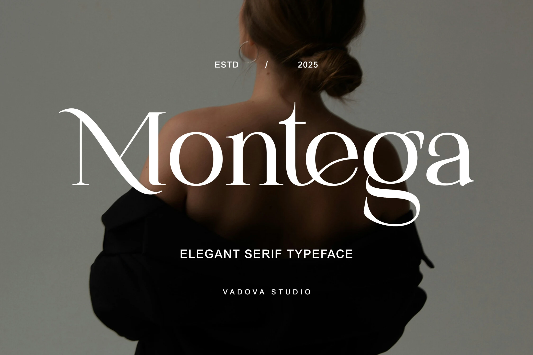
Best For: logos, luxury designs, editorial designs, beauty branding
Montega Font balances geometric precision and high contrast with flowing lowercase swashes. That combination gives beauty branding, fashion identities, and editorial layouts a distinctive voice, while the decorative movement is best limited to short display wording.
Elegant Font
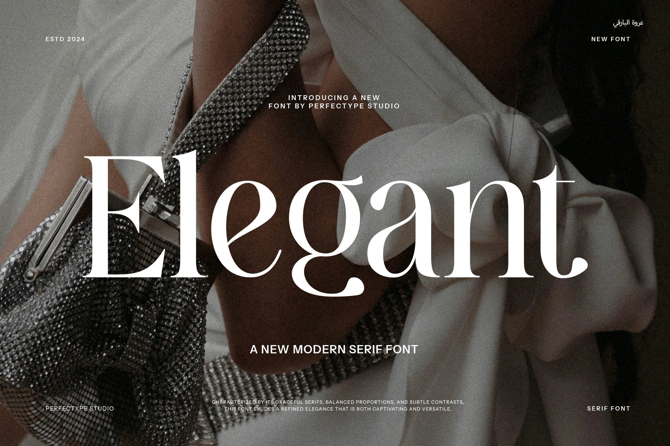
Best For: logos, luxury designs, editorial designs, headlines
Elegant Font softens the severity of sharper display serifs through fluid curves, gently curved terminals, and moderate proportions. It adapts well to logos and headlines, though its thin high-contrast strokes still need generous sizing.
Romane Font
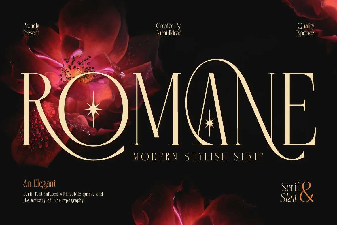
Best For: logos, branding, editorial designs, headlines
Romane Font builds its identity from sweeping swashes, mixed slant, and four-pointed star ornaments layered onto thin, sharp serifs. It can distinguish titles and brand marks, but the ornament density rules it out for continuous reading.
Wolmer Font
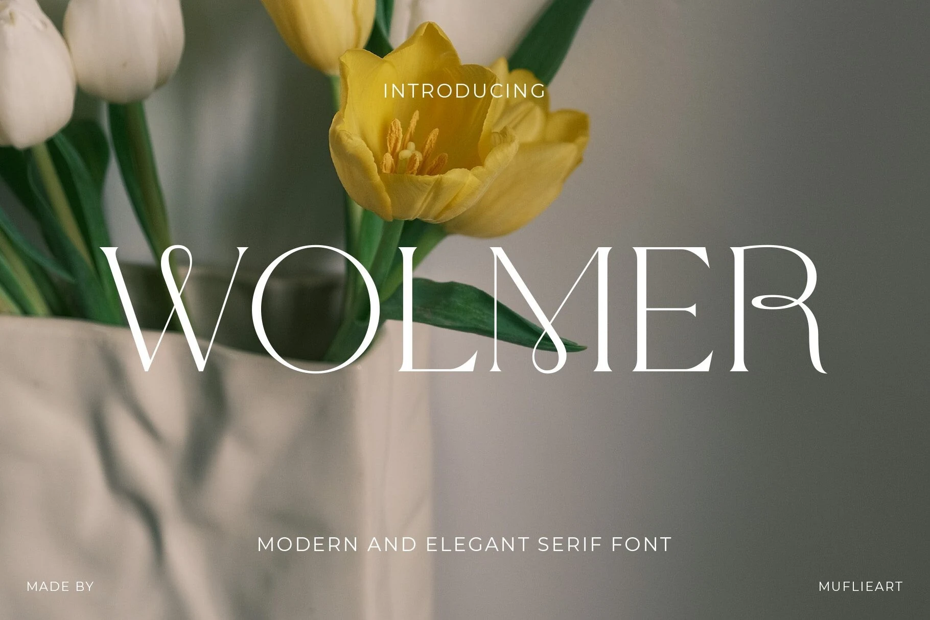
Best For: editorial designs, luxury designs, headlines, display text
Wolmer Font keeps its spacious serif fit relatively clean, then adds recognition through an extended R swash and interlocking crossbars. It performs well in large editorial lines, although the R detail may vanish at reduced sizes.
Seraphim Font
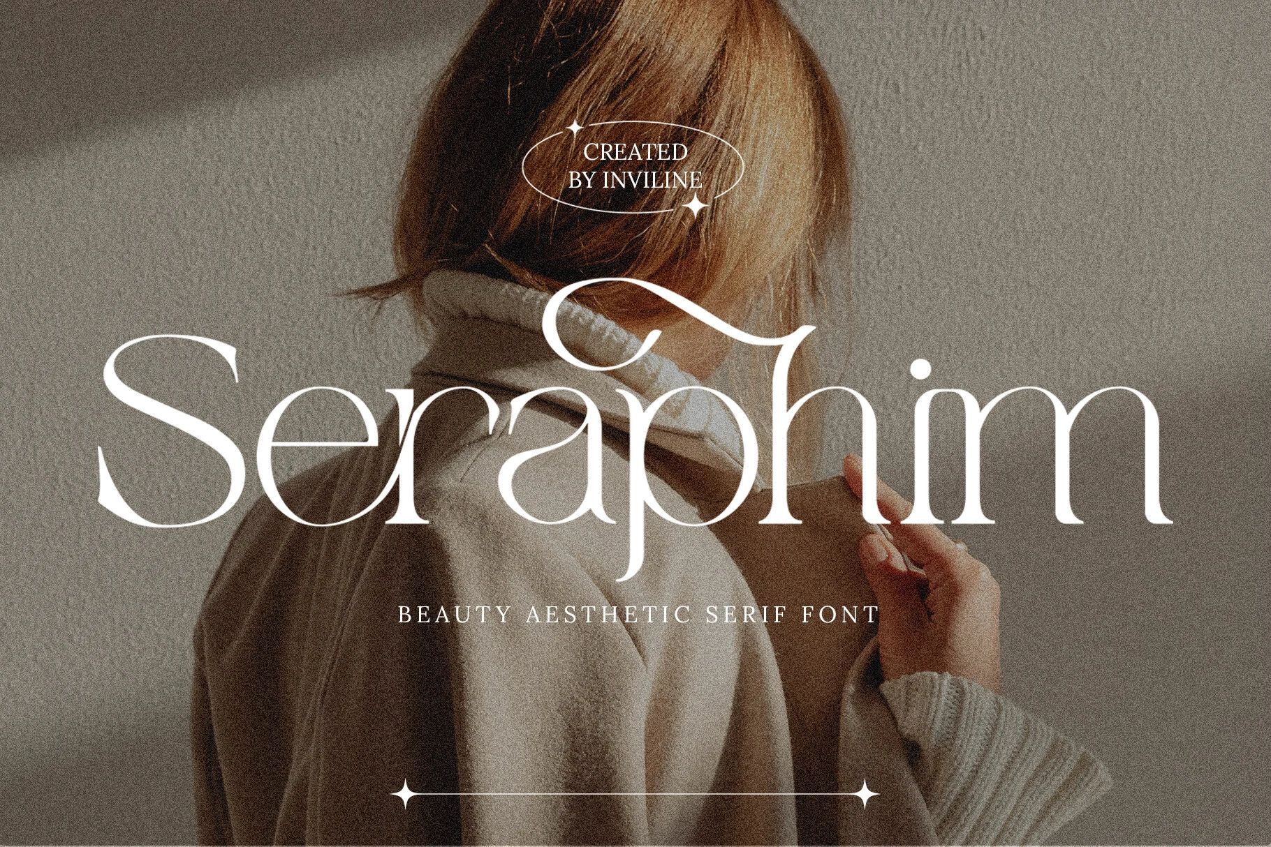
Best For: branding, packaging, wedding designs, quotes
Seraphim Font uses open spacing and an airy serif framework, punctuated by a prominent lowercase r swash and pointed serifs. It suits packaging, invitations, branding, and quotes, but its thin strokes require clear display scale.
Stellar Oracle Font
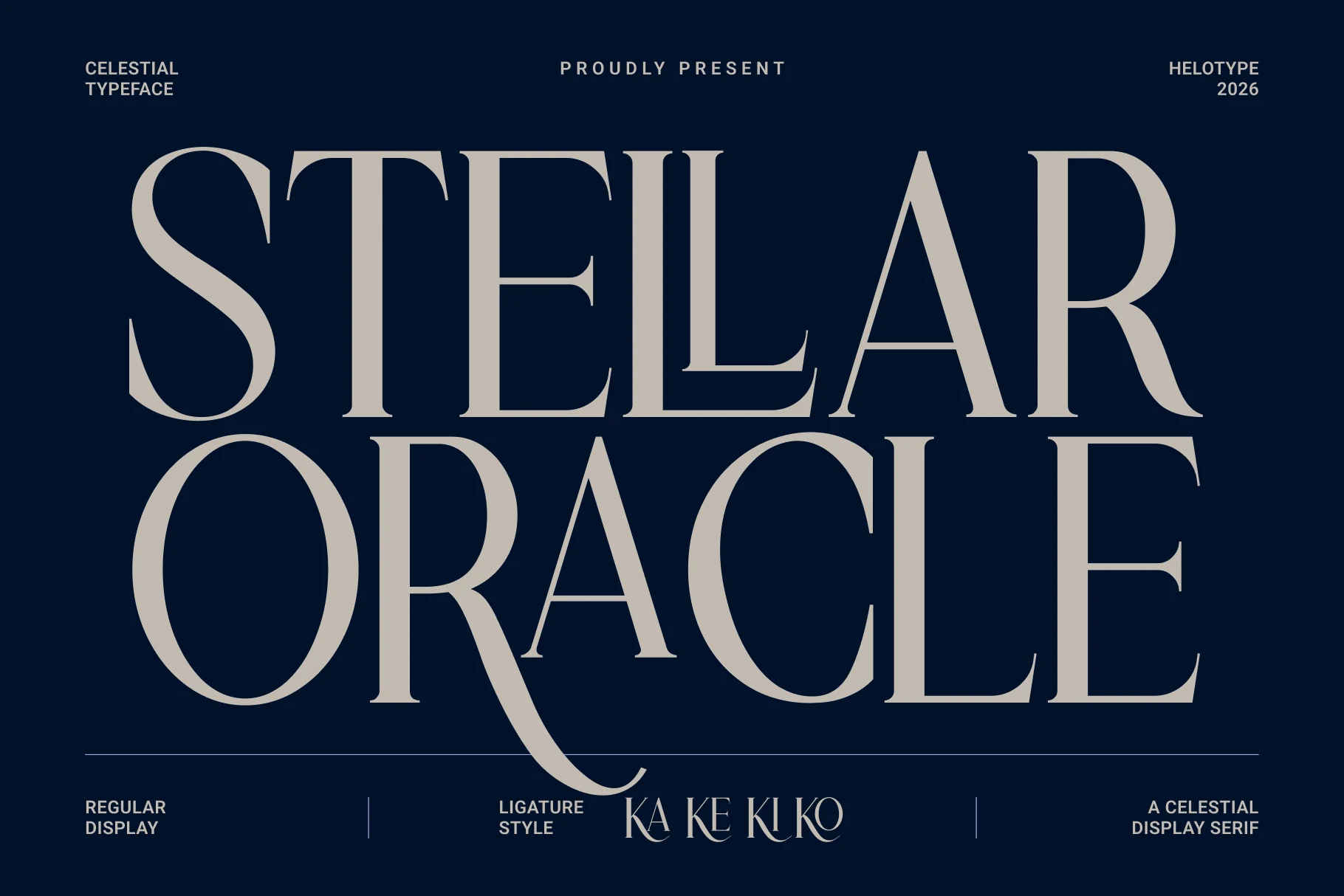
Best For: branding, packaging, book covers, luxury designs
Stellar Oracle Font has wide proportions, extended detailing, and a long R swash that gives short titles a broad, celestial silhouette. It fits book covers, packaging, and branding better than dense copy.
Georgia Praline Font
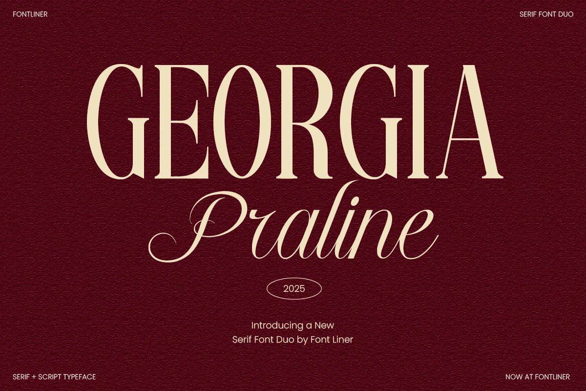
Best For: branding, wedding designs, editorial designs, premium designs
Georgia Praline Font pairs a high-contrast serif with a flourished script, giving the set two distinct lettering functions. Use the serif for supporting wording and the script for names or accents in weddings, branding, and packaging; the script remains display-only.
Olivia Serif Font
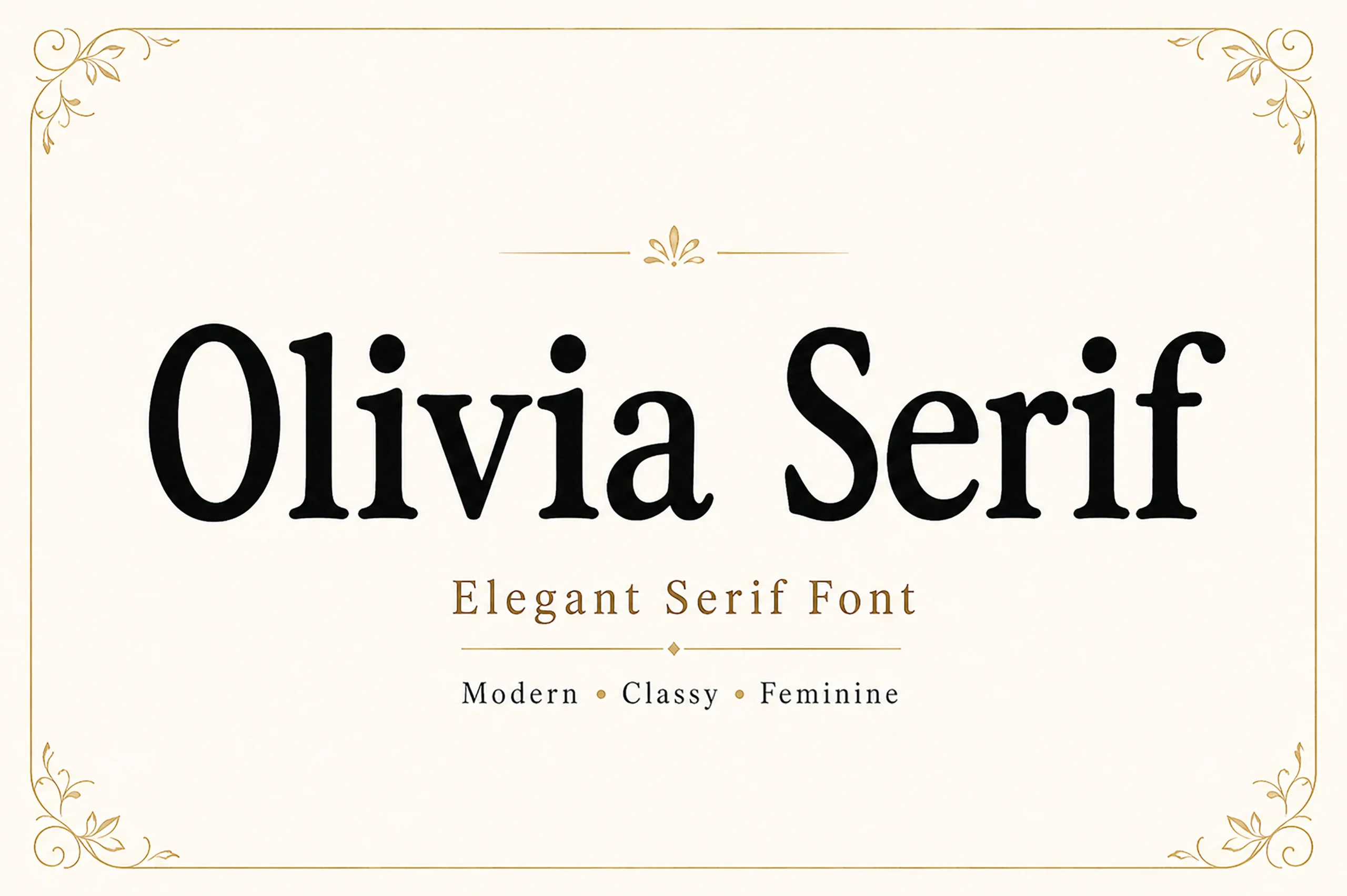
Best For: branding, luxury designs, editorial designs, headlines
Olivia Serif Font stays comparatively traditional with a vertical axis, bracketed serifs, and familiar structural proportions. Its clear construction supports display headings and branding, while high contrast and fine details make body text less suitable.
Grandeur – Elegant Classic Serif Font
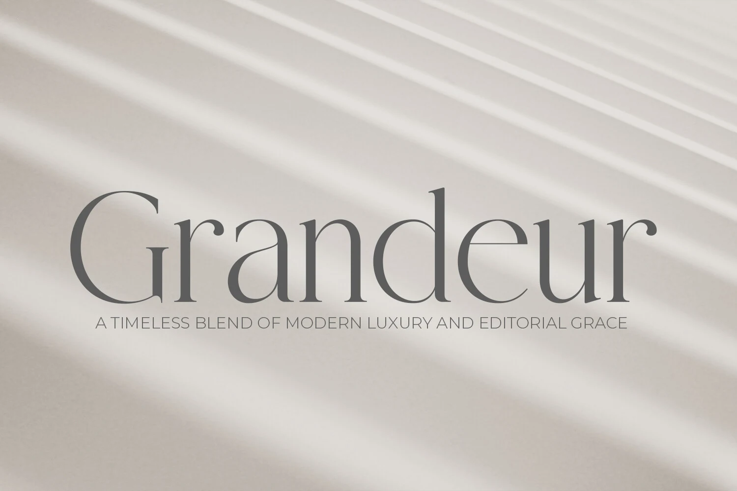
Best For: logos, branding, editorial designs, luxury designs
Grandeur – Elegant Classic Serif Font opens up its high-contrast structure with wide proportions, open counters, and triangular serifs. Large titles remain easy to read, but hairline details discourage paragraph-sized use.
The Avenue Editorial Font
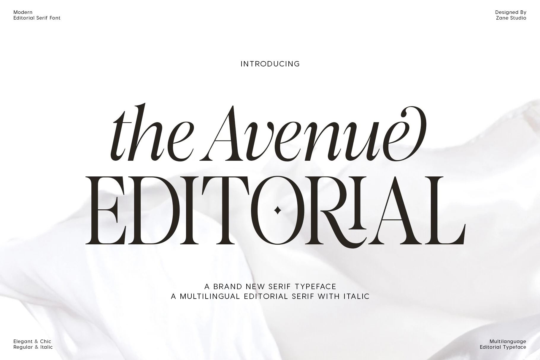
Best For: magazine covers, website headers, fashion branding, headlines
The Avenue Editorial Font creates a recognizable editorial fingerprint through a lowercase e flourish and diamond detail inside the uppercase O. Its italics and contrasting strokes suit headers and logos, though compact text becomes harder to scan.
Rethena Font
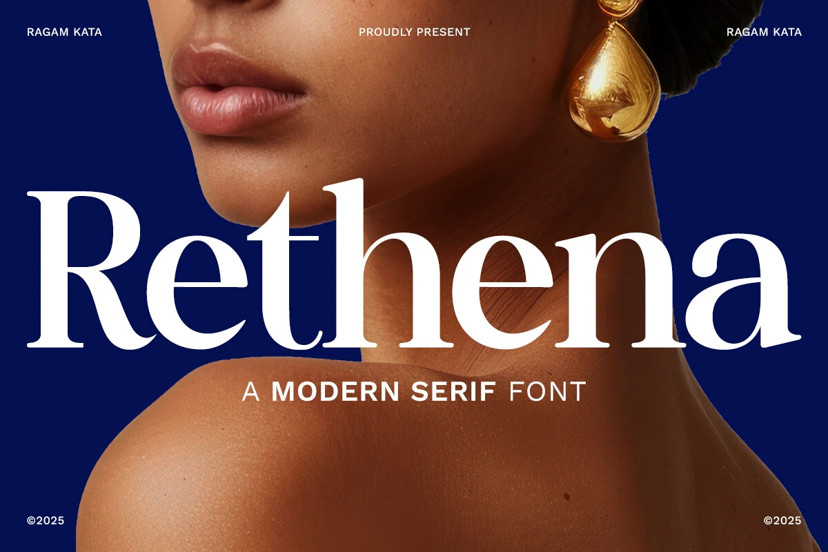
Best For: luxury designs, fashion branding, high-end designs, logos
Rethena Font combines bold weight, wide characters, sharp serifs, and rhythmic curve transitions for a strong presence in fashion branding and large headlines. Its thin internal strokes need generous sizing to remain distinct.
Gilgan Font
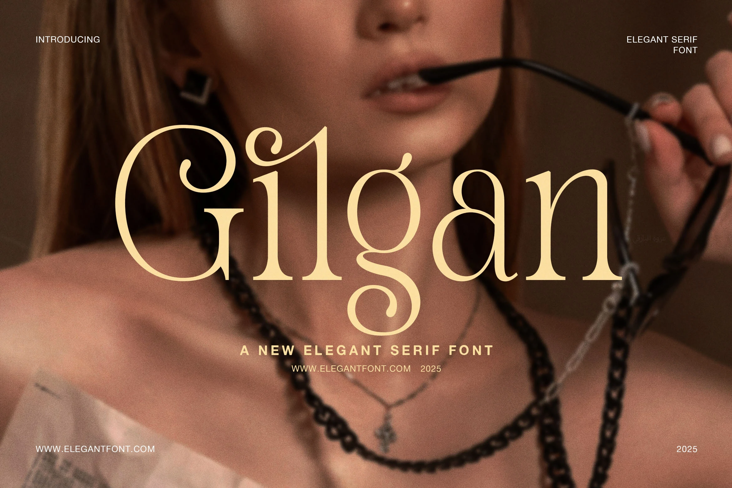
Best For: branding, magazine covers, fashion branding, display text
Gilgan Font retains a classic serif skeleton but adds flowing ligatures and swash terminals on the G and n. These linked accents elevate magazine covers and fashion marks, while smaller settings lose clarity.
Chiko Font
Best For: logos, editorial designs, luxury designs, display text
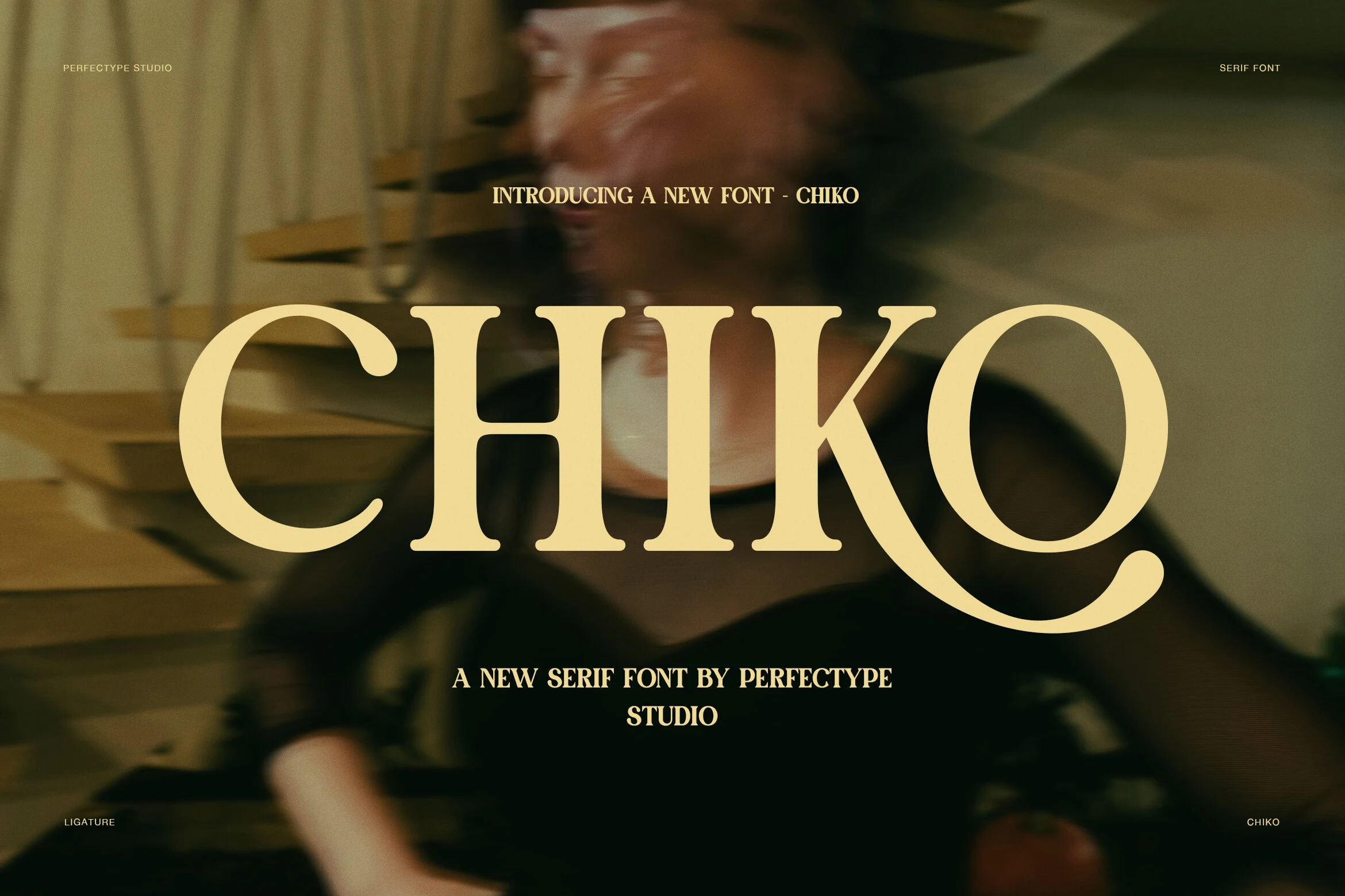
Chiko Font uses large horizontal serifs and a sweeping Q tail to give its bold editorial structure a clear focal detail. The weight holds attention in logos and display lines, but the Q is less neutral in functional text.
Things Font
Best For: logos, branding, headlines, high-end designs
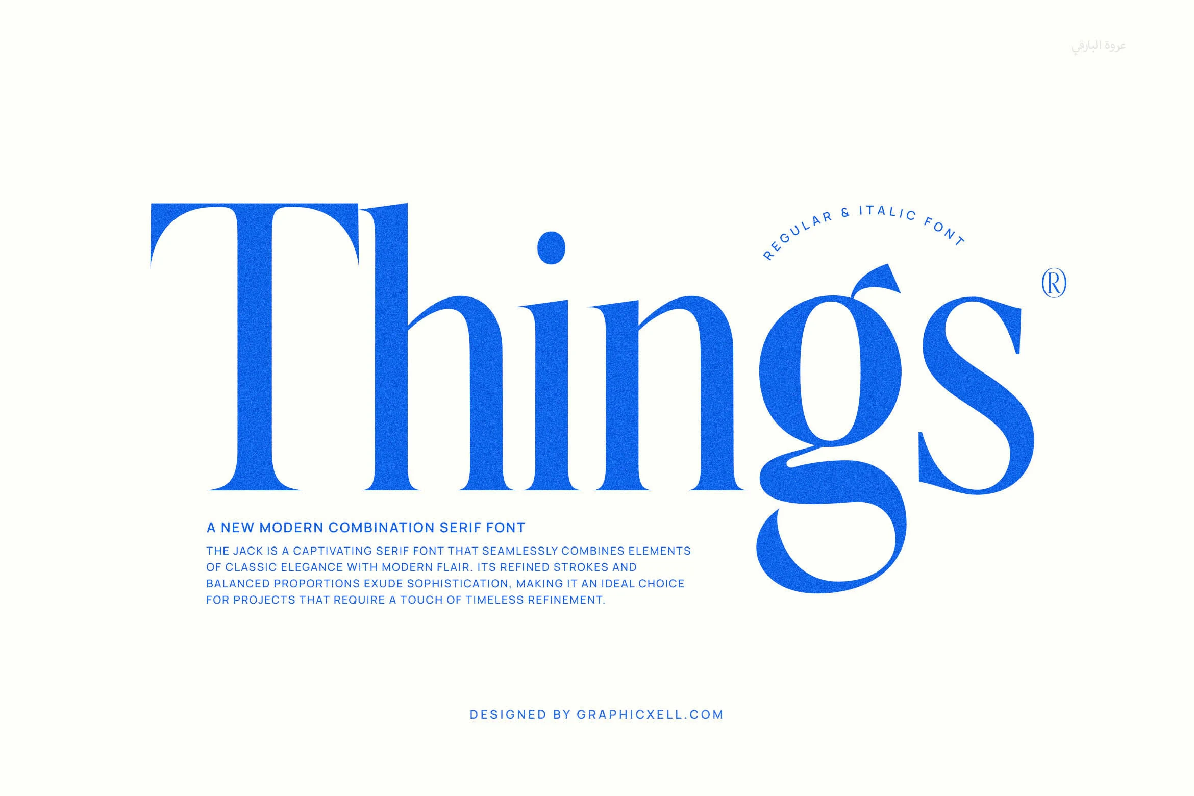
Things Font distinguishes its high-contrast serif through sharp triangular serifs, elongated terminals, and unusually high circular dots. Those details reward large logos and headlines, while fine strokes lose definition in body copy.
Personal Vogue Font
Best For: luxury designs, editorial designs, headlines, branding
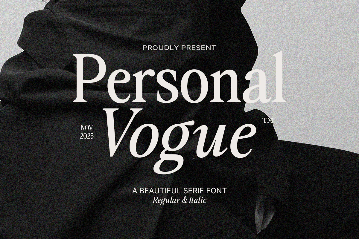
Personal Vogue Font adds editorial motion through mixed slant and flowing italic curves alongside balanced upright forms. The contrast works well for fashion titles and branding, but its high-contrast strokes still favor large display sizes.
Ornate, Vintage, and Tactile Displays
These Serif Aesthetic Fonts add stencil breaks, ink-bleed edges, star dots, calligraphic terminals, or flourished initials. Their tactile and decorative surfaces favor memorable display moments over neutral typography.
Tobacco Road Font
Best For: logos, branding, headlines, T-shirts
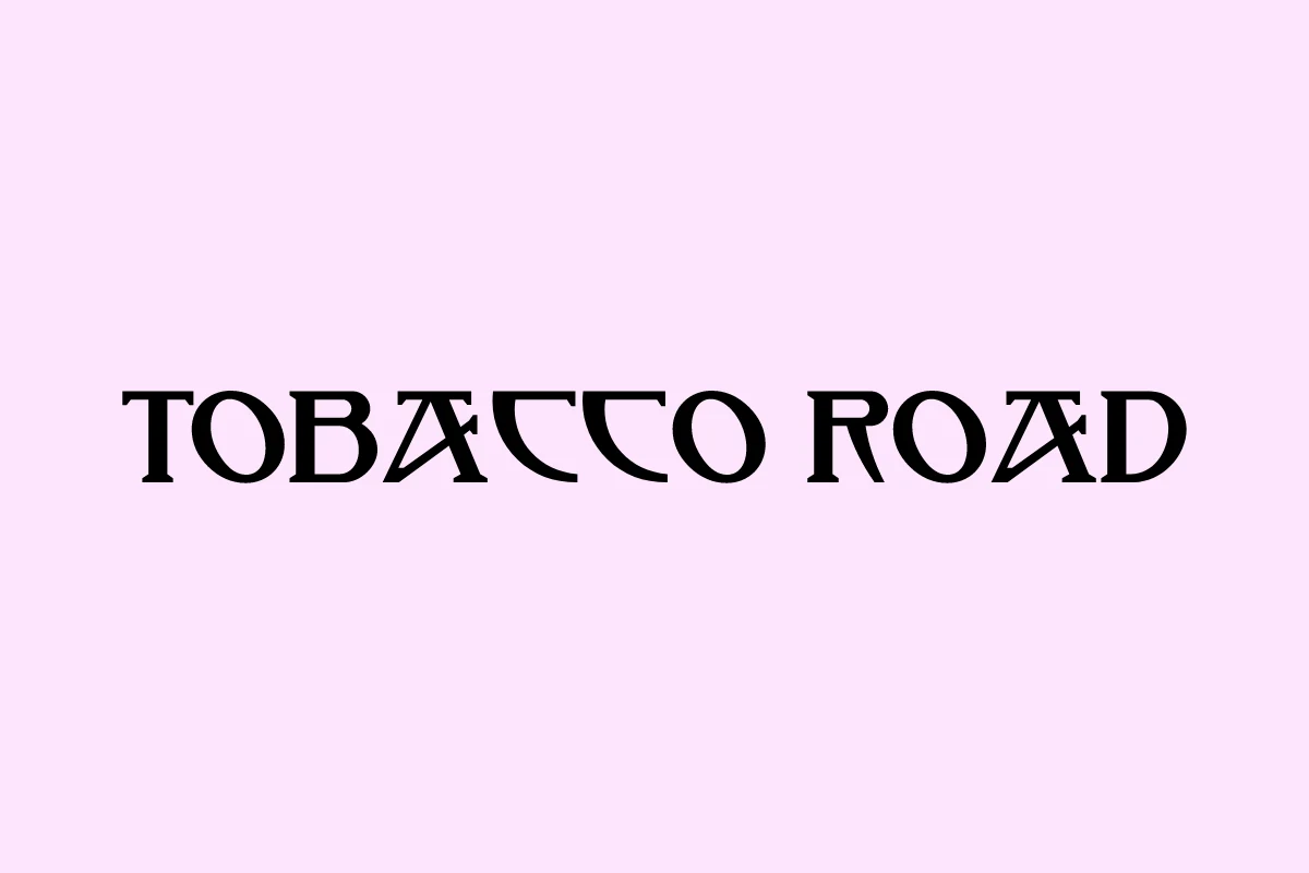
For Serif Aesthetic Fonts with a broken, retro surface, Tobacco Road Font cuts stencil-like gaps through sharp, flared serif forms. The interruptions bring character to logos, headlines, and T-shirts, but make paragraphs difficult to scan.
Loving Ambros Font
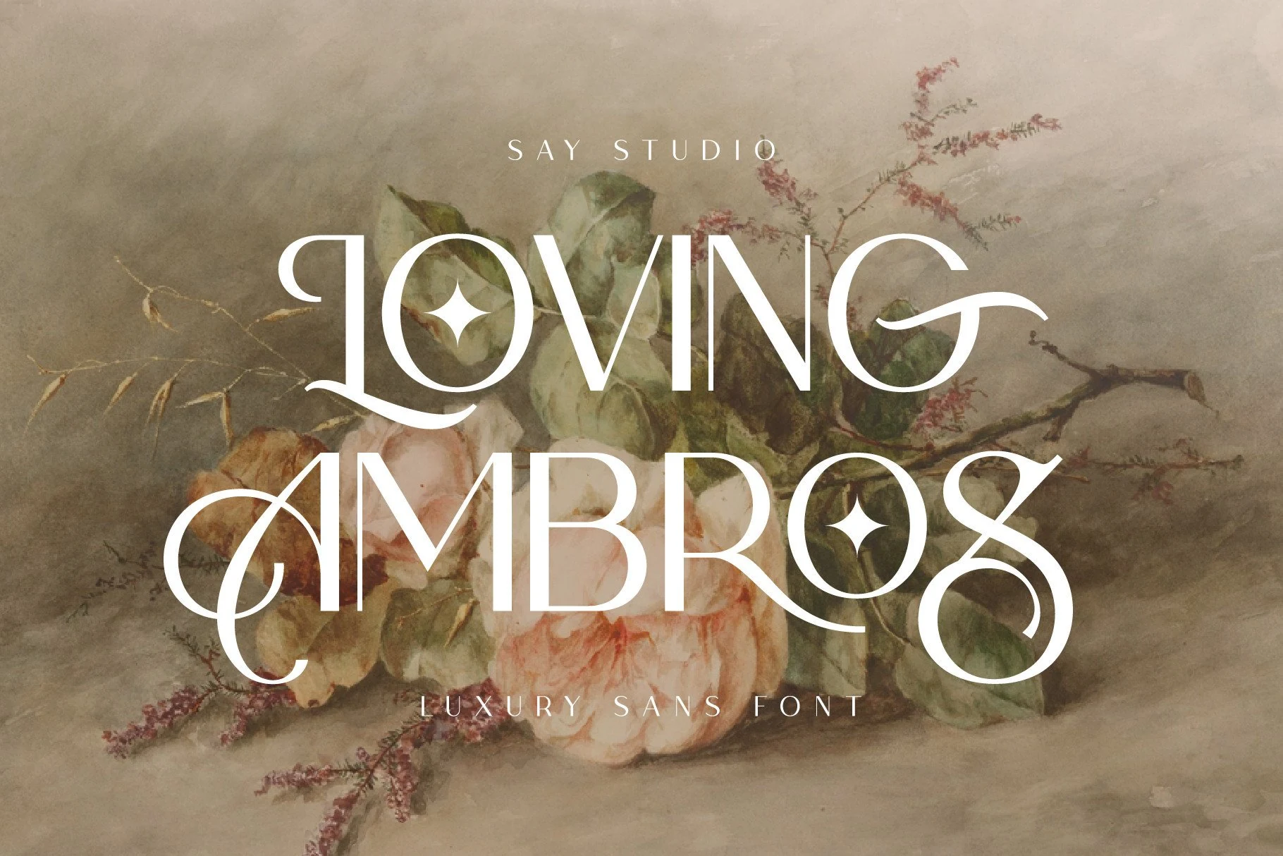
Best For: headlines, logos, packaging, editorial designs
Loving Ambros Font pushes a condensed serif base toward ornate display lettering with exaggerated swashes and diamond-shaped dots. Its tall, high-contrast forms suit titles, logotypes, packaging, and wedding work, provided the lettering is shown large.
Inktype Font
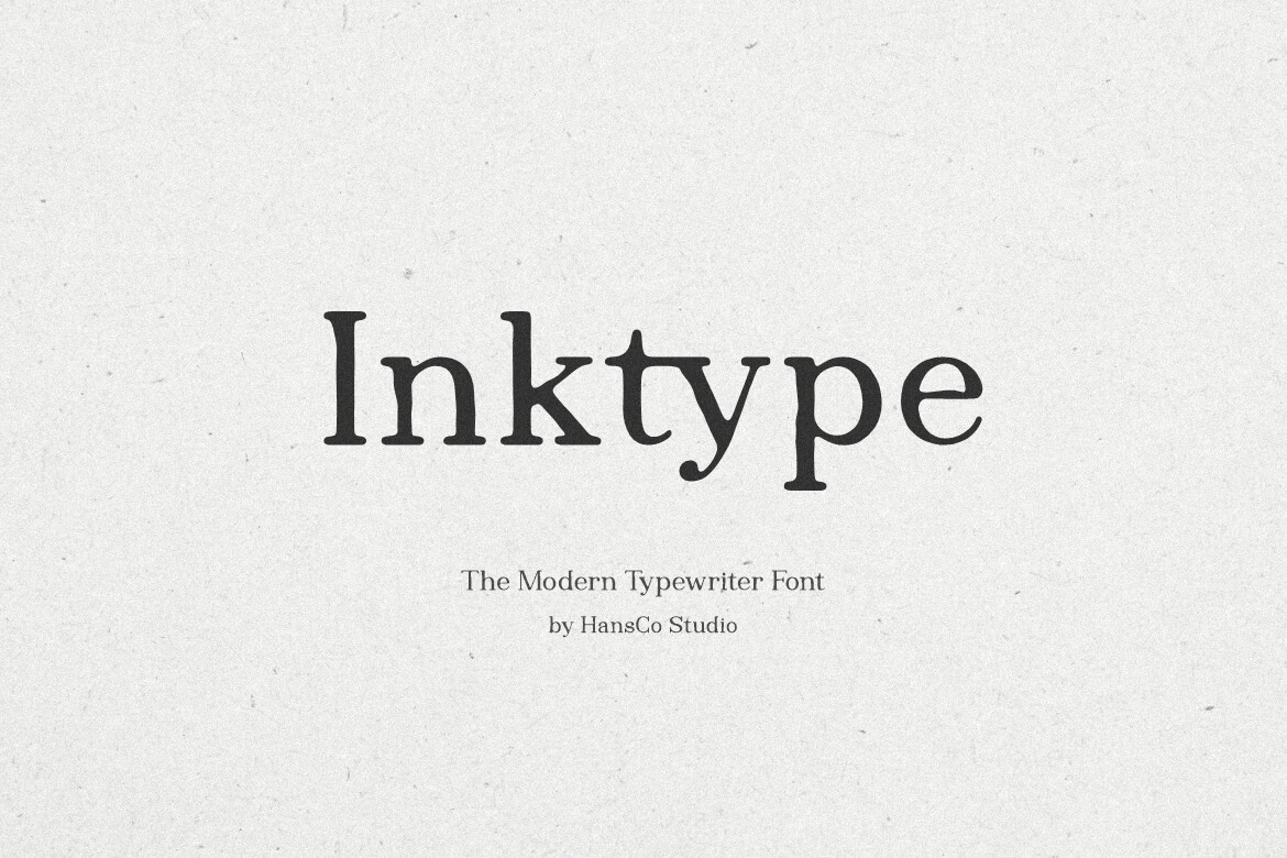
Best For: branding, posters, invitations, business cards
Inktype Font combines block-like slab serifs with uneven ink-bleed edges and a hand-drawn surface. The tactile finish works particularly well on posters, invitations, business cards, and branding where a perfectly clean corporate texture would feel too sterile.
Semika Font
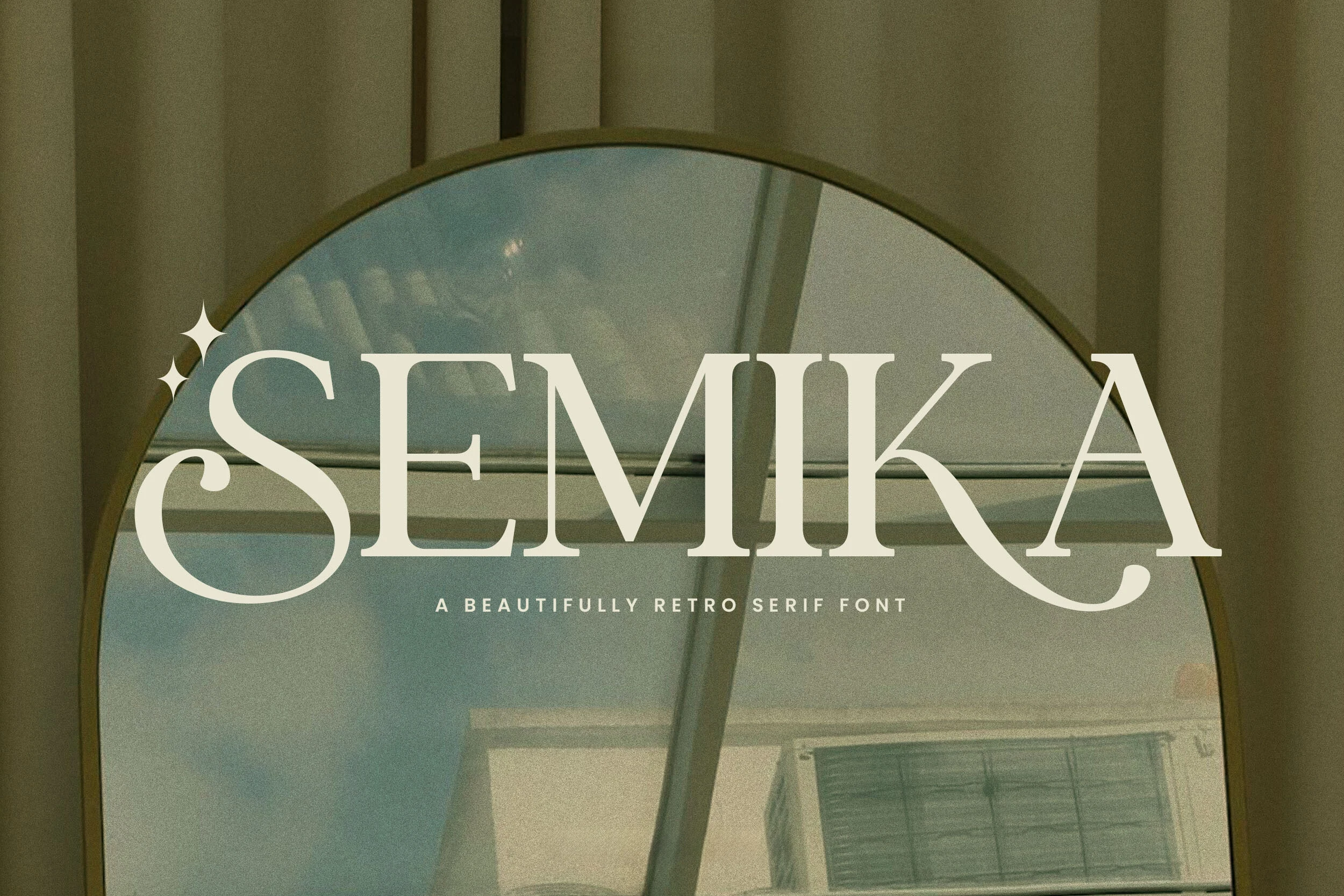
Best For: logos, packaging, display text, headlines
Semika Font reinforces its retro serif structure with terminal swashes and a star-shaped dot on the uppercase I. Those details make logos, display text, and wedding packaging memorable, but less appropriate for neutral layouts.
Frestin Font
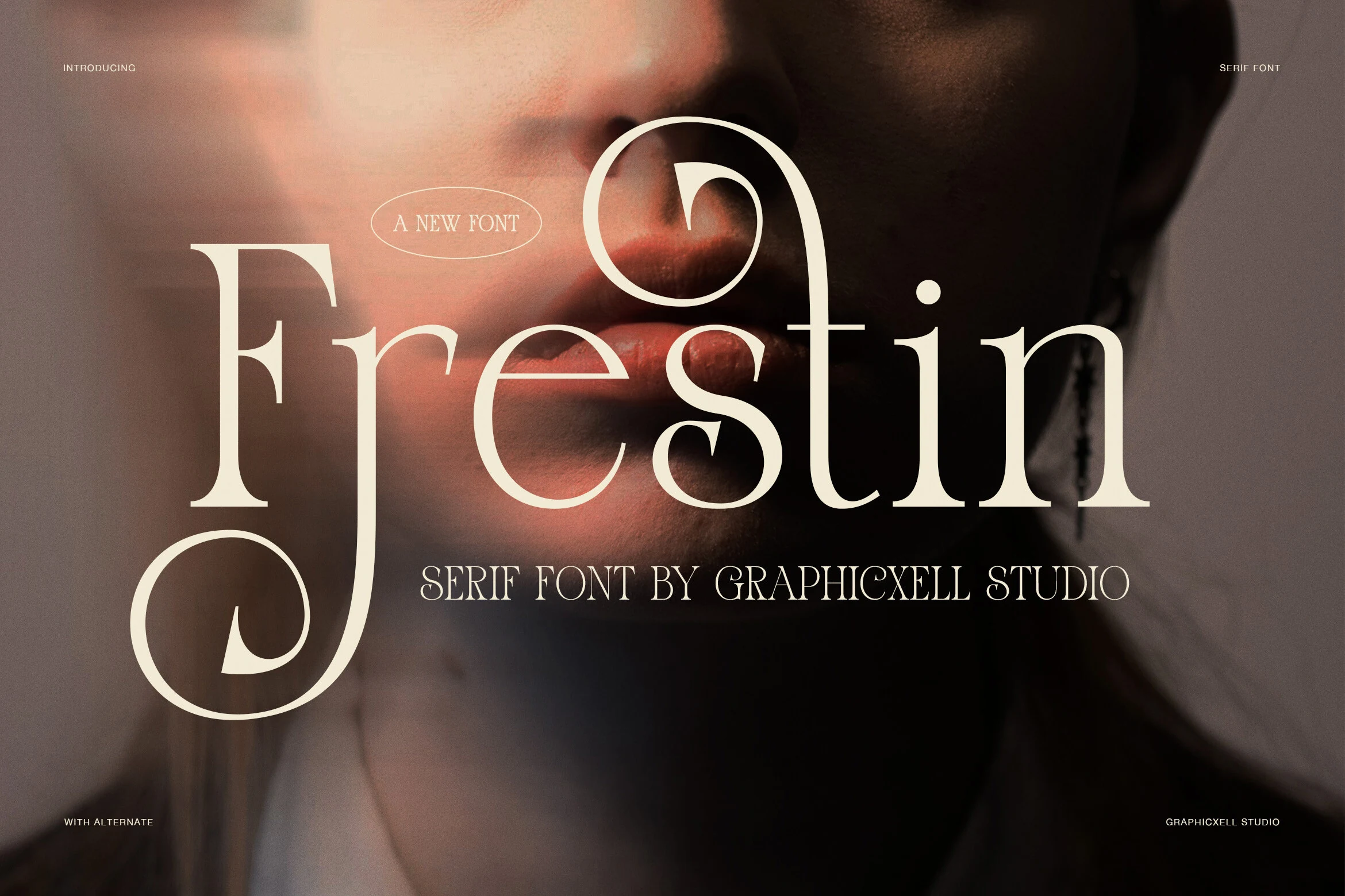
Best For: branding, magazine covers, fashion branding, high-end designs
Frestin Font turns an upright, high-contrast serif into a theatrical display face with calligraphic terminal swashes. It brings strong emphasis to covers and fashion branding, though the flourishes leave little room for long headlines.
Acreme Bloom Font
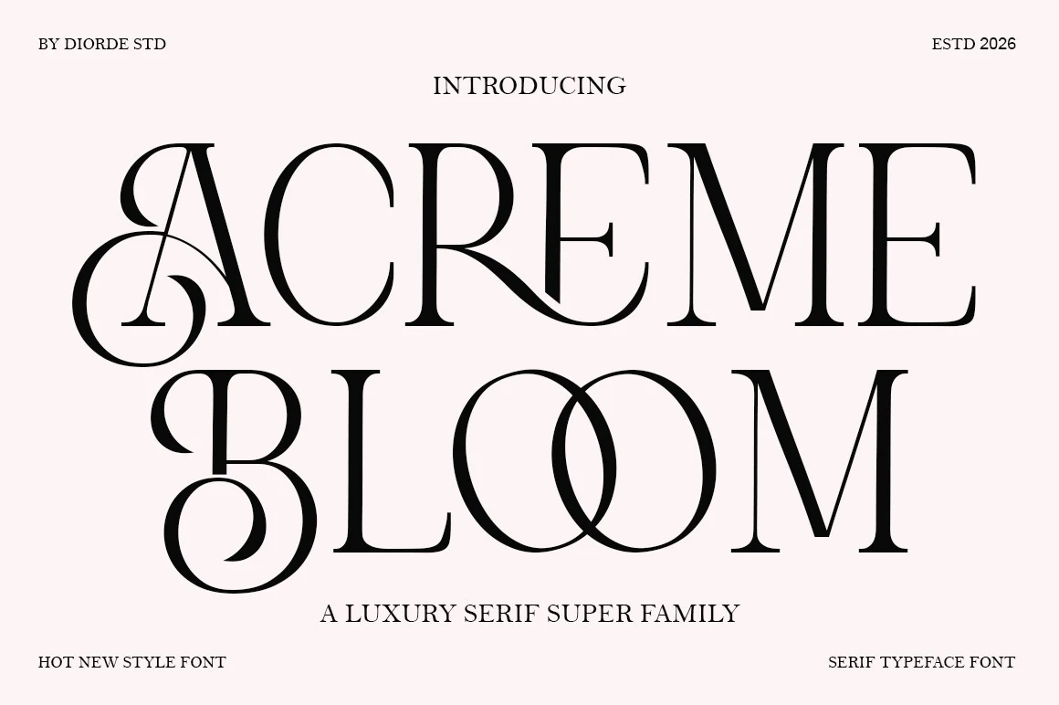
Best For: display text, headlines, magazine covers, luxury designs
Acreme Bloom Font concentrates its decorative energy in exaggerated initial swashes, extended crossbars, and flowing curves. It works best for covers and opening words, since heavily flourished initials can disrupt repeated or longer text.
How to Choose the Right Font
Choose among Serif Aesthetic Fonts by starting with construction: condensed faces save width, connected styles prioritize customized joins, and editorial serifs offer clearer counters. Check weight and contrast at the intended scale, reserve swashes for short display wording, and use sturdier slab or monoline options when posters and labels need dependable readability.