18 Best Brush Calligraphy Fonts for Wedding Invitations in 2026
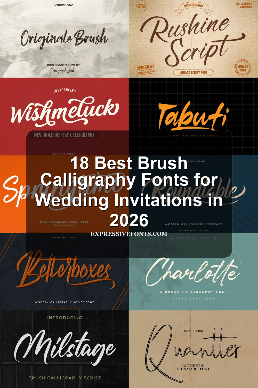
This collection of Brush Calligraphy Fonts ranges from polished, high-contrast lettering with sweeping flourishes to gritty, dry-brushed scripts and dense, energetic display styles. Together, they suit logos, packaging, invitations, posters, social graphics, headlines, and other short-form designs where visible stroke character matters.
Looking for more calligraphy fonts? Browse our complete Calligraphy Fonts collection to compare modern, elegant, bold, wedding, and logo-friendly calligraphy styles.
Brush Calligraphy Fonts: Flourished Elegance
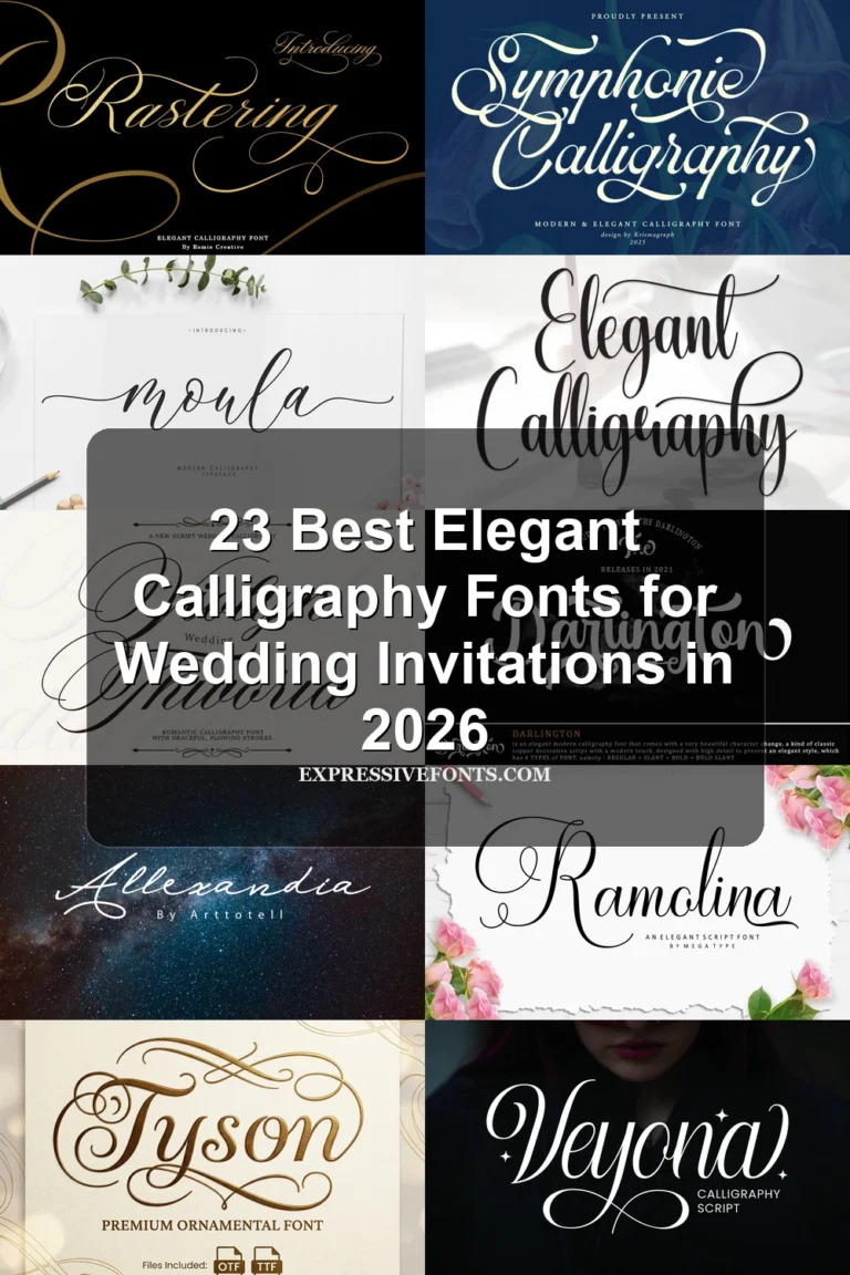
These Brush Calligraphy Fonts emphasize controlled slants, dramatic contrast, pointed terminals, and ornamental swashes, giving them a more formal, decorative role than the rougher or heavier groups.
Advantageous Font
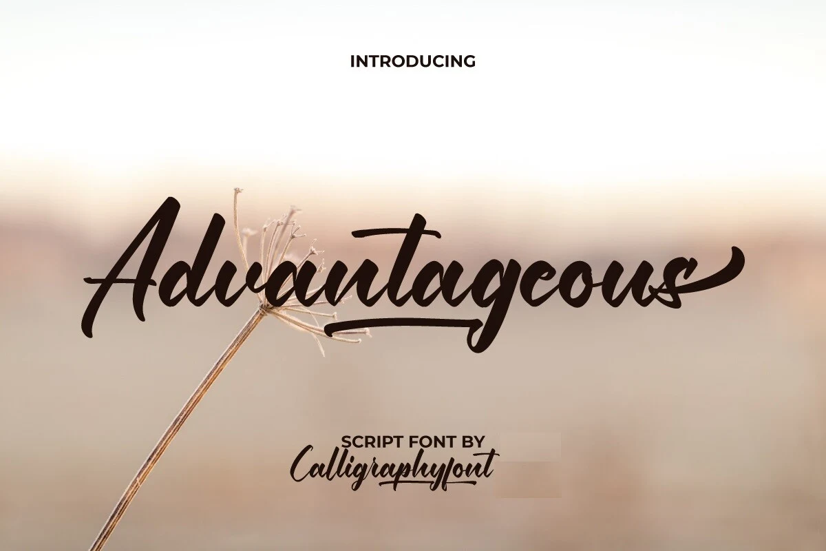
Best For: business cards, packaging, website headers, magazine covers
Advantageous Font pairs high thick-to-thin contrast with connected, right-leaning curls and a pronounced horizontal swash underline. Its intricate construction is better reserved for short headers, business cards, packaging, and covers than continuous reading.
Roundtable Font
Best For: logos, branding, business cards, signage
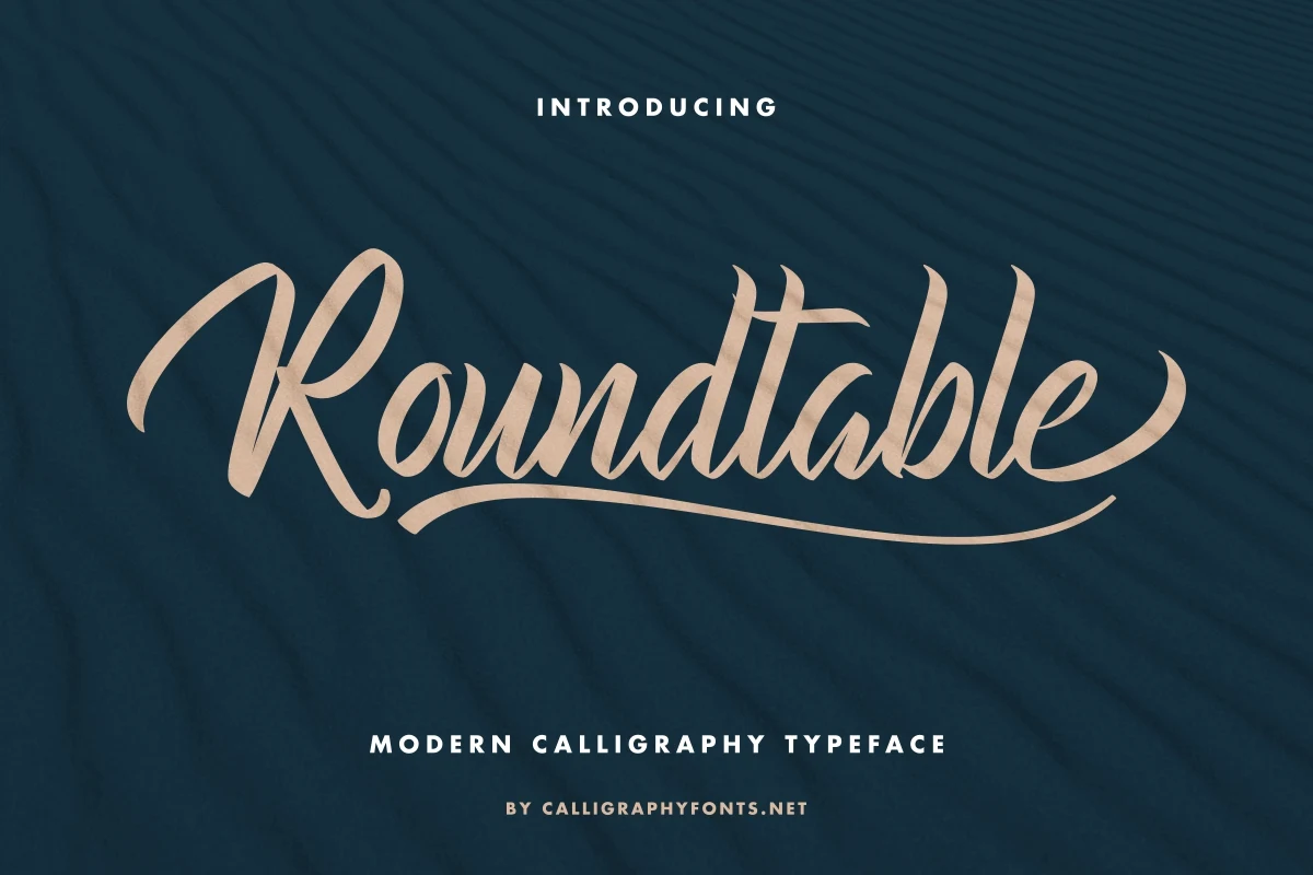
Roundtable Font separates itself with pointed pen-style terminals, flowing connected letters, and pronounced flourishes rather than rounded endings. Its high contrast works well for large branding, signage, and business cards, while small applications quickly become difficult to decipher.
Ovelyned Font
Best For: logos, packaging, social media graphics, invitations
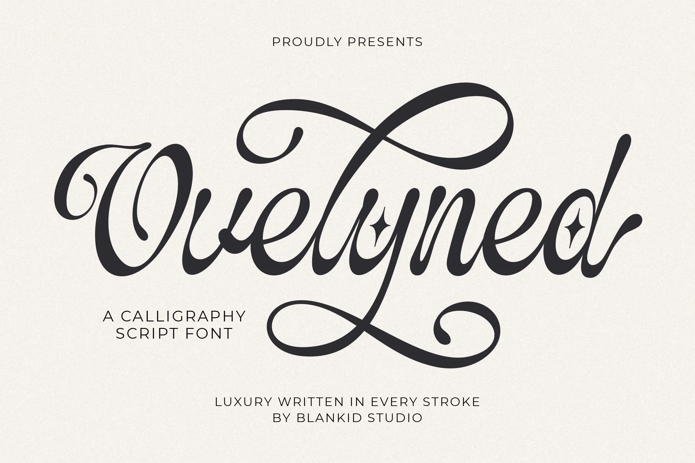
Ovelyned Font suits invitations and packaging when you want Brush Calligraphy Fonts with a formal, decorative finish. Dramatic contrast, sweeping swashes, and star accents add detail to large marks, logos, and social graphics, but restrict comfortable small-scale reading.
Artemil Font
Best For: logos, invitations, packaging, social media graphics
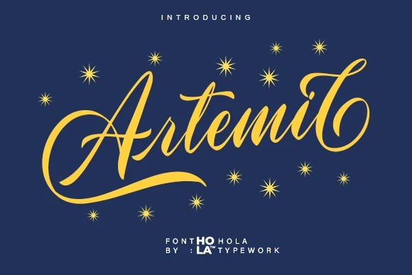
Artemil Font tempers ornate, right-slanting connections with a stable baseline, giving its flowing letterforms more control than an irregular script. Pronounced swashes still call for display sizing, making it a strong choice for logos, invitations, packaging, and social graphics.
Betterboxes Font
Best For: logos, branding, headlines, invitations
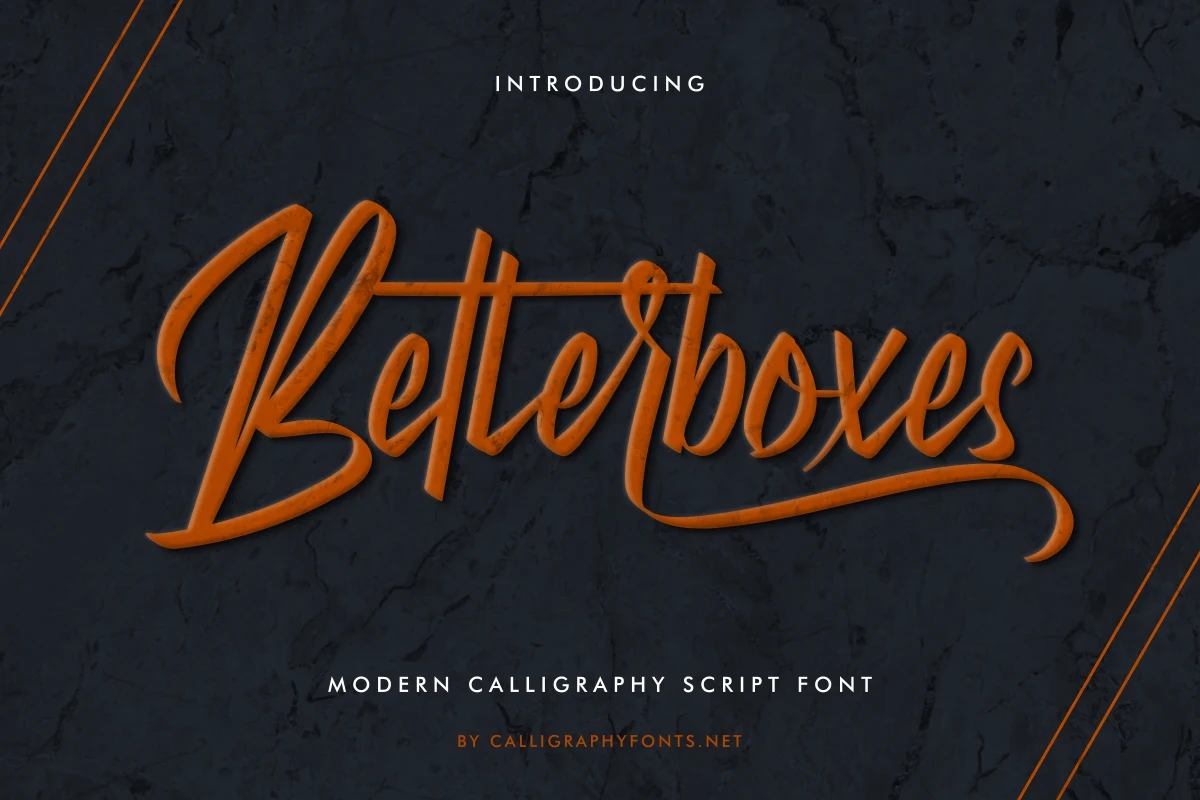
Betterboxes Font makes extended swashes on lowercase final characters its defining feature. High-contrast connected joins reward large logos, branding, headlines, and invitations, but the long endings and narrow details lose clarity quickly when the lettering is reduced.
Textured Brush Scripts
Grain, distressed edges, and painted irregularity connect this group, while steadier or monolinear constructions distinguish it from the polished flourishes and denser weight of the other categories.
Charlotte Font
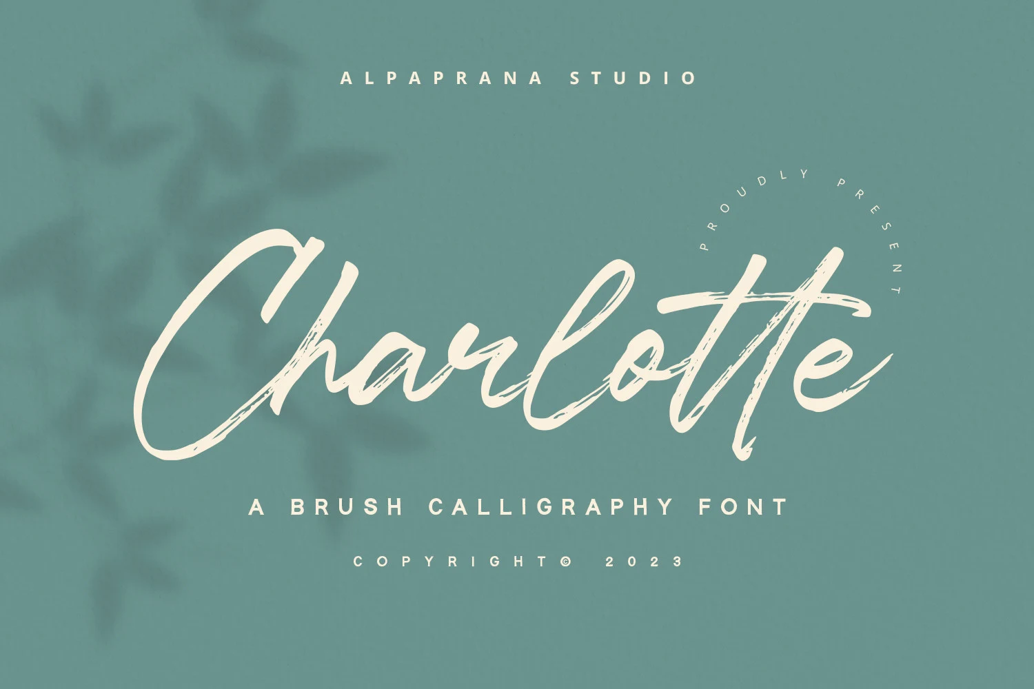
Best For: logos, branding, packaging, posters
Charlotte Font brings dry-brush edges to a high-contrast, connected script with a forward slant. The painted texture gives logos and branding tangible surface character, but generous sizing is important for posters, packaging, and other display applications.
Milstage Font
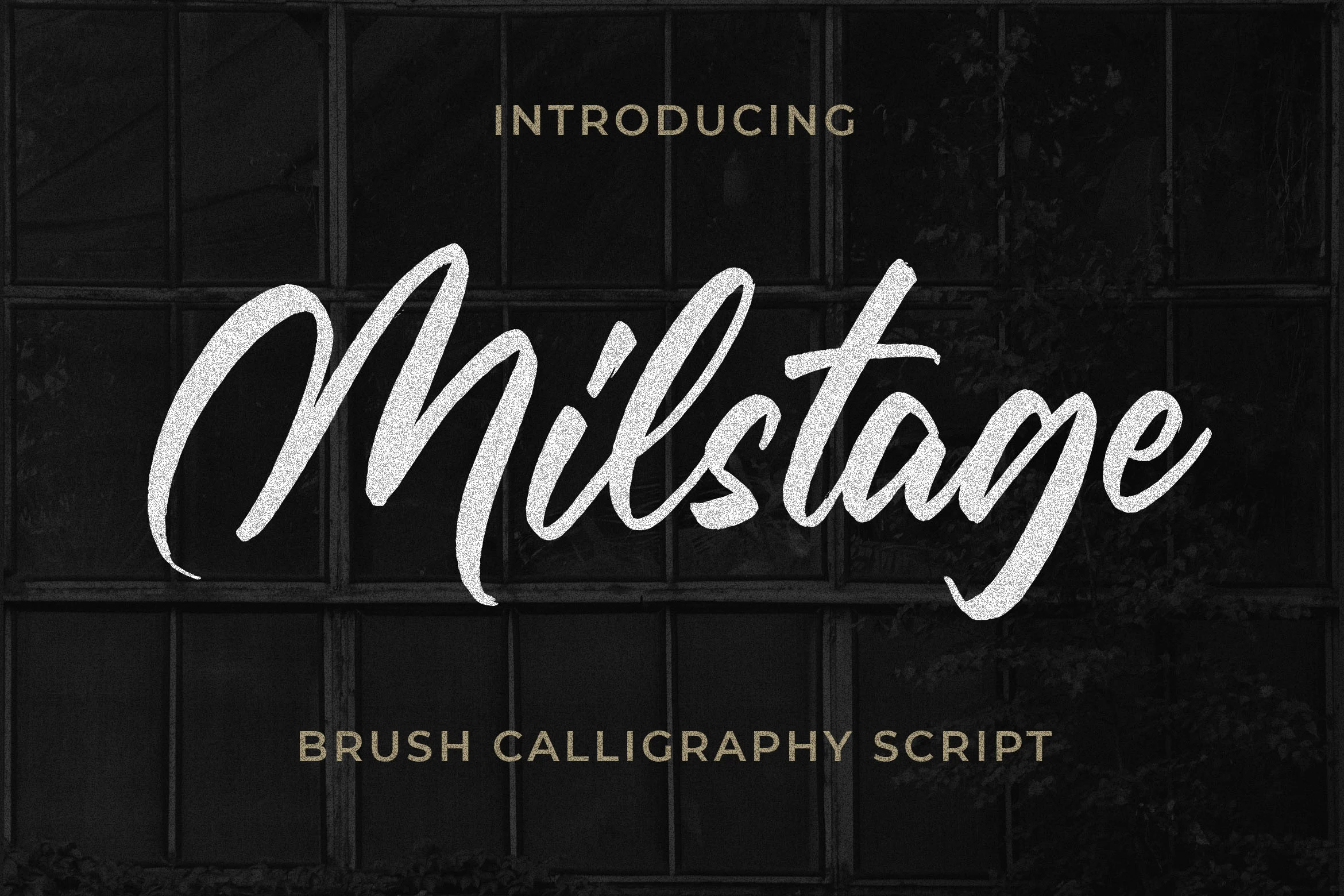
Best For: logos, branding, posters, quotes
For Brush Calligraphy Fonts with layered motion, Milstage Font combines grain inside high-contrast strokes with extended entry and exit swashes. The connected forms need room to breathe, so they read most clearly in large logos, quotes, posters, and prominent branding.
Frintake Font
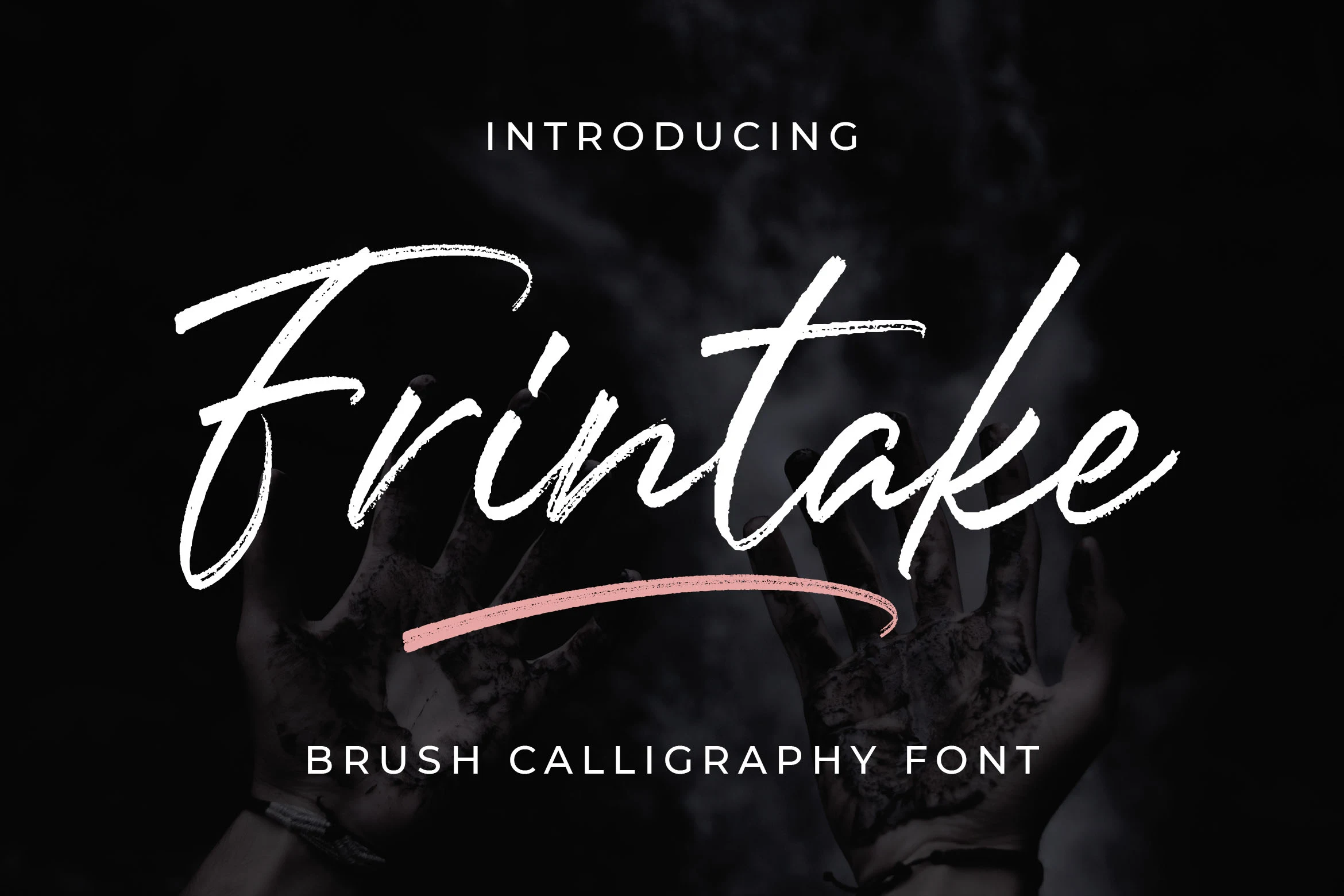
Best For: logos, branding, display text, headlines
Frintake Font combines gritty brush texture with a sweeping underline for an organic, hand-painted impression. Because the grain reduces compact-size clarity, use it for logos, branding, headlines, and other large display text rather than detailed copy.
Ridleys Font
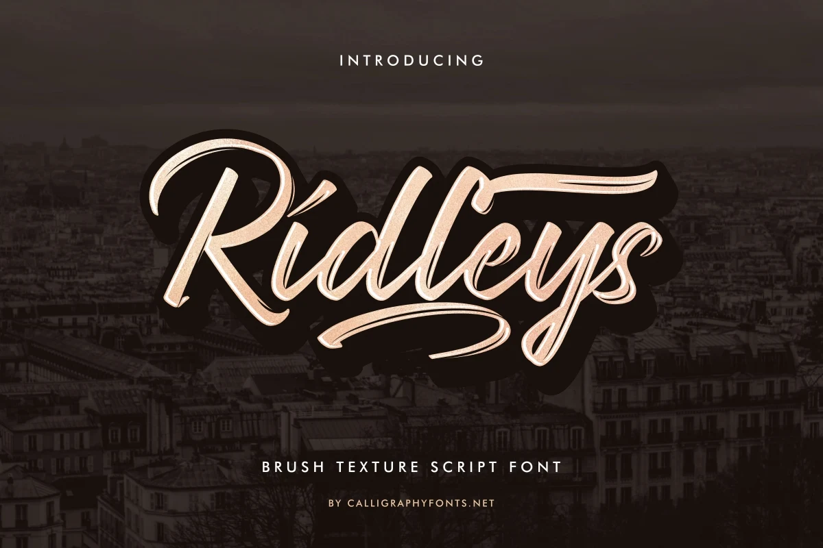
Best For: logos, branding, headlines, short phrases
Ridleys Font uses regular-width connected forms and a stable rhythm, then roughens them with grainy texture and broad flourishes. It supports short branding phrases and headlines, but the textured edges and underlines need generous display sizing to remain clear.
Originale Brush Font
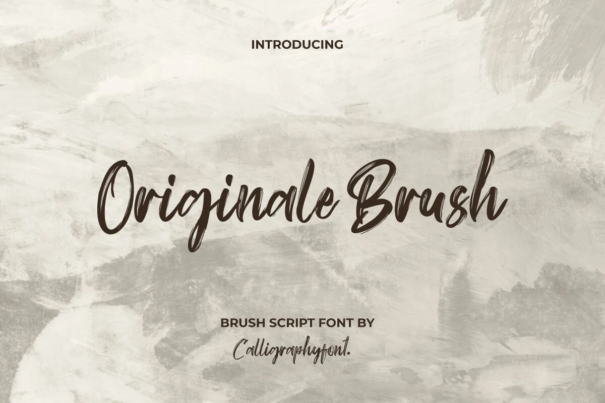
Best For: logos, branding, packaging, headlines
Originale Brush Font attaches dry-brush paint texture directly to each connected character, creating a visibly handcrafted surface. Its high contrast and rightward flow suit packaging, logos, branding, and titles, while extended passages become noisy and harder to follow.
Quantter Font
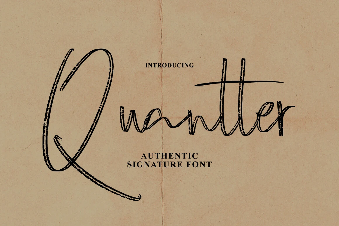
Best For: invitations, branding, business cards, quotes
Quantter Font uses monolinear strokes, distressed edges, connected joins, and a bouncy baseline for an unmistakably handmade result. The exaggerated initial Q adds personality to invitations, branding, business cards, and quotes, but its uneven texture challenges small reading.
Rushine Font
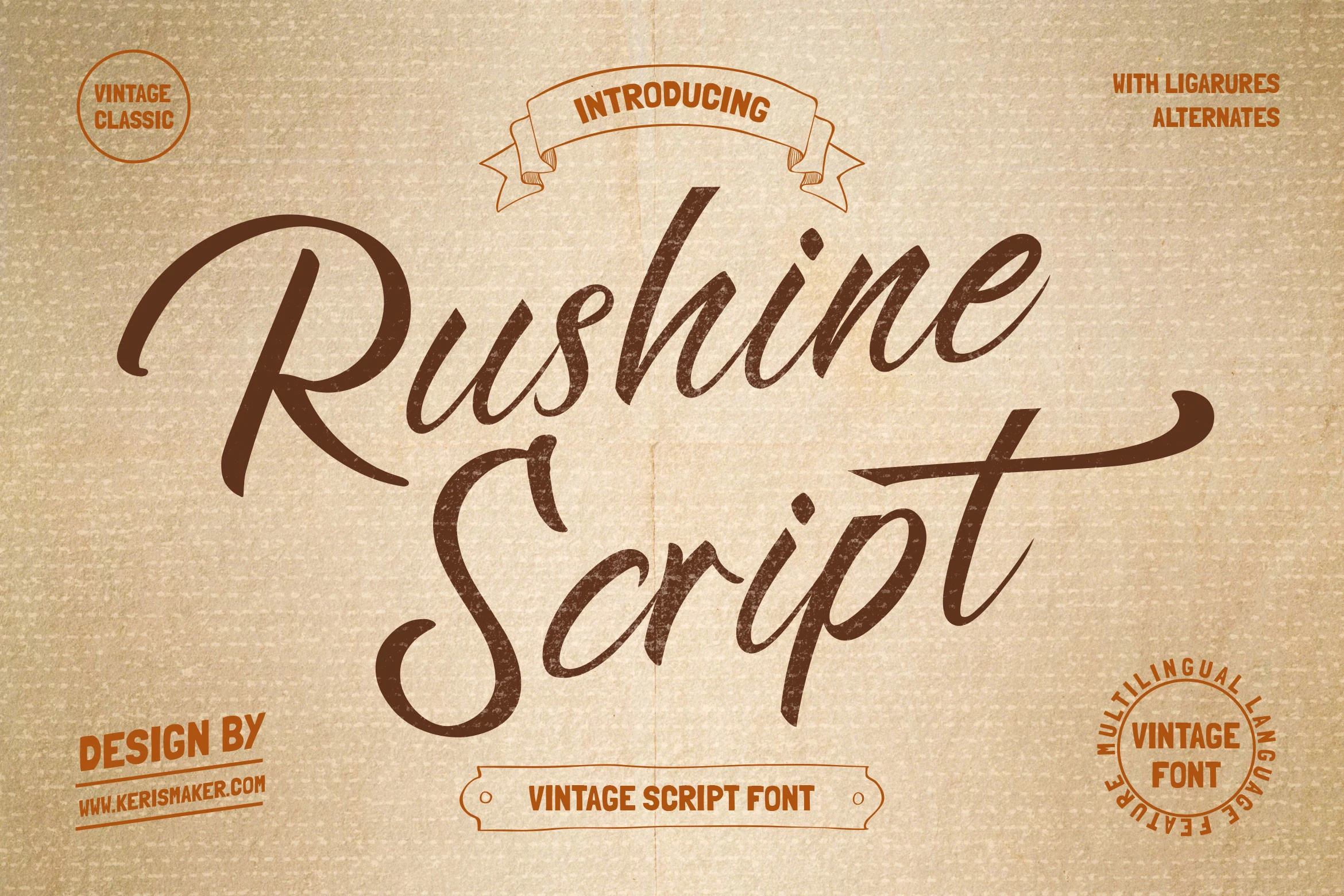
Best For: logos, social media graphics, book covers, short phrases
Rushine Font carries its vintage character through high-contrast connected forms and elongated flourishing terminals. The flowing contours suit logos, social graphics, book covers, and short phrases; for supporting copy, pair it with a simpler sans or serif face.
Bold Expressive Brush Scripts
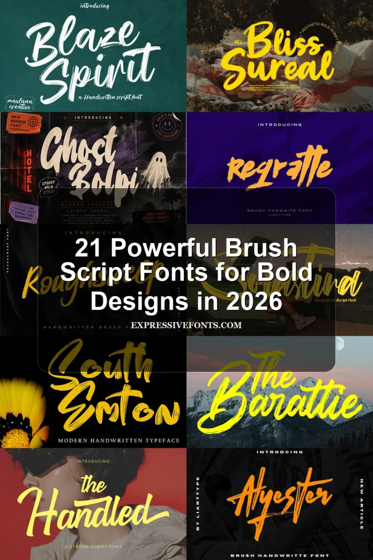
These scripts use heavier strokes, expressive baselines, and emphatic swashes to create immediate visual energy, making them more forceful at display sizes than the textured middle group.
Beckley Font
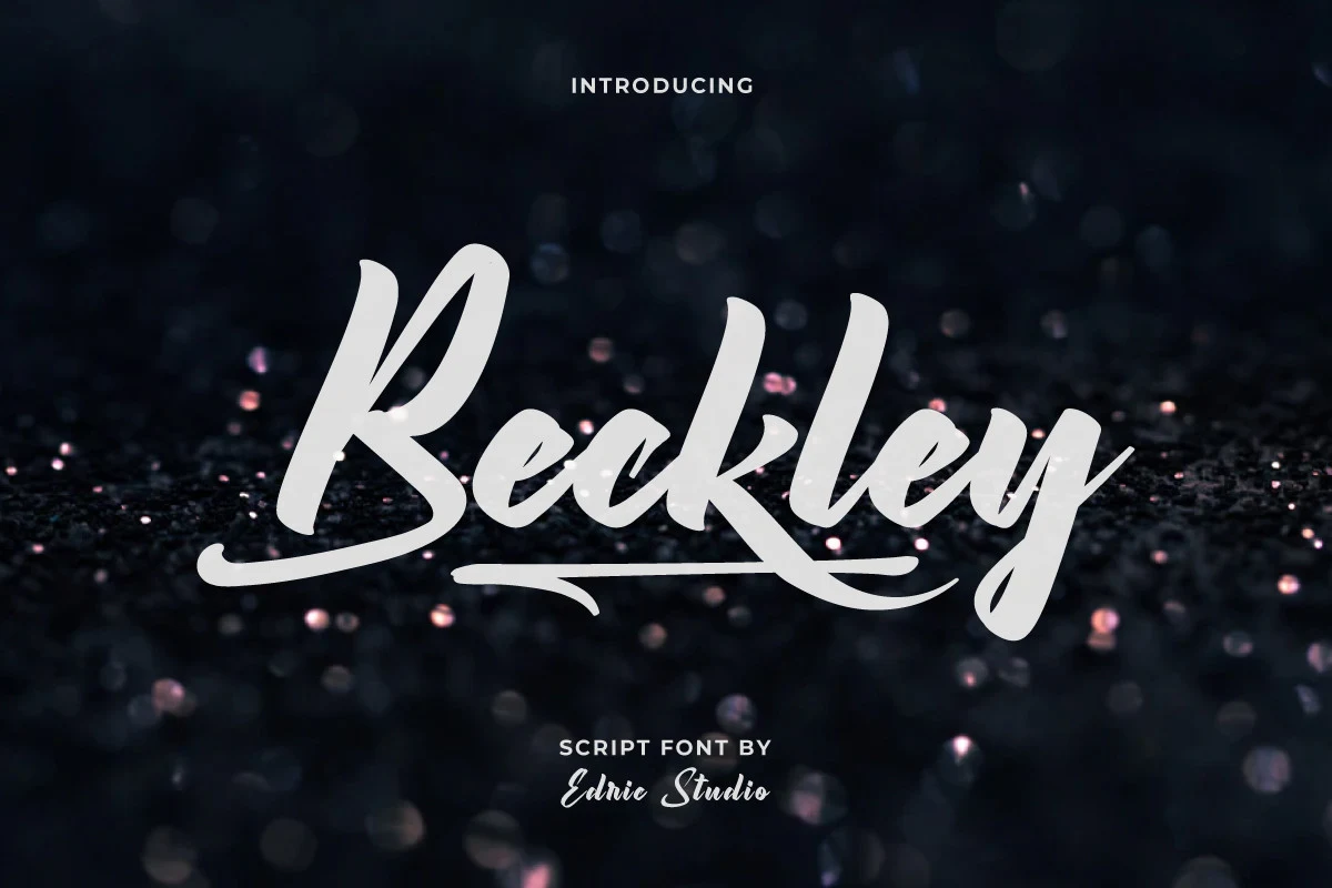
Best For: logos, branding, website headers, display text
Beckley Font creates movement through bold connected letters, a rightward slant, an irregular baseline, and extended decorative swashes. That uneven rhythm adds energy to logos, branding, and headers, but its display-focused forms lose clarity when reduced.
Rightism Font
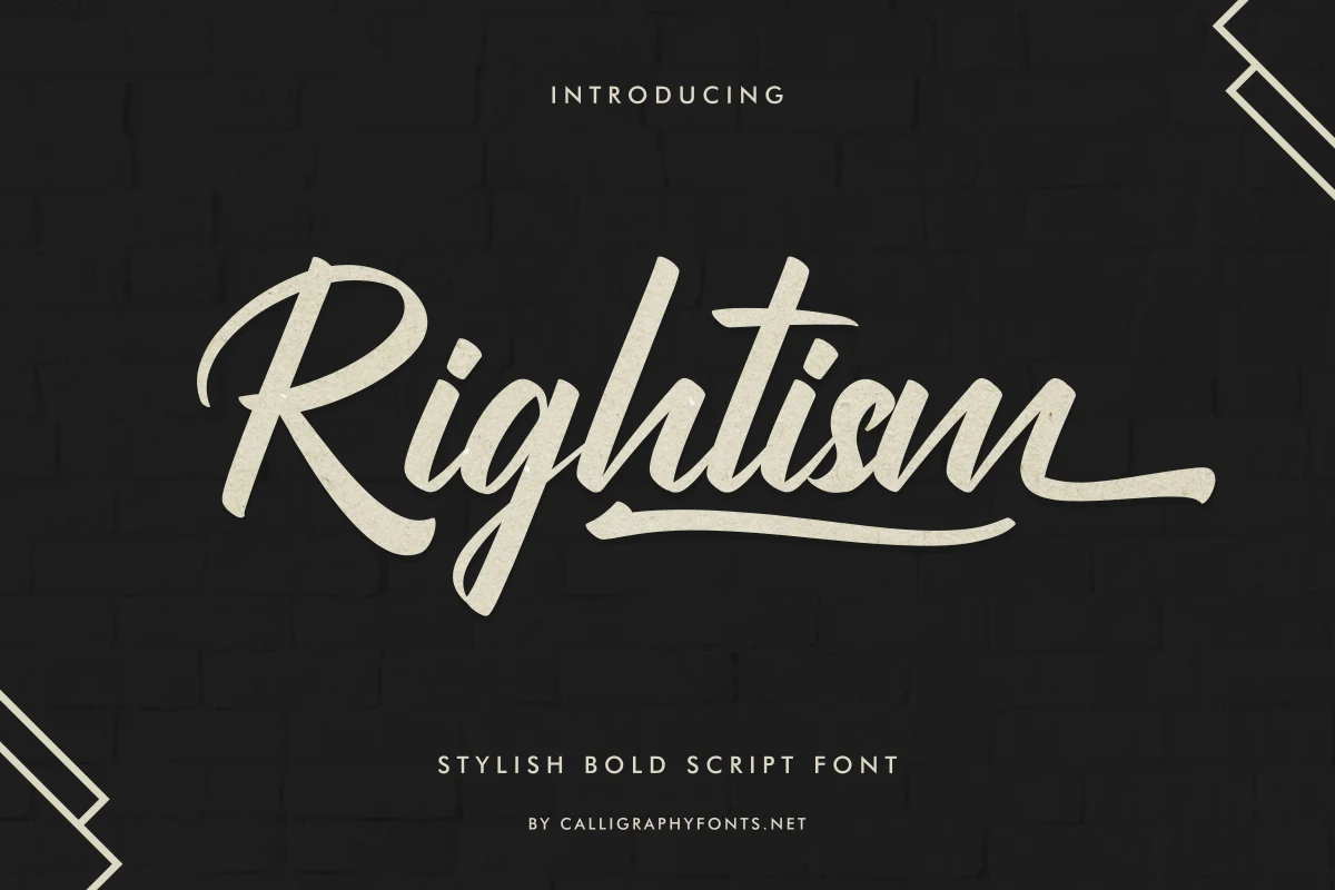
Best For: logos, branding, T-shirts, invitations
Rightism Font is defined by a strongly slanted connected structure and the prominent swash rising from its lowercase g. Dense strokes remain clearest at large sizes, where the signature gesture can lead logos, invitations, and T-shirt lettering.
Tabuti Font
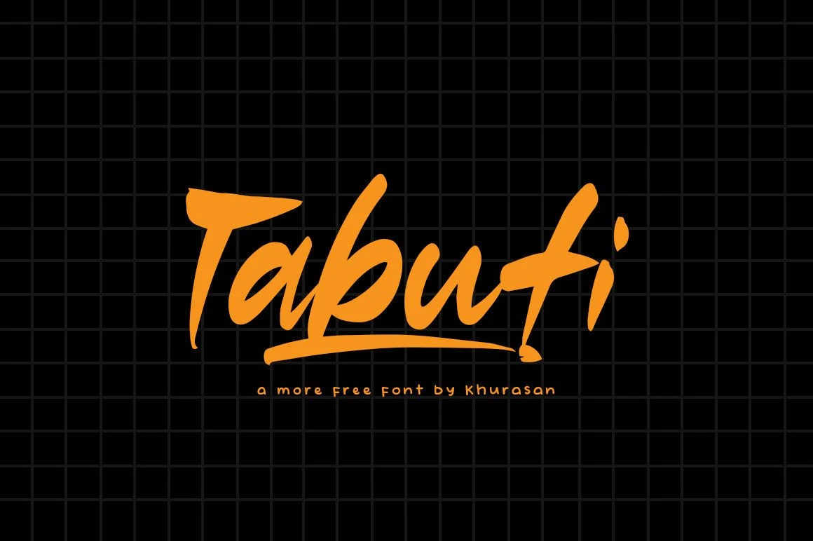
Best For: logos, posters, book covers, magazine covers
Tabuti Font gives Brush Calligraphy Fonts an energetic lift through a visibly shifting baseline, varied line weight, and an elongated underline flourish. At large sizes it can carry posters, logos, magazines, and covers; at small sizes, its irregular movement complicates reading.
Wishmeluck Font
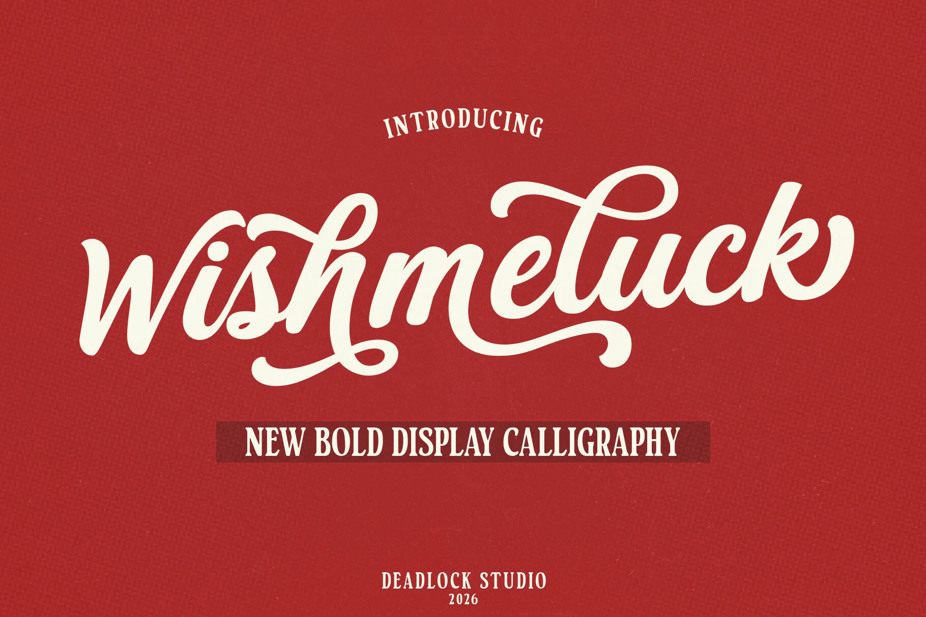
Best For: logos, branding, display text, headlines
Wishmeluck Font builds a dense, retro-leaning presence from heavy connected strokes, moderate contrast, and sweeping flourishes. Its weight gives logos and headlines strong impact, though the decorative forms need large sizing to preserve their contours and legibility.
Springtime Font
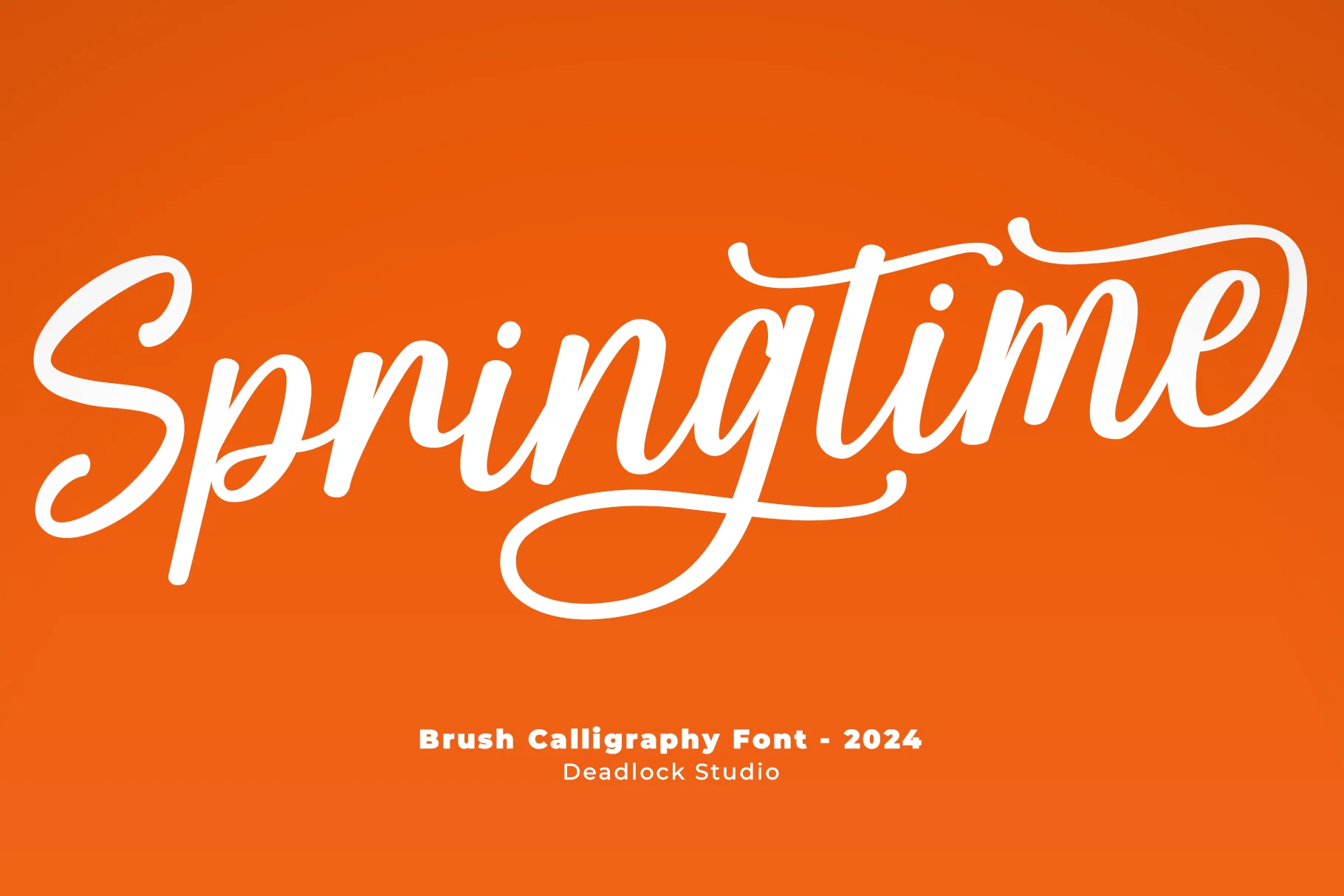
Best For: logos, branding, posters, short phrases
Springtime Font brings Brush Calligraphy Fonts a bold, high-contrast structure framed by decorative initial and terminal swashes. Its forward motion suits posters, branding, logos, and short phrases, while the connected flourishes make sustained text less practical.
Cupink Font
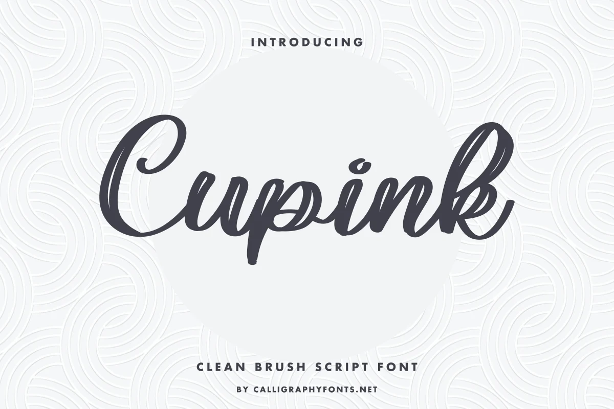
Best For: logos, branding, headlines, display text
Cupink Font is comparatively approachable, using rounded terminals, moderate thickness, a consistent slant, and slightly uneven brush texture. Those choices keep its connected lettering clear for headlines, logos, and display text without making it suitable for body copy.
How to Choose the Right Font
Choose Brush Calligraphy Fonts by matching construction to scale: use high-contrast flourishes for invitations and logos, textured or distressed edges for packaging and titles, and heavier, steadier scripts for energetic headlines. Test every option at its final size, since joins, swashes, grain, and irregular baselines can quickly reduce readability.