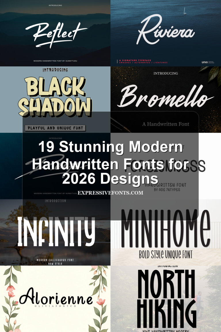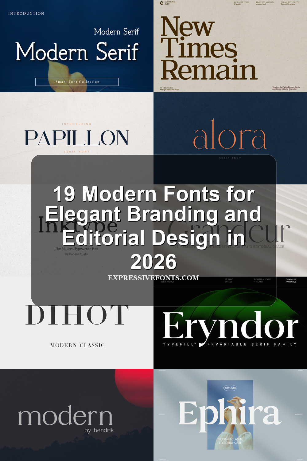
19 Modern Fonts for Elegant Branding and Editorial Design in 2026
Modern fonts are moving toward cleaner structure, sharper contrast, and more editorial personality in 2026. This collection brings together 19 refined typefaces for designers who need polished typography for logos, branding, packaging, fashion visuals, and premium digital layouts.
Fenno Font
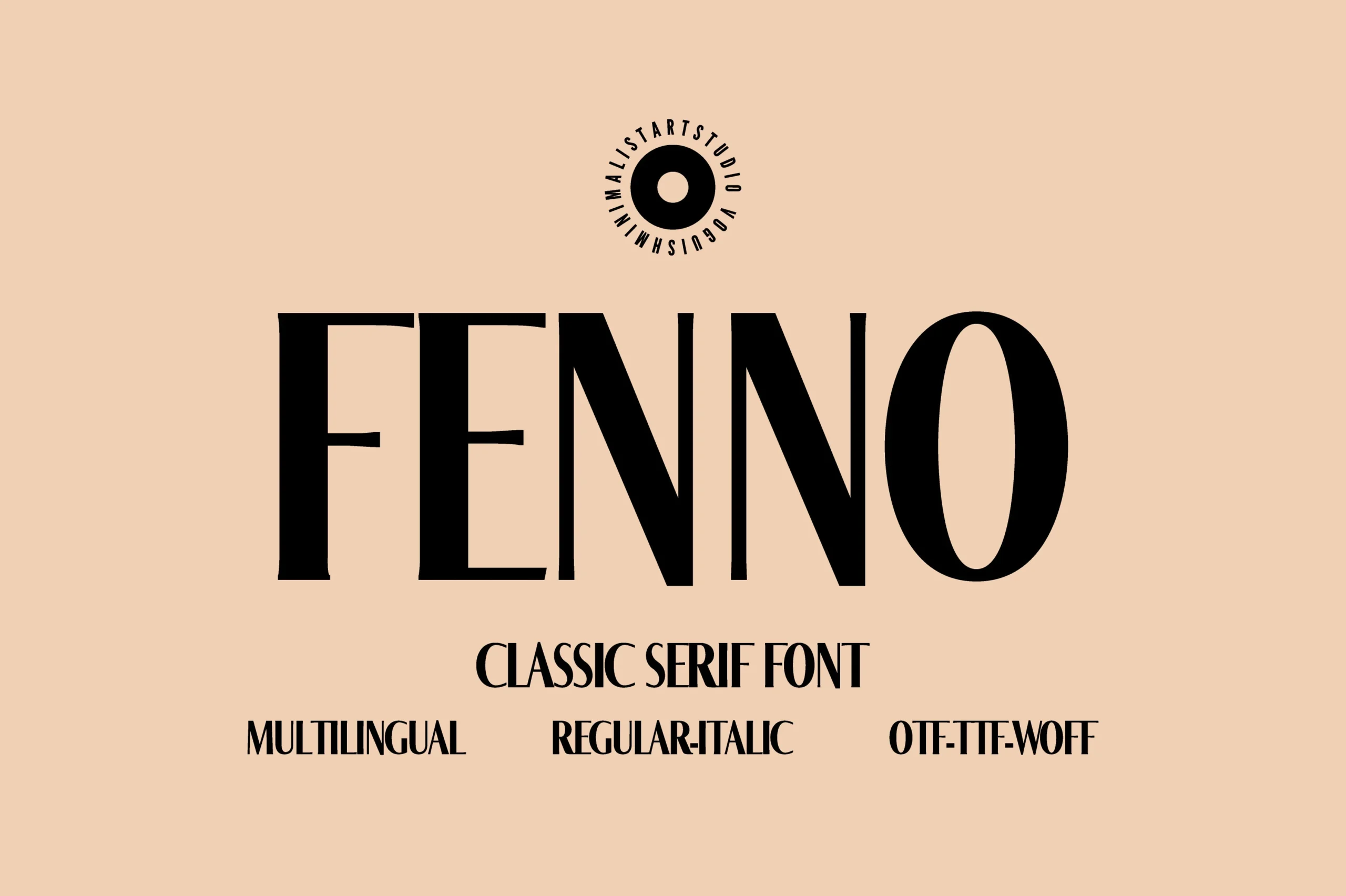
Best For: logos, branding, editorial designs, high-end designs
Fenno Font has a tall classic serif structure with strong vertical weight, narrow proportions, and sharp contrast between thick stems and fine internal details. Its uppercase forms feel composed rather than ornate, giving Modern Fonts projects a more editorial and brand-focused tone.
The condensed rhythm makes it useful for logos, title locks, and refined packaging where the wordmark needs height without spreading too wide. Keep spacing deliberate and avoid cramped layouts, since the thin counters and high-contrast strokes need clean surrounding space to stay crisp.
Minimally Serif Font
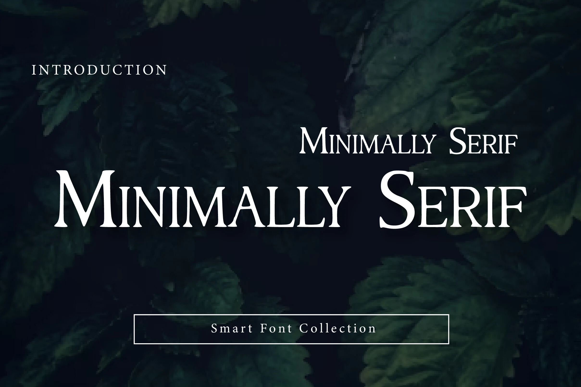
Best For: logos, editorial designs, website headers, headlines
Minimally Serif Font leans into a restrained editorial mood, with fine contrast, gently flared serifs, and balanced proportions that make the letterforms feel polished without becoming stiff. The capitals carry a calm authority, while the open lowercase keeps the texture readable, giving Modern Fonts layouts a refined, contemporary edge.
It works best when you let it handle the hierarchy in headlines, mastheads, or logo lines, then pair it with a neutral sans for supporting text. A touch of extra tracking helps the shapes breathe, and that measured rhythm keeps short titles crisp across covers, websites, and brand presentations.
Grandeur – Elegant Classic Serif Font
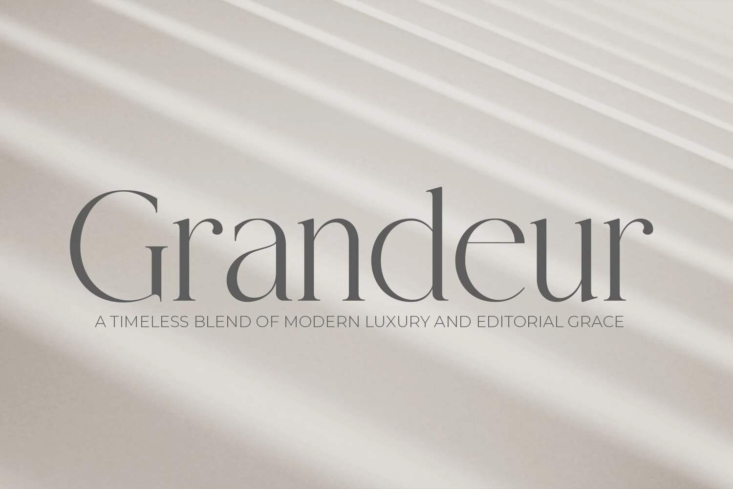
Best For: logos, branding, editorial designs, luxury designs
Grandeur – Elegant Classic Serif Font has a refined editorial character, with slim hairlines, soft curves, and tall letterforms that feel calm rather than decorative. The wide, graceful shapes give Modern Fonts projects a polished luxury tone while still holding onto a classic print-inspired structure.
Use it where the typography needs to set the mood on its own: logo marks, fashion headers, packaging titles, or magazine-style layouts. Its delicate contrast benefits from generous spacing and a clean background, while the large rounded counters help longer brand names stay readable.
Dihot Font
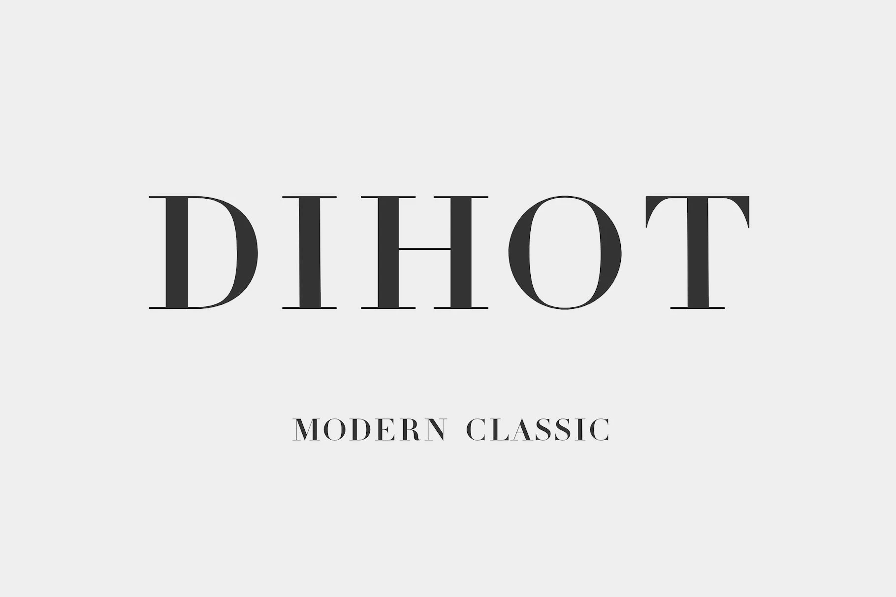
Best For: logos, branding, magazine covers, editorial designs
Dihot Font draws on the Didot tradition with razor-thin hairlines, strong vertical stress, and broad high-contrast capitals that feel poised and formal. That crisp refinement gives Modern Fonts layouts a more polished editorial voice, especially when the type needs to look intentional rather than decorative.
The generous spacing in the preview keeps the shapes airy, which suits mastheads, logo work, and cover titles where elegance depends on restraint. Use it at larger sizes and pair it with a quiet sans or understated body serif, so the dramatic contrast stays sharp instead of disappearing in dense compositions.
Verso Font
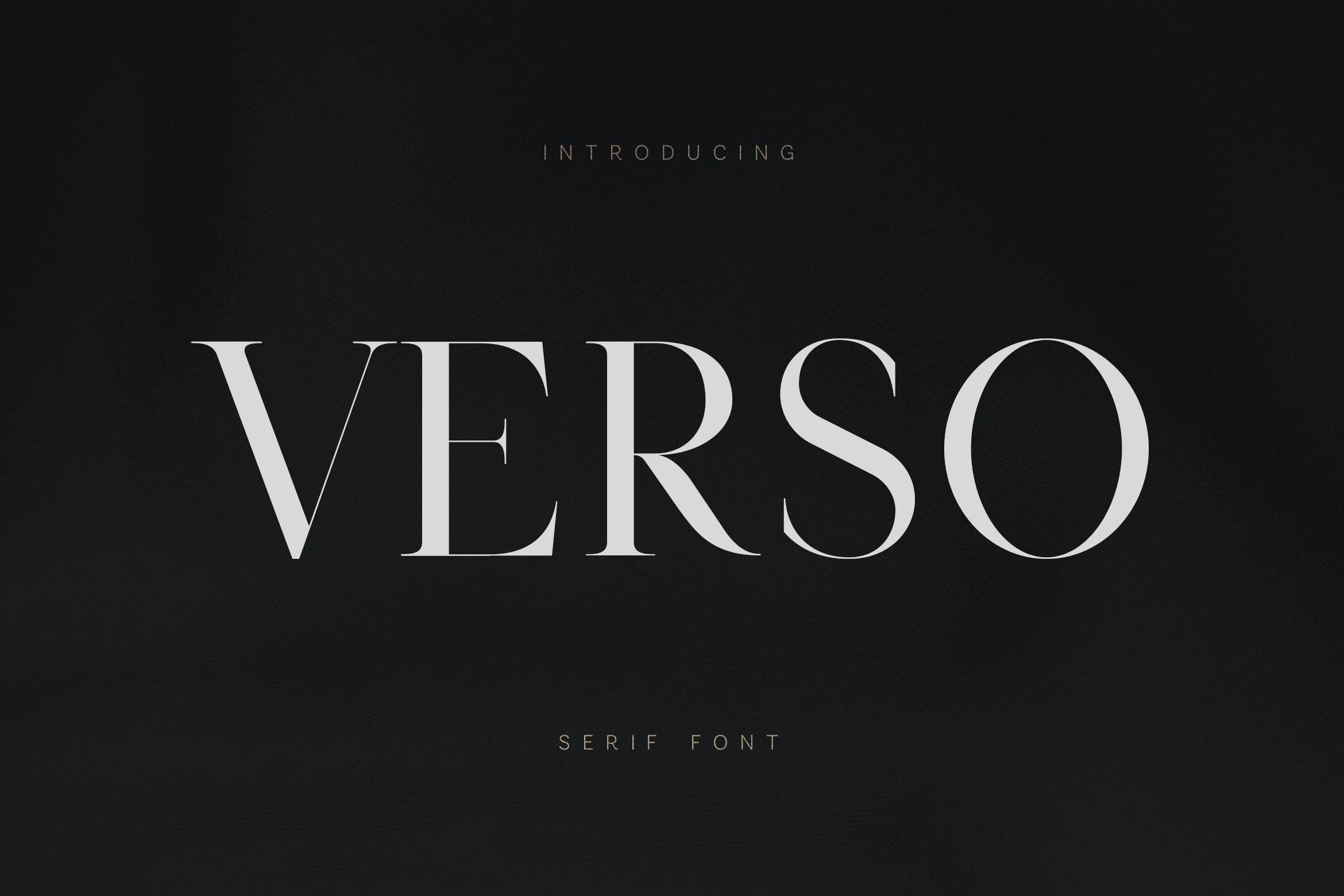
Best For: logos, branding, editorial designs, high-end designs
Verso Font has a controlled high-contrast serif style, with thin hairlines, sculpted curves, and wide uppercase forms that create a sleek editorial presence. The sharp verticals and open spacing give Modern Fonts layouts a premium look without relying on heavy ornament.
Its strongest use is in short, prominent text where the contrast can stay crisp: logos, magazine-style headers, packaging titles, and refined brand marks. Give the letters generous tracking and strong background contrast, since the fine strokes lose authority when crowded or scaled too small.
Eryndor Font
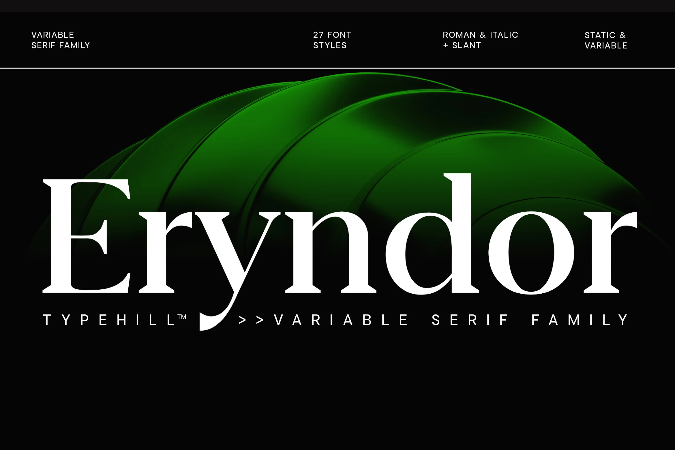
Best For: branding, editorial designs, packaging, high-end designs
Eryndor Font pairs crisp high-contrast strokes with generous curves and a poised serif structure that feels both editorial and contemporary. Its large display forms have a polished, cinematic presence, and the variable family setup gives Modern Fonts projects more control over tone, from sharp headlines to quieter secondary lines.
It performs best when you use that range to build hierarchy across branding, packaging, or cover layouts. Keep the main words large and well spaced, then shift weight or slant for subheads instead of adding extra decorative elements, so the contrast and clean rhythm stay in focus.
Shelina Modern Font
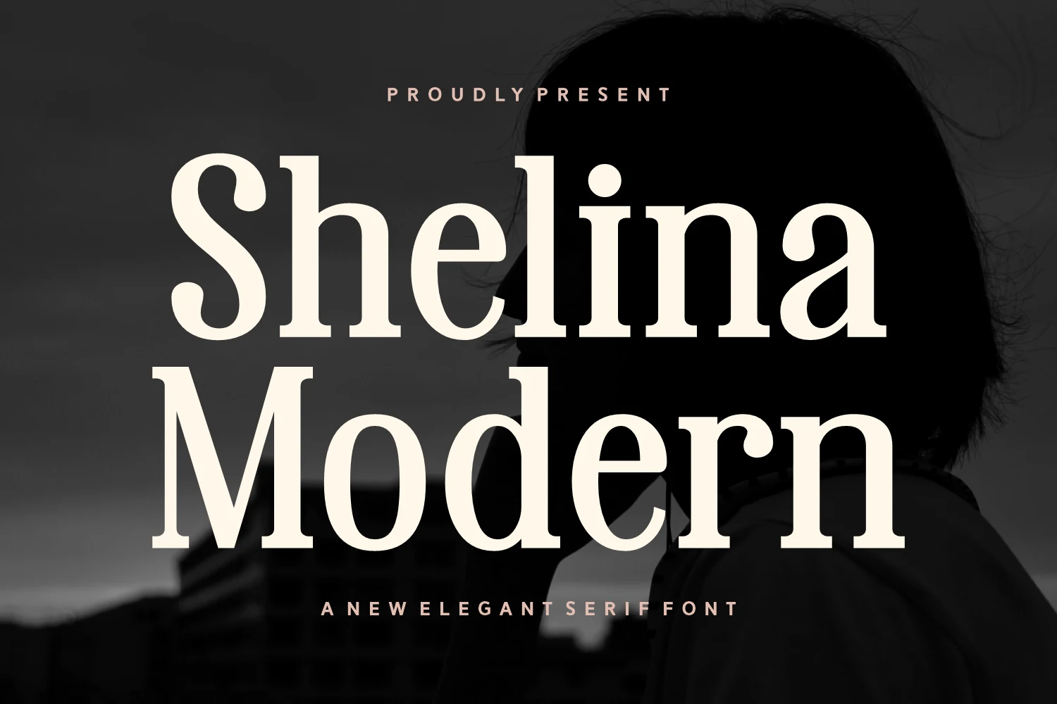
Best For: logos, branding, magazine covers, high-end designs
Shelina Modern Font uses a bold serif build with rounded bowls, thick stems, and soft bracketed details that keep the letterforms strong without feeling rigid. The stacked preview shows how its generous curves and high contrast can give Modern Fonts layouts a confident editorial tone.
It is best handled as a display face for short names, cover titles, and brand-led typography. Keep the leading controlled when stacking words, use clear contrast, and avoid tight supporting text around the letters so the heavy serifs and open counters stay clean.
Modern Font
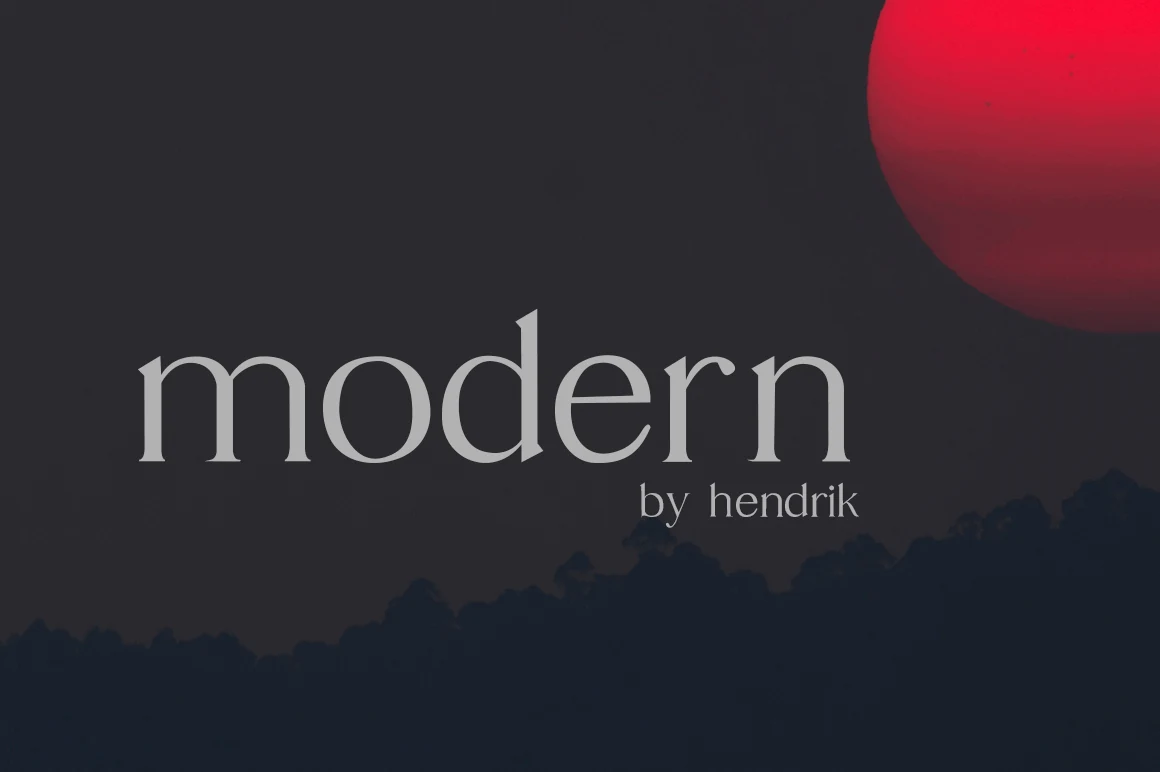
Best For: branding, website headers, editorial designs, minimal designs
Modern Font has a restrained serif voice, with rounded bowls, slender stems, and a smooth rhythm that keeps the letterforms airy instead of severe. Its lowercase-focused look feels calm and polished, giving Modern Fonts collections a cleaner editorial direction without losing warmth.
It works best in short branding lines, website headers, and minimal title settings where the open counters can stay visible. Give it enough scale and a little breathing room, then pair it with a neutral sans or quiet text face so the refined proportions remain the main point of focus.
Ephira Font
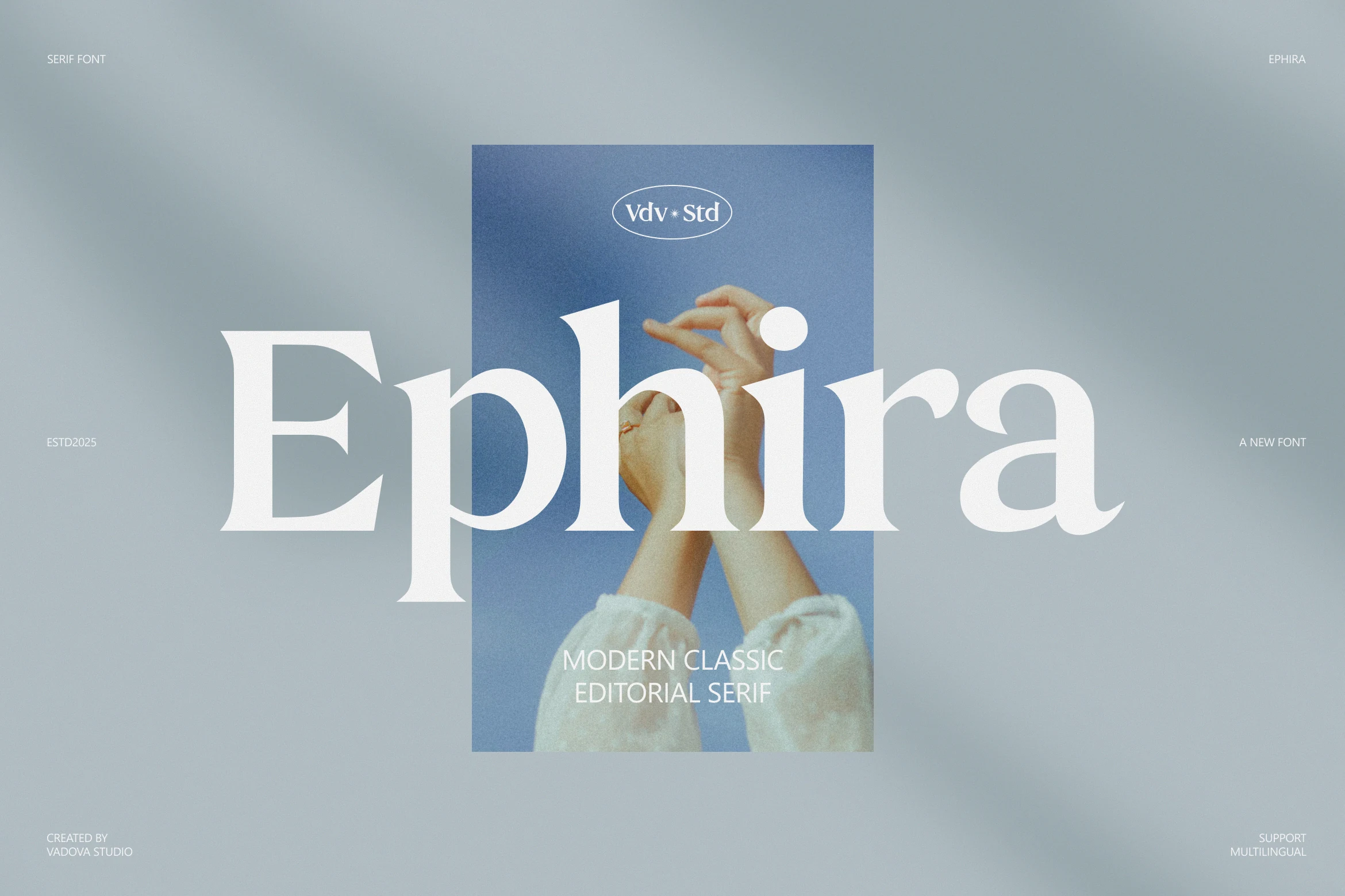
Best For: branding, packaging, editorial designs, fashion branding
Ephira Font has a modern classic serif profile, with broad curves, sharp wedge-like terminals, and confident contrast that gives the wordmark a clean editorial pull. The large lowercase forms feel polished and open, making it a strong fit for Modern Fonts layouts that need refinement without looking fragile.
Use it for fashion branding, packaging titles, and lifestyle headers where one word needs to carry the visual identity. Its full multilingual support helps keep brand systems consistent across languages, while generous spacing and a calm layout preserve the smooth rhythm of the heavier serifs.
Modern Serif Font
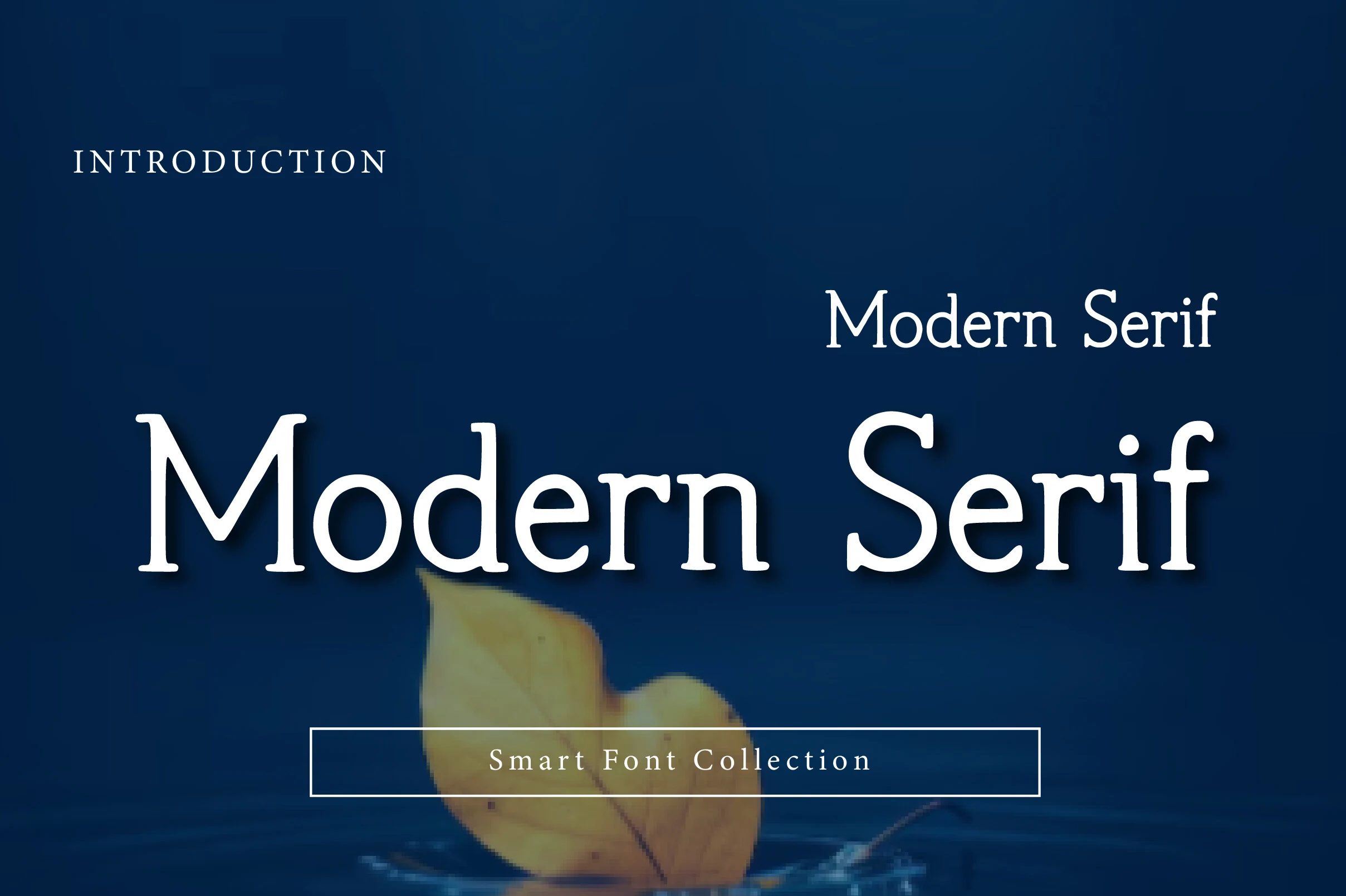
Best For: logos, website headers, headlines, editorial designs
Modern Serif Font has a clean display presence, with broad rounded bowls, gently bracketed serifs, and a balanced stroke pattern that keeps the letterforms polished without feeling severe. That mix of classic structure and softness gives Modern Fonts layouts a calm editorial look with enough character for prominent titles.
It works especially well in headlines and website headers where the large shapes can stay open and legible. Keep the spacing a little generous and pair it with a quiet sans for supporting text, so the crisp serif details and steady rhythm remain the visual anchor instead of getting lost in a crowded layout.
Chanceux Modern Stylish Font
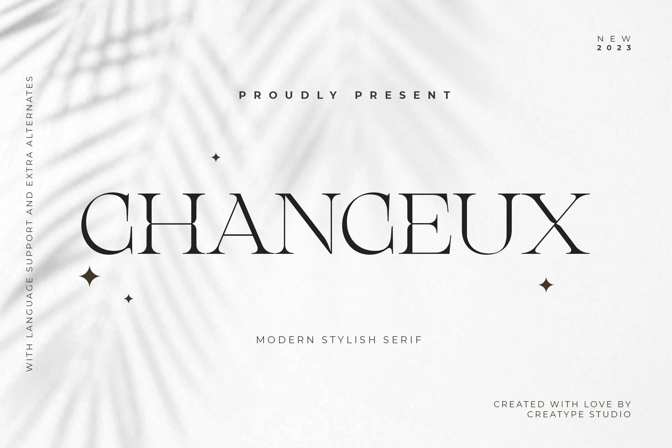
Best For: logos, branding, editorial designs, luxury designs
Chanceux Modern Stylish Font has a refined fashion-editorial look, with wide capitals, sharp contrast, and fine hairlines that give the letterforms a controlled sense of drama. Its thin joins and sculpted serif details make it stand out in Modern Fonts collections without becoming overly decorative.
The design works best in short, spacious typography where the delicate strokes have room to stay visible. Use it for logos, magazine-style titles, and premium brand headers, with generous tracking and strong contrast so the elegant proportions remain crisp at display scale.
Patcher Font
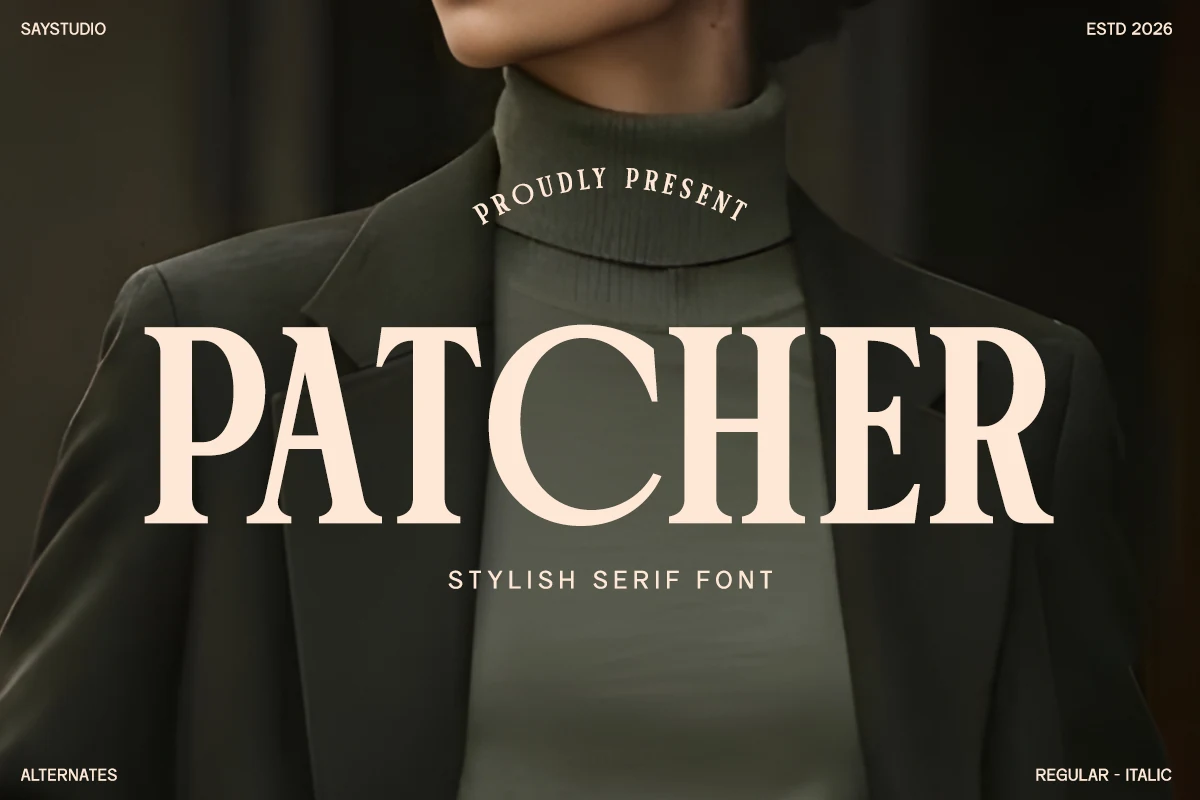
Best For: logos, packaging, magazine covers, fashion branding
Patcher Font has a bold editorial serif voice, with wide capitals, firm vertical stems, and smooth curves that keep the design polished rather than stiff. The contrast feels strong but controlled, which gives Modern Fonts layouts a fashion-led presence without sacrificing readability.
It works best in mastheads, logo lines, and packaging titles where the serif structure can carry the whole composition. Let it take the top of the hierarchy and keep the supporting text restrained, because the broad proportions and compact rhythm do their best work when the main word has room to lead.
Royel Aura Font
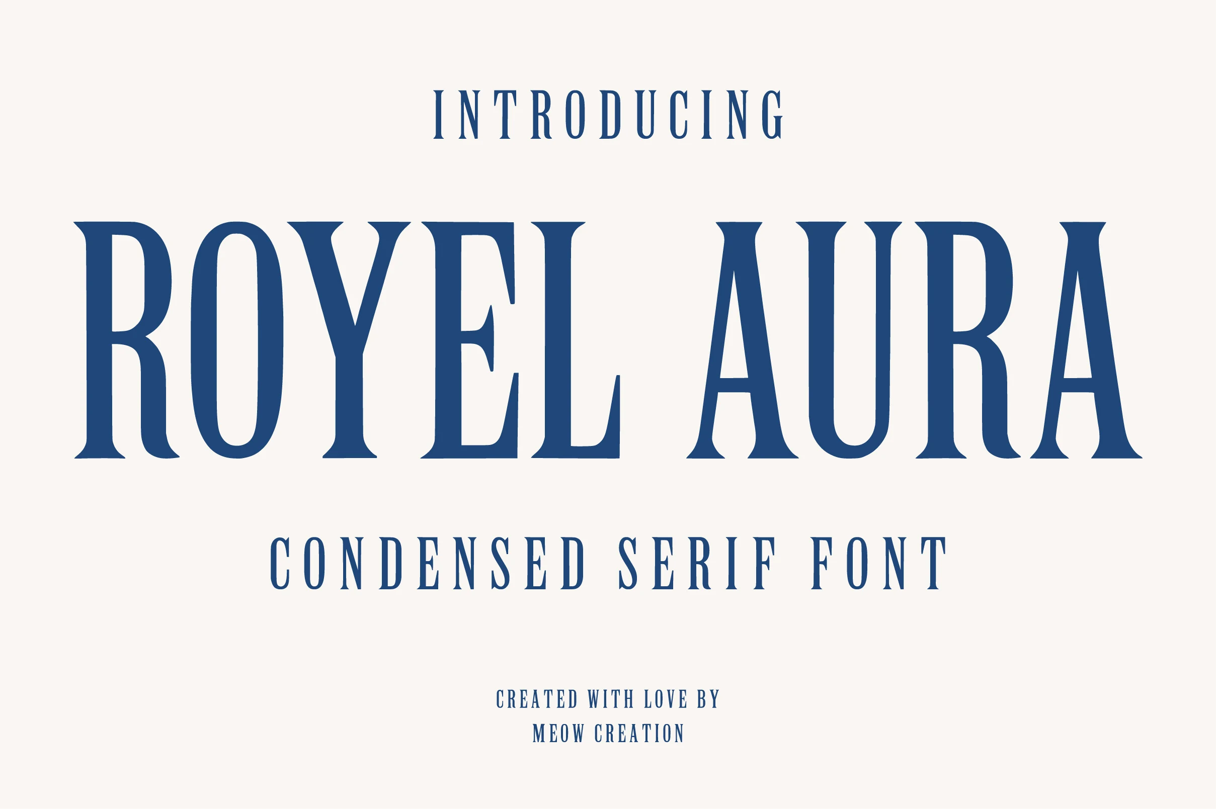
Best For: logos, branding, headlines, premium designs
Royel Aura Font has a tall condensed serif shape, with narrow capitals, firm vertical strokes, and sharp bracketed details that give the lettering a formal display presence. The blue preview emphasizes its clean, premium structure, making it a strong choice for Modern Fonts layouts built around titles and brand names.
Its height and tight proportions work best when the wordmark has enough horizontal room to stretch without crowding. Use measured tracking for headlines, packaging titles, and logo lockups, then keep supporting text lighter so the vertical rhythm stays dominant and readable.
Zanela Font
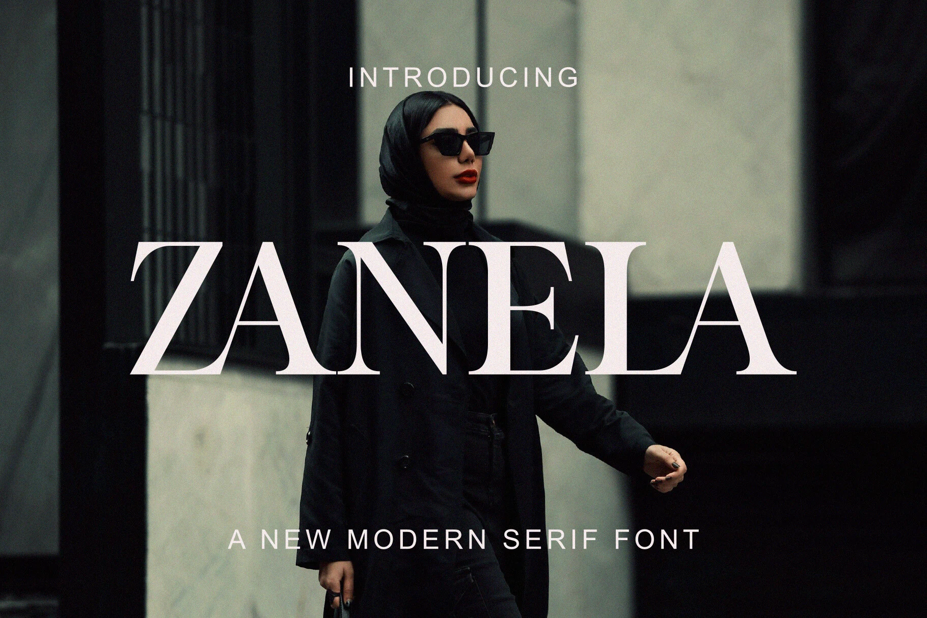
Best For: fashion branding, magazine covers, beauty branding, high-end designs
Zanela Font has a high-fashion serif presence, with strong vertical stress, sharp needle-like serifs, and broad high-contrast strokes that make each letter feel crisp and commanding. The tall proportions and geometric apertures give Modern Fonts layouts a polished editorial edge rather than a soft decorative look.
It performs best in large, high-visibility settings such as mastheads, cosmetic packaging, and minimalist logo work, where the contrast can stay clean. Keep the hierarchy simple and let Zanela lead the composition, because its fine details lose impact when crowded by equally assertive supporting type.
New Times Remain Font
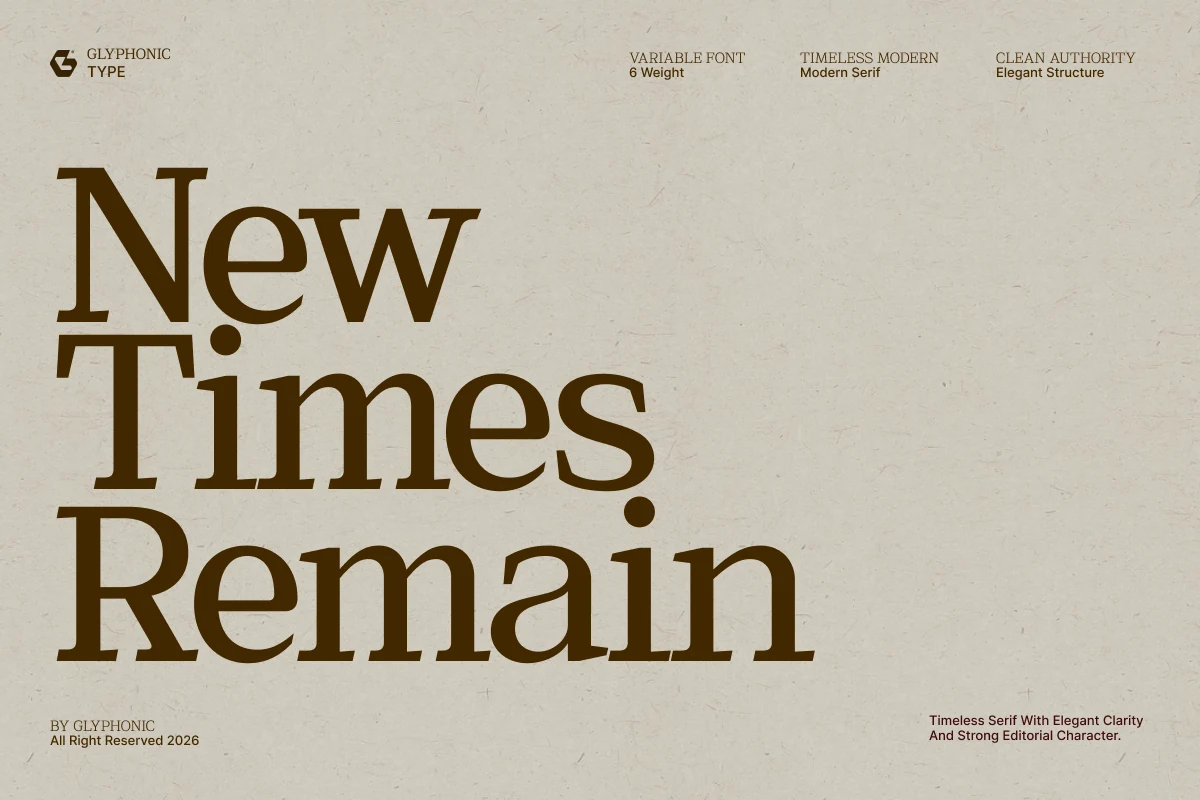
Best For: logos, branding, editorial designs, professional designs
New Times Remain Font has a strong archival serif character, with sturdy stems, high contrast, and sharp rhythmic serifs that make the stacked preview feel authoritative. Its newsprint-like structure gives Modern Fonts layouts a more institutional, editorial weight instead of a delicate luxury tone.
Use it where credibility needs to be built through the type itself: law firm marks, architecture identities, magazine titles, and stately social headers. The heavy forms can handle compact stacking, but the best results come from clear line breaks and measured spacing so the serifs keep their clean authority.
Papillon Serif – Elegant Modern Luxury Font
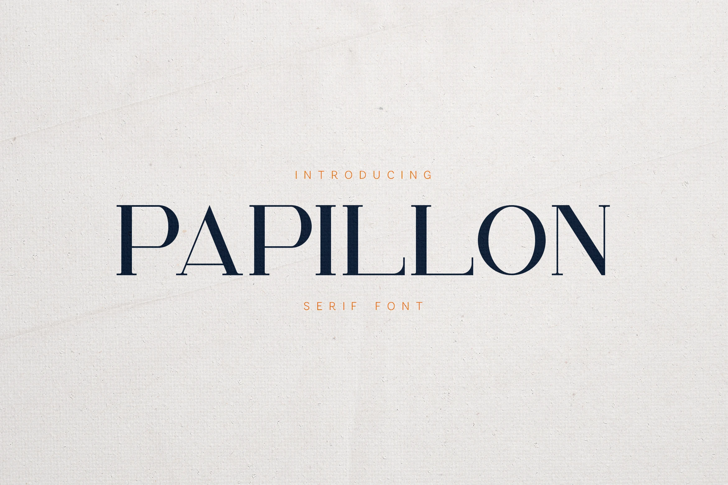
Best For: logos, branding, editorial designs, luxury designs
Papillon Serif – Elegant Modern Luxury Font brings a poised high-contrast serif look, with slim hairlines, crisp verticals, and softly sculpted curves that keep the wordmark elegant without feeling cold. Its long proportions and open spacing give Modern Fonts projects a polished editorial tone with a hint of organic softness.
It works especially well when the typography needs to carry the mood on its own. Use it for mastheads, logo lines, or packaging titles, and give it enough breathing room so the fine serifs stay sharp; paired with a restrained sans, it creates a clean hierarchy with a distinctly premium finish.
Alora Font
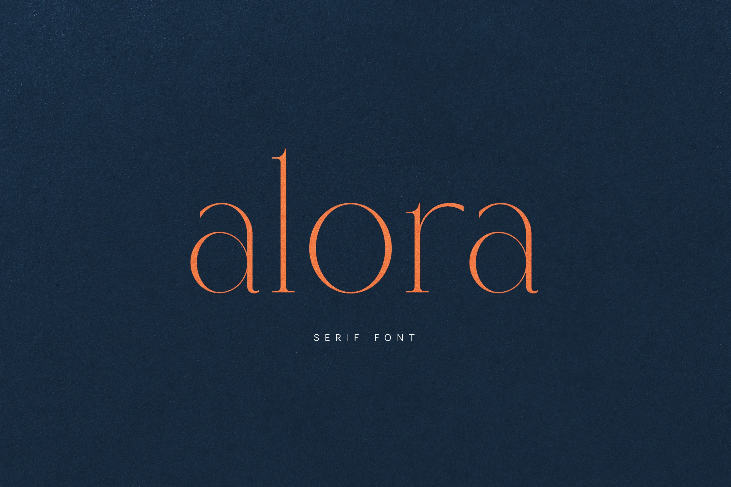
Best For: logos, branding, editorial designs, high-end designs
Alora Font has a refined high-contrast serif style, with slender stems, smooth rounded bowls, and delicate terminals that give the lowercase wordmark a quiet luxury feel. Its airy rhythm and fine details make Modern Fonts layouts feel polished without relying on heavy decorative styling.
The font is strongest in short brand names, editorial titles, and packaging lines where the thin strokes can stay visible. Use generous spacing and strong contrast, especially on dark backgrounds, so the elegant curves remain clear instead of blending into the composition.
Inktype Font
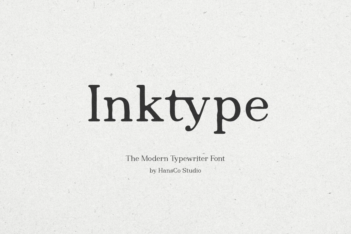
Best For: quotes, posters, handmade designs, vintage designs
Inktype Font has a soft typewriter character, with slightly uneven serif shapes, rounded terminals, and a printed texture that keeps the letters warm rather than strict. That handmade rhythm gives Modern Fonts collections a more personal, analog voice, especially when you want text to feel composed but not polished flat.
It suits short phrases, quote graphics, and paper-based designs best, where the quirky spacing and sturdy forms can stay readable. The extensive language support helps when you need the same vintage tone across different markets, and a little extra breathing room keeps the inky details from feeling cramped.
Electra Font
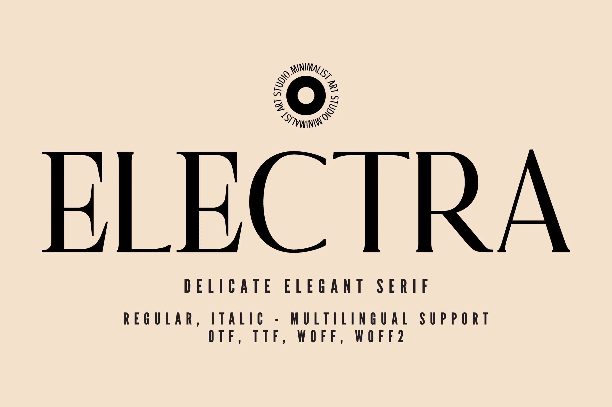
Best For: logos, branding, editorial designs, luxury designs
Electra Font has a delicate serif profile, with high-contrast strokes, long refined curves, and precise uppercase forms that feel minimal but still expressive. The wide spacing in the preview gives Modern Fonts layouts a calm luxury tone, especially where the typography needs to look controlled rather than ornamental.
Use it for logo marks, editorial headers, and premium packaging where thin serifs and elegant proportions can stay visible. Its range of weights helps build hierarchy inside a restrained system, so you can shift emphasis without adding extra decorative type or crowding the composition.
The right modern font can define the whole tone of a project before any color, image, or layout decision is added. These Modern Fonts from Creative Fabrica cover everything from delicate luxury serifs to stronger editorial display styles, giving you practical options for brand identities, magazine-inspired designs, packaging, and polished creative work.