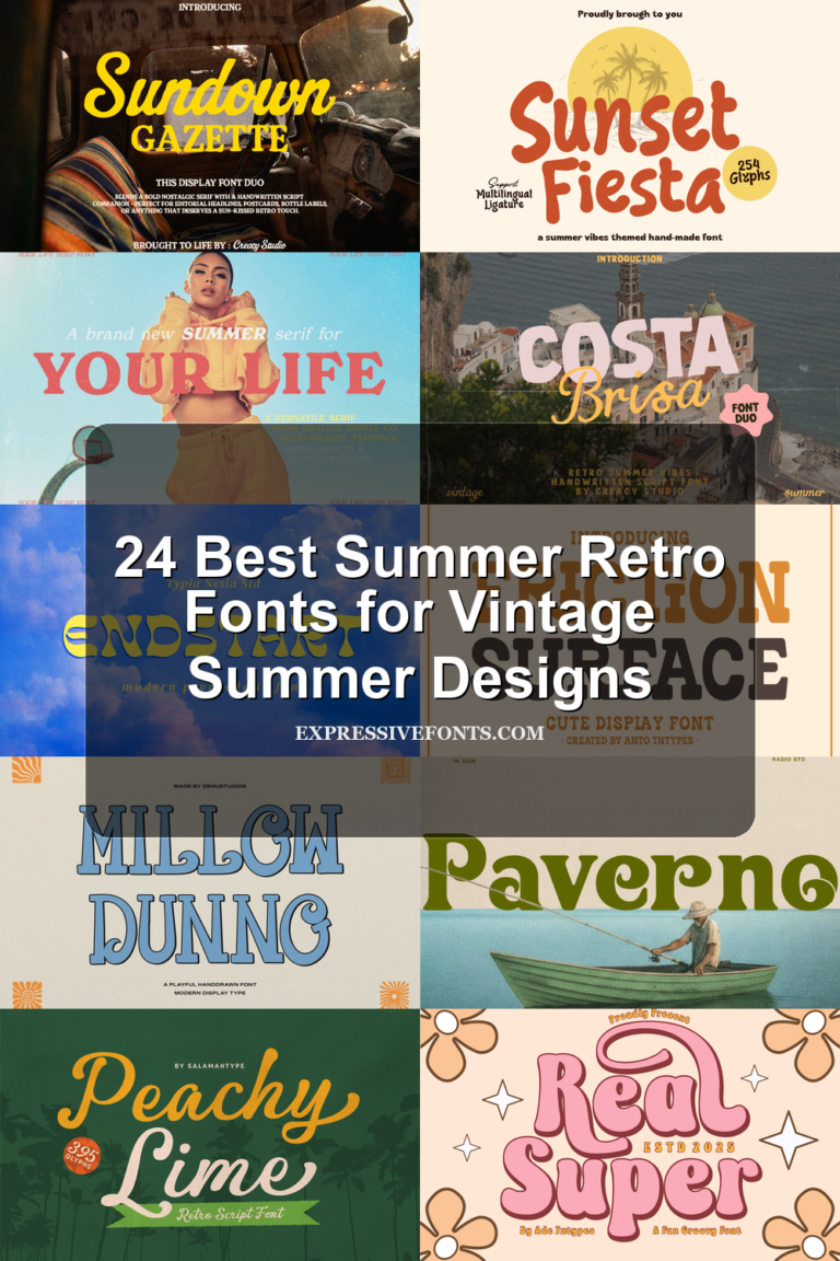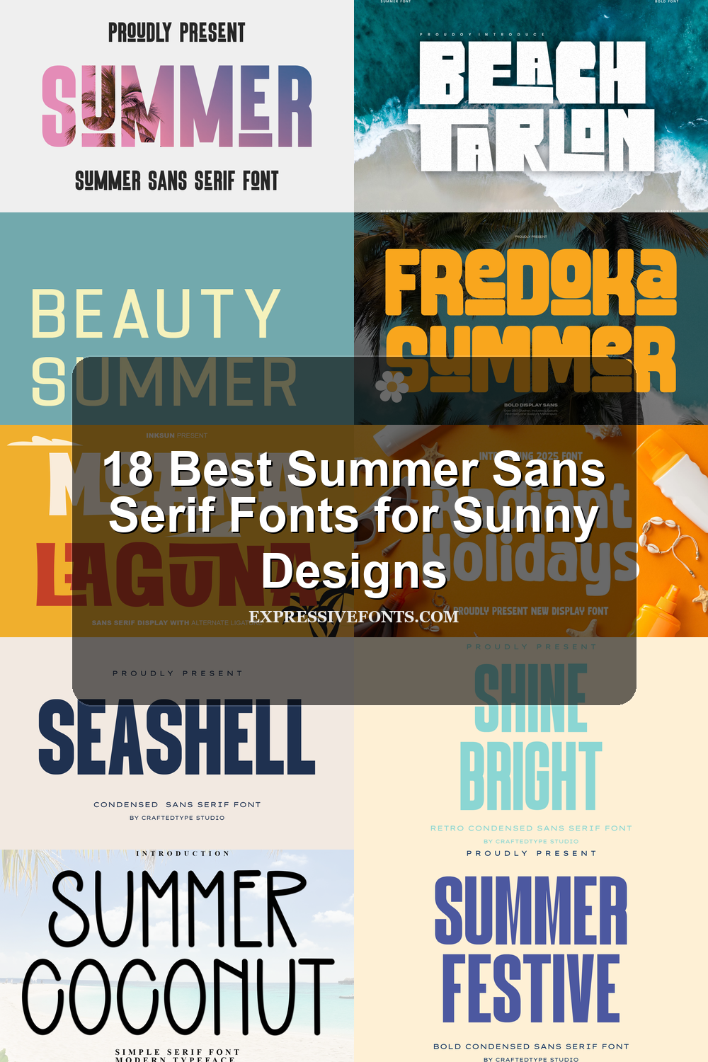
18 Best Summer Sans Serif Fonts for Sunny Designs
This collection is for designers, crafters, and brand owners who need summer sans serif fonts with clean, bold, playful, or tropical character. These 18 fonts work best for beach posters, T-shirts, stickers, packaging, social media graphics, logos, invitations, and seasonal branding where the lettering needs to feel bright, readable, and easy to use.
Fredoka Summer Font
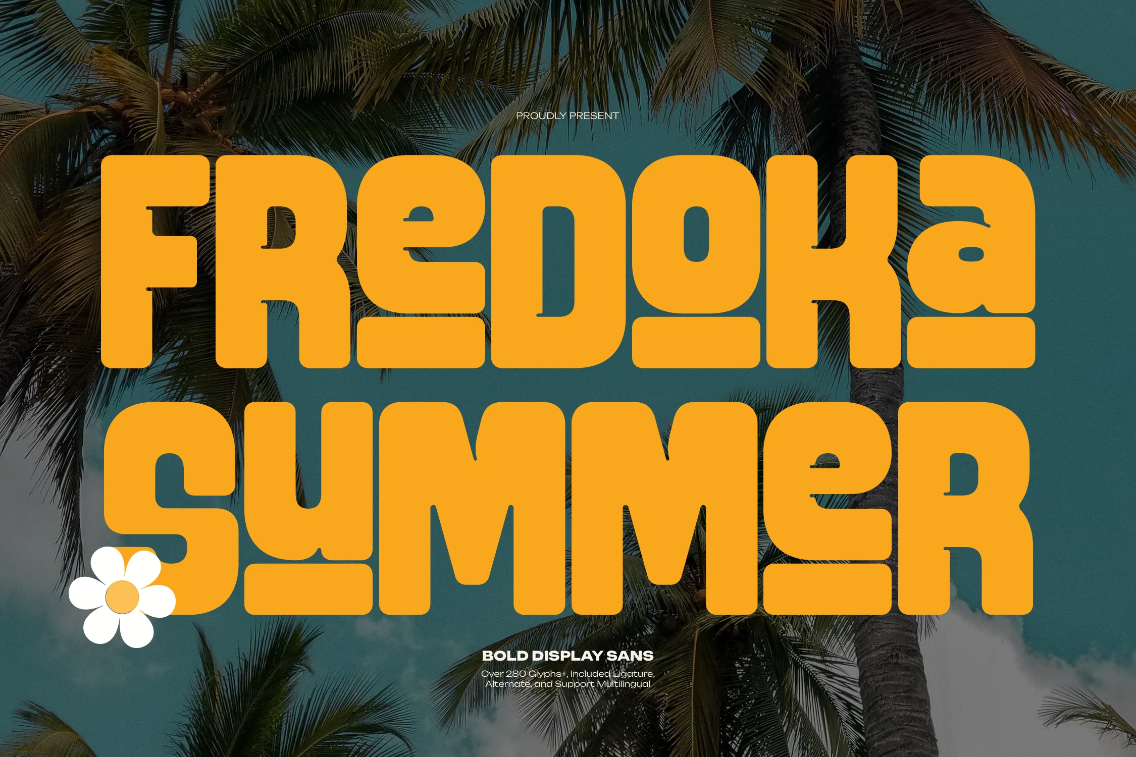
Best For: posters, social media graphics, children’s designs, bold designs
Fredoka Summer Font uses massive rounded sans letters with squat proportions, soft corners, and chunky counters that make each word feel solid and graphic. The playful cuts in the e, a, and broad m shapes give Summer Sans Serif Fonts a retro beach-poster tone without moving into script or serif styling.
Keep it in short headlines where the heavy weight can dominate the layout. The included ligatures and alternates help break up repeated shapes in large display text, while multilingual support keeps poster and apparel systems consistent across markets; use strong contrast and generous line spacing so the blocky forms do not merge.
Seashell Font
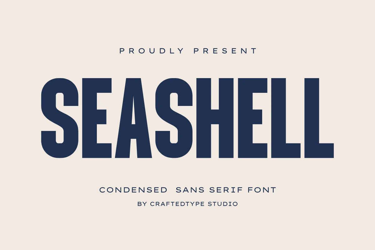
Best For: logos, branding, packaging, headlines
Seashell Font leans on tall condensed capitals, straight strokes, and a firm vertical rhythm that gives it a polished, editorial feel. The narrow proportions make it a strong fit for Summer Sans Serif Fonts when you want something clean and modern rather than playful or overly decorative.
Its slim width is especially useful when a title needs impact without taking over the whole layout, so it works well on logo locks, poster headings, and front-facing packaging. Try a little extra tracking and plenty of surrounding space to keep the condensed shapes crisp and to build a sharper hierarchy.
Sunset Fiesta Font
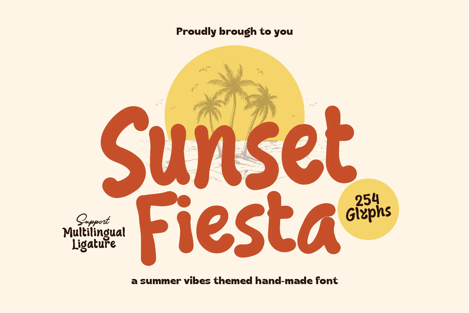
Best For: posters, social media graphics, T-shirts, playful designs
Sunset Fiesta Font has thick handmade strokes, rounded terminals, and a relaxed baseline that makes the words feel casual without losing display strength. Its solid, unconnected shapes give Summer Sans Serif Fonts a warmer tropical option, closer to painted signage than a clean geometric sans.
Use it for short phrases where the wide curves and heavy weight can carry the composition. Tight line spacing works poorly with these chunky forms, so leave clear vertical separation and pair it with smaller, simpler text to keep the title hierarchy readable.
Urban Summer Font
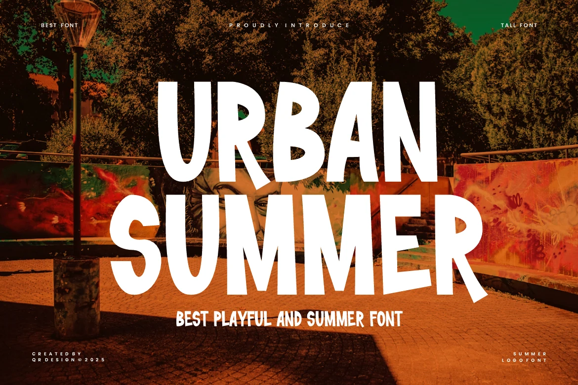
Best For: posters, social media graphics, headlines, playful designs
Urban Summer Font uses tall hand-drawn sans letters with uneven widths, soft bends, and a slightly loose rhythm that keeps the line feeling casual rather than geometric. That irregular structure gives Summer Sans Serif Fonts a livelier, more street-poster tone, especially when the words are stacked large.
It works best in short headlines, promos, and merch where the narrow forms can fill vertical space without looking stiff. Pair it with simpler supporting text and leave a bit of room between lines, since the playful proportions read better when the headline has space to breathe.
Summer Grupole Font
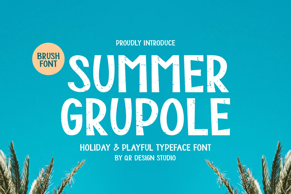
Best For: branding, packaging, posters, playful designs
Summer Grupole Font has tall hand-drawn sans letters with a lightly distressed surface, narrow proportions, and soft irregular curves that keep the texture relaxed instead of rigid. It brings a breezy handmade feel to Summer Sans Serif Fonts, especially when you want something cheerful without looking overly cute or polished.
The condensed shapes help long words stack neatly in posters, labels, and front-facing branding, while the rough edges add enough character to carry a simple layout on their own. Keep supporting text cleaner and smaller, and use contrast rather than crowding, so the textured strokes stay crisp at headline size.
Summer Coconut Font
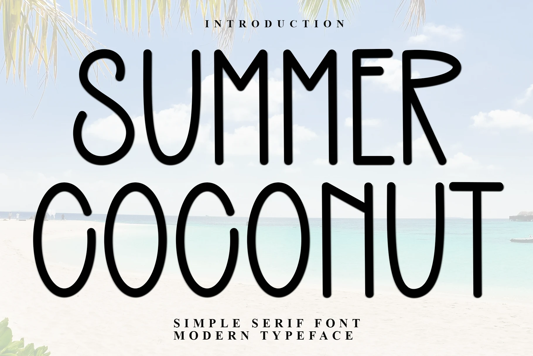
Best For: logos, branding, posters, minimal designs
Summer Coconut Font stands out with extra-tall monoline letters, rounded stroke endings, and open counters that keep the layout feeling airy even at a very large scale. That lean silhouette gives Summer Sans Serif Fonts a lighter, more relaxed direction, with enough character to feel coastal without leaning on rough texture or retro bulk.
Because the strokes are thin and elongated, it works best in short titles, logo concepts, and spacious poster layouts where the vertical rhythm can carry the composition. Use it with generous margins and a stronger secondary font for smaller text so the delicate structure stays clear and intentional.
Beach Tarlon Font
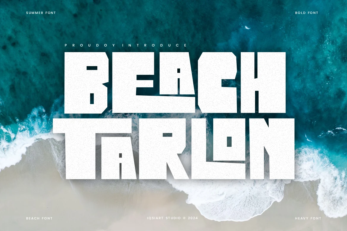
Best For: posters, branding, headlines, bold designs
Beach Tarlon Font is built from heavy block letters with sharp internal cuts, squared counters, and a gritty distressed surface that gives the words a worn poster texture. Within Summer Sans Serif Fonts, it sits on the rugged end: loud, compact, and made for titles that need instant weight.
The massive letterforms work best when the headline is short and the surrounding layout stays simple. Use strong contrast behind it, avoid tight paragraph-style stacking, and let the rough texture stay visible at display size so the blocky construction does not turn into a flat white slab.
Summer Minimalist Font
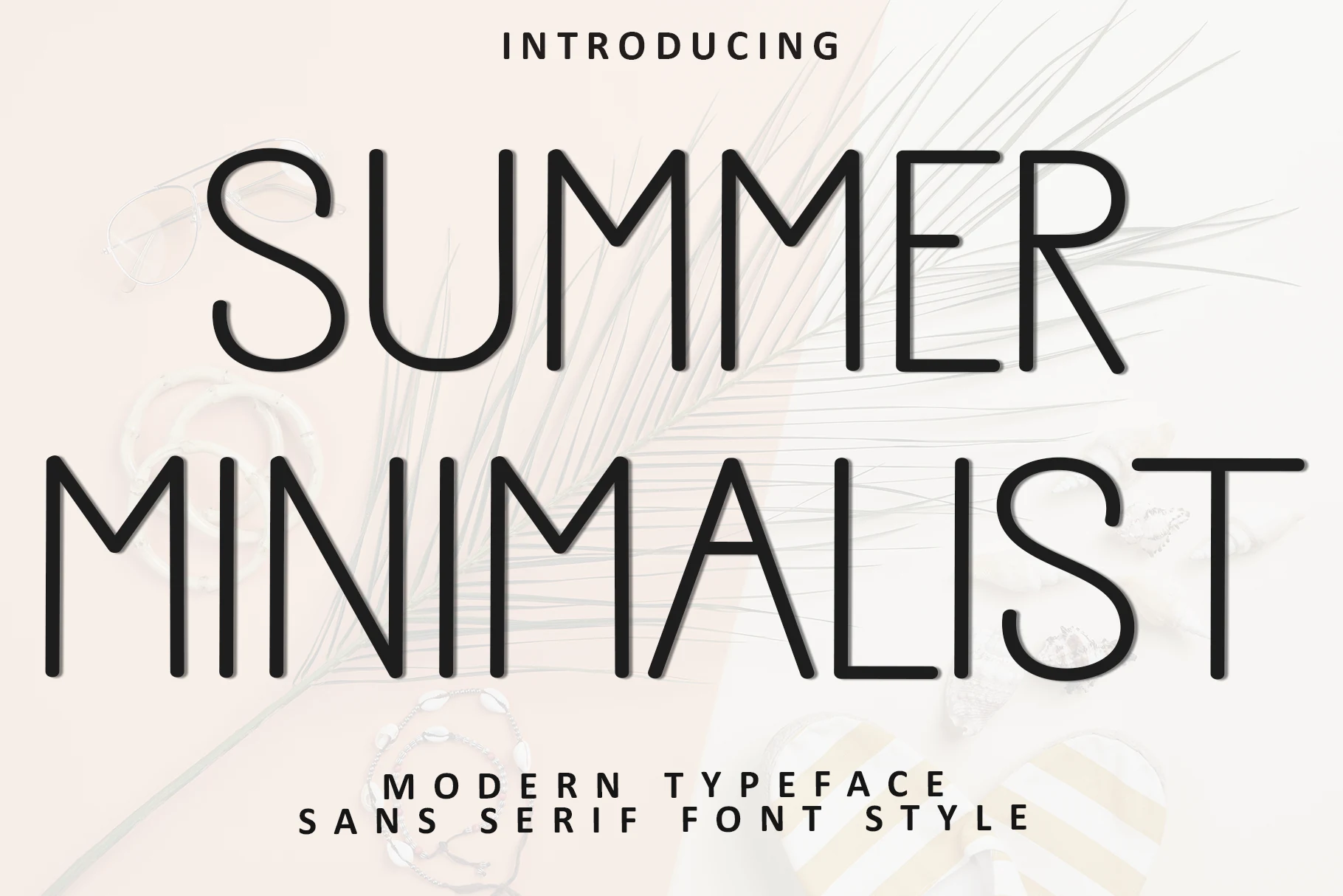
Best For: logos, branding, website headers, minimal designs
Summer Minimalist Font uses ultra-thin monoline strokes, tall proportions, and generous open spacing that give the letters a calm editorial rhythm. It takes Summer Sans Serif Fonts in a cleaner direction, with rounded terminals and simple geometry that feel airy rather than playful or decorative.
This style works best when the layout has space around it, especially for logos, hero headings, and refined packaging. Keep tracking moderate and pair it with subtle contrast, because the slim structure reads most clearly at larger sizes and loses presence when crowded by heavier supporting text.
Summer Time Font
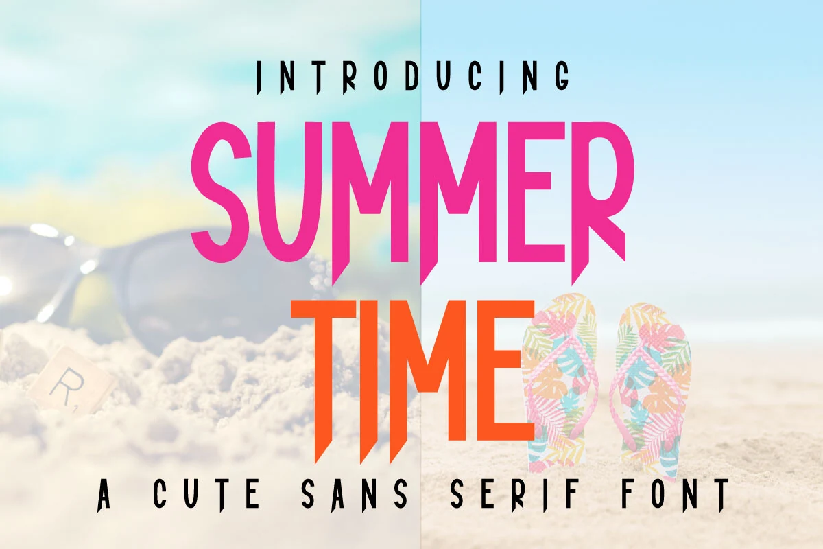
Best For: posters, product labels, T-shirts, playful designs
Summer Time Font uses tall sans serif letters with a uniform stroke, clean verticals, and sharp angled cuts that create pointed lower stems and lively diagonal details. It gives Summer Sans Serif Fonts a bright display look that feels energetic without relying on texture or heavy retro curves.
The solid weight helps it stay readable over photo backgrounds, especially in short words, event titles, and merchandise slogans. Keep contrast high and avoid overly tight tracking; the architectural angles need enough space to stay crisp, while a simpler secondary font can handle dates, captions, and smaller label text.
Shine Bright Font
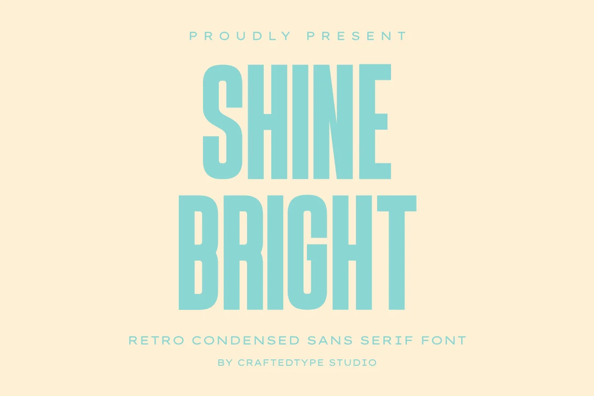
Best For: posters, T-shirts, stickers, branding
Shine Bright Font has tall condensed capitals, smooth geometric edges, and a firm vertical rhythm that gives it a clean retro punch. The narrow structure feels especially strong for Summer Sans Serif Fonts, where you want a vintage note without losing clarity or turning the headline too bulky.
It suits posters, merch, and bold brand lines because the compact width keeps large words tight and readable. The clean outlines are also useful for Cricut or Silhouette work, since simple cutting paths hold up better on stickers and shirt graphics than fussy decorative shapes.
Beauty Summer Font

Best For: logos, invitations, magazine covers, elegant designs
Beauty Summer Font has a clean uppercase sans structure with even strokes, open counters, and gently rounded geometry that keeps it polished without feeling cold. In Summer Sans Serif Fonts, it reads more refined than playful, with a calm modern rhythm that suits elegant branding and pared-back editorial layouts.
Because the letterforms are broad and uncluttered, it works well for logos, invitations, and magazine-style headings where clarity matters as much as mood. Keep the tracking slightly open and pair it with lighter supporting text or soft contrast, so the simple forms hold the hierarchy without looking flat.
Moana Laguna Font
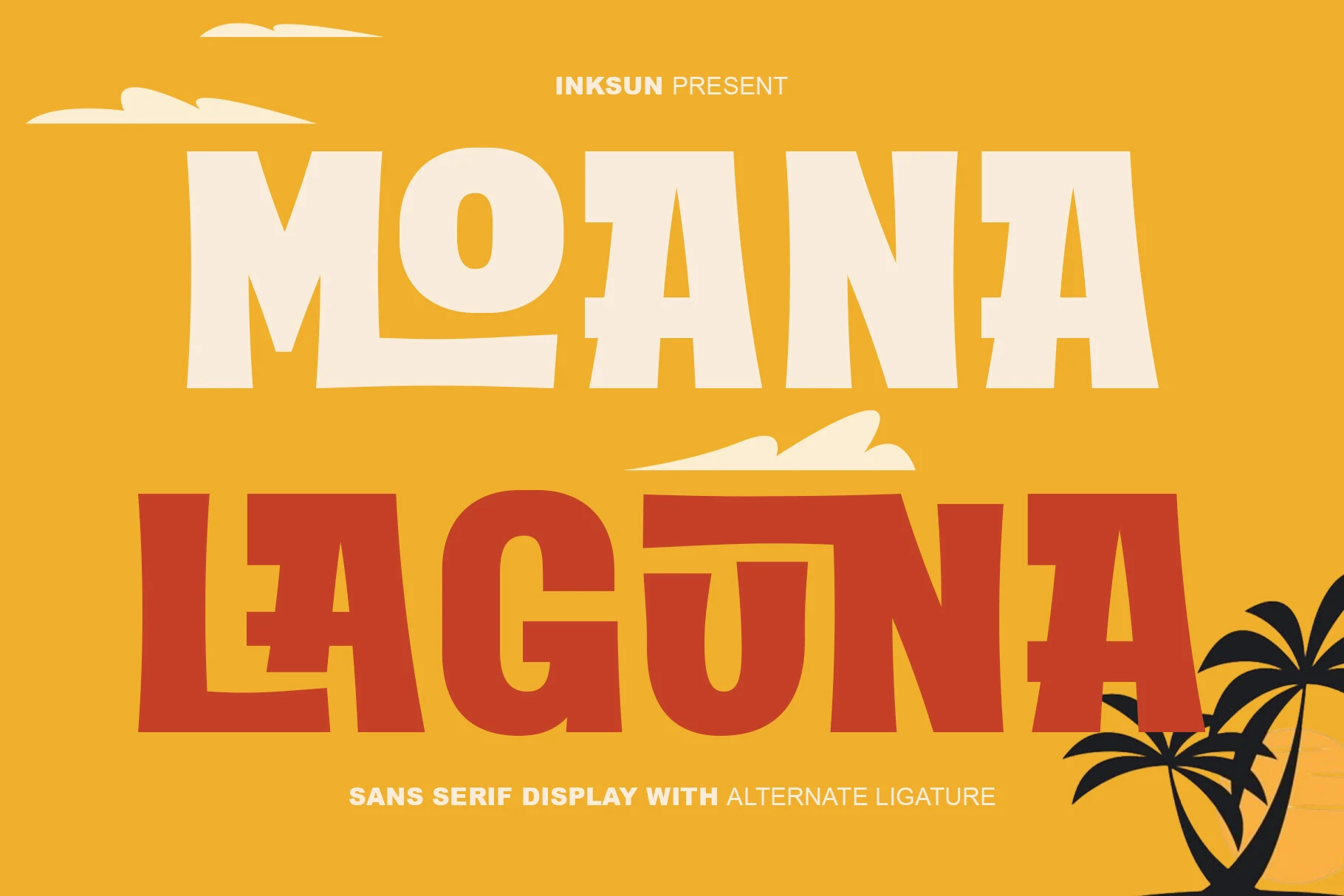
Best For: posters, branding, headlines, retro designs
Moana Laguna Font combines thick block capitals, broad counters, and slightly playful proportions that give it a confident tropical presence. The distinctive nested O adds a memorable detail, and that sturdy geometry makes it a strong fit for Summer Sans Serif Fonts when you want retro vacation energy with clear headline impact.
It works best in short titles where the heavy shapes can carry the layout without extra decoration. The alternate ligatures help create more custom-looking wordmarks, which is useful for posters, merch, and bold branding; keep supporting text lighter and leave enough surrounding space so the chunky forms stay sharp instead of crowding together.
Summer Festive Font
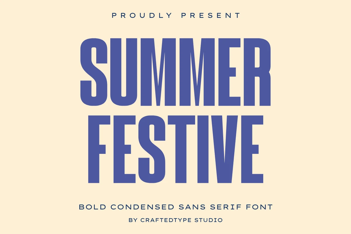
Best For: posters, T-shirts, social media graphics, bold designs
Summer Festive Font uses tall condensed capitals, heavy vertical strokes, and clean geometric shaping to create a strong headline block. Its narrow build gives Summer Sans Serif Fonts a sharper event-poster direction, with enough weight for impact while still keeping the letterforms orderly and easy to scan.
The smooth outlines make it practical for Cricut and Silhouette projects, where simpler edges cut cleaner on shirts, mugs, and stickers. Use it in stacked titles or short slogans, but keep line spacing controlled and supporting text lighter so the dense uppercase forms stay crisp instead of forming a heavy rectangle.
Radiant Holidays Font
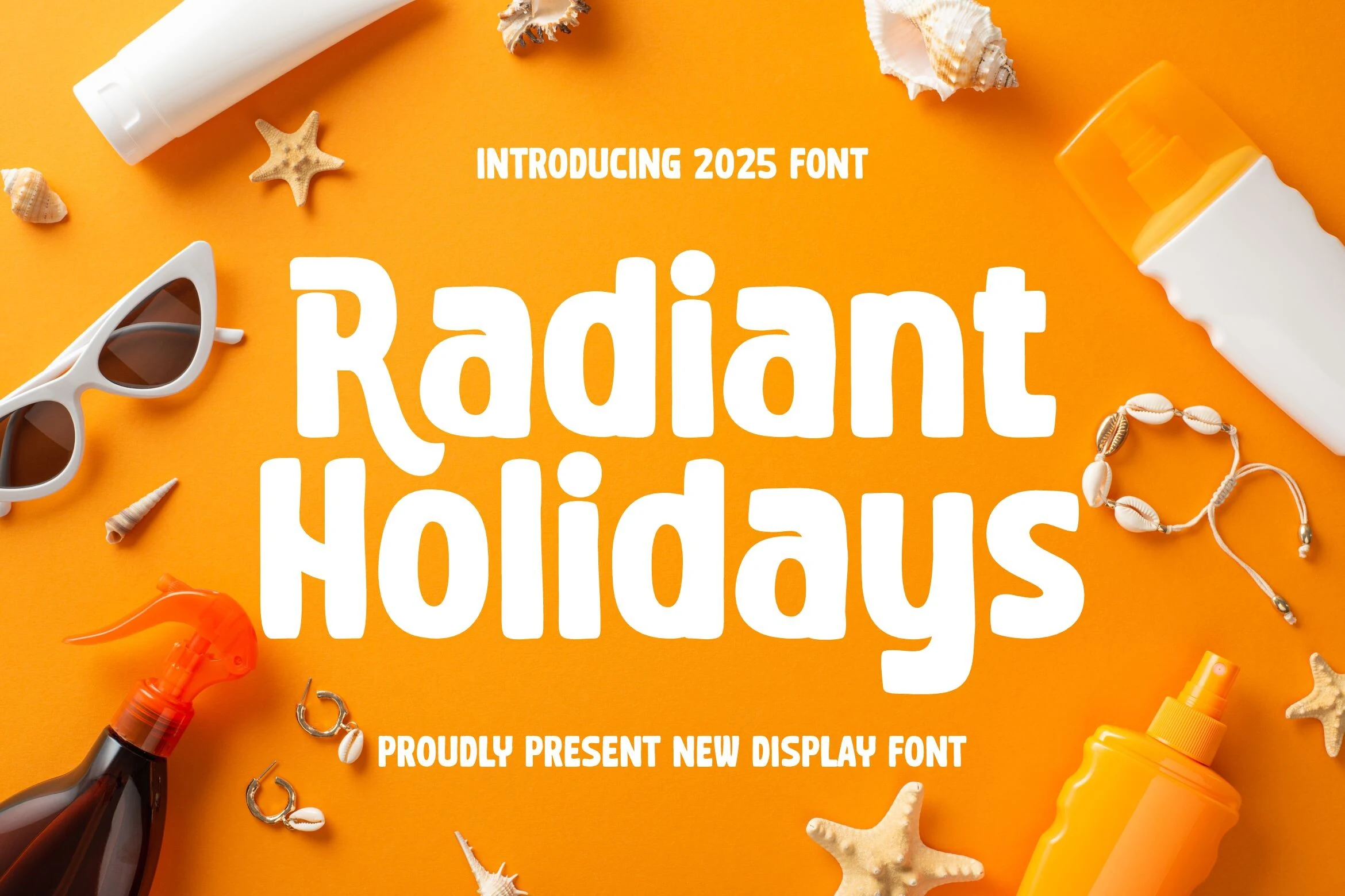
Best For: branding, packaging, posters, fun designs
Radiant Holidays Font has chunky rounded strokes, soft corners, and slightly quirky proportions that make the headline feel cheerful instead of rigid. It gives Summer Sans Serif Fonts a brighter, more carefree tone, with enough weight to stand out quickly on travel promos, seasonal packaging, and vacation-first branding.
Because the forms are broad and friendly, it works best in short titles where the words can carry the mood on their own. Use simpler secondary text and a clear size contrast around it, so the wide shapes stay readable and the playful rhythm does not get lost in a crowded layout.
Summer Font
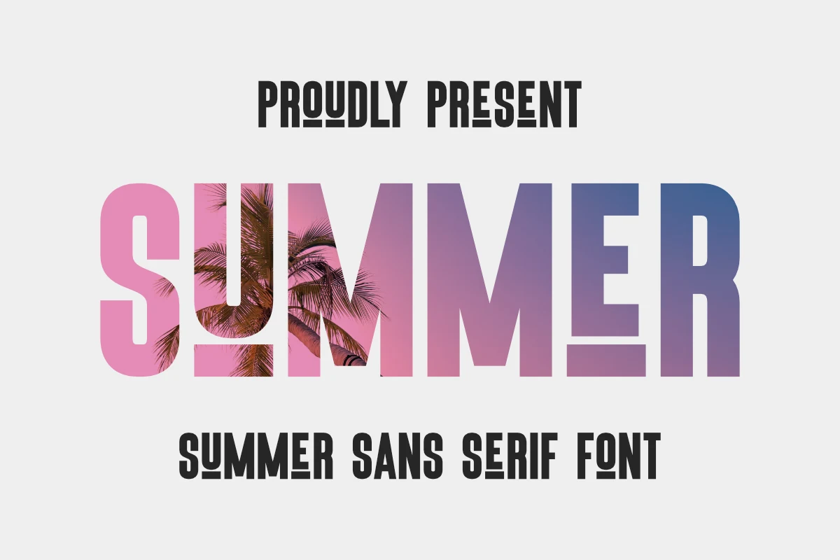
Best For: posters, T-shirts, merch design, branding
Summer Font uses bold condensed capitals with tight vertical rhythm, squared terminals, and a retro poster weight that feels direct rather than decorative. Its chunky letterforms give Summer Sans Serif Fonts a strong vintage angle, especially when the large strokes are used with color blocks, texture, or image-fill effects.
The compact width makes it useful for T-shirt slogans, mugs, tote bags, posters, and branding where a short word needs to fill space fast. Keep tracking controlled and avoid small paragraph use; the heavy shapes work best as a clear headline layer with lighter supporting text underneath.
Summer Teacher Font
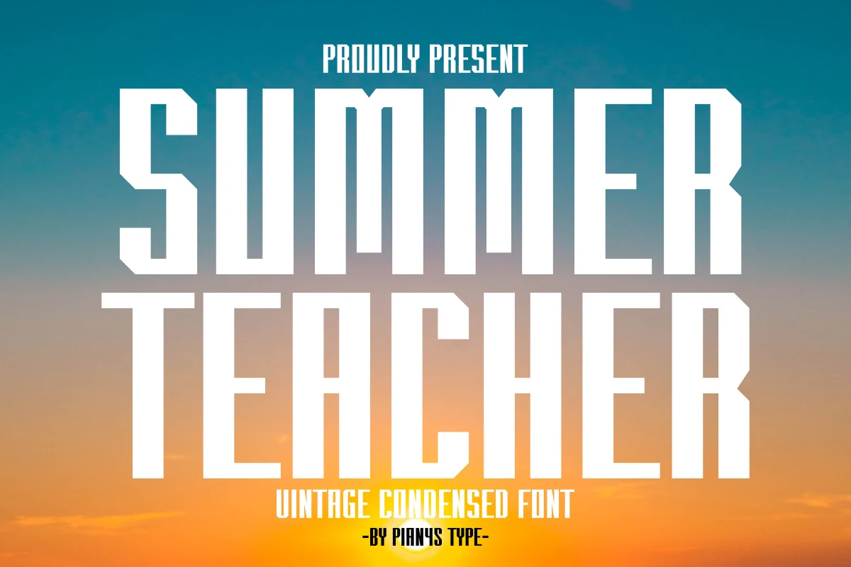
Best For: posters, headlines, T-shirts, vintage designs
Summer Teacher Font uses a tall condensed sans shape with heavy vertical strokes, squared counters, and sharp angled cuts on the corners. The result feels closer to vintage sports titles and old movie posters than soft summer lettering, with a rigid stacked rhythm that makes single words look forceful.
Use it when Summer Sans Serif Fonts need a bold, poster-sized voice with a classic edge. Keep tracking controlled rather than loose, and build clear title hierarchy around short phrases; the compressed proportions carry impact well, but longer lines need extra line spacing to avoid turning into a dense wall of type.
Happy Summer Font
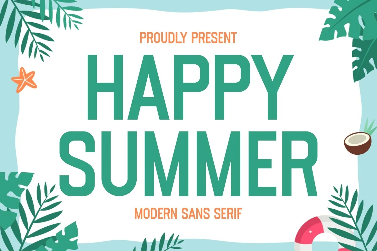
Best For: posters, quotes, T-shirts, social media graphics
Happy Summer Font has a bright, easygoing tone built from tall sans serif letters, smooth curves, and a steady stroke weight. The shapes feel clean rather than strict, so the font reads quickly while still carrying a light seasonal mood that suits upbeat display work.
For Summer Sans Serif Fonts, this one works best when you want a fresh headline without extra decoration. It holds color well, especially in bold tropical palettes, and the simple structure makes it easy to stack into short titles or quotes; keep the spacing balanced so the lines stay airy instead of turning heavy.
Summer Sunset Font
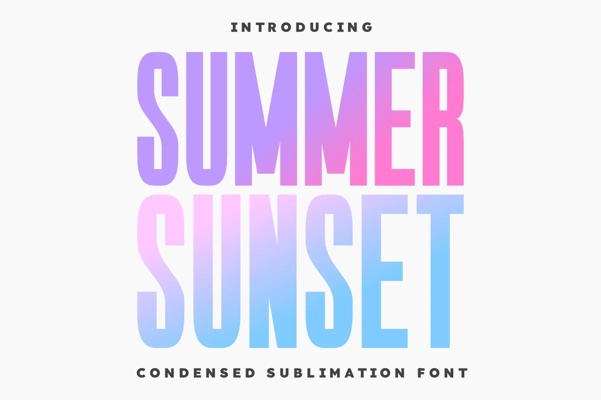
Best For: posters, headlines, merch design, bold designs
Summer Sunset Font is built around tall condensed sans serif capitals with heavy strokes, narrow counters, and a strong vertical pull. The letterforms feel modern and display-driven, with enough clean structure to stay readable when stacked into bold two-line compositions.
Use it when Summer Sans Serif Fonts need impact without decorative extras. The compressed width helps large words fit across posters, shirts, and craft layouts, but it works best with generous line spacing and high contrast so the dense vertical rhythm stays clear instead of crowding the design.
The best choice depends on how much weight and personality your design needs. Use chunky rounded fonts like Fredoka Summer or Radiant Holidays for playful summer graphics, tall condensed fonts like Seashell or Shine Bright for cleaner posters and logos, and lighter options like Summer Minimalist or Summer Coconut for airy coastal branding.