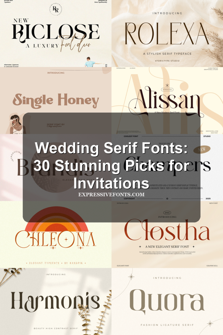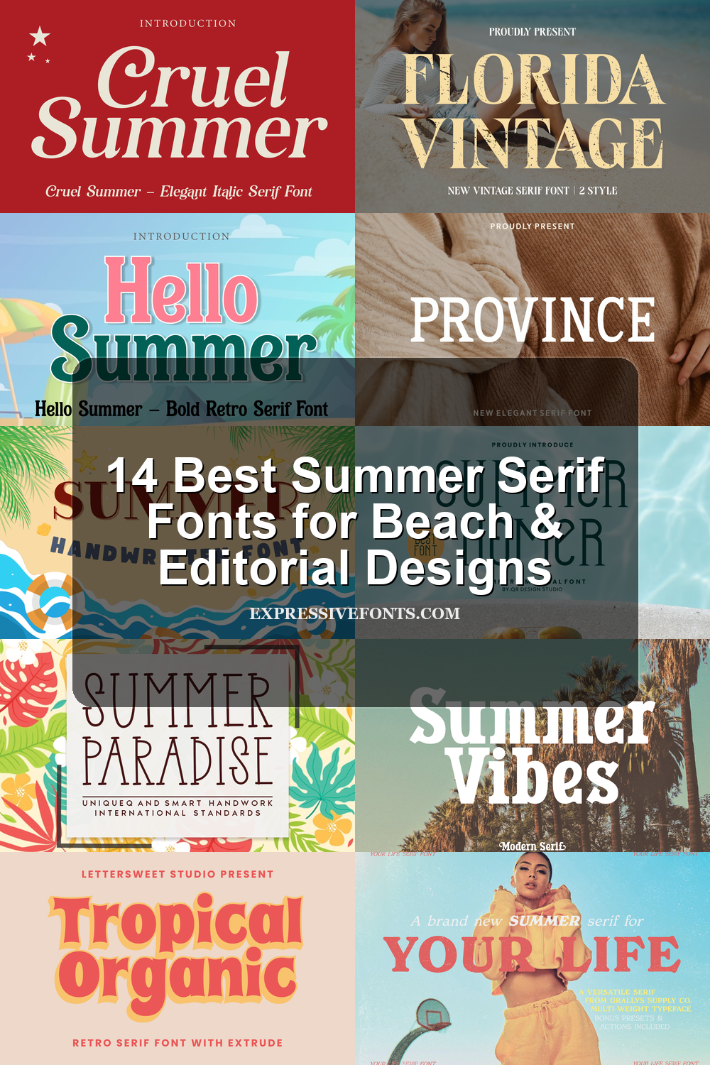
14 Best Summer Serif Fonts for Beach & Editorial Designs
This collection is for designers who need summer serif fonts with a warmer, more polished seasonal mood. The 14 fonts cover retro serifs, elegant editorial styles, playful beach lettering, luxury display faces, and vintage-inspired options for logos, posters, packaging, invitations, social graphics, fashion branding, and vacation-themed designs.
Your Life Font
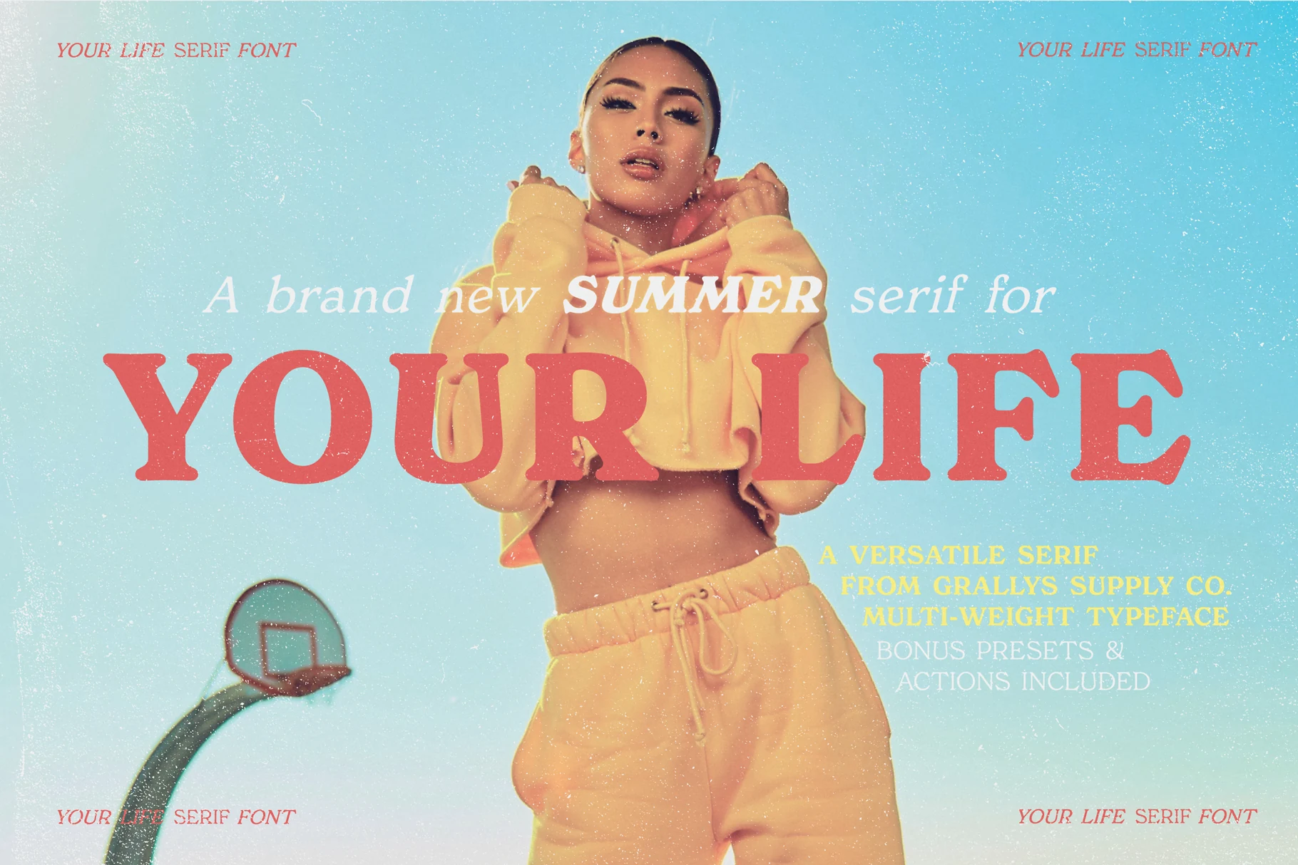
Best For: fashion branding, magazine covers, posters, editorial designs
Your Life Font leans into retro summer styling with broad serif capitals, rounded curves, and a sun-faded warmth that feels lifted from vintage fashion editorials. The bold headline treatment carries real presence, while the softer italic companion line gives the family a breezier contrast.
It works especially well when Summer Serif Fonts need both impact and hierarchy in the same layout. Use the heavier styles for oversized titles and the quieter cuts for secondary copy, then bring in the included retro summer Photoshop actions when the composition needs extra texture.
Cruel Summer Font
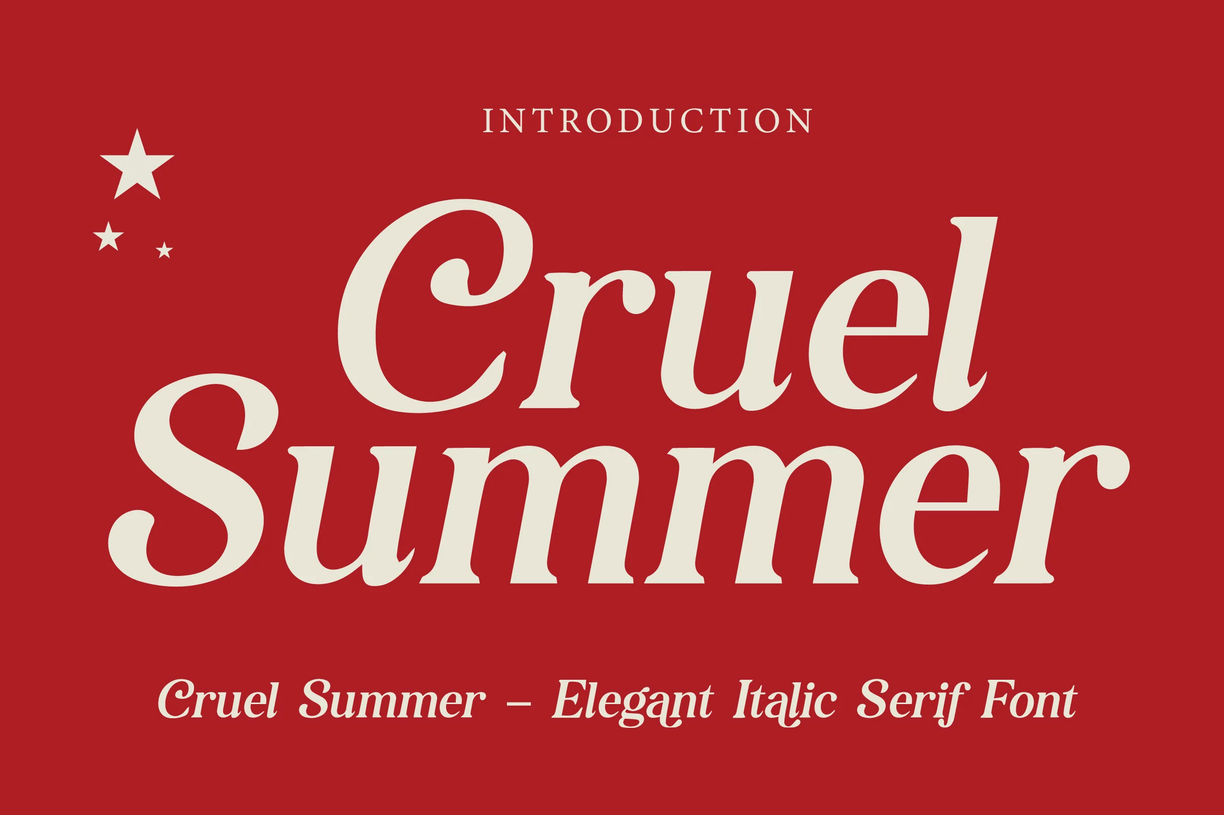
Best For: editorial designs, fashion branding, magazine covers, luxury designs
Cruel Summer Font is a high-contrast italic serif with broad cream strokes, sharp wedge serifs, and curled capitals that push the word shape into magazine-cover territory. It feels polished rather than delicate: the slant adds motion, while the oversized curves keep the headline dramatic.
Use it where Summer Serif Fonts need a fashion-forward voice without losing readability. Tight title settings work well because the forms are wide and confident, but longer lines need measured tracking and strong color contrast so the swashes and angled terminals stay clean.
Province Font
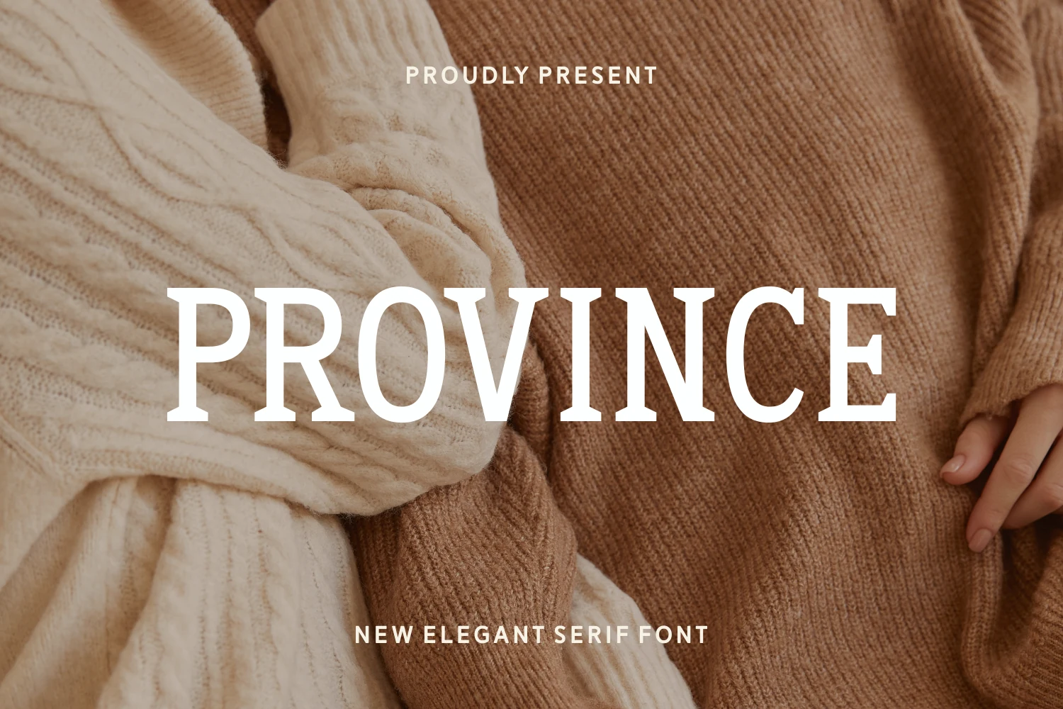
Best For: classic designs, editorial designs, elegant designs, website headers
Province Font is a grounded serif with tall uppercase forms, sturdy wedge serifs, and a calm rhythm that reads more classic than decorative. Its broad letter shapes give headlines weight, while the restrained contrast keeps the style polished instead of overly vintage.
For Summer Serif Fonts with a warmer editorial mood, Province works best when the title has generous margins and controlled tracking. Pair its heavier capitals with smaller neutral text, so the serif texture carries the hierarchy without making the layout feel crowded.
Come on Summer Font

Best For: stickers, social media graphics, invitations, children’s designs
Come on Summer Font has a cheerful, chunky serif style with rounded terminals and bouncy proportions that make every word feel upbeat. The preview shows how well its soft curves hold attention, while the included dingbats bring in ready-made beach symbols that support the main lettering without needing extra illustration work.
If you are collecting Summer Serif Fonts with a more playful voice, this one works best in short, bold phrases where the wide shapes can stay open and readable. Give it space, keep surrounding text simple, and use the icons to build quick themed layouts for labels, stickers, or seasonal promos.
Tropical Organic Font
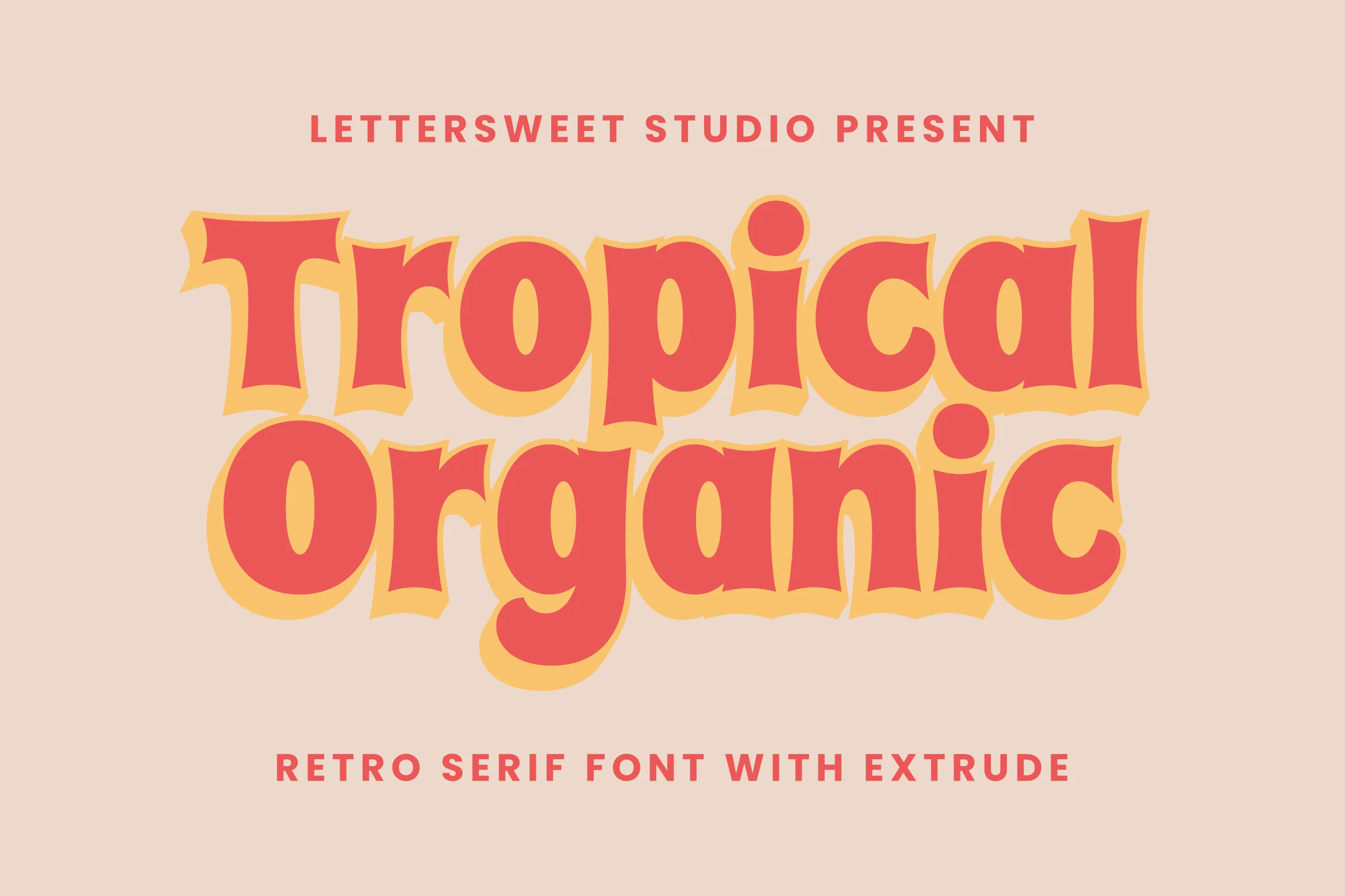
Best For: posters, packaging, logos, social media graphics
Tropical Organic Font is a bold retro serif with swollen curves, flared terminals, and a hand-drawn wobble that gives the letters a loose groovy rhythm. The red fill and yellow extrude treatment in the preview show how much depth the type can carry before it needs extra decoration.
For Summer Serif Fonts with a loud vintage personality, keep it to short headlines and let the shadowed forms dominate the hierarchy. Its chunky proportions suit posters and packaging, but tight spacing can make the inner counters feel heavy, so leave enough tracking around stacked words.
Summer Vibes Font
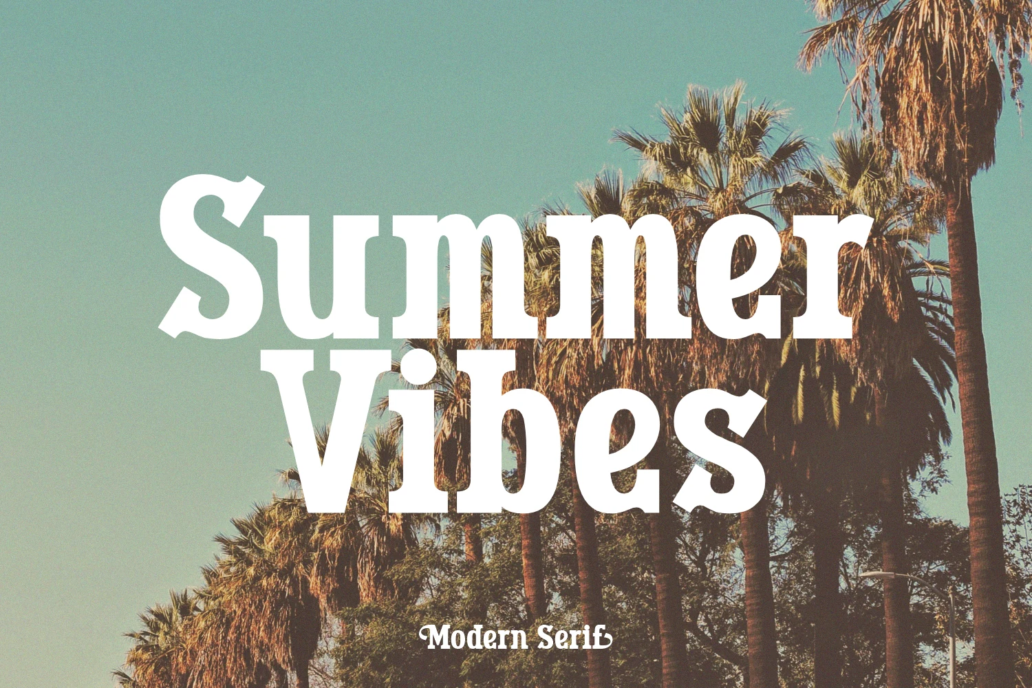
Best For: personal branding, website headers, fashion branding, quotes
Summer Vibes Font has a bold serif build with rounded shoulders, chunky stems, and compact counters that give it a confident, easygoing presence. In the preview, the stacked words feel strong and sunny rather than delicate, which makes the design read clearly even against a busy background.
For Summer Serif Fonts that need instant impact, this one works best in short headlines, quote graphics, and branded hero text. The alternates and swashes help you soften endings or vary repeated letters, while roomy line spacing keeps the heavy shapes from feeling crowded in stacked layouts.
Paradise Summer Font
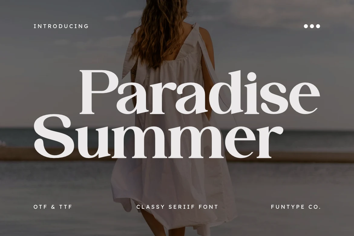
Best For: fashion branding, luxury designs, logos, posters
Paradise Summer Font is a polished display serif with high contrast, wide curves, and crisp wedge-like terminals that give its large words a controlled luxury tone. The preview shows strong title presence without much ornament, so the elegance comes from proportion and spacing rather than decoration.
Use it when Summer Serif Fonts need a clean fashion-branding edge for logos, hero headers, or digital posters. Keep the background contrast firm and avoid tight multi-line settings; the broad capitals and refined thin strokes need enough room to stay sharp. OTF and TTF files support use across standard design platforms.
Summer Paradise Font
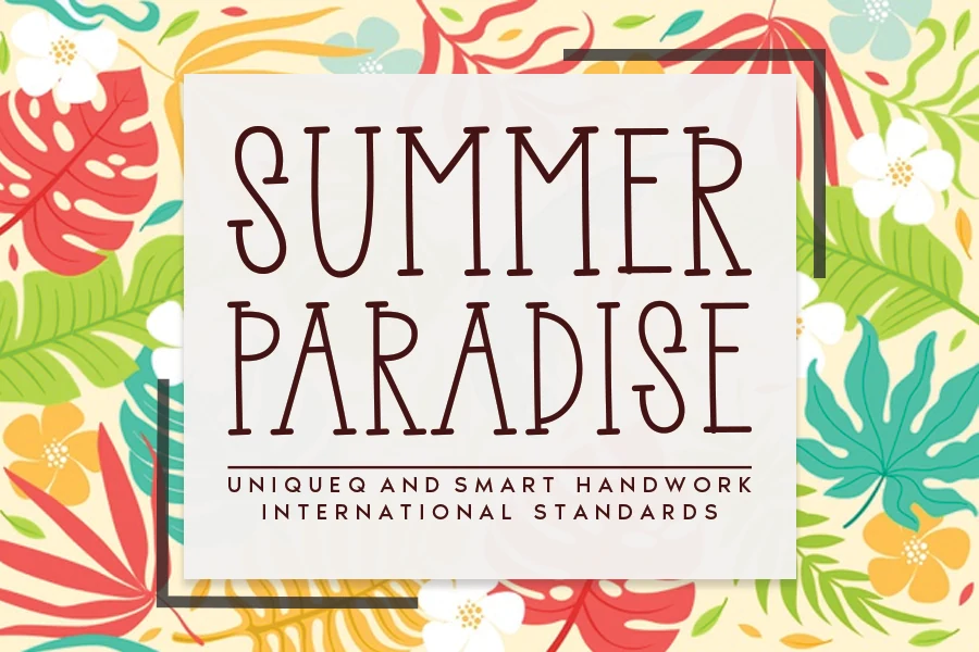
Best For: posters, packaging, product labels, headlines
Summer Paradise Font has a tall, narrow serif style with lightly quirky proportions and a clean hand-drawn feel. The strokes stay fairly even, while the curved terminals and elongated stems give the letters a relaxed tropical character that feels decorative without becoming overly busy.
In Summer Serif Fonts, this one stands out best in short titles where its vertical rhythm can stay crisp and airy. Give it a bit of spacing and let it lead the layout, especially on labels or poster-style graphics, because smaller dense text can make the slim shapes lose some of their charm.
Summer Font
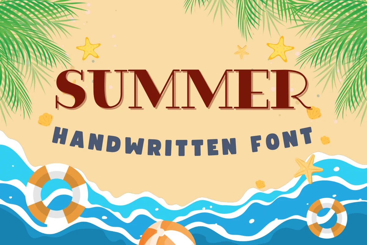
Best For: invitations, social media graphics, children’s designs, merch design
Summer Font mixes a playful beach mood with a bold serif headline style. The main letters have tall stems, squared serif details, and a slightly decorative split-shadow feel, while the handwritten companion text adds a looser, kid-friendly rhythm underneath.
For Summer Serif Fonts aimed at party invites, vacation merch, or sunny social posts, this works best with clear title hierarchy: let the serif word carry the headline, then use the handwritten style as a shorter accent. Keep spacing open so the playful forms stay readable against illustrated backgrounds.
Summer Homer Font
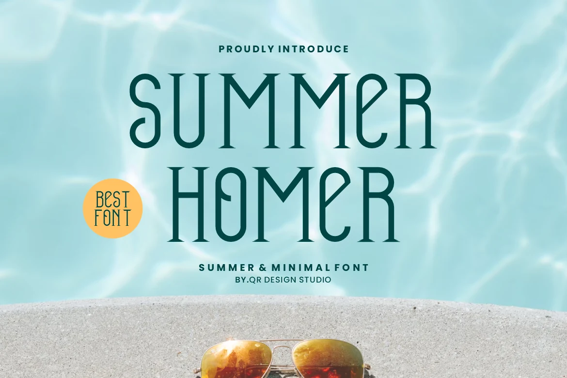
Best For: website headers, minimal designs, elegant designs, fashion branding
Summer Homer Font has a tall, slim silhouette with clean vertical rhythm and delicate pointed terminals that give it a lightly art-deco edge. The narrow proportions keep the texture airy, while the even stroke weight makes the overall look feel calm, polished, and very controlled.
Within Summer Serif Fonts, this one suits layouts that need clarity more than flourish. It performs best in short headlines, spacious logos, or pared-back hero text, where generous tracking and open margins let the condensed forms breathe instead of collapsing into a dense block.
Paradise Spring Font
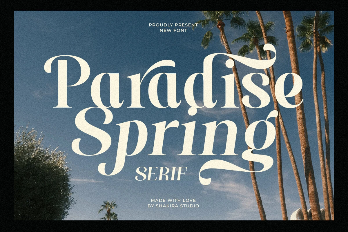
Best For: logos, posters, fashion branding, luxury designs
Paradise Spring Font is a retro display serif with heavy rounded forms, sharp contrast, and long airy swashes that curl out from selected terminals. The letters feel polished but not stiff, with enough movement in the descenders and capitals to make a title look styled before extra decoration is added.
Use it when Summer Serif Fonts need a glamorous, resort-editorial tone for logos, posters, or fashion-led layouts. Keep the wording short and give the flourishes clean negative space; tight stacking can make the swashes compete, while wide margins let the bold forms and thin strokes stay balanced.
California Summer Font
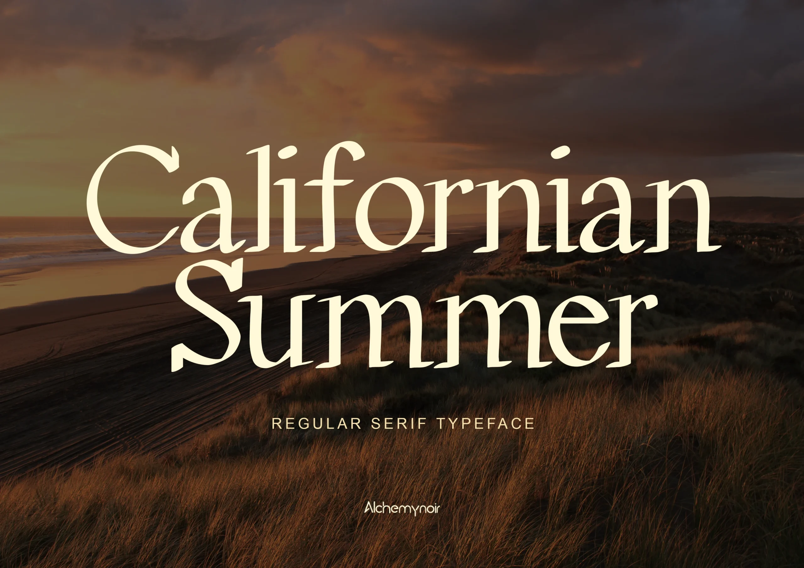
Best For: logos, posters, merch design, luxury designs
California Summer Font has a calm, polished serif style with broad curves, softly tapered terminals, and an easy rhythm that keeps large titles looking refined rather than stiff. The letterforms feel classic and slightly cinematic, with enough contrast to read as elegant while staying simple on the page.
When Summer Serif Fonts need a cleaner luxury tone, this one works well for logos, posters, and apparel graphics. Its wide proportions hold up best in short phrases with generous spacing, where the open shapes and balanced weight can carry the composition without extra ornament.
Florida Vintage Font
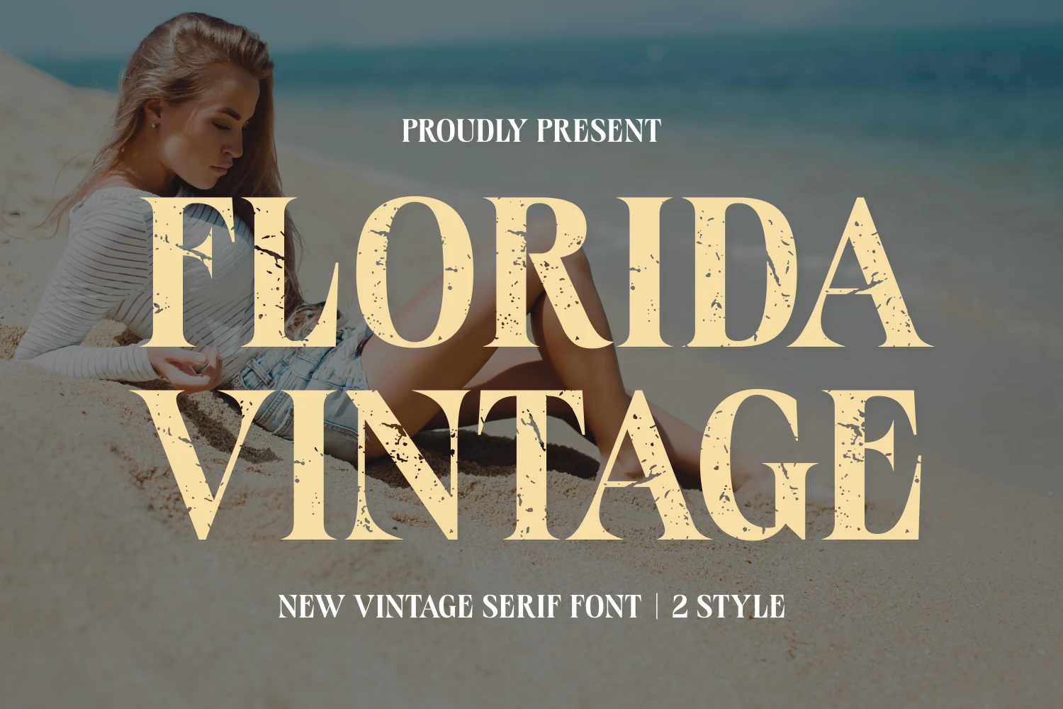
Best For: fashion branding, packaging, book covers, T-shirts
Florida Vintage Font leans into bold display impact with tall capitals, sharp wedge serifs, and a sun-faded distressed texture that gives the letters instant age and grit. The forms feel sturdy and glamorous at once, landing somewhere between a vintage fashion headline and an old coastal poster.
If you want Summer Serif Fonts with a more weathered personality, this one works best in short uppercase titles where the grunge accents stay visible. Pair it with clean secondary text and let the rough texture do the styling work, especially on covers, apparel, or packaging where a polished finish would feel too smooth.
Hello Summer Font
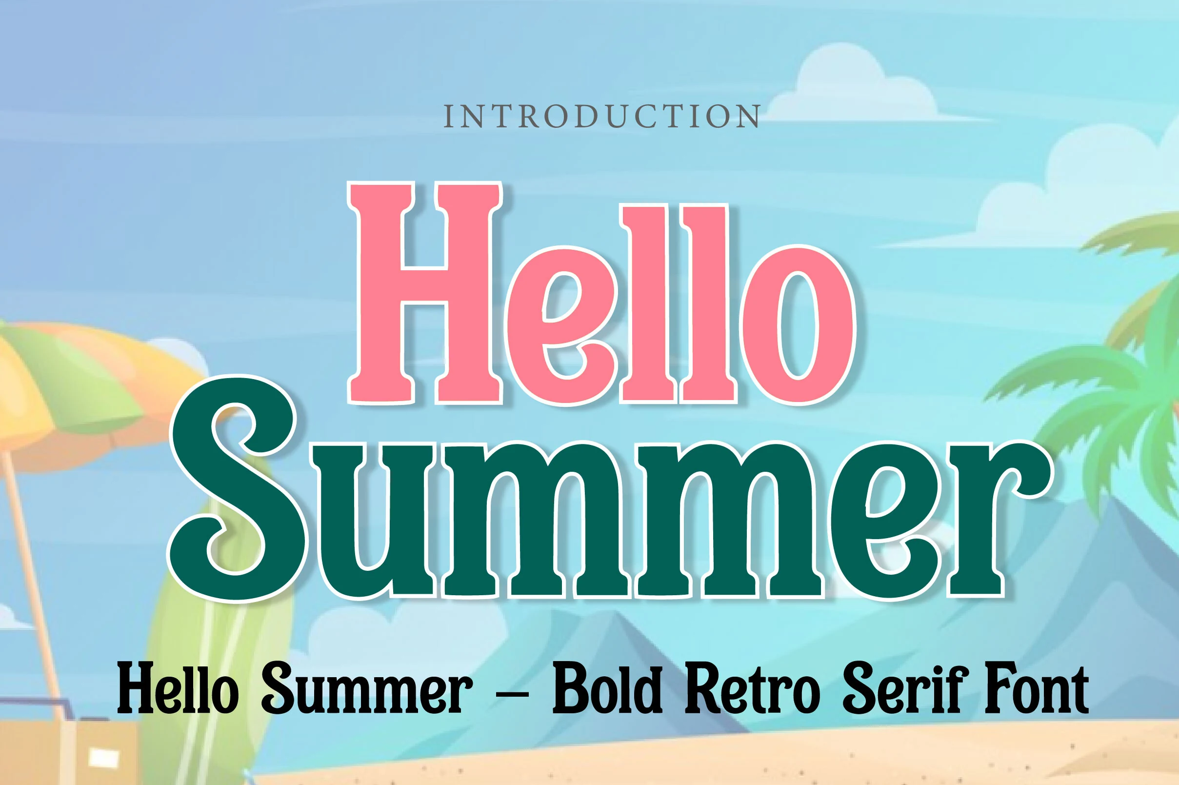
Best For: packaging, invitations, social media graphics, posters
Hello Summer Font is a heavy retro serif with thick blocky strokes, rounded slab serifs, and a soft edge that keeps the weight friendly instead of harsh. The preview shows strong color separation and a poster-like rhythm, with the large lowercase curves giving the layout a warm seaside pull.
Use it where Summer Serif Fonts need a nostalgic vacation voice for headers, packaging, or party invites. Keep phrases short and give the outlines strong contrast; the massive forms handle busy scenes well, but tight spacing can flatten the rounded details that make the font feel lively.
Summer serif fonts work best when the type needs seasonal warmth without losing structure. Choose bold retro serifs for posters, packaging, and merch, polished high-contrast styles for fashion branding and editorial layouts, and playful rounded fonts for invitations, stickers, and beach-themed social graphics.