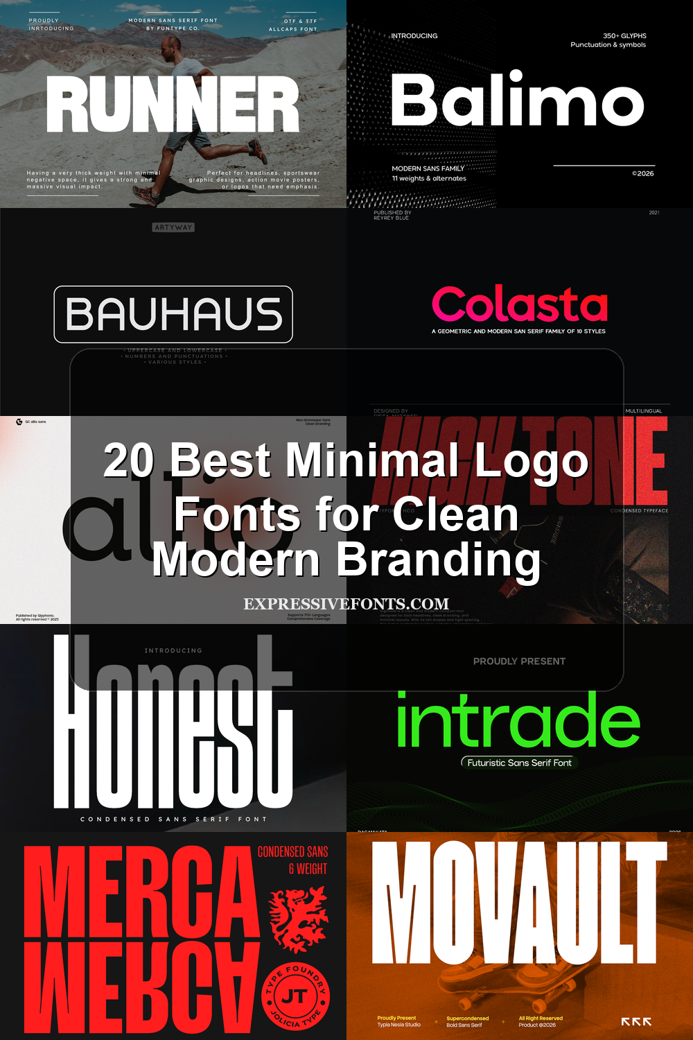
20 Best Minimal Logo Fonts for Clean Modern Branding
Minimal Logo Fonts help designers build clean, restrained brand marks without relying on decoration. This collection is for logo designers, brand owners, and creatives choosing type for modern identities, packaging, website headers, posters, editorial layouts, and product branding where clarity, spacing, and shape matter most.
Geometric & Rounded Minimal Logo Fonts
These fonts use circular shapes, soft terminals, and balanced sans serif proportions, making them useful for friendly logos, product packaging, app identities, and clean brand systems.
Gc Allio Font
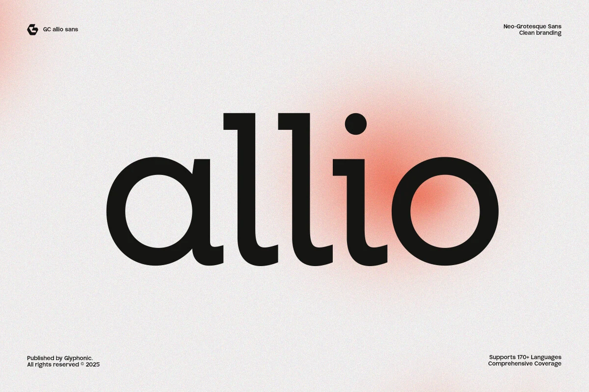
Best For: logos, branding, packaging, editorial designs
Gc Allio has the quiet confidence of a neo-grotesque sans, with low contrast, broad curves, and an even rhythm that makes the oversized lettering feel calm and controlled. The single-storey a, round i dot, and softly finished terminals keep it approachable, so the minimal construction never turns sterile.
It suits Minimal Logo Fonts especially well when a brand needs clarity without looking generic. Use it for logos, packaging, or editorial titles where shape carries the identity; its wide bowls and steady stroke weight read best with generous white space and a tight hierarchy rather than extra decorative styling.
Bauhaus Font
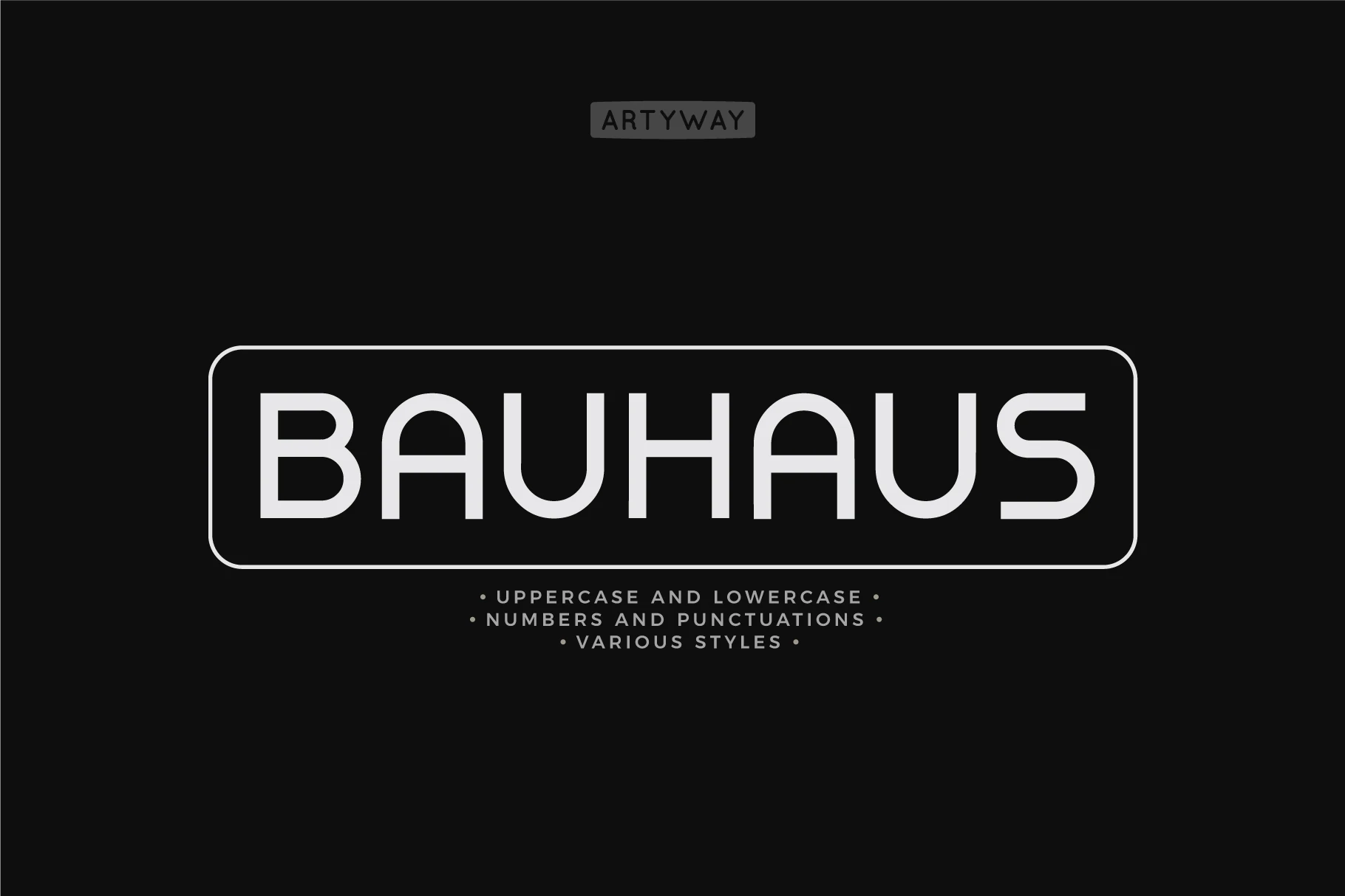
Best For: logos, signage, modern designs, clean designs
Bauhaus Font uses a geometric sans structure with rounded corners, even strokes, and spacious shapes that keep the large uppercase sample looking calm and orderly. The circular bowls and simplified construction create a clean visual rhythm, while the soft curves stop the minimal design from feeling cold.
That balance makes it a natural fit for Minimal Logo Fonts, especially when you want a mark to feel modern, stable, and easy to read. It works best in short names, signage, and clear brand lockups; give the wide forms enough room and let the simple geometry carry the hierarchy instead of relying on extra effects.
Rimini Font
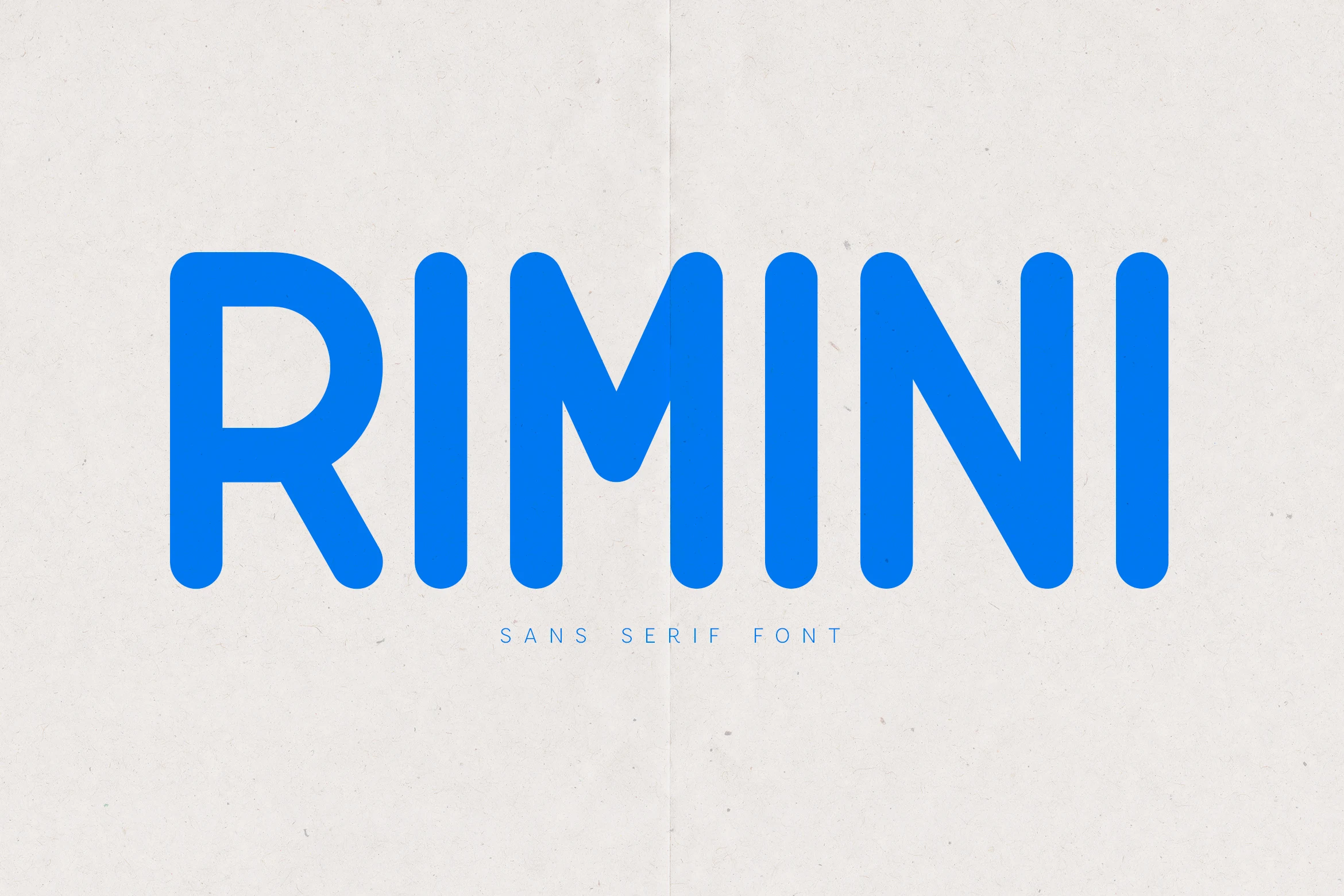
Best For: logos, branding, packaging, clean designs
Rimini Font has a rounded geometric build with thick, even strokes and soft vertical terminals that make the uppercase sample feel clear and approachable. The wide R, rounded M joins, and open spacing give it a friendly modern rhythm without pushing it into cartoon territory.
Rimini works in Minimal Logo Fonts when a brand needs softness, clarity, and a simple digital feel. Its smooth curves suit packaging, app-style identities, and clean editorial headers; keep contrast high and avoid squeezing the tracking, because the rounded forms read best when each letter has a little room to hold its shape.
Colasta Font
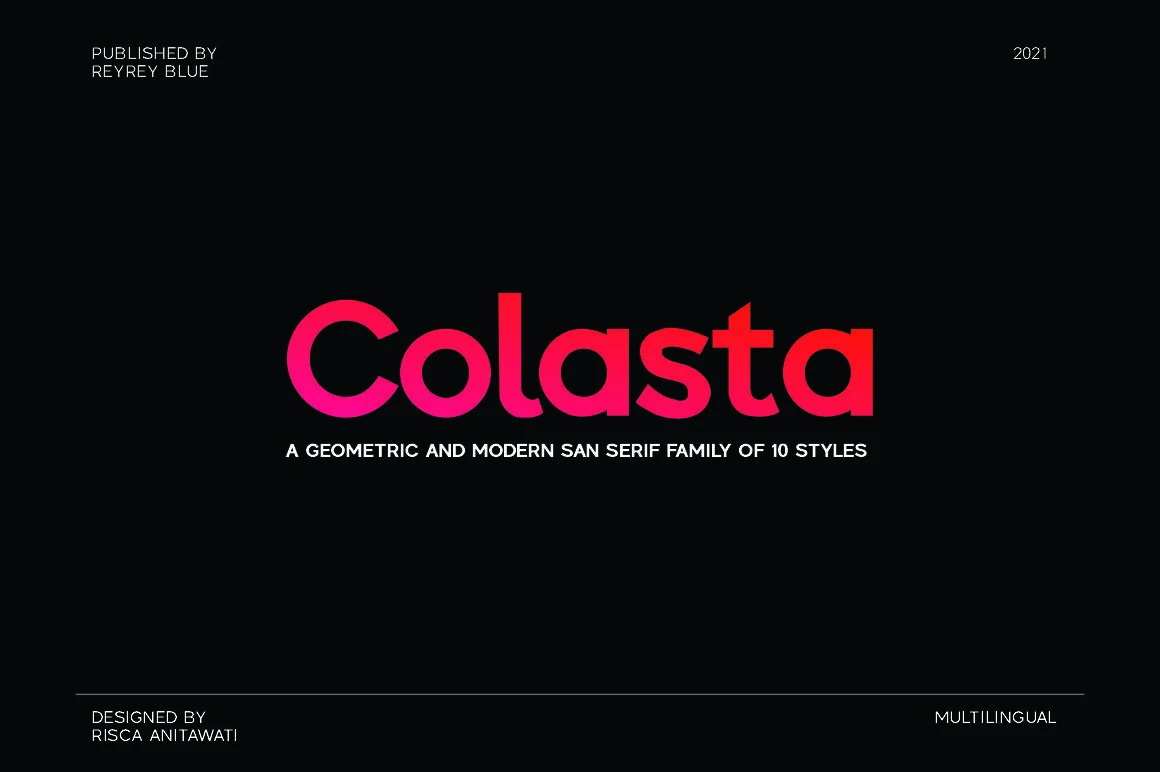
Best For: logos, branding, modern designs, minimal designs
Colasta Font has a geometric sans serif build with thick strokes, round bowls, and compact lowercase shapes. The preview gives the letters a firm, modern presence: the C and o stay smooth and circular, while the straight l and t keep the wordmark from feeling too soft.
For Minimal Logo Fonts, Colasta suits identities that need a clean shape but more visual weight than a thin neutral sans. Keep spacing fairly tight so the rounded forms connect as one unit, then use contrast in size or color to make the main name carry the hierarchy.
Balimo Font
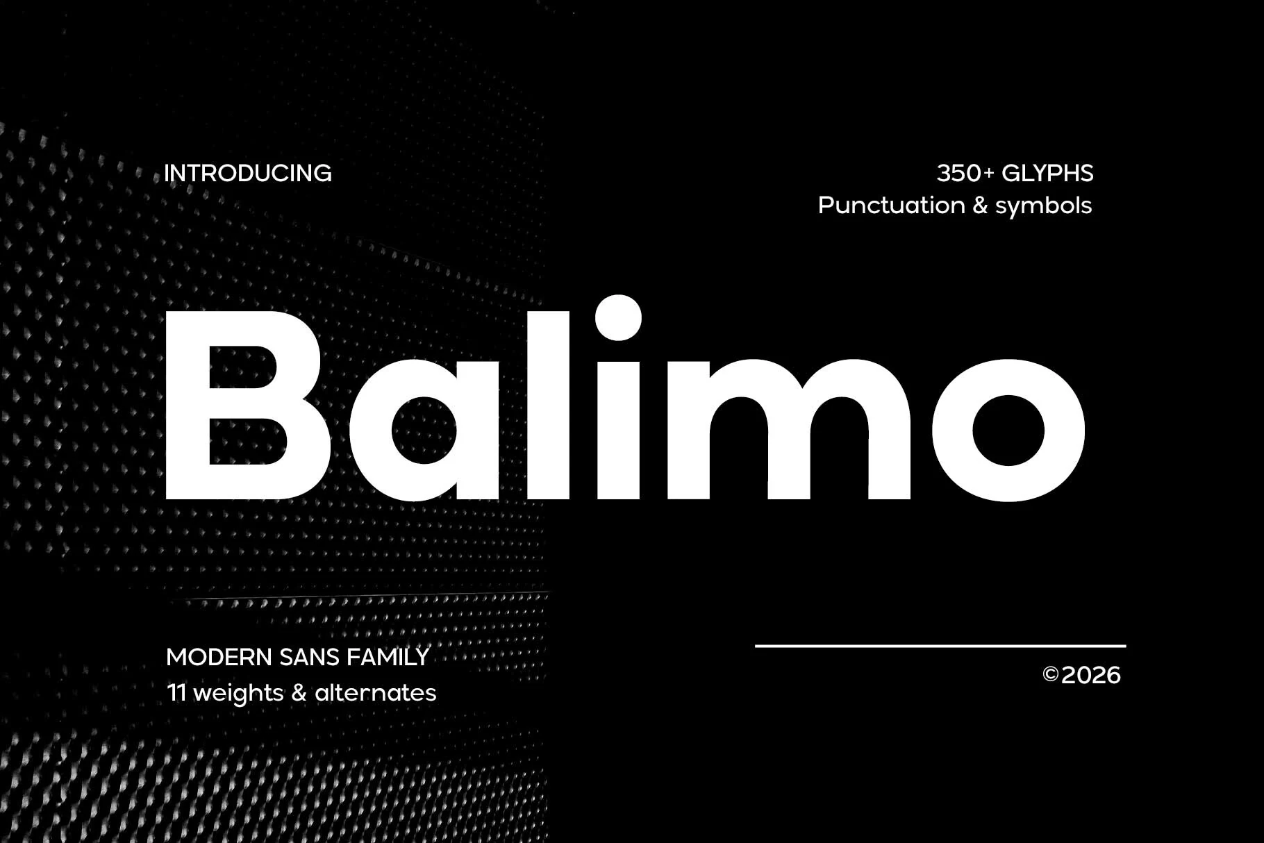
Best For: logos, branding, minimal designs, professional designs
Balimo Font has a heavy geometric sans structure with smooth circular counters, blunt terminals, and a wide, stable stance. The lowercase forms feel compact but not cramped, and the oversized dot on the i reinforces the clean modern rhythm without adding decorative noise.
For Minimal Logo Fonts, Balimo is strongest when the design needs plain shapes with real visual weight. Use tighter spacing for short wordmarks so the rounded letters read as one solid unit, then pair it with smaller, lighter supporting text to keep the hierarchy sharp and controlled.
Thin & Editorial Minimal Logo Fonts
This group focuses on slim strokes, airy spacing, serif details, and refined contrast for boutique logos, editorial mastheads, premium packaging, and elegant brand marks.
Minimal Font
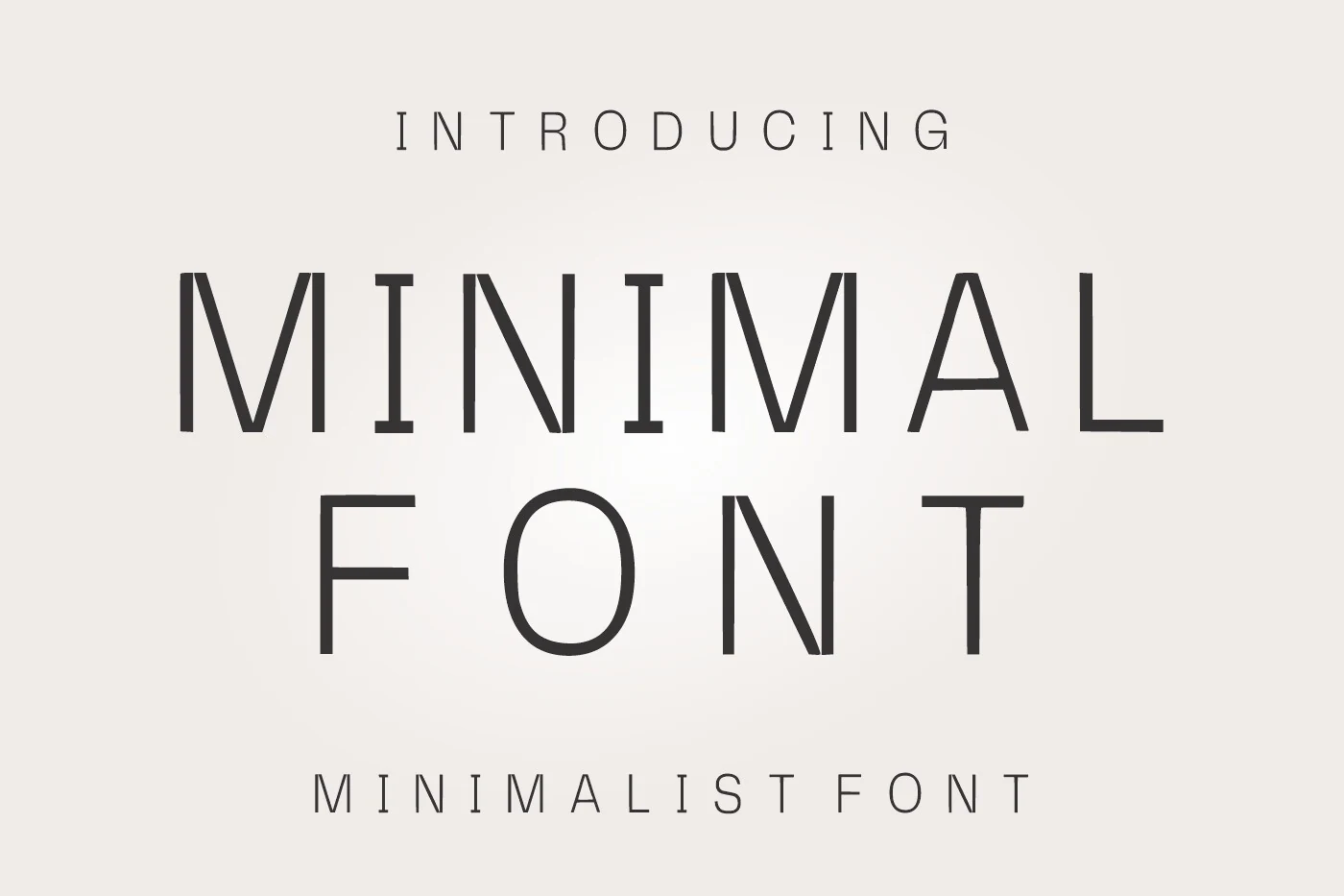
Best For: logos, branding, editorial designs, minimal designs
Minimal Font has a refined monoline look, with slim geometric capitals, airy spacing, and clean vertical rhythm. The letterforms feel tall and deliberate rather than delicate, so the overall effect is polished and contemporary while still keeping a quiet, timeless presence.
It suits Minimal Logo Fonts especially well when you want elegance without decorative noise. The wide spacing gives wordmarks a calm premium feel, but it performs best on short names and titles; keep supporting text in a simpler, slightly heavier sans so the slender strokes stay crisp in the hierarchy.
Minimalist Font
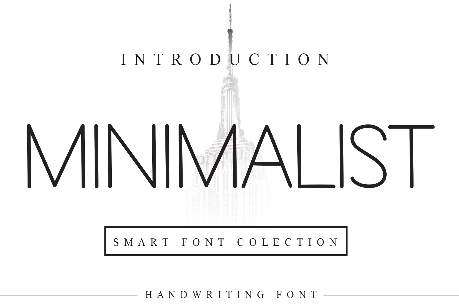
Best For: logos, branding, minimal designs, elegant designs
Minimalist Font has a fine monoline structure with open spacing, tall uppercase forms, and softly rounded terminals that give the lettering a quiet architectural feel. The wide gaps between characters are part of its personality, helping the thin strokes feel deliberate instead of fragile.
For Minimal Logo Fonts, it works best on refined names, editorial marks, and clean identity systems where restraint is the main visual signal. Keep contrast high and avoid crowded layouts; its narrow strokes need space around the wordmark, while a heavier supporting sans can handle smaller practical text.
Friendly Font
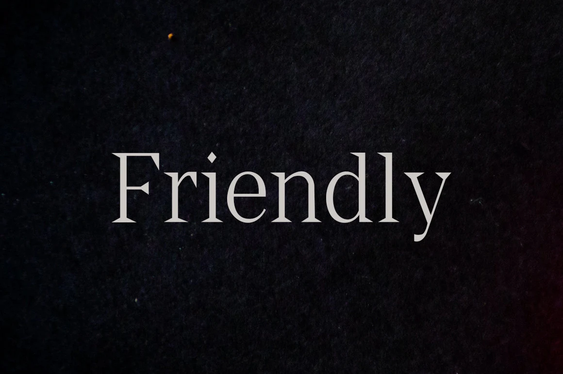
Best For: logos, branding, editorial designs, elegant designs
Friendly Font reads as a refined display face with slim serif details, smooth curves, and a calm, classic rhythm. The tapered strokes and delicate terminals give the wordmark a polished tone, while the open counters keep the letters clear instead of overly ornamental.
It suits Minimal Logo Fonts when you want elegance to come from shape rather than decoration. Short names, editorial marks, and boutique branding benefit most from its light structure; keep it at display sizes and pair it with a plain secondary sans so the fine details stay crisp in the hierarchy.
Vector Font
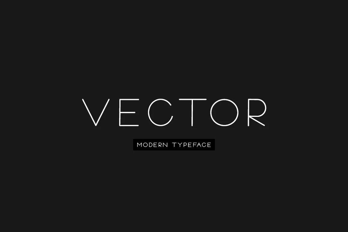
Best For: logos, branding, website headers, minimal designs
Vector Font has a light monoline structure with generous spacing, open geometric shapes, and crisp uppercase forms that feel understated rather than cold. The thin strokes and clean round bowls give it a calm modern rhythm, making simple words look polished and intentional.
That restraint suits Minimal Logo Fonts especially well, where clarity matters more than decoration. Vector works best for short brand names, sleek headers, and editorial lockups; keep plenty of negative space around it, and pair it with a slightly heavier sans for supporting text so the title keeps its quiet presence.
Bourgueil Font
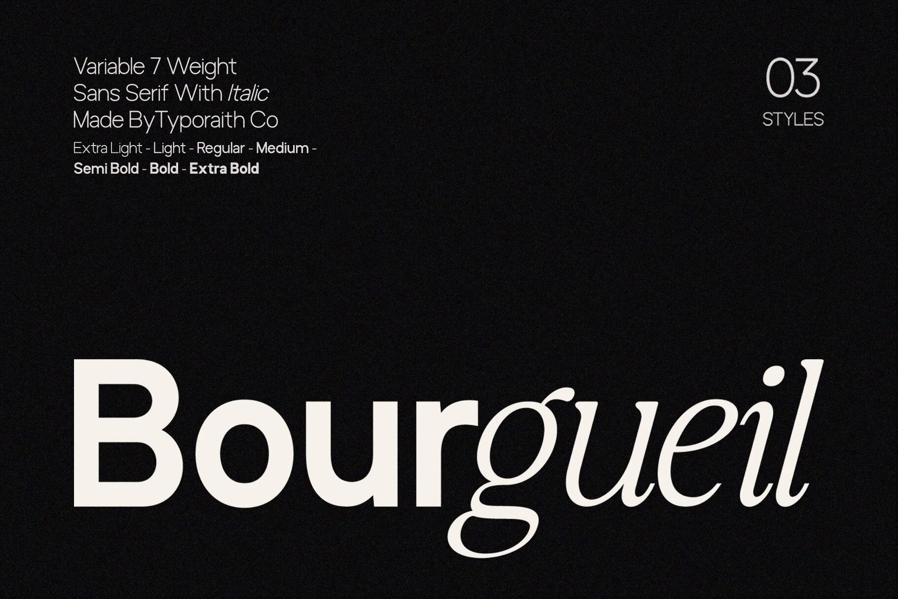
Best For: logos, branding, editorial designs, minimal designs
Bourgueil Font pairs a clean sans serif structure with an elegant italic companion, giving the family a polished contrast right in the preview. The upright shapes feel broad and steady, with open counters and smooth curves, while the italic letters introduce a lighter, more flowing rhythm that softens the overall tone.
In Minimal Logo Fonts, Bourgueil works especially well when you mix the roman and italic styles inside one wordmark or title. That contrast builds hierarchy without extra ornament, and its refined proportions help short names stay crisp across branding, editorial mastheads, and interface-led layouts.
Brooklyn Font
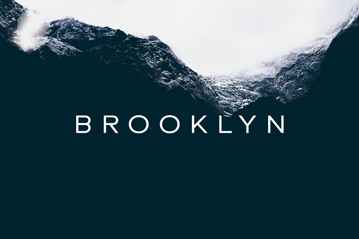
Best For: logos, branding, modern designs, minimal designs
Brooklyn Font uses slim monoline strokes, crisp uppercase shapes, and generous spacing to create a calm, architectural look. The preview shows clean round forms in the O letters and straight verticals throughout, which gives the type a light, polished rhythm without feeling cold or overly technical.
For Minimal Logo Fonts, Brooklyn works best when you let the tracking stay open and the wording stay short. That airy spacing becomes part of the identity, so it suits wordmarks that need a refined presence, especially when paired with a tighter secondary line for contrast and clearer hierarchy.
Condensed & Bold Minimal Logo Fonts
These compact fonts use narrow widths, heavy strokes, and tall vertical rhythm to create strong wordmarks for posters, apparel, sports branding, and short high-impact names.
Hightone Font
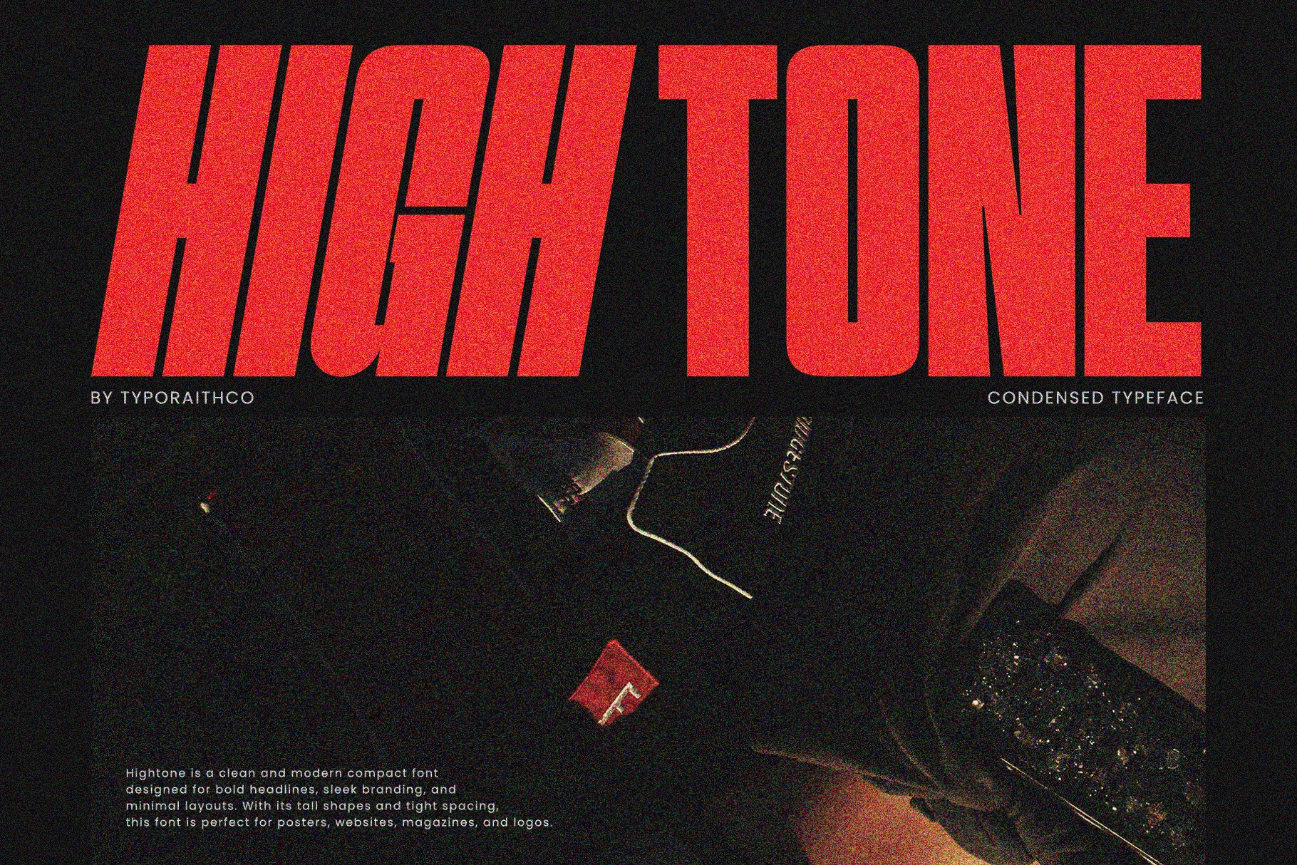
Best For: logos, posters, album covers, bold designs
Hightone Font is built for impact, with very tall condensed capitals, thick strokes, and a slightly retro swagger that feels loud without looking messy. The narrow shapes and tight internal spacing create a solid block of color, so even a single word lands with strong poster energy.
That makes it a smart pick for Minimal Logo Fonts when you want a mark to feel bold, compact, and fashion-aware. The included Regular and Italic/Slanted styles help you build contrast inside the same visual language; keep it on short names or headlines, where the compressed proportions stay crisp instead of turning dense.
Runner Font
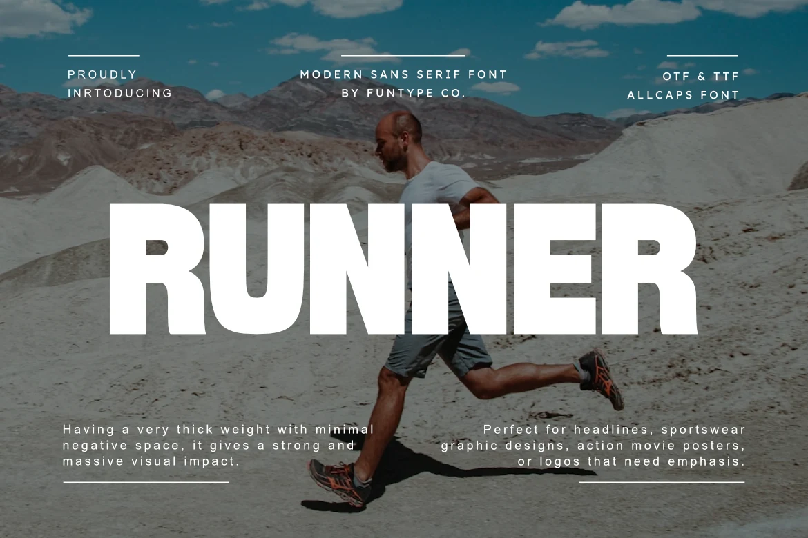
Best For: logos, headlines, posters, bold designs
Runner Font uses a massive all-caps sans structure with thick block strokes, tight counters, and very little negative space. The letterforms feel clean rather than decorative, but their sheer weight creates a dominant title shape that holds attention even over busy imagery.
For Minimal Logo Fonts, Runner works when the identity needs blunt force, not subtle detail: sports marks, action posters, apparel graphics, and short brand names. Keep spacing firm and avoid long wording, because the compact rhythm is strongest when the wordmark stays wide, simple, and high-contrast.
Movault Font
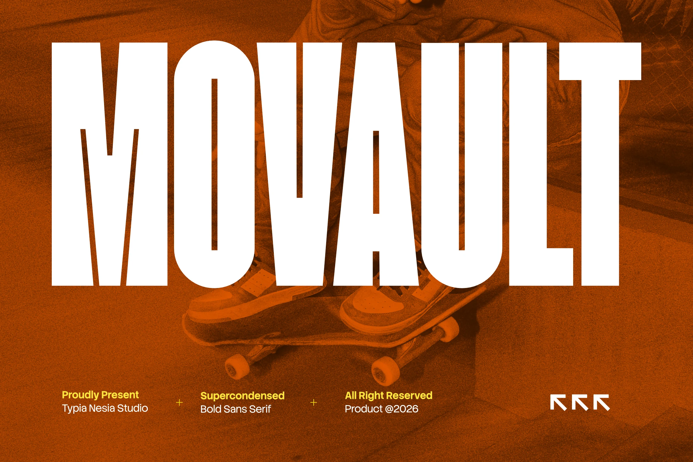
Best For: logos, posters, headlines, bold designs
Movault Font is a bold super-condensed sans with towering vertical strokes, tight counters, and a clean blocky finish. Its narrow proportions pack a lot of height into a compact wordmark, giving the letters a strong display presence without adding ornamental detail.
Movault fits Minimal Logo Fonts when a brand needs a sharp, oversized title system rather than a quiet neutral mark. Use it for short names, posters, and athletic or street-led layouts; the compressed spacing works best with high contrast, controlled tracking, and simple supporting type that does not compete with the main word.
Merca Font
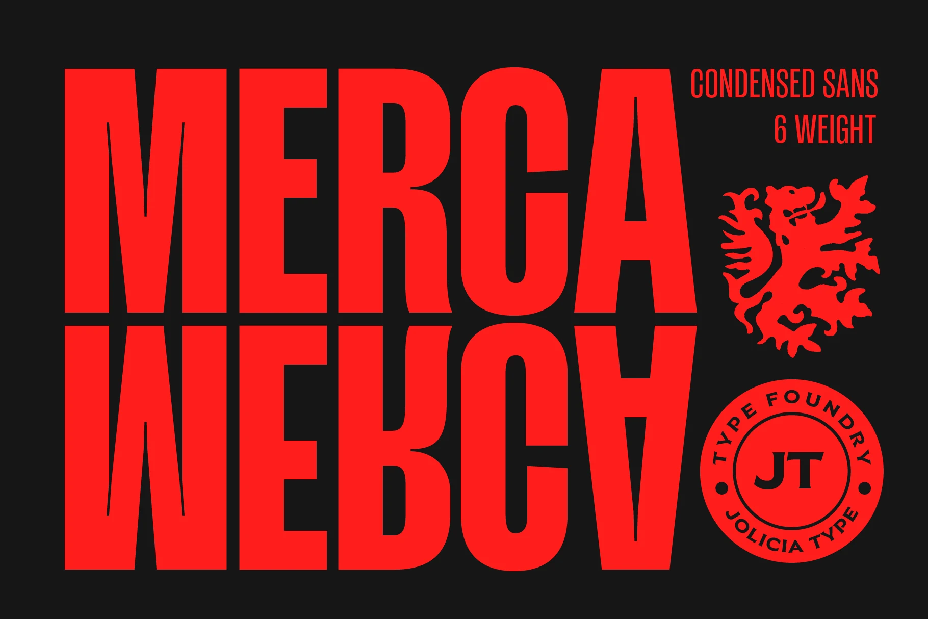
Best For: logos, posters, headlines, bold designs
Merca Font pushes a condensed sans structure into a loud display shape, with towering vertical strokes, narrow counters, and sharp rectangular cuts that keep the letters aggressive but readable. The stacked preview shows how its tight width builds a dense wall of type without relying on texture or ornament.
Merca earns its place among Minimal Logo Fonts when the goal is impact through proportion alone. Use it for short brand names, poster titles, or badge-style graphics; keep the tracking tight but not crushed, and pair it with smaller narrow sans text so the headline remains the dominant visual anchor.
Honest Font
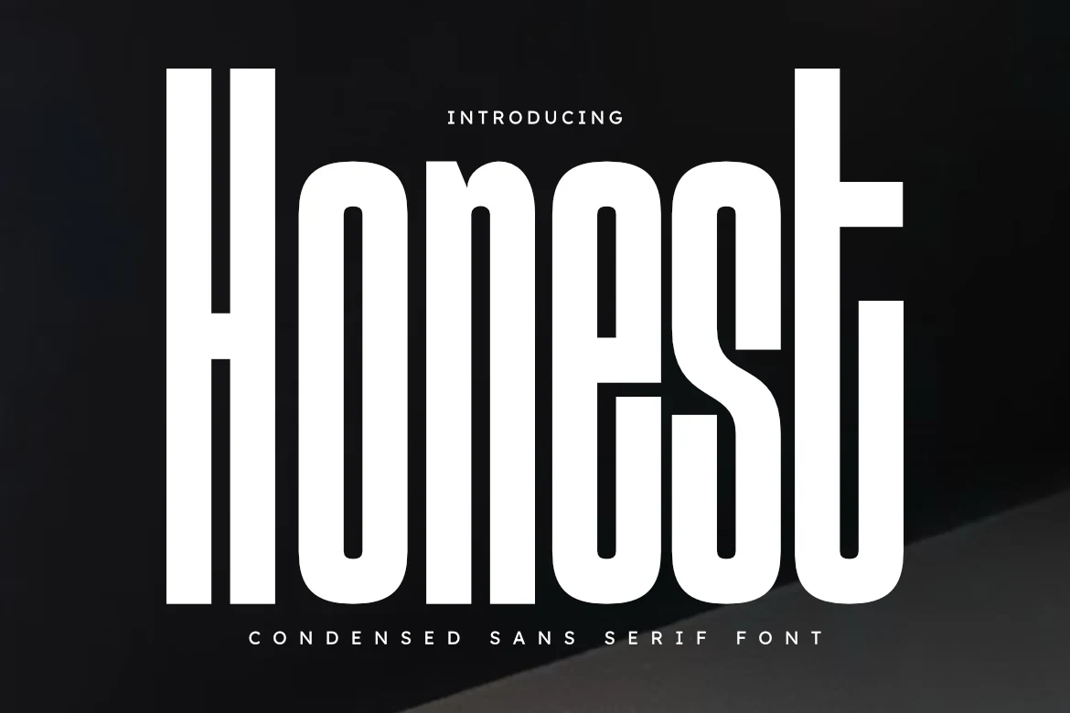
Best For: logos, packaging, magazine covers, luxury designs
Honest Font has a tall condensed structure with smooth curves, narrow counters, and a strong vertical rhythm that gives the lettering a polished, architectural feel. Even at a bold weight, the forms stay clean and balanced, while the rounded turns soften the strict proportions.
For Minimal Logo Fonts, Honest is strongest in short names, magazine-style mastheads, and packaging where height can do the work of decoration. Keep tracking controlled and add a little extra line space in stacked layouts, then pair it with a quieter secondary sans so the condensed silhouette stays dominant.
Monospace & Tech Minimal Logo Fonts
These fonts lean on fixed-width rhythm, squared details, and clean digital forms, making them practical for software logos, startup marks, gaming titles, and modern interface branding.
Gatecode Font
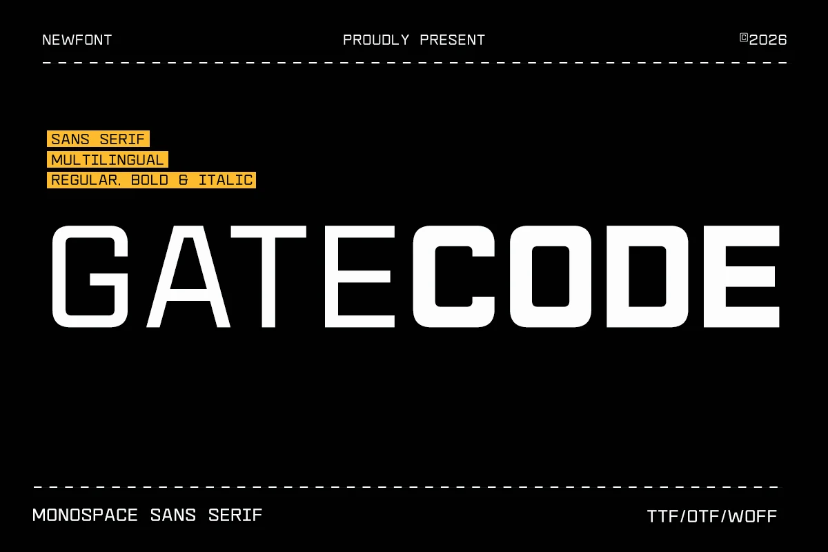
Best For: logos, website headers, minimal designs, modern designs
Gatecode Font has a strict monospace rhythm, squared terminals, and wide geometric counters that make the wordmark feel technical without becoming decorative. The heavier letterforms in the preview give it strong horizontal authority, while the open cuts keep the shapes readable across compact tech layouts.
For Minimal Logo Fonts, Gatecode works best where precision matters: startup marks, software headers, gaming titles, and digital product branding. Keep tracking controlled rather than loose, because the fixed-width structure already creates enough spacing; contrast it with a lighter neutral sans to separate title hierarchy from supporting copy.
Intrade Font
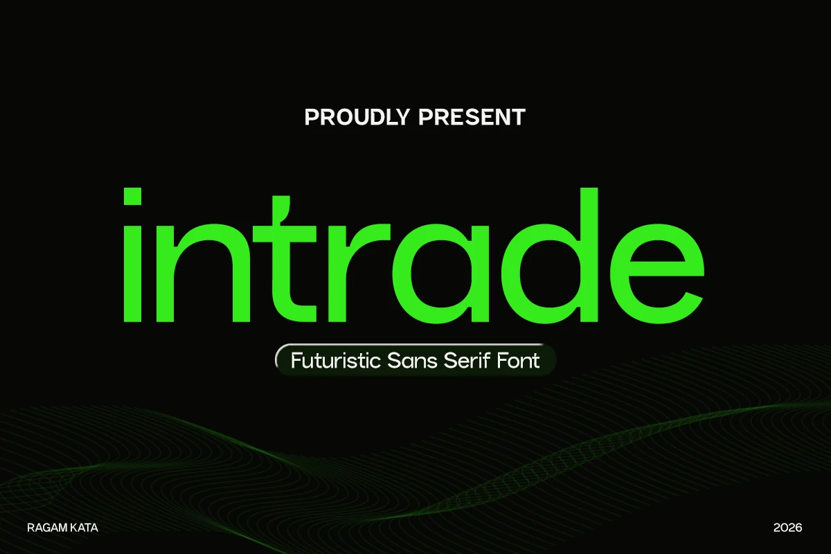
Best For: logos, branding, website headers, modern designs
Intrade Font has a sleek lowercase build with rounded geometry, smooth stroke turns, and generous counters that keep the wordmark feeling clean and highly legible. The bright preview highlights its soft-tech character: minimal at first glance, but shaped with enough curve and width to feel warm rather than rigid.
For Minimal Logo Fonts, Intrade is strongest in tech branding, app identities, and modern headers where you want a forward-looking tone without sharp aggression. The balanced proportions make short names sit neatly in a single line, and a little breathing room around the wordmark helps the futuristic shapes stay crisp and professional.
Sawith Mono Font
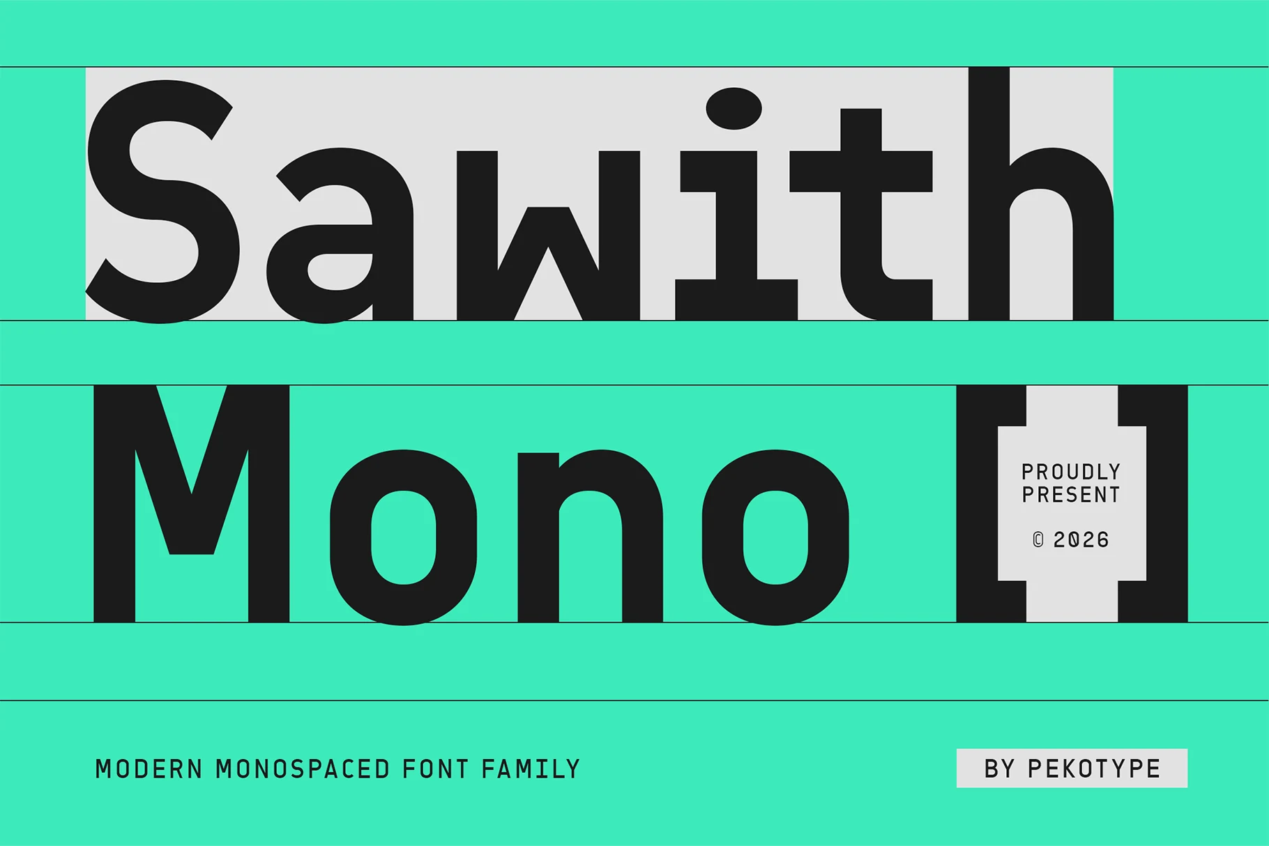
Best For: logos, website headers, editorial designs, modern designs
Sawith Mono has a sturdy monospaced rhythm, rounded corners, and broad even strokes that keep the oversized sample feeling clean rather than mechanical. The single-storey a, circular o, and simple vertical terminals give it a friendly tech tone, while the open counters help the letters stay readable at display size.
For Minimal Logo Fonts, it works well when you want a smart digital look without the coldness of a strict code face. Use it for tech branding, UI headlines, or packaging with short wordmarks; the fixed-width structure already creates order, so tighter hierarchy and restrained spacing usually work better than adding extra visual noise.
Noirden Font
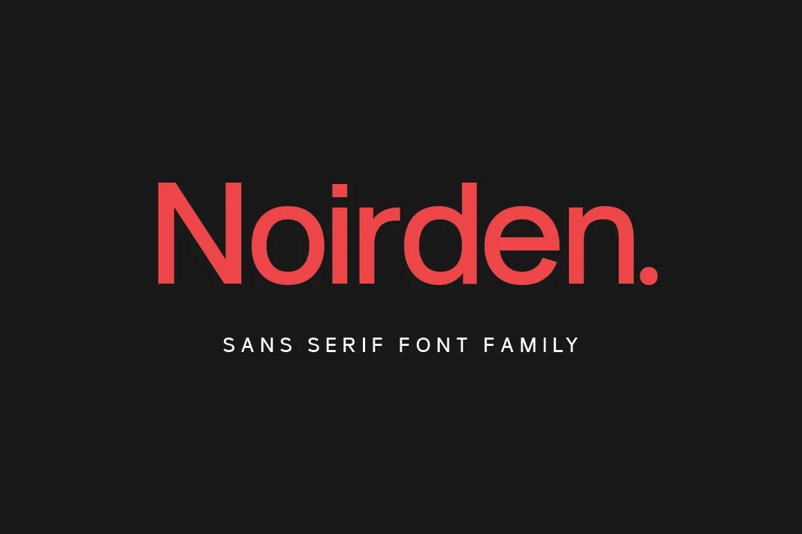
Best For: logos, branding, modern designs, minimal designs
Noirden Font has a clean sans serif build with broad vertical strokes, squared details, and open counters that keep the word shape steady. The preview shows a firm dot on the i, compact shoulders on the r and n, and a blunt period, giving the face a controlled modern rhythm rather than a soft casual tone.
For Minimal Logo Fonts, Noirden works best when the logo needs plain structure with enough weight to hold against dark or high-contrast layouts. Keep spacing moderate: its simple terminals can look too loose when tracked heavily, while tighter title hierarchy helps the wordmark feel compact, direct, and easy to read.
Conclusion
For Minimal Logo Fonts, choose geometric or rounded styles when the logo needs softness and clarity, thin editorial fonts for premium restraint, condensed bold faces for compact impact, and tech-led fonts when the brand should feel digital, precise, or modern.