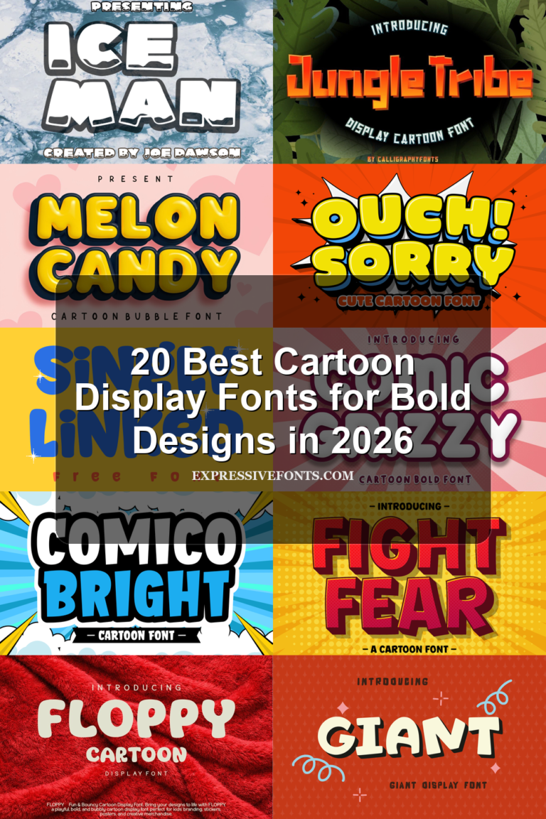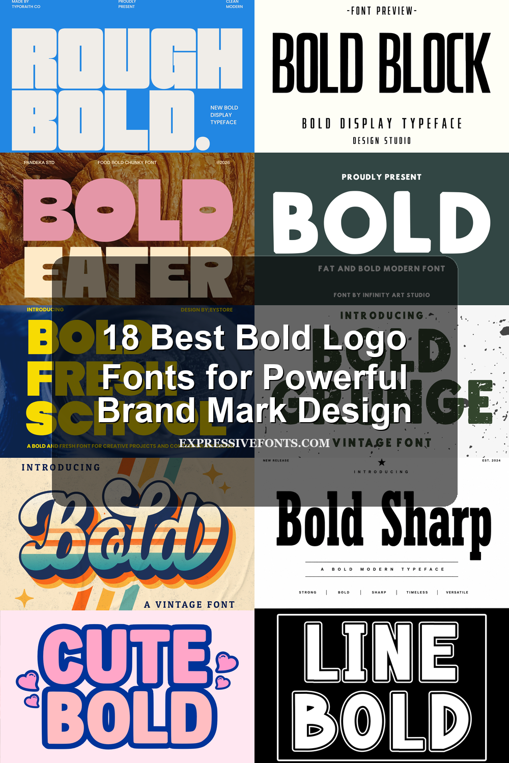
18 Best Bold Logo Fonts for Powerful Brand Mark Design
Bold Logo Fonts are built for designers who need strong wordmarks, poster-style identities, merch graphics, packaging, and social media branding. This collection focuses on fonts with heavy shapes, loud outlines, retro scripts, sporty slabs, and clean block structures that can carry a logo without extra decoration.
Rounded & Playful Bold Logo Fonts
These rounded and playful fonts use soft curves, chunky weight, and friendly shapes for logos that need bold impact without looking rigid or severe.
Cute Bold Font
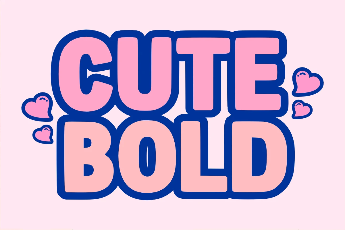
Best For: logos, stickers, T-shirts, cute designs
Cute Bold Font uses heavy all-caps lettering with inflated curves, blunt terminals, and a thick outline that gives each word a sticker-like edge. The counters stay simple and open, so the playful weight reads quickly even when the letters are stacked tightly.
For Bold Logo Fonts, this style works best where the mark needs instant charm rather than restraint. Keep the wording short, let the outline carry the contrast, and avoid crowding it with fine illustrations that would fight against its rounded, high-energy proportions.
Bold Fresh School Font
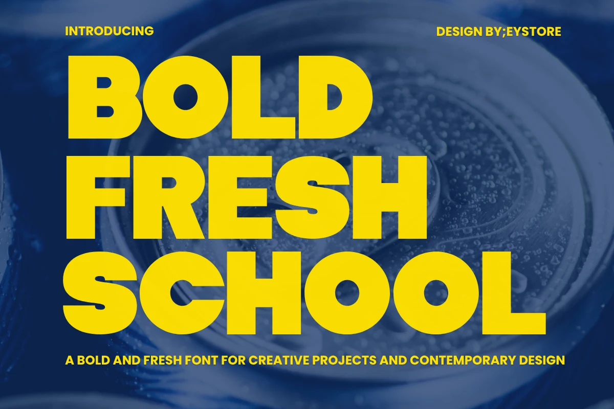
Best For: logos, posters, headlines, children’s designs
Bold Fresh School Font has oversized rounded letterforms, dense weight, and smooth curves that give it a cheerful, high-impact rhythm. The wide shapes and simple counters keep the texture clean, so large words stay easy to scan even when the layout feels loud and playful.
It works well for Bold Logo Fonts, posters, and classroom-style graphics that need instant visibility without looking harsh. Stack it in short lines or compact title blocks, then leave breathing room around the text so the heavy forms hold their shape and do not overwhelm smaller supporting copy.
Bold Eater Font
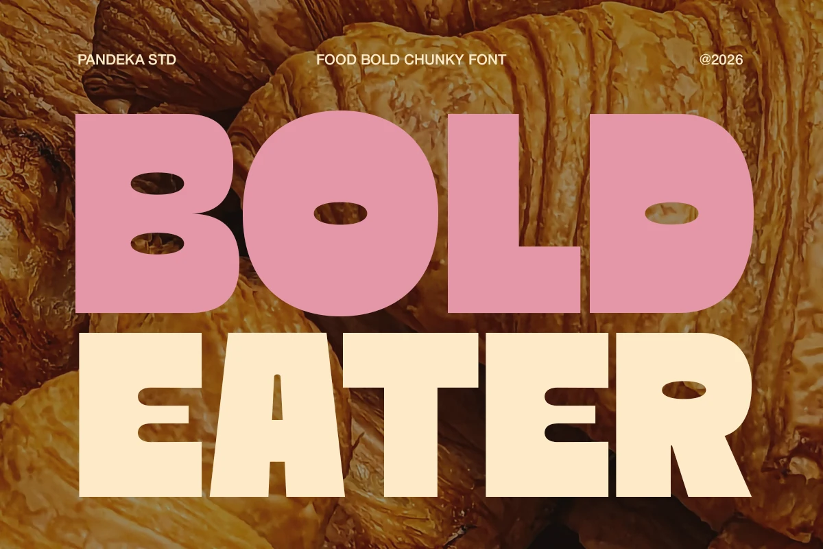
Best For: logos, packaging, product labels, restaurant menus
Bold Eater Font uses huge rounded block letters with heavy stems, soft corners, and compact oval counters that give the words a full, appetizing presence. The shapes feel dense but not sharp, which suits food branding where the type needs to look friendly and instantly readable.
For Bold Logo Fonts with a snack, bakery, or café angle, this style works best in short names and stacked headline layouts. Keep supporting text smaller and cleaner, then use strong color contrast so the chunky letterforms stay crisp on menus, labels, and packaging panels.
Rough Bold Font
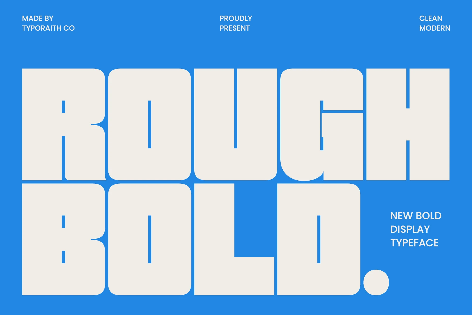
Best For: logos, posters, packaging, headlines
Rough Bold Font uses massive geometric letterforms with rounded corners, flat-sided curves, and narrow vertical counters that turn each word into a dense block. The preview reads clean and modern rather than distressed, with weight doing most of the visual work.
For Bold Logo Fonts, this typeface is strongest when the layout needs scale, simplicity, and immediate impact. Keep the spacing controlled, leave clear margins around the wordmark, and pair it with small neutral text so the oversized proportions remain the main structure.
Condensed & Block Bold Logo Fonts
This group focuses on dense sans serif, block, and sharp serif styles for compact wordmarks, posters, packaging, and clean high-impact brand systems.
Mini Bold Font
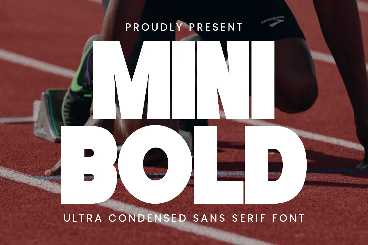
Best For: logos, posters, T-shirts, headlines
Mini Bold Font is built from tall, ultra-condensed sans serif forms with blunt edges, dense vertical weight, and very little internal slack. The narrow proportions let large words occupy less horizontal space while still landing with the force of a heavy display face.
For Bold Logo Fonts that need a sports or performance tone, its strength comes from compression rather than decoration. Use strong contrast, keep tracking tight but not touching, and stack words in clear blocks so the height of the letters drives the title hierarchy.
Bold Block Font
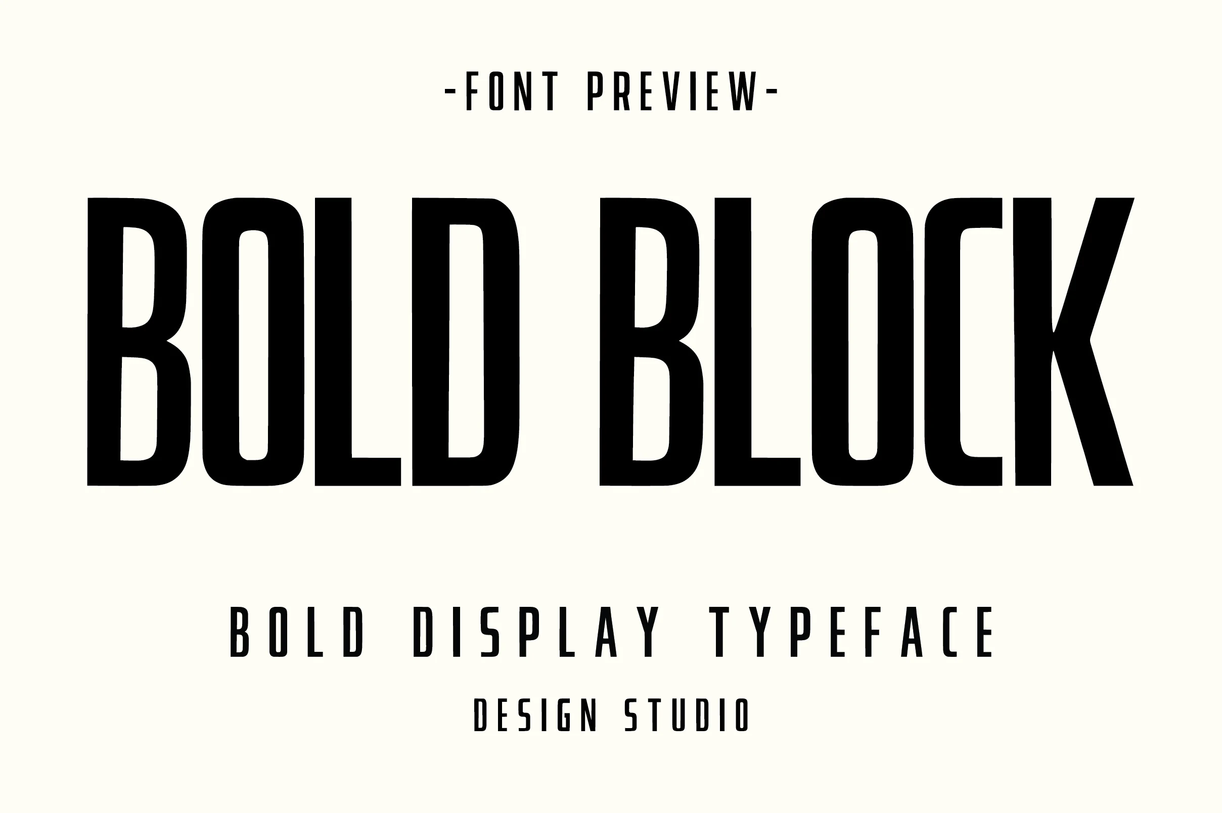
Best For: logos, posters, packaging, headlines
Bold Block Font is a condensed display face with tall vertical stems, heavy black weight, and narrow counters that push the letters into a strong rectangular rhythm. Its clean edges and compressed width give headlines a modern, industrial feel without adding texture or ornament.
For Bold Logo Fonts, this works best when the layout needs force in limited horizontal space. Keep the spacing deliberate, use enough margin around the wordmark, and let the height of the letters set the hierarchy instead of adding extra graphic effects.
Bold Font
Best For: logos, posters, packaging, headlines
Bold Font uses fat modern sans serif letters with rounded bowls, heavy vertical mass, and slightly clipped corners that keep the shapes from feeling plain. The wide proportions make a word feel stable and loud, while the simple counters preserve clarity at display size.
In a Bold Logo Fonts roundup, it suits clean brand marks that need weight without texture or ornament. Give the letters firm contrast, avoid over-tight tracking, and use the blocky rhythm as the main visual structure instead of adding extra decorative elements.
Line Bold Font
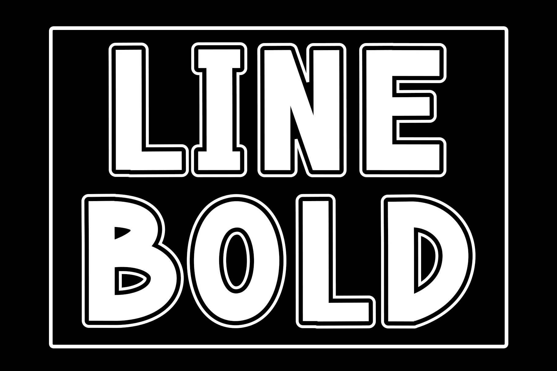
Best For: logos, posters, signage, display text
Line Bold Font uses massive geometric letterforms with solid white fills, square terminals, and a layered outline that creates a clean dimensional effect. The wide bowls and open counters keep the heavy construction readable, while the inner line detail adds structure without rough texture.
It brings Bold Logo Fonts into a poster-sign direction where contrast and spacing matter more than ornament. Use it at large scale, keep the background simple, and avoid tight letter spacing so the outline gaps stay crisp instead of closing into visual noise.
Bold Sharp Font
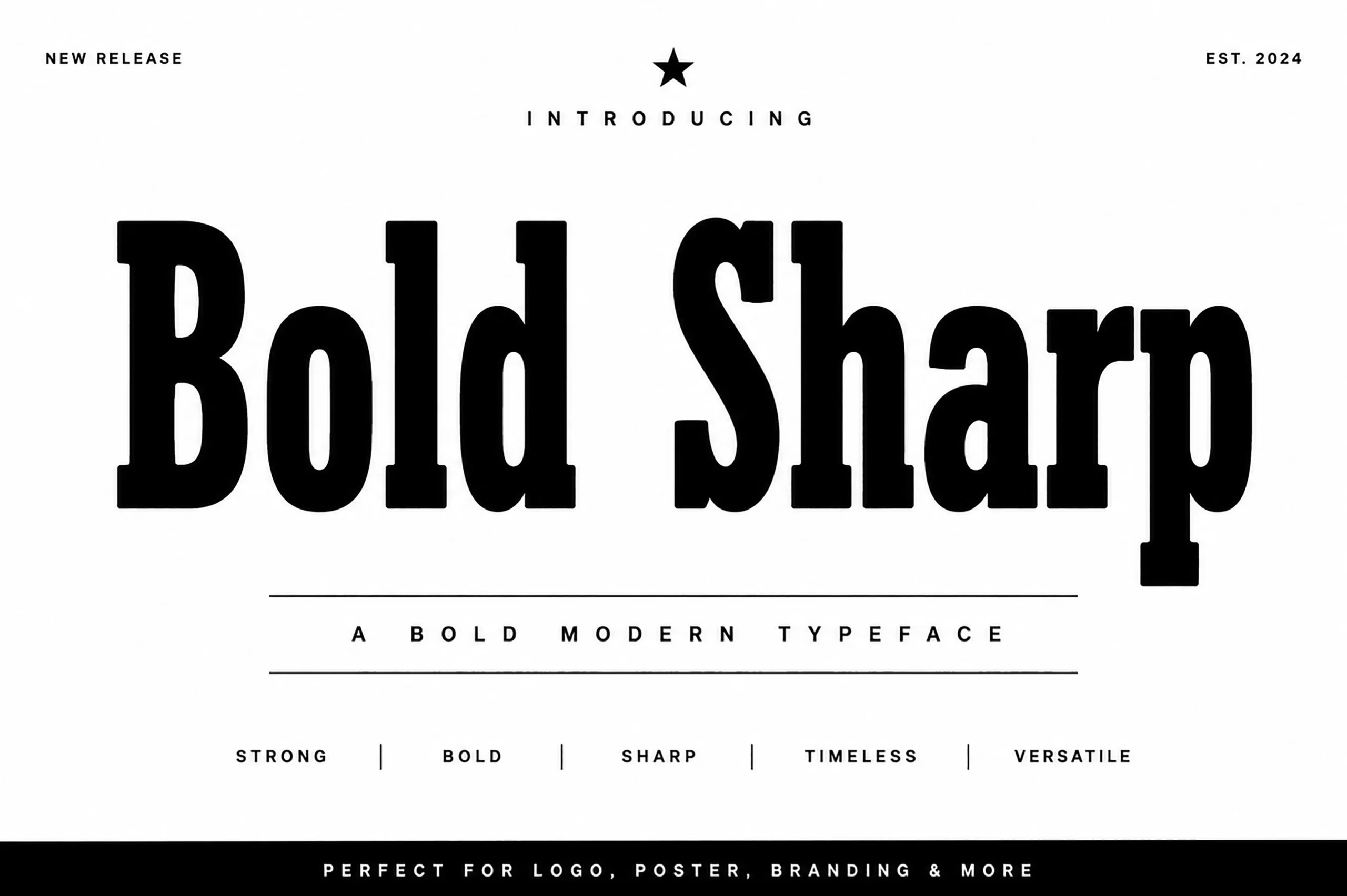
Best For: logos, posters, branding, headlines
Bold Sharp Font combines extra-heavy serif construction with tight curves, tall lowercase forms, and crisp cuts that make each word feel solid and direct. The thick vertical strokes create strong page presence, while the sharp serifs keep the design from looking soft or cartoonish.
For Bold Logo Fonts, this typeface works best when the layout needs authority with a refined edge. Use restrained spacing, strong black-and-white contrast, and a clear hierarchy so the dense weight can dominate the logo or poster title without losing the distinctive serif detail.
Retro & Script Bold Logo Fonts
These retro and script fonts bring flowing movement, nostalgic curves, shadows, and striped details to logos that need personality rather than strict geometry.
Ridge 5 Bold Font
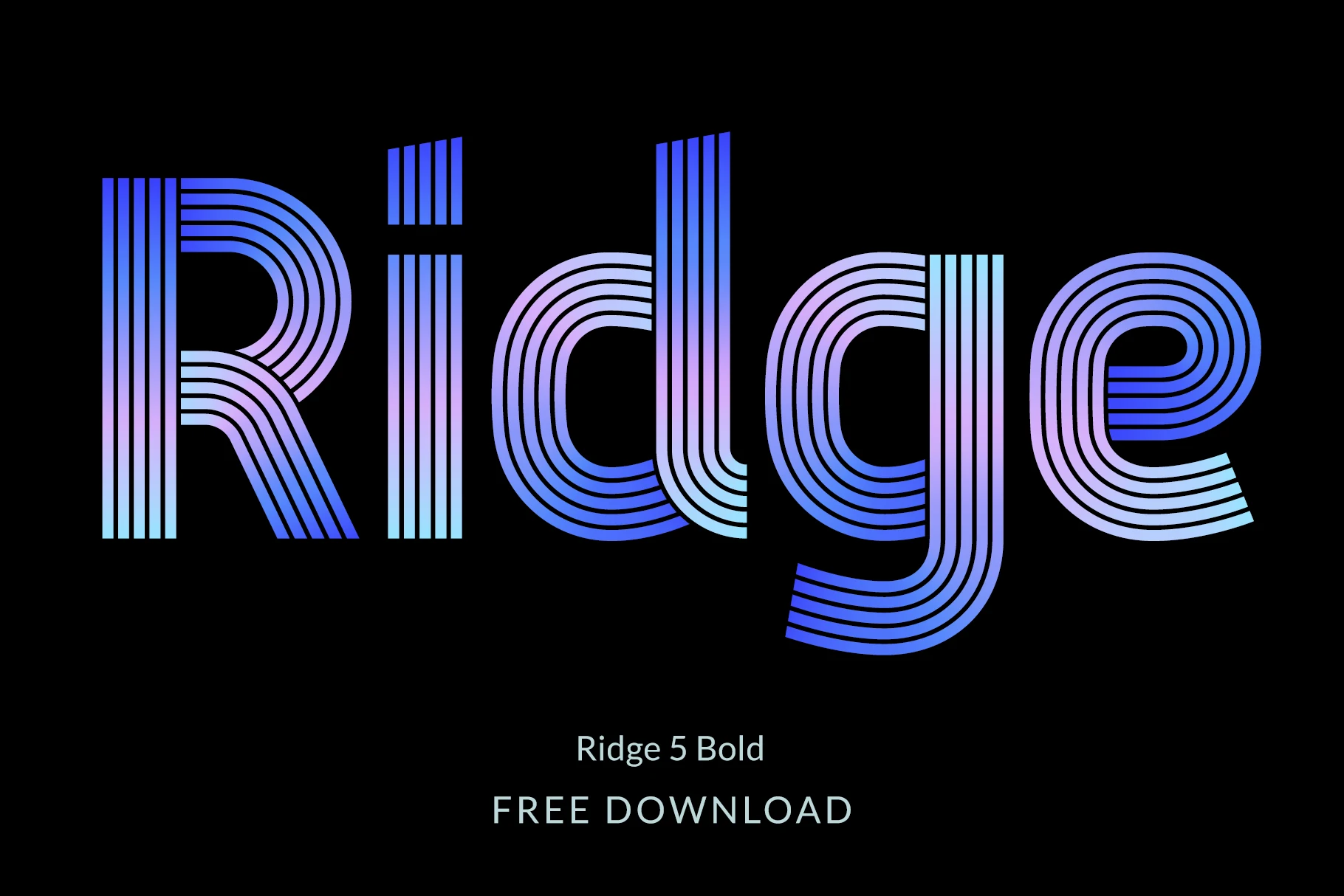
Best For: logos, posters, display text, creative projects
Ridge 5 Bold Font turns each letter into a rounded multi-line structure, with parallel strokes wrapping through bowls, stems, and curves like a retro optical pattern. Its open stripe construction gives Bold Logo Fonts a bold surface without relying on solid mass.
The lowercase set helps this style work beyond short initials, while European diacritics and alternate characters give designers more control when building full wordmarks. Keep backgrounds simple, avoid thin competing details, and use enough scale so the internal line rhythm stays clean.
Bold Groovy Font
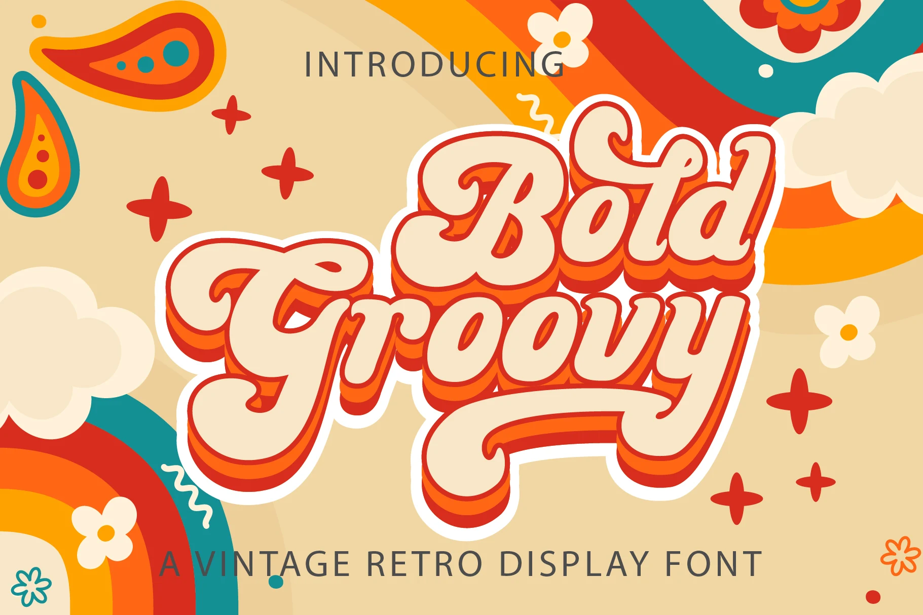
Best For: logos, branding, social media graphics, retro designs
Bold Groovy Font has a chunky handwritten script style with swollen curves, looping capitals, and long sweeping terminals that lean into a 1970s poster mood. The heavy cream letter shapes and warm shadow treatment make the words feel dimensional without turning the strokes too sharp.
For Bold Logo Fonts, it works best on short brand names or display phrases where the swashes can shape the composition. Keep spacing loose around the descenders and underline strokes, use strong outline contrast, and avoid small supporting type that competes with its rounded retro movement.
Bold Script Font
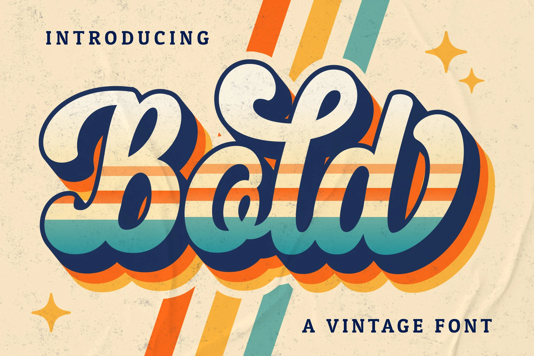
Best For: logos, branding, social media graphics, retro designs
Bold Script Font has a thick vintage script rhythm with swollen downstrokes, looped capitals, and long curling terminals that make the wordmark feel wide and flowing. The connected forms are decorative but still readable because the counters stay open and the main strokes keep a steady weight.
The style fits Bold Logo Fonts when the brand mark needs retro movement instead of rigid block impact. Use it for short names, keep clear space around the swashes, and build contrast with shadows or outlines rather than crowding the lettering with extra ornaments.
Retro Bold Font
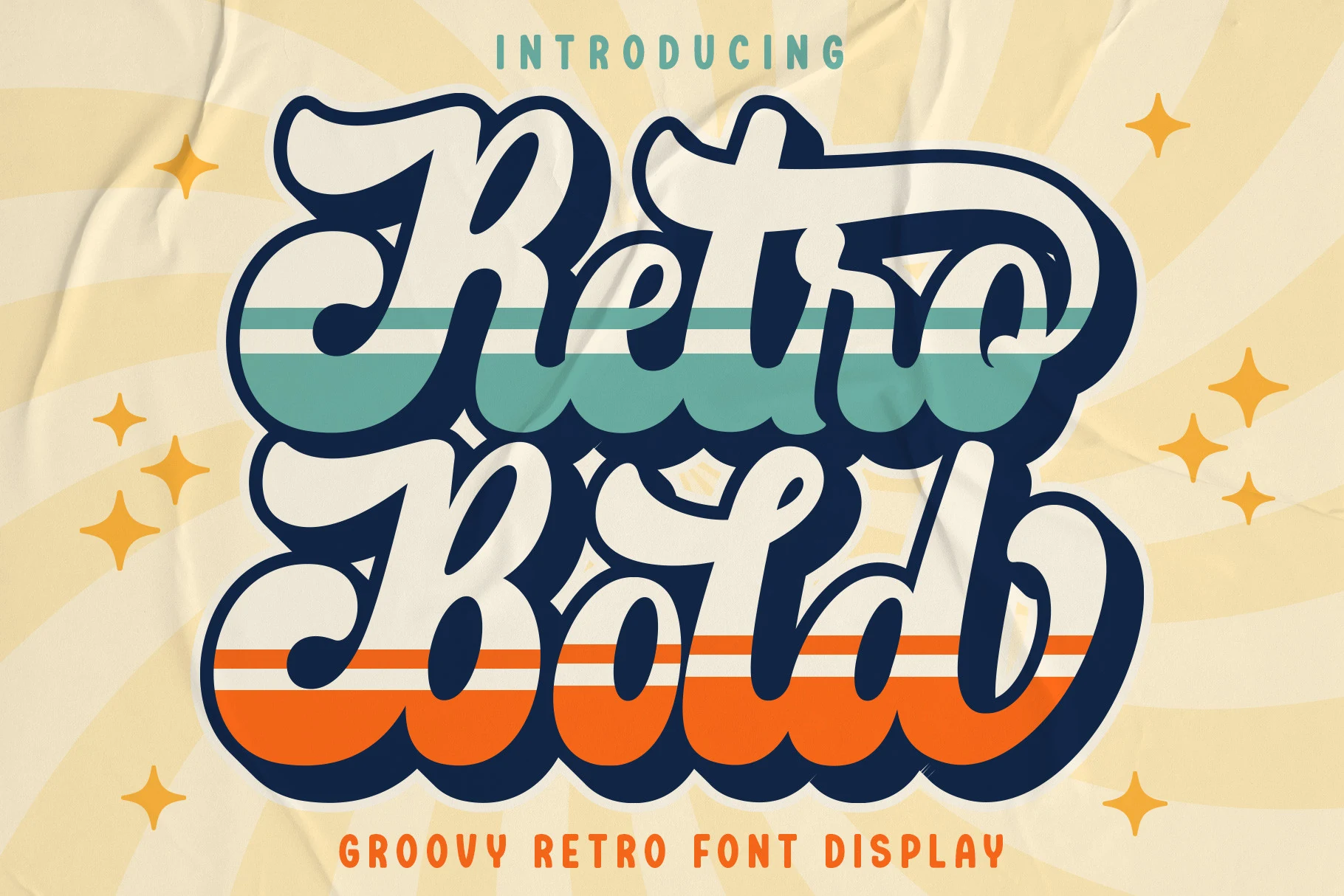
Best For: logos, branding, retro designs, nostalgic designs
Retro Bold Font has a heavy 70s script build, with thick connected strokes, inflated curves, and long sweeping terminals that make each word feel compact and loud. The oversized loops give it strong display weight, while the narrow internal cuts keep the letters from turning into a solid mass.
For Bold Logo Fonts, this one works best where the wordmark can dominate the layout. Keep spacing tight enough to preserve the connected rhythm, but use strong contrast behind it so the deep swashes and stacked letter shapes stay readable in badges, retro branding, and short headline treatments.
Bold Sans Font
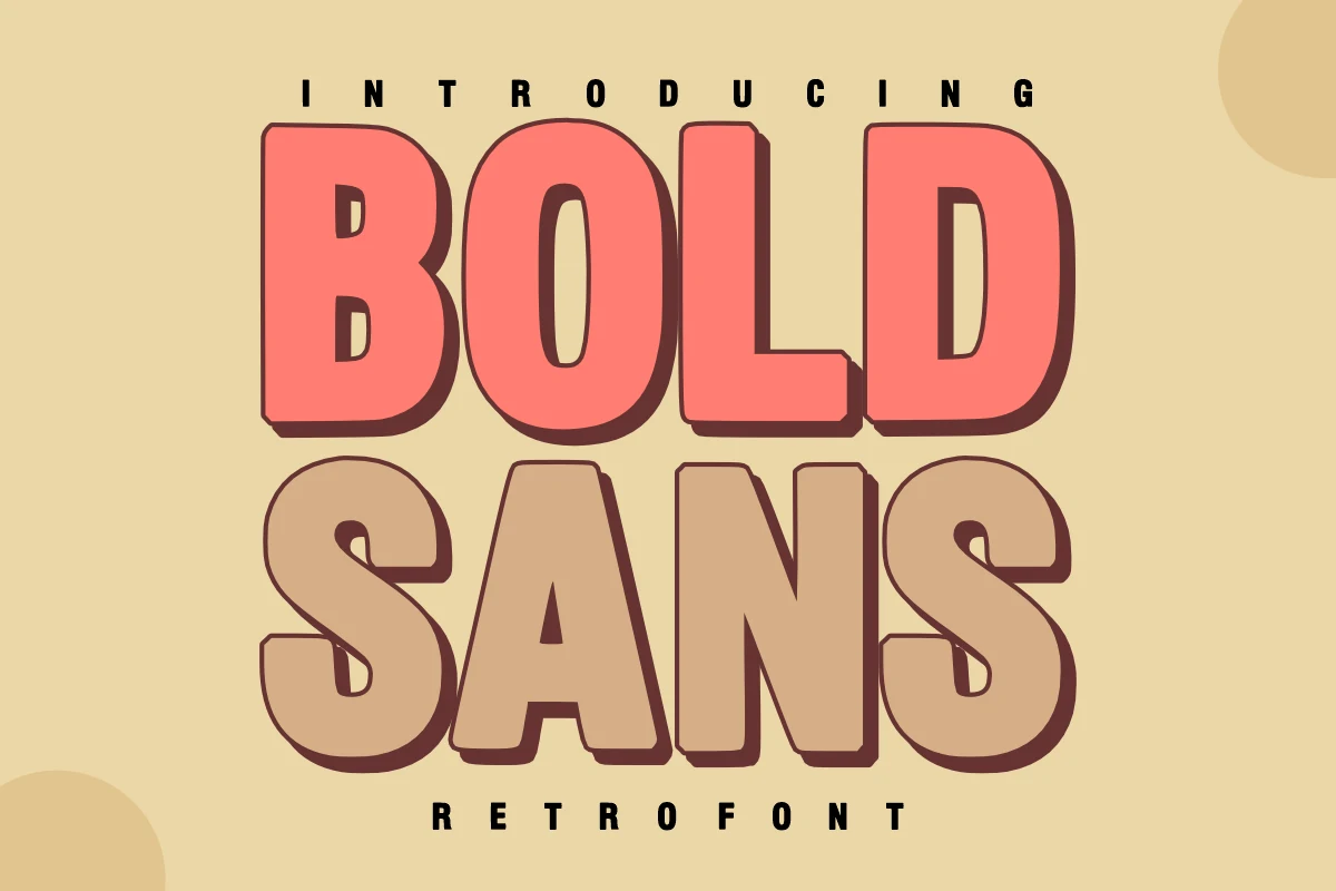
Best For: logos, headlines, posters, retro designs
Bold Sans Font uses thick, blocky sans lettering with rounded corners, compressed counters, and a dark offset shadow that gives each word a stacked retro sign feel. The heavy proportions make short names feel loud without relying on extra ornament.
Use it where Bold Logo Fonts need a nostalgic display voice: logo marks, poster headlines, sticker text, or merch graphics. Keep spacing moderately tight, but give the shadow enough contrast against the background so the lower-right depth stays readable.
Vintage, Athletic & Textured Bold Logo Fonts
This section covers varsity slabs, vintage signage, grunge texture, and aggressive brush lettering for logos with sport, heritage, or street-poster energy.
Varsity Bold Font
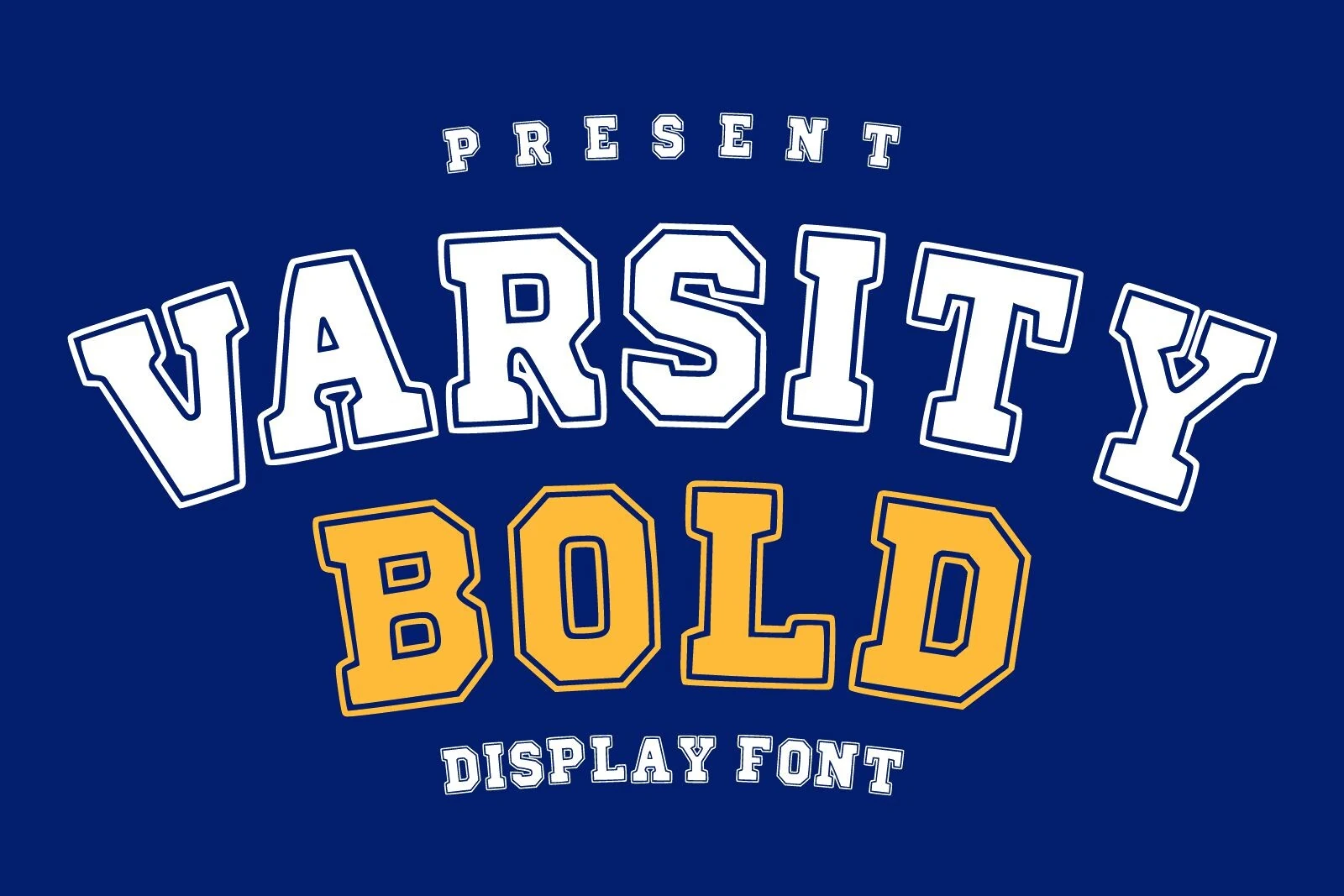
Best For: logos, T-shirts, merch design, headlines
Varsity Bold Font has the unmistakable structure of college athletic lettering: wide slab shapes, squared cuts, heavy verticals, and a drawn outline that adds pressure around each character. The angled stance keeps the words from feeling static, while the open counters help the blocky forms stay readable.
For Bold Logo Fonts, it is strongest in team marks, school graphics, and merchandise layouts where the lettering can carry the whole composition. Use tight but controlled spacing, keep contrast high between fill and outline, and let the slab proportions define the title hierarchy.
Bold Grunge Font
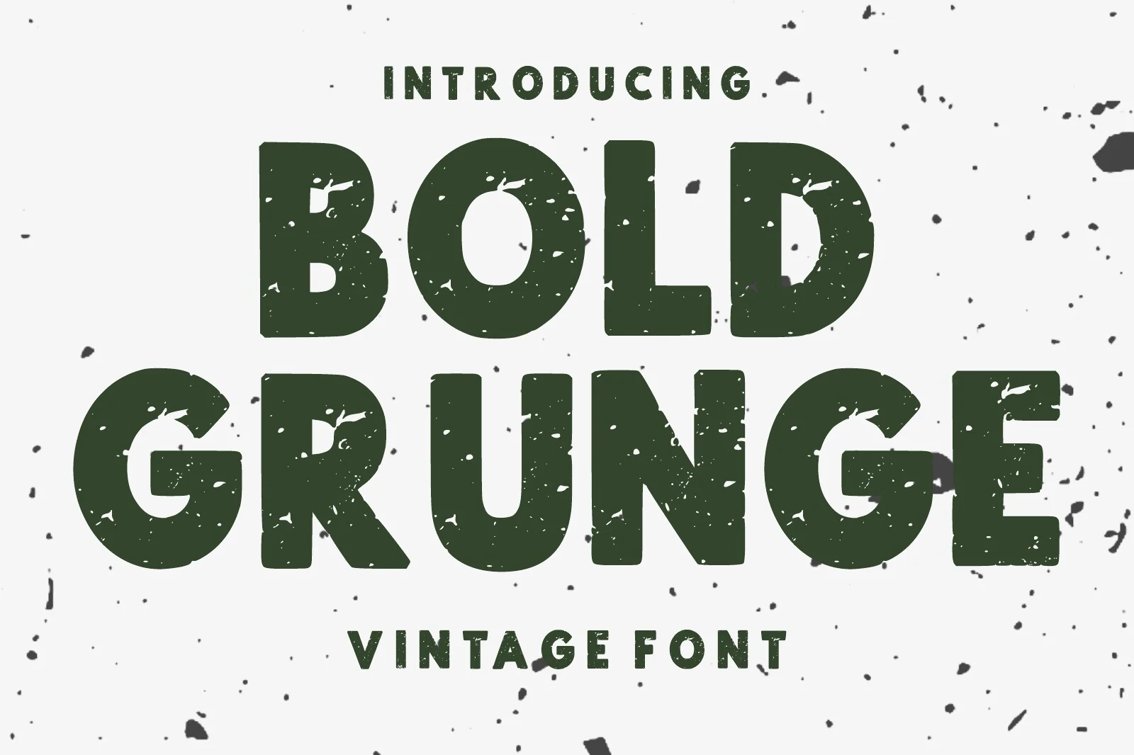
Best For: logos, posters, T-shirts, vintage designs
Bold Grunge Font uses heavy all-caps sans serif shapes with rounded shoulders, blunt terminals, and worn-out speckling across the strokes. The distressed texture breaks up the mass of the letters without weakening their blocky impact, giving the font a rugged vintage feel.
For Bold Logo Fonts, this one suits marks that need grit rather than polish. Keep the composition high-contrast, avoid tiny supporting text near the textured edges, and use generous spacing when the word is long so the rough surface stays legible.
Bold Chicago Font
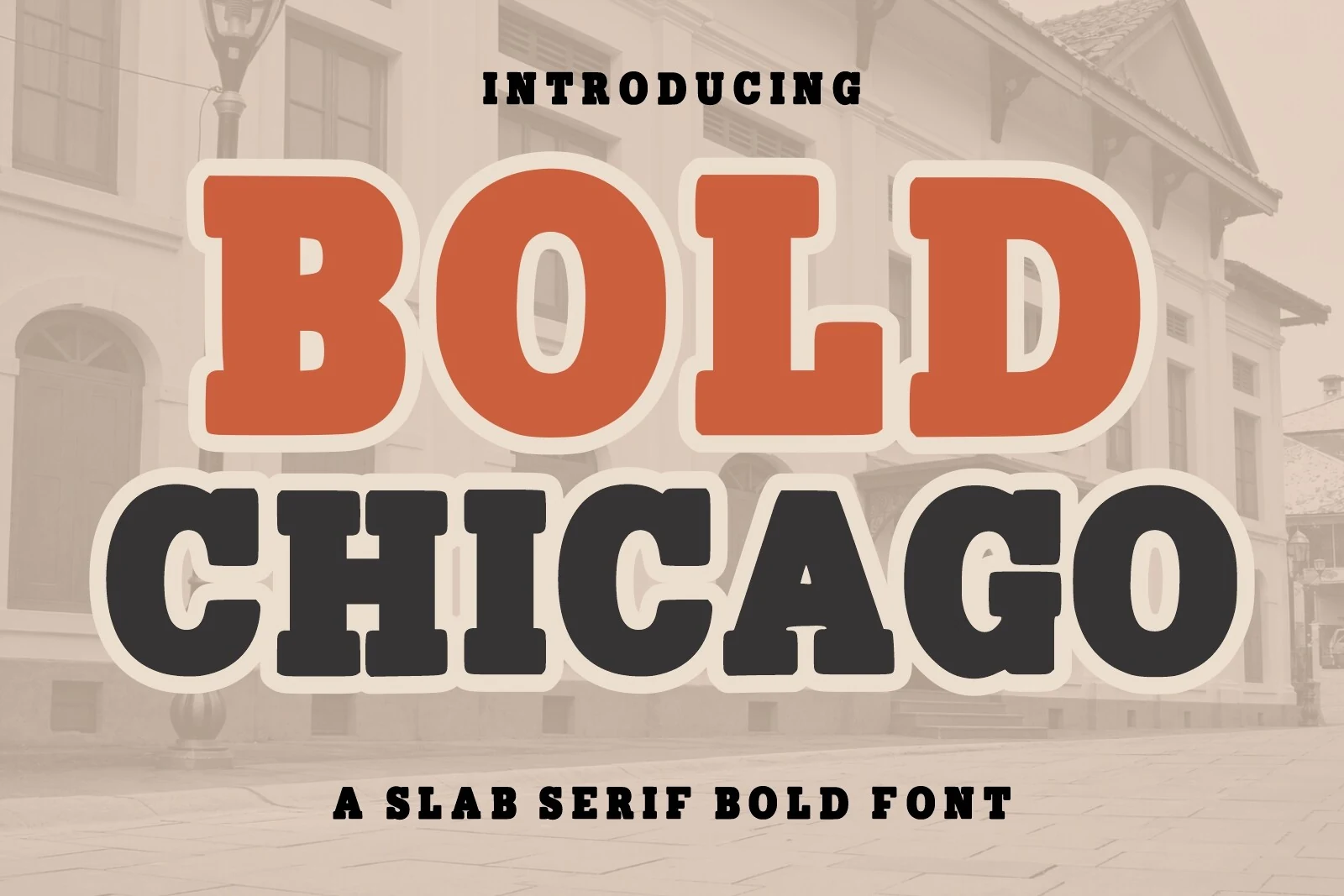
Best For: logos, posters, packaging, vintage designs
Bold Chicago Font has a broad slab serif build with heavy strokes, rounded counters, and squared bracketed details that give the letters a vintage sign-painting feel. The thick outline treatment suits its shape well, making each word feel substantial without hiding the internal letter structure.
For Bold Logo Fonts with a retro American tone, this face works best when the lettering is allowed to dominate the layout. Use strong fill-and-outline contrast, avoid cramped secondary text, and keep the word spacing steady so the slab forms read as confident signage rather than decorative clutter.
Temur Amorak Urban Bold Brush Font
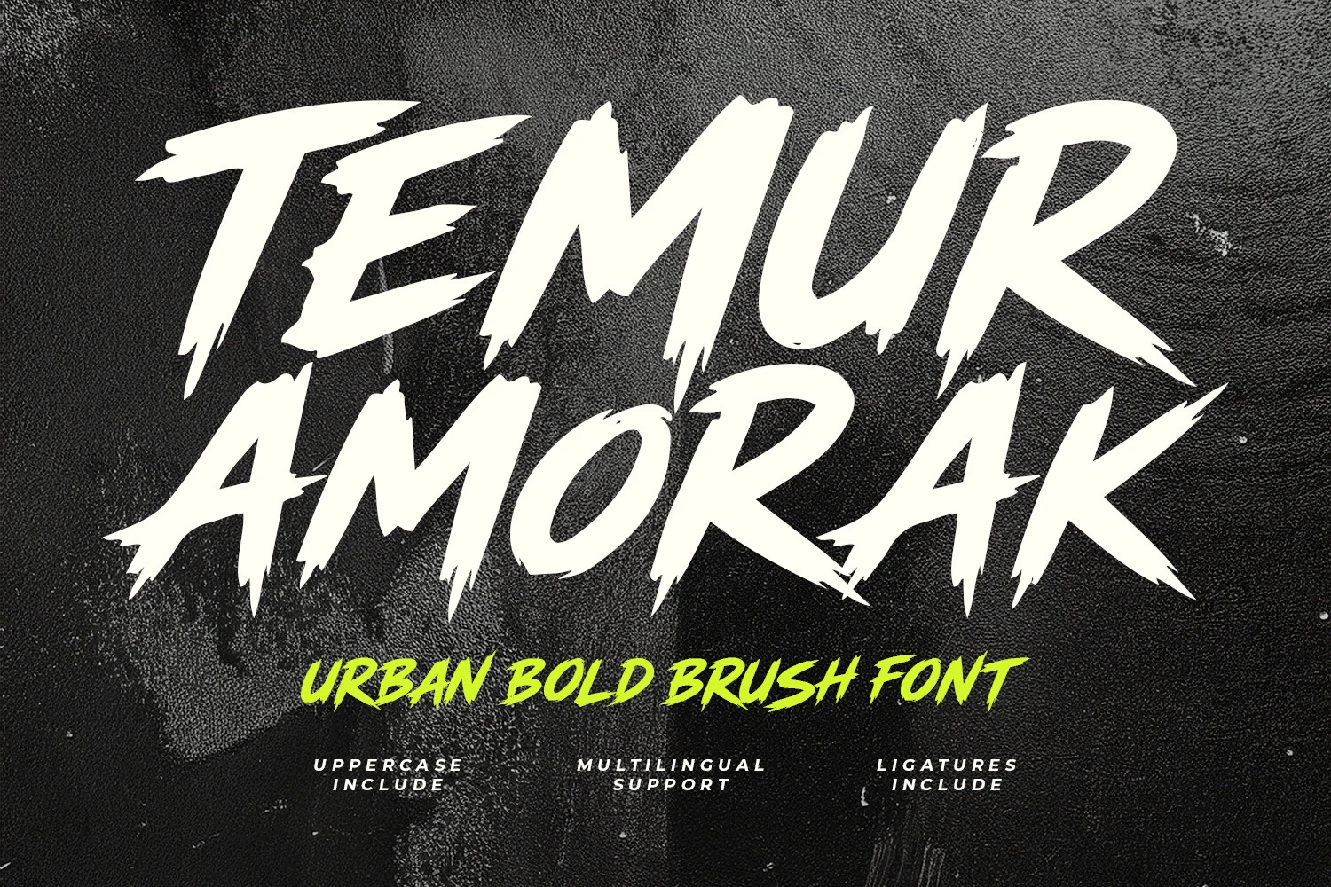
Best For: logos, posters, merch design, expressive designs
Temur Amorak Urban Bold Brush Font is built from fast, angular brush strokes with torn edges, sharp entry points, and aggressive slants that make the words feel in motion. The uneven stroke texture gives it a street-poster energy rather than a polished script look.
For Bold Logo Fonts, it suits short names that need force, speed, and rough personality. The uppercase set keeps titles loud, while ligatures help reduce repetition in brush shapes; use strong contrast and avoid long copy so the jagged rhythm stays readable.
Conclusion
Choose rounded bold fonts for friendly logos, condensed and block fonts for direct impact, retro scripts for nostalgic branding, and textured or athletic fonts when the mark needs grit, speed, or heritage.