26 Best Cool Futuristic Fonts in 2026
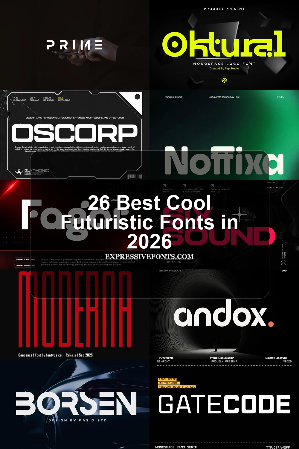
This collection covers a broad range of futuristic letterforms, from open geometric structures and stencil interruptions to condensed silhouettes, interlocking joins, and forceful angled displays. Use these styles for logos, branding, packaging, interfaces, posters, headlines, social graphics, invitations, and other short-format designs where construction, readability, and visual character must work together.
Looking for more cool fonts? Browse our complete Cool Fonts collection to compare bold, vintage, retro, script, and gothic cool styles.
Cool Futuristic Fonts: Clean Geometric Tech
Cool Futuristic Fonts in this group rely on geometric proportions, monoline strokes, open counters, and controlled terminals, offering clearer branding and interface options than the more disrupted display styles.
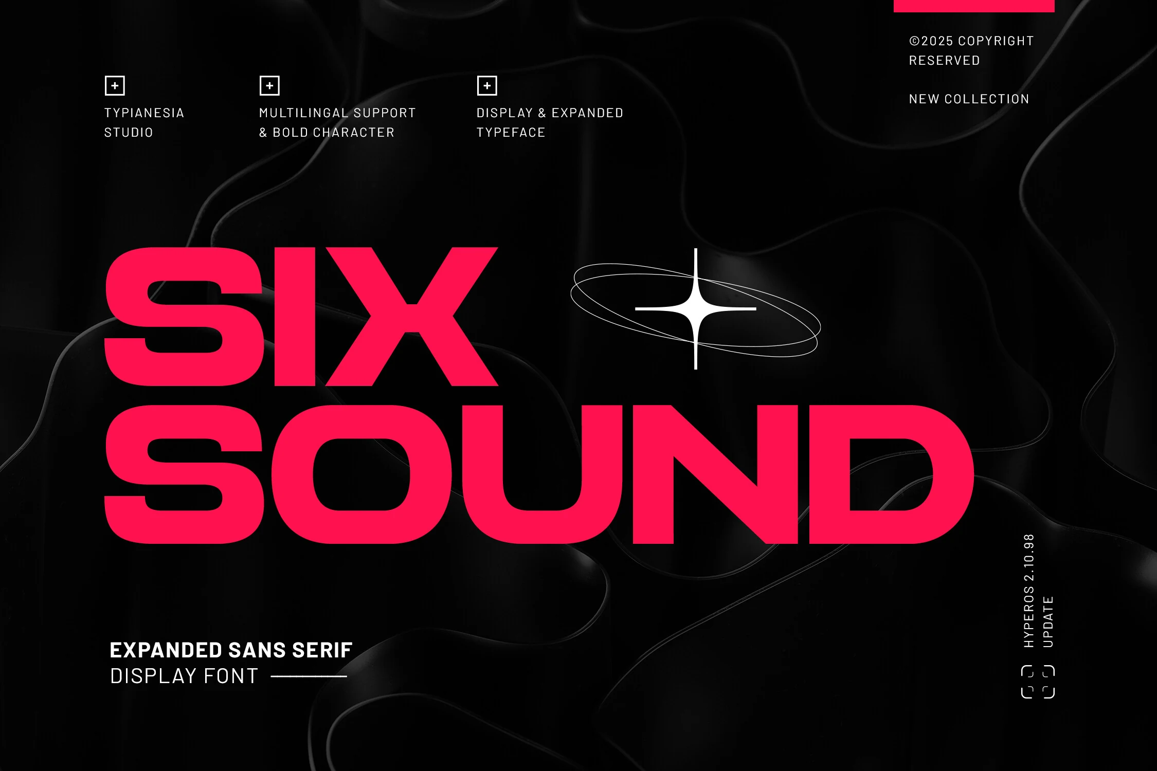
Six Sound Font
Best For: logos, branding, display text
For wide headlines and logos, Six Sound Font combines expanded proportions with uniform heavy strokes, rounded outer corners, and angular inner spaces. This Cool Futuristic Fonts option reads strongly at display scale, but its broad footprint demands generous horizontal room. Uppercase, lowercase, ligatures, alternates, and multilingual support add flexibility.
Surfume Font
Best For: logos, posters, product labels
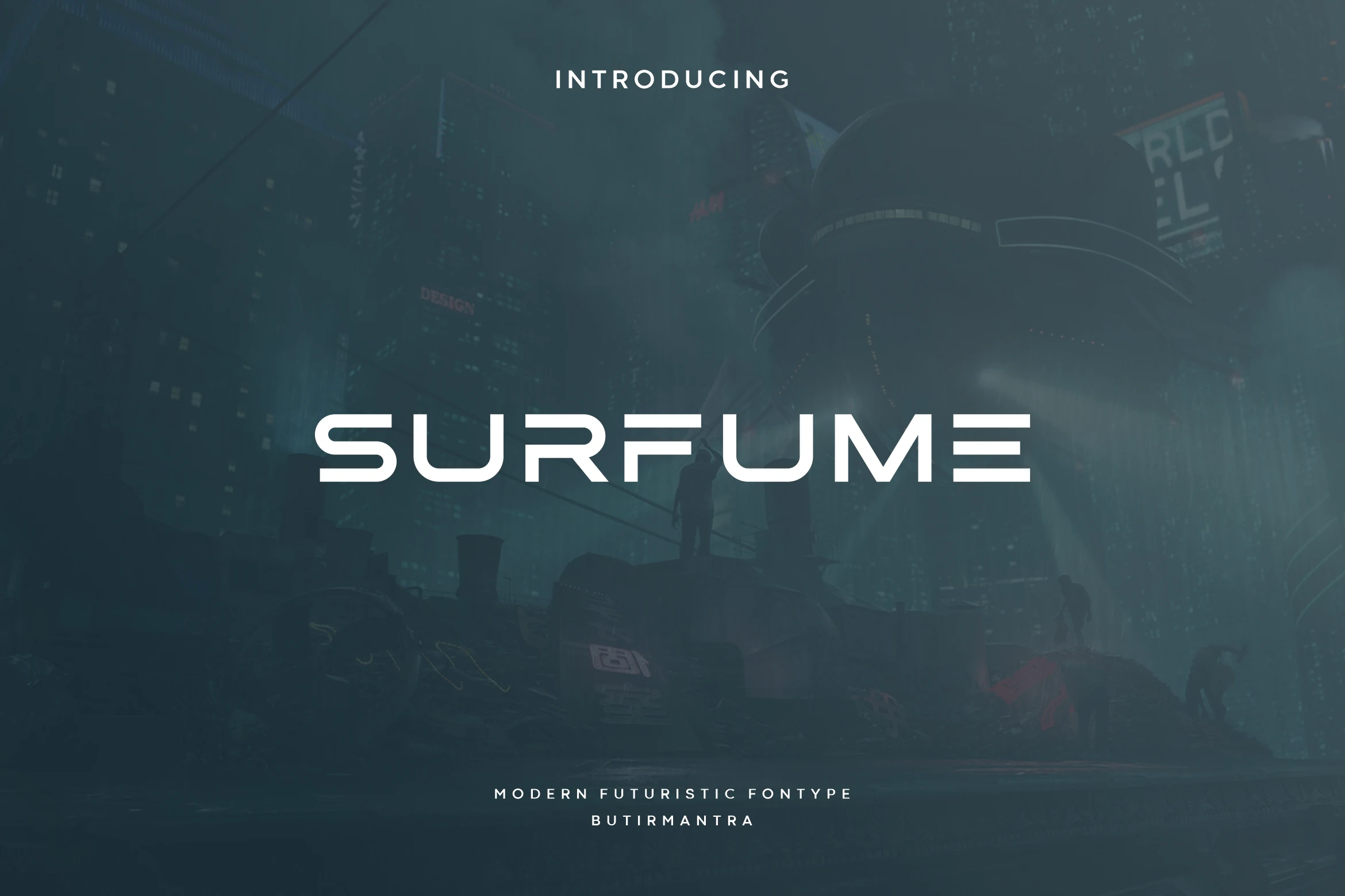
Surfume Font looks broadly geometric until the horizontal interruptions in its E introduce a stencil-like signal. Its open counters perform well in large titles, posters, and labels, while the gaps can lose definition in small interface text.
Noffixa Font
Best For: branding, logos, website headers
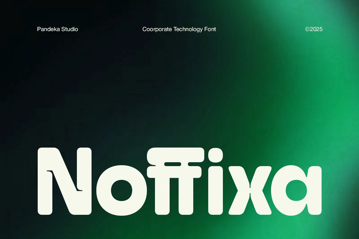
Noffixa Font uses open counters to soften its heavy geometric build, giving Cool Futuristic Fonts better display legibility than many technical faces. It fits software headers, logos, and digital branding, although its substantial weight is excessive for body copy.
Furion Font
Best For: logos, branding, website headers
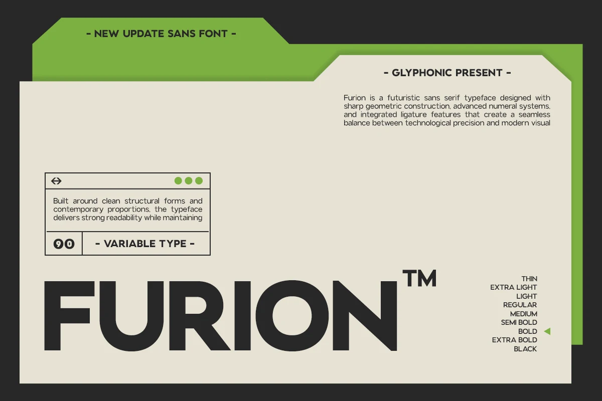
Furion Font creates a clinical technical tone with sharp-edged, balanced geometric forms rather than stencil gaps. Its clear structure works well in Cool Futuristic Fonts branding and headers at larger sizes, while dense small text is less practical.
Cenura Font
Best For: logos, branding, website headers
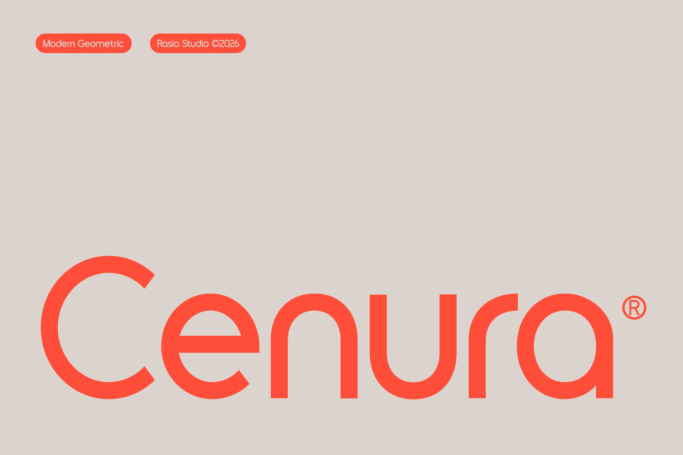
Cenura Font is the most approachable geometric choice here, using consistent monoline strokes, rounded terminals, and stable spacing. Among Cool Futuristic Fonts, it supports logos, headers, and display text without the severe readability penalty of disconnected or cutout constructions.
Ragonte Font
Best For: branding, website headers, display text
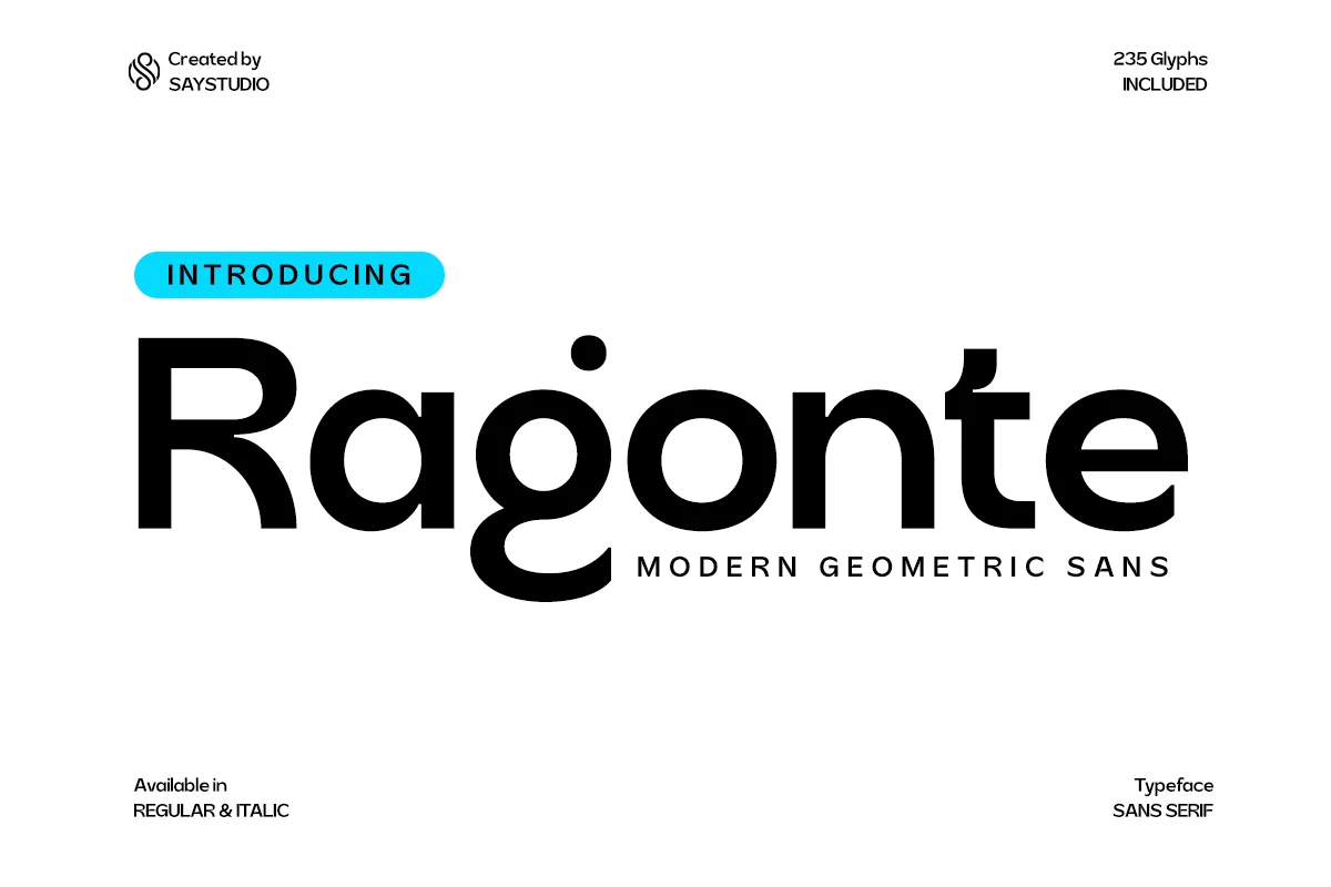
Ragonte Font builds its heavy geometric structure around circular forms in the a, g, and o. The open internal logic gives Cool Futuristic Fonts a readable technology-branding option for headings, though the weight remains better for display text than paragraphs.
Konect – Futuristic Tech Sans Serif Font
Best For: logos, branding, website headers
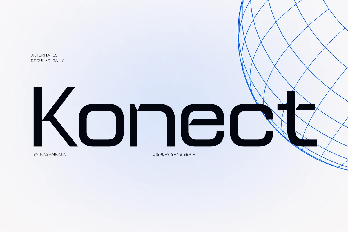
Konect – Futuristic Tech Sans Serif Font: Konect Font adds a horizontal bar to the lowercase t, giving otherwise geometric letters a precise technical signature. Its clear shapes make Cool Futuristic Fonts useful for short headers and logos, while angular details make sustained reading less comfortable.
Montreal Font
Best For: branding, website headers, clean designs
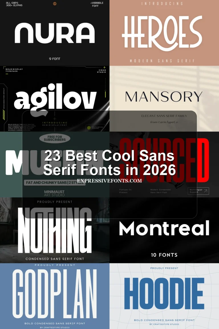
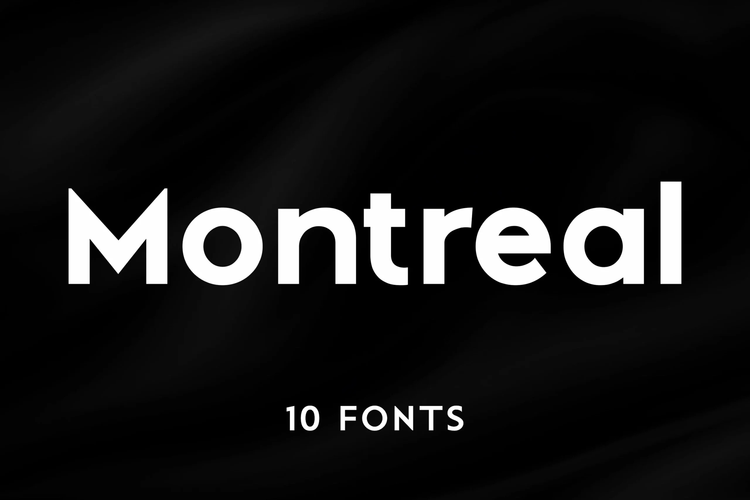
Montreal Font pairs a large x-height with straightforward geometric construction, making it one of the more usable Cool Futuristic Fonts choices for smaller UI elements. Ten styles expand branding and interface options, although the restrained forms create less visual disruption.
Sogea Font
Best For: logos, branding, headlines
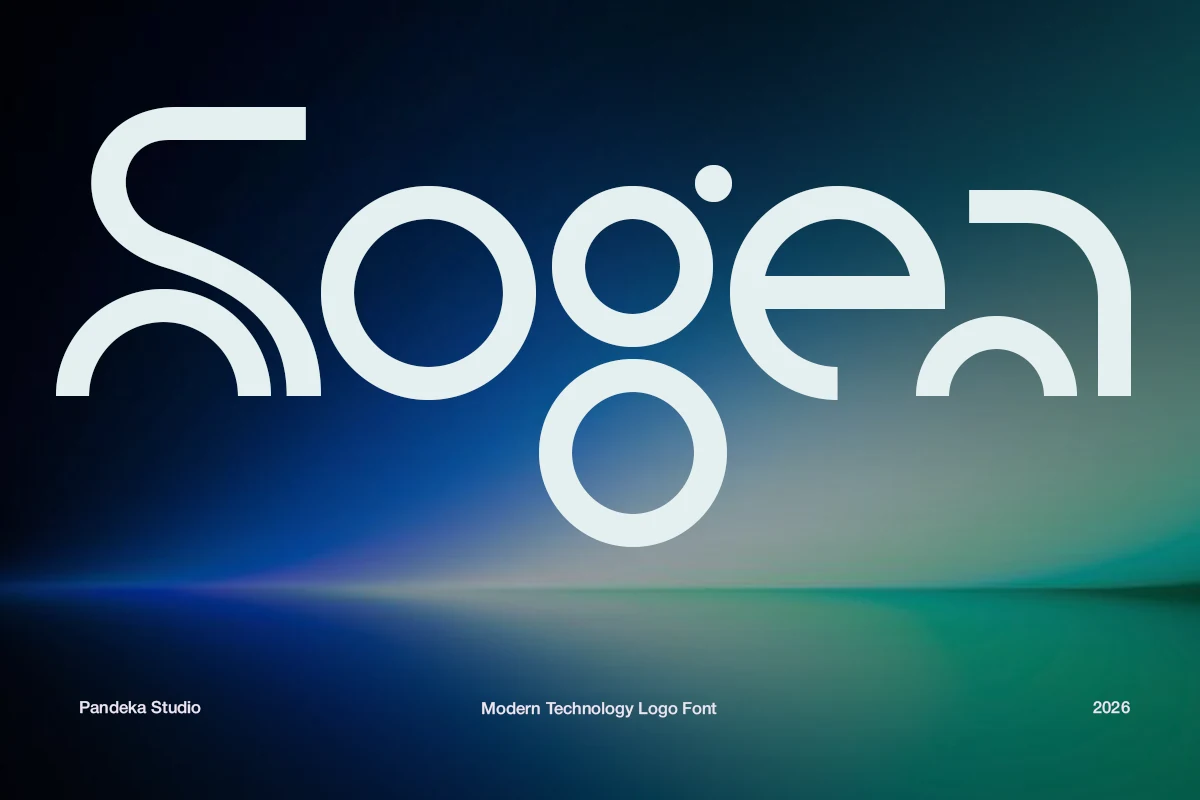
Sogea Font uses open terminals, circles, arcs, and extensive negative space to form an unconventional geometric system. It gives Cool Futuristic Fonts a logo-led identity for technology branding, while small-size readability is secondary to the distinctive outline.
Fagor Font
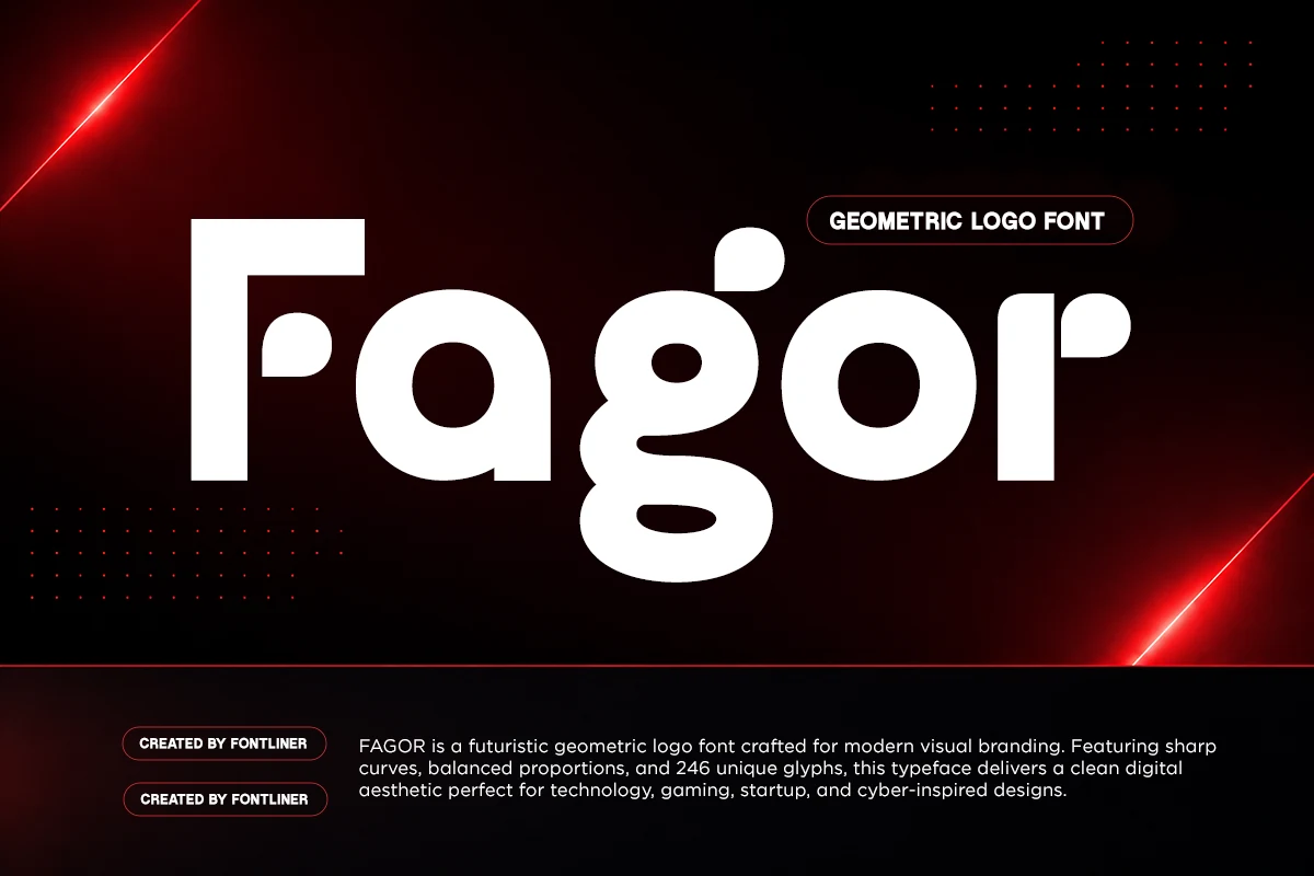
Best For: logos, branding, modern designs
Fagor Font combines wide circular and square elements with asymmetrical drop-shaped terminals. The unusual endings give Cool Futuristic Fonts a memorable logo signature and strong large-scale presence, but they make long-form reading less functional.
Angular, Stencil, and Cutout Displays
These faces use stencil gaps, angular notches, incomplete strokes, or squared cuts as their main signatures. They create stronger visual interruption than the cleaner geometric group and need generous display sizing.
Futuristic Font

Best For: logos, branding, posters
Futuristic Font builds letters from light monoline geometry with incomplete, open structures. The diagram-like construction gives Cool Futuristic Fonts an intentionally unfinished edge, but broken strokes slow recognition. Use it for large logos, posters, and brief display lines rather than quick-reading text.
Andox Font
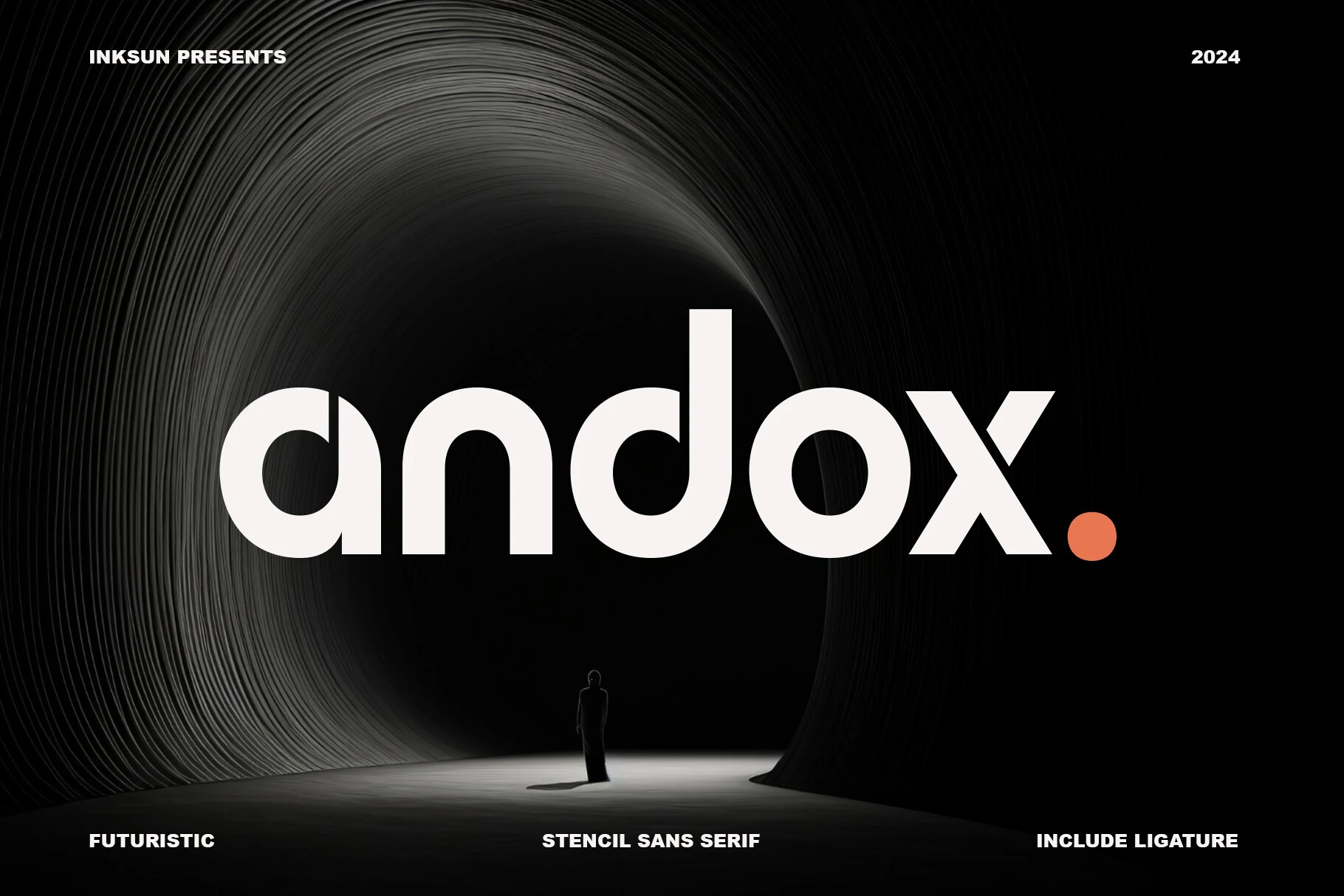
Best For: branding, headlines, posters
Andox Font places controlled stencil breaks and rounded terminals inside a regular geometric frame. The interruptions remain readable when enlarged, so it suits Cool Futuristic Fonts applications such as technology headlines, branding, posters, and editorial covers more than extended copy.
Oscorp Font
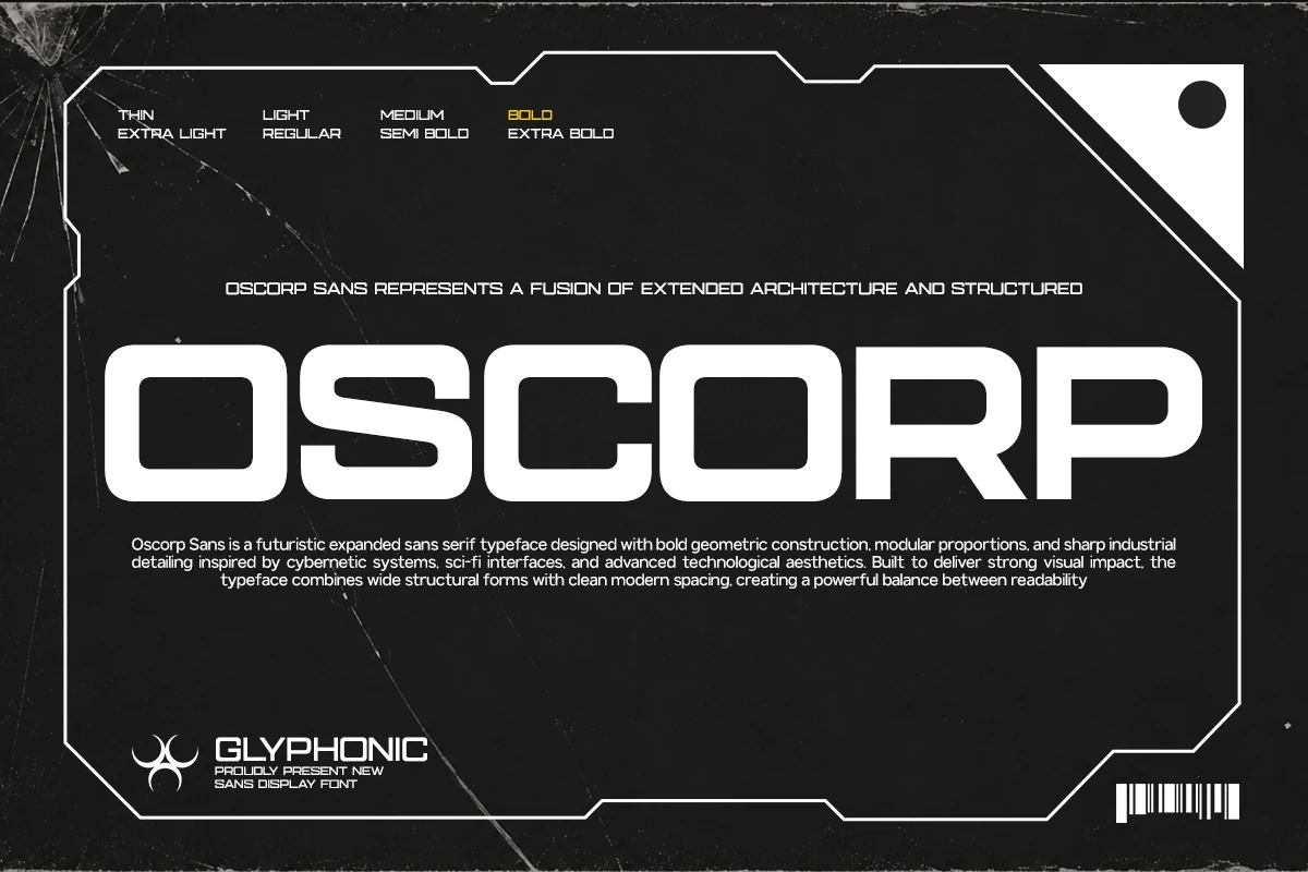
Best For: website headers, posters, headlines
Oscorp Font stretches geometric characters horizontally, balancing rounded interior corners against sharply squared exteriors. The wide block structure gives Cool Futuristic Fonts a strong header and poster presence, but it wastes space and rhythm in long-form text.
Gatecode Font
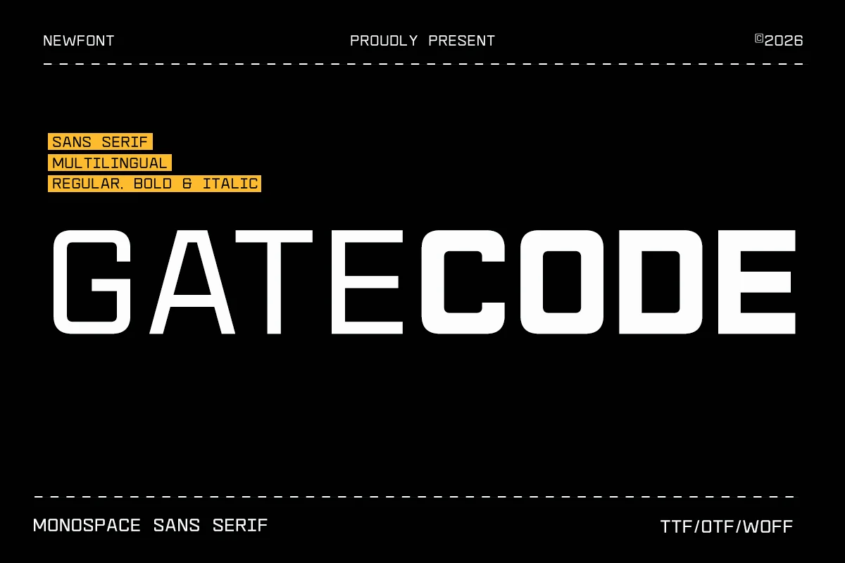
Best For: posters, website headers, social media graphics
Gatecode Font resembles a purpose-built interface system through monospaced proportions, square outer forms, and rounded interior corners. That wide block rhythm makes Cool Futuristic Fonts useful for UI concepts, gaming visuals, and headers, but continuous reading feels cumbersome.
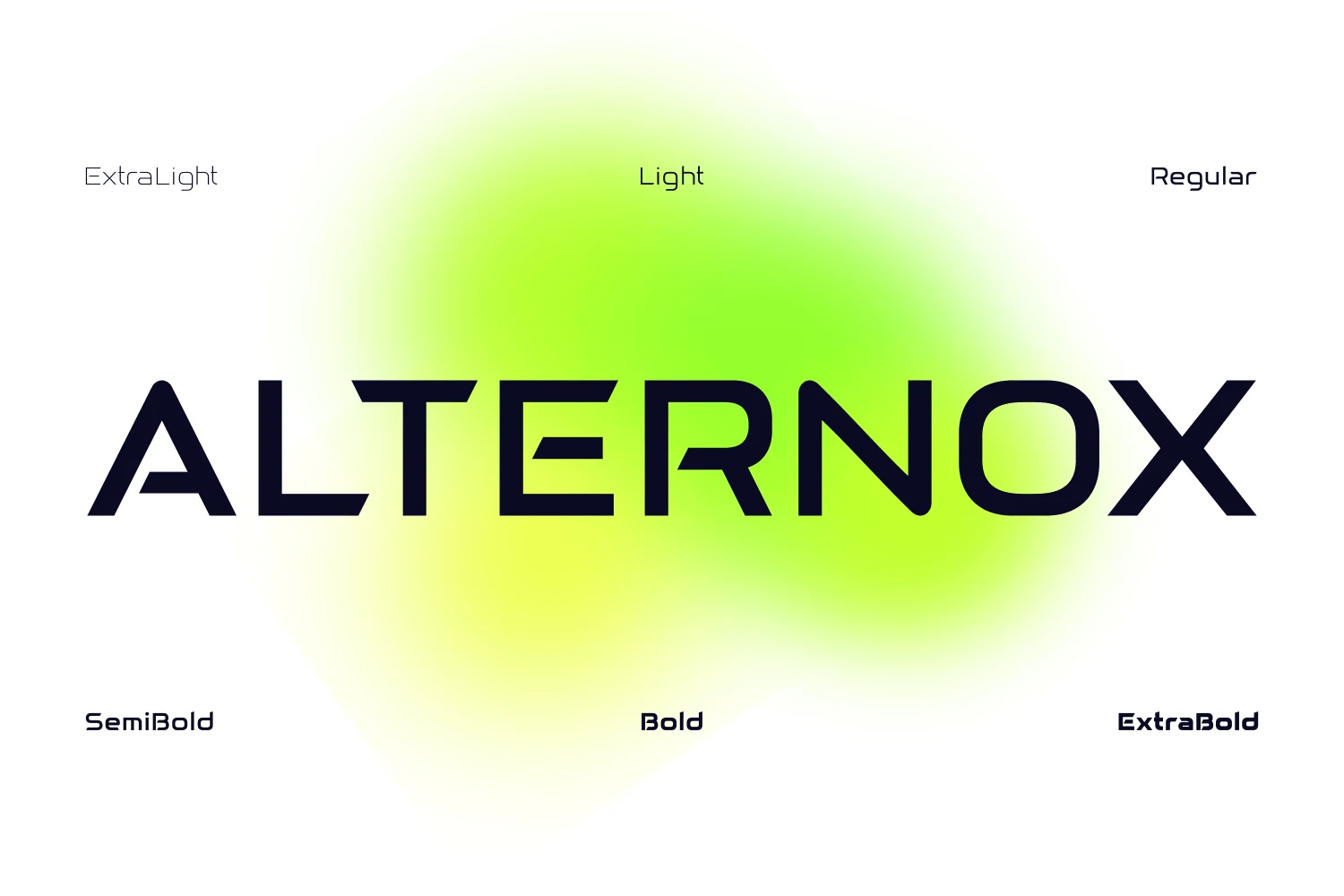
Alternox Font
Best For: logos, branding, website headers
Alternox Font gets its character from angular notches and terminal cuts rather than gaps across the main strokes. The wide forms give Cool Futuristic Fonts a distinctive logo and header presence, while the interrupted details lack the continuity needed for long reading.
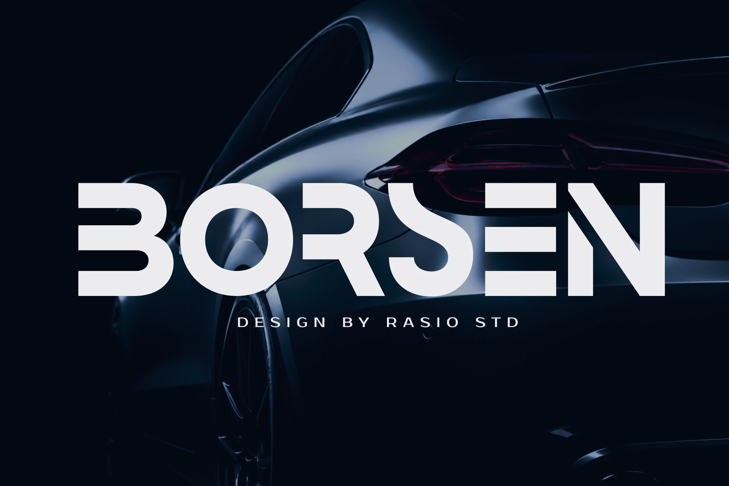
Borsen Font
Best For: logos, branding, packaging
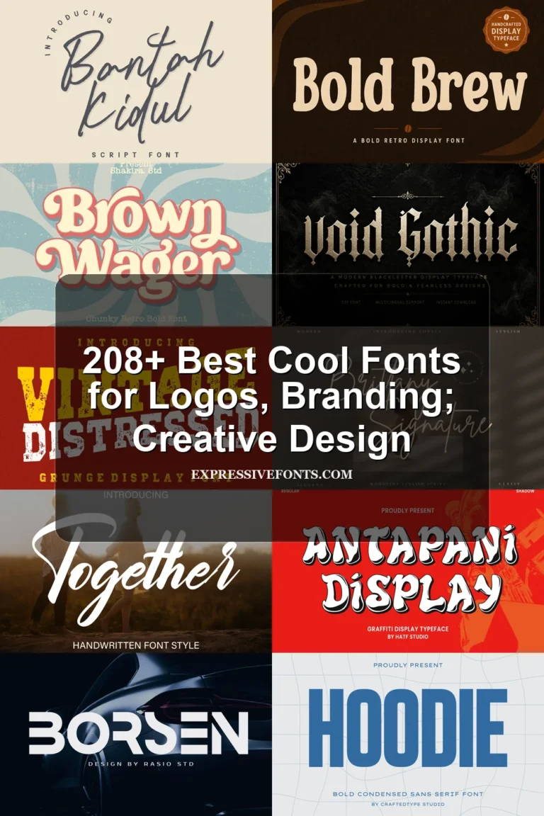
Borsen Font places horizontal stencil gaps inside wide geometric forms with notably closed apertures. This gives Cool Futuristic Fonts a forceful packaging and automotive silhouette, but the cutouts and dense shapes make small-size legibility a concern.
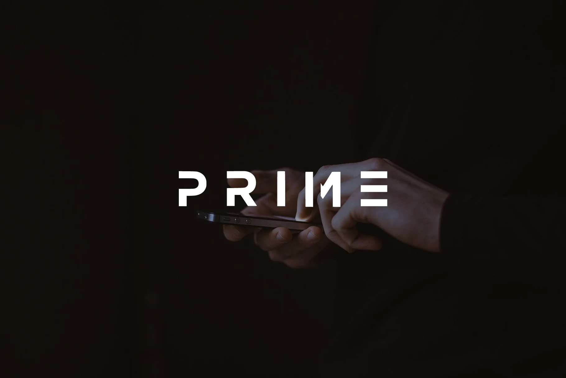
Prime Font
Best For: logos, branding, website headers
Prime Font combines square-cut terminals with stencil-like gaps in a compact uppercase system. These Cool Futuristic Fonts details remain clear in large branding and headers, but interrupted strokes can slow recognition when the lettering is reduced.
Condensed and Interlocking Forms
Condensation and connected joins define this set, producing tall, space-saving silhouettes or integrated letter structures. They fit narrow headline areas and logos, but their compressed rhythm limits comfortable reading.
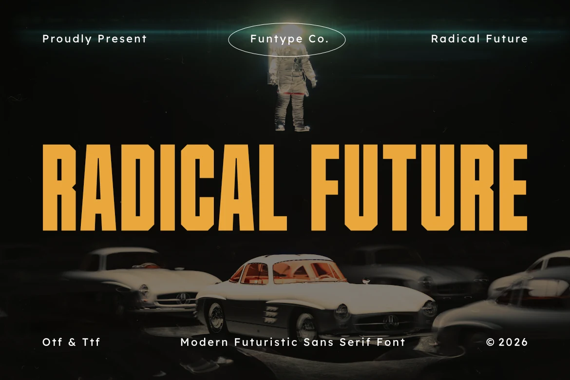
Radical Future Font
Best For: branding, headlines, T-shirts
Radical Future Font uses tall condensed characters, heavy block weight, and sharp notches where strokes meet. Cool Futuristic Fonts with this structure stay clear in large headlines, though spacing can crowd small text. Multilingual support and OTF/TTF formats make it practical for branding and produced merchandise.
Moderna Font
Best For: headlines, posters, display text
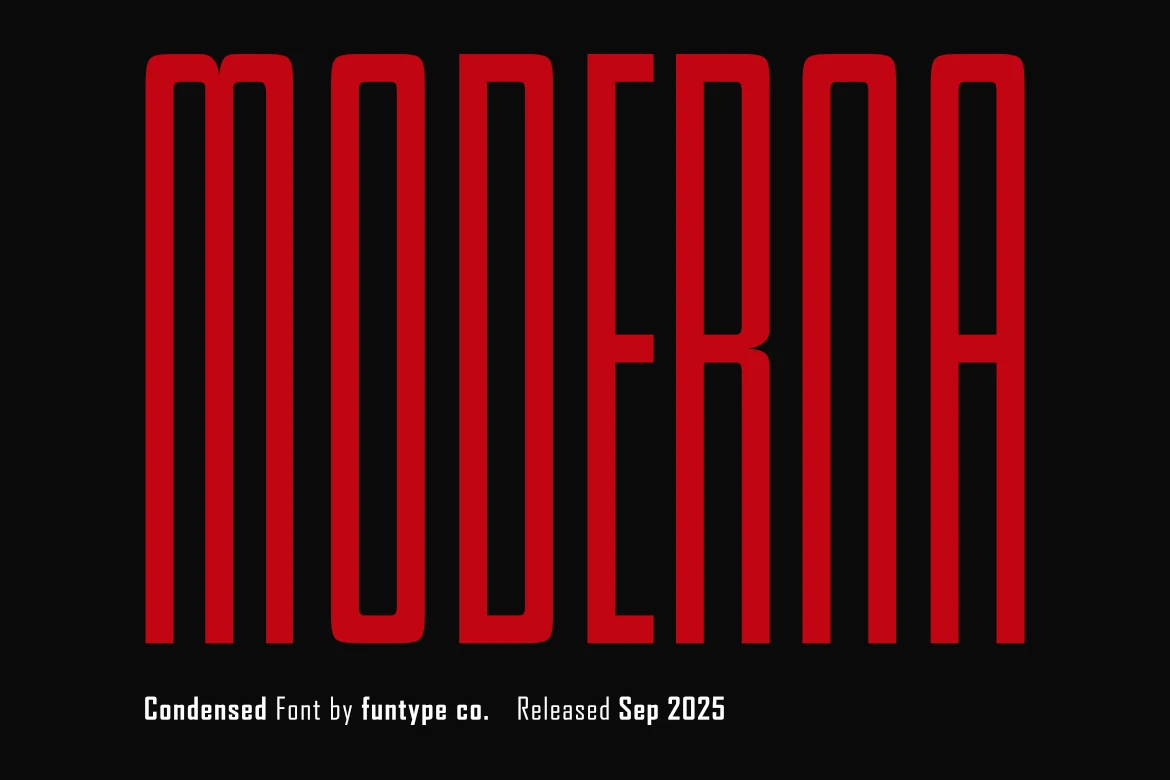
Moderna Font creates an extremely tall, narrow uppercase silhouette with rounded terminals. It is useful when Cool Futuristic Fonts must occupy a slim headline column, poster edge, or vertical accent, but the severe compression makes small text difficult to scan.
Kariwa Font
Best For: branding, posters, headlines
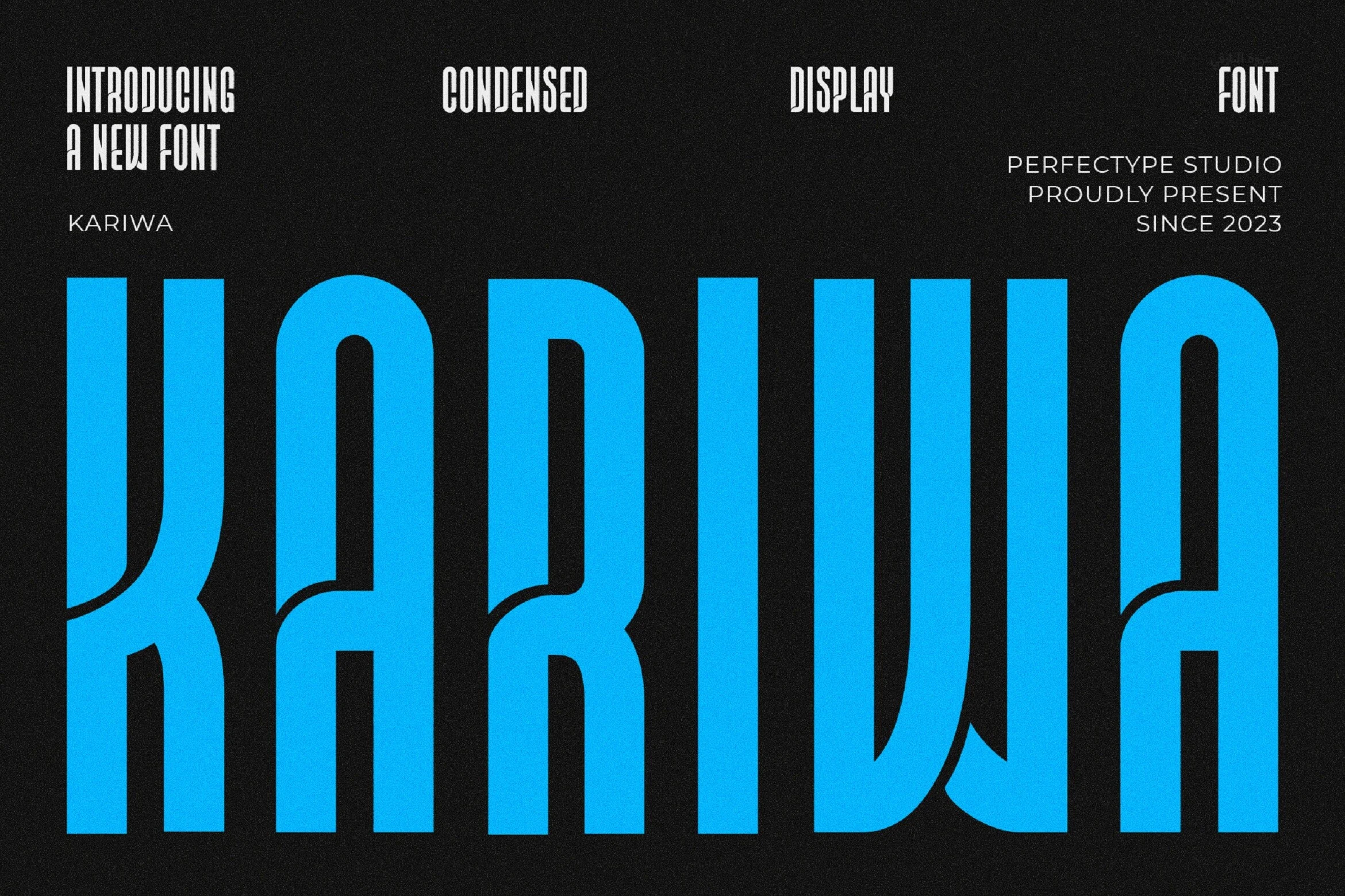
Kariwa Font connects and interlocks neighboring characters, using truncated terminals and extreme condensation to save space. That integrated construction makes Cool Futuristic Fonts distinctive in logos and headlines, but overlapping joins quickly become impractical for body text.
Prospect Font
Best For: logos, branding, headlines
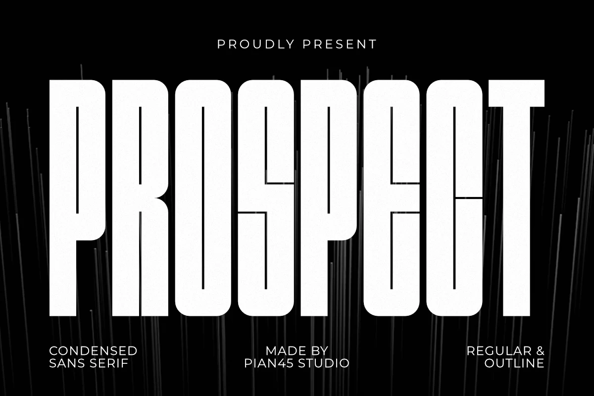
Prospect Font delivers tall rectangular characters in an extreme, space-saving condensed structure. It gives Cool Futuristic Fonts an efficient poster and logo silhouette, but dependable recognition depends on generous sizing because the narrow forms are difficult to scan small.
Bold Motion and Industrial Displays
Wide heavy strokes, sharp terminals, slants, and dense square forms give this group a sense of speed and force. It is more performance-oriented than the restrained geometric categories.
Rodsak Font
Best For: logos, branding, merch design
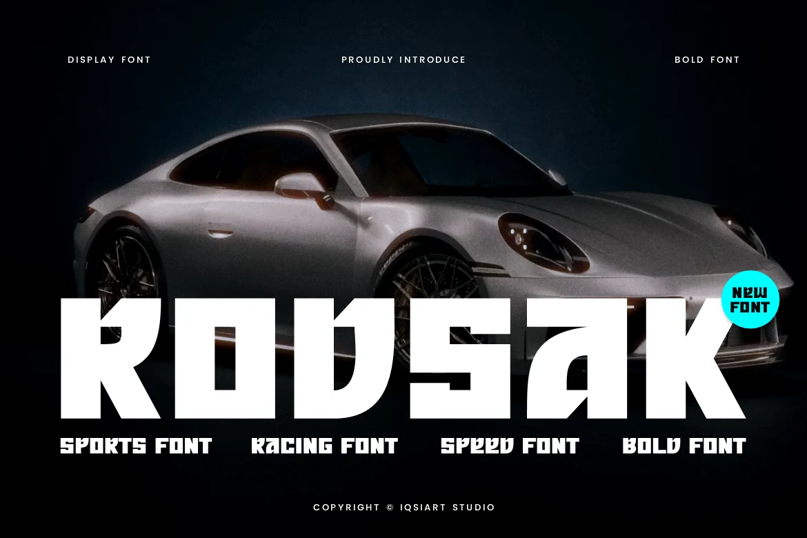
Rodsak Font gives Cool Futuristic Fonts a racing and esports attitude through sharp diagonal cuts, thick uniform strokes, and minimal counters. The heavyweight construction is memorable in logos, posters, and merchandise, but tight interior spaces reduce clarity when the lettering is scaled down.
Practive Family Font
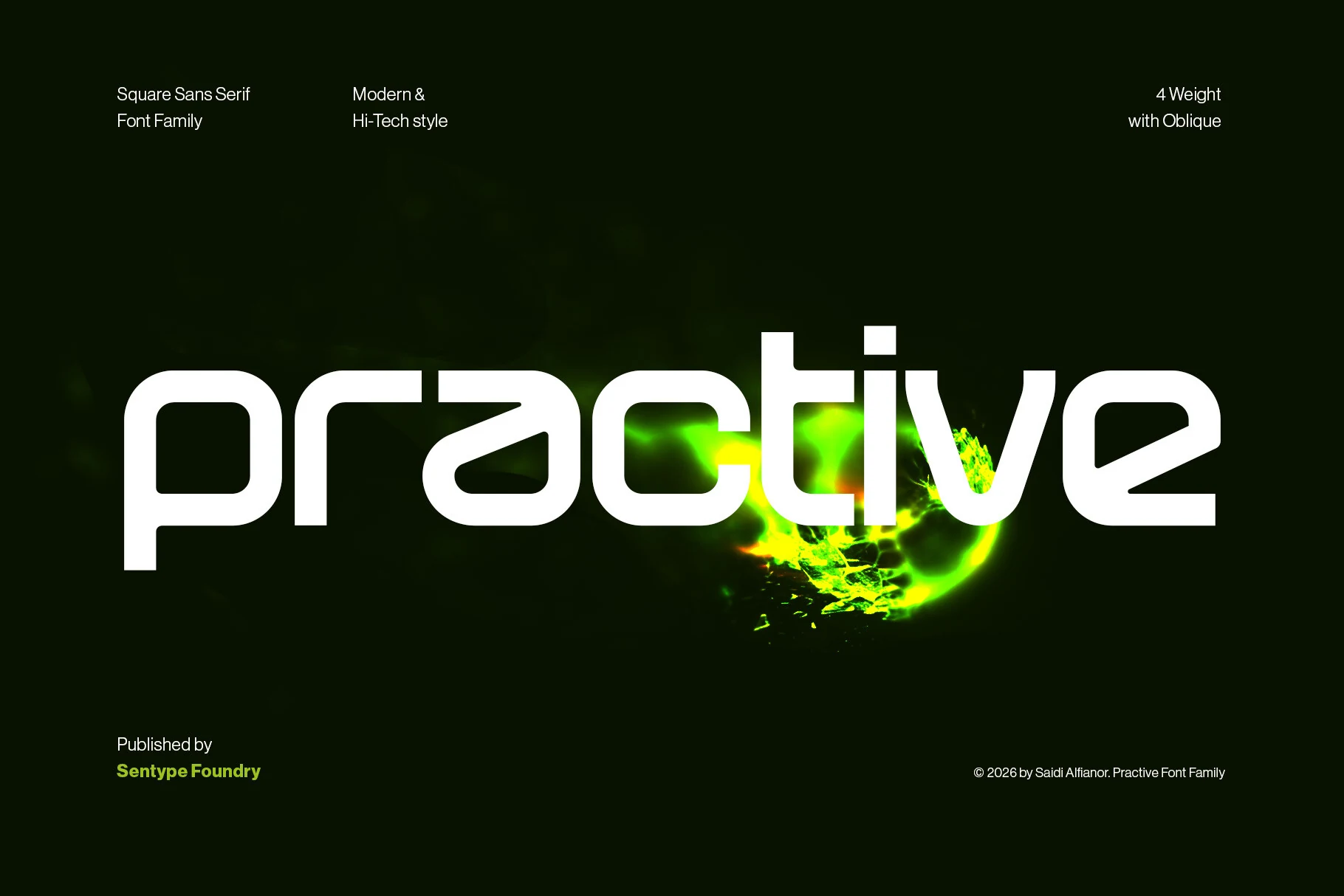
Best For: T-shirts, stickers, wall art
Practive Family Font uses wide square characters, right-angle corners, and uniform heavy strokes for a dense digital-industrial presence. Four weights with matching obliques provide layout range, while the broad forms can feel too heavy for small interface text.
Fesibel Font
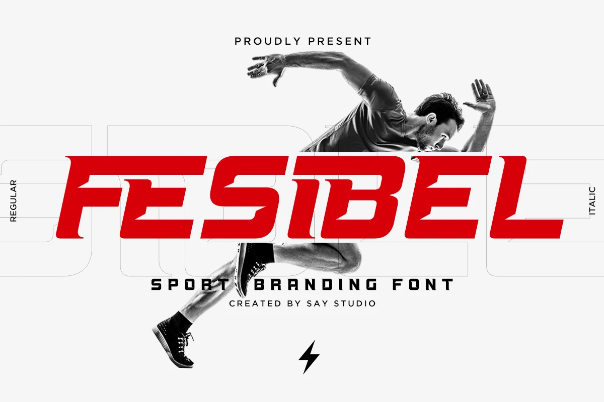
Best For: logos, posters, headlines
Fesibel Font uses wide athletic characters and sharply angled terminals to imply speed and competition. It gives Cool Futuristic Fonts a clear sports and racing role in large identities, though those terminal cuts become less forgiving at small sizes.
Oktural Font
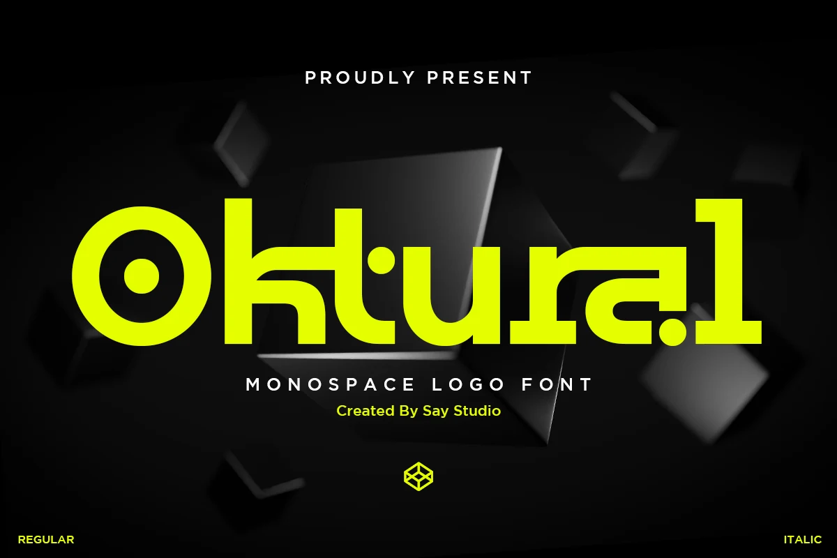
Best For: logos, branding, website headers
Oktural Font combines square and rectangular structures with circular elements and stencil-like breaks inside a monospace framework. The unusual cutouts make Cool Futuristic Fonts especially effective for gaming headers, technology marks, and logos, but recognition drops when reduced.
Movark Font
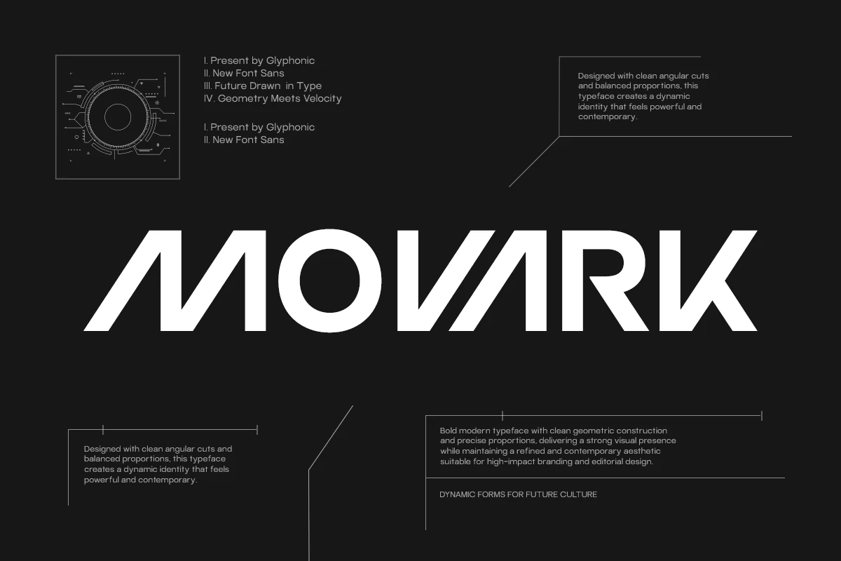
Best For: logos, branding, posters
Movark Font pushes Cool Futuristic Fonts forward with a pronounced rightward slant, heavy geometry, and sharp angular cuts. The construction creates memorable logos and headlines, but its lean and unconventional terminals rule it out for body text.
How to Choose the Right Font
Choose open counters and consistent monoline strokes when readability matters most, especially for UI elements and repeated headers. Select stencil gaps, notches, or incomplete forms when the design role is primarily a logo or poster. For narrow spaces, compare condensed width carefully; for sports or gaming work, slant and angular cuts add motion but demand larger type.