14 Best Witch Halloween Fonts for Halloween Designs in 2026
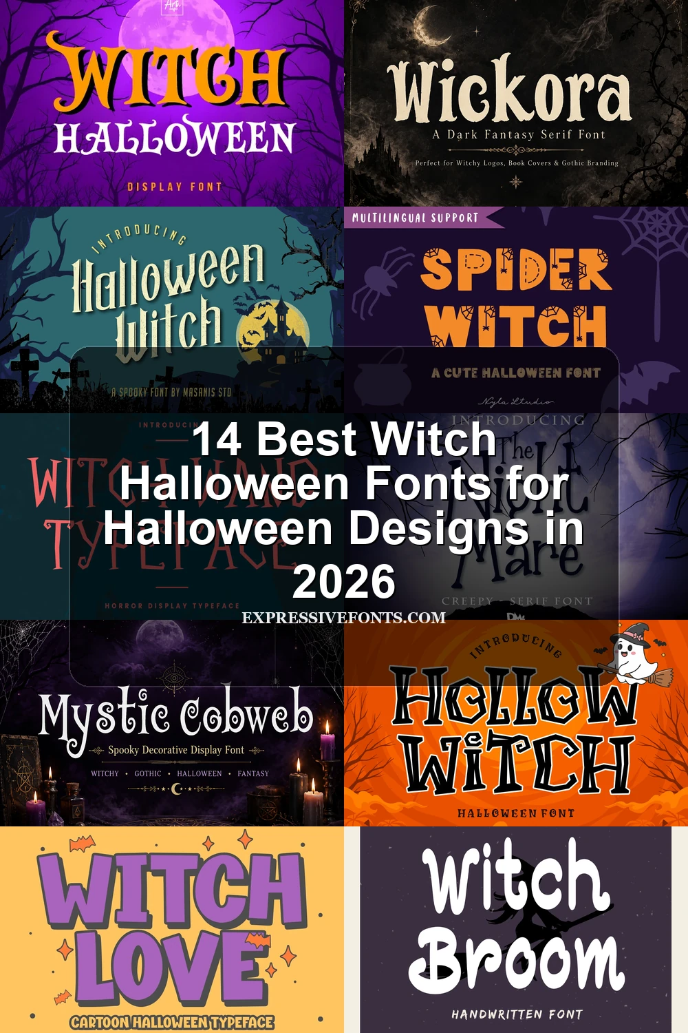
This collection of Witch Halloween Fonts spans chunky cartoon blocks, jagged distressed forms, hand-drawn letters, and ornamental serif styles. Use them for posters, apparel, stickers, logos, invitations, book covers, and other short display projects where construction and mood matter more than paragraph-length readability.
Looking for more halloween fonts? Browse our complete Halloween Fonts collection to compare vintage, cute, scary, spooky, and creepy halloween styles.
Witch Halloween Fonts: Themed Display Lettering
Witch Halloween Fonts: Themed Display Lettering combines sturdy block shapes with recognizable hats, webs, and other motifs, making this group more direct and merchandise-friendly than the rougher or more ornamental categories.
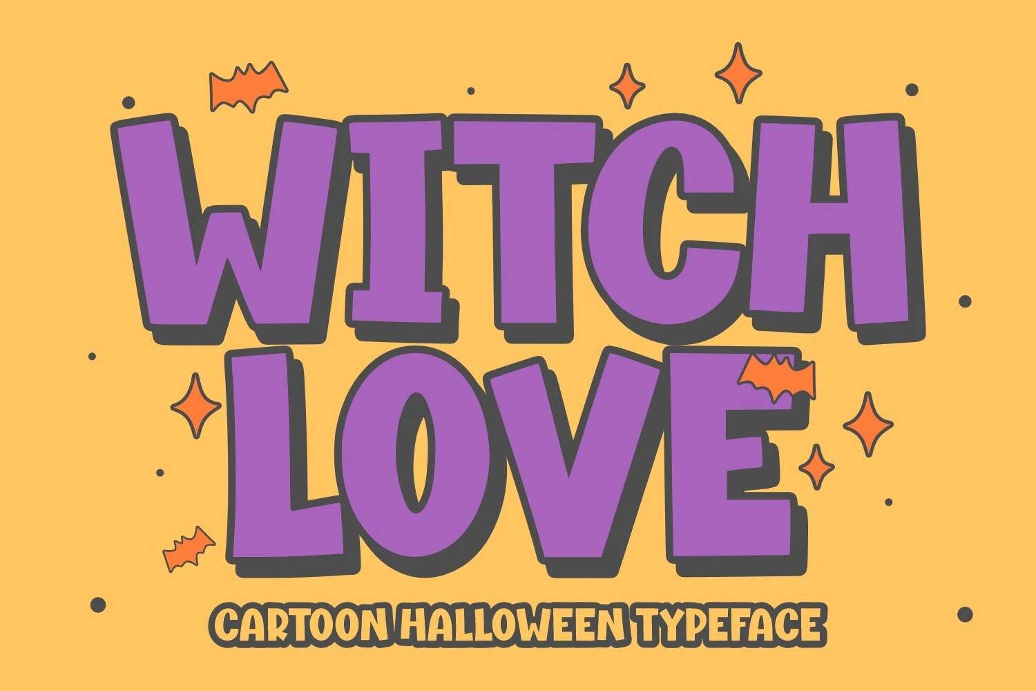
Witch Love Font
Best For: logos, branding, T-shirts
Witch Love Font has wide upright proportions, thick uniform strokes, closed apertures, and chunky slab-like serifs. This cartoon construction stays clear on logos and T-shirts, although its dense block shapes become tiring across long phrases. It is a practical choice when Witch Halloween Fonts need a friendly, solid presence.
Halloween Witch Font

Best For: invitations, posters, signage
For invitations, posters, and short signage, Halloween Witch Font offers display lettering with a clear distinction between its main strokes and smaller details. That contrast gives the shapes useful structure, allowing readers to compare the letterforms without flattening the Halloween character. Keep the wording brief so the design remains easy to inspect.
Spider Witch Font
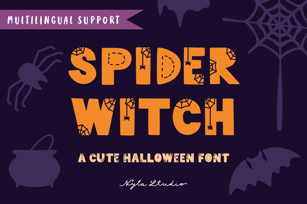
Best For: posters, logos, packaging, stickers
Spider Witch Font combines thick disconnected characters, rounded terminals, and integrated spiderweb accents. The soft contours keep the letters readable on large craft surfaces, making it especially useful for Cricut projects, stickers, packaging, and logos.
Halloween Witch Font
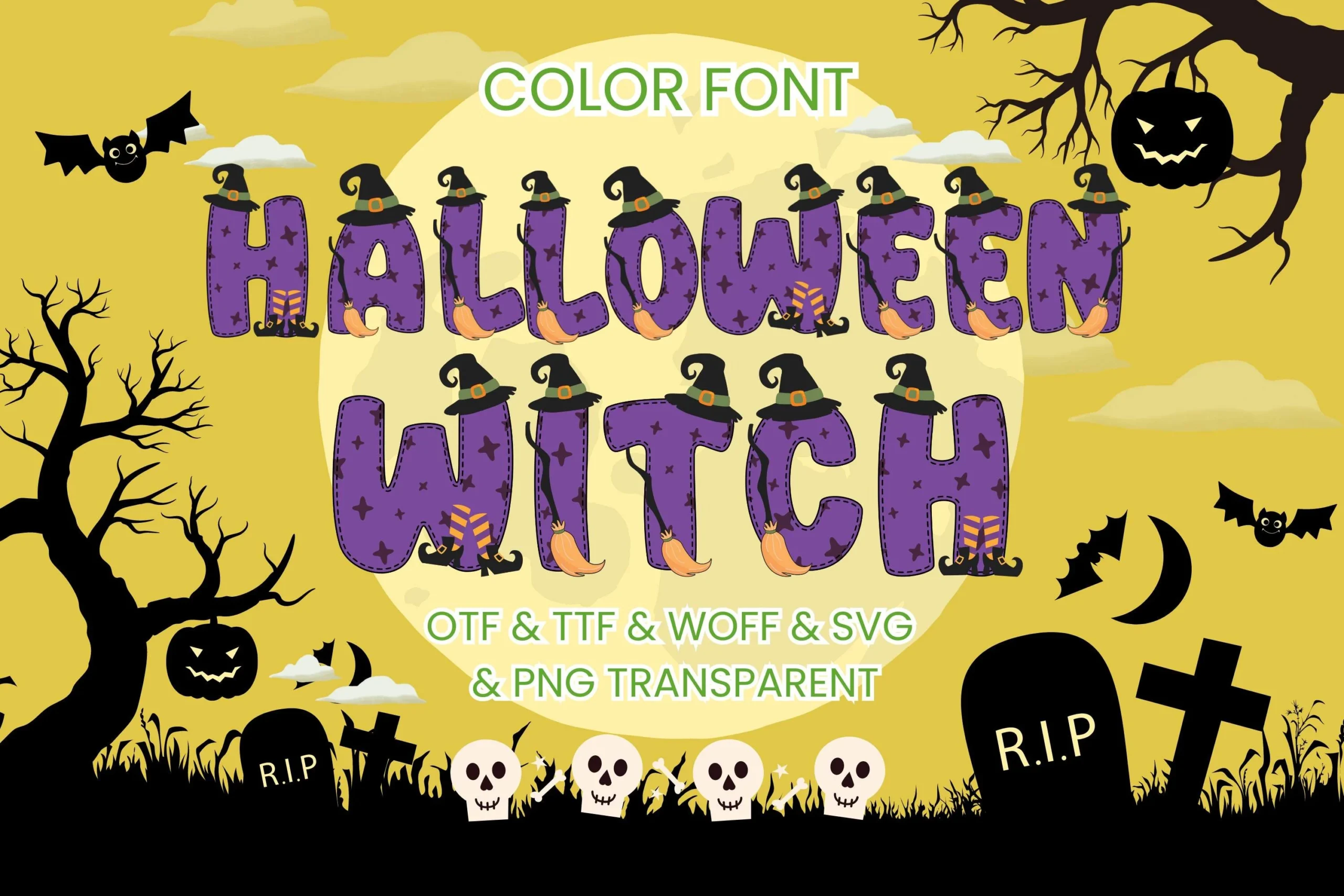
Best For: T-shirts, stickers, posters
Halloween Witch Font is a color font that builds witch hats, broom icons, and stitched borders into heavy rounded letters. Those embedded graphics add instant theme to T-shirts, stickers, and posters, but generous sizing is essential for quick word recognition.
Witch Broom Font
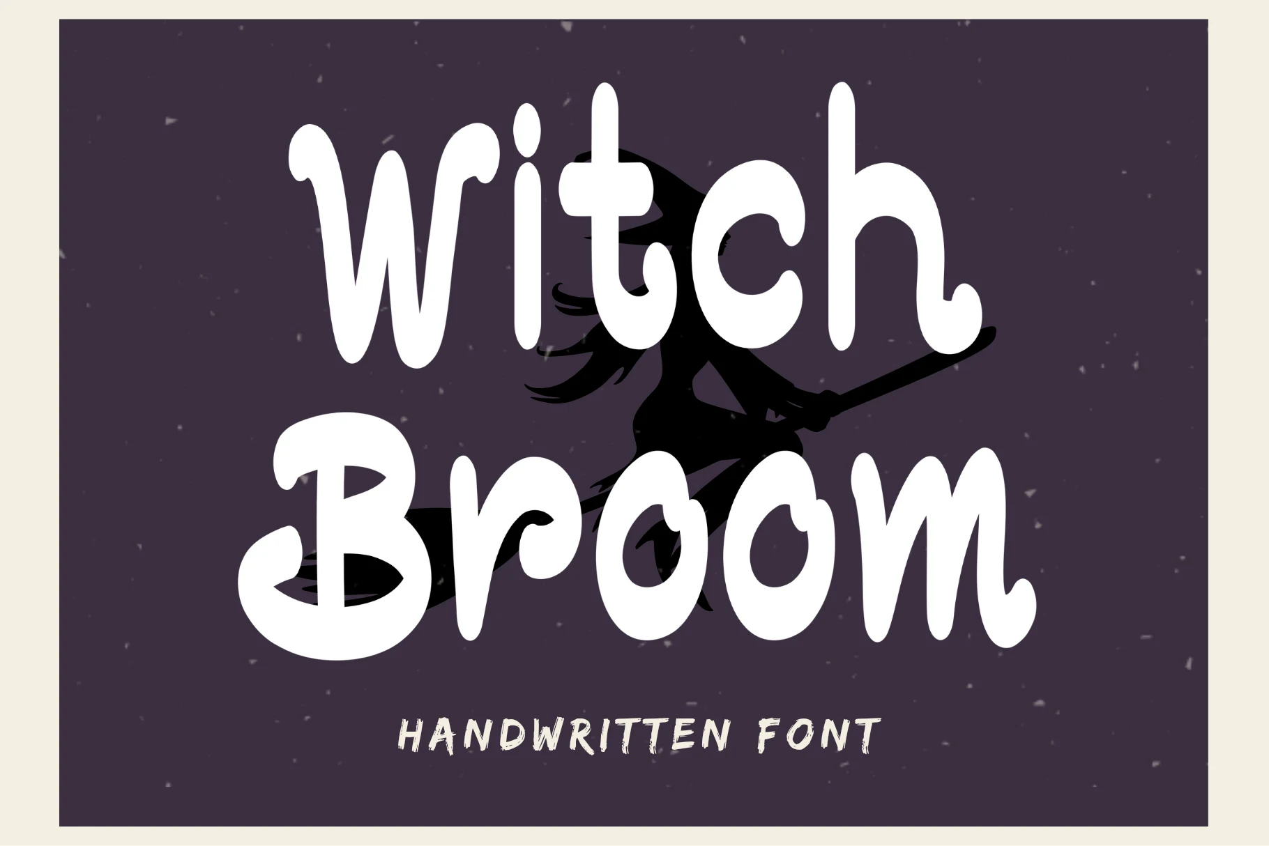
Best For: T-shirts, stickers, logos, quotes
Witch Broom Font uses monoline strokes, rounded bubbly terminals, disconnected lowercase-style forms, and a slightly irregular bounce. The substantial shapes remain readable for quotes, logos, hats, stickers, and children’s themes, while the informal rhythm prevents the lettering from feeling rigid.
Jagged And Distressed Gothic Forms
These jagged and distressed faces rely on broken edges, sharp terminals, uneven alignment, or weathered texture. They deliver stronger menace and poster impact than the softer themed and whimsical groups.
Witch Wand Font
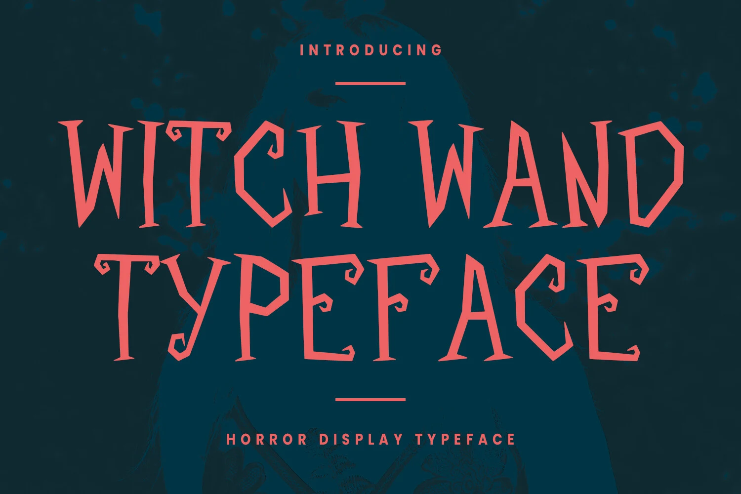
Best For: logos, social media graphics, book covers
Witch Wand Font uses heavy, disconnected strokes with uneven jagged edges, triangular protrusions, and asymmetrical points. Its irregular silhouette suits logos, social media graphics, and book covers, but the dense construction needs generous display sizing.
Silent Witch Font
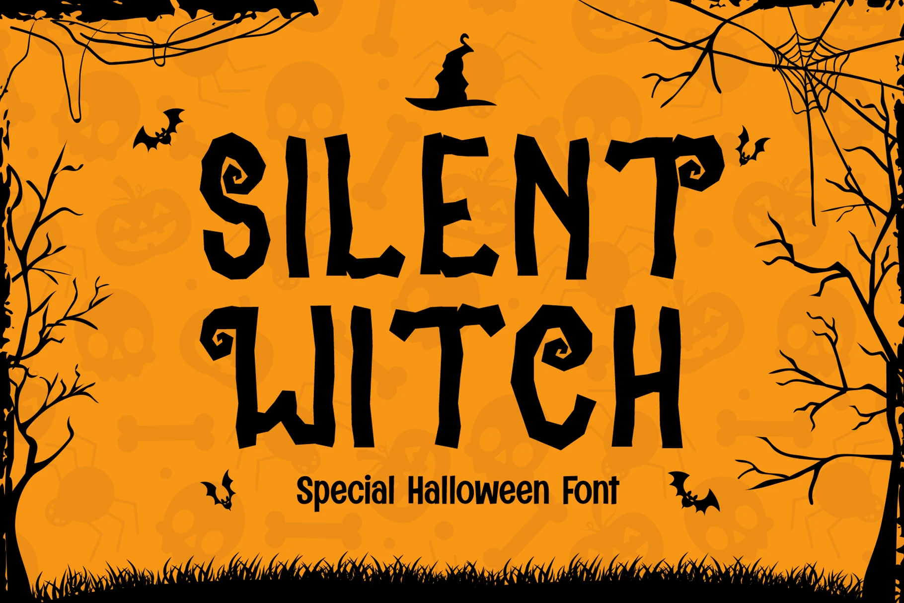
Best For: invitations, posters, headlines
Silent Witch Font creates an unsettled rhythm through jagged strokes, irregular baselines, pointed terminals, and fanciful uppercase curls. The high contrast gives invitations and posters personality, while the uneven alignment makes extended text blocks impractical.
The Nightmare Font
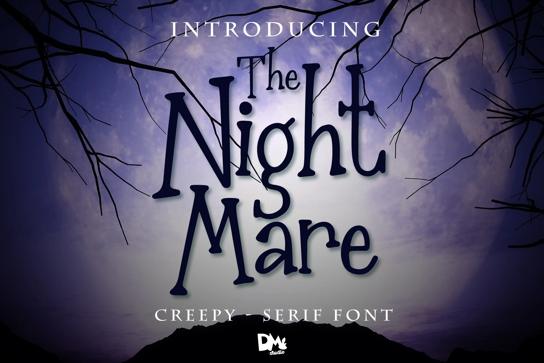
Best For: posters, headlines, stickers
The Nightmare Font is suited to horror posters and witch-themed headlines, with elongated vertical strokes, pointed flared terminals, irregular organic shapes, and varying weights. It delivers strong large-scale impact, but the mixed construction can blur in small text, so it works best when Witch Halloween Fonts must carry a short title rather than body copy.
Hollow Witch Font
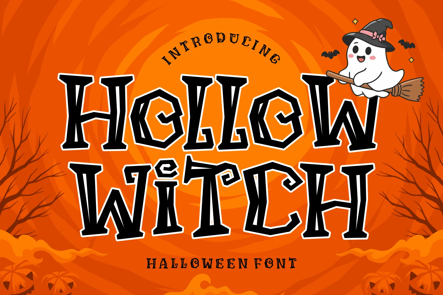
Best For: posters, headlines, T-shirts
Hollow Witch Font breaks its heavy wide letters into stencil-like segments with angular terminals and jagged edges. The fragmented construction gives banners, apparel, and large posters a cut-apart look, but reduced small-size clarity limits its use for compact wording.
Wickora Font
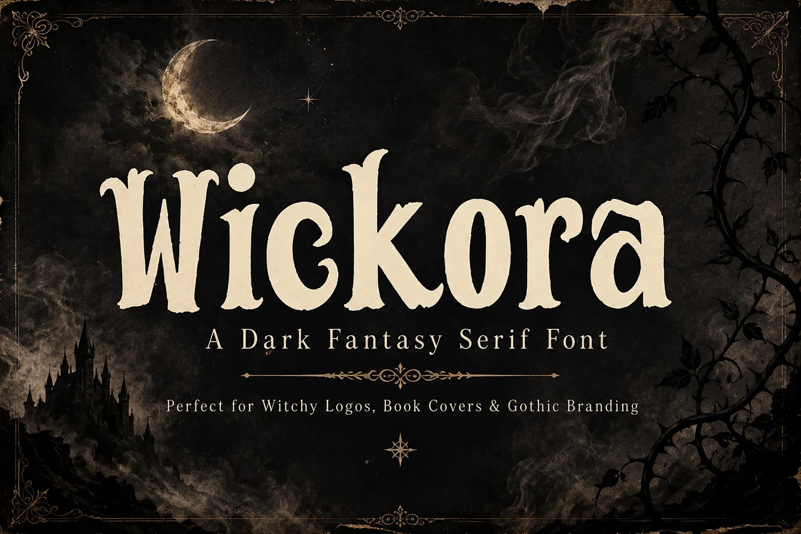
Best For: posters, headlines, vintage designs
Wickora Font combines high-contrast serif structure with weathered edges, pointed serifs, and organic curves. Its distressed texture strengthens headlines and posters by adding print-like wear, yet counters and fine details can disappear when the lettering is reduced.
Halloween Witch Font
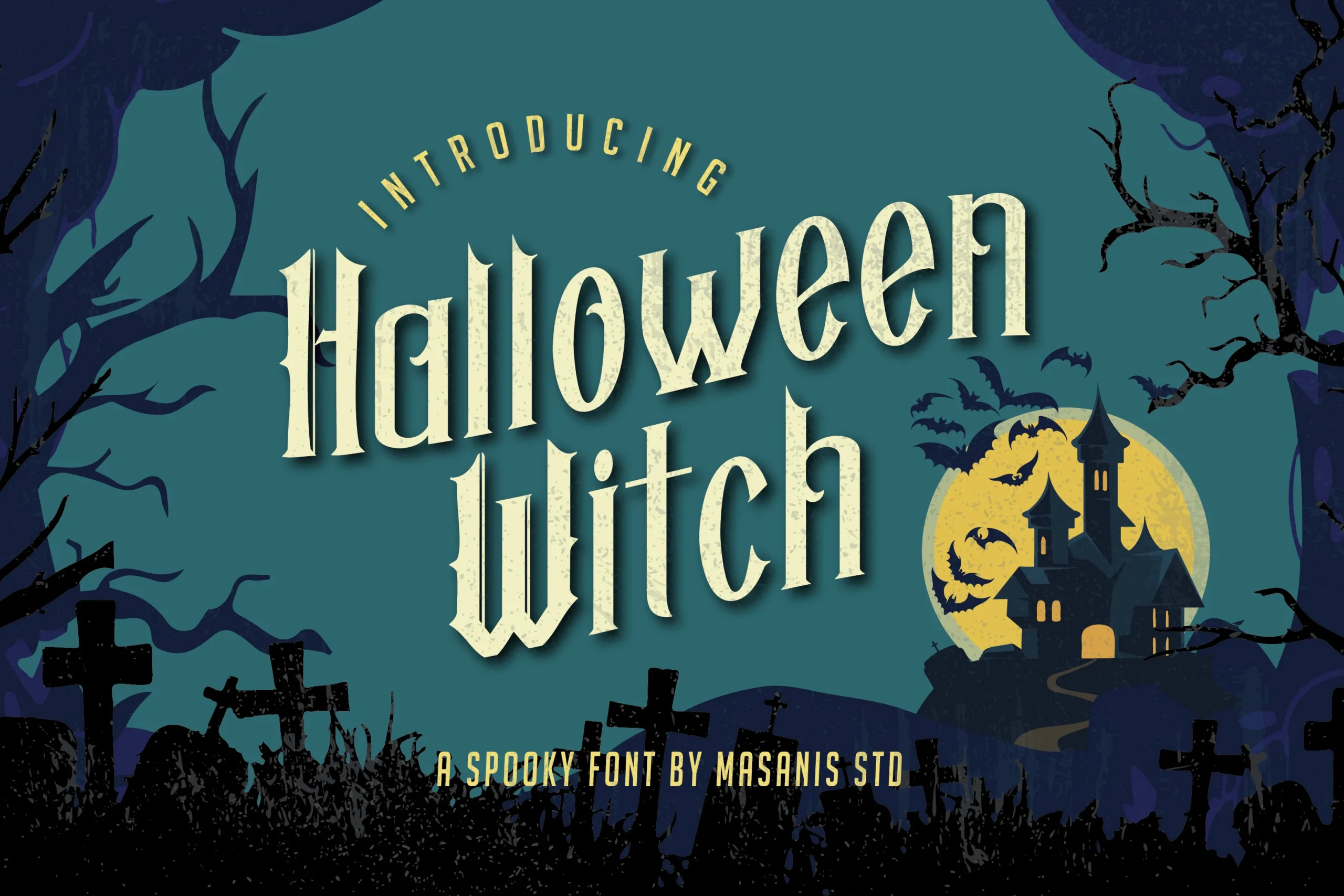
Best For: posters, headlines, T-shirts
Halloween Witch Font takes a more structured route with sharp triangular slab serifs, vertical stress, high contrast, and weathered texture. Its distinct letter shapes support readable headlines and titles, although the rough treatment is less suitable for compact text.
Whimsical And Ornamental Lettering
Whimsical and ornamental lettering uses rounded irregular forms, curls, spirals, and high-contrast terminals. It feels more decorative and character-led than the solid blocks or fragmented distressed styles elsewhere.
Witch Halloween Font
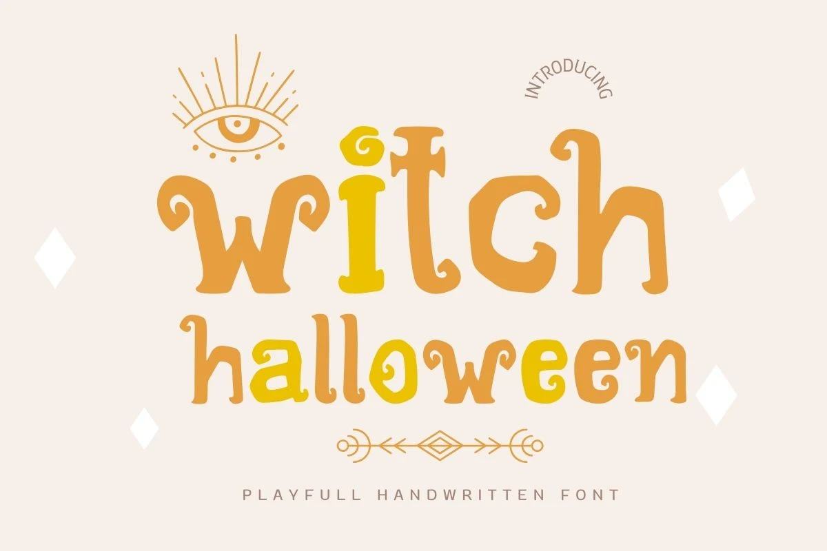
Best For: T-shirts, stickers, invitations, children’s designs
Witch Halloween Font has uneven hand-drawn weights, irregular rounded forms, curved flared terminals, and a disconnected upright structure. Its approachable shapes suit children’s designs, T-shirts, stickers, and invitations, though larger headings give the stylization room to remain legible.
Witch Halloween Font
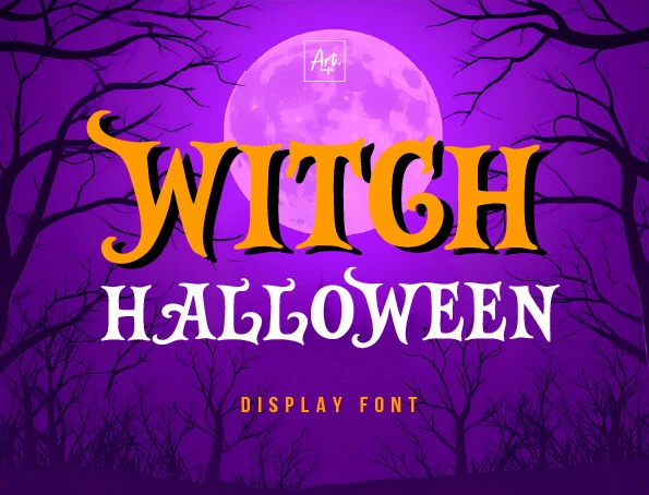
Best For: posters, headlines, T-shirts
Witch Halloween Font brings pointed serifs, curved terminals, irregular edges, and strong stroke contrast to large posters and shirts. Its substantial weight supports headline clarity, but the ornamental edges make small captions less dependable. Choose it when Witch Halloween Fonts should feel like a prominent title rather than supporting text.
Mystic Cobweb Font
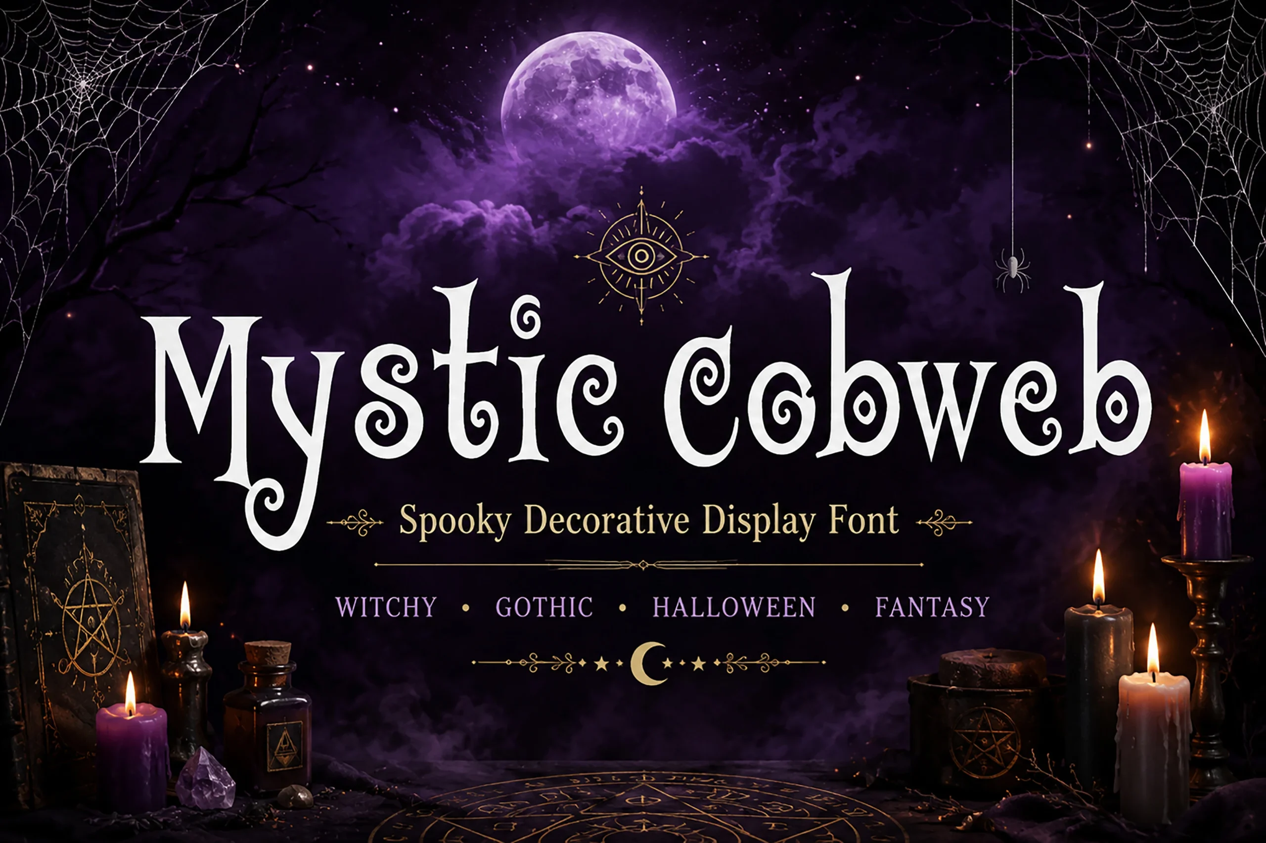
Best For: posters, headlines, short phrases
Mystic Cobweb Font is defined by swirly spiral terminals attached to open rounded letters. The varied weight creates a cobweb-like rhythm for short phrases and posters, but the curling ends need headline scale to stay distinct.
How to Choose the Right Font
Choose heavy, disconnected faces when you need clarity on shirts, stickers, or logos; use jagged or distressed styles for larger horror headlines and book covers. Rounded and hand-drawn options soften the message, while high-contrast serifs and spirals add ceremony. In every case, test the smallest intended size before committing Witch Halloween Fonts to detailed lettering.