13 Best Vacation Fonts for Travel & Summer Designs
This collection is for designers, crafters, and brand owners who need vacation fonts for travel posters, beach graphics, summer merch, stickers, invitations, and social posts. It includes 13 fonts, from retro scripts and bold display faces to playful handwritten styles, so you can match the lettering to relaxed, nostalgic, cute, or poster-ready designs.
Hustle Trip Font
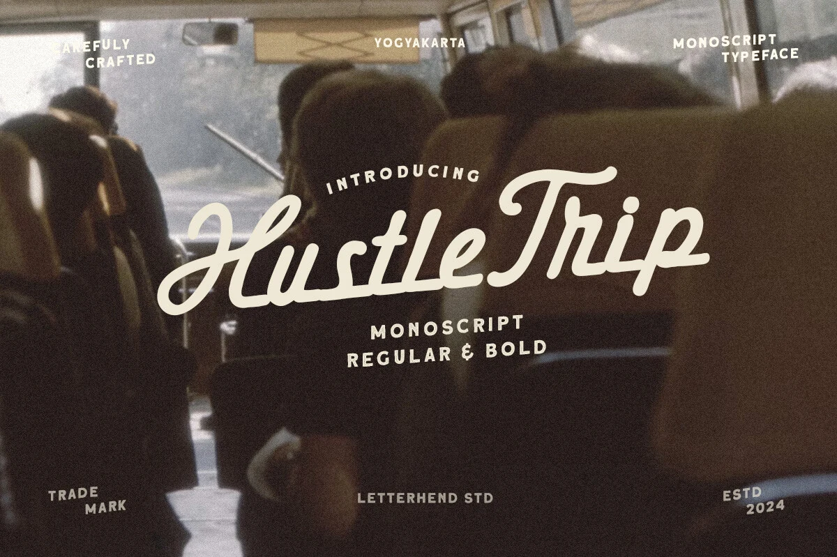
Best For: logos, posters, retro designs, vintage designs
Hustle Trip Font has the steady rhythm of a connected monoscript, with thick rounded strokes, soft terminals, and extended swashes that make the capitals feel cinematic without becoming fragile. Its vintage travel character fits naturally into a Vacation Fonts collection, especially where the lettering needs to suggest motion, signage, or old postcard branding.
The Regular and Bold weights give designers room to build hierarchy: use the heavier cut for short names or poster titles, then let the lighter weight handle supporting marks or secondary lines. Keep spacing controlled rather than loose, because the connected baseline and long entry strokes work best when the words feel compact and badge-like.
A Holiday Story Font
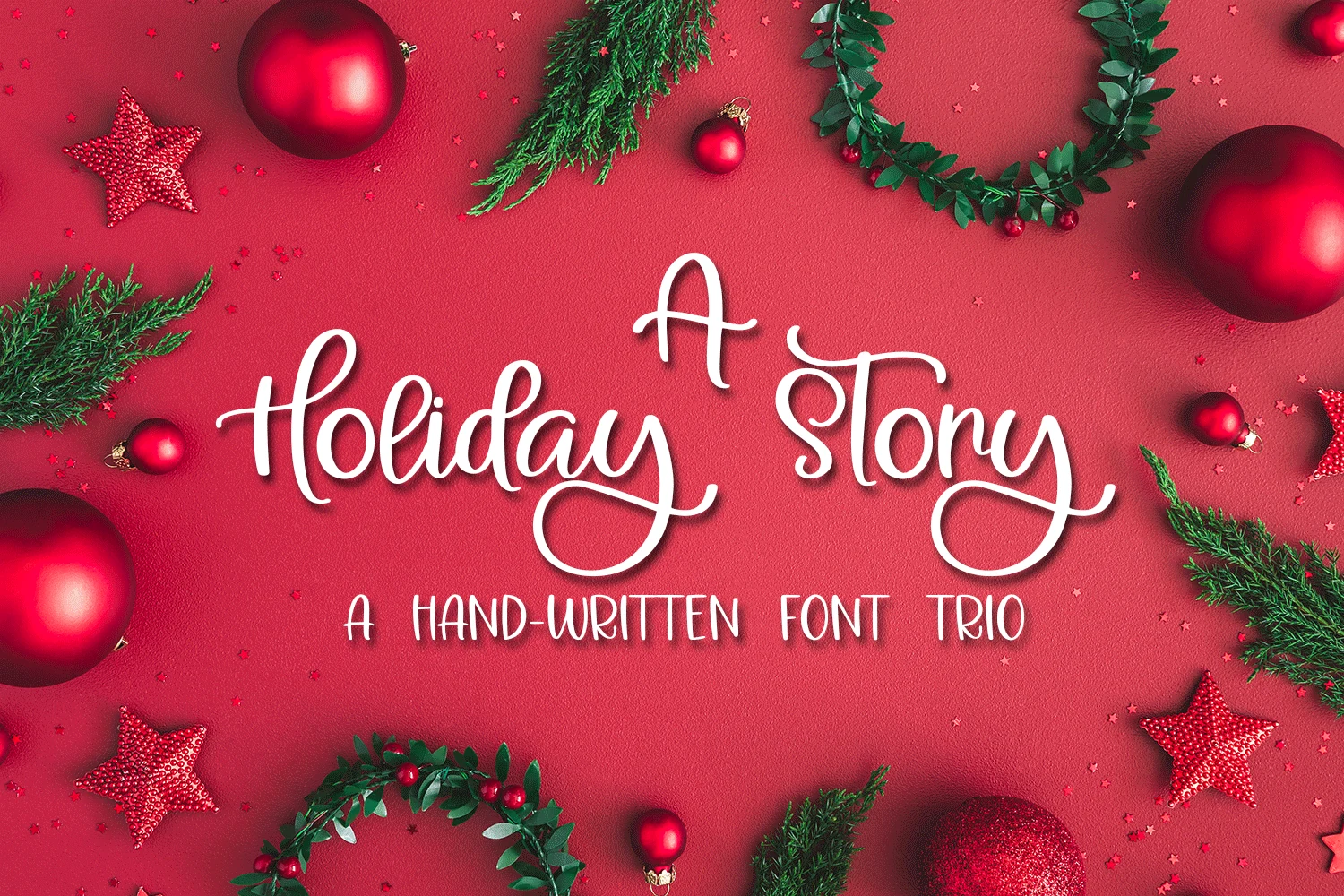
Best For: invitations, stickers, quotes, handmade designs
A Holiday Story Font mixes a looping handwritten script with a slim all-caps companion, giving the set a warm, handmade rhythm that feels personal rather than polished. The generous swashes and rounded stroke endings make it a natural fit for Vacation Fonts content that leans festive, nostalgic, or giftable.
Because the main script has long descenders and decorative terminals, it works best as the focal line while the narrow print style handles dates, tags, or short secondary copy. That contrast is especially useful for SVG, Cricut, and Silhouette projects, where clear lettering layers help keep cards, decals, and cut-file layouts readable.
Holiday Font
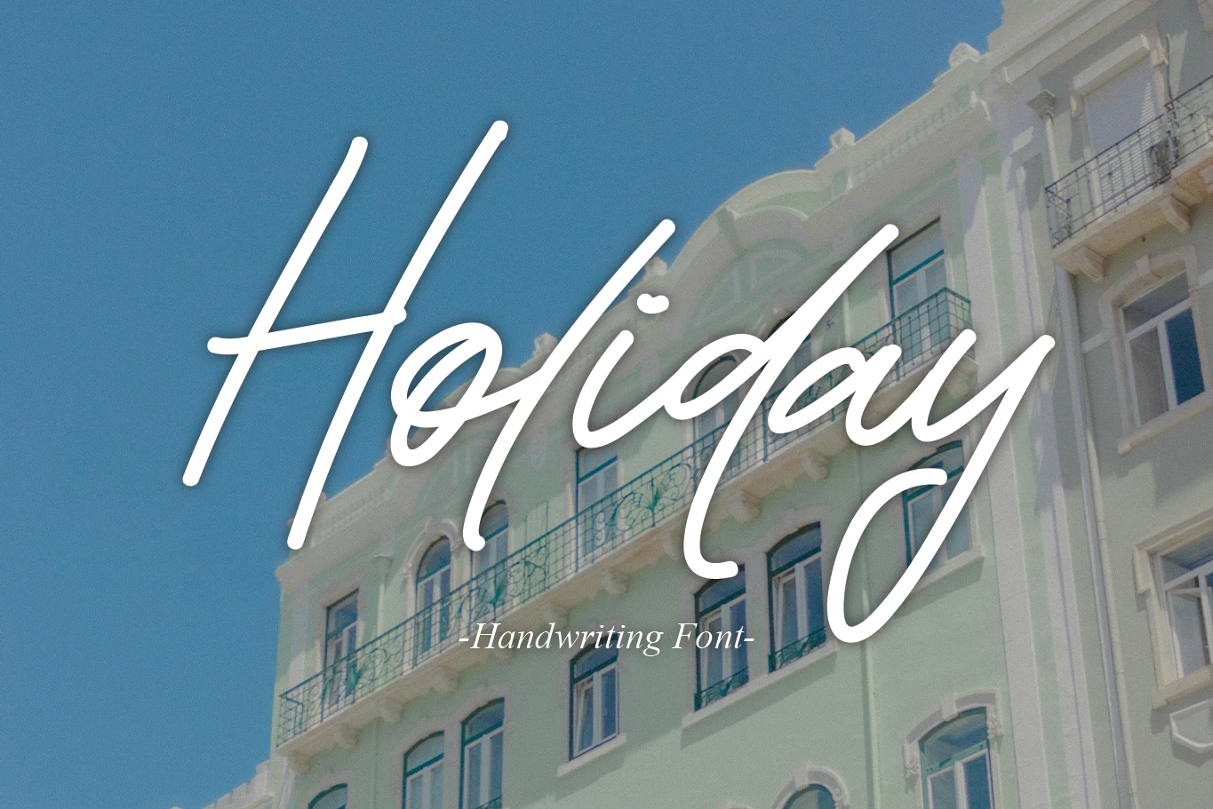
Best For: logos, branding, invitations, wedding designs
Holiday Font is a refined handwritten script with tall slanted ascenders, smooth connected strokes, and a wide, relaxed baseline rhythm. Its clean white-lettering style gives it a polished travel-card feel, making it a useful pick for Vacation Fonts when the design needs elegance rather than novelty.
The oversized entry strokes and deep descenders need vertical room, so it works strongest as a short logo name, invitation title, or social header instead of dense copy. Keep supporting text lighter and more compact; the contrast helps the script stay graceful without losing readability.
Holiday Pleasure Font
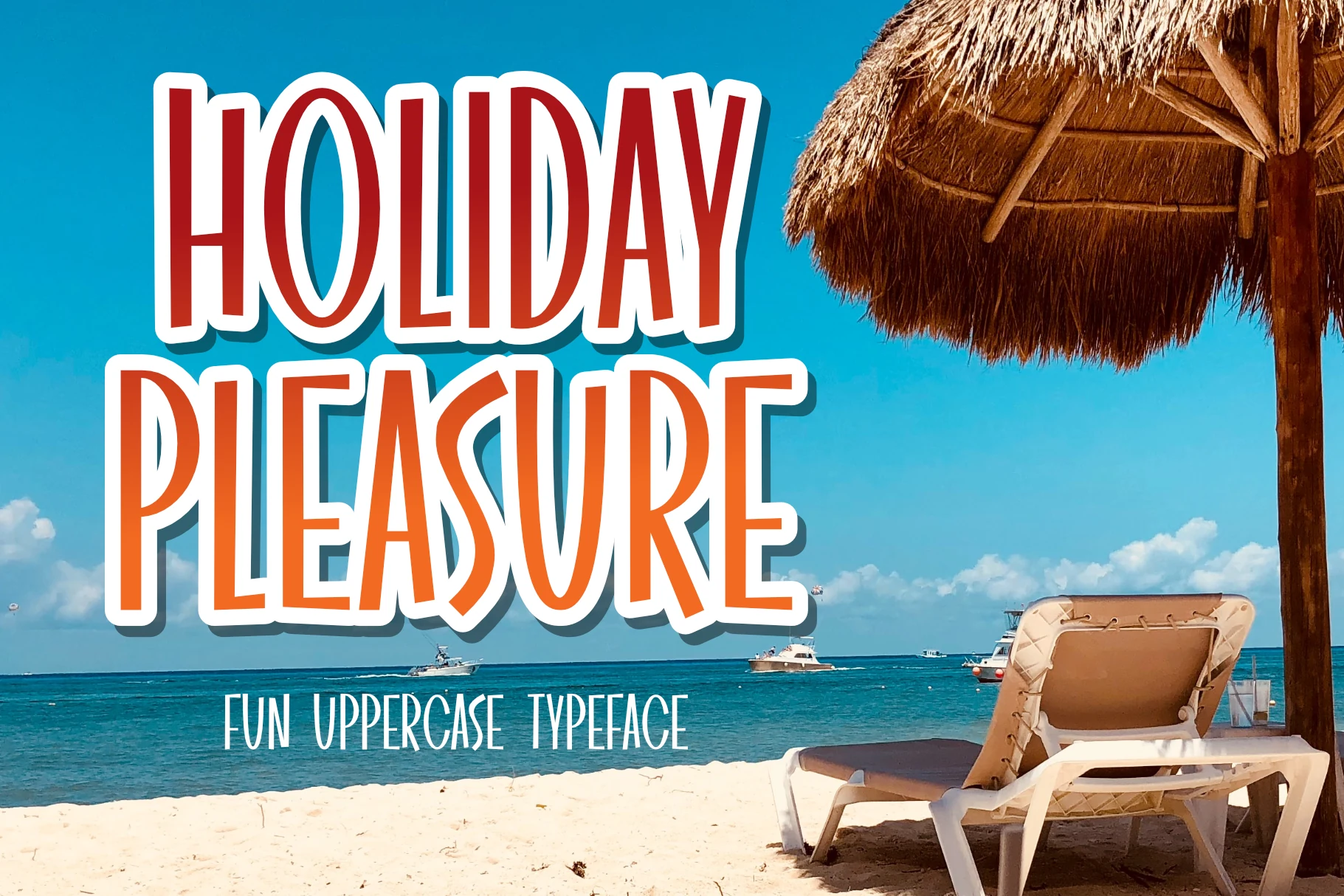
Best For: posters, headlines, social media graphics, fun designs
Holiday Pleasure Font is a tall uppercase display face with slim proportions, rounded edges, and slightly quirky curves that keep the letters lively instead of rigid. The narrow build and playful shaping give it an easy beach-poster rhythm, which makes it a strong fit for Vacation Fonts graphics with a bright, casual mood.
Its condensed silhouette works especially well in stacked titles, where you want plenty of impact without taking over the whole layout. Use it at larger sizes and pair it with simple supporting text, because the uneven character widths and elongated forms already bring enough personality to carry the headline.
Happy Holiday Font
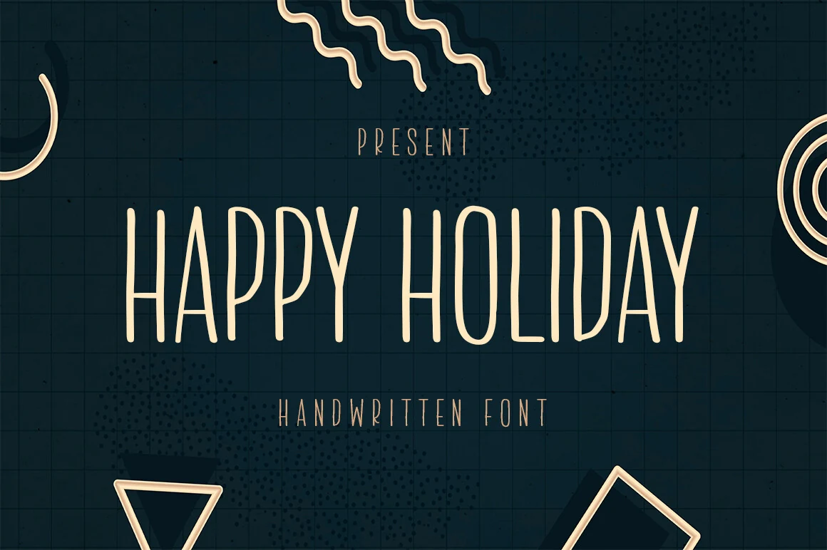
Best For: display text, headlines, posters, handmade designs
Happy Holiday Font uses a tall, narrow handwritten structure with rounded stroke endings, high counters, and slightly uneven verticals that keep the uppercase letters human rather than mechanical. Its spare rhythm suits Vacation Fonts designs where the mood needs to feel festive, clean, and modern without heavy ornament.
The condensed proportions make it useful for centered titles, menu-style headings, or compact poster layouts, but the thin strokes need strong contrast behind them. Keep word spacing moderate and avoid long sentences; short stacked lines let the height and handmade texture do the work.
Playful Holiday Font
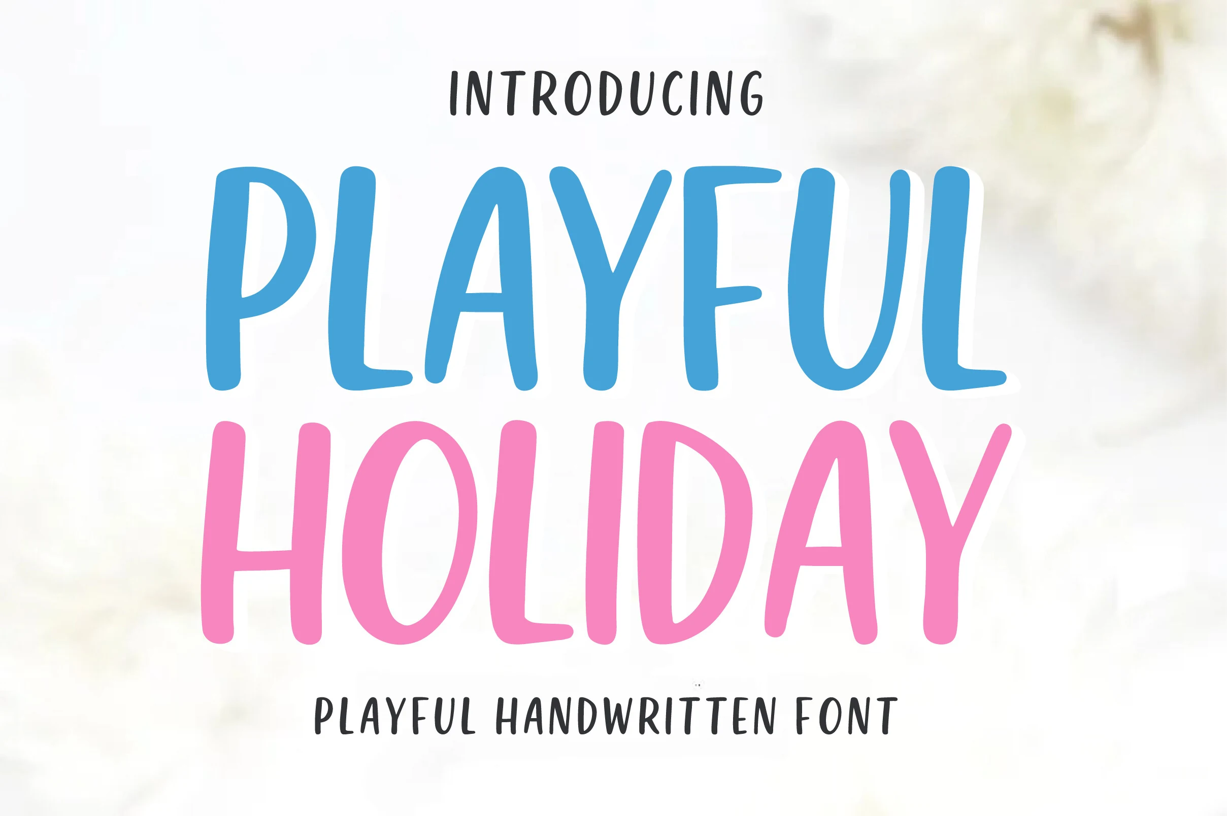
Best For: stickers, quotes, children’s designs, fun designs
Playful Holiday Font uses soft, rounded uppercase letters with a hand-drawn bounce that feels cheerful without turning chaotic. The thick monoline strokes and open shapes keep it readable, which makes it a bright choice for Vacation Fonts when you want something friendly, casual, and easy to spot at a glance.
Its wide, simple forms work best in short titles, labels, and quote-style layouts where the lettering can stay large and clear. Because the font already carries plenty of personality, pair it with smaller plain supporting text and keep line breaks compact so the hierarchy stays clean.
Retro Holiday Font
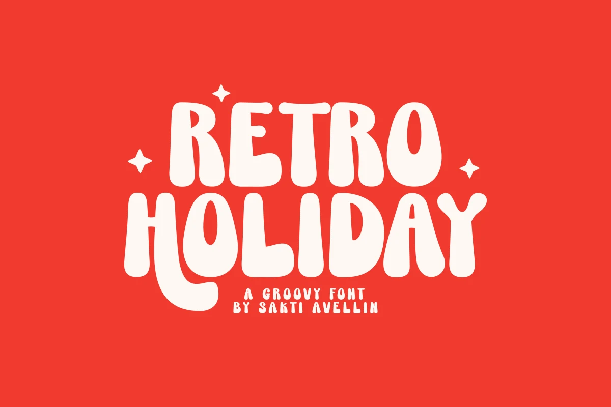
Best For: posters, logos, T-shirts, retro designs
Retro Holiday Font is a bold groovy display face with rounded cream-filled letters, chunky proportions, and soft irregular curves that make the words feel hand-shaped. Its old-school energy fits Vacation Fonts layouts where the title needs to look bright, nostalgic, and instantly readable.
The uppercase alternate features are useful for logotypes and poster lettering because they break up repeated shapes without adding extra graphics. Keep it in short stacked phrases, use strong color contrast, and let the heavy forms carry the composition rather than crowding it with detailed secondary text.
Afterain Holiday Font
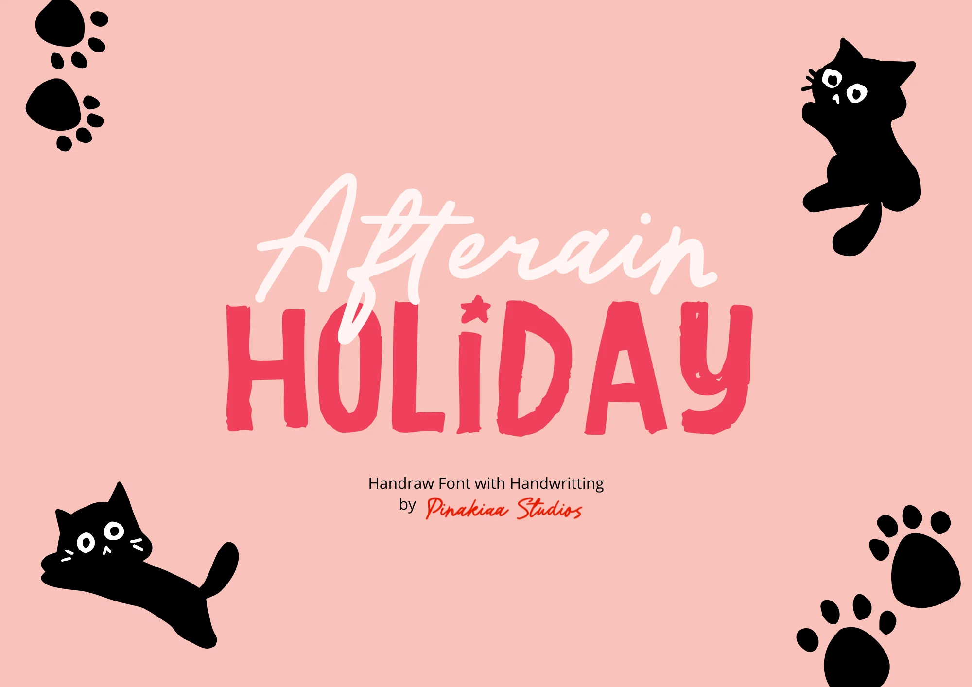
Best For: stickers, quotes, children’s designs, cute designs
Afterain Holiday Font pairs a light, flowing script with a rougher hand-drawn display style, creating instant contrast between soft charm and playful punch. The looping strokes in “Afterain” and the blocky, slightly irregular uppercase below give it a lively handmade feel that stands out nicely in Vacation Fonts collections with a fun, personal tone.
This bundle is especially useful when you want built-in hierarchy without searching for a second typeface. Let the script handle names or a short accent line, then use the textured display letters for the main message, where their uneven edges and sturdy shapes keep tags, stickers, and social graphics readable.
Love Holiday Font
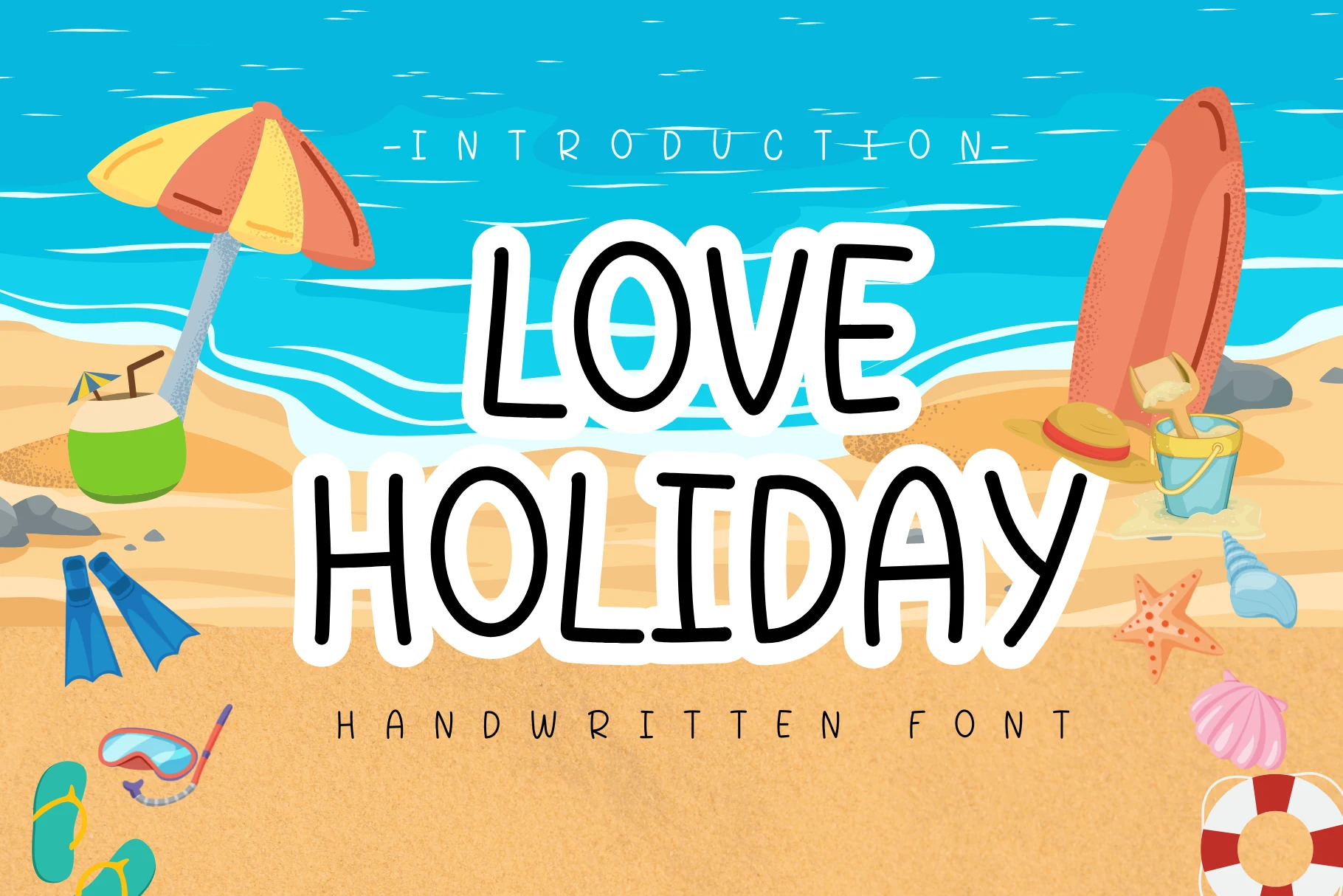
Best For: social media graphics, stickers, quotes, casual designs
Love Holiday Font uses tall rounded handwritten capitals with a relaxed, slightly uneven rhythm that keeps the lettering casual and friendly. The sturdy strokes and open shapes stay clear at a glance, which makes it a strong fit for Vacation Fonts designs that need a bright, informal voice.
Its narrow upright build is useful when you want short headlines to feel playful without taking over the whole layout. It works especially well for greeting cards, diary-style covers, banners, and social posts, where a simple high-contrast pairing helps the handmade texture stay crisp and readable.
Vacation Font
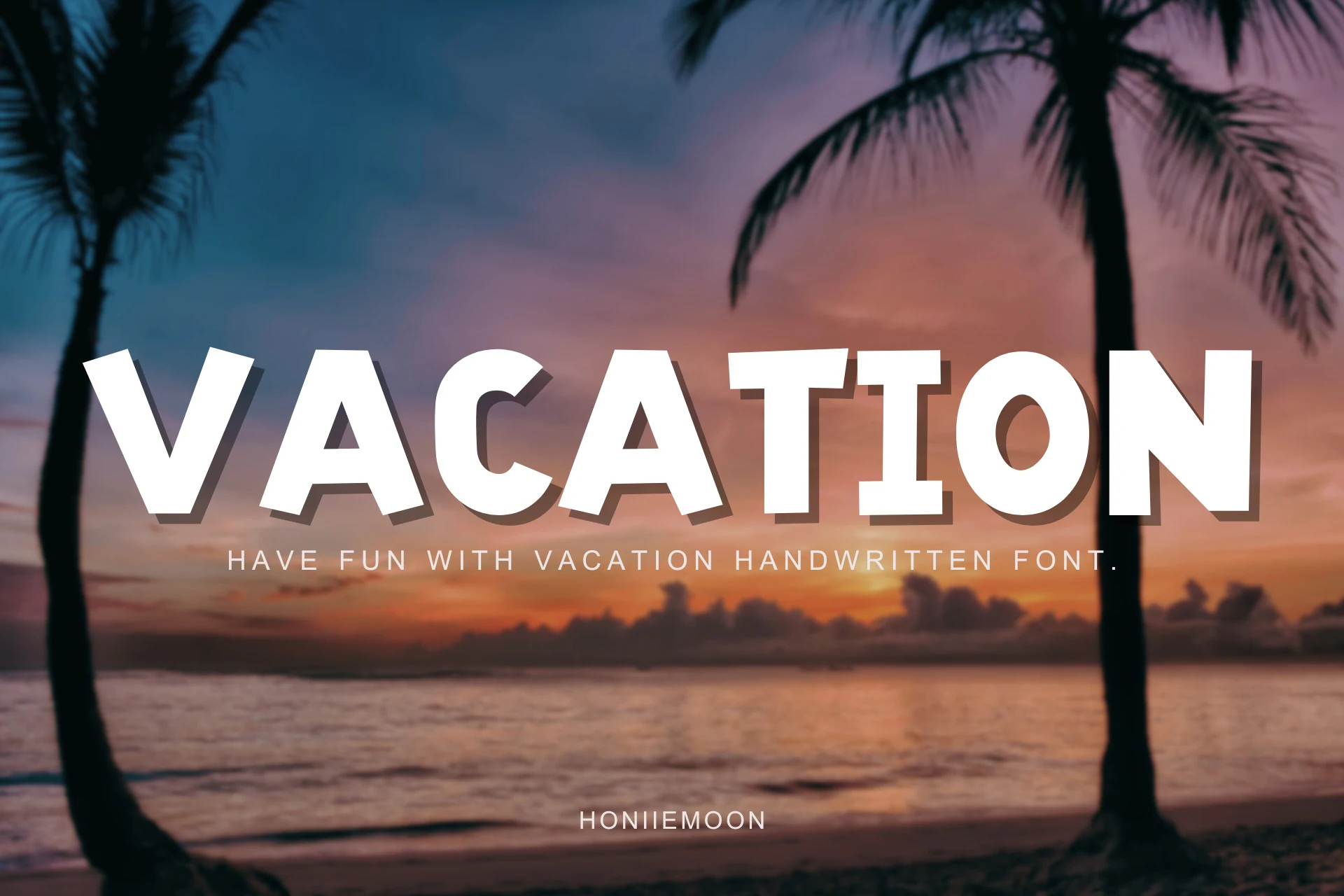
Best For: posters, logos, social media graphics, T-shirts
Vacation Font is a bold uppercase display face with wide blocky letters, angled cuts, and uneven slants that give the title a sun-faded poster attitude. Its heavy weight and clear counters make it useful for Vacation Fonts projects where the headline needs to read fast over photography, texture, or busy color.
The sharp diagonal rhythm works best in short words, large titles, and stacked layouts for posters, flyers, stickers, and apparel graphics. Use strong contrast and keep secondary text narrow and plain, because the main letters already provide the movement and visual weight.
Vacation Sunday Font
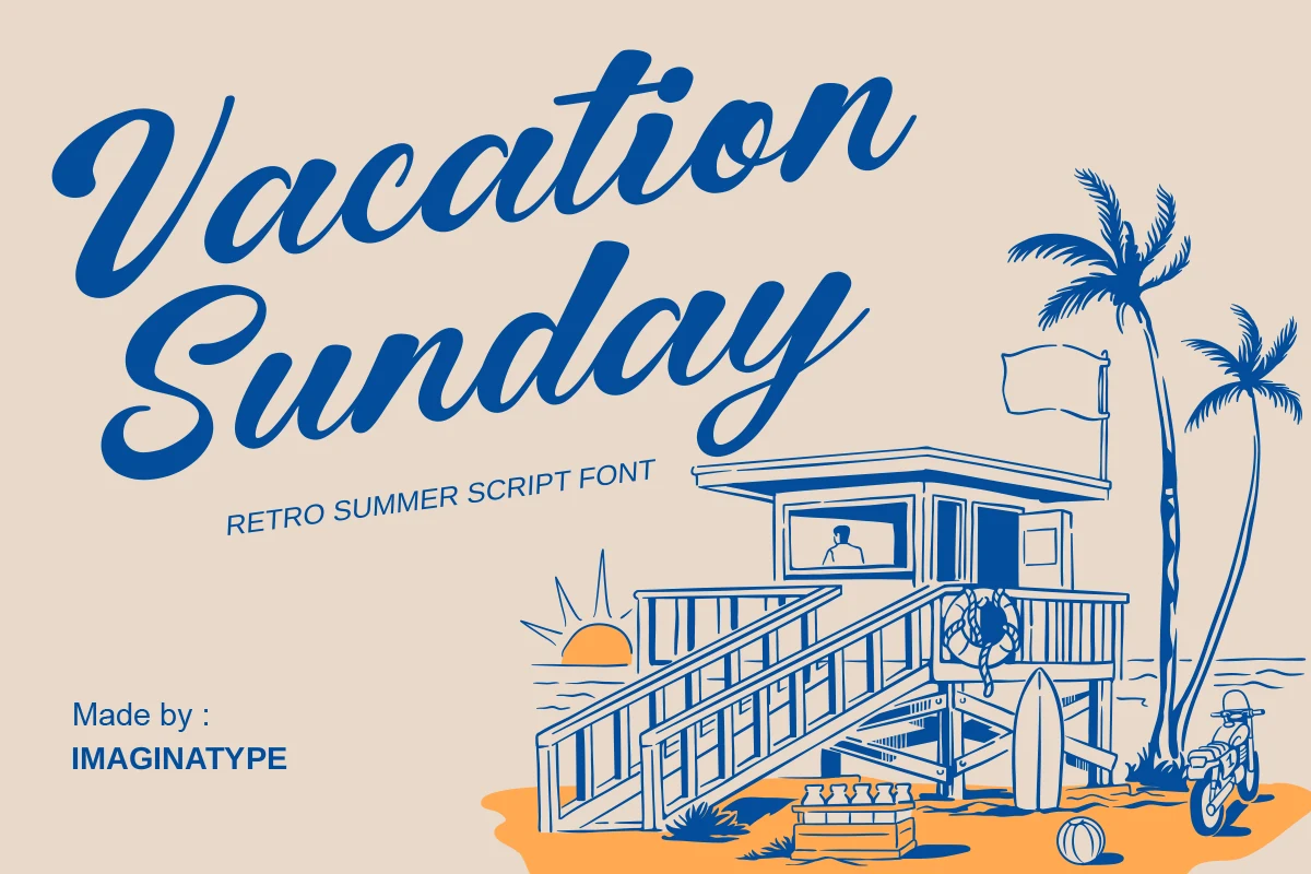
Best For: logos, posters, retro designs, vintage designs
Vacation Sunday Font has the thick, creamy rhythm of a retro beach script, with broad strokes, rounded joins, and long flowing terminals that instantly echo mid-century postcard lettering. It sits comfortably in a Vacation Fonts roundup because the letterforms feel sunny, nostalgic, and display-driven without losing readability.
The slanted baseline and generous curves give headlines plenty of motion, so it works best when you let it take the lead on short names or poster titles. Keep supporting text simpler and a bit tighter, which helps the script hold that 60s signage mood instead of getting visually crowded.
Cursive Holiday Font
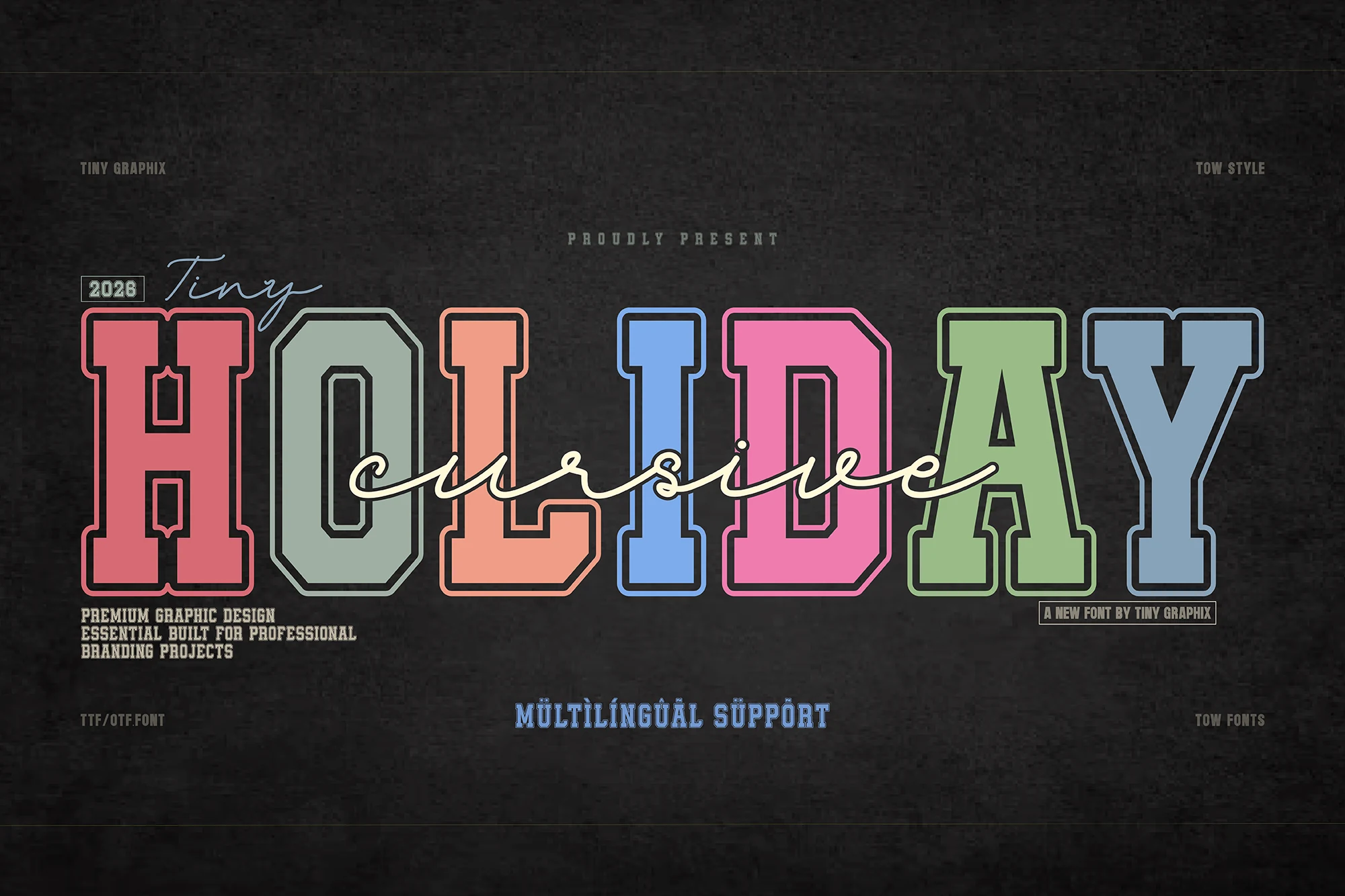
Best For: logos, branding, T-shirts, bold designs
Cursive Holiday Font combines a heavy varsity serif with a fluid script layer, giving the design strong headline weight and softer handwritten movement in one pairing. The block letters use sharp slab details, inner outlines, and a collegiate rhythm, while the script cuts across them with thin, looping strokes that add contrast for Vacation Fonts layouts with a sporty-retro edge.
This duo works best when the serif carries the main word and the cursive style acts as an accent, because the contrast is the point of the system. Use tight stacking, clear outlines, and limited supporting text so the athletic structure stays readable on apparel graphics, logotypes, and editorial-style covers.
Planing Vacation Font
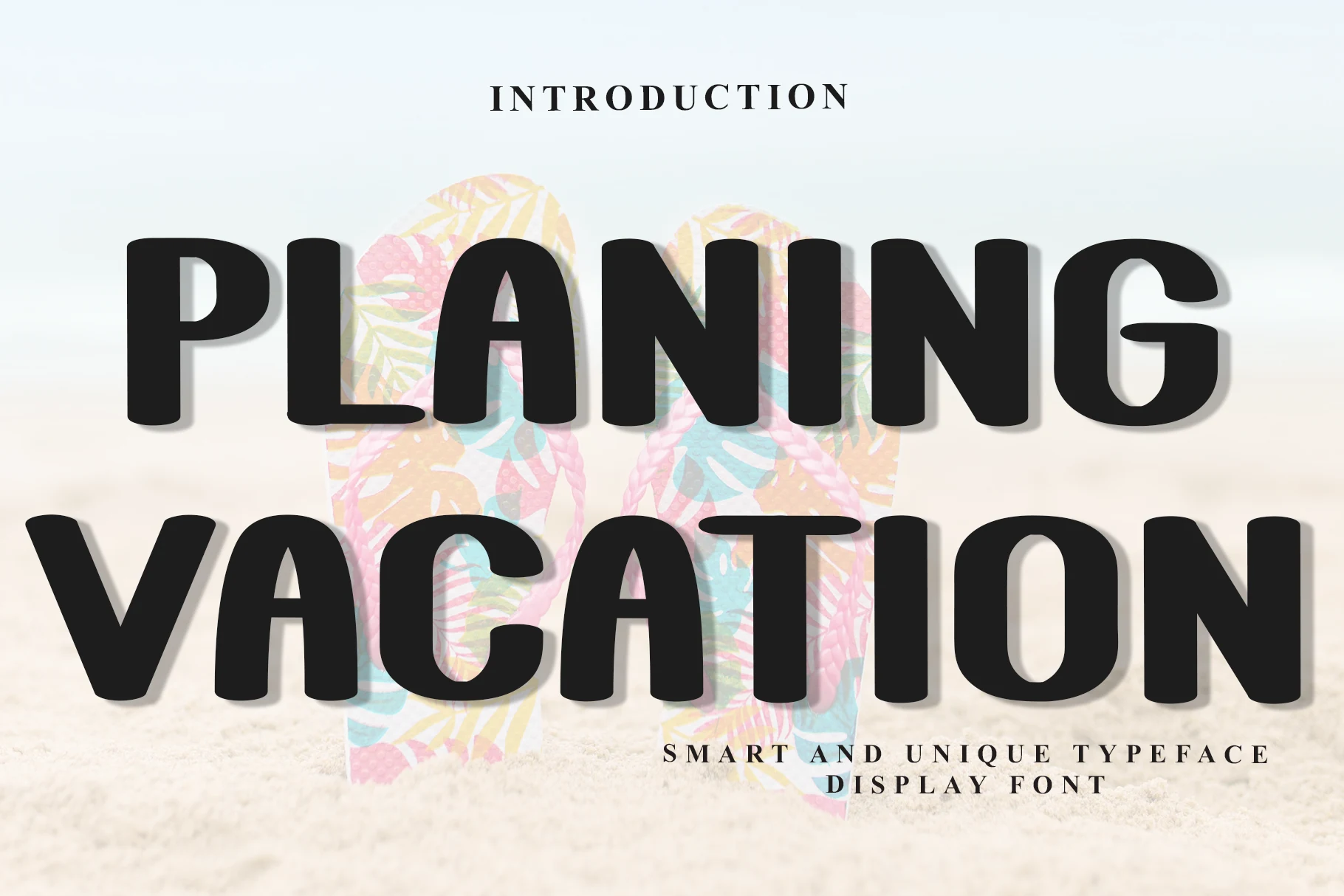
Best For: posters, headlines, social media graphics, bold designs
Planing Vacation Font uses a heavy rounded display style with wide proportions, soft corners, and dense strokes that make every word feel bold yet approachable. It reads cleaner than most novelty styles, so it fits naturally into Vacation Fonts roundups when you want a strong headline without losing legibility.
The even weight and compact shapes help it hold up well over photography, sandy textures, or simple layouts, which makes it especially effective for poster titles, greeting cards, and quick social graphics. Keep the main wording short and let the big forms lead, then use smaller restrained copy underneath for contrast.
The best vacation font depends on the mood of your project. Use retro scripts like Hustle Trip or Vacation Sunday for nostalgic travel branding, bold display fonts like Vacation or Planing Vacation for posters and merch, and playful handwritten styles like Playful Holiday or Love Holiday for stickers, quotes, and casual summer graphics.