16 Best Cool Vintage Fonts in 2026
Cool Vintage Fonts span connected sign-painting scripts, distressed slab lettering, Western-inspired serifs, pixel grids, typewriter textures, and compact sans displays. Their practical roles differ just as sharply: some suit short logos and invitations, while others preserve clarity in posters, packaging, signage, and headline layouts.
Looking for more cool fonts? Browse our complete Cool Fonts collection to compare bold, vintage, retro, script, and gothic cool styles.
Cool Vintage Fonts: Connected Retro Scripts
These Cool Vintage Fonts share connected strokes, rounded terminals, slant, swashes, or layered effects that create movement. Unlike the blockier groups, they work best for short, expressive display wording rather than dense information.
Barbie Vintage Font
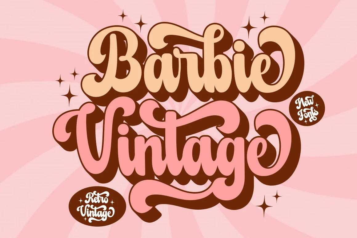
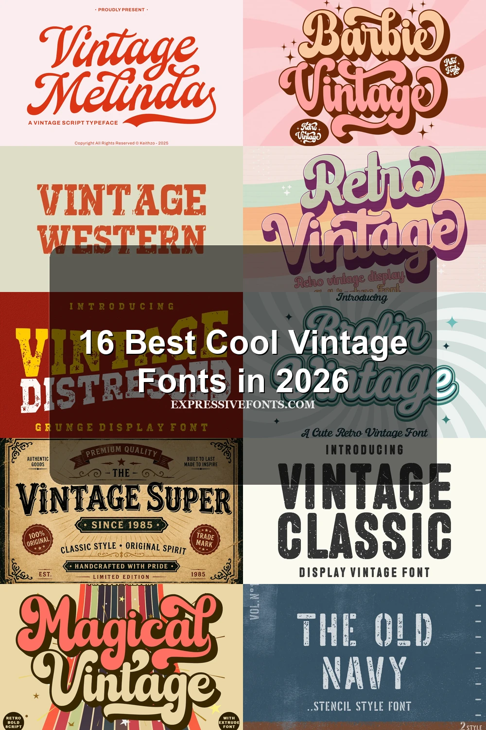
Barbie Vintage Font uses thick, connected, right-leaning strokes, oversized swash terminals, and a built-in drop shadow. It is one of the more theatrical Cool Vintage Fonts choices for headlines and posters, but the layered details need generous display sizing to remain clear.
Vintage Melinda Font
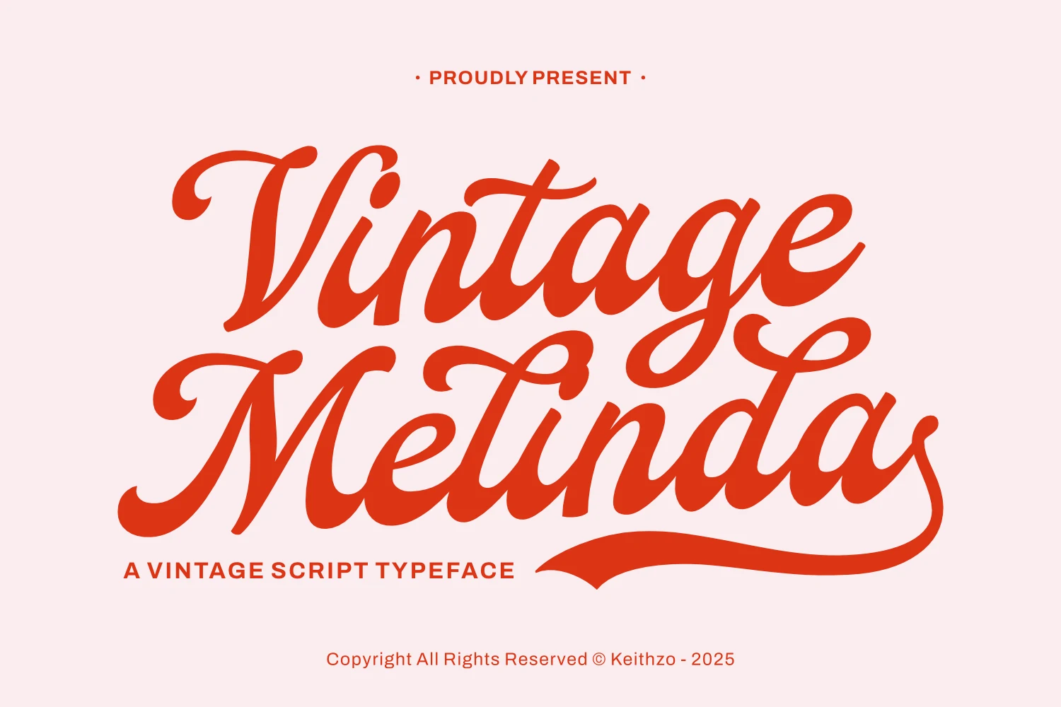
Best For: logos, branding, headlines
Vintage Melinda Font suits logos, branding, and short headlines where its high-contrast connected script can move prominently across the layout. A pronounced rightward slant, integrated swashes, and flourished tails add energy, while thin-thick variation makes extended wording and small settings harder to read. As Cool Vintage Fonts go, it is firmly display-oriented.
Brolin Vintage Font
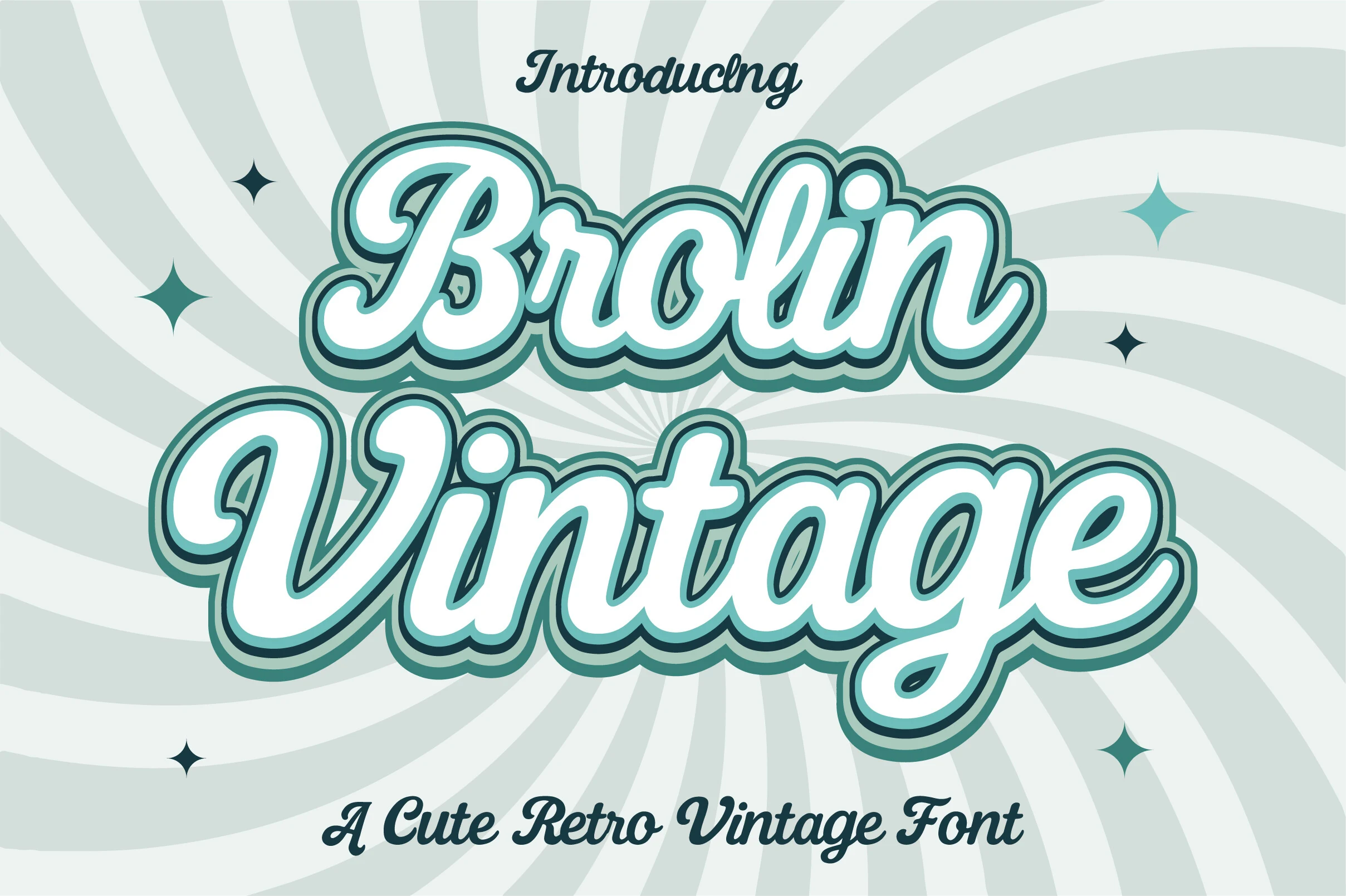
Best For: logos, posters, headlines
Brolin Vintage Font softens its connected script with bold monoline strokes, rounded terminals, and a layered outline. The outline helps letters separate at display sizes, making it useful for logos, posters, and headlines, but continuous joins make long wording inefficient.
Back to Vintage Font
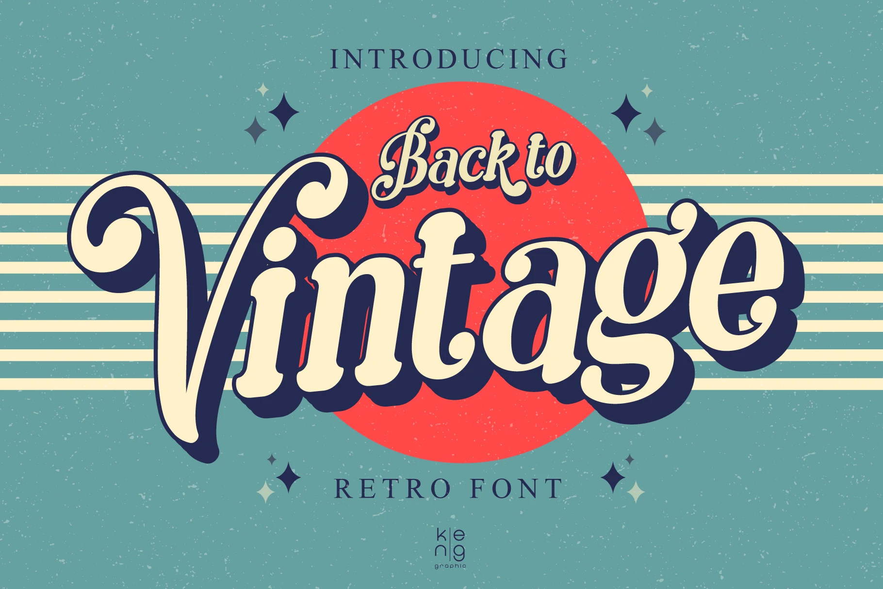
Best For: posters, packaging, logos
Back to Vintage Font pairs a high-contrast connected script with rounded corners, expressive swashes, and a conspicuous drop shadow. The shadow adds depth to posters and packaging, but it competes with fine script details when reduced.
Retro Vintage Font
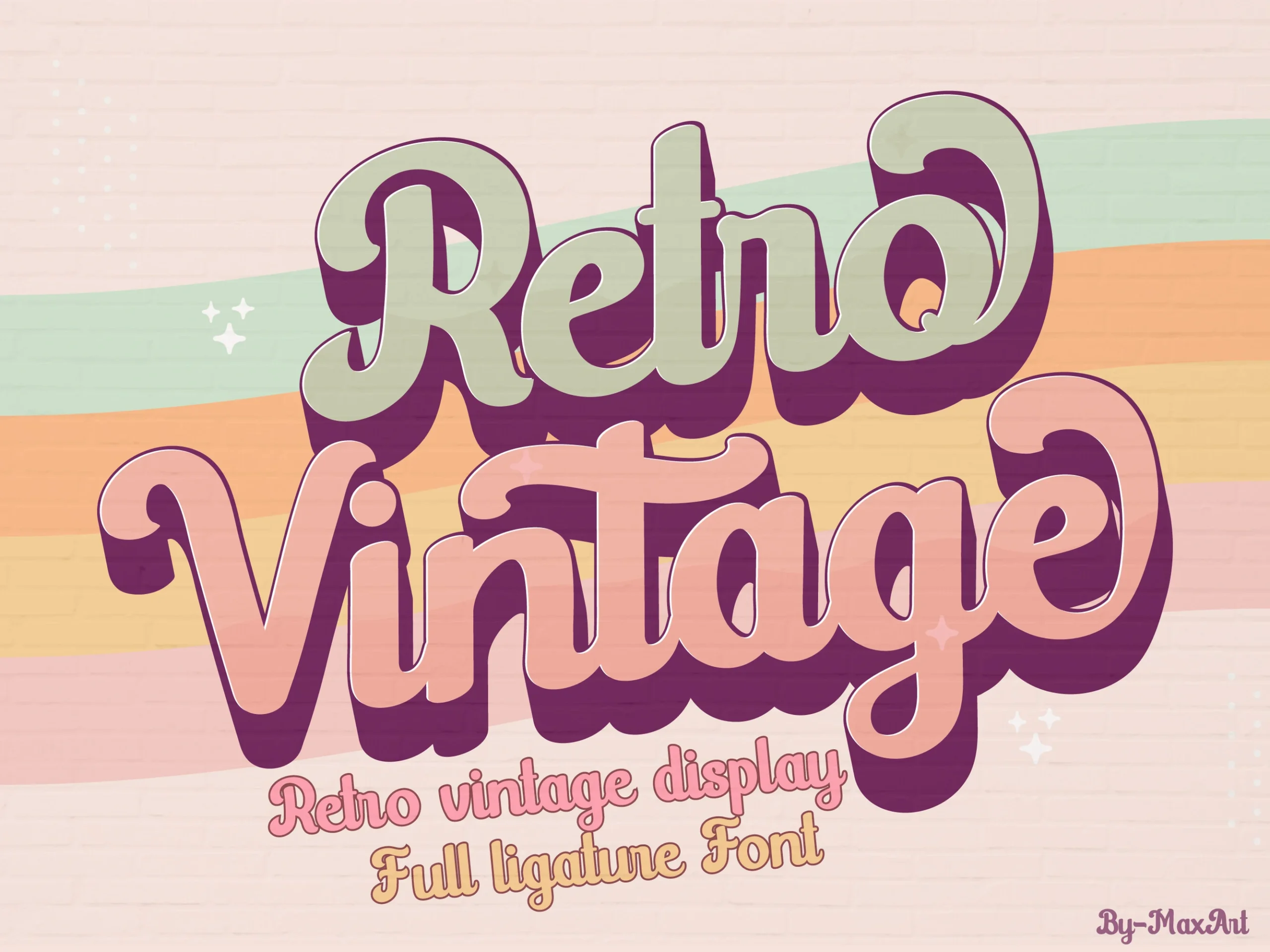
Best For: logos, branding, invitations
Retro Vintage Font relies on heavy connected lettering, uniform strokes, rounded terminals, and exaggerated loops rather than sharp contrast. That approachable construction suits invitations and identity marks, but dense joins restrict reading length and make large display sizing preferable.
Magical Vintage Font
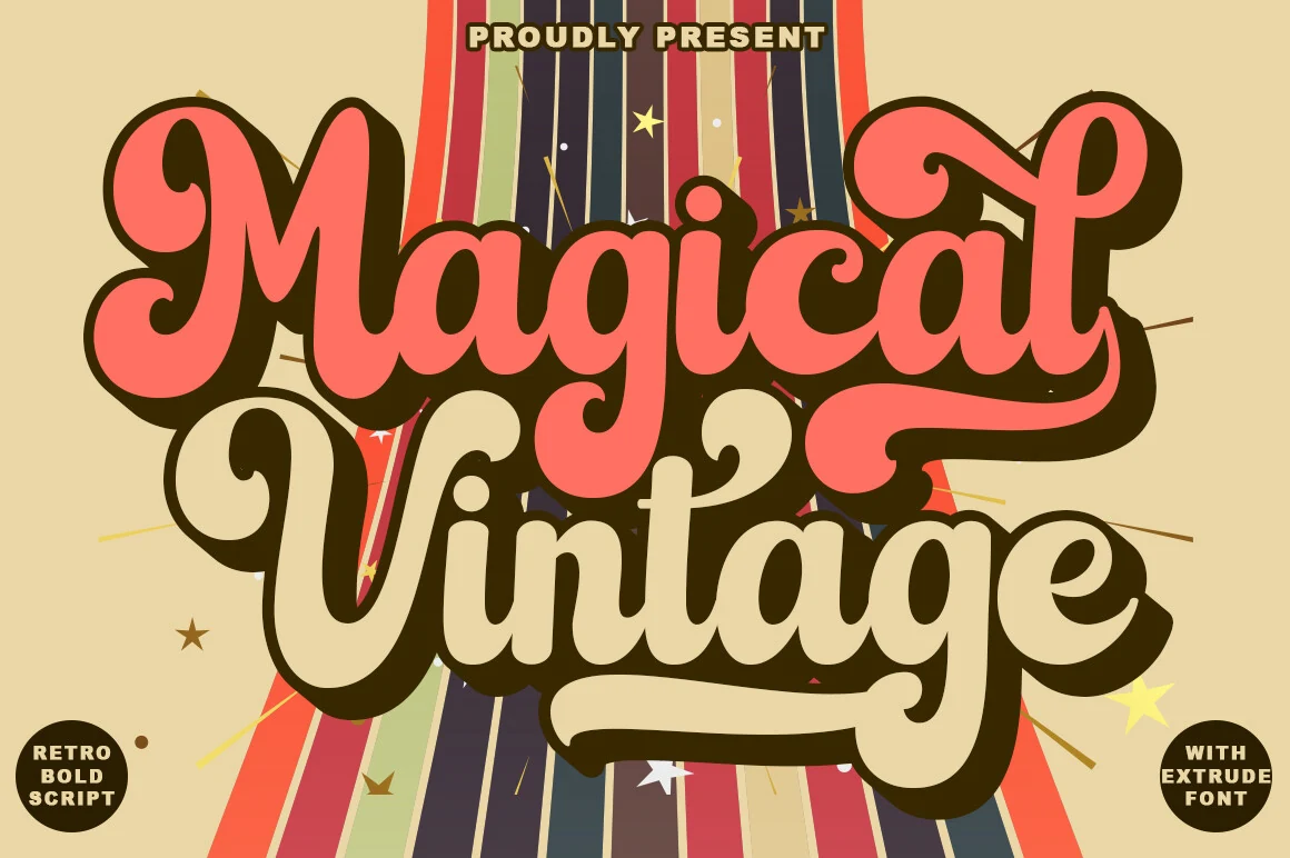
Best For: logos, branding, product labels
Magical Vintage Font is a bulbous, right-leaning connected script with rounded terminals and exaggerated curves. Its thick, flowing construction suits logos, branding, and product graphics, although the joined forms remain intended for short display wording rather than extended text.
Weathered Slabs And Western Signs
Heavy slab serifs, stencil gaps, block proportions, and distressed cuts connect this group to worn signs and industrial lettering. Their mass holds up at poster scale, but texture and weight limit small text.
The Old Navy Font
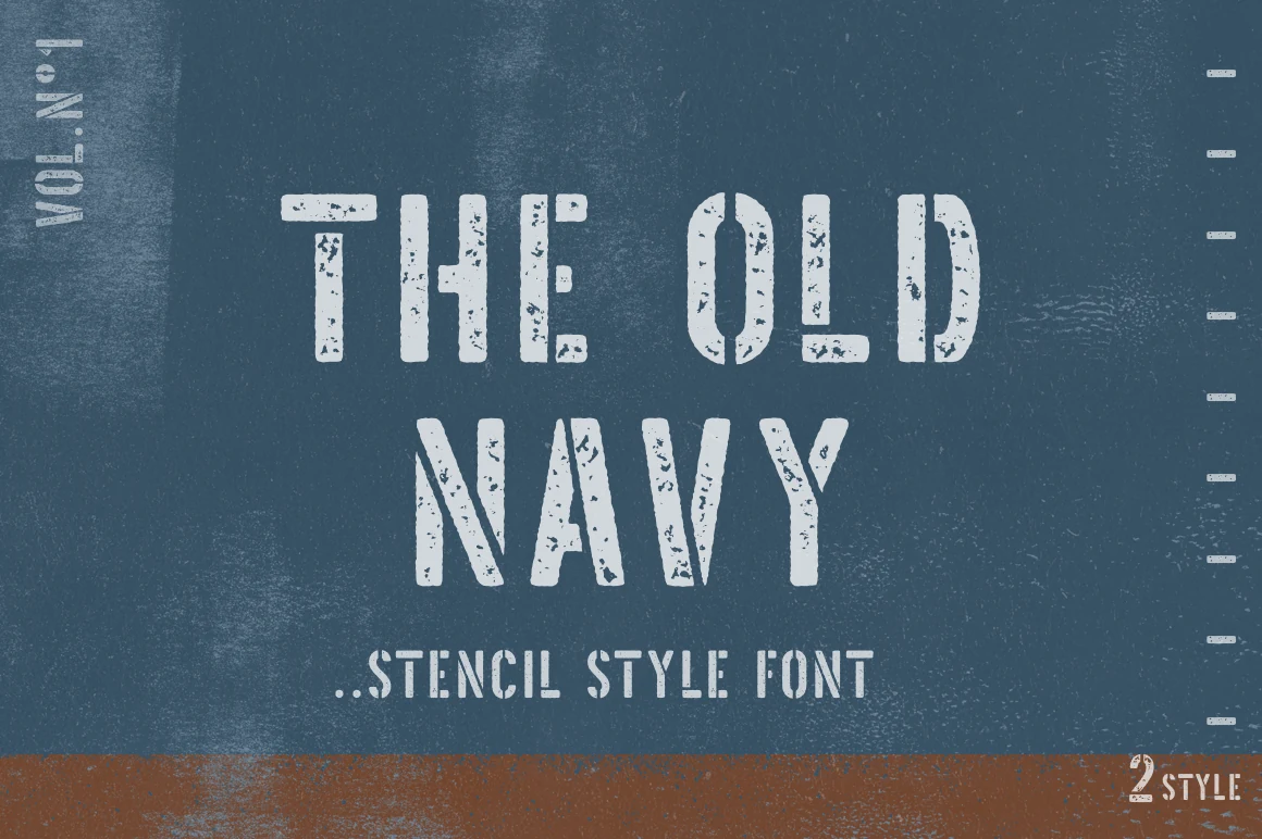
Best For: posters, signage, T-shirts
The Old Navy Font combines heavy slab lettering with stencil gaps and a weathered surface, producing a military-industrial sign effect. Its regular and grunge versions provide texture control, but the interrupted strokes need poster or signage scale to stay legible.
Vintage Strong Font
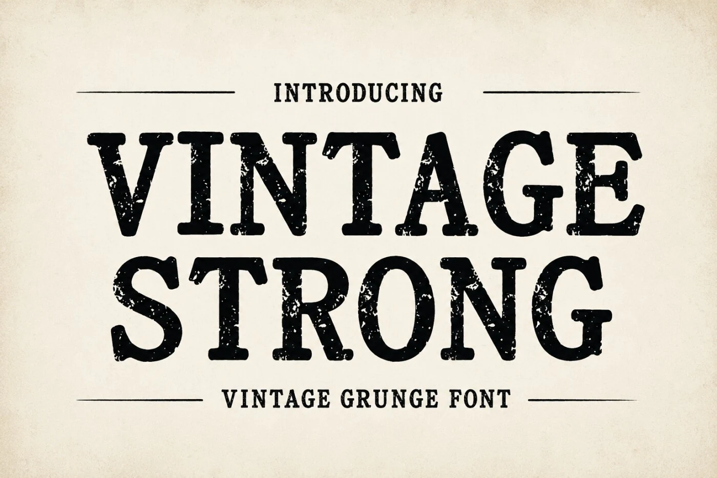
Best For: posters, signage, branding
Vintage Strong Font is defined by wide, substantial slab-serifs, uniform heavy strokes, and a roughened grunge finish. The broad silhouette holds together in large headings and signage, although its weight and texture can overwhelm smaller branding applications.
Second Vintage Font
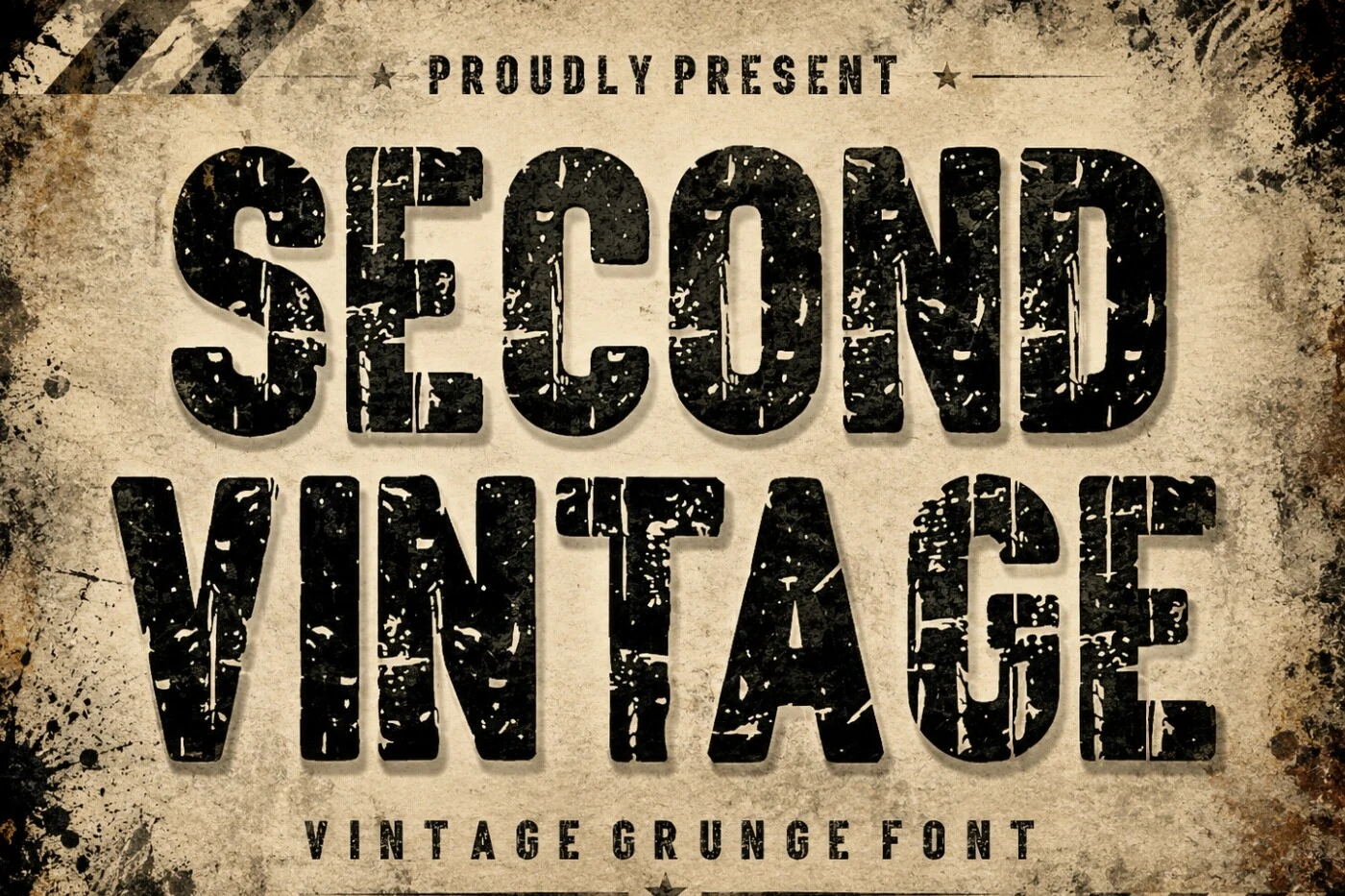
Best For: display text, headlines, signage
Second Vintage Font uses condensed slab-serif letters with heavy internal distress and a worn industrial surface. Its compact width fits signage and poster compositions efficiently, while dense grunge noise makes long wording slower to scan.
Vintage Distressed Font
Best For: posters, T-shirts, logos
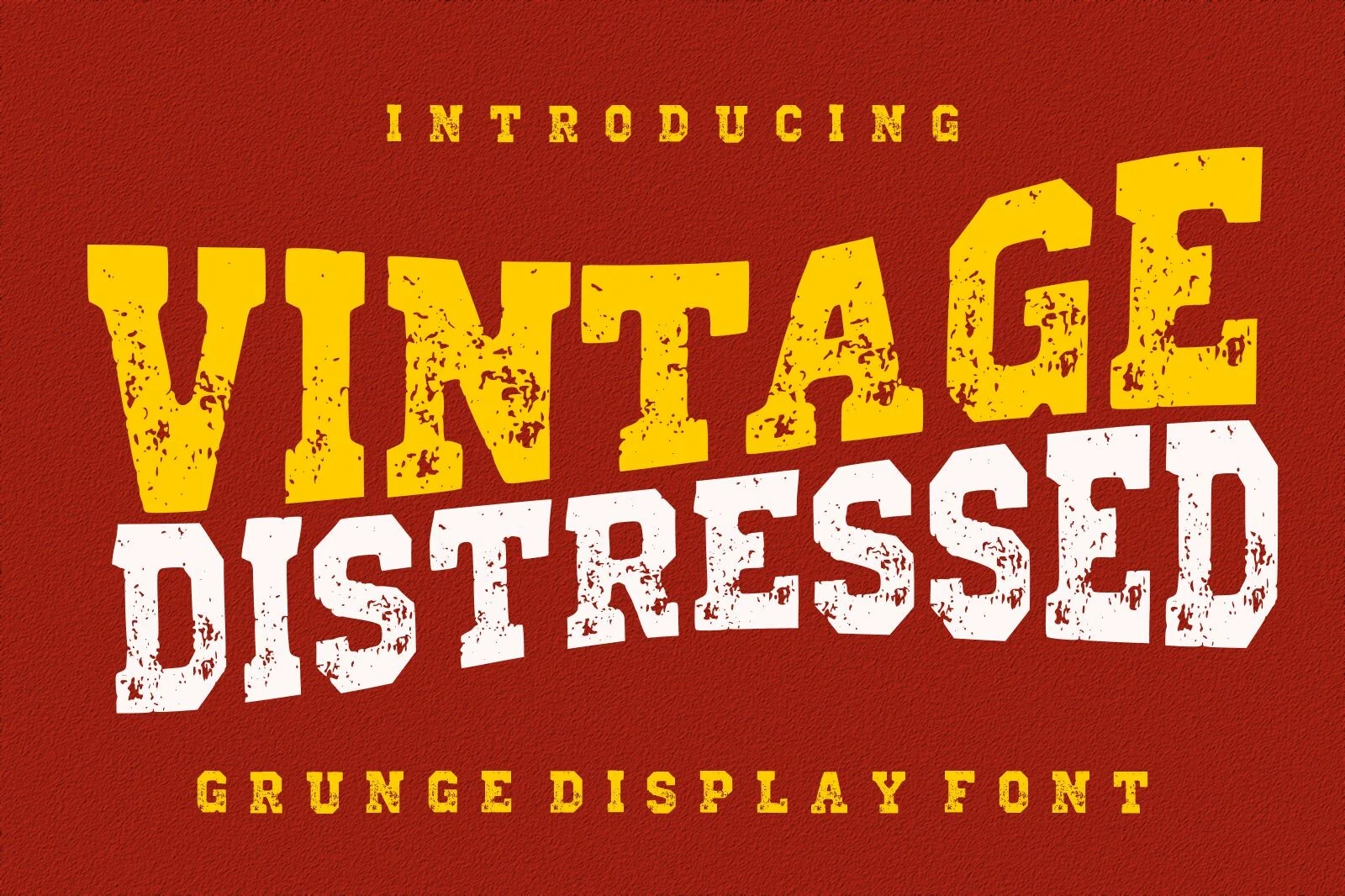
Vintage Distressed Font emphasizes mass through blocky slab serifs, minimal contrast, and dense surface distress. The sturdy silhouette supports logos and T-shirts, but small applications lose clarity as the texture breaks up counters and internal spaces.
Vintage Western Font
Best For: logos, product labels, signage
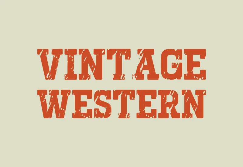
Vintage Western Font gives regular-width characters block-like proportions, heavy slab serifs, bracketed details, and woodblock-style distressed cuts. Its stable silhouette suits labels and signage, while the surface treatment gradually reduces definition in smaller text.
Vintage Magic Font
Best For: signage, headlines, packaging
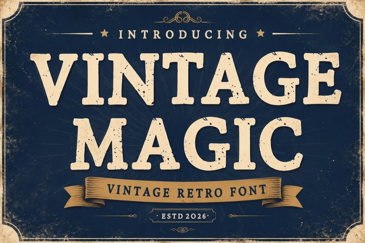
Vintage Magic Font uses regular proportions and thick slab serifs to create a stable block silhouette beneath a distressed Western-sign texture. Its large forms remain readable on packaging and signage, while the surface details lose value at very small sizes.
Pixel, Typewriter, And Condensed Displays
This mixed group relies on visible systems: square pixels, monospaced impressions, condensed serifs, or sans-serif frames. Compared with scripts and slabs, these fonts offer more rigid alignment or tighter footprints.
Old Game Font
Best For: posters, T-shirts, display text
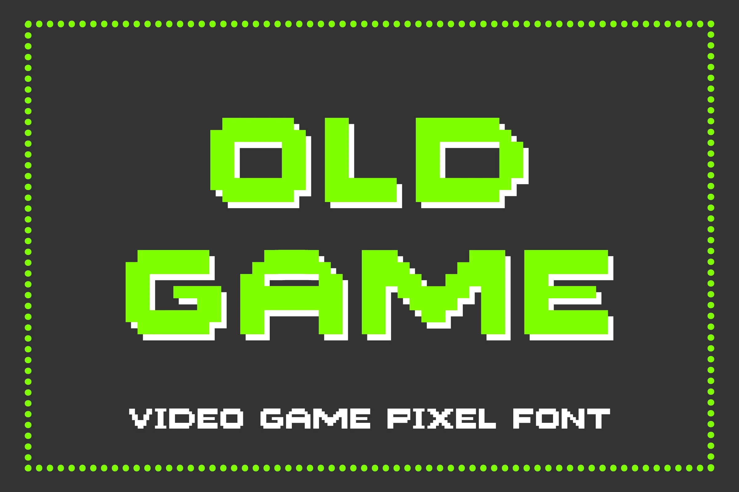
Old Game Font builds every character on a monospaced 8-bit square grid, with uniform strokes and sharp 90-degree joints. Its crisp geometry stays readable when enlarged, making it effective for deliberately digital posters, T-shirts, and display text, though it offers little flexibility outside that role.
Vintage Super Font
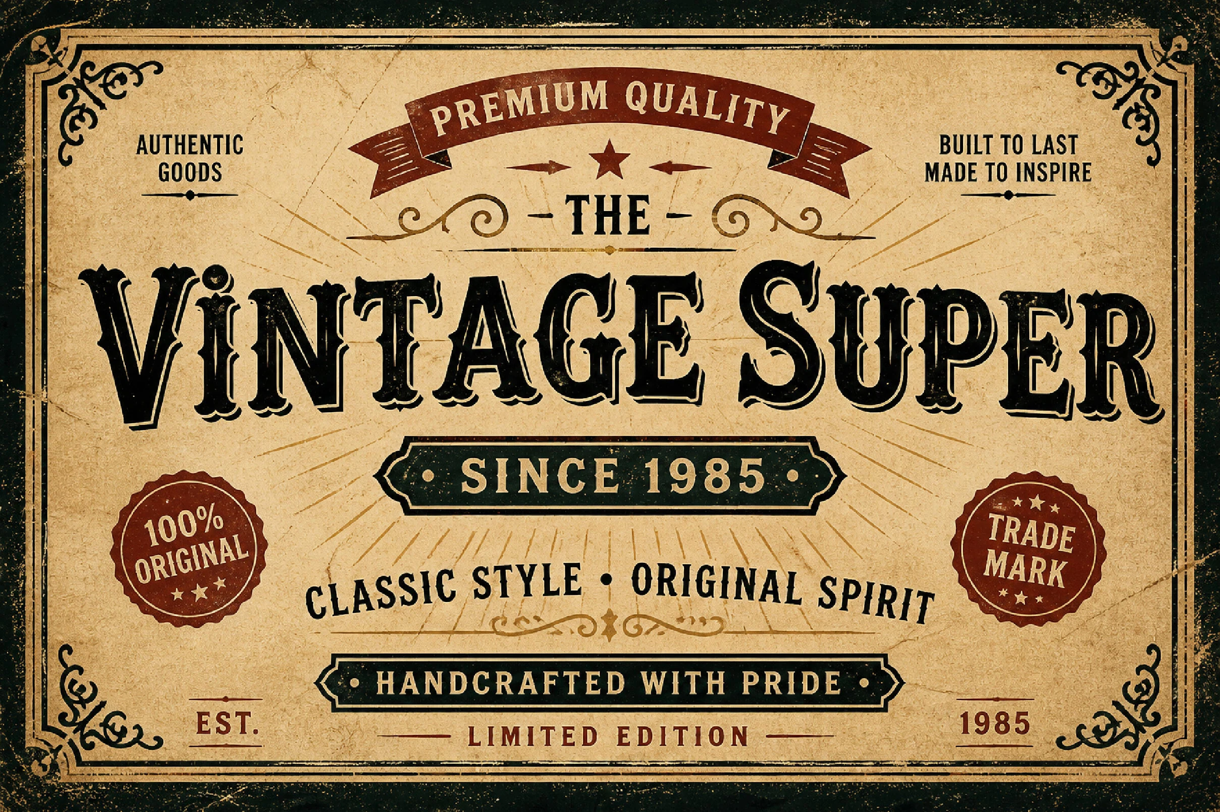
Best For: headlines, posters, display text
Vintage Super Font packs ornate, high-contrast serifs, condensed proportions, and a drop shadow into a tightly framed Western display style. Among Cool Vintage Fonts, its narrow footprint is especially useful for headline layouts, but intricate serif details require generous reproduction size for clarity.
Old Typewriter Font
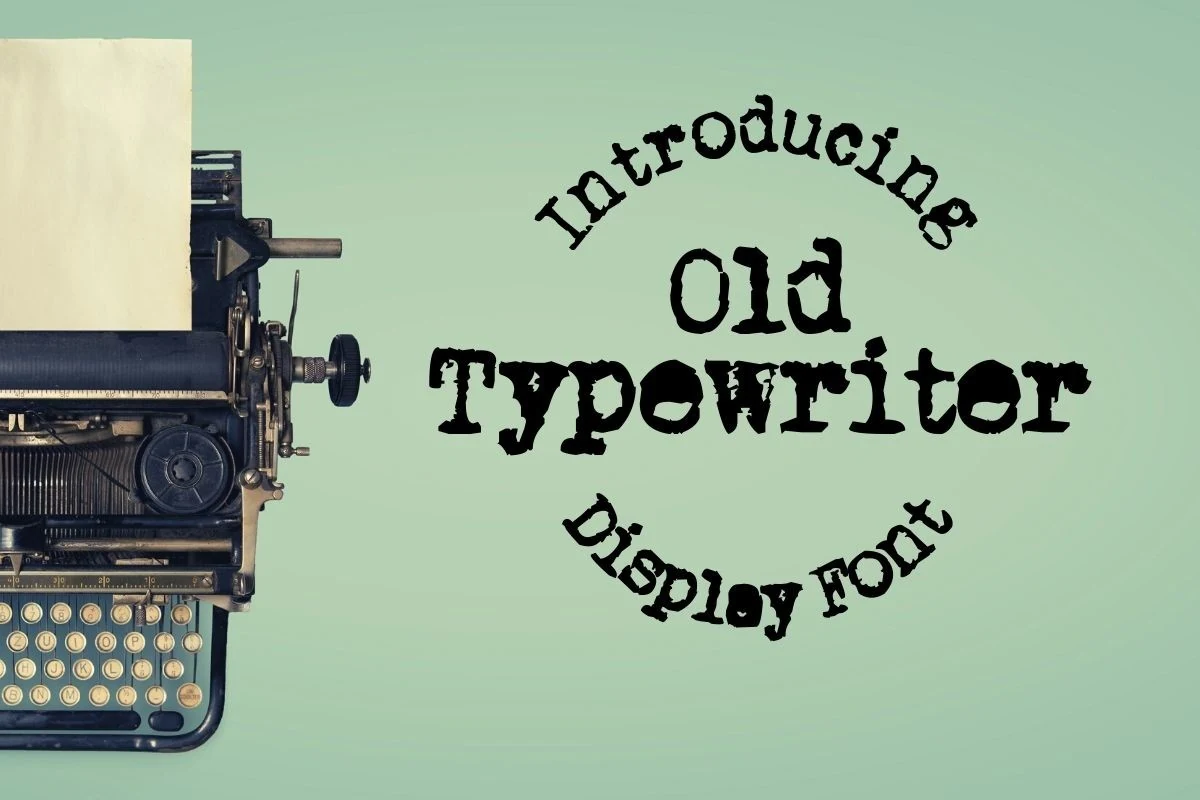
Best For: posters, logos, headlines
Old Typewriter Font combines monospaced slab-serif forms with irregular, ink-stamped edges that mimic distressed impressions. This Cool Vintage Fonts option adds print character to posters and logos, but its uneven texture makes small headline settings less dependable.
Vintage Classic Font
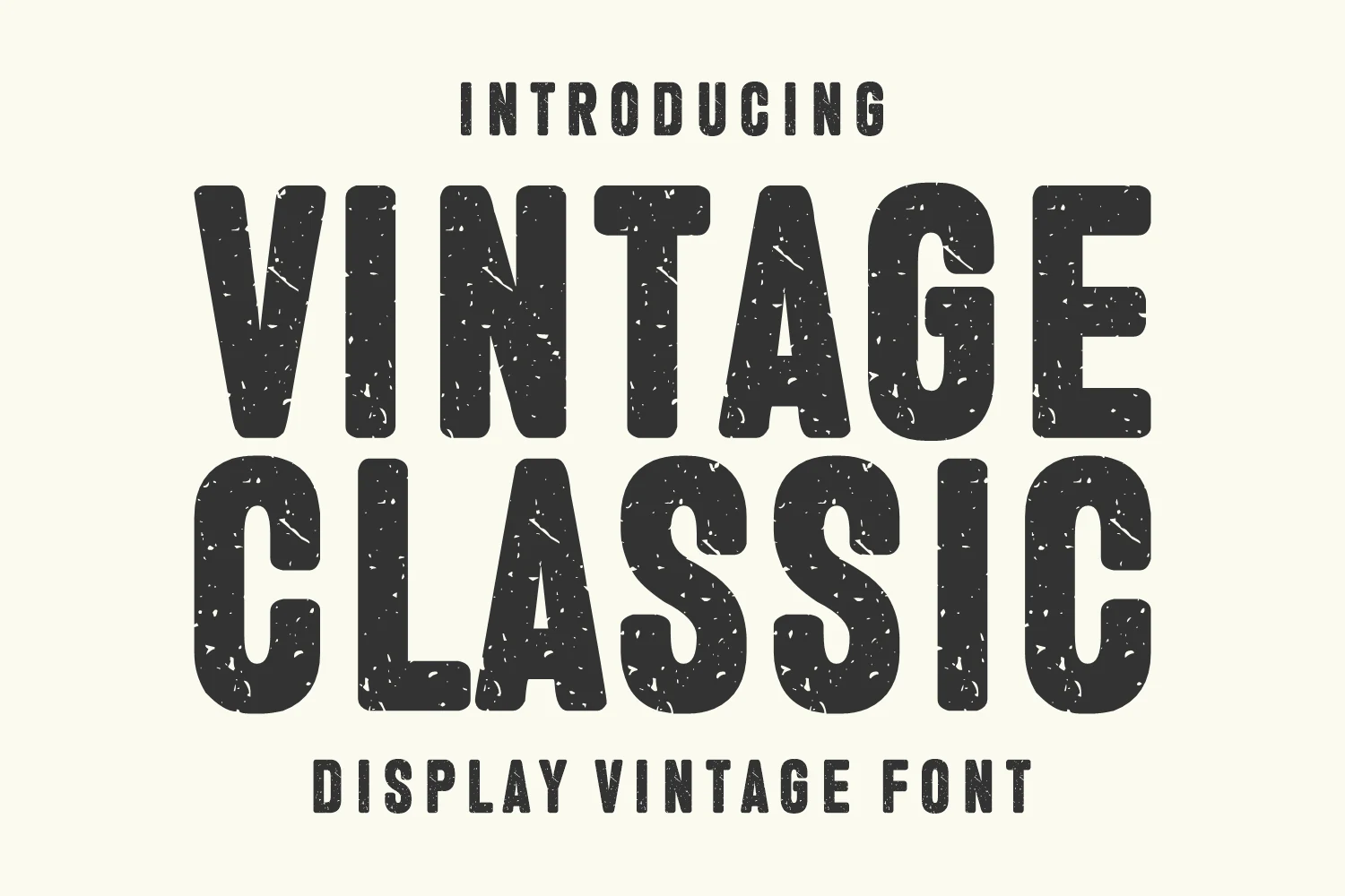
Best For: logos, branding, posters
Vintage Classic Font replaces serif ornament with a condensed sans-serif frame, rounded terminals, uniform heavy strokes, and worn texture. The squeezed width supports compact logos and headlines, though distress can compromise tiny text and fine-scale branding.
How to Choose the Right Font
Choose Cool Vintage Fonts by matching construction to scale and message: connected scripts need short wording and generous size, distressed slabs benefit from texture-tolerant posters or signs, and pixel, typewriter, or condensed styles offer more controlled footprints. Check joins, contrast, shadow, flourishes, and damaged counters at the final reproduction size before committing.