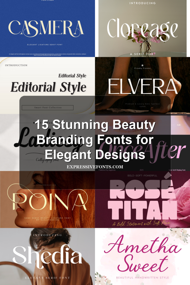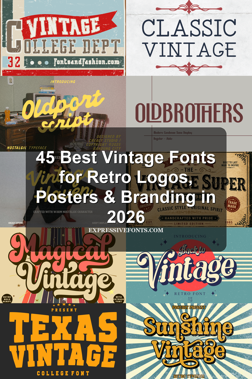
45 Best Vintage Fonts for Retro Logos, Posters & Branding in 2026
Vintage Fonts are still a strong choice in 2026 for designs that need character, texture, and a clear old-school mood. This collection brings together 45 retro-inspired typefaces for logos, posters, packaging, apparel, labels, and branding projects, from groovy scripts to varsity slabs and distressed display fonts.
Retro Vintage Font
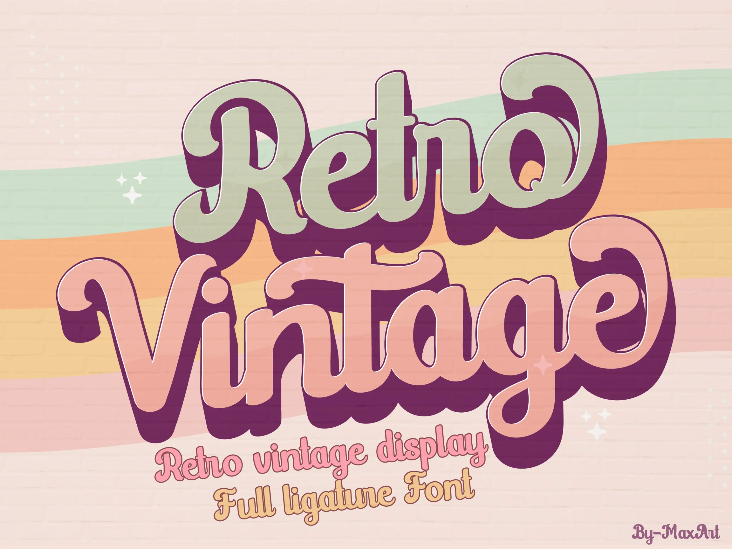
Best For: logos, branding, retro designs, vintage designs
Retro Vintage Font has thick, looping script letters with rounded terminals, stacked swashes, and a heavy shadow-like mass that gives each word a poster-style rhythm. The connected forms feel soft and nostalgic rather than formal, so the type works best where the lettering can act as the main graphic element.
For Vintage Fonts projects, use it in short phrases, logos, invitations, or social graphics where the curves have enough space to stay readable. Tight spacing will crowd the inner loops, while strong contrast and a simple supporting typeface help keep the title hierarchy clear.
Noah Font
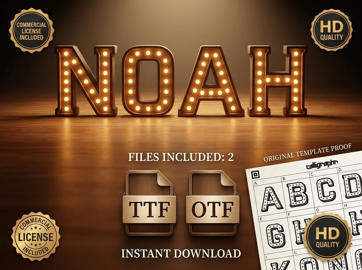
Best For: logos, posters, headlines, signage
Noah Font channels classic marquee lettering through sturdy slab-serif forms, squared proportions, and an inset bulb pattern that gives each letter a lit stage-sign presence. The structure feels solid and architectural, while the glowing interior detail brings in Old Hollywood drama without making the shapes hard to read.
In Vintage Fonts roundups, this one stands out when the title itself needs to carry the mood. Use it for posters, event branding, or cinematic headers, and give the letters enough scale and breathing room so the light pattern stays crisp; a plain supporting typeface helps keep the hierarchy clean.
Vintage King Font
Best For: logos, branding, vintage designs, old-school designs
Vintage King Font uses ornate serif letters with irregular hand-drawn edges, carved interior lines, and decorative curves that give the words an aged sign-painter character. Its narrow counters and distressed detailing make the type feel handmade rather than polished, with a romantic vintage touch carried mostly through the flowing ornamentation.
For Vintage Fonts projects, keep this one in display roles where the decorative texture can stay visible. It suits logos, labels, and short headings, but the spacing needs room around each word; crowding the letters will blur the inner strokes and weaken the old-style silhouette.
Old Charlotte Font
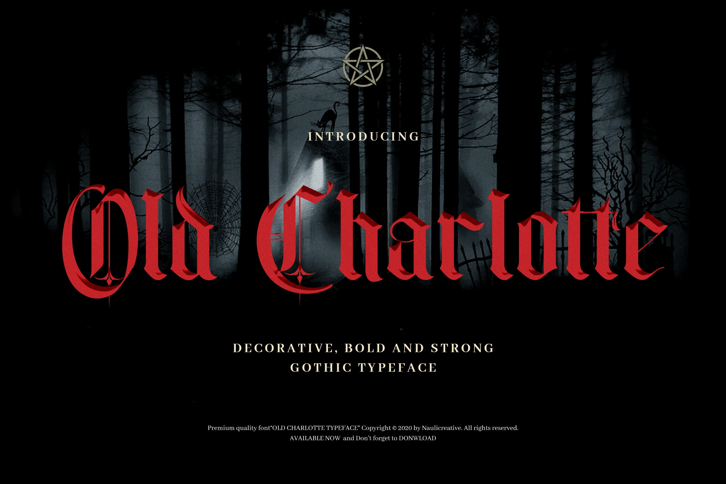
Best For: logos, posters, headlines, decorative designs
Old Charlotte Font leans into a dramatic blackletter look, with tall angular forms, split terminals, and deep curves that give each word a carved, ceremonial weight. The strokes feel bold and decorative rather than delicate, so the type carries a dark Gothic presence even in a short title.
Within Vintage Fonts, this one works best when you treat it as the focal point. Use it for logos, posters, or short headings, and keep the wording tight; the dense shapes and narrow counters read more cleanly when paired with generous spacing and a plain secondary typeface underneath.
Vintage Spur Font
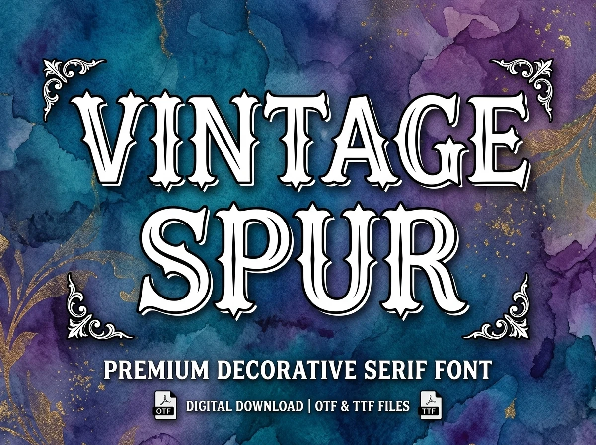
Best For: logos, posters, decorative designs, vintage designs
Vintage Spur Font has a bold decorative serif structure with wide letterforms, sharp spurred terminals, and inline detailing that gives the strokes a carved sign-shop feel. The heavy outline increases contrast around the white letters, making the style read as old-school display type rather than a quiet serif.
In a Vintage Fonts collection, it fits short titles that need a clear ornamental edge: posters, labels, logos, and header graphics. Keep the word count limited and avoid tight tracking, because the inner lines and pointed serifs need open spacing to stay crisp at smaller sizes.
Oldport Script Font
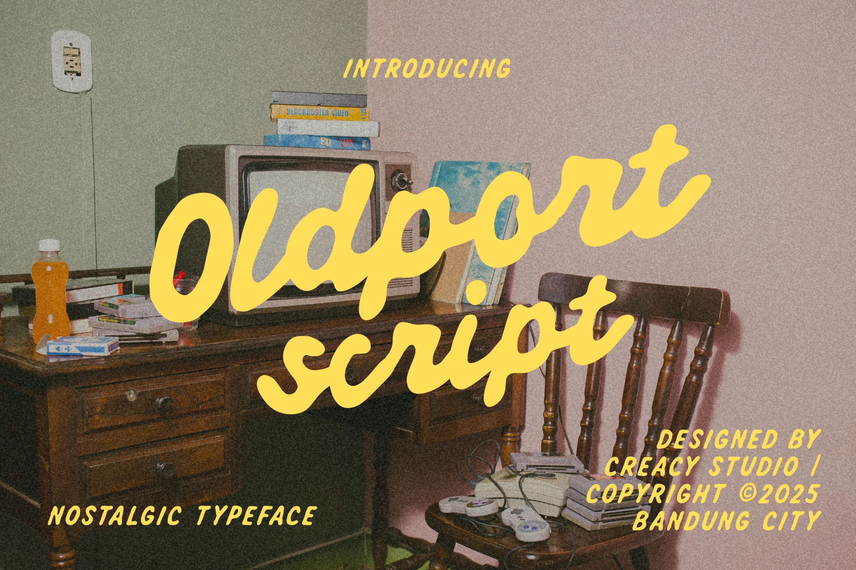
Best For: logos, branding, vintage designs, nostalgic designs
Oldport Script Font has a chunky handwritten look with rounded strokes, soft terminals, and a smooth connected flow that feels easygoing rather than polished. The broad monoline shapes give it a warm retro voice, while the slight slant and casual rhythm keep the lettering friendly and full of lived-in charm.
In Vintage Fonts lineups, it works best when you let the script do the talking. Use it for short headlines, logos, or packaging where the thick curves stay clear, and pair it with a plain sans for supporting text so the heavy handwritten forms do not crowd the layout.
Old Brothers Font
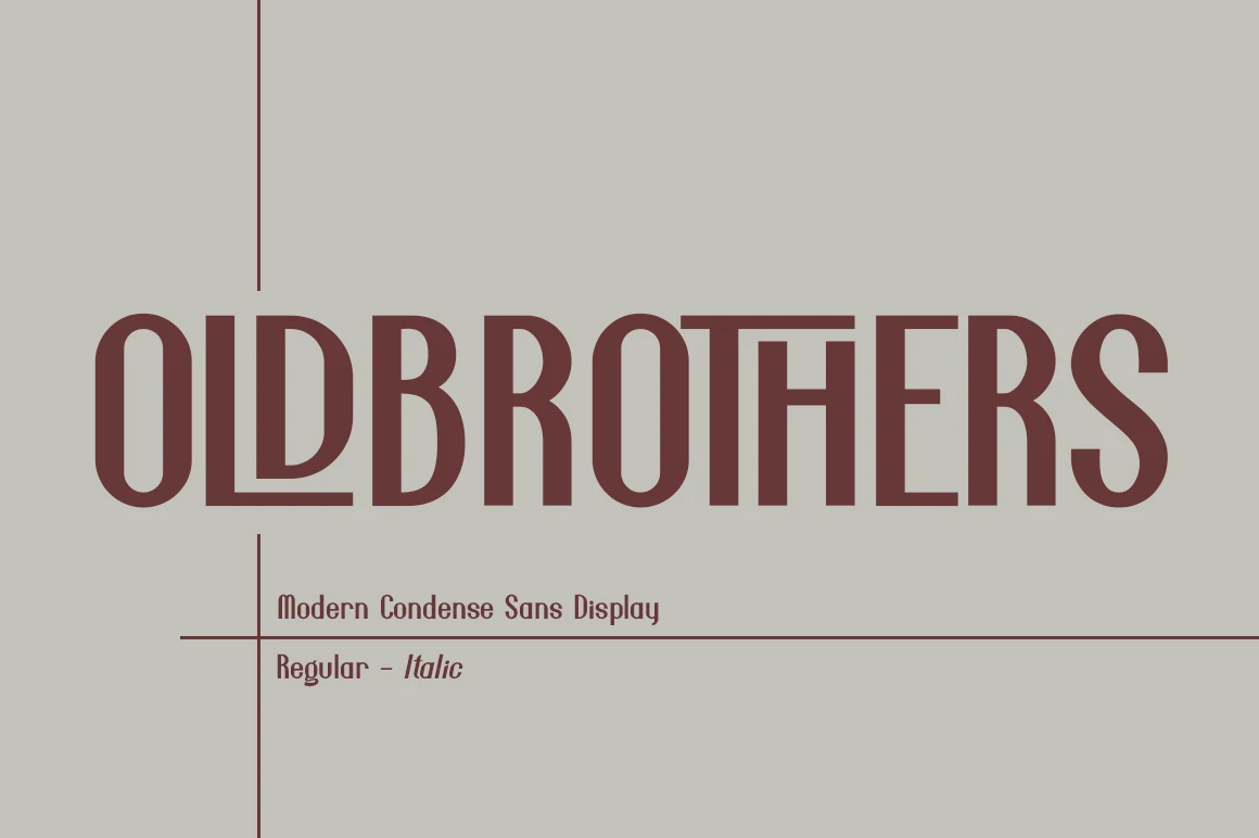
Best For: logos, branding, headlines, vintage designs
Old Brothers Font uses tall condensed sans serif letters with heavy vertical strokes, narrow proportions, and softened interior curves that give the wordmark a strong retro-industrial feel. The compact width creates impact without needing decorative texture, making the lettering feel clean, firm, and display-focused.
For Vintage Fonts projects, it works best in logos, headlines, posters, and packaging where a bold title needs structure more than ornament. Keep the tracking controlled but not cramped; the narrow counters need a little space so the condensed rhythm stays readable across longer words.
Strong Vintage Font
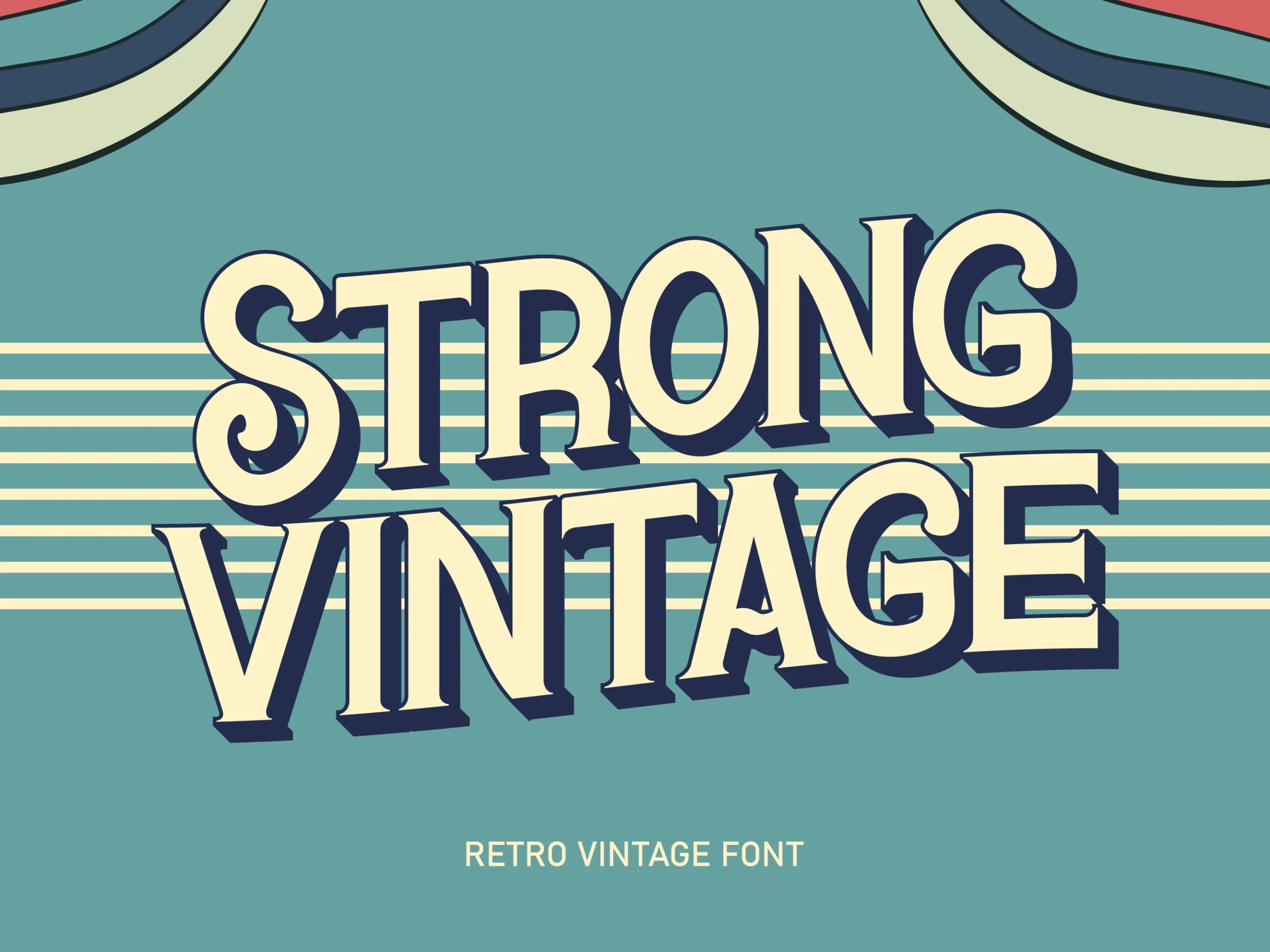
Best For: logos, posters, headlines, vintage designs
Strong Vintage Font leans on broad serif shapes, rounded inner curves, and a slightly condensed stance that gives the lettering a sturdy retro sign feel. The thick strokes create immediate impact, while the curled terminals in letters like S and G keep the overall look warm and approachable rather than stiff.
In Vintage Fonts lineups, it works especially well for posters, logos, and title treatments that need weight without heavy ornament. Let it run large and keep supporting text simple; the compact width and strong vertical rhythm read best when spacing stays even and the wording remains fairly short.
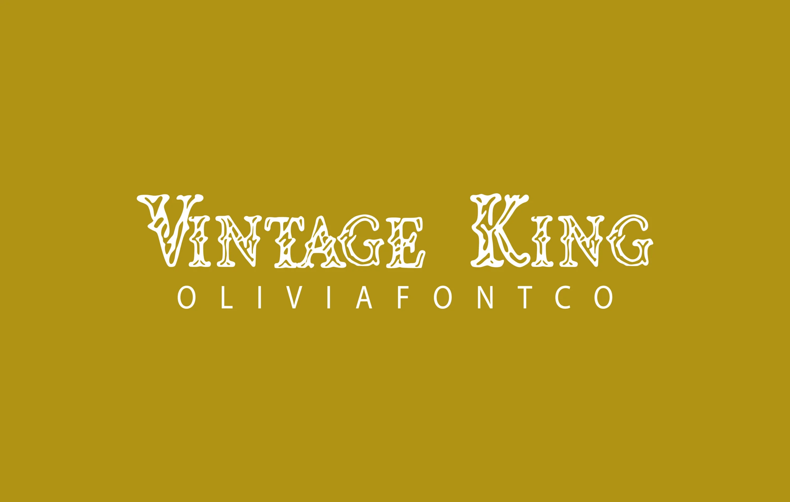
Vintage King Font
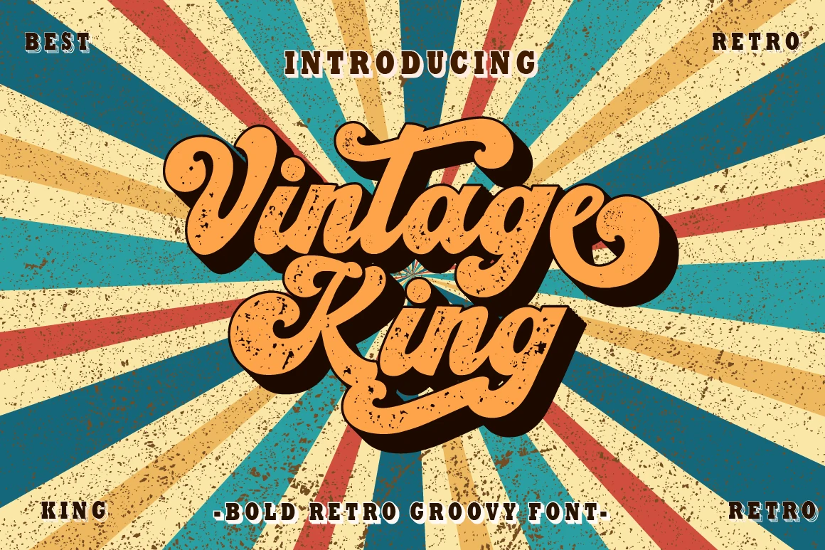
Best For: logos, branding, headlines, retro designs
Vintage King Font has a bold groovy script style with thick rounded strokes, curled terminals, and a heavy shadow that pushes the lettering into classic 1970s display territory. The distressed texture gives the forms a printed poster feel, while the connected rhythm keeps the wordmark lively and compact.
For Vintage Fonts projects, use it where the title can carry most of the visual weight: logos, magazine-style headers, branding, and short promotional phrases. Its PUA encoding gives access to glyphs and swashes, which helps refine endings and build stronger custom word shapes without overcrowding the layout.
Halloween Vintage Font
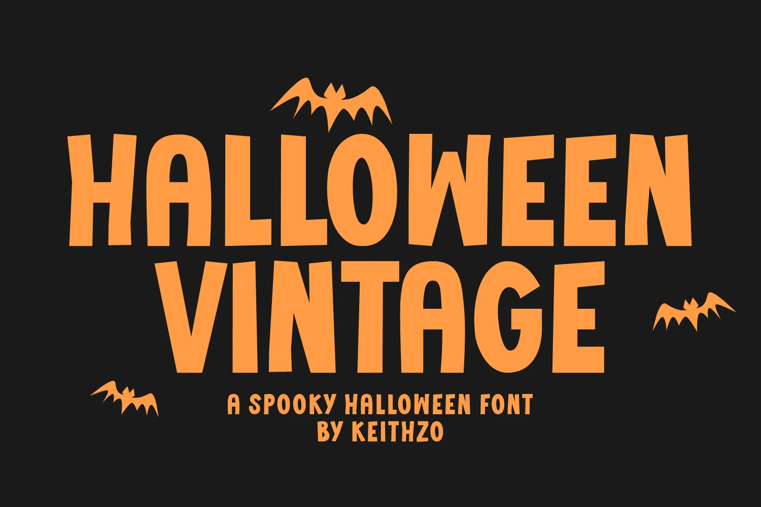
Best For: T-shirts, stickers, headlines, posters
Halloween Vintage Font has a chunky spooky display style with tall condensed letters, uneven edges, and a slightly warped rhythm that feels playful rather than grim. The bold monoline build keeps the words loud and readable, while the irregular shapes give it that nostalgic seasonal character.
Within Vintage Fonts, this one works best for short merch-friendly statements on T-shirts, stickers, tumblers, or posters. Keep the wording brief and let the heavy shapes sit with generous spacing, because the narrow forms hold up best when they are not squeezed into long lines.
Old Newspaper Font
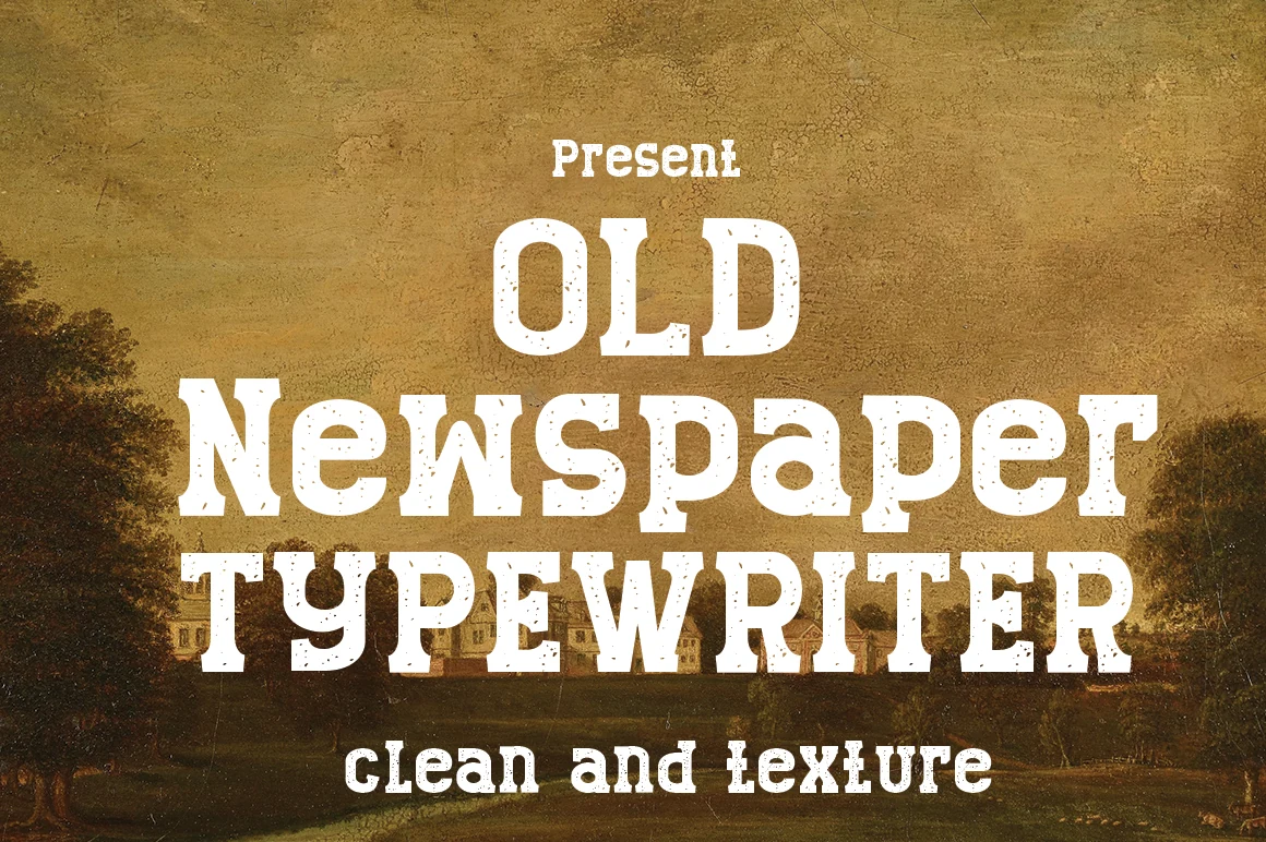
Best For: headlines, posters, vintage designs, old-school designs
Old Newspaper Font has a bold slab-serif build with chunky bracketed serifs, uneven ink texture, and compact letter spacing that immediately suggests printed headlines and aged press type. The distressed marks break up the heavy strokes, giving the words a worn paper feel without removing their basic readability.
For Vintage Fonts projects, it is strongest in short editorial-style titles, posters, labels, and retro branding pieces. Use it at display size with enough contrast behind the letters; the texture is part of the character, but small sizes will make the speckled edges look noisy instead of intentional.
Old English Font
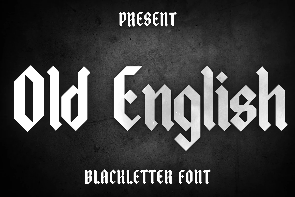
Best For: logos, headlines, posters, decorative designs
Old English Font uses angular blackletter forms with sharp diagonal cuts, tall vertical strokes, and compact counters that give it a formal Gothic presence. The letterforms feel rigid and ceremonial rather than casual, so even a short word carries strong historical character and visual weight.
For Vintage Fonts projects, this one works best in short headlines, logos, greeting card accents, or decorative banners where mood matters more than fast readability. Keep the wording brief and give the letters some space, because the dense shapes and tight joins lose clarity in long lines or small secondary text.
Vintage Haven Font
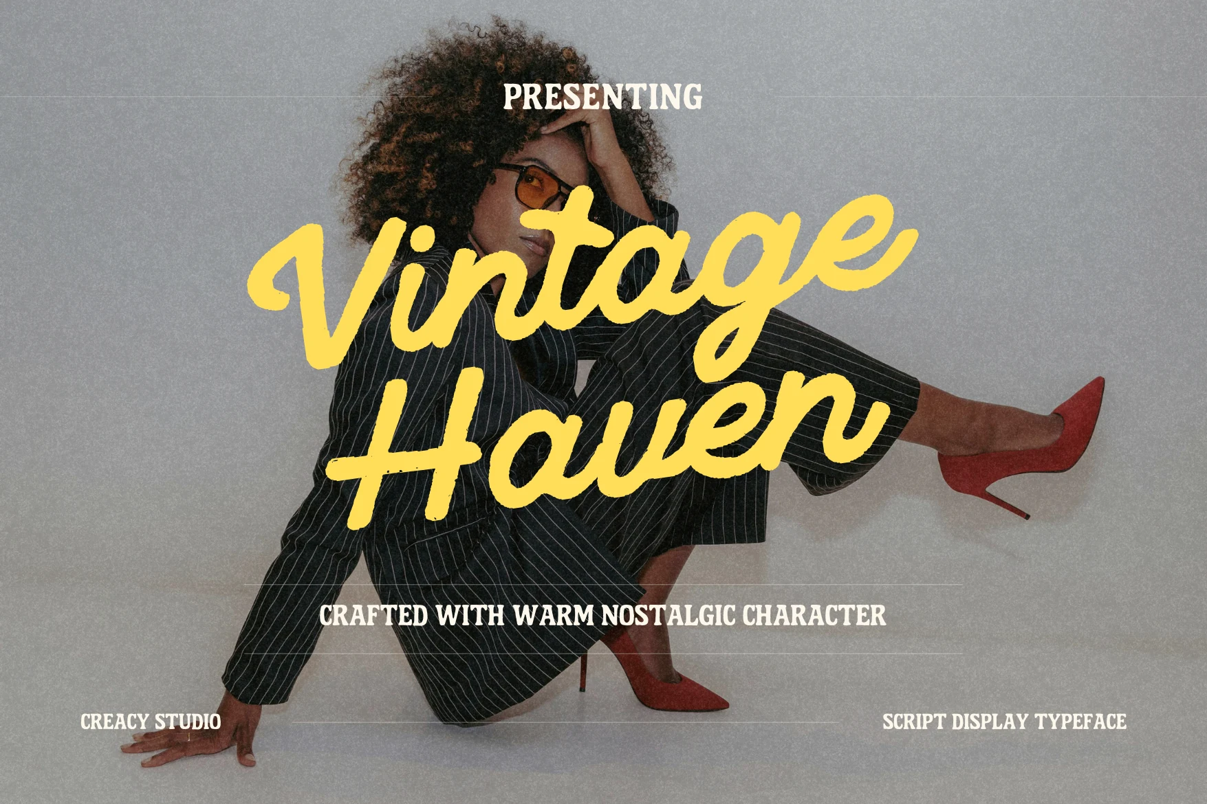
Best For: logos, branding, social media graphics, nostalgic designs
Vintage Haven Font has a thick brush-script style with soft rounded strokes, relaxed connections, and a slightly uneven baseline that gives the lettering a casual nostalgic pull. The broad yellow forms feel hand-painted rather than polished, while the open loops and smooth slant keep the words readable at display size.
For Vintage Fonts projects, it fits fashion-led headers, social posts, logos, and warm branding pieces that need a loose retro voice. Keep the phrase short and avoid tight stacking; the heavy strokes need space around ascenders and descenders so the script flow does not turn into a dense shape.
Old Typewriter Font
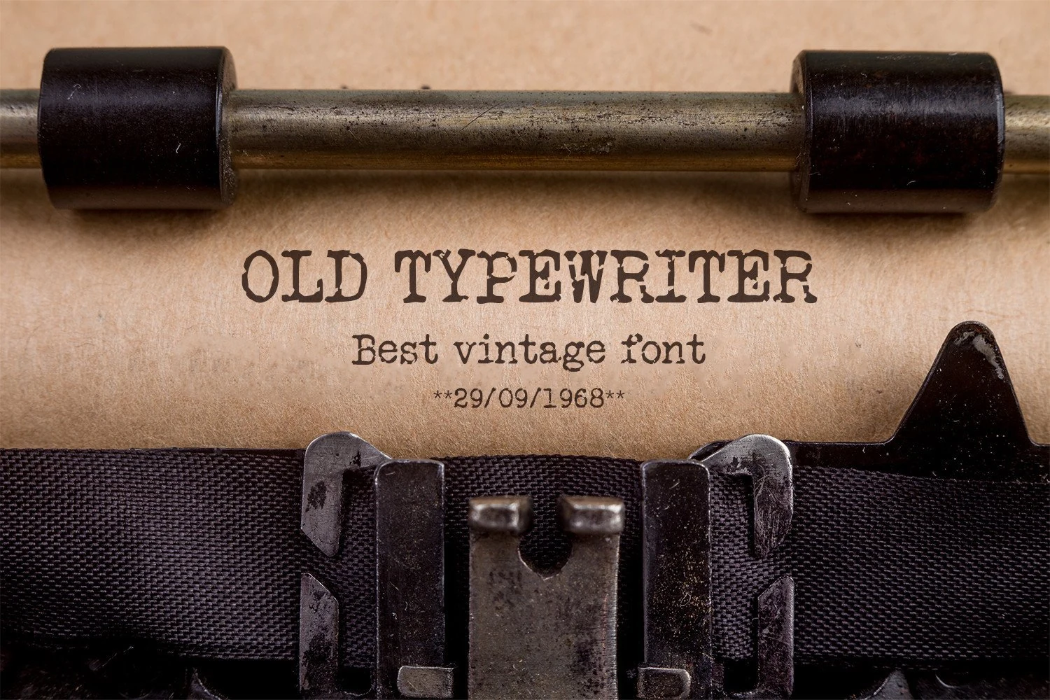
Best For: book covers, posters, quotes, short phrases
Old Typewriter Font has uneven slab serif letters, rough ink breaks, and the slightly battered rhythm you expect from a mechanical machine. The capitals feel stamped rather than polished, which gives titles an archival tone and a believable paper-and-ribbon texture.
For Vintage Fonts with an editorial or forensic edge, use it on posters, quotes, book covers, or short labels. It reads best in short lines with a little extra leading, since tight spacing can make the distressed edges merge and soften the crisp typewriter effect.
Vintage Retro Font
Best For: logos, posters, T-shirts, retro designs
Vintage Retro Font uses bold athletic slab lettering with wide uppercase forms, strong inline outlines, and a college-inspired rhythm. The yellow strokes and dark shadowing in the preview emphasize its sporty display character, while the open interior lines keep the large words graphic and readable.
For Vintage Fonts projects, it suits logos, T-shirts, posters, packaging labels, and quote graphics that need a firm retro headline. Keep it in short stacked phrases with steady spacing; the outline detail needs enough scale to stay clean, especially on merch or small social layouts.
Vintage Sport Font
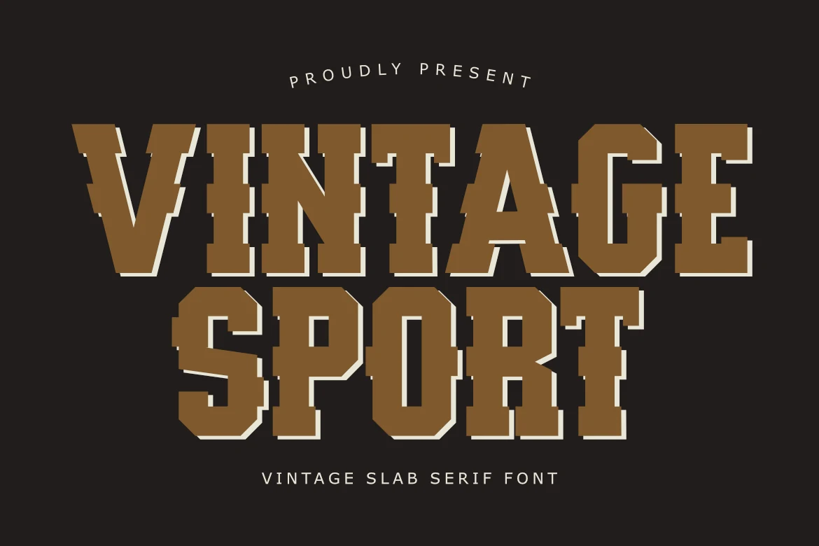
Best For: logos, headlines, posters, T-shirts
Vintage Sport Font mixes a western slab serif structure with blocky athletic proportions, stepped corners, and a layered shadow effect that gives the letters a tough, poster-ready stance. The heavy weight and squared counters make the words feel bold and grounded, with a strong old-team sign character.
For Vintage Fonts collections, it works best on headlines, logos, T-shirts, and poster graphics where short wording can do the heavy lifting. Keep the tracking slightly open and pair it with a plain secondary face, so the chunky slabs and offset outline stay crisp instead of turning dense in longer lines.
Vintage Victory Font
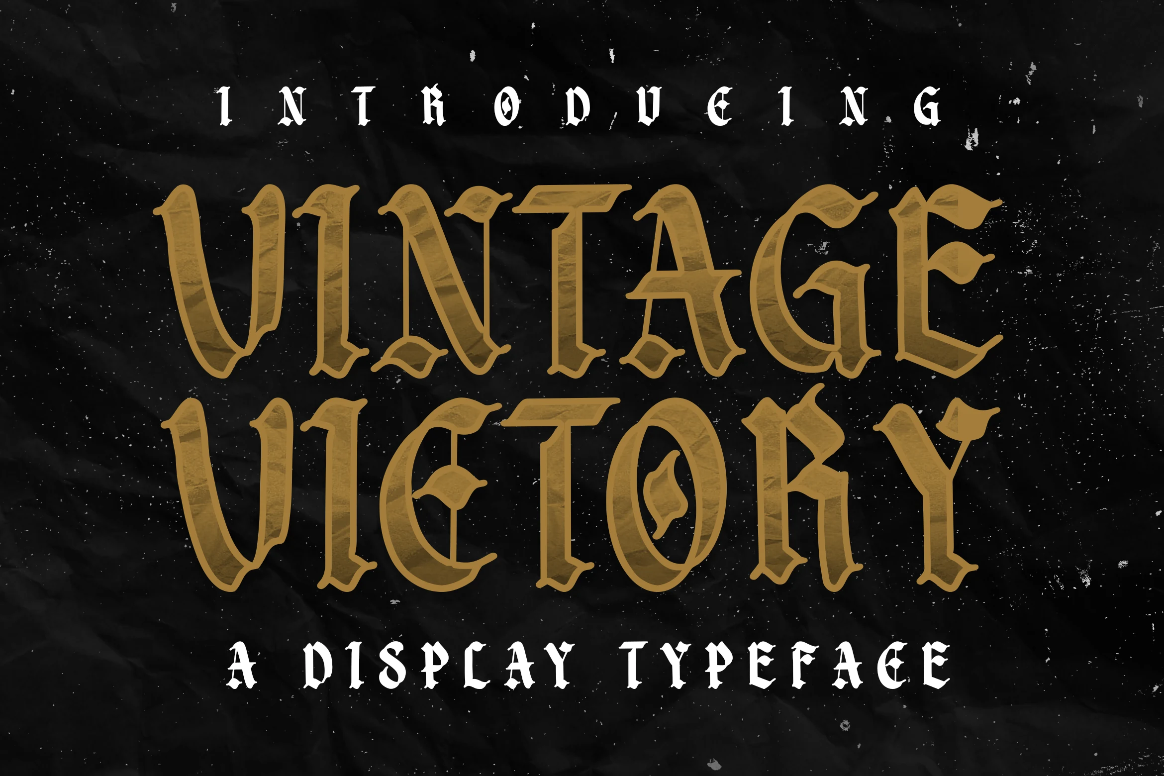
Best For: logos, signage, posters, vintage designs
Vintage Victory Font brings a heavy gothic blackletter voice with angular cuts, split inner strokes, and sharp bracketed edges. Its broad uppercase shapes feel old-world and dramatic, while the worn texture keeps the style closer to gritty Vintage Fonts than polished formal lettering.
Use it where the title is meant to dominate the layout: badges, posters, signage, or logo marks with a medieval-retro edge. The decorative structure works best in short wording, with generous tracking around smaller supporting text so the dense blackletter forms stay readable.
Vintage Talkins Font
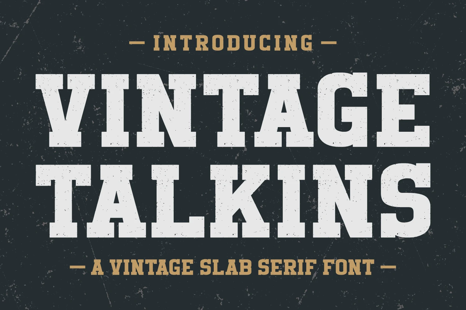
Best For: logos, posters, signage, vintage designs
Vintage Talkins Font has the kind of blocky slab serif structure that feels pulled from old storefront signs and printed labels. The broad capitals, square serifs, and lightly worn texture give it a sturdy, nostalgic voice that fits naturally into Vintage Fonts without leaning overly decorative.
It works best when you let the weight do the talking in short titles, badge text, or packaging headers. Pair it with a quieter supporting face and build in clear size contrast, so the distressed detail stays crisp and the headline keeps its bold, heritage feel.
Vintage Stories Font
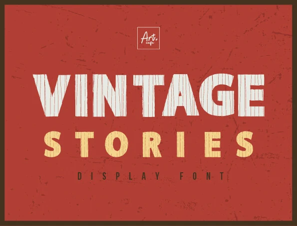
Best For: posters, headlines, retro designs, vintage designs
Vintage Stories Font uses chunky block capitals with slab-like weight, straight-sided forms, and a vertical worn texture running through the strokes. Its broad shapes give it strong poster impact, while the distressed detail places it firmly among Vintage Fonts with a rough print-shop character.
The font is built for short, stacked headlines rather than long reading lines. Keep the main word large, use tight but controlled spacing, and let smaller supporting text sit cleaner and narrower so the textured letters stay dominant without making the layout feel crowded.
Bright Vintage Font
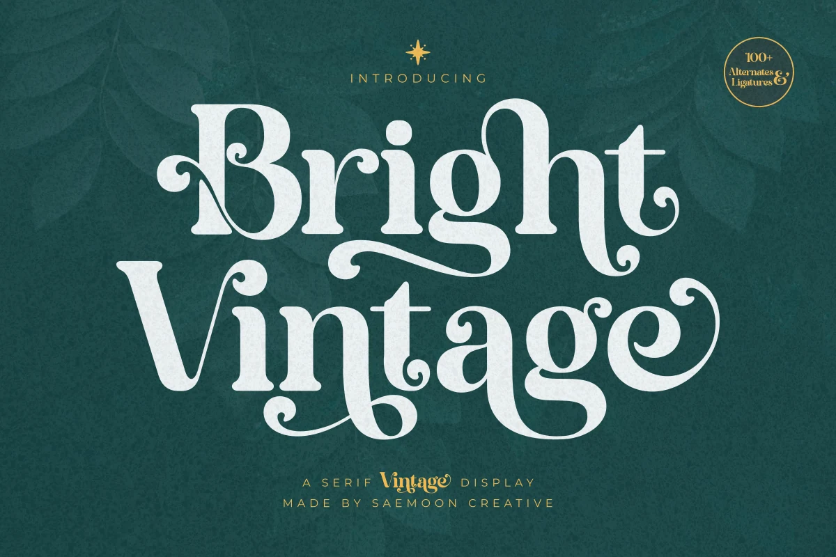
Best For: branding, invitations, beauty branding, vintage designs
Bright Vintage Font has a high-contrast serif display style with curling terminals, rounded inner curves, and long swashy strokes that give it an elegant old-advertising feel. The bold weight keeps it confident, while the decorative rhythm makes it stand out within Vintage Fonts without losing its polished structure.
This one works best in short feature text where the ornate details have room to show. Use it for names, invitations, or front-facing branding, and keep the surrounding typography simple with clear size contrast so the flourished capitals and sweeping descenders stay crisp instead of crowding the layout.
Sunshine Vintage Font
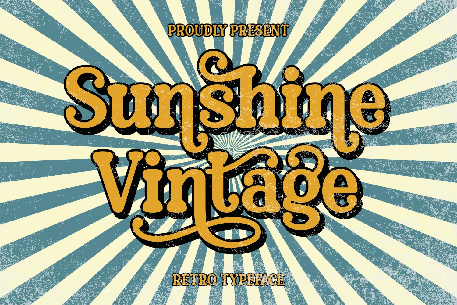
Best For: posters, retro designs, fun designs, children’s designs
Sunshine Vintage Font has a chunky retro display style with rounded slab forms, curled terminals, and a heavy shadowed presence. The letters feel friendly and easy to read, while the scuffed texture and 1970s-style bounce give it a louder place among Vintage Fonts.
Use it for upbeat headlines, craft graphics, greeting cards, or poster-style layouts where the wordmark needs instant personality. It performs best with short phrases, strong color contrast, and enough spacing around the shadow so the playful curves do not merge into the background.
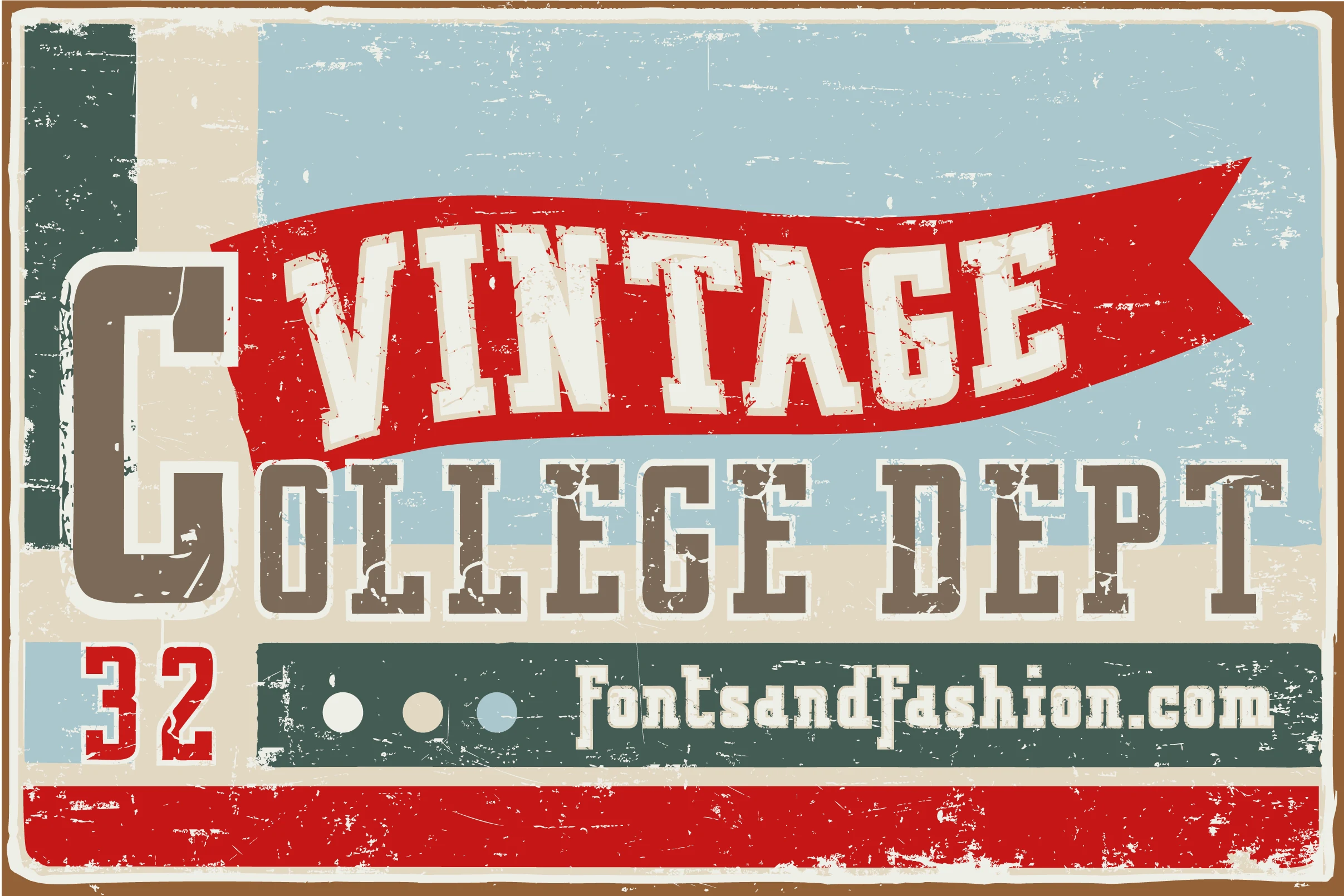
Vintage College Dept Pure Font
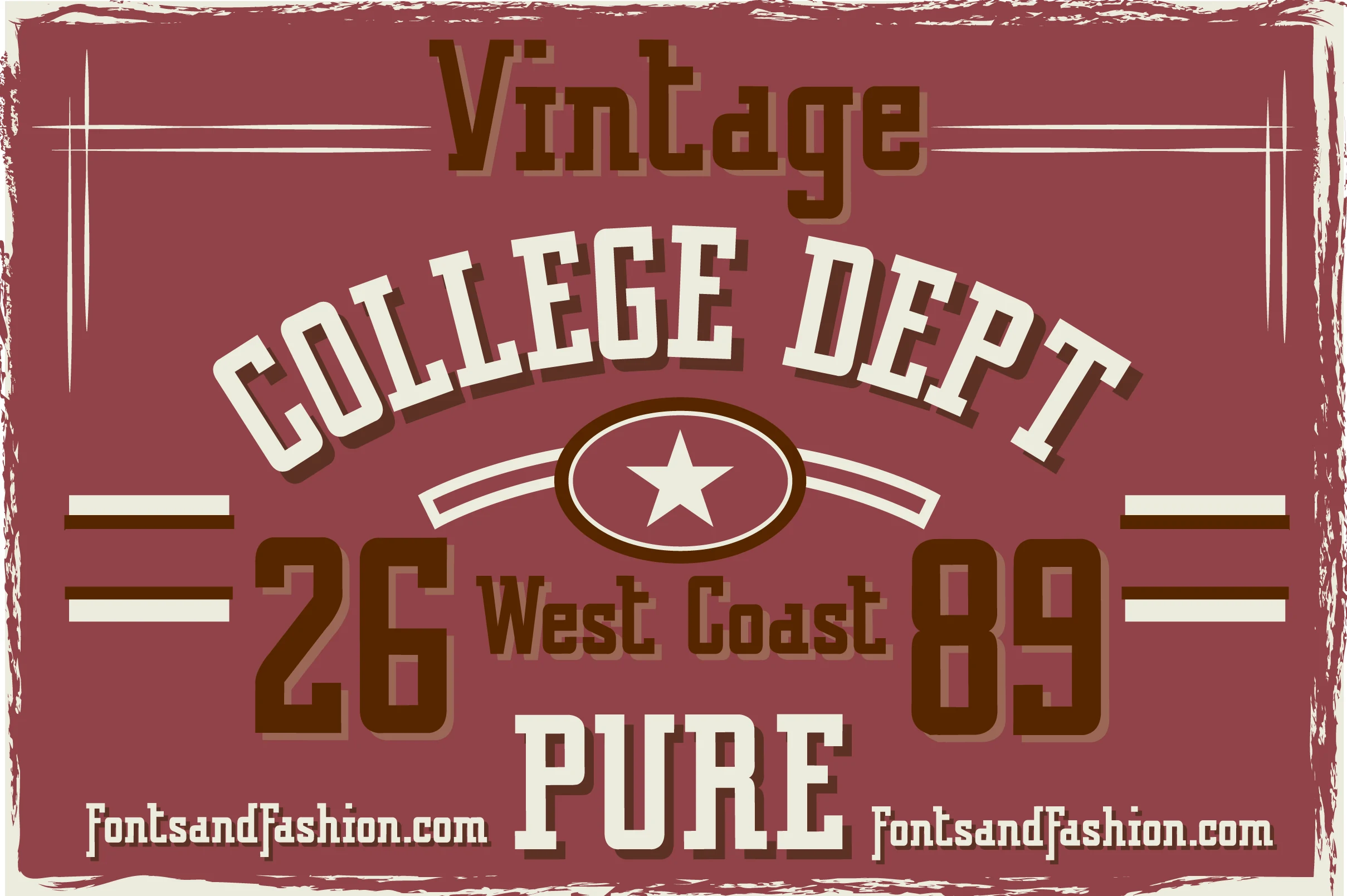
Best For: T-shirts, merch design, badges, signage
Vintage College Dept Pure Font leans into classic varsity lettering with square slab serifs, compact proportions, and the solid weight you expect from old athletic graphics. Its crisp block shapes give it a grounded, no-frills presence that fits naturally into Vintage Fonts with a clear college-sports attitude.
It shines in stacked layouts, arched headings, and number-driven compositions where that jersey influence can lead the design. Keep supporting text narrower or simpler, and use the heavier words as the focal point so the structure stays punchy on apparel, badges, or retro team-style branding.
Bali Vintage Font
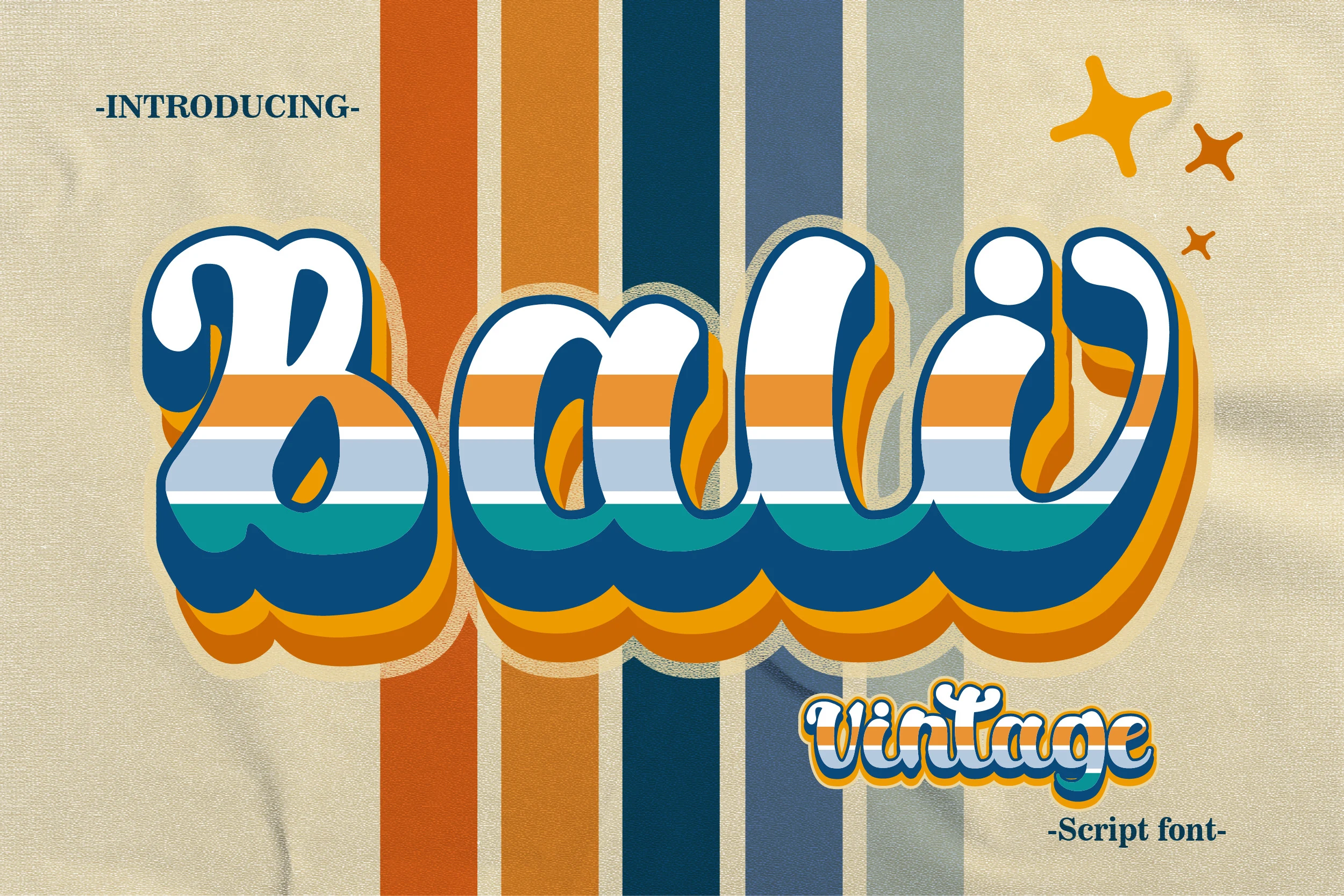
Best For: logos, branding, social media graphics, retro designs
Bali Vintage Font has a bold retro script shape with thick rounded strokes, soft looped joins, and a relaxed 1970s-style rhythm. Its connected letters feel playful rather than formal, giving Vintage Fonts a colorful wordmark option with strong personality and easy headline recognition.
Use it for short names, logo marks, social graphics, or packaging where the lettering can sit large and central. The chunky curves need clear spacing around descenders and swashes, especially when adding shadows or layered color, so the inner counters and flowing baseline stay readable.
Vintage Canva Font
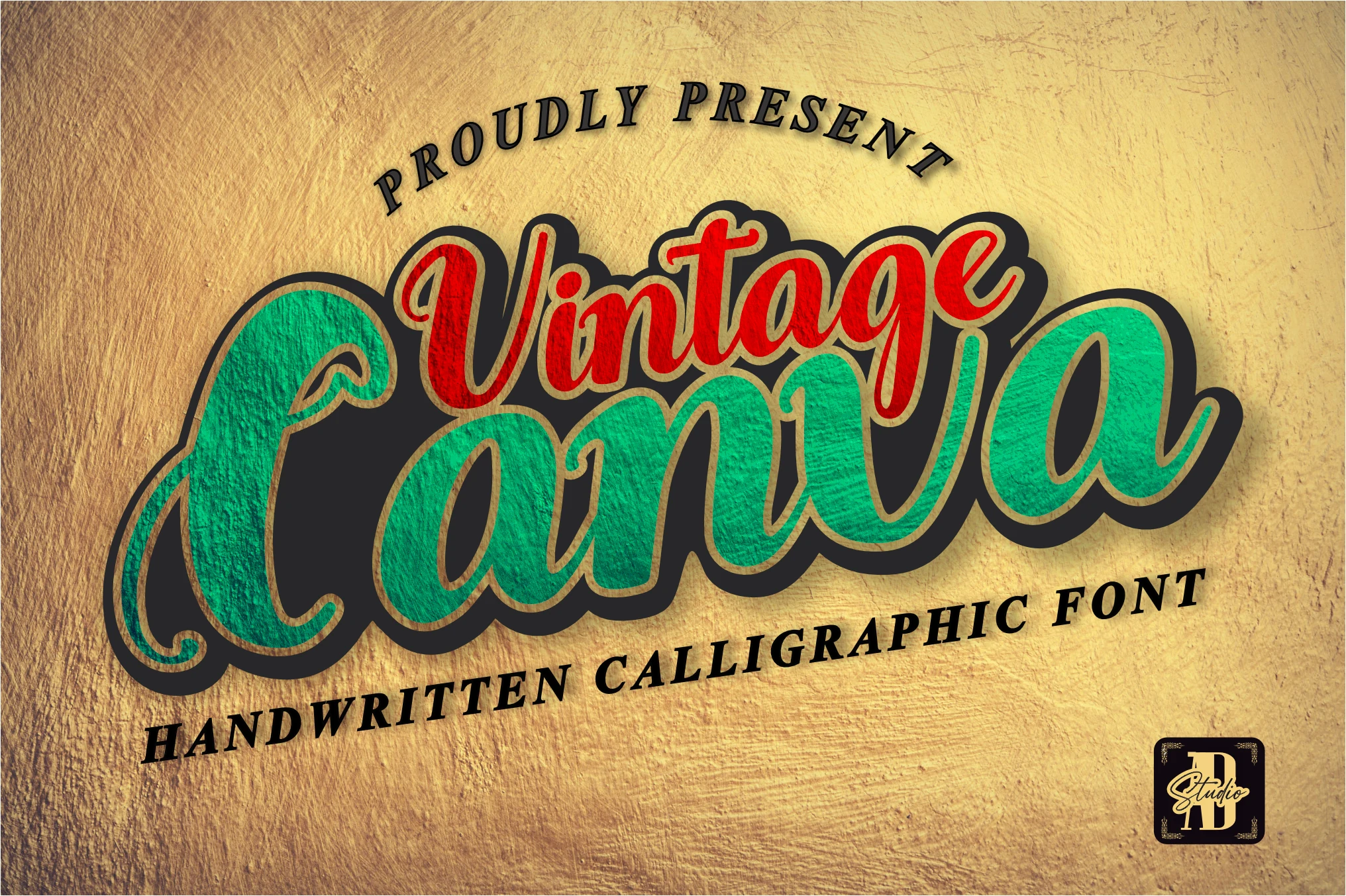
Best For: logos, product labels, posters, quotes
Vintage Canva Font mixes a bold handwritten script with inflated curves, smooth joins, and curled entry strokes that give it a sign-painted feel. The heavy outline and deep shadow push the lettering forward, while the broad lowercase rhythm keeps it readable inside playful Vintage Fonts palettes.
It works especially well for short branding lines, packaging, and poster headers where the script can carry the mood on its own. Keep supporting text simpler and straighter, and leave enough space around the long terminals so the layered outline and thick counters do not close up in tighter layouts.
Vintage College Dept_Double Font
Best For: T-shirts, merch design, posters, vintage designs
Vintage College Dept_Double Font has a worn varsity slab serif build with tall block capitals, square serifs, and a rough grunge texture across the strokes. The layered college-poster styling gives the letters extra depth, placing it firmly inside Vintage Fonts with an athletic, campus-era attitude.
Use it for team-style headlines, apparel graphics, badges, or retro event posters where the typography needs to feel printed and aged. Keep the main words large and avoid cramped spacing, since the distressed edges and shadowed structure need contrast to stay sharp.
Farm Vintage Font
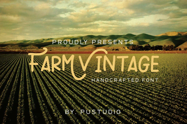
Best For: packaging, product labels, signage, vintage designs
Farm Vintage Font has a hand-drawn display feel, with slim uneven strokes, soft curves, and a casual rhythm that makes the lettering feel rustic rather than polished. The open forms and slightly quirky proportions give it a warm homemade character, placing it among Vintage Fonts with a more organic countryside tone.
It works best in short titles for labels, signs, and packaging where that natural looseness can stay visible. Keep it at a comfortable display size and pair it with a simpler companion face, so the narrow strokes and irregular details do not disappear against busy layouts or photography.
Master Vintage Font
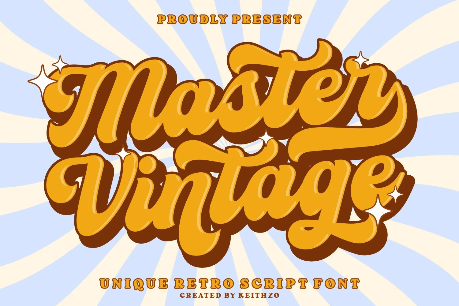
Best For: logos, branding, packaging, posters
Master Vintage Font uses a bold connected script with thick rounded strokes, sweeping tails, and oversized swashes that create a strong retro wordmark feel. The heavy shadowed styling suits Vintage Fonts with a louder 1970s-inspired personality, especially when the lettering needs to feel energetic and front-facing.
Use it for short names, packaging headers, poster titles, or brand marks where the script can sit large and carry the full visual tone. Keep enough open space around the long terminals and use firm color contrast, because the dense curves and layered shadow can crowd quickly in smaller compositions.
Barbie Vintage Font
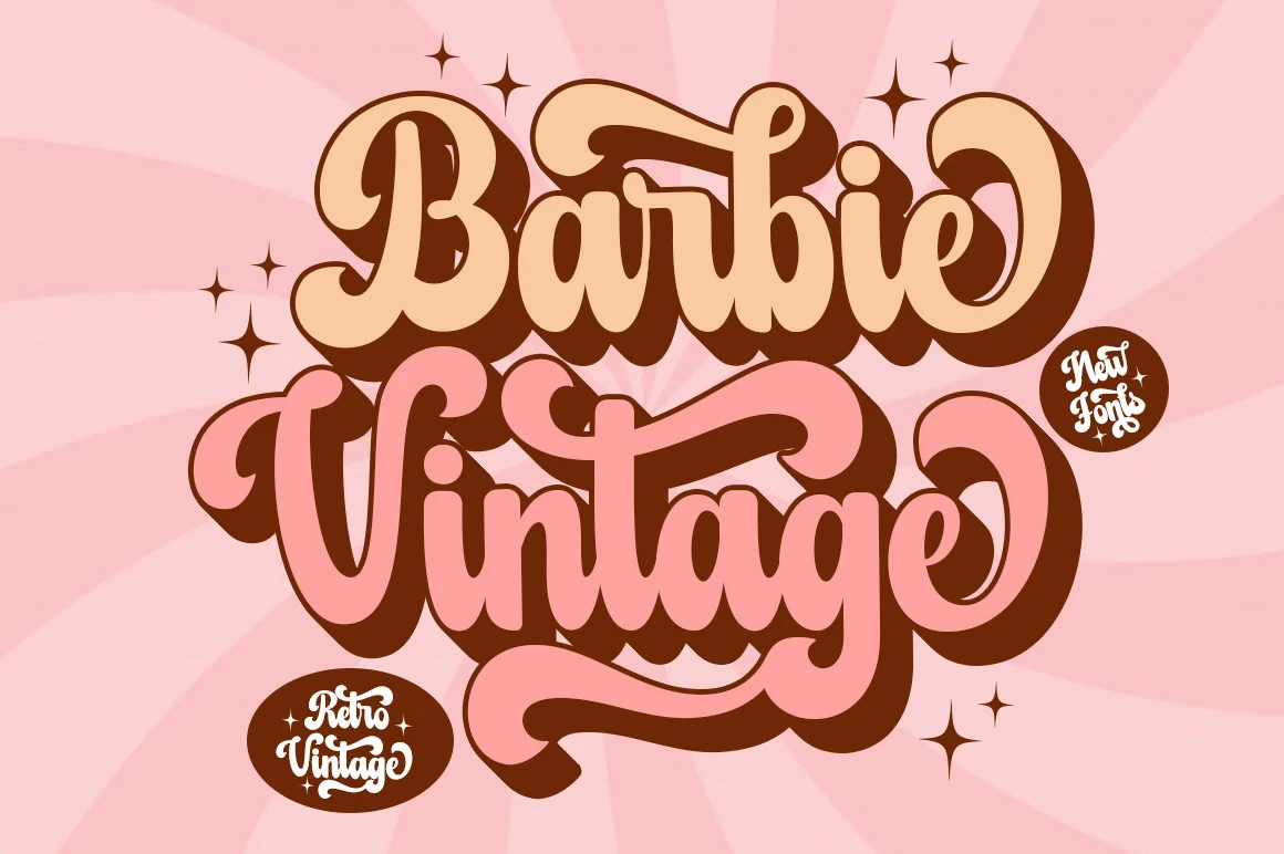
Best For: logos, social media graphics, playful designs, feminine designs
Barbie Vintage Font leans into a bubbly retro display style, with thick rounded strokes, oversized curls, and swooping terminals that give the words a cheerful, candy-shop rhythm. The stacked look and deep shadowing push the playful nostalgia forward, making it a lively pick within Vintage Fonts for designs that need warmth and personality.
It works best in short headlines or logo-style wording where the soft counters and long swashes have space to show. Keep secondary text clean and smaller, and leave enough breathing room around the descenders so the chunky curves and shadowed edges stay crisp instead of crowding the layout.
Vintage Typewriter Font
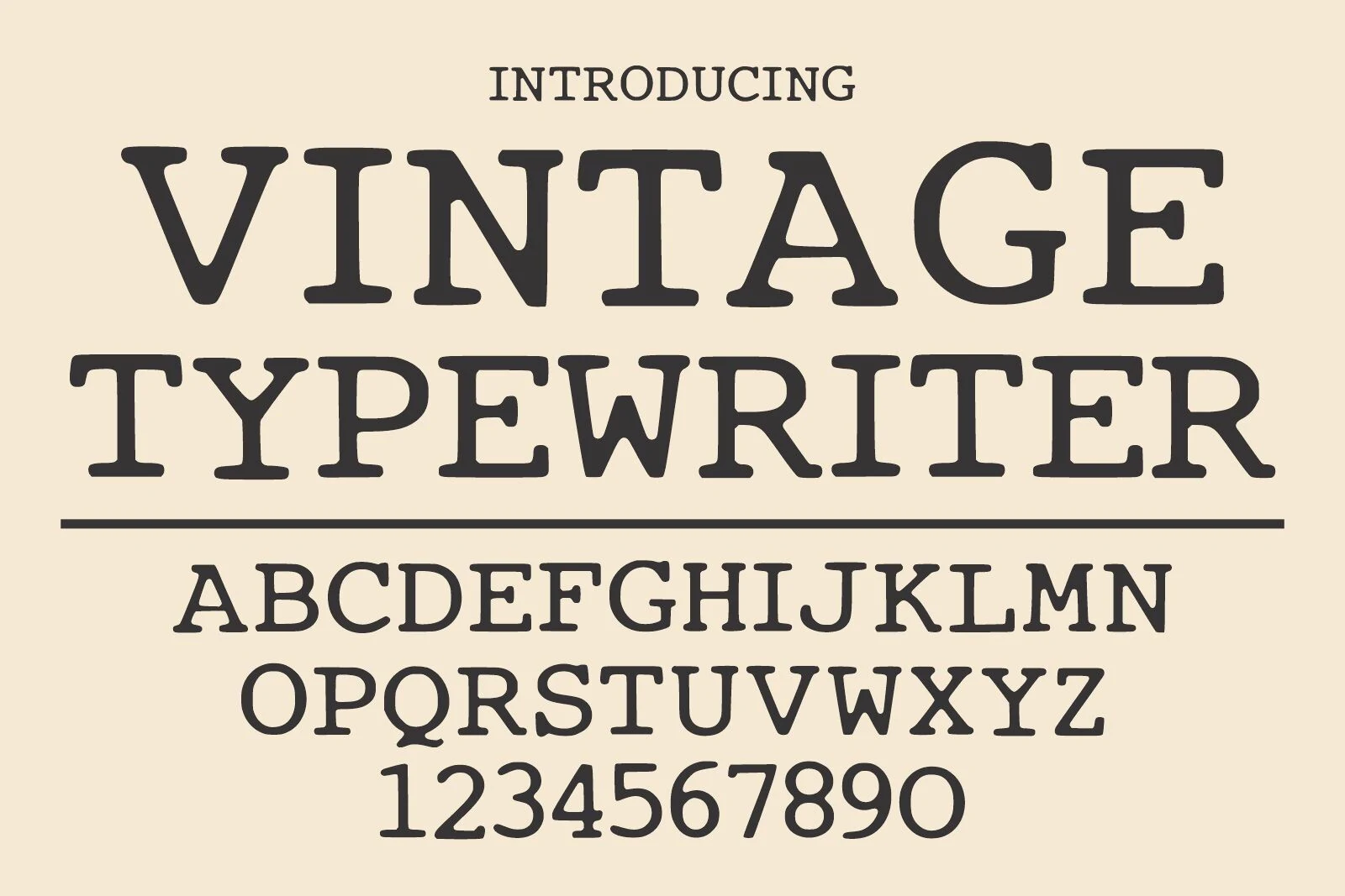
Best For: book covers, editorial designs, quotes, vintage designs
Vintage Typewriter Font has a classic serif structure with rounded slab-like terminals, sturdy uppercase forms, and the slightly mechanical rhythm of old typed pages. Its clean black shapes keep the alphabet readable, giving Vintage Fonts a quieter editorial option instead of a heavily distressed display style.
Use it for book covers, quote layouts, packaging copy, or retro branding where the design needs a printed-document mood. It benefits from measured line spacing and restrained contrast, especially in multi-line text, so the strong serifs and compact letter shapes stay orderly rather than dense.
Classic Vintage Font
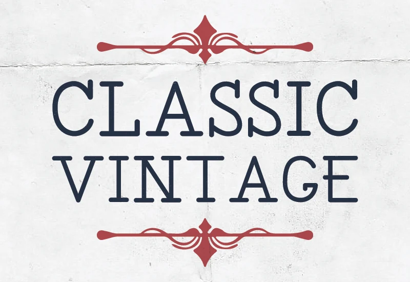
Best For: logos, branding, minimal designs, clean designs
Classic Vintage Font brings a restrained take to Vintage Fonts, with upright capitals, tidy slab-like terminals, and open counters that keep the letterforms crisp. The proportions feel steady and unfussy, while the subtle Western typewriter influence adds character without pushing the design into novelty.
It works especially well when you want a retro tone that still reads cleanly in a logo or brand header. Use moderate tracking and clear hierarchy around it, and pair it with simple supporting text so the calm structure and decorative details can hold the mood without cluttering the layout.
Wrecks – Vintage Font
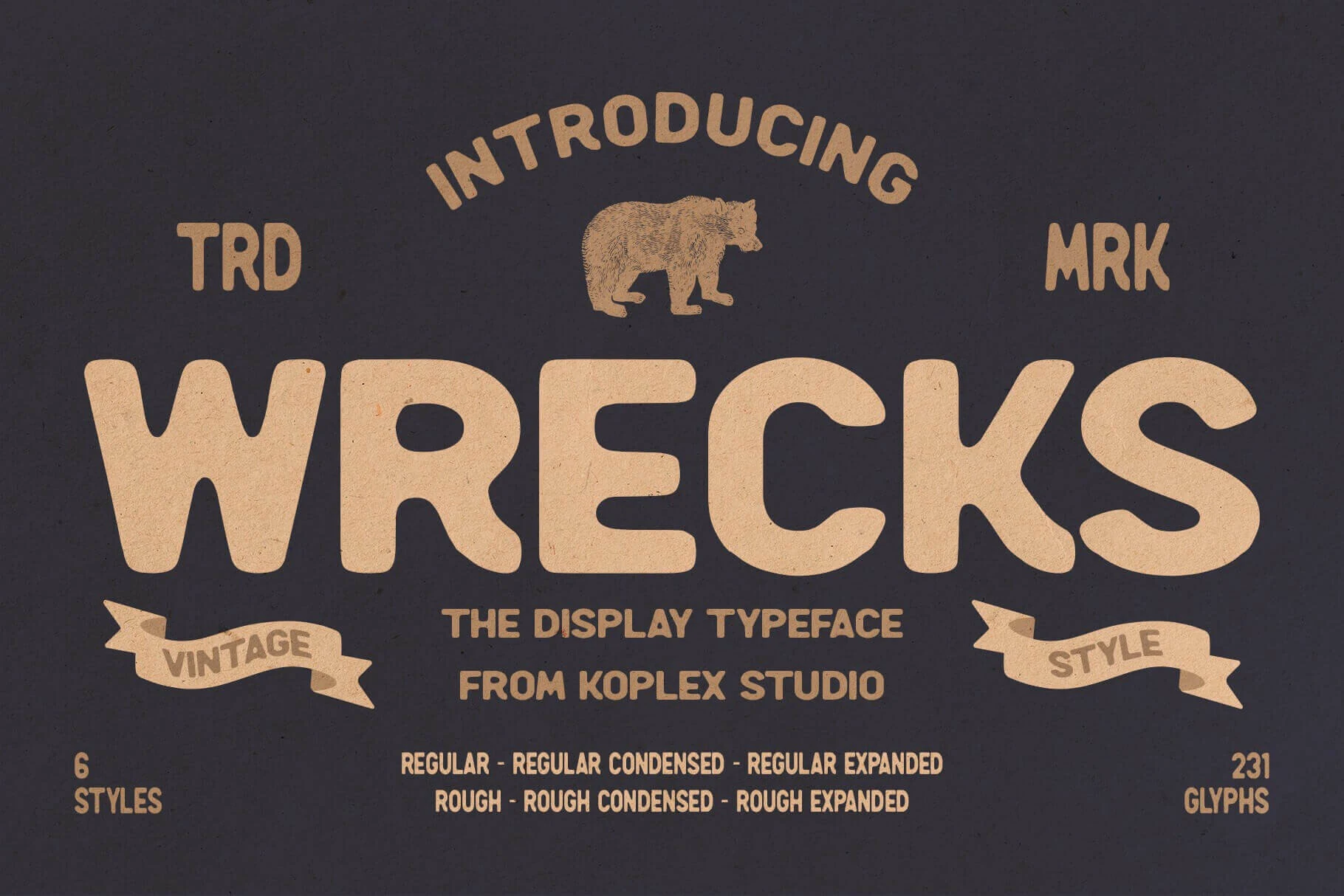
Best For: logos, posters, badges, vintage designs
Wrecks – Vintage Font uses oversized rounded letters with soft corners, thick stems, and a slightly worn texture that gives the type a printed, aged feel. Its wide, blocky shapes carry strong poster energy while staying friendly rather than harsh, which makes the style useful when Vintage Fonts need a bold but approachable voice.
The font works best when the lettering is allowed to dominate the layout: short names, arched headings, badge marks, and stacked title compositions suit its chunky proportions. Keep supporting text lighter or narrower so the main wordmark does not compete with another heavy display face.
Vintage Super Font
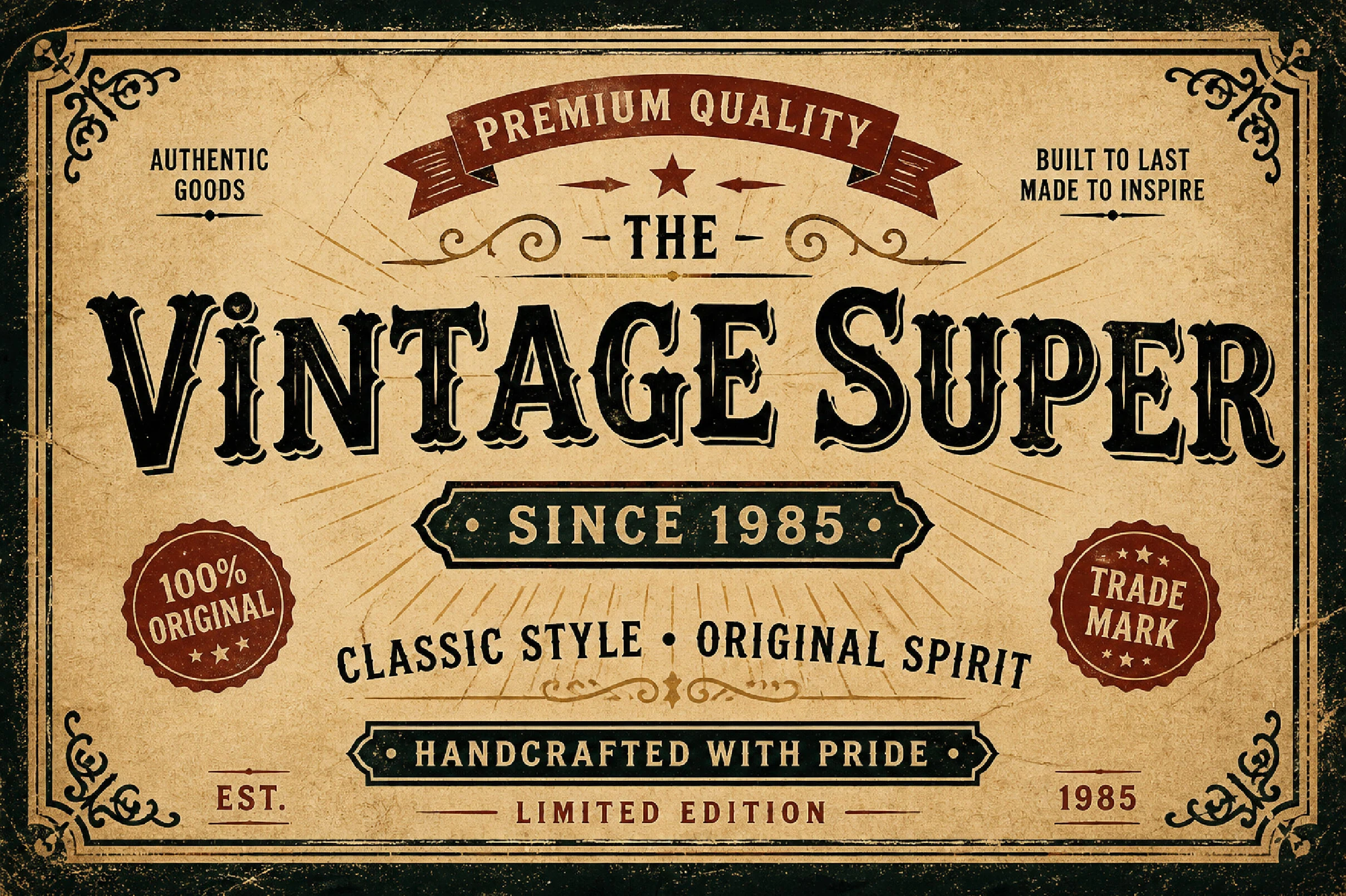
Best For: logos, posters, signage, vintage designs
Vintage Super Font leans into an old-signage look with ornate serif forms, deep contrast, and carved details that make the lettering feel timeworn and authoritative. The thick strokes and decorative edges give it the kind of strong personality Vintage Fonts often need when a design calls for heritage, grit, and immediate visual weight.
Its structure is best used in short display settings, where the dramatic silhouette can stay clear and punchy. For labels, poster headings, or badge-style marks, pair it with a plain secondary face and leave a little breathing room around the main line so the texture and detailing stay readable instead of turning dense.
Magical Vintage Font
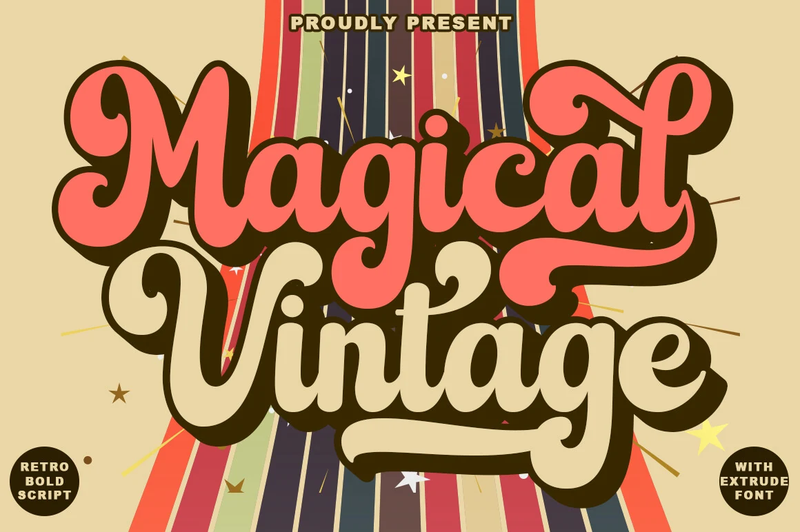
Best For: logos, branding, social media graphics, retro designs
Magical Vintage Font has a full 70s script rhythm, with chunky connected strokes, rounded terminals, and oversized swashes that make each word feel like a retro headline. The heavy shadowed look gives it strong separation, so Vintage Fonts with this much curve and weight can hold attention without needing extra decoration.
Use it for short brand names, ad-style headers, social graphics, and product marks where the lettering can stay large and central. Its style alternates, style sets, and contextual alternatives help shape smoother wordmarks, but the bold script still needs generous spacing around descenders and long tails to avoid a crowded layout.
Sunday Vintage Font
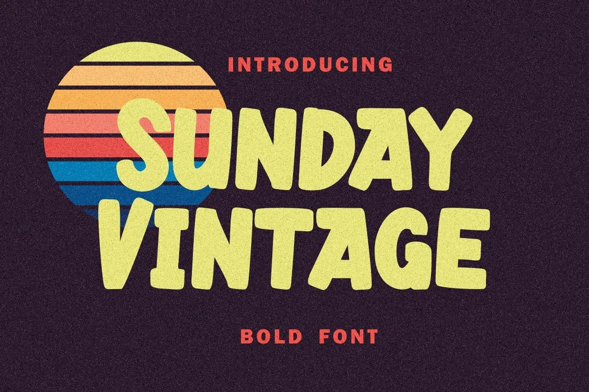
Best For: posters, T-shirts, headlines, retro designs
Sunday Vintage Font has chunky, slightly irregular letterforms with soft corners and a cheerful 70s feel. The wide strokes and compact counters make it read as bold and friendly at the same time, which gives Vintage Fonts like this one a strong casual presence for titles that need warmth instead of polish.
It performs best in short headlines, poster copy, and T-shirt graphics where the heavy shapes can do the work. Because the letters are broad and tightly packed, keep the wording brief and give the line breaks room; a plain narrow sans underneath will keep the main heading punchy instead of crowded.
La Vintage Font
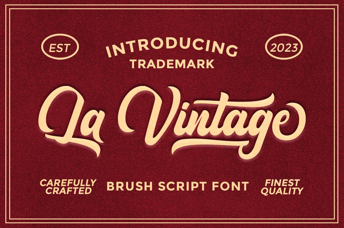
Best For: logos, product labels, badges, vintage designs
La Vintage Font is a brush script with smooth connected strokes, high-contrast curves, and long swashes that give the lettering a polished trademark-style presence. Its flowing capitals and rounded lowercase forms make it one of the more refined Vintage Fonts for designs that need retro charm without looking rough or overly distressed.
The ligatures support a more natural wordmark rhythm, especially in short names where the letters need to feel custom rather than simply typed. Use it large for logos, labels, and badge compositions, and keep nearby text compact and upright so the sweeping terminals have enough space to stay legible.
Back to Vintage Font
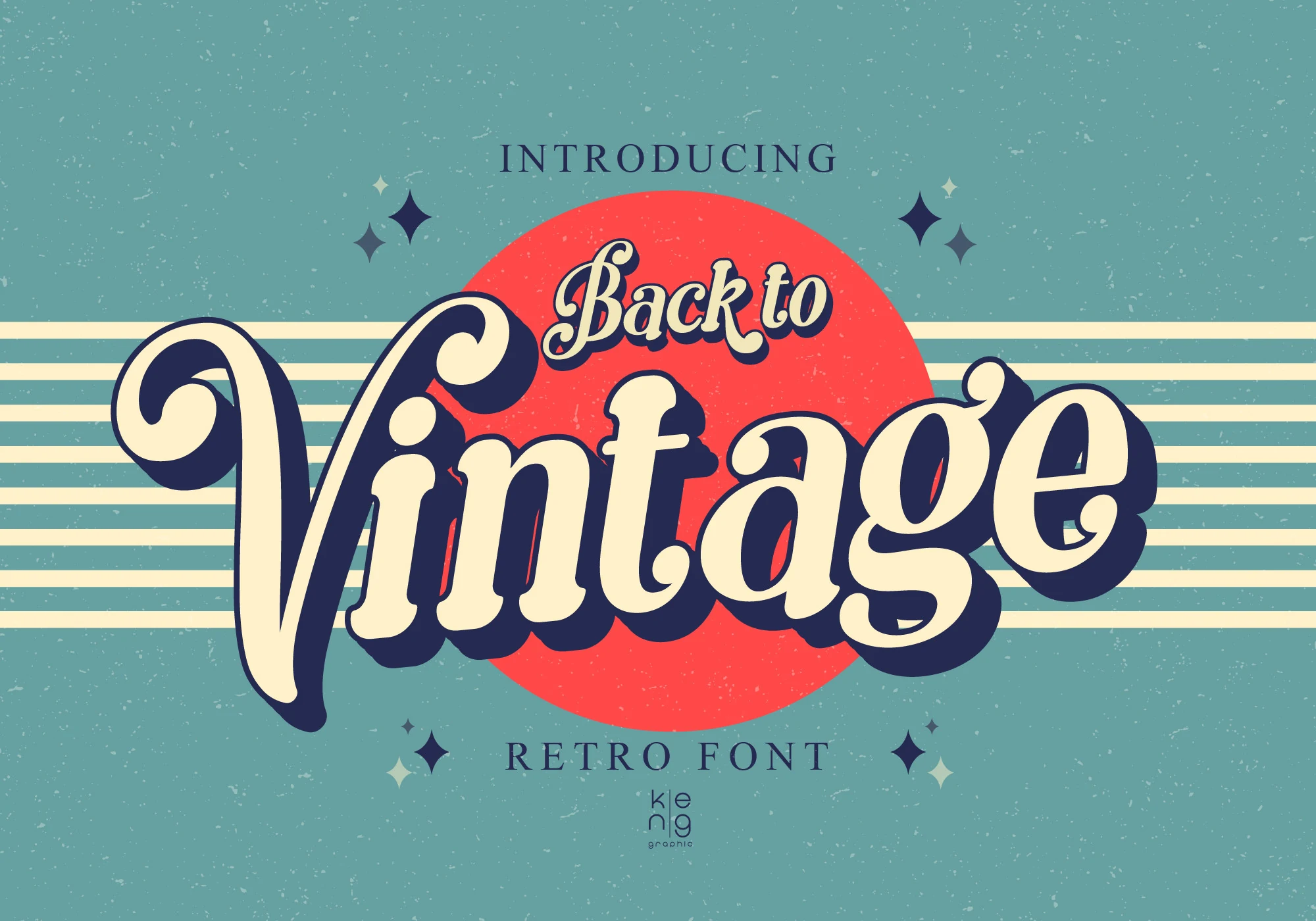
Best For: logos, posters, headlines, retro designs
Back to Vintage Font pulls together 60s, 70s, and 80s display cues in a rounded script style with thick strokes, soft corners, and a deep shadowed silhouette. The bouncing rhythm gives it an easy retro presence, and that blend of movement and weight helps it stand out in Vintage Fonts when a title needs warmth instead of a rigid look.
Its character comes through best in short, prominent lines where the wide curves have room to read cleanly. Use it for logos, poster titles, or hero headings, and keep the wording brief; pairing it with a plain secondary face will stop the layout from feeling overloaded while letting the main wordmark carry the nostalgia.
Texas Vintage Font
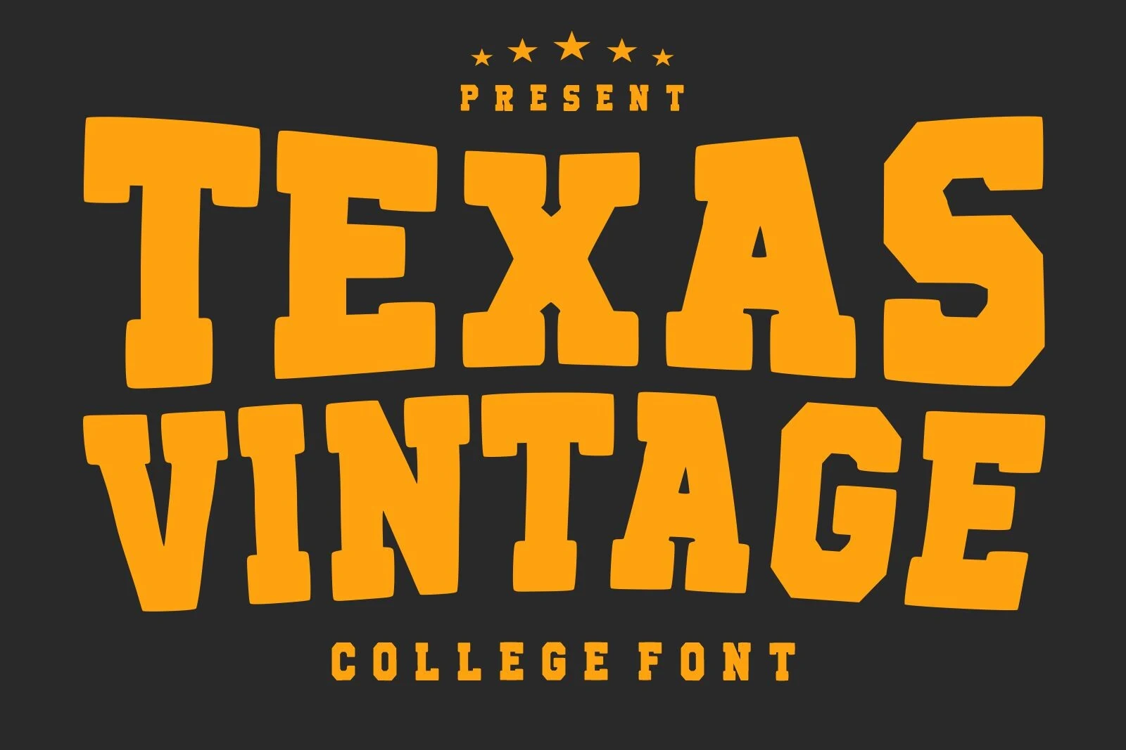
Best For: logos, posters, T-shirts, merch design
Texas Vintage Font uses oversized varsity block letters with slab-like serifs, squared cuts, and slightly uneven angles that keep the style from feeling too polished. Its college lettering influence gives Vintage Fonts a strong athletic tone, especially when a design needs authority, nostalgia, and quick readability.
The font works best in stacked layouts, team-style marks, poster titles, and shirt graphics where the heavy forms can sit at the top of the hierarchy. Keep tracking controlled and avoid long phrases; the wide uppercase shapes have more impact when the wording is short and the supporting text stays narrow and simple.
Vendeur Vintage Font
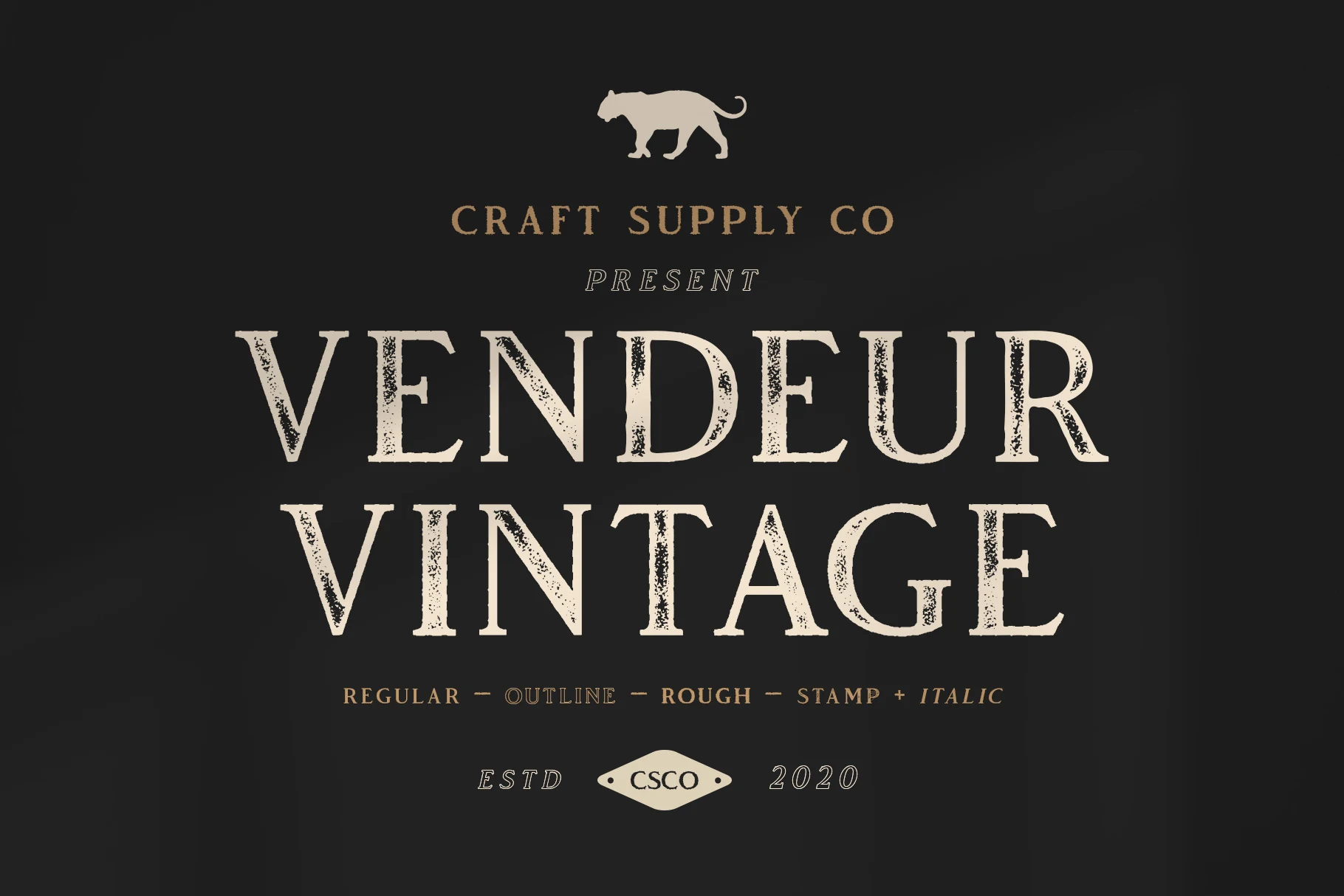
Best For: logos, packaging, book covers, vintage designs
Vendeur Vintage Font has tall serif capitals, narrow proportions, and lightly weathered edges that give the letters a worn print character without losing clarity. The contrast between the thin hairlines and solid stems creates a refined old-shop tone, so it sits comfortably among Vintage Fonts that need heritage rather than heaviness.
It works best in short display lines where the textured outline and elegant spacing can stay visible, especially on dark backgrounds or label-style layouts. For logos, covers, or packaging, pair it with restrained secondary text and keep the hierarchy clean; too many decorative elements will dilute its quiet authority.
Wild Ventura Vintage Font
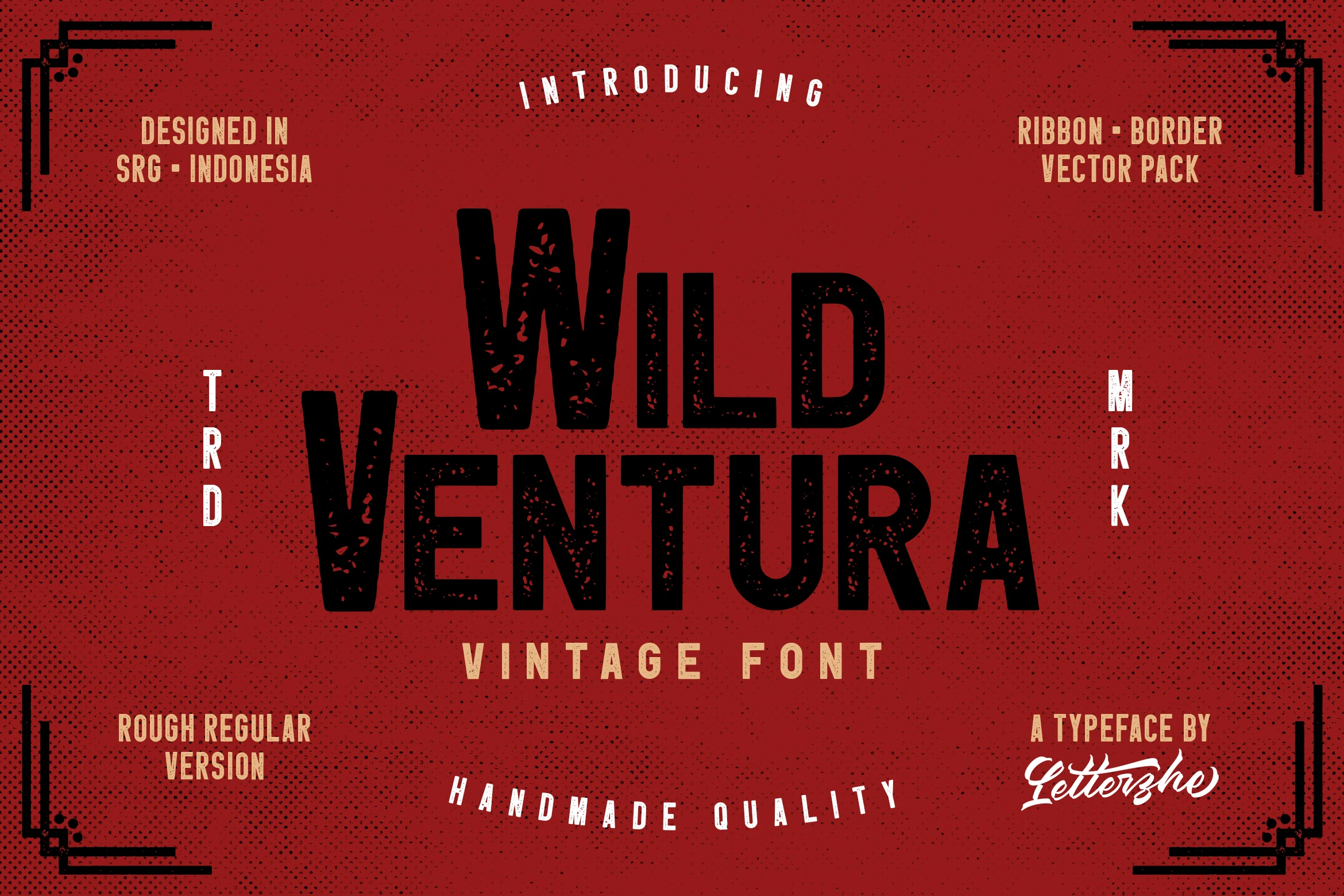
Best For: logos, posters, signage, vintage designs
Wild Ventura Vintage Font is a heavy sans display face with condensed proportions, blunt cuts, and a rough stamped texture running through the letters. Its tall uppercase forms feel direct and handmade, giving Vintage Fonts a tougher poster-shop character rather than a polished retro look.
The font suits bold titles, label marks, event posters, and rugged brand graphics where texture is part of the message. Keep the composition high-contrast and avoid long copy; the distressed interiors stay clearer when the words are short, stacked, and supported by simple narrow text around the main line.
Vintage Western Font
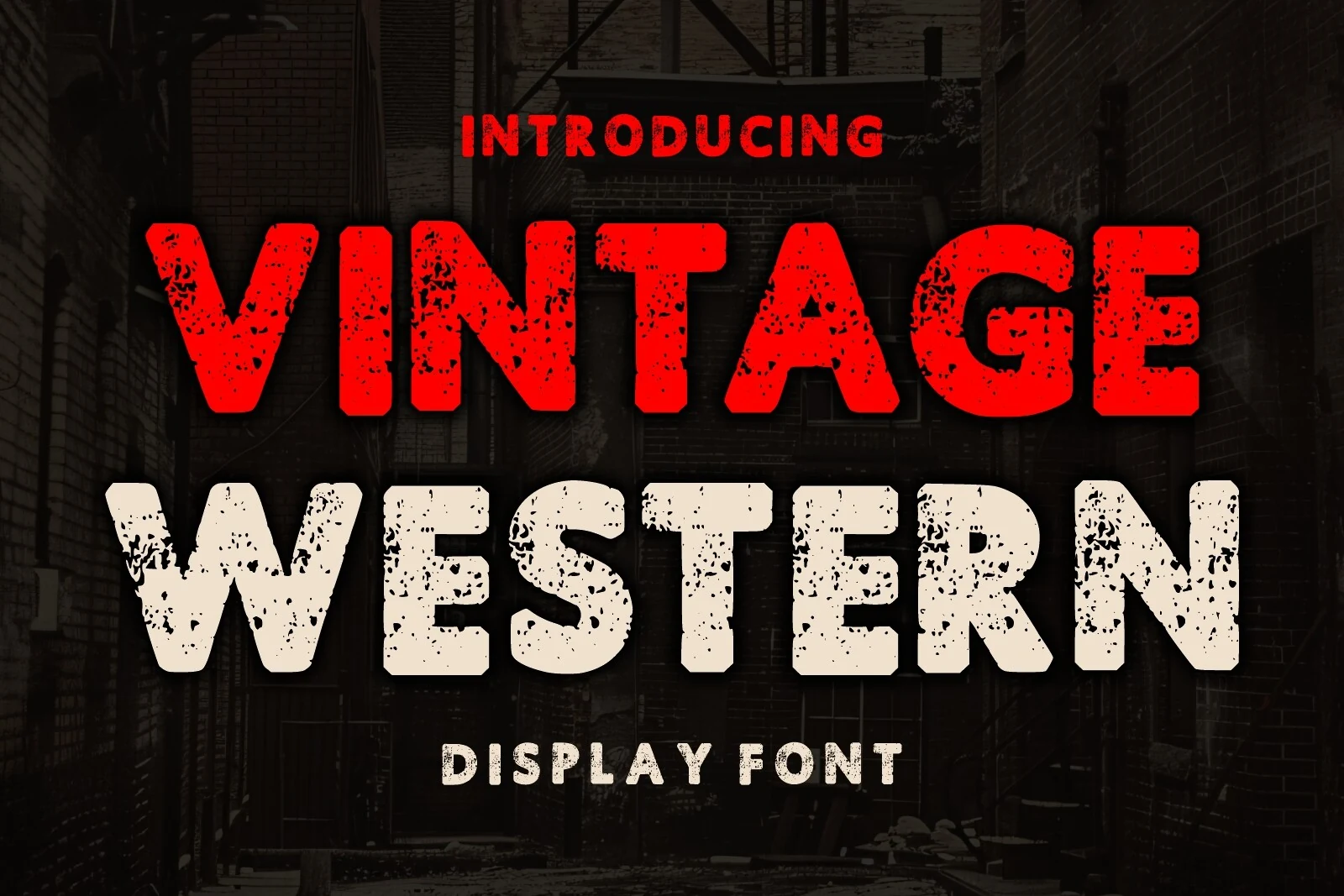
Best For: logos, posters, signage, T-shirts
Vintage Western Font uses thick uppercase forms, blunt corners, and a heavy distressed texture that gives the letters a weathered saloon-poster feel. The gritty surface keeps the message loud and rough, which helps Vintage Fonts like this one bring instant frontier energy to a design.
It works best in short, forceful lines where the worn texture can stay visible, especially for posters, signage, or apparel graphics. Keep the supporting copy simple and slightly smaller; the main heading already carries plenty of attitude, so a cleaner secondary line will preserve hierarchy instead of competing with it.
Costa Brisa Duo Font
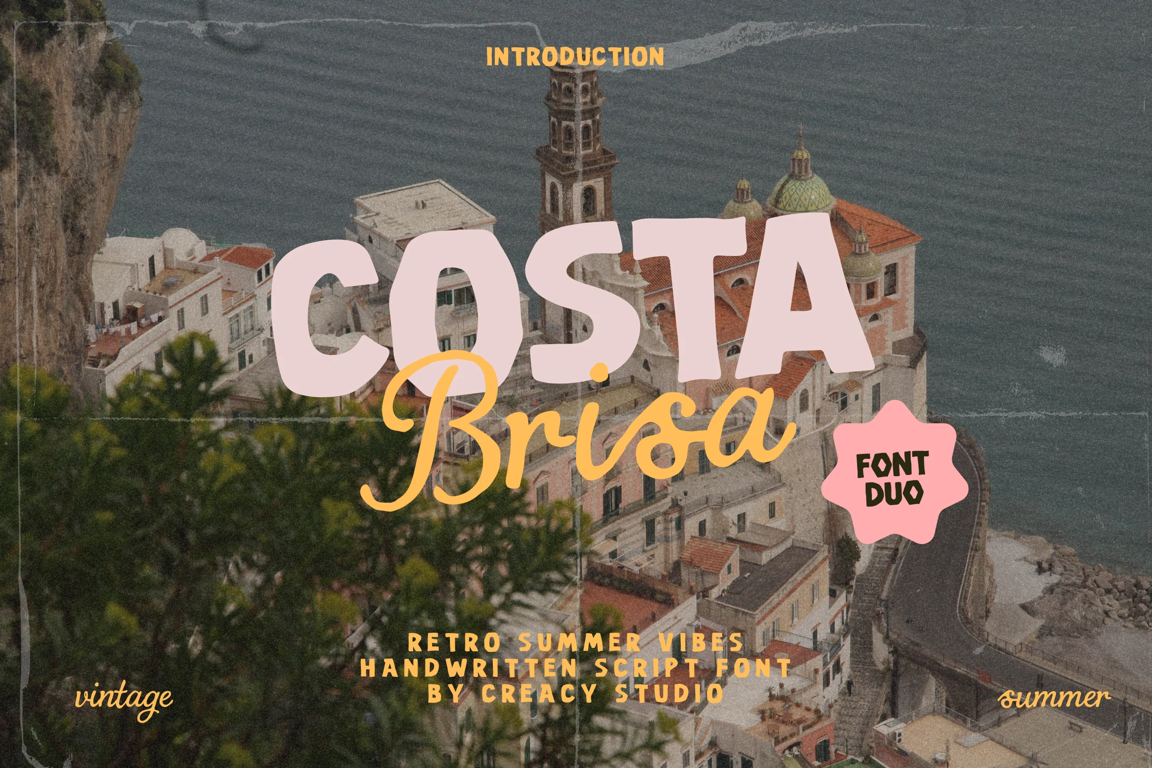
Best For: logos, branding, social media graphics, retro designs
Costa Brisa Duo Font combines a chunky rounded display style with a loose handwritten script, giving the preview a soft retro-summer rhythm. The block letters feel broad and relaxed, while the script adds motion underneath, making it useful when Vintage Fonts need a lighter coastal mood instead of a heavy distressed look.
The duo works best when the bold face handles the main word and the script acts as a secondary accent, as shown by the clear title contrast in the preview. Keep the script phrase short and slightly separated from the heavy letters so the hierarchy stays readable across social posts, travel-style graphics, and casual brand layouts.
Royal Vintage Label Font
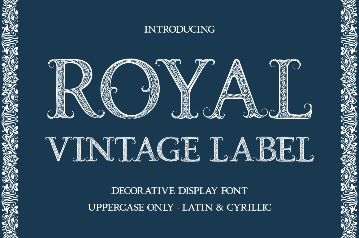
Best For: logos, packaging, product labels, badges
Royal Vintage Label Font is built around tall ornamental capitals with engraved inner detailing, curled terminals, and a crisp old-label structure that feels formal without turning stiff. The decorative linework gives the face real presence, so Vintage Fonts in this vein work especially well when a design needs heritage, richness, and a clear premium mood.
Because the letters carry so much internal texture, it performs best in short words, badges, and front-facing label compositions where the outlines can stay sharp. Let it lead the hierarchy and keep secondary text simpler and smaller; that contrast helps the detailing read cleanly instead of dissolving at reduced sizes.
Vintage Varsity Font
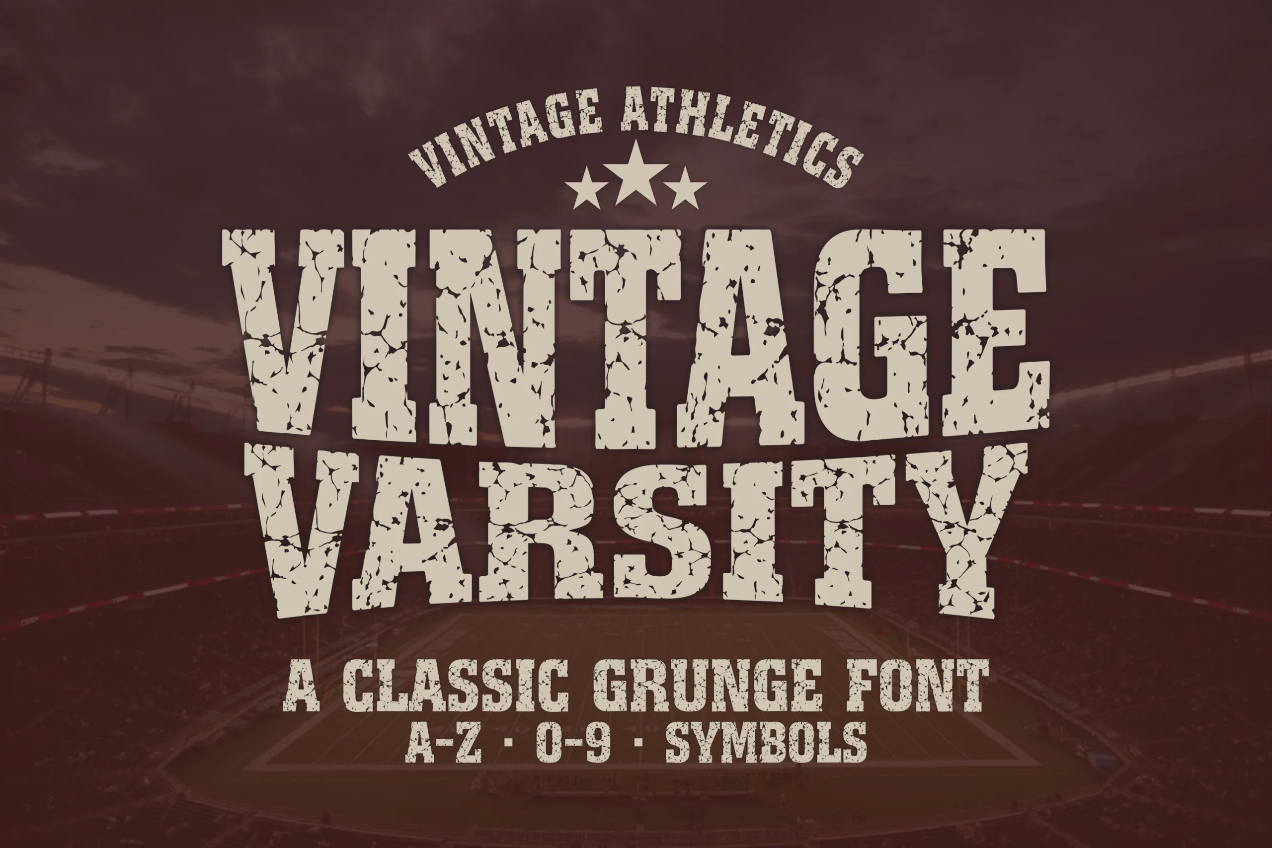
Best For: logos, posters, T-shirts, merch design
Vintage Varsity Font uses heavy slab-style athletic capitals with cracked distressing and a solid stadium-lettering structure. The wide strokes, squared serifs, and rough texture give Vintage Fonts a direct sports identity, built for designs that need grit, strength, and a clear college-inspired voice.
Use it in short stacked titles, team marks, shirt graphics, and poster layouts where the uppercase forms can stay large enough for the weathered details to read. Keep spacing firm and avoid long lines; the font has more impact when the main wording is compact and supported by simpler secondary text.
Moment Vintage Font
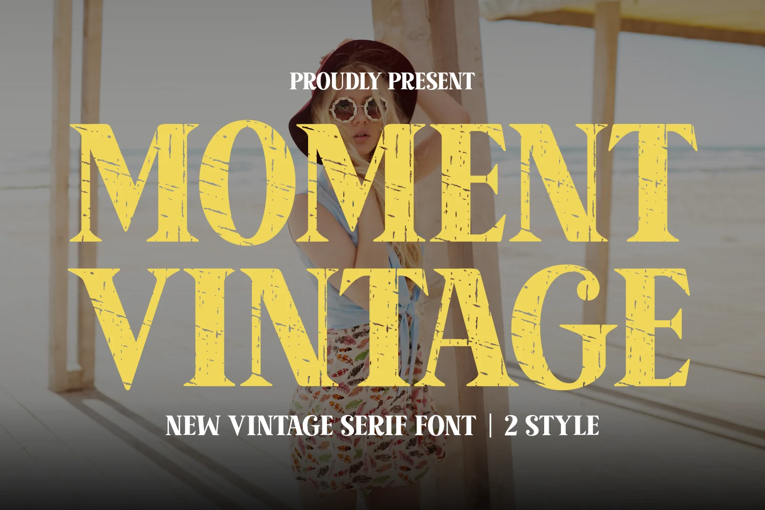
Best For: logos, branding, posters, T-shirts
Moment Vintage Font has broad uppercase serif letters, sharp wedge-like terminals, and a scratched distressed texture that gives the words a sun-faded poster feel. It lands between bold and refined, which makes it a strong pick within Vintage Fonts when you want nostalgia with cleaner structure rather than overly rough lettering.
The two included styles give you a simple way to build hierarchy across titles, logos, and apparel graphics without changing the overall mood. Use the main line large and keep secondary text shorter and tighter beneath it, so the texture stays visible and the wide serif shapes do not lose their impact.
Vintage Jersey Style Font
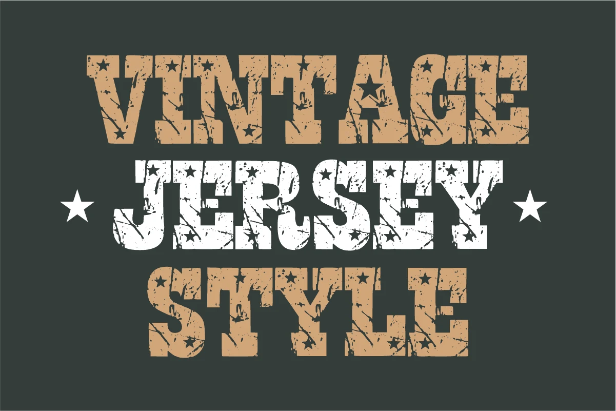
Best For: T-shirts, merch design, signage, vintage designs
Vintage Jersey Style Font uses heavy slab block letters with rough distressing, star cutouts, and a compact athletic rhythm. The broad uppercase shapes feel worn and direct, giving Vintage Fonts a gritty jersey-shop look that fits retro sports layouts and old-school signage without needing extra texture overlays.
Use it for short team names, shirt graphics, badge-style layouts, and large poster titles where the chipped details stay visible. The letters carry a lot of weight, so keep line spacing generous and pair it with a plain supporting font to prevent the stacked composition from becoming too dense.
The right vintage typeface can quickly shape the tone of a design, whether you need a worn print-shop look, a bold athletic headline, a nostalgic script logo, or a refined old-style label. These Vintage Fonts are available on Creative Fabrica, making it easier to test different retro styles and find a font that fits your next branding, poster, packaging, or merch project.